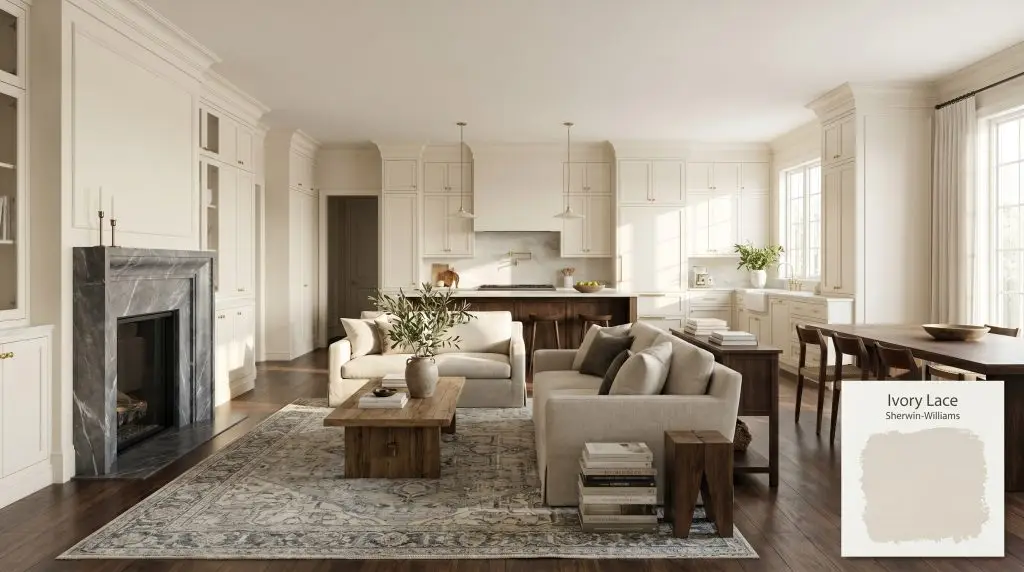
Sherwin-Williams Ivory Lace (SW 7013) is a warm, creamy off-white paint color. With an LRV of 78.79, it brings a soft, inviting brightness to a room without feeling stark. Its architectural finish features a warm beige base with subtle, hidden pink or greige undertones.
Will Ivory Lace clash with your room?
Paint Technical Profile
| Color ID / SKU | SW 7013 |
| HEX Code | #ECE5D8 |
| Light Reflectance (LRV) | 78.79 |
| Temperature | Warm |
| Primary Undertone | Warm Cream |
| Hidden Undertones | Subtle Cool Pink And Greige |
| Use | Interior, Exterior |
| Best Exposures | North-facing or heavily wooded rooms |
| Best For | Kitchen cabinets, living room walls, exterior siding, traditional trim |
Ivory Lace Digital Design Concept Boards
Kitchen Cabinetry & Millwork
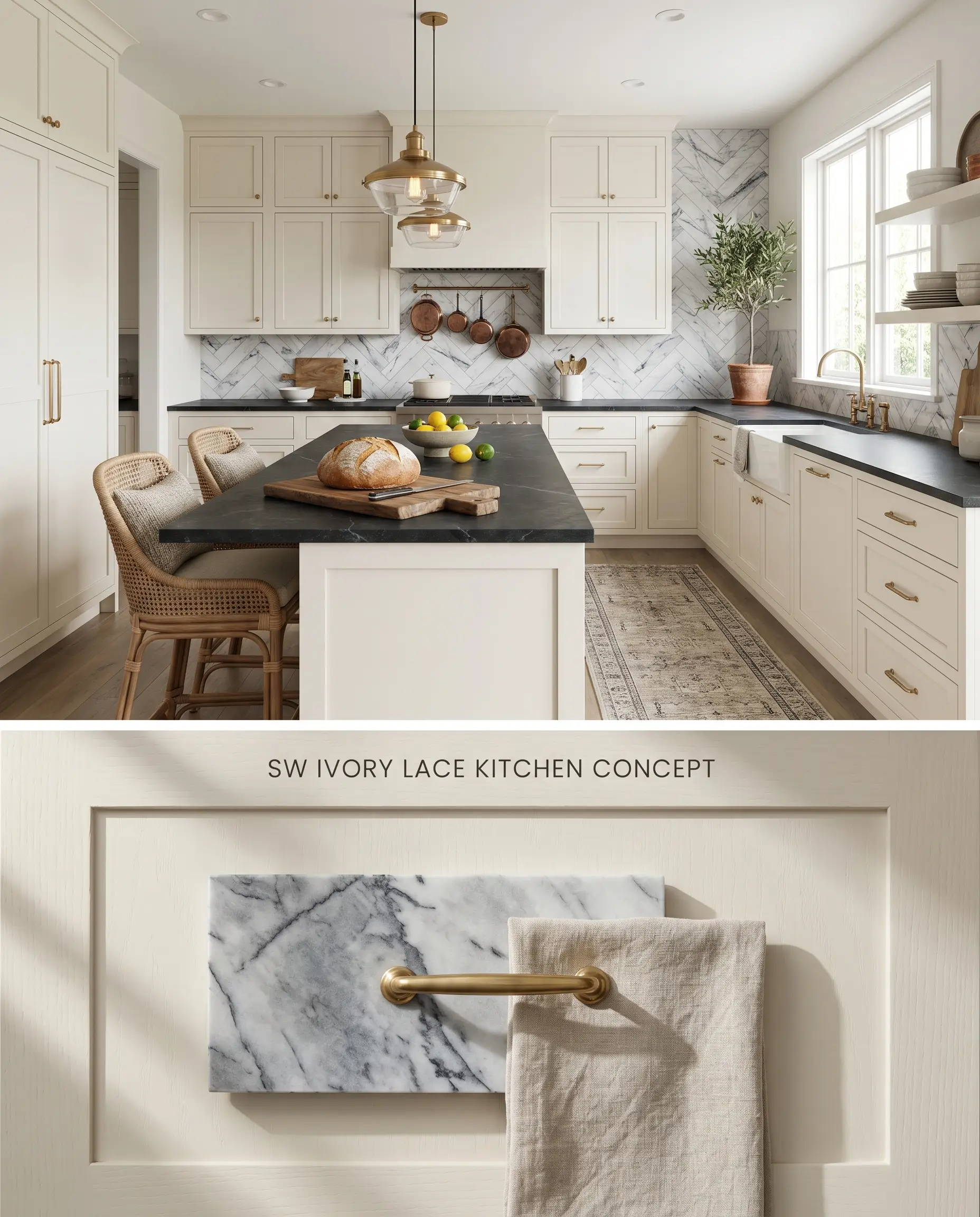
Ivory Lace acts as a sophisticated, warm off-white foundation for transitional kitchen cabinetry, provided it is kept away from intense, direct sunlight which triggers a bounce effect that washes out its subtle chromatic profile. Because of its specific undertone structure, it pairs flawlessly with deeply saturated cool tones while strictly avoiding golden oak or orange-toned floors that force the paint to read as dingy.
Living Room Walls
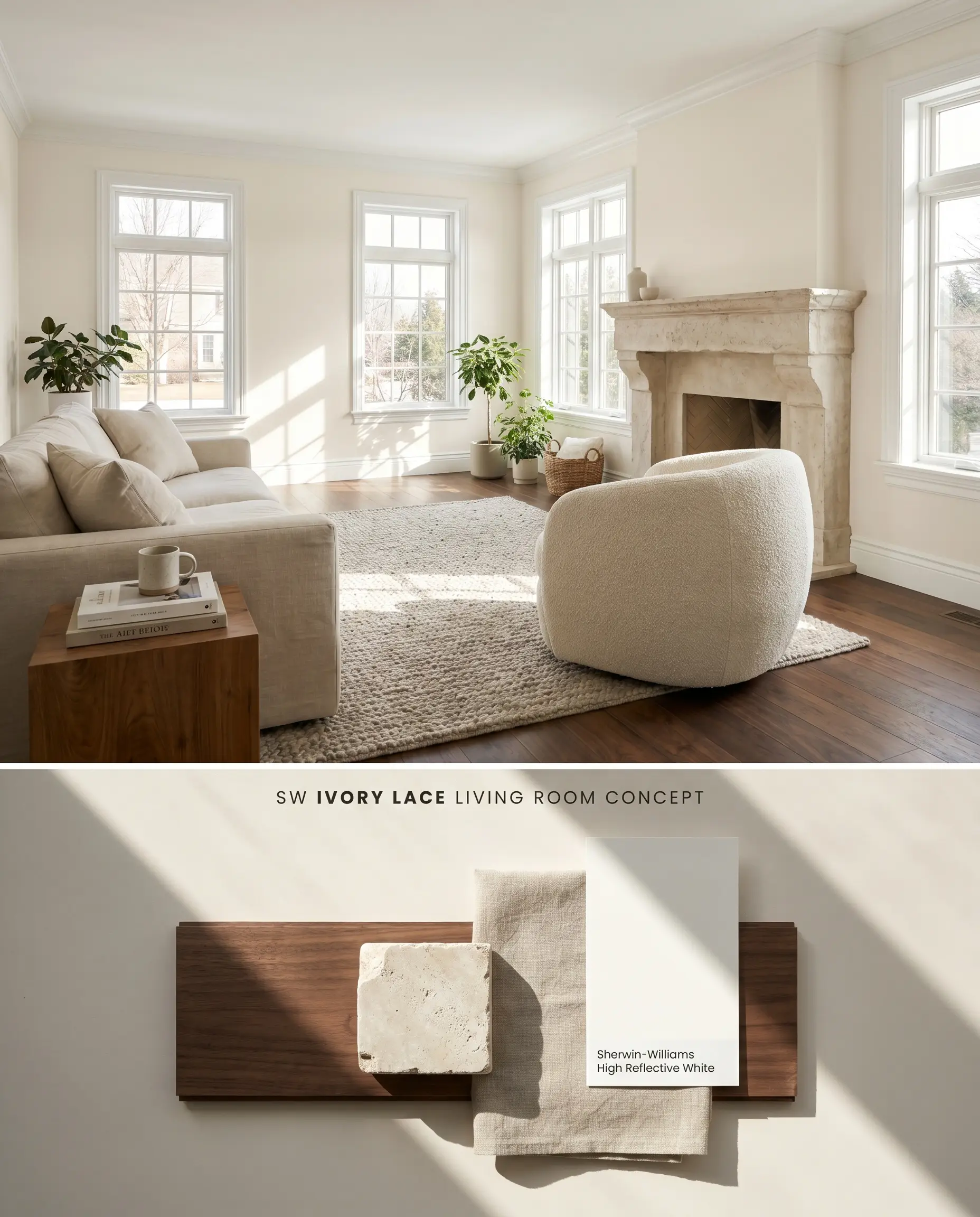
While often considered for shaded lots, applying this paint in rooms with strict northern exposure or wooded lot lighting will amplify its hidden pink undertone and greige shift. To maintain its intended warm off-white identity, redirect this color to living spaces receiving abundant southern or western light, grounding the airy walls with rich, dark walnut flooring to absorb excess luminosity.
Exterior Siding & Trim
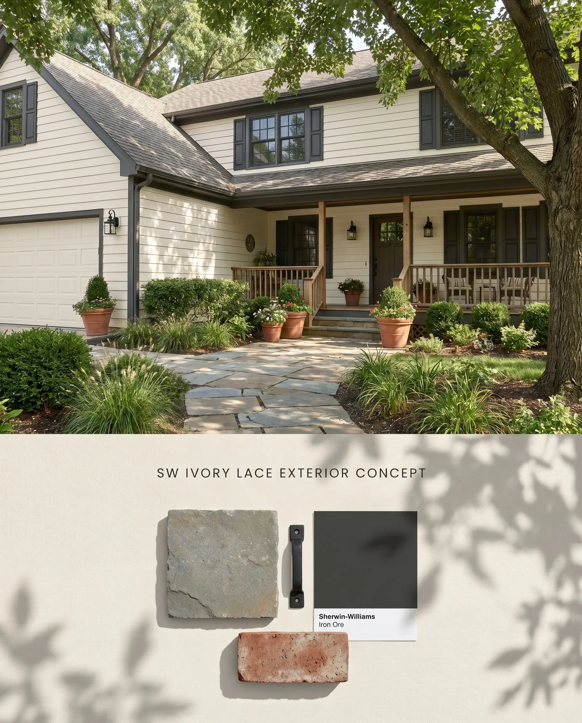
Using this shade on exteriors requires careful orientation planning, as direct, unmitigated midday sun flattens its nuanced LRV 78.79 into a stark, blinding white. It performs best on shaded elevations or underneath deep porches where the ambient light allows its creamy base to register against dark, contrasting architectural elements.
Traditional & Transitional Interiors
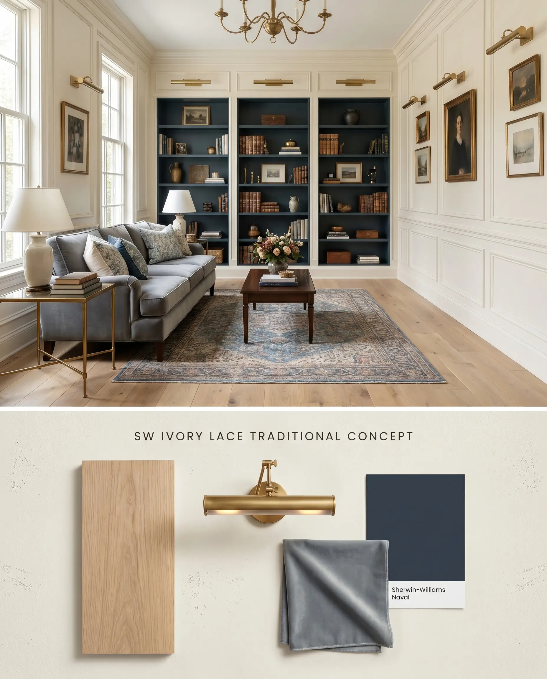
In traditional interiors, this color bridges the gap between stark modern whites and dated yellows, offering a sophisticated backdrop for intricate wainscoting and crown molding. The subtle warmth requires careful pairing with cool or neutral textiles, as introducing yellow-toned woods or fabrics will force the paint’s undertones into an immediate clash.
Chromatic Profile Comparisons
Sherwin-Williams Ivory Lace SW 7013 vs. Sherwin-Williams Alabaster SW 7008
Alabaster (LRV 82) is lighter and has a distinct beige-yellow undertone, making it a predictable, straightforward off-white. Ivory Lace (LRV 78.79) carries a lower LRV and a more complex chromatic profile that includes a subtle pink undertone. Specify Alabaster for spaces with unpredictable light where you need a stable neutral, and reserve Ivory Lace for bright, south-facing rooms where its creamy base can fully develop without flashing greige.
Sherwin-Williams Ivory Lace SW 7013 vs. Sherwin-Williams Creamy SW 7012
Creamy (LRV 81) leans aggressively into a yellow-beige base, generating a much warmer, traditional glow. Ivory Lace sits slightly darker and cooler, utilizing its greige shift to maintain a more muted presence. Choose Creamy when working alongside warm earth-toned masonry, but switch to Ivory Lace when integrating cool-toned marbles or slate, as the prominent yellow in Creamy will clash with gray stone.
Sherwin-Williams Ivory Lace SW 7013 vs. Benjamin Moore White Dove OC-17
White Dove (LRV 85.38) is significantly brighter and utilizes a gray-yellow base to achieve its muted, luminous quality without reading pink. Ivory Lace is darker, denser, and strictly requires strong natural light to avoid its low-light trap behavior. Deploy White Dove in dim, north-facing spaces to maximize light reflection, and use Ivory Lace in sun-drenched rooms where White Dove would wash out completely.
Technical FAQs
Yes, the cool, indirect light of a northern exposure frequently amplifies its hidden pink undertone and greige shift. To prevent this, limit its use to south-facing or well-lit western rooms where the sunlight brings out its clean, warm cream base.
Yes, placing this paint next to strong yellow or orange wood tones creates an immediate clash. The contrast forces the paint to look dingy and mismatched, so it must be paired with neutral white oak, dark walnut, or cool-toned stones instead.
Wooded lot lighting and heavy green foliage cast a green reflection onto the siding, which interacts with the paint’s pink undertone to create a muddy, muted greige shift. It requires strategic placement on shaded elevations without immediate, dense tree canopies reflecting directly onto the surface.
It is not inherently too yellow, but its LRV 78.79 and creamy base lack the stark, sterile crispness required for an ultra-modern aesthetic. While intense direct sunlight may cause a bounce effect that washes it out, it remains fundamentally a traditional or transitional off-white rather than a modern gallery white.
Room Compatibility & Clashes Diagnoses
Hackrea's reports evaluating the compatibility of Ivory Lace in real rooms.West-Facing Living Room
"The narrow light reflectance gap between the trim and proposed Divine White walls reduces architectural contrast, while warm West-facing light significantly intensifies the trim's yellow-cream undertone."
Paint Aesthetic & Practical Analysis
| Profile | Analysis | |
|---|---|---|
| Aesthetic | Ivory Lace is a highly versatile, mid-range white that beautifully bridges the gap between stark modern whites and heavy traditional creams. It excels in spaces with abundant natural light or wooded surroundings, though its subtle pink shift requires careful testing against yellow-heavy finishes. | |
| The Coverage Catch | Because it is a very light, low-chroma color, dark or uneven substrates may show patchiness. A high-quality primer or a third coat might be necessary for full, opaque coverage. | |
| The Lighting Shift | In north-facing or heavily wooded rooms, the color structure can occasionally flash a subtle cool pink or greige. In bright southern light, it reads as a clean, warm cream. | |
| The Clash Warning | May clash with heavily yellow or orange-toned wood cabinets (like golden oak), as the subtle pink/greige cast can look slightly dingy or mismatched next to strong yellow hues. | |
| The Bounce Effect | Highly reflective in bright spaces; it can wash out and lose its creamy warmth in rooms flooded with intense direct sunlight. | |
| The Low Light Trap | In windowless rooms or spaces with poor artificial lighting, it can lose its brightness and lean slightly flat or muddy. | |
| The Touch Up | Generally touches up well in flat or matte finishes, but higher sheens on cabinetry may flash if not blended properly. |
Closest Cross-Brand Equivalents
The absolute closest scientific color matches for Ivory Lace across top paint brands.