Prospect SW 9615
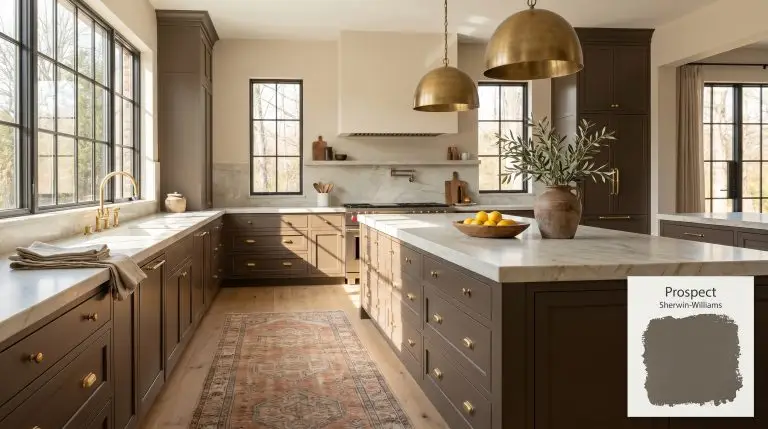
Sherwin-WilliamsSherwin-Williams Prospect (SW 9615) is a deep, dramatic neutral that blends a warm brown base with subtle gray and olive green undertones. With an LRV of 10, it serves as a sophisticated, moody accent color for cabinets, doors, and exteriors.
| Temperature | Warm |
|---|---|
| Primary Undertone | Brown |
| Hidden Undertones | Olive green, deep gray |
| Best Exposures | South-facing, West-facing |
| Best For | Kitchen cabinets, accent walls, exterior siding, built-in bookcases, interior doors |
Hackrea Review
Prospect by Sherwin-Williams is a stunningly rich neutral that anchors a room without feeling overly heavy. Its subtle olive and gray undertones keep the brown base from looking dated, making it a highly sophisticated choice for modern and transitional spaces alike.Architectural Applications for Sherwin-Williams Prospect
Kitchen islands and lower cabinetry
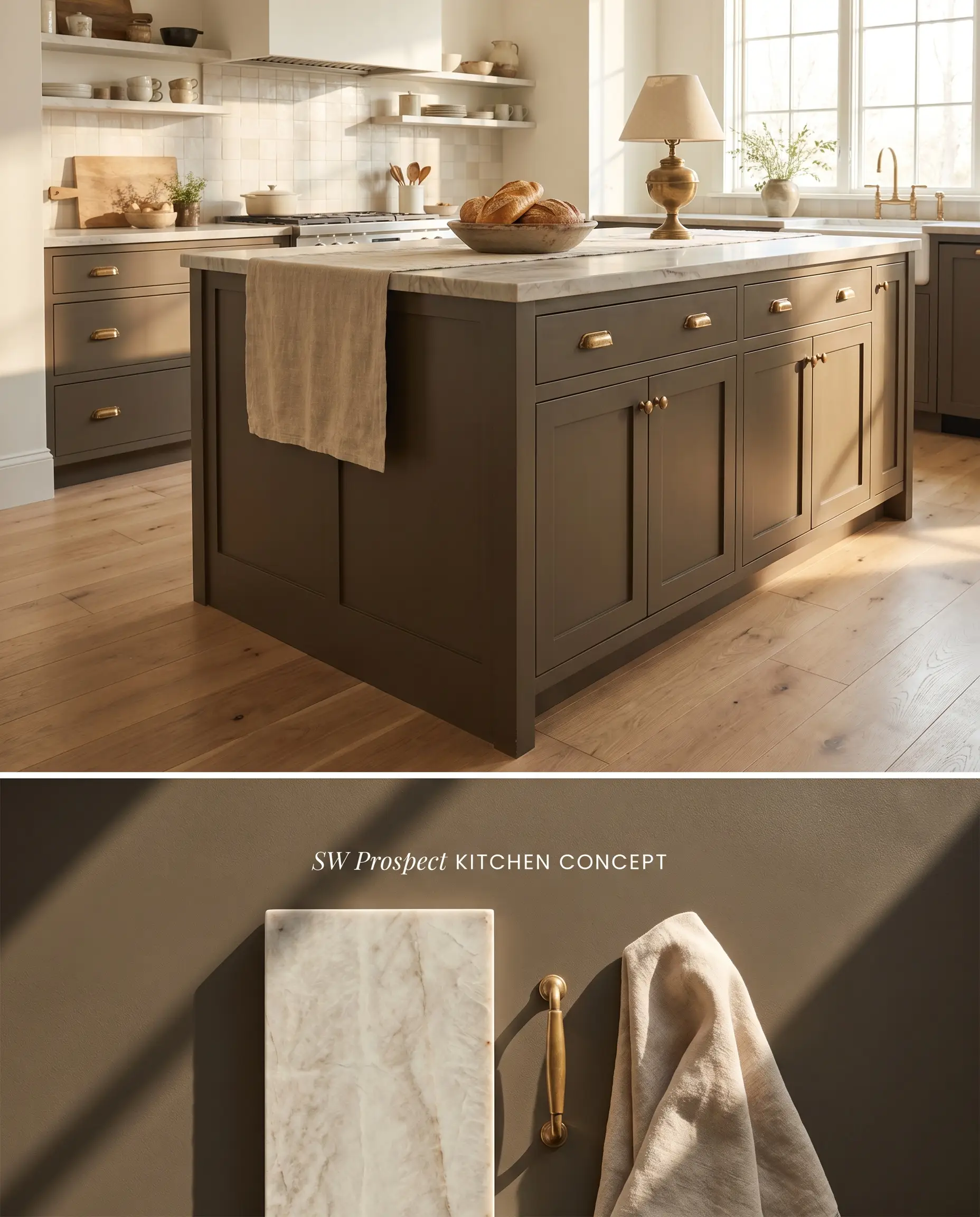
Grounding a culinary space with this dark neutral anchors the room while hiding scuffs along the kickplate. The warm brown and olive undertone interact with natural stone veining, pulling out earthy minerals without reading as a standard, predictable gray.
Exterior siding and trim accents
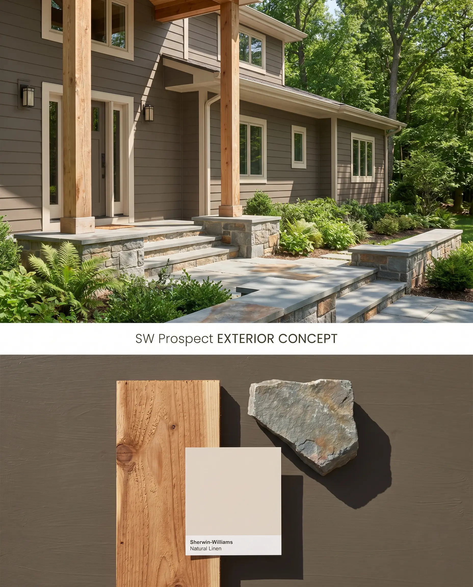
As an exterior siding color, Prospect SW 9615 absorbs intense UV rays, preventing the washed-out effect that plagues mid-tone neutrals. The deep chromatic profile bridges the gap between organic landscaping and rigid architectural lines, particularly on Craftsman or woodland contemporary builds.
Built-in bookcases and library walls
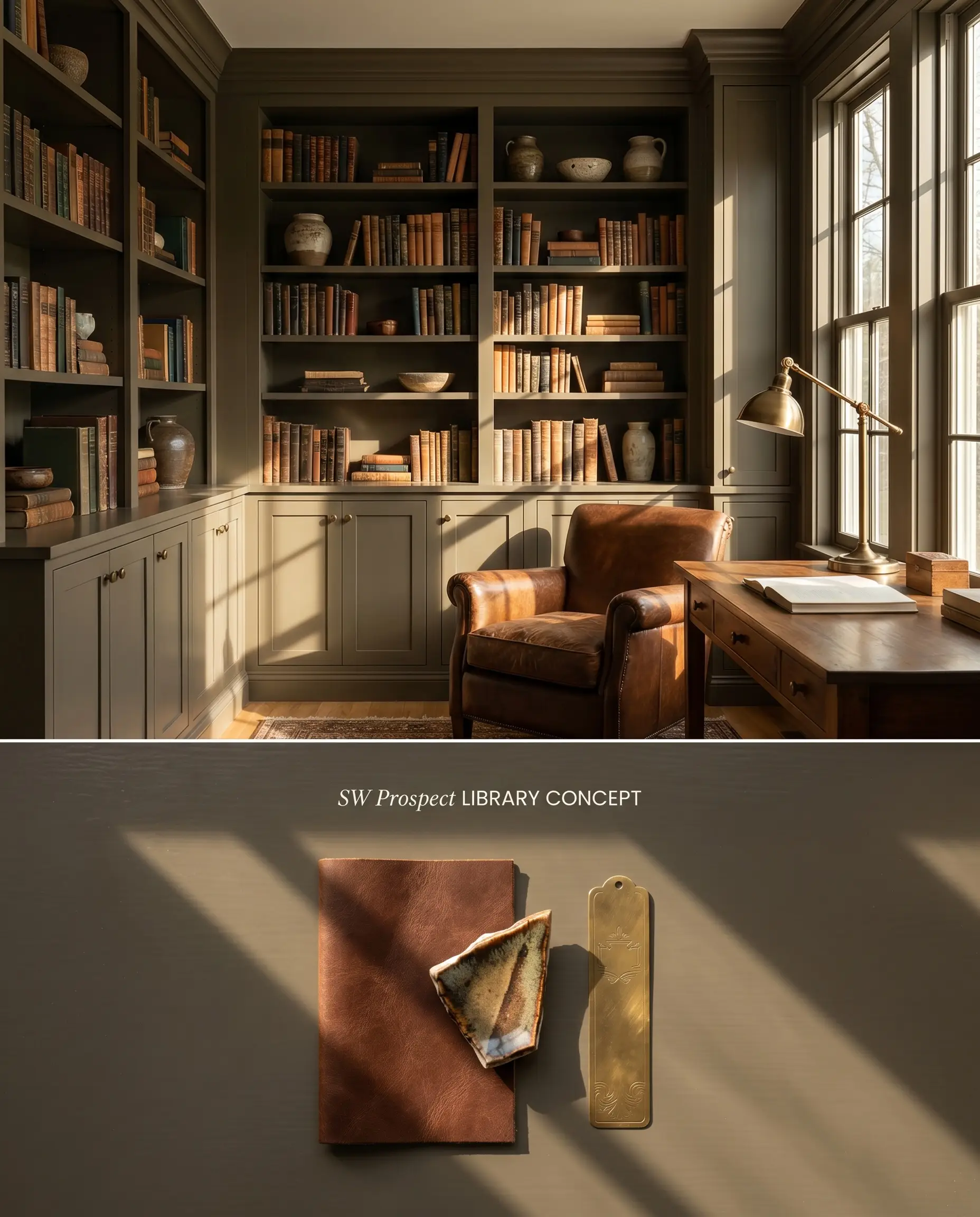
Wrapping floor-to-ceiling millwork in this moody accent color establishes immediate visual gravity in a study or home office. The color structure visually recedes, pushing the spines of books and curated ceramics forward into the viewer’s focal plane.
Interior doors and window sashes
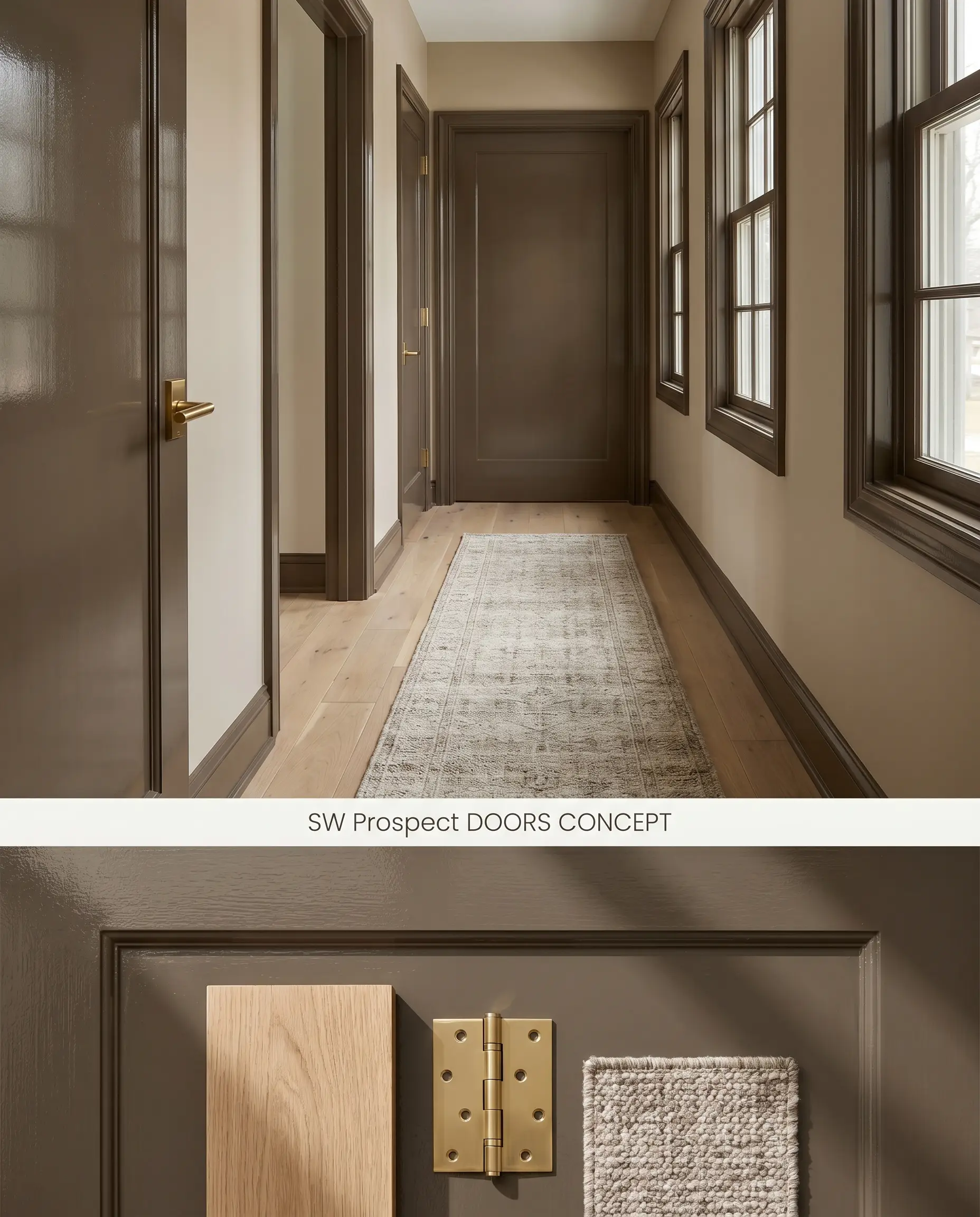
Coating interior passage doors in Prospect SW 9615 frames transitional sightlines with a sharp, tailored edge. The contrast against lighter, warm-toned walls mimics the structural definition of custom steel-framed windows.
Moody accent walls in dining rooms
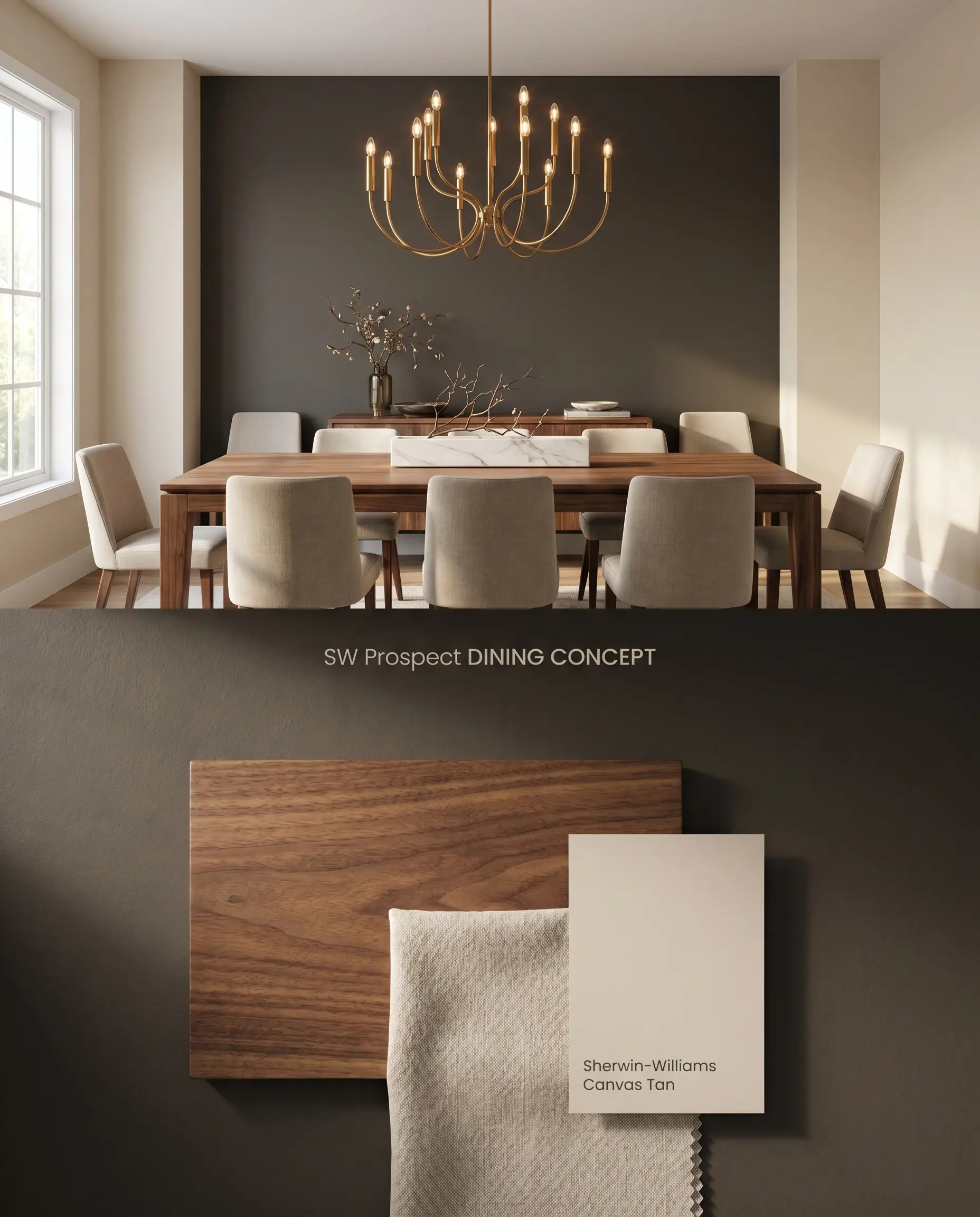
Concentrating this deep shade on a single dining room wall absorbs excess glare and creates a high-contrast backdrop for sculptural lighting fixtures. By limiting the application to one plane, you avoid the aggressive bounce effect that compresses small spaces.
You can apply wallpapers, paints, etc. on walls and see how they look in various interiors.

Color Theory Clashes: Comparative Neutral Analysis
Sherwin-Williams Prospect SW 9615 vs. Sherwin-Williams Porpoise SW 7047
Sherwin-Williams Porpoise SW 7047 carries a slightly higher LRV of 13 and leans distinctly into a bronze-brown base, lacking the strong gray influence found in Prospect. When applied in north-facing rooms, Porpoise retains its warmth, whereas Prospect SW 9615 will shift cool and project a muted, charcoal-gray dominance. Specify Porpoise for cool-light environments where you need sustained warmth, and reserve Prospect for south-facing spaces where its hidden olive cast can properly activate.
Sherwin-Williams Prospect SW 9615 vs. Sherwin-Williams Muddled Basil SW 7745
Sherwin-Williams Muddled Basil SW 7745 is an overt, saturated green with a brown base, whereas Prospect belongs to the Sherwin-Williams Neutral collection, operating primarily as a dark greige that only hints at olive. Muddled Basil commands the visual palette and forces surrounding materials to coordinate with green, while the lower LRV of Prospect acts as an anchoring shadow. Deploy Muddled Basil when the architecture requires a distinct color statement, but rely on Prospect for grounding millwork where you want the stone countertops to remain the primary focal point.
Sherwin-Williams Prospect SW 9615 vs. Benjamin Moore North Creek Brown 1001
Benjamin Moore North Creek Brown 1001 contains a pronounced red-orange undertone that fundamentally opposes the green-gray chromatic profile of Prospect. This underlying red makes North Creek Brown highly compatible with cherry wood and pink-toned beiges—materials that will harshly clash with Prospect. Choose the Benjamin Moore option when working with legacy red-toned woods, but pivot to Prospect SW 9615 when integrating with pale white oaks, honed slate, and cooler natural stones.
Technical Specifications & Application FAQs
Yes, the intense, warm light of a south-facing exposure penetrates the dark neutral base, pulling the hidden olive and warm brown tones to the surface. To prevent this from skewing too green, balance the room with textured, warm-toned textiles and unlacquered brass hardware.
Yes, placing this LRV 10 shade in a low-light trap strips away its nuance, causing it to read as a flat, dense charcoal-brown. It absorbs available light rather than reflecting it, making windowless spaces feel uncomfortably restrictive.
Prospect performs exceptionally well outdoors, as the intense UV light prevents the dark color structure from looking like a black void. However, because deep tints absorb significant solar heat, you must ensure the siding material is rated for low LRV paints to prevent warping.
Cherry wood, mahogany, and any flooring with strong red or pink undertones will actively fight the olive-green base of Prospect, making the paint look muddy and discordant. Stick to white oak, ash, or deep espresso stains to maintain color harmony.
Similar Paint Colors
Same Brand
Cross-Brand Equivalents