Lazy Gray SW 6254
Sherwin-WilliamsSherwin-Williams Lazy Gray (SW 6254) is a cool, medium-light blue-gray. With an LRV of 53, it perfectly balances steely gray with soothing blue undertones. Depending on the lighting, it can lean heavily into its blue roots, making it an excellent choice for crisp, modern spaces or relaxing bedrooms.
| Temperature | Cool |
|---|---|
| Primary Undertone | Blue |
| Hidden Undertones | Silver, slight purple in cool light |
| Best Exposures | South-facing or West-facing |
| Best For | Bedroom Walls, Bathroom Vanities, Kitchen Cabinets, Living Room Accents |
Hackrea Review
Lazy Gray is a fantastic two-for-one hue for those who can't decide between blue and gray. While it is undeniably soothing, its blue undertones are strong—so don't expect a true, flat neutral. It shines brightest when paired with crisp white trim in well-lit rooms.Architectural Applications for a Blue-Gray Hybrid
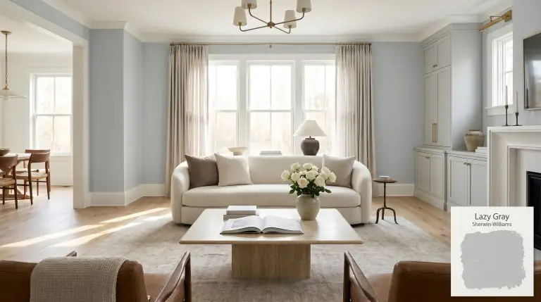
Bedroom Walls
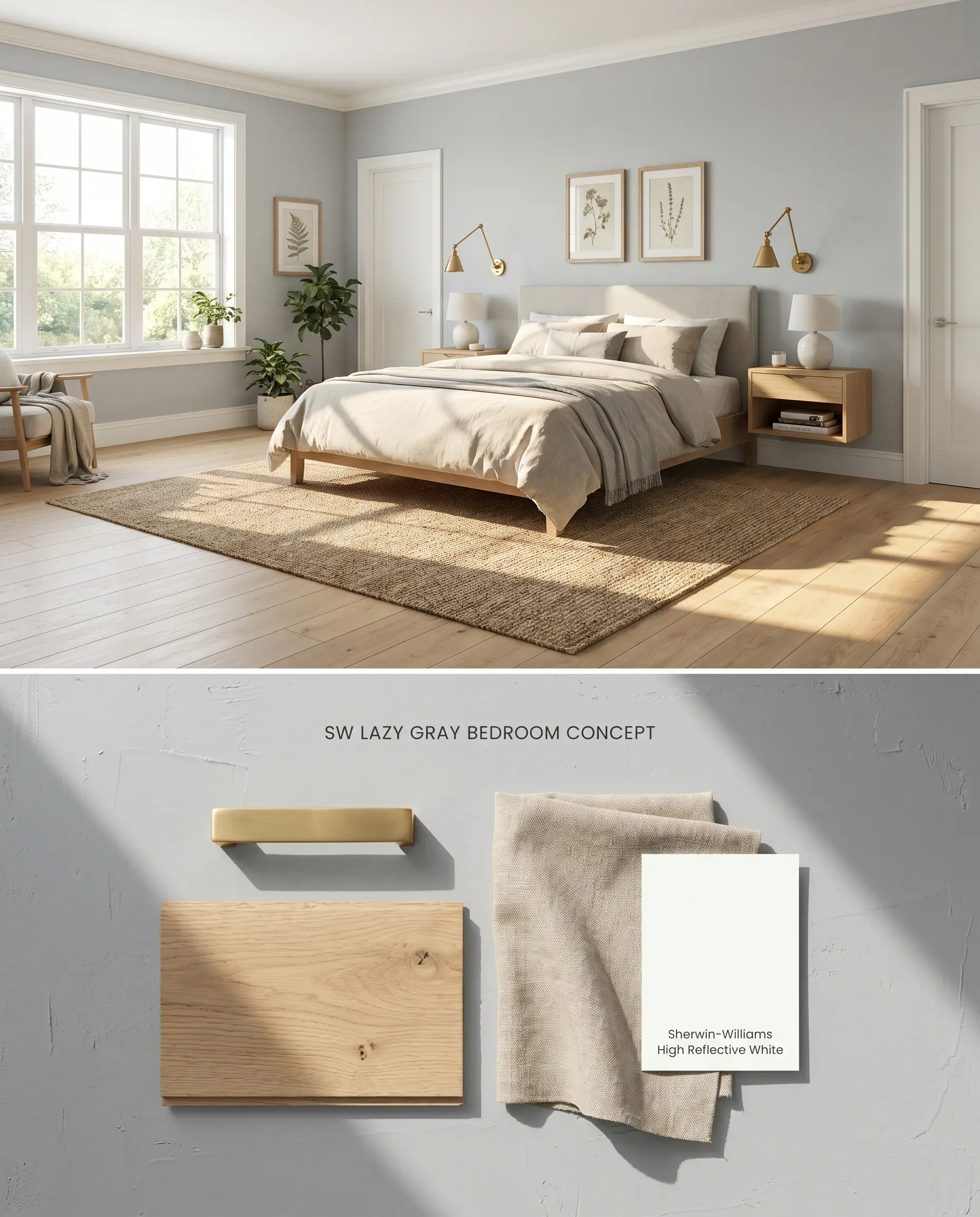
South-facing or western exposures temper the blue-gray hybrid nature of this mid-tone gray, preventing the paint from reflecting short-wave blue light and reading as a juvenile baby blue. The cool neutral tones physically absorb intense afternoon sunlight, lowering the visual temperature of the room while grounding airy, light-toned textiles. Pairing this with matte, textured linens and unlacquered brass hardware introduces necessary warmth to balance the steely undertones.
Bathroom Vanities
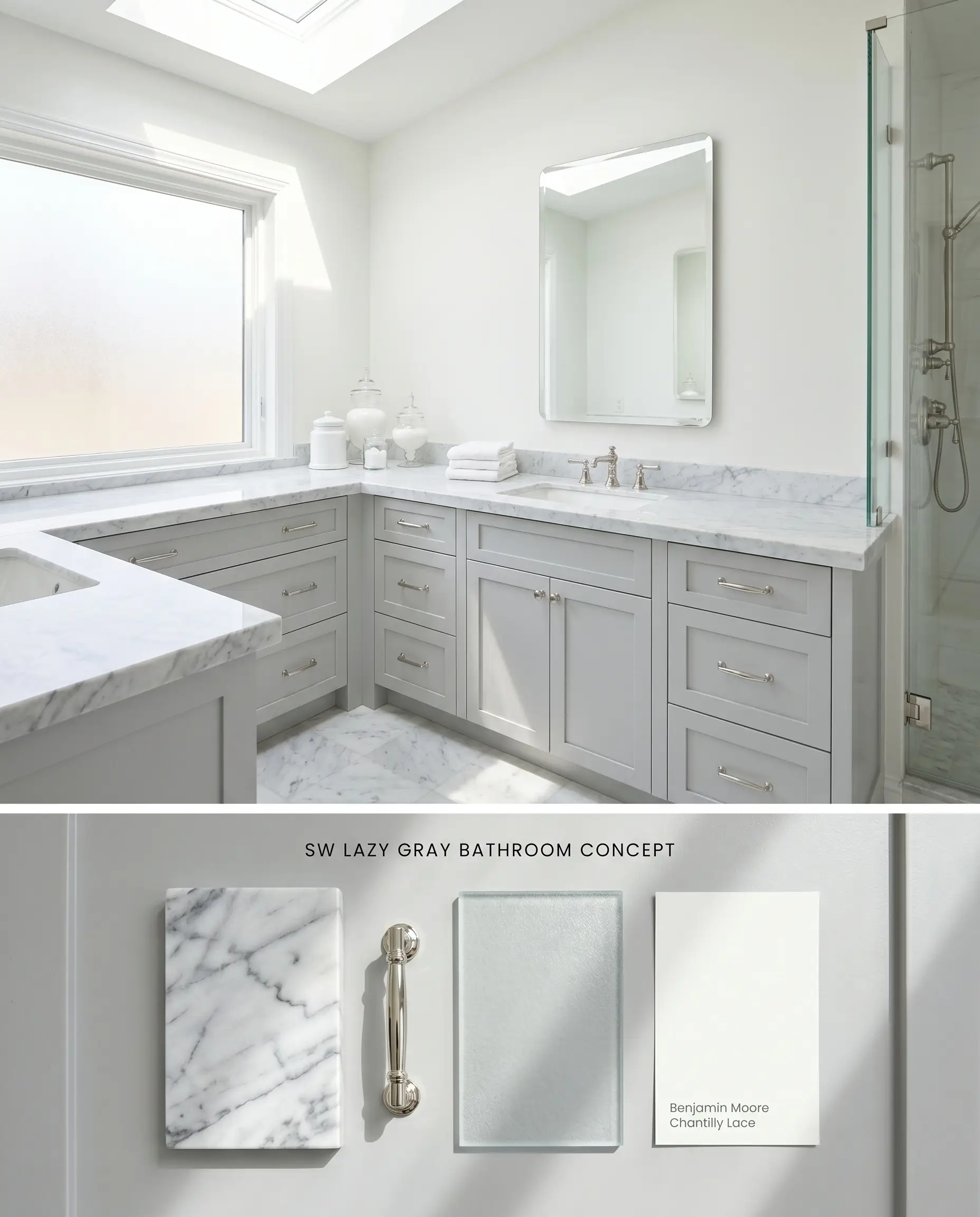
In bathrooms flooded with natural daylight, this color transforms standard millwork into a soothing architectural finish. The steely undertones contrast sharply against polished Carrara marble countertops, physically mirroring the gray mineral veining within the stone. Avoid windowless layouts entirely, as the 53 LRV will compress the space and read muddy without incoming natural photons to activate the blue pigments.
Kitchen Cabinets
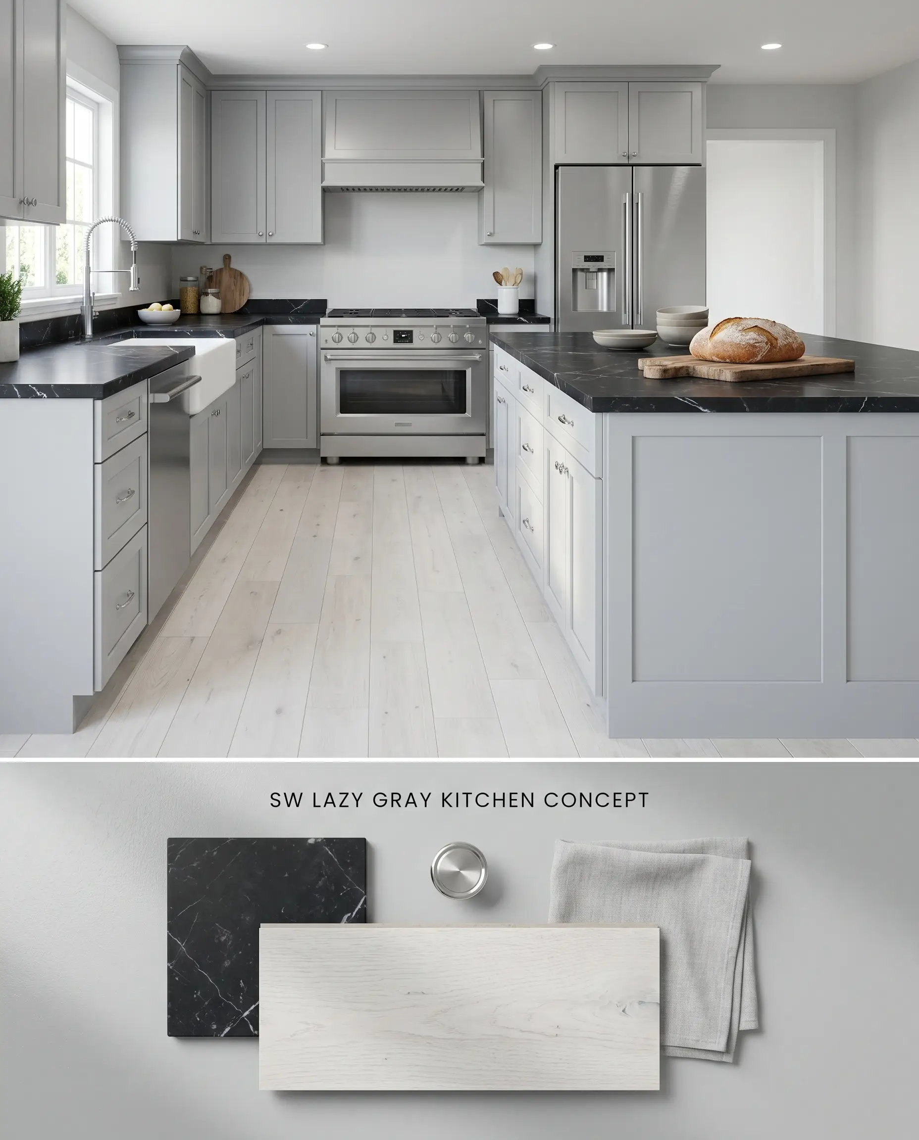
When applied to lower cabinetry or an island, this shade acts as a grounding anchor for kitchens utilizing cool-toned natural stone. Because the blue pigments clash directly with warm, honey oak floors, it requires pairing with cool slate tile or heavily whitewashed engineered hardwoods to maintain visual harmony. The color saturation holds its ground against stainless steel appliances, bridging the transitional gap between metallic finishes and painted millwork.
Living Room Accents
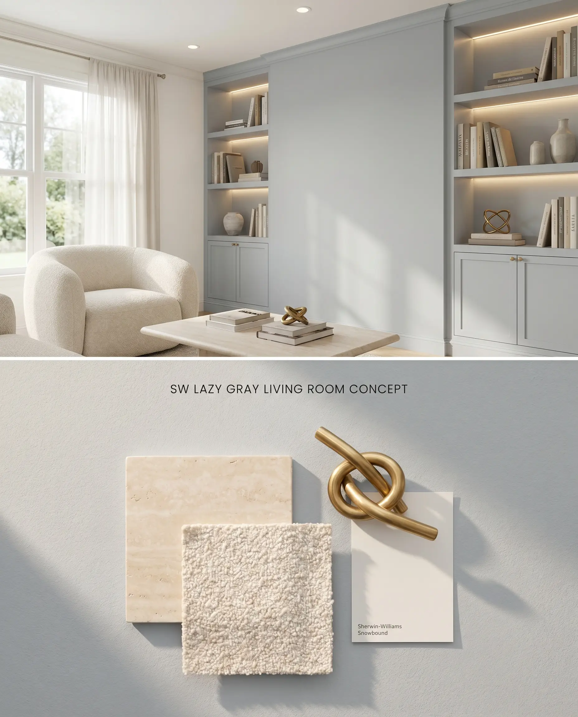
Using this on a focal wall or custom built-ins requires careful evaluation of the exterior landscaping. If the living room windows face dense foliage, the chromatic profile of the paint will absorb the green light wavelengths reflecting off the leaves, shifting the finish toward a subtle teal. Mitigate this bounce effect by flanking the accent wall with bright, neutral drapery and utilizing warm 3000K accent lighting to neutralize the incoming green cast.
You can apply wallpapers, paints, etc. on walls and see how they look in various interiors.

Head-to-Head Comparisons: Sherwin-Williams Lazy Gray
Sherwin-Williams Lazy Gray SW 6254 vs. Sherwin-Williams Morning Fog SW 6255
Sherwin-Williams Lazy Gray SW 6254 sits at an LRV of 53, bringing noticeably more light reflectance to a room than Sherwin-Williams Morning Fog SW 6255, which drops to an LRV of 42. Morning Fog carries a deeper, more storm-cloud intensity that absorbs light, making it suitable for high-contrast dining rooms or well-lit studies. Lazy Gray leans further into its blue-gray hybrid identity, requiring careful pairing to avoid looking like baby blue, whereas Morning Fog stays strictly rooted in deep slate territory regardless of the natural lighting shift.
Sherwin-Williams Lazy Gray SW 6254 vs. Benjamin Moore Pelican Gray 1612
While both operate as mid-tone grays, Benjamin Moore Pelican Gray 1612 possesses a slightly cleaner, more silvery base compared to the pronounced steely undertones of Sherwin-Williams Lazy Gray SW 6254. Pelican Gray holds an LRV of 65.4, making it significantly more reflective and safer for spaces with moderate lighting. Reserve Lazy Gray for rooms with intense southern exposure where the high volume of sunlight can wash out lighter colors, and use Pelican Gray when you need a gentle, airy neutral that won’t shift teal near exterior greenery.
Sherwin-Williams Lazy Gray SW 6254 vs. Sherwin-Williams Samovar Silver SW 6233
Sherwin-Williams Samovar Silver SW 6233 is a dedicated cool silver with an LRV of 51, placing it nearly identical in light reflectance to Sherwin-Williams Lazy Gray SW 6254. However, Samovar Silver exhibits a distinct violet-blue undertone that reacts sharply to artificial incandescent lighting. Lazy Gray maintains a more traditional blue-gray profile that pairs effortlessly with crisp white trim, making it the better choice for transitional architectural spaces, provided it is kept strictly away from yellow-toned wood floors.
Technical FAQs: Chromatic Profile Shifts
Yes, North-facing light amplifies the blue undertones significantly, causing the paint to read as a true baby blue rather than a balanced neutral gray.
Yes, the cool steely undertones clash directly with warm yellow and orange wood tones, creating a disjointed, overly icy appearance in the space.
The paint is highly susceptible to a bounce effect, picking up a distinct teal or greenish cast when exterior foliage reflects light into the room.
No, its mid-range LRV of 53 causes it to lose its crispness and appear muddy or heavy in low-light, windowless spaces.
Similar Paint Colors
Same Brand
Cross-Brand Equivalents