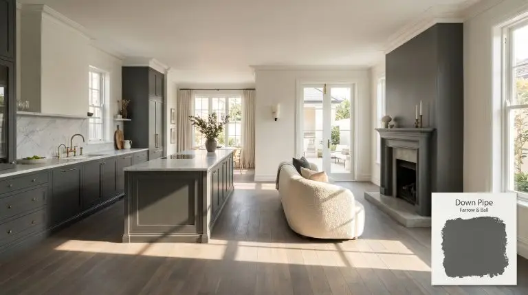
Down Pipe No. 26
Farrow & BallFarrow & Ball Down Pipe No. 26 is a dramatic, dark lead gray with distinct blue undertones. Inspired by historic cast-iron guttering, this moody and complex charcoal hue is perfect for creating deeply atmospheric spaces, striking kitchen cabinetry, or elegant exterior trim.
| Temperature | Cool |
|---|---|
| Primary Undertone | Blue |
| Hidden Undertones | Greenish-blue, lead, earthy notes |
| Best Exposures | South-facing or North-facing |
| Best For | Kitchen cabinets, Front doors, Hallways, Dramatic dining rooms, Accent walls, Exterior trim |
Hackrea Review
Down Pipe is one of Farrow & Ball's most iconic moody shades. Its ability to shift between a deep, earthy charcoal and a rich, atmospheric blue-gray makes it an exceptional choice for statement cabinetry or dramatic entryways. While it requires careful lighting to avoid feeling heavy, its architectural depth is unmatched.Architectural Applications for Farrow & Ball Down Pipe
Kitchen Cabinets
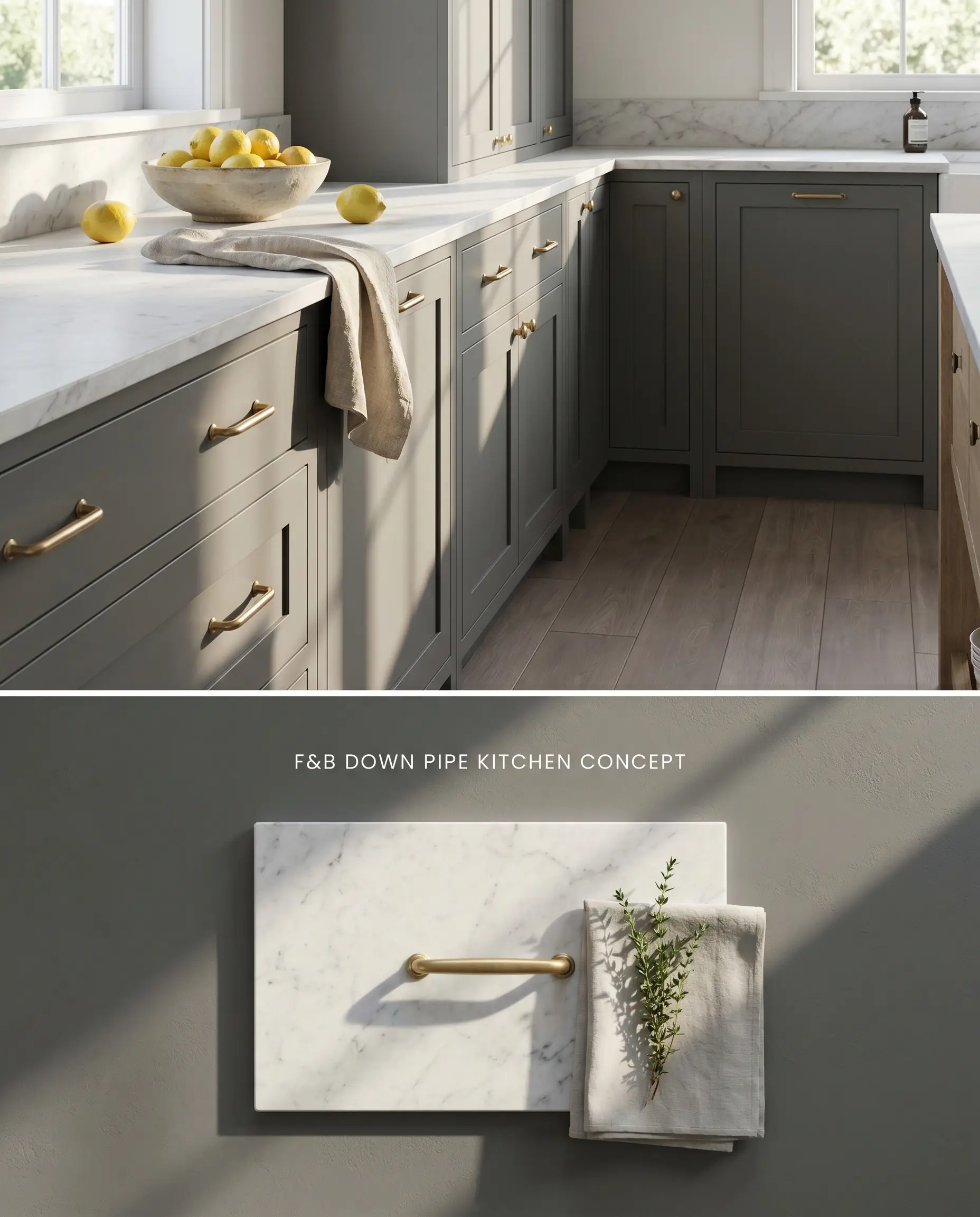
Down Pipe grounds lower cabinetry with a dense, moody charcoal weight that anchors the visual plane of the kitchen. The blue undertones contrast sharply against unlacquered brass hardware, allowing the metallic finish to reflect ambient light and break up the dark lead gray mass. Pairing this with a honed Carrara marble countertop provides a cool, porous transition that bridges the deep base cabinets to softer upper walls.
Front Doors
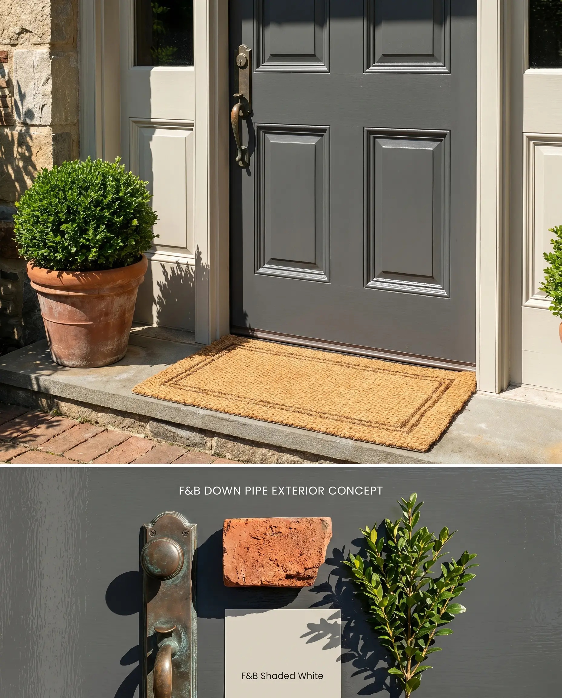
Applied to a classic paneled exterior door, this dark lead gray replicates the historic weight of cast-iron guttering, establishing immediate architectural permanence. The atmospheric depth of the color shifts dynamically outdoors, reading as a crisp charcoal under direct sun and shifting toward a muted teal in the evening shadows. Surrounding the door with a soft, muted off-white trim prevents the stark contrast that often makes deep grays read as muddy.
Hallways
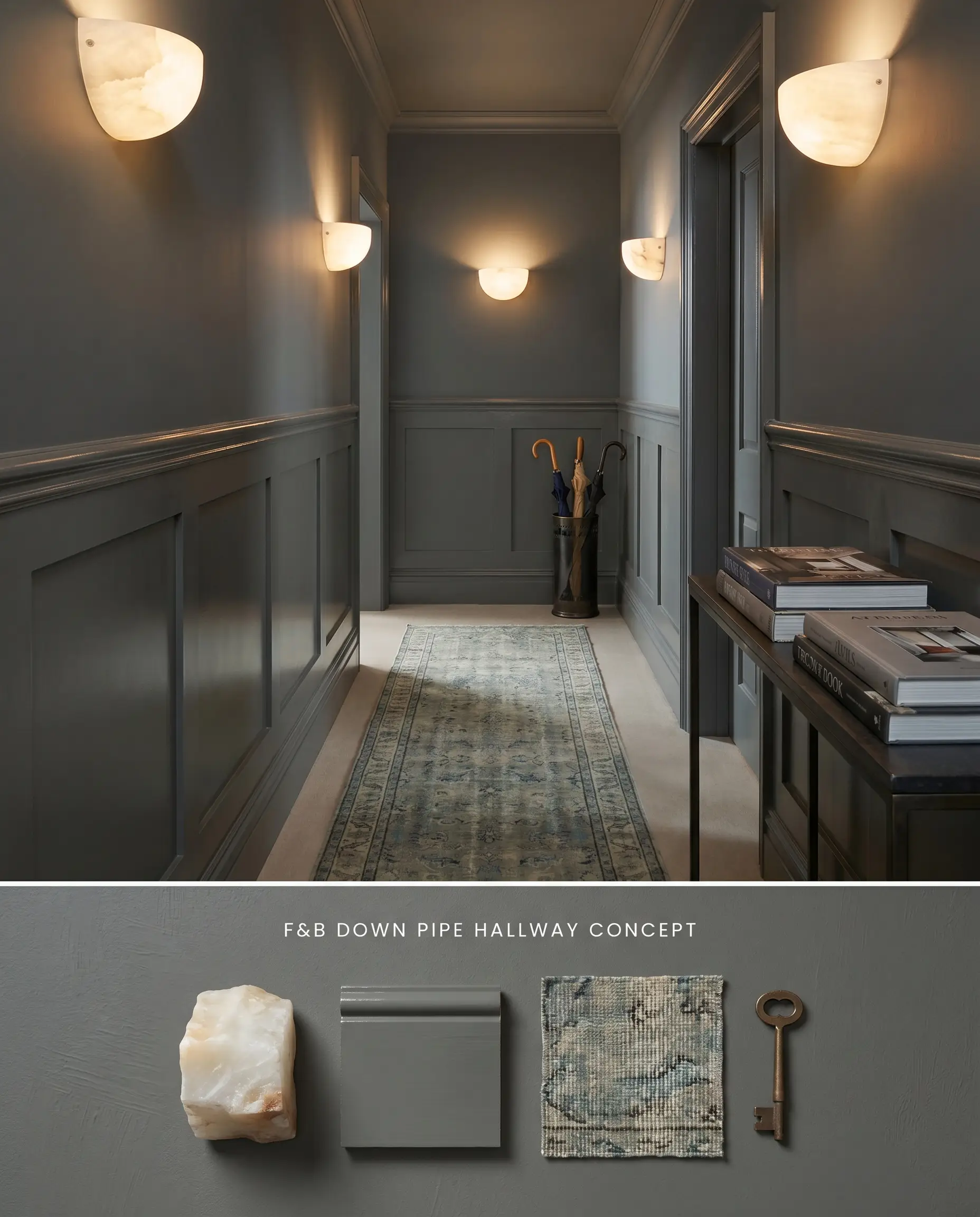
Color-drenching a transit space in this moody charcoal creates a high-compression zone that makes adjacent, lighter rooms feel expansive upon entry. Because this shade absorbs a massive amount of light with its LRV of 13, the hallway requires layered sconce lighting to illuminate the chromatic profile and prevent the walls from reading as a dense, flat black. Integrating a high-sheen wainscoting detail reflects artificial light back into the narrow corridor.
Dramatic Dining Rooms
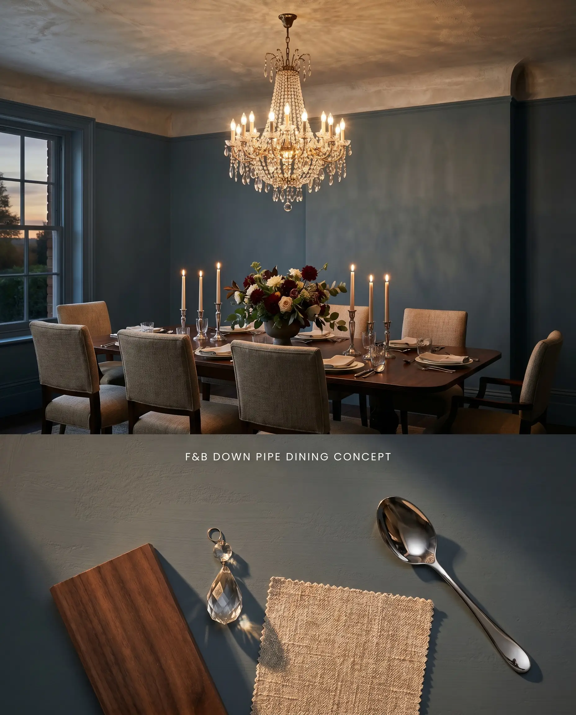
Wrapping a dining room entirely in this architectural finish establishes an enclosed perimeter that forces the eye toward the center of the table. The deep, light-absorbing walls recede under dim evening lighting, allowing crystal chandeliers or polished silverware to dictate the room’s focal points. Utilizing a textured limewash or plaster ceiling above the dark walls introduces a tactile surface that scatters overhead light.
Accent Walls
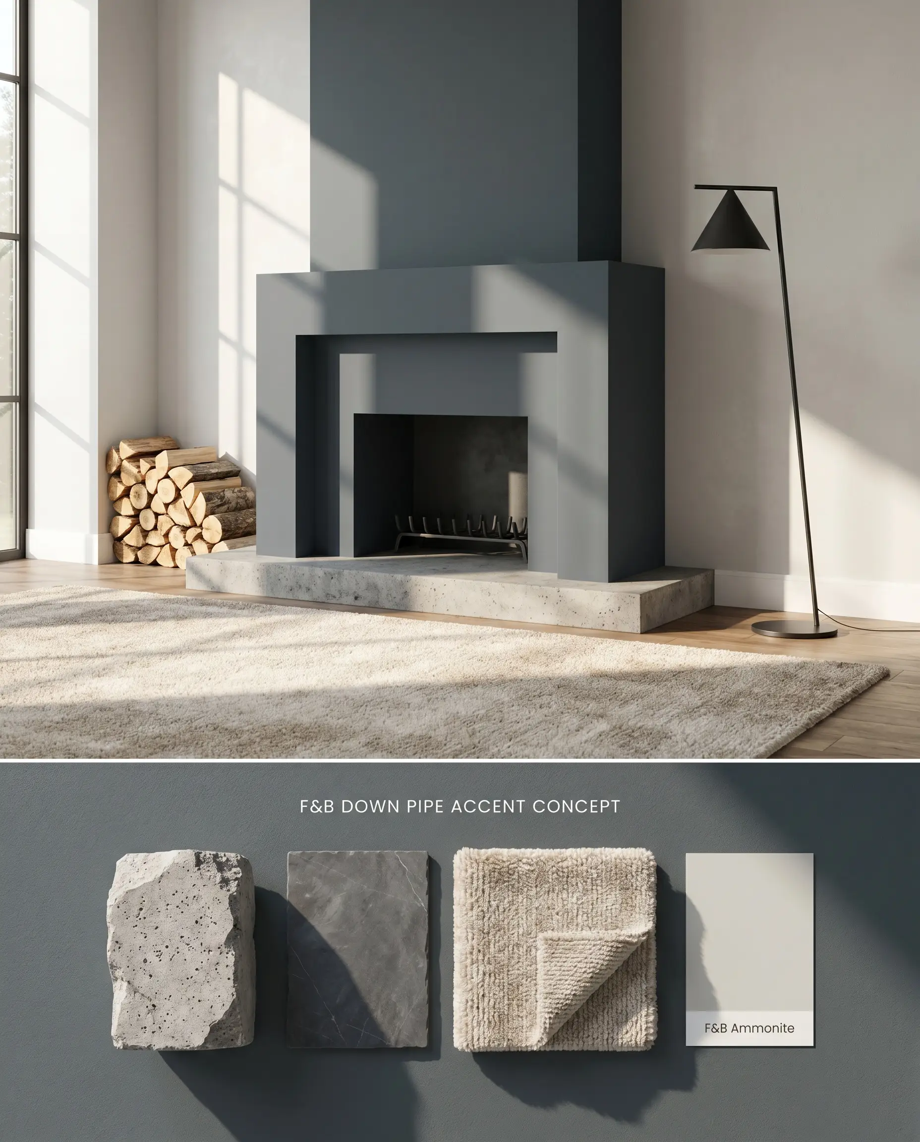
Isolating this color on a single structural wall, such as a fireplace surround, anchors the room’s geometry without shrinking the overall footprint. The dark lead gray pushes the accented plane backward, creating an optical illusion of increased depth in smaller living spaces. Balancing this dark focal point with pale, light-reflective adjacent walls ensures the room maintains its ambient brightness.
Exterior Trim
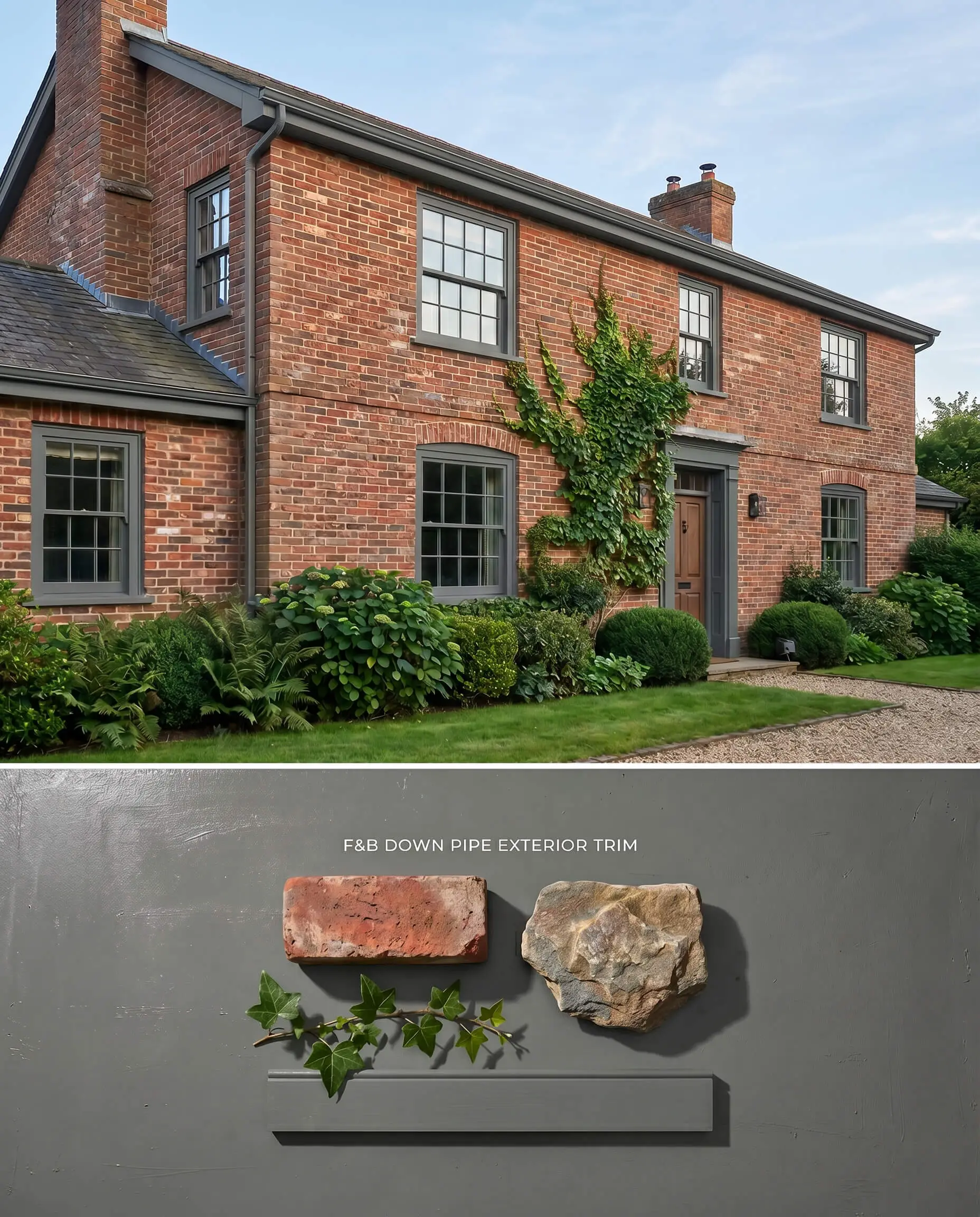
Framing exterior windows and fascia in this deep gray modernizes traditional brick or stone facades by introducing a sharp, defining outline. The subtle blue-green undertones of the paint interact with the surrounding landscaping, pulling out the natural greens of foundational plantings while grounding the structure. This application mimics the visual weight of historical cast-iron guttering, anchoring the roofline to the masonry.
You can apply wallpapers, paints, etc. on walls and see how they look in various interiors.

Chromatic Profile Comparisons: Dark Lead Grays
Farrow & Ball Down Pipe vs. Farrow & Ball Hopper Head No. 305
Farrow & Ball Hopper Head No. 305 presents as a purer, more straightforward charcoal, stripping away the complex blue-green undertones that define Down Pipe. In North-facing rooms where Down Pipe flashes a moody teal or eggplant, Farrow & Ball Hopper Head No. 305 maintains a strict, neutral gray structure. Specify Farrow & Ball Hopper Head No. 305 when surrounding finishes, like green-veined marbles, clash with blue undertones, and reserve Down Pipe for spaces that require the atmospheric depth of a shifting, multi-pigmented charcoal.
Farrow & Ball Down Pipe vs. Benjamin Moore Iron Mountain 2134-30
Benjamin Moore Iron Mountain 2134-30 leans significantly warmer, featuring an earthy, brown undertone that contrasts directly with Down Pipe’s cool, leaden blue cast. When dealing with warm-toned flooring like wide-plank chestnut, Benjamin Moore Iron Mountain 2134-30 bridges the gap smoothly, whereas Down Pipe will actively fight the yellow hues and read as murky. Deploy Down Pipe in South-facing rooms where intense, warm sunlight neutralizes its coolness, and utilize Benjamin Moore Iron Mountain 2134-30 in cooler, Northern exposures to inject necessary warmth.
Farrow & Ball Down Pipe vs. Sherwin Williams Peppercorn SW 7674
Sherwin Williams Peppercorn SW 7674 operates as a highly balanced, true dark gray with an LRV of 10, lacking the specific blue-green color structure of Down Pipe. Because Sherwin Williams Peppercorn SW 7674 lacks a dominant undertone, it serves as a safer, more predictable backdrop for highly colorful artwork or varied textiles. Choose Down Pipe when the paint itself needs to act as a dynamic, shifting architectural finish, and select Sherwin Williams Peppercorn SW 7674 when you require a static, light-absorbing neutral that will not change character throughout the day.
Technical Application FAQs
Yes, in North-facing light, the cool blue undertones become highly pronounced, frequently shifting the color toward a moody teal or eggplant. To mitigate this effect, utilize the paint in warm, South-facing rooms where it reads as a true, earthy charcoal.
Yes, pairing this specific gray with yellow-dominant woods like honey oak will pull out unwanted murky or green undertones from the paint. Always pair it with cooler, neutral materials like honed slate or smoked oak to maintain its intended color structure.
The chalky Estate Emulsion finish burnishes easily under physical contact, causing touch-ups to flash noticeably in high-traffic areas. For transit spaces like hallways, switch to the Dead Flat finish to ensure exceptional scuff resistance while maintaining an ultra-matte aesthetic.
Similar Paint Colors
Same Brand
Cross-Brand Equivalents