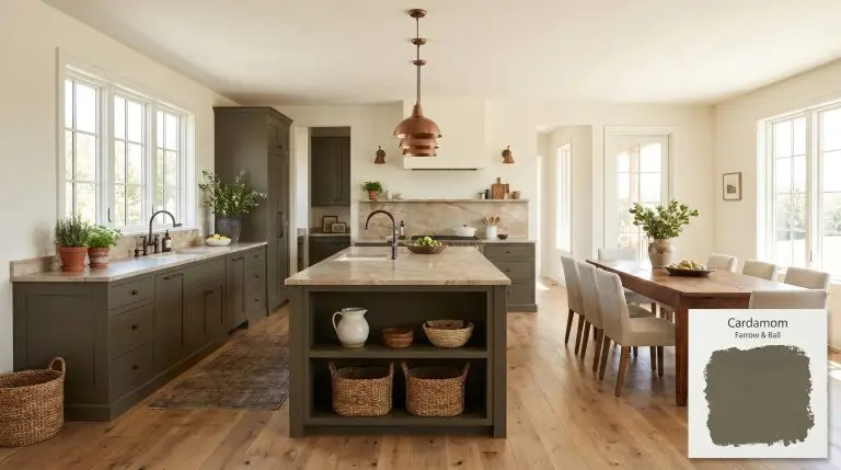
Cardamom CB5
Farrow & BallCardamom by Farrow & Ball is a rich, earthy brown hue with strong olive green and bronze undertones. Inspired by the versatile spice, this deep, warming shade boasts an LRV of 12, making it perfect for creating cocooning, sophisticated spaces.
| Temperature | Warm |
|---|---|
| Primary Undertone | Olive green |
| Hidden Undertones | Bronze, golden-yellow, muddy brown |
| Best Exposures | North-facing, South-facing |
| Best For | Studies, dining rooms, custom kitchen millwork, mudrooms, cozy feature walls |
Hackrea Review
Cardamom is a triumph from the Carte Blanche collection. It masterfully walks the line between a muddy olive cast and a rich bronze-brown base. It’s a bold, cocooning architectural finish that feels incredibly organic and sophisticated, especially when drenched across walls and millwork.Applying Farrow & Ball Cardamom: Architectural Recipes
Studies and Home Libraries
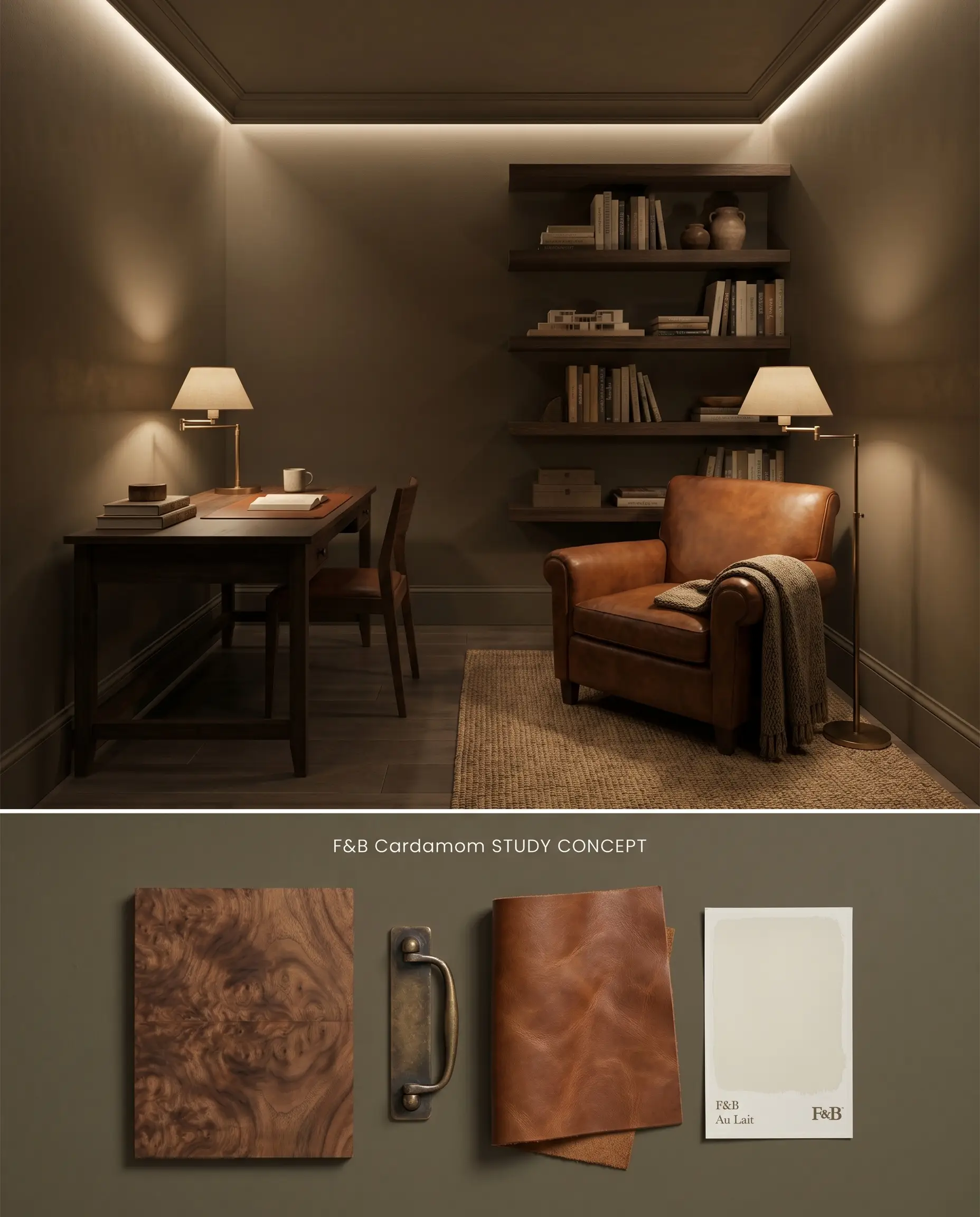
The low LRV 12 absorbs ambient light, pulling the walls inward to establish a structured cocooning effect that grounds floating shelving and reflective brass fixtures. When executing continuous color drenching across the ceiling and baseboards, the paint’s density requires precise artificial illumination to prevent the space from flattening into shadows. Layering directional task lighting activates the bronze undertones, separating the dark walls from dark timber furnishings.
Formal Dining Rooms
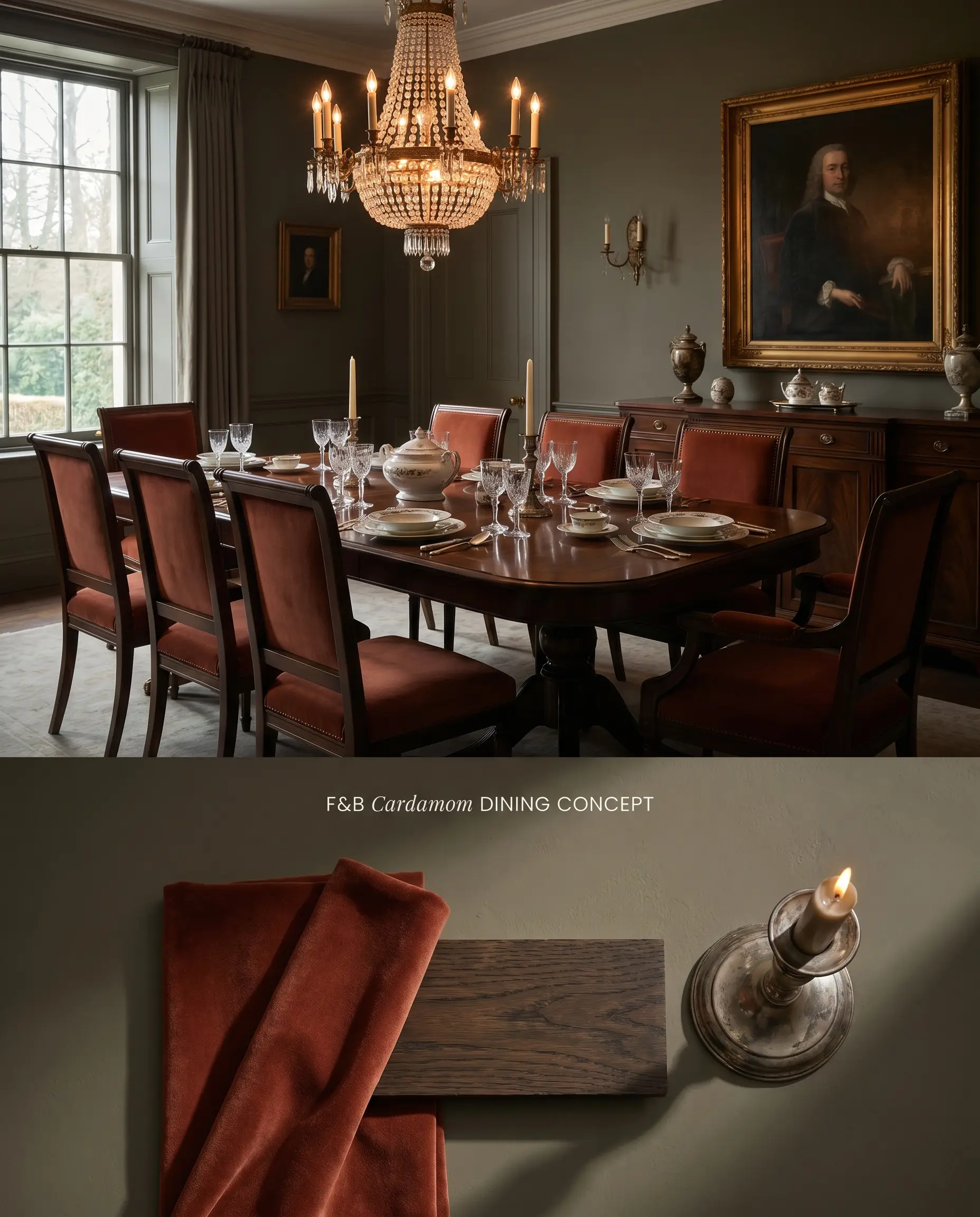
In spaces designed for evening entertainment, this earthy brown acts as a deep, light-absorbing backdrop that pushes the dining table and chandelier into sharp focus. The muddy olive elements recede into the shadows under dim lighting, while the rich base provides a stabilizing architectural finish. The intense pigment density commands a high-adhesion base layer to ensure the color structure remains unbroken.
Custom Kitchen Millwork and Cabinetry
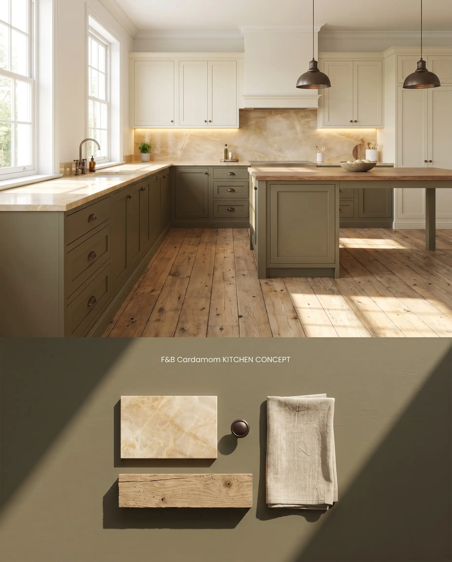
Applying Cardamom CB5 to lower cabinetry anchors the kitchen’s visual weight, establishing a firm horizon line against lighter upper elements. The chromatic profile shifts rapidly under warm under-cabinet task lighting, revealing subtle green notes that bridge the visual gap between natural stone countertops and raw timber flooring. Surrounding this color with cool-toned materials will immediately force the brown base to look dirty and neglected.
Mudrooms and Boot Rooms
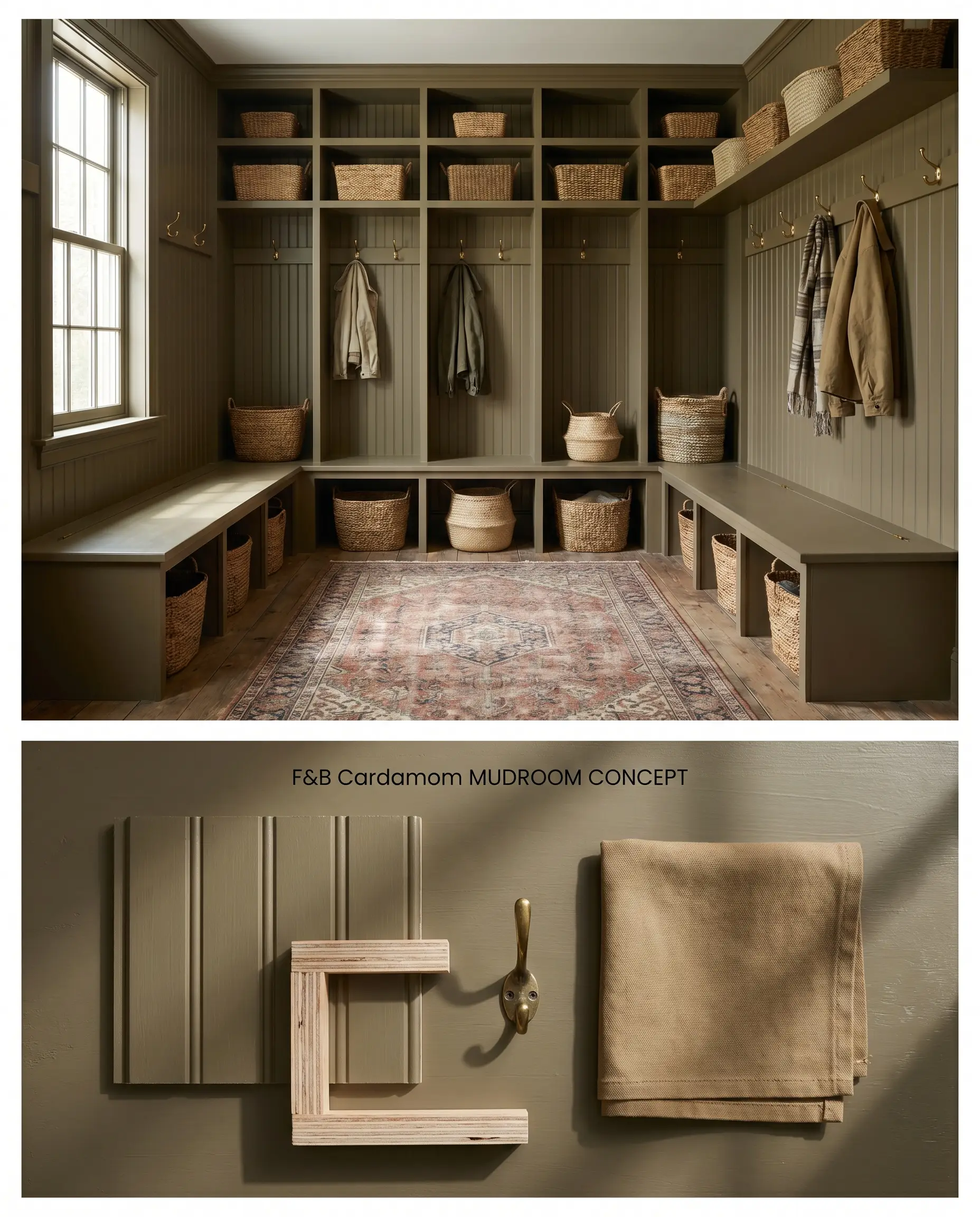
This tone masks daily dirt and scuffs while injecting a sophisticated, heritage-inspired aesthetic into a utilitarian transition zone. The deep pigment anchors built-in benches and cubbies, giving basic plywood framing the gravitas of custom millwork. Because high-friction areas risk surface burnishing, careful application and maintenance strategies are required to preserve the uniform sheen.
Cozy Feature Walls
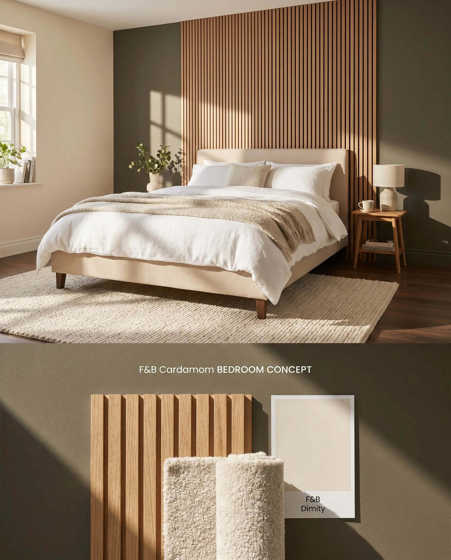
Confining this intense hue to a single focal wall prevents the low light reflectance value from shrinking a smaller room. The rich pigment absorbs harsh glare from adjacent windows, grounding the bed frame or fireplace while allowing the remaining creamy walls to project light back into the space. The sharp contrast between the dark accent and the surrounding envelope requires a meticulous cut-in edge to maintain architectural rigor.
You can apply wallpapers, paints, etc. on walls and see how they look in various interiors.

Head-to-Head Architectural Paint Comparisons
Farrow & Ball Cardamom CB5 vs. Farrow & Ball Pantalon No. 221
Cardamom CB5, formulated for the Christopher John Rogers Carte Blanche collection, operates as a distinct earthy brown with a muddy olive shift. Pantalon No. 221 functions as a more ambiguous brown-black with an underlying red-bronze flash. In South-facing rooms, Cardamom projects golden-brown warmth, whereas Pantalon deepens into a shadowy, muted espresso. Use Cardamom when you need a green-leaning organic anchor, and specify Pantalon when designing a brooding, library-style interior that requires red-based heat.
Farrow & Ball Cardamom CB5 vs. Sherwin-Williams Nettle SW 9535
Sherwin-Williams Nettle SW 9535 possesses a higher light reflectance value, bouncing substantially more light and reading as a distinct, legible olive green on the wall. Cardamom CB5 carries far more visual weight, acting primarily as a brown that only hints at green under specific lighting constraints. Specify Nettle for moderately lit living spaces where you want a clear botanical presence, but deploy Cardamom in bright, sun-drenched rooms where its dense pigment can absorb the glare without washing out.
Farrow & Ball Cardamom CB5 vs. Benjamin Moore Durango 2137-30
Benjamin Moore Durango 2137-30 is a straightforward, dusty taupe-brown lacking the complex undertones of Farrow & Ball’s formulation. Cardamom CB5 injects a distinct bronze flash that reacts dynamically to 2700K artificial lighting, shifting between brown and olive depending on the bulb’s proximity. Durango provides a static, predictable backdrop for high-traffic family rooms, while Cardamom is required for custom cabinetry where the shifting color play adds necessary architectural interest.
Technical FAQs
In North-facing rooms, the cool, indirect light amplifies Cardamom’s muddy olive-green undertones, suppressing its inherent warmth. To pull the earthy brown back to the surface, you must layer warm 2700K ambient artificial lighting.
Yes, pairing Cardamom with icy blue-grays or stark, brilliant whites will cause the paint’s earthy structure to appear dirty and discordant. It requires warm, creamy whites like Au Lait or honed, warm-veined natural stones to maintain visual harmony.
The ultra-matte Dead Flat finish absorbs light entirely, creating a dense, velvety brown that maximizes the cocooning effect. Modern Eggshell reflects ambient light off its mid-sheen surface, which highlights the bronze and golden-brown undertones along the raised profiles of the millwork.
Yes, skipping the Dark Tones Primer & Undercoat will result in a patchy finish and prevent the pigment from reaching its full saturation, especially when painting over lighter existing walls.
Similar Paint Colors
Same Brand
Cross-Brand Equivalents