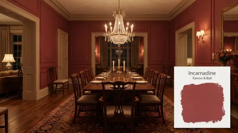
Incarnadine No. 248
Farrow & BallFarrow & Ball Incarnadine is a rich, unapologetically classic crimson red. With an LRV of 11.59, it is a deeply saturated, warm hue that exudes glamour in dining rooms and powder rooms, though it can flash slightly pink in cool, North-facing light.
| Temperature | Warm |
|---|---|
| Primary Undertone | Rich Crimson / Yellow-Red |
| Hidden Undertones | Subtle blue-pink in cool light, fiery orange-red in warm light |
| Best Exposures | South-facing or West-facing |
| Best For | Dining Rooms, Powder Rooms, Front Doors, Kitchen Cabinets, Accent Walls |
Hackrea Review
Incarnadine is the quintessential classic crimson. It brings an undeniable sense of heritage and drama to a space. While it requires patience and a tinted primer to achieve full opacity, the resulting depth and velvety architectural finish are spectacular, especially in candlelit dining rooms or on a high-gloss front door.Farrow & Ball Incarnadine in Architectural Spaces
Dining Rooms
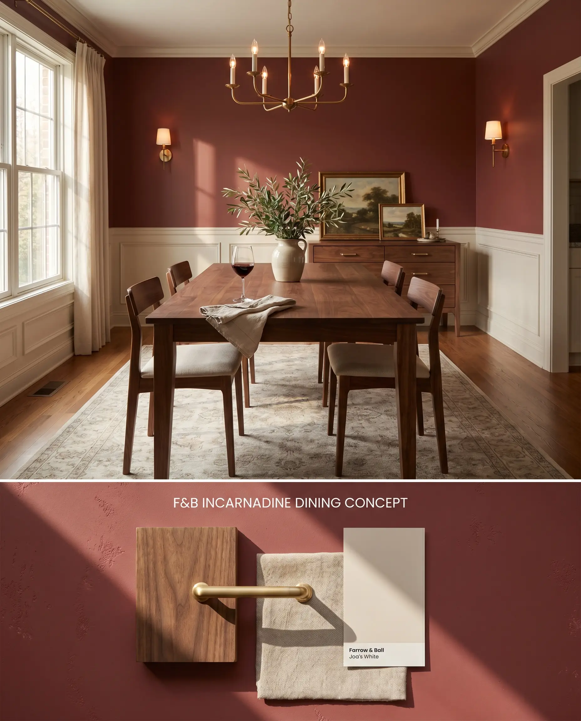
The visual weight of this heritage hue anchors a formal dining space by absorbing ambient evening light rather than reflecting it. When surrounded by warm, earthy neutrals, the crimson red deepens without turning harsh or theatrical.
Estate Emulsion ($$$$ (Boutique/Luxury Tier)). Delivers Farrow & Ball’s signature, chalky matte finish with unparalleled depth of color, perfect for formal living rooms and master bedrooms where aesthetic impact is prioritized over heavy scrubbing.
The Consultant’s Finish
Powder Rooms
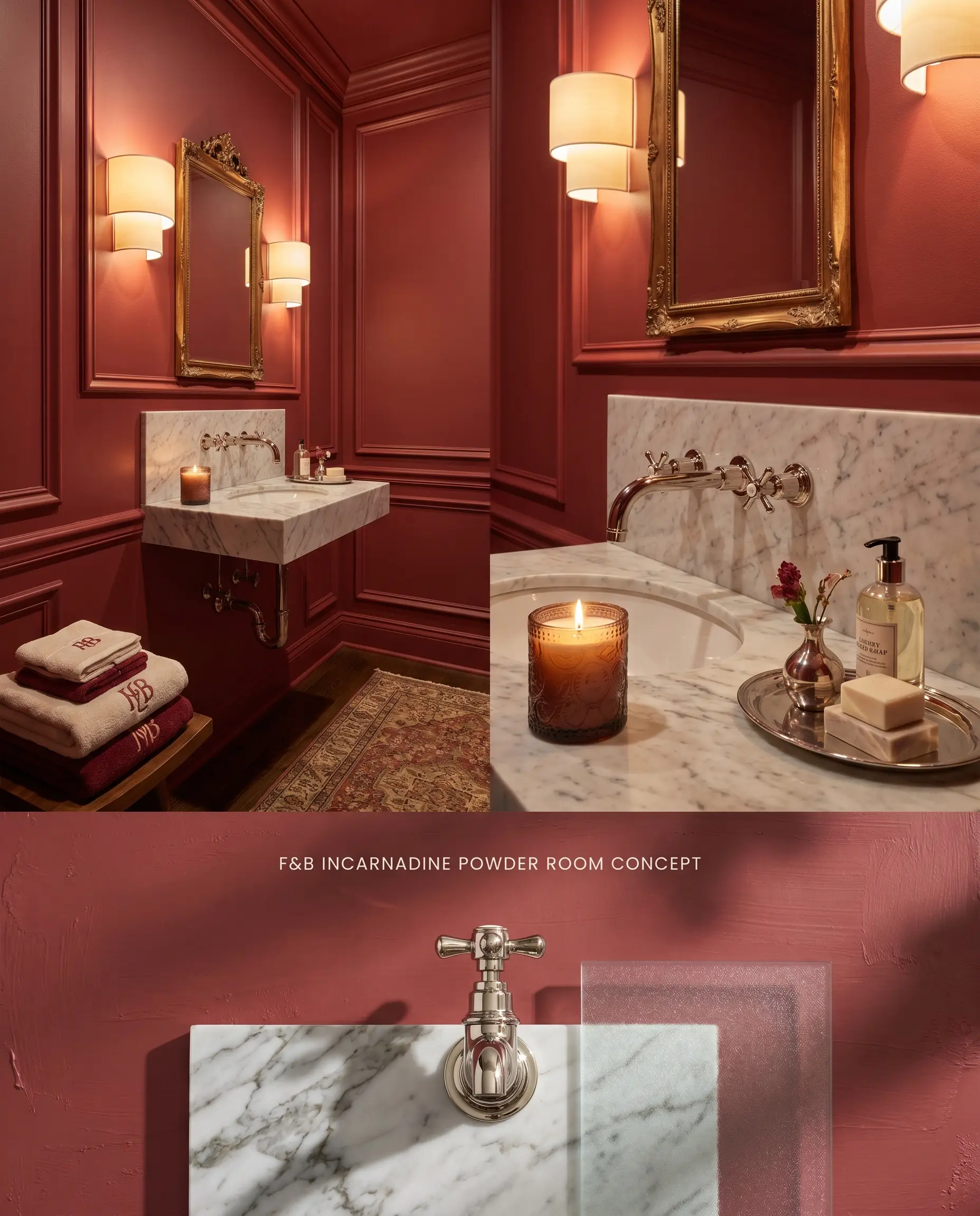
Applying a highly saturated damask red in a confined footprint creates an intentional, jewel-box effect. To counteract the inevitable bounce effect where the red reflects onto adjacent surfaces, enveloping the entire space—walls, trim, and ceiling—in a continuous finish unifies the chromatic profile.
Modern Emulsion ($$$$ (Boutique/Luxury Tier)). Features a specialized mold- and water-resistant formulation that brings bespoke, highly pigmented color to bathrooms and kitchens without sacrificing a luxurious matte aesthetic.
The Consultant’s Finish
Front Doors
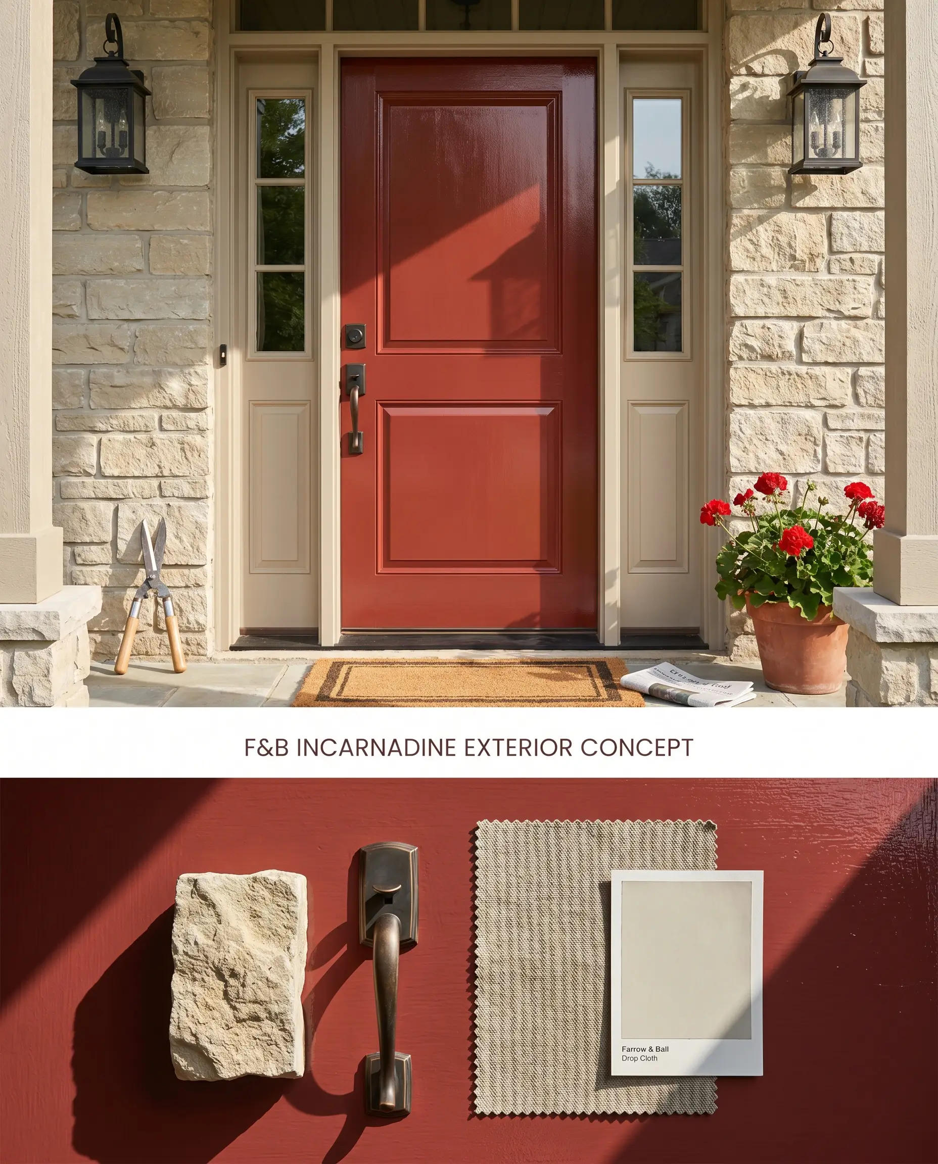
Applying a high-gloss crimson red to an exterior door establishes an immediate architectural focal point against neutral masonry. The intense color saturation requires a high-sheen architectural finish to reflect sunlight and push the red away from its latent blue undertones.
Full Gloss ($$$$ (Boutique/Luxury Tier)). Provides a striking, 95% sheen water-based finish that reflects light beautifully, ideal for dramatic front doors, bold trim, or statement-making reflective ceilings.
The Consultant’s Finish
Kitchen Cabinets
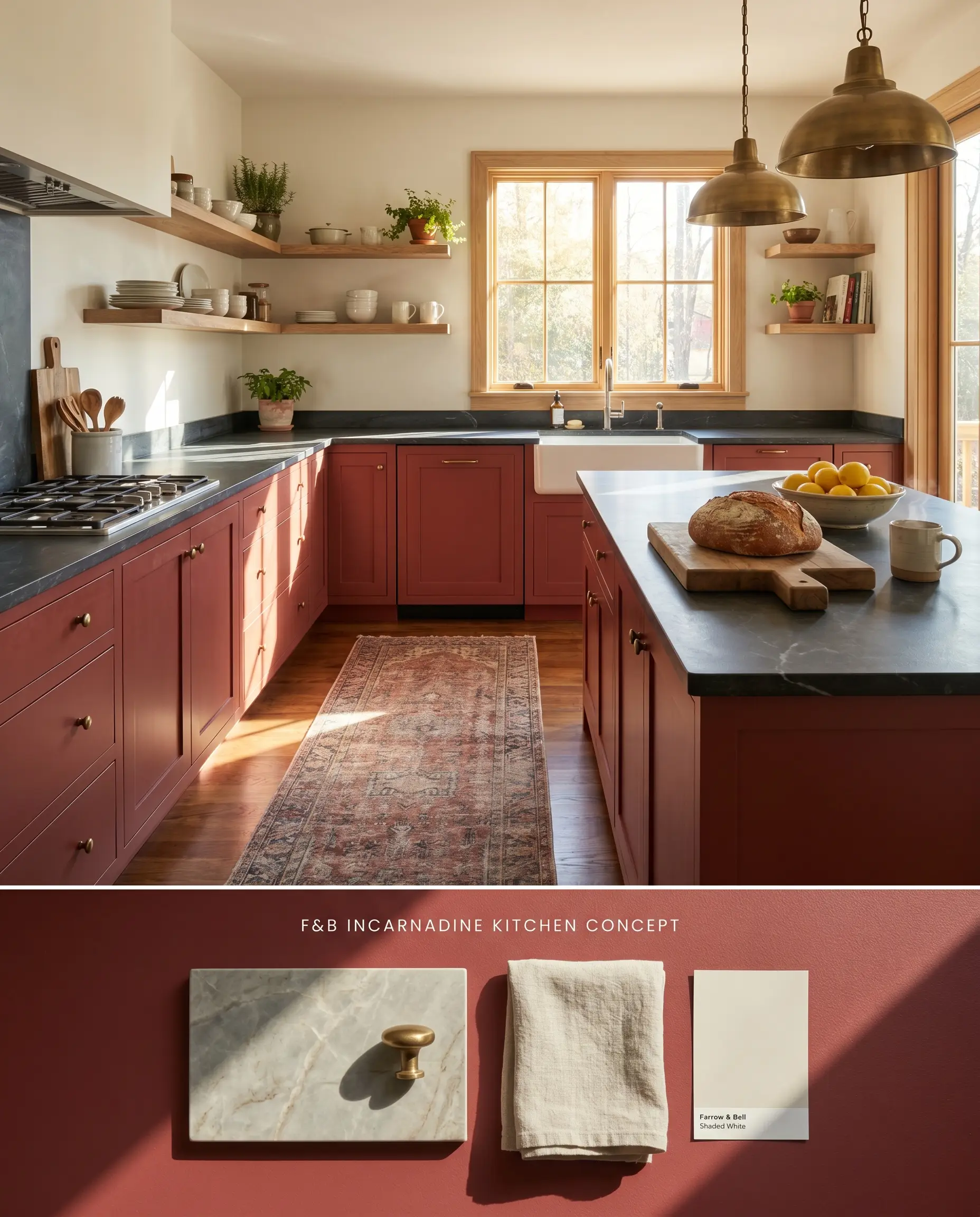
Utilizing Farrow & Ball Incarnadine on base cabinetry anchors the kitchen’s lower hemisphere while allowing for lighter upper walls. Pairing this deep red with charcoal or soapstone countertops absorbs stray light, preventing the red from feeling overly dominant.
Modern Eggshell ($$$$ (Boutique/Luxury Tier)). An exceptionally durable, mid-sheen waterborne finish designed to withstand the heavy wear of cabinetry, doors, and millwork, ensuring a flawless, long-lasting surface.
The Consultant’s Finish
Accent Walls
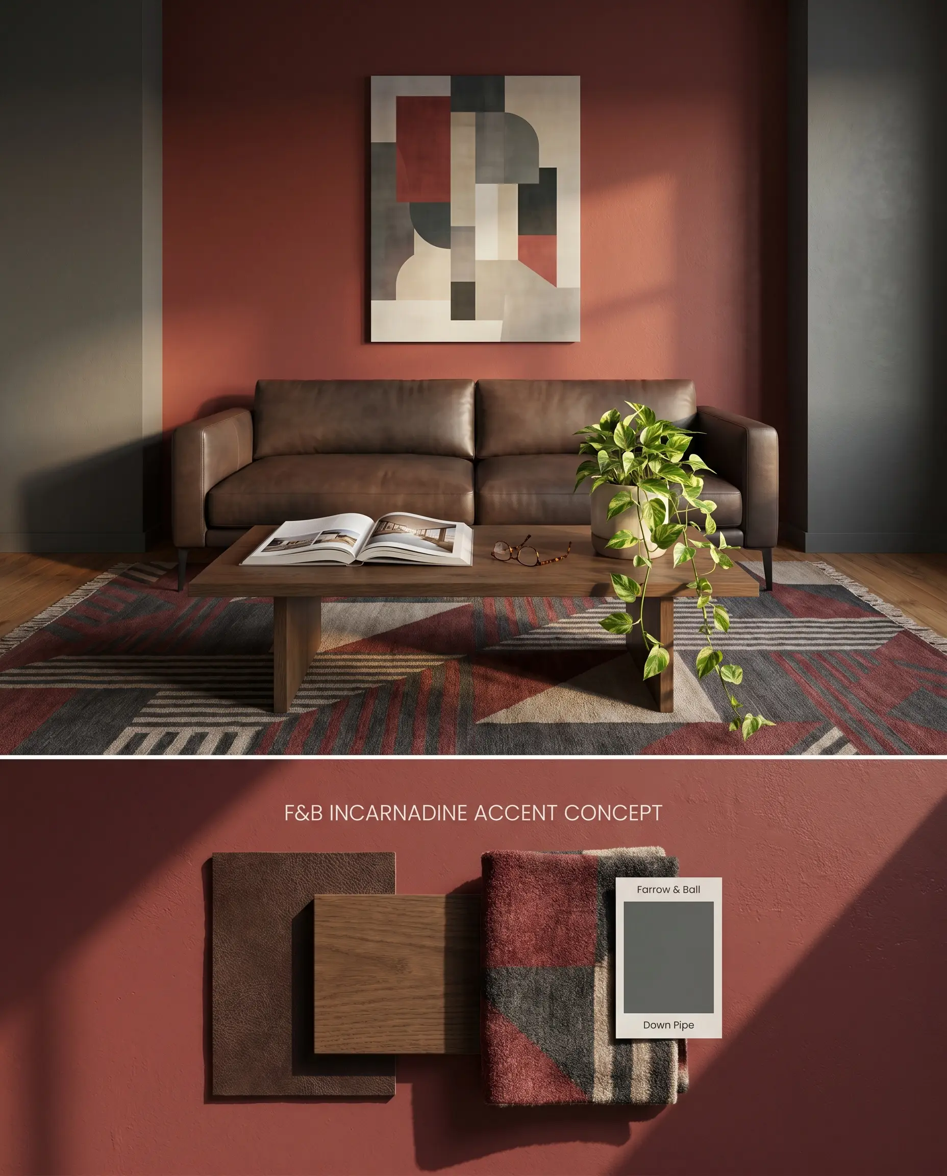
Confining this color to a single focal wall limits the bounce effect in smaller rooms while still delivering high impact. Flanking the red wall with deep charcoals rather than cool whites maintains a sophisticated, grounded transition that avoids abrupt visual breaks.
Dead Flat ($$$$ (Boutique/Luxury Tier)). A multi-surface, ultra-matte finish that offers exceptional scuff resistance and washability, making it the premier choice for busy hallways, kids’ rooms, and continuous color-drenching.
The Consultant’s Finish
You can apply wallpapers, paints, etc. on walls and see how they look in various interiors.

Evaluating Red & Warm Tones
Farrow & Ball Incarnadine vs. Farrow & Ball Rectory Red No. 217
Farrow & Ball Rectory Red No. 217 contains more black pigment, pushing it toward a deeper, more muted brick tone compared to Incarnadine’s cleaner, crimson red base. In North-facing rooms where Incarnadine’s blue undertones will flash pinkish or magenta, Rectory Red remains stable and earthen. Specify Incarnadine for high-energy, sun-drenched spaces, and reserve Rectory Red for traditional studies or libraries lacking direct sunlight.
Farrow & Ball Incarnadine vs. Sherwin-Williams Antique Red SW 7587
Sherwin-Williams Antique Red SW 7587 carries a slightly higher LRV and leans further into an orange-brown rust territory. Incarnadine retains a purer, damask red profile with a cooler, hidden blue undertone. If outfitting a room with warm, amber-toned wood flooring, Antique Red bridges the wood tones naturally, whereas Incarnadine provides a sharper, more distinct boundary against warm oak or pine.
Farrow & Ball Incarnadine vs. Benjamin Moore Segovia Red 1288
Benjamin Moore Segovia Red 1288 is a brighter, more vivid red that lacks the complex, muted shadowing found in Incarnadine. Segovia Red projects forward, making it an aggressive choice for large wall expanses but excellent for small, highly lacquered furniture pieces. Incarnadine’s lower light reflectance value allows it to recede slightly into the architecture, making it the superior choice for full-room color-drenching in formal dining or living spaces.
Technical Specifications & Farrow & Ball Incarnadine FAQs
Yes, in cool, North-facing light, Incarnadine’s subtle blue undertones emerge, causing it to flash magenta or pinkish. It requires warm, South-facing light to maintain its rich crimson appearance.
You must use Farrow & Ball’s Red & Warm Tones Primer & Undercoat to establish the correct color structure. Even with this specialized primer, expect to apply three coats for completely streak-free opacity.
Yes, stark whites and cool grays create a harsh, theatrical contrast that amplifies the red’s intensity. It pairs much better with warm, earthy neutrals or deep charcoals to soften the architectural transition.
Highly saturated reds reflect onto adjacent surfaces, meaning Incarnadine will cast a warm, pinkish-red hue onto a white ceiling. To avoid this, color-drench the ceiling in the same red or use a dark, light-absorbing ceiling color.
Similar Paint Colors
Same Brand
Cross-Brand Equivalents