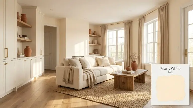
Behr Pearly White (M270-1) is a refreshing, light off-white with a warm, creamy yellow base and subtle hints of pale orange. With an LRV of 88, it acts as an upbeat, airy neutral that brings a soft, sunlit glow to any space without feeling overly yellow.
| Temperature | Warm |
|---|---|
| Primary Undertone | Creamy Yellow |
| Hidden Undertones | Pale Orange / Peach |
| Best Exposures | North, East |
| Best For | Nurseries, Kitchens, Exterior Stucco, Living Rooms, Trim and Millwork |
Hackrea Review
Behr Pearly White is a cheerful and optimistic off-white that perfectly balances a creamy base with a touch of peach. It's an excellent choice for homeowners looking to inject warmth into cool, north-facing rooms without committing to a saturated yellow. While it requires a solid primer for optimal coverage, the resulting airy, sun-kissed finish is well worth the effort.Architectural Applications for Behr Pearly White M270-1
Nurseries
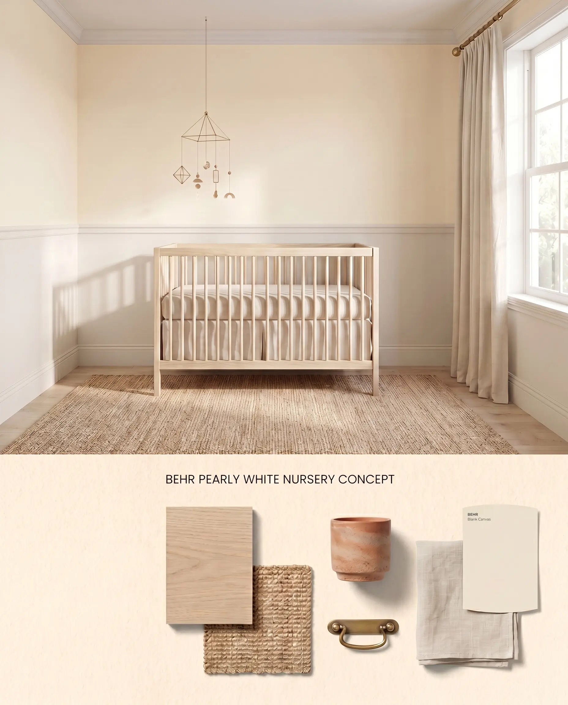
Avoid small, brightly lit nurseries where the bounce effect amplifies Behr Pearly White M270-1 into an overwhelming pastel yellow tint. Instead, apply it in moderately lit spaces on upper walls above wainscoting to control the high LRV off-white reflection. The pale orange cast pairs seamlessly with natural rattan, warm terracotta accents, and unbleached linens.
Behr Dynasty Interior Matte ($$$ (Premium/DIY Tier)). Provides highly concentrated pigmentation and one-coat coverage in a flat, elegant profile that minimizes surface imperfections in formal, low-traffic living spaces.
The Consultant’s Finish
Kitchens
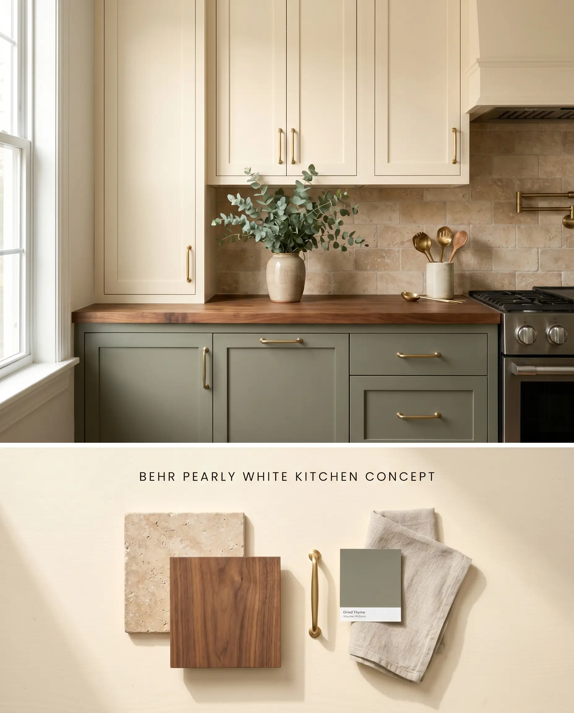
Because this warm neutral clashes aggressively with icy blues and cool gray flooring, it requires a kitchen palette anchored by earthy materials. Applying Behr Pearly White M270-1 to upper cabinetry against a tumbled travertine backsplash grounds the airy lightness. The creamy yellow base harmonizes with unlacquered brass hardware, avoiding the sickly contrast that cool-toned finishes create.
Behr Cabinet, Door & Trim Enamel ($$ (Value/Accessible Tier)). Provides a durable, fast-drying finish that resists sticking and withstands heavy daily use, offering an excellent cost-to-performance ratio for cabinet and millwork updates.
The Consultant’s Finish
Exterior Stucco
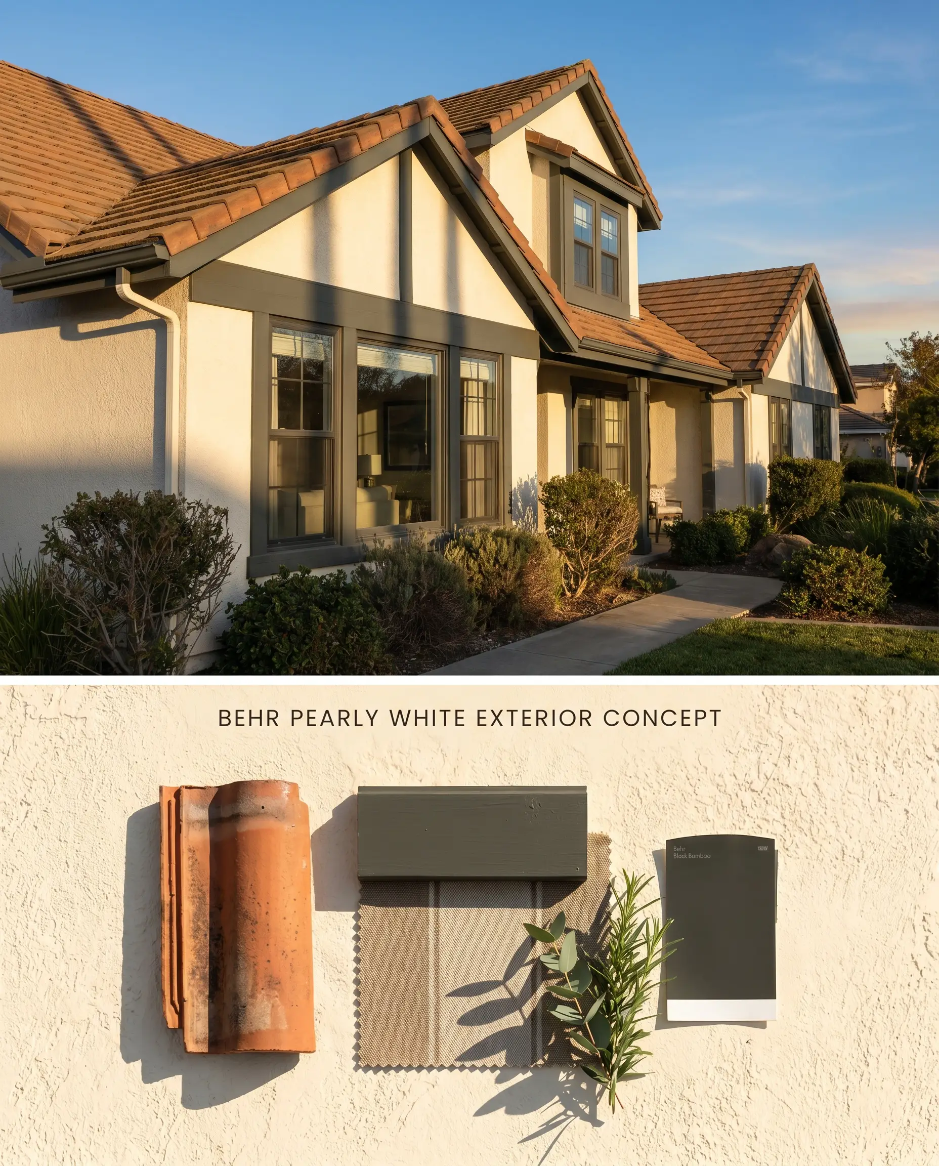
Behr Pearly White M270-1 operates exceptionally well as a stucco exterior finish, provided the surrounding hardscaping avoids stark, cool-toned concrete. Under direct sunlight, the light reflectance value of 88 prevents heat absorption, while the inherent warmth stops the facade from looking sterile. The textured architectural finish of the stucco breaks up the surface, mitigating the coverage catch typical of pale, high-LRV paints.
Behr Marquee Exterior ($$$ (Premium/DIY Tier)). A heavy-duty, dirt-resistant formula that offers exceptional UV protection and robust weather resistance, maximizing time efficiency and long-term value for exterior projects.
The Consultant’s Finish
Living Rooms
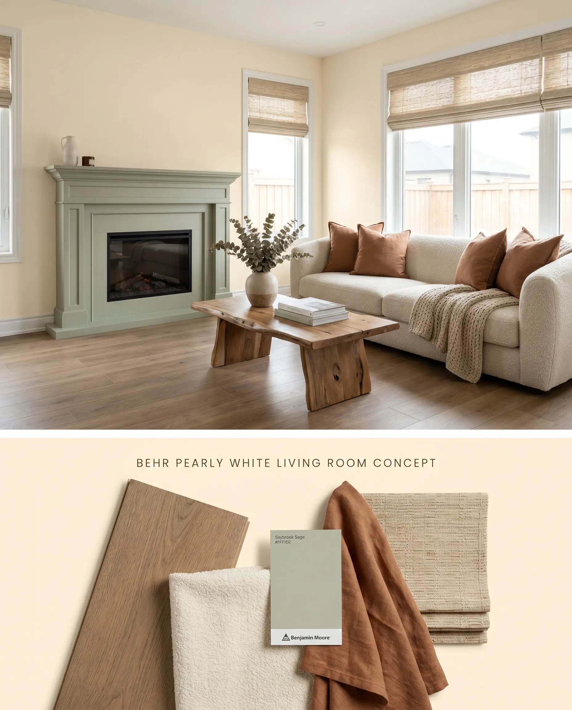
This color fails in windowless or poorly lit living areas, dropping into a flat, dingy cream. It requires an open-concept space with abundant natural light to activate its full chromatic profile. To prevent the pale orange cast from dominating, ground the room with rich, warm-toned woods and textured, neutral upholstery.
Behr Dynasty Interior ($$$ (Premium/DIY Tier)). Engineered with advanced scuff and mar-resistant technology that actively repels stains, ensuring high-traffic hallways and family rooms remain looking freshly painted.
The Consultant’s Finish
Trim and Millwork
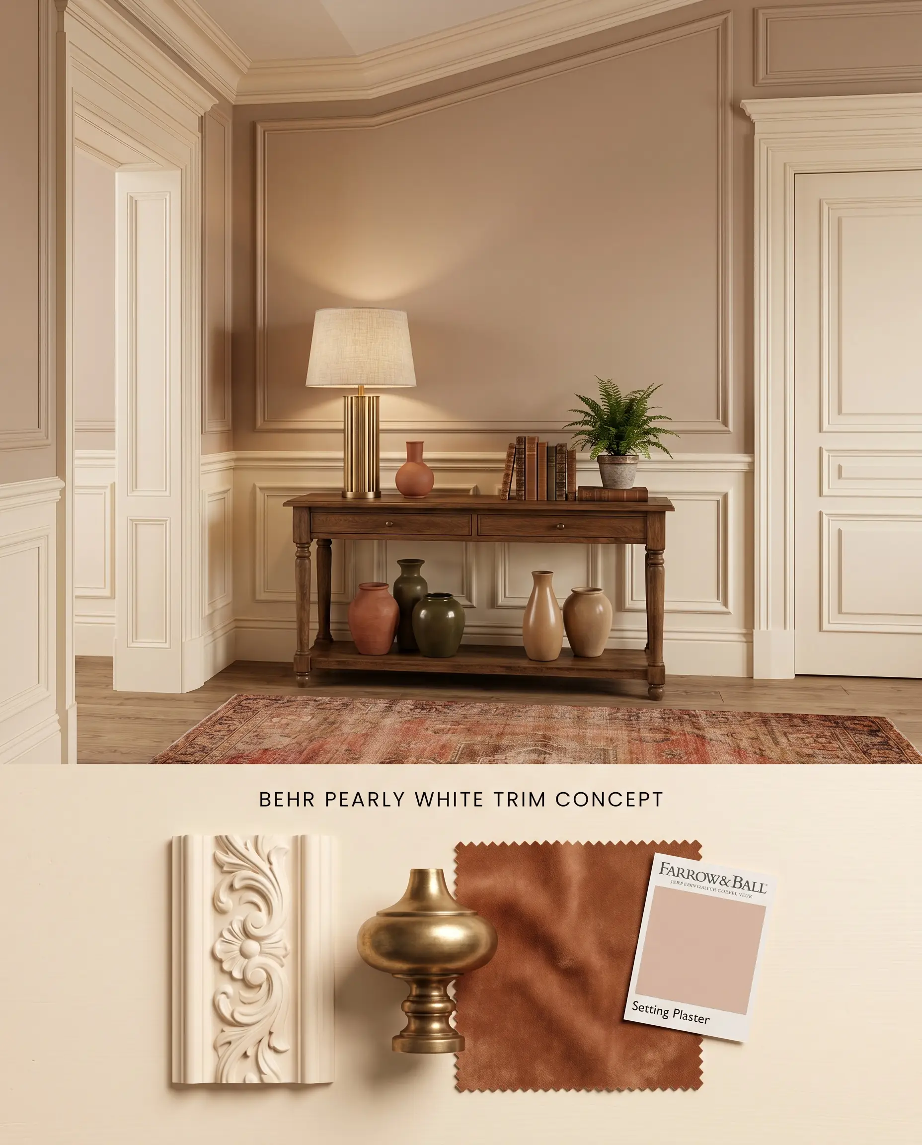
Using Behr Pearly White M270-1 on trim requires a deliberate pairing with deeper, warm-toned wall colors to justify its creamy yellow base. If paired with a stark white wall, the color structure breaks down, making the trim look unintentionally aged. It excels when framing rich, earthy tones, providing a soft transition rather than a sharp, high-contrast border.
Behr Cabinet, Door & Trim Enamel ($$ (Value/Accessible Tier)). Provides a durable, fast-drying finish that resists sticking and withstands heavy daily use, offering an excellent cost-to-performance ratio for cabinet and millwork updates.
The Consultant’s Finish
You can apply wallpapers, paints, etc. on walls and see how they look in various interiors.

Chromatic Profile Comparisons
Behr Pearly White M270-1 vs. Sherwin Williams Dover White SW 6385
Sherwin Williams Dover White SW 6385 carries a lower LRV of 83 and a distinct, traditional yellow-cream undertone that lacks the peach nuance of Behr Pearly White M270-1. Dover White SW 6385 performs best on historical millwork where a pronounced, buttery warmth is required to offset dark antique woods. Conversely, Pearly White M270-1 operates as a higher-reflectance backdrop, ideal for spaces that need a pale orange cast to complement terracotta or rust-toned furnishings without dropping into a dense yellow.
Behr Pearly White M270-1 vs. Benjamin Moore Mayonnaise OC-85
Benjamin Moore Mayonnaise OC-85 shares a nearly identical LRV (88.28) but relies on a clean, clear yellow base, entirely devoid of the pale orange cast found in Behr Pearly White M270-1. Mayonnaise OC-85 excels in North-facing rooms where its clear yellow cuts through the chilly, blue-tinted light to simulate sunshine. Pearly White M270-1 should be selected when the architectural materials—such as tumbled travertine or warm oak—demand an earthy, peach-leaning cream to bridge the color structure.
Behr Pearly White M270-1 vs. Behr Honied White YL-W03
Behr Honied White YL-W03 is a deeper, more saturated golden cream that anchors a room with undeniable visual weight, whereas Behr Pearly White M270-1 acts as a high LRV off-white designed for spatial expansion. Use Honied White YL-W03 in formal dining rooms or studies where a rich, enveloping warmth is the primary design objective. Reserve Pearly White M270-1 for broad, open-concept applications where its lighter creamy yellow base can reflect ambient light without dominating the surrounding architectural finishes.
Technical Performance and Undertone FAQs
Yes, in South-facing or warm afternoon light, the pale orange and creamy yellow base will become highly pronounced, shifting into a true pastel yellow. If the room is small and brightly lit, the color will bounce off itself, amplifying this warmth significantly.
Due to its high LRV of 88 and pale tint, it struggles with hide over darker or uneven surfaces. You must use a high-quality tinted primer followed by at least two coats to achieve a flawless, opaque finish.
Under intense sunlight, the high light reflectance value prevents excessive heat absorption while the texture of the stucco exterior breaks up the surface, mitigating its typical coverage issues. Expect the color to read as a bright, warm off-white that flares into a soft pastel yellow during golden hour.
Yes, pairing this warm neutral with stark, cool-toned grays or icy blues will create a harsh visual clash. The cool gray flooring will strip the warmth from the paint, making the walls look sickly and overly yellow.
Similar Paint Colors
Same Brand
Cross-Brand Equivalents