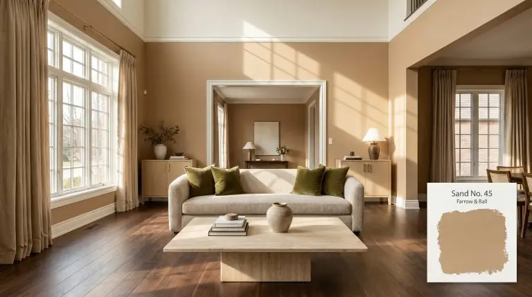
Farrow & Ball Sand No. 45 is a rich, caramel-hued earthy neutral with distinct red and warm yellow undertones. With an LRV of 32, it creates an inviting, enveloping atmosphere, especially in traditional spaces or rooms needing a cozy, grounded aesthetic.
| Temperature | Warm |
|---|---|
| Primary Undertone | Red |
| Hidden Undertones | Yellow, Earthy Brown |
| Best Exposures | North-facing, East-facing |
| Best For | Living rooms, cozy dens, traditional dining rooms, home offices, heritage-inspired exteriors |
Hackrea Review
Farrow & Ball's Sand No. 45 is a masterclass in earthy warmth. While it requires careful attention to lighting and primer, its rich caramel depth and subtle red undertones create an exceptionally inviting, enveloping space that mass-market brands struggle to replicate.Architectural Applications for Deep Caramel Neutrals
Living Rooms
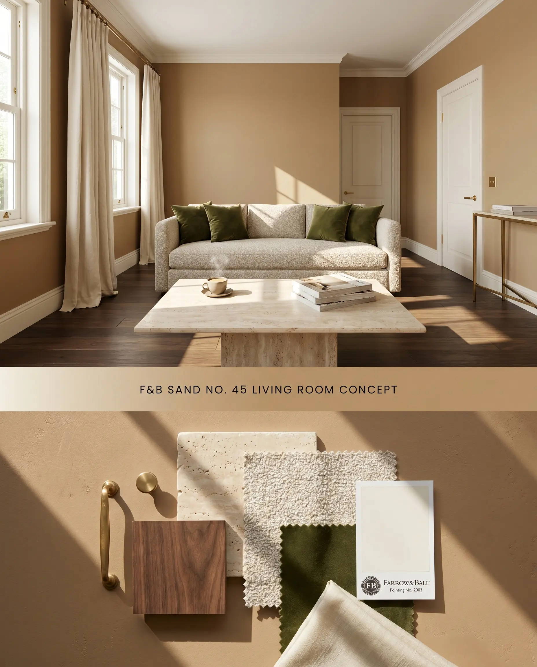
This chromatically dense, caramel-hued neutral anchors large structural footprints by absorbing ambient light rather than reflecting it. The prominent red undertone advances the walls slightly, compressing the visual field to make expansive seating arrangements feel intimate. Pairing this shade with unlacquered brass hardware and textural linen upholstery mitigates the visual mass of the pigment.
Estate Emulsion ($$$$ (Boutique/Luxury Tier)). Delivers Farrow & Ball’s signature, chalky matte finish with unparalleled depth of color, perfect for formal living rooms and master bedrooms where aesthetic impact is prioritized over heavy scrubbing.
The Consultant’s Finish
Cozy Dens
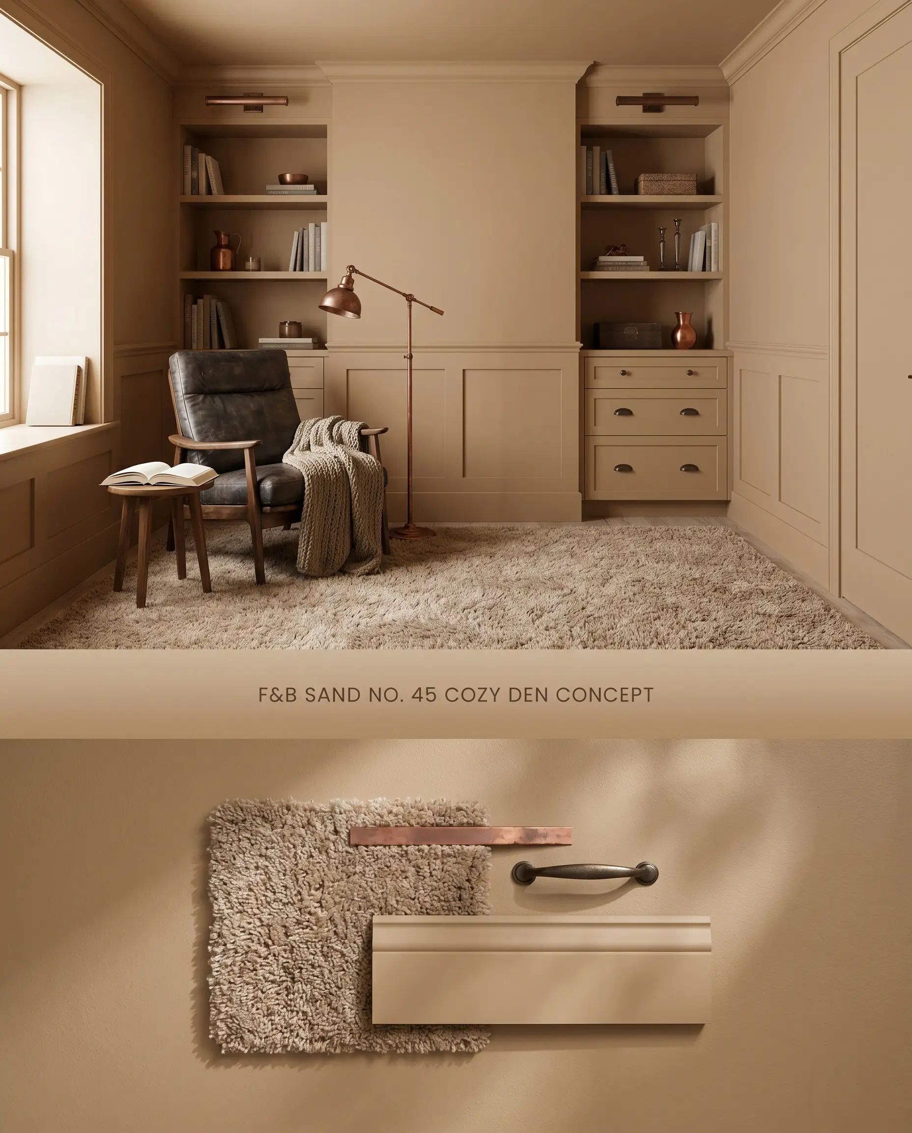
Wrapping a den in a warm earthy tone eliminates sharp architectural contrasts, allowing the eye to rest entirely on the furnishings. The low LRV of 32 absorbs shadows in corners, creating a continuous envelope that blurs the transition between wainscoting and the ceiling. Introducing high-pile wool rugs and oxidized copper accents grounds the red undertone, pulling it away from an overly saturated terracotta read.
Dead Flat ($$$$ (Boutique/Luxury Tier)). A multi-surface, ultra-matte finish that offers exceptional scuff resistance and washability, making it the premier choice for busy hallways, kids’ rooms, and continuous color-drenching.
The Consultant’s Finish
Traditional Dining Rooms
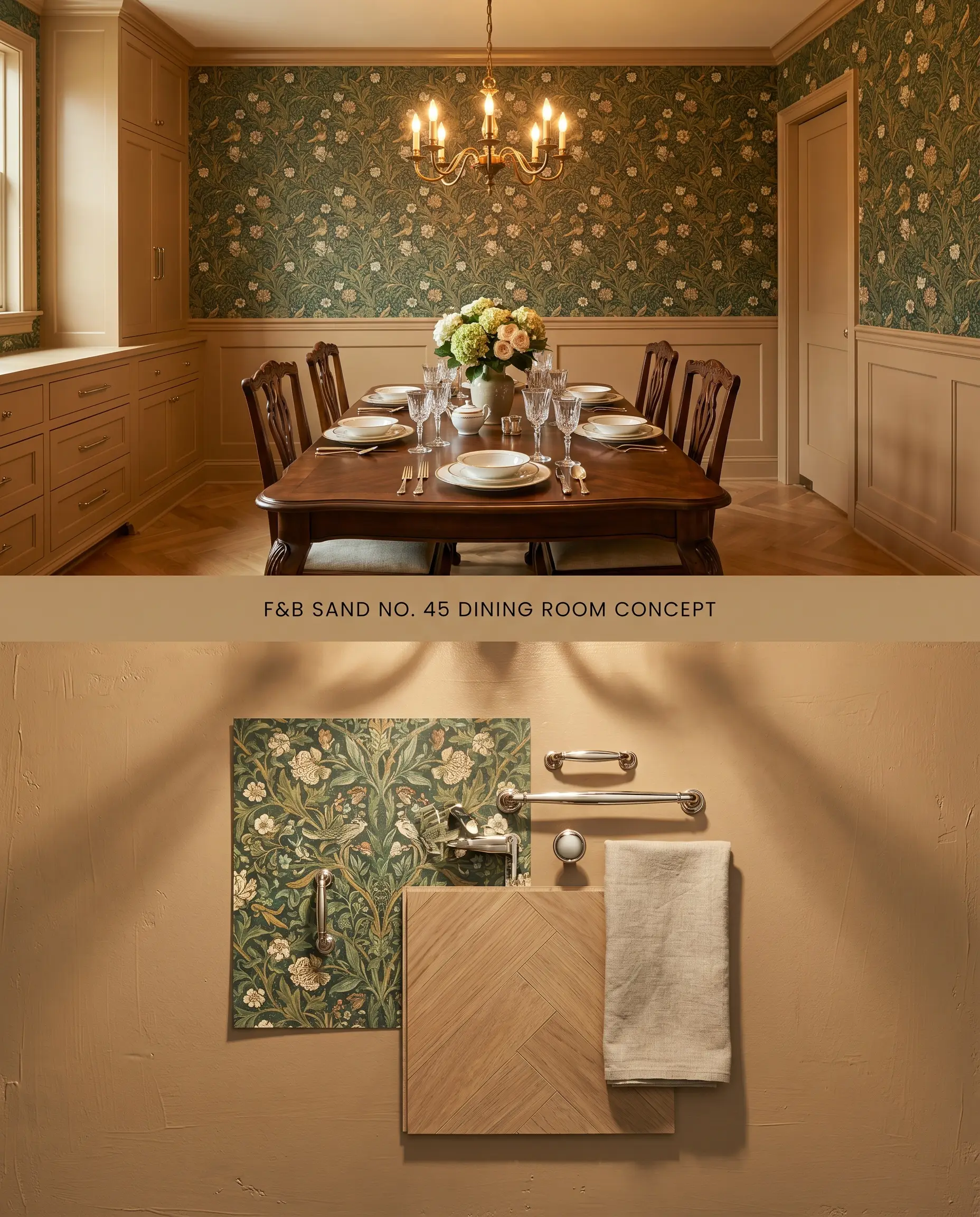
Applying this pigment to lower-third millwork establishes a robust foundation for intricate botanical wallpapers above the chair rail. The red undertone interacts predictably with incandescent chandelier lighting, emitting a rich, coppery glow during evening meals. Using a mid-sheen finish on the paneling introduces subtle specular highlights that articulate the edges of picture-frame molding.
Modern Eggshell ($$$$ (Boutique/Luxury Tier)). An exceptionally durable, mid-sheen waterborne finish designed to withstand the heavy wear of cabinetry, doors, and millwork, ensuring a flawless, long-lasting surface.
The Consultant’s Finish
Home Offices
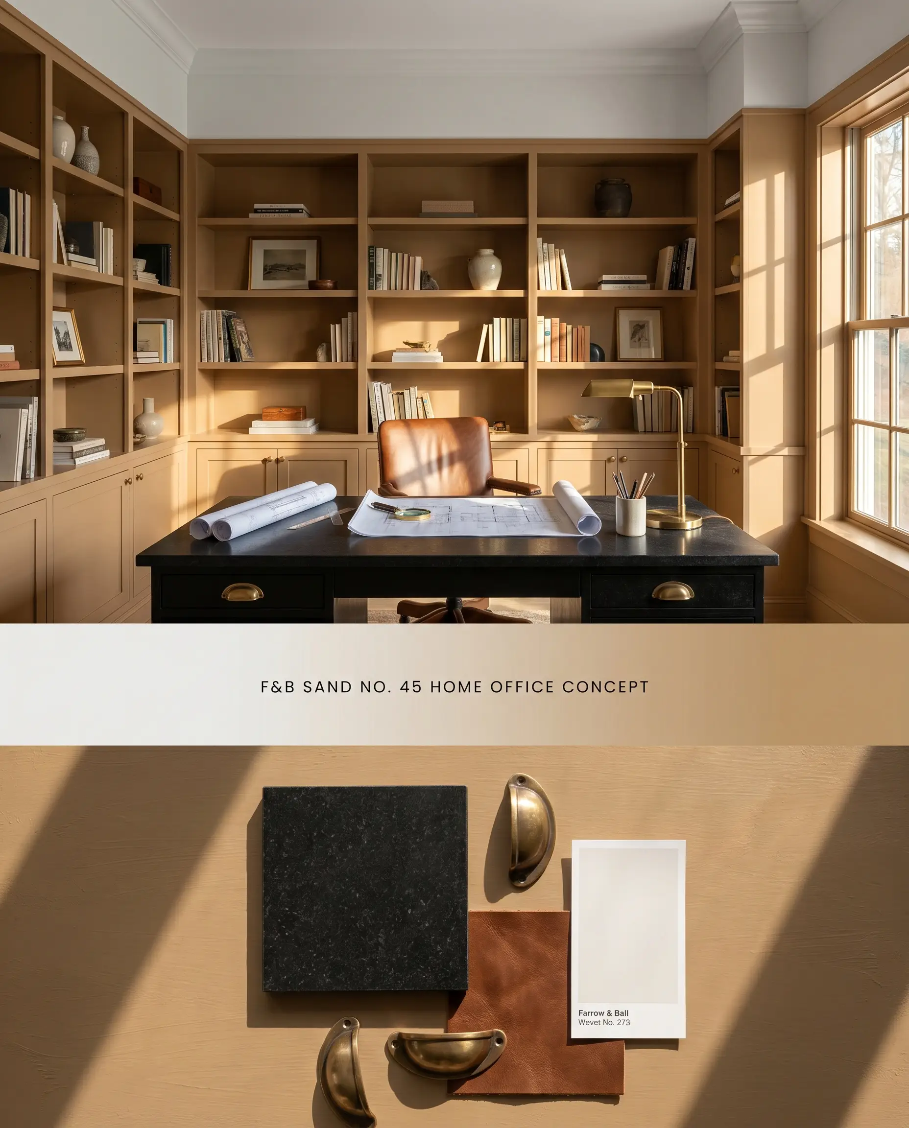
Coating floor-to-ceiling bookshelves in this Archive Collection shade turns functional storage into a cohesive architectural focal point. The LRV of 32 provides enough saturation to camouflage the irregular shapes of book spines and office equipment. Contrasting the caramel-hued neutral with a crisp, cool-toned white on the ceiling prevents the room from feeling visually unbalanced.
Modern Eggshell ($$$$ (Boutique/Luxury Tier)). An exceptionally durable, mid-sheen waterborne finish designed to withstand the heavy wear of cabinetry, doors, and millwork, ensuring a flawless, long-lasting surface.
The Consultant’s Finish
Heritage-Inspired Exteriors
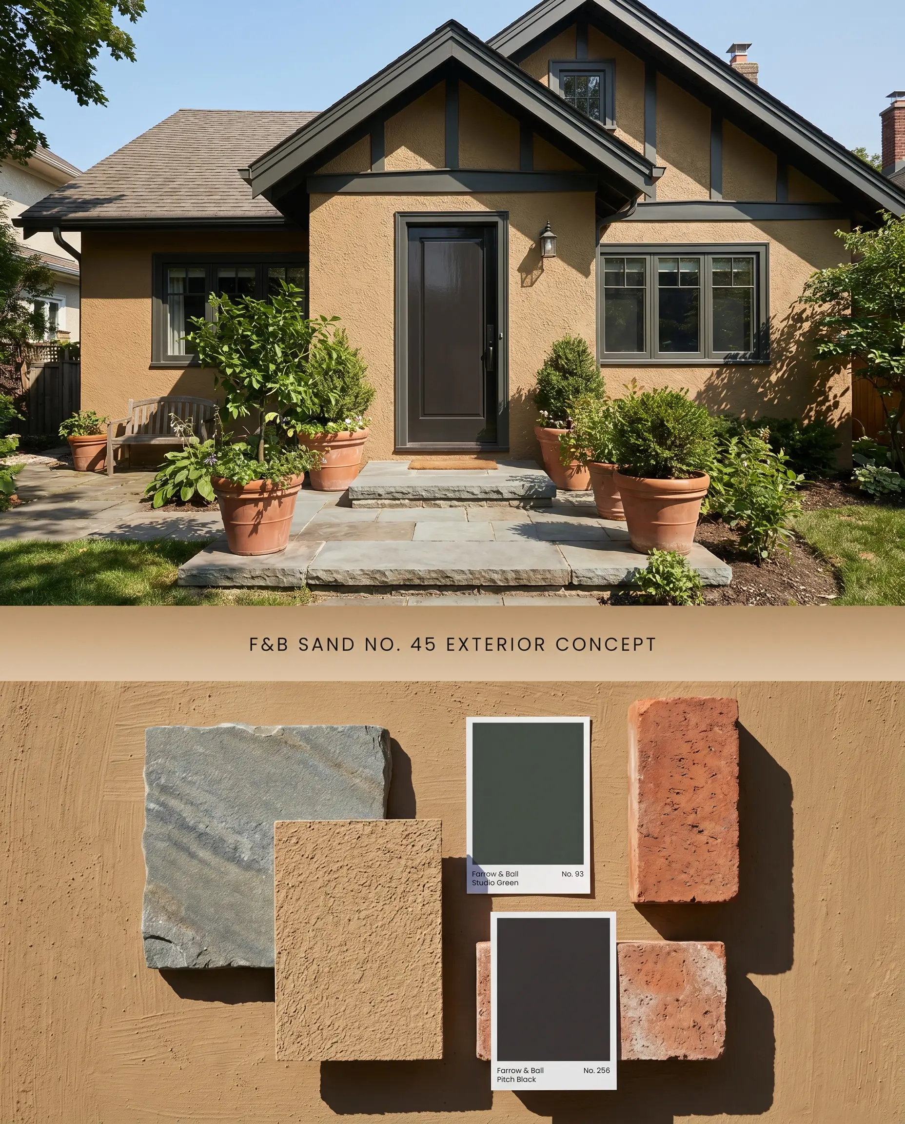
On exterior stucco or wood siding, natural sunlight shifts the perceived LRV upward, rendering the color as a sophisticated, sun-baked clay rather than a dark brown. This shade excels on heritage colors palettes, anchoring historical facades while complementing natural stone foundations. Pairing it with a stark, blackened-green trim sharply defines the roofline and window casings against the warm field color.
Exterior Eggshell & Masonry ($$$$ (Boutique/Luxury Tier)). Highly breathable, fungal-resistant formulas that provide a flexible, durable shield against the elements, ensuring heritage colors remain vibrant outdoors.
The Consultant’s Finish
You can apply wallpapers, paints, etc. on walls and see how they look in various interiors.

Farrow & Ball Sand No. 45 vs. Farrow & Ball Wet Sand No. 46
Farrow & Ball Wet Sand No. 46 operates with a slightly higher LRV and a muted, yellow-brown base, making it a safer neutral for spaces with unpredictable directional lighting. Farrow & Ball Sand No. 45, conversely, relies on a potent red undertone that actively warms up cool, north-facing rooms but risks pulling overly pink in intense southern exposures. Specify Wet Sand No. 46 when working with vast, open-concept floor plans that require a passive backdrop, and reserve Sand No. 45 for intimate, enclosed spaces where its chromatically dense profile can dictate the mood.
Sherwin-Williams Baguette SW 6123 vs. Farrow & Ball Sand No. 45
Sherwin-Williams Baguette SW 6123 is a golden-tan with a strong yellow-orange bias, reflecting light more aggressively than the Farrow & Ball formulation. Sand No. 45 absorbs light through its chalky base, grounding the red undertone to produce a muted, brick-like warmth rather than a bright gold. Deploy Baguette SW 6123 in dimly lit hallways where the yellow bias can artificially replicate sunlight, but implement Sand No. 45 in rooms with abundant natural light, where its lower LRV of 32 prevents the walls from glowing neon.
Chromatic Comparison: Benjamin Moore Peanut Shell 2162-40
Benjamin Moore Peanut Shell 2162-40 presents a cooler, more balanced brown with subtle green undertones that neutralize its warmth. Sand No. 45 is undeniably red-based, shifting toward a terracotta or caramel-hued neutral depending on the time of day. Utilize Peanut Shell 2162-40 when pairing with cool-toned hard finishes like Carrara marble or gray-washed oak floors, as its green trace bridges the temperature gap, and select Sand No. 45 exclusively when anchoring a palette of warm woods, unlacquered brass, and rich, autumnal textiles.
Technical Specifications & Application FAQs
In direct southern exposure, the prominent red undertone in Sand No. 45 amplifies significantly, often reading as a saturated terracotta or burnt orange. To mitigate this effect, utilize a flat finish to absorb the intense light and pair the walls with cool-toned, contrasting trim to pull the visual temperature down.
Yes, the strong red and warm earthy tone of Sand No. 45 will actively fight against the blue and green undertones present in cool gray marble or ashy wood floors. This combination creates an uncomfortable visual tension; always pair this pigment with warm-toned stones like Crema Marfil or rich walnut flooring.
Utilizing the specific Red & Warm Tones Primer is essential for Sand No. 45 to achieve its intended color structure and full opacity. Skipping this foundation layer forces the topcoat to work harder, often resulting in a muddy finish or requiring three to four coats to eliminate the previous wall color.
The chalky, 2% sheen of Estate Emulsion scatters light, allowing the red undertone in Sand No. 45 to appear velvety and chromatically dense. Modern Emulsion introduces a 7% sheen that creates subtle specular highlights, slightly sharpening the color’s edge and making the caramel tones appear more rigid under artificial lighting.
Similar Paint Colors
Same Brand
Cross-Brand Equivalents