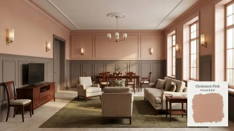
Ointment Pink 21
Farrow & BallFarrow & Ball Ointment Pink No. 21 is a soft, earthy terracotta-pink. Warmer and brighter than Dead Salmon, this heritage hue features distinct orange and brown undertones that create a cozy, glowing atmosphere, particularly in north-facing rooms or traditional spaces.
| Temperature | Warm |
|---|---|
| Primary Undertone | Terracotta |
| Hidden Undertones | Orange, earthy brown, subtle coral |
| Best Exposures | North, East, West |
| Best For | Living rooms, dining rooms, hallways, traditional spaces, north-facing rooms |
Hackrea Review
Ointment Pink is a masterful heritage shade that bridges the gap between coral and terracotta. It excels in spaces needing a dose of warmth without the saccharine sweetness of a traditional pink, offering a deeply sophisticated, earthy glow.The Clash Warning
Farrow & Ball Ointment Pink: Architectural Applications & Styling Recipes
Cozy Living Rooms
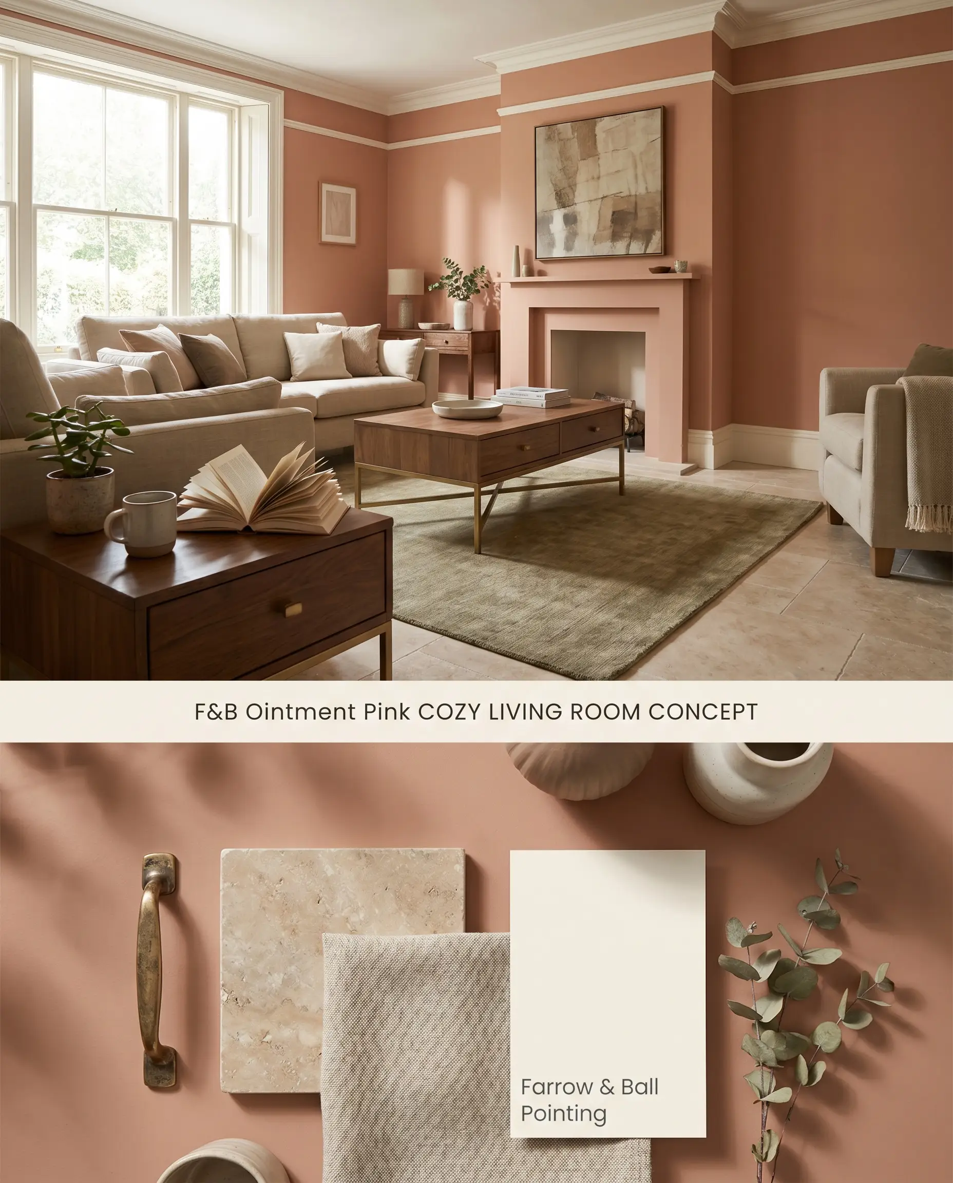
The soft terracotta undertones of Farrow & Ball Ointment Pink absorb ambient light, reducing glare and pulling the walls inward to create physical intimacy. Pairing this muddy pink with tactile materials like unlacquered brass and tumbled travertine grounds the space without relying on dark, light-absorbing shades.
Estate Emulsion ($$$$ (Boutique/Luxury Tier)). This formulation delivers Farrow & Ball’s signature, chalky matte finish with unparalleled depth of color, perfect for formal living rooms where aesthetic impact is prioritized over heavy scrubbing.
The Consultant’s Finish
Formal Dining Rooms
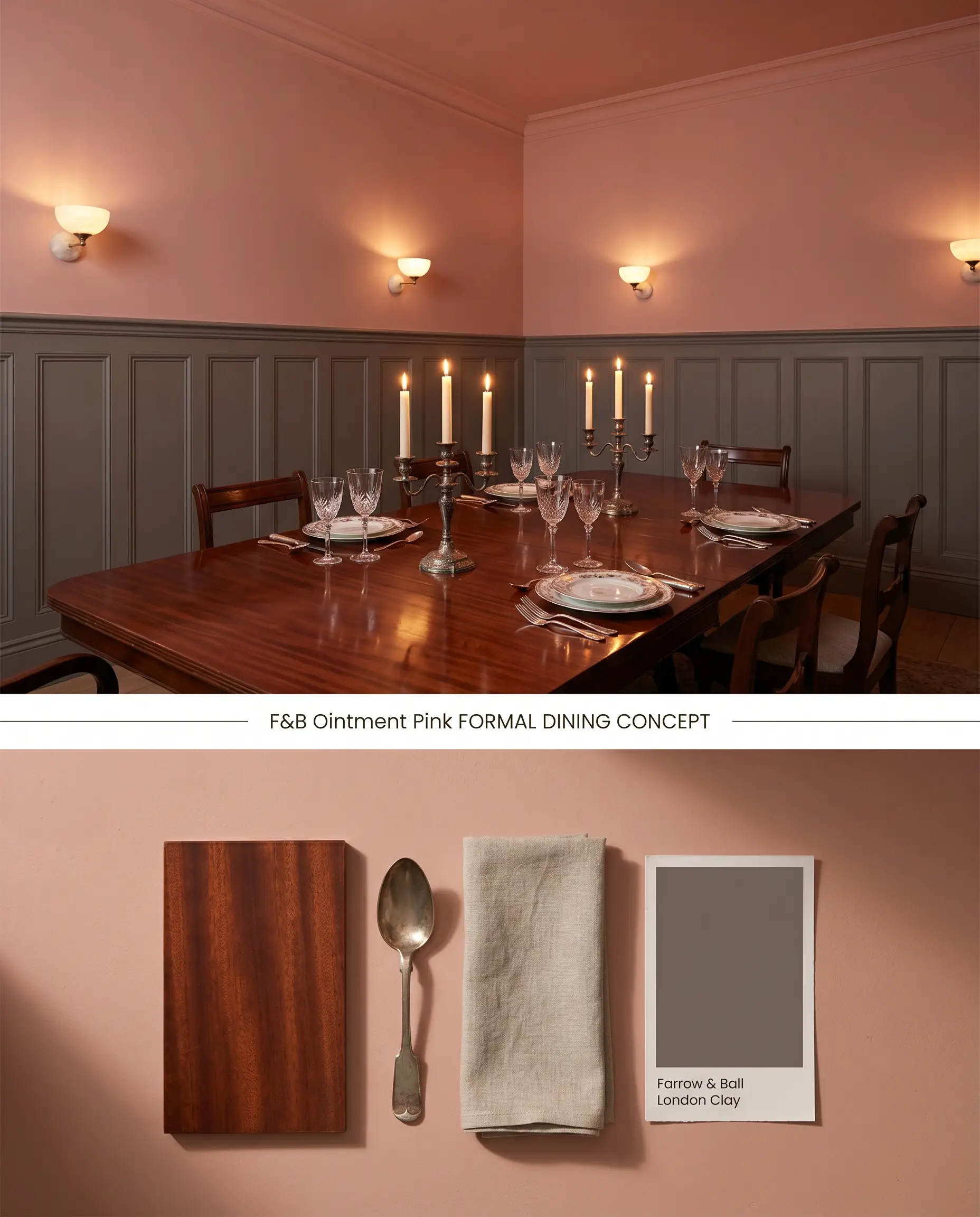
In low-light environments, the orange-pink base intensifies, mimicking the glow of candlelight against the walls. This warm neutral provides a high-contrast backdrop for polished mahogany and tarnished silver, amplifying the reflective qualities of the hard finishes.
Estate Emulsion ($$$$ (Boutique/Luxury Tier)). The low-glare profile delivers Farrow & Ball’s signature, chalky matte finish with unparalleled depth of color, perfect for formal dining rooms where aesthetic impact is prioritized over heavy scrubbing.
The Consultant’s Finish
Traditional Hallways
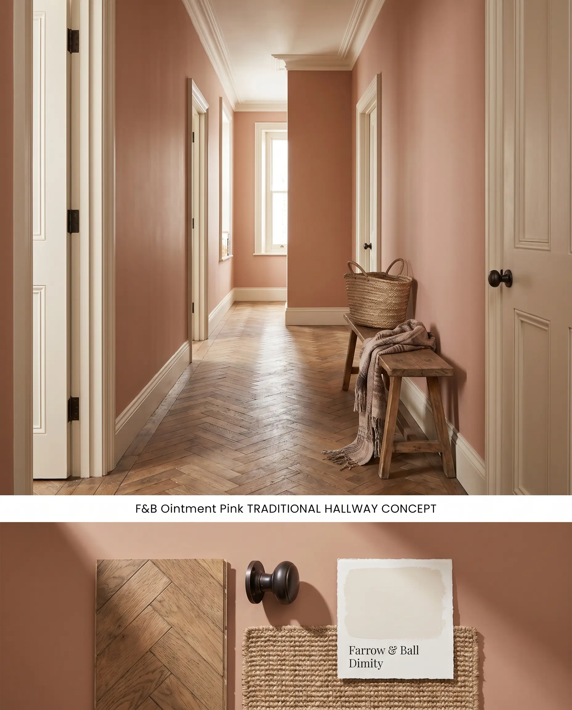
A transition space requires a color that adapts to fluctuating light sources throughout the day. The earthy glow of this heritage pink holds its saturation against shadows, preventing the corridor walls from receding into flat gray voids.
Dead Flat ($$$$ (Boutique/Luxury Tier)). This multi-surface, ultra-matte finish offers exceptional scuff resistance and washability, making it the premier choice for busy hallways and continuous color-drenching over trim and doors.
The Consultant’s Finish
North-Facing Bedrooms
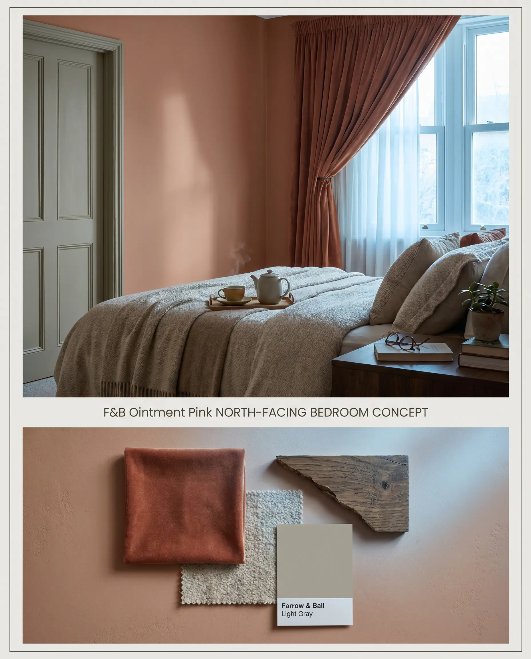
North-facing rooms receive cool, blue-tinted light that washes out pale neutrals. The dense, orange-pink base of Farrow & Ball Ointment Pink actively counteracts this blue light, converting a frigid exposure into a visually warm envelope.
Estate Emulsion ($$$$ (Boutique/Luxury Tier)). This formulation delivers Farrow & Ball’s signature, chalky matte finish with unparalleled depth of color, perfect for master bedrooms where aesthetic impact is prioritized over heavy scrubbing.
The Consultant’s Finish
Historic Restoration Projects
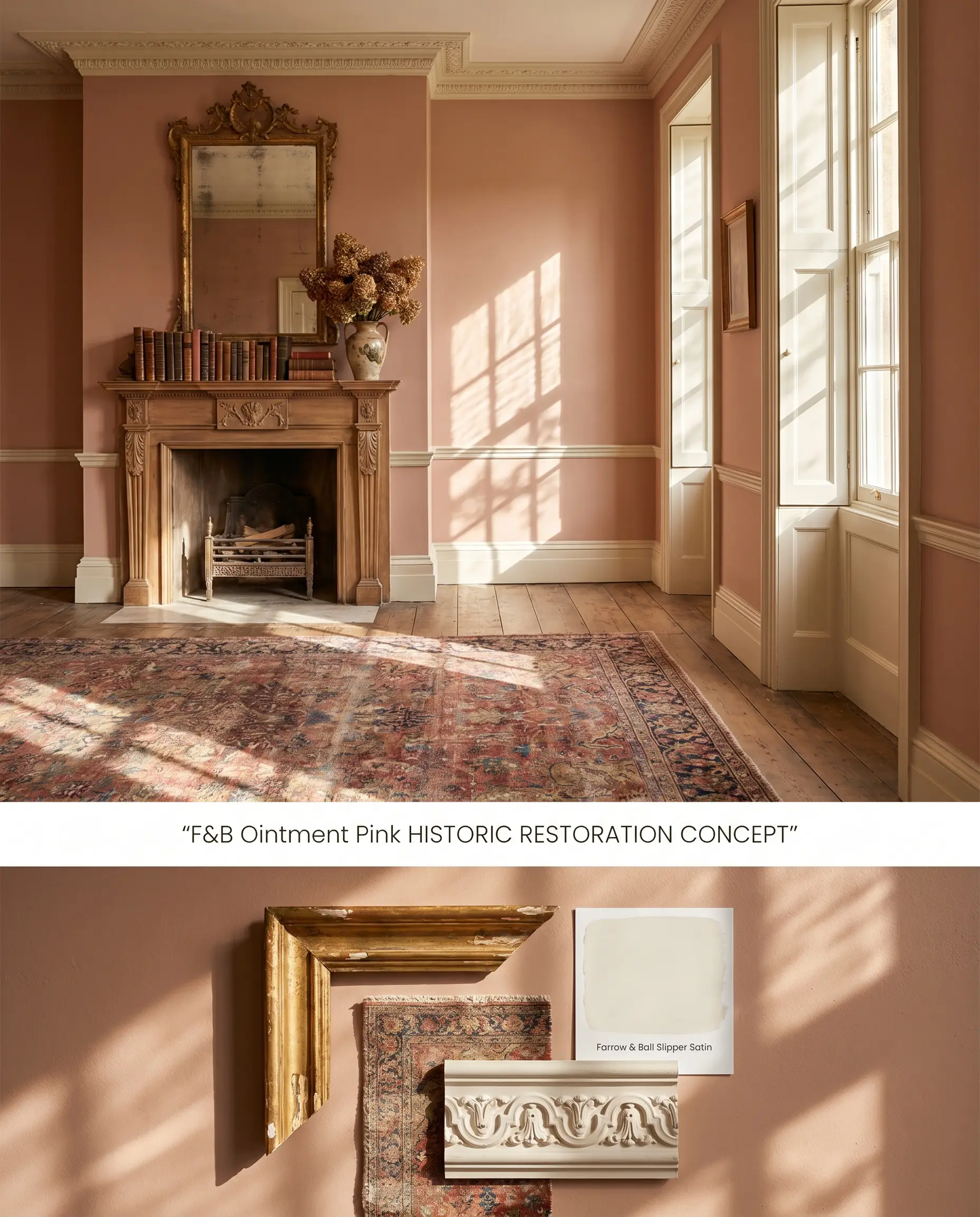
Pulled directly from a 19th-century palette, this shade replicates the exact chromatic profile of aged, unpainted plaster. It serves as an authentic historical backdrop that allows intricate crown molding and carved mantels to project forward visually.
Dead Flat ($$$$ (Boutique/Luxury Tier)). This multi-surface, ultra-matte finish mimics historical distemper while offering exceptional scuff resistance and washability, making it the premier choice for continuous color-drenching across antique walls and millwork.
The Consultant’s Finish
You can apply wallpapers, paints, etc. on walls and see how they look in various interiors.

Chromatic Profile & Head-to-Head Comparisons
Farrow & Ball Ointment Pink vs. Farrow & Ball Dead Salmon 28
While both sit in the muddy pink category, Farrow & Ball Dead Salmon 28 contains a significantly higher dose of brown, pulling it toward a mushroom-taupe. Farrow & Ball Ointment Pink possesses a stronger orange-pink base, giving it a higher perceived saturation. In a dim hallway, Dead Salmon 28 recedes into a flat brown shadow, whereas Ointment Pink retains its soft terracotta warmth. Reserve Dead Salmon 28 for south-facing rooms where intense sunlight prevents it from flattening, and utilize Ointment Pink in cooler exposures to artificially inject warmth.
Farrow & Ball Ointment Pink vs. Farrow & Ball Setting Plaster 231
Farrow & Ball Setting Plaster 231 has a higher LRV (41) and relies on a yellow-pink undertone, making it lighter and more transparent on the wall. Farrow & Ball Ointment Pink sits lower on the LRV scale at 36, utilizing red and orange pigments to create a denser, more opaque architectural finish. If you are pairing the wall color with dark, light-absorbing millwork like mahogany, Setting Plaster 231 provides necessary lift, while Ointment Pink offers a low-contrast, moodier alternative.
Farrow & Ball Ointment Pink vs. Sherwin-Williams Mellow Mauve SW 0039
Sherwin-Williams Mellow Mauve SW 0039 is formulated with cool, purple undertones, directly contrasting the baked, earthy glow of Farrow & Ball Ointment Pink. Placing Mellow Mauve SW 0039 alongside warm red oak flooring creates a jarring temperature clash, whereas Ointment Pink harmonizes with the wood’s natural amber grain. Mellow Mauve SW 0039 requires crisp, cool whites to look intentional, while Ointment Pink demands creamy, yellow-based whites to prevent it from looking overly fleshy.
Technical FAQs: Mastering the Orange-Pink Base
Direct southern exposure amplifies the red and yellow pigments in the paint, pushing the soft terracotta base closer to a true orange. To ground this effect, pair the walls with light-absorbing matte finishes and avoid highly reflective warm metals like polished brass.
Yes, placing this earthy glow against stark whites or blue-veined Carrara marble strips the paint of its warmth, making it appear fleshy and muddy. Always transition the wall color with warm, yellow-based whites to maintain a cohesive architectural finish.
In low light, Setting Plaster retains its lighter, yellow-pink transparency due to its higher LRV. Ointment Pink absorbs more shadow, deepening into a dense, historic brown-pink that requires artificial ambient lighting to prevent it from looking flat.
Ointment Pink harmonizes beautifully with red oak because both materials share an orange-pink base, creating a low-contrast, continuous visual flow. Ensure your baseboards are painted in a warm white to provide a subtle structural break between the two surfaces.
Similar Paint Colors
Same Brand
Cross-Brand Equivalents