Palladian Blue HC-144
Benjamin MooreBenjamin Moore Palladian Blue (HC-144) is a soft, airy blue-green that conjures clear skies. While it leans primarily blue, a distinct green influence and a touch of mother-of-pearl keep it grounded, making it a timeless choice for tranquil spaces.
Benjamin Moore Palladian Blue: The Architectural Blue-Green Defying Coastal Clichés
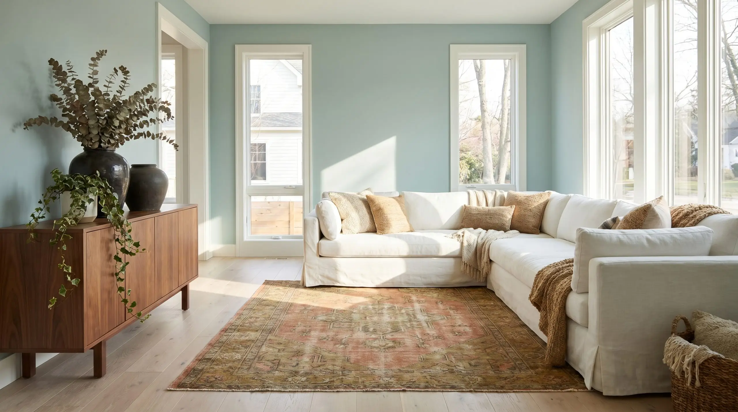
Many homeowners approach blue paint with a healthy dose of caution, terrified of accidentally turning their adult living space into a pastel nursery. Palladian Blue entirely bypasses this risk by operating as a highly sophisticated, blue-green architectural finish rather than a standard primary color. It provides the visual relief of a traditional neutral while injecting a quiet, layered personality into the room.
While it proudly sits within Benjamin Moore’s Historical Colors collection, its actual behavior on the wall feels remarkably current. The pigment structure is complex enough to adapt to varying design styles, shifting its mood based entirely on the furniture and fabrics you place next to it. It is a color that rewards thoughtful material pairings.
Benjamin Moore Palladian Blue: Temperature, Undertones & LRV
Is Palladian Blue warm or cool? It is definitively a cool color, but it possesses a subtle warming green influence that prevents it from ever feeling stark or icy on your walls.
At an official light reflectance value of 60.4, this shade sits comfortably in the light-to-medium range. It reflects ample illumination to keep a hallway feeling expansive, but it retains enough pigment density to pop crisply against bright white trim without washing out.
You can apply wallpapers, paints, etc. on walls and see how they look in various interiors.

Lighting Effects & The Chameleon Factor
Because of its nuanced gray and green base, HC-144 acts as a chameleon, actively shifting its temperature based on your home’s window exposure and light fixtures.
Popular Applications for Palladian Blue
This color thrives when you let its shifting nature dictate the surrounding materials and architectural features. Here is how to manipulate this soft blue-green across different environments to achieve a highly intentional aesthetic.
Beyond the Basic Spa-Like Bathroom
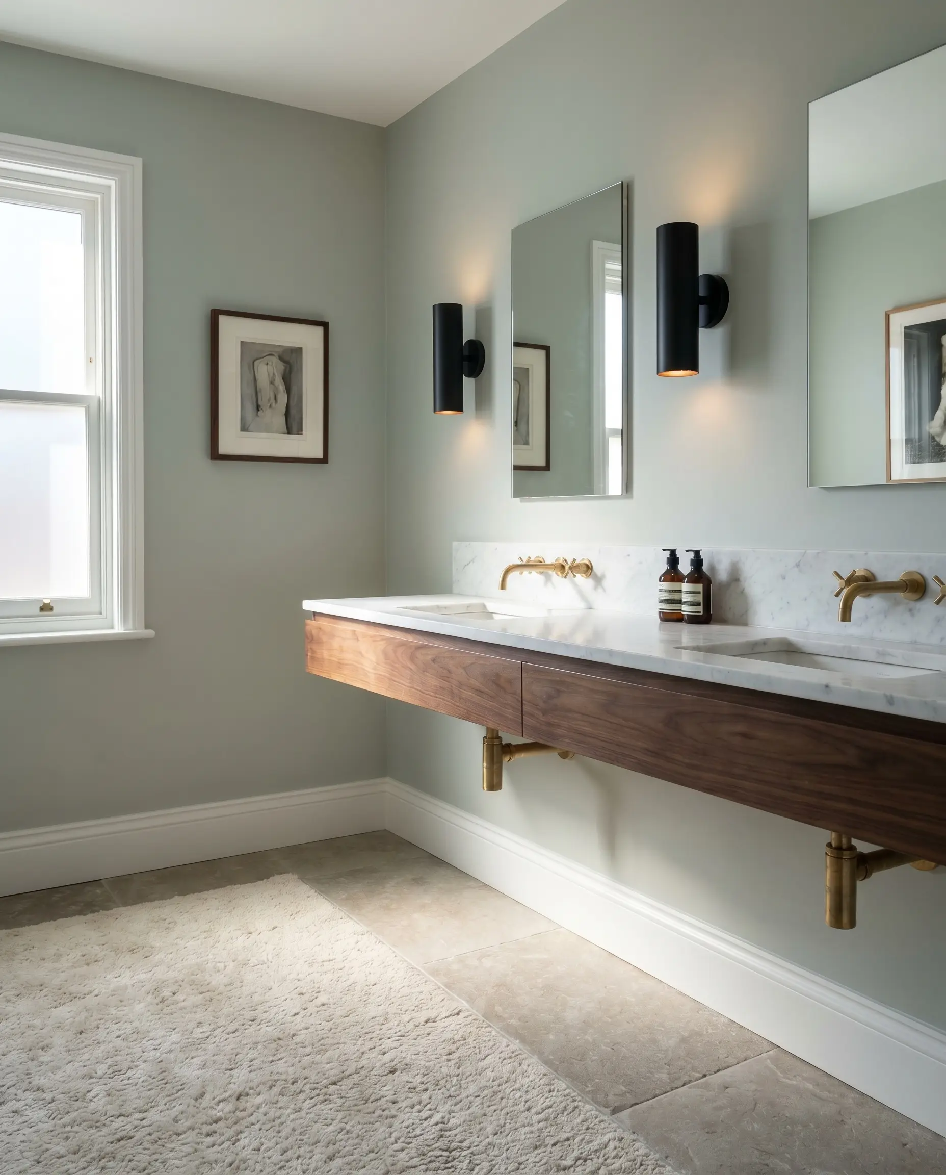
While a spa-like aesthetic is the default expectation for light blue-greens, you can push this color much further by treating it as a high-contrast backdrop. Instead of predictable white subway tile, pair this shade with honed marble countertops and unlacquered brass plumbing fixtures for a richly layered look.
When using soft blue-greens in a bathroom, stabilize the airy wall color with matte black iron sconces or a rich walnut floating vanity to prevent the room from feeling entirely weightless.
Hackrea Pro-Tip (The Finish Contrast)
Color-drenching the ceiling and walls in a powder room creates a jewel-box effect that feels incredibly curated. For busy families sharing a hectic morning bathroom, the soothing tone noticeably lowers the visual noise of the space.
Layered Primary Bedrooms
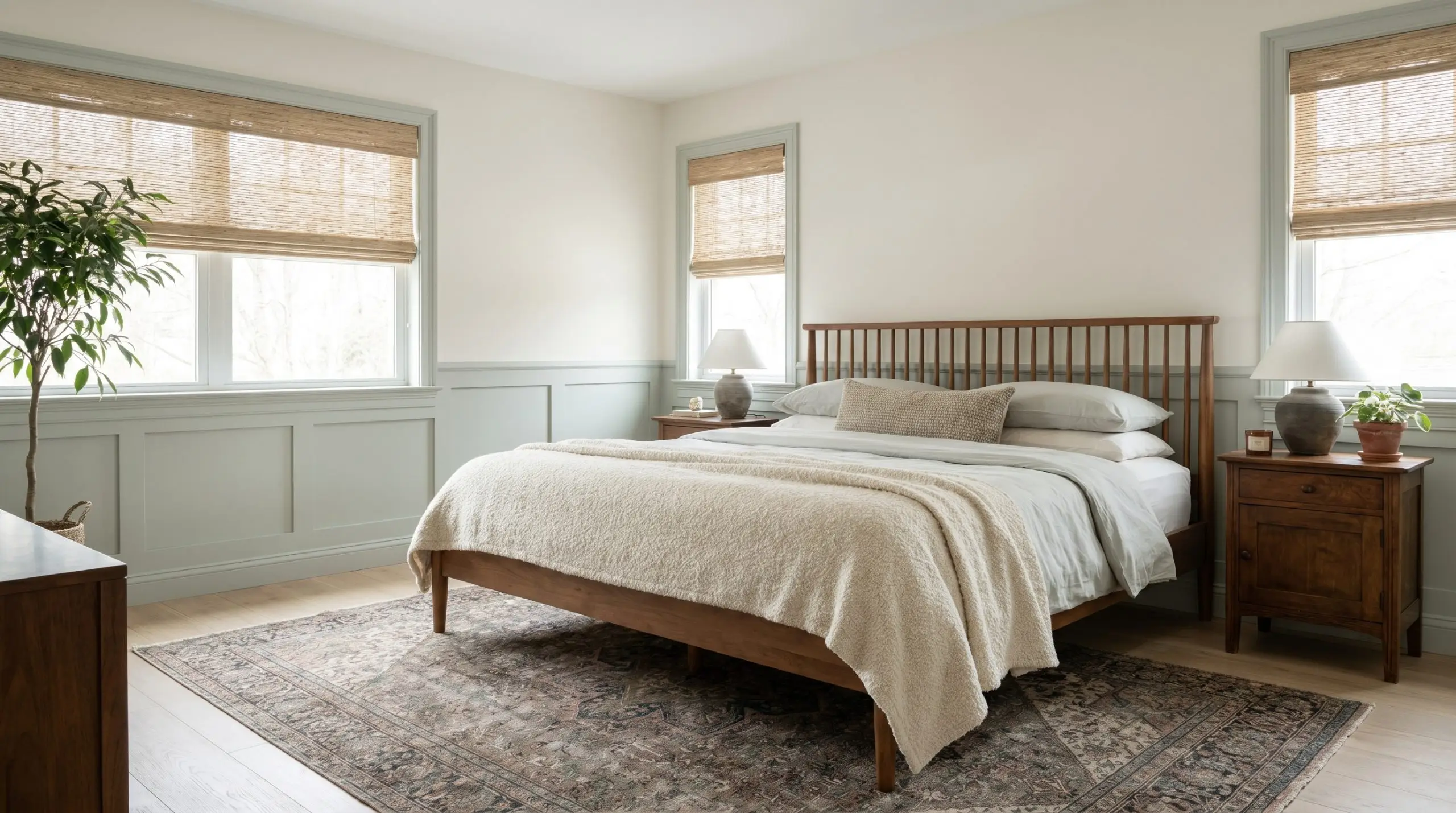
To build a truly restorative primary suite for a busy professional, use the paint’s silvery-gray cast as the foundation for an aggressively textured room. Layer a spindle bed with washed percale sheets, a chunky boucle throw, and woven grasscloth window shades. The contrast between the smooth, cool walls and the highly tactile fabrics creates immediate design tension.
If you are working with a standard suburban bedroom, consider applying the color to traditional wainscoting while leaving the upper walls a warm white. This roots the lower half of the room while drawing the eye upward.
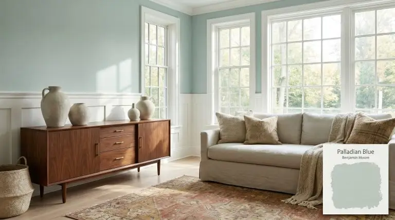
Reimagining the Coastal Living Room
You do not need seashell decor to execute a beautiful coastal neutral palette. Modernize the application by pairing Palladian Blue with a slipcovered linen sofa, bleached oak flooring, and oversized, asymmetrical ceramics. The green base of the paint speaks beautifully to trailing indoor greenery or large, sculptural branches placed on a mid-century sideboard.
Avoid pairing this delicate blue-green with highly saturated, warm-toned furniture like cherry wood or bright red leather. The intense warmth will force the subtle paint to look jarring and completely out of place.
Clash Warning (The Upholstery Trap)
To add structure to the soft walls, introduce a vintage rug featuring muted terracotta or mustard tones.
The Modern Porch Ceiling
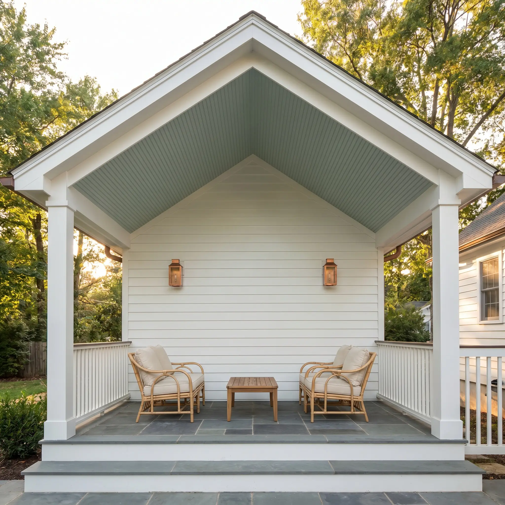
Using a soft blue-green on an exterior porch ceiling is a beloved Southern tradition, but it translates beautifully to modern suburban patios and urban balconies. The haint blue ceiling application draws the eye up, mimicking the sky and visually expanding the overhead space.
Because direct exterior sunlight washes out paint colors, the 60.4 light reflectance value ensures the pigment retains its character without turning glaringly white. Pair the painted ceiling with brushed copper exterior lanterns and rattan lounge chairs to seamlessly connect your interior comfort with outdoor living.
High-Function Laundry Rooms and Mudrooms
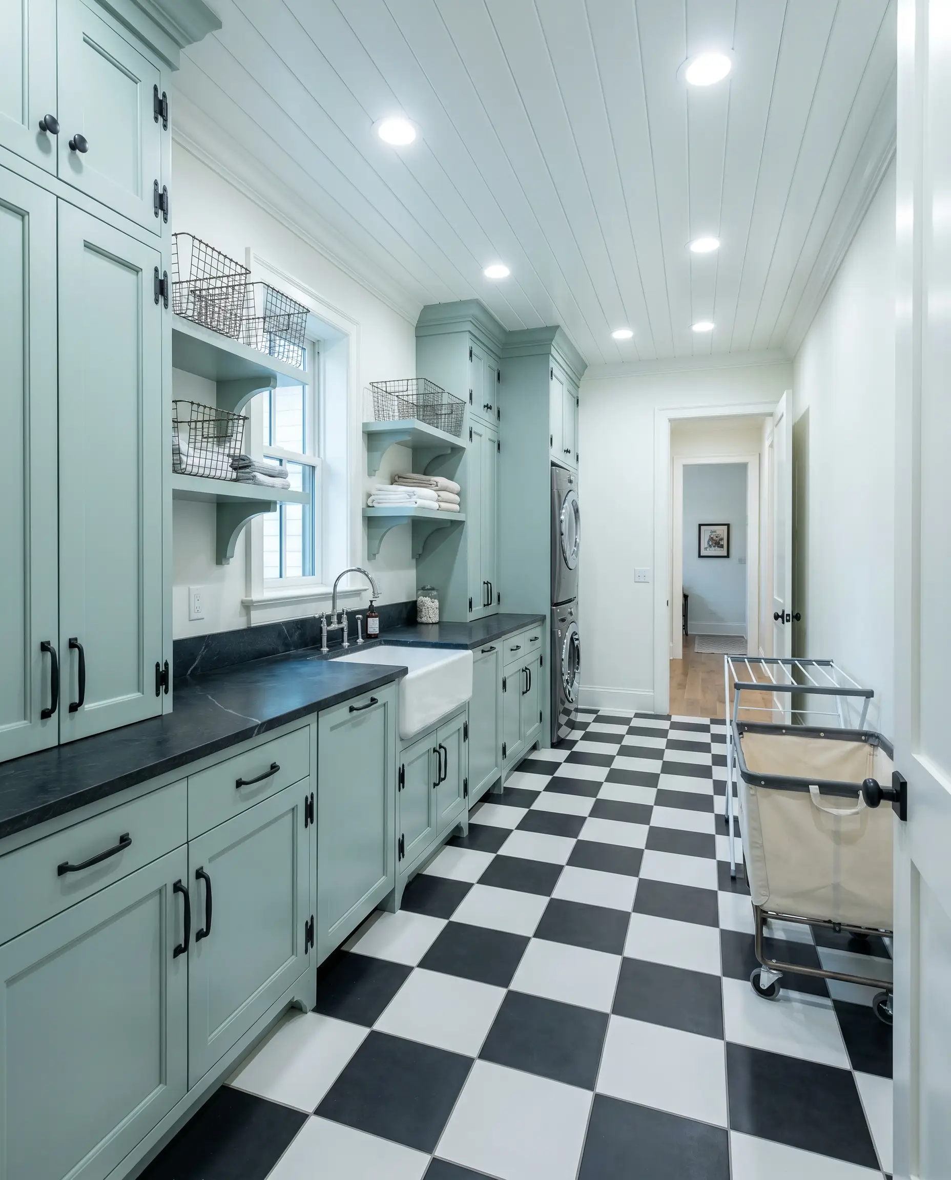
Utilitarian spaces are the perfect testing ground for elevating everyday routines through color. Painting custom mudroom built-ins or standard laundry cabinetry in BM HC-144 instantly makes a chore-focused room feel entirely custom-designed.
Pair the painted woodwork with a durable checkerboard floor or soapstone counters to balance the softness of the mother-of-pearl undertone with rugged, hardworking materials. The color hides minor scuffs much better than stark white while keeping windowless utility rooms feeling remarkably fresh.
Relational Dynamics: Building a Palette Around Palladian Blue
This muted pigment thrives on intentional contrast, relying on crisp, luminous boundaries to maintain its structure against changing sunlight. Without deliberate grounding elements, its luminous mother-of-pearl undertone can easily drift into an overly sweet, undefined pastel.
Tailoring the Architectural Boundaries
Elevating the Tactile Foundation
Complementary Shades & Tonal Shifts
Curated Design Vignettes
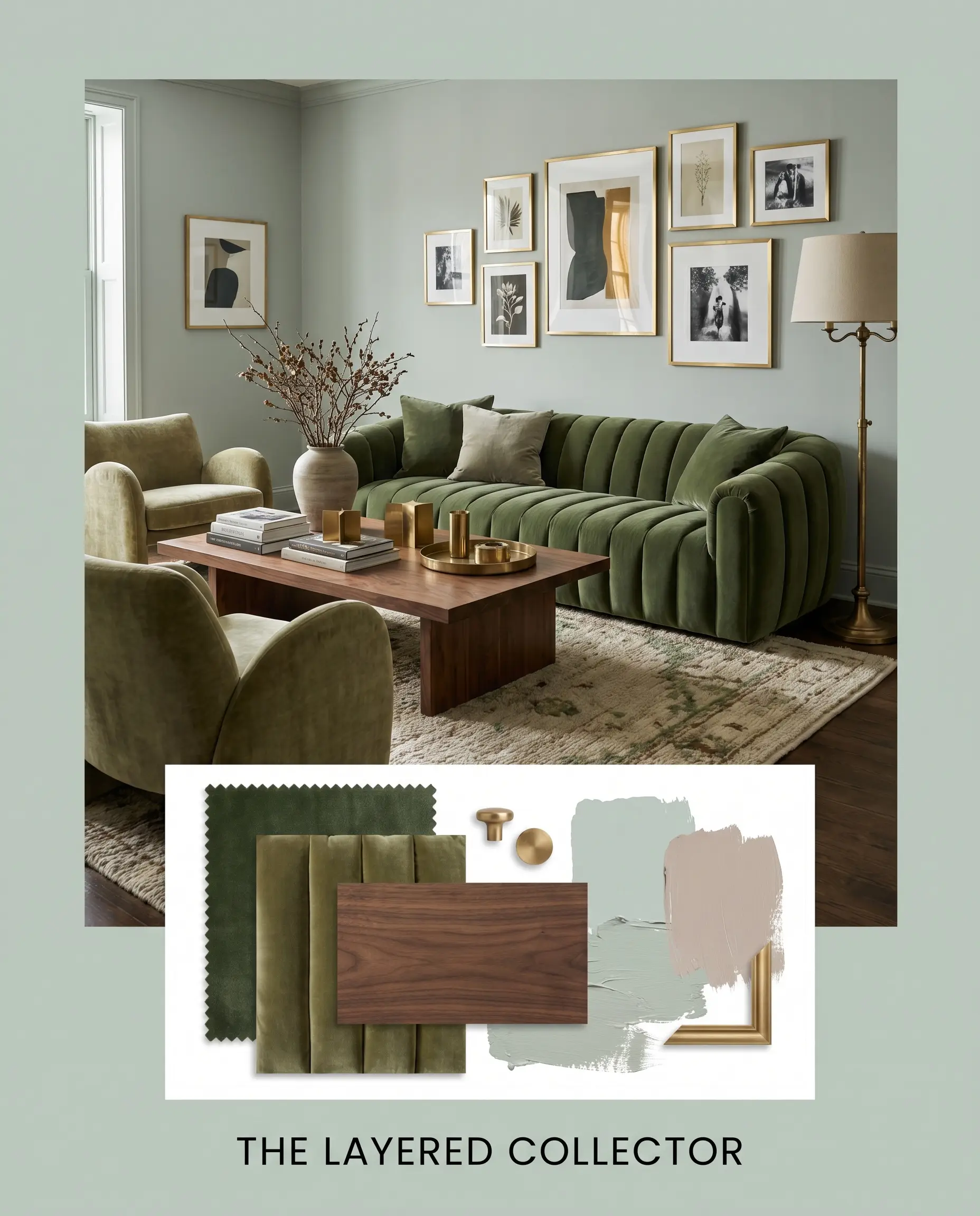
The Layered Collector This palette thrives on the tension between delicate hues and profoundly rich textures, creating an environment that feels collected over decades. Anchor the soft blue-green walls with dense walnut furniture silhouettes and vintage rugs featuring subtle blush tones to echo the dusty pink of Farrow & Ball Peignoir. Introduce unlacquered brass picture frames and thick, channel-tufted velvet upholstery to transform the airy paint into a moody, sophisticated foundation.
Utilitarian Elegance By stripping away traditional coastal decor, this aesthetic focuses entirely on clean lines and hardworking materials. Frame the luminous wall color with Sherwin-Williams Iron Ore window sashes and doors to establish a rigid, modern boundary. Layer in matte black iron hardware, fluted glass partitions, and a durable checkerboard floor to ground the space in practical, everyday luxury.
Benjamin Moore Palladian Blue vs. Leading Industry Alternatives
There are specific architectural scenarios where this beloved shade might lose its structure, particularly in aggressively warm, south-facing light where its green base can become overwhelming. If your space lacks natural light or features deeply saturated, warm-toned flooring, pivoting to a rival color with a different undertone profile is the safest path forward.
Benjamin Moore Palladian Blue vs. Benjamin Moore Wythe Blue
If you crave a more dramatic, historic presence, Wythe Blue HC-143 delivers a noticeably darker and more saturated teal profile. While Palladian sits at a breezy 60.4 LRV, Wythe drops to 48.6, absorbing far more light and requiring ample illumination to avoid feeling dense. Choose the lighter option for airy, expansive spaces, and reserve Wythe Blue for intimate, high-contrast areas like dining rooms or custom cabinetry.
Benjamin Moore Palladian Blue vs. Sherwin-Williams Sea Salt
Sherwin-Williams Sea Salt SW 6204 is the definitive choice if you want a color that leans much further into a muted, earthy gray. While HC-144 retains a distinct, pearl-like luminosity, Sea Salt mutes its own green base with a stronger slate undertone, making it slightly more forgiving alongside warm wood floors. If your room features intense afternoon sun that amplifies green too aggressively, Sea Salt will maintain a calmer, more neutral stance.
Benjamin Moore Palladian Blue vs. Benjamin Moore Beach Glass
Beach Glass 1564 strips away a significant portion of the green warmth, replacing it with a cooler, more traditional blue-gray foundation. It reflects slightly less light, giving it a moodier, more subdued presence on the wall. If your goal is to cool down a hot, west-facing room without dipping into pastel territory, Beach Glass offers a more stabilizing chill.
Benjamin Moore Palladian Blue vs. Sherwin-Williams Rainwashed
Rainwashed SW 6211 presents a crisper, more straightforward blue-green that lacks the complex, silvery-gray muddiness of its Benjamin Moore counterpart. It reads slightly more vibrant and fresh, making it highly effective in poorly lit spaces that need an artificial lift. However, if you are mixing the paint with aged, vintage materials, the Benjamin Moore option provides the necessary antique softness that Rainwashed lacks.
Navigating Color Matches and Tone Variations
Finding the exact hue for your specific lighting conditions often requires minor adjustments in depth or clarity. Whether you need a slightly more vivid tone to combat a dark hallway or a cross-brand equivalent for local sourcing, these alternatives provide beautiful, targeted shifts.
Subtle Brand Variations
Cross-Market Matches
Execution Strategy: Painting with Palladian Blue
Translating a beautiful color from a swatch to a flawless architectural finish requires strict attention to your materials and application methods.
Selecting the Proper Finish
Primer Strategy
Because this shade relies on a delicate balance of blue, green, and gray, you must use a high-quality, pure white primer to block any underlying wall colors from bleeding through. Applying this over an existing warm beige or yellow wall without a stark white base coat will instantly turn the final finish into a muddy, sickly green.
Coverage & Success Tips
Achieving the true, luminous depth of this pigment requires a strict two-coat minimum over a properly primed surface.
Soft blue-greens are notoriously prone to “flashing,” where uneven roller pressure leaves visible, shiny streaks as the paint dries. Maintain a wet edge, use a premium 3/8-inch microfiber roller, and never aggressively press the roller into the drywall to extract the last drops of paint.
Hackrea Design Secret (The Roller Warning)
Frequently Asked Questions
Because windowless spaces rely entirely on artificial lighting, standard warm bulbs can over-activate the green undertone, pushing it toward a minty appearance. To maintain its sophisticated blue-gray balance, install cooler LED bulbs in the 3500K to 4000K range.
It performs exceptionally well outdoors, as its 60.4 LRV provides enough pigment density to hold its shape against intense exterior sunlight. The subtle gray cast keeps the ceiling looking like a natural, atmospheric sky rather than a glaring pastel.
The intense orange and red tones found in unstained red oak will aggressively pull out the green in this paint, often creating an unbalanced, highly vibrant contrast. If you have red oak floors, you will need to bridge the gap with large, neutral area rugs to soften the transition.
It pairs beautifully with both, but they create entirely different moods. Warm, unlacquered brass provides a striking, heritage-inspired contrast against the cool walls, while polished nickel leans into the paint’s silvery-gray undertones for a seamless, spa-like finish.
The Final Architectural Ruling
Benjamin Moore Palladian Blue is a masterclass in nuanced color design, offering the restorative qualities of a coastal hue while maintaining the strict architectural discipline of a gray-based neutral. It is the perfect selection for homeowners who want to introduce genuine color into their spaces but demand a mature, highly adaptable backdrop. It elevates everything from modern utilitarian laundry rooms to richly layered, tactile primary suites, proving its worth far beyond the traditional spa bathroom application.
However, this delicate balance requires careful environmental curation. You must be extremely cautious when applying this paint in rooms dominated by highly saturated, warm-toned woods like cherry, mahogany, or unstained red oak. The intense red and orange frequencies in those materials will aggressively pull out the green base of the paint, forcing the soft, mother-of-pearl pigment to read as an overly vibrant, clashing mint. If your home features extensive warm wood paneling or flooring, you are much better off pivoting to a deeply muted slate or a warm, grounding taupe that can absorb that radiant heat without losing its composure.