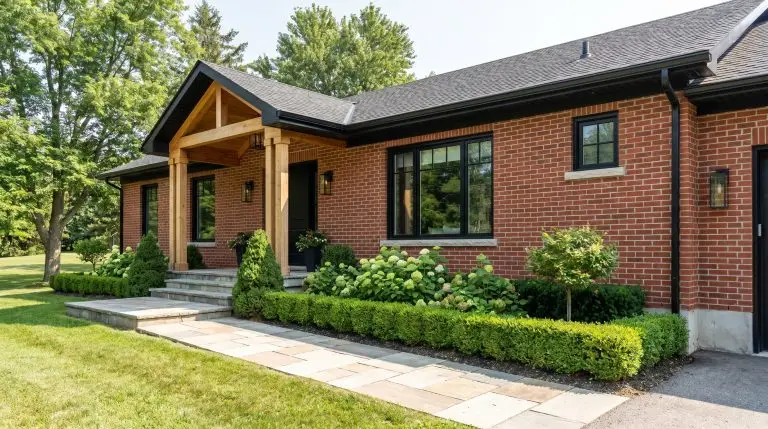
The modern home often feels loud, making the desire for a restorative, quiet space a necessity rather than a trend. Designing Japandi style kitchens requires strict discipline regarding materials and layout to reduce visual clutter. It is not about adopting a generic aesthetic; it is about engineering a highly tactile environment that actively lowers your heart rate. Walking into a perfectly executed space should feel like exhaling.
True architectural success in this realm proves that absolute material restraint equals profound mental clarity.
The Cabinetry Playbook: Form, Wood, and Flow
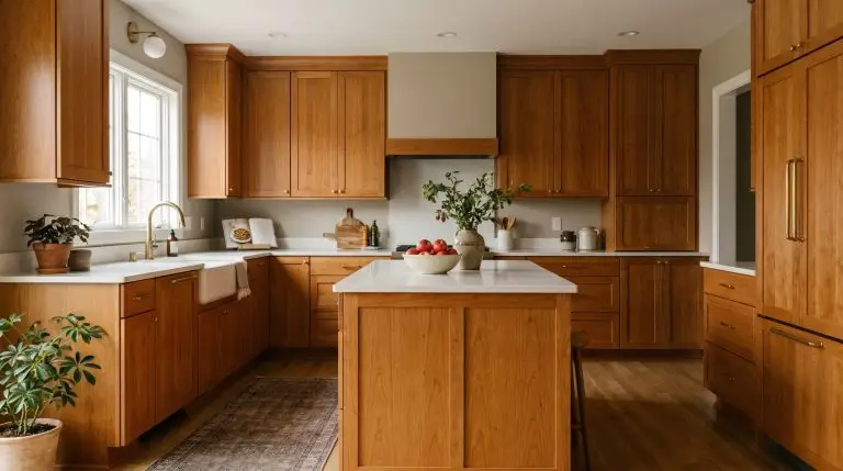
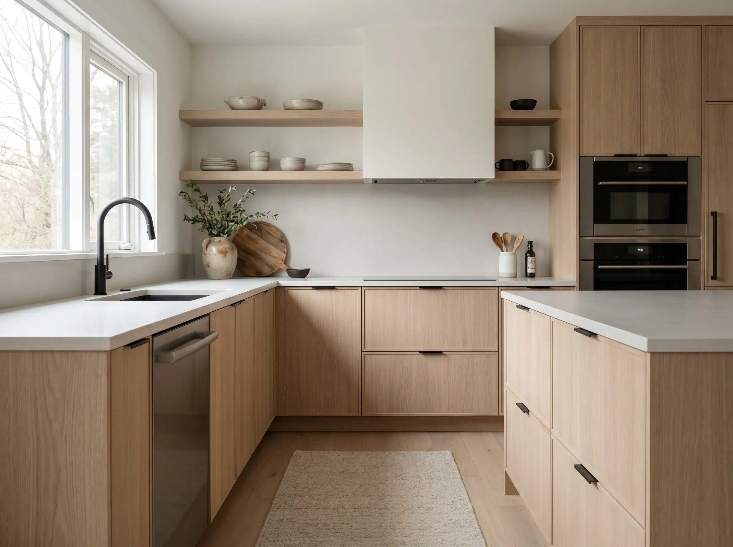
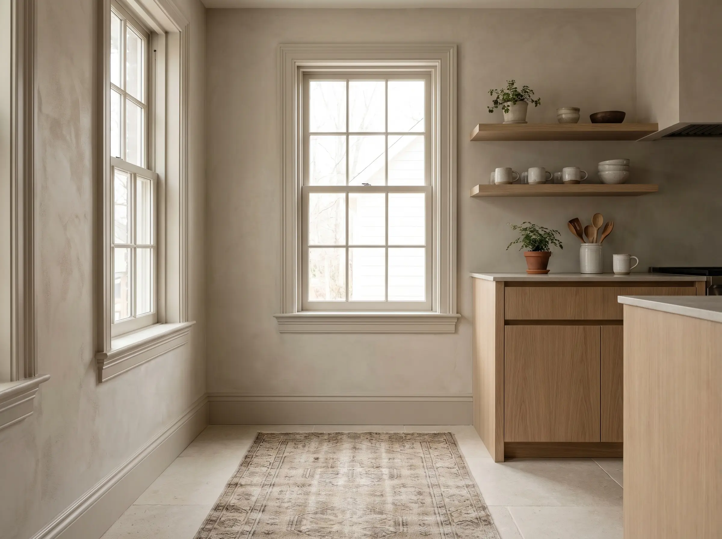
Cabinetry serves as the structural foundation of the room. Treat these vertical surfaces as continuous architectural paneling rather than utilitarian storage boxes, ensuring an unbroken visual flow that grounds the space.
Flat-Panel Rift-Sawn Oak for Linear Calm
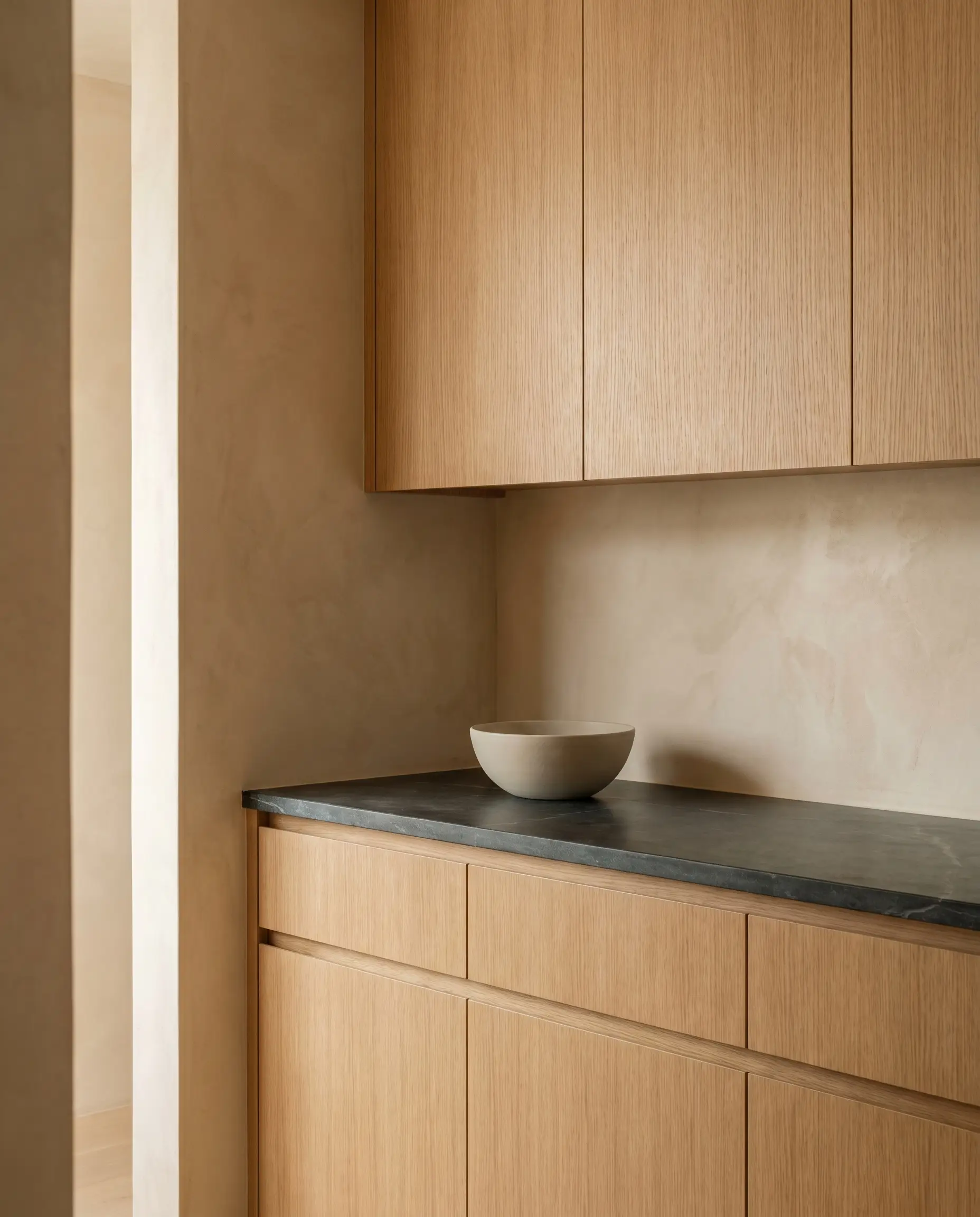
The specific cut of the wood dictates the energy of the room. Rift-sawn oak provides a tight, linear grain that removes the chaotic, swirling patterns of standard cuts, establishing immediate visual calm.
- Vibe: Grounded and highly disciplined.
- Key Material: Rift-sawn white oak veneer with a clear matte sealant.
- Styling Pro-Tip: Run the wood grain vertically to stretch the visual height of the ceiling.
The “High-Low” Modular Hack
Achieving a bespoke, architect-designed look does not require custom millwork budgets. Pair affordable, structural cabinet carcasses with premium aftermarket artisan fronts to maximize your investment where it is actually touched and seen.
- Vibe: Accessible luxury.
- Key Material: IKEA METOD or SEKTION carcasses paired with KOAK Design or SemiHandmade fronts.
- Structural Pro-Tip: Upgrade the hinges to soft-close Blum hardware to maintain a premium acoustic experience.
| Custom Millwork | Aftermarket Modular Hack |
|---|---|
| Pros: Exacting measurements, unlimited finish options, highly tailored internal storage. | Pros: Significantly lower cost, DIY-friendly installation, premium exterior aesthetic. |
| Cons: High cost, long fabrication lead times, expensive to repair or replace sections. | Cons: Restricted to standard box sizes, requires careful planning for filler panels. |
Deep Walnut Contrasts for Japanese Weight
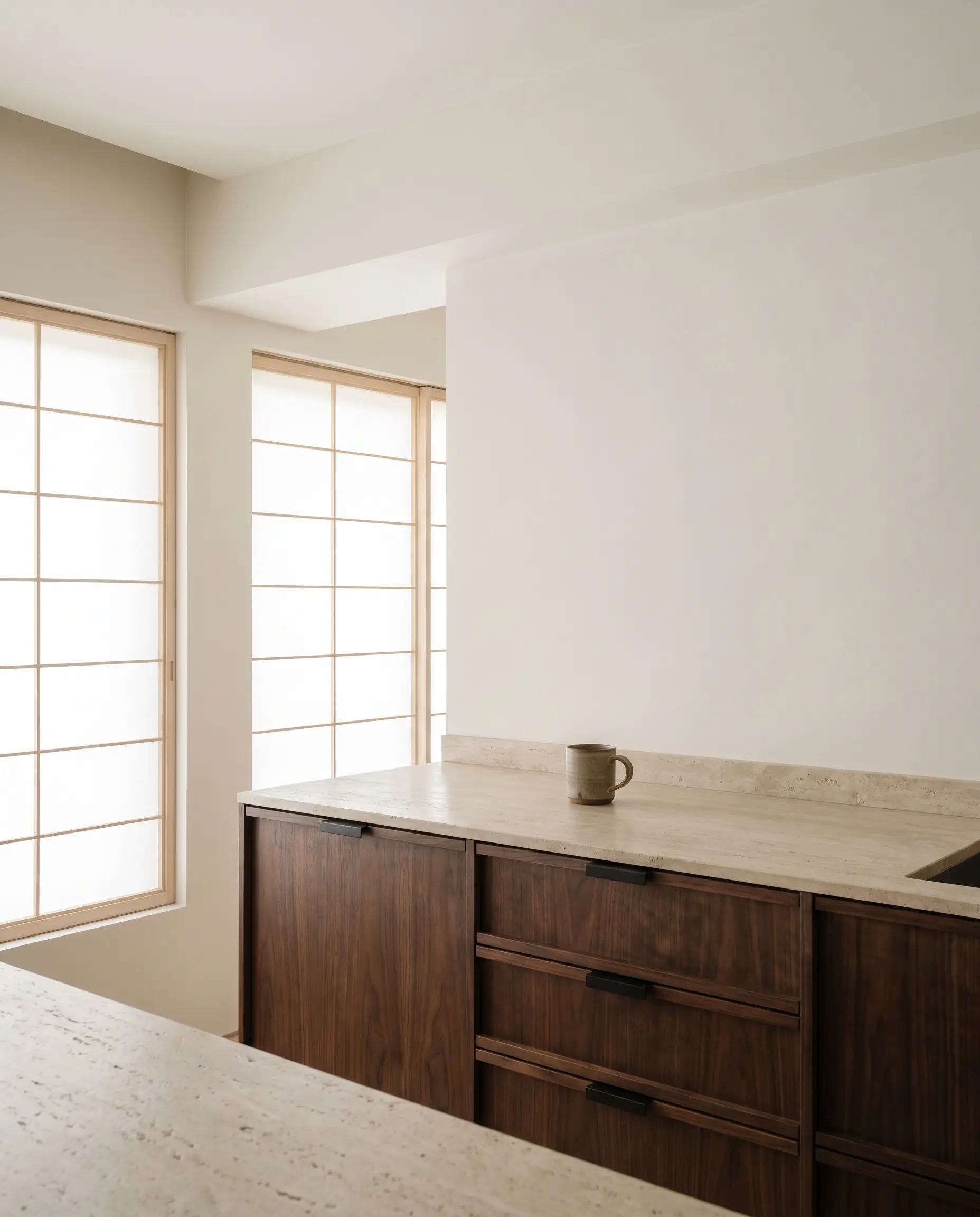
While Scandinavian design leans heavily on pale woods, introducing American walnut on base cabinets anchors the room. This darker, richer tone provides the necessary visual weight inherent in traditional Japanese architecture.
- Vibe: Deep, moody, and restorative.
- Key Material: American walnut with a zero-sheen protective oil finish.
- Styling Pro-Tip: Keep upper cabinets lighter or remove them entirely to prevent the dark wood from feeling oppressive.
Slatted Wood Islands for Tactile Depth
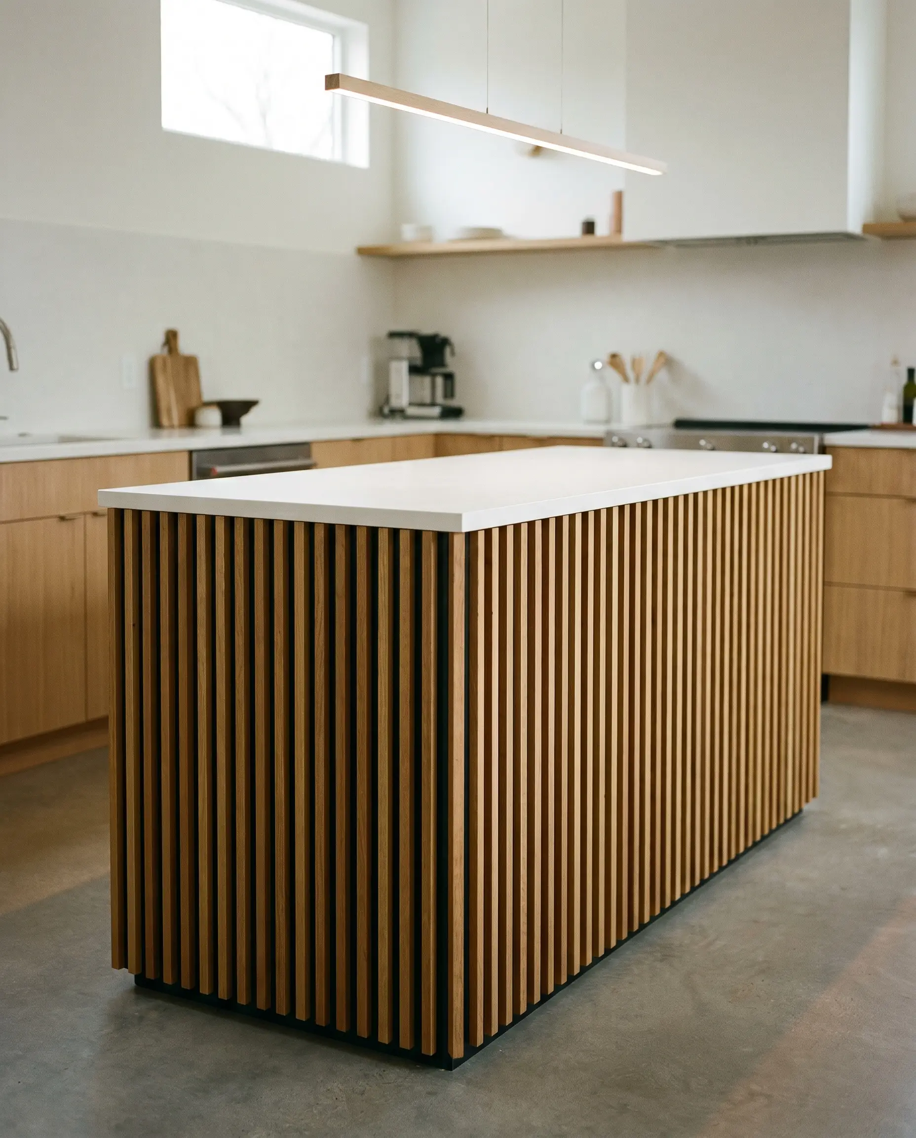
Flat planes can occasionally border on sterile if left entirely uninterrupted. Wrapping an island in fluted or slatted wood introduces necessary tactile depth and shadow play without adding physical clutter to the countertops.
- Vibe: Rhythmic and architectural.
- Key Material: Custom milled oak slats spaced uniformly against a dark backing.
- Styling Pro-Tip: Ensure the slat depth is shallow enough to easily wipe down, maintaining hygiene without sacrificing texture.
Pocket Doors and Appliance Garages
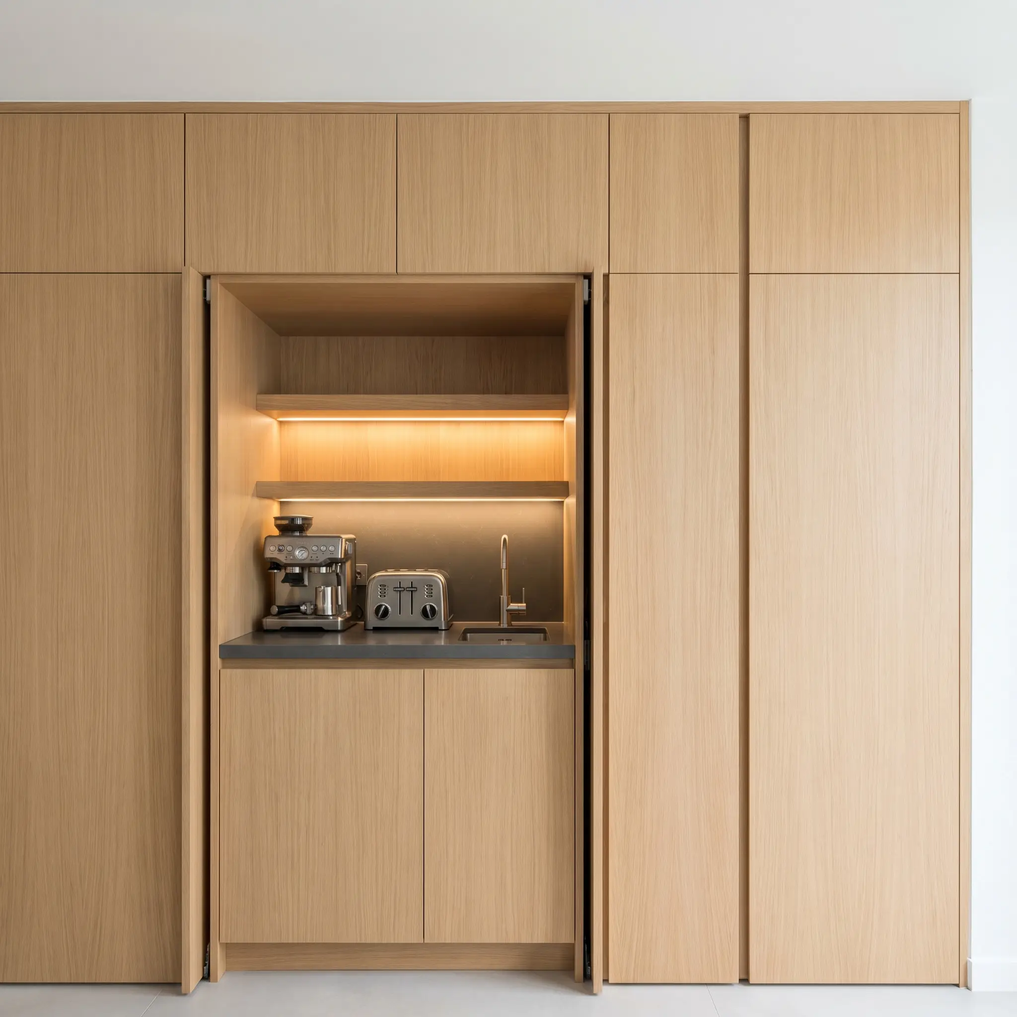
The psychological impact of hidden appliances is profound. Conceal the coffee maker, toaster, and blender behind retracting pocket doors to maintain a pristine visual plane when the kitchen is not in active use.
- Vibe: Stealthy and immaculate.
- Key Material: High-grade bi-fold or pocket retracting track hardware.
- Styling Pro-Tip: Install internal outlets and warm LED lighting inside the garage to create a hidden, fully functional prep station.
Handleless Fronts and Integrated Finger Pulls
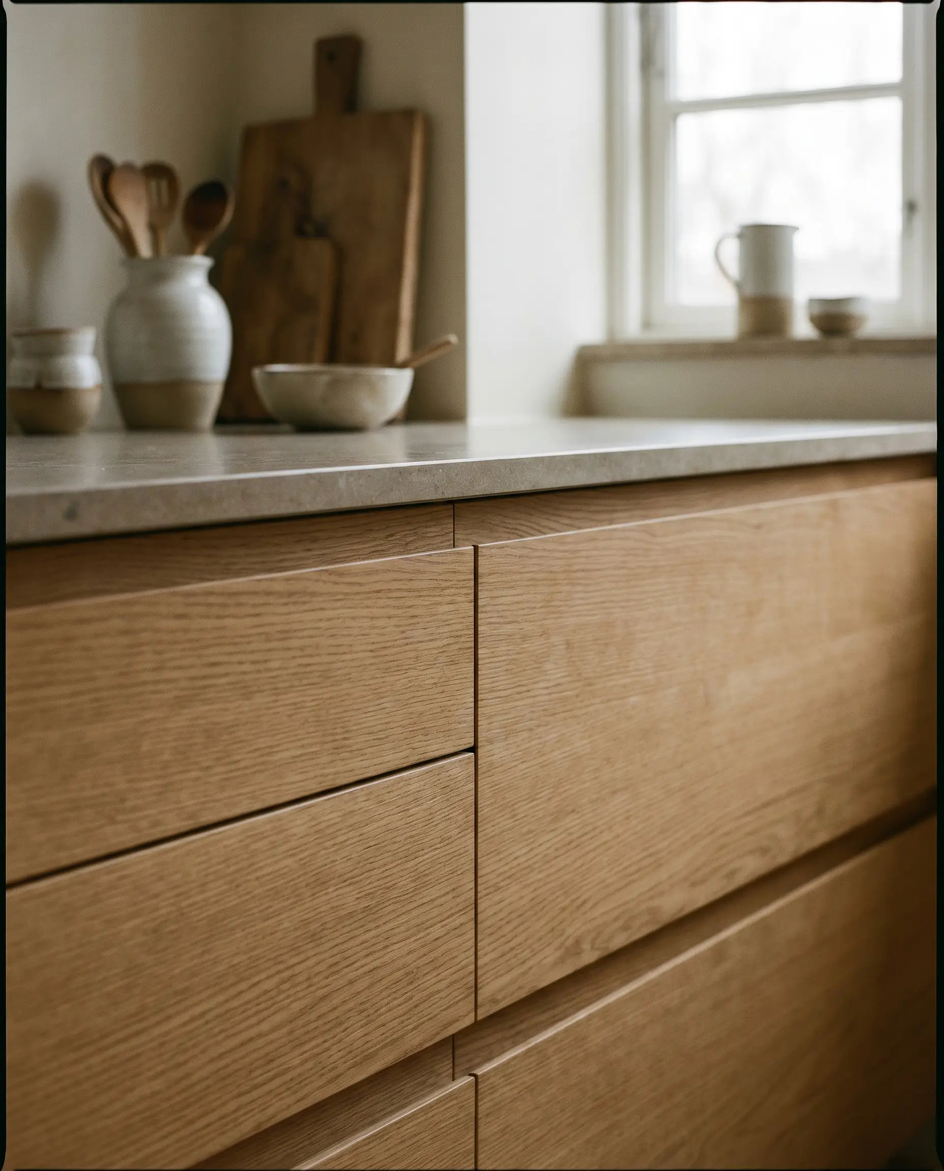
Eliminating protruding hardware keeps the architectural lines of the cabinetry unbroken. Integrated finger pulls or push-to-open mechanisms allow the eye to travel across the wood grain without interruption.
- Vibe: Seamless and quiet.
- Key Material: J-channel routed pulls or magnetic push-latches.
- Styling Pro-Tip: Opt for a routed edge that matches the cabinet finish exactly, ensuring the pull disappears into the shadow line.
You can apply wallpapers, paints, etc. on walls and see how they look in various interiors.

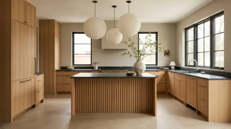
Surfaces & Textures: The Anti-Gloss Mandate
Light absorption is critical to crafting a restorative environment. High-gloss finishes bounce light aggressively and create visual anxiety, whereas light-absorbing matte surfaces generate an immediate sense of calm and tactile warmth.
Honed and Leathered Stone Countertops
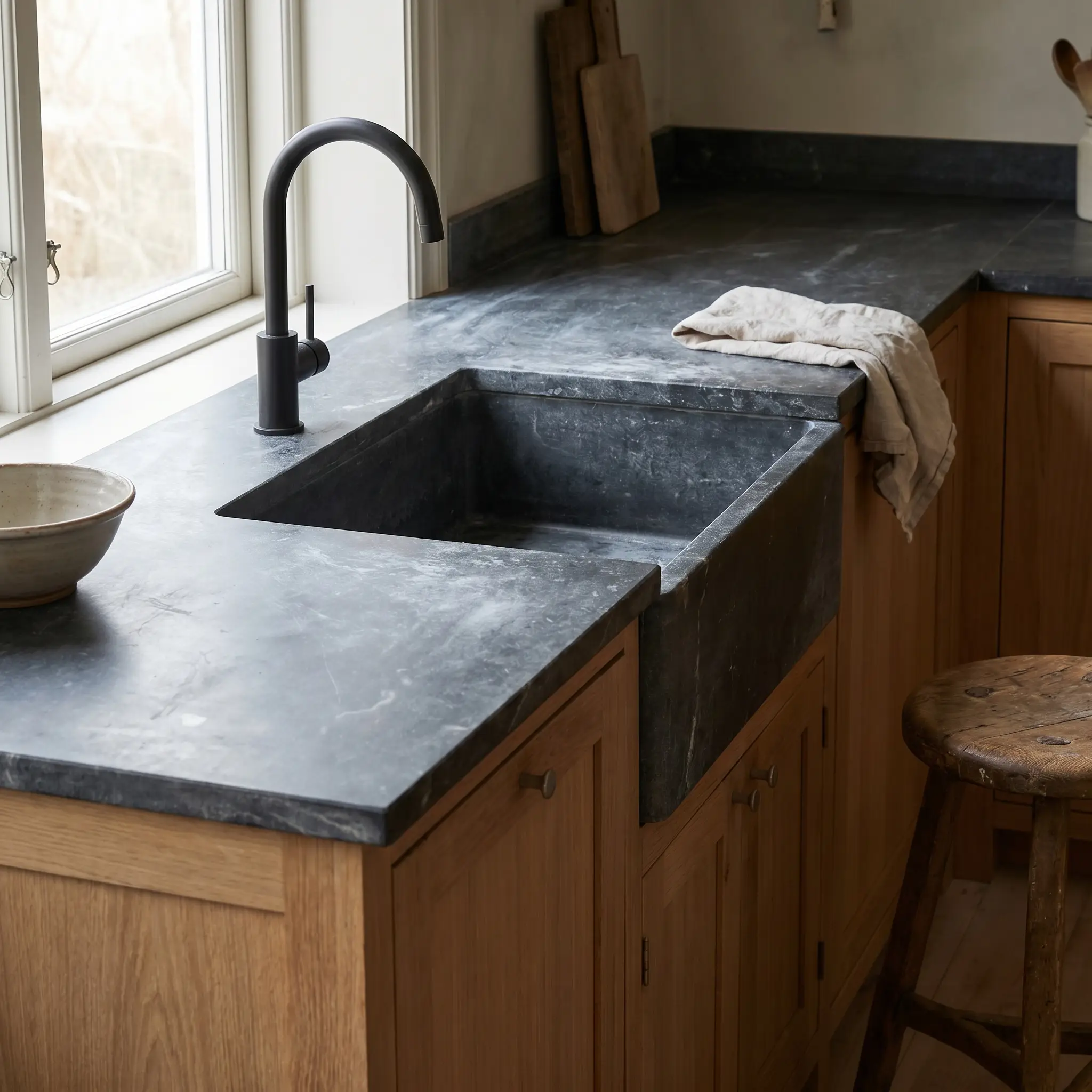
Polished quartz ruins the organic intention of the space. Source honed soapstone, leathered travertine, or matte porcelain to ensure the surface feels raw, natural, and inherently tactile.
- Vibe: Earthy and substantial.
- Key Material: Honed soapstone or matte porcelain slabs.
- Styling Pro-Tip: Pair with a matte faucet to ensure the light absorption remains consistent across the workstation.
To maintain the matte beauty of honed stone without constant fear of staining, apply an impregnating stone sealer rather than a topical wax. This penetrates the pores to block oils while leaving the raw, chalky texture completely intact.
Designer Secret
Warm Ceramic and Zellige Backsplashes
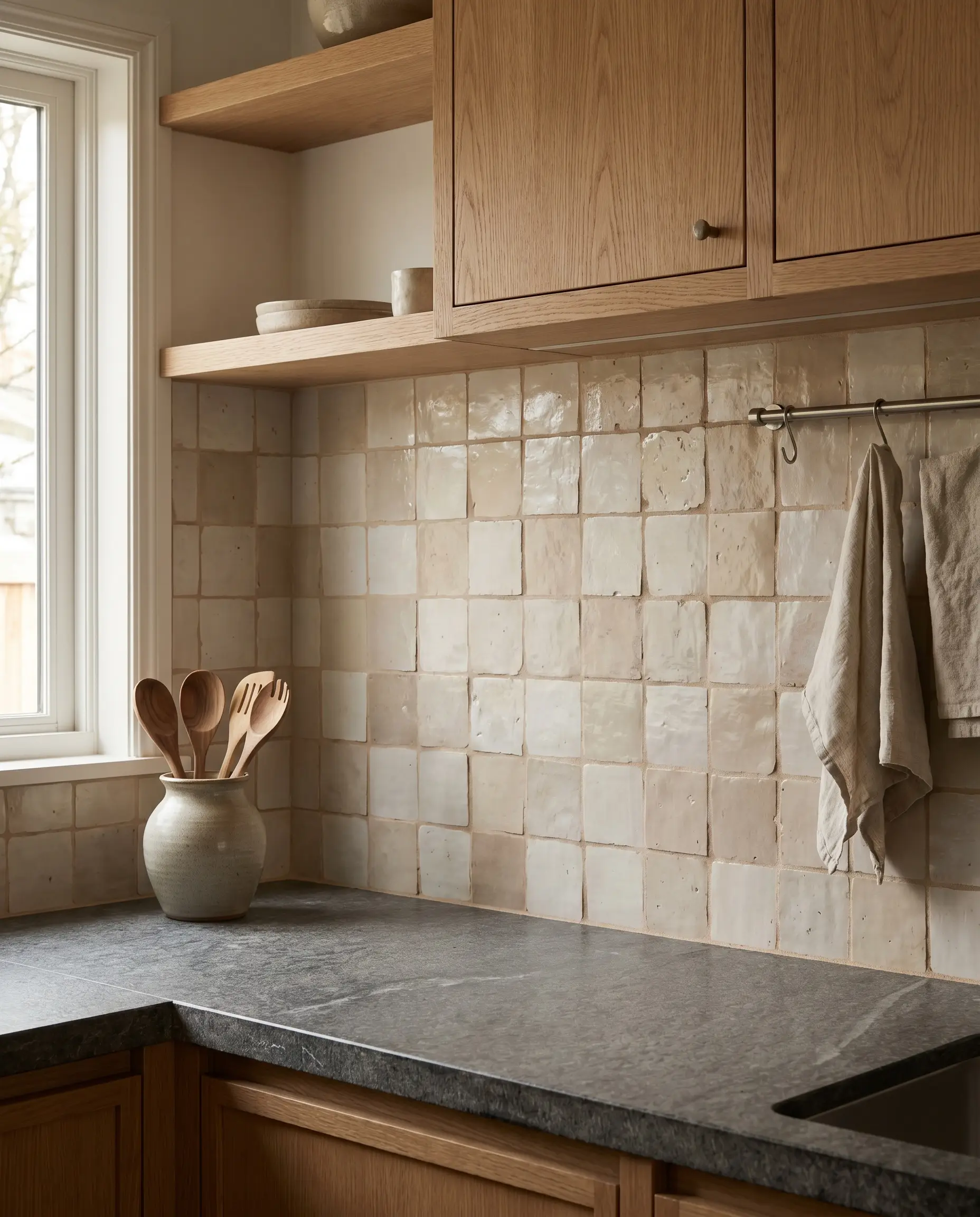
Introducing subtle, handmade imperfections into the backsplash breaks up the rigorous straight lines of the cabinetry. The slight undulation of fired clay embraces wabi-sabi principles, catching natural light softly.
- Vibe: Perfectly imperfect.
- Key Material: Unglazed or matte-glazed square Zellige tiles.
- Styling Pro-Tip: Use a closely matched grout color to prevent the grid pattern from becoming too visually loud.
Seamless Micro-Cement or Concrete Floors
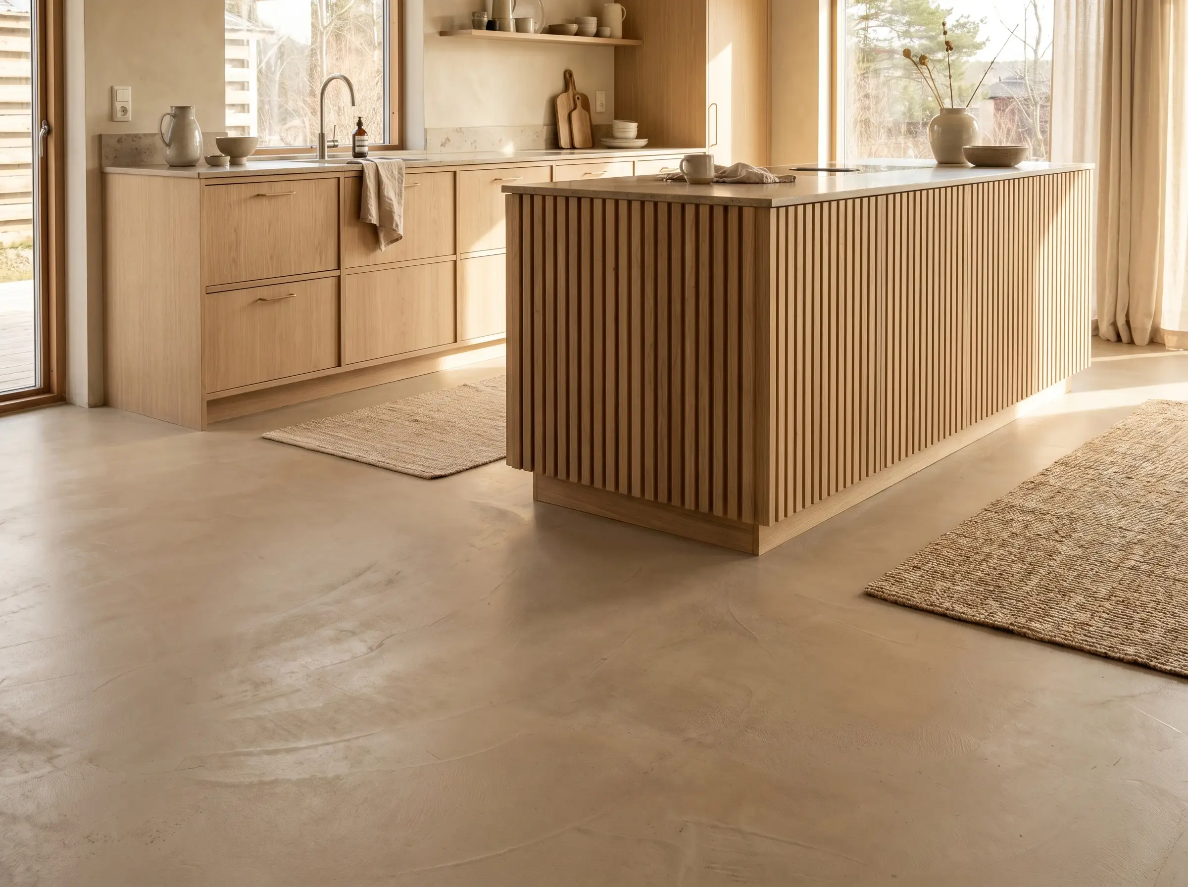
A continuous, unbroken visual plane on the floor expands the spatial perception of the room. Micro-cement offers a durable, highly textured surface that grounds the kitchen in organic modernism.
- Vibe: Industrial yet warm.
- Key Material: Troweled micro-cement with a matte polyurethane sealant.
- Styling Pro-Tip: Install radiant floor heating to counteract the physical coldness of the concrete, adding an unseen layer of hygge.
Wide-Plank Ash or Bleached Oak Flooring
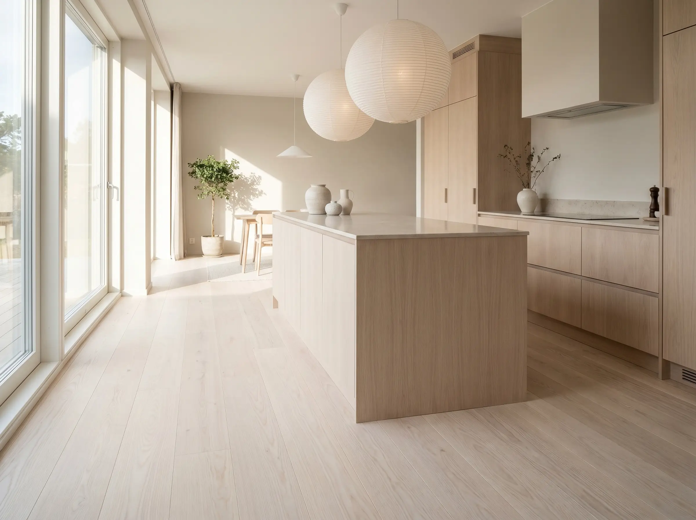
If concrete feels too severe, matching Scandi-inspired wide-plank wood floors to the cabinetry establishes a cohesive, wrapped environment. The long, continuous planks draw the eye outward, enhancing the biometric flow of the space.
- Vibe: Expansive and harmonious.
- Key Material: Engineered wide-plank European white ash.
- Styling Pro-Tip: Run the planks parallel to the longest wall or the main source of natural light to elongate the room.
Seamless Slab Backsplashes
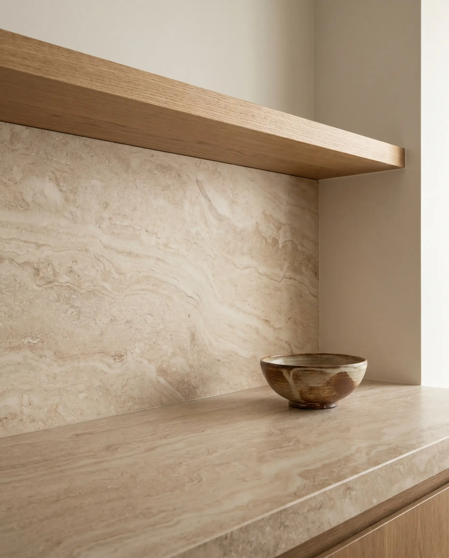
Carrying the countertop stone directly up the wall eliminates grout lines and simplifies the visual field. This monolithic approach highlights the natural veining of the stone as a singular piece of art.
- Vibe: Monolithic and luxurious.
- Key Material: Continuous slab of leathered travertine or quartzite.
- Styling Pro-Tip: Terminate the slab exactly at the bottom of the upper cabinets or the floating shelf for a crisp, intentional line.
The 2026 Japandi Color Palette
Achieving this look requires moving beyond stark, clinical white. The foundation of a quiet room relies on earthy, grounding paint tones that absorb shadows and reflect natural light gently.
Sage Green: The 2026 Bridge Color
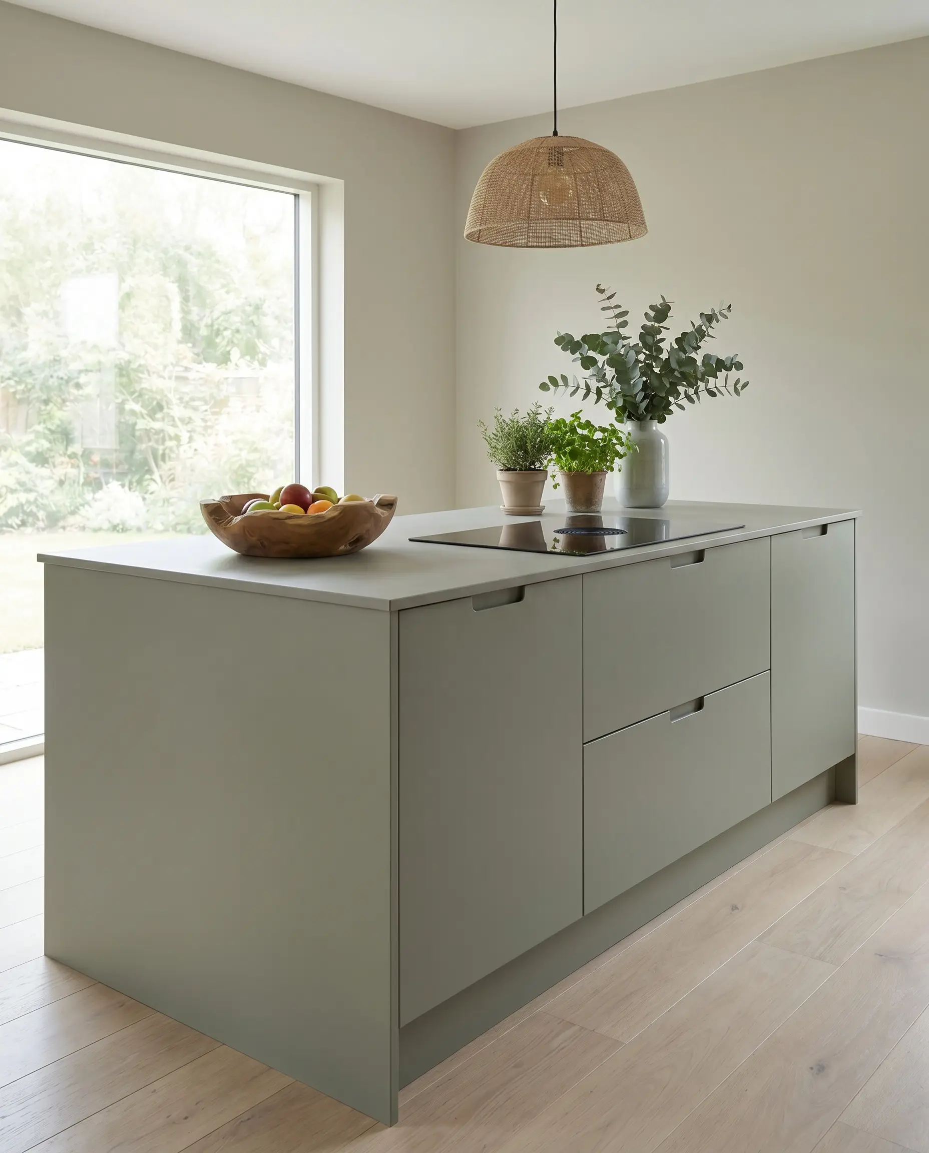
Muted, organic green acts as the perfect link between Japanese reverence for nature and Scandinavian restraint. It provides life and depth without overwhelming the senses.
- Vibe: Biophilic and balanced.
- Color Recommendation: Sherwin-Williams Evergreen Fog.
- Styling Pro-Tip: Apply this tone to a central island or lower base cabinets to ground the workspace.
Warm Greige Over Stark White
Pure, untinted white can feel jarring and sterile against natural wood. Replace it with plaster, beige, or putty tones to soften the transitions between walls and cabinetry.
- Vibe: Soft and enveloping.
- Color Recommendation: Farrow & Ball Drop Cloth.
- Styling Pro-Tip: Color-drench the baseboards and window trims in the same greige to maintain an unbroken envelope.
Charcoal and Ink Accents
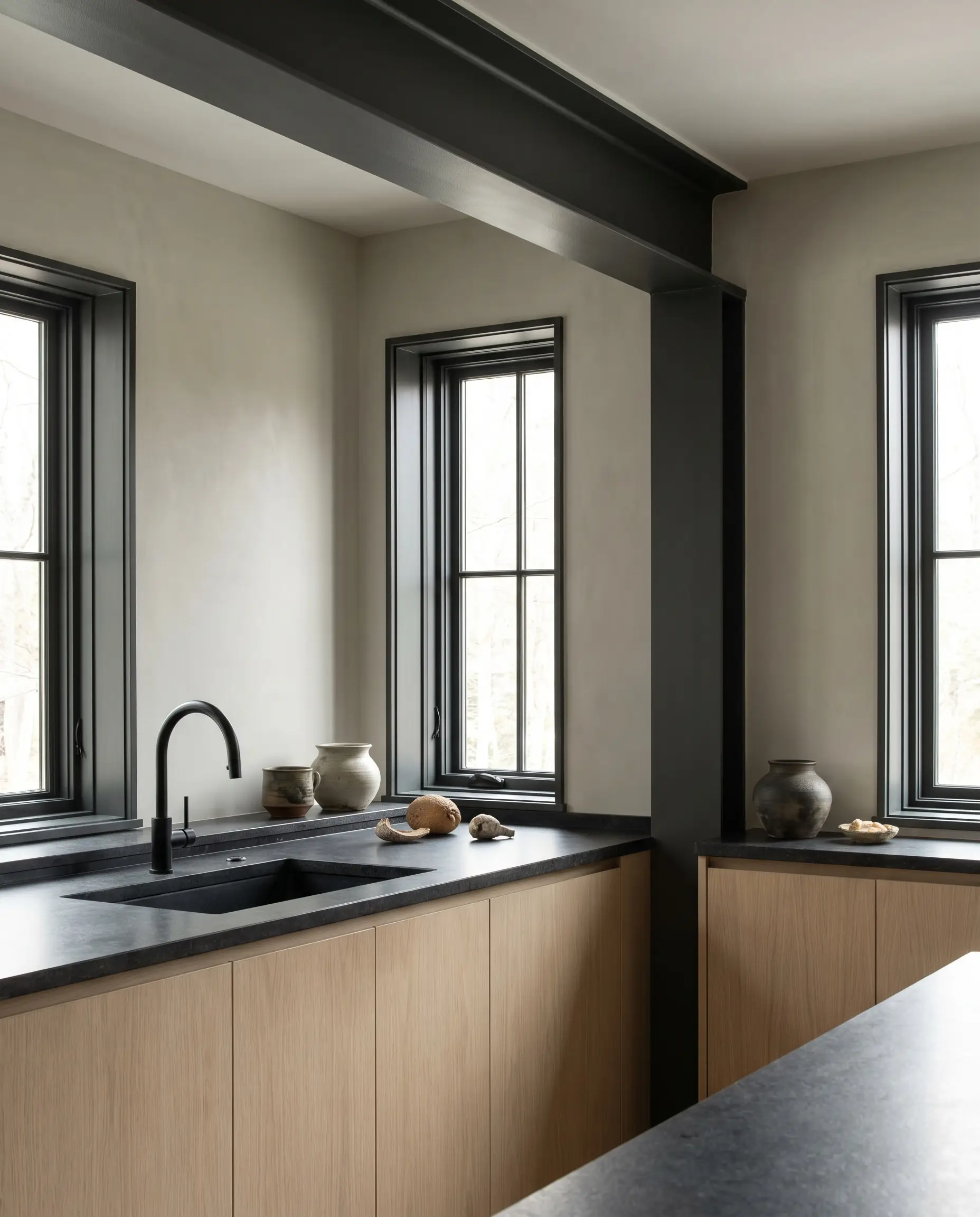
A completely pale room lacks definition. Deploying matte black or deep charcoal creates necessary visual anchors, defining the geometry of the architecture.
- Vibe: Sharp and defined.
- Color Recommendation: Benjamin Moore Cheating Heart.
- Styling Pro-Tip: Limit this color to thin profiles, such as window mullions or a single architectural beam.
Terracotta and Ochre Undertones
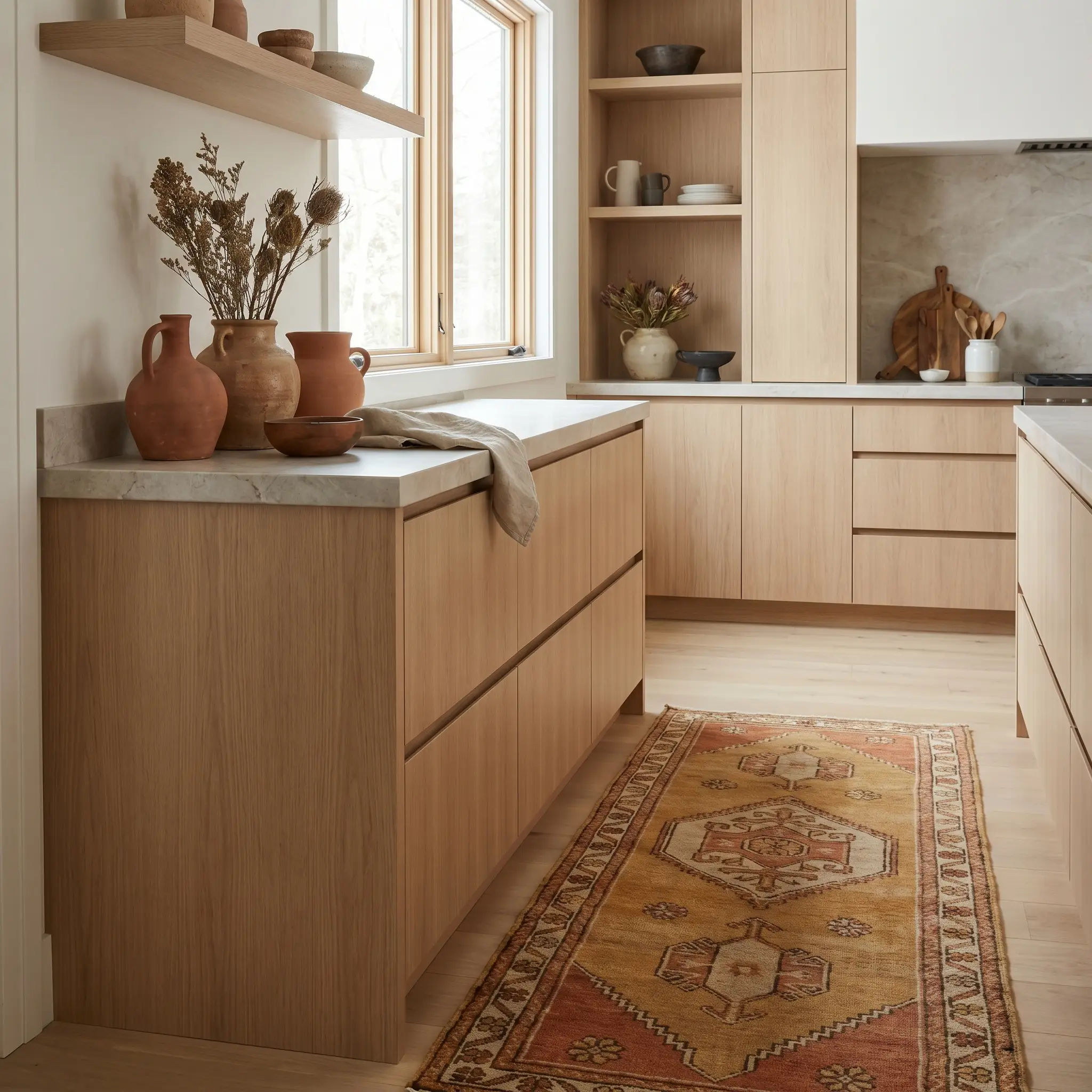
To prevent the minimalist aesthetic from reading as cold, introduce subtle heat through styling objects or textiles. Baked earth tones provide a quiet pulse of warmth that complements oak beautifully.
- Vibe: Earthy and baked.
- Key Material: Vintage wool runners or fired clay vessels.
- Styling Pro-Tip: Avoid painting entire walls terracotta; keep the application strictly to easily swappable textiles and ceramics.
The Japandi Paint Equivalency Guide:
- For Whites: Look for Light Reflectance Values (LRV) between 70 and 82 with warm amber or gray undertones. Avoid anything above 85.
- For Greige/Putty: Target LRVs between 50 and 65 to ensure the color provides enough contrast against pale oak without absorbing too much room light.
- For Greens: Stick to heavily desaturated tones. If the paint chip looks overtly green in the store, it will be too loud on the wall. Choose a gray that leans green.
- For Accents: Ensure dark charcoals have a warm brown or green undertone to avoid the harshness of pure industrial black.
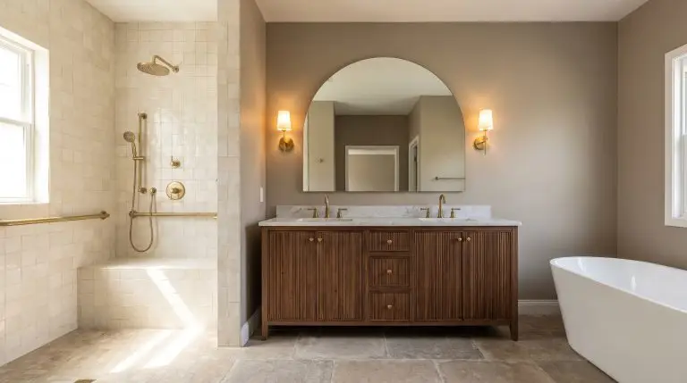
Lighting & Hardware: The Quiet Details
Hardware and lighting act as the jewelry of the architecture, but in a space governed by restraint, this jewelry must remain profoundly understated. Select living finishes and diffused light sources that whisper rather than shout.
Oversized Paper Lantern Pendants
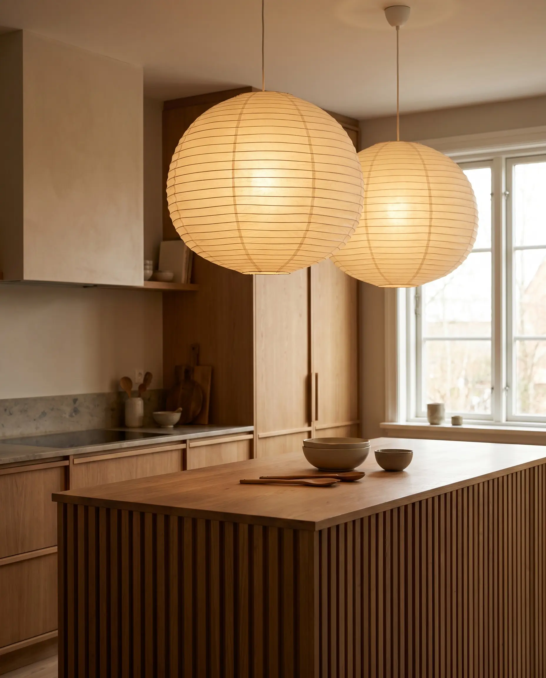
Shoji-inspired lighting provides a soft, diffused glow that eliminates harsh shadows over the prep zone. The delicate paper texture adds a layer of organic fragility against the hard stone and wood.
- Vibe: Ethereal and sculptural.
- Key Material: Rice paper or linen shades with internal wire ribbing.
- Styling Pro-Tip: Hang them slightly lower than standard glass pendants to create an intimate pool of light over the island.
Matte Black or Patinated Brass Faucets
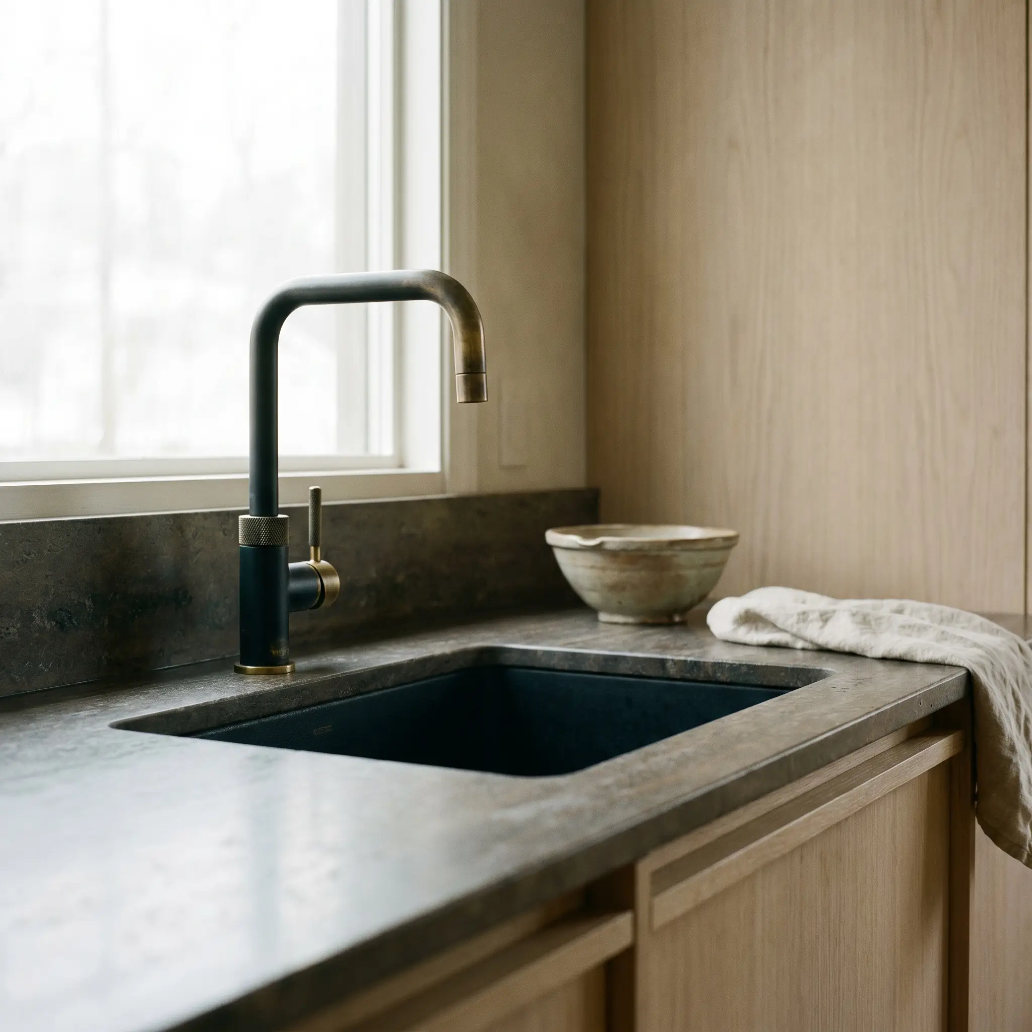
The central fixture of the sink must act as a deliberate silhouette. Choosing a Matte Black or living brass finish ensures the hardware ages beautifully, settling into the room’s patina over time.
- Vibe: Utilitarian and timeless.
- Key Material: Solid brass construction with a Matte Black powder coat or raw finish.
- Styling Pro-Tip: Select a faucet with a knurled handle to introduce a micro-texture that feels substantial to the touch.
Soft Wash Architectural Lighting
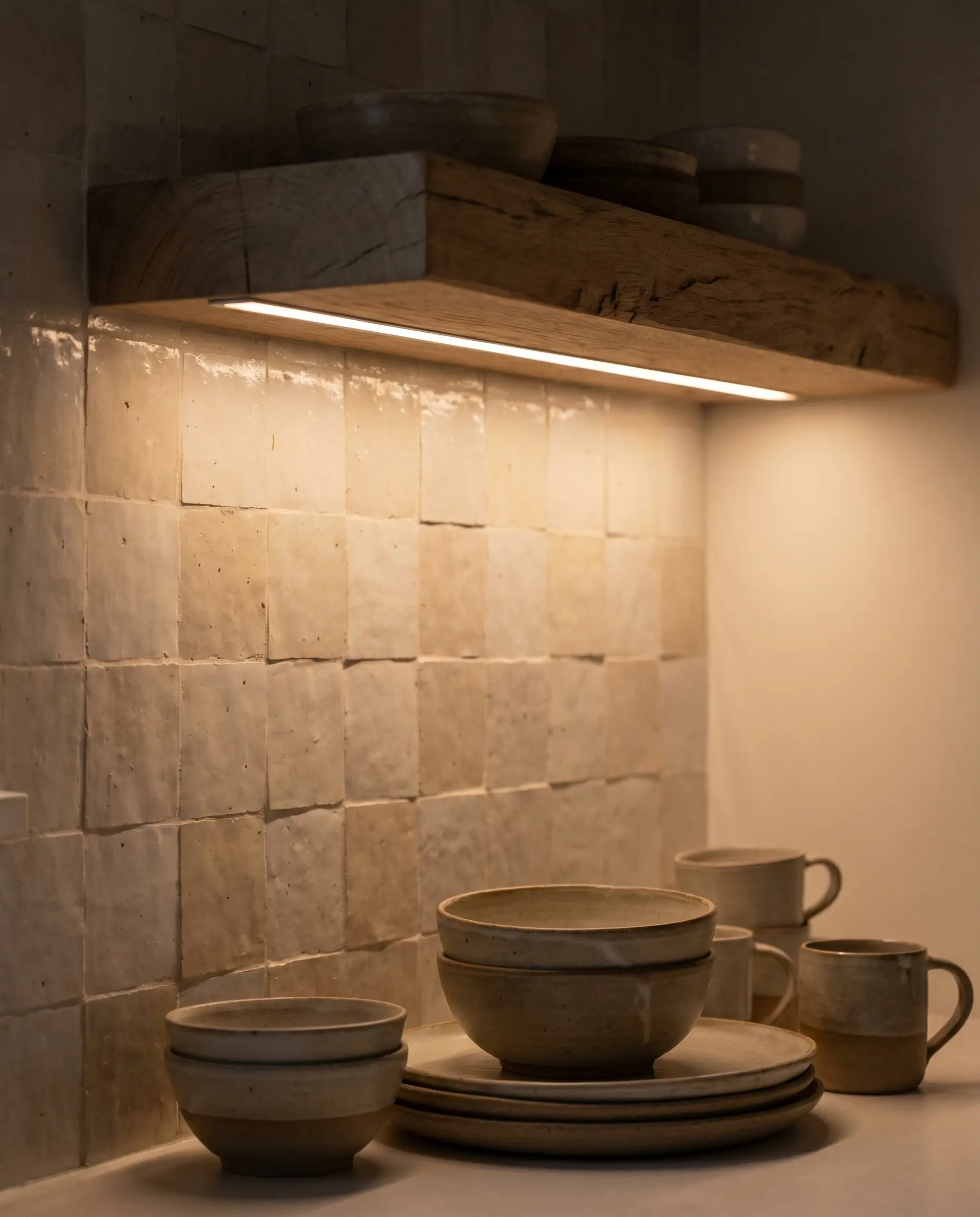
Harsh overhead recessed cans create visual stress and glare. Rely on hidden LED strips channeled into the underside of floating shelves to wash the backsplash in a gentle, functional glow.
- Vibe: Ambient and hidden.
- Key Material: 2700K warm-white LED tape set inside an aluminum diffusion channel.
- Styling Pro-Tip: Wire the ambient shelf lighting to a separate dimmer switch from the ceiling fixtures to control the mood.
Unlacquered Brass Accents
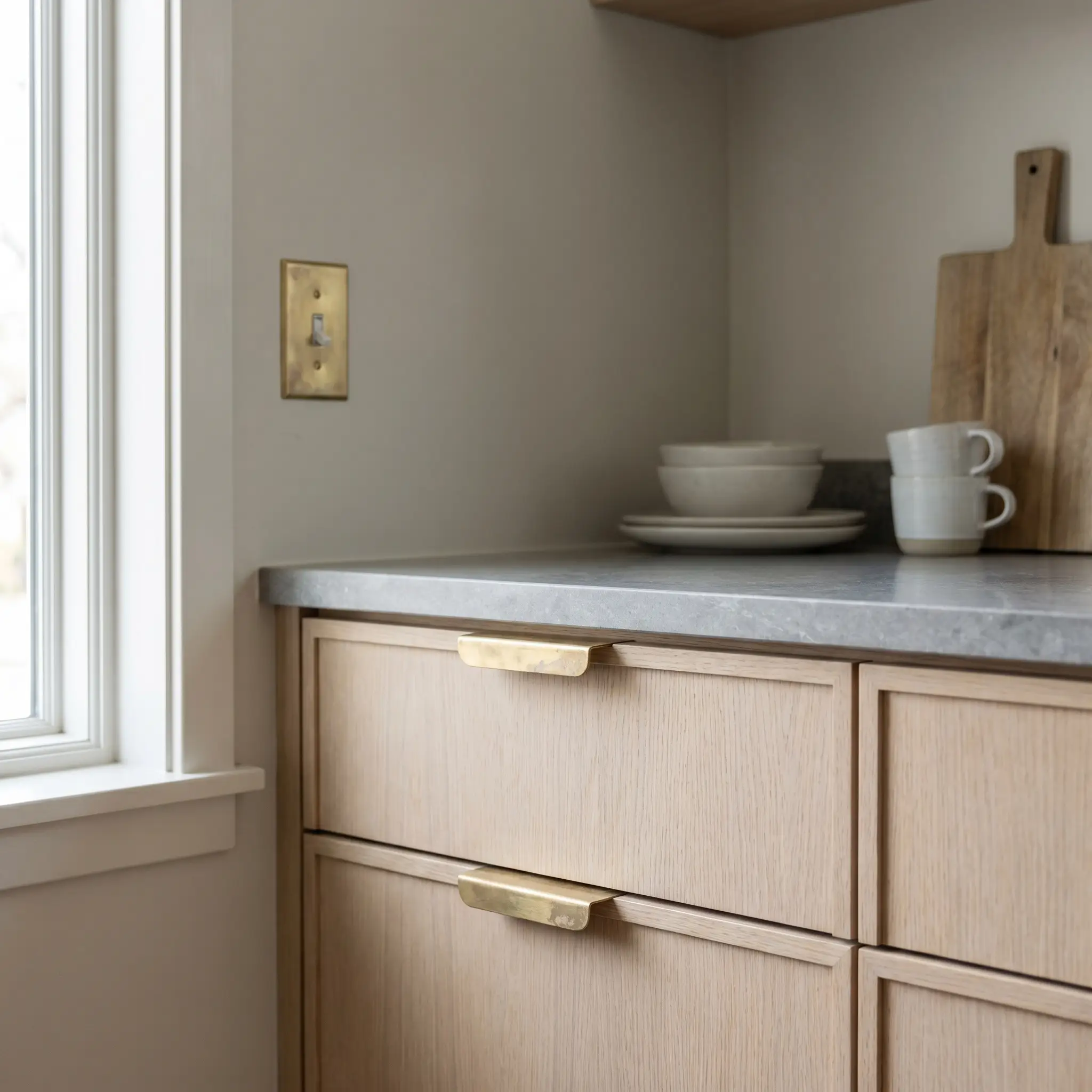
Embracing the wabi-sabi aging process means allowing materials to show the passage of time. Unlacquered Brass catches fingerprints, oxidizes, and darkens, adding an irreplaceable, lived-in soul to the kitchen.
- Vibe: Authentic and evolving.
- Key Material: Raw, Unlacquered Brass switch plates or subtle edge pulls.
- Styling Pro-Tip: Let it age naturally; do not polish it back to a high shine.
Layout & Wabi-Sabi Styling
There is a distinct boundary between intentional styling and accidental clutter. In a highly optimized space, functional items double as the decor, requiring every visible object to earn its placement.
Floating Open Shelving with Restraint
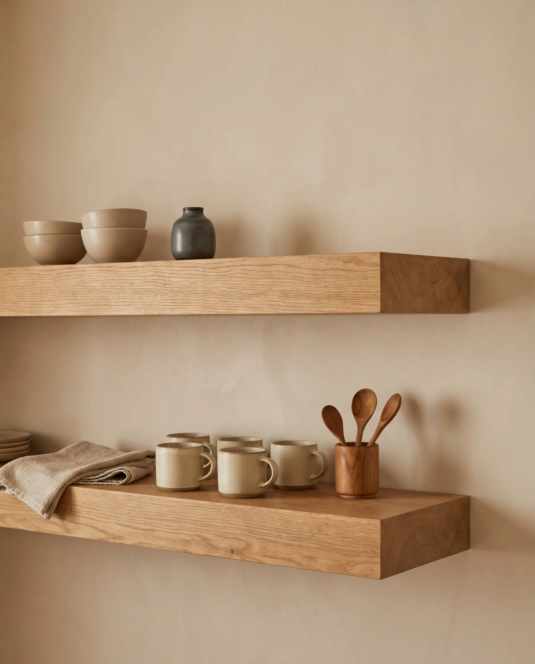
Open shelving is not for bulk storage; it is a display of discipline. The negative space around the objects is just as crucial as the objects themselves, allowing the eye a place to rest.
- Vibe: Curated and breathable.
- Key Material: Two-inch thick rift-sawn oak shelves with concealed heavy-duty brackets.
- Styling Pro-Tip: Limit the color palette of the displayed items to three tonal shades.
Do: Group functional items in odd numbers, relying heavily on sets of three for visual balance.
Don’t: Stack items to the ceiling or push items completely against the back wall; let the pieces breathe.
Handmade Ceramic Tableware Displays
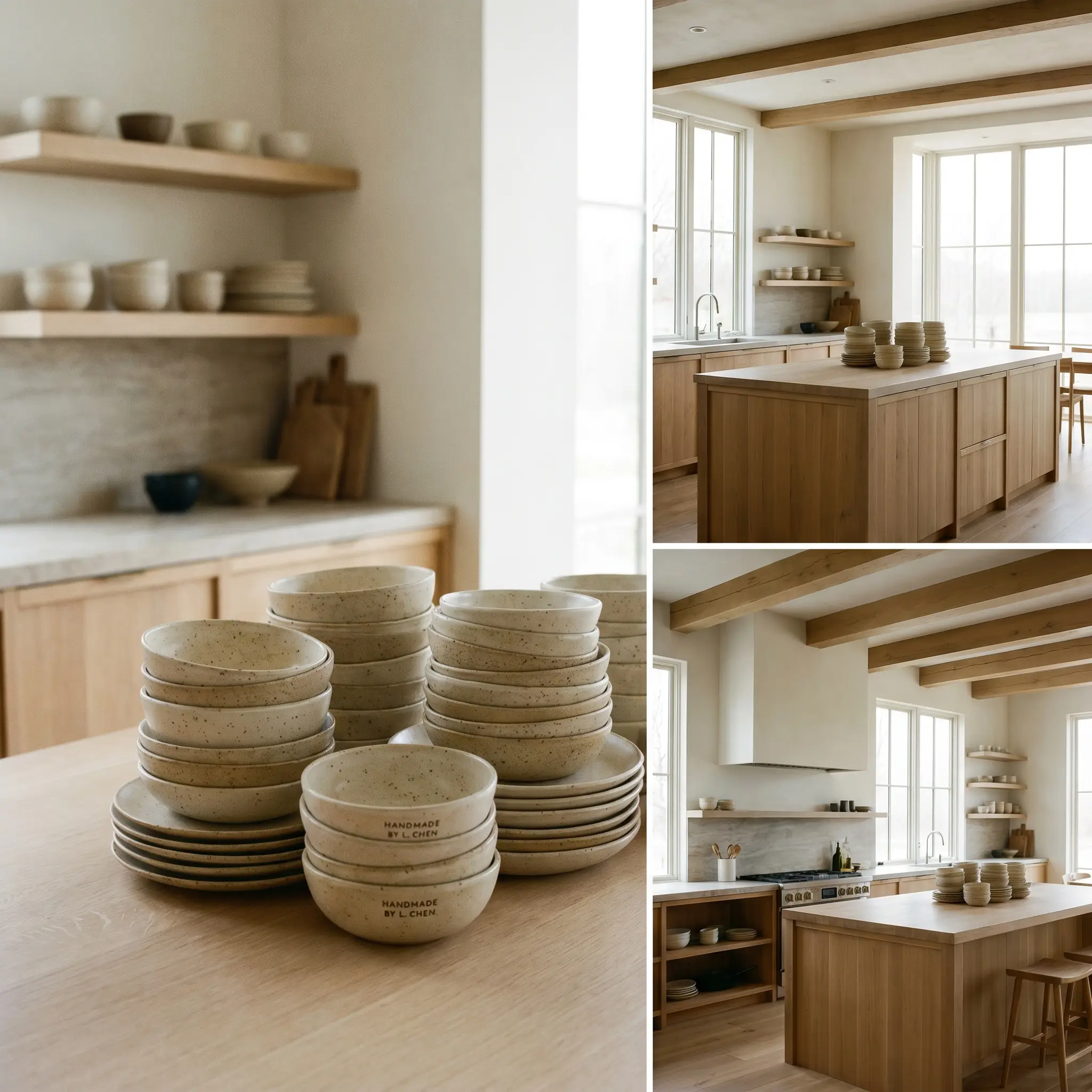
Curate your everyday bowls and plates as functional art. Stacking warm ceramic pieces adds a necessary human touch, grounding the rigorous architectural lines with wabi-sabi irregularity.
- Vibe: Artisan and grounded.
- Key Material: Wheel-thrown stoneware with speckled or matte glazes.
- Styling Pro-Tip: Mix slightly different shades of beige and cream ceramics to create subtle depth.
Biophilic Branch Arrangements
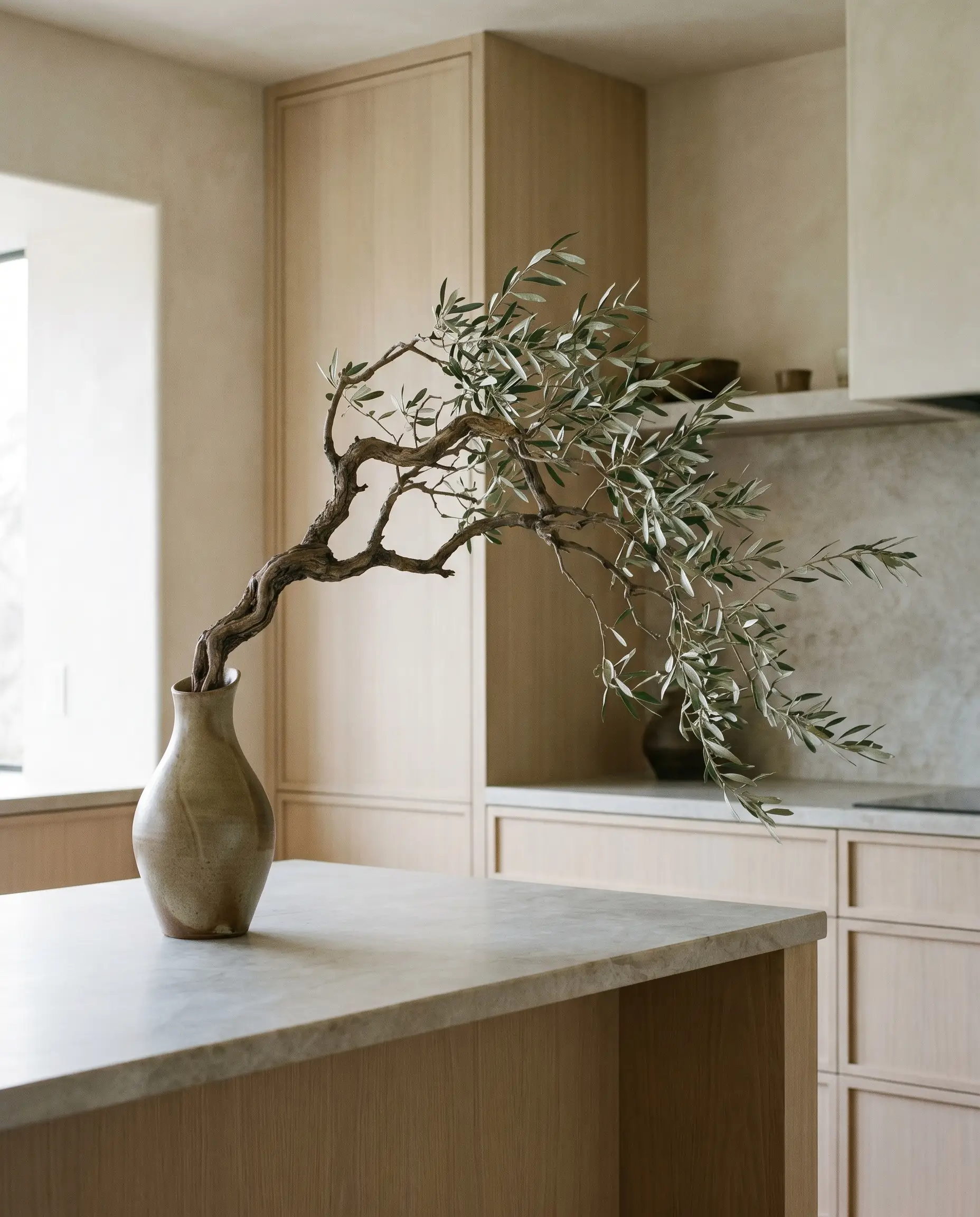
Traditional, highly colorful floral bouquets disrupt the quiet color palette. Forage for a single, structural branch and place it in an asymmetrical vessel to bring the outside in with architectural intention.
- Vibe: Sculptural and organic.
- Key Material: Foraged oak, olive, or cherry blossom branches.
- Styling Pro-Tip: Choose a vessel with a narrow neck to force the branch into a dramatic, sweeping angle.
The Japandi Investment Playbook: Where to Spend vs. Save
Achieving this restorative, minimalist aesthetic requires strategic allocation of your budget. Material restraint is the ultimate goal, but true architectural calm relies on knowing exactly which tactile elements demand premium execution and which components can be sourced affordably without compromising the visual plane.
| Invest Heavy (Bespoke Execution) | Save Smart (Accessible Hacks) |
|---|---|
| Surfaces: Honed stone, leathered travertine, and continuous slab backsplashes dictate the tactile quality of the room. | Cabinet Carcasses: Utilize modular interior boxes (like IKEA) since they are entirely hidden behind the doors. |
| Hardware Fixtures: Heavy, unlacquered brass or solid matte black faucets ensure daily touchpoints feel substantial. | Styling Ceramics: Source imperfect, handmade wabi-sabi stoneware from local artisans or Etsy rather than high-end showrooms. |
| Lighting: High-quality 2700k LED strips and architectural paper lantern pendants define the ambient warmth. | Cabinet Fronts: Leverage aftermarket artisan companies to apply premium rift-sawn oak veneers over budget-friendly frames. |
Apply these principles rigorously to engineer a kitchen that serves as a true retreat from the chaos of modern life. For further layout inspiration and material sourcing, explore our curated gallery of Modern Kitchen Styles to continue refining your space.
The Aesthetics Desk curates the visual direction for Hackrea. Specializing in design history, global architectural movements, and interior styling, this desk focuses on the psychology of space and how to translate high-end, magazine-quality aesthetics into approachable residential design without falling into fleeting micro-trends.