How to Style a Sherwin Williams Accessible Beige Living Room: 15 Elevated Pairings
Sherwin-Williams Accessible Beige (SW 7036) is a legendary, high-performing neutral, but without precise execution, it easily falls flat. With an LRV of 58 and a subtle gray-green base, this chameleon shade can either look like a bespoke, curated backdrop or a muddy relic of 2010 builder-grade housing. Designing a cohesive sherwin williams accessible beige living room requires mastering its undertones, controlling the ambient wash of natural light, and introducing high-contrast textures.
We are not treating this paint as a safe, passive fallback; we are treating it as a dynamic canvas for Organic Modern, Quiet Luxury, and Transitional styling. Here are 15 hyper-specific architectural, lighting, and furniture pairings to completely modernize your Accessible Beige living room.
Architectural & Paint Execution Strategies
Before arranging a single piece of furniture, you must establish the foundational boundaries of the room. The right ceiling, trim, and floor pairings anchor the space, preventing the walls from feeling disconnected. Here is how to construct the perfect architectural base.
Color-Drench the Baseboards for a Seamless Transitional Look
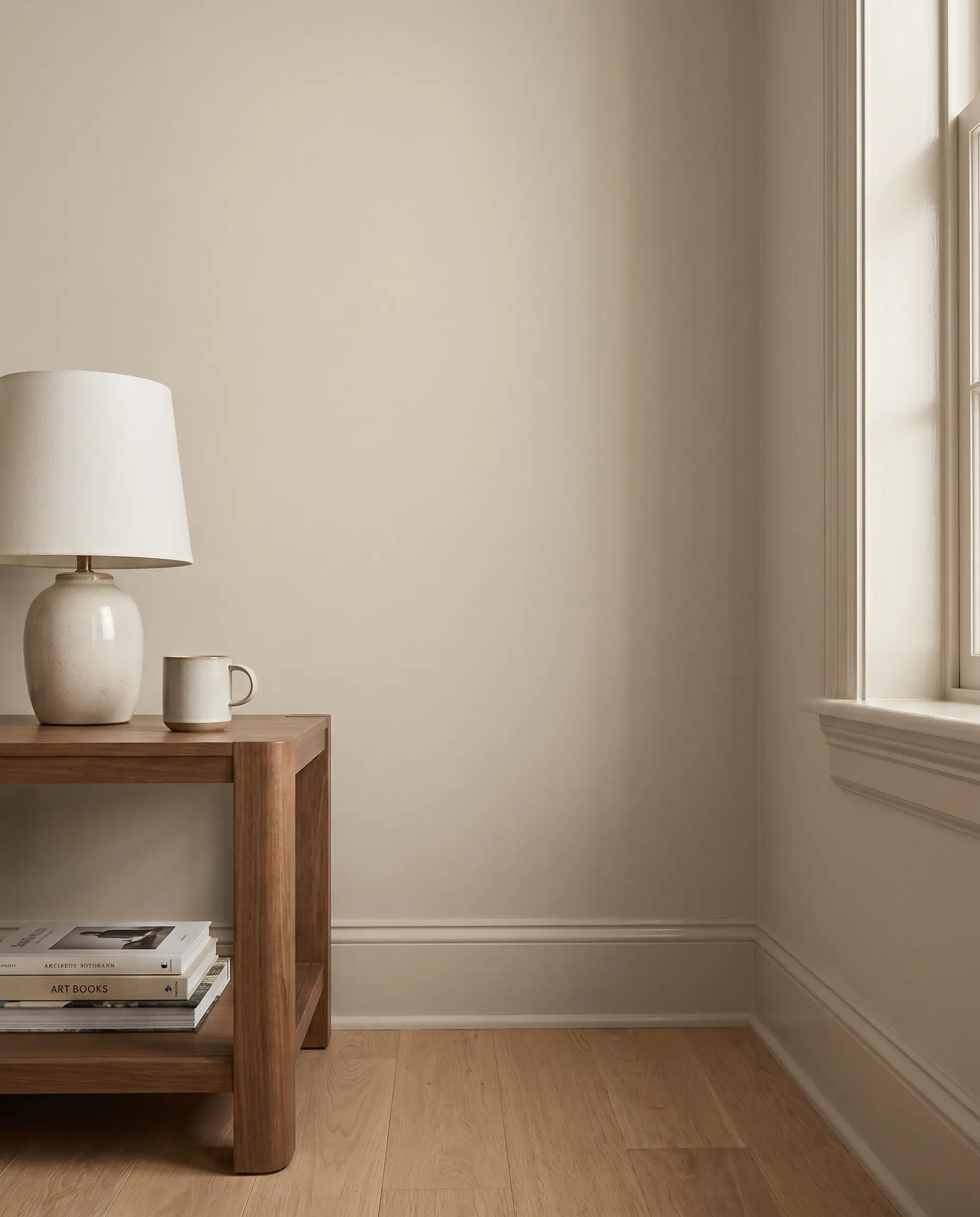
Painting the baseboards and window casings the exact same color as your walls creates an unbroken, Quiet Luxury aesthetic. This modern monochromatic technique eliminates sharp visual breaks, tricking the eye into perceiving much taller ceilings.
- Vibe: Quiet Luxury, Modern Transitional
- Key Technique: Color-Drenching
- Paint Match: SW Accessible Beige (SW 7036)
When color-drenching baseboards, shift to a satin finish to reflect floor lighting, leaving the walls in a flat finish for depth.
Designer Pairing Insight
Frame the Room with SW Pure White (SW 7005) Crown Molding
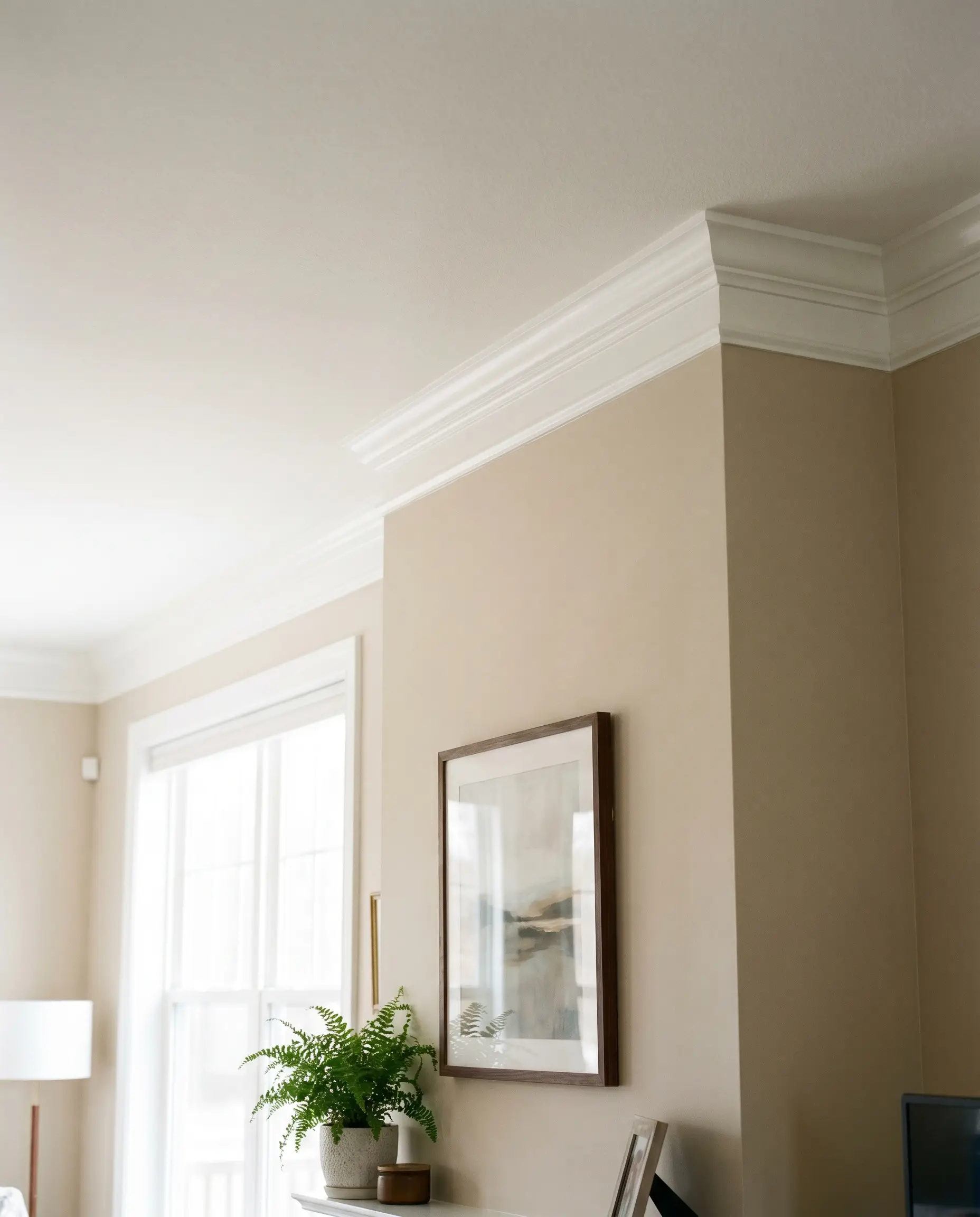
For those who prefer a crisp, traditional boundary, SW Pure White offers a highly reflective, neutral frame. It cleanly separates the ceiling from the walls without pulling out the yellow or green undertones hidden within the greige base.
- Vibe: Crisp, Modern Traditional
- Trim Paint Match: SW Pure White (SW 7005)
- Application Tip: Apply in a semi-gloss finish to maximize light bounce around the perimeter of the room.
Soften the Contrast with SW Alabaster (SW 7008) Trim
If your goal is a warm, California Casual aesthetic, the creamy undertones of Alabaster melt beautifully into Accessible Beige. Rather than a stark white line, this pairing creates a soft, organic transition between the wall and the architectural details.
- Vibe: Organic Modern, California Casual
- Trim Paint Match: SW Alabaster (SW 7008)
- Pure White vs. Alabaster:
- Choose Pure White for sharp, high-contrast framing and modern interiors.
- Choose Alabaster for a softer, tonal transition in earth-toned or organic spaces.
Anchor the Space with Rift-Sawn White Oak Flooring
Accessible Beige thrives alongside the muted, ashy tones and subtle grain of white oak. The natural texture of the wood provides the necessary grounding effect without competing with the warmth of the walls.
- Vibe: Attainable Luxury, Organic Modern
- Key Material: Rift-Sawn White Oak
- Styling Pro-Tip: Use a matte, water-based polyurethane sealer to prevent the wood from yellowing over time.
Avoid cherry or mahogany floorings; the red undertones will immediately pull an unwanted green cast out of Accessible Beige.
Undertone Warning
You can apply wallpapers, paints, etc. on walls and see how they look in various interiors.

Strategic Lighting & Undertone Control
Directional light dictates how color behaves in a room. Before selecting fabrics, you must understand how the sun’s exposure shifts the LRV and undertone of your walls throughout the day.
| Light Direction | Effect on SW 7036 | Styling Countermeasure |
|---|---|---|
| North-Facing | Pulls out cool gray and green shadows. | Add warm ambient fixtures and amber tones. |
| South-Facing | Washes the room in warm, traditional beige. | Filter light with natural woven window treatments. |
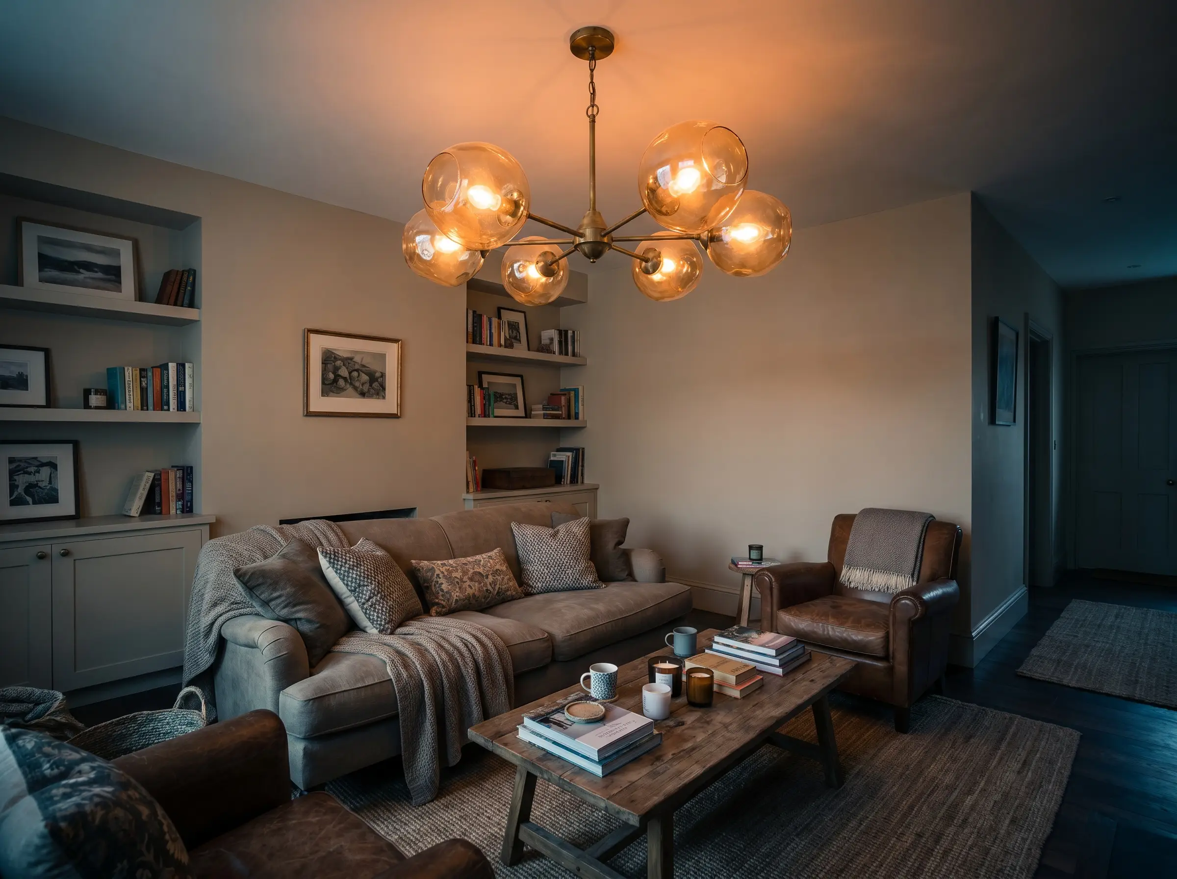
Install 3000K LED Bulbs to Neutralize Green Shadows
Precision lighting is non-negotiable. Standard 2700K bulbs will make Accessible Beige look muddy and overly yellow, while commercial 4000K bulbs will render it sterile and flat. 3000K provides the perfect warm, clean wash to keep the color true to its swatch.
- Ambient Lighting Spec: 3000 Kelvin (Warm White)
- Application: Recessed overhead lighting, floor lamps, and sconces.
- Dimmer Compatibility: Ensure all LED fixtures are paired with a dimmer switch to control the wash intensity at night.
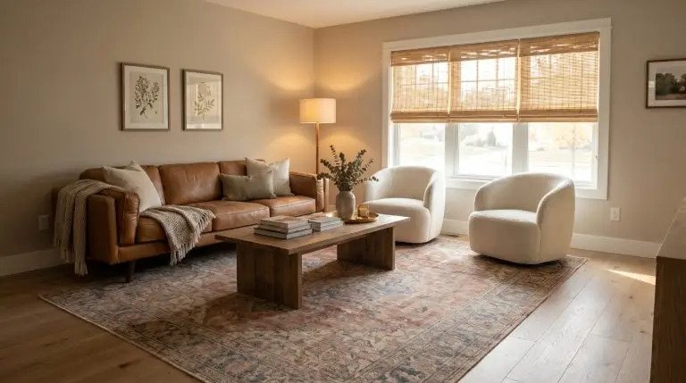
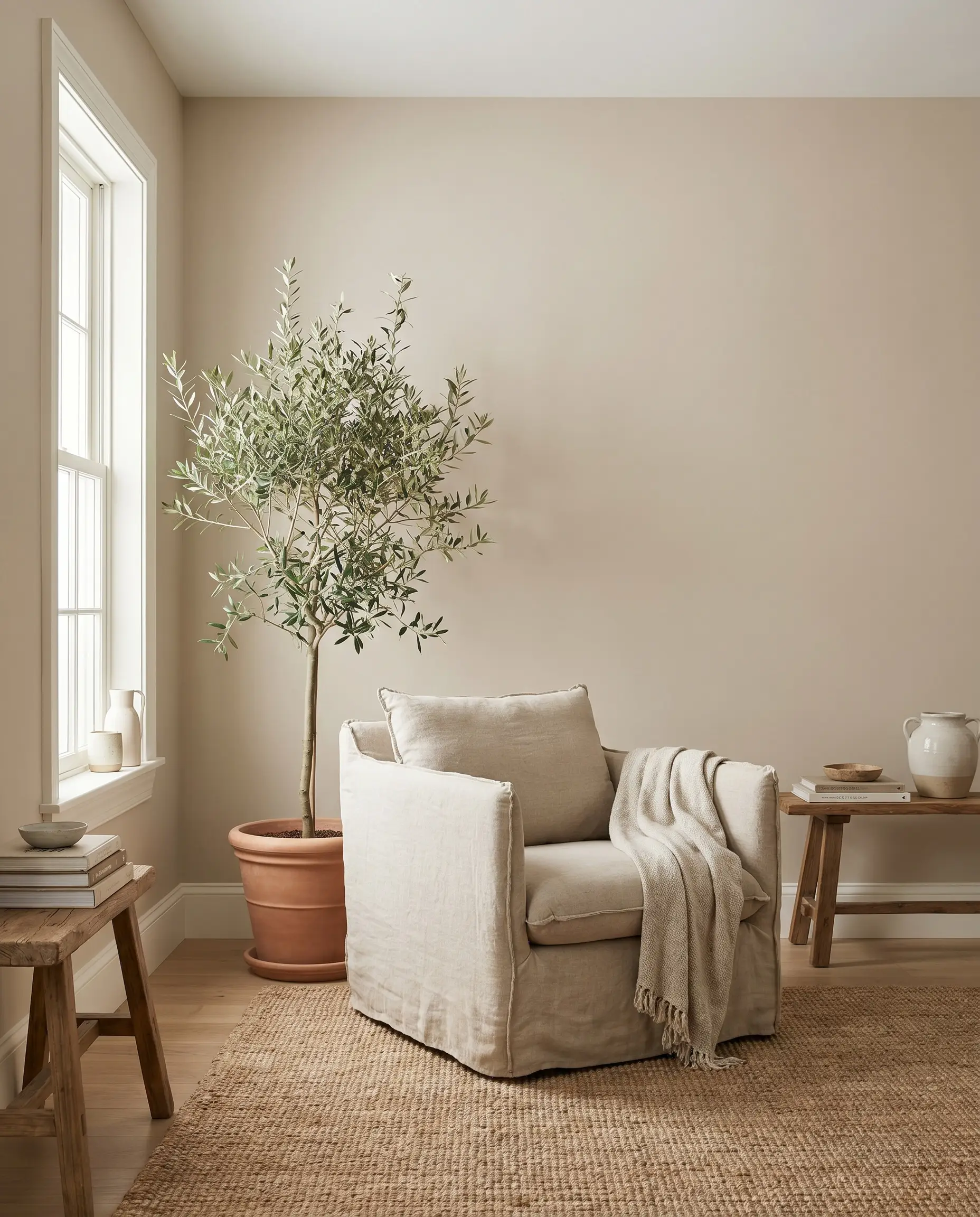
Maximize South-Facing Light with Woven Bamboo Shades
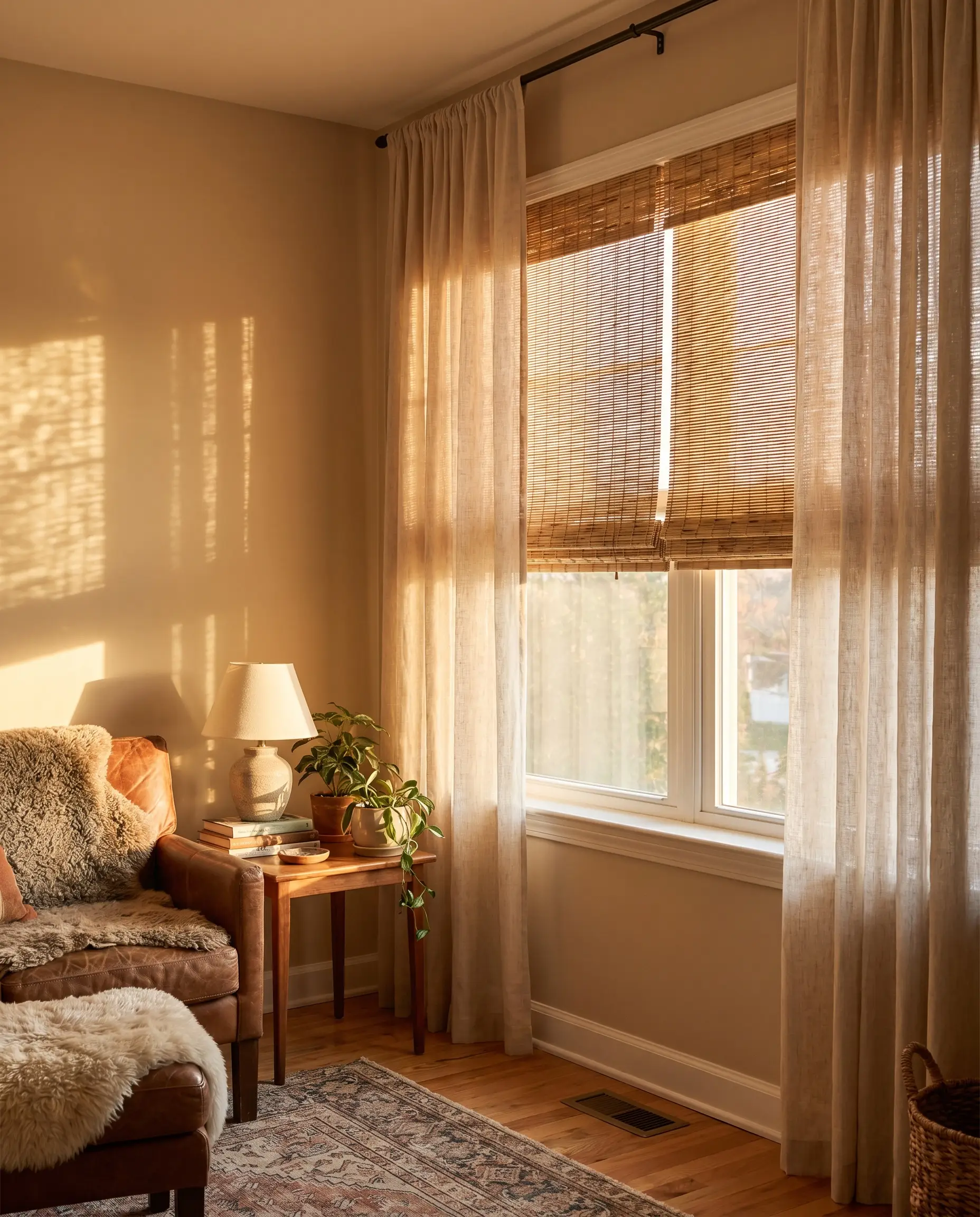
South-facing rooms flood the space with a warm wash, causing the paint to lean heavily toward a traditional beige. Counteract this intensity by adding textural, unlined natural woven bamboo shades to filter the light and introduce an Organic Modern edge.
- Window Treatment: Unlined natural woven bamboo or rattan shades
- Vibe: California Casual, Earthy
- Styling Pro-Tip: Inside-mount the woven shades and frame the outside with light-filtering linen drapes.
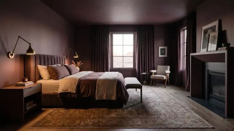
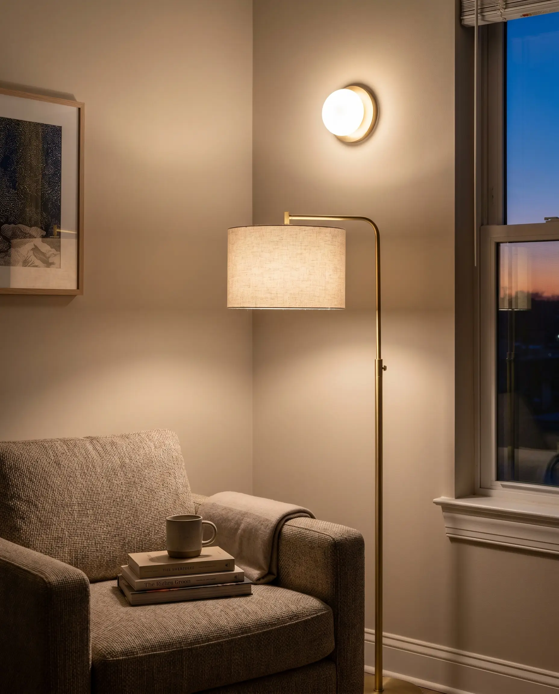
Offset Cool North-Facing Light with Amber Glass Pendants
North-facing light inherently pulls the chilly gray and subtle green out of this paint. Combat the cold shadows by introducing warm ambient sources, letting the sensory glow of amber glass or brass-based table lamps radiate against the matte walls.
- Fixture Material: Amber blown glass, aged brass
- Placement: Central chandelier or oversized table lamps.
- Vibe: Moody, Curated Transitional
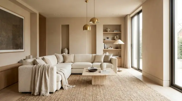
Furniture & Texture Pairings for Accessible Beige
To avoid the dreaded “beige box” effect, your furnishings must provide high-contrast texture and varying visual weights. Because Accessible Beige is a mid-tone neutral, layering tactile fabrics and sharp metallic finishes is essential.
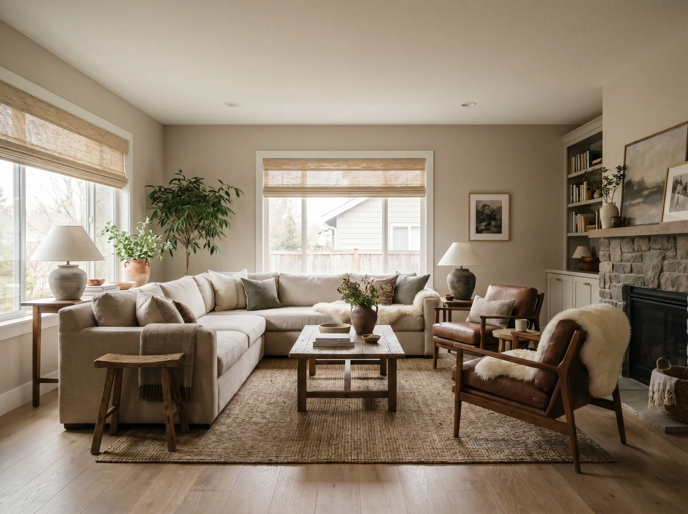
Introduce Cognac Leather Sofas to Pull Warm Tones
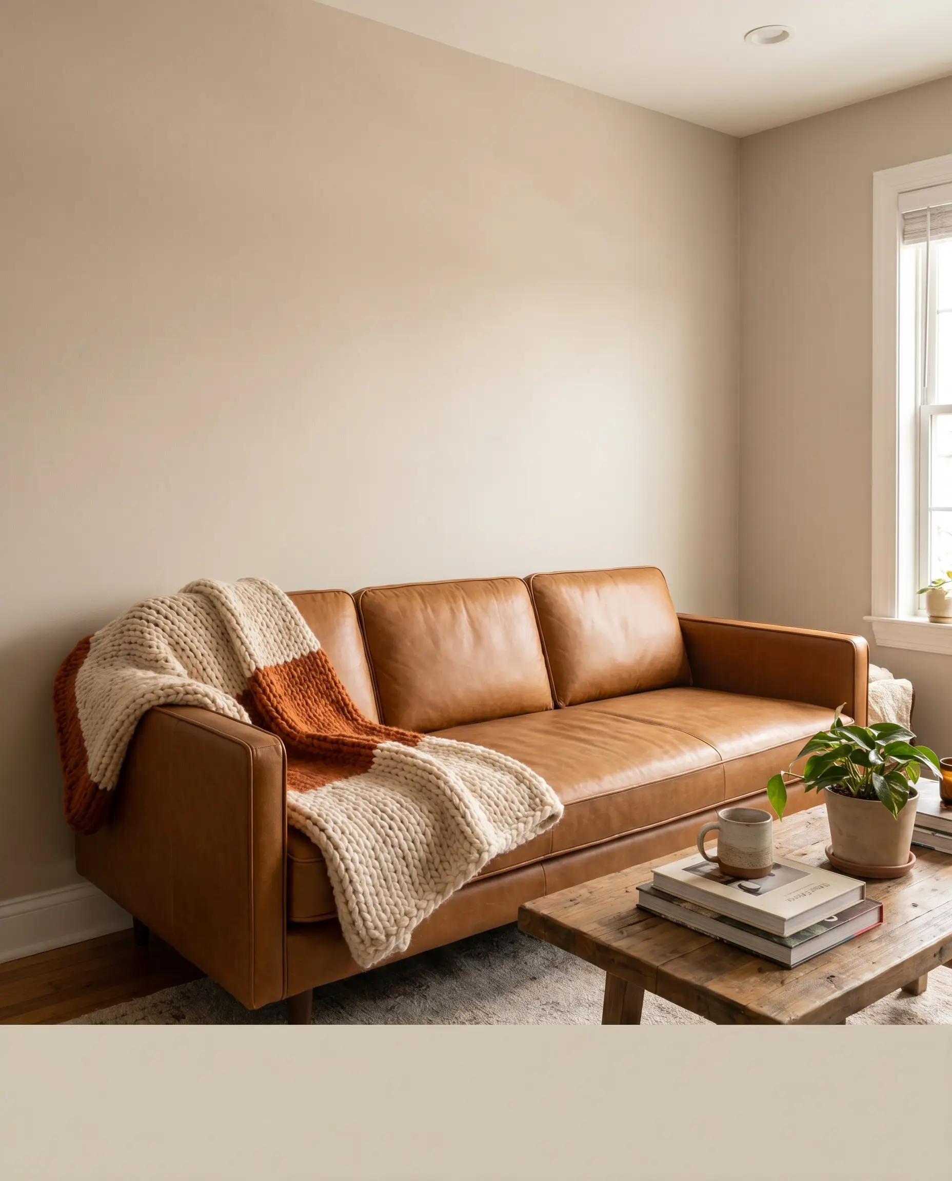
A rich cognac or camel leather sofa serves as the perfect grounding element for the room. The earthy orange and brown tones of the leather contrast beautifully against the cooler greige base, providing immediate warmth.
- Key Material: Top-grain cognac leather
- Furniture Silhouette: Low-profile, clean-lined, modern track arms
- Styling Pro-Tip: Soften the leather seating by draping a chunky knit wool throw over the armrest.
Punctuate the Softness with Matte Black Iron Fixtures
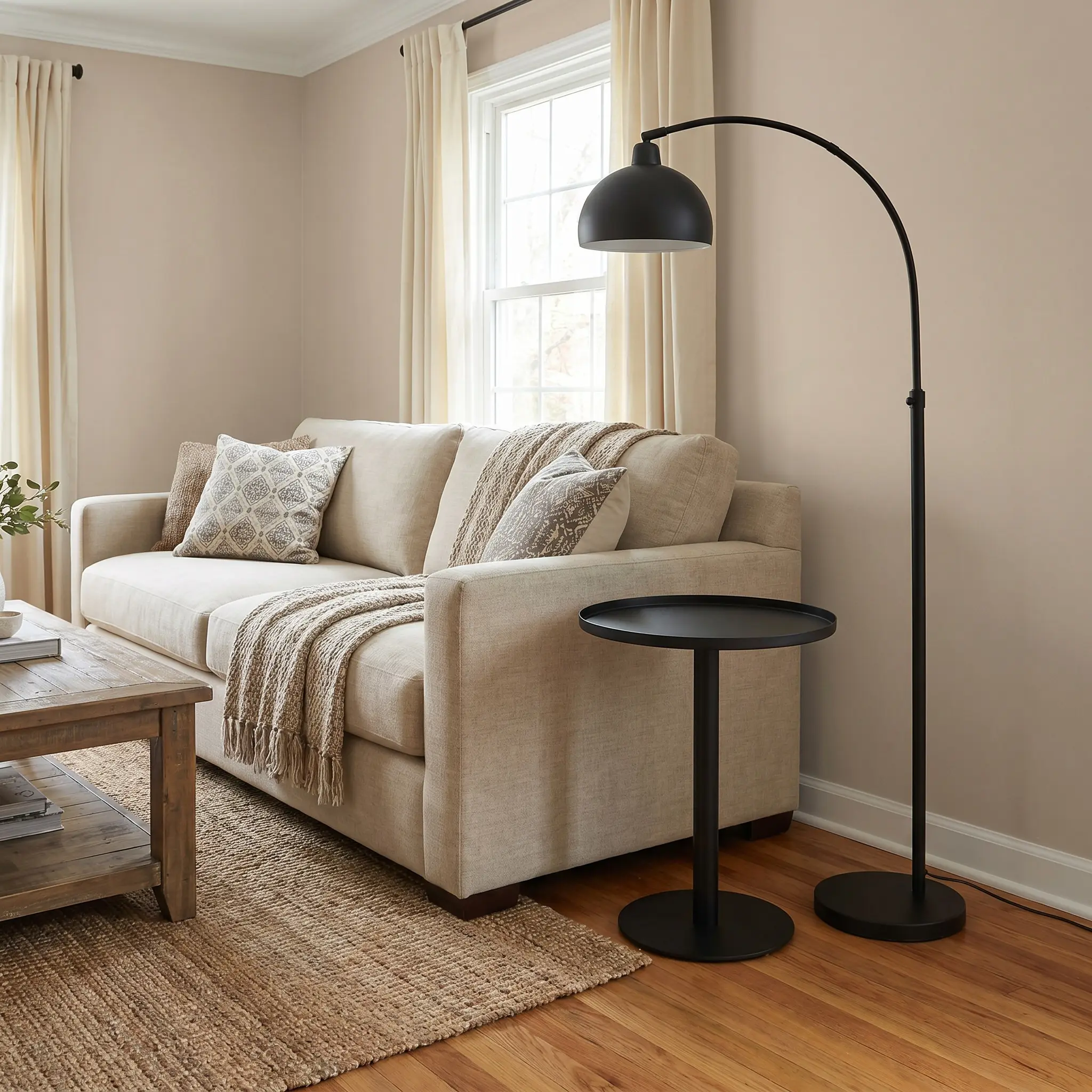
To prevent the room from feeling overwhelmingly soft or overly traditional, introduce sharp, matte black accents through curtain rods, side table frames, or lighting hardware. This creates a decisive, Transitional edge that anchors the eye.
- Hardware Finish: Matte black iron or powder-coated steel
- Vibe: Modern Transitional, High-Contrast
- Application: Drapery hardware, floor lamp stems, and coffee table bases.
Follow the 80/20 rule of visual weight: keep 80% of the room rooted in soft, warm neutrals, and use 20% stark matte black for grounding contrast.
Designer Pairing Insight
Layer Creamy Bouclé Accent Chairs for Tactile Depth
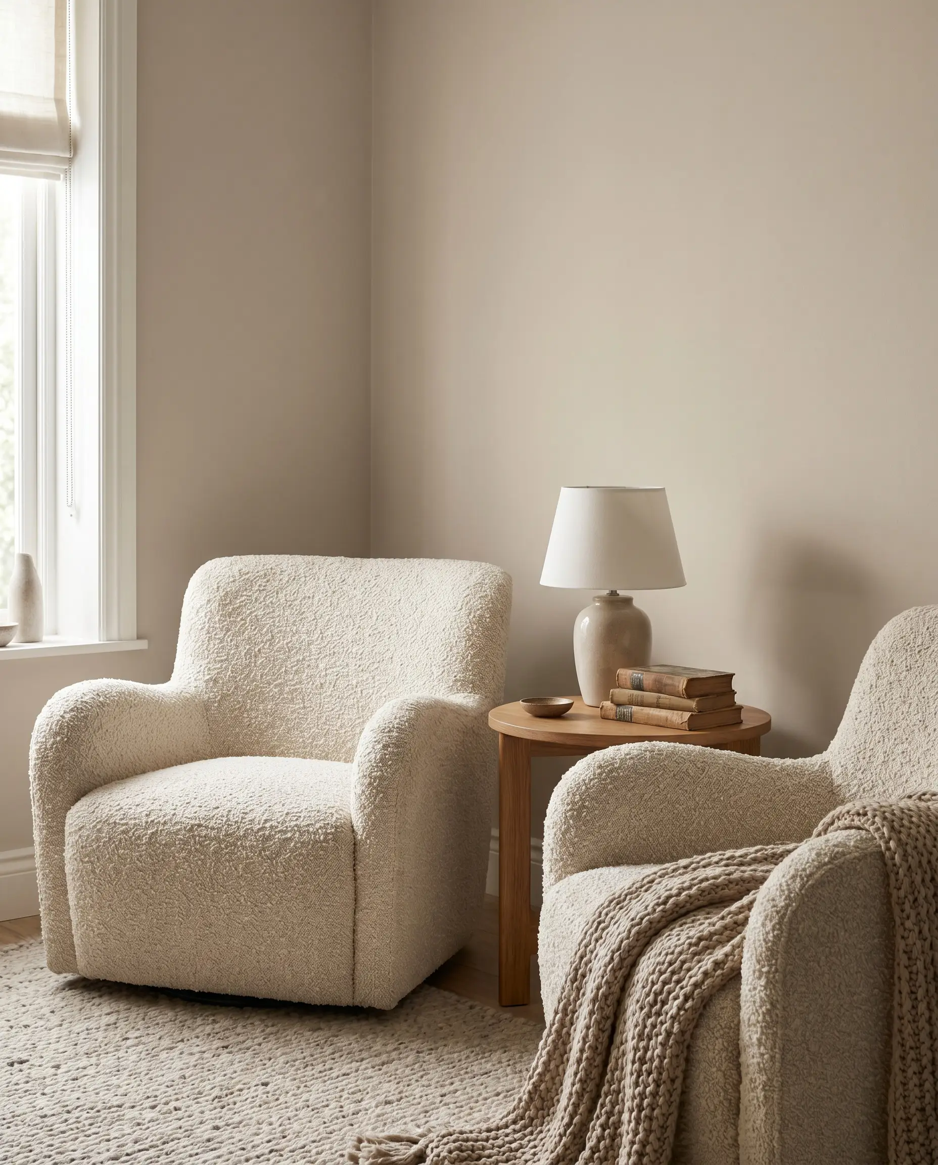
Bring in heavily textured fabrics in a shade slightly lighter than the walls, such as ivory or cream. The tactile experience of bouclé or shearling creates immense visual depth without relying on chaotic, busy patterns.
- Fabric Recommendation: Ivory bouclé or faux shearling
- Pairing Tip: Place twin bouclé accent chairs opposite the cognac leather sofa for a balanced material contrast.
- Vibe: Accessible Luxury, Tactile Warmth
Ground the Seating Area with a Faded Vintage Turkish Rug
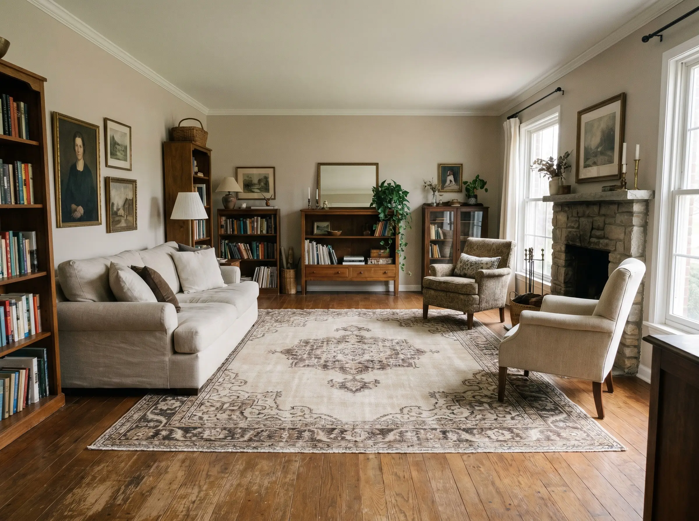
Tie the wall color to your flooring by deploying a muted, distressed rug that incorporates creams, subtle mochas, and faded charcoals. The distressed finish adds historical character while respecting the muted palette of the room.
- Rug Style: Faded or distressed vintage Turkish
- Color Palette: Creams, mochas, and washed-out charcoals
- Styling Pro-Tip: Ensure the rug is large enough that the front legs of all major seating pieces rest entirely on it.
Elevated Accent Color Combinations
Accessible Beige is a highly versatile foundation, but it performs best when paired with organic, nature-inspired hues rather than sharp primary colors.
| Accent Color | Vibe | Where to Apply |
|---|---|---|
| Olive Green | Earthy, Sophisticated | Throw pillows, oversized ceramics |
| Charcoal Gray | Moody, High-End | Built-in cabinetry, fireplaces |
| Terracotta | Mediterranean Warmth | Coffee table books, small vases |
| Slate Blue | Coastal Transitional | Drapery panels, accent seating |
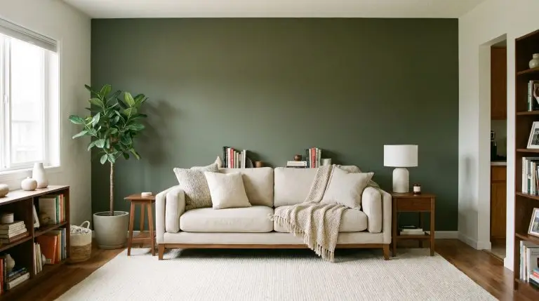
Weave in Deep Olive Green Velvet Pillows
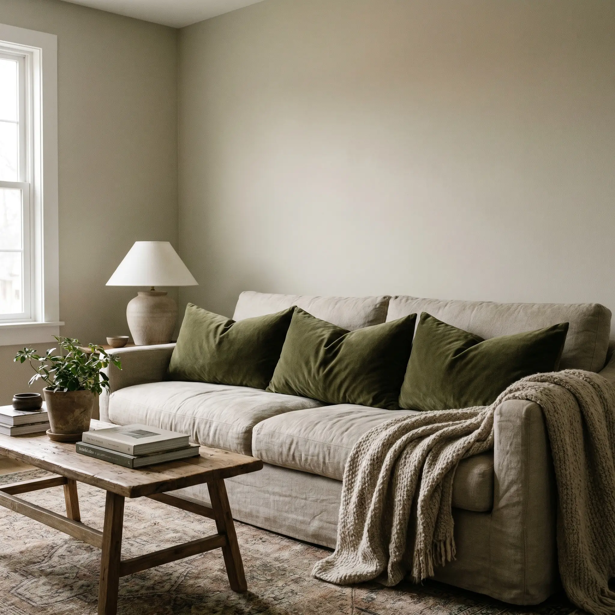
Olive green naturally complements the slight green undertone hidden deep within Accessible Beige. Introducing this color via rich, heavy textiles creates a cohesive, earthy, and highly sophisticated palette.
- Accent Color: Deep Olive Green
- Material: Heavy cotton velvet
- Application: Lumbar pillows or heavy drape panels.
Contrast the Walls with Charcoal Gray Built-In Cabinetry
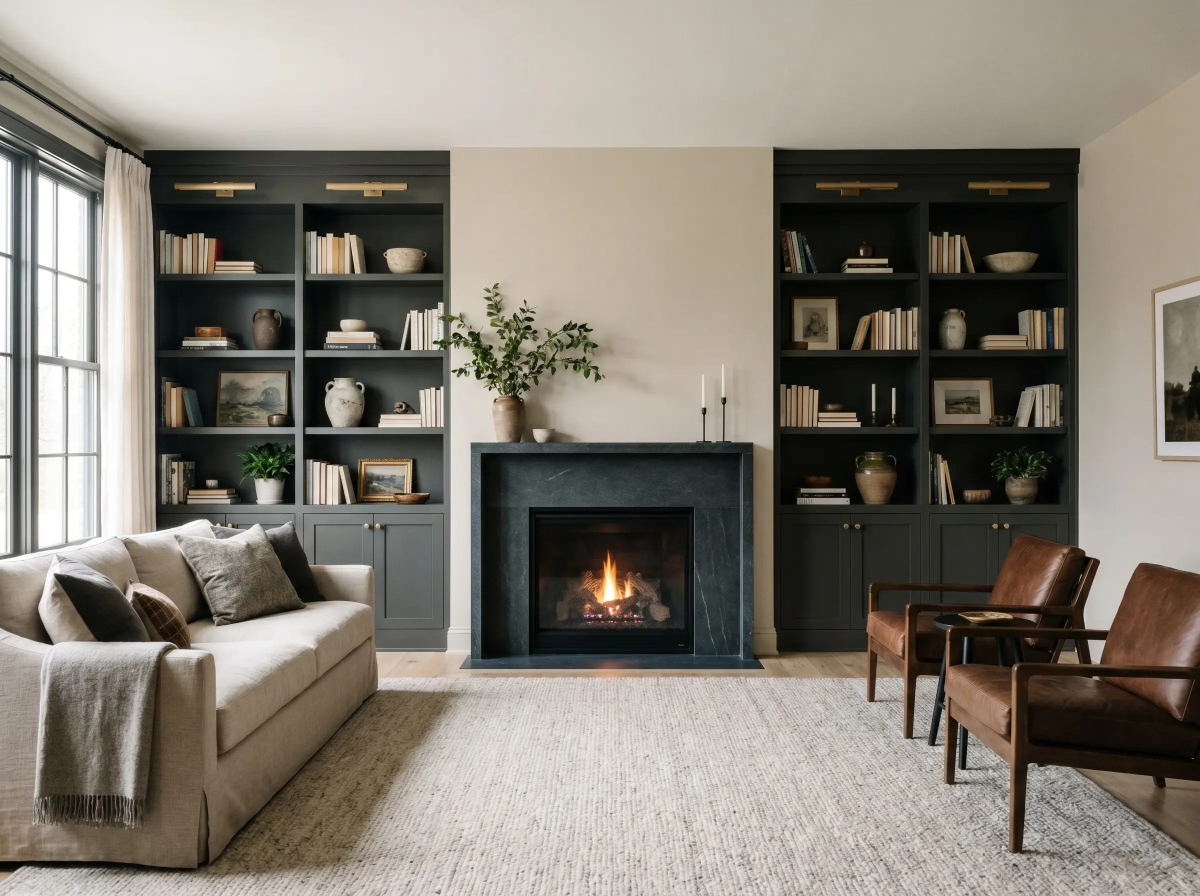
For a moody, high-end grounding effect, paint your living room built-ins or fireplace mantle a deep charcoal. This stark, dark focal point creates a stunning architectural contrast against the LRV 58 walls.
- Paint Match: SW Iron Ore (SW 7069)
- Application: Millwork, bookcases, or media consoles.
- Finish Recommendation: Satin or semi-gloss for durability and subtle light reflection.
Introduce Muted Terracotta Ceramics for Earthy Warmth
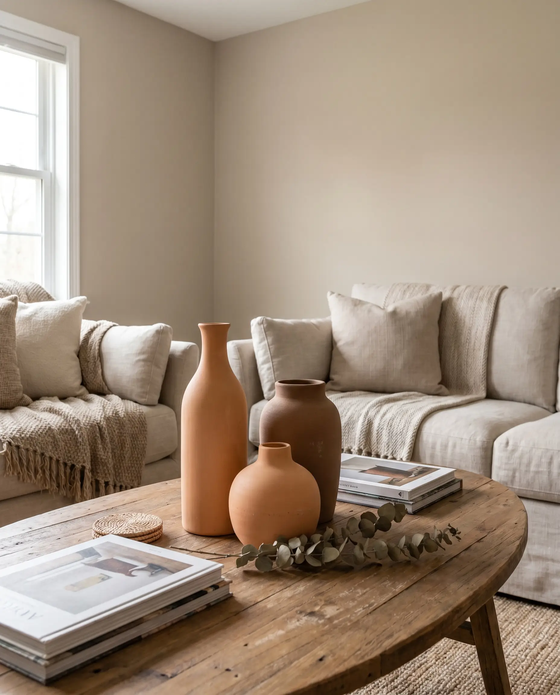
Small styling objects bring a subtle Mediterranean heat to the room without overwhelming the greige walls. Muted terracotta ceramics provide a highly tactile, organic variation in color.
- Accent Material: Unglazed, muted terracotta
- Placement: Coffee table styling, bookshelf micro-accessories, or structural vases.
- Styling Pro-Tip: Cluster terracotta vases in groups of three, varying their heights for visual balance.
Pair with Soft Slate Blue Drapes for a Coastal Nod
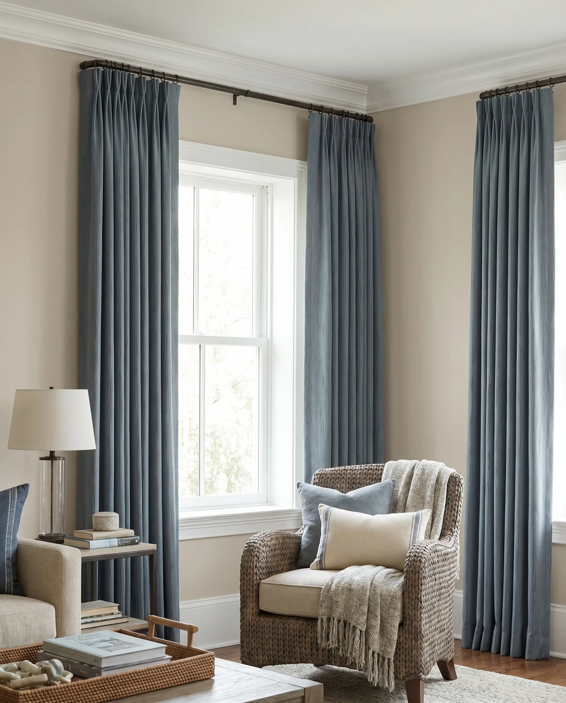
For a more traditional or coastal-transitional aesthetic, muted slate blues look incredibly sophisticated against the warm greige background. The key is ensuring the blue is heavily muted with gray so it does not clash.
- Accent Color: Muted Slate Blue
- Application: Floor-to-ceiling pinch-pleat drapes.
- Styling Pro-Tip: Hang the drapery rod directly below the crown molding to maximize the perceived height of the room.
The Accessible Beige Execution Strategy
Sherwin-Williams Accessible Beige will only perform as well as the lighting, textures, and architectural details surrounding it. Before you commit to a full-room application, paint large swatches on multiple walls and observe how your specific directional light shifts the undertones from morning to dusk. Once you understand the light, you can confidently deploy the right trim, the correct wood flooring, and the perfect high-contrast furnishings to anchor your space.
Ready to finalize your architectural base? Read our complete guide on the best trim colors for greige walls to perfectly frame your next project.
The Hackrea Style Desk treats interior decoration as an exact visual science. Rather than focusing on demolition or floor plans, this desk masters the art of color theory, undertone matching, material pairings, and spatial proportion. From balancing the visual weight of mixed metals to finding the perfect bridging tone between disparate wood species, this desk provides the rigorous aesthetic rules needed to achieve high-end, editorial-quality harmony in any space.