You have excellent taste. Selecting Benjamin Moore’s Pale Oak (OC-20) for your sleep space signals a desire for sophisticated, accessible luxury. However, this legendary warm taupe is notoriously a chameleon color, shifting its appearance entirely based on the natural light pouring through your windows and the textiles you place against it. The fear of undertone surprise—painting an entire room only to watch the afternoon shadows turn your walls a faint lavender—is a very real, very common design hurdle.
A flawless Benjamin Moore pale oak bedroom requires precise execution. We are going to break down the exact chemistry of this complex greige, teaching you how to manipulate its undertones through strategic window orientation, precise architectural trim pairings, and highly intentional textile layering. This is your definitive guide to mastering Pale Oak.
The Technical Blueprint: Mastering Pale Oak in a Sleep Space
Great interior design relies heavily on the chemistry of color before a single piece of furniture enters the room. Understanding the structural realities of your paint’s Light Reflectance Value (LRV) and undertone behavior is the crucial first step to controlling the final aesthetic.
1. Manipulate the Undertones Based on Bedroom Window Direction
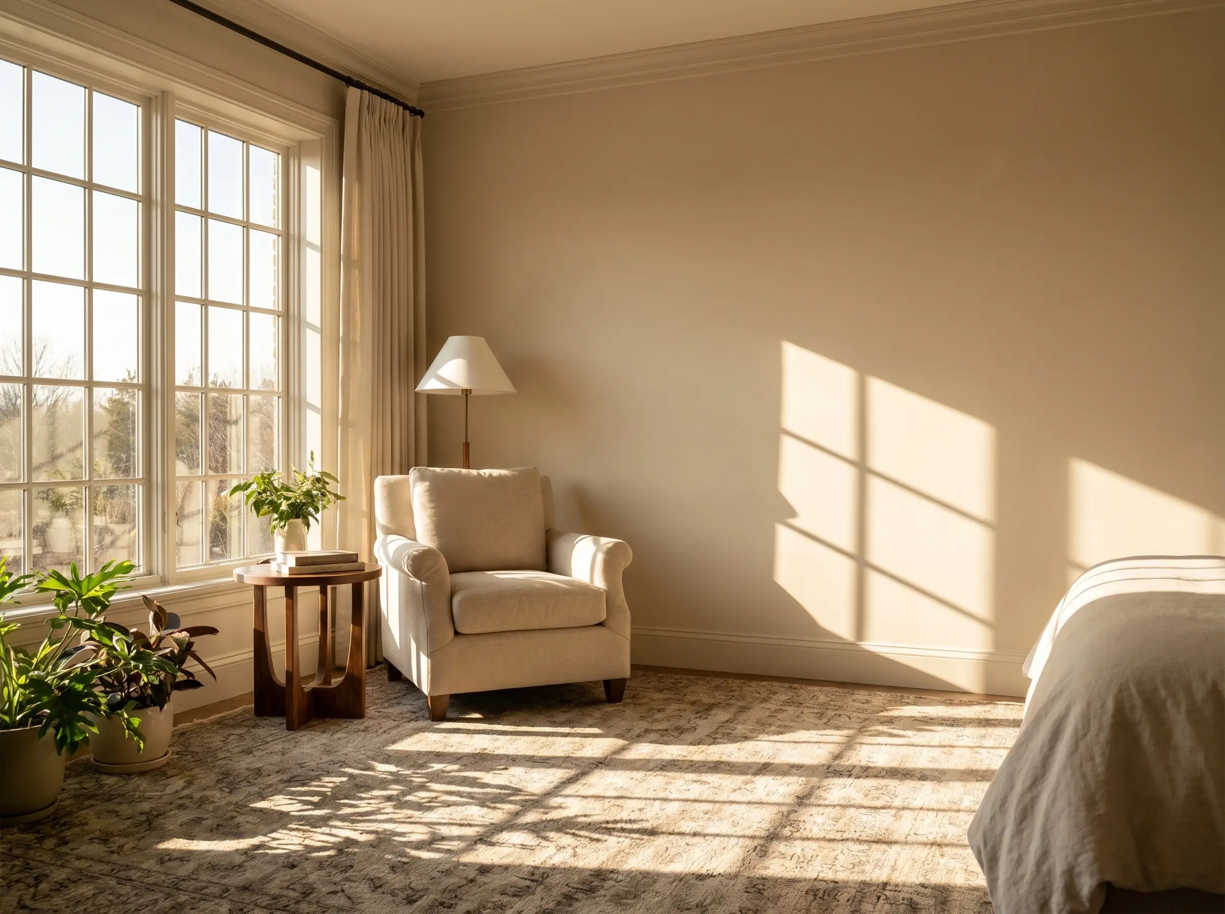
Pale Oak carries an LRV of roughly 68.64, placing it firmly in the light-to-medium greige category, but its complex taupe base reacts drastically to directional sunlight. To prevent unwanted color shifts, you must adapt your styling expectations based on the exact orientation of your windows.
- North-Facing Rooms (Cool Light): The cool, slightly blue natural light will neutralize the warmth in Pale Oak, pulling it toward a grayer tone and occasionally flashing a subtle pink or lavender undertone.
- South-Facing Rooms (Warm Light): The intense, golden natural light will pull out the creamy, rich taupe qualities of the paint, making the room feel noticeably warmer and more traditional.
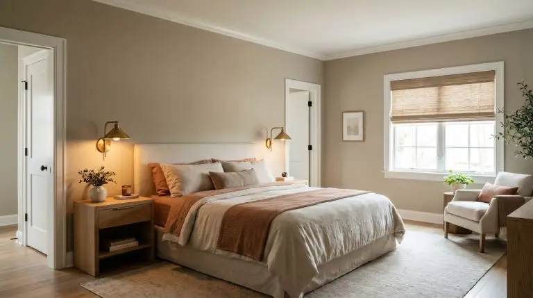
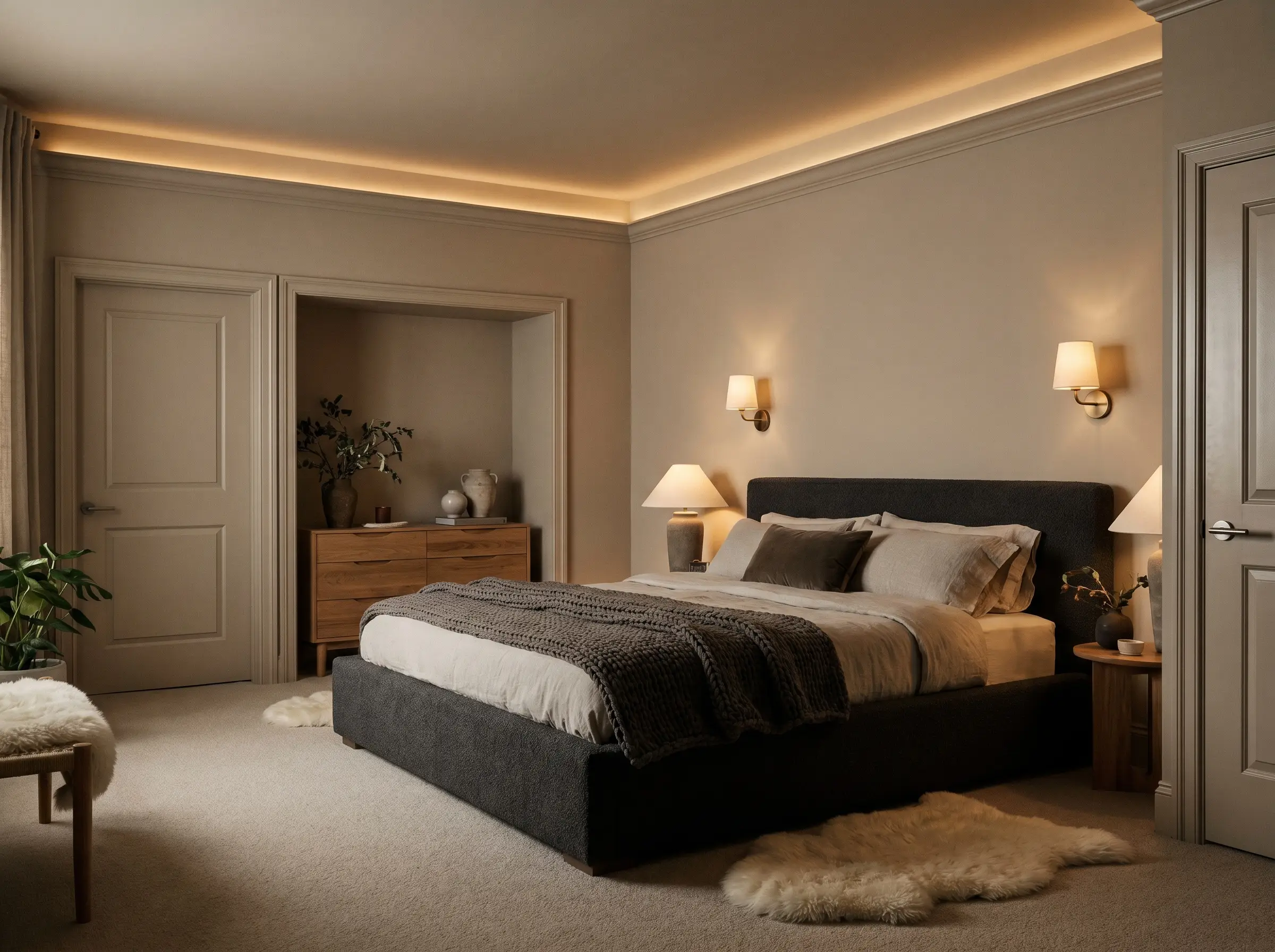
2. Warm Up the Room with 2700K Artificial Lighting
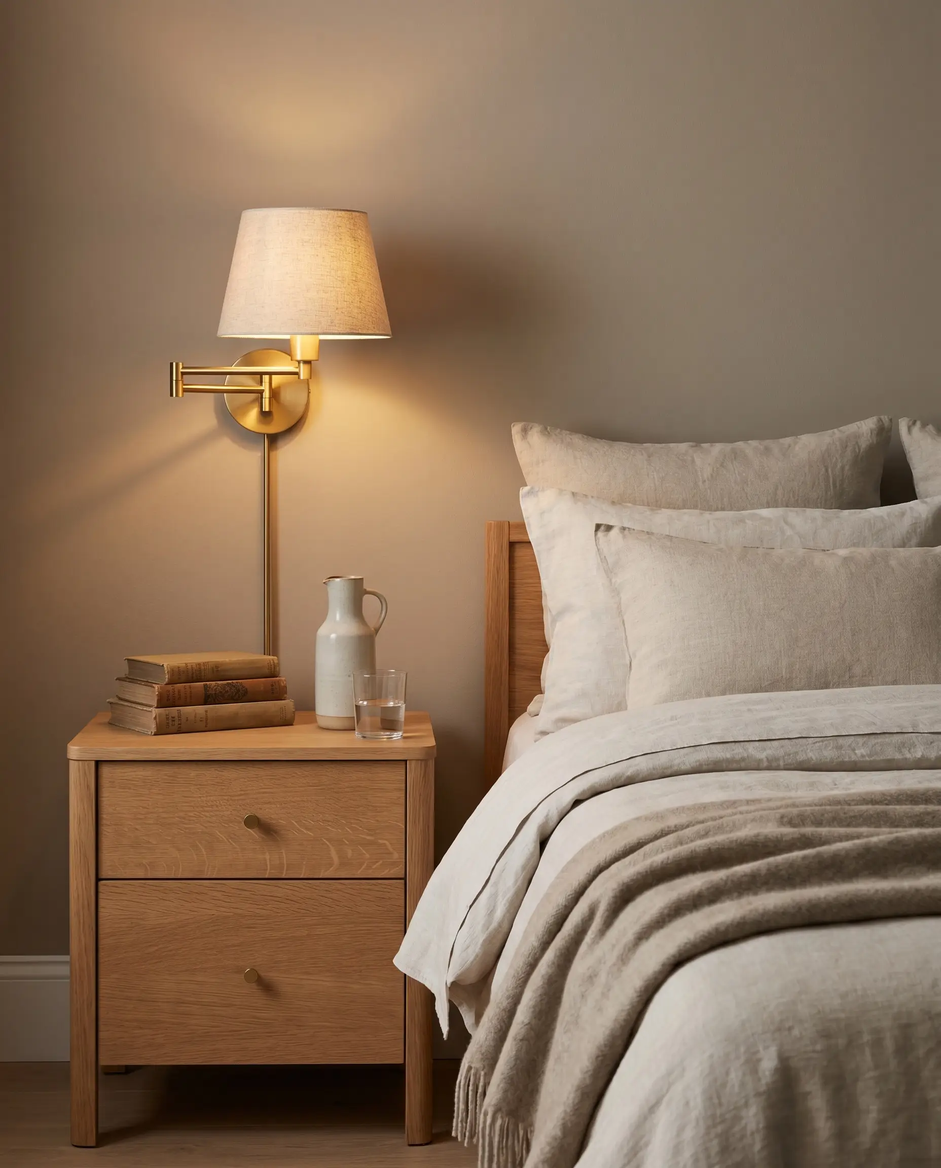
Because bedrooms function primarily at night, your artificial lighting plan dictates the success of your wall color. You must control the ambient environment by sticking strictly to warm, inviting color temperatures in your bedside lamps and wall sconces.
Avoid using cool daylight bulbs (4000K+) with Pale Oak, as the harsh blue light will instantly kill the warmth of the taupe, flattening the color and creating a sterile, clinical environment.
Designer Warning
- Vibe: Intimate, restorative, and professionally layered.
- Key Hardware: Unlacquered brass dimmable sconces.
- Bulb Specification: 2700K LED bulbs (Mandatory for warm taupe walls).
- Styling Pro-Tip: Use linen lamp shades to further diffuse the light and cast a soft, golden glow against the greige paint.
You can apply wallpapers, paints, etc. on walls and see how they look in various interiors.

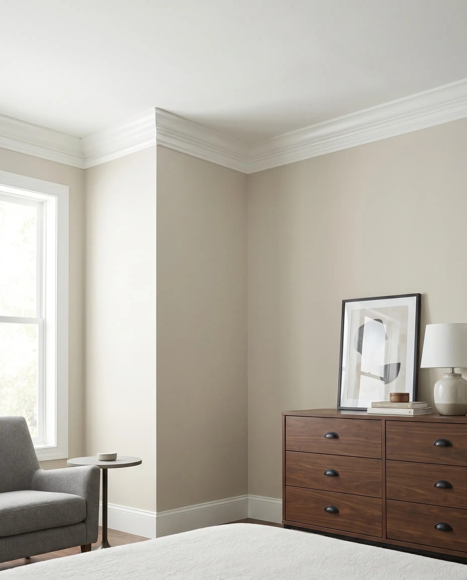
Architectural Trim & Ceiling Combinations for Pale Oak
A wall color is only as strong as the architectural trim framing it. The exact shade of white you choose for your baseboards, crown molding, and ceiling will directly dictate whether your bedroom leans crisp and modern or soft and earthy.
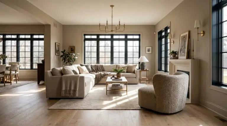
3. Crisp Contrast: Frame the Room with Chantilly Lace (OC-65)
For a sharp, modern transitional aesthetic, Benjamin Moore’s Chantilly Lace provides a definitive clean border. Because it carries virtually no distinct undertones, this pure white creates a striking, high-contrast frame that makes the greige walls pop cleanly without clashing.
- Vibe: Modern Transitional, tailored, and crisp.
- Trim Paint Recommendation: Benjamin Moore Chantilly Lace (OC-65).
- Finish Match: Satin or semi-gloss for baseboards; flat for the ceiling.
- Styling Pro-Tip: Pair this high-contrast trim with matte black hardware to heighten the contemporary edge.
4. Soft & Seamless: Pair with White Dove (OC-17) Trim
If your goal is a highly cohesive, organic modern retreat, you need a trim color that bridges the gap rather than creating a stark line. White Dove carries a faint hint of gray and yellow in its base, which harmonizes beautifully with the taupe in Pale Oak.
- Vibe: Earthy, soft traditional, and deeply restorative.
- Trim Paint Recommendation: Benjamin Moore White Dove (OC-17).
- Key Materials: Washed linen curtains and woven wood Roman shades.
- Styling Pro-Tip: Carry White Dove onto the ceiling to envelop the room in a gentle, warm glow.
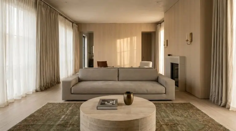
5. The Color Drenching Technique: Paint Trim and Walls Identically
Removing visual breaks entirely is a high-end architectural application that makes small bedrooms feel expansive and ceilings feel taller. By painting the walls, trim, and doors the exact same color, you envelop the room in a continuous, tactile layer of warmth.
- Vibe: High-end bespoke, moody, and deeply immersive.
- Wall Finish: Benjamin Moore Pale Oak in a Matte or Flat finish.
- Trim & Door Finish: Benjamin Moore Pale Oak in a Satin or Semi-Gloss finish.
- Styling Pro-Tip: The subtle sheen difference between the matte walls and satin trim provides just enough architectural definition without breaking the continuous color plane.
Furniture & Material Pairings to Anchor the Room
Greige walls absolutely require textural friction to survive. If every piece of furniture in the room is smooth and perfectly neutral, the space will immediately degrade into a generic, lifeless hotel room.
6. Ground the Space with Rift-Sawn Oak or Walnut Nightstands
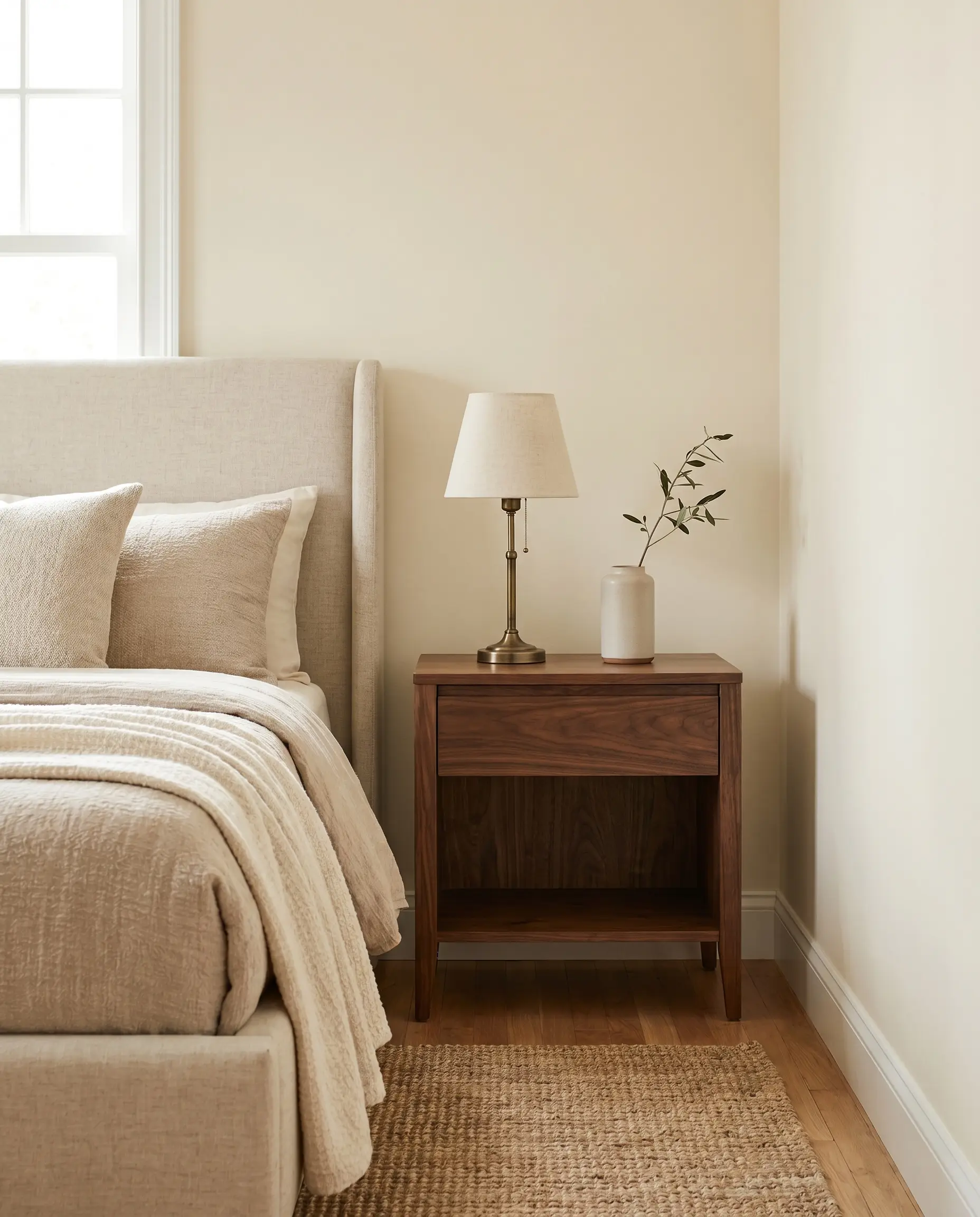
Pale Oak thrives when paired with mid-tone woods that possess a strong, visible grain profile. The natural friction of rift-sawn white oak leans perfectly into a Belgian minimalist aesthetic, while rich walnut grounds the room for a classic transitional feel.
- Vibe: Organic Modern to Classic Transitional.
- Wood Match: Rift-sawn white oak or solid walnut.
- Material Warning: Strictly avoid reddish woods like cherry or mahogany, which aggressively clash with Pale Oak’s taupe base.
- Styling Pro-Tip: Select nightstands with open shelving to keep the visual weight light against the pale walls.
7. Introduce Unlacquered Brass Sconces and Hardware
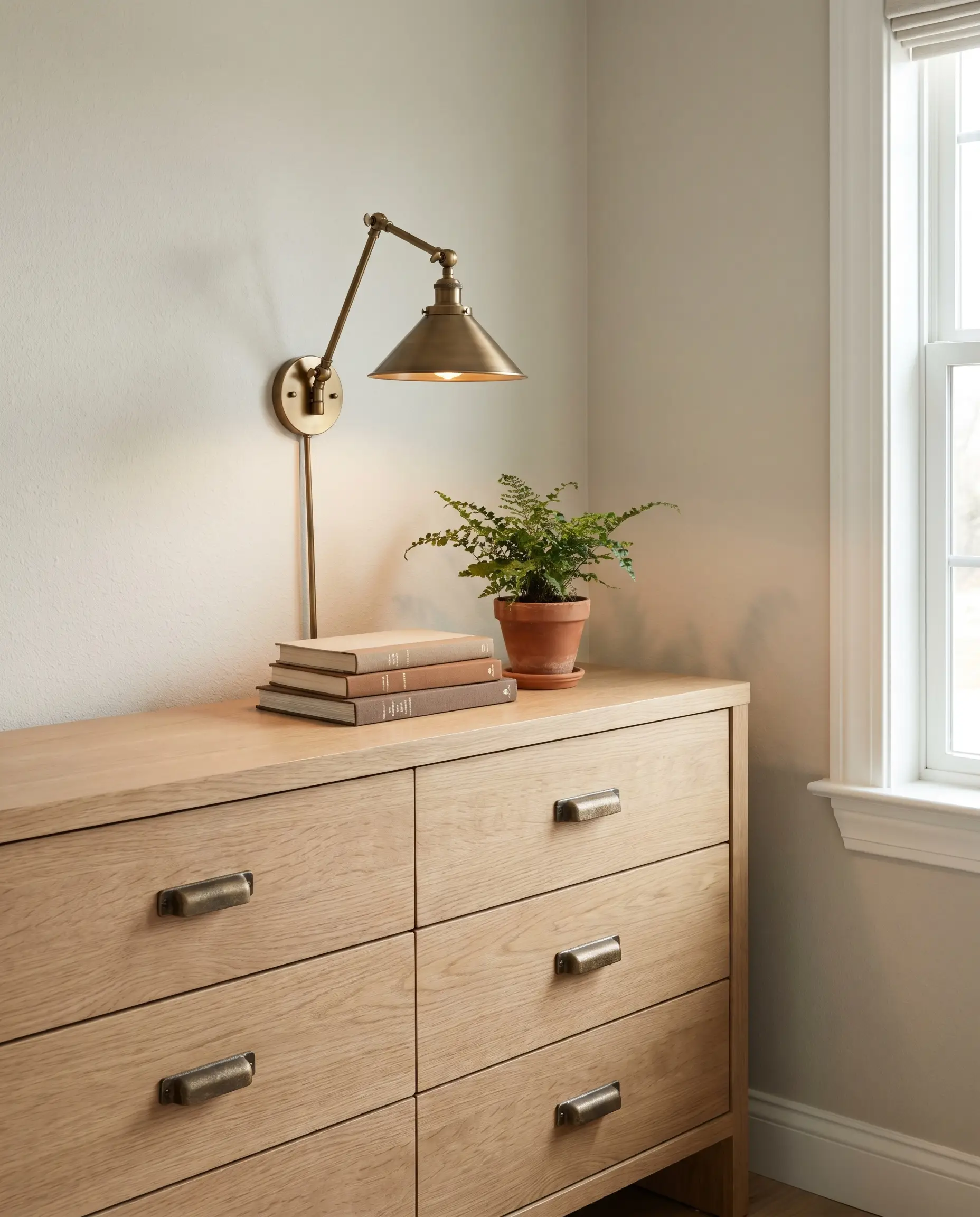
The living finish of unlacquered brass pulls out the subtle elegance and warmth of a greige background flawlessly. As the brass patinas over time, it adds a layer of authentic, aged character that prevents the room from feeling overly sterile.
- Vibe: Heritage luxury and refined warmth.
- Hardware Match: Unlacquered or aged brass drawer pulls and sconces.
- Key Materials: Heavy cast brass, avoiding cheap, shiny gold plating.
- Styling Pro-Tip: Mount articulating brass reading sconces directly into the Pale Oak drywall for a custom, built-in aesthetic.
8. Anchor with Matte Black Curtain Rods and Accents
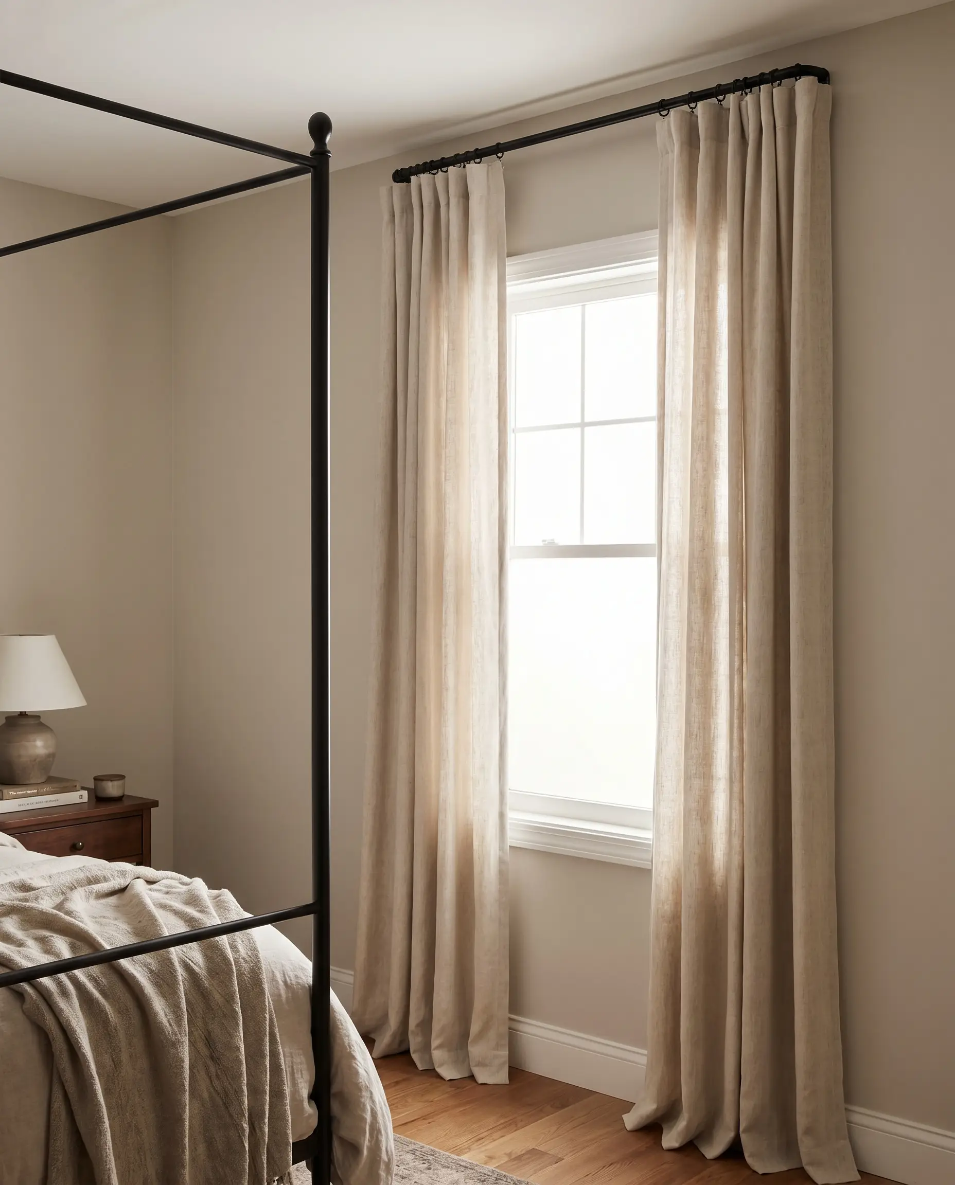
Every neutral room requires a touch of black for necessary spatial weight. Introducing thin, matte black metal accents acts as an anchor, preventing the light walls and soft textiles from visually floating away.
Think of matte black as the eyeliner of your bedroom; you only need a thin, precise application to define the room’s features.
Hackrea Styling Tip
- Vibe: Grounded, tailored, and expertly balanced.
- Key Hardware: Matte black French-return curtain rods.
- Secondary Accents: Thin black metal picture frames or a black iron bed frame.
- Styling Pro-Tip: Keep the black accents spindly and delicate to avoid overwhelming the soft taupe walls.
9. Choose Oatmeal or Charcoal Upholstered Bed Frames
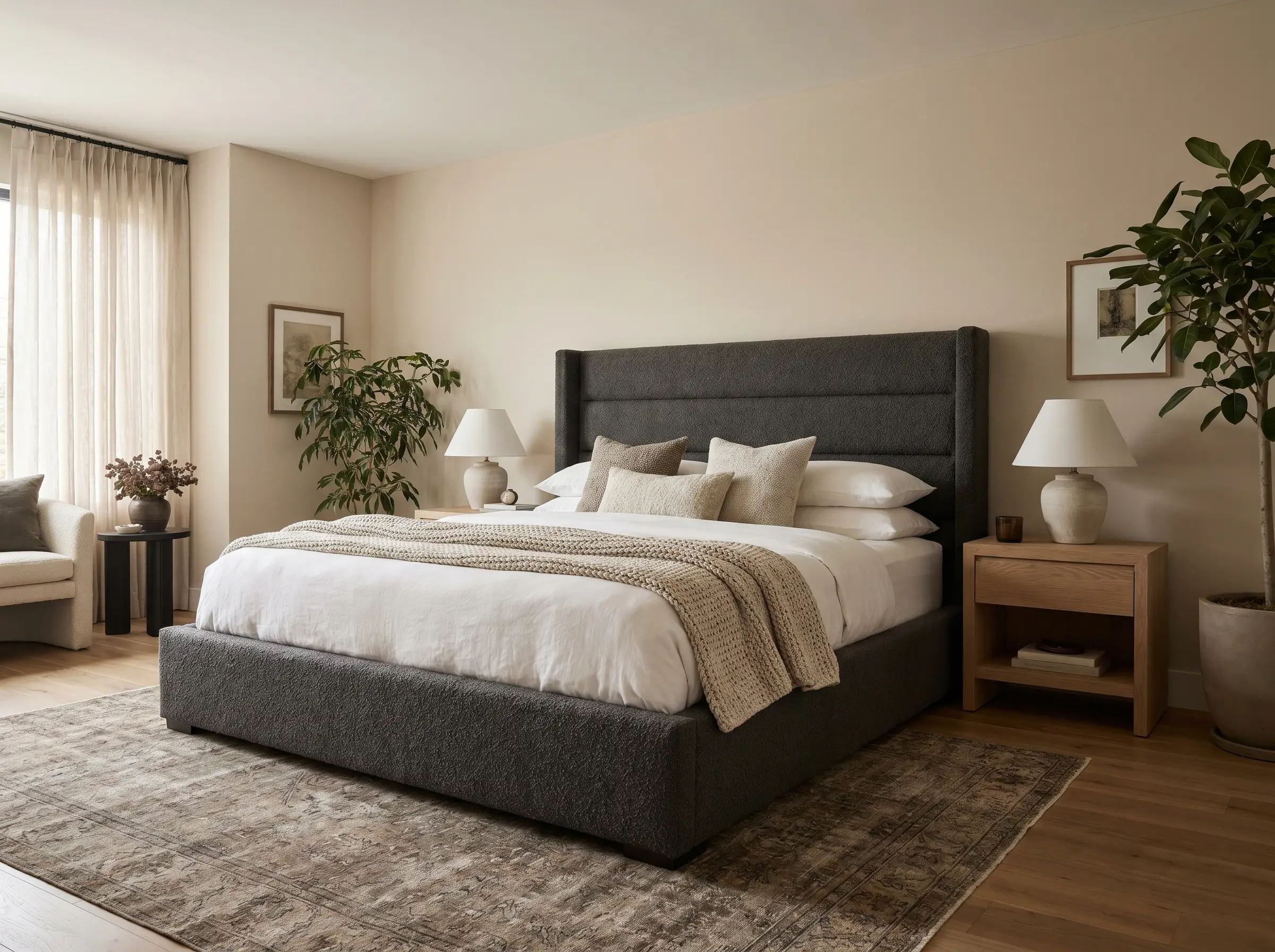
Your bed is the largest geometric shape in the room, making its fabric choice critical to the overall color palette. An oatmeal linen establishes a low-contrast, tonal environment, while a deep charcoal bouclé creates a striking, moody focal point.
- Vibe: Tonal serenity or high-contrast drama.
- Fabric Match (Low Contrast): Oatmeal or flax-colored washed linen.
- Fabric Match (High Contrast): Deep charcoal or slate gray heavy bouclé.
- Styling Pro-Tip: Ensure the headboard fabric has a heavy, tactile weave so it doesn’t visually blend into the flat painted drywall behind it.
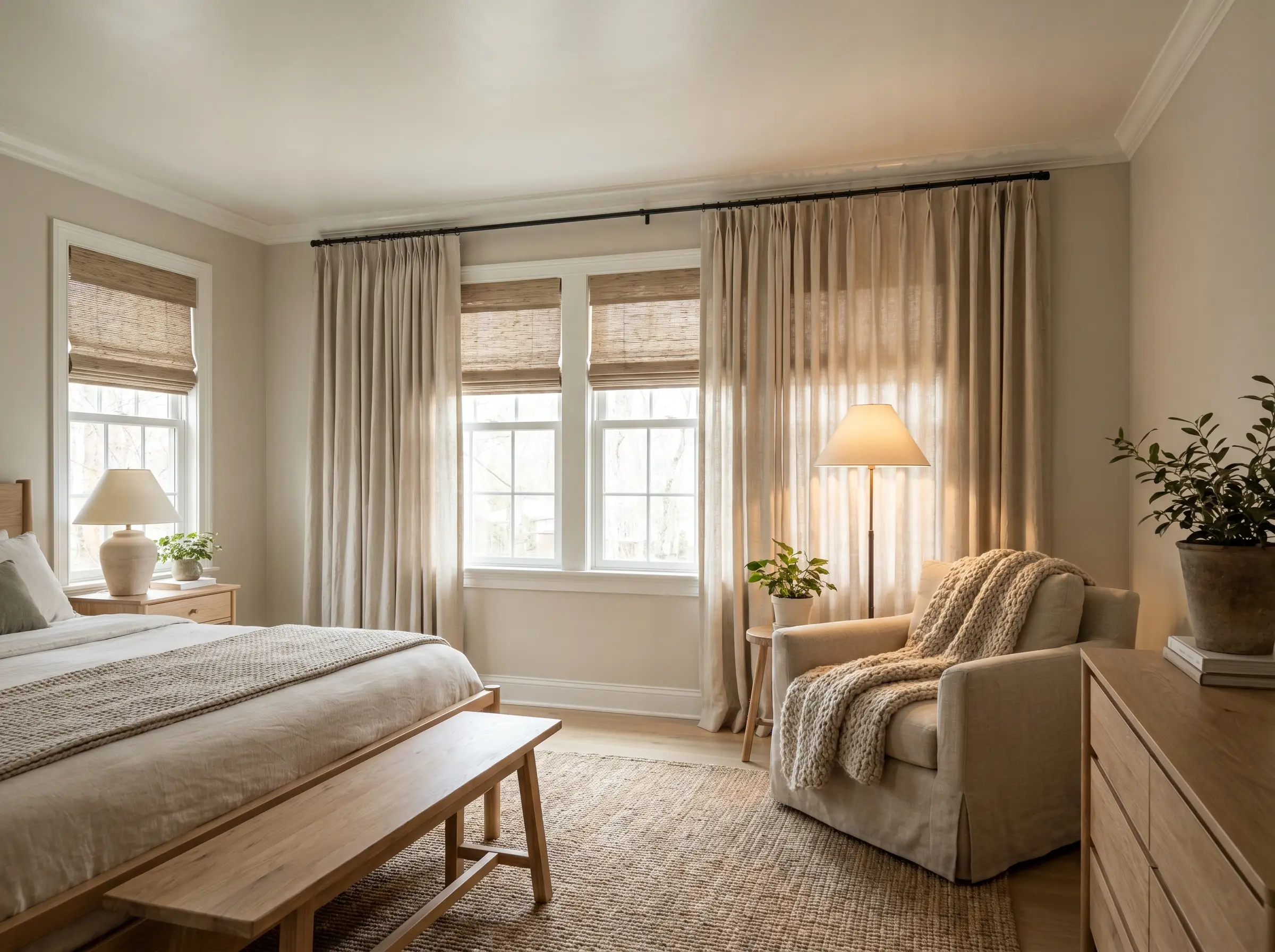
Bedding & Textile Palettes for a Pale Oak Bedroom
The soft styling is where your sleep space truly comes alive. Textiles dictate the tactile experience of the bedroom and provide the easiest layer for introducing organic color against a neutral backdrop.
10. The Earthy Palette: Terracotta, Olive, and Warm Taupe
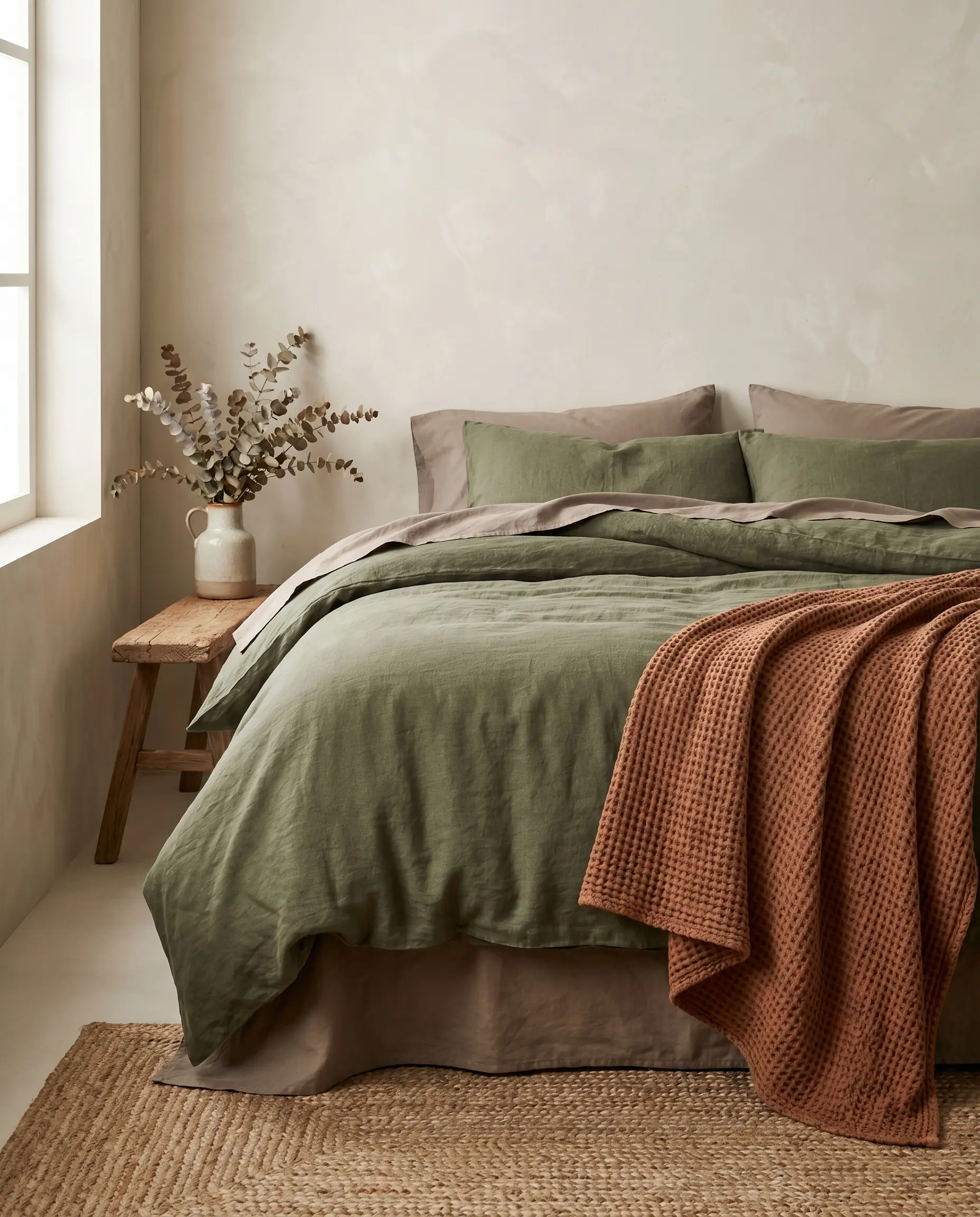
Harmonizing your greige walls with heavy linen duvet covers in muted olive green or baked terracotta creates a deeply restorative, nature-inspired environment. These earthy tones pull out the organic warmth of Pale Oak without overwhelming the senses.
- Vibe: Organic Modern, grounded, and rich.
- Color Match: Muted olive green, baked terracotta, and warm taupe.
- Key Materials: Heavyweight stonewashed linen and raw cotton.
- Styling Pro-Tip: Layer a terracotta waffle-knit blanket over an olive green duvet at the foot of the bed for maximum textural depth.
11. The Coastal Transitional Palette: Navy Blue and Crisp White
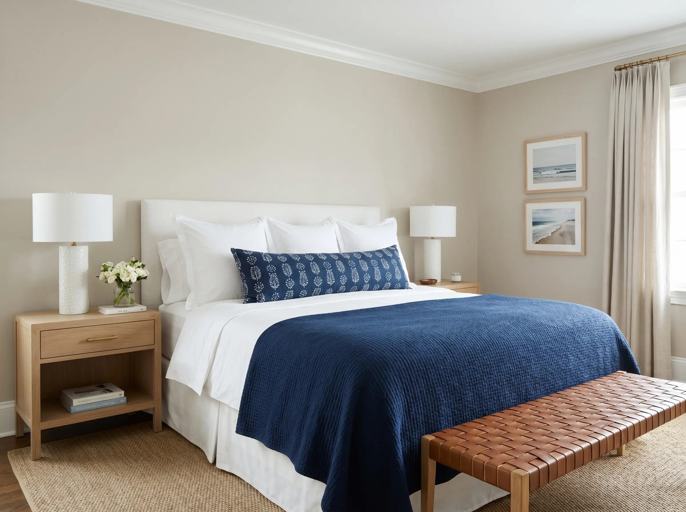
For a sharper, more universally appealing aesthetic, pair your walls with bright white, hotel-style percale sheets and a heavy navy blue coverlet. The cool, dense navy provides a stunning architectural counterweight to the warm, airy walls.
- Vibe: Tailored, classic, and coastal transitional.
- Color Match: True navy blue and crisp, bright white.
- Key Materials: Crisp cotton percale and heavy cotton matelassé.
- Styling Pro-Tip: Add a single, extra-long lumbar pillow in a navy block-print pattern to tie the crisp bedding to the greige walls.
12. The Monochromatic Escape: Layering Creams and Greiges
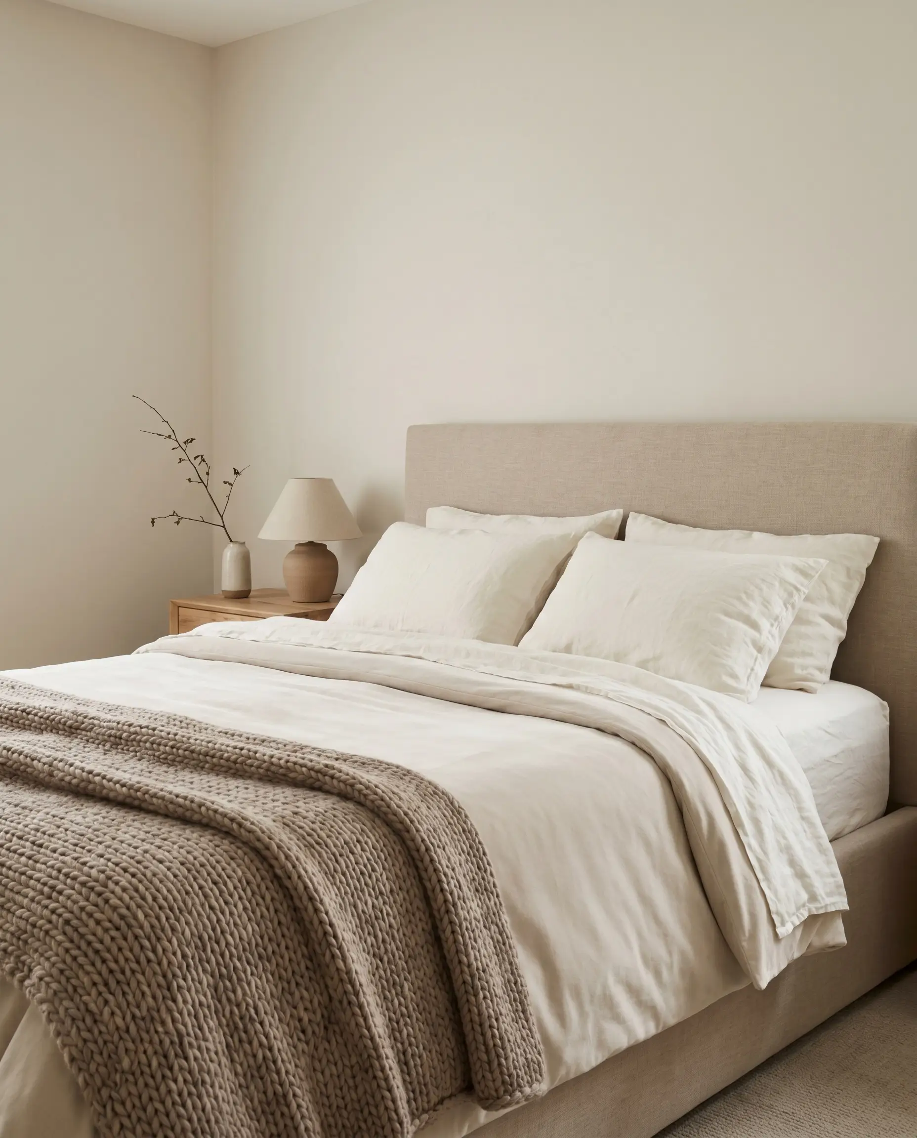
The tone-on-tone method relies on layering ivory sheets, a bone-colored duvet, and a taupe wool throw blanket to achieve the pinnacle of minimalist luxury. When executed correctly, this creates a seamless, cloud-like retreat.
If you choose not to use contrasting colors in your bedding, you MUST multiply the physical textures. Mix rumpled linen, chunky knit wool, and smooth velvet to prevent the bed from looking flat and lifeless.
The Texture Rule for Neutrals
- Vibe: Minimalist luxury, serene, and highly tactile.
- Color Match: Ivory, bone white, and warm taupe.
- Key Materials: Chunky merino wool, washed linen, and matte velvet.
- Styling Pro-Tip: Keep the whitest tones closest to the pillows to brighten your face, graduating to darker taupes at the foot of the bed.
Accent Colors: What to Pair with Pale Oak Walls
While Pale Oak shines as a standalone neutral, it also serves as an exceptional canvas for highly specific accent colors. If you plan to introduce statement art, a vintage rug, or an accent chair, you must select hues that respect the taupe base.
13. Deep Green Accents (Hunter Green or Studio Green)
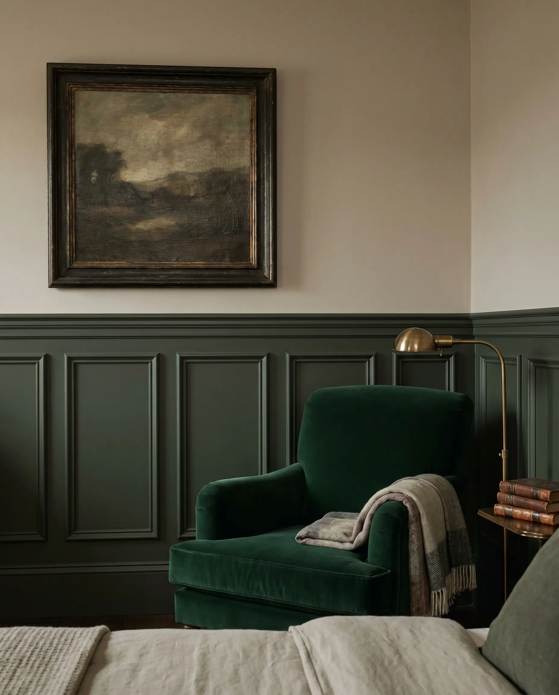
Dark, saturated greens look incredibly sophisticated against a greige background. Introducing an emerald velvet accent chair or painting a wainscoting feature wall in a deep, historic green grounds the room with an undeniable sense of luxury.
- Vibe: Heritage luxury and moody sophistication.
- Paint Match: Benjamin Moore Hunter Green (2041-10) or Farrow & Ball Studio Green (93).
- Key Materials: Rich cotton velvet or heavily textured oil paintings.
- Styling Pro-Tip: Place a dark green upholstered bench at the end of the bed to visually anchor the room’s layout.
14. Soft Moody Blues (Hale Navy or Providence Blue)
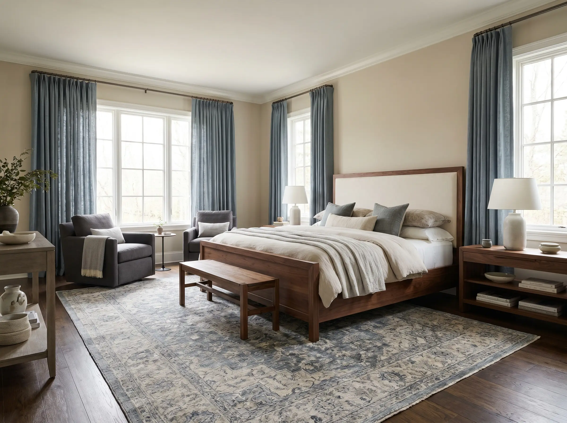
Muted, sophisticated blues are scientifically proven to aid in sleep and sit beautifully against a warm taupe base. Introducing these complex blues through a distressed area rug or heavy drapery adds color without sacrificing the room’s restorative calm.
- Vibe: Calming, refined, and deeply restorative.
- Paint Match: Benjamin Moore Hale Navy (HC-154) or Providence Blue (1636).
- Key Materials: Distressed wool rugs or heavy linen drapery.
- Styling Pro-Tip: Ensure your blues have a distinct gray undertone; bright, primary blues will severely clash with Pale Oak.
15. Avoid High-Octane Yellows and Cool Purples
Certain colors will actively fight with Pale Oak’s delicate chemistry, forcing the paint to flash its absolute worst undertones. Bright lemon yellows and icy, cool purples will immediately pull out the unwanted pink flash hidden inside the greige.
Never pair Pale Oak with cool-toned lavenders, icy violets, or neon yellows. These aggressive hues conflict with the warm taupe base and will make your walls look like a muddy, accidental pink.
Designer Warning
- Vibe: What NOT to do.
- Colors to Avoid: Lemon yellow, icy lavender, and cool magenta.
- Material Warning: Avoid cheap, shiny synthetic fabrics in these colors, which exacerbate the visual clash.
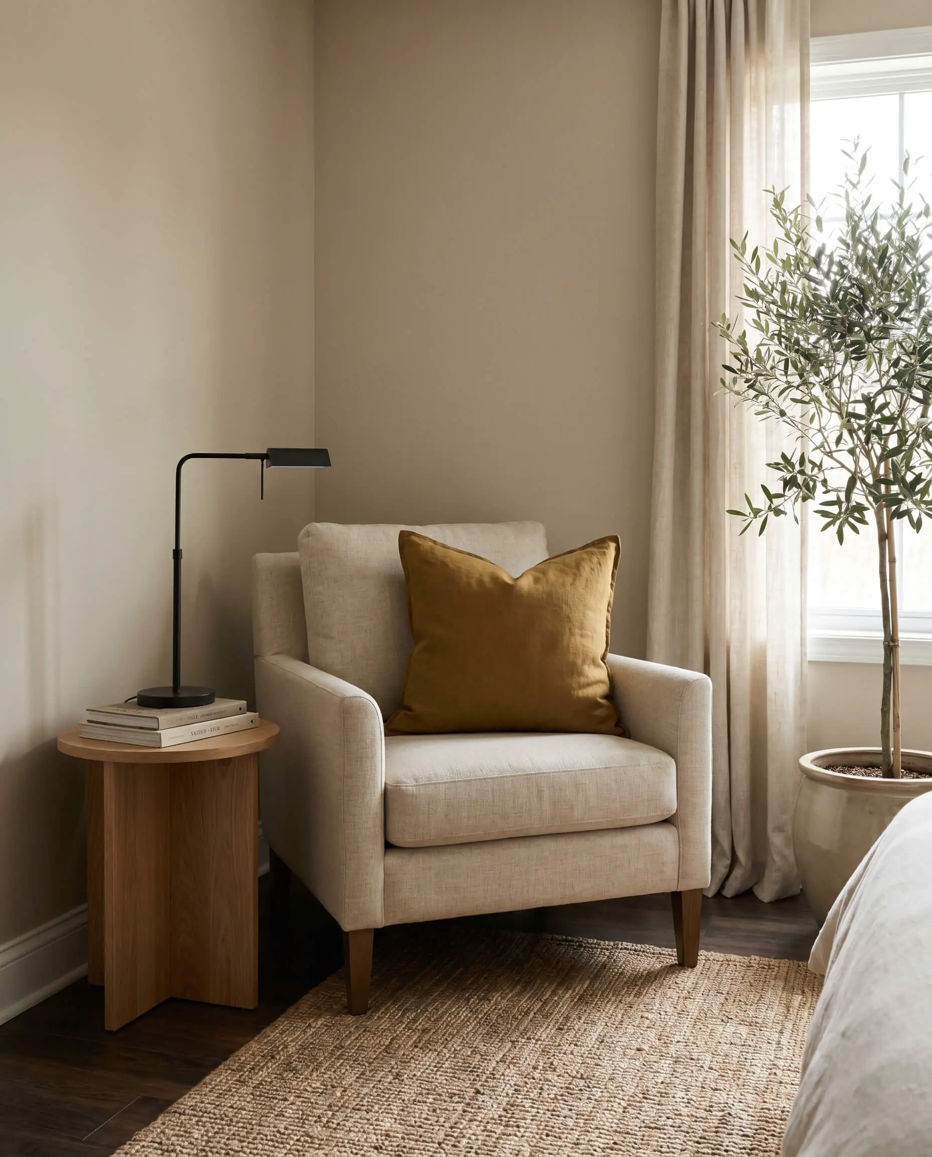
- Styling Pro-Tip: If you love yellow, opt for a deeply muted, earthy mustard or ochre instead of a primary yellow.
Bringing Your Greige Retreat to Life
Pale Oak is a masterclass in subtlety. Because it responds so drastically to its environment, you must test the paint on multiple walls in your specific sleep space, observing how the pigment shifts from the crisp morning light to the warm glow of your bedside lamps at night. By controlling your window orientation, executing precise trim pairings, and layering heavily textured bedding, you can force this chameleon paint to perform exactly how you want it. To ensure your space is perfectly calibrated, review our complete guide on bedroom lighting to select the exact fixtures that will make your newly painted walls glow.
The Hackrea Style Desk treats interior decoration as an exact visual science. Rather than focusing on demolition or floor plans, this desk masters the art of color theory, undertone matching, material pairings, and spatial proportion. From balancing the visual weight of mixed metals to finding the perfect bridging tone between disparate wood species, this desk provides the rigorous aesthetic rules needed to achieve high-end, editorial-quality harmony in any space.