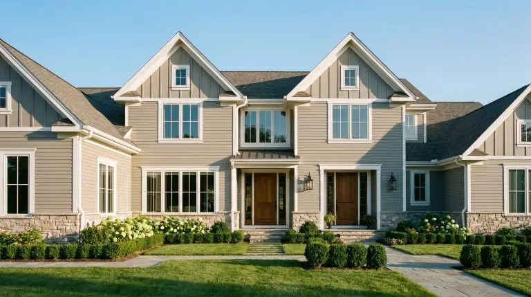
Sherwin Williams Accessible Beige (SW 7036) is not a relic of builder-grade 1990s subdivisions; it is a highly sophisticated, foundational chameleon. When executed with architectural rigor, this powerhouse neutral sits perfectly at the intersection of gray and beige. Its brilliance lies in its specific formulation—an LRV of 58 ensures it reflects just enough light to feel expansive, while its subtle greige undertones prevent the color from turning fleshy, pink, or artificially yellow under incandescent bulbs.
The fear of a flat, boring beige box is valid, but the solution is not to abandon warm neutrals. True accessible luxury comes from spatial and tactile alchemy. Accessible Beige bends and flexes depending on the light exposure, the sheen applied, and the physical materials—from rift-sawn white oak to unlacquered brass—placed in front of it.
This is your masterclass in elevating an industry-standard paint into a bespoke design feature. By mastering the interplay of monochromatic color drenching, deliberate sheen variations, and high-contrast material pairings, you can transform Sherwin Williams Accessible Beige into the ultimate canvas for modern luxury.
The Lighting & Sheen Matrix for SW 7036
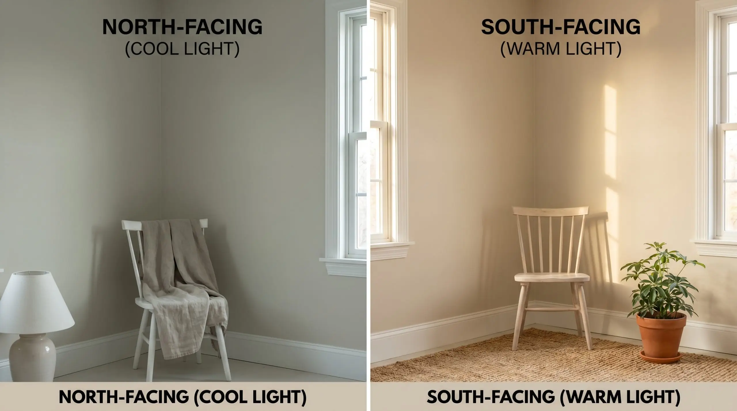
The most exquisite paint application will fail if you ignore the environmental realities of your space. Lighting and finish absolutely dictate how Accessible Beige performs, shifting its complex undertones from cool and architectural to warm and enveloping. Before lifting a brush, consult this foundational matrix.
| Light Exposure | Visual Effect | Recommended Sheen |
|---|---|---|
| North-Facing | Enhances the gray/green undertones, cooling the color down significantly. | Flat for walls to absorb the cooler light smoothly. |
| South-Facing | Pulls forward the warmth, making the beige feel sun-drenched and golden. | Flat for walls; Eggshell for high-traffic transition zones. |
| Artificial Warm | Pushes the color toward a richer, more traditional beige profile. | Satin for trim and doors to reflect ambient light beautifully. |
You can apply wallpapers, paints, etc. on walls and see how they look in various interiors.

Architectural & Trim Executions (Moving Beyond the Walls)
The most luxurious way to deploy Accessible Beige isn’t always rolling it onto standard drywall. True high-end execution requires deliberate architectural application, utilizing the paint across trim, doors, and custom millwork to manipulate spatial perception.
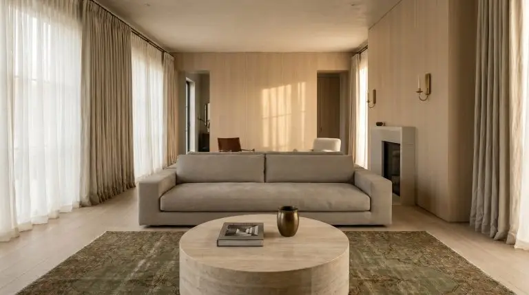
Drench the Room in Monochromatic Layers
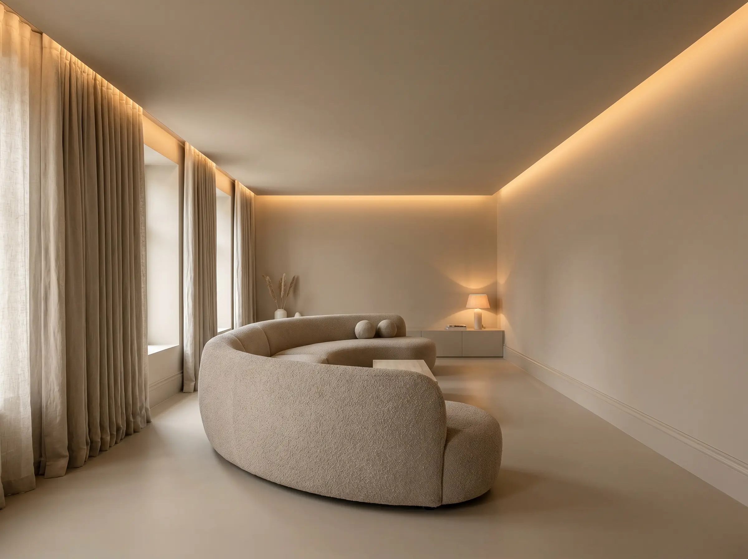
Color drenching erases the harsh visual boundaries between walls, trim, and ceilings, making small rooms feel instantly expansive and custom-built. By wrapping the entire space in a single hue, the architecture becomes a seamless, monolithic backdrop that lets your furniture and lighting command the room.
- Atmosphere: Enveloping, bespoke, and highly modern.
- Key Technique: Paint walls, trim, and ceilings the exact same shade to eliminate visual breaks.
- Paint Recommendation: Flat SW 7036 for walls; Satin SW 7036 for trim, doors, and millwork.
- Styling Pro-Tip: Introduce heavily textured fabrics like bouclé or raw linen to provide the visual interest that contrasting trim normally would.
When executing a color drench with Accessible Beige, always test the swatch vertically and horizontally, as lighting hits flat ceilings and vertical walls differently, sometimes altering the perceived undertone.
Designer Secret
Contrast with SW Alabaster Trim for Crisp Definition
For those who prefer traditional, crisp definition, brilliant or cool whites will clash disastrously with the greige walls. Sherwin-Williams Alabaster harmonizes beautifully, offering a warm, creamy contrast that defines the architecture without feeling sterile or jarring.
- Atmosphere: Classic, tailored, and refined.
- Color Match: SW Alabaster (SW 7008).
- Key Technique: Apply Alabaster to crown molding, baseboards, and window casings.
- Styling Pro-Tip: Carry the Alabaster onto the ceiling in a flat finish to draw the eye upward and maximize perceived ceiling height.
Elevate Builder-Grade Doors with Satin Accessible Beige
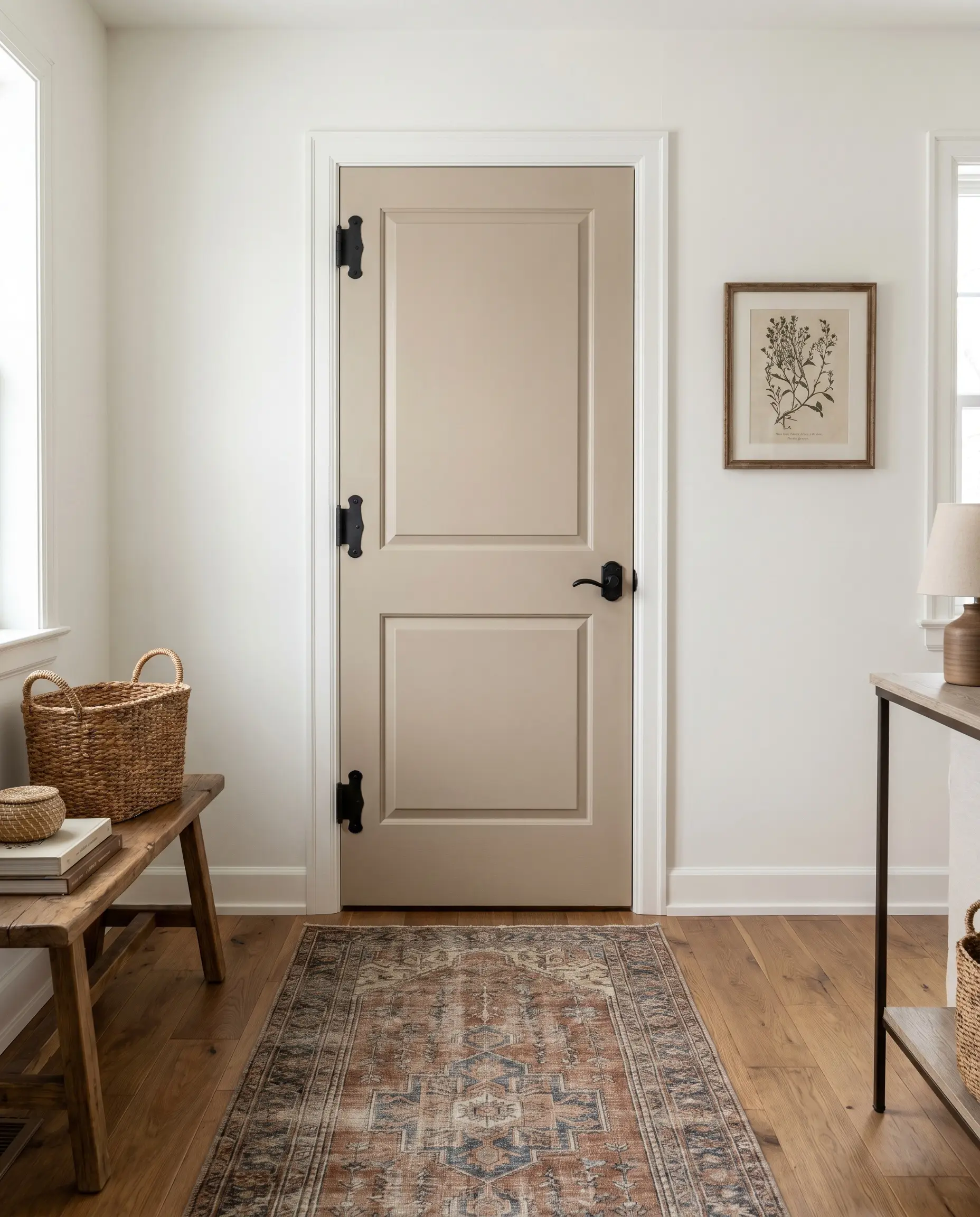
Leaving the walls a crisp white while painting all interior doors and casing in a saturated beige instantly injects a European farmhouse atmosphere into standard architecture. This high-impact weekend DIY upgrade grounds the home, making lightweight, hollow-core doors feel heavy, intentional, and expensive.
- Atmosphere: European Farmhouse meets Transitional.
- Key Technique: Keep walls SW Pure White (SW 7005) and coat all interior doors in SW 7036.
- Paint Recommendation: Satin or Semi-Gloss SW 7036 for maximum durability and light bounce.
- Hardware Upgrade: Swap standard hinges for oil-rubbed bronze or matte black to complete the transformation.
Use on Kitchen Cabinets for a Modern “Mushroom” Effect
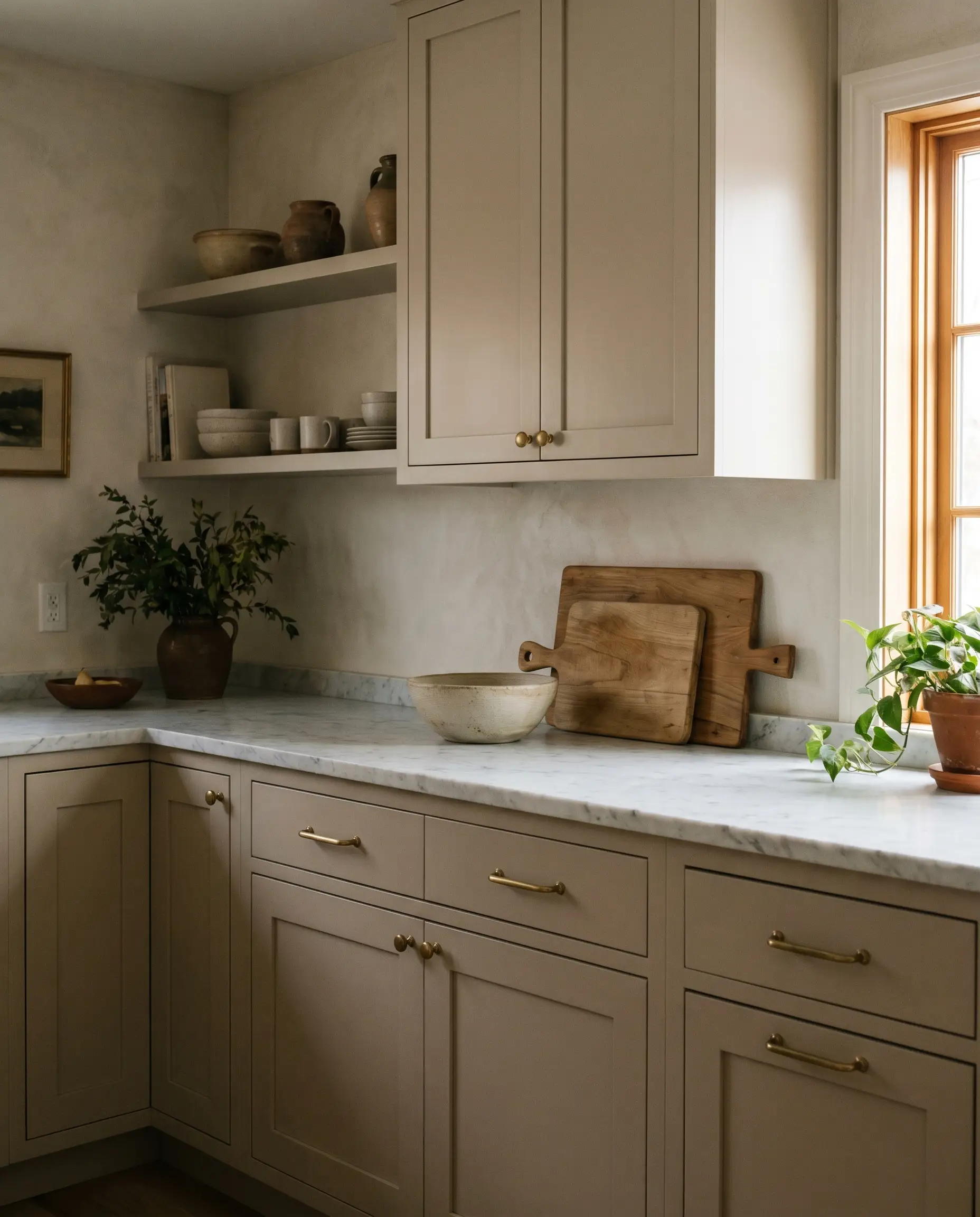
Applying this complex neutral to kitchen cabinetry creates a sophisticated, highly sought-after “mushroom” tone that feels far more bespoke than stark white. The warmth of the paint grounds the kitchen, offering the perfect organic counterpoint to honed stone countertops and raw metals.
- Atmosphere: Organic Modern Culinary Space.
- Key Technique: Spray cabinets with a high-quality enamel for a factory-smooth finish.
- Material Match: Honed Carrara marble or light, subtly veined quartz countertops.
- Hardware Match: Unlacquered brass pulls and knobs.
When painting cabinets Accessible Beige, always apply a high-adhesion, stain-blocking primer first. Wood tannins bleeding through will ruin the delicate greige undertones, turning the finish an unflattering yellow.
Designer Secret
Room-by-Room Spatial Layouts
The spatial layout and function of a room dictate how this color sets the emotional tone. By analyzing the directional light and the room’s purpose, you can leverage Accessible Beige to either amplify brightness or cultivate moody intimacy.
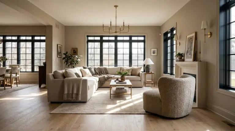
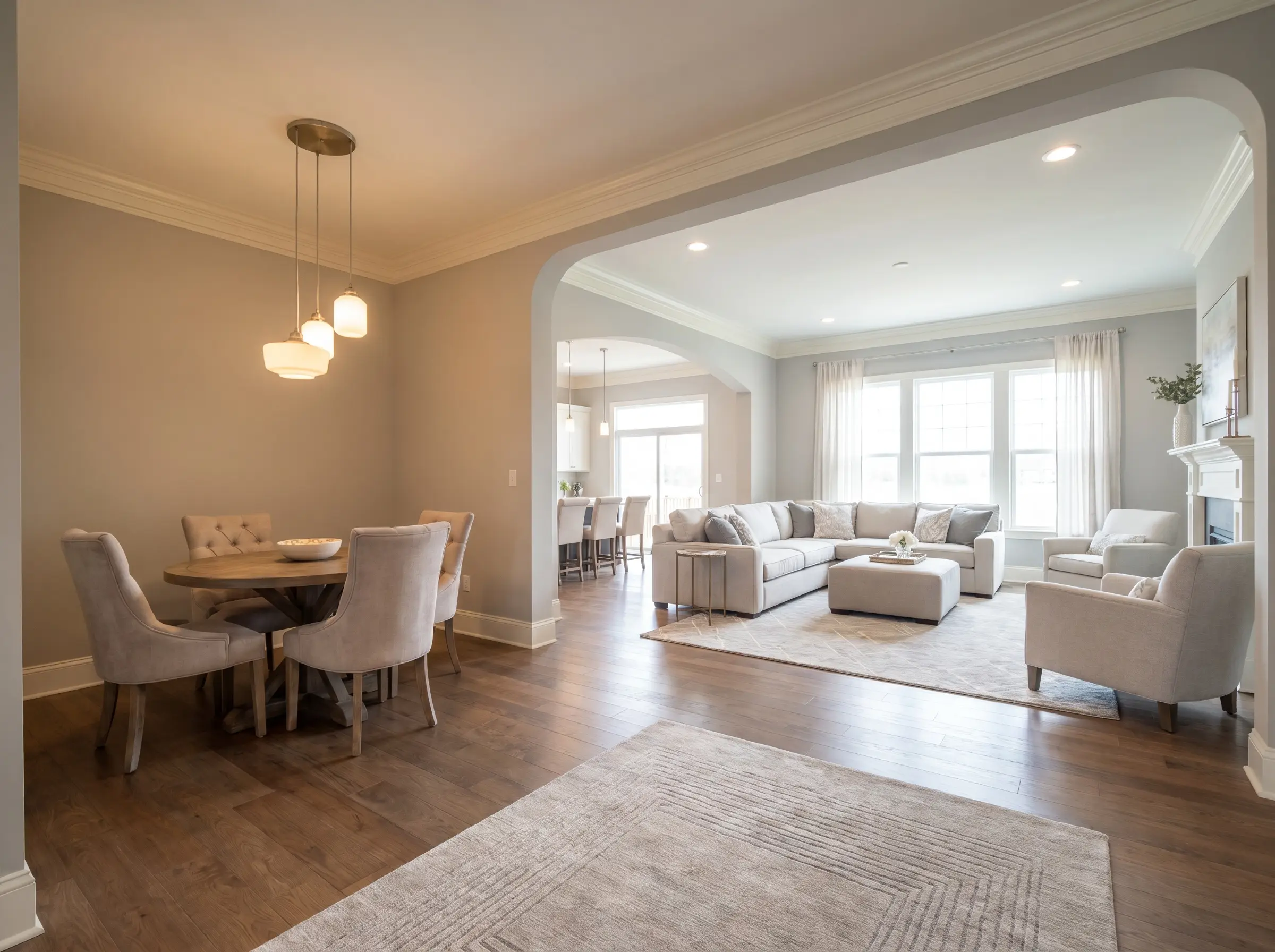
The Sun-Drenched South-Facing Living Room
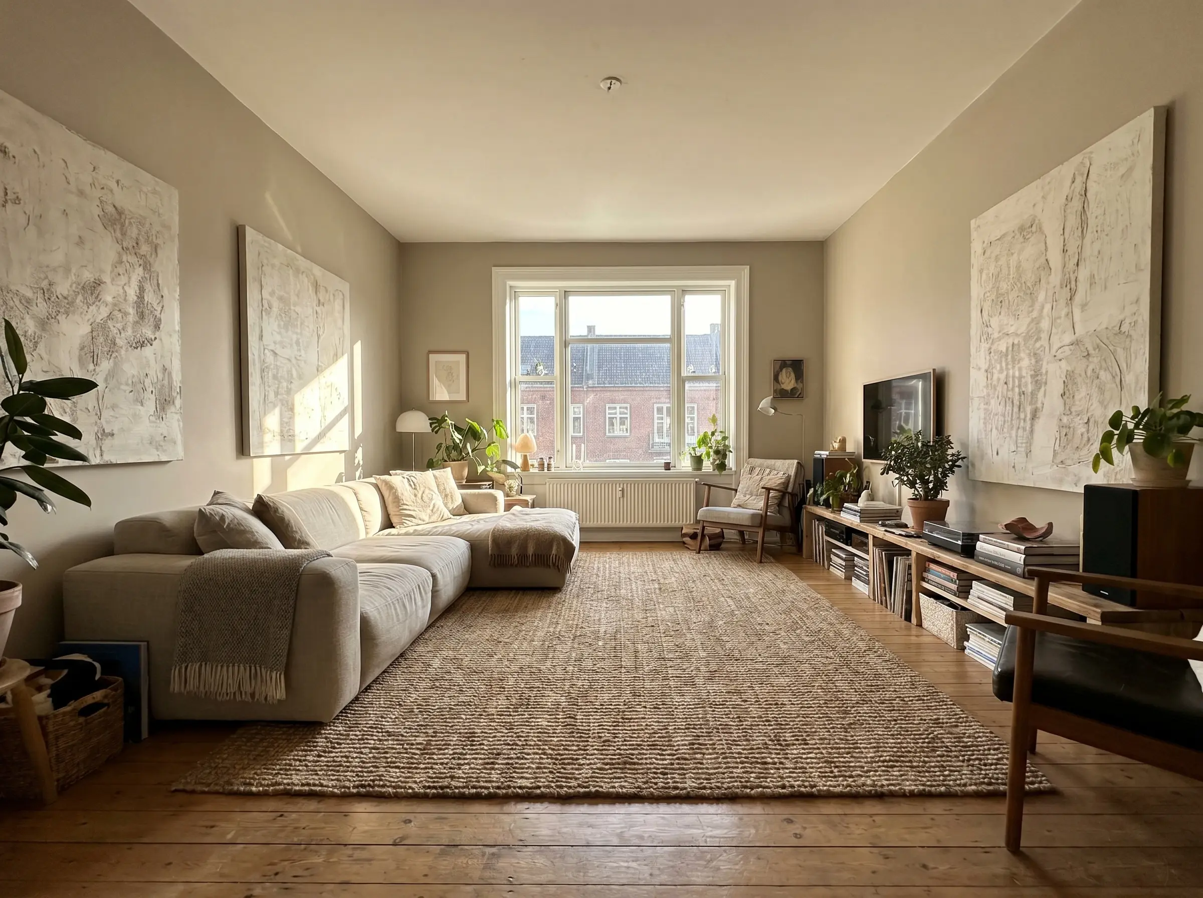
In south-facing spaces, the abundance of warm natural light pulls forward the beige, making the room feel incredibly inviting and expansive. Anchor this airy, sun-drenched feel with low-profile, organic silhouettes and large-scale textured art to maintain a grounded visual weight.
- Atmosphere: Bright, airy, and grounded.
- Key Technique: Leverage the natural light to warm the paint, avoiding heavy, dark drapery.
- Furniture Match: A low-profile, oatmeal-toned linen sectional.
- Styling Pro-Tip: Introduce a massive, heavily textured jute or wool rug to absorb excess light and add necessary tactile friction.
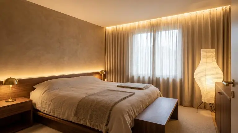
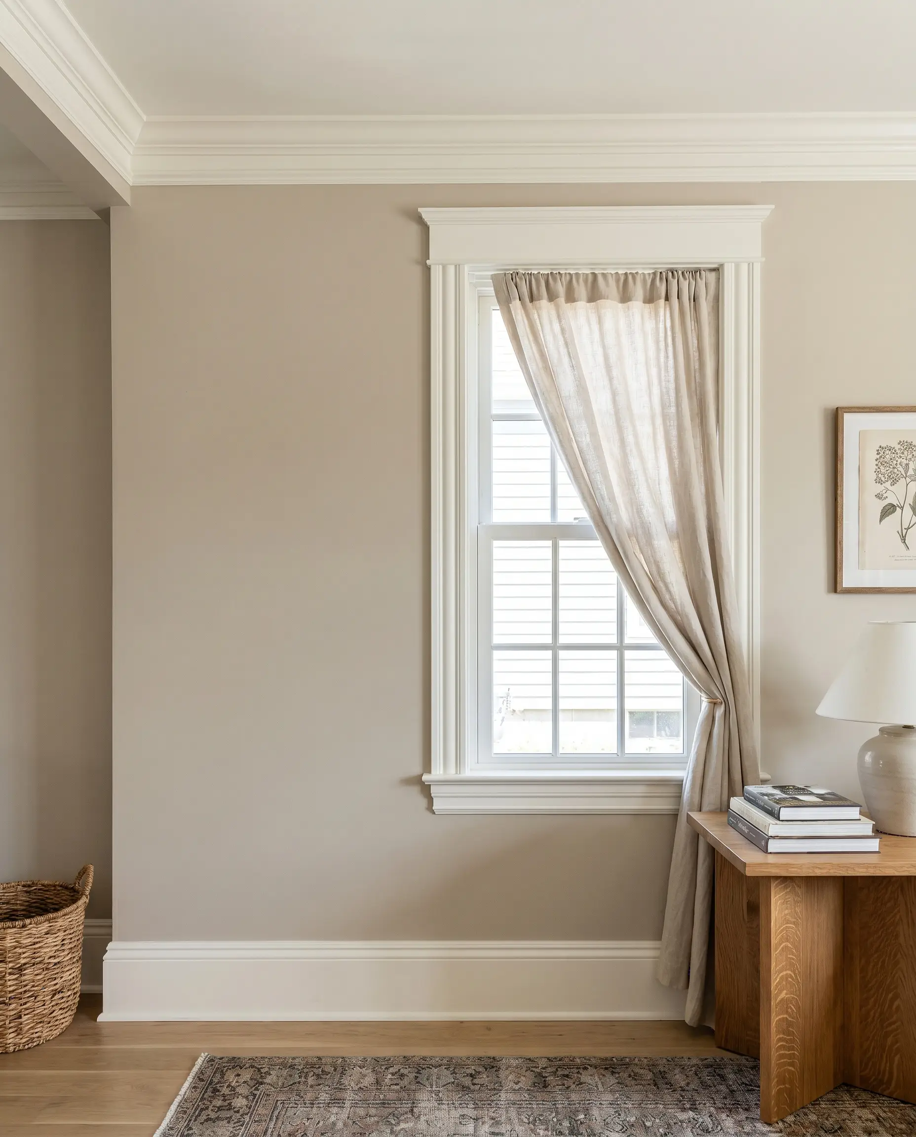
The Cozy, North-Facing Bedroom Retreat
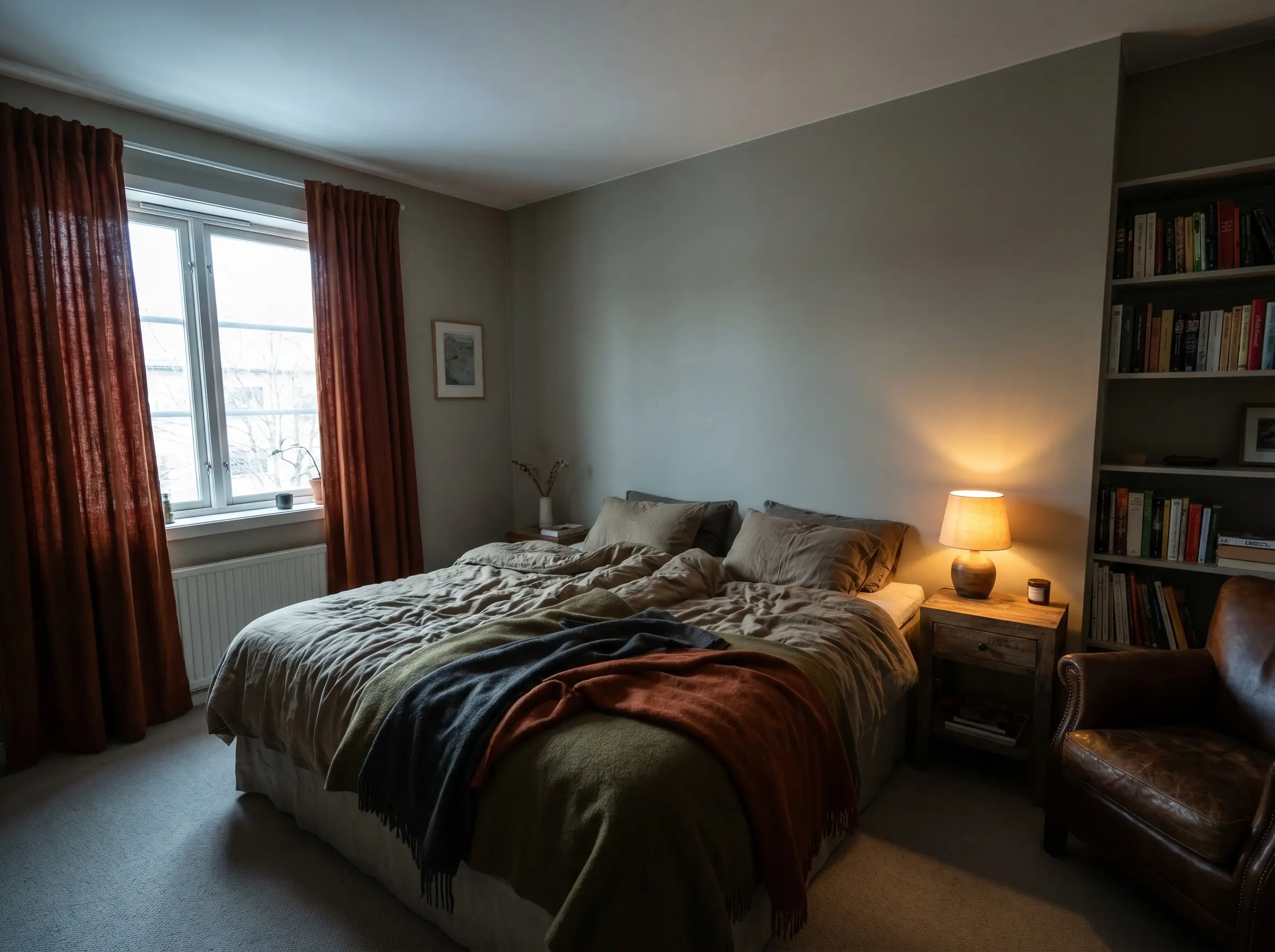
North-facing light naturally enhances the subtle gray and green undertones of the paint, cooling it down significantly. Instead of fighting this shadow, lean into a moody, restful bedroom environment by layering heavy, tactile window treatments that absorb the cooler light.
- Atmosphere: Intimate, moody, and restful.
- Key Technique: Embrace the cooler shift by avoiding stark white bedding, which will make the walls look muddy.
- Textile Match: Heavy, textured curtains in a deep olive, charcoal, or saturated rust.
- Styling Pro-Tip: Use warm-toned, low-wattage bedside lamps (2700K) to counteract the cool natural light during the evening.
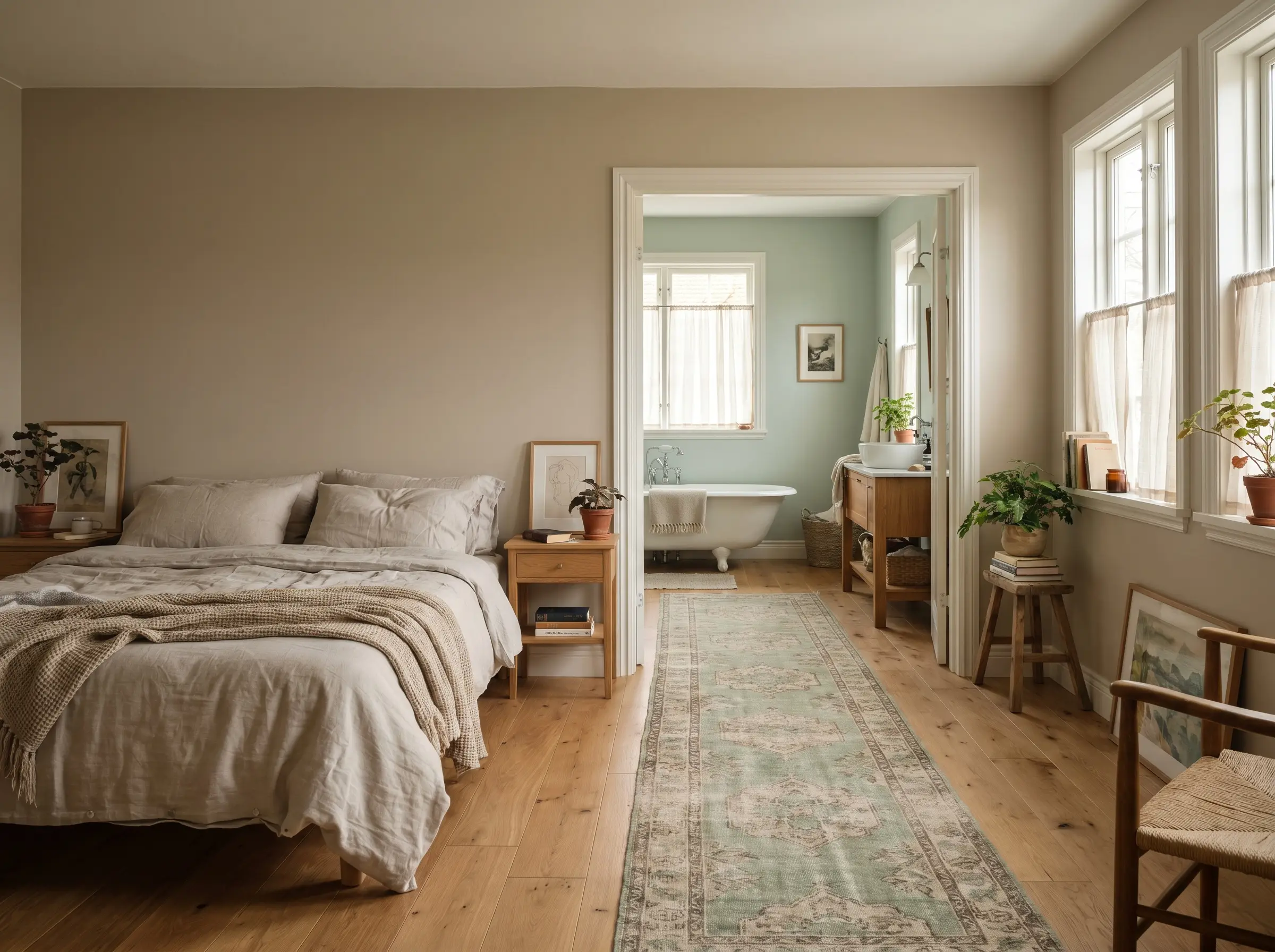
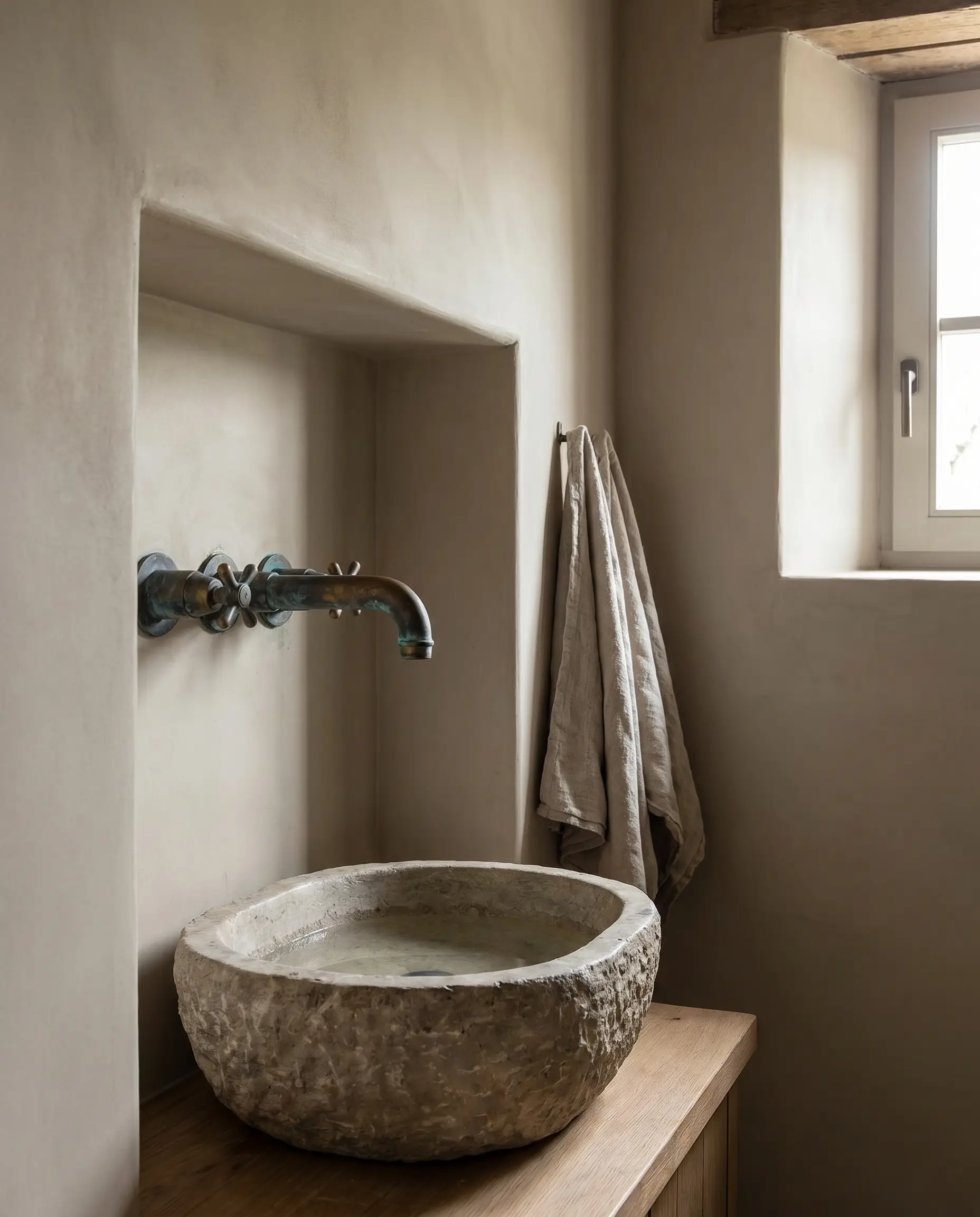
A Spa-Like Bathroom Paired with Polished Nickel
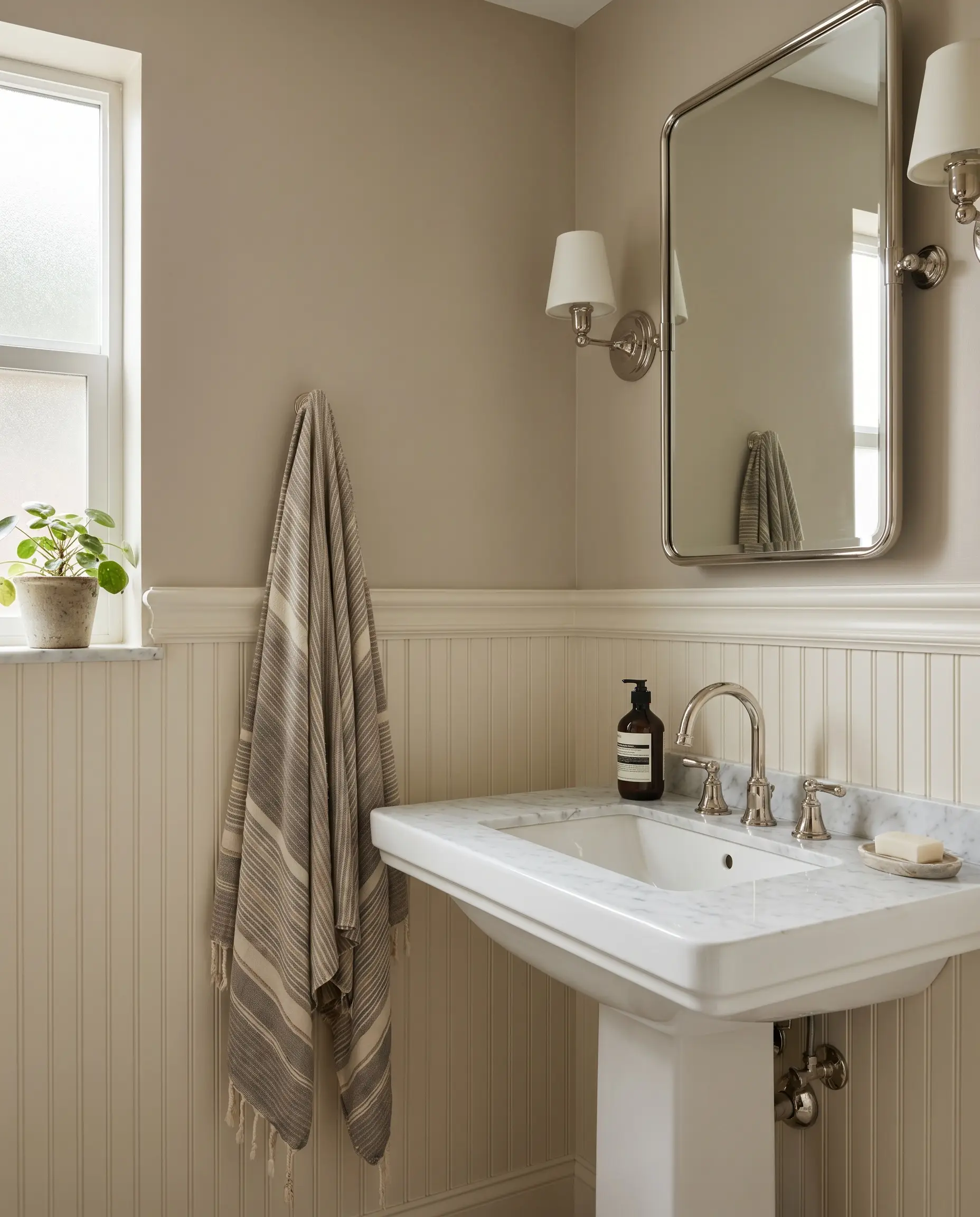
Bathrooms run the risk of feeling sterile due to the dominance of hard porcelain, glass, and tile. Wrapping the upper walls in this warm greige above crisp white wainscoting instantly neutralizes that coldness, establishing a refined, spa-like sanctuary.
- Atmosphere: Refined, classic, and restorative.
- Key Technique: Install traditional beadboard or wainscoting painted in SW Alabaster on the lower third of the wall.
- Hardware Match: Polished nickel fixtures, which offer a classic, warm reflectivity that chrome lacks.
- Styling Pro-Tip: Hang an oversized, vintage-inspired Turkish towel to bridge the gap between the crisp wainscoting and the warm walls.
Welcoming Entryways with Beadboard Detailing
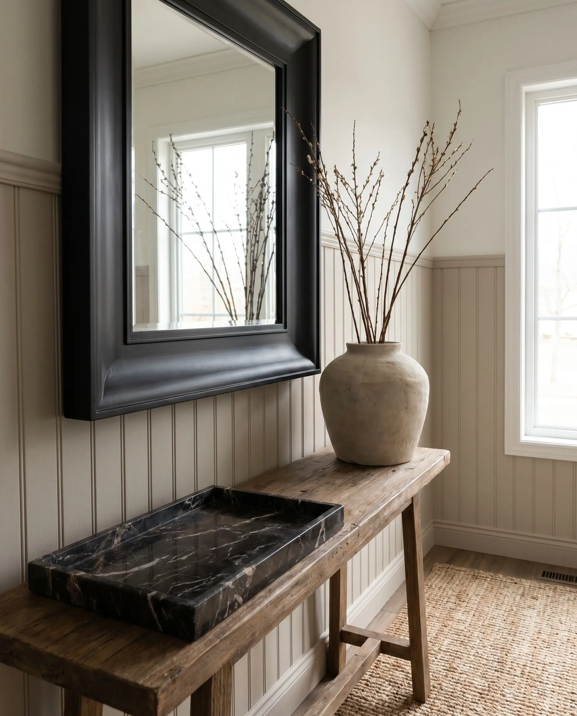
The entryway is a high-traffic transition zone that requires both durability and an exceptional first impression. Applying this saturated neutral to beadboard or board-and-batten hides daily scuffs far better than stark white while enveloping guests in immediate, sophisticated warmth.
- Atmosphere: Elevated and highly durable.
- Key Technique: Carry the beadboard at least two-thirds up the wall to create a striking architectural datum line.
- Console Styling 1: Anchor the space with a deeply veined, dark marble catch-all tray.
- Console Styling 2: Hang a dramatically oversized, matte black framed mirror to bounce light.
- Console Styling 3: Forage for tall, organic branches and display them in a raw, monolithic ceramic vase.
The Exact Sherwin-Williams Color Pairing Strategy
Eliminate the guesswork of the paint aisle with a strict, complementary color palette. These exact pairings manipulate the undertones of Accessible Beige, allowing you to seamlessly pull the environment toward modern industrial, organic coastal, or earthy warmth.
Ground the Space with SW Iron Ore Accents
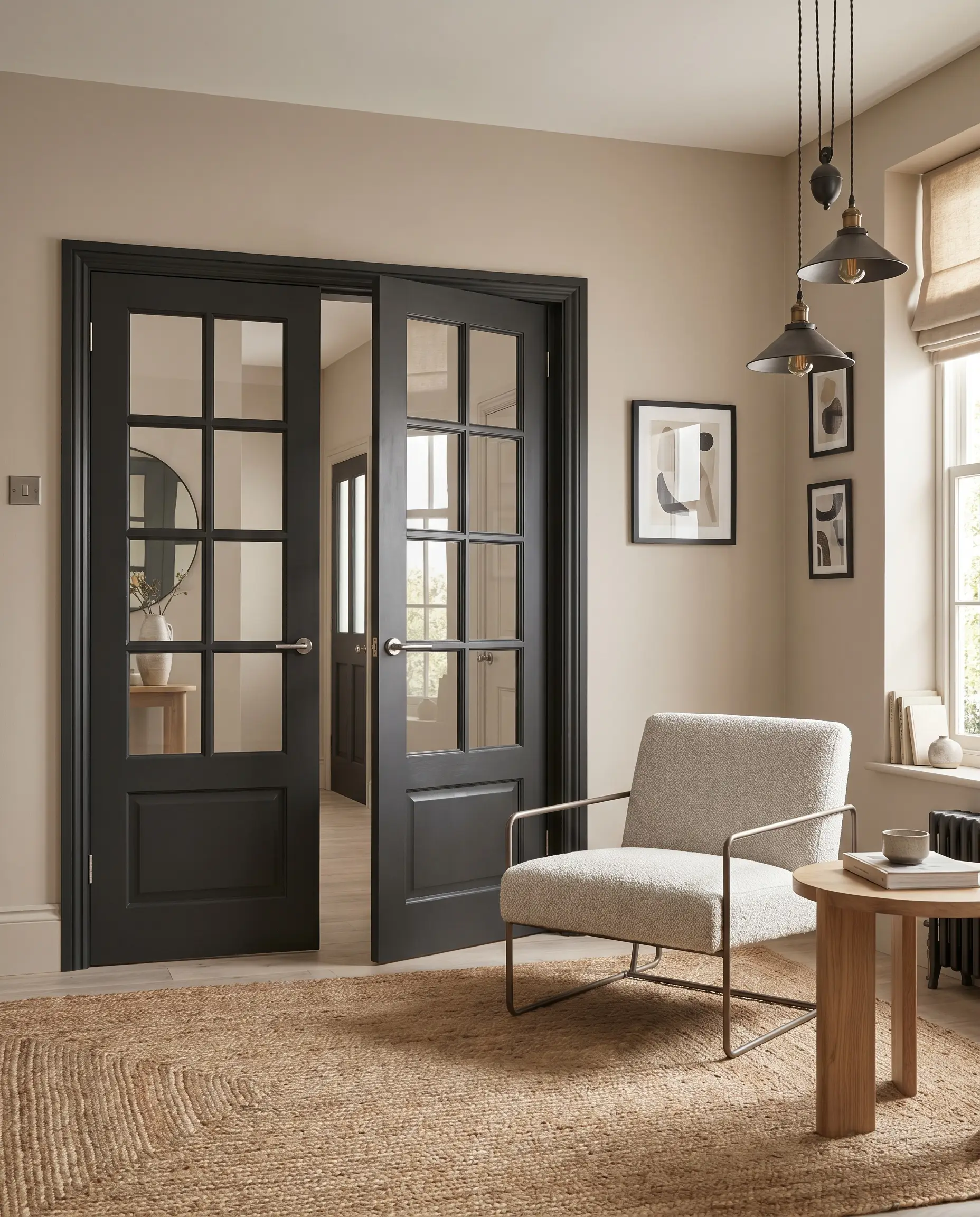
A room composed entirely of soft mid-tones lacks structural anchor and risks feeling visually weightless. Introducing a soft, charcoal-black on architectural focal points modernizes the beige, cutting through the warmth with sharp, contemporary contrast.
- Atmosphere: Modern Industrial meets Transitional.
- Color Match: SW Iron Ore (SW 7069).
- Key Technique: Apply Iron Ore to interior window mullions, French doors, or a prominent fireplace mantel.
- Styling Pro-Tip: Balance the dark architectural accents with lighter, monolithic furniture pieces to maintain spatial equilibrium.
Introduce Organic Greenery with SW Sea Salt
Establishing flowing sightlines between rooms is critical for a cohesive, designer-led home. Because both colors share subtle green undertones, transitioning from a greige living space into a soft, coastal green adjoining room creates an unbroken, organic visual journey.
- Atmosphere: Organic Coastal and serene.
- Color Match: SW Sea Salt (SW 6204).
- Key Technique: Use Sea Salt in adjoining spaces—like a primary bathroom off an Accessible Beige bedroom—to pull the green undertones forward naturally.
- Styling Pro-Tip: Bridge the two rooms with a vintage runner rug that incorporates both soft sage and warm greige threads.
Complement with Earthy Terracottas and Clays
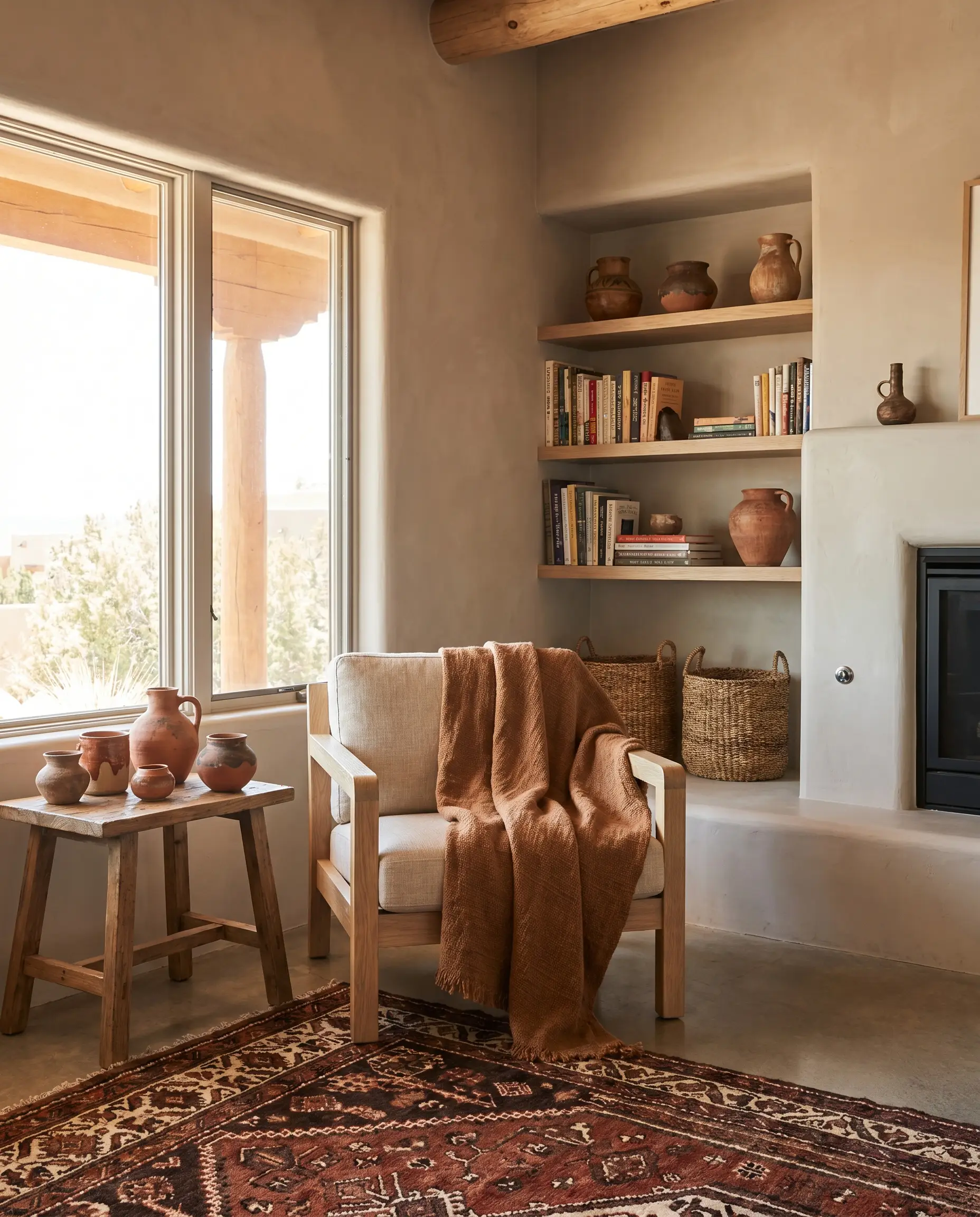
To push the paint into a highly stylistic, warm organic modern territory, you must surround it with rich, sun-baked hues. Muted terracottas and rusts pull out the deepest warmth of the beige, creating a highly saturated, trend-forward environment.
- Atmosphere: Southwestern Organic Modern.
- Color Match: Deep terracotta, rust, and clay tones.
- Key Technique: Introduce these colors through heavy textiles, artisan ceramics, and foundational upholstery rather than accent walls.
- Styling Pro-Tip: Drape a heavy, rust-toned linen throw over a pale oak chair to instantly warm up a neglected corner.
Bridge the Gap with SW Agreeable Gray
Expansive, open-concept floor plans often require tonal shifts to define different living zones without jarring transitions. While Accessible Beige offers enveloping warmth for intimate dining spaces, transitioning to a slightly cooler greige in massive, well-lit great rooms maintains balance.
- Atmosphere: Cohesive, expansive, and balanced.
- Color Match: SW Agreeable Gray (SW 7029).
- Key Technique: Use SW 7036 in smaller, contained rooms and SW 7029 in large, open-concept areas with abundant natural light.
- Styling Pro-Tip: Keep the trim color identical (e.g., SW Alabaster) throughout both spaces to unify the shifting wall colors.
If you are torn between SW Accessible Beige and SW Agreeable Gray, remember this rule: Accessible Beige is definitively warmer and pushes toward tan, while Agreeable Gray possesses a slightly cooler, true-gray base. Let your existing flooring dictate the choice.
Designer Secret
Material & Texture Integration (Avoiding the 90s Trap)
The final layer of alchemy relies entirely on your furniture and hardware selections. To prevent this color from slipping into a dated, builder-grade trap, you must strictly control your material contrasts, favoring raw woods, matte metals, and heavy textiles.
Warm Up the Room with Rift-Sawn White Oak
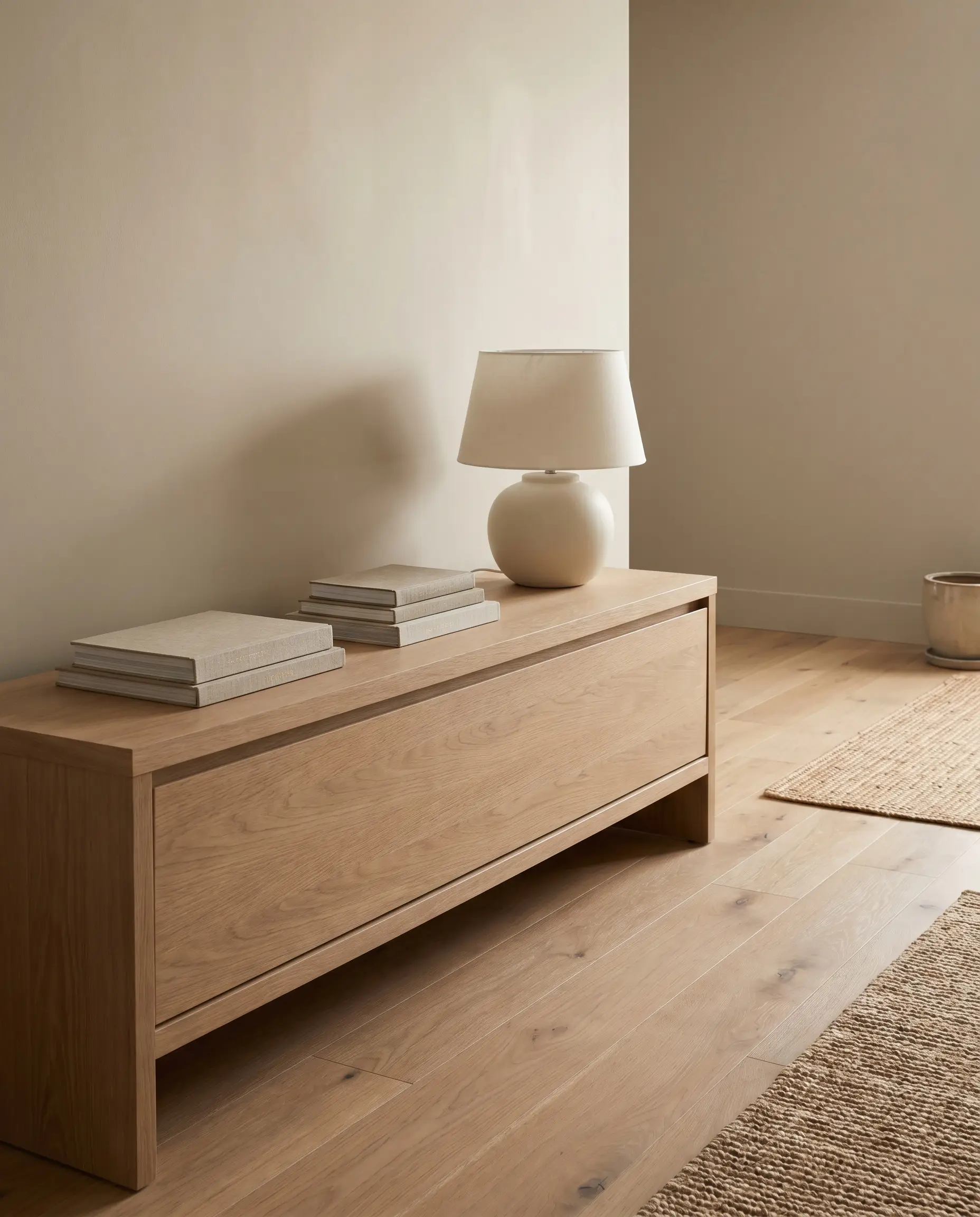
This specific greige demands the quiet, raw elegance of muted or bleached woods to look authentically modern. The linear grain and pale tone of rift-sawn white oak flooring and furniture complement the paint perfectly, elevating the space into high-end organic modernism.
- Atmosphere: Elevated Organic Modern.
- Material Match: Raw, bleached, or rift-sawn white oak.
- Strictly avoid: Heavy red-toned woods like mahogany or heavily lacquered cherry, which clash violently with the green undertones and instantly date the room.
- Styling Pro-Tip: Keep wood finishes matte or oiled rather than glossy to align with the quiet nature of the paint.
Contrast with Matte Black Hardware
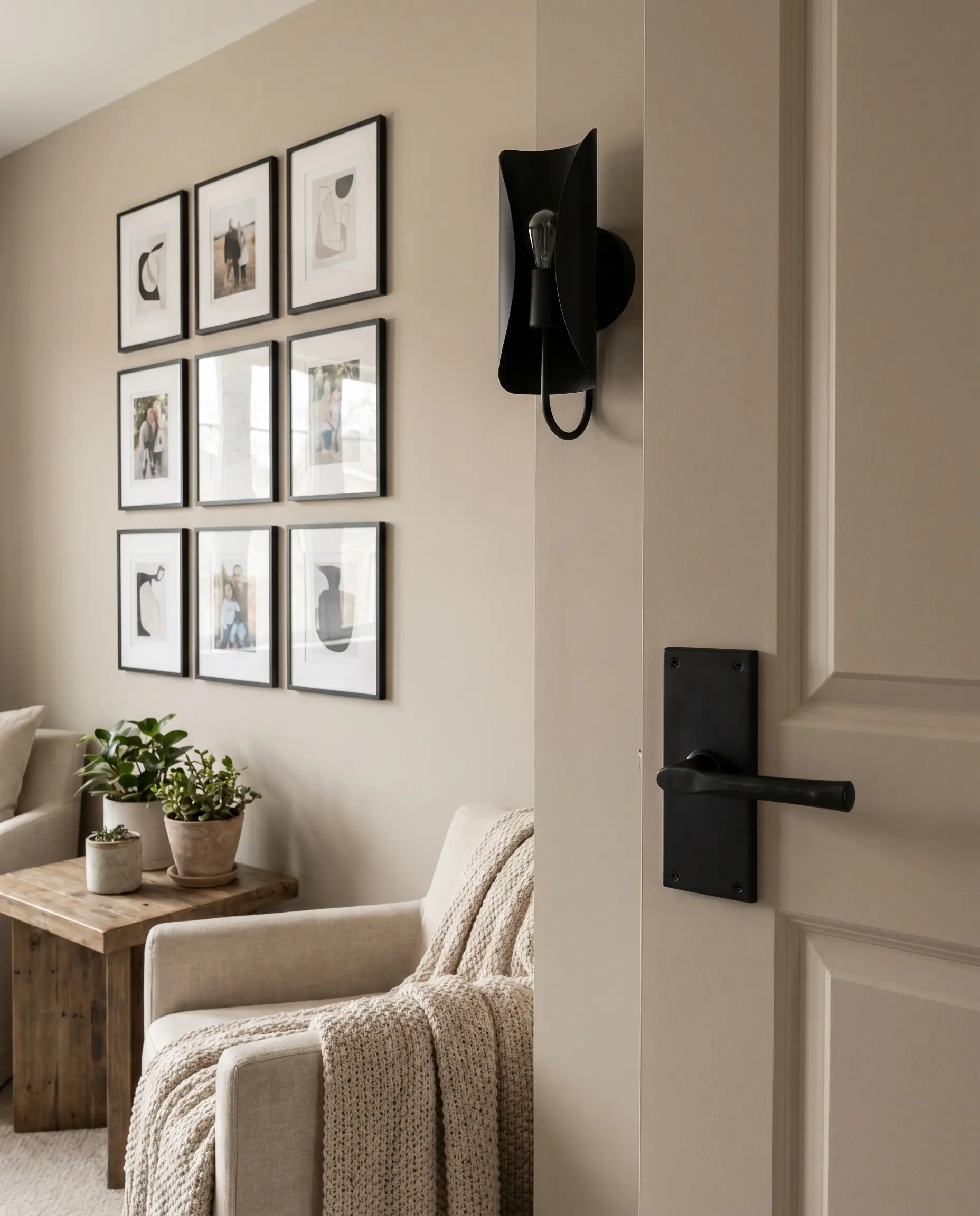
Soft, monochromatic rooms require visual punctuation to avoid feeling washed out. Door knobs, cabinet pulls, and lighting fixtures finished in matte black provide necessary architectural rigidity, slicing through the warmth of the beige with industrial precision.
- Atmosphere: Sharp, tailored, and modern.
- Material Match: Matte black forged iron or powder-coated steel.
- Key Technique: Swap out all shiny, builder-grade chrome hardware for matte black to instantly update the room’s profile.
- Styling Pro-Tip: Echo the matte black hardware with a thin, black metal picture frame gallery wall to distribute the visual weight evenly.
Elevate with Unlacquered Brass
For a bespoke, European Farmhouse execution, polished and lacquered metals feel too pristine and commercial. Unlacquered brass introduces a living finish that develops a rich, clouded patina over time, speaking beautifully to the earthy, complex undertones of the walls.
- Atmosphere: Bespoke European Farmhouse.
- Material Match: Solid, unlacquered brass hardware and plumbing fixtures.
- Key Technique: Allow the brass to age naturally; do not polish it. The resulting patina is the ultimate mark of quiet luxury.
- Strictly avoid: Cheap, bright yellow “brass-plated” fixtures, which will look aggressively artificial against the nuanced greige.
Layer Textures Over Patterns (Bouclé and Linen)
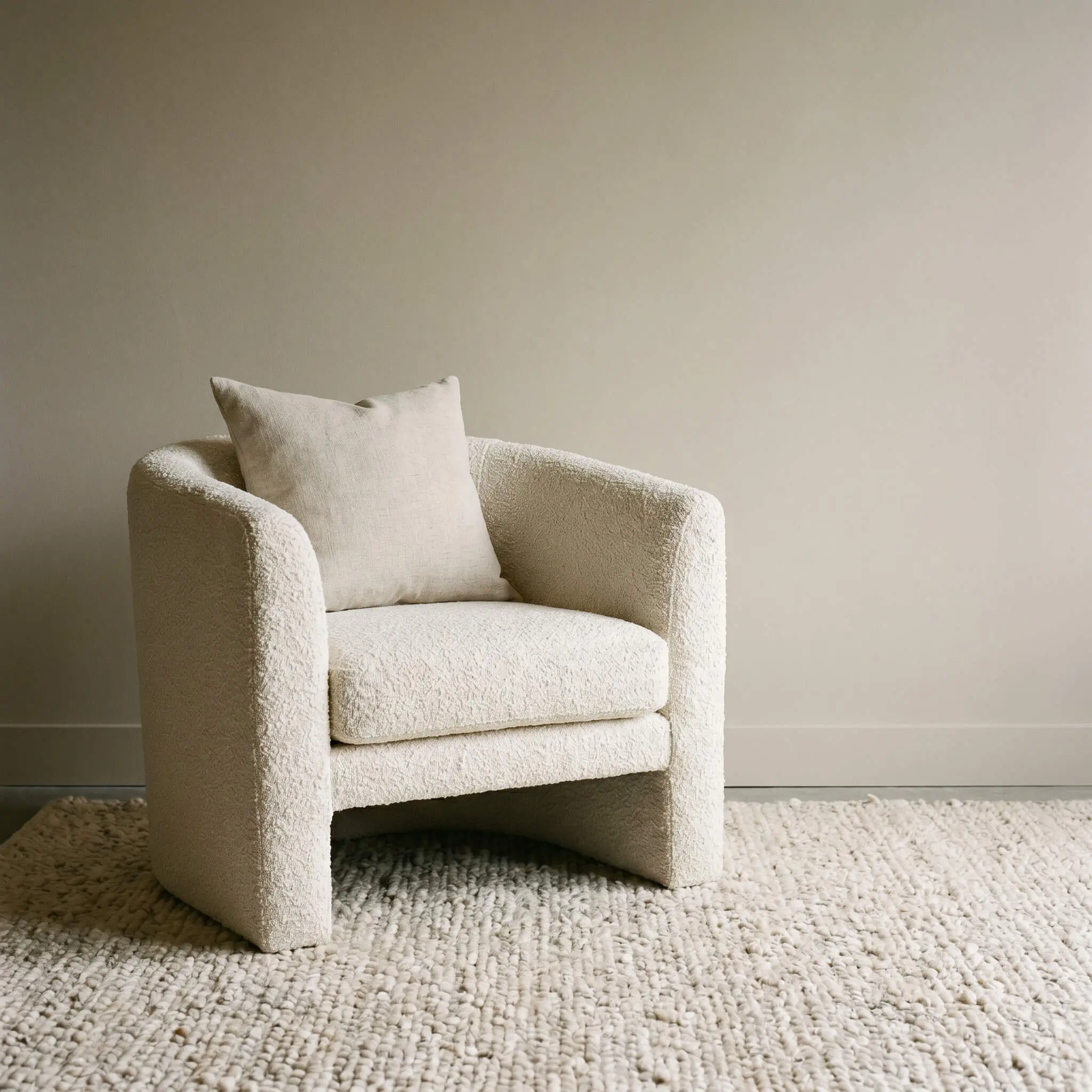
Loud, high-contrast geometric prints disrupt the calm, monolithic nature of a greige space. To generate profound visual interest without visual noise, rely entirely on extreme tactile contrasts, layering chunky woven materials against smooth walls.
- Atmosphere: Tactile, calm, and sophisticated.
- Material Match: Heavyweight linen, chunky wool, and nubby bouclé.
- Key Technique: Replace patterned throw pillows with solid pillows that feature extreme textural variance.
- Styling Pro-Tip: Anchor the seating arrangement with a deeply textured, hand-knotted wool rug to ground the smooth painted walls.
When designing a tonal room, the 80/20 rule of visual weight is critical: 80% of the room should feature smooth, monolithic surfaces (like your perfectly painted SW 7036 walls), while 20% must deliver aggressive textural friction (like a chunky bouclé chair).
Designer Secret
Curating Your Accessible Beige Sanctuary
Sherwin Williams Accessible Beige is not merely a background color; it is a highly capable, foundational tool. It acts as a chameleon, bending to the architectural choices, directional lighting, and physical textures placed within its orbit. By demanding high-contrast materials like matte black metals and rift-sawn oak, and by executing deliberate color drenching techniques, you elevate a simple gallon of paint into a masterclass in modern design.
Never commit to a color based solely on a screen. Purchase a sample, paint a large swatch, and observe how your room’s specific light alters the undertones from morning until dusk.
If you are ready to master the nuances of spatial layout and elevate your home’s architecture even further, subscribe to the Hackrea for our ongoing, deep-dive series into designer color theory and tactile alchemy.