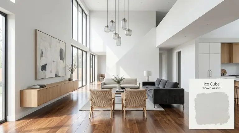
Ice Cube SW 6252
Sherwin-WilliamsSherwin-Williams Ice Cube (SW 6252) is a highly reflective, cool-toned light gray with distinct icy blue undertones. Sitting at an LRV of 77.49, this architectural finish bridges the gap between a crisp off-white and a soft pastel, bringing a refreshing chill to interior spaces.
Sherwin-Williams Ice Cube: The Crisp, Cool Gray That Reshapes Natural Light
Some paint colors absorb the energy of a room, while others actively push the boundaries of the walls outward. Sherwin-Williams Ice Cube (SW 6252) falls firmly into the latter category, acting as a highly reflective spatial expansion tool that instantly clears the visual clutter of a space.
This cool-toned off-white operates like a sharp, tailored button-down shirt for your walls. It offers just enough pigment to contrast beautifully against pure white trim, yet it remains incredibly airy.
Understanding its unique chromatic profile is the key to unlocking its full potential. By mastering how this shade captures and bends light, you can transform cramped, shadowy rooms into expansive, breathable environments.
Temperature, Undertones & LRV of Sherwin-Williams Ice Cube
When homeowners ask if Ice Cube is warm or cool, the answer is an undeniable, crisp cool. This specific visual temperature is exactly what gives the color its modern, refreshing edge.
With a light reflectance value of 77.49, this color bounces a massive amount of light back into the room. This high LRV is your best tool for spatial expansion, making tight corridors or low-ceilinged rooms feel instantly larger.
You can apply wallpapers, paints, etc. on walls and see how they look in various interiors.

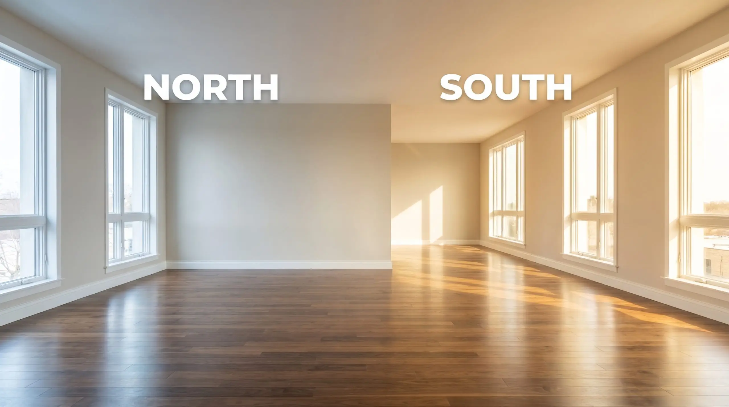
Ambient Light Absorption & The Chameleon Factor
Because of its highly reflective nature, this crisp gray dramatically shifts its personality depending on the sun’s trajectory.
Never pair this cool gray with overly warm 2700K incandescent bulbs. The yellow artificial light fights the blue foundation, creating a muddy gray-green clash that instantly drains the vitality from your room.
Hackrea Pro-Tip (The Bulb Warning)
Popular Architectural Placements for Ice Cube
You can deploy this cool-toned off-white across a variety of spaces, provided you respect its icy undertones. The most successful rooms use intentional material pairings to either warm up the chill or lean into the crisp, architectural vibe.
Crafting a Spa-Inspired Bathroom Retreat
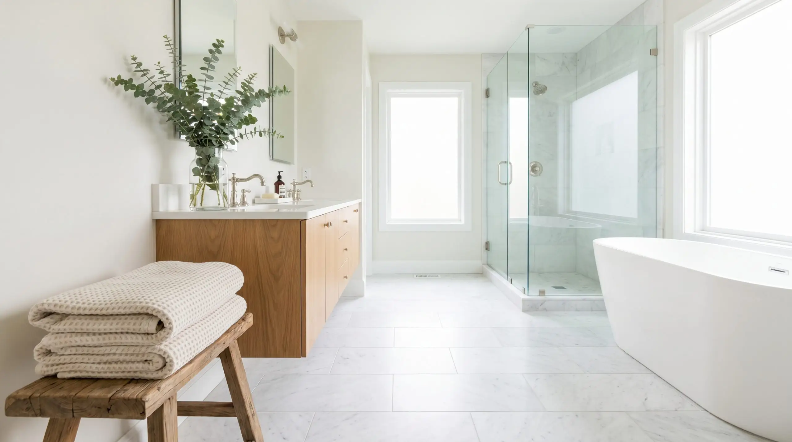
High-humidity areas with good natural light are perfect for this refreshing gray. Pair it with highly textural elements to keep the space from feeling like a sterile clinic.
Think honed Carrara marble floors, a floating white oak vanity, and polished nickel plumbing fixtures. A stack of plush, waffle-knit towels and a clear glass vase holding fresh eucalyptus will soften the crisp walls.
Designing Serene, Minimalist Bedrooms
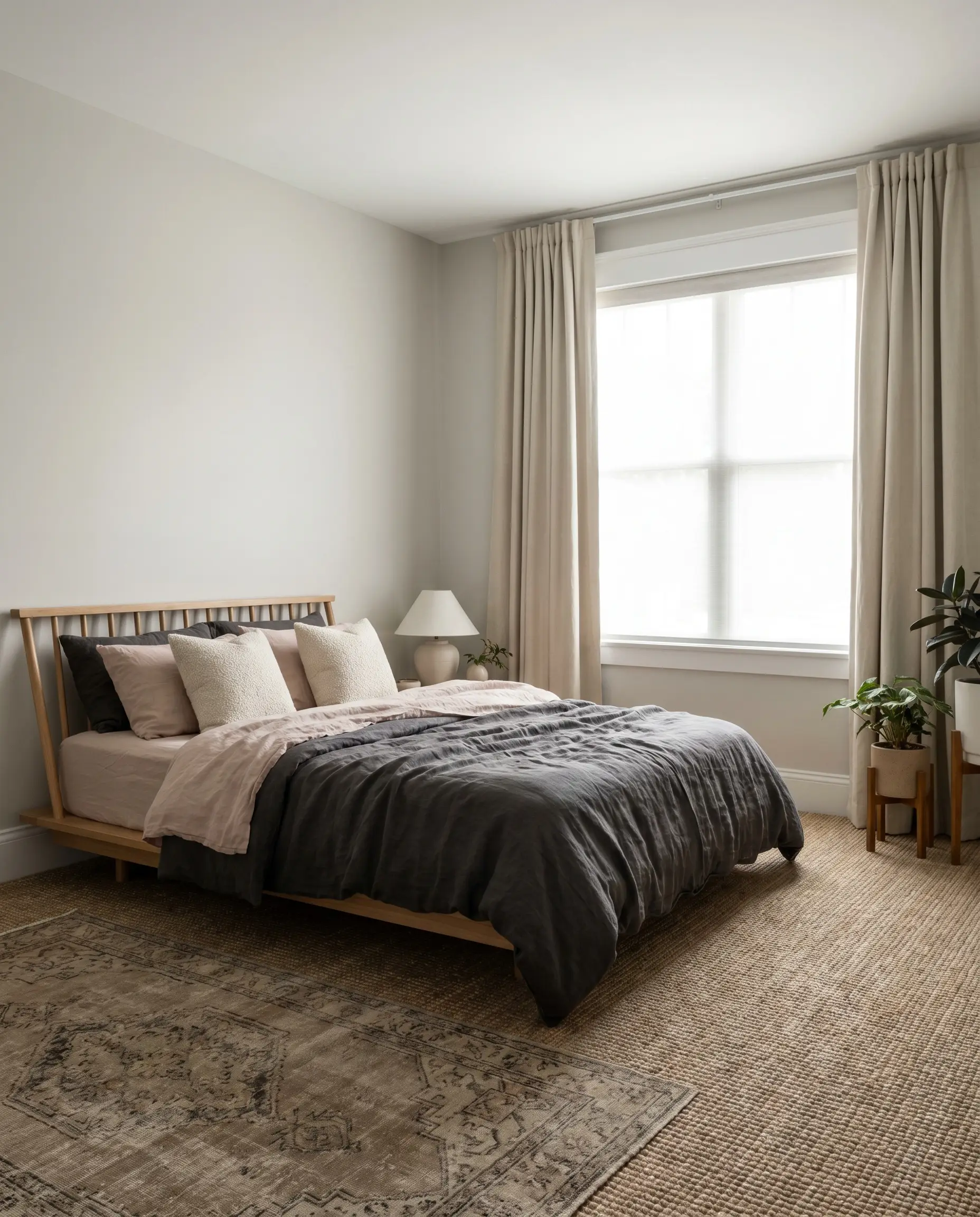
For a restful, distraction-free environment, use this shade to establish a quiet, Japandi-inspired aesthetic. The cool walls visually recede, allowing your furniture to take center stage.
Introduce a low-profile spindle bed dressed in layered, washed linen sheets in charcoal and soft blush. Add warmth with raw terracotta table lamps and a vintage rug layered over a textured sisal carpet.
When wrapping a bedroom in a highly reflective, cool gray, you must introduce tactile warmth. Thick canvas drapery and boucle accent pillows provide the necessary physical friction to keep the room feeling inviting.
Hackrea Design Secret (Textile Balancing)
Refreshing Well-Lit Utility Spaces
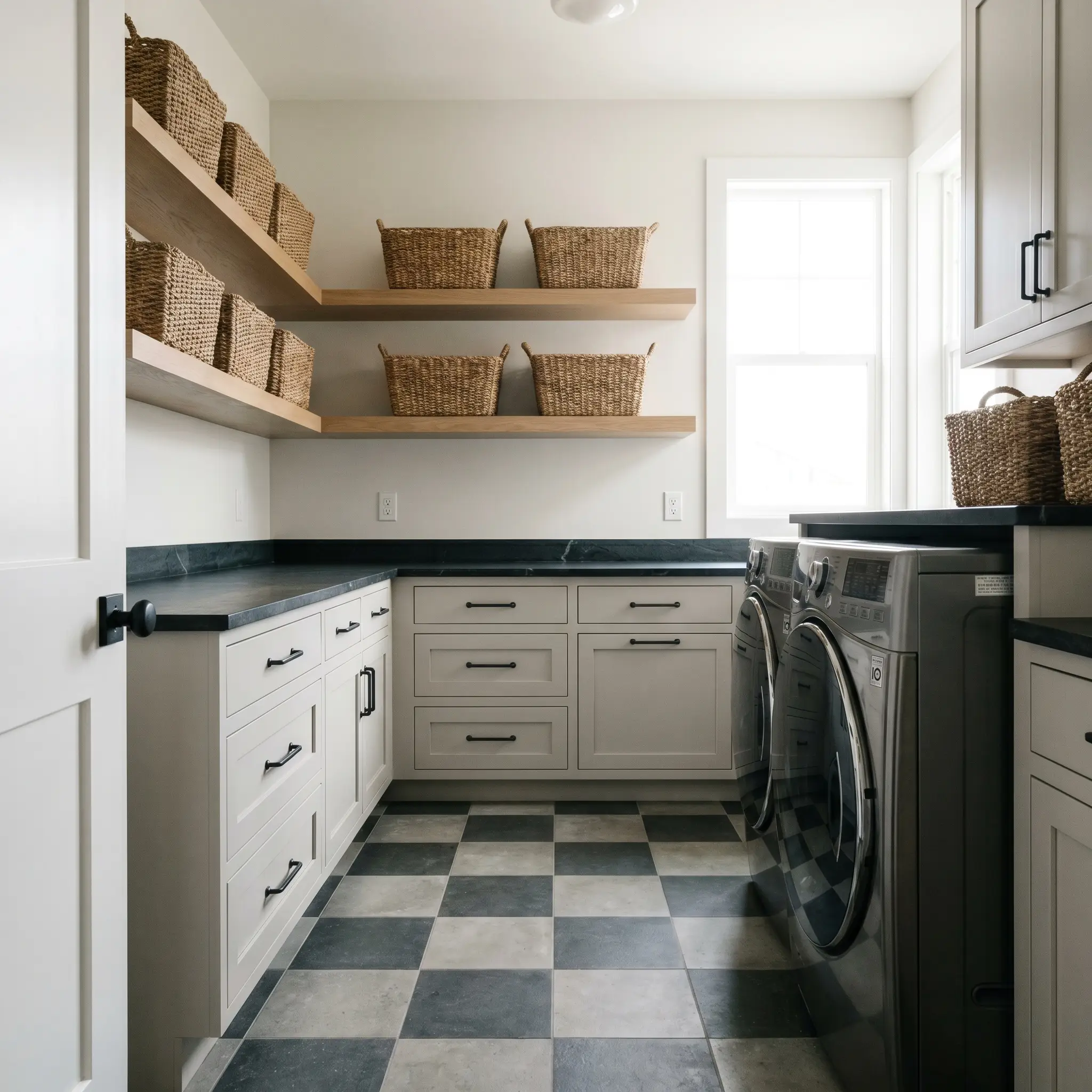
Utilitarian spaces thrive with a clean color structure that maximizes the available light. This shade makes sorting clothes or organizing supplies feel remarkably less chaotic.
Contrast the icy walls with dark soapstone countertops and blackened steel cabinet hardware. A checkerboard concrete floor and floating shelves stacked with woven catchalls add a touch of soft industrial charm.
Setting the Tone in Modern Entryways
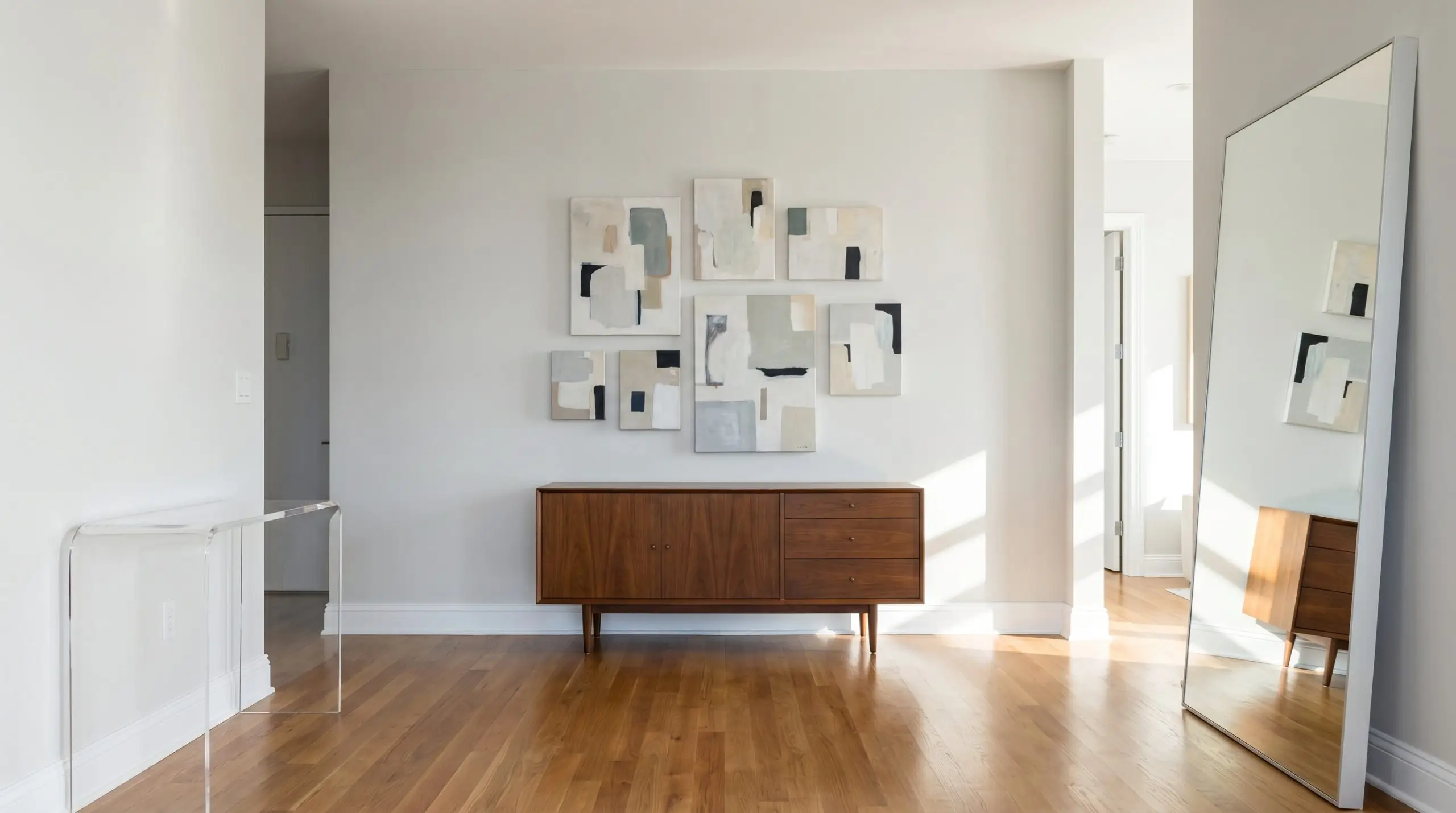
First impressions matter, and a crisp, light gray instantly communicates a tailored, highly organized home. It acts as a brilliant, neutral backdrop for an eclectic mix of art and furniture.
Center the space with a mid-century vintage credenza topped with an asymmetrical gallery wall of abstract canvases. A sculptural acrylic console table or an oversized, floor-leaning mirror will bounce even more light down the hallway.
Transforming Beadboard and Ceiling Architecture
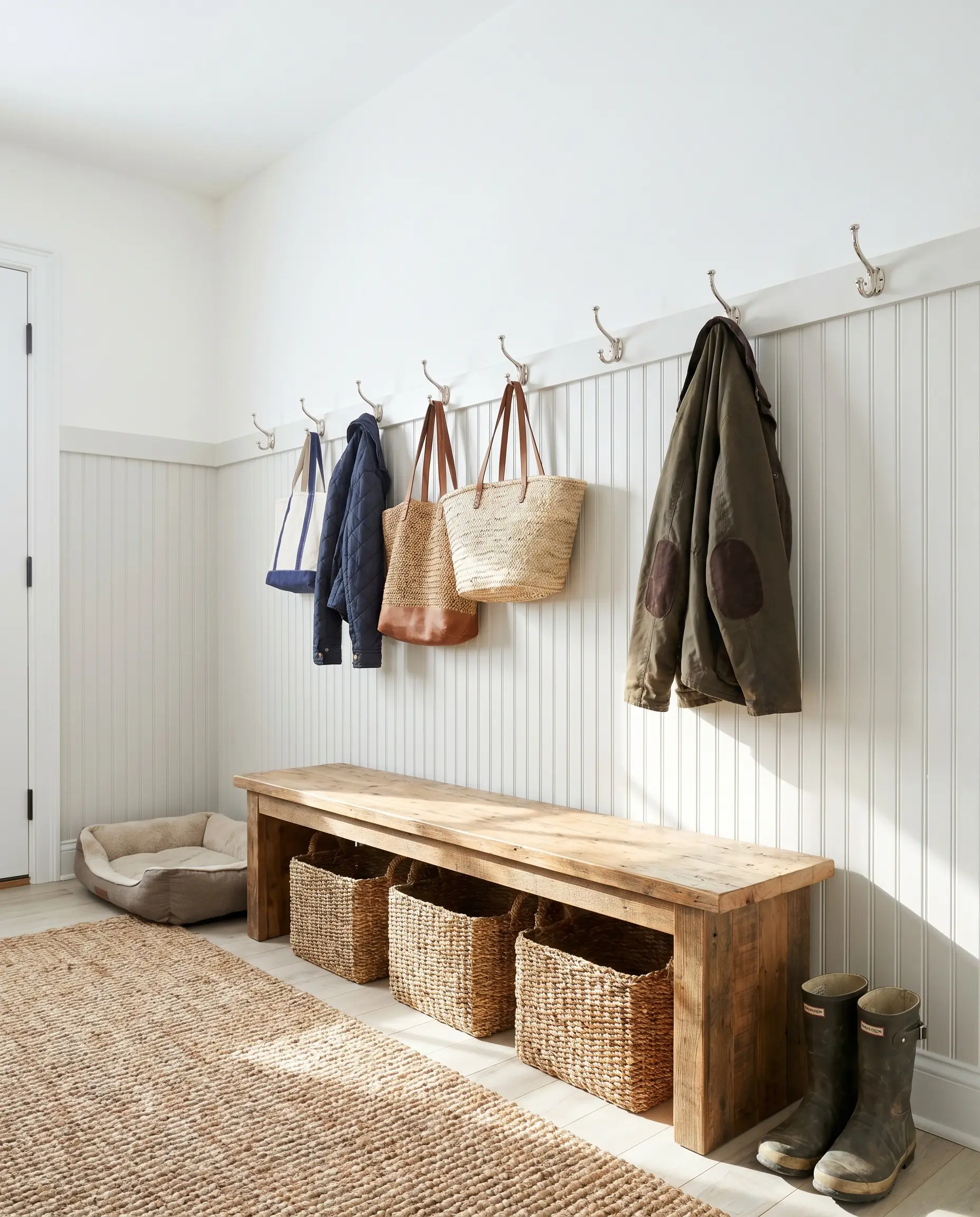
Do not limit this color to standard drywall; its subtle pigmentation shines when applied to textured millwork or overhead surfaces. Painting the ceiling this soft blue-gray mimics the open sky, visually raising the roofline.
Apply it to classic beadboard wainscoting in a mudroom, contrasting it against crisp white upper walls and a reclaimed pine bench. For a bolder statement, drench exposed ceiling beams in this cool gray while keeping the surrounding ceiling flat white.
Pairing Sherwin-Williams Ice Cube: Materials and Palettes
This highly reflective paint requires deliberate, contrasting textures to prevent its icy undertone from washing out a room. You must actively introduce deep, grounding accents or razor-sharp boundaries to give this cool-toned off-white a distinct visual purpose.
Precision Trim and Baseboard Selections
Tactile Elements and Hardware Integration
Grounding Accent Palettes
Curated Room Aesthetics
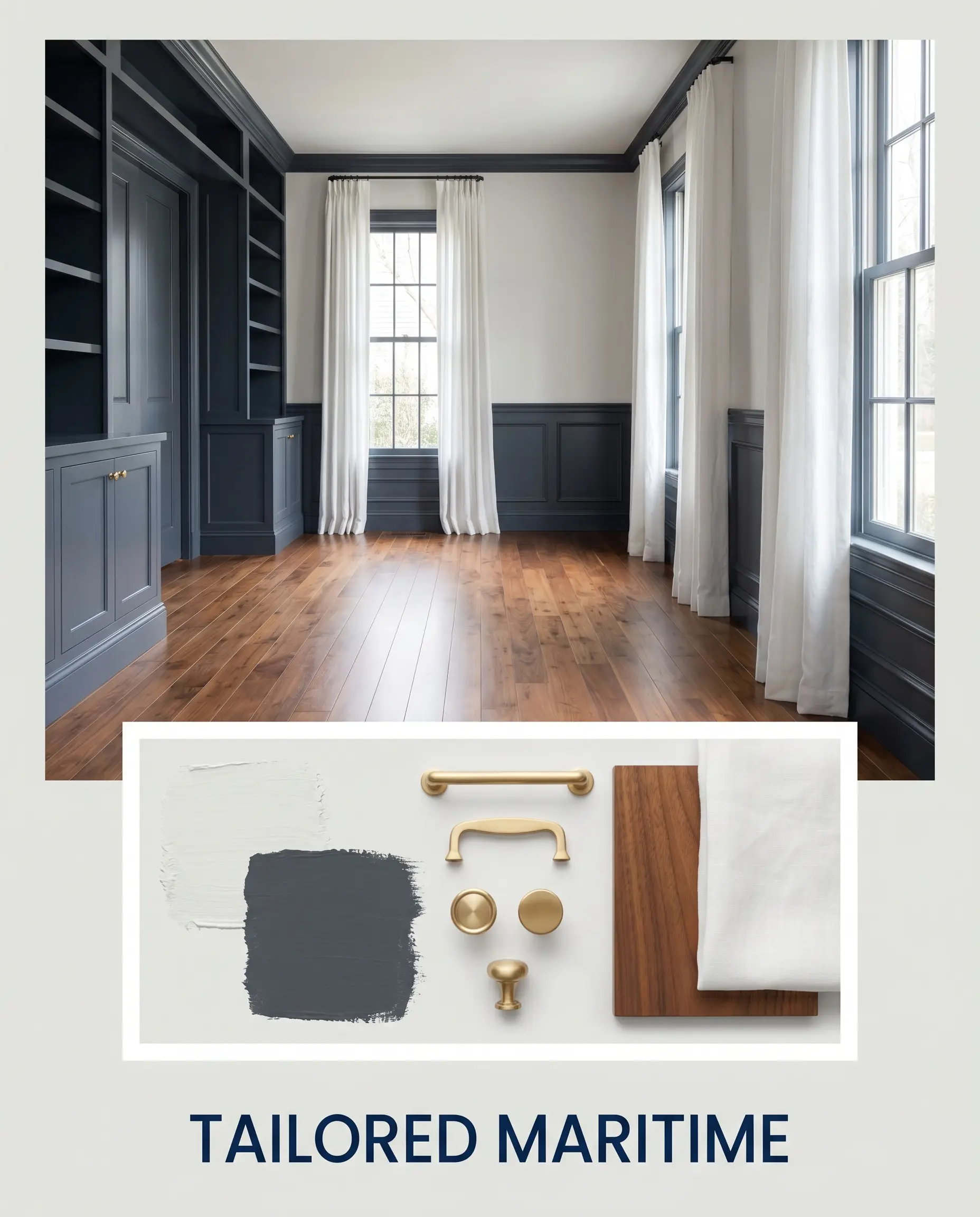
Tailored Maritime This aesthetic uses sharp, high-contrast boundaries to create a highly structured, sophisticated environment. Crisp walls serve as the backdrop for Benjamin Moore Hale Navy millwork, while unlacquered brass hardware adds a layer of lived-in warmth. Polished walnut floors and crisp, white linen drapery complete the tailored, yacht-inspired energy.
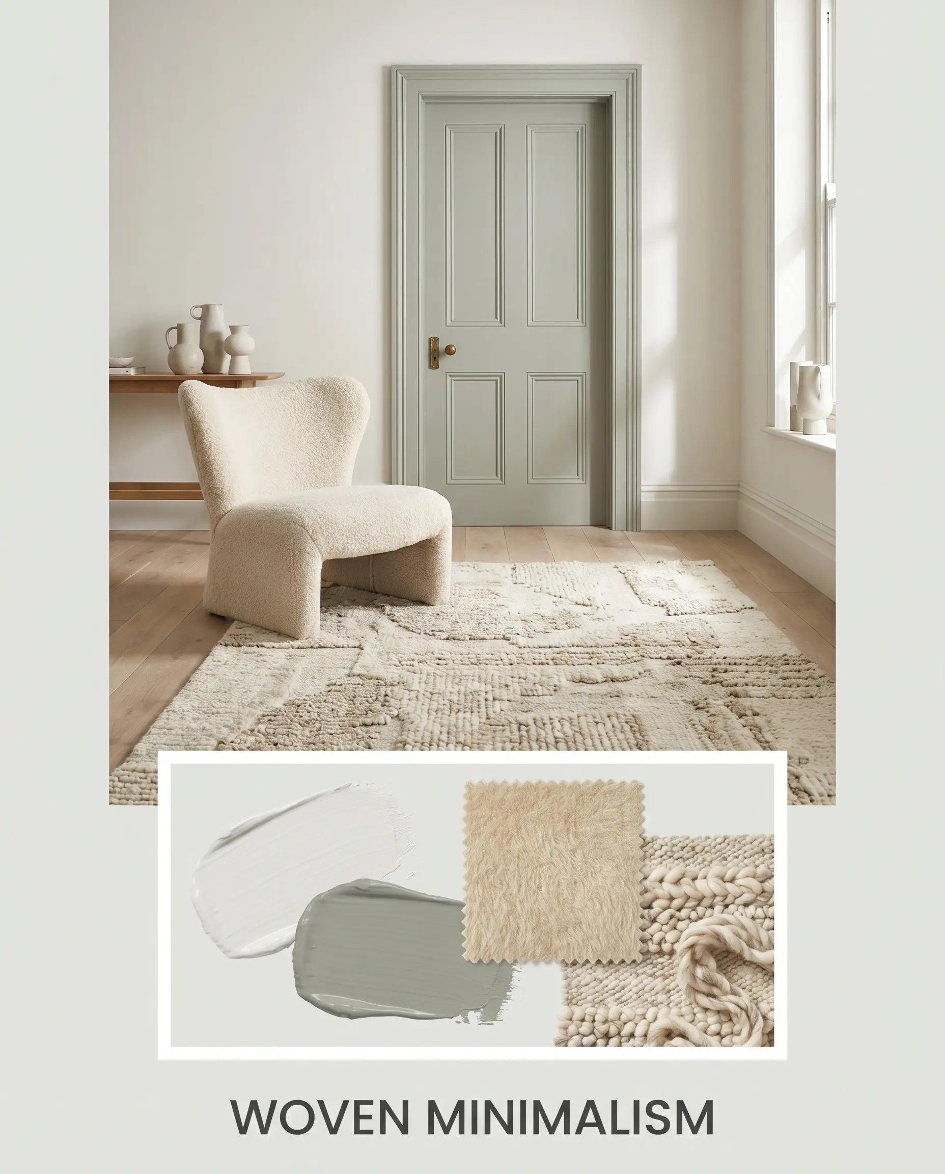
Woven Minimalism To soften the chill of the paint, this palette relies entirely on dense, light-absorbing textures. Mohair accent chairs and thick, hand-knotted wool rugs provide a plush counterweight to the airy walls. Farrow & Ball Pigeon is used on interior doors to inject a subtle, earthy grounding effect without breaking the serene mood.
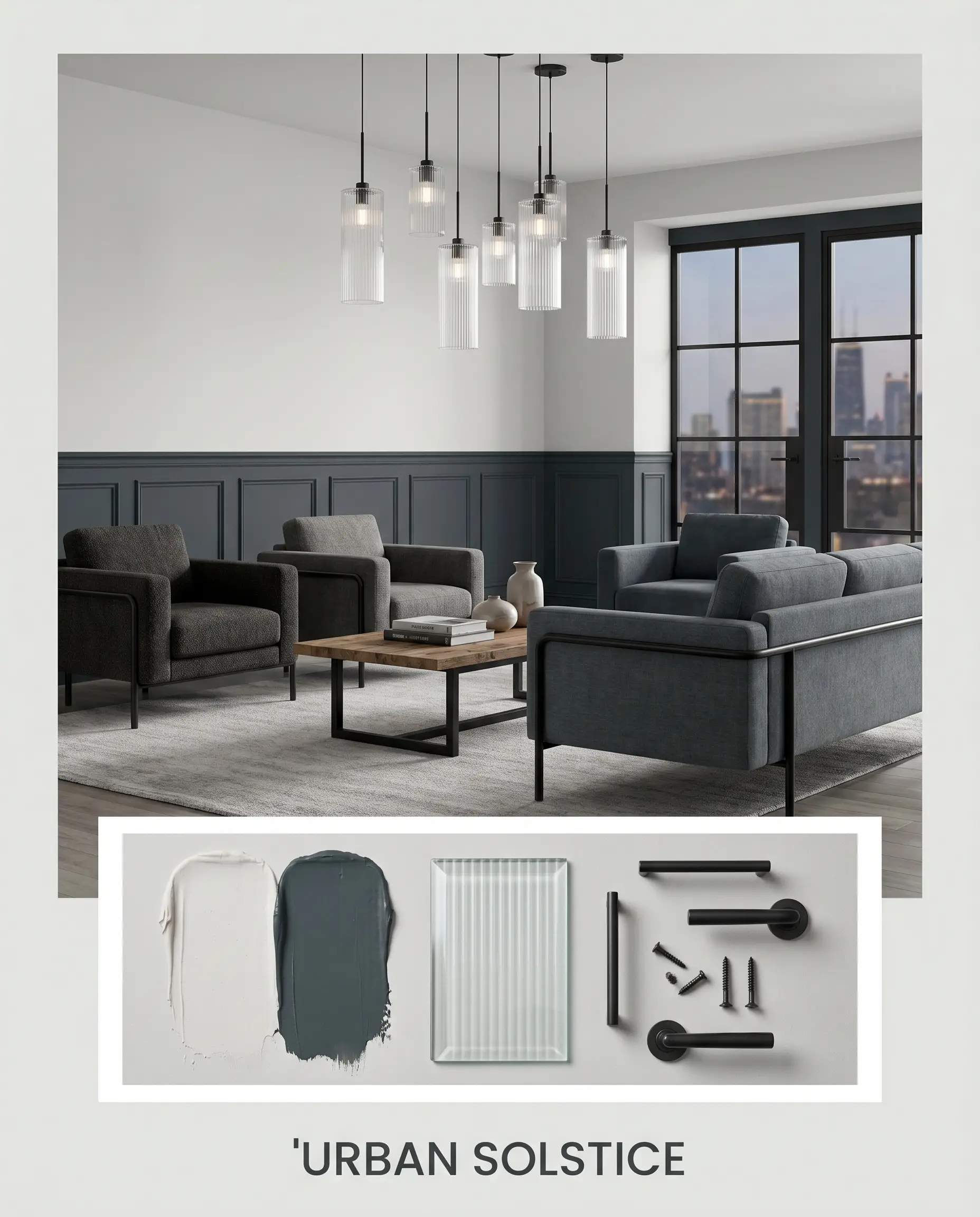
Urban Solstice This high-impact look embraces the paint’s modern edge by pairing it with industrial elements and stark contrasts. Sherwin-Williams Outerspace coats the lower architectural features, while fluted glass light fixtures scatter the ambient light across the cool walls. The styling remains sparse, featuring blackened steel framing and low-profile, track-arm seating.
Sherwin-Williams Ice Cube vs. Leading Cool Grays
When testing cool-toned off-whites, the final decision often comes down to the specific angle of your natural light and the fixed architectural elements already present in the home. If your space features intensely red-leaning brick or blinding southern exposure, a rival gray might handle the ambient light absorption more effectively.
Sherwin-Williams Ice Cube vs. Sherwin-Williams Olympus White SW 6253
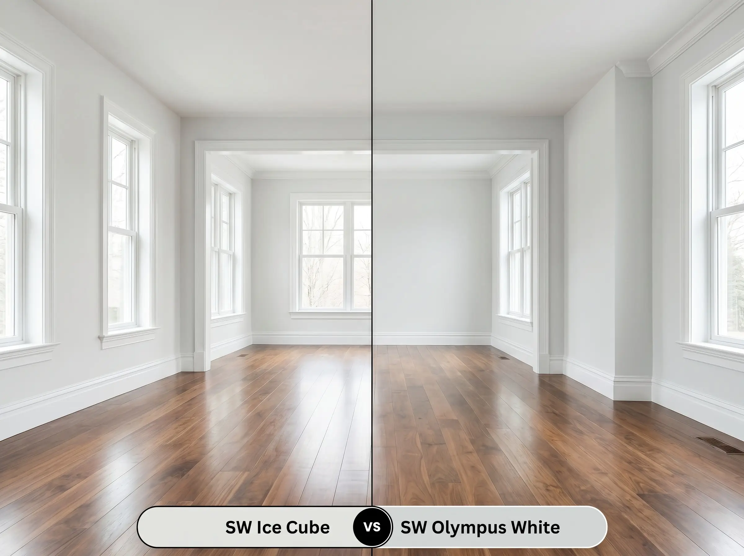
Olympus White carries a slightly lower light reflectance value and a more pronounced, saturated blue-gray base. If your room receives blinding afternoon sun that washes out lighter colors, Olympus White will hold its structure much better.
Sherwin-Williams Ice Cube vs. Sherwin-Williams Rhinestone SW 7656
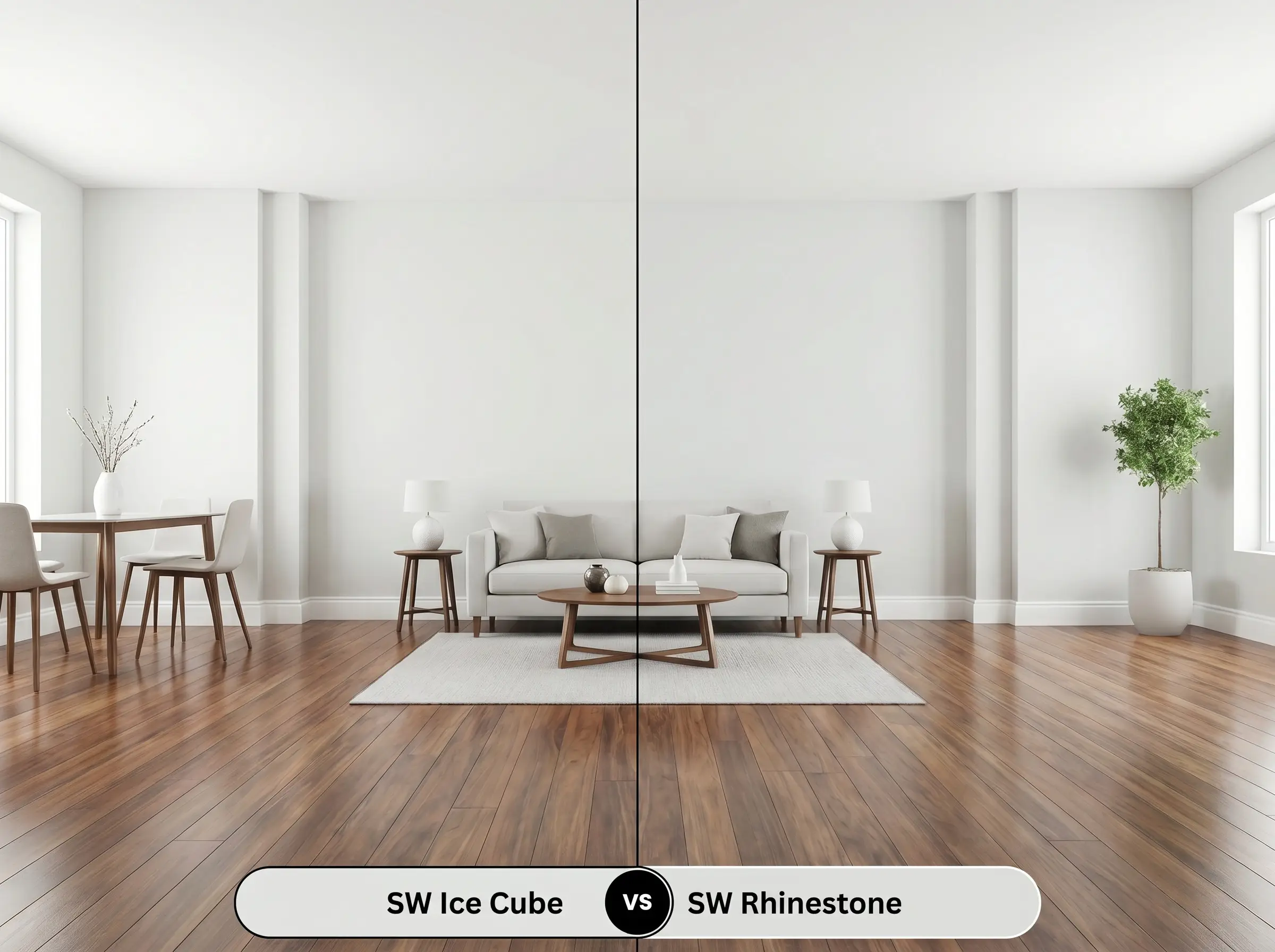
Rhinestone shares a similar lightness but leans strongly toward a crisper, almost minty green undertone rather than blue. If you are pairing the paint with warm terracotta floors, Rhinestone will clash less intensely than the icy blue cast of its rival.
Sherwin-Williams Ice Cube vs. Benjamin Moore Paper White OC-55
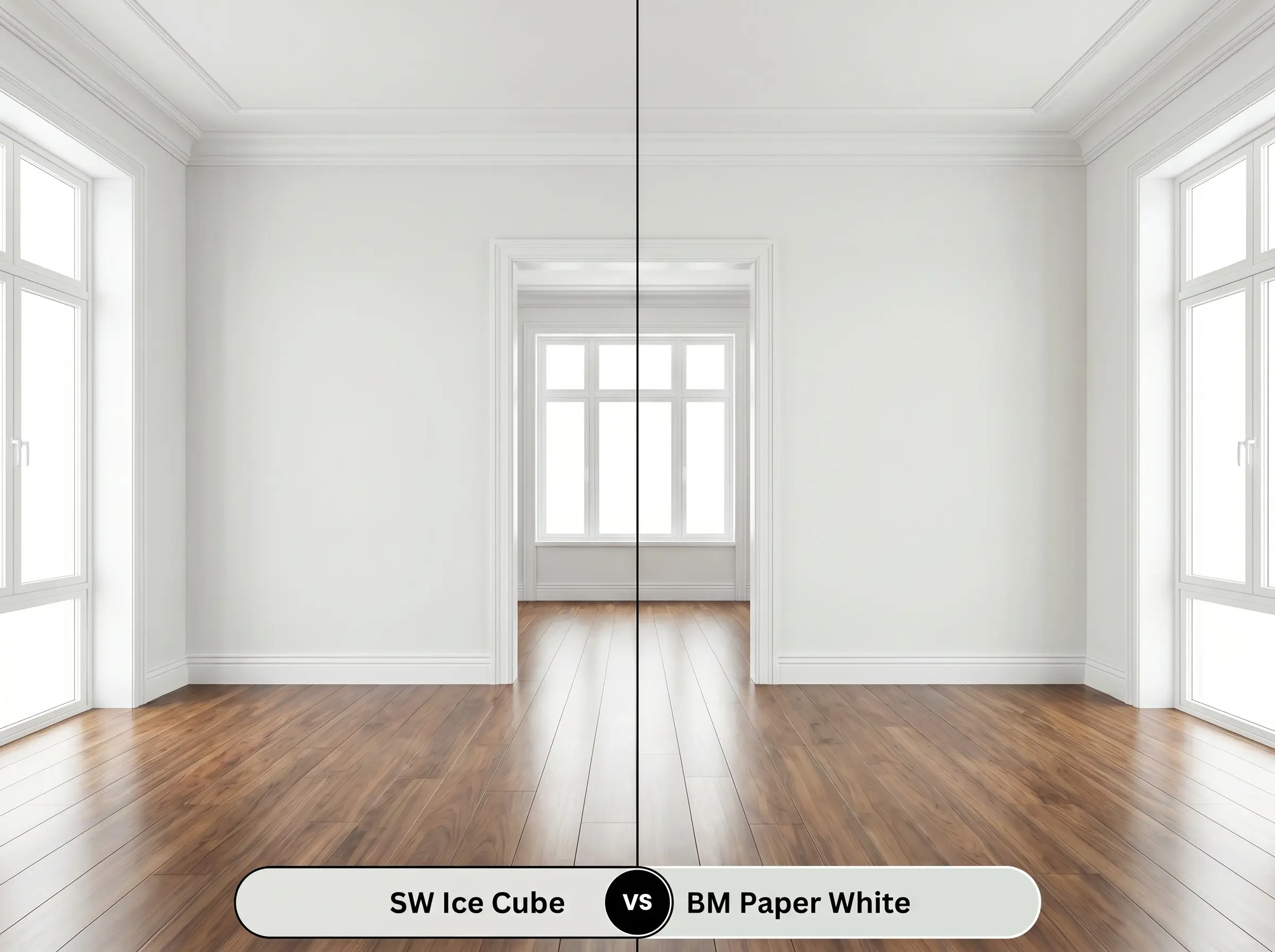
Paper White features a distinctly softer, slightly warmer gray base with less aggressive light reflectance. If you want a gentle, atmospheric glow rather than a sharp architectural finish, the Benjamin Moore alternative is the superior choice.
Exploring Alternative Crisp Off-Whites
Sometimes a color looks perfect on a swatch but feels slightly too intense or too bright once tested on your actual walls. Whether you need a deeper pigment to anchor a large layout or you are restricted to a specific manufacturer, these close matches offer strategic pivots.
Same-Brand Variations
Cross-Brand Matches
Executing Your SW Ice Cube Project
Translating this highly reflective gray from a digital concept to a physical wall requires strict attention to your materials and application methods.
Strategic Sheen Selection
Primer Strategy
This highly reflective shade requires a premium, high-hide white primer tinted to a cool gray. A standard, untinted white primer will struggle to mask underlying warm tones, allowing old yellow or beige paint to subtly muddy the final finish.
Coverage & Success Tips
Plan for two generous coats, as light cool grays are notorious for showing roller marks if stretched too thin over drywall. Always maintain a wet edge while rolling to prevent “flashing,” where overlapping dry and wet paint creates visible, permanent streaks in the final sheen.
Common Paint Queries
Because textured ceilings create micro-shadows that trap light, this color’s blue cast will absolutely intensify overhead. If the room lacks strong natural sunlight, it will lean noticeably toward a soft baby blue rather than a crisp gray.
The intense orange and red tones in the wood will actively fight the cool blue-gray walls, often making the paint look noticeably colder and more sterile. You must bridge this gap with large, textured rugs to soften the abrupt transition.
While it lacks the tactile texture of authentic limewash, applying it in a dead flat finish alongside raw concrete and blackened steel creates a strikingly similar, austere aesthetic. Its high light reflectance softens the dense, imposing feel of brutalist materials.
Under crisp 4000K lighting, this shade performs brilliantly, rendering as a clean, hyper-modern off-white that feels exceptionally sanitary and bright. It effectively mimics the feeling of natural daylight in enclosed utility spaces.
The dense green canopy filters the sunlight, causing the paint’s hidden gray-green trace to surface prominently. Instead of a crisp white, the exterior will take on a moody, shaded slate appearance that blends organically with the landscape.
The Hackrea Final Verdict
Sherwin-Williams Ice Cube is a brilliant tool for light manipulation, perfectly suited for homeowners who want to visually expand their spaces with a crisp, tailored aesthetic. It thrives in south-facing rooms, modern minimalist layouts, and coastal-leaning designs where its refreshing energy can breathe life into tired architecture. When paired with rich woods and highly tactile fabrics, it transforms standard drywall into a sophisticated, airy backdrop that feels incredibly intentional.
You must actively avoid using this highly reflective gray in rooms dominated by Tuscan-style travertine, amber-toned wood trim, or earthy terracotta tiles. The intense, inherent warmth of those materials will aggressively reject the icy blue foundation of the paint, resulting in a disjointed, muddy gray-green clash that feels visually jarring. If your home features predominantly warm, yellow-leaning fixed elements, attempting to force this cool-toned off-white onto the walls will strip the room of its inviting energy and leave the space feeling permanently unfinished and stark.
Clash Warning (The Warmth Resistance)