White Flour SW 7102
Sherwin-WilliamsSherwin-Williams White Flour (SW 7102) is a soft, warm off-white with gentle creamy beige undertones. With an LRV of 87, it acts as a highly reflective, brightening neutral that avoids the starkness of pure whites while remaining less yellow than traditional cream.
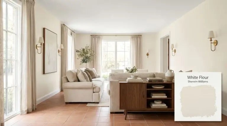
Sherwin-Williams White Flour: Crafting the Perfect Warm Neutral Foundation
Finding a white paint that illuminates a room without turning it into a sterile clinic is one of the most common challenges in residential design. Homeowners often cycle through dozens of swatches, searching for a shade that bounces natural light while retaining a sense of lived-in comfort. Sherwin-Williams White Flour offers a highly specific solution to this exact problem.
This warm off-white architectural finish operates as a structural foundation for your walls, bringing a soft, sunlit energy to a room regardless of the actual weather outside. It actively resists the stark, chalky finish of pure builder-grade whites. Instead, White Flour wraps a space in a subtle, creamy radiance that instantly makes rigid architecture feel more forgiving.
Because of its specific chromatic profile, this color requires a strategic approach to lighting and material pairings. We are going to break down exactly how SW 7102 behaves across different environments, and how you can manipulate its underlying tones to build a beautifully curated home.
Sherwin-Williams White Flour: Temperature, Undertones & LRV
Sherwin-Williams White Flour is a definitively warm paint color. It carries enough golden energy to instantly thaw out a chilly room, establishing a soft neutral cast that feels welcoming rather than clinical.
You can apply wallpapers, paints, etc. on walls and see how they look in various interiors.

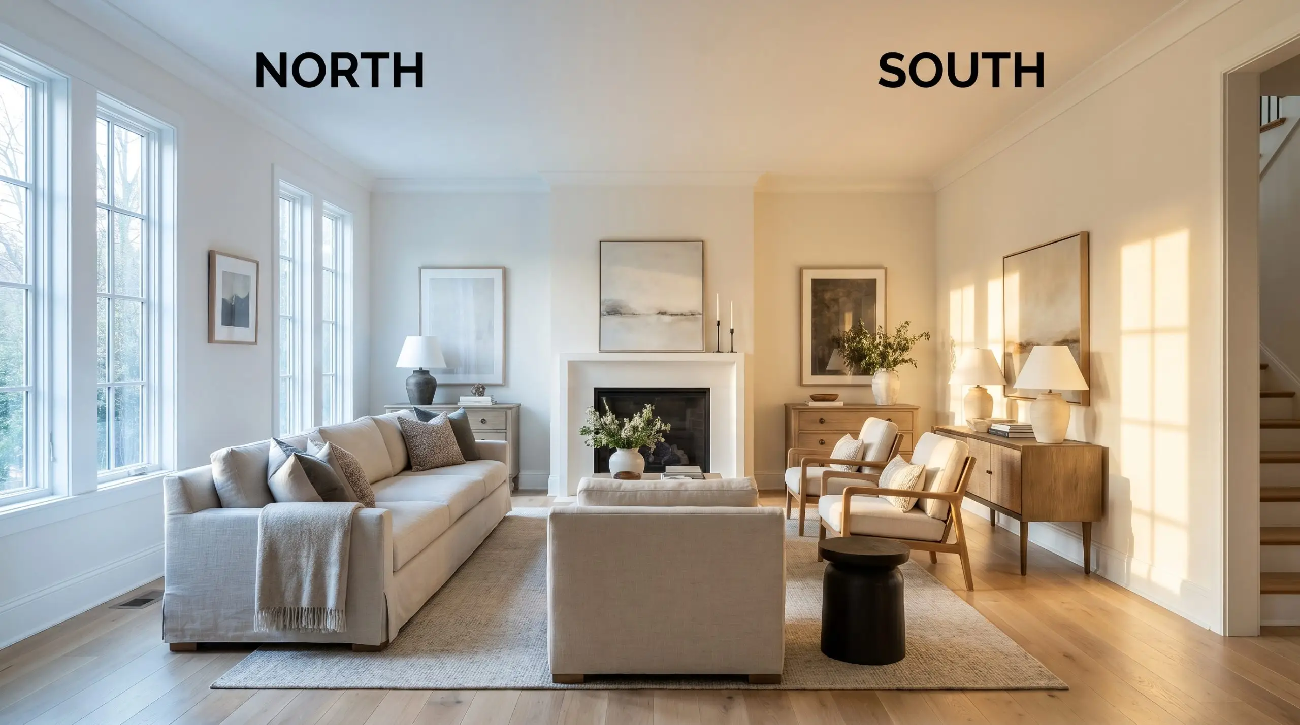
Ambient Lighting Shifts & The Chameleon Factor
The way light filters through your windows will dramatically alter how the underlying yellow and bone tones in White Flour are perceived.
If you want to maintain the soft, modern off-white appearance of SW 7102 at night without letting it turn overly yellow, swap your standard 2700K bulbs for 3000K to 3500K LEDs. This temperature range provides a clean, neutral glow that flatters the paint’s subtle bone tint.
Hackrea Pro-Tip (The Bulb Rule)
Popular Applications for This Warm Off-White
The true value of this creamy neutral lies in its ability to adapt. Because it balances a high LRV with tangible warmth, it serves as a highly forgiving backdrop that easily transitions between different lighting scenarios and material palettes.
Transitional Kitchen Cabinetry
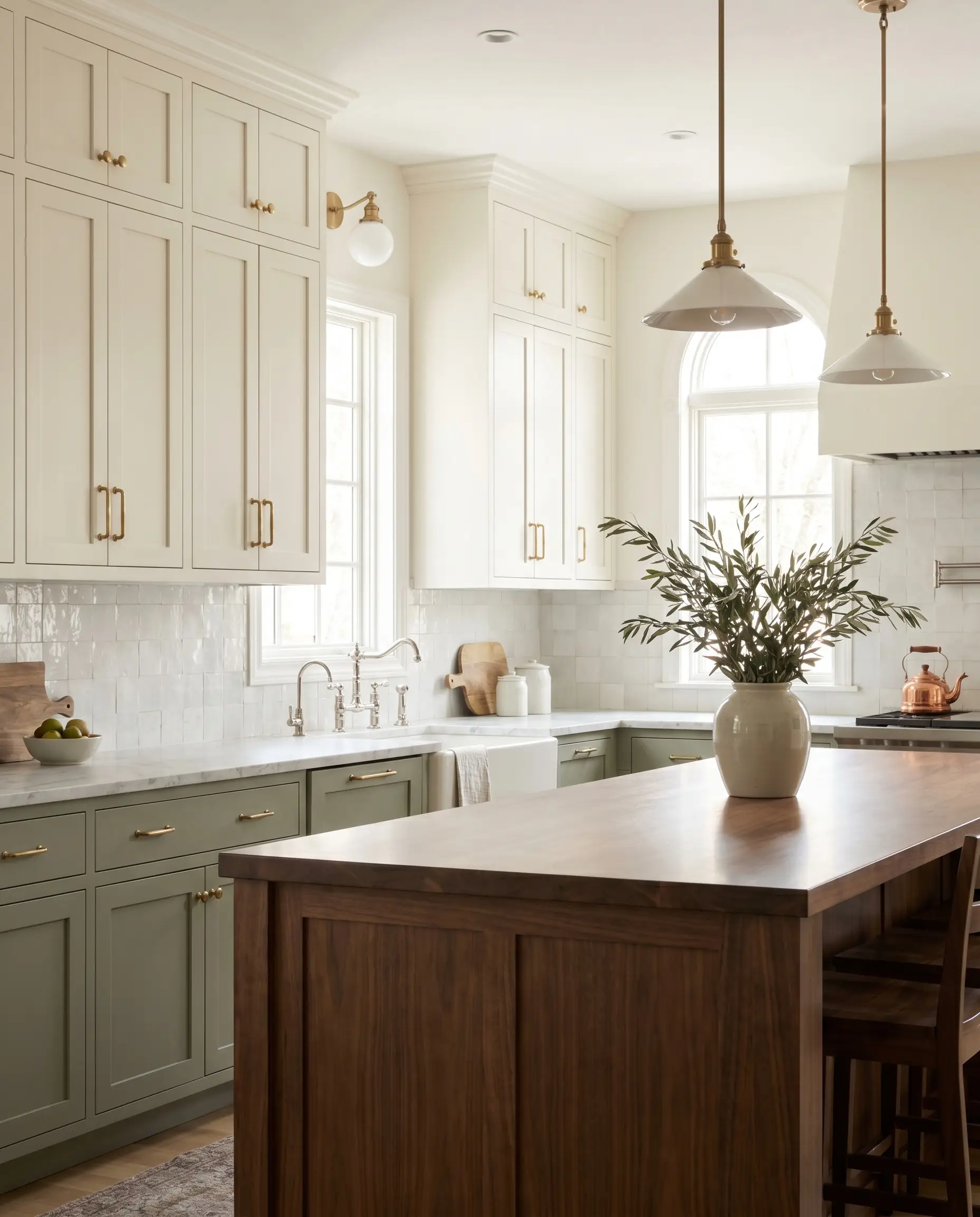
While a yellow-based hue is often associated with rustic farmhouse kitchens, applying White Flour to flat-panel or shaker cabinetry immediately softens the rigid lines of a modern, transitional layout. The creamy beige color structure provides a beautiful alternative to stark white kitchens, especially when paired with a premium slab of honed Carrara marble or a textured zellige tile backsplash. To balance the warmth of the paint, introduce unlacquered brass cabinet hardware and polished nickel plumbing fixtures. This mix of metals adds a sophisticated visual tension. If you are updating standard kitchen boxes, painting the lower cabinets in a muted sage or soft black while using SW 7102 on the uppers will stabilize the room’s proportions and draw the eye upward.
North-Facing Living Rooms
Rooms that only receive cool, indirect northern light often feel shadowy and unwelcoming. White Flour actively combats this by using its yellow undertones to inject artificial sunshine into the space. In a Scandinavian or Soft Minimalist living room, use a matte finish on the walls to absorb glare and create a velvety texture. Pair the paint with low-profile, slipcovered sofas in washed linen and introduce natural white oak flooring to establish a seamless, organic flow. To prevent the room from feeling too floaty, introduce visual weight through a blackened steel coffee table or a dark charcoal geometric flatweave rug.
Because this paint relies heavily on a creamy beige foundation, never pair it with cool, blue-based grays. The conflicting temperatures will make the gray look like dirty cement and force the off-white to read as dingy yellow. Always opt for warm taupes, greiges, or earthy tones instead.
Clash Warning (The Gray Conflict)
Cozy Primary Bedrooms & Retreats
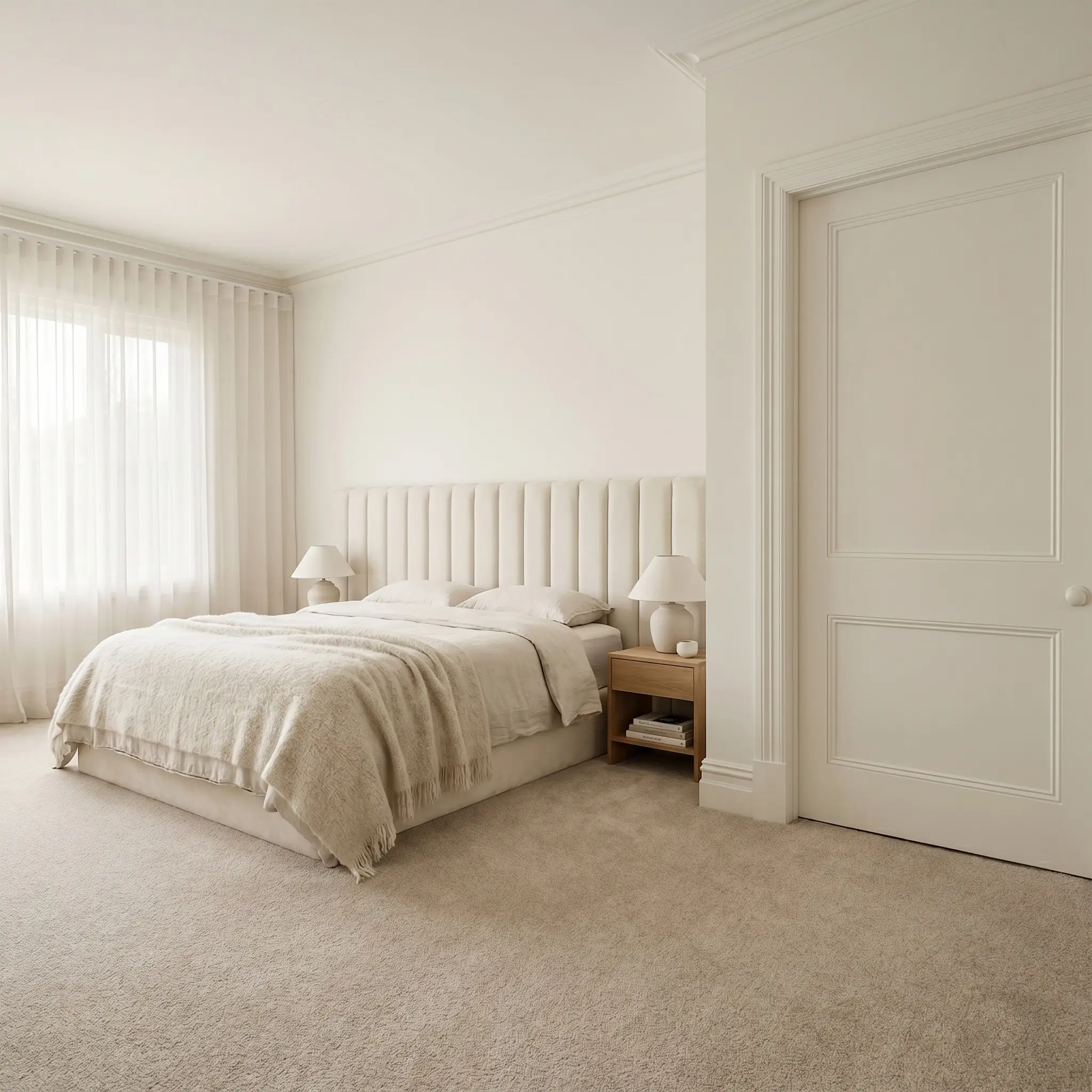
For a primary suite designed as a quiet sanctuary, lean into the paint’s subtle bone tint by utilizing a tonal color-drenching technique. Painting the walls, baseboards, crown molding, and interior doors in the exact same shade of White Flour blurs the architectural boundaries, making standard ceiling heights feel taller and more expansive. Contrast this soft, monolithic envelope with highly tactile textiles. Layer a channel-tufted headboard in performance velvet against the wall, and drape a heavy alpaca throw over the foot of the bed. If you have wall-to-wall carpeting, ensure the carpet leans toward a warm oatmeal or taupe rather than a stark, cool silver.
Open-Concept Hallways
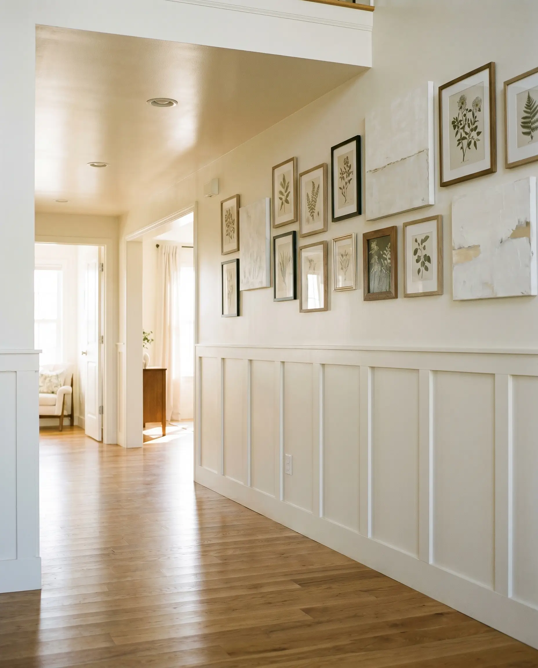
Hallways are notoriously starved for natural light, making the 87 LRV of this architectural finish incredibly useful. The paint bounces whatever ambient light is available from adjacent rooms, preventing narrow corridors from feeling closed in. To elevate a standard drywall hallway, install picture molding or a simple board and batten treatment along the lower half of the wall. Paint the millwork in a durable satin finish of White Flour, and use a flat finish of the same color on the upper walls. This subtle shift in sheen highlights the architectural details without requiring contrasting colors. Use the warm, highly reflective upper walls to display an asymmetrical gallery wall of abstract canvas art or framed botanicals.
Exterior Siding & Trim
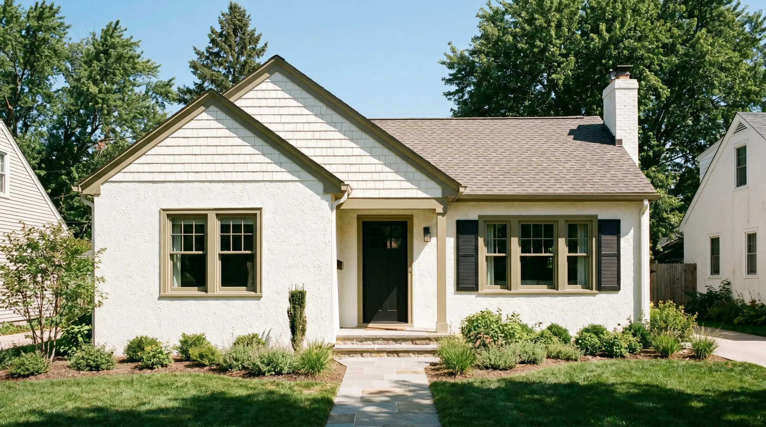
When taken outside, direct sunlight strips away much of the perceived color in any paint. On an exterior facade, White Flour loses its overt creaminess and reads as a brilliant, sun-washed white that feels historically grounded rather than blindingly new. It performs exceptionally well on textured surfaces like traditional stucco, brick, or cedar shake siding. To create a modern cottage aesthetic, pair the soft off-white siding with a warm, earthy trim—like a muted olive green or a rich terracotta red—on the window sashes and fascia boards. If you are updating a classic suburban home, use a soft black on the front door and shutters to secure the exterior palette and provide sharp, intentional contrast.
Coordinating Colors & Material Pairings for White Flour
This creamy beige color structure relies on subtle tonal shifts rather than stark contrasts to define a room. Placing it next to the right finishes determines whether the walls recede into a soft, atmospheric glow or establish a clean, tailored boundary.
Trim & Baseboards
Hardware, Wood & Material Pairings
Coordinating Colors
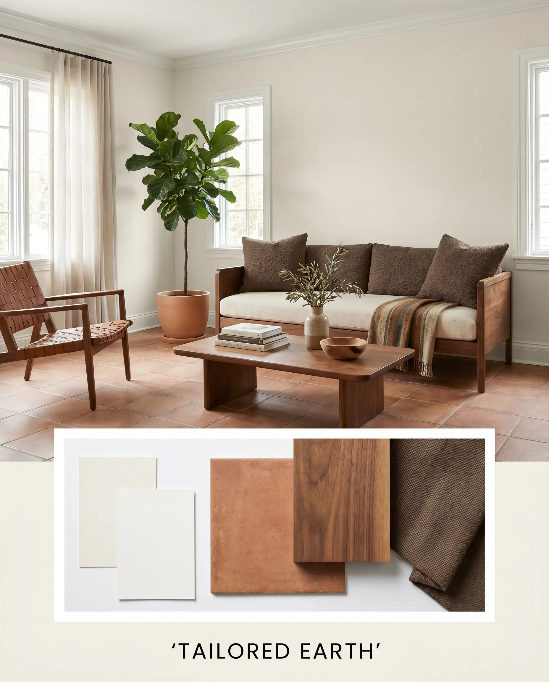
Designer Mood Boards
Tailored Earth: This palette merges the crisp boundaries of Chantilly Lace trim with the grounding, earthy depth of matte terracotta tiles. Introducing mid-tone walnut furniture silhouettes establishes a quiet, structured energy that feels both highly curated and deeply relaxing. Layering in accents of London Clay provides a rich, shadowy contrast that allows the warm off-white walls to radiate a gentle, sun-baked glow throughout the day.
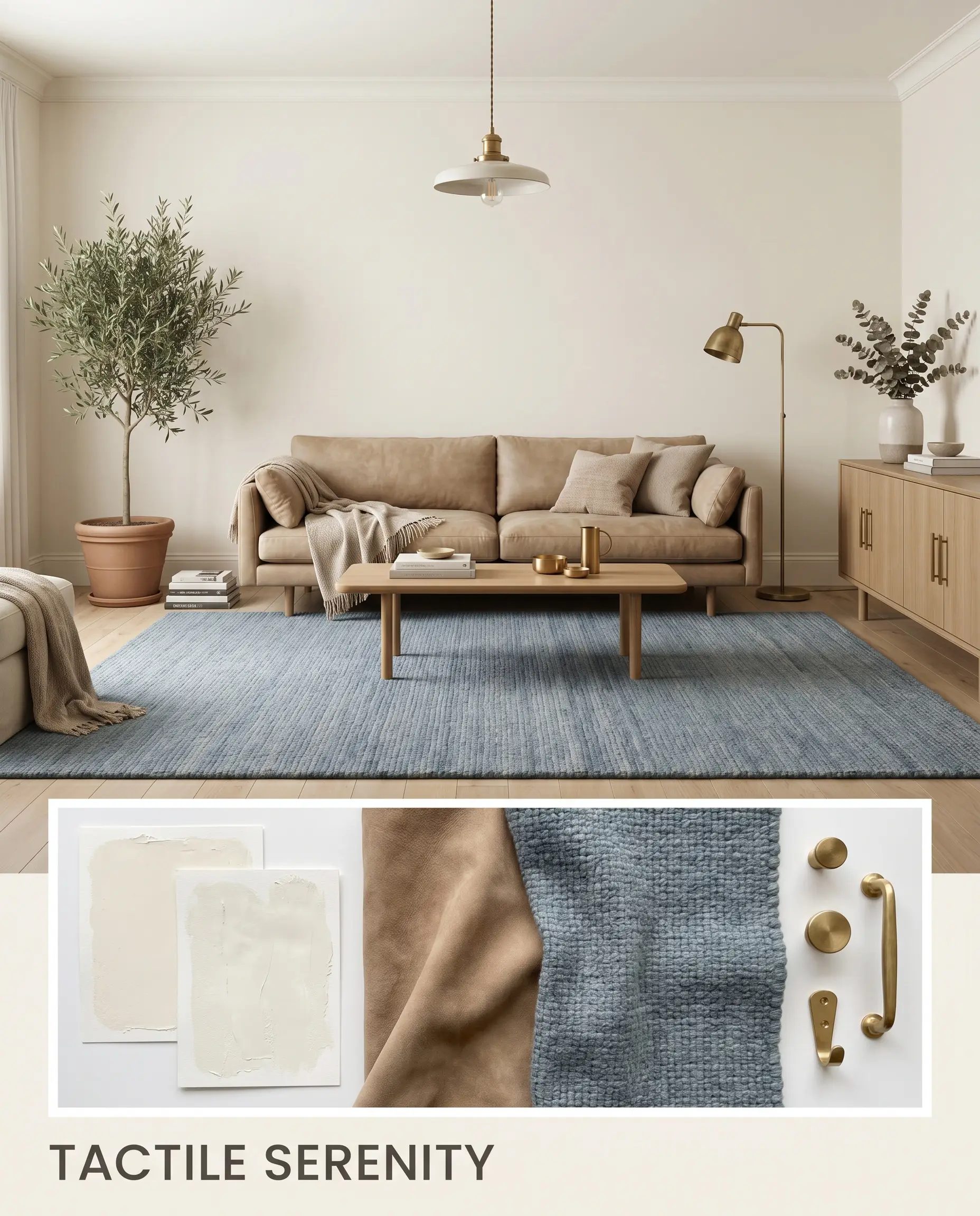
Tactile Serenity: By relying on the seamless atmospheric bleed between the main walls and All White trim, this combination creates an uninterrupted envelope of softness. Bringing in nubuck leather upholstery and a muted rug in Smoky Azurite introduces a gentle visual tension that keeps the room from feeling overly floaty. The addition of unlacquered brass hardware catches ambient light, adding a subtle spark of vitality to an otherwise deeply calming, restorative environment.
Head-to-Head Paint Comparisons
When testing off-whites, the final decision often comes down to the specific lighting conditions and architectural exposures of your home. A slight shift in natural light can easily push a seemingly perfect neutral into a dingy or overly stark territory. Understanding how rival paints handle these environmental shifts is crucial for a flawless execution.
Sherwin-Williams White Flour vs. Sherwin-Williams Creamy SW 7012
Sherwin-Williams Creamy carries a slightly lower light reflectance and a much more pronounced yellow-peach base. If your room faces north and needs a significant injection of artificial sunshine, Creamy will provide a richer, more traditional warmth. However, if you want a cleaner, more adaptable off-white that won’t turn excessively yellow under warm artificial lighting, White Flour is the superior choice.
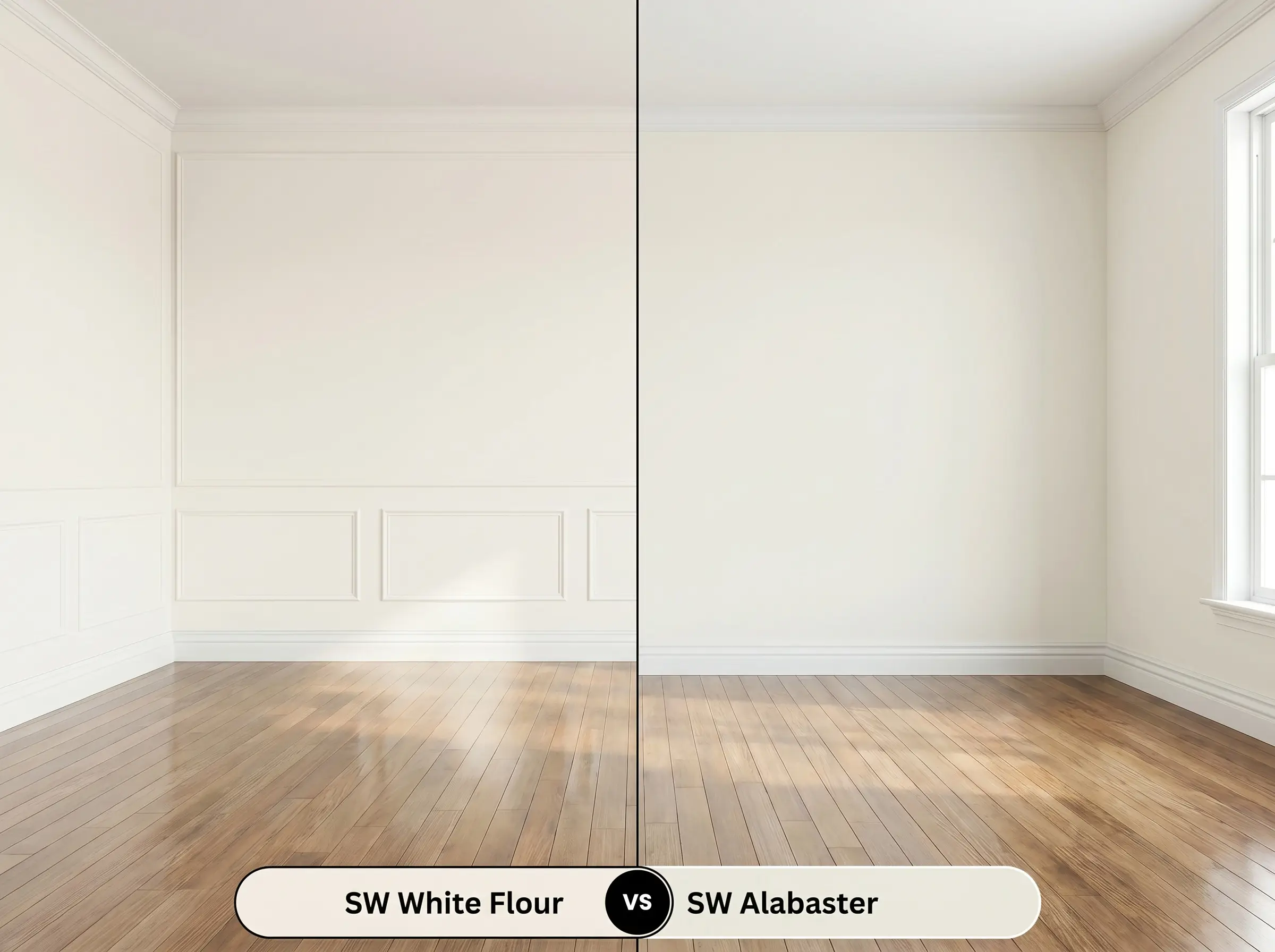
Sherwin-Williams White Flour vs. Sherwin-Williams Alabaster SW 7008
Sherwin-Williams Alabaster is a highly popular alternative that features a slightly lower LRV and a subtle greige undertone. If you are pairing your walls with cool Carrara marble or stark white cabinetry, Alabaster offers a more neutral transition that avoids color clashing. Conversely, if your space features rich woods and you want to actively enhance the golden energy of the room, White Flour delivers a much creamier, sunlit effect.
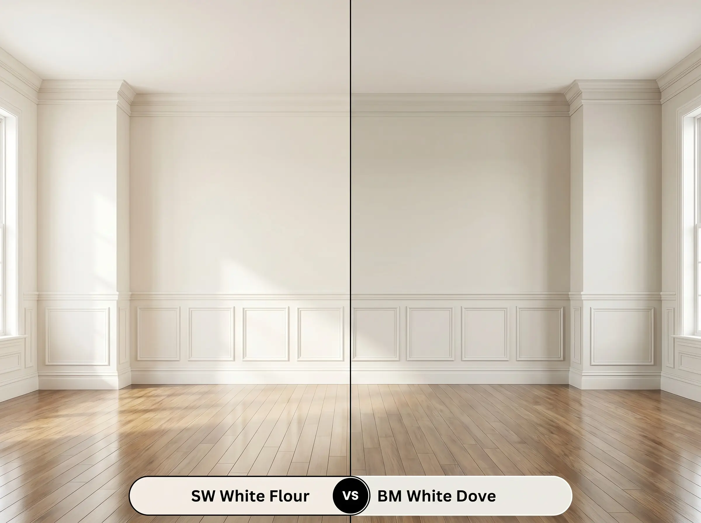
Sherwin-Williams White Flour vs. Benjamin Moore White Dove OC-17
Benjamin Moore White Dove relies on a distinct gray shadow to keep its warmth in check, making it incredibly versatile in complex lighting. If your home has highly reflective hardwood floors that might bounce unwanted red or orange tones onto the walls, White Dove will absorb and neutralize that glare beautifully. Choose White Flour only when you intentionally want to amplify the creamy, inviting nature of the space without the muted gray filter.
Exploring Alternatives to Sherwin-Williams White Flour
There are times when a room’s specific exposure demands a slight pivot away from your initial color choice. Whether you need a touch more depth to anchor a bright corridor or a nearly identical match from a different manufacturer, these alternatives provide precise tonal shifts.
Similar Sherwin-Williams Colors
Cross-Brand Paint Matches
Practical Application Guide
Transitioning this warm off-white from a tiny paper swatch to a full architectural surface requires precise execution. The final perceived color will shift dramatically based on your sheen selection and the quality of your foundational prep work.
The Dynamic Sheen Guide
Primer Strategy
Applying this light, highly reflective shade over dark or vibrant existing walls mandates a premium, high-hide white primer. A pure white primer foundation prevents dark underlying pigments from bleeding through and muddying the delicate creamy beige color structure. If you skip this step, the yellow-based hue will struggle to achieve its intended brightness, resulting in a dull, shadowy finish.
Coverage & Success Tips
Achieving a flawless, professional finish with this high-LRV off-white typically requires two full coats over a properly primed surface. When rolling expansive walls, maintain a wet edge at all times to prevent “flashing,” which occurs when overlapping dry and wet paint creates visible, uneven streaks. Because touch-ups on light, warm neutrals are notoriously visible, always complete full wall sections in a single continuous session rather than returning to fix small patches later.
To maintain the smooth, architectural finish of this highly reflective paint, always use a premium 3/8-inch microfiber roller cover. A thicker nap will leave a subtle orange-peel texture that catches shadows and disrupts the paint’s natural, creamy glow.
Hackrea Design Secret (The Roller Nap Rule)
Frequently Asked Questions
Direct southern sunlight actually washes out the subtle yellow undertones, causing the paint to read as a brilliant, warm white on exterior stucco. It prevents the facade from looking stark or blinding, offering a historically grounded, sun-washed glow instead.
Because Carrara marble features distinct cool gray and blue veining, pairing it directly with this yellow-based hue can create a harsh temperature clash. To bridge this gap, introduce warm metallic hardware or a natural wood island to balance the visual energy and make the pairing feel highly intentional.
The creamy beige color structure is highly susceptible to reflecting the dominant colors in a room. If you have intensely red-toned oak floors, the high LRV will bounce that red light back onto the walls, potentially causing the paint to cast a faint peach shadow during peak daylight hours.
Utilizing the exact same color on both walls and trim is a sophisticated tonal technique that blurs architectural boundaries. Simply apply a flat or matte finish on the drywall and a durable satin or semi-gloss on the trim to create a subtle, tactile contrast that elevates the entire room.
Final Verdict & Expert Warnings
Sherwin-Williams White Flour is an exceptional choice for homeowners seeking a luminous, welcoming foundation that actively combats the sterile chill of pure builder-grade whites. Its high light reflectance and creamy beige color structure make it incredibly effective in north-facing living rooms, cozy primary retreats, and transitional spaces that crave a soft, sunlit energy. It truly shines when anchored by natural, tactile materials like mid-tone walnut, unlacquered brass, and matte terracotta. By treating this off-white as a deliberate architectural layer rather than an afterthought, you can create a home that feels effortlessly curated and deeply relaxing.
While incredibly versatile, this paint requires careful consideration regarding its surrounding hard finishes. If your home features cool, blue-based gray flooring, stark white vinyl window frames, or icy glass tile backsplashes, the yellow-based hue of this off-white will visually clash, causing the paint to read as dingy rather than intentionally warm. It is not the right choice for ultra-modern spaces that rely on crisp, cool-toned contrasts, as the inherent golden warmth will constantly fight against sleek, icy architectural elements.
Clash Warning (The Temperature Conflict)