Mouse's Back No. 40
Farrow & BallFarrow & Ball's Mouse's Back No. 40 is a muted, earthy grey-brown with a distinct green base. Inspired by the British field mouse, this versatile mid-tone neutral shifts beautifully in changing light, reading greener in shaded rooms and warmer in direct sunlight.
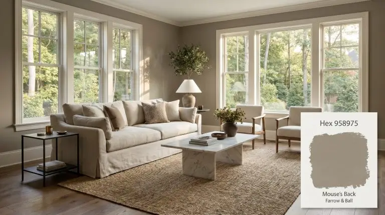
Farrow & Ball Mouse’s Back: The Moody Grey-Brown Redefining Curated Interiors
Some neutrals sit quietly in the background, but this earthy grey-brown actively participates in the room’s design. It captures the shifting shadows of the afternoon sun and translates them into a rich, tactile experience on your walls.
When applied in Farrow & Ball’s signature Estate Emulsion, this color structure takes on a velvety, matte texture that absorbs light rather than reflecting it. This creates an immediate sense of intimacy, transforming vast, echoing rooms into comforting retreats.
By mimicking the subtle tones of the natural world, it seamlessly connects your interior styling with the landscape outside the window. It is the perfect foundational layer for homeowners who want their walls to feel established, warm, and endlessly intriguing.
Undertones & LRV of Mouse’s Back
If you are wondering whether Farrow & Ball Mouse’s Back #958975 reads warm or cool, the answer is definitively warm. However, this warmth is highly sophisticated, completely avoiding the flat, muddy appearance of standard builder-grade browns.
To truly understand how this shade will saturate your room, we have to look at its underlying color DNA:
With a light reflectance value (LRV) of 26, this architectural finish sits firmly in the mid-to-dark depth range.
This means it will absorb a significant amount of ambient light. Rather than pushing your walls outward to make a room feel larger, an LRV of 26 draws the structural boundaries inward. This establishes a snug, secure atmosphere that wraps around the room like a worsted wool blanket.
You can apply wallpapers, paints, etc. on walls and see how they look in various interiors.

Lighting Effects & The Chameleon Factor
Because of its complex green-based neutral profile, this paint is a true shape-shifter. As the sun moves across the sky or you switch on a lamp, the color physically responds to the changing light waves.
Here is exactly how you can expect the shade to behave throughout your home:
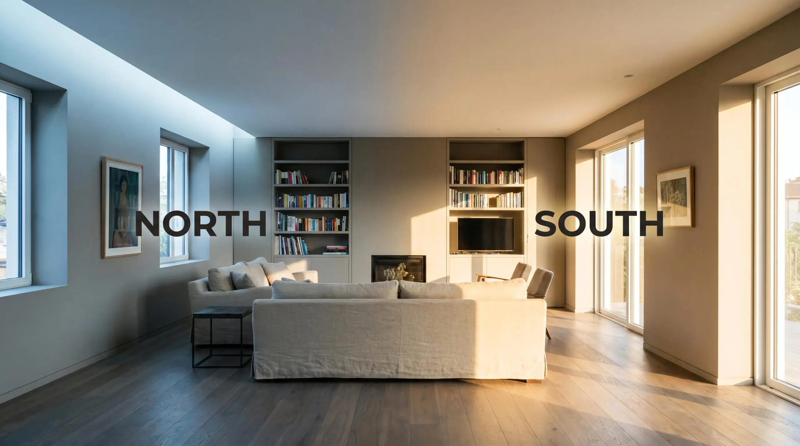
If you want to maintain the rich, organic warmth of this grey-brown in the evening, strictly avoid cool-toned LEDs. Opt for bulbs in the 2700K to 3000K range to keep the green undertones from turning sour and flat.
Hackrea Pro-Tip (The Bulb Rule)
Farrow & Ball Mouse’s Back in Real Homes: Curated Applications
Because this earthy grey-brown carries a mid-tone depth, it demands intentional placement. You cannot simply roll it onto every wall in a dimly lit house and expect magic; it requires thoughtful architectural integration and tactile material pairings.
Here is how to successfully implement this complex neutral across different functional spaces.
Kitchen Cabinetry & Islands
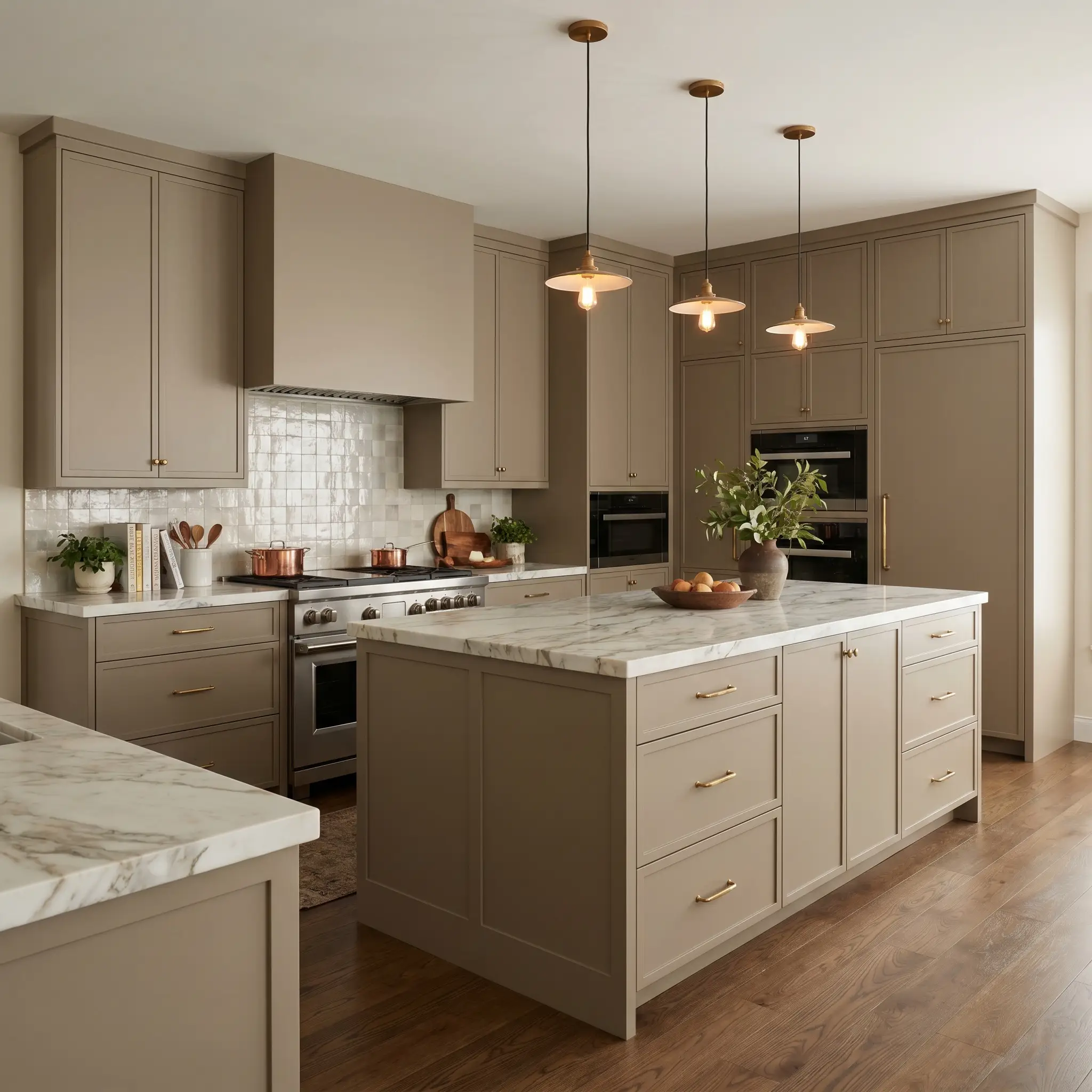
Moving away from the predictable stark white kitchen, this fawny neutral brings an incredible level of sophistication to custom cabinetry. When applied to sleek, flat-panel doors or classic shaker profiles, it immediately warms up the hard surfaces of a culinary prep space.
To elevate the design, pair the painted cabinets with heavily veined soapstone countertops or honed Calacatta marble. The organic movement in the stone speaks directly to the earthy green base of the paint.
Finish the space with unlacquered brass hardware and zellige tile backsplashes. The reflective, uneven surface of the tile will bounce light around the room, perfectly balancing the light-absorbing qualities of the dark cabinetry.
Cozy Home Libraries & Studies
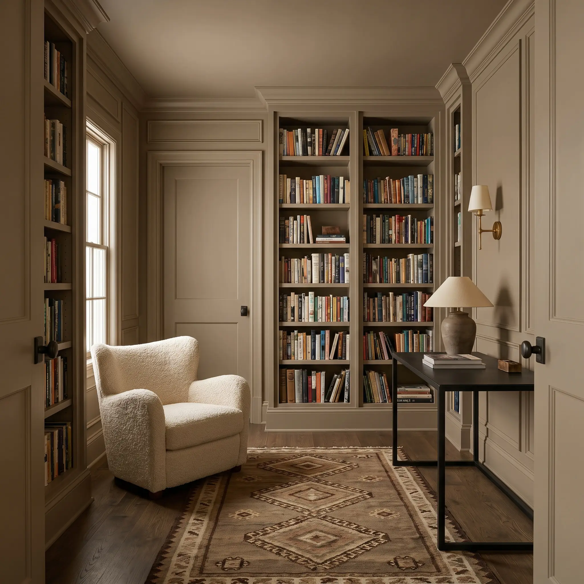
For a work-from-home professional who needs a focused, glare-free environment, this shade is incredibly effective when color-drenched across the entire room. By painting the walls, built-in bookcases, crown molding, and even the doors in the same continuous grey-brown, you blur the edges of the room.
This technique settles the space, creating a seamless, wraparound effect that minimizes visual distractions. Styling is crucial here to prevent the room from feeling too traditional.
Introduce modern, tactile elements like a low-profile bouclé reading chair, a blackened steel desk, and a vintage kilim rug. The contrast between the heritage-inspired walls and the contemporary furnishings creates a brilliant, curated tension.
Be incredibly cautious when pairing this specific green-based neutral with cherry or red-toned mahogany furniture. The red tones in the wood will aggressively highlight the green base of the paint, creating an unintentional, high-contrast Christmas effect. Stick to smoked oak, burl wood, or ebonized finishes instead.
Clash Warning (Wood Tones)
Exterior Trim & Doors
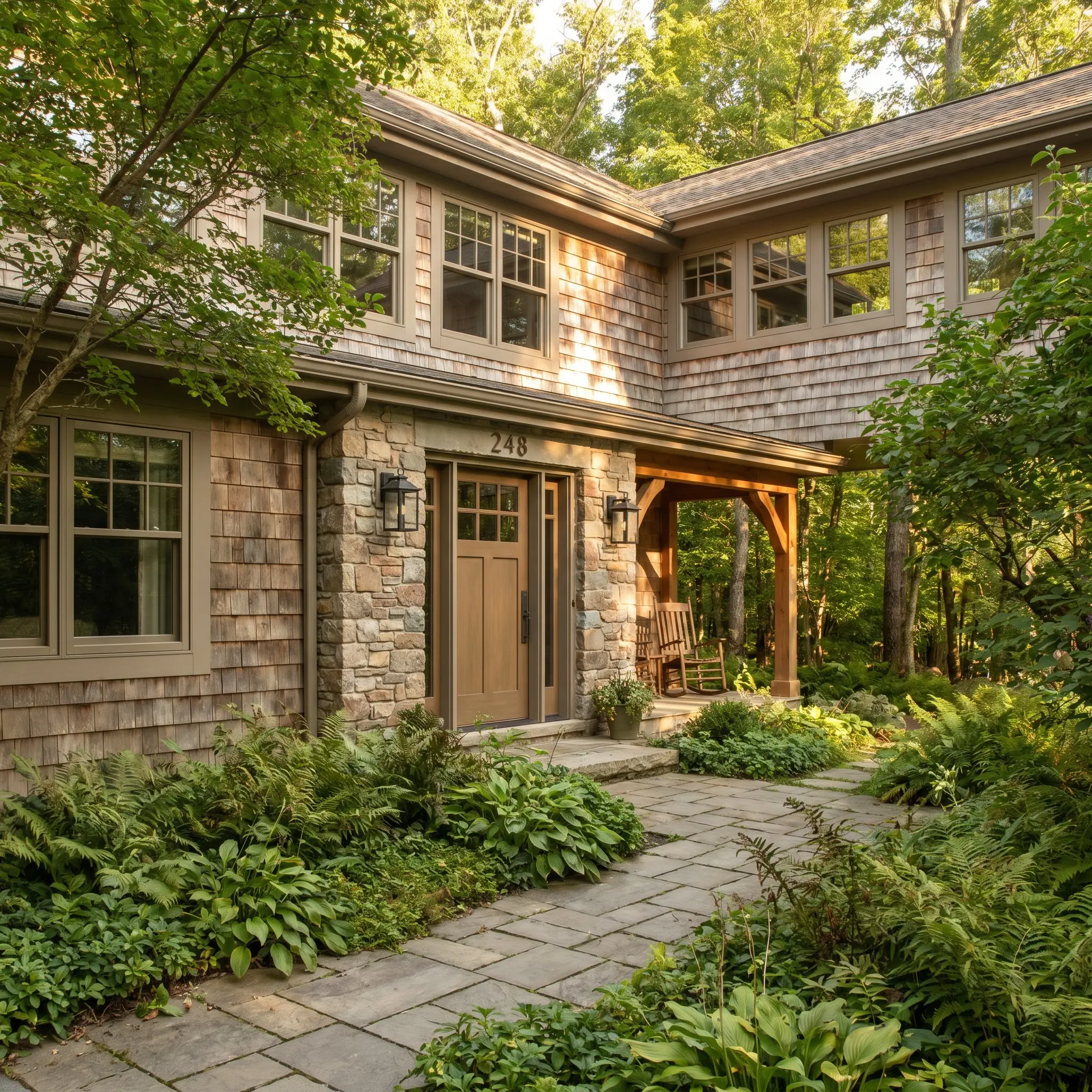
When taken outside, the intense wash of direct exterior sunlight will significantly lighten the perceived depth of the paint. What looks like a moody grey-brown indoors will soften into a beautiful, organic mushroom tone on a facade.
Use it on exterior window sashes, front doors, and architectural trim to seamlessly blend a home into a wooded or heavily landscaped lot. It pairs beautifully with natural stone facades, limewashed brick, or weathered cedar shingles.
For a modern rustic exterior update, pair this trim color with matte black lighting fixtures and patinated bronze house numbers.
Windowless Powder Rooms
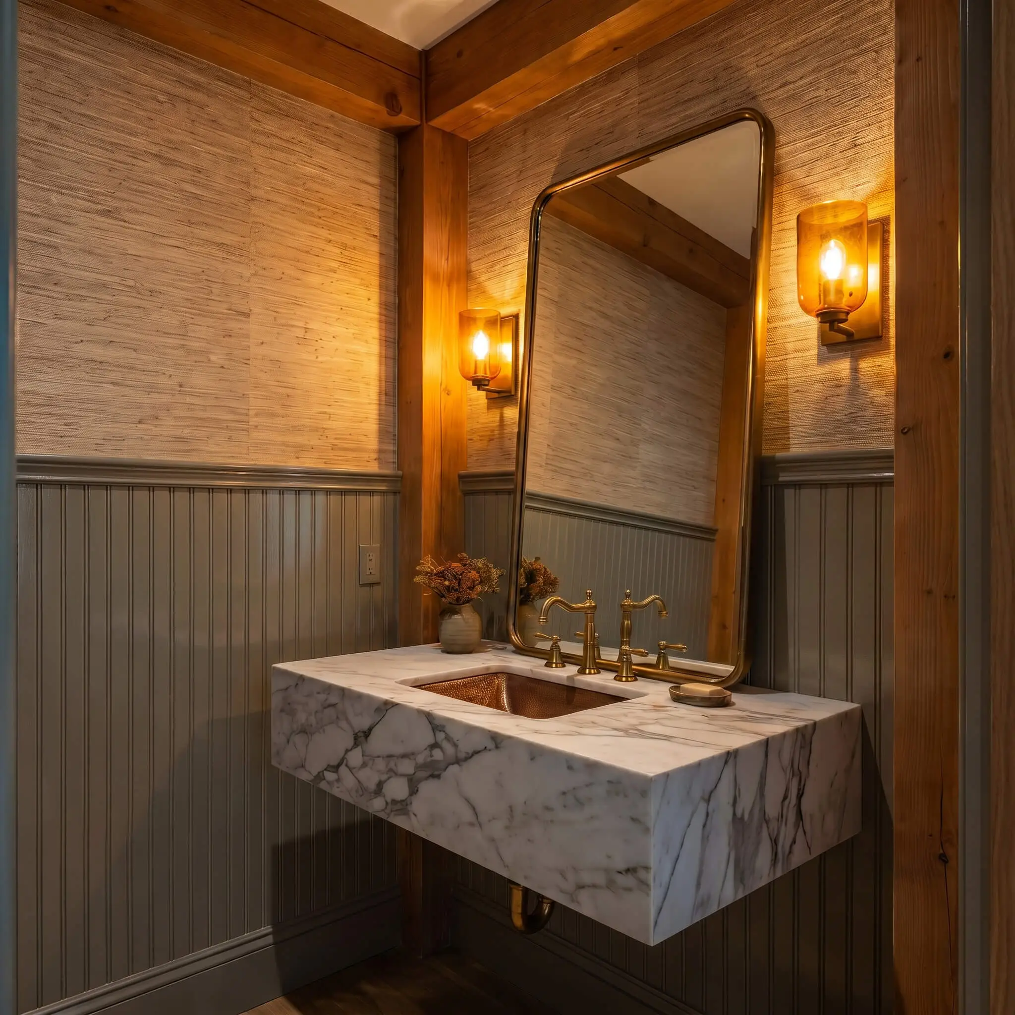
Small, windowless spaces are the perfect canvas for leaning into the light absorption of an LRV 26 paint. Instead of fighting the lack of natural light with a pale color, embrace the shadows by saturating the walls in this rich neutral.
To keep the small space from feeling flat, manipulate the finish. Consider using a high-gloss enamel on the beadboard or wainscoting on the lower half of the wall, paired with a matte finish or a textured grasscloth wallpaper on the upper half.
The glossy lower half will reflect your warm vanity lighting, adding depth and movement to the otherwise dark room. Complete the look with a floating marble vanity and an oversized, leaning mirror to maximize the available artificial light.
Historic Property Living Rooms
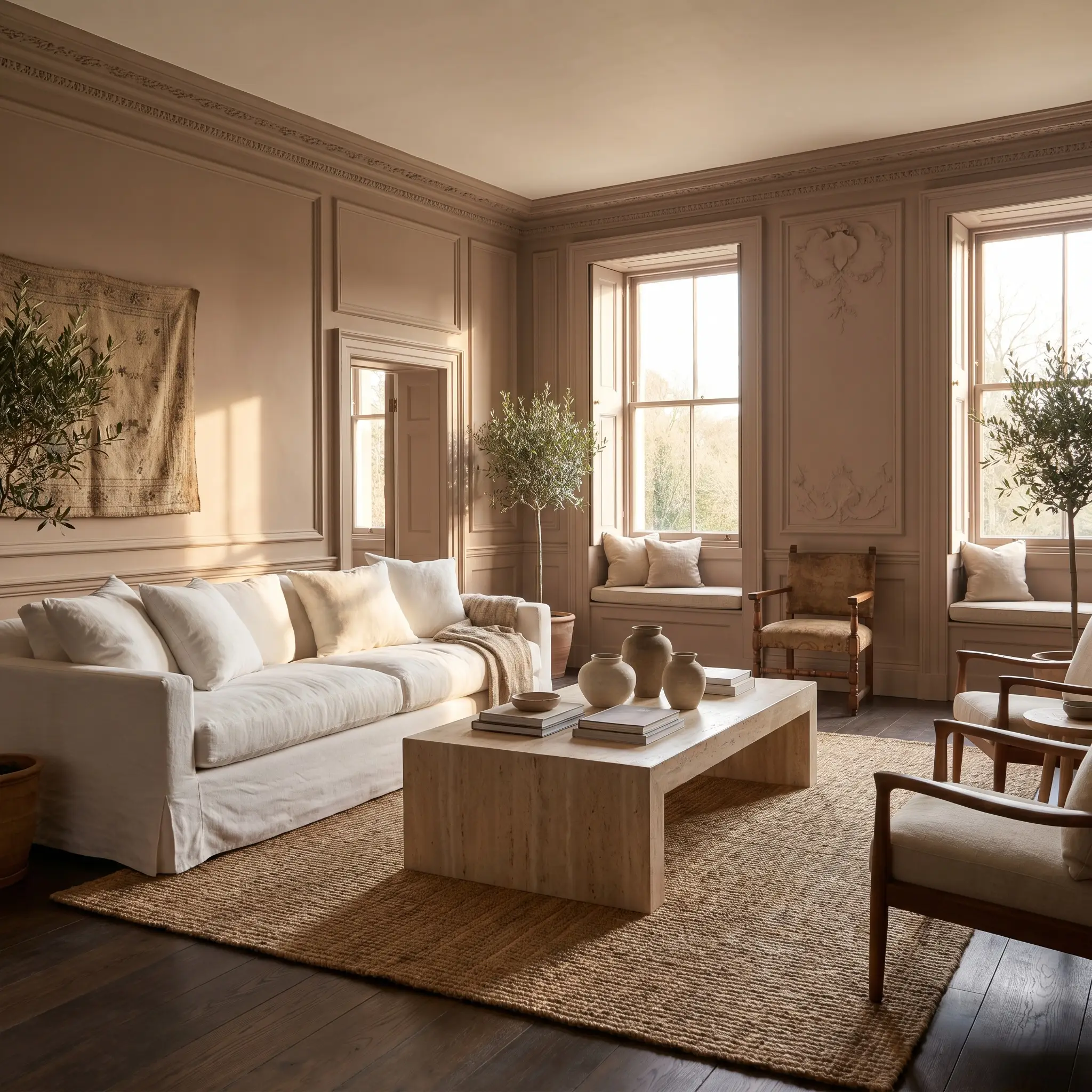
In homes with rich heritage architecture, this paint honors the original craftsmanship while providing a fresh, updated backdrop. The earthy hue beautifully highlights intricate picture molding, deep window seats, and original plaster reliefs.
However, a historic shell does not require a museum-like interior. To keep the living room feeling relevant and dynamic, introduce highly contemporary silhouettes.
Layer a massive, slipcovered linen sofa over a natural jute rug, and anchor the seating arrangement with a monolithic travertine or plinth coffee table. By mixing the formal, historic property restoration of the walls with relaxed, modern-organic furniture, you create a space that feels both highly curated and effortlessly livable.
Coordinating Palettes & Material Pairings
This fawny chromatic profile thrives on soft tonal bleeds rather than sharp, high-contrast boundaries. When placed next to equally muted, earthy elements, the pigment relaxes into the background, allowing the textures of the room to take center stage.
Selecting the Right Millwork Finish
Choosing a trim color dictates how the structural edges of your room will frame this earthy grey-brown.
Hardware, Wood & Material Pairings
To maximize the sophistication of this mid-tone depth, surround it with materials that share its organic, unrefined elegance.
Complementary Paint Palettes
Building a cohesive home palette around this complex neutral requires secondary colors that share its muted, sun-baked quality.
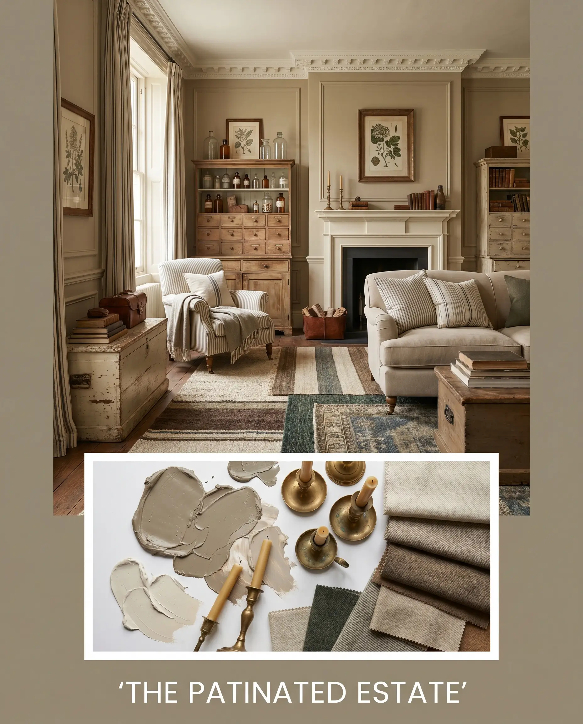
Designer Mood Boards
Understanding the theory is only half the process; seeing how these elements merge establishes the final aesthetic.
The Patinated Estate This aesthetic leans into historic property restoration while keeping the styling crisp and intentional. Imagine walls saturated in this fawny neutral, framed by Farrow & Ball Slipper Satin No. 2004 millwork, with vintage apothecary cabinets and unlacquered brass candlesticks scattered throughout. Layered worsted wool rugs and subtle ticking stripe textiles create a comforting, layered energy that feels collected over generations.
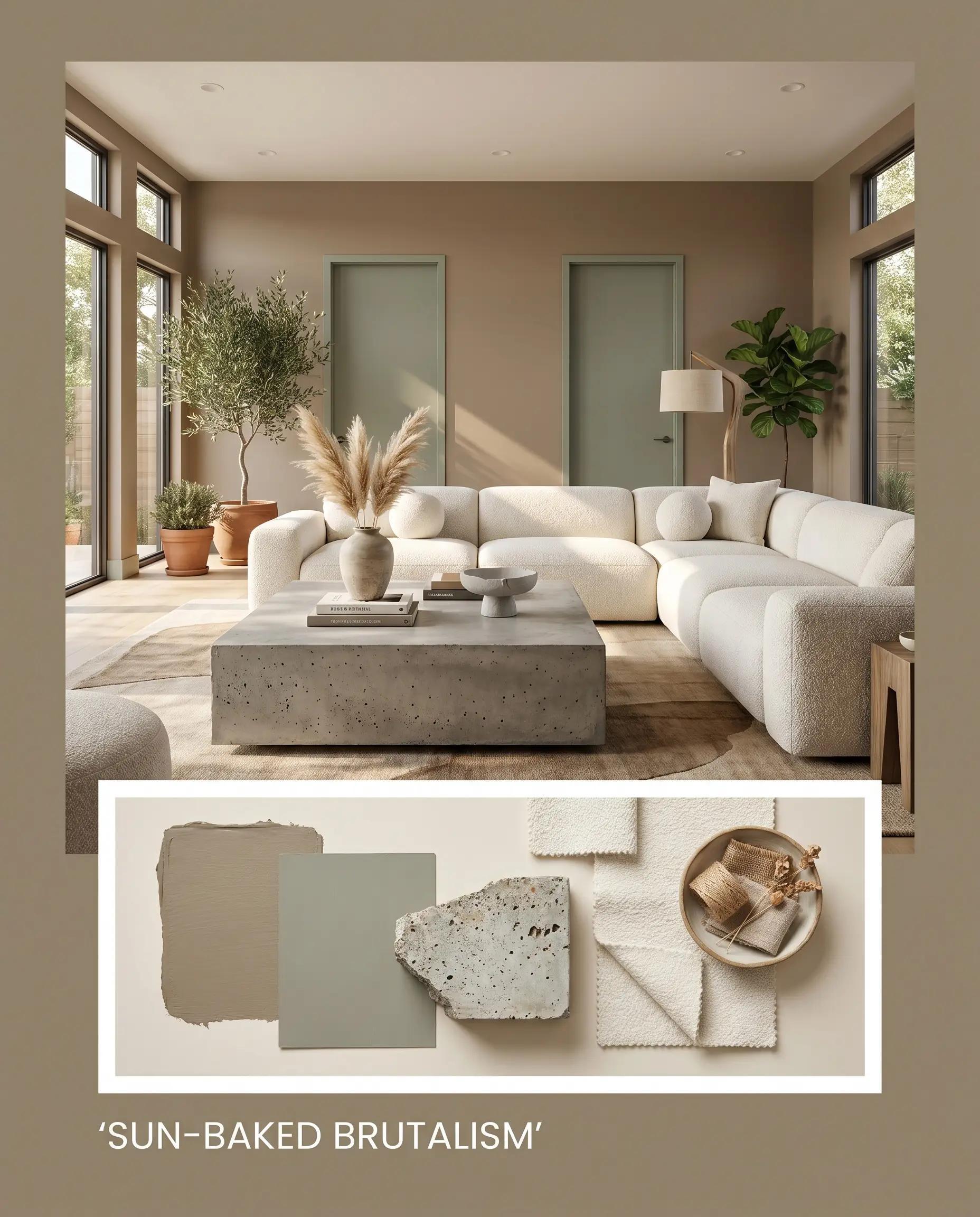
Sun-Baked Brutalism Pushing the color into a purely modern realm, this palette focuses on raw, unrefined shapes and tonal warmth. Pair the earthy grey-brown walls with a monolithic poured concrete coffee table, a low-profile bouclé sectional, and accents of Sherwin-Williams Evergreen Fog SW 9130 on interior doors. The juxtaposition of the soft, light-absorbing paint against hard, sculptural lighting establishes a grounded, incredibly sophisticated mood.
Comparing Farrow & Ball Mouse’s Back to Popular Neutrals
Finding the exact right neutral often comes down to analyzing your specific architectural lighting and exposure. If your room faces a certain direction, or if your furnishings demand a slightly different undertone, a rival shade might be the superior choice.
Farrow & Ball Mouse’s Back vs. Farrow & Ball London Stone No. 6
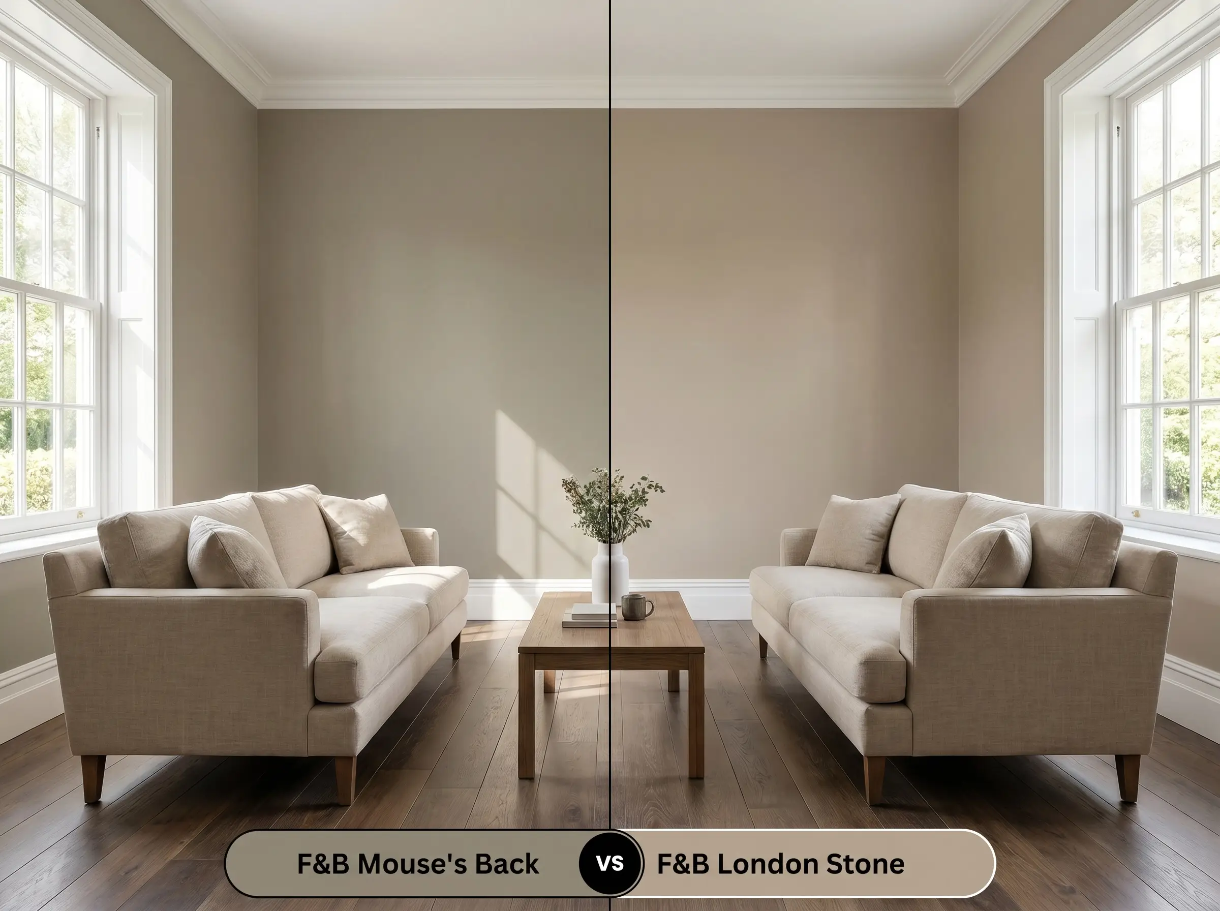
London Stone offers a slightly higher LRV and leans much more into a warm, magenta-tinged beige rather than an earthy green. If your room is north-facing and the green base of Mouse’s Back is pulling too cool or murky, London Stone will inject a much-needed dose of rosy warmth. Choose the fawny grey-brown when you want a shaded, woodland feel, and pivot to London Stone for a brighter, sandy atmosphere.
Farrow & Ball Mouse’s Back vs. Benjamin Moore Chelsea Gray HC-168
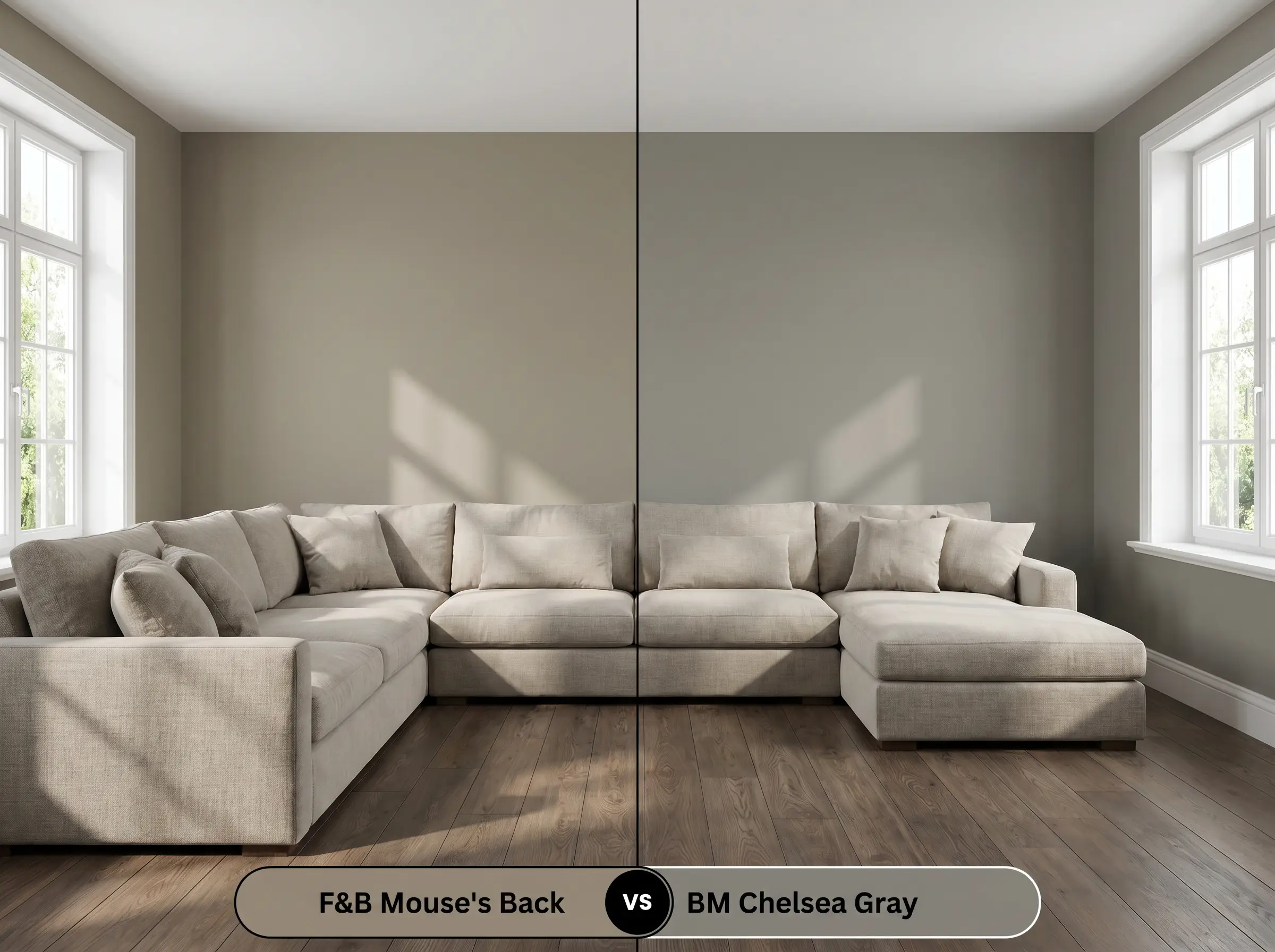
Chelsea Gray is a classic, deeply saturated charcoal-gray that lacks the sun-baked, fawny brown qualities entirely. If you are designing a crisp, high-contrast transitional space with bright white trim and cool-toned marble, Chelsea Gray provides a sharper, more tailored backdrop. However, if you want your walls to feel organic and seamlessly connected to nature, the Farrow & Ball option remains the better candidate.
Alternative Shades & Cross-Brand Color Matches
Sometimes a color is incredibly close to your vision, but you need a minor adjustment in depth or a practical match from a local supplier.
Similar Colors Within the Same Brand
If you love the foundational DNA of this hue but need to tweak the light reflectance, look to its immediate siblings.
Cross-Brand Matches from Rival Manufacturers
If you are utilizing a different paint supplier, these alternatives capture a very similar fawny chromatic profile.
Practical Application & Professional Finish Advice
Translating a premium color from a swatch to your walls requires precise execution and the correct technical finishes.
The Dynamic Sheen Guide
The sheen level you select will dramatically alter how this mid-tone depth reflects light.
Primer Strategy & Coverage Expectations
Because this shade sits at an LRV of 26, painting it directly over a stark white wall or a vivid primary color will lead to an uneven, patchy finish. You must use a mid-tone tinted primer to establish a solid, neutral base layer.
Expect to apply two full, generous coats for true color accuracy and completely opaque coverage.
Darker, matte finishes are notorious for “flashing”—visible, shiny roller marks caused by uneven drying. To prevent this, maintain a wet edge as you roll, work in small sections, and never go back over semi-dry paint.
Hackrea Pro-Tip (Avoiding Roller Flashing)
Frequently Asked Questions
When applied using a specialized masonry finish, this earthy hue performs beautifully outdoors, though high humidity means you must allow extended drying times between coats. The intense exterior sunlight will actually soften the color, making it look like a natural, organic mushroom tone on the stucco.
Embracing the shadows is a brilliant strategy for tricky spaces, as the low light reflectance value blurs sharp corners and hides uneven drywall seams. By color-drenching the entire basement, you transform a flawed room into a highly intentional, snug retreat.
Because green and red sit opposite each other on the color wheel, pairing this paint with mahogany will aggressively amplify the green undertones. If you want to maintain the fawny brown aesthetic, it is best to avoid red-toned woods and opt for smoked oak or walnut instead.
This shade promotes an incredible sense of focus and stability, making it an ideal backdrop for a workspace. The muted, earthy tones reduce visual fatigue and glare, creating a grounded atmosphere that encourages deep concentration.
Final Verdict: Is Mouse’s Back Right for Your Home?
This fawny chromatic profile is the ultimate solution for homeowners who want to inject their spaces with established, organic warmth without resorting to predictable beiges. It thrives in rooms layered with premium tactile materials, from unlacquered brass to honed marble, making it perfect for both historic property restorations and contemporary organic designs. When applied thoughtfully, it transforms standard walls into a rich, enveloping backdrop that feels incredibly intentional.
You must be highly strategic when introducing bright white trims to this earthy grey-brown. Pairing this shade with a stark, cool-toned white creates a jarring, high-contrast boundary that instantly strips the paint of its sophisticated, sun-baked warmth. If your home features brilliant white vinyl windows or unchangeable cool white baseboards, this color will look murky and confused, so you are better off selecting a cooler, more traditional charcoal for your walls instead.
Clash Warning (The Trim Trap)