The Designer’s Guide to Styling Fluted Walnut Cabinets: Hardware & Paint Pairings
Fluted walnut is a masterclass in architectural texture, transforming flat elevations into rhythmic, tactile experiences. Investing in this caliber of bespoke joinery brings both macro-texture and rich, complex color undertones to a space—but it also introduces a rigorous set of installation parameters. The wrong hardware will sit awkwardly over the vertical grooves, shattering the visual flow, while an improperly balanced paint tone will instantly wash out the wood’s organic depth.
Our analysis bypasses standard installation to concentrate strictly on elite material pairings, undertone science, and the physical realities of mounting hardware on a ridged surface. We are decoding the exact edge pulls, unlacquered brass profiles, and Light Reflectance Value (LRV) formulas required to honor your premium millwork.
The Hardware Strategy: Profiles That Respect the Fluting
Mounting hardware on a three-dimensional surface requires absolute precision. You cannot simply drill a standard knob into a grooved ridge without compromising the architectural lines or creating a wobbly, unrefined touchpoint. These five profiles solve the structural geometry of fluted wood:
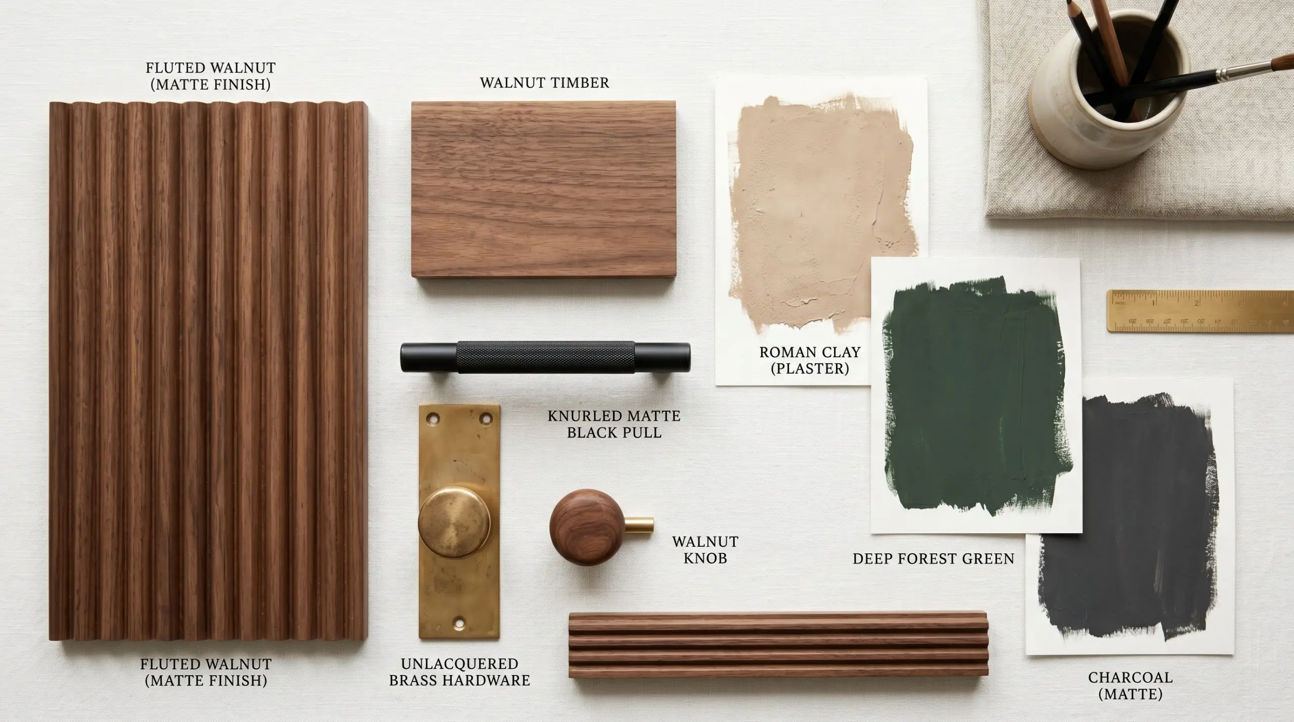
1. Low-Profile Edge Pulls for Uninterrupted Lines
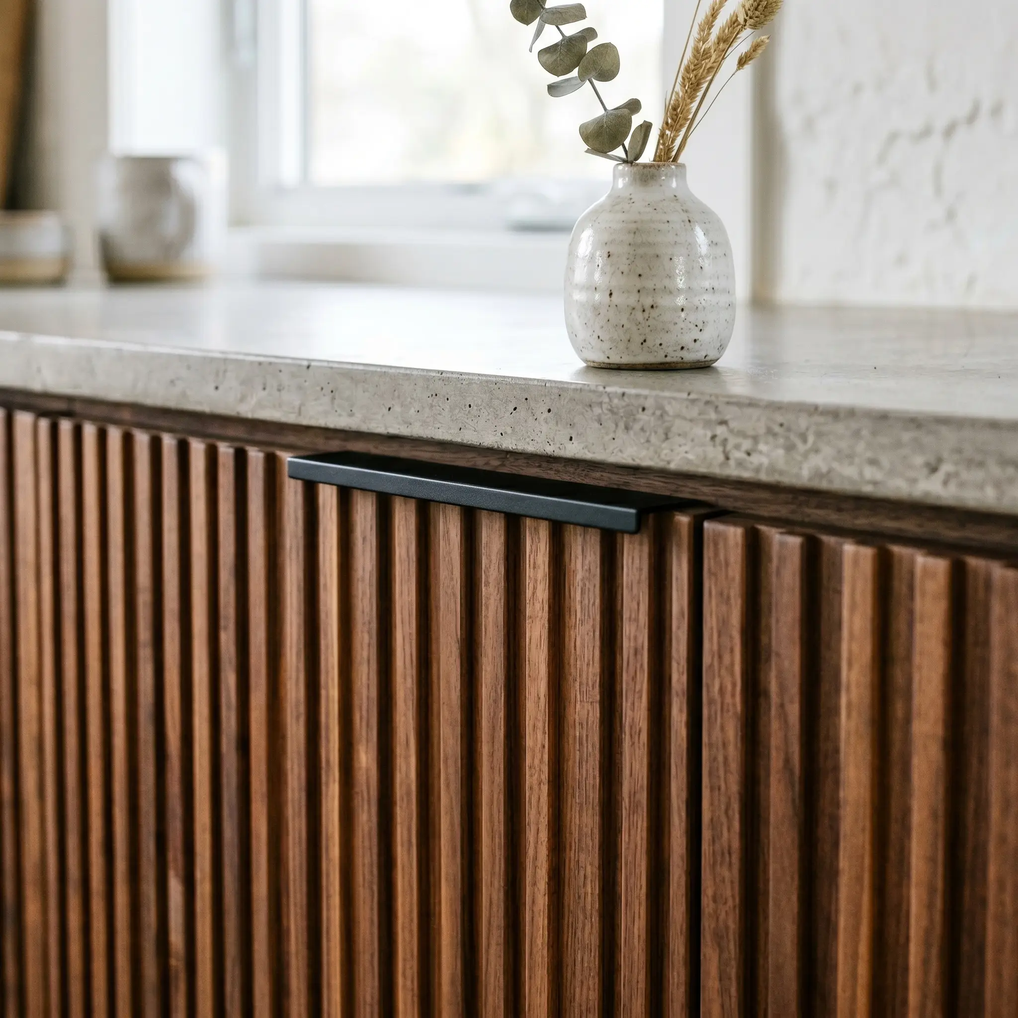
The ultimate minimalist solution allows the rhythmic macro-texture of the fluting to cascade down the cabinet face completely uninterrupted. By mounting solid brass or matte black lip pulls to the top or side of the door, the hardware becomes a subtle architectural framing device rather than an obtrusive focal point.
For a truly flush, bespoke execution, instruct your installer to route a shallow channel into the top edge of the cabinet door so the thickness of the metal pull sits perfectly flush with the wood frame.
Designer Secret
- Hardware Profile: Top-mounted or side-mounted lip pull.
- Finish Recommendation: Matte black or aged brass.
- Ideal Aesthetic: Japandi or ultra-modern minimal.
2. Hardware Backplates for Structural Integrity
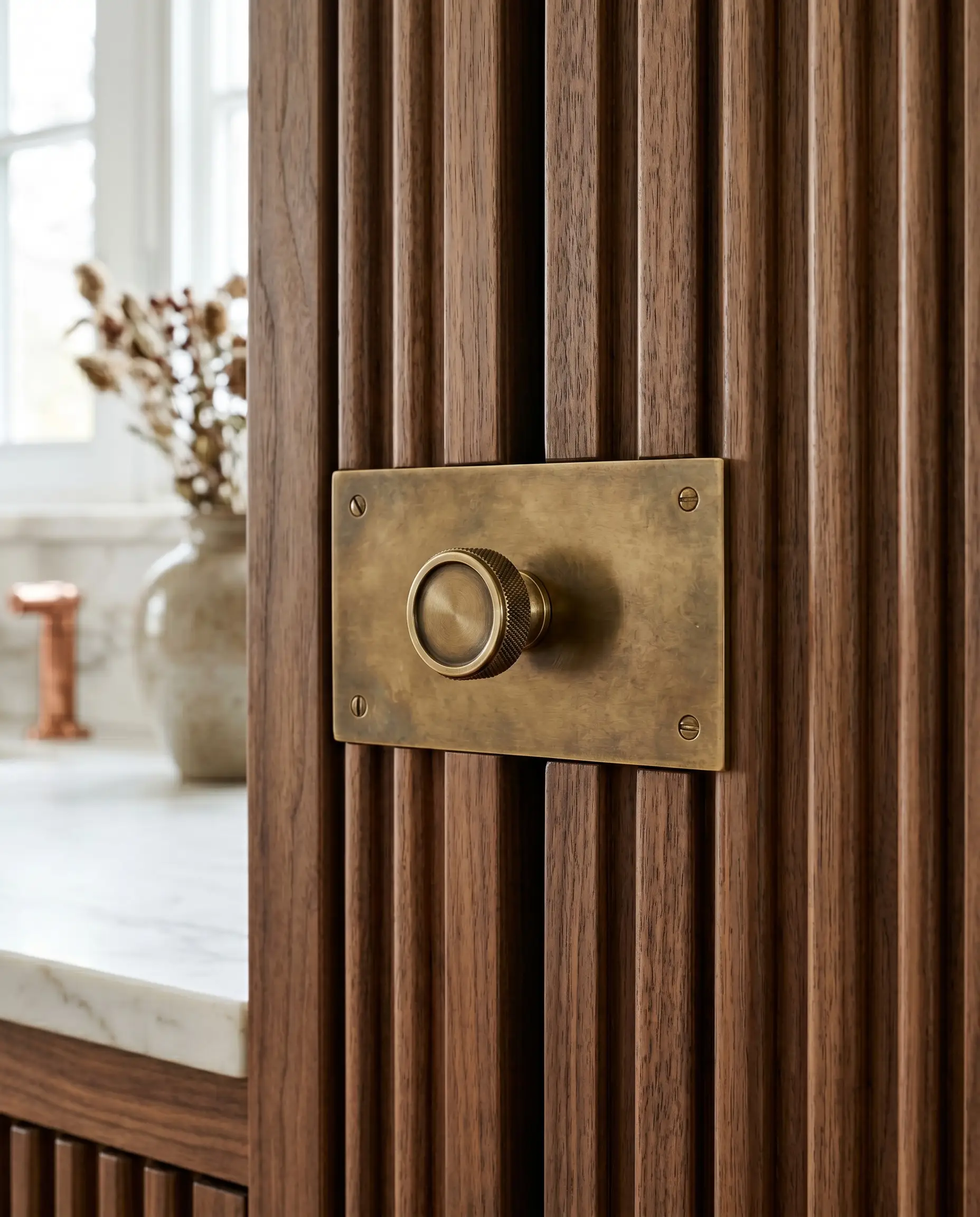
To solve the inherent wobble of mounting standard hardware over vertical grooves, premium fabricators utilize an escutcheon or solid backplate. This flat base bridges the gaps between the ridges, establishing a stable, visually deliberate mounting surface that honors the millwork rather than fighting it.
The backplate width must be mathematically measured against the width of your specific fluted grooves. The plate must span the gap cleanly and rest evenly across two peaks to ensure structural integrity.
Mounting Reality Check
- Hardware Profile: Knobs or pulls with a rectangular or circular solid backplate.
- Brand Match: Armac Martin.
- Functionality: Eliminates mounting instability on 3D surfaces.
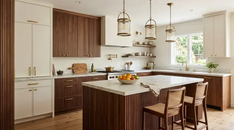
3. Unlacquered Brass T-Bars for Organic Patina
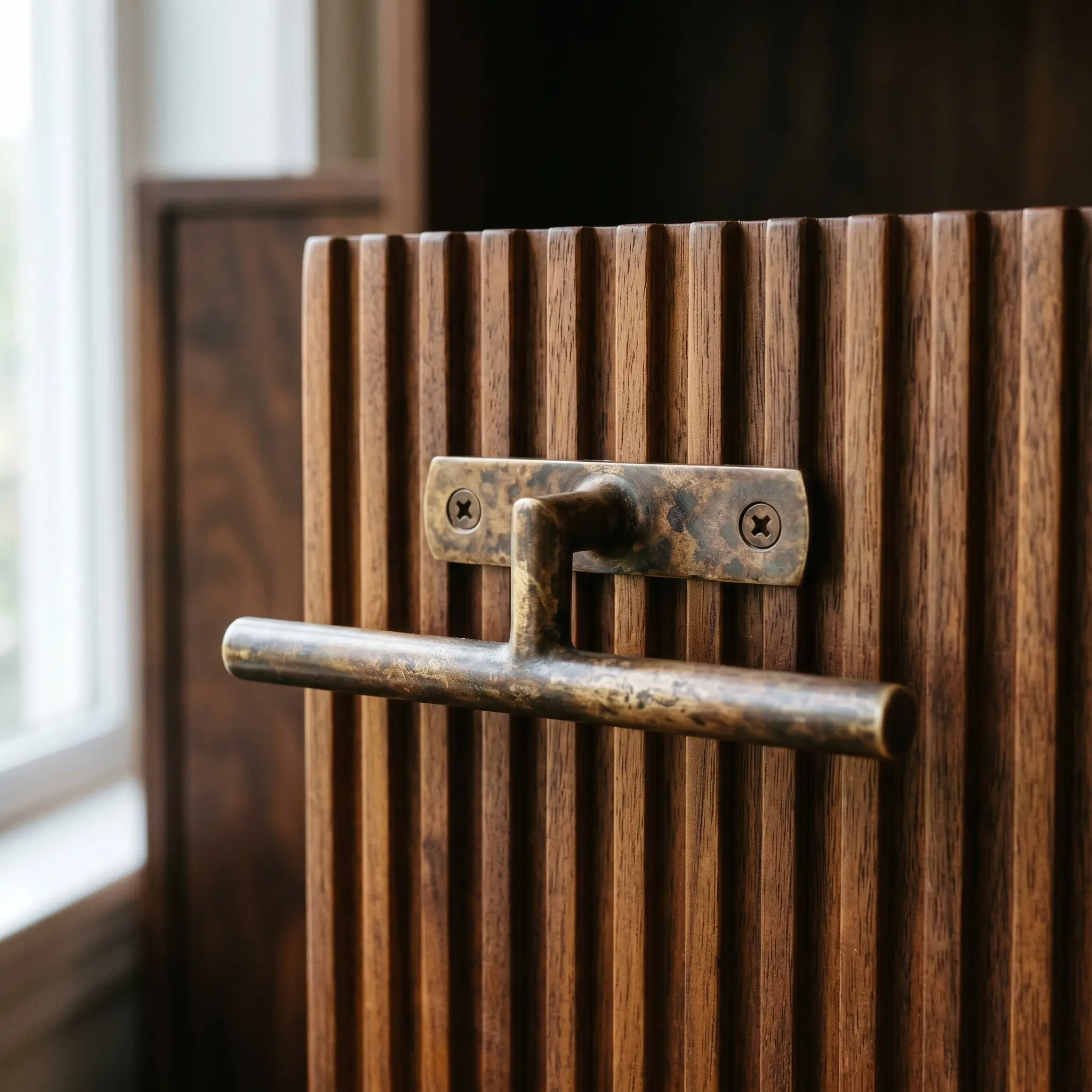
Pairing the organic warmth of walnut with a “living” metal finish creates an unparalleled tactile experience. As the unlacquered brass oxidizes and develops a rich patina over time, it perfectly mimics the natural, timeless aging process of the premium hardwood.
- Hardware Profile: Solid T-bar mounted horizontally to intersect the vertical lines.
- Material: Unlacquered brass.
- Design Impact: Introduces a dynamic, evolving finish that ages alongside the wood.
4. Knurled Matte Black Bars for Micro-Texture
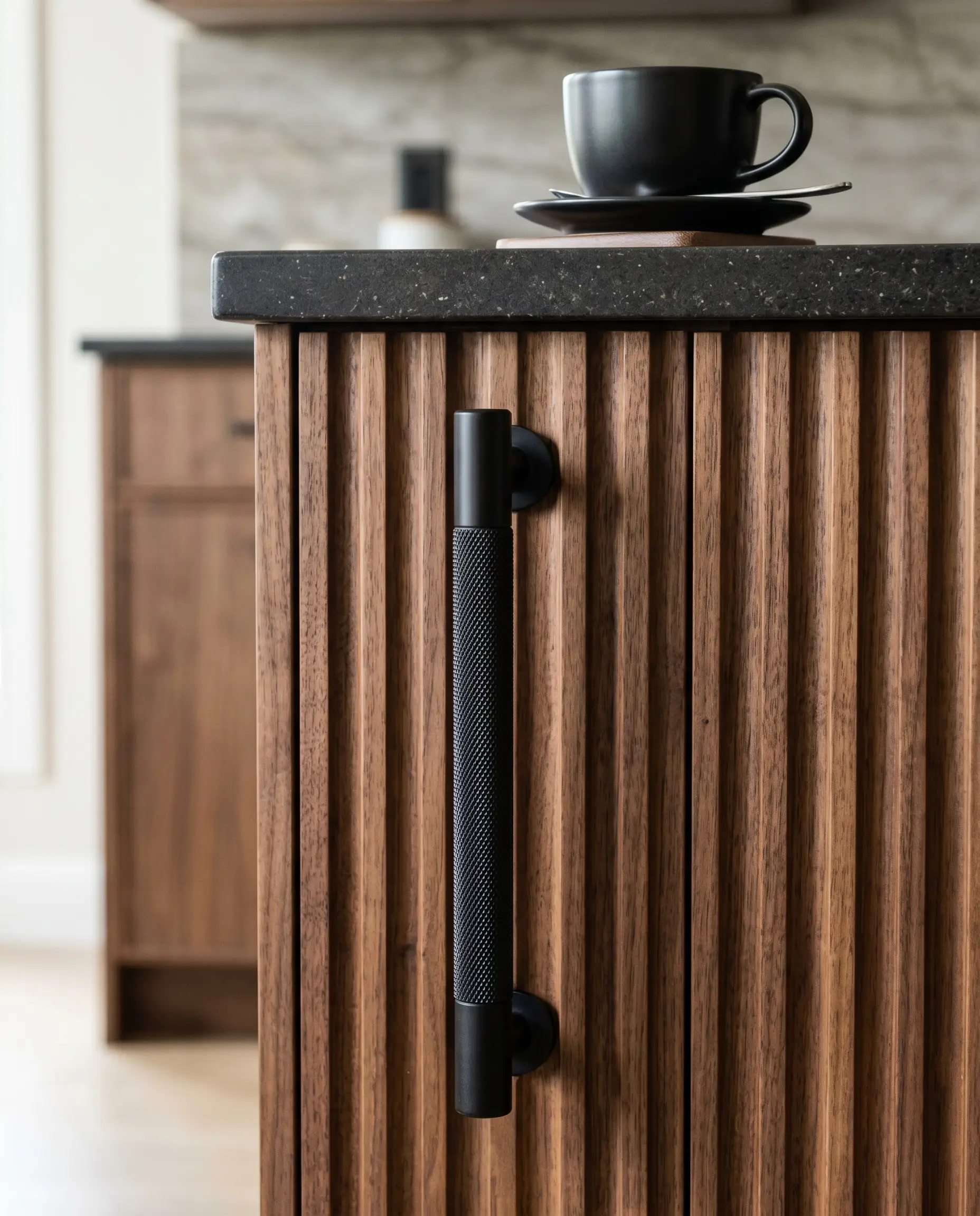
Fluting provides a sweeping macro-texture, which demands a contrasting micro-texture for industrial-leaning spaces. Diamond knurled texture introduces a sharp, tactile cross-hatching that rewards close-up interaction, while the matte black finish grounds the rich brown tones of the walnut.
- Hardware Profile: Heavyweight cylindrical bar pulls.
- Texture Pairing: Diamond knurling against smooth wood grooves.
- Brand Match: Buster + Punch.
5. Tone-on-Tone Walnut Knobs for a Monolithic Aesthetic
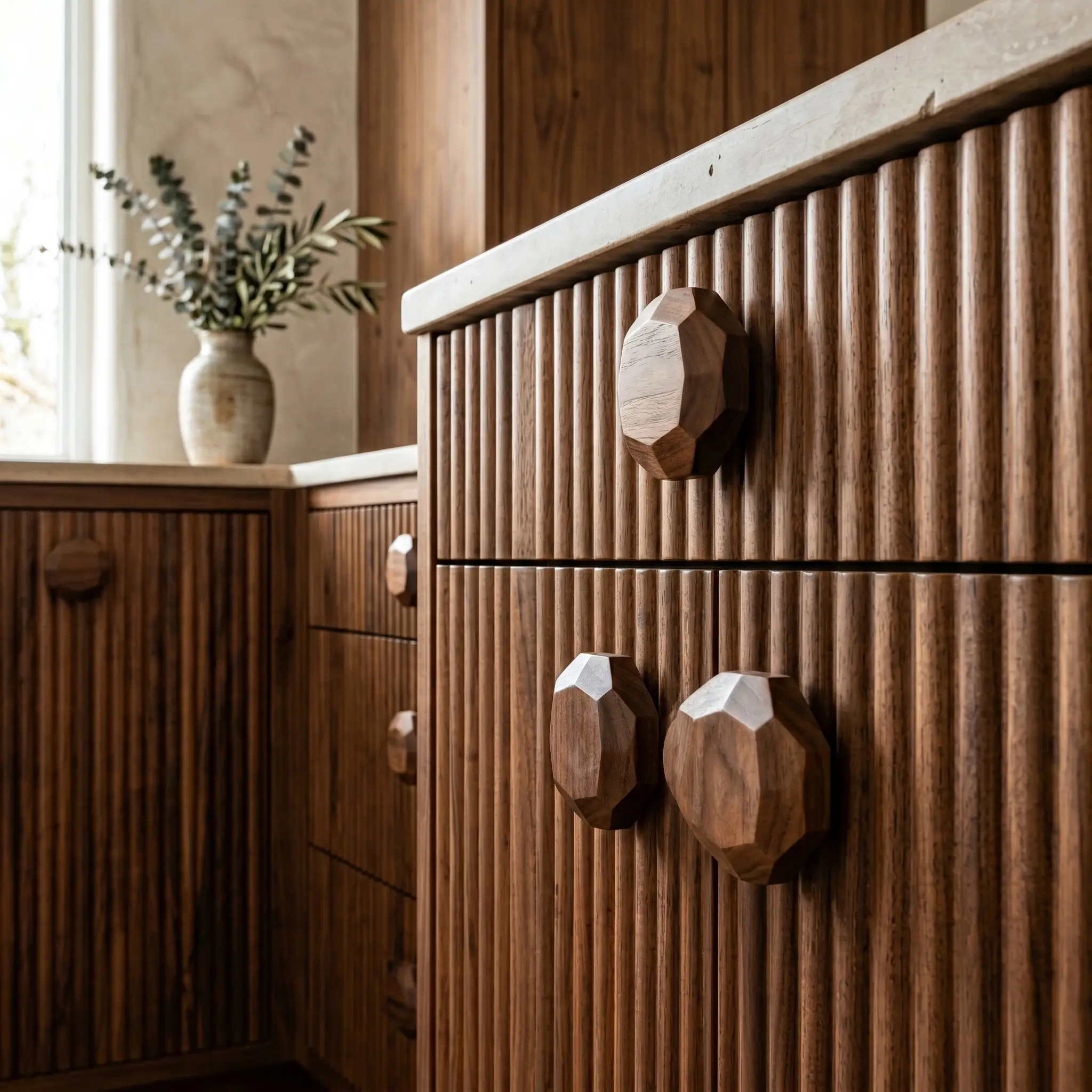
The apex of the Organic Modern movement utilizes oversized, smooth walnut knobs or integrated wooden pulls to create a continuous, stealth application. This tone-on-tone approach camouflages the hardware, allowing the vertical grooves to dominate as a singular, monolithic architectural statement.
- Hardware Profile: Oversized geometric wood knobs or integrated routed pulls.
- Material Match: Solid walnut matched to the exact stain of the cabinetry.
- Vibe: Quiet luxury and hyper-bespoke organic warmth.
The Paint Palette: Colors That Elevate Walnut’s Undertones
Raw walnut carries complex color undertones, typically reading as warm red, deep amber, or subtle purple. The surrounding environment—whether adjacent flat cabinetry, kitchen islands, or walls—must either provide high-contrast grounding or warm, harmonious blending. Selecting high-LRV stark whites or cool base tones will instantly strip the wood of its luxury.
1. Roman Clay and Plaster (Textural Harmony)
Rather than relying on flat latex paint, enveloping the adjacent walls in a specialized plaster finish speaks the exact same earthy language as the fluted wood. The subtle, suede-like mottling of the plaster provides a textural harmony that elevates a kitchen or vanity alcove into a bespoke architectural feature.
- Application: Surrounding walls or alcoves.
- Material: Portola Paints Roman clay or premium limewash.
- Color Match: Portola Paints “Dune” or a similar warm beige.
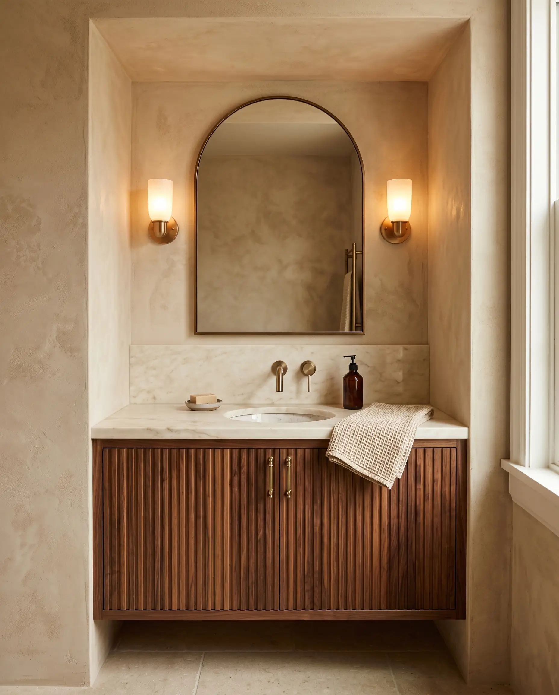
2. Warm, Creamy Whites (Avoiding the Stark White Trap)
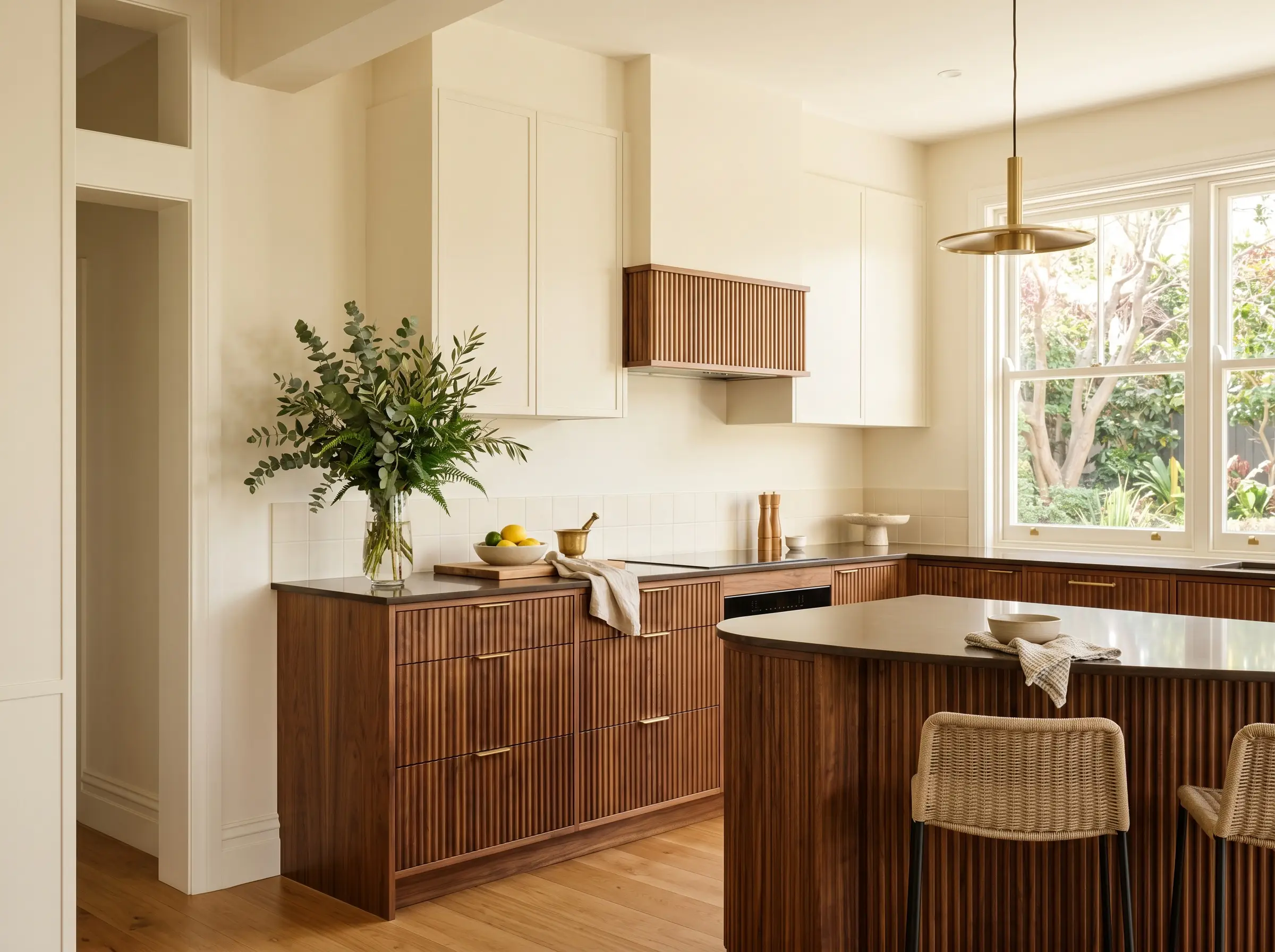
Cool, blue-based whites reflect an icy light that makes natural walnut look synthetic and unrefined. Demanding warm, creamy whites with subtle yellow or green undertones ensures the surrounding cabinetry or walls embrace the wood rather than isolating it.
Matching the intrinsic warmth of the wood to the warmth of your white paint creates necessary visual cohesion. A stark white creates a harsh, clinical boundary, whereas a creamy white acts as a luminous, soft reflector for the wood’s organic hues.
Color Theory Rule
- Recommended Shade: Benjamin Moore Swiss Coffee.
- Alternative Shade: Farrow & Ball School House White.
- Vibe: Luminous, inviting, and highly refined.
3. Deep Forest and Olive Greens (The Complementary Classic)
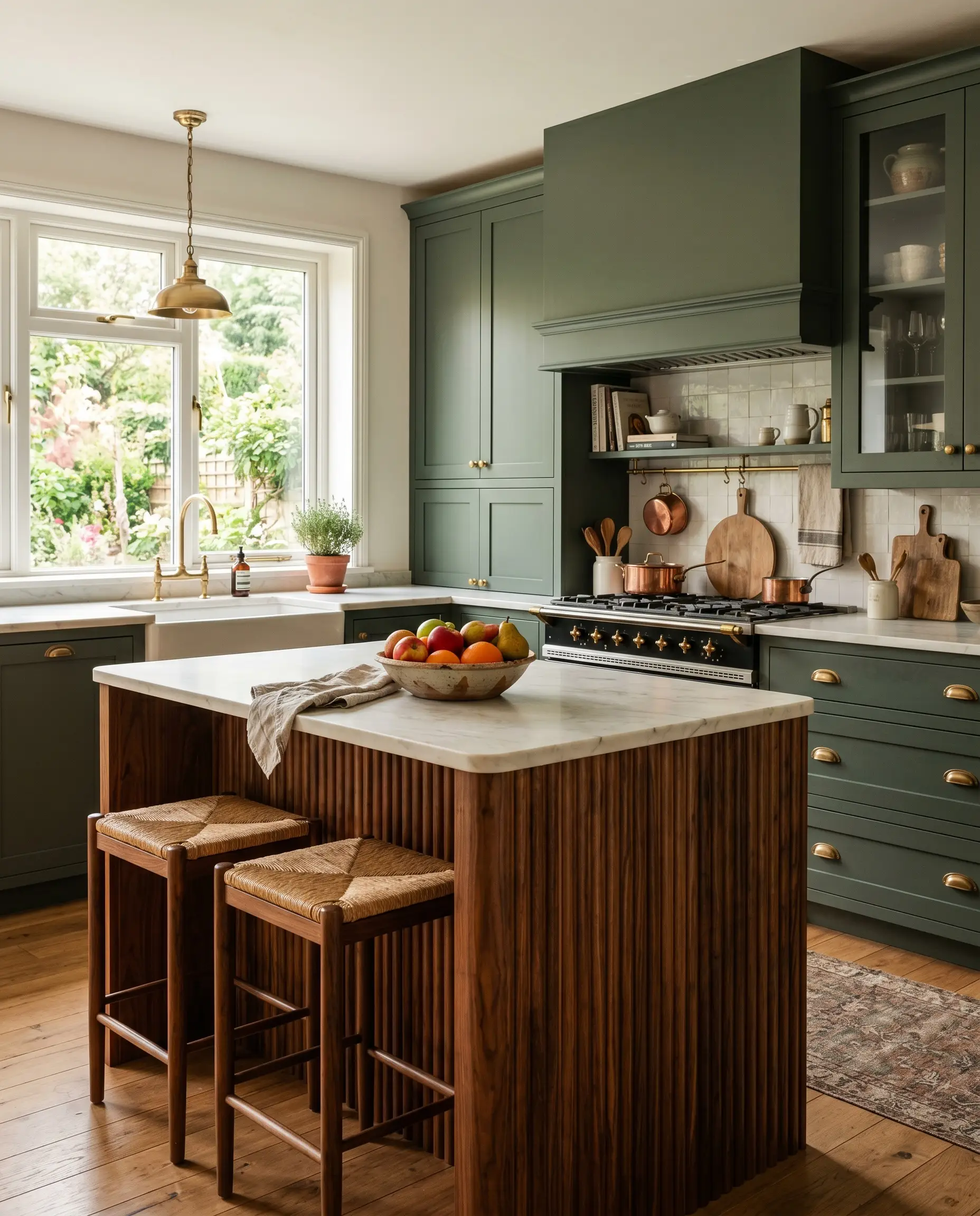
Green sits directly opposite the red and orange undertones of walnut on the color wheel, establishing a sophisticated complementary harmony that makes both materials vibrantly pop. This pairing remains the absolute staple of the high-end transitional English kitchen.
- Recommended Shade: Sherwin-Williams Pewter Green.
- Alternative Shade: Farrow & Ball Studio Green.
- Application: Adjacent flat-panel cabinets or kitchen islands.
4. Saturated Aubergine and Burgundy (Bespoke Luxury)
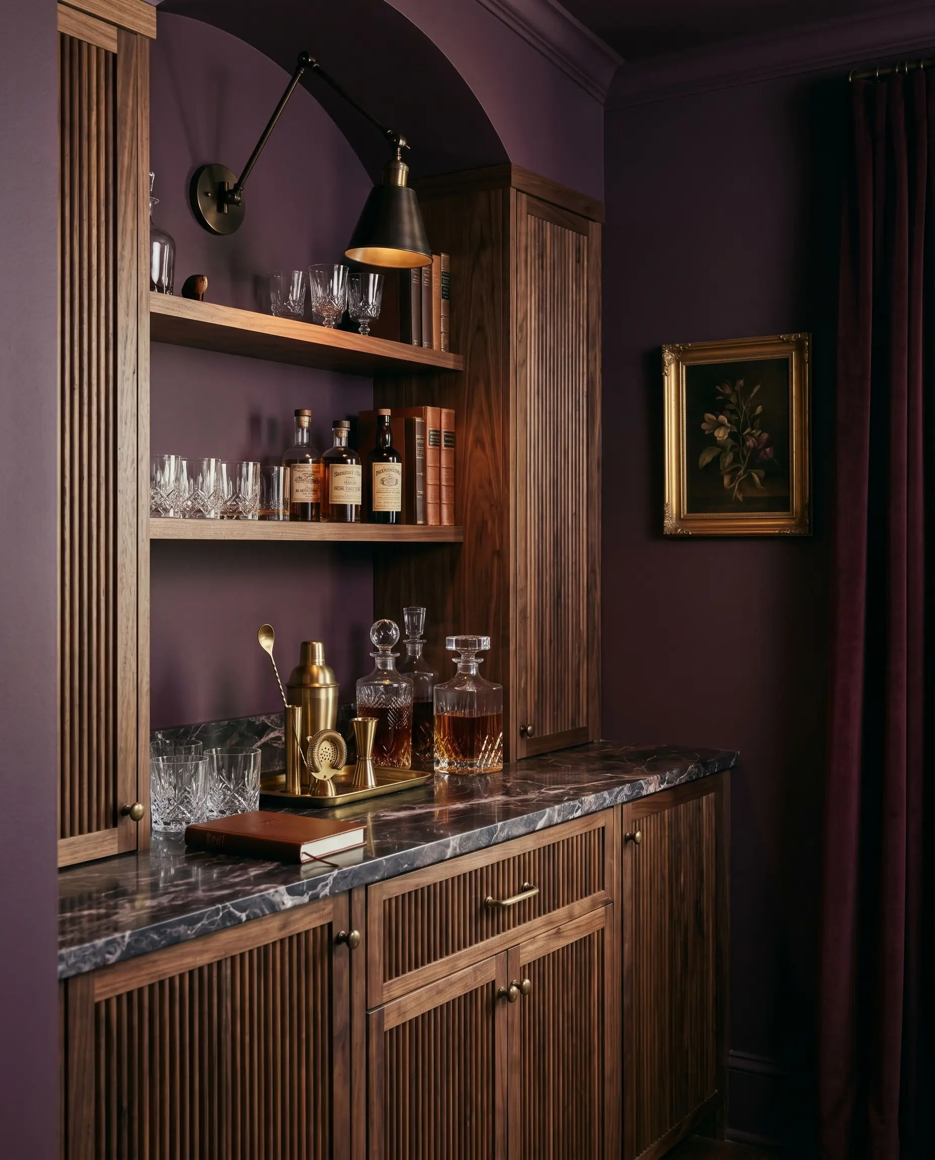
Leaning into the subtle purple undertones naturally found in raw walnut creates an intoxicating, enveloping atmosphere. Drenching the surrounding walls or bar area in a saturated aubergine delivers a moody, bespoke aesthetic perfect for high-end speakeasy or Dark Academia designs.
- Recommended Shade: Farrow & Ball Brinjal.
- Application: Powder room walls, wet bars, or library cabinetry.
- Vibe: Unapologetically dramatic and bespoke.
5. Soft Mushroom and Greige (The Transitional Bridge)
For spaces where creamy white feels too timid and forest green feels too assertive, a soft mushroom bridges the gap impeccably. This blend of gray and beige with subtle green undertones softens the heavy visual weight of fluted wood while maintaining absolute sophistication.
- Recommended Shade: Benjamin Moore Natural Cream.
- Functionality: Acts as a neutral transition between strong architectural textures.
- Vibe: Grounded, calm, and highly versatile.
6. Grounding Charcoal and Soft Black (Modernist Contrast)
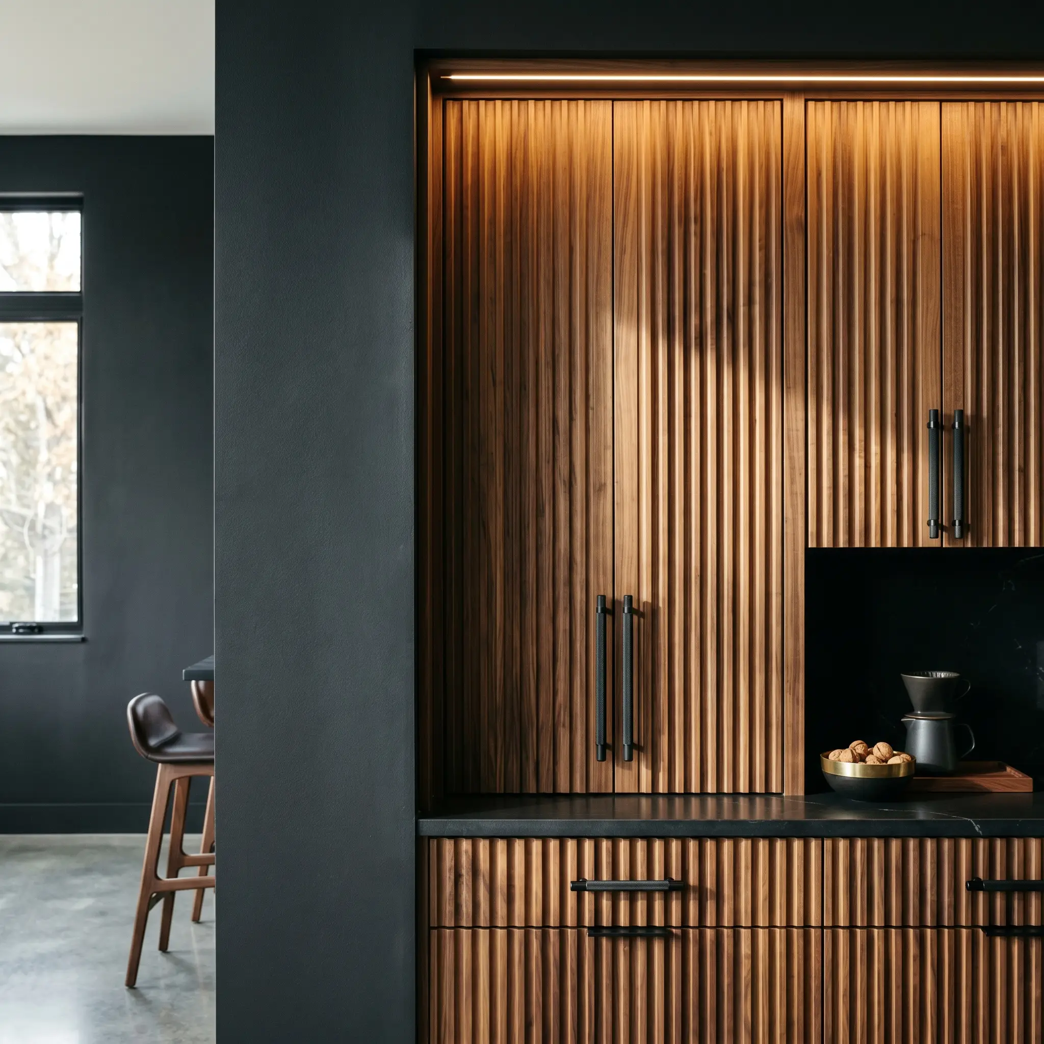
Pairing fluted walnut with soft, chalky blacks creates an ultra-contemporary modernist contrast. The black absorbs ambient light, allowing the dynamic shadows naturally cast by the fluted ridges to take absolute center stage.
- Recommended Shade: Benjamin Moore Cheating Heart.
- Styling Pro-Tip: Pair this exact paint color with knurled matte black hardware to create a cohesive, industrial-luxe loop.
- Vibe: Mid-Century Modern revival or sleek contemporary.
7. Muted Terracotta (Earthy Warmth)
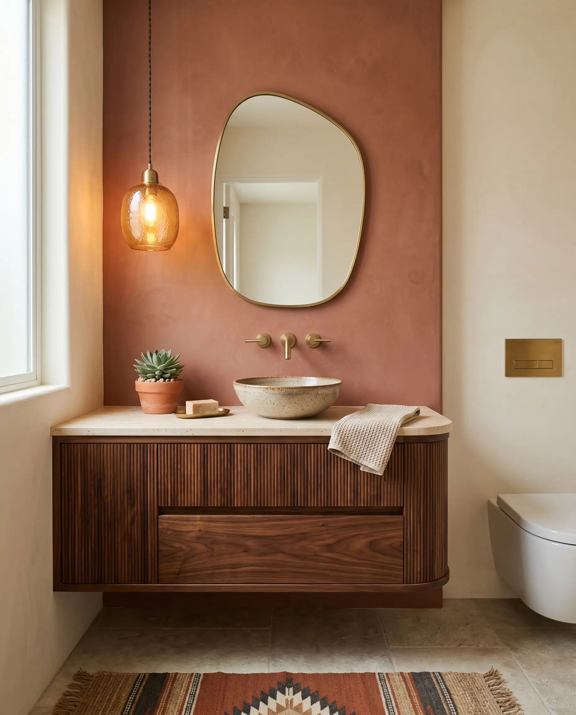
A dusty, muted terracotta acts as an amplifier for the richest ambers hiding within the walnut grain. To avoid a heavy, dated aesthetic, the terracotta must rely on a strong gray or brown base, making it perfect for an Organic Modern powder room featuring a fluted vanity.
- Recommended Shade: Sherwin-Williams Cavern Clay.
- Application: Accent walls or vanity backdrops.
- Vibe: Southwestern-inspired Organic Modern luxury.
Hardware & Paint Pairings
To streamline your material sourcing, our analysis maps the optimal hardware profiles and paint palettes to four distinct architectural aesthetics. Use this matrix to lock in your specific design style.
| Design Style | Hardware Choice | Paint Color Palette |
|---|---|---|
| Organic Modern | Tone-on-Tone Walnut Knobs | Roman Clay & Muted Terracotta |
| Mid-Century Modern | Knurled Matte Black Bars | Grounding Charcoal (BM Cheating Heart) |
| Moody Transitional | Hardware Backplates (Armac Martin) | Deep Forest Green & Saturated Aubergine |
| Japandi | Low-Profile Edge Pulls | Warm Creamy Whites (BM Swiss Coffee) |
Fluted Cabinet Fails: What to Strictly Avoid
Protecting your investment in bespoke joinery means understanding exactly what materials will degrade the aesthetic. Avoid these specific applications to maintain the integrity of your fluted walnut.
- The High-Gloss Glare: Do not use high-gloss polyurethane or lacquer on fluted walnut. The shiny finish causes terrible, disjointed glare on the peaks of the ridges, completely ruining the tactile depth. Stick exclusively to matte or satin clear coats.
- Fussy, Ornate Hardware: Steer clear of traditional rosettes, crystal knobs, or heavily scrolled pulls. These intricate details violently fight the clean, architectural lines of the fluting.
- Cool Gray Clashes: Applying cool, blue-based grays near walnut will instantly date the space. The cool tones fight the warm wood, making the entire room feel disjointed and strikingly unrefined.
Final Details: Sealing the Bespoke Look
In any space where it is deployed, fluted walnut is the undisputed star of the show. The hardware and paint are merely the supporting cast, meticulously calculated to frame the macro-texture and elevate the natural undertones of the wood. Before drilling a single hole or opening a paint tin, order physical hardware samples and brushout swatches. You must test these elements directly against your specific walnut cuts under the natural light of your room.
Have you recently integrated bespoke millwork into your space? Share your hardware and paint pairings in the comments below, or continue refining your design by exploring Hackrea’s architectural guide to custom kitchen lighting.
The Hackrea Style Desk treats interior decoration as an exact visual science. Rather than focusing on demolition or floor plans, this desk masters the art of color theory, undertone matching, material pairings, and spatial proportion. From balancing the visual weight of mixed metals to finding the perfect bridging tone between disparate wood species, this desk provides the rigorous aesthetic rules needed to achieve high-end, editorial-quality harmony in any space.