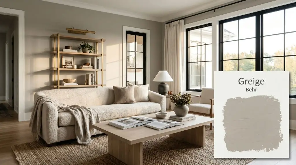
Greige PPU24-11
BehrBehr Greige (PPU24-11) is a perfectly balanced, mid-tone warm neutral that blends the depth of gray with the inviting warmth of sandy beige. With an LRV of 46, it provides substantial contrast against crisp white trim while adapting beautifully to shifting light conditions.
Paint Technical Profile
| Color ID / SKU | PPU24-11 |
| HEX Code | #b7b4ac |
| Light Reflectance (LRV) | 46 |
| Use | Interior, Exterior |
| Best Exposures | South-Facing, East-Facing |
| Best For | Living Rooms, Kitchen Cabinets, Exteriors |
Behr Greige Review: The Shapeshifting Neutral That Brings Effortless Warmth to Any Space
Finding the exact midpoint between a cool, distant gray and a warm, overly yellow beige is one of the most common challenges in interior design. We often want a room to feel inviting and lived-in, but we also need it to maintain a clean, sophisticated edge. This is exactly where Behr Greige proves its incredible value as a foundational color.
Instead of fading into the background, this versatile shade acts as a substantial architectural finish that actively shapes the mood of a room. It brings a gentle, earthy warmth to the walls while retaining enough structure to feel entirely intentional.
Whether you are updating a suburban living room or refreshing a mid-century exterior, this shade adapts beautifully to its surroundings. Let’s break down the exact color structure of this popular paint and explore how to use it effectively throughout your home.
Behr Greige: Temperature, Undertones & LRV Explained
When evaluating if Behr Greige is warm or cool, the answer lies firmly on the warm end of the spectrum. However, this warmth is highly regulated. It avoids the yellow or peach pitfalls of traditional tans, offering a much more balanced, sophisticated profile.
To understand why this color behaves the way it does, we have to look closely at its underlying chromatic profile:
Understanding the Light Reflectance Value (LRV) Behr Greige has an LRV of 46. This places it squarely in the mid-tone category, meaning it absorbs a noticeable amount of light rather than bouncing it around the room. In practical terms, this LRV gives the paint enough visual weight to create a striking, crisp contrast against bright white trim, without making your space feel enclosed or dark.
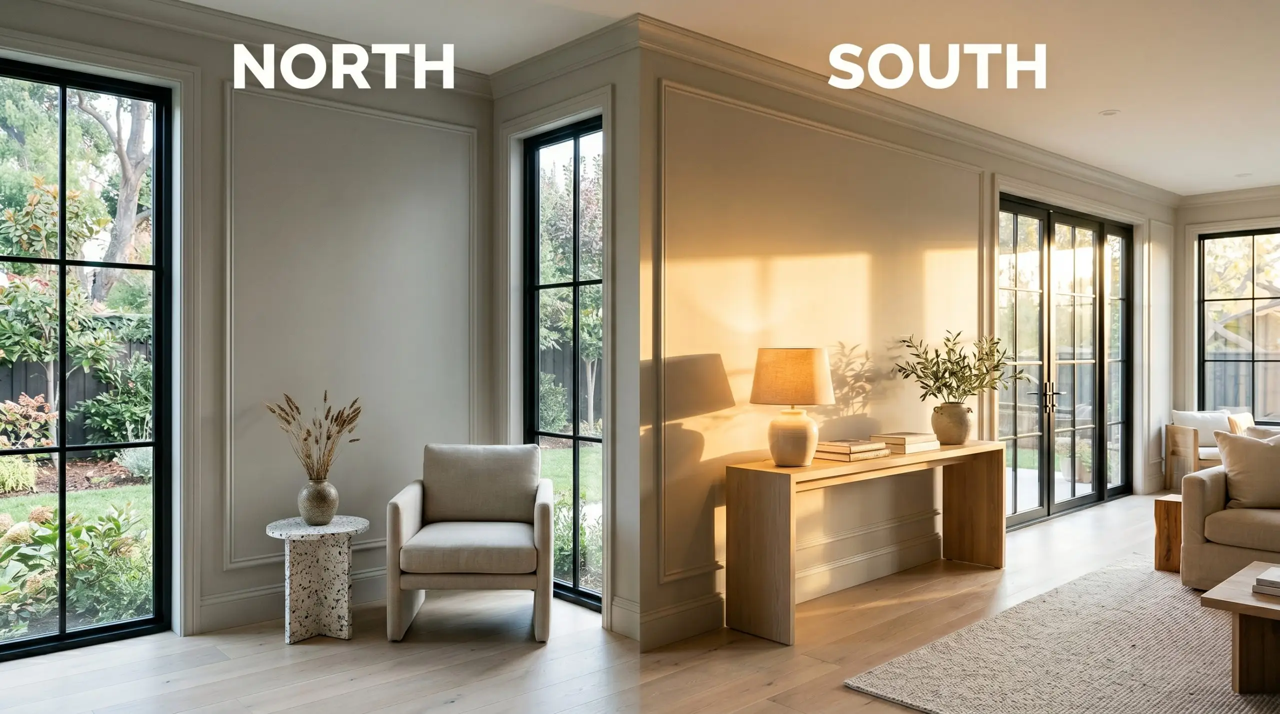
The Chameleon Factor: How Light Changes This Mid-Tone
Because of its delicate balance of warm and cool pigments, Behr Greige is highly reactive to the lighting in your environment. You will notice distinct shifts in its personality depending on the time of day and the direction your windows face.
If you want to maintain the perfect balance of this greige after the sun goes down, stick to soft white bulbs around 3000K. This temperature provides a clean, neutral glow that won’t distort the paint’s natural undertones.
Hackrea Pro-Tip (The Bulb Strategy)
Where to Use Behr Greige in Your Home
Because it sits right in the middle of the lightness scale, this paint is incredibly forgiving and versatile. It has enough substance to stand alone on cabinetry or exteriors, yet it remains soft enough to wrap an entire living space. Here is how to maximize its potential across various design scenarios.
Living Spaces with Transitional Appeal
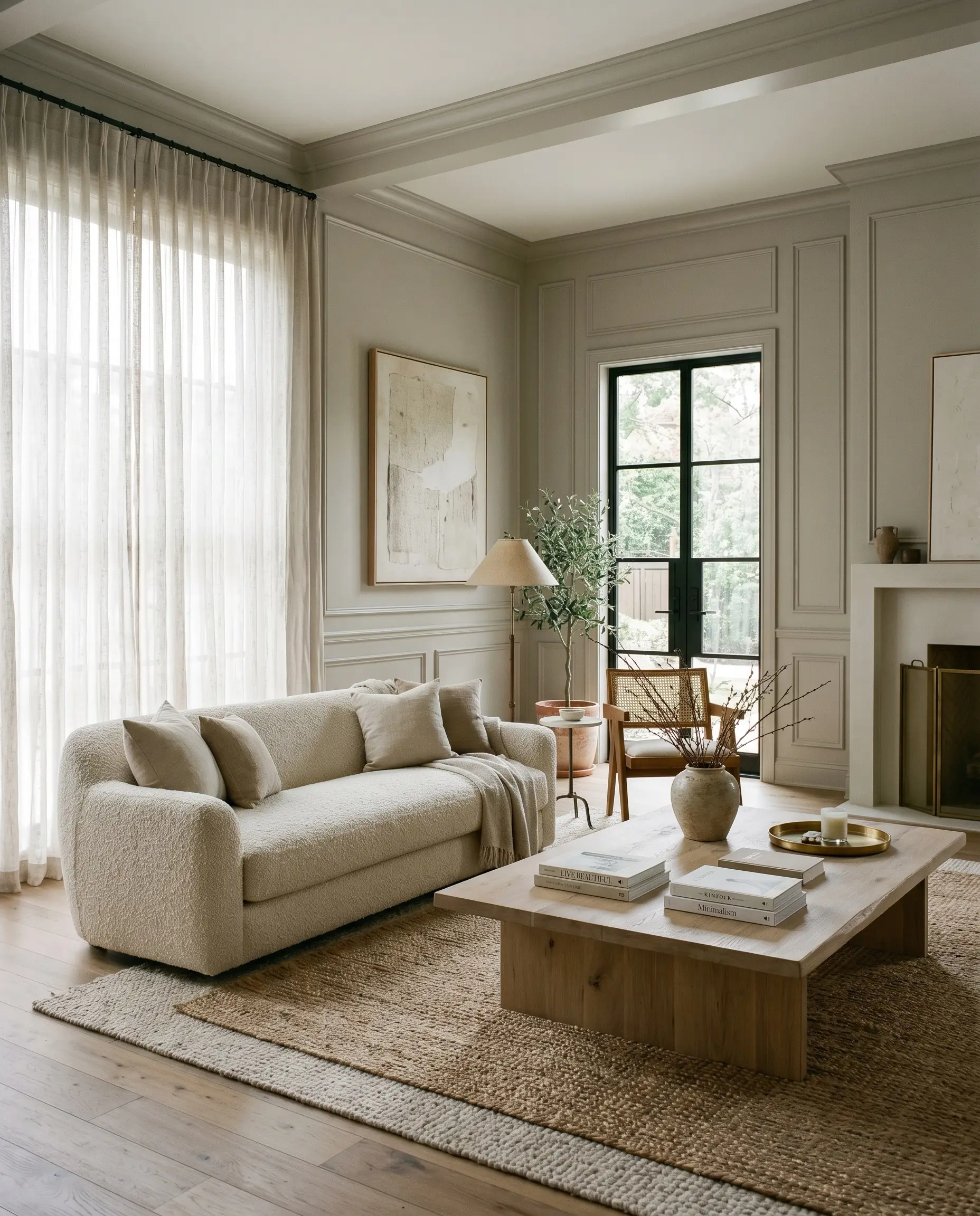
In a living room, this mid-tone neutral excels at stabilizing a mix of different furniture styles and eras. It provides a quiet but sturdy backdrop that allows both vintage pieces and modern silhouettes to coexist beautifully. For a busy household, this color is incredibly practical, as its slightly darker LRV hides everyday scuffs much better than a stark white.
To lean into a relaxed, organic modern aesthetic, pair the painted walls with heavily textured textiles like a bouclé sofa or washed linen drapery. Introduce natural materials like a bleached oak coffee table and a layered jute rug to enhance the earthy qualities of the sandy beige.
If your room features architectural details like picture molding or wainscoting, consider painting the trim and walls in the exact same color but in different finishes. A flat finish on the walls with a satin finish on the trim creates a subtle, sophisticated contrast that feels instantly elevated.
Kitchen Islands and Lower Cabinetry
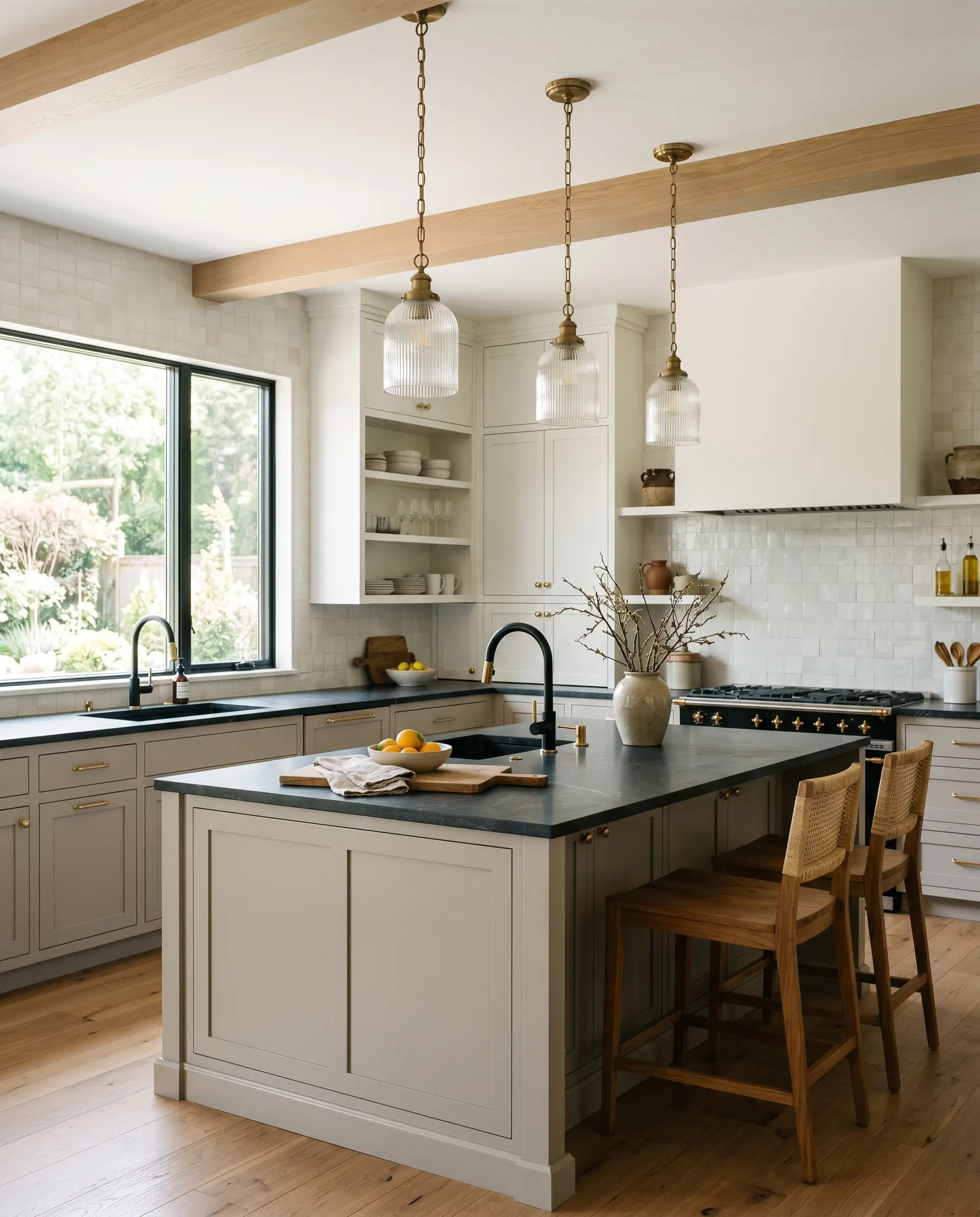
Using this shade on kitchen cabinetry is a brilliant way to introduce color without committing to a bold, saturated hue. It works exceptionally well on lower cabinets or a central island, providing a stabilizing visual base for the room. When paired with warm white upper cabinets, it creates a gentle, two-tone effect that feels incredibly custom.
To bring out the subtle green-taupe in the paint, dress your cabinets with unlacquered brass hardware. The living finish of the brass warms up the gray, creating a beautifully balanced, high-end look.
Hackrea Design Secret (The Hardware Pairing)
For a sleek, transitional kitchen, pair the painted cabinetry with a honed soapstone or matte quartz countertop. You can further modernize the space by incorporating reeded glass pendants and matte black plumbing fixtures. This prevents the color from leaning too traditional and keeps the overall design feeling fresh and current.
Restful Primary Bedrooms
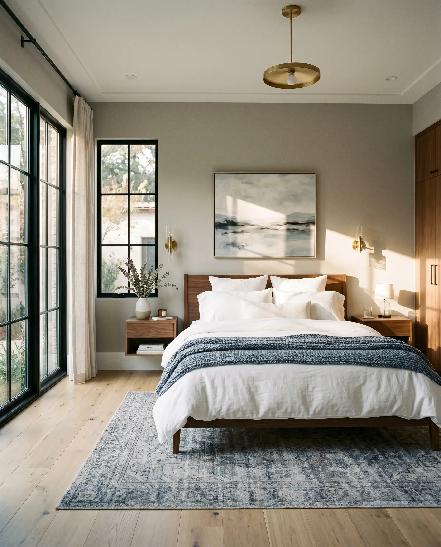
A primary bedroom should feel like a retreat, and the warm, enveloping nature of this color achieves exactly that. Because it absorbs a fair amount of light, it naturally softens the edges of the room, making it an ideal choice for promoting rest and relaxation. It is a fantastic option for young professionals who want a sophisticated, hotel-like atmosphere at home.
To create a soft contemporary vibe, pair the walls with floating walnut nightstands and modern sconce lighting. Keep your bedding simple and textural, utilizing layers of crisp white cotton and a chunky knit throw in a muted terracotta or slate blue.
If your bedroom receives strong southern light, the walls will glow with a comforting warmth throughout the day. To balance this, introduce cooler elements like a travertine tray on the dresser or a cool-toned vintage rug to keep the room’s energy perfectly balanced.
Exterior Facades and Architectural Trim
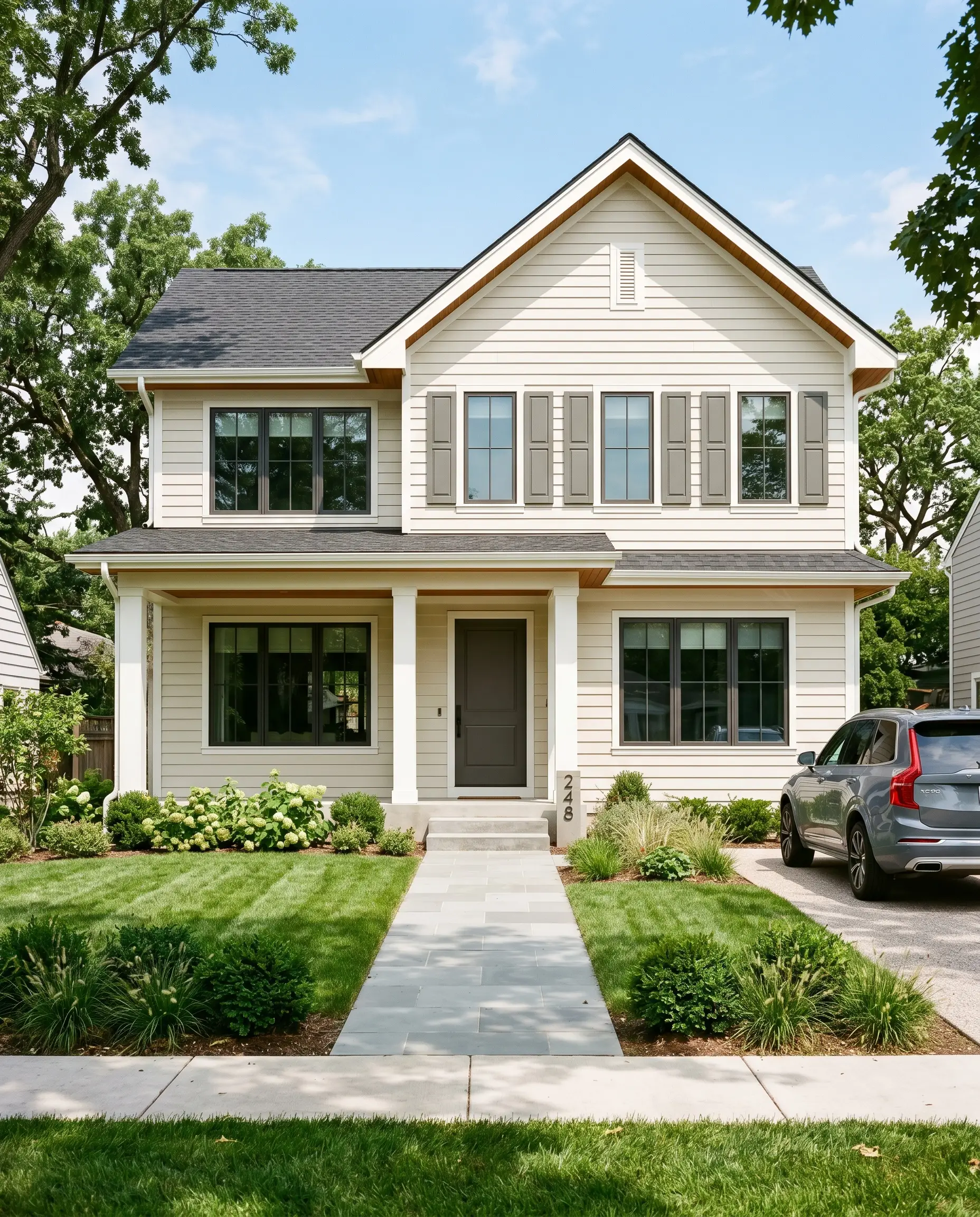
When taken outside, the intense natural light of the sun will wash out the color, making it appear significantly lighter than it does on an interior wall. On an exterior facade, this shade transforms into a beautiful, creamy off-white with just enough gray to prevent it from looking glaringly bright. It is an excellent choice for updating a 90s suburban brick home or refreshing horizontal lap siding.
To create a striking, modern exterior, pair the siding with crisp, bright white trim around the windows and roofline. Then, introduce a contrasting element like a charcoal gray or forest green on the front door and shutters.
Before committing to this color on your exterior, hold a large painted swatch directly against any existing stone or brickwork. If your masonry has strong pink or orange undertones, the green-taupe in the paint may clash, making the siding look slightly muddy.
Clash Warning (Exterior Stone)
Windowless Powder Rooms
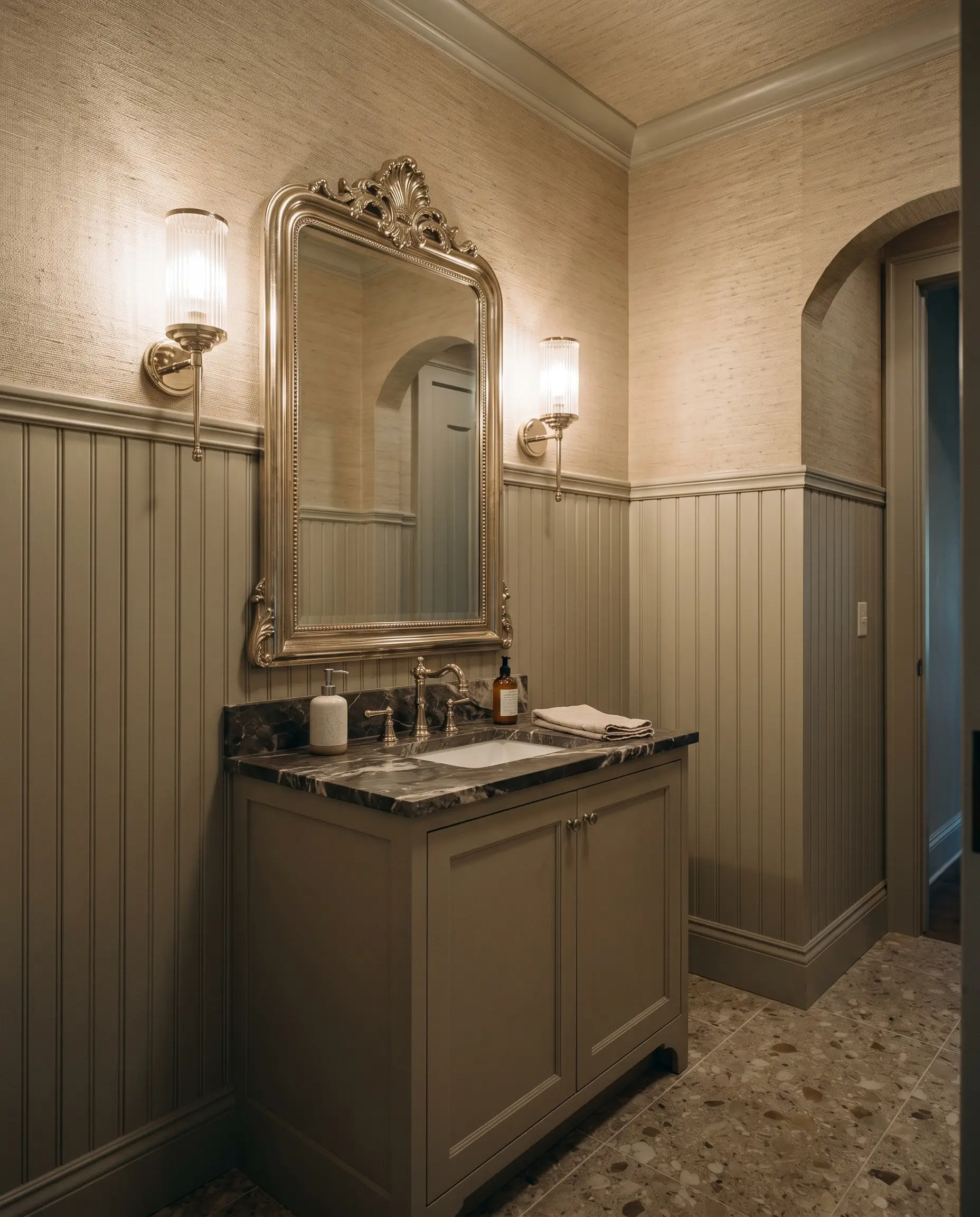
Windowless powder rooms are the perfect place to experiment with a slightly darker, more dramatic application. Because there is no natural light to dictate the color’s behavior, you have complete control over the atmosphere through your choice of artificial lighting.
For a truly immersive experience, try the color drenching technique by painting the walls, ceiling, and trim all in this same rich shade. This blurs the sharp corners of the small room, making the space feel surprisingly expansive and cohesive.
Elevate the design by installing a striking wall feature, such as textured grasscloth wallpaper on the upper half of the walls, while keeping the paint on a beadboard wainscoting below. Finish the space with an oversized, ornate mirror and polished nickel fixtures to bounce your artificial light around the room.
Behr Greige Coordinating Colors & Best Pairings
When placing this mid-tone neutral next to other finishes, its underlying pigments demand thoughtful interaction rather than passive existence. It requires either crisp, high-contrast boundaries to emphasize its structural shape or rich, saturated tones to pull out its earthy warmth. The way you surround this color will completely dictate how it reads in your home.
Trim & Baseboards
To establish a clean, tailored boundary, Benjamin Moore Chantilly Lace OC-65 is an exceptional trim choice. This bright, clean white provides the necessary contrast to make the sandy beige base of the walls pop without introducing any competing undertones. The sharp transition ensures the room feels modern and intentional.
If you prefer a softer, more atmospheric glow, Sherwin-Williams Pure White SW 7005 is the superior option. It carries a tiny drop of yellow pigment that gently speaks to the warmth of the wall color. Pairing these two together creates a seamless, gentle transition that softens the entire room while maintaining a distinct architectural outline.
Hardware, Wood & Material Pairings
The key to elevating this Behr neutral lies in mixing highly tactile, everyday materials with one striking, aspirational finish. Because it absorbs a noticeable amount of light, it benefits immensely from textures that either bounce illumination back into the room or lean into its grounded, earthy nature.
Coordinating Colors
Designer Mood Boards
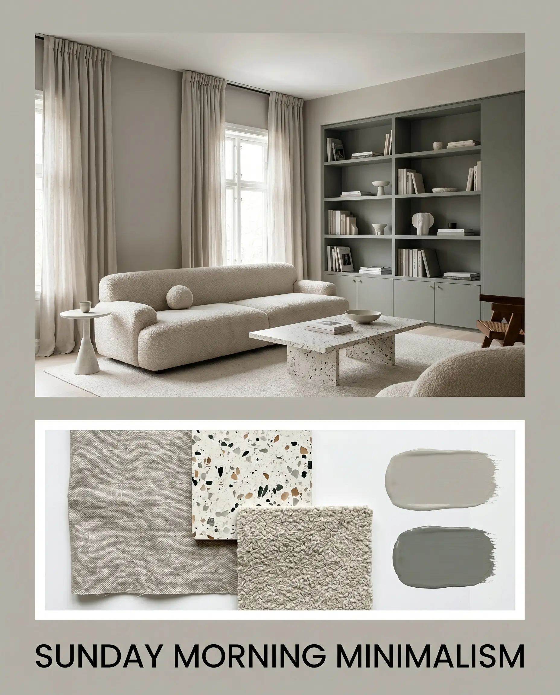
Sunday Morning Minimalism This palette relies on gentle textures and soft light to create a deeply restorative energy. Walls coated in this Behr neutral are paired with voluminous washed linen drapery and a plush, low-profile bouclé sofa. A terrazzo coffee table adds a playful yet grounded focal point, while subtle accents of Sherwin-Williams Retreat SW 6207 on a nearby built-in bookcase bring a quiet, organic rhythm to the space.
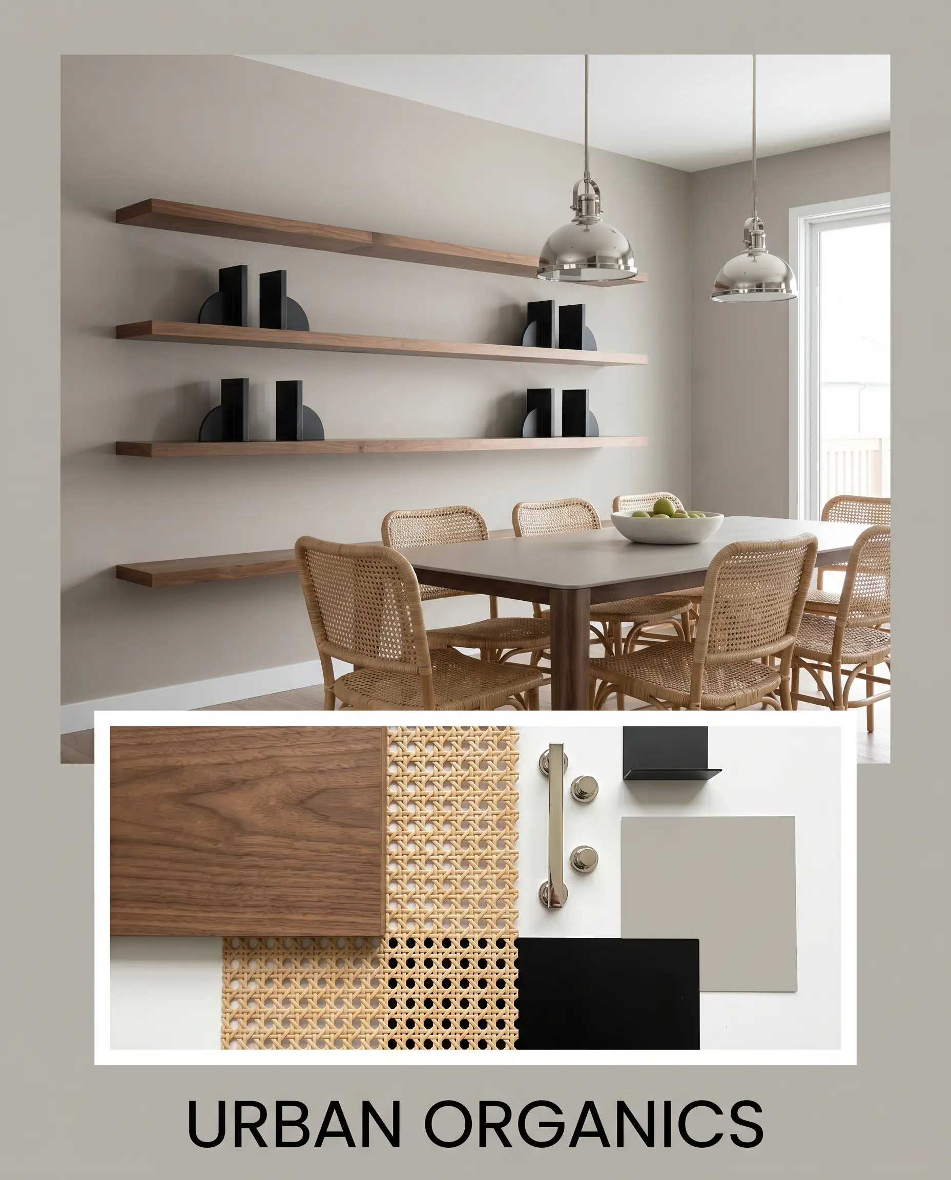
Urban Organics Designed for those who appreciate sleek lines warmed by natural materials, this aesthetic balances structure and comfort. The warm walls act as a canvas for striking matte black architectural bookends and floating walnut shelving. Natural rattan dining chairs soften the sharp edges, while polished nickel pendant lights bounce brilliant highlights across the room.
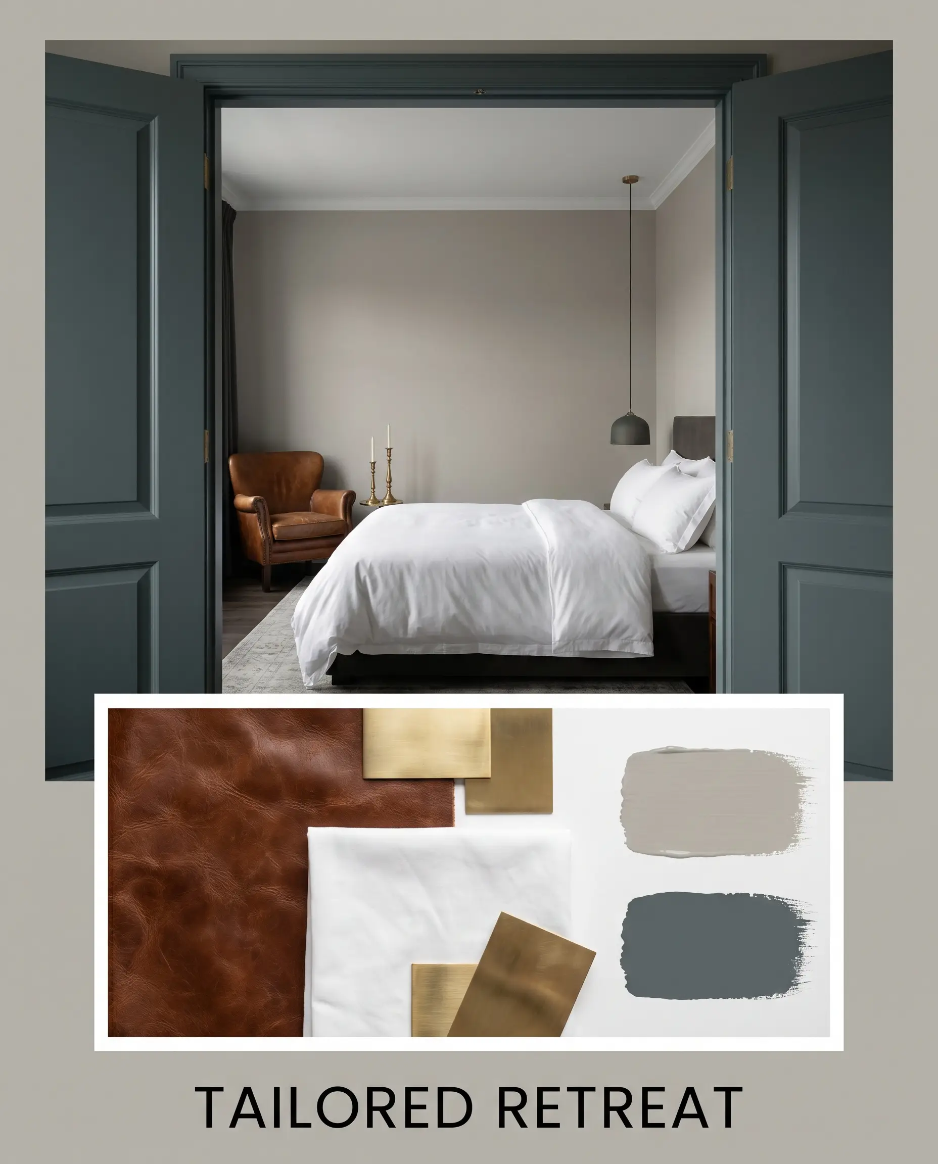
Tailored Retreat This combination channels the sophistication of a boutique hotel suite using rich, saturated contrasts. The mid-tone walls are dramatically framed by interior doors painted in Farrow & Ball Inchyra Blue No.289. Crisp white cotton bedding, a vintage leather accent chair, and brass candlesticks complete the look, resulting in a deeply layered, curated atmosphere.
Comparing Mid-Tone Neutral Alternatives
There are specific lighting conditions or exterior exposures where this particular paint might fail to deliver the exact mood you are chasing. If your room lacks natural light and the color begins to feel too dense, or if you need a slightly different undertone to harmonize with existing floors, you will need to pivot. Here is how this shade stacks up against its closest competitors.
Behr Greige vs. Sherwin-Williams Agreeable Gray SW 7029
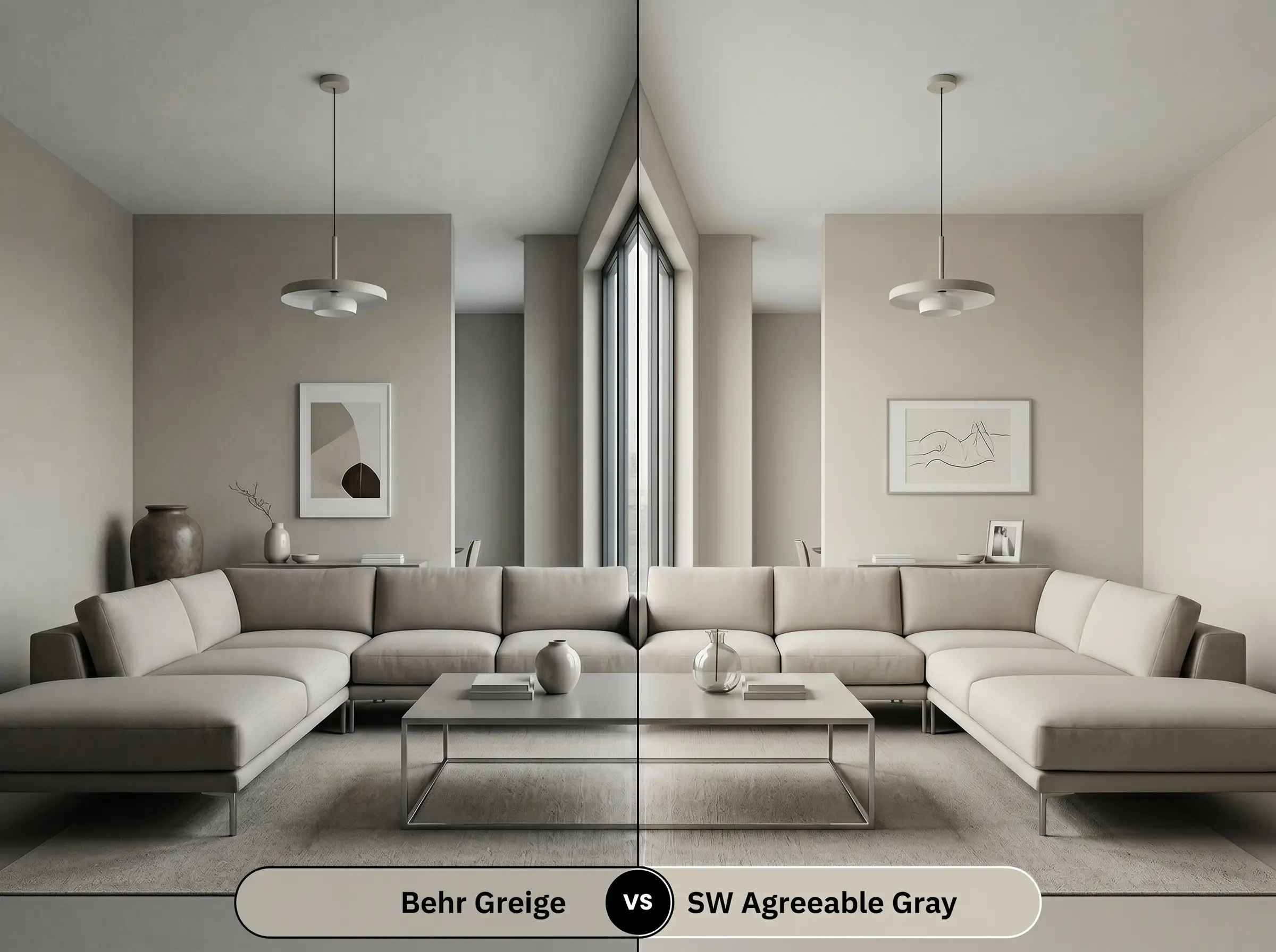
When you place these two side-by-side, the differences in light reflection become immediately obvious. Sherwin-Williams Agreeable Gray SW 7029 has a noticeably higher LRV, meaning it will bounce more light around a dimly lit room and feel significantly lighter on the wall.
If your space is north-facing and you are worried about the walls feeling too enclosed, Agreeable Gray is the safer choice. However, if you have ample southern light and want a richer, more substantial color that holds its shape against bright sunlight, the Behr option provides much better structural depth.
Behr Greige vs. Benjamin Moore Revere Pewter HC-172
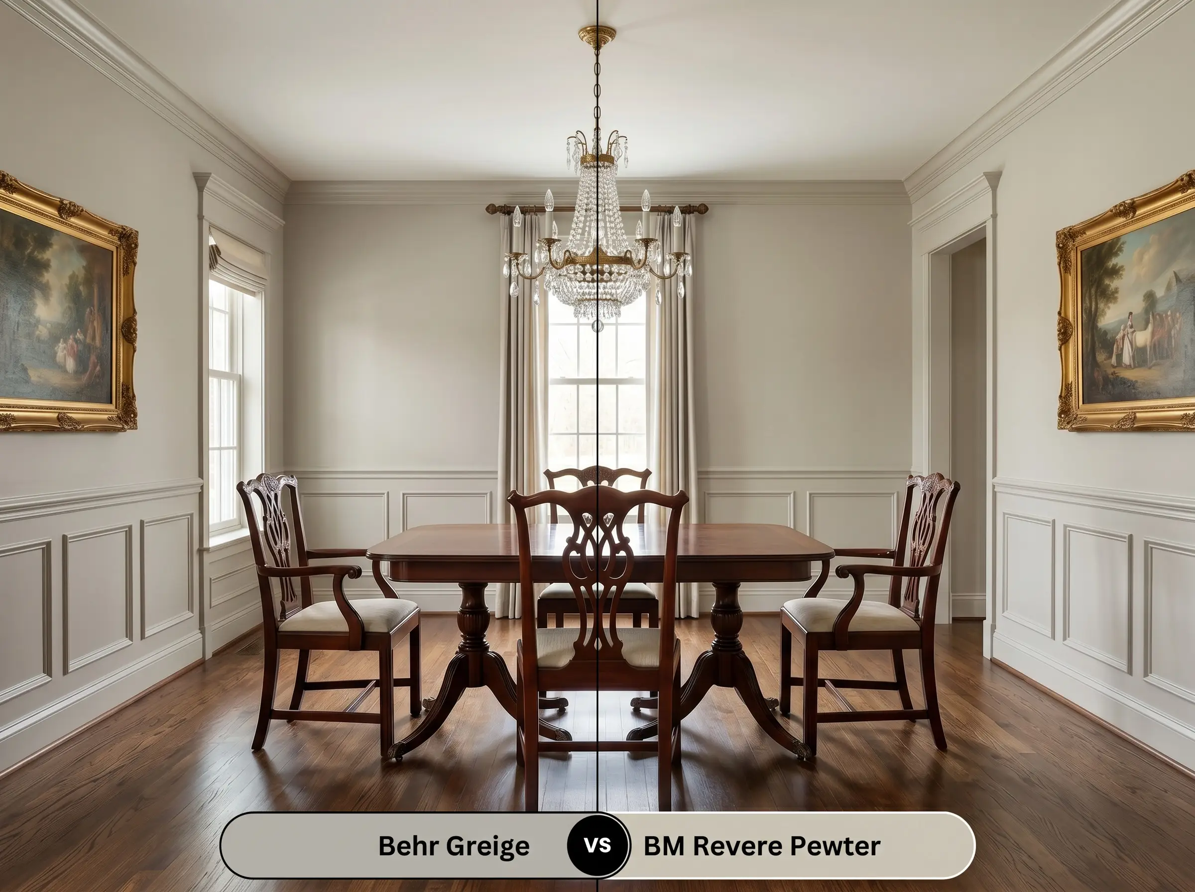
This is a classic matchup between two incredibly popular transitional colors. Benjamin Moore Revere Pewter HC-172 carries a slightly more pronounced green-gray muddiness, giving it a slightly more historic, aged appearance.
If your home features a lot of warm, traditional wood tones and you want a color that feels deeply rooted and classic, Revere Pewter is excellent. Conversely, if you want a slightly cleaner, more modern sandy base that adapts easily to contemporary furnishings, stick with the Behr neutral.
Similar Colors & Brand Equivalents
Sometimes a homeowner falls in love with a color’s general profile but needs a minor adjustment to make it work flawlessly in their specific environment. Whether you need a touch more warmth for a chilly hallway or you are shopping across different paint brands, these alternatives offer excellent solutions.
Same-Brand Alternatives
Cross-Brand Matches
Practical Application & DIY Advice
Transitioning from design theory to the physical reality of a weekend painting project requires a shift in strategy. To ensure this color looks as intentional and premium on your walls as it does on a mood board, you must select the right finishes and prep materials.
The Dynamic Sheen Guide
Primer Strategy
Do not skip the primer when working with a color of this visual weight. You will need a high-quality, lightly tinted primer to create a neutral base layer. This ensures the sandy beige base develops evenly without your old wall color bleeding through and altering the final temperature.
Mid-tone paints are notorious for “flashing”—which means you can see shiny, uneven roller marks when light hits the wall at an angle. To avoid this, always maintain a wet edge while rolling, apply two full coats, and never go back to touch up a semi-dry spot.
Hackrea Pro-Tip (The Flashing Warning)
Coverage & Success Tips
For a truly professional, saturated finish, plan for two complete coats of paint over your primed surface. Cutting in around the trim requires a steady hand, as the contrast between this richer color and bright white baseboards will highlight any wavy brush strokes. Take your time with painter’s tape to ensure those boundaries remain razor-sharp.
Frequently Asked Questions
Because of its subtle green-taupe undertone, this paint actually works beautifully to neutralize the intense orange hues found in honey oak. Instead of clashing, it provides a cooling, stabilizing backdrop that modernizes the wood.
In deep shade, the lack of direct sunlight will suppress the warm sandy base and amplify the green-taupe notes. It can sometimes read slightly muddy in these specific conditions, so testing a large swatch against your exterior stone is highly recommended.
Yes, its LRV of 46 gives it enough visual weight to gently absorb light overhead. Painting a soaring ceiling this color will effectively pull the ceiling down, making a massive room feel much more intimate and grounded.
Low-CRI (Color Rendering Index) bulbs often have poor color accuracy and can unpredictably spike certain pigments. If you use cheap LED lighting, it will likely pull out an unwanted, sickly green cast, so always invest in bulbs with a CRI of 90 or higher.
The Final Verdict on Behr Greige
Behr Greige is a highly capable, transitional workhorse that excels at bringing effortless warmth to a home without sacrificing architectural structure. Its absolute best application is in living spaces and primary bedrooms where you want to bridge the gap between cool modernism and cozy traditionalism. It is the perfect choice for homeowners who love layering natural textures, mixing vintage and contemporary furniture, and creating a grounded, inviting atmosphere that feels expertly curated.
However, this paint is not a universal fix for every design scenario. If your home is heavily outfitted with stark, blue-leaning cool grays or cherry wood finishes with strong red tones, this color will struggle to harmonize. The green-taupe undertones will actively fight against the cool blues and intense reds, resulting in a room that feels disjointed and visually confused. Always ensure your existing hard finishes lean either neutral or gently warm before committing to this beautifully complex shade.
Closest Cross-Brand Equivalents
The absolute closest scientific color matches for Greige across top paint brands.