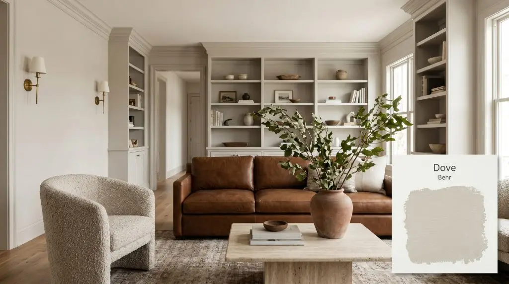
Dove HDC-MD-21
BehrBehr Dove (HDC-MD-21) is a warm, sophisticated greige with an LRV of 66. Sitting comfortably between gray and beige, this versatile hue features subtle yellow-orange undertones that prevent it from feeling cold, making it an ideal transitional neutral for both modern and traditional spaces.
Paint Technical Profile
| Color ID / SKU | HDC-MD-21 |
| HEX Code | #d9d4cb |
| Light Reflectance (LRV) | 66 |
| Use | Interior, Exterior |
| Best Exposures | South, West, East |
| Best For | Open-concept living areas, kitchen cabinetry, and transitional spaces |
Behr Dove (HDC-MD-21): Crafting a Tailored, Earthy Foundation With the Perfect Greige
The most successful interiors rarely rely on loud, demanding colors to make a statement; instead, they depend on quiet, structural layers that make every other material in the room look incredibly intentional.
Behr Dove (HDC-MD-21) operates exactly like this invisible framework. This warm greige functions as a premium architectural finish, softly absorbing chaotic natural light while smoothing out the hard edges of a room.
It is the kind of low chroma neutral that allows you to mix raw travertine, aged brass, and slipcovered linen without the walls ever competing for attention. Rather than fading into the background, it actively frames your design choices, establishing a tailored, earthy foundation that feels both relaxed and highly curated.
Behr Dove: Undertones & LRV Explained
When evaluating its exact temperature, Behr Dove is undeniably warm. It avoids the icy, sterile shadows of early 2010s grays, providing a much cozier, lived-in atmosphere.
To understand exactly how this paint will behave in your home, we have to look at how its color structure is built:
At a light reflectance value (LRV) of 66, this paint absorbs approximately 34% of ambient light.
This specific metric is the sweet spot for modern homes. It reflects more than enough illumination to keep a standard living room feeling expansive and airy, but it carries just enough depth to provide a crisp, highly visible contrast against pure white trim and ceilings.
Mastering the Light: The Chameleon Factor
Because of its complex undertones, this shade shifts beautifully depending on the direction of your windows and the time of day.
Here is exactly how the ambient light absorption will manipulate the color cast in your space:
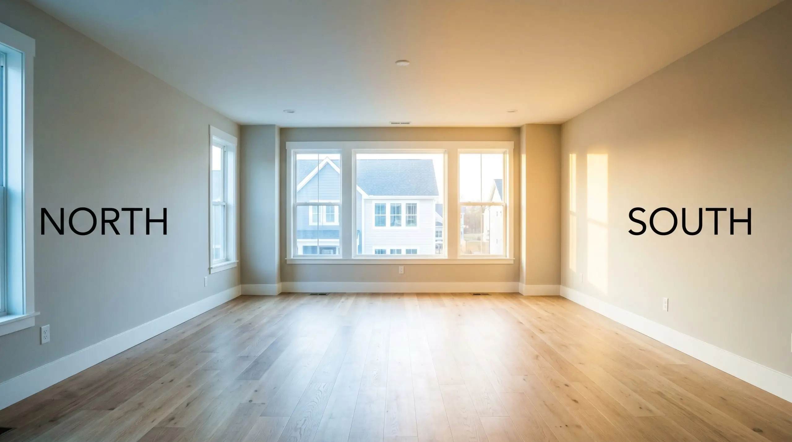
Always paint large swatches on both window-facing walls and the darker corners of your room. You need to see how the yellow-orange undertones react to the shadows before committing to a full room application.
Hackrea Pro-Tip (The Lighting Test)
Transforming Your Home with Behr Dove
The true value of a bridging neutral is its ability to move seamlessly from room to room, adapting to completely different functions and aesthetics.
Here is how to maximize this paint across your most important spaces.
Open-Concept Living Rooms
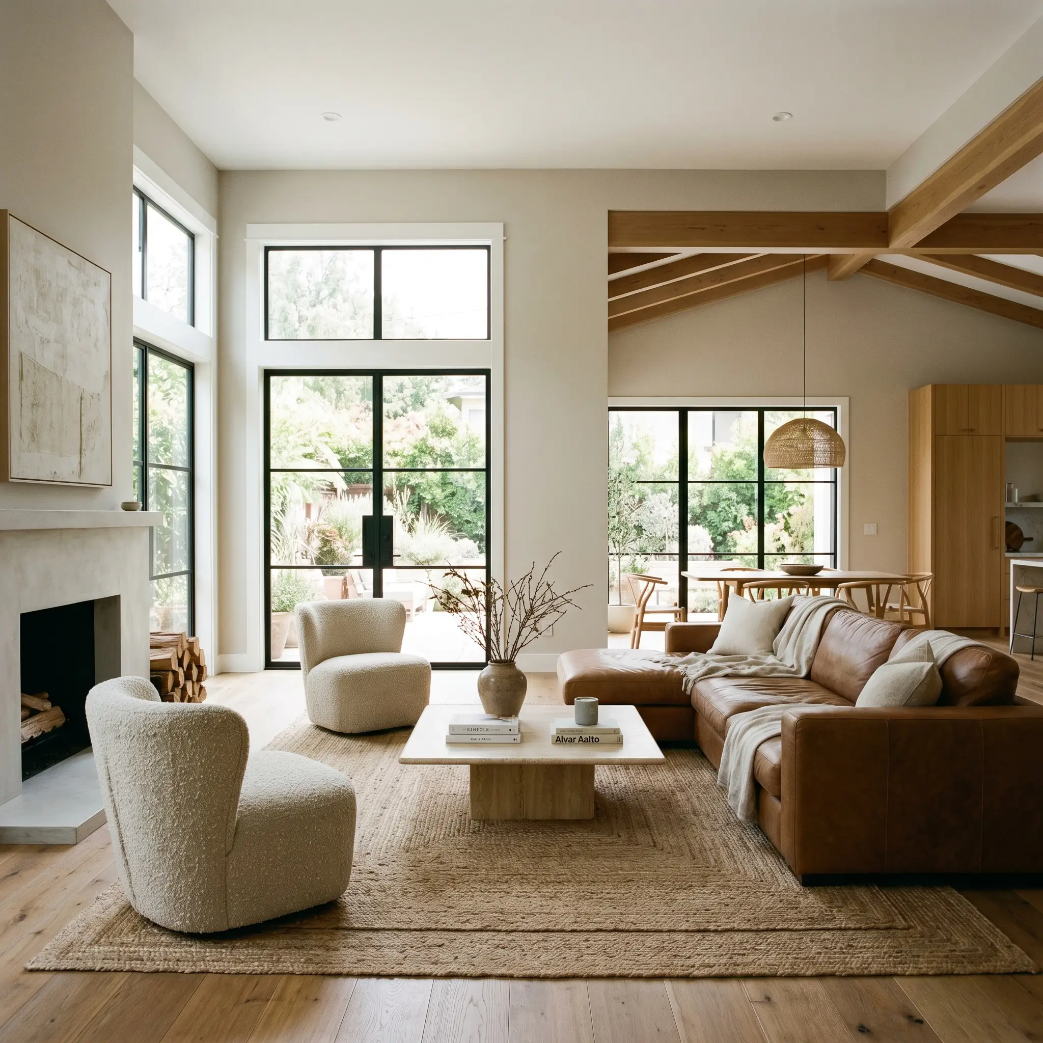
In sprawling, multi-use living areas, white walls can often feel stark, while darker tones can visually shrink the footprint. This greige solves the spatial dilemma by wrapping the room in a soft, continuous warmth that defines the boundaries without closing them in.
For a beautifully layered Organic Modern aesthetic, pair the walls with rift-sawn oak flooring and large-scale, low-profile furniture. Introduce tactile contrast through nubby bouclé accent chairs, a vintage terracotta vase with oversized branches, and layered jute rugs.
If your living room features built-in shelving or a brick fireplace, consider painting the surrounding trim and mantel in the exact same HDC-MD-21 shade. This monochromatic approach blurs the architectural lines, making standard ceilings feel significantly taller and standard millwork look custom-built.
When furnishing a greige living room, avoid buying upholstery in the exact same mid-tone value. You must introduce contrast. Pair these walls with either bright, pure white slipcovers or rich, saturated accents like a saddle leather sofa or a charcoal velvet ottoman to keep the room from looking muddy.
Hackrea Design Secret (The Greige Trap)
Transitional Kitchen Cabinetry
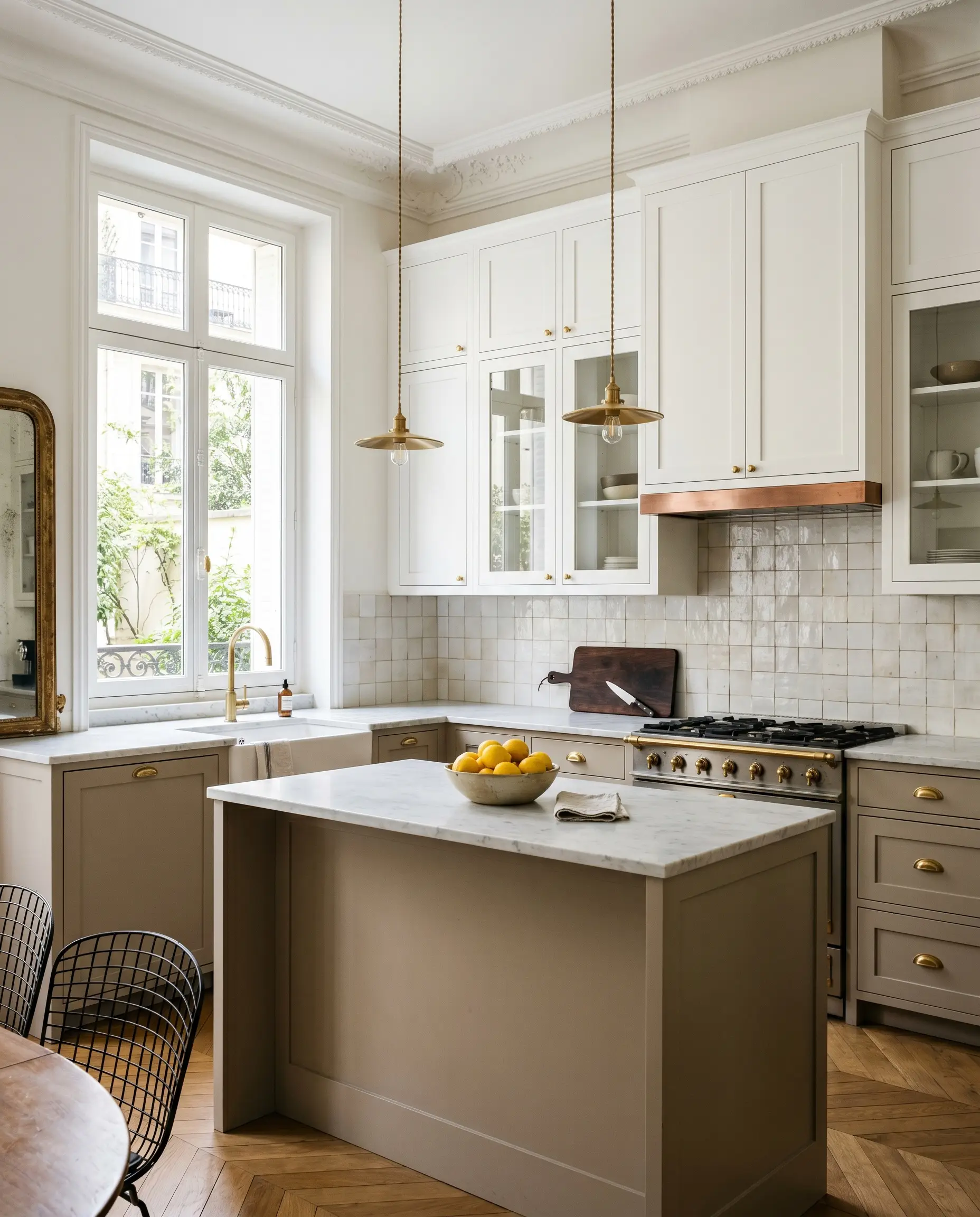
While white kitchens will always be classic, painting your cabinetry in a soft mushroom tone instantly injects character and warmth into the heart of the home. It is an incredibly smart choice for a Parisian Chic or Soft Minimalist kitchen update.
Do not limit this color to standard wall applications. Use it as a two-tone cabinetry solution, applying the greige to the lower cabinets and a crisp, pure white to the uppers to keep the sightlines open.
To elevate the finish, pair the cabinetry with honed marble countertops (or a high-quality quartz equivalent) and unlacquered brass hardware. The metallic warmth of the brass beautifully echoes the hidden yellow-orange undertones in the paint, creating a cohesive, high-end visual flow.
Primary Bedrooms
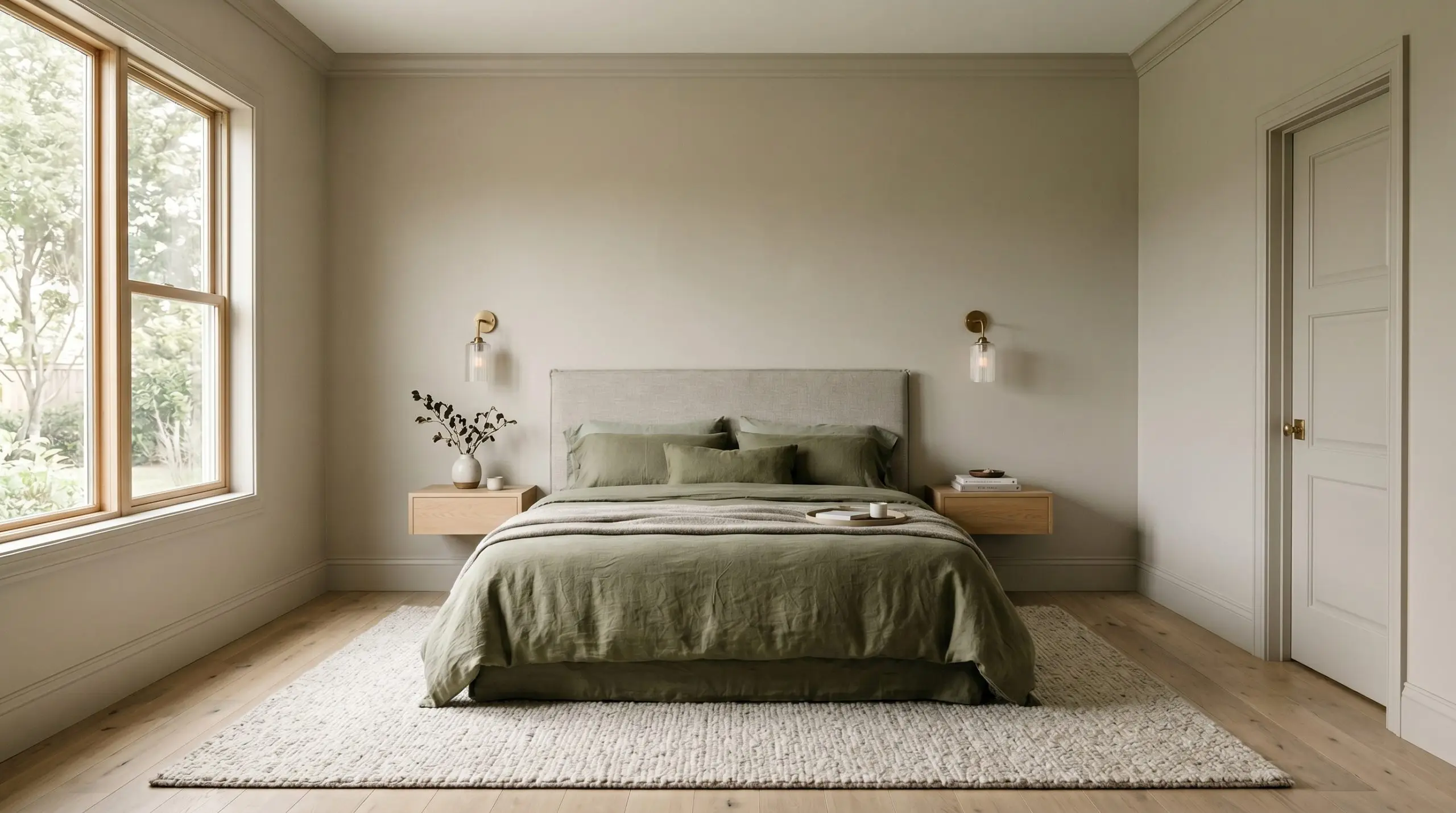
A primary bedroom should function as a visual exhale at the end of a long day. Because this paint naturally softens harsh angles and shadows, it is the perfect candidate for a fully color-drenched bedroom.
Paint the walls, the baseboards, the crown molding, and even the bedroom doors in the exact same finish. This technique erases visual clutter, turning a standard bedroom into a seamless, restful retreat for a busy professional or parent.
Style the space with relaxed, washed linen bedding in muted olive or dusty rose. Add floating sconces with fluted glass shades and a plush, oversized wool rug to prioritize comfort and sensory calmness over rigid perfection.
Hallways and Entryways
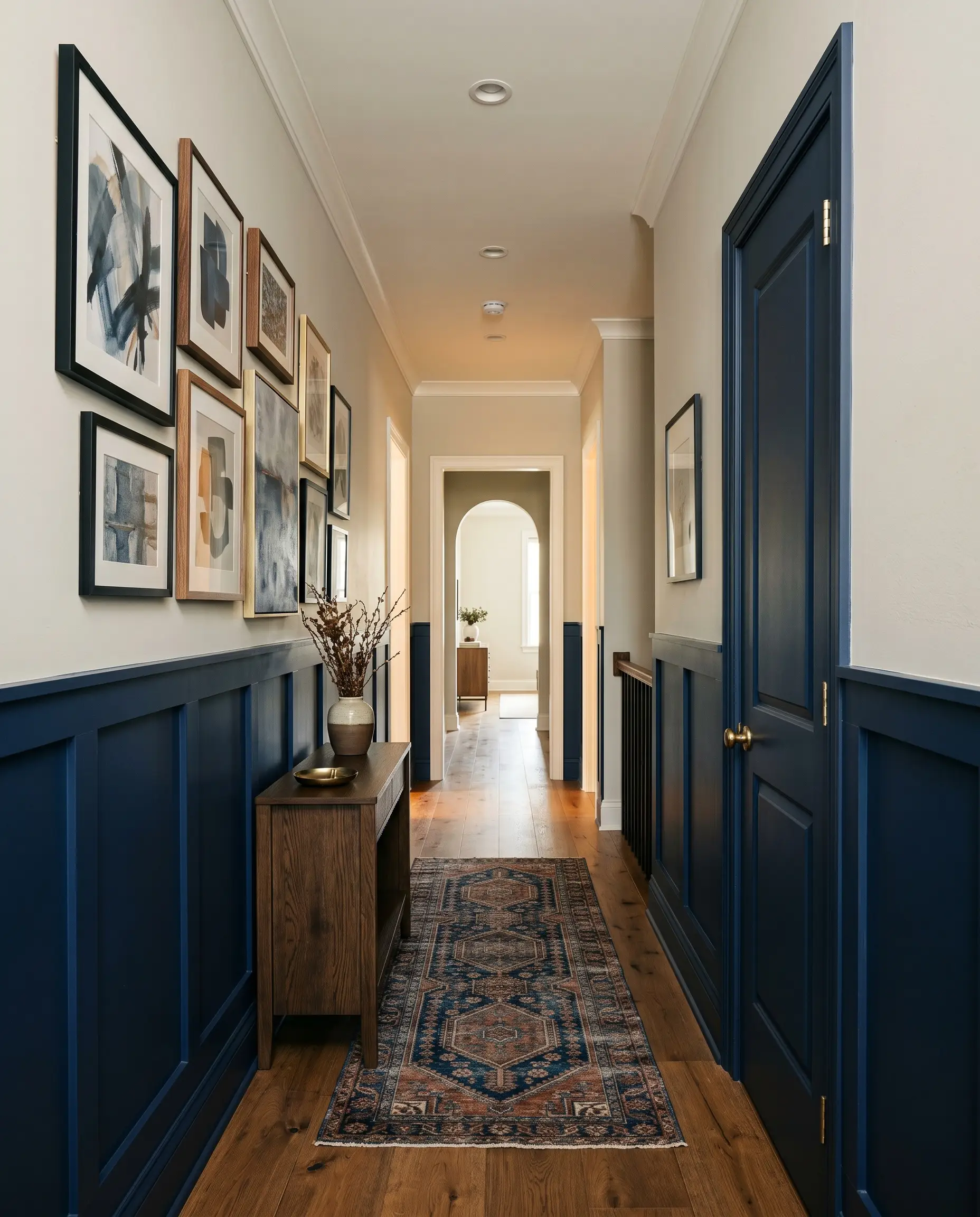
Transitional spaces like hallways and entryways are notoriously difficult to design because they often lack natural light and serve purely functional purposes. Here, the paint acts as the ultimate bridging neutral, connecting the distinct color palettes of your adjoining rooms.
To make a standard hallway feel like a curated destination, install simple board and batten paneling up to the two-thirds mark of the wall. Paint the lower paneling in a rich, saturated color like midnight blue or deep sage, and use Behr Dove on the upper third.
This high-contrast application grounds the narrow space while allowing the upper walls to reflect light. Finish the corridor with an asymmetrical gallery wall of abstract art and a vintage runner to create a space that feels intentional rather than like an architectural afterthought.
Coordinating Colors & Elevating Behr Dove
This paint requires highly intentional styling to guide its warmth, either craving crisp boundaries to hold its shape or rich, tactile contrasts to feel truly grounded. Instead of letting the color dictate the room, use your trim and furnishings to manipulate exactly how the greige behaves.
Defining the Architecture: Trim & Baseboards
To establish a tailored, high-end look, pair your walls with Benjamin Moore Chantilly Lace OC-65. This crisp, pure white provides a clean, neutral border that allows the greige to act as the sole source of warmth in the room.
If you prefer a slightly sharper, more modern transition, Sherwin-Williams Extra White SW 7006 is an excellent alternative. It offers a cooler contrast that sharpens the edges of your millwork, making the soft wall color pop beautifully without feeling harsh.
Hardware, Wood & Material Pairings
The Core Coordinating Palette
The Artisan’s Canvas
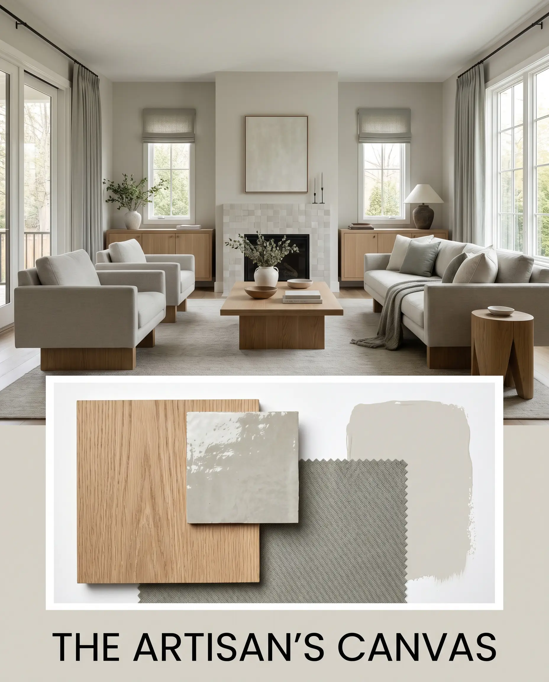
This palette is rooted in slow living and intentional craft, creating an atmosphere that feels incredibly serene and organic. The soft greige walls serve as a quiet backdrop for rift-sawn oak furniture resting on solid plinth bases. Visual interest is layered in through textured zellige tile accents and oversized branches placed in artisan vases. By introducing muted textiles in Evergreen Fog, the entire space breathes with a relaxed, earthy elegance that feels deeply connected to nature.
Soft Industrial Edge
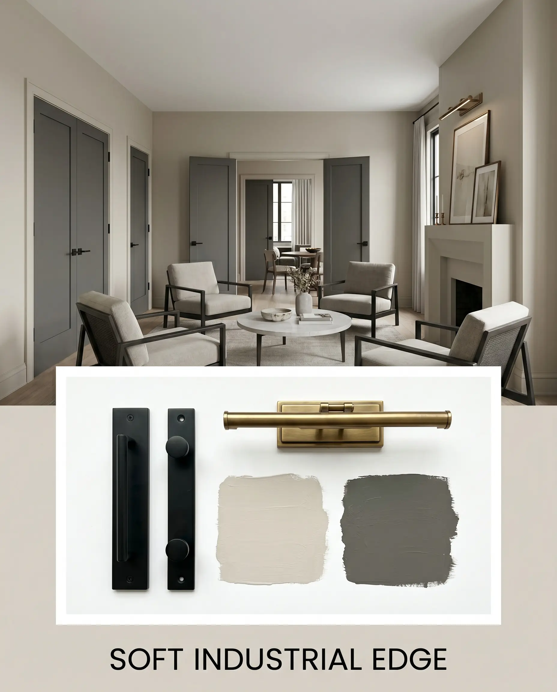
For a more confident, tailored aesthetic, this styling approach uses sharp contrasts to elevate the warmth of the walls. The room is defined by the rigid lines of matte black steel hardware and structural accent chairs, cutting through the softness of the paint. Interior doors painted in Kendall Charcoal provide a bold, grounding weight, while a minimalist mantel styled with aged brass picture lights adds a layer of refined warmth. The resulting energy is urban and collected, proving that industrial elements do not have to feel cold.
Head-to-Head Paint Comparisons
Choosing the right neutral often comes down to evaluating how the color performs under specific lighting or against your existing fixed finishes. If your space features stark stonework or lacks natural light, you may need to pivot to ensure the walls do not lose their intended depth.
Sherwin-Williams Repose Gray SW 7015 vs. Behr Dove
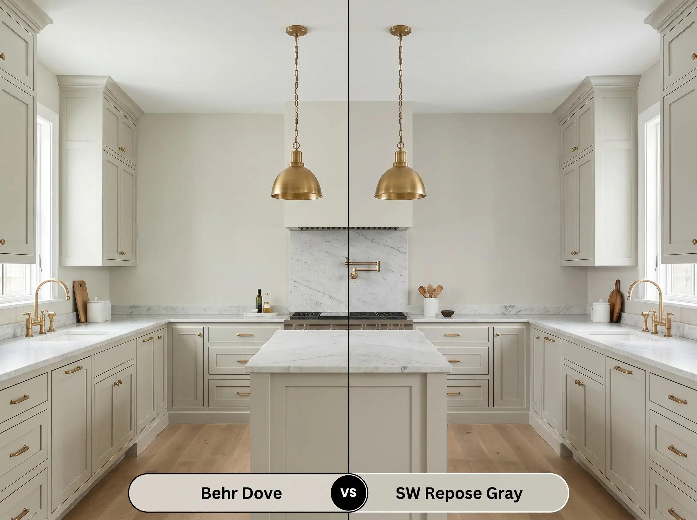
Repose Gray carries a distinctly cooler, violet-brown undertone compared to the creamy yellow-orange base of HDC-MD-21. If your room receives ample southern light, the Behr option will glow with an inviting, sunlit warmth. However, if you are working with cool-toned marble countertops or rely heavily on stark artificial lighting, Repose Gray will hold its neutral shape much better without leaning overly warm.
Benjamin Moore Revere Pewter HC-172 vs. Behr Dove
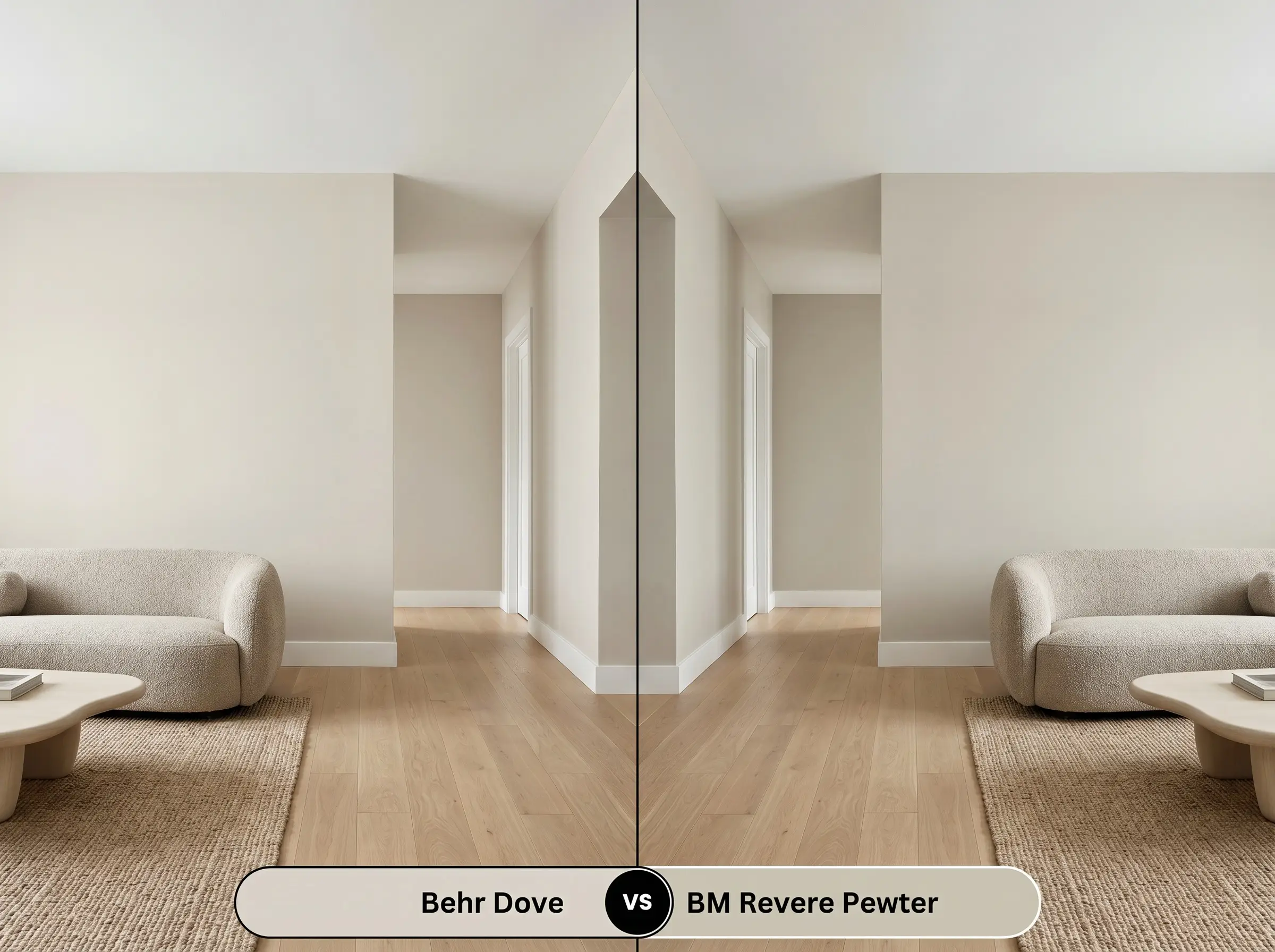
Revere Pewter is slightly deeper with a lower LRV, pulling more pronounced green-gray undertones to the surface. Choose the Benjamin Moore classic if you need to ground a large, brightly lit room with a bit more visual weight. If your goal is to maintain a light, airy flow in a standard-sized space, the Behr formulation provides a cleaner, less demanding backdrop.
Alternative Shades & Brand Matches
Sometimes a color is almost perfect, but you need a slight adjustment in depth to suit a dark hallway, or you find yourself shopping across different paint counters.
Similar Colors Within the Behr Catalog
Cross-Brand Equivalents
Practical Application & DIY Advice
Transitioning from curating the perfect palette to actually rolling the color onto your walls requires a shift in strategy. The finish you choose will physically alter how the color is perceived.
The Dynamic Sheen Guide
Primer Strategy & Coverage
Because of its LRV of 66, this shade offers solid hiding power over light-to-medium existing colors. However, a high-quality, stain-blocking primer is non-negotiable if you are painting over dark, saturated hues or raw, unpainted wood.
Plan for two full coats to achieve true color accuracy. Watch your roller pressure carefully; stretching the paint too thin will cause “flashing,” where the underlying wall texture creates uneven, shiny streaks that disrupt the smooth architectural finish.
Frequently Asked Questions
Direct sunlight will wash out its subtle depth. On a textured exterior, the high UV exposure strips away the greige nuance, causing the paint to read almost completely off-white. If you want a true greige exterior, you need to select a shade with a significantly lower LRV.
Because this paint shares a warm, earthy DNA, it actually harmonizes beautifully with red oak. The creamy base softens the aggressive grain of the wood, creating a cohesive, inviting flow rather than a stark, modern contrast.
It can, but you must control your bulbs. Low-CRI lighting will flatten the color structure, making it look dull or muddy. You must use high-quality LED bulbs (around 3000K) to pull the warmth forward and keep the basement feeling intentional.
No, its specific yellow-orange base protects it from reading pink. Instead, the terracotta will pull out the paint’s golden, earthy warmth, making it an excellent backdrop for Mediterranean or Organic Modern styling.
Final Verdict & Expert Warnings
Behr Dove is the ultimate transitional tool for homeowners who want a warm, sophisticated foundation without committing to a demanding color palette. It thrives in open-concept living spaces and north-facing rooms where its creamy, low chroma profile can soften the light and wrap the architecture in a quiet, tailored elegance. It is perfect for those who love the High/Low mix, acting as an upscale canvas that elevates everyday furnishings and natural textures.
While highly adaptable, this shade does have its limits. You must exercise caution when pairing it with stark, cool-toned finishes like icy blue glass tiles or blue-gray Carrara marble. Placing this earthy, yellow-orange base directly against a frosty, blue-leaning stone creates an uncomfortable visual friction, causing the paint to suddenly look dingy or aged rather than intentionally warm. If your fixed elements lean heavily toward the cool side of the spectrum, you will achieve a much more cohesive design by pivoting to a truer, cooler gray.
Hackrea Pro-Tip (The Cool Stone Conflict)
Closest Cross-Brand Equivalents
The absolute closest scientific color matches for Dove across top paint brands.