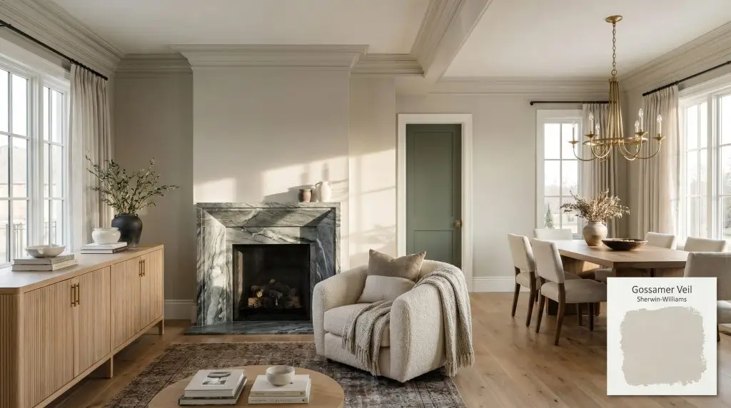
Gossamer Veil SW 9165
Sherwin-WilliamsSherwin-Williams Gossamer Veil (SW 9165) is a highly versatile, warm greige paint color. With an LRV of 62, it strikes a perfect balance between light gray and beige, featuring subtle green and faint violet undertones that adapt beautifully to shifting light.
Paint Technical Profile
| Color ID / SKU | SW 9165 |
| HEX Code | #D3CEC4 |
| Light Reflectance (LRV) | 62 |
| Use | Interior, Exterior |
| Best Exposures | South, East, North |
| Best For | Open-concept living areas, north-facing bedrooms, and transitional kitchen cabinets |
Sherwin-Williams Gossamer Veil: The Warm Greige That Quietly Reshapes Your Walls
Finding a neutral that feels genuinely alive on the walls is one of the most frustrating challenges in home design. Too often, standard beiges fall flat and basic grays turn a room stark and uninviting.
Sherwin-Williams Gossamer Veil changes that narrative entirely.
Rather than just sitting passively in the background, this highly adaptable architectural finish actively interacts with the sunlight in your home. It softens rigid corners, warms up cold morning shadows, and provides a stabilizing foundation for the rest of your decor. Whether you are updating a suburban living room or modernizing a historic townhouse, SW 9165 offers a rare kind of quiet confidence.
Sherwin-Williams Gossamer Veil: Undertones & LRV
If you are standing in the paint aisle wondering, “Is this paint warm or cool?” you can confidently categorize Gossamer Veil as a decidedly warm greige. It completely bypasses the icy, sterile feel of traditional grays. Instead, it wraps a room in a soft, inviting temperature that feels incredibly natural.
Understanding how this color behaves requires looking closely at its underlying color structure.
The Light Reflectance Value (LRV) is 62.
This places Gossamer Veil squarely in the sweet spot of the light-to-medium reflectance tier. It absorbs just enough natural light to maintain its rich, stabilizing presence on the wall without ever feeling shadowy. Simultaneously, it bounces enough illumination back into the room to keep standard-sized spaces feeling open, airy, and effortlessly expansive.
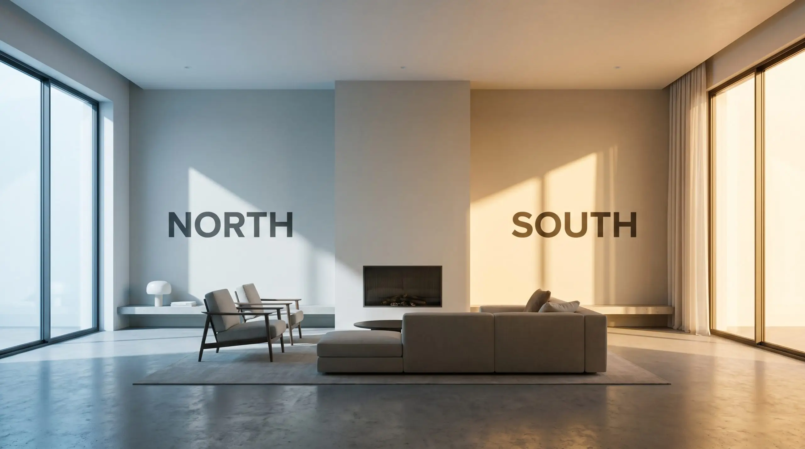
The Shifting Color Structure in Ambient Lighting
Every premium paint is a shapeshifter, and this warm greige is incredibly responsive to the shifting sun. The direction your windows face will fundamentally alter how you experience this color throughout the day.
If you want this color to look consistent from day to night in a living room, stick to 3000K LED bulbs. They provide a clean, flattering light that enhances the paint’s natural warmth without turning it overly yellow or muddy.
Hackrea Pro-Tip (The Bulb Strategy)
Popular Applications for a Transitional Design
Because its light reflectance value sits in that perfect middle ground, this paint is an incredibly forgiving whole-house color. It thrives in bustling, high-traffic family homes just as effortlessly as it does in a quiet, curated apartment.
Here is how to maximize its potential across different spaces.
Living & Gathering Spaces
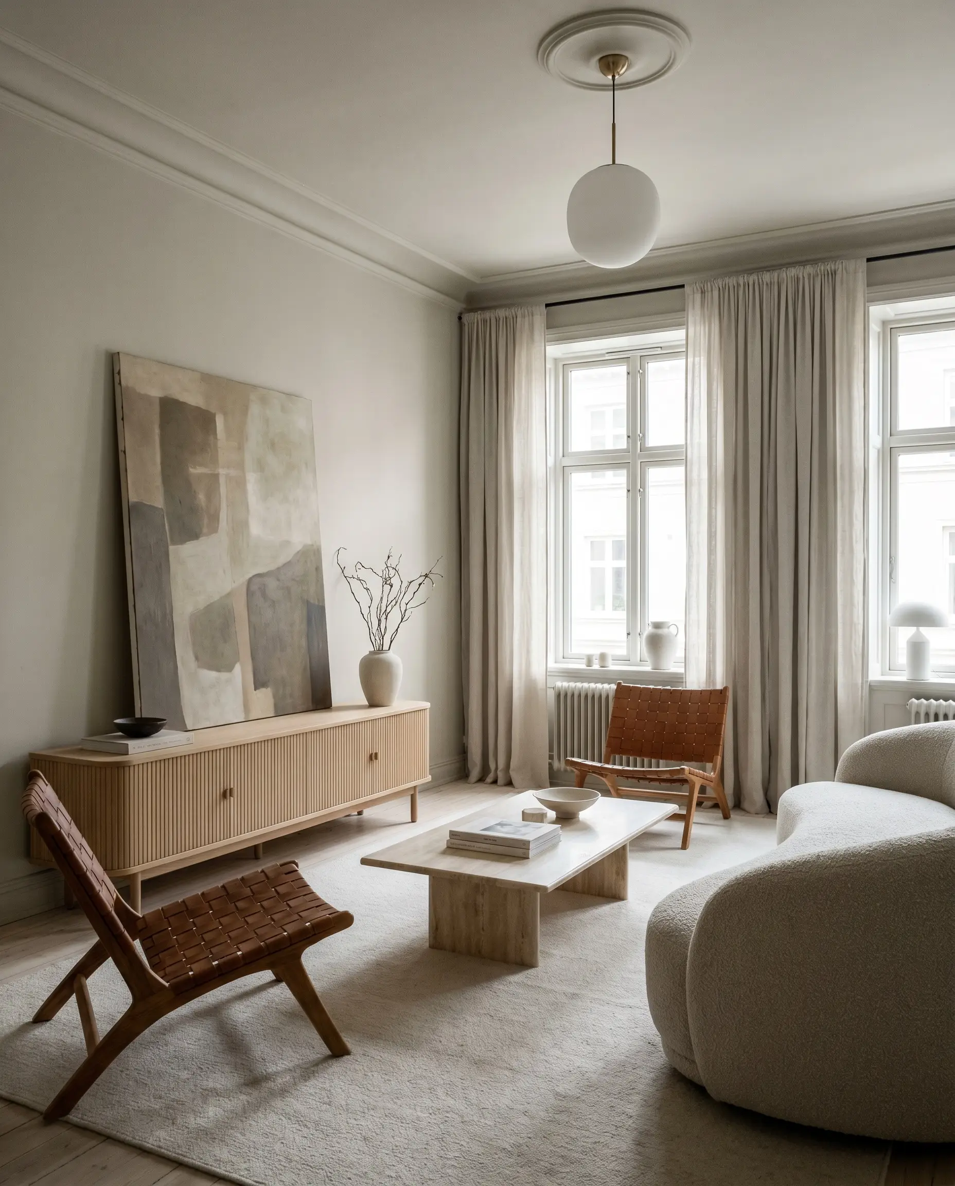
You do not have to default to traditional decor just because you are using a classic greige. In a living room, this shade provides a stunning, stabilizing backdrop for a Scandinavian Modern aesthetic.
Pair the soft walls with fluted white oak furniture and heavily textured textiles, like a chunky boucle accent chair or washed linen drapery. The warmth of the paint prevents the minimalist styling from feeling austere. To elevate the room’s high/low mix, invest in one premium focal point—like a slab of heavily veined soapstone for the fireplace surround or an oversized, abstract canvas.
If you are dealing with a room that lacks interesting architectural features, consider taking the color across the baseboards, walls, and crown molding. This seamless application blurs the visual boundaries of the space, making standard eight-foot ceilings feel significantly taller.
Kitchen Cabinetry & Millwork
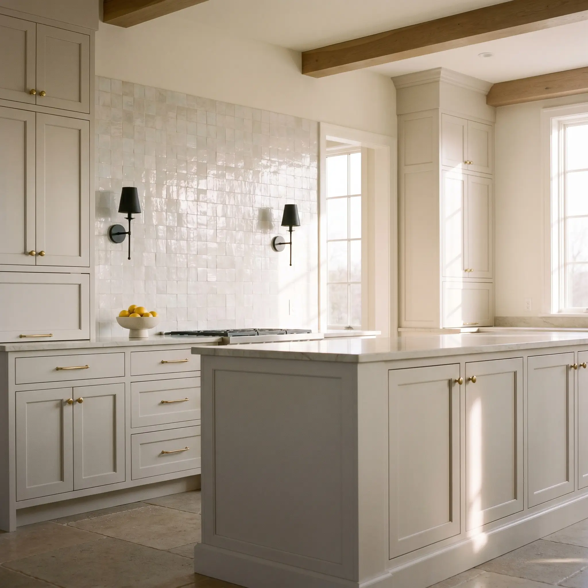
If you are tired of stark white kitchens but aren’t ready for a moody, dark color, SW 9165 is a brilliant choice for cabinetry. It brings a soft, tactile warmth to the heart of the home, especially for young professionals who love hosting evening gatherings.
The secret to making standard cabinetry look custom is in the material pairings. Contrast the soft, creamy base of the paint with unlacquered brass hardware that will beautifully patina over time. Add a backsplash of pearlescent zellige tiles to bounce light around the room, and finish the space with matte black iron sconces for a touch of contemporary tension.
When painting millwork or kitchen islands, always opt for a satin or semi-gloss finish. The slight sheen not only makes the cabinets durable and easy to wipe down, but it also catches the light, highlighting the subtle nuances of the color structure.
Hackrea Design Secret (The Finish Selection)
Exterior Siding & Facades
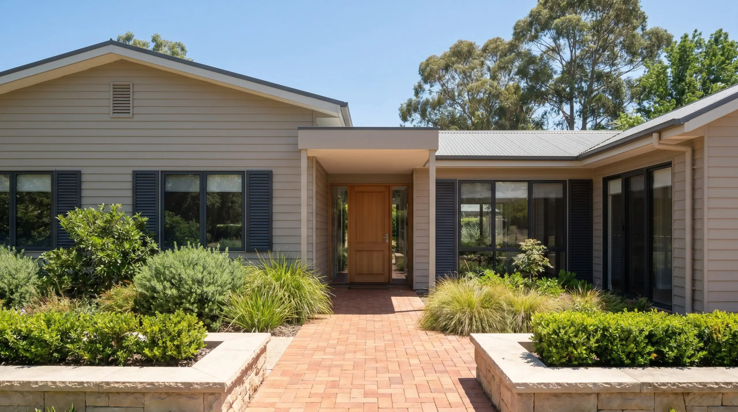
Taking this color outdoors completely changes its personality. When used as an exterior siding color, the intense, direct sunlight will wash out a significant portion of its depth.
What looks like a medium greige indoors will read as a sophisticated, creamy off-white on the outside of your home. It is a fantastic choice for modernizing a dated suburban facade without resorting to a blinding, pure white. To keep the exterior looking crisp and intentional, pair it with highly contrasting architectural elements.
Consider charcoal or soft slate blue for the shutters, and a rich, terracotta-toned brick for the front walkway. The warmth of the siding plays beautifully against natural landscaping, making the entire property feel established and welcoming.
Curating a Palette Around Sherwin-Williams Gossamer Veil
Because of its subtle yellow-orange base, this pigment demands intentional contrast to maintain its shape in a room. It thrives when bordered by crisp, clean lines that define its warmth, rather than letting it bleed into similar mid-tone neutrals.
Crafting the Perfect Trim Boundary
The trim color you select will fundamentally alter how this greige behaves on your walls. You must decide if you want the room to feel highly structured or softly atmospheric.
Tactile Finishes and Hardware Pairings
The Supporting Color Palette
Curated Room Aesthetics
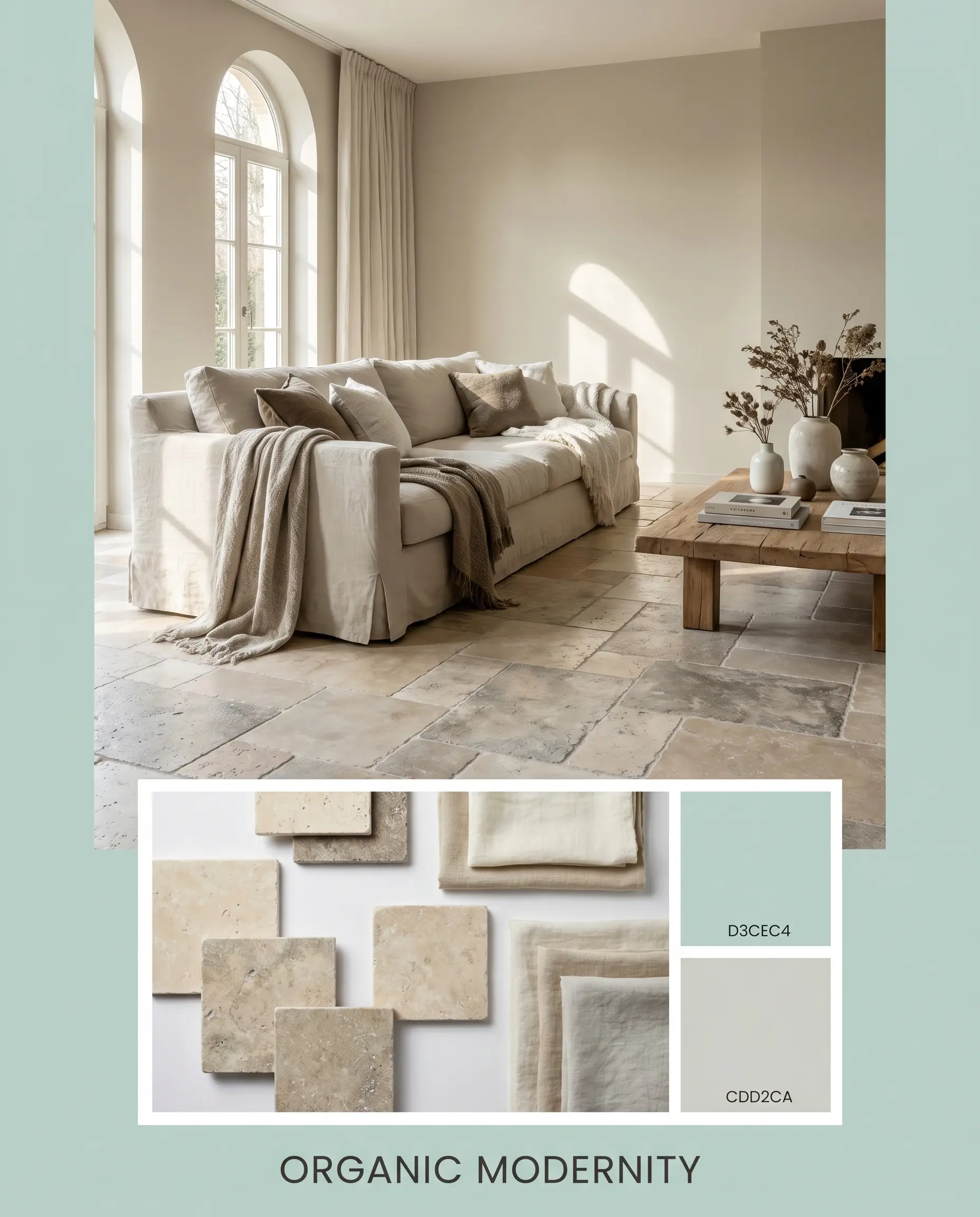
Organic Modernity This aesthetic relies on the soft interplay between natural textures and the sunlit warmth of the walls. Imagine the tactile comfort of a slipcovered sofa draped in washed linen, sitting atop a floor accented by tumbled travertine. By incorporating subtle accents of Sherwin-Williams Sea Salt SW 6204, the room breathes with a calm, refreshing energy that feels effortlessly collected.
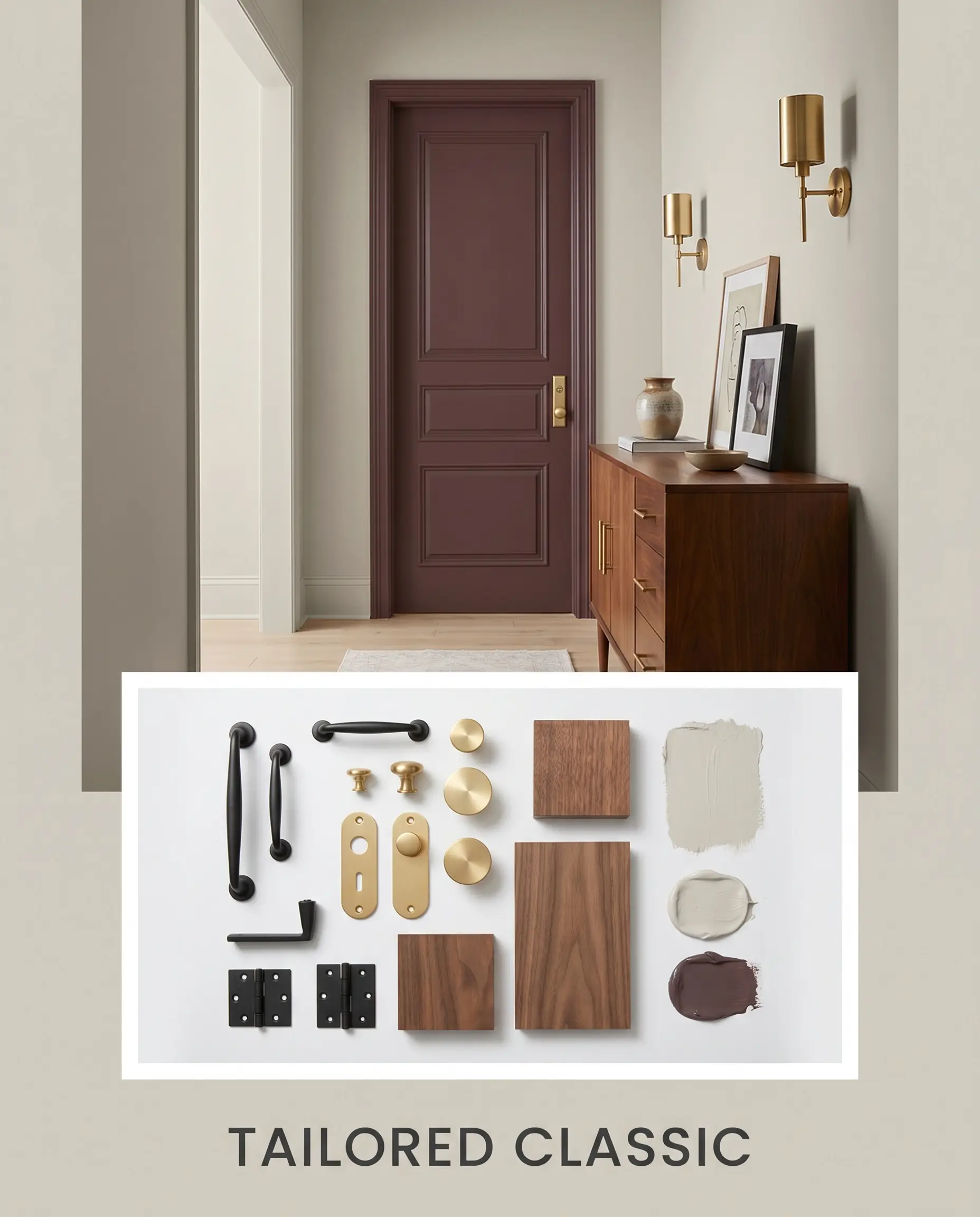
Tailored Classic For a more structured, sophisticated vibe, we lean into intentional contrast. The walls provide a stabilizing backdrop for striking matte black iron hardware and a mid-century credenza. A strategic pop of Farrow & Ball Brinjal No. 222 on an accent door adds a layer of rich, premium tension, while unlacquered brass sconces elevate the entire visual composition.
Head-to-Head Neutral Comparisons
Sometimes, the specific lighting in your home or your existing hard finishes will demand a slightly different undertone. If your room receives very cold northern light, or if you are working with decidedly cool-toned floors, you might need to pivot to a color with a different foundational structure. Here is how SW 9165 stacks up against its closest competitors.
Sherwin-Williams Gossamer Veil vs. Sherwin-Williams Agreeable Gray SW 7029
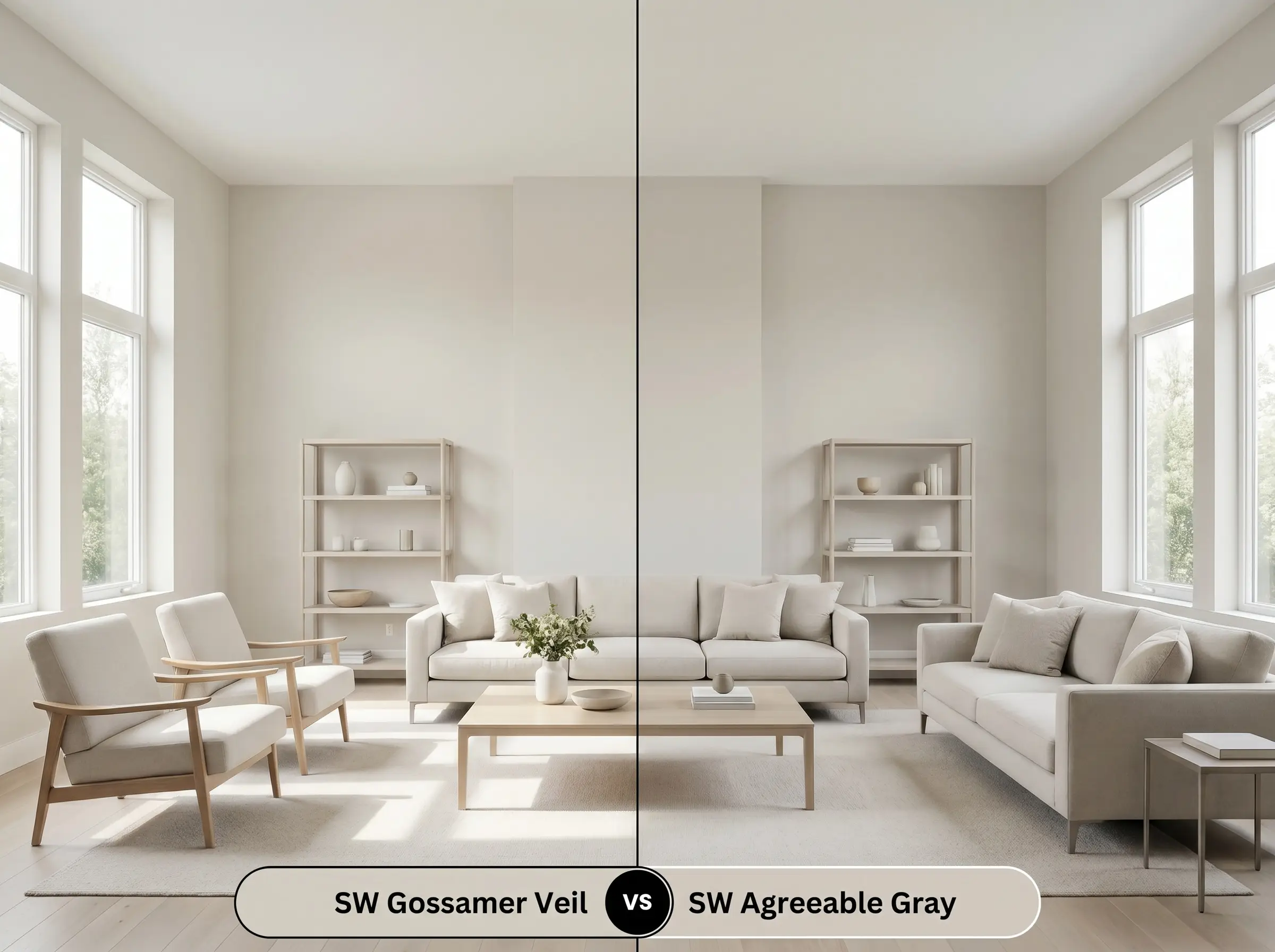
Agreeable Gray is slightly darker and leans much further into its gray base. If you need a color to stand up to very bright, washed-out southern light, Agreeable Gray holds its depth beautifully. However, if your room lacks natural light, Gossamer Veil will always feel significantly warmer and more inviting.
Sherwin-Williams Gossamer Veil vs. Sherwin-Williams Repose Gray SW 7015
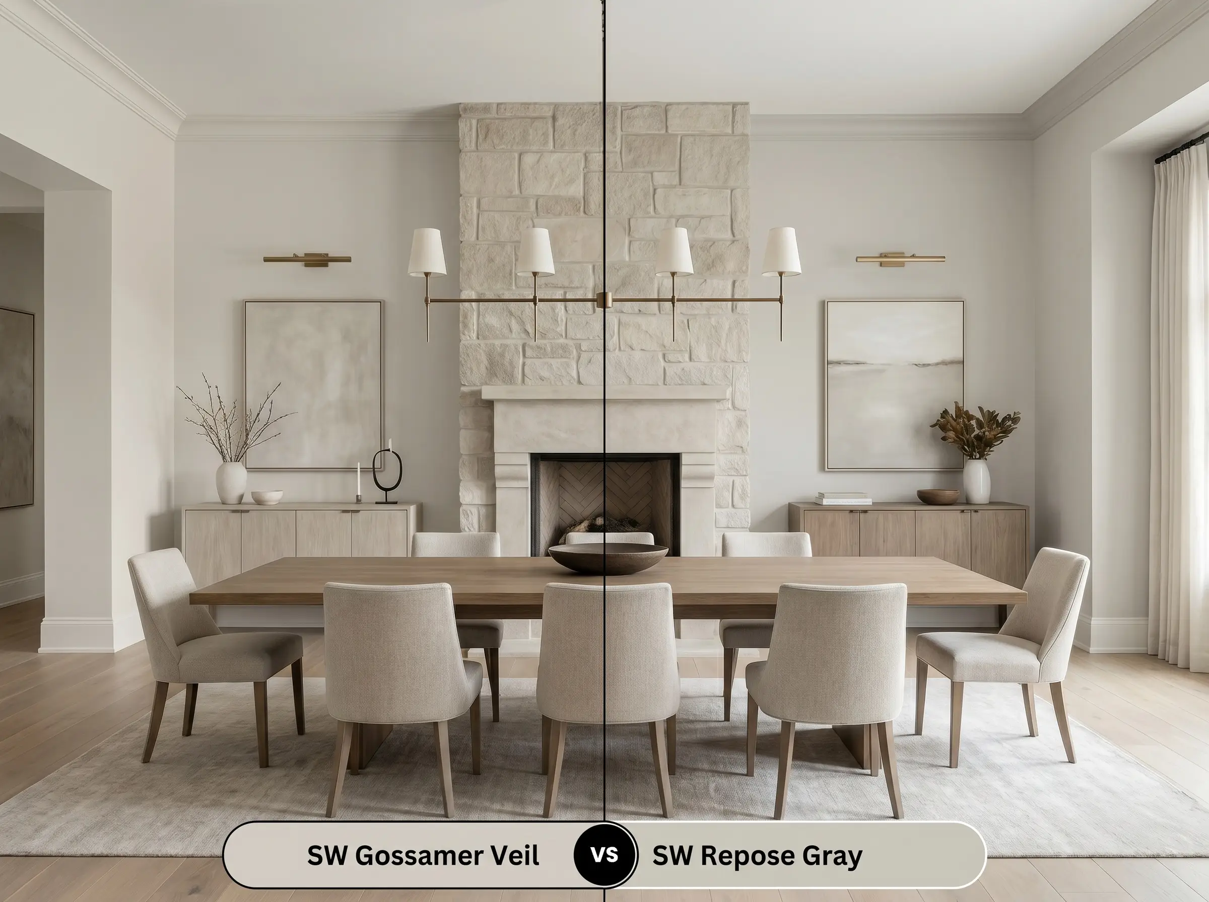
Repose Gray features a distinct violet-brown undertone and reads noticeably cooler on the wall. If your room features cool-toned stone fireplaces or icy marble countertops, Repose Gray will harmonize perfectly. Placing SW 9165 next to those same cool elements might cause its yellow-orange base to look unintentionally muddy.
Sherwin-Williams Gossamer Veil vs. Benjamin Moore Edgecomb Gray HC-173
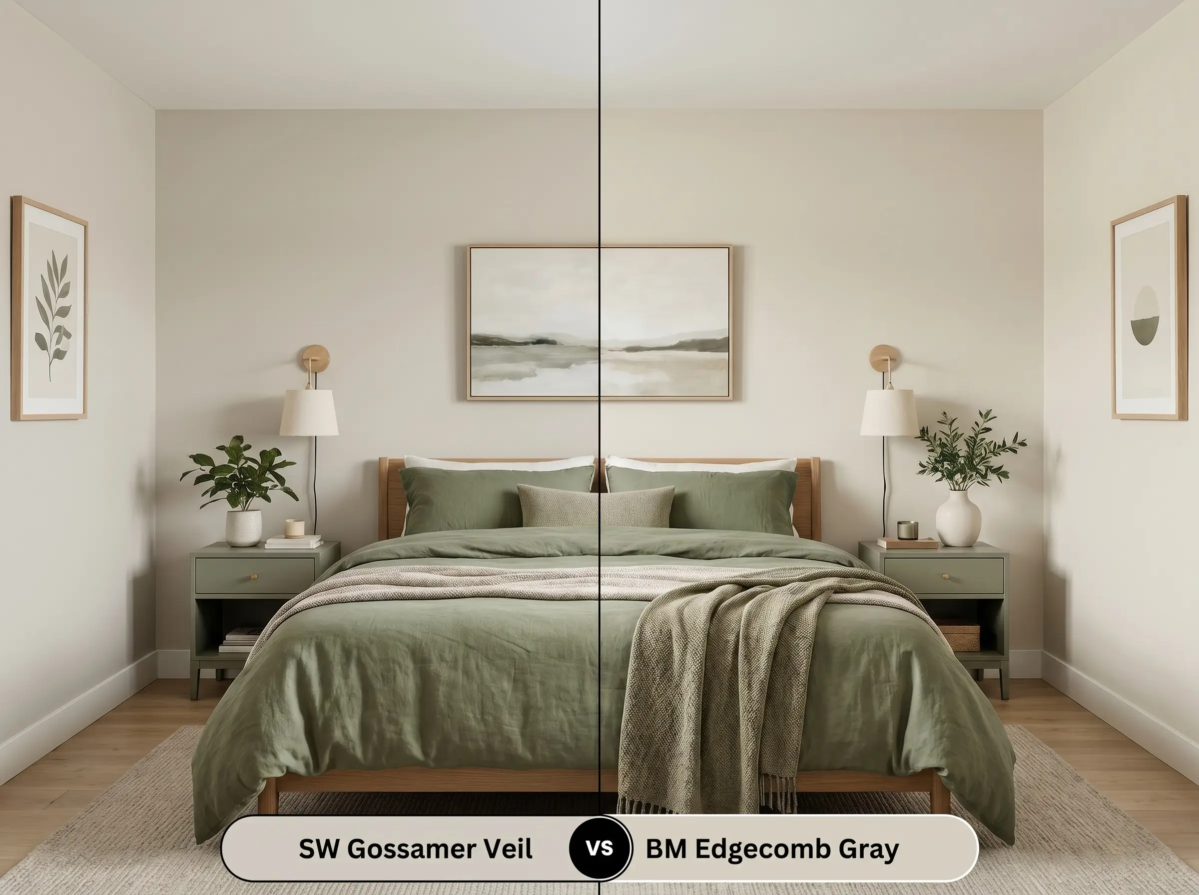
Edgecomb Gray shares a very similar light reflectance value but carries a slightly more prominent yellow-green cast. If you are decorating with warm, earthy greens, Edgecomb Gray will amplify that organic vibe. Gossamer Veil remains a bit more neutral, making it the better choice for highly varied color palettes.
Alternative Matches and Close Relatives
A slight shift in your room’s natural light can completely alter a paint’s behavior, making you wish for a pigment that is just a fraction lighter or slightly more muted. When you need to make a subtle adjustment, these close relatives offer excellent fallback options.
The Sherwin-Williams Family Alternatives
Color Matching Across Brands
Practical Application and DIY Advice
Moving from curating a beautiful palette to actually rolling the paint onto drywall requires a shift in strategy. The way this pigment cures and reflects light is entirely dependent on your preparation and finish choices.
Selecting the Right Finish
Preparation and Coat Requirements
Because this color sits in the middle of the reflectance scale, it requires a high-quality, white tinted primer to ensure the yellow-orange base develops accurately. Plan for two full coats to achieve a professional, opaque finish.
When touching up a mid-tone greige like this, always use the exact same roller nap you used for the original application. Applying touch-ups with a brush will change the texture and cause “flashing,” where the repaired spot reflects light differently and stands out awkwardly from the rest of the wall.
Hackrea Pro-Tip (Avoiding the Flashing Trap)
Frequently Asked Questions
Because of the deep shadows created by textured stucco, this color will appear slightly darker and more muted on a Mediterranean-style home. On smooth HardiePlank, the paint reflects sunlight evenly, reading as a bright, crisp off-white that beautifully updates traditional siding.
The crisp, cool output of 4000K bulbs acts as a fantastic counterbalance to the paint’s yellow-orange base, preventing it from feeling murky. It will actually read as a very clean, modern greige in a windowless space, provided you use enough lighting fixtures to support its mid-range LRV.
Its specific color structure makes it an excellent mediator for this exact scenario. The warm foundation of the paint naturally relates to the honey oak, while its subtle gray overtones provide a flattering, cohesive backdrop for cooler upholstery and contemporary silhouettes.
Sunlight filtering through dense greenery will cast a distinct green reflection onto your walls, which will amplify the paint’s hidden green micro-nuance. To prevent the room from feeling overwhelmingly earthy, counteract this effect by styling the space with warm metallic accents and rich, contrasting textiles.
The Final Verdict on Sherwin-Williams Gossamer Veil
This warm greige is the ultimate transitional tool for homeowners who want to soften their spaces without committing to stark whites or moody darks. It performs brilliantly in open-concept living areas and modern kitchens, providing a stabilizing foundation for a rich mix of textiles and metals. If you are trying to bridge the gap between classic architectural details and contemporary furnishings, this paint is an exceptional choice.
However, you must be cautious of its underlying warmth. If your home is filled with icy, blue-toned grays, stark white LED lighting, or highly cool-toned permanent fixtures like Carrara marble, this paint will struggle to harmonize. Placing it next to rigidly cool elements will pull out its yellow-orange base in an unflattering way, making the walls look dull rather than intentional. It demands a palette that respects its warmth, thriving best when surrounded by organic textures and rich, earthy contrasts.
Closest Cross-Brand Equivalents
The absolute closest scientific color matches for Gossamer Veil across top paint brands.