Ceiling Bright White SW 7007
Sherwin-WilliamsSherwin-Williams Ceiling Bright White (SW 7007) is a crisp, cool white paint color with an LRV of 83. Known for its subtle blue-green undertones, it brilliantly reflects light to create the optical illusion of taller, more expansive ceilings in modern spaces.
Paint Technical Profile
| Color ID / SKU | SW 7007 |
| HEX Code | #E9EBE7 |
| Light Reflectance (LRV) | 83 |
| Use | Interior, Exterior |
| Best Exposures | South-Facing, West-Facing, Windowless Rooms |
| Best For | Ceilings, Trim, Modern Interiors |
Sherwin-Williams Ceiling Bright White: The Crisp Architectural Secret to Expanding Any Space
The overhead plane is often the most neglected surface in a home, treated as a mere structural necessity rather than a crucial design element. Sherwin-Williams Ceiling Bright White completely changes that narrative by actively manipulating how your room feels. Instead of settling for a flat, chalky finish that absorbs energy, you can use this highly specific shade to visually lift the roof off your space.
This is not your standard, uninspired builder-grade neutral. It is a highly engineered architectural finish designed to maximize the ambient light in your home. By bouncing diffused daylight back down into the room, it creates an immediate sense of optical expansion.
Whether you are trying to rescue a cramped hallway or modernize a sprawling living area, SW 7007 acts as a silent structural tool. It provides a crisp, brilliant canopy that allows your furniture, textiles, and art to take center stage.
The Undertones & LRV of Sherwin-Williams Ceiling Bright White
If you are wondering whether Ceiling Bright White leans warm or cool, the answer is definitively cool. At its core, this architectural finish is built on a crisp white base with a microscopic blue-green undertone. This specific color structure is entirely intentional, acting as a safeguard to prevent the overhead plane from feeling dingy or yellowed over time.
With a light reflectance value (LRV) of 83, this shade acts as a powerful spatial expander. It bounces light beautifully around the room, offering a brilliant visual lift without hitting the blinding, clinical extremes of a pure 90+ LRV white. This makes it an incredibly safe, reliable choice for standard residential spaces.
Harnessing the Light: How Ceiling Bright White Shifts
Because of its nuanced chromatic profile, this white does not stay completely static throughout the day. It actively responds to the changing light sources in your home, subtly shifting its temperature based on the environment.

Popular Applications for SW 7007
This paint is far more than a default utility color; its ability to redirect light makes it a highly strategic tool for specific architectural challenges. By understanding its underlying structure, you can deploy it to solve everyday design problems.
Expanding the Living Room Canopy

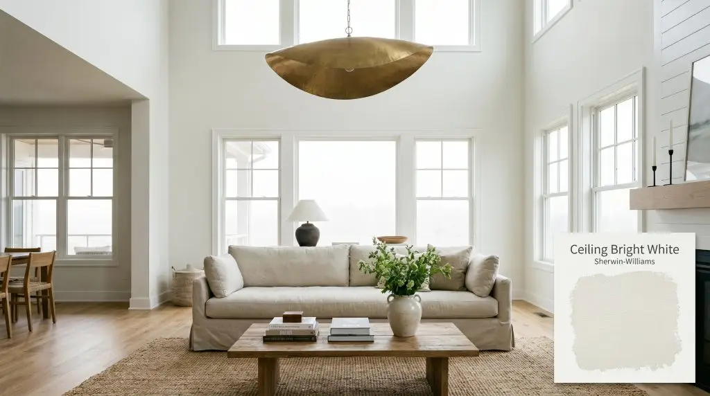
When dealing with standard eight-foot ceilings, the goal is always to push the visual boundary upward. Applying this cool white cast to the ceiling establishes a receding plane, making the room feel significantly taller than its actual footprint. It works beautifully in Transitional or Modern Coastal spaces, where the crisp overhead light enhances the breezy, relaxed atmosphere below.
To elevate a standard drywall ceiling, pair this paint with accessible architectural upgrades like simple crown molding or a DIY coffered layout. Ground the bright overhead space with a comfortable, slipcovered linen sofa and a textural jute rug. Then, add one premium focal point—like an oversized, sculptural brass pendant light—to draw the eye upward and highlight the crispness of the paint.
To maximize optical expansion in a standard living room, carry this cool white just a few inches down the top of the wall before transitioning to your main wall color. This creates a subtle trompe l’oeil effect that tricks the eye into perceiving a higher ceiling line.
Hackrea Pro-Tip (The Visual Lift)
Crisp Cabinetry and Kitchen Architecture
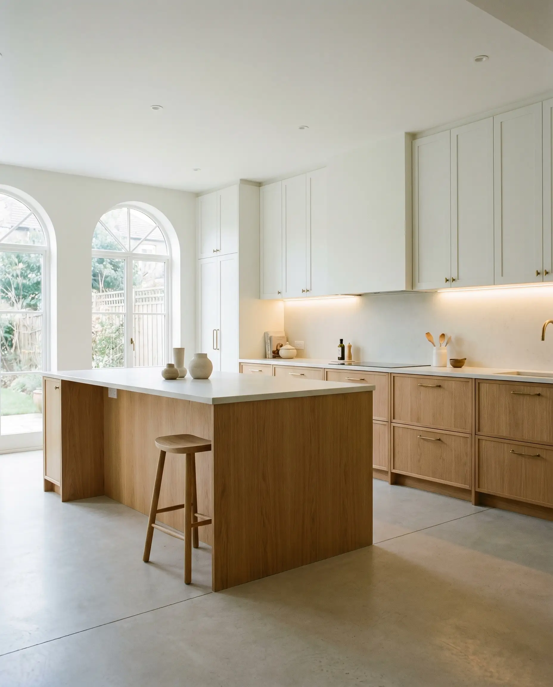
While famous as a ceiling paint, this shade is a brilliant choice for upper cabinetry in a Soft Minimalist kitchen remodel. Its high reflectance value bounces the under-cabinet lighting around the countertops, making the entire prep zone feel incredibly clean and expansive. The subtle blue-green undertone provides a beautifully sharp contrast against warm, accessible materials.
Pair these crisp upper cabinets with warm white oak lowers and durable, honed quartz countertops for a balanced High/Low mix. The coolness of the paint thrives when set against organic textures, so consider styling the counters with oversized foraged branches in a curated ceramic vase. Always test your hardware finishes against this paint; the cool base looks exceptionally sophisticated when paired with the living finish of unlacquered brass pulls.
Brightening Windowless Bathrooms
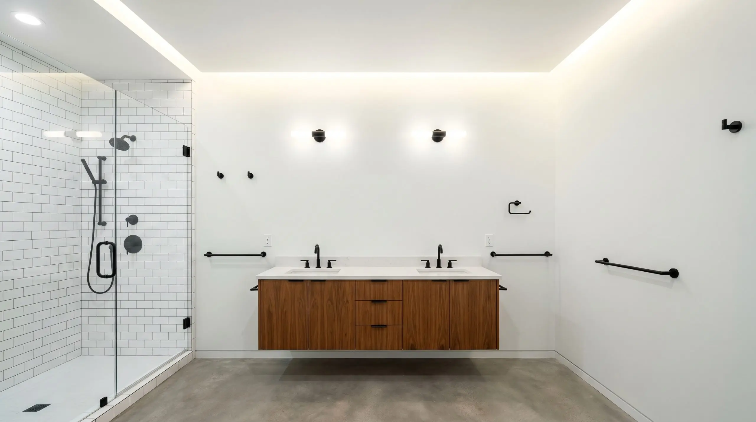
Interior bathrooms inherently lack diffused daylight, often suffering from heavy shadows and a cramped atmosphere. Using SW 7007 on both the walls and the ceiling creates a continuous, highly reflective box that maximizes whatever artificial lighting you have available. This color-drenching technique erases the visual boundary between the wall and the ceiling, making a small bathroom feel instantly more expansive.
Lean into a high-contrast modern aesthetic to keep the space from feeling like a sterile hospital room. Install accessible matte black steel fixtures and a warm wood floating vanity to stabilize the bright white walls. Add a premium, hand-glazed zellige tile in the shower to introduce organic texture and break up the uniformity of the crisp paint.
Because of its cool blue-green base, avoid pairing this shade with creamy, yellow-toned travertine or heavy Tuscan tiles. Instead, opt for crisp white subway tile, cool gray marble, or slate to maintain a cohesive, fresh look.
Clash Warning (Tile Pairing)
Transforming Subterranean Basements
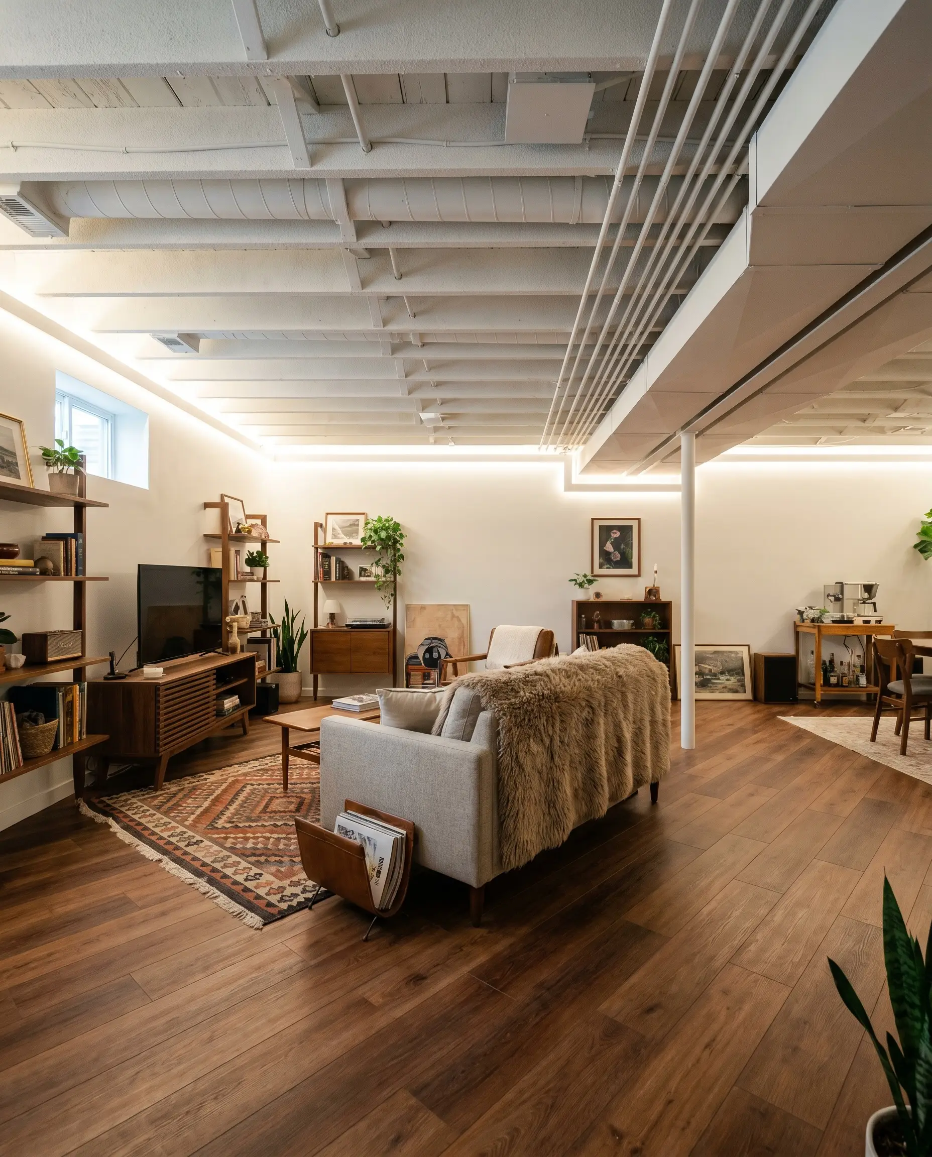
Basements are notoriously difficult to design due to their low ceilings and lack of natural light. Instead of dropping a standard acoustic ceiling, consider spraying the entire exposed ceiling—joists, ductwork, and plumbing included—in Ceiling Bright White. This creates an airy, Industrial-Lite aesthetic that feels incredibly intentional and custom-built.
The crisp white overhead plane instantly modernizes the subterranean space, making it feel like a trendy urban loft rather than a dark storage area. To balance the cool, expansive ceiling, secure the room with warm, accessible luxury elements. Install wide-plank luxury vinyl plank flooring in a warm chestnut tone and layer in heavily textured textiles, like a chunky alpaca throw and a vintage-inspired geometric rug.
Cultivating the Palette: Best Pairings for Ceiling Bright White
This specific pigment requires intentional pairings to dictate how it behaves within a room. Because of its cool white cast, it thrives when given crisp, tailored boundaries to hold its modern shape. Conversely, it can also be softened through subtle tonal bleeds with other muted, icy hues to create a serene, unified atmosphere.
Tailoring the Trim and Baseboards
When defining the architectural edges of your space, the trim color must actively converse with the overhead plane. Benjamin Moore Chantilly Lace provides a razor-sharp, brilliant boundary that highlights the subtle blue-green undertone of the ceiling. This combination creates a highly tailored, graphic outline that feels incredibly fresh.
If you prefer a softer transition, Farrow & Ball All White is an exceptional choice for your baseboards and casings. It lacks the starkness of pure white, offering a seamless, atmospheric glow that connects the walls to the ceiling without introducing any conflicting yellow undertones.
Tactile Elements and Hardware Finishes
To elevate this crisp architectural finish, anchor the room with foundational, everyday materials while introducing one premium focal point. Polished nickel hardware is a brilliant companion, as its highly reflective surface actively bounces the cool undertones of the paint around the room. This creates a cohesive, silvery thread throughout the space.
To prevent the high light reflectance value from feeling clinical, introduce wide-plank white oak flooring or floating shelves. The natural, organic warmth of the wood stabilizes the icy overhead plane, providing a welcoming balance. Soften the room’s hard architectural lines further by layering in washed linen drapery, allowing the fabric’s relaxed texture to diffuse the incoming daylight.
For your aspirational element, ground the airy palette with a honed Nero Marquina marble coffee table or fireplace surround. The dense, matte black stone provides a profound visual anchor that makes the crisp white ceiling feel even more expansive by comparison.
The Complementary Color Roster
Curated Aesthetic Concepts
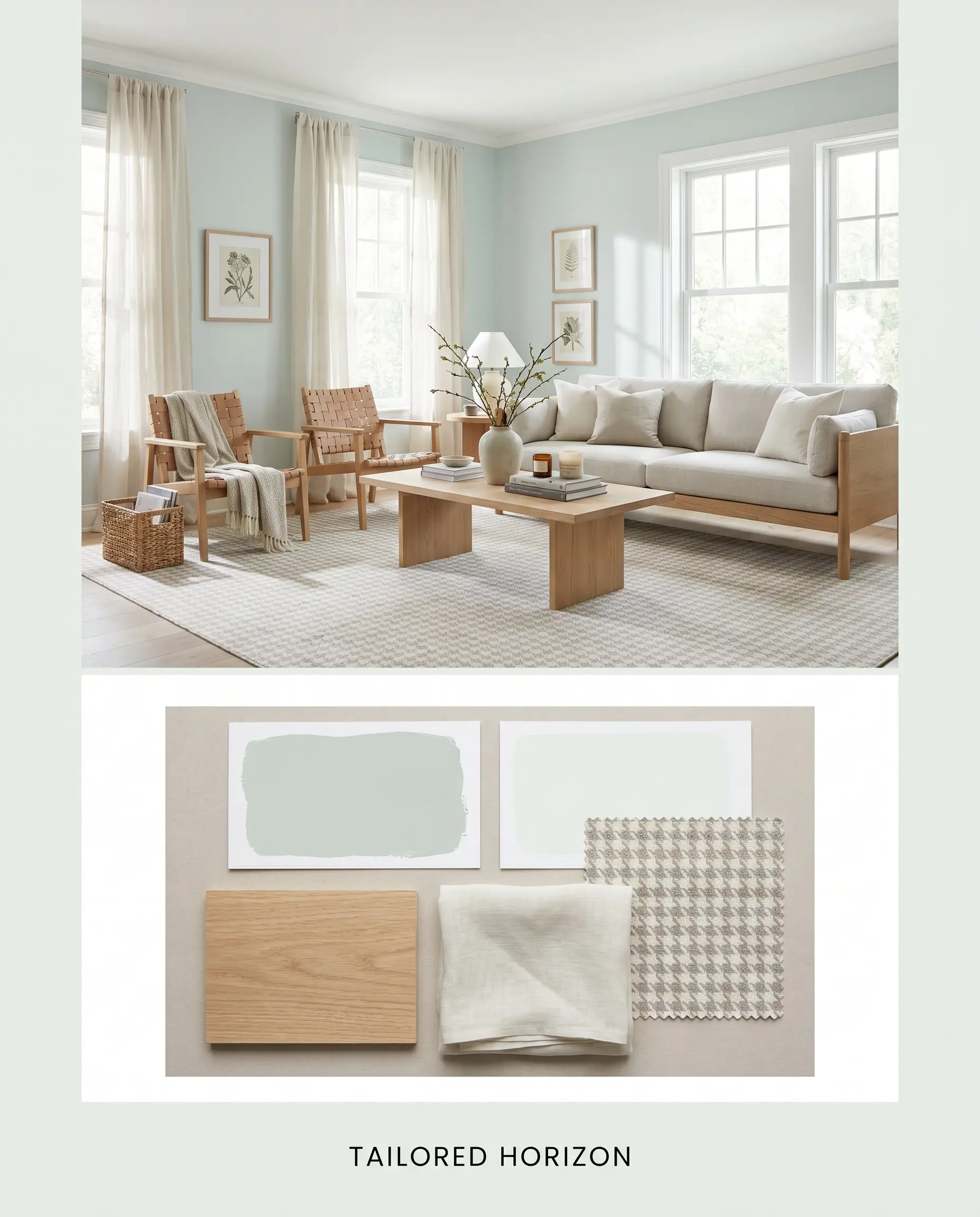
Tailored Horizon This aesthetic relies on the soft tonal bleed between Sherwin-Williams 7007 and walls painted in SW Sea Salt. The energy here is breezy and restorative, relying on the natural light to amplify the subtle blue-green pigments in both paints. To ground the airy atmosphere, incorporate foundational white oak furniture and drape the windows in sheer washed linen. Finish the look with a subtle houndstooth patterned rug to add a layer of tailored sophistication.
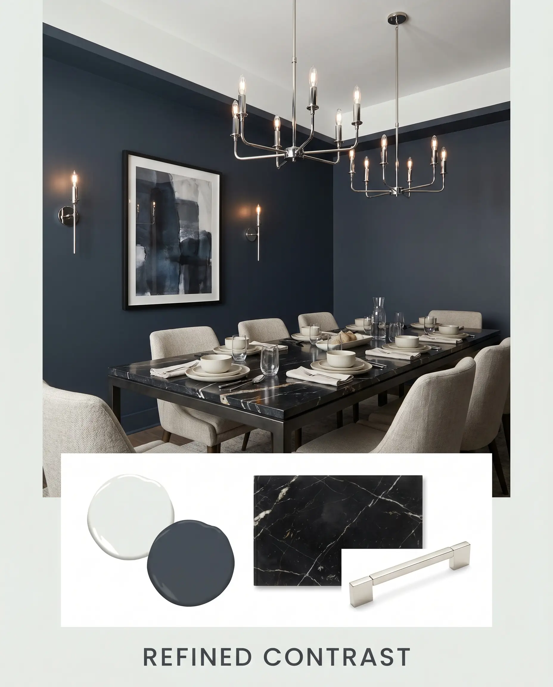
Refined Contrast For a more dramatic, imposing atmosphere, this concept uses BM Hale Navy to establish a firm boundary against the crisp white overhead plane. The energy is highly structured and confident, perfect for spaces that require a touch of modern formality. Introduce a honed Nero Marquina marble accent piece to serve as the premium focal point, and use polished nickel lighting fixtures to reflect the icy brilliance of the ceiling.
Comparative Color Theory: SW 7007 Against the Competition
While this shade is a powerhouse for optical expansion, its cool white cast is not universally perfect for every lighting scenario. If your home is dominated by chilly, north-facing light, the hidden blue-green undertone can sometimes feel a bit too stark. Understanding how this paint stacks up against its closest rivals will help you make a confident, final decision.
Sherwin-Williams Ceiling Bright White vs. Sherwin-Williams Pure White
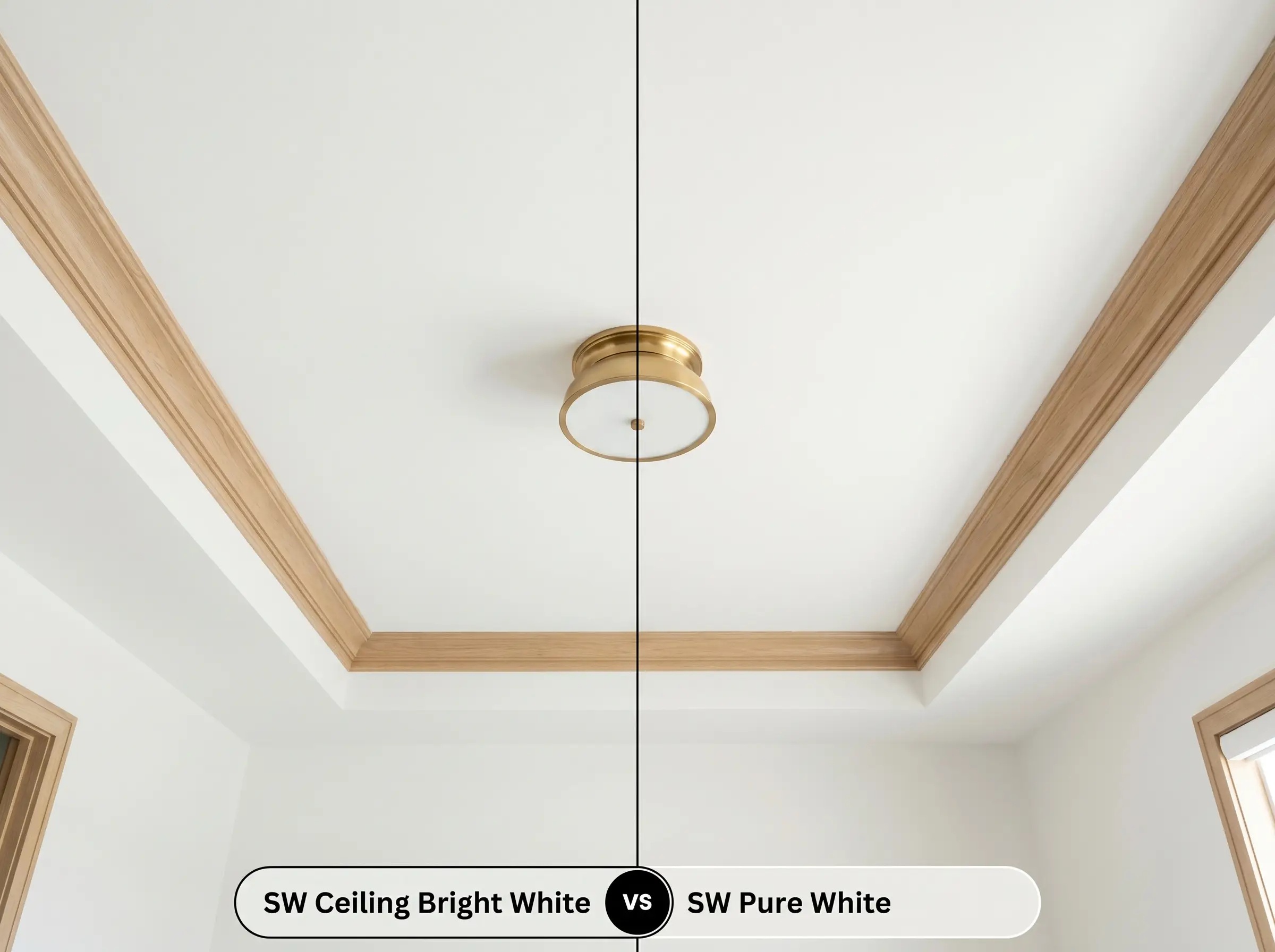
If you are designing a room that feels inherently cold, SW Pure White is often the safer choice. Pure White contains a subtle drop of warmth that prevents it from ever looking icy, making it incredibly versatile across all lighting conditions. However, if your goal is strict architectural crispness and maximum light reflection, SW 7007 provides a much sharper, cleaner ceiling line.
Sherwin-Williams Ceiling Bright White vs. Sherwin-Williams Extra White
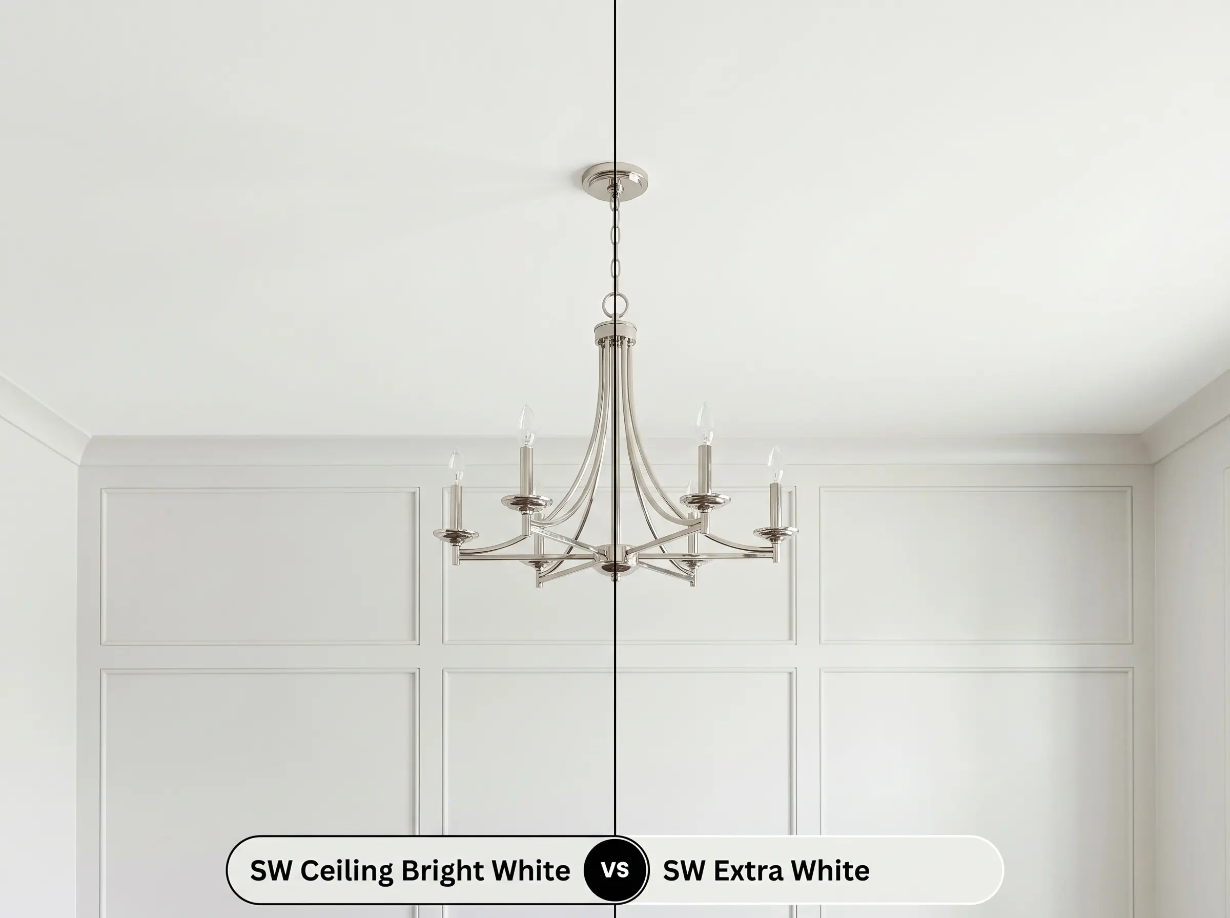
These two shades are incredibly close, but SW Extra White reads as a slightly starker, more neutral option. Extra White lacks the distinct blue-green undertone, making it a favorite for ultra-modern trim and doors. Choose the Ceiling Bright variant when you want a highly reflective overhead plane that retains a subtle, airy character rather than a completely neutral blank slate.
Sherwin-Williams Ceiling Bright White vs. Benjamin Moore Super White
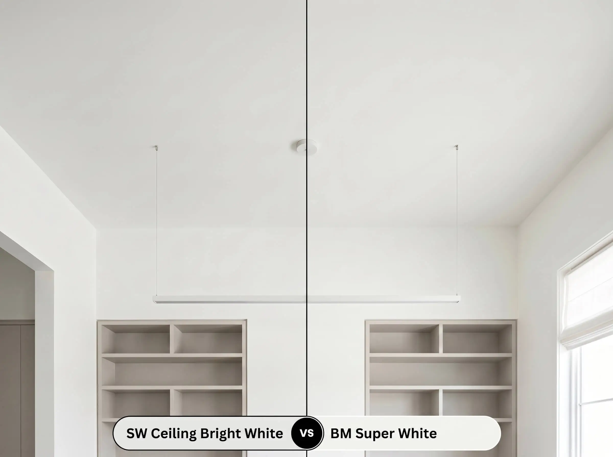
Benjamin Moore Super White is a famously brilliant, clean white with almost no discernible undertones. It acts as a true, uncompromised reflector, whereas the Sherwin-Williams option brings that microscopic hint of cool color structure. If you are pairing your ceiling with incredibly warm, earthy wall colors, Super White will maintain its neutrality better without clashing.
Alternative Selections and Brand Matches
Sometimes a specific project requires a slight pivot in depth or you need to match a color across different manufacturing lines. Whether you need a whisper of extra pigment for a bright hallway or a direct alternative from a rival brand, these tonal relatives offer reliable solutions.
Tonal Relatives Within the Catalog
Trusted Equivalents from Rival Brands
Execution Strategy for Sherwin-Williams 7007
Transitioning this crisp pigment from a swatch to your actual surfaces requires a strategic approach to preparation. Because of its high light reflectance value, this paint will highlight the physical texture of whatever it covers. Choosing the correct finish and primer is critical to achieving a flawless, professional result.
Optimizing Your Sheen Profile
Preparation and Coverage Expectations
To ensure the hidden undertones render accurately, you must start with a high-quality, high-hide white primer. If you are painting over a darker ceiling or bare drywall, skipping the primer will cause the cool white cast to look muddy and uneven.
This specific depth of color typically requires two full coats for a completely opaque, brilliant finish. When rolling large overhead areas, maintain a wet edge and work in small sections to prevent “flashing”—those visible, uneven roller marks that can disrupt the clean architectural look.
Always roll your final coat of ceiling paint in the same direction as the primary natural light source (parallel to the main windows). This simple technique minimizes the appearance of subtle roller lap marks, ensuring a perfectly smooth visual expanse.
Hackrea Design Secret (The Roller Direction)
Common Application Inquiries
Because popcorn ceilings cast thousands of micro-shadows, the cool blue-green undertone can become slightly magnified and read as a faint icy blue. If you want a pure white overhead plane without that cool shift, opt for a warmer, more neutral alternative.
Its high light reflectance value actively bounces ambient light, which is brilliant for everyday living spaces but can cause unwanted screen glare in a dedicated viewing room. For a true theater environment, transition to a deeply saturated, light-absorbing matte finish.
Absolutely, this architectural finish translates beautifully to vertical paneling. The crispness of the paint highlights the horizontal shadow lines of the shiplap, creating a sharply tailored coastal look.
The cool white cast actually provides a stunning, high-contrast backdrop that allows warm wood tones to pop beautifully. Just ensure the wood has a rich, natural stain rather than a yellowed polyurethane finish to maintain a sophisticated balance.
The Final Verdict on SW Ceiling Bright White
Sherwin-Williams Ceiling Bright White is an indispensable architectural tool for anyone looking to maximize the perceived volume of their home. Its true strength lies in its ability to take a flat, uninspired overhead plane and turn it into an active reflector of diffused daylight. This paint is perfect for homeowners updating Transitional, Modern Coastal, or Soft Minimalist spaces who want a crisp, clean canopy that allows their furnishings to shine. By leveraging its cool white cast, you can instantly modernize cramped hallways, elevate standard living rooms, and bring a refreshing brilliance to windowless areas.
However, this specific color structure is not a universal fix for every design scenario. If your home features predominantly earthy, Tuscan-inspired finishes—think muddy beige walls, tumbled travertine floors, or heavily yellowed oak cabinets—this paint will fight your architecture. The icy blue-green undertone will react poorly to those warm, dense materials, making the ceiling look stark and disconnected from the rest of the room. In those richly warm environments, you need a creamier, softer white to maintain harmony and keep the space feeling cohesive.
Closest Cross-Brand Equivalents
The absolute closest scientific color matches for Ceiling Bright White across top paint brands.