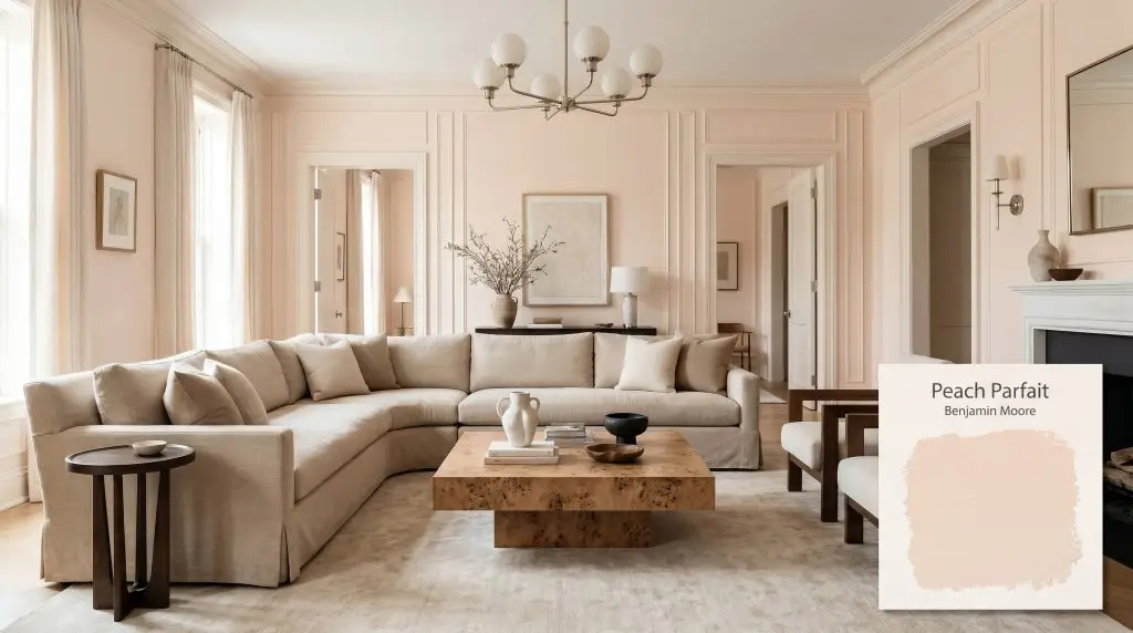
Peach Parfait 2175-70
Benjamin MooreBenjamin Moore Peach Parfait (2175-70) is a pale, warm peach-beige with distinct pink and soft yellow-red undertones. Boasting an LRV of 79.62, it acts as a frosty, light-reflecting pastel that brings a cozy yet airy glow to interior spaces.
Paint Technical Profile
| Color ID / SKU | 2175-70 |
| HEX Code | #F9E7DA |
| Light Reflectance (LRV) | 79.62 |
| Use | Interior |
| Best Exposures | North, East |
| Best For | Bathrooms, Nurseries, Dressing Rooms, Ceilings |
Benjamin Moore Peach Parfait: Bottling the Morning Sun with a Frosty Pastel
Stark white walls are finally loosening their grip on modern interiors, making room for colors that actively generate their own warmth. Benjamin Moore Peach Parfait steps into this role beautifully, acting as a highly reflective architectural finish that wraps a room in a soft, flattering light. Rather than retreating into the background like a standard builder-grade beige, this specific pastel saturation actively shapes the mood of your home.
It offers a brilliant compromise for those who want color without the commitment of a dark, moody palette. By capturing and amplifying natural sunlight, it creates a welcoming, airy atmosphere that feels both intentional and effortlessly chic.
Benjamin Moore Peach Parfait: Undertones & LRV Breakdown
Homeowners constantly ask us: is this paint warm or cool? Peach Parfait is undeniably warm, but its specific construction holds a clever secret that keeps it from feeling like a retro, overly baked orange. The magic lies entirely in how its core pigments interact on your walls.
Sitting at an LRV (Light Reflectance Value) of 79.62, this peach-beige minimizes ambient light absorption, allowing it to bounce a massive amount of illumination around the room. This means the color acts as an airy, glowing layer rather than a dense wall of pigment. Because of this high light reflectance, it will wash out slightly if hit by blinding, direct exterior sunlight.
Lighting Effects & The Chameleon Factor
Because of its delicate frosty pink undertone, this warm chromatic profile shifts noticeably as the sun moves across your home. Understanding this daily movement is the key to predicting exactly how the color will behave alongside your furniture and fabrics.
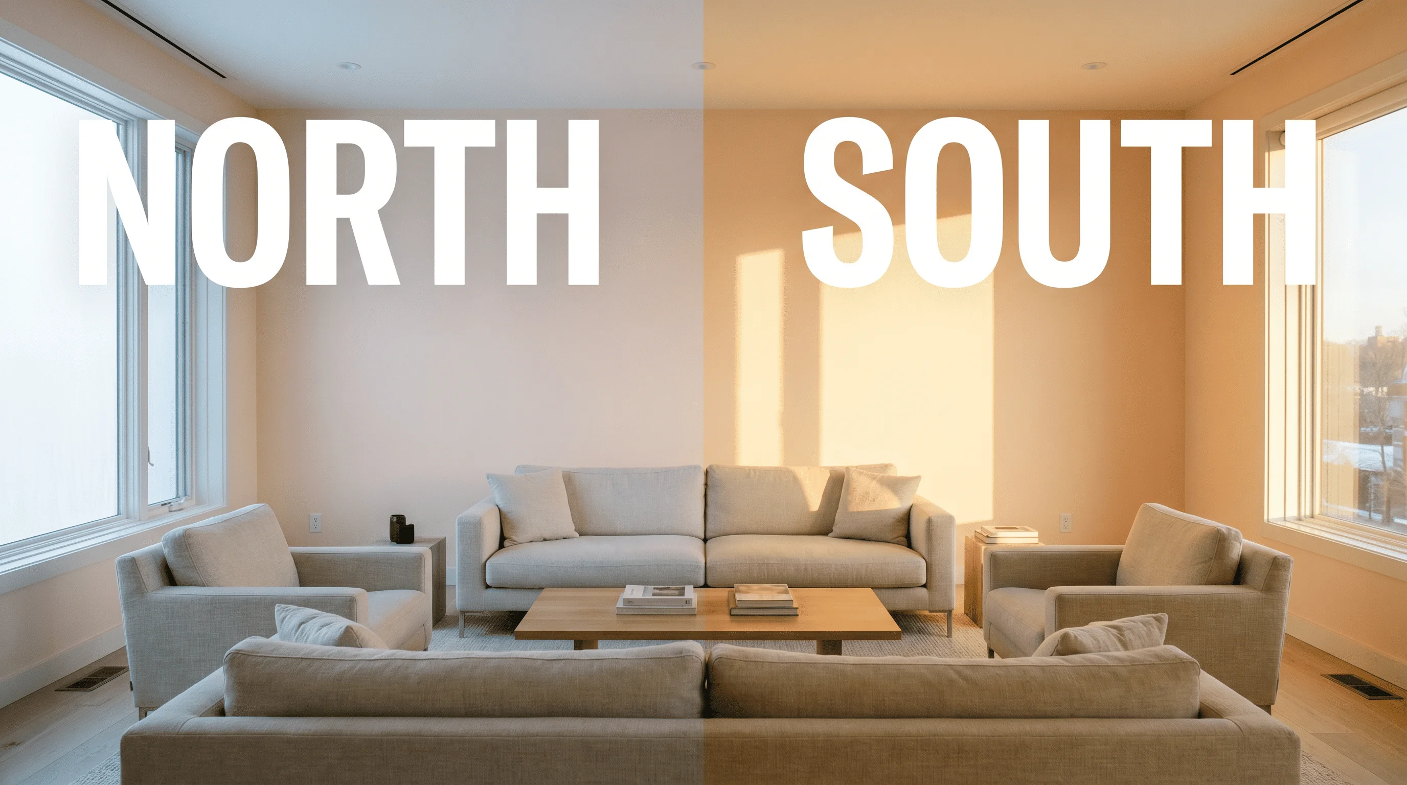
Because this color sits so high on the LRV scale, placing it in a room with massive, unshaded south-facing windows can cause the pigment to completely bleach out during peak afternoon hours. If your room is flooded with blinding natural light, consider using it on the ceiling instead to capture a softer, indirect glow.
Hackrea Pro-Tip (The Washout Warning)
Curating Spaces with Benjamin Moore Peach Parfait
It is incredibly easy to pigeonhole a soft peach into very specific, traditional roles. However, when you treat this hue as a highly adaptable material, it reveals an impressive ability to soften modern edges and inject life into overlooked spaces.
Bathrooms and Powder Rooms
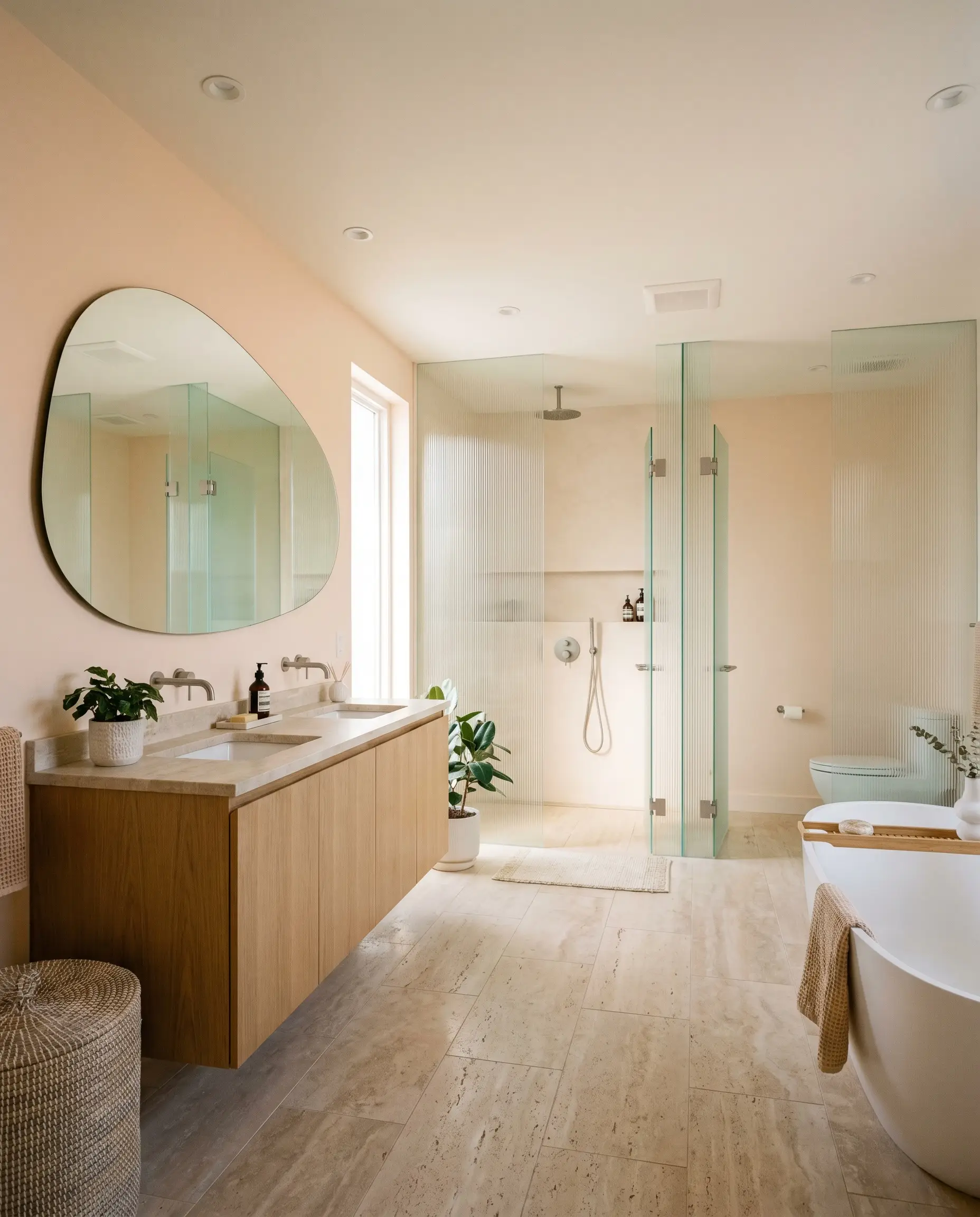
There is a highly practical reason to wrap your bathroom in this warm chromatic profile: it creates an incredibly flattering, natural filter for your morning routine. Instead of defaulting to a retro 1950s aesthetic, push this color into a contemporary organic space. Pair the soft walls with honed travertine floors, a white oak floating vanity, and fluted glass shower partitions.
The frosty pink undertone interacts beautifully with unlacquered brass fixtures, allowing the metal to shine without clashing against a stark white background. For a brilliant high/low mix, invest in a premium, asymmetrical oversized mirror to serve as the focal point against the peach-beige walls. Keep your towels and bath mats in crisp, warm whites to maintain a spa-like freshness.
Nurseries and Children’s Bedrooms
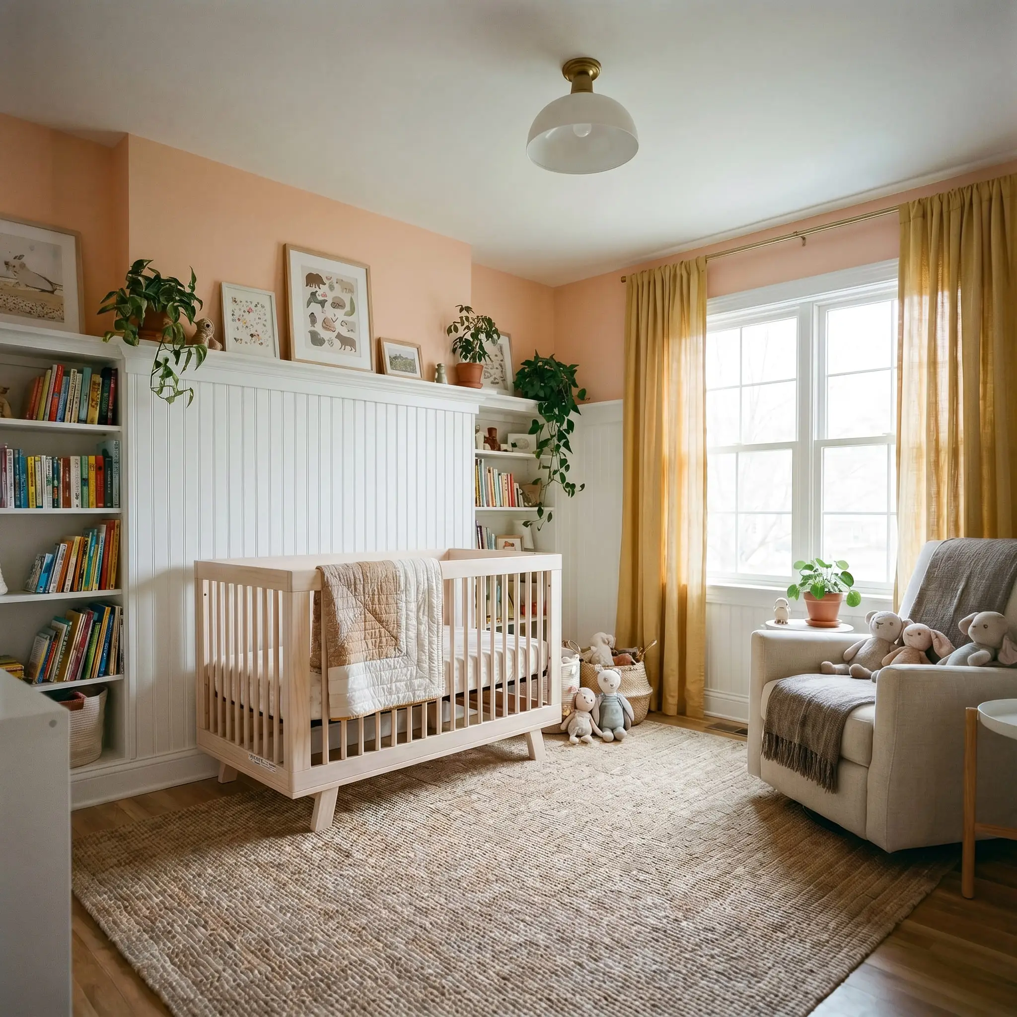
Nurseries naturally invite softer palettes, but you do not have to sacrifice sophisticated design to achieve a playful atmosphere. By using Peach Parfait 2175-70 as a foundational neutral rather than a thematic statement color, you create a room that easily evolves as a child grows.
Lean into a soft Scandinavian aesthetic by pairing the walls with pale wood tones, woven wool rugs, and simple, functional furniture. Layering washed linen curtains in a soft mustard yellow or sage green introduces a playful contrast that feels curated rather than chaotic.
If you are worried about a full room of peach feeling too sweet, try a two-tone application. Install classic beadboard on the lower half of the wall painted in a crisp, warm white, and use the sorbet hue exclusively on the upper half to draw the eye upward and keep the space feeling tailored.
Hackrea Design Secret (The Two-Tone Transition)
Dressing Rooms and Closets
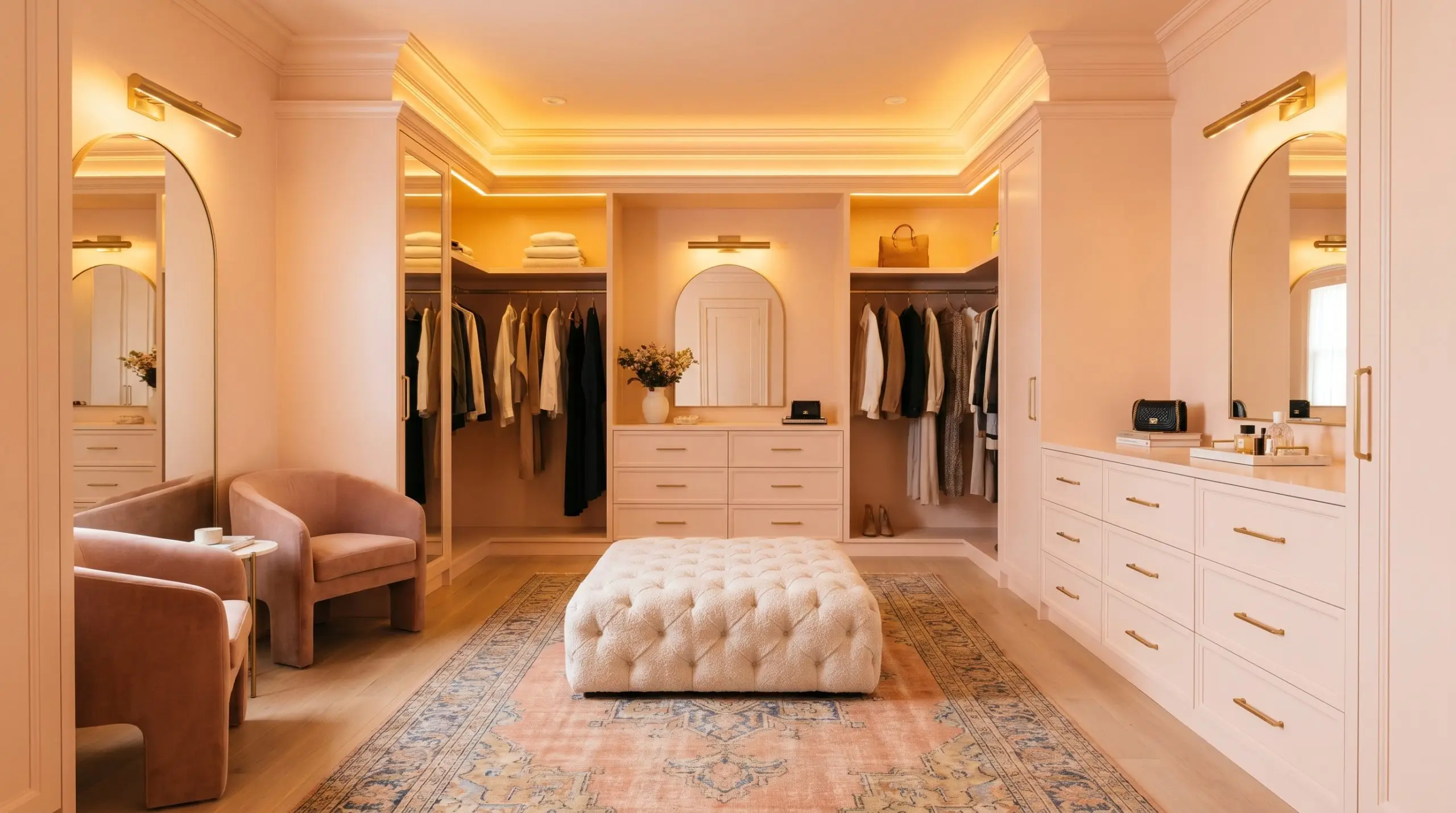
A dedicated dressing area should feel like a personal sanctuary, and this glowing hue instantly provides a boutique-like atmosphere. Color-drenching the space—painting the walls, trim, and custom built-in cabinetry in the exact same finish—creates a seamless, jewel-box effect. This monochromatic approach visually expands tight spaces by erasing harsh architectural lines.
To elevate the room into a Parisian chic aesthetic, introduce tactile, luxurious materials. A tufted boucle ottoman, polished nickel hardware, and a vintage Persian runner will offset the pastel’s sweetness with sophisticated texture.
Ceilings (The Unexpected Fifth Wall)
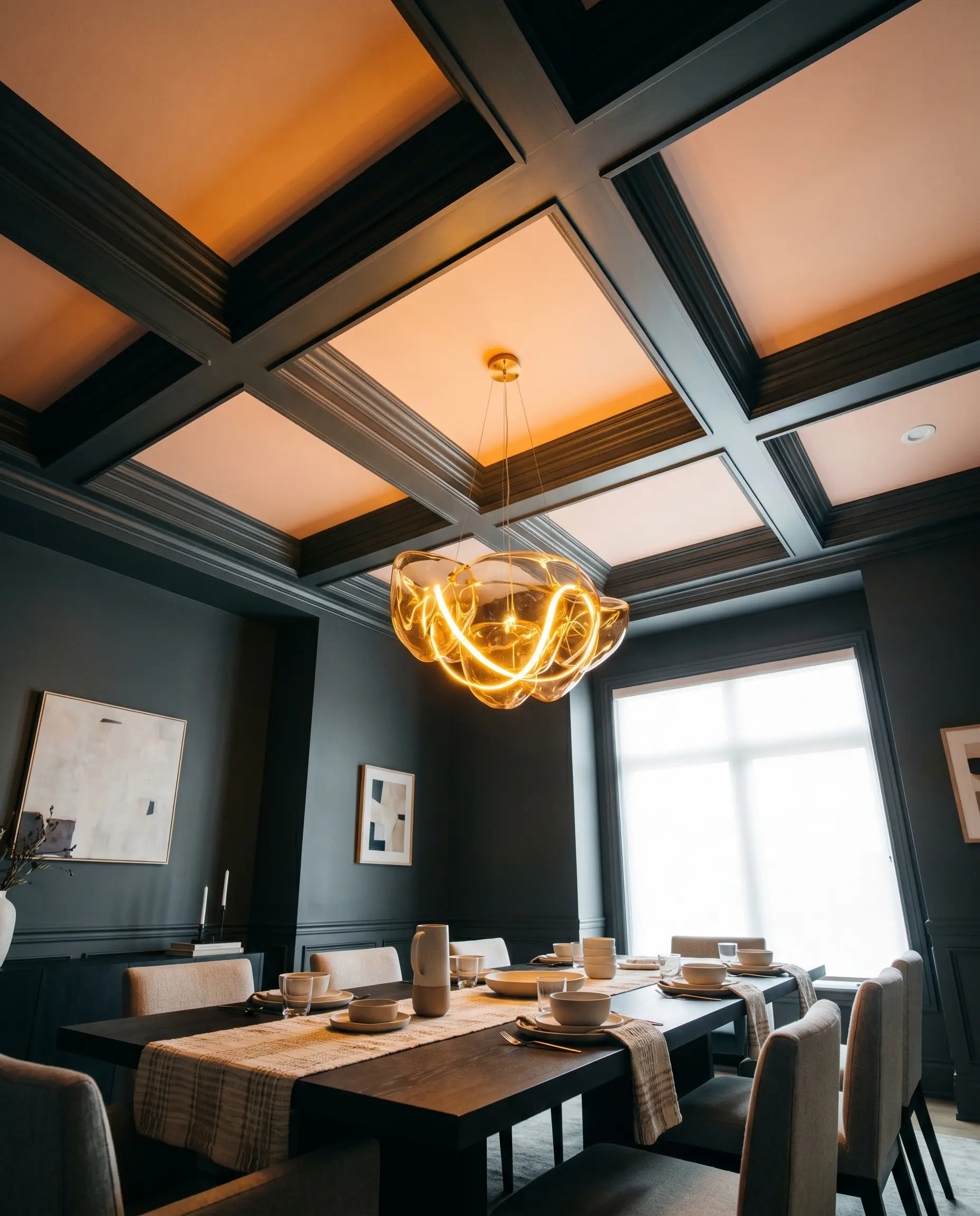
Leaving the ceiling stark white is often a missed design opportunity, especially in rooms that crave a touch of unexpected warmth. Brushing this frosty pastel onto the “fifth wall” mimics the effect of a setting sun, casting a subtle, ambient glow over the entire room.
This technique works exceptionally well in dining rooms or living spaces featuring heavy architectural details like crown molding or coffered ceilings. Pair the peach ceiling with deep charcoal gray or navy blue walls to create a striking, high-contrast environment that feels both moody and uniquely inviting.
Material Pairings & Color Harmonies
Instead of relying on rigid contrast, this specific pigment demands soft, tonal bleeds to feel truly serene. It actively expands and softens when placed next to muted, earthy elements rather than competing with them for attention.
Framing The Pastel With Precision
Selecting the right trim dictates whether this color feels like a modern architectural feature or a dated afterthought. You must pair it with a white that offers enough crispness to hold the pastel’s shape without being so stark that it creates a jarring visual boundary.
Tactile Elements & Hardware
To truly elevate this sorbet hue, you must introduce textures that either absorb its high light reflectance or complement its inherent warmth.
Harmonizing The Palette
Building a successful palette around this hue requires secondary colors that manipulate its temperature and control its sweetness.
Curated Aesthetic Concepts
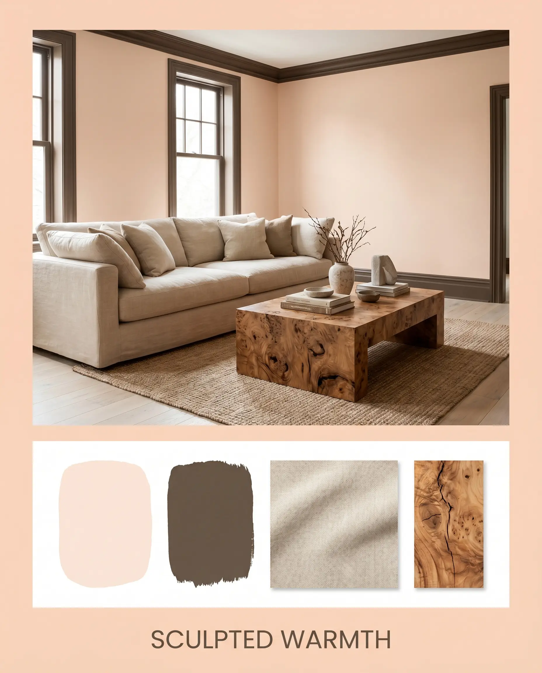
Sculpted Warmth This aesthetic uses bold, organic shapes to ground the airy nature of the pastel walls. Imagine an environment anchored by a sweeping, curved sofa upholstered in durable stonewashed canvas, paired with a brutalist burl wood coffee table. The walls provide a glowing backdrop, while accents painted in the deep, grounding tone of BM Brown Horse 2108-30 add necessary visual weight. It creates an atmosphere that feels incredibly grounded, yet effortlessly light.
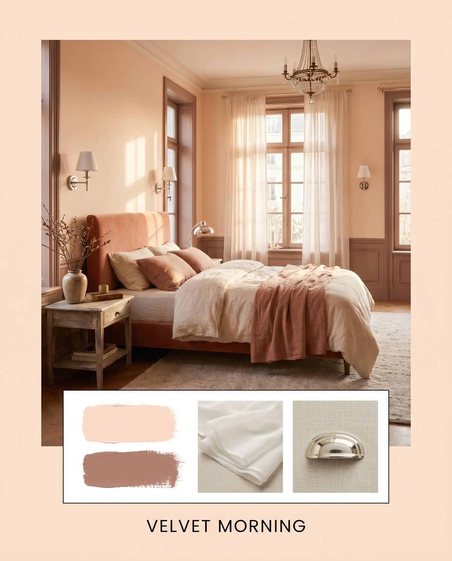
Velvet Morning Focusing entirely on a soft, tonal experience, this palette wraps you in a calming, unified energy. The walls blend seamlessly into trim painted in Farrow & Ball Dead Salmon, creating a sophisticated, muddy transition that eliminates harsh architectural lines. Layering sheer voile drapery and polished nickel lighting fixtures adds a gentle shimmer. The resulting mood is quiet, deeply restorative, and undeniably elegant.
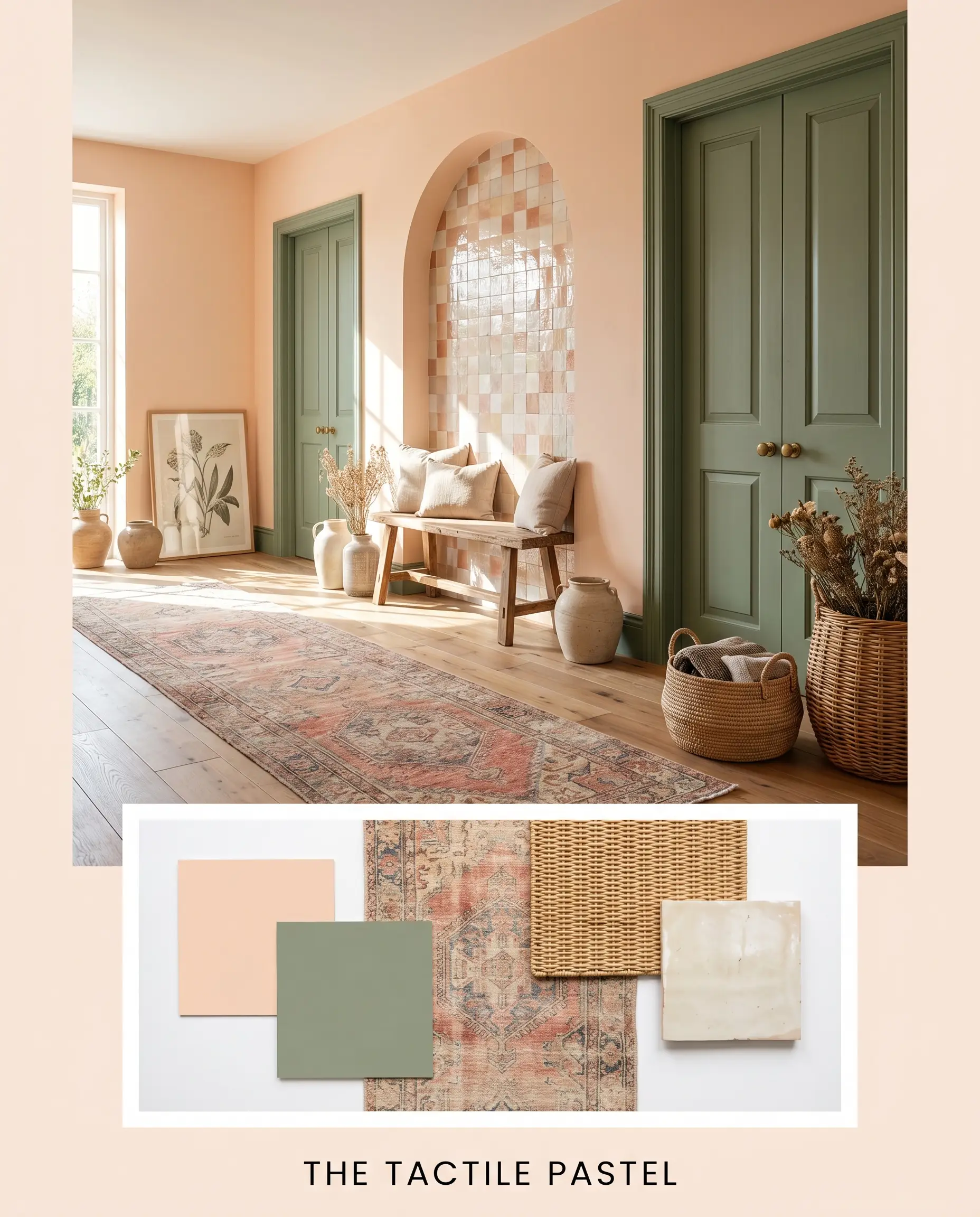
The Tactile Pastel To push the color into a more contemporary, energized direction, this styling relies on natural textures and refreshing color contrasts. A vintage Persian runner introduces complex, saturated patterns, while accents of Sherwin-Williams Retreat on interior doors provide a crisp, organic break from the warmth. By incorporating woven baskets and a glazed zellige tile focal point, the room feels vibrant, curated, and wonderfully tactile.
Benjamin Moore Peach Parfait Head-to-Head Comparisons
Sometimes a room’s natural light will completely alter how a pastel reads, requiring a subtle shift in your color strategy. If your space receives icy northern light or lacks natural illumination entirely, you might need to pivot to a rival hue with a different structural build to achieve your desired aesthetic.
Benjamin Moore Peach Parfait vs. Benjamin Moore Warm Blush
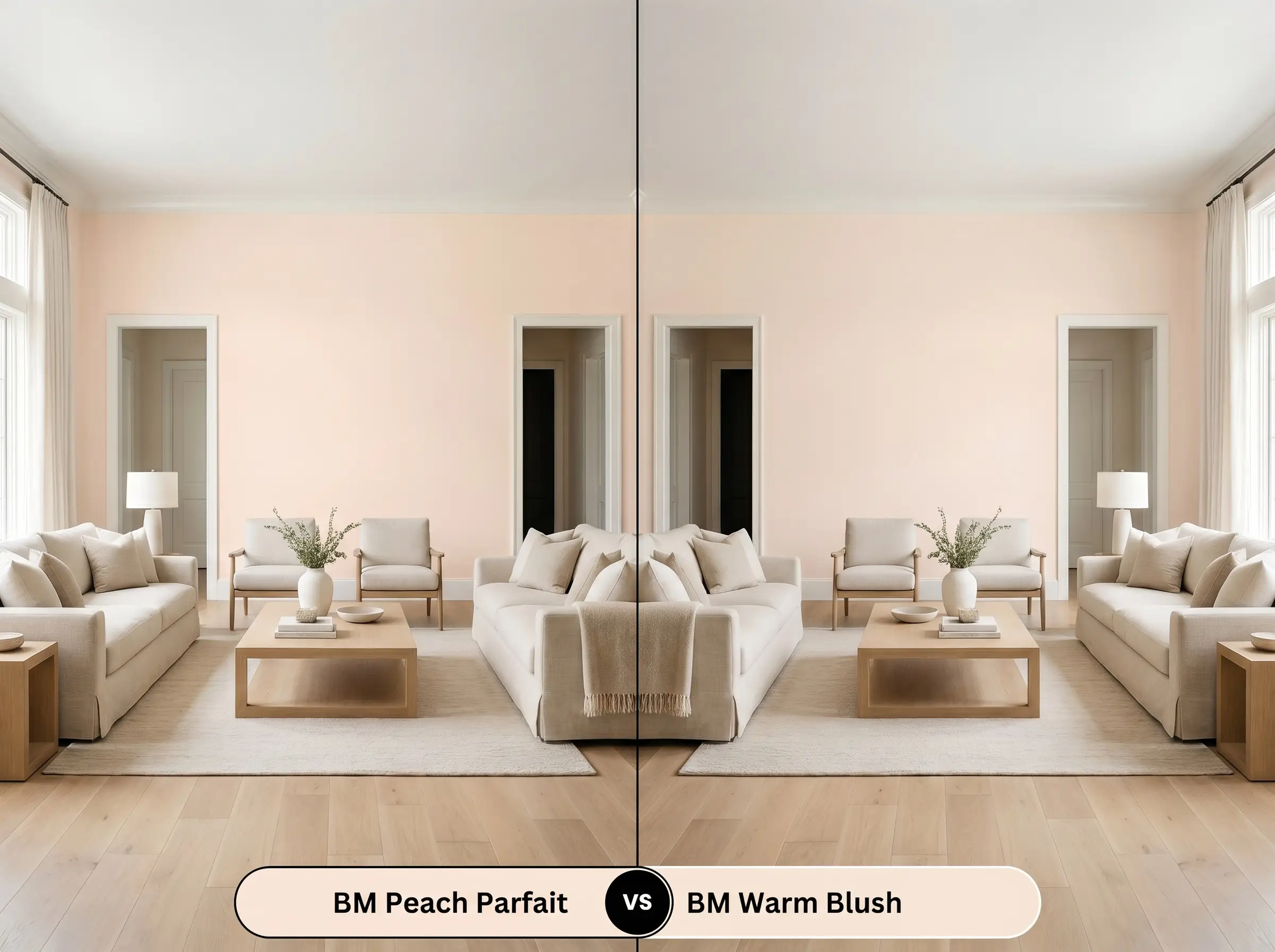
When comparing these two, the decision comes down to your tolerance for color saturation. Warm Blush is significantly deeper and carries a much stronger red-orange presence, making it a true, undeniable statement color.
If you want a soft, ambient glow that acts as a flattering neutral, stick with Peach Parfait. However, if your room is massive and you need a richer pigment to visually pull the walls inward and create intimacy, Warm Blush is the superior choice.
Benjamin Moore Peach Parfait vs. Sherwin-Williams Possibly Pink
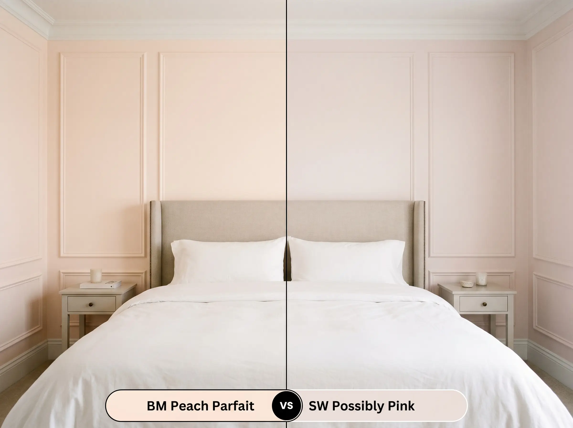
These two colors often confuse homeowners, but they behave very differently once rolled onto a wall. Possibly Pink by Sherwin-Williams has a slightly higher LRV and leans much closer to a true off-white with just a whisper of fruit-toned warmth.
If you are terrified of your walls looking too pink, SW Possibly Pink offers a safer, more restrained alternative. Conversely, if you want a color that actively shapes the mood and provides a distinct, frosty pastel identity, the Benjamin Moore option will deliver that required energy.
Alternative Pastels & Brand Matches
Finding the exact right level of saturation is crucial for a cohesive design, and sometimes your lighting demands a minor adjustment. Whether you need a slightly darker alternative or a direct match from a different manufacturer, these options keep you in the same aesthetic family.
Exploring Same-Brand Alternatives
Reliable Cross-Brand Matches
Practical Application For Peach Parfait
Transitioning this glowing hue from a digital swatch to your actual walls requires a strategic approach to finish and prep. The way light hits the final surface will dictate whether the color feels like a premium architectural feature or a flat, uninspired layer.
Selecting The Ideal Finish
Because pastels with a high light reflectance value can occasionally show roller marks in rooms with intense side-lighting, always maintain a “wet edge” while painting. Roll from ceiling to floor in a single, continuous W-motion to ensure the pigment dries as a seamless, unified layer.
Hackrea Pro-Tip (The Roller Strategy)
Priming And Professional Coverage
Due to its light base, this color generally offers excellent hide over standard builder-white walls. However, if you are painting over a dark or vibrant existing color, a high-quality white primer is absolutely non-negotiable.
Without a bright white primer, the underlying dark tones will absorb the paint’s interior glow, leaving the final result looking dull and muddy. Plan for two full coats of premium paint to achieve the true, radiant sorbet hue you see on the swatch.
Frequently Asked Questions
Because of its high light reflectance, it actually draws the eye upward without the stark, clinical contrast of a flat white. It mimics the soft glow of natural sunlight, tricking the eye into perceiving the ceiling as an airy, expanding canopy rather than a low, oppressive lid.
The frosty pink undertone actually acts as a beautiful balancing agent against the aggressive orange in red oak floors. Instead of clashing, the paint cools down the room just enough to let the floors shine without the entire space feeling overwhelmingly warm.
Yes, but your artificial lighting strategy is critical for success. You must use crisp, neutral LED bulbs (around 3000K to 3500K) to activate the paint’s light reflectance; otherwise, dim lighting will cause the beige notes to flatten and look muddy.
Any paint with an LRV this high will catch the light and subtly highlight bumps or uneven textures on your walls. To minimize this effect in older homes, strictly use a flat or matte finish, which absorbs light and visually smooths out surface flaws.
Final Verdict & Expert Warnings
Benjamin Moore Peach Parfait is an incredibly effective tool for homeowners looking to inject soft, radiant life into their interiors without committing to a dark, overpowering palette. Its true brilliance lies in its ability to capture and amplify natural light, transforming flat, uninspired rooms into glowing, welcoming environments. It thrives beautifully in soft modern, contemporary organic, and Parisian chic spaces where its frosty pink undertones can interact with tactile materials like burl wood, unlacquered brass, and stonewashed linen. If you need a color that actively flatters a space and provides a gentle, uplifting energy, this pastel is an exceptional choice.
However, you must respect the delicate nature of its underlying pigment. If you try to force this color into a stark, industrial loft filled with cool concrete, blackened steel, and harsh fluorescent lighting, the paint will lose its warmth and read as a sickly, washed-out beige. Furthermore, pairing it with aggressive, primary colors like cherry red or vibrant lemon yellow will instantly overpower its subtle nuance, reducing the sophisticated pastel to a chaotic, juvenile clash. You must surround it with muted, earthy tones and premium textures to allow its true architectural glow to confidently take center stage.