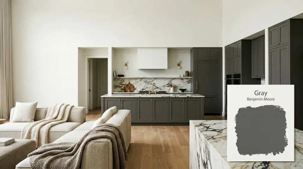
Gray 2121-10
Benjamin MooreBenjamin Moore Gray 2121-10 is a deeply saturated, true neutral charcoal with an LRV of 11.51. Because its RGB values are perfectly balanced, it lacks distinct undertones, making it a sophisticated, modern alternative to harsh black for interior accents and cabinetry.
Paint Technical Profile
| Color ID / SKU | 2121-10 |
| HEX Code | #585858 |
| Light Reflectance (LRV) | 11.51 |
| Use | Interior, Exterior |
| Best Exposures | South-Facing, Well-Lit Spaces |
| Best For | Accent Walls, Cabinetry, Interior Trim, Moody Studies |
The Architectural Shadow: Decoding Benjamin Moore Gray 2121-10
Every room needs a moment of absolute stillness. Benjamin Moore Gray 2121-10 delivers exactly that, acting less like a traditional paint color and more like a structural shadow. This saturated charcoal strips away the chaotic undertones usually found in dark paints, achieving a flawless achromatic balance. It allows your curated materials—from unlacquered brass to prominently veined marble—to take center stage without competing for visual dominance.
The Chromatic Profile of Benjamin Moore Gray
Is this paint warm or cool? It is a remarkably pure shade. Unlike most dark colors that secretly harbor unwanted hues, this specific pigment profile maintains a perfect neutral cast, leaning neither warm nor cool.
At a Light Reflectance Value of 11.51, this saturated shade offers significant light absorption, taking in nearly 89% of the illumination that hits it. This creates a dense architectural finish that beautifully manipulates the perceived boundaries of any space.
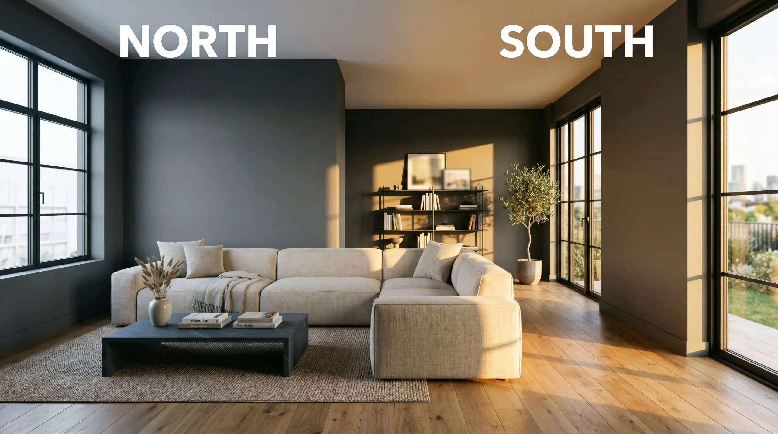
Lighting Effects & The Chameleon Factor
Even a pure neutral responds to the shifting nature of the sun. Because of its intense light absorption, the surrounding illumination dictates how soft or stark this charcoal appears throughout the day.
Curated Room Applications
The beauty of a perfectly balanced charcoal lies in its absolute versatility. Whether you are centering a bright, airy space or leaning into a deeply saturated aesthetic, this shade adapts effortlessly to your architectural needs.
Kitchen Islands and Lower Cabinetry
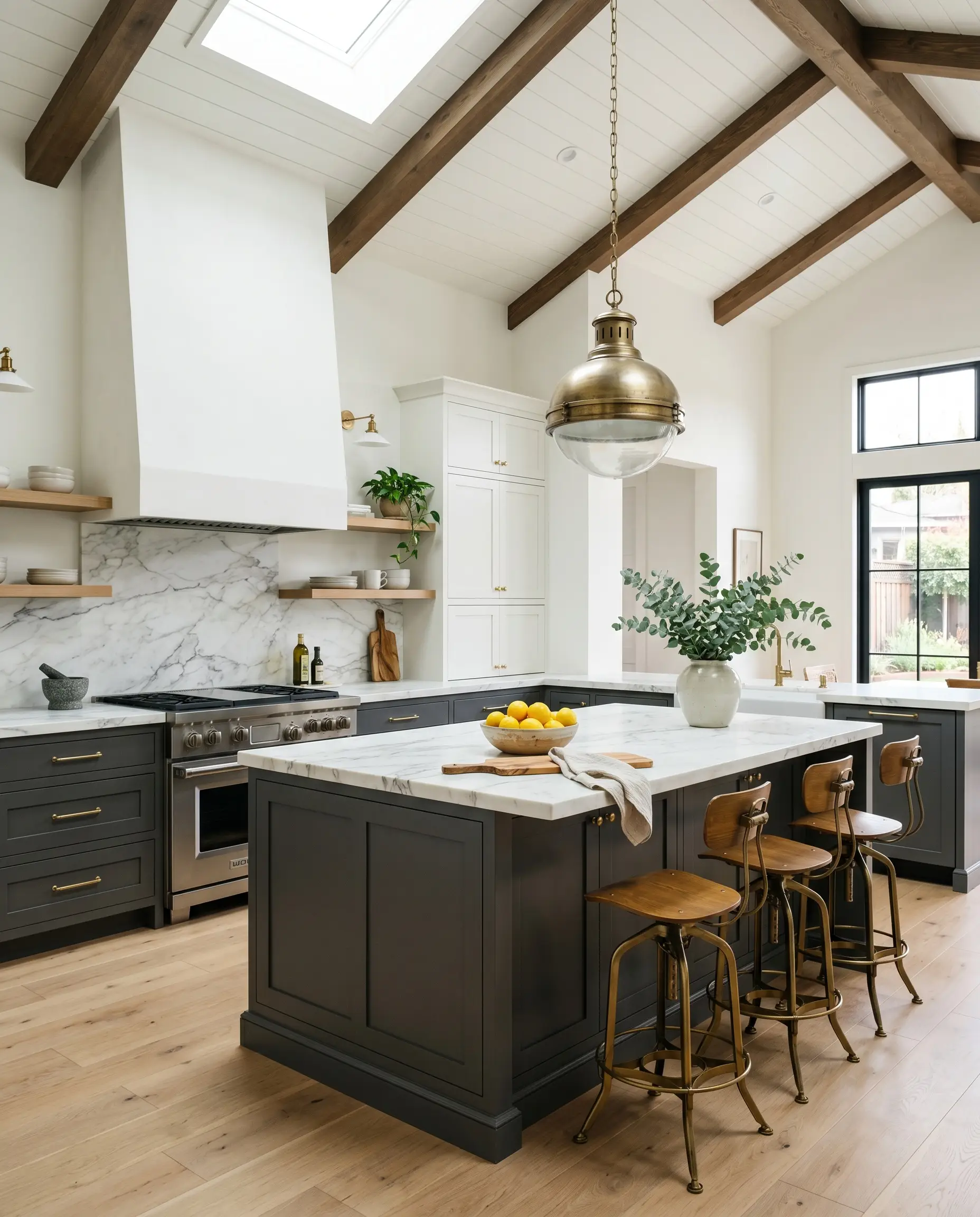
Applying this dense shade to lower cabinetry instantly grounds a kitchen, especially in homes with soaring ceilings. Pairing it with warm white oak floors and unlacquered brass hardware creates a stunning, high-contrast transitional look. The dark base visually recedes, allowing prominently veined marble countertops to truly shine, while intense southern exposure will soften the charcoal into a beautiful dusty graphite.
When painting high-traffic lower cabinets in a dark shade, always opt for a durable satin or semi-gloss finish. Flat finishes in this dark of a color will show every single fingerprint and scuff mark.
Hackrea Pro-Tip (The Finish Factor)
Moody Home Offices and Libraries
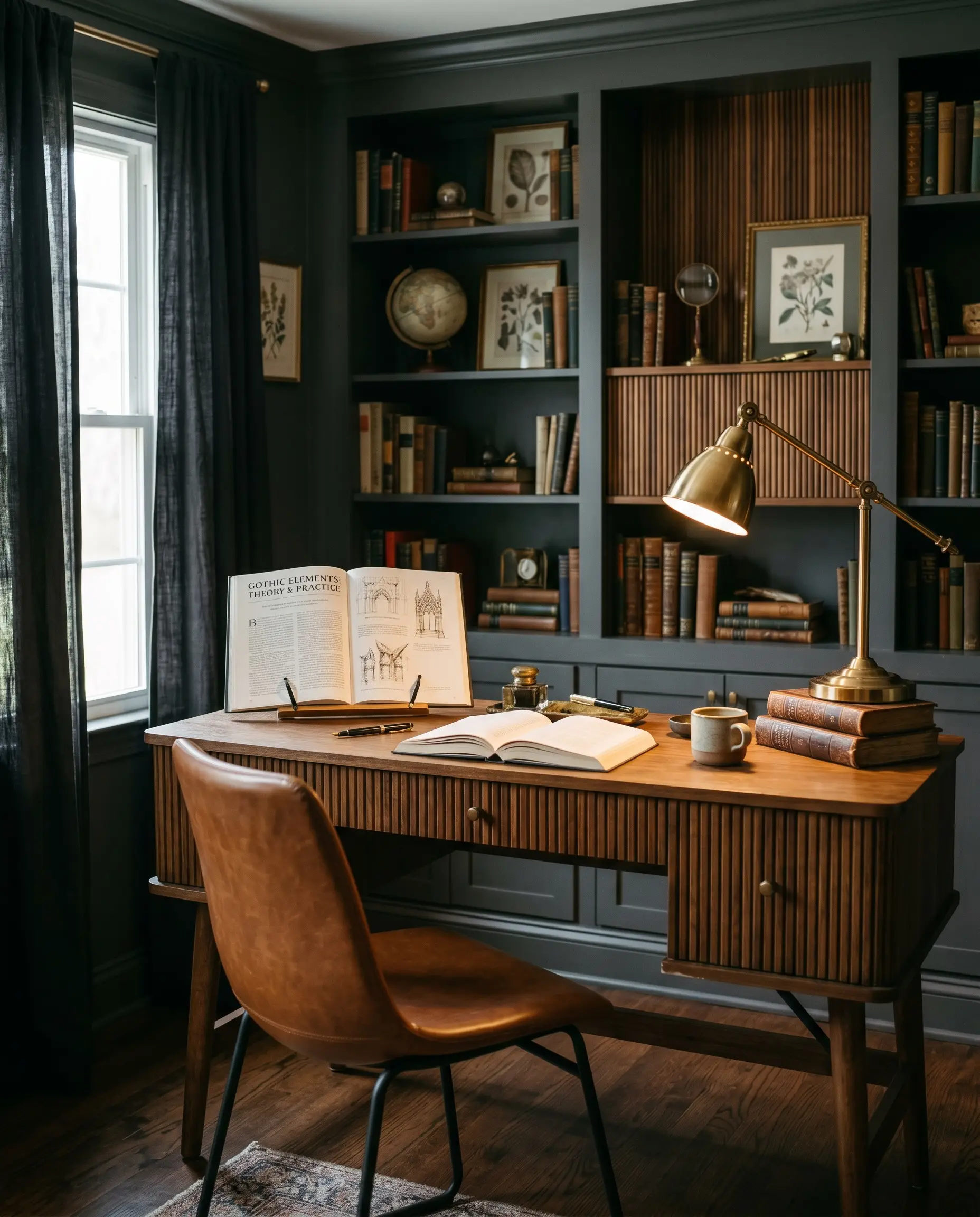
For the professional who needs a focused workspace, color drenching the office in this saturated neutral is incredibly effective. Painting the walls, built-in bookcases, and trim in a single sheen eliminates visual clutter and creates a seamless, enveloping atmosphere. Introduce reeded walnut accents and a sleek saddle leather desk chair to warm up the dark perimeter, fostering deep concentration.
Windowless Powder Rooms
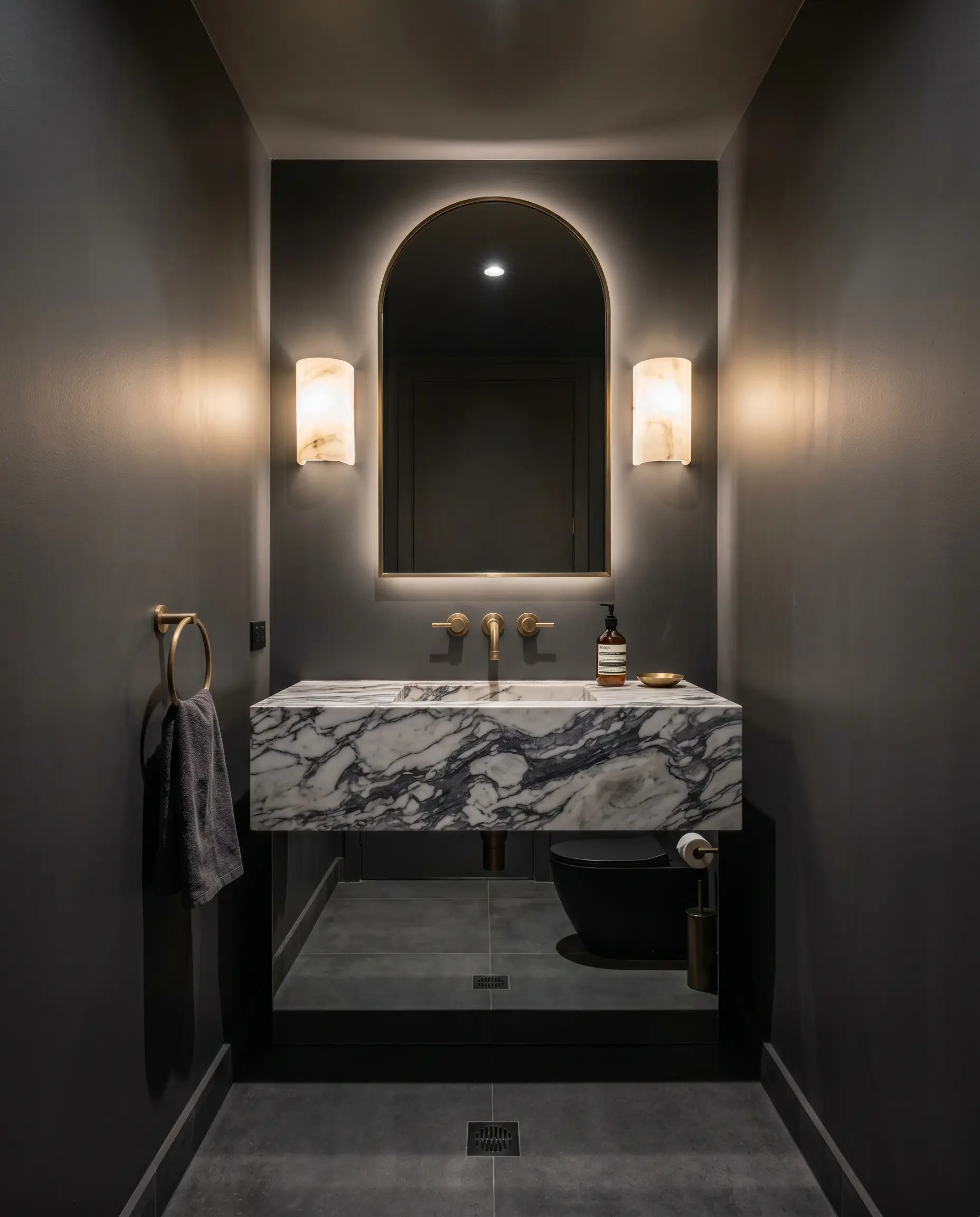
A windowless powder room is the perfect architectural blank slate for a dramatic, jewel-box transformation. Instead of fighting the lack of natural light, wrap the entire small space in this profound charcoal and install alabaster architectural sconces to bounce warm, ambient light around the room. This creates an intimate, highly curated experience for guests, proving that small spaces can handle immense visual weight.
Media Rooms and Home Theaters
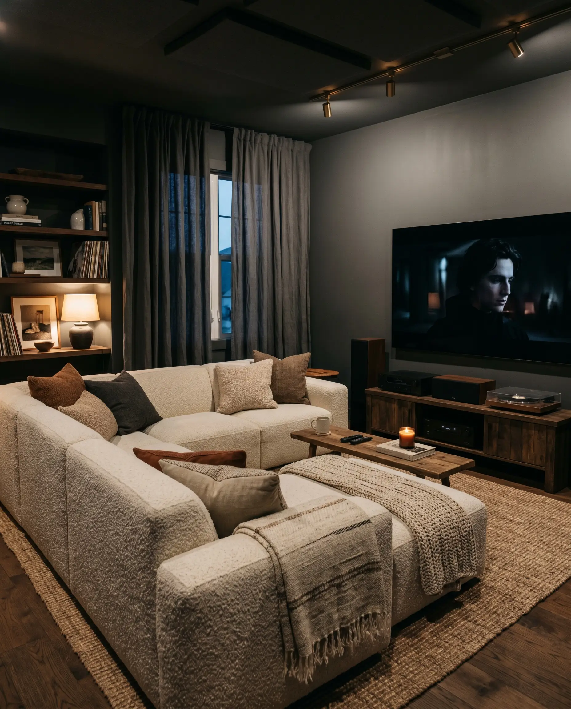
When designing a media room for family movie nights, light absorption is your greatest asset. The exceptionally low light reflectance of this pure neutral makes it the ultimate choice for reducing screen glare and making the walls seemingly disappear in the dark. Soften the industrial edge with highly tactile furnishings, like a modular sectional upholstered in thick boucle, and layer stonewashed linen curtains to enhance the cinematic vibe.
Interior Doors and Millwork
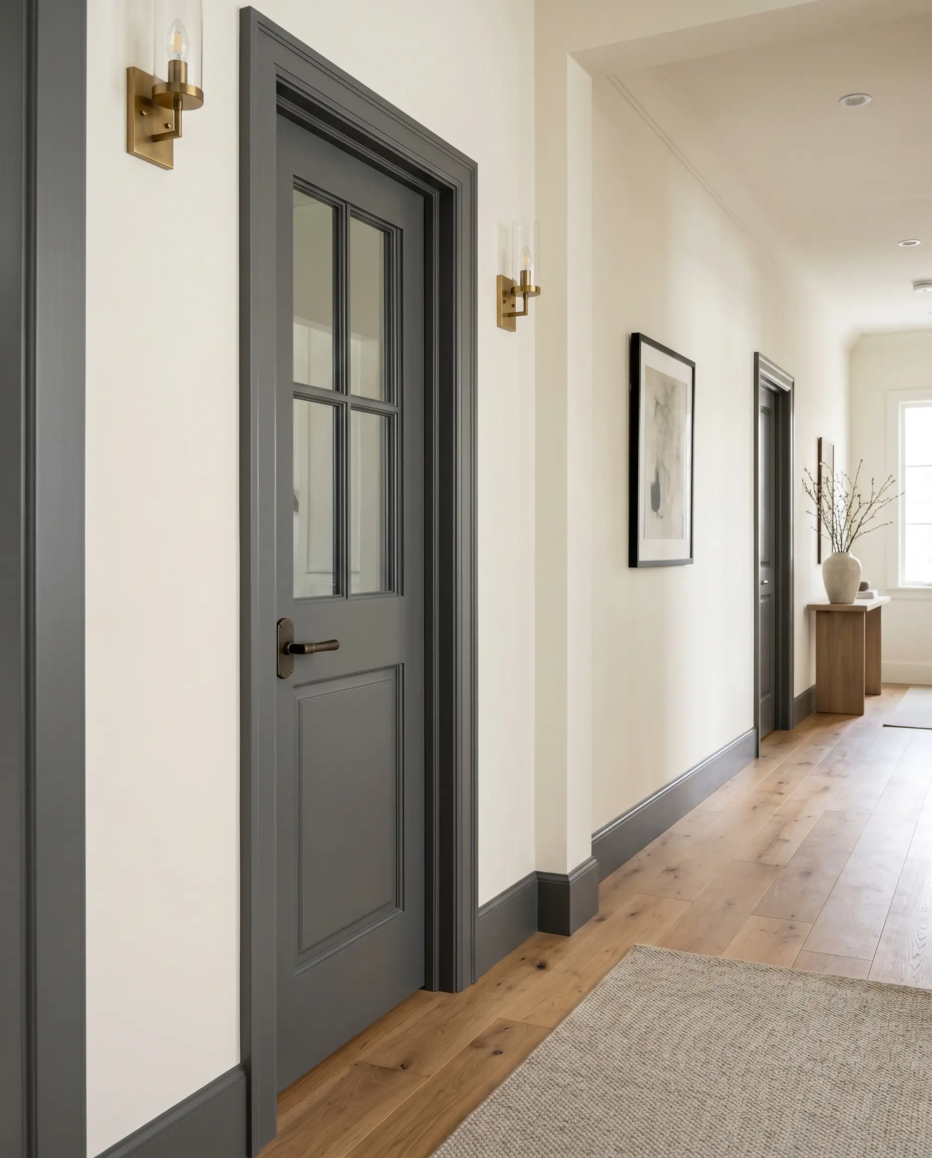
If you are not ready to commit to dark walls, painting your interior doors and window casings is a brilliant way to introduce high-end architectural contrast. A crisp, dark door instantly elevates standard hallways, making the entire home feel custom-built. To execute this properly, ensure your surrounding walls are a warm, creamy off-white to prevent the space from feeling too cold.
Do not paint your doors dark if you have standard, yellowish-orange oak trim from the 1990s. The pure, achromatic nature of the charcoal will aggressively clash with the warm, dated wood tones, making both look much worse.
Clash Warning (The Builder-Grade Trap)
Coordinating Colors & Material Pairings for Benjamin Moore Gray
Because this deep shade possesses a strict achromatic balance, it requires intentional, tactile contrast to prevent the room from feeling flat. It thrives when pushed against warm, highly saturated tones or crisp, luminous boundaries that allow its charcoal structure to truly anchor the space.
Tailored Trim and Baseboard Selections
For a razor-sharp, gallery-like transition, Benjamin Moore Chantilly Lace OC-65 provides an ultra-crisp, unyielding boundary that highlights the dense color depth of the walls. The pure white trim acts as a brilliant frame, making the dark walls feel intensely intentional.
If you prefer a slightly softer transition that still reads as pure white, Sherwin-Williams Pure White SW 7005 offers just enough hidden warmth to take the edge off the dark charcoal. This subtle warmth prevents the high-contrast pairing from feeling too stark or clinical in rooms with poor natural light.
High-Impact Material and Hardware Pairings
Harmonious Palette Additions
Curated Aesthetic Concepts
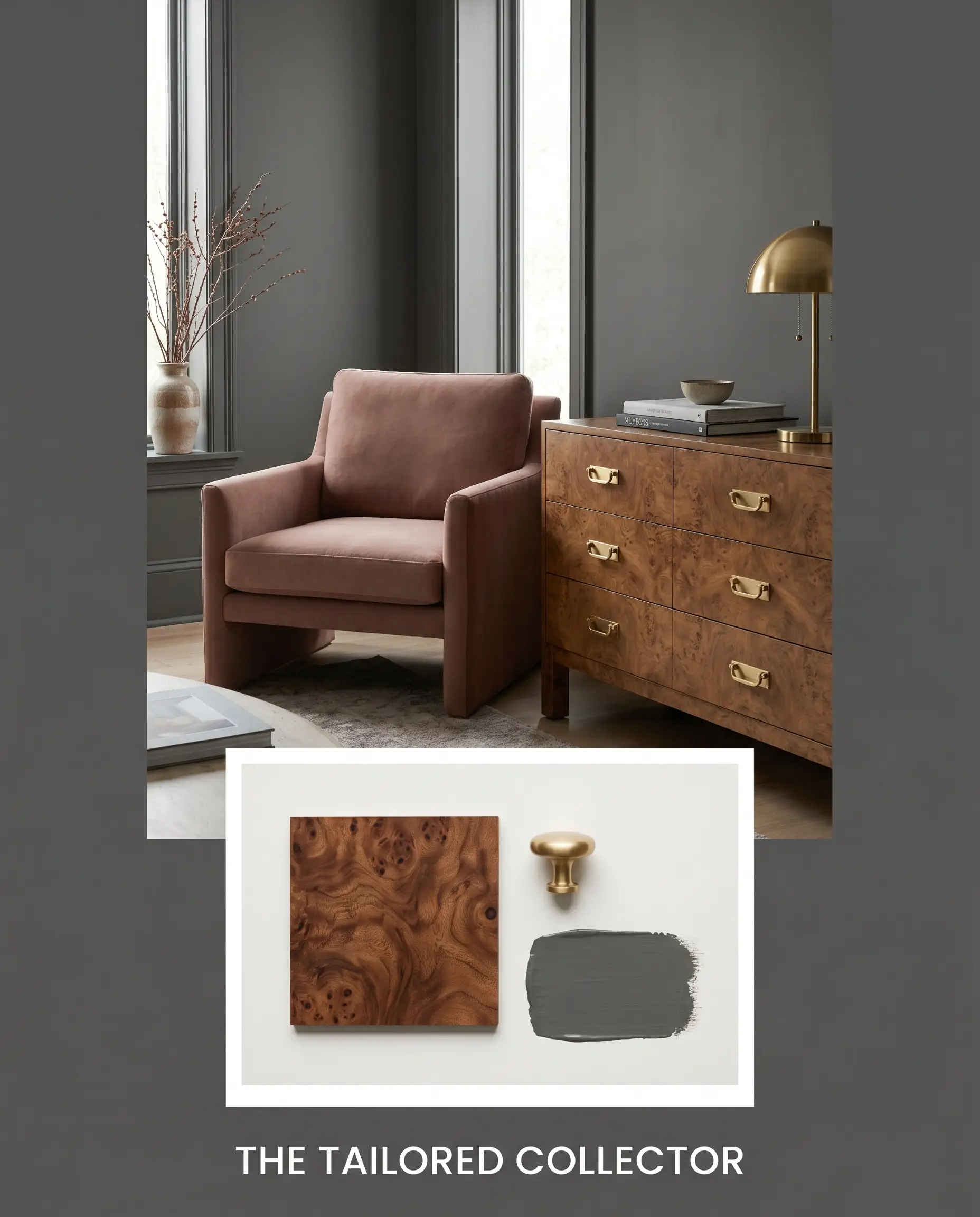
The Tailored Collector This palette thrives on the tension between strict architectural lines and deeply romantic, organic warmth. By layering Farrow & Ball Sulking Room Pink against the dark charcoal walls, the room immediately feels wrapped in sophisticated, approachable luxury. Introduce a vintage burl wood credenza and gleaming unlacquered brass hardware to bounce warm light around the space, finishing the look with abstract watercolor prints and stacked art books.
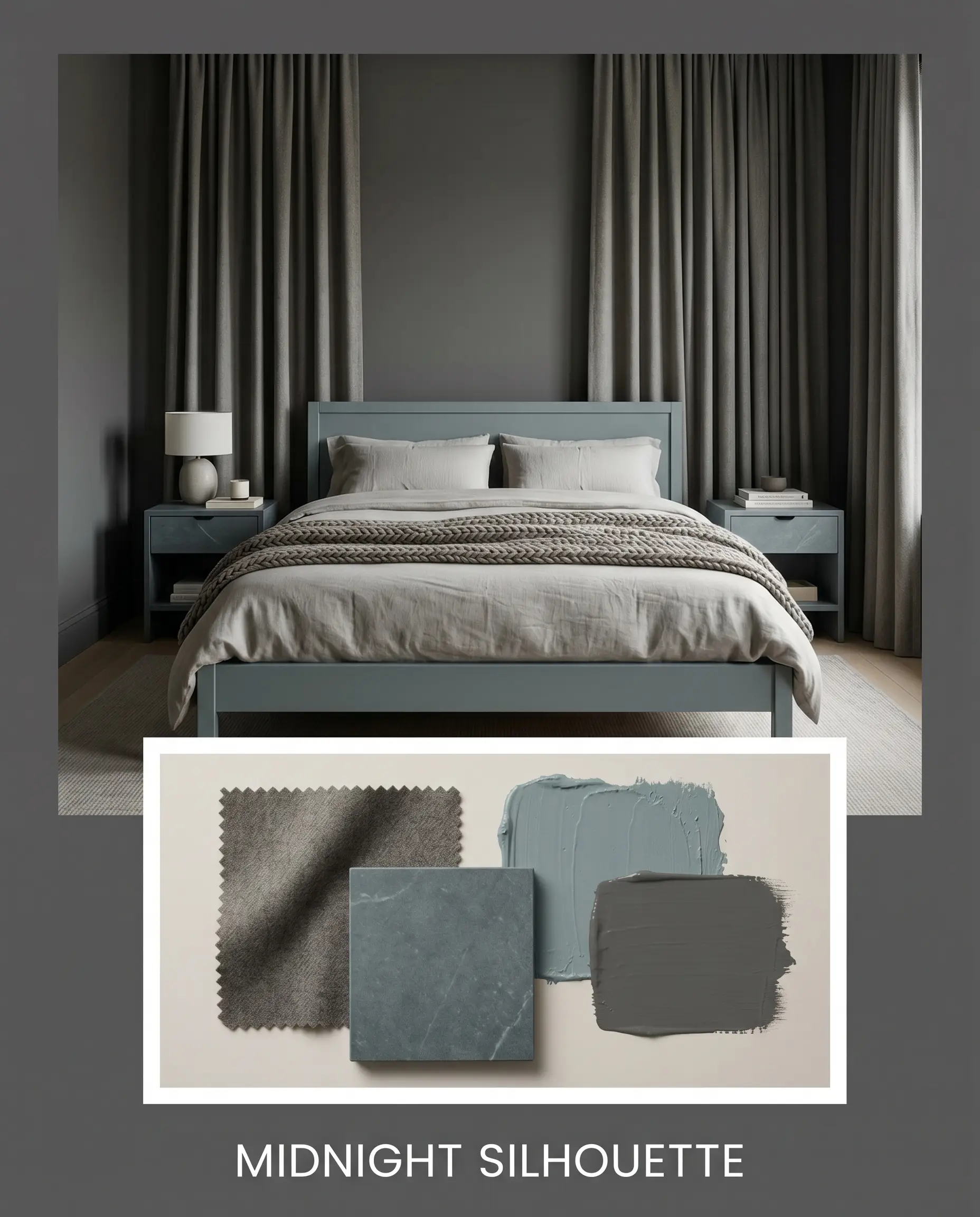
Midnight Silhouette Designed for those who crave a deeply enveloping, modern retreat, this aesthetic leans into rich, tonal layering. The combination of the dark base walls and Sherwin-Williams Moody Blue creates a quiet, stormy atmosphere that feels both grounding and expansive. Anchor the room with thick worsted wool drapery and matte honed soapstone surfaces to absorb the light, keeping the energy completely serene and focused.
Head-to-Head: Benjamin Moore Gray 2121-10
When evaluating such a dense, pure shade, the decision often comes down to how much warmth or cool undertone your specific lighting requires. If your room faces north or lacks natural light, a true charcoal might feel too stark, pushing you toward a rival with a slightly warmer or more complex DNA.
Benjamin Moore Gray 2121-10 vs. Sherwin-Williams Peppercorn SW 7674
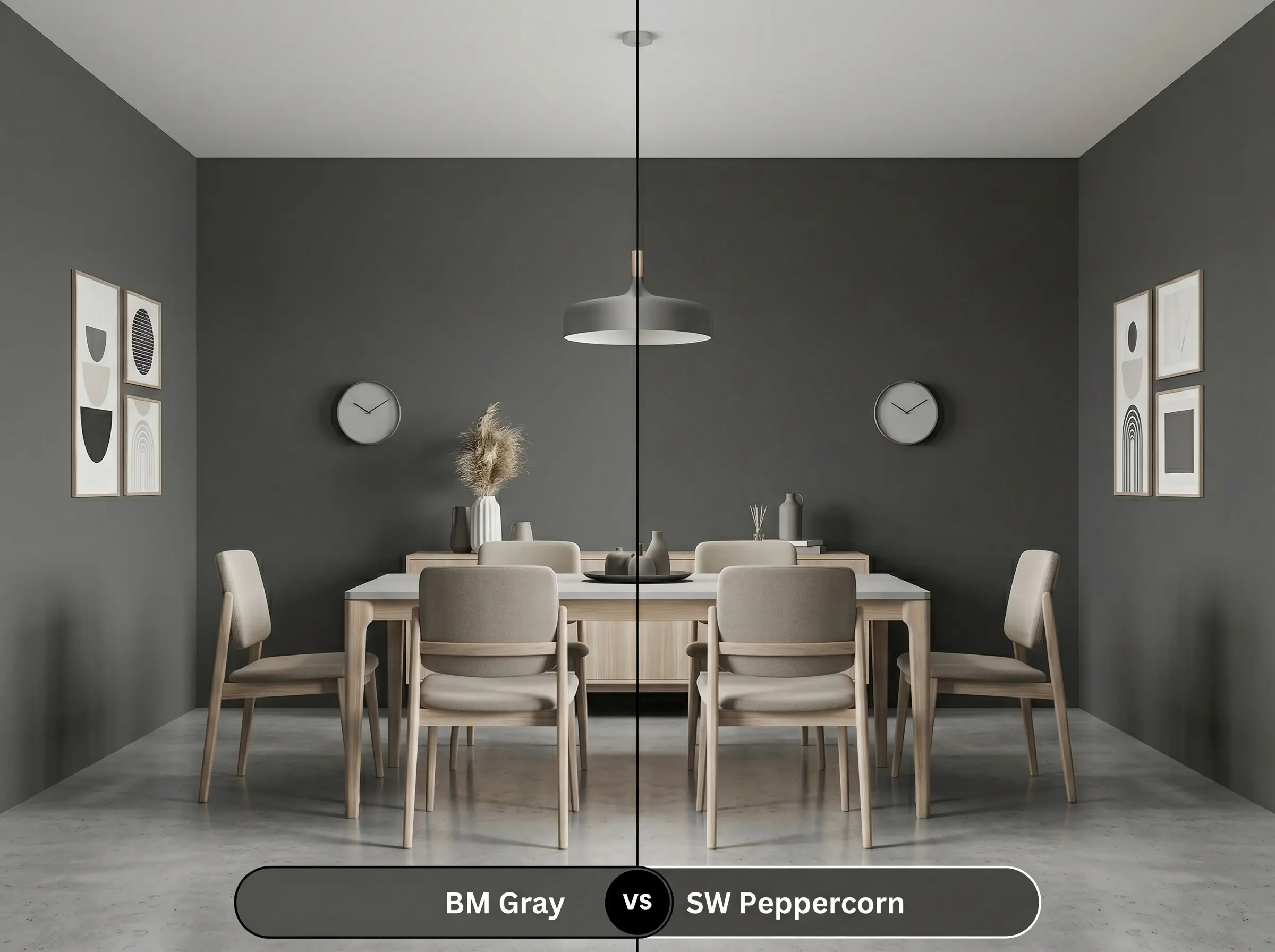
While both of these saturated shades offer immense drama, their underlying composition behaves quite differently on the wall. If your room receives icy, indirect sunlight, then Sherwin-Williams Peppercorn SW 7674 is often the safer choice because it carries a subtle hint of warmth that prevents the room from feeling chilly. However, if you want a strictly pure, unyielding charcoal that will not shift purple or brown throughout the day, the Benjamin Moore option remains the superior architectural neutral.
Benjamin Moore Gray 2121-10 vs. Benjamin Moore Kendall Charcoal HC-166
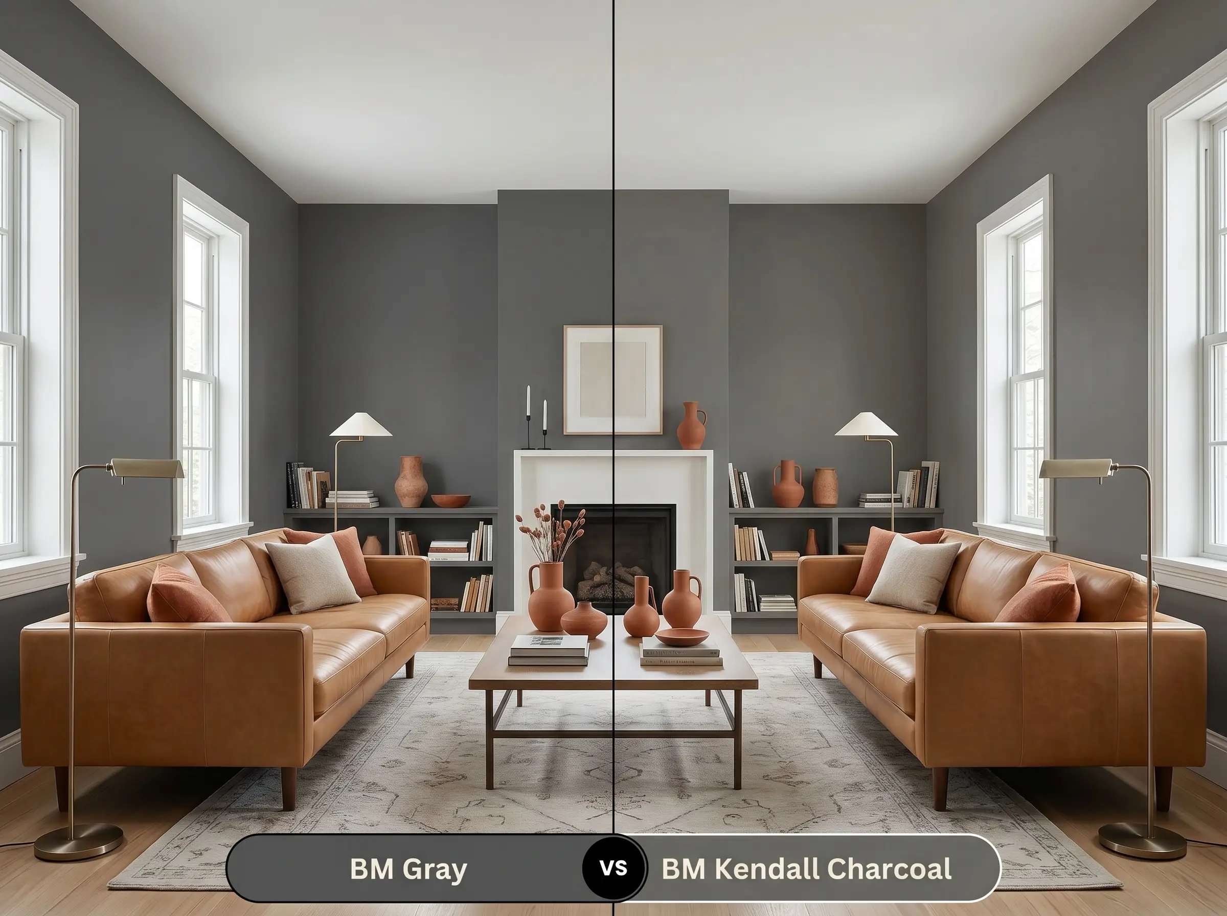
This comparison perfectly highlights the difference between a pure neutral and a complex one. If you are pairing your dark walls with earthy terracotta tiles or warm leather furniture, then Benjamin Moore Kendall Charcoal HC-166 will harmonize beautifully due to its strong green and brown undertones. Conversely, if you are designing a crisp, monochromatic space with bright white trim and cool metals, the pure chromatic profile of Gray 2121-10 provides a much cleaner, more modern backdrop.
Exploring Alternative Charcoal Options
Sometimes a space demands just a fraction more light reflectance, or perhaps you need to color-match across different paint manufacturers. Here are the closest alternatives that maintain a similar moody depth while offering subtle shifts in tone.
Benjamin Moore Family Alternatives
Cross-Brand Matches
Executing This Dark Neutral Like a Professional
Transitioning from design theory to physical application requires a clear understanding of how dark pigments behave on drywall and wood. Mastering the sheen and prep work is exactly what separates a premium, high-end finish from a messy weekend project.
The Sheen Strategy
Priming and Coverage Expectations
To achieve true, rich color depth without streaking, you must use a high-quality primer tinted to a deep gray base. Skipping this step will force you to apply three or four coats of the expensive topcoat just to eliminate the patchy, lighter spots shining through.
Dark paints are notorious for “flashing”—a frustrating issue where overlapping roller marks dry with a different sheen, making the wall look striped. To avoid this, maintain a wet edge while rolling and never go back over a partially dry section to touch it up.
Hackrea Design Secret (The Flashing Phenomenon)
Frequently Asked Questions
Because of its intense depth, it actually creates a stunning jewel-box effect rather than feeling industrial, especially when you pair it with warm alabaster sconces to bounce flattering light around the small space.
Certain interior-only dark pigments lack the necessary UV resistance for outdoor exposure, meaning the harsh sun will cause this specific formula to rapidly fade and chalk if applied to an exterior.
The deep shadows created by textured surfaces actually enhance the color’s richness, making elements like beadboard or painted brick look incredibly custom and architecturally significant.
Painting a ceiling this dark creates a beautiful, enveloping canopy effect that instantly makes overly tall rooms feel much cozier and more intimate.
The Final Verdict on This Pure Charcoal
Benjamin Moore Gray 2121-10 is the ultimate architectural tool for homeowners who crave intense, moody drama without the unpredictable undertones of standard dark paints. It is perfect for modern minimalist, transitional, or dark academia spaces that rely on high-contrast material layering. By providing a flawless, pure charcoal backdrop, it allows your premium hardware, natural stones, and curated textiles to command the room’s attention.
However, this unforgiving depth requires intentional styling to succeed. You should avoid pairing this strict neutral with vast expanses of dated, yellow-orange oak flooring or overly warm, Tuscan-style travertine tiles. Placing such a pure, cool-leaning charcoal directly against prominent yellow or orange undertones creates an uncomfortable, jarring visual clash that makes the paint feel dead and the flooring look artificially bright. If your home is dominated by these warm, 1990s-era hard finishes, you are much better off selecting a dark greige or a charcoal with strong brown undertones to bridge the gap gracefully.
Closest Cross-Brand Equivalents
The absolute closest scientific color matches for Gray across top paint brands.