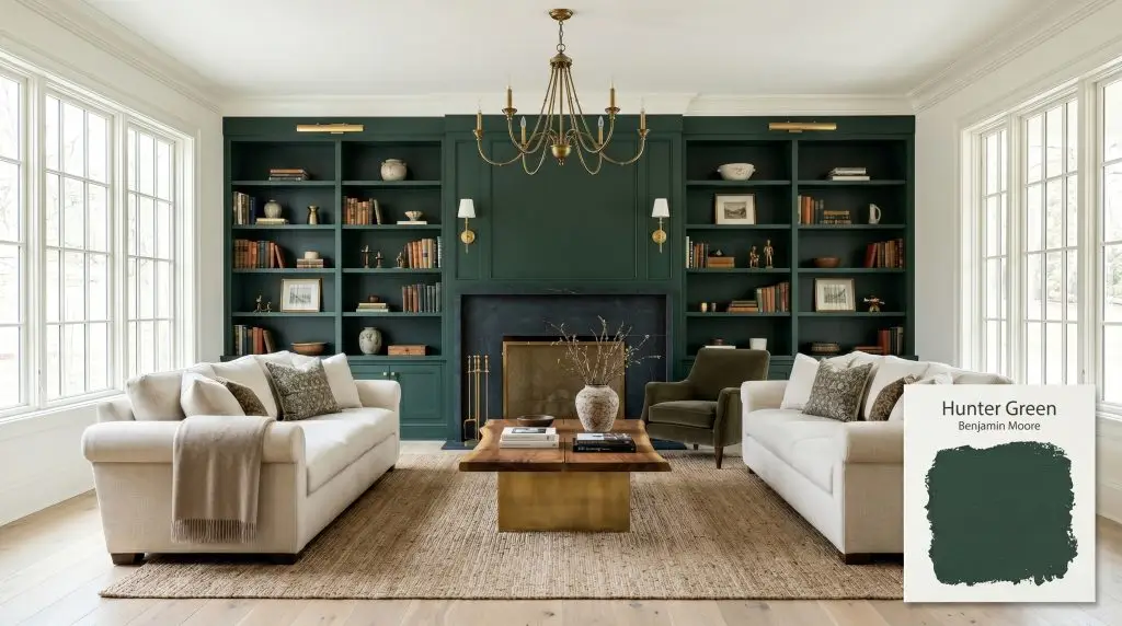
Hunter Green 2041-10
Benjamin MooreBenjamin Moore Hunter Green 2041-10 is a timeless, dark forest green with a cool blue-gray undertone. With a low LRV of 4.31, it absorbs significant light, creating a sophisticated, moody atmosphere perfect for cabinetry, libraries, and striking exterior accents.
Paint Technical Profile
| Color ID / SKU | 2041-10 |
| HEX Code | #2A453D |
| Light Reflectance (LRV) | 4.31 |
| Use | Interior, Exterior |
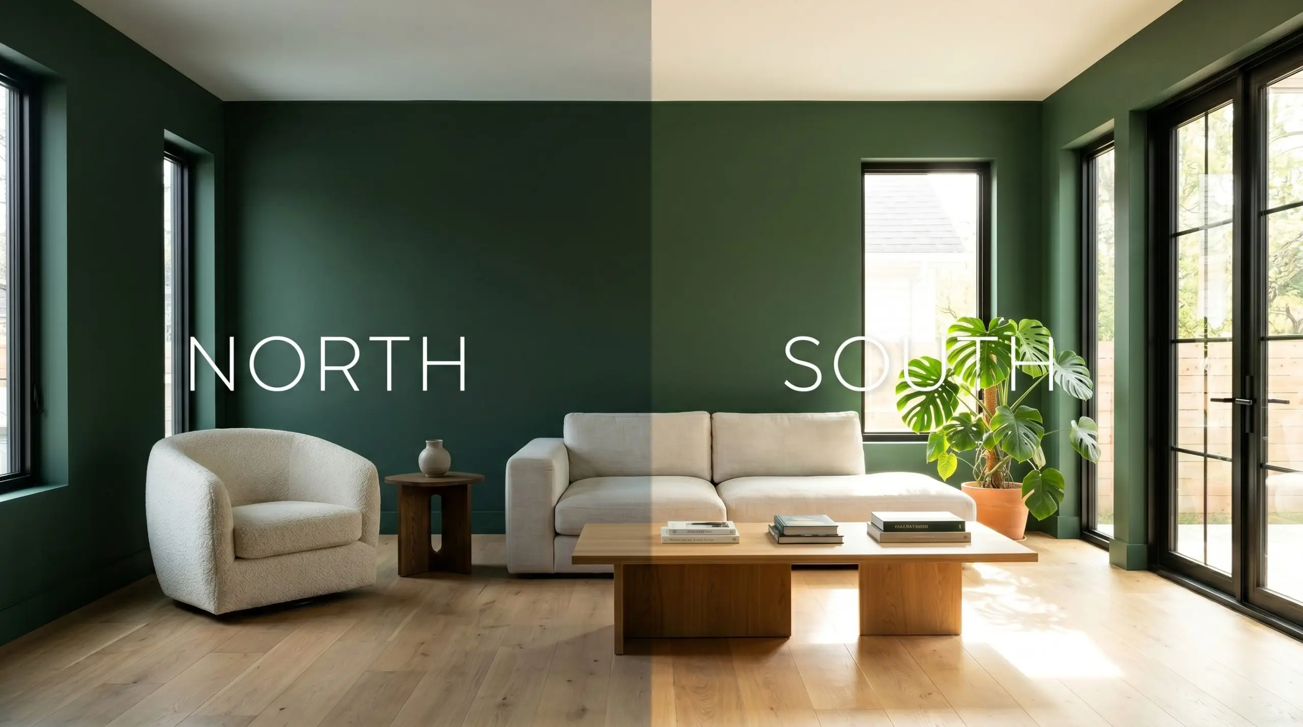
| Best Exposures | South, East, West |
| Best For | Cabinetry, Accent Walls, Exteriors, Powder Rooms |
Benjamin Moore Hunter Green: The Ultimate Guide to Tailored, Immersive Design
Some colors simply coat a wall, while others architecturally redefine the boundaries of a room. Benjamin Moore Hunter Green (2041-10) belongs entirely to the latter category.
When you apply a shade this saturated, you are no longer just choosing a backdrop for your furniture; you are installing a dense, atmospheric material that instantly gives a space gravity and intention. This specific pigment operates like a perfectly tailored suit for your walls, bringing a sharp, sophisticated edge to even the most standard suburban architecture.
Mastering this color requires understanding how its hidden nuances react to the environment around it. We are going to break down exactly how this pigment behaves, how it manipulates light, and how to style it across multiple aesthetics to create a truly curated home.
The Core Identity: Temperature, Undertones & LRV of Hunter Green
Benjamin Moore’s Hunter Green firmly establishes itself on the cool-leaning side of the color spectrum. If you are searching for a warm, muddy olive or a vibrant, tropical leaf tone, this is not your paint.
Its sophisticated, moody profile is built on a very specific foundation:
When we look at its light reflectance value, Hunter Green 2041-10 sits at a strikingly low LRV of 4.31.
This means the architectural finish is a dense light-absorber. It will not bounce illumination around your room to make it feel larger. Instead, it creates a velvet-like void that pulls the walls inward, instantly generating a sense of intimacy, drama, and wrap-around comfort.
When working with an LRV this low, your sheen choice dictates the entire mood. A flat or matte finish will maximize the velvety, light-absorbing qualities for a soft, modern look. Conversely, using a high-gloss or satin finish on trim will bounce the minimal light it catches, highlighting the crisp blue undertones and adding instant architectural tension.
Hackrea Design Secret (The Finish Factor)
How Lighting Shifts the Color Structure
Because of its profound ambient light absorption, Hunter Green 2041-10 is highly reactive to the directional light flowing through your windows. You must anticipate how your specific lighting environment will manipulate its appearance.
Here is exactly how the shade behaves under different lighting conditions:
Designing with Benjamin Moore Hunter Green: Popular Architectural Applications
Understanding the underlying theory of a paint is only the first step; the true magic happens in the application. Because this shade acts as such a strong grounding force, it can completely redefine the atmosphere of a room based entirely on the materials and styling you pair it with.
Here is how to deploy this saturated pigment across various architectural moments in your home.
Libraries and Home Offices
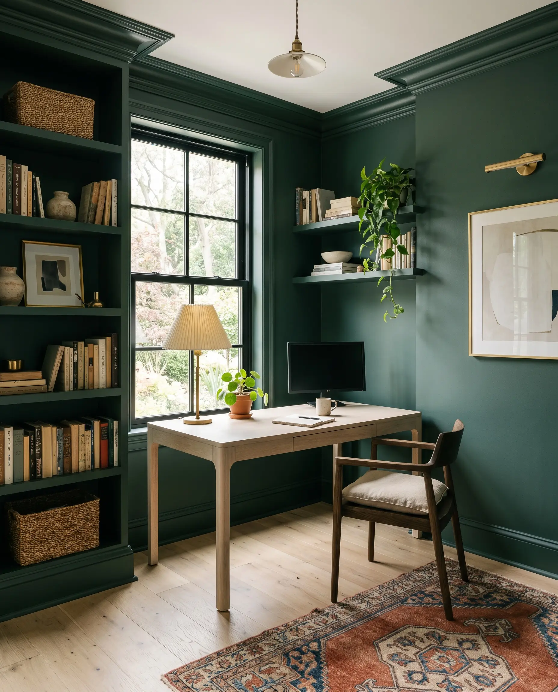
While the functional label of a home office might suggest a standard, utilitarian approach, this dense pigment offers an opportunity to craft a deeply focused, immersive environment. Color drenching—painting the walls, baseboards, crown molding, and built-in bookcases in the exact same finish—erases visual clutter and turns the room into a seamless, calming retreat for the work-from-home professional.
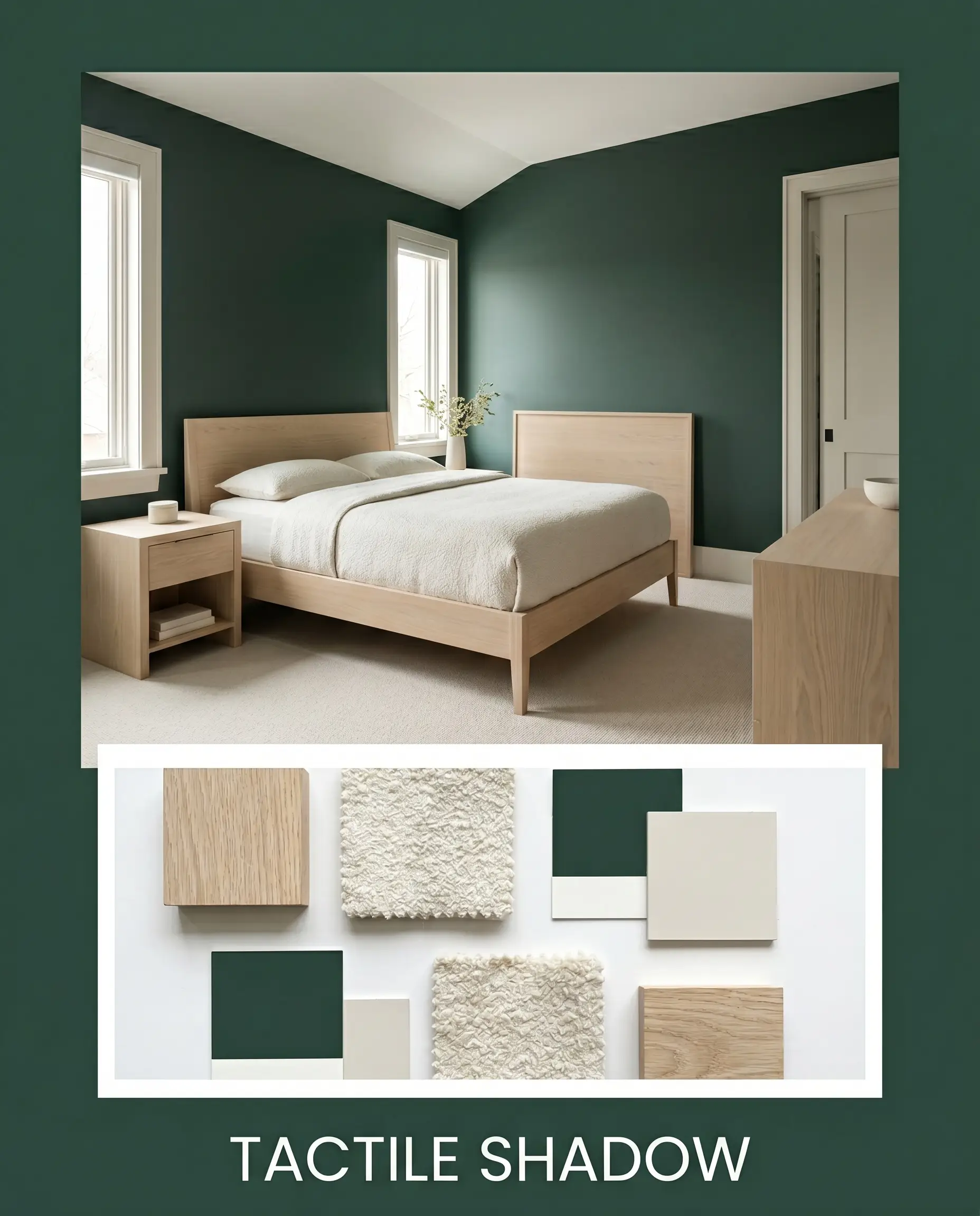
To prevent the space from feeling like a dusty, forgotten parlor, introduce modern organic materials to break up the dark expanse. A sleek, bleached white oak desk and floating shelves provide a striking, airy contrast against the saturated walls. Style the shelves with curated coffee table books, ceramic table lamps with pleated shades, and woven baskets to bring tactile warmth to the cool-leaning foundation.
Powder Rooms
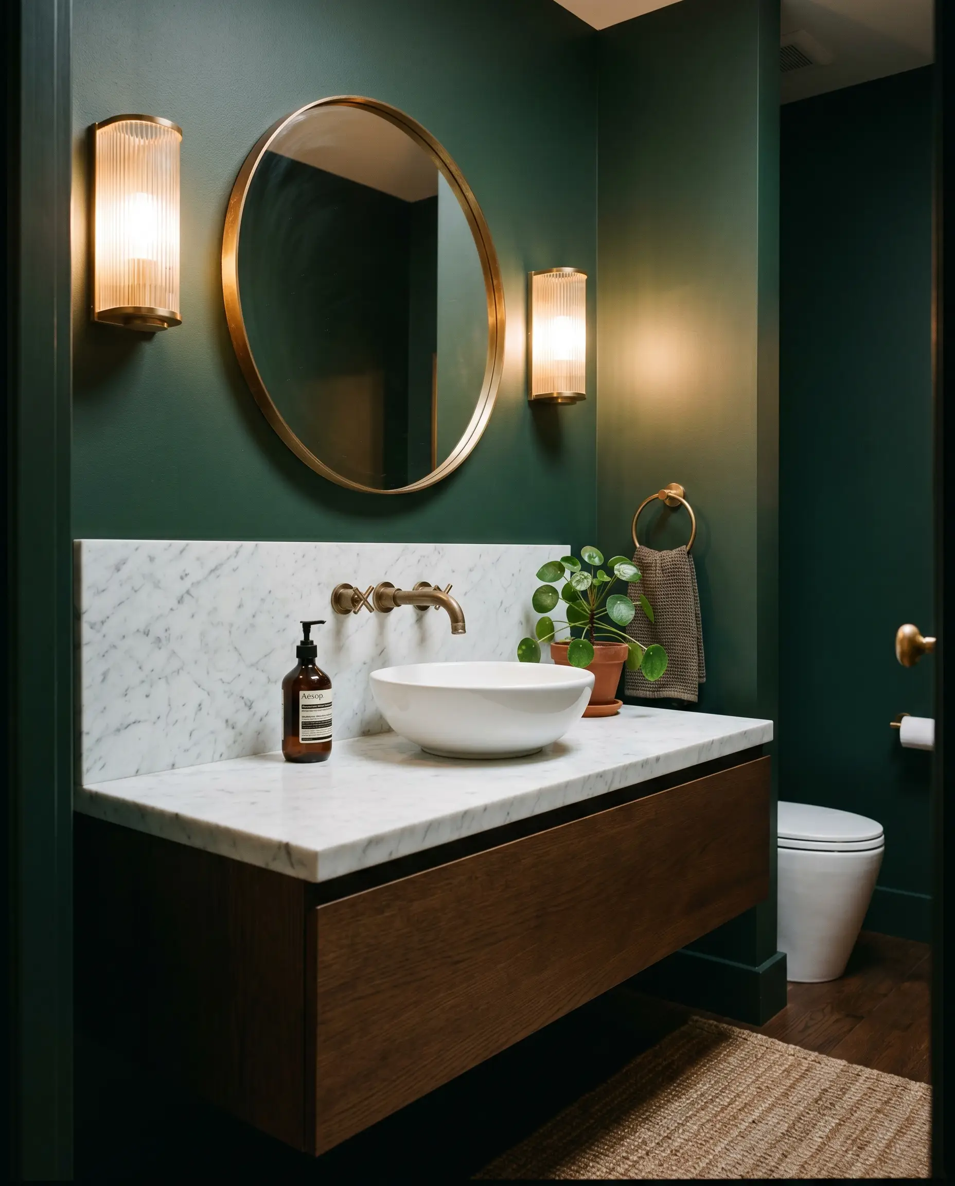
Powder rooms are naturally constrained spaces, making them the perfect architectural canvas for high-drama, jewel-box crispness. Instead of trying to make a windowless bathroom feel larger with pale colors, lean fully into the intimacy by wrapping the entire room in Hunter Green.
Elevate the standard fixtures by pairing the dark walls with a minimalist, floating vanity topped with honed Carrara marble. The stark white stone against the moody green creates a breathtaking, premium contrast. Finish the space with unlacquered brass hardware and reeded glass sconces; the metallic warmth will cut right through the cool blue undertones, establishing a highly curated, contemporary luxury vibe.
Be incredibly cautious when pairing this specific green with existing bathroom tiles that feature warm, pink, or beige undertones (like dated 90s travertine). The cool blue-gray cast of the paint will visually clash with the pinkish stone, making the tile look dirty and the paint look stark. Stick to crisp whites, stark blacks, or neutral gray veining for a flawless integration.
Clash Warning (The Tile Trap)
Kitchen Cabinetry (Islands and Lower Cabinets)
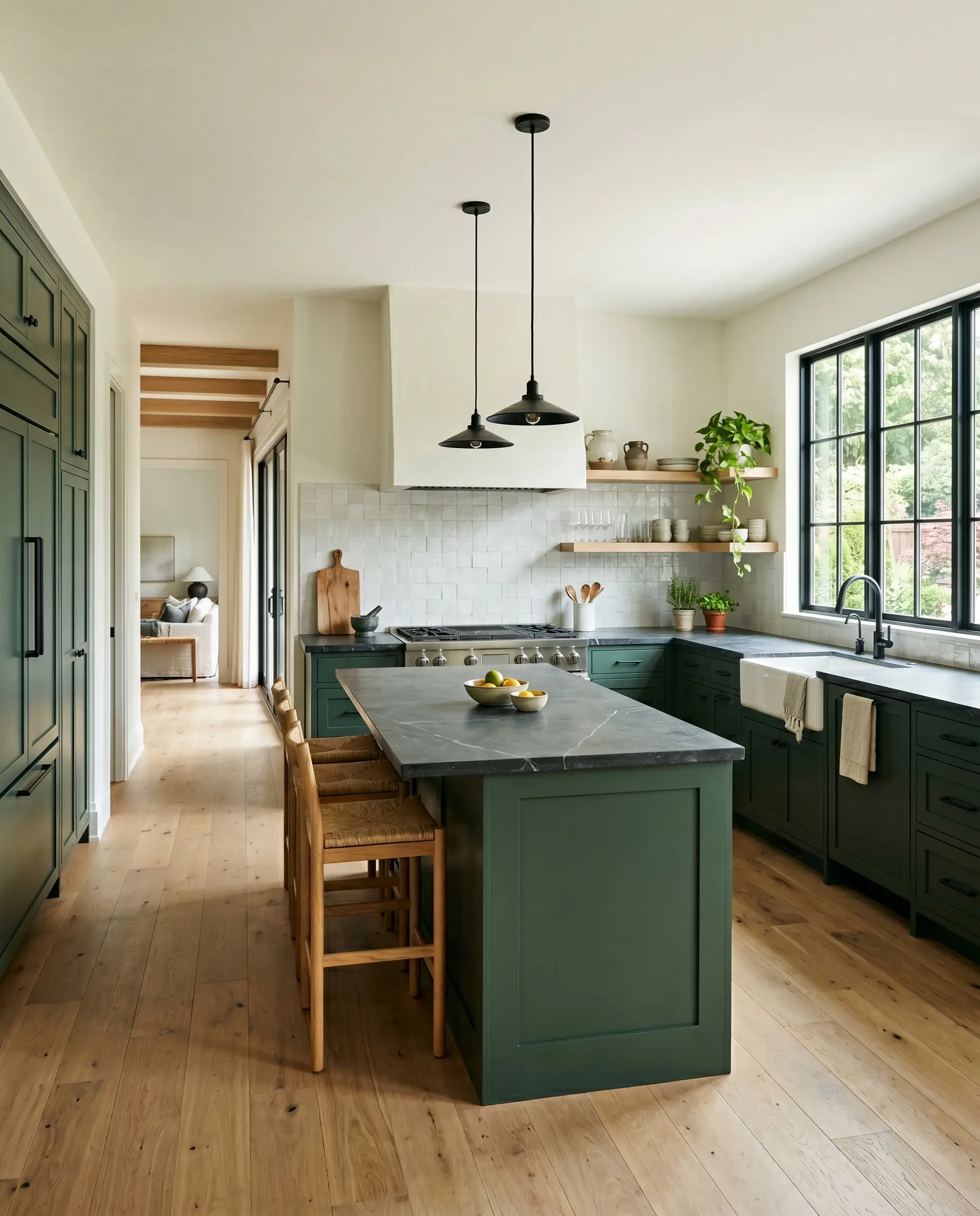
If a fully green kitchen feels too overwhelming for your daily routine, deploying this shade exclusively on lower cabinets or a central island is a brilliant way to stabilize the room. The dark pigment grounds the cabinetry, allowing upper walls painted in a warm, creamy white to soar, making the ceiling feel significantly higher.
This application thrives in transitional design schemes where classic and modern elements intersect. Pair the green base with matte black iron hardware or polished nickel cup pulls for a tailored, utilitarian edge. To soften the contrast, install a textured zellige tile backsplash and top the island with durable, matte soapstone—the organic imperfections in the tile and stone will beautifully offset the sharp, tailored nature of the paint.
Exterior Front Doors and Shutters
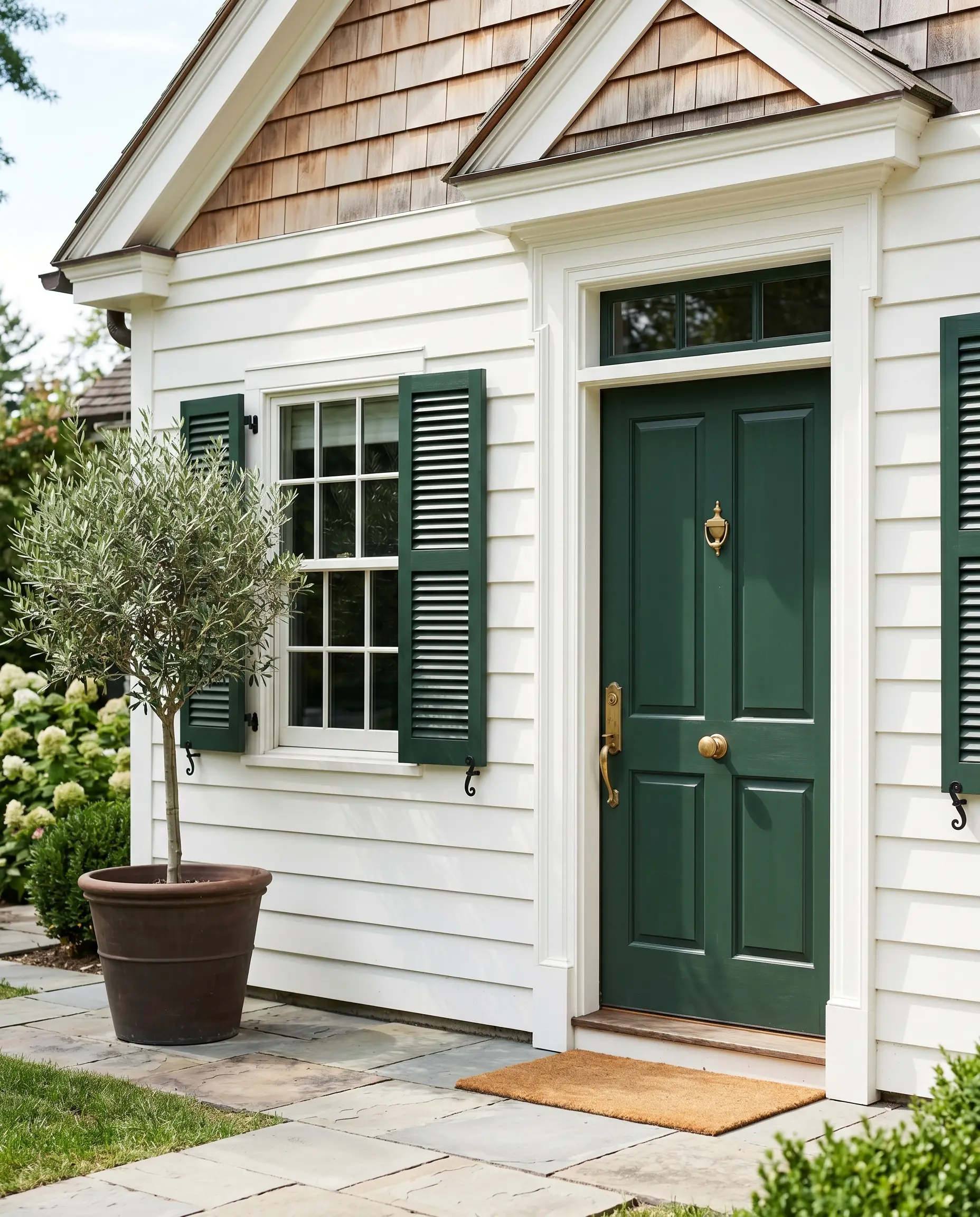
On an exterior facade, Hunter Green acts as a timeless, defining accent that instantly boosts curb appeal without resorting to overly trendy hues. It provides a sharp, sophisticated contrast against warm white siding, natural cedar shingles, or classic red brick homes.
When applying it outdoors, the natural sunlight will wash out some of the darkness, allowing the truest forest green to shine through. Always opt for a high-quality exterior satin or semi-gloss finish for doors and shutters; the slight sheen not only protects the wood from the elements but also catches the sunlight, highlighting the subtle teal micro-nuance that makes this color so distinctive.
Formal Dining Rooms (Above Wainscoting)
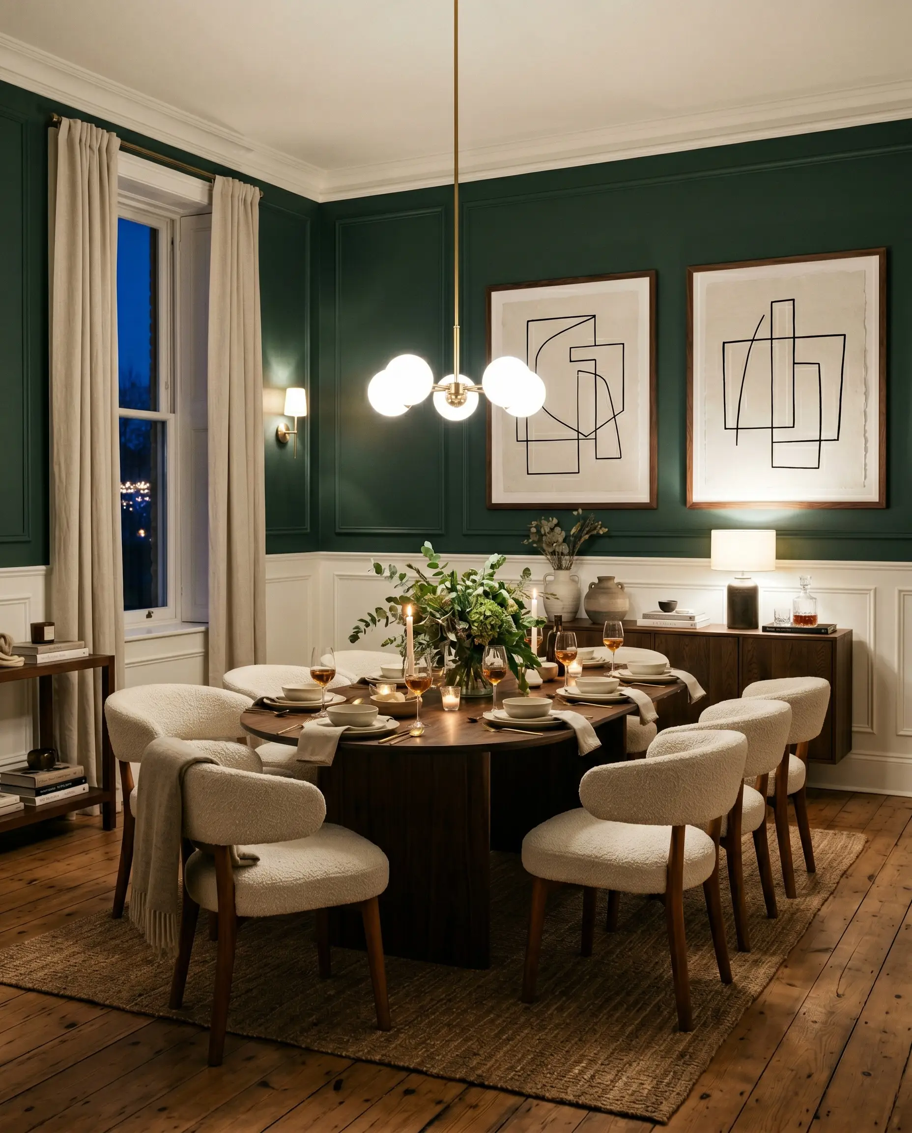
For evening entertainers looking to spark conversation, splitting the wall with architectural molding is a highly effective strategy. Keep the lower wainscoting or board-and-batten painted in a crisp, clean white, and apply the saturated green exclusively to the upper half of the walls.
This technique honors the traditional roots of the color while allowing you to push the furnishings into a much more modern territory. Anchor the room with a minimalist pedestal dining table surrounded by curved, nubby bouclé chairs to introduce a soft, tactile contrast. Hang oversized, abstract line art on the dark green upper walls to create intentional design tension, proving that this classic shade can effortlessly support a crisp, contemporary aesthetic.
Curating the Perfect Palette for Benjamin Moore Hunter Green
This saturated shade does not play well with indecision; it demands highly intentional relationships with the materials around it. To truly succeed, this pigment requires either razor-sharp boundaries to hold its tailored shape or soft, muted tonal bleeds to create a serene, enveloping atmosphere.
Tailored Architectural Boundaries
When you place a dark, cool-leaning foundation on the wall, your trim acts as the vital architectural framing. Benjamin Moore Chantilly Lace OC-65 provides a stark, icy contrast that emphasizes the jewel-box crispness of the green.
For a slightly softer boundary that still maintains a clean edge, Farrow & Ball All White No. 2005 offers a pure, pigment-free glow that prevents the transition from feeling too abrupt. If you need a brilliant, modern flash of light, Sherwin-Williams High Reflective White SW 7757 bounces maximum illumination right back into the room.
Tactile Elements and Finishes
Harmonizing Paint Combinations
Curated Design Aesthetics
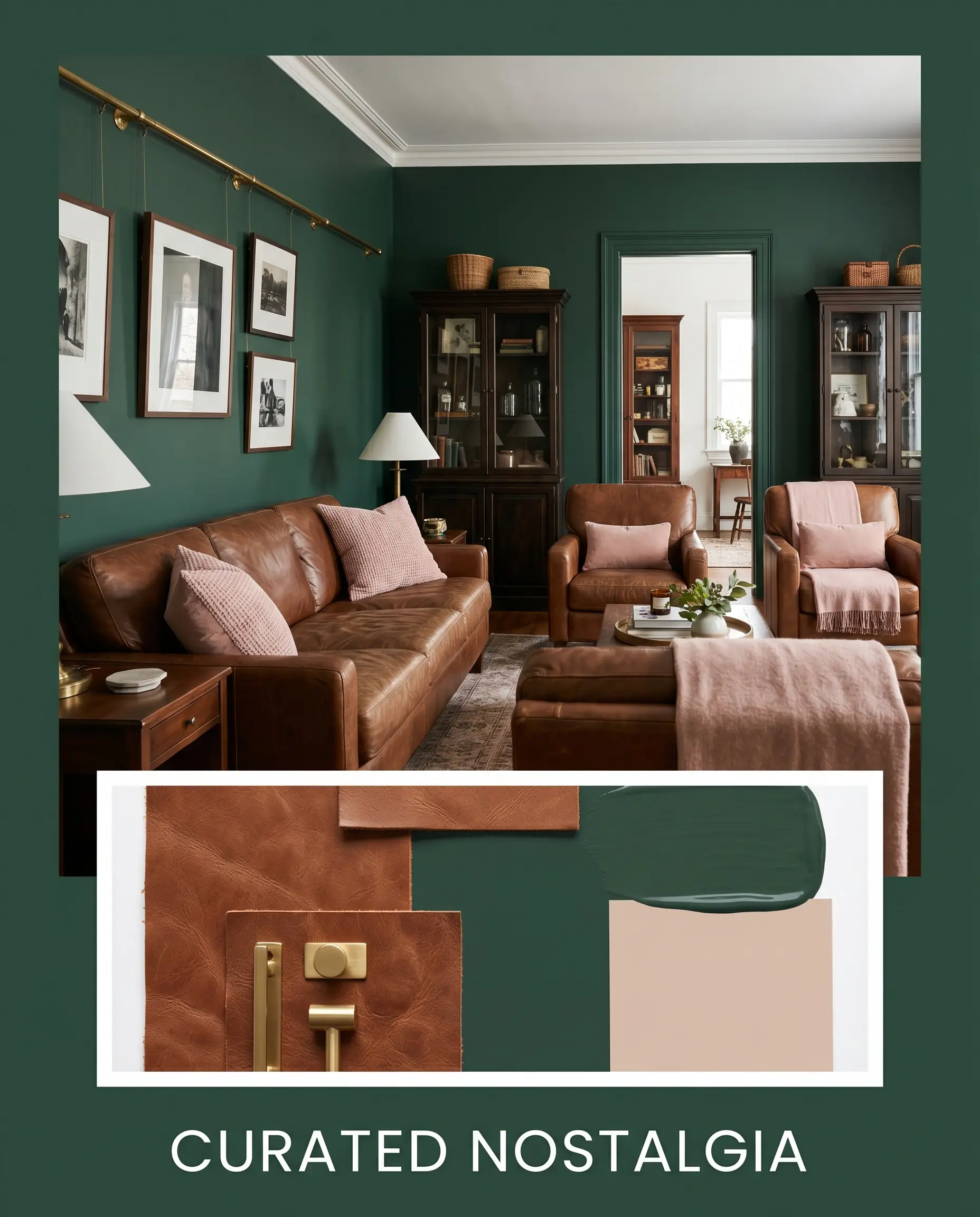
Curated Nostalgia: This aesthetic relies on the beautiful tension between dark walls and warm, earthy accents. Picture the saturated green foundation stabilized by rich saddle leather seating and soft, dusty pink accents painted in Setting Plaster No. 231. Finish the look with unlacquered brass gallery rails and vintage apothecary cabinets to create an atmosphere that feels both historically rooted and effortlessly current.
Tactile Shadow: For a more contemporary, sleek environment, this palette leans heavily into modern organic minimalism. The deep green walls are softened by the introduction of bleached white oak furniture and airy bouclé textiles. By keeping the surrounding accents painted in the gentle warmth of Pale Oak OC-20, the dark pigment feels incredibly grounding and restorative rather than formal.
Benjamin Moore Hunter Green Head-to-Head Comparisons
Sometimes your specific lighting conditions or exterior exposures require a slight pivot to achieve the perfect result. If your space lacks natural light or features warm-toned fixed elements, you might need a shade with a slightly different foundational structure to prevent the room from feeling disjointed.
Benjamin Moore Hunter Green vs. Sherwin-Williams Dard Hunter Green SW 0041
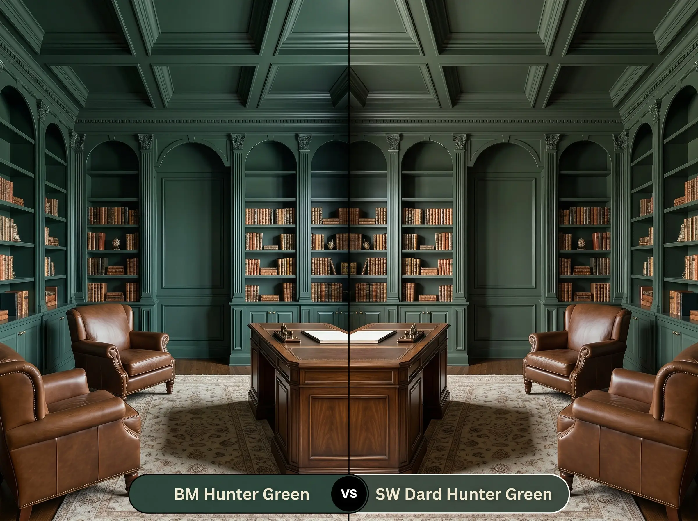
Dard Hunter Green leans significantly warmer and carries a distinctly yellowish, olive-toned base. If your room receives icy northern light, the Sherwin-Williams option will resist turning blue and maintain a traditional forest feel. However, if you want a sharp, modern edge, the Benjamin Moore pigment remains the superior choice.
Benjamin Moore Hunter Green vs. Sherwin-Williams Hunt Club SW 6468
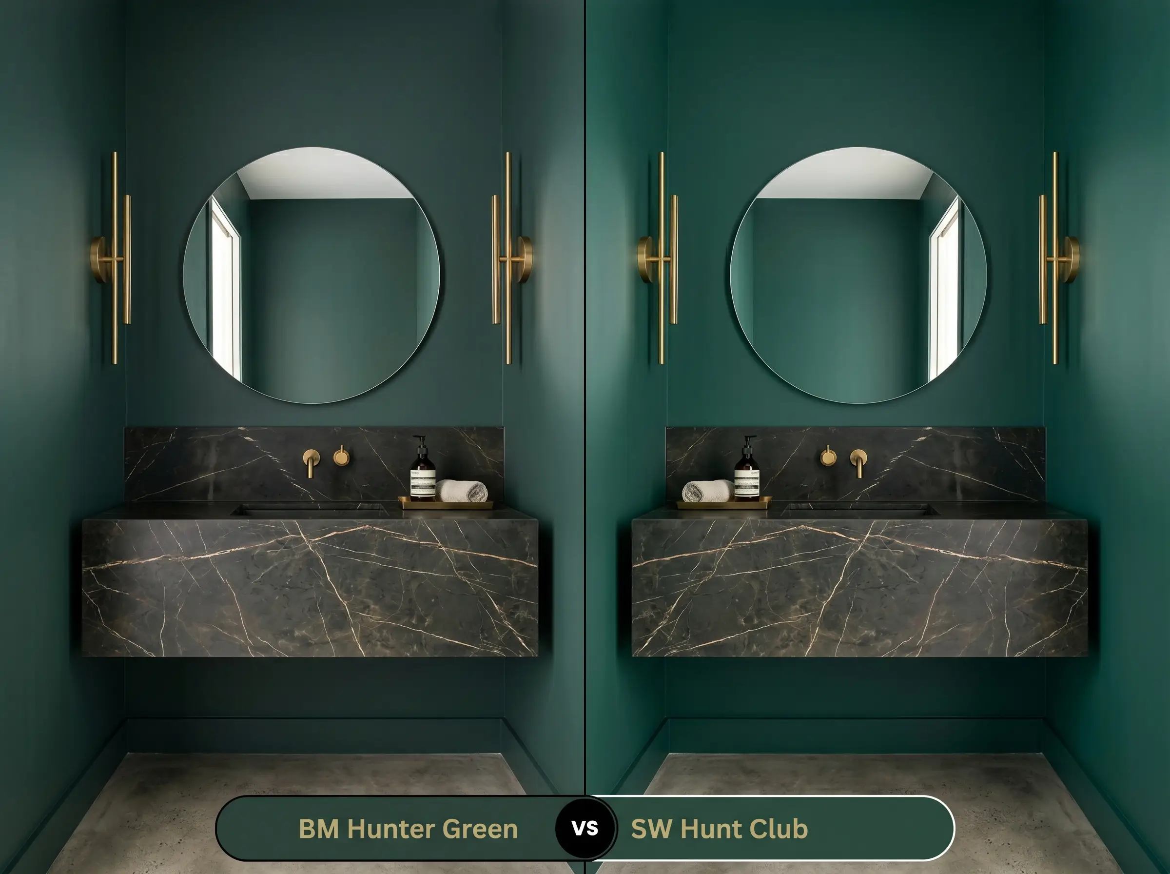
Hunt Club pushes much further into a vibrant, emerald-teal territory. While both shades share a cool foundation, the Sherwin-Williams alternative reflects noticeably more light and feels highly energetic. Choose Hunt Club for a playful, dynamic pop of color, but stick to 2041-10 for a grounded, serious architectural finish.
Benjamin Moore Hunter Green vs. Benjamin Moore Essex Green HC-188
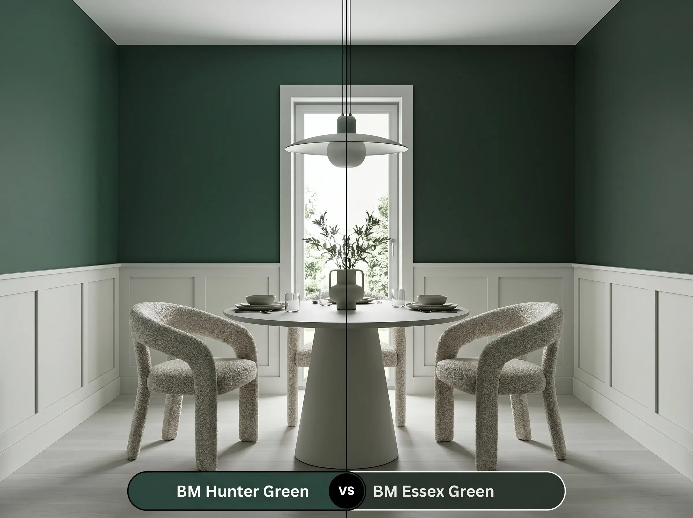
Essex Green is a step darker, edging incredibly close to a pure, black-green void. If you are color-drenching a high-gloss space and want maximum dramatic depth, HC-188 delivers an almost bottomless finish. Yet, if you need the green tones to remain visible in standard lighting, the slightly higher reflectance of Hunter Green makes it much more reliable.
Exploring Alternatives to This Saturated Hue
Even when a color feels almost perfect, a specific room might demand just a touch more warmth or a slightly crisper finish. Here are the closest alternatives to help you fine-tune your final selection.
Same-Brand Variations
Rival Brand Equivalents
Executing the Finish on the Wall
Transitioning this intense pigment from a sample swatch to a flawless architectural feature requires strict attention to your application strategy. Dark, light-absorbing colors highlight surface imperfections, meaning your preparation and finish choices are just as critical as the paint itself.
Selecting the Right Finish
A deeply saturated shade like this requires a tinted primer—specifically a deep gray base—to ensure the true color develops correctly. Without a tinted primer, you will easily find yourself painting three or four coats just to eliminate visible roller streaks.
Hackrea Pro-Tip (The Tinted Base Strategy)
Primer Strategy and Professional Coverage
Even with perfect preparation and a deep gray primer, plan for two full, generous coats to achieve that seamless, wrap-around comfort. Rolling a dark color requires maintaining a “wet edge” at all times. If you let a section dry before overlapping your roller, you risk “flashing,” where uneven streaks become permanently visible in the final finish.
Frequently Asked Questions
Because of its low light reflectance, this pigment will absolutely read as a soft, moody black-green in spaces without natural light. Instead of fighting this characteristic, lean into the dramatic depth by adding warm metallic lighting fixtures to create a stunning, intimate atmosphere.
This shade provides a softer, more organic contrast on brick than a stark black, preventing the facade from looking too severe. However, like all deeply saturated exterior paints, it will absorb significant heat and may fade slightly faster in direct, intense sunlight.
The most effective strategy to prevent a top-heavy feel is to ground the lower cabinets or a central island with this dark pigment while keeping the upper cabinetry and walls a crisp white. This stabilizes the room beautifully while allowing the upper half of the space to feel airy and open.
Dark, matte finishes are notorious for showing scuffs and chalky fingerprints in busy areas. To protect your walls while maintaining a sophisticated look, opt for a washable matte or a low-lustre eggshell finish specifically formulated for high-traffic durability.
The Final Verdict on This Saturated Pigment
Benjamin Moore Hunter Green 2041-10 is an incredibly powerful design tool for anyone looking to inject instant architectural gravity into a standard space. It excels brilliantly in transitional and modern organic environments where its cool, tailored edge can be softened by natural woods and warm metals. This paint is perfect for the homeowner who embraces moody atmospheres and wants to create a space that feels highly curated, intentional, and immersive.
However, this bold pigment demands absolute harmony with its surroundings. If your home features predominantly warm, earthy fixed elements like Tuscan-style travertine floors, orange-toned oak trim, or yellowed countertops, this cool-leaning green will visually conflict with those finishes. The resulting friction will make the warm stones look muddy and force the paint to appear stark and uninviting. To succeed, you must commit to pairing it with crisp whites, cool-toned stones, or deeply neutral woods to maintain its sophisticated elegance.