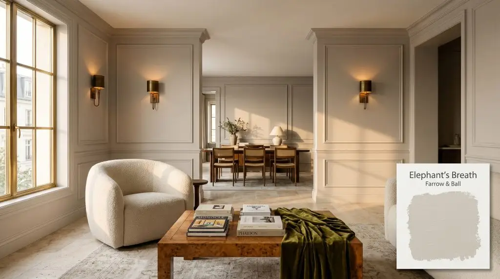
Elephant's Breath 229
Farrow & BallFarrow & Ball's Elephant's Breath (No. 229) is a warm, contemporary mid-grey renowned for its earthy depth and subtle magenta undertones. Depending on the lighting, it can read as a grounded greige or shift toward a soft lilac in cooler exposures.
Paint Technical Profile
| Color ID / SKU | 229 |
| HEX Code | #c7beb3 |
| Light Reflectance (LRV) | 53.62 |
| Use | Interior, Exterior |
| Best Exposures | South, East |
| Best For | Living areas, cabinetry, transitional spaces |
Farrow & Ball Elephant’s Breath: The Earthy Mid-Grey with a Hidden Edge
Originally created by the legendary John Fowler, this iconic color has spent decades quietly defining some of the most sophisticated interiors in the world. Yet, Farrow & Ball’s Elephant’s Breath is far from a stagnant historical relic. When paired with the right materials, this complex shade sheds its traditional expectations and becomes the ultimate foundational layer for modern, tactile living spaces.
What makes this specific mid-grey so captivating is its refusal to lay flat against a wall. Unlike standard neutrals that simply fade into the background, this color actively responds to the environment around it. It shifts, warms, and cools depending on the sunlight pouring through your windows and the fabrics draped across your furniture.
This dynamic personality is exactly why it remains a staple among contemporary neutrals. It offers the comforting warmth of an earthy scheme while maintaining enough crispness to feel incredibly tailored. If you are looking for a shade that feels substantial without overwhelming the room, understanding how this color physically behaves in your home is your first crucial step.
Elephant’s Breath Undertones & LRV
When evaluating Farrow & Ball’s Elephant’s Breath, the most immediate question is always whether this paint leans warm or cool. This is definitively a warm color. However, that warmth is entirely dependent on a highly specific chromatic profile that requires careful handling.
To successfully integrate this shade into your home, you must understand exactly how its color structure is built:
With a Light Reflectance Value (LRV) of 53.62, this architectural finish sits perfectly in the mid-tone range. It absorbs enough light to make a room feel beautifully established and immersive. Yet, it still reflects just enough illumination to prevent the space from feeling visually compressed or overly shadowed.
Before committing to this shade, place your fabric swatches directly against your painted sample. Yellow-based linens or stark white cottons will instantly amplify the purple notes. To keep the room feeling earthy, pair it with muted terracottas, deep olives, or unbleached hemp.
Hackrea Pro-Tip (The Fabric Test)
The Chameleon Factor: Lighting Elephant’s Breath
The true magic—and the biggest challenge—of this specific paint lies in how it manipulates shifting sunlight. Because of its complex magenta base, the color you see at breakfast will rarely be the exact color you see at dinner.
Here is exactly how this shade behaves under different lighting conditions:
Never evaluate your test swatches using only your home’s overhead lighting. You must observe the paint on multiple walls throughout the day. If your room is heavily shaded by exterior trees, expect the purple undertones to dominate the aesthetic.
Clash Warning (The Lighting Trap)
Popular Applications for Farrow & Ball’s Iconic Greige
Because this shade sits so beautifully on the greige spectrum, it offers incredible versatility across entirely different architectural zones. However, success depends entirely on how you manipulate its surrounding elements. By intentionally selecting your textiles, hard finishes, and lighting fixtures, you can steer this color toward your desired aesthetic.
Living Rooms
In a primary living space, this color excels at creating an atmosphere that feels both relaxed and highly tailored. To lean into a Parisian Chic aesthetic, apply the paint across the walls, deep baseboards, and intricate picture molding for a seamless, tonal look. Pair this application with a curved bouclé armchair and a vintage burl wood coffee table to add necessary visual friction.
If your home leans more toward Organic Modernism, use the paint’s earthy base to your advantage. Contrast the warm walls with a slipcovered sofa in worsted wool and layer a textural jute rug over wide-plank white oak floors. The natural fibers will harmonize with the mushroom notes, keeping the room feeling incredibly grounded and inviting for a busy household.
To prevent the space from feeling too soft or muted, you must introduce sharper elements. Incorporate accents of blackened steel or dark bronze through minimalist wall sconces or slender curtain rods. These darker touches provide a necessary visual boundary, ensuring the mid-grey walls retain their sophisticated edge.
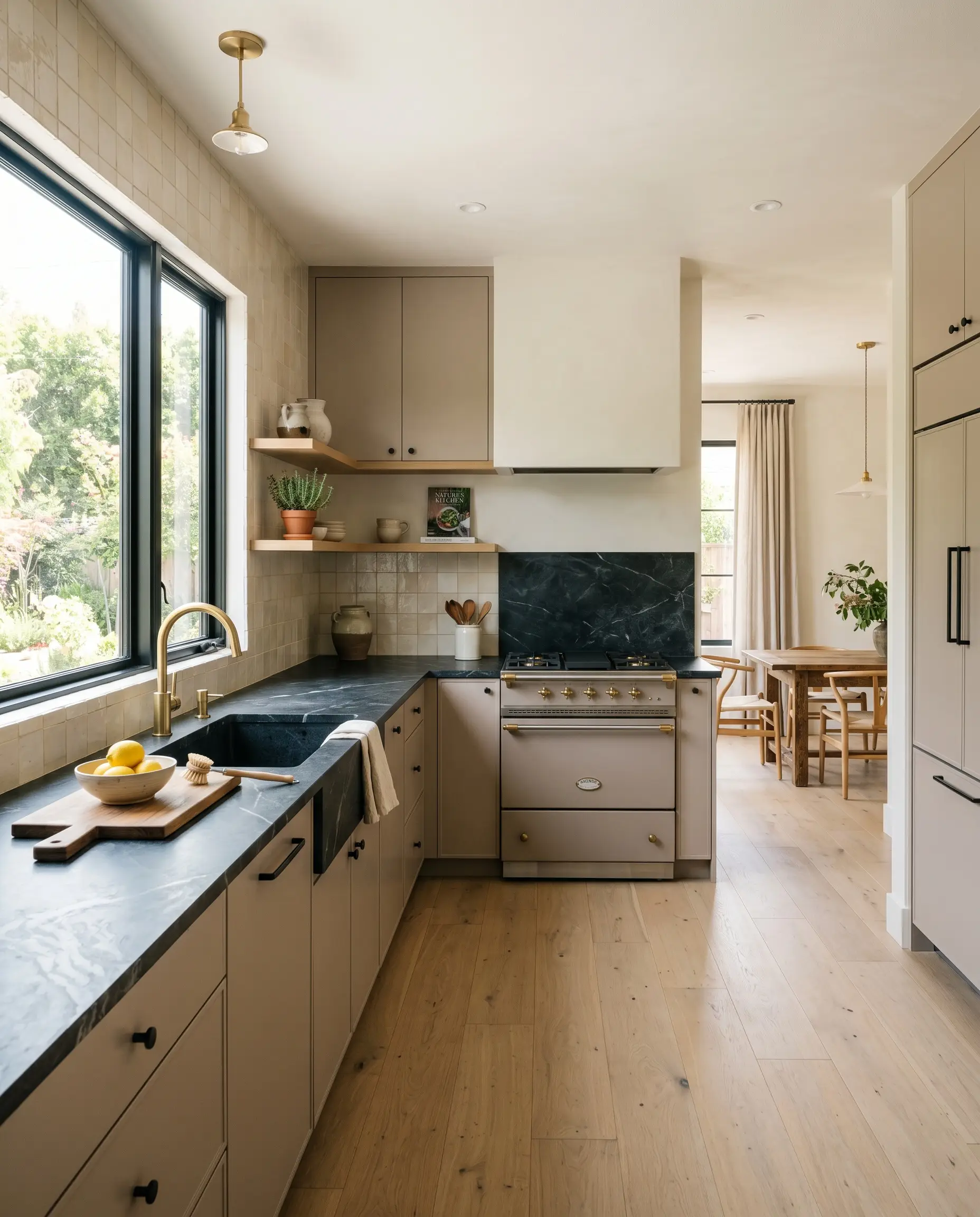
Kitchen Cabinetry
Applying this complex shade to kitchen cabinetry instantly elevates the room beyond standard white or trendy blue kitchens. For a sleek, Transitional aesthetic, paint flat-panel doors in this shade and pair them with heavily veined soapstone countertops. The organic movement in the dark stone beautifully offsets the softness of the painted wood.
If you prefer a Heritage English feel, use this color on traditional shaker cabinets and a plaster range hood. Elevate the installation by introducing unlacquered brass hardware and an oxidized copper pendant light. As the brass develops a natural patina over time, it will draw out the warmest, most inviting qualities of the cabinet color.
When using this color on cabinetry, be incredibly careful with your backsplash selection. Avoid stark, cool-toned white subway tiles, which will instantly make the cabinets look dirty or overly purple. Instead, opt for a warm, creamy zellige tile or carry a honed travertine slab up the wall.
Hackrea Design Secret (The Backsplash Rule)
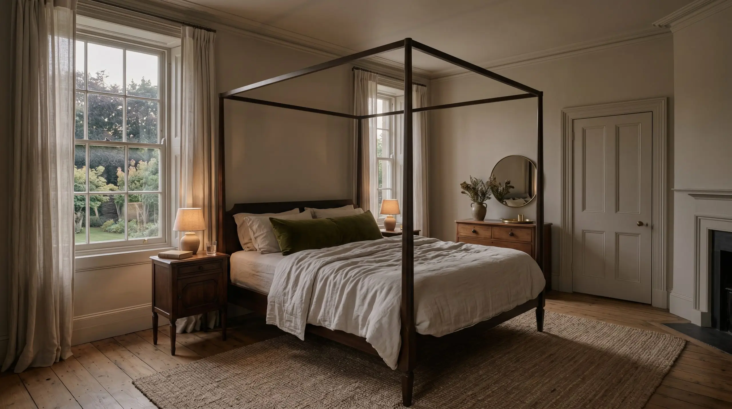
Primary Bedrooms
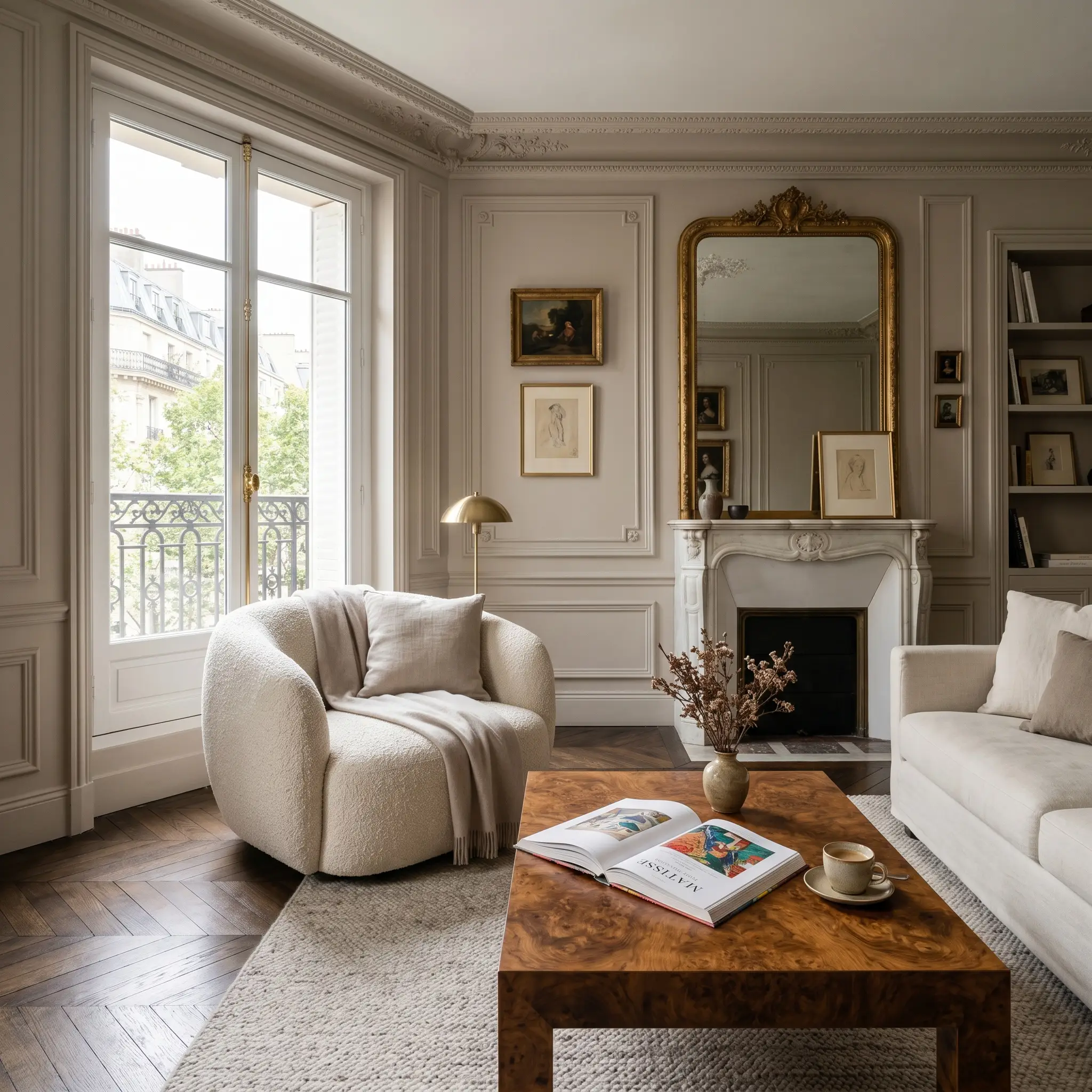
A bedroom requires an atmosphere of restful permanence, and this mid-tone shade delivers exactly that. To create a Boutique Hotel experience, consider color-drenching the room—painting the walls, ceiling, and trim in the exact same finish. This technique blurs the architectural boundaries, wrapping the room in a continuous, soothing embrace that is perfect for winding down.
To style this immersive application, focus heavily on tactile layering. Dress a four-poster bed in washed linen sheets and a heavy silk velvet lumbar pillow in deep olive. The rich green tones will effortlessly neutralize any unwanted purple shifts, keeping the room feeling organic and serene.
For a slightly more structured look, install tongue-and-groove paneling halfway up the wall and paint it in this rich shade. Leave the upper walls a soft, warm parchment color to draw the eye upward. Finish the space with floating walnut nightstands and brass picture lights to add a touch of refined warmth.
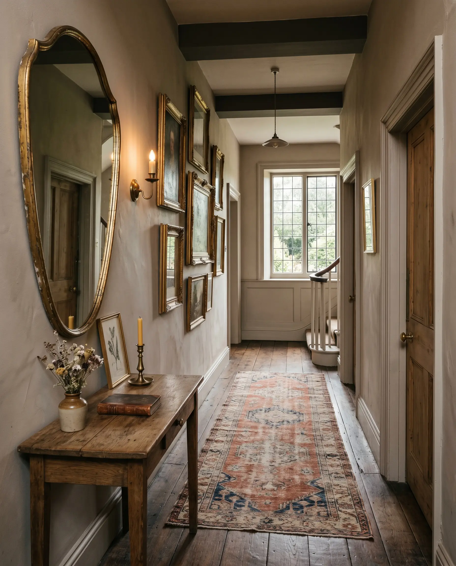
Transitional Hallways
Hallways are often treated as architectural afterthoughts, but they offer the perfect canvas for this dynamic color. Because these spaces typically lack abundant natural light, the paint will often reveal its moodier, lilac-tinged personality. Embrace this shift by treating the hallway as a curated gallery space.
Install an oversized, asymmetrical mirror or a series of antique gilt frames along the wall. The metallic finishes will beautifully reflect whatever light is available, adding a necessary spark to the enclosed space. Pair the painted walls with a distressed vintage runner in muted terracottas and faded blues to give the corridor a sense of history and purpose.
If your hallway features beautiful paneled doors, consider painting the doors in a charcoal black while keeping the walls in this earthy mid-grey. This high-contrast approach creates a stunning visual rhythm as you move through the home, turning a simple transition area into a memorable design moment.
Coordinating Colors & Best Pairings for Elephant’s Breath
Because this specific pigment carries such a complex internal structure, it refuses to act as a passive backdrop. It demands intentional relationships, thriving best when surrounded by materials that either pull out its grounding warmth or softly bleed into its cooler, shadowed edges.
Curated Trim & Baseboards
Selecting the right trim color dictates exactly how this shade will behave within your architecture. If you want to create a crisp, highly tailored boundary that forces the wall color to look deeper, pair it with Benjamin Moore Chantilly Lace OC-65. This stark, clean white frames the greige beautifully, giving the room a sharp, defined outline.
For a softer, more traditional transition, Sherwin-Williams Pure White SW 7005 offers just enough warmth to prevent the trim from feeling jarring. However, the most sophisticated application comes from tonal layering. By using Farrow & Ball Strong White No.2001 on your baseboards and crown molding, you allow the walls and trim to melt together, creating a seamless, atmospheric glow that feels incredibly intentional.
Hardware, Wood & Material Pairings
To truly elevate this mid-grey, you must introduce tactile elements that interact with its shifting light reflectance. Honed travertine is an exceptional grounding material for this paint. The matte, porous surface of the stone absorbs light, pulling out the earthy mushroom notes of the paint while suppressing any unwanted purple shifts.
To introduce a necessary spark of illumination, incorporate unlacquered brass hardware across your cabinetry or doors. As the brass catches the light, it bounces a golden warmth directly onto the painted surface, actively fighting the cooler shadows that develop in the late afternoon.
For textiles, drape your upholstery in deep, worsted wool. The dense, matte nature of the wool anchors the lightness of the walls, creating a comforting, immersive environment. Finally, introduce moments of visual friction by incorporating dramatically veined Calacatta marble on a coffee table or fireplace surround, allowing the crisp grey veining to converse directly with the wall color.
Harmonizing Color Palettes
Designer Mood Boards
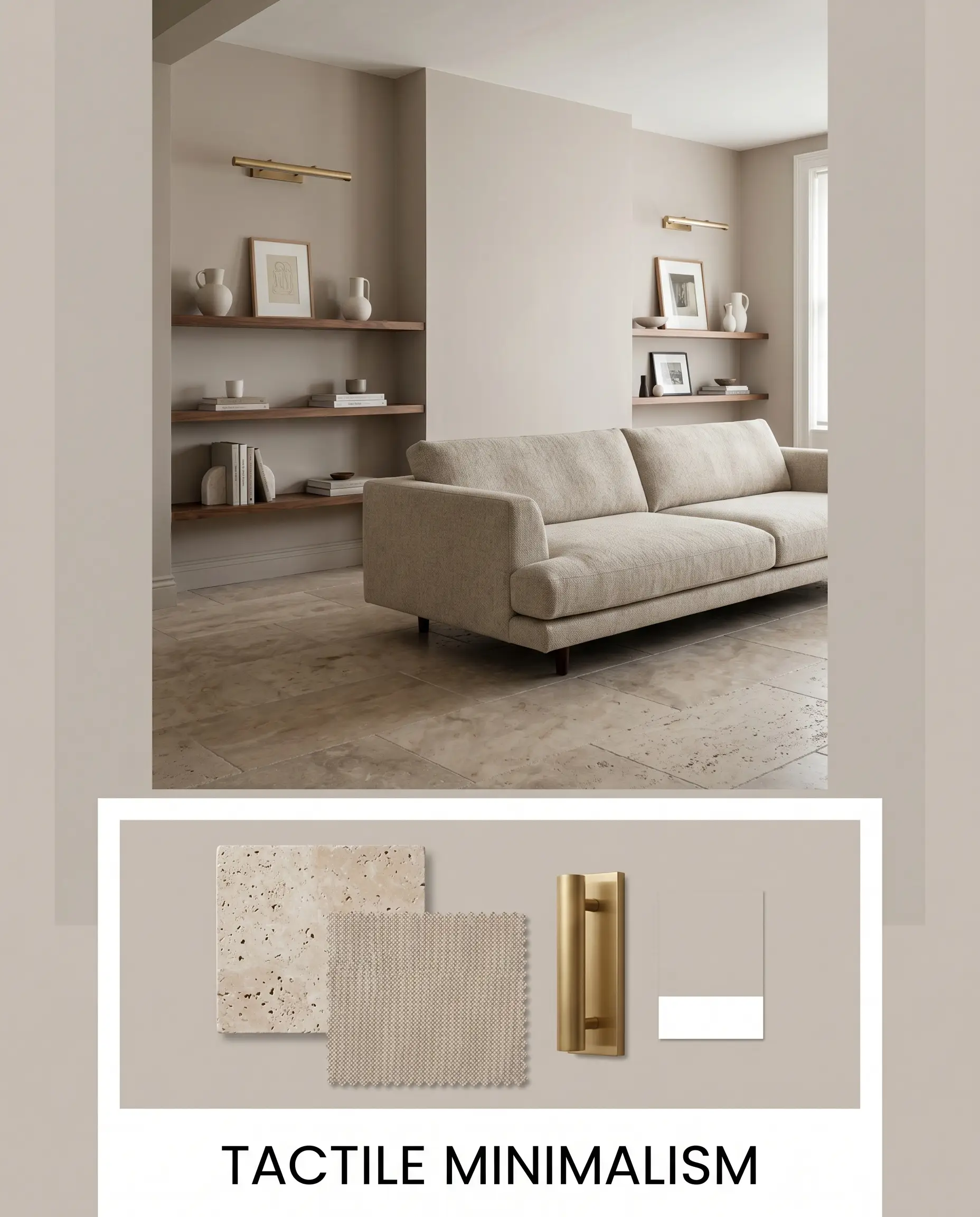
Tactile Minimalism This aesthetic relies entirely on the tension between soft, earthy warmth and strict, clean lines. Anchor the room with a large expanse of honed travertine flooring, allowing its natural porosity to ground the shifting mid-grey walls. Introduce a low-profile sofa upholstered in dense worsted wool to absorb the natural light and create a sense of quiet permanence. Finish the styling with unlacquered brass picture lights and floating walnut shelves, ensuring the room feels warm, curated, and effortlessly precise.
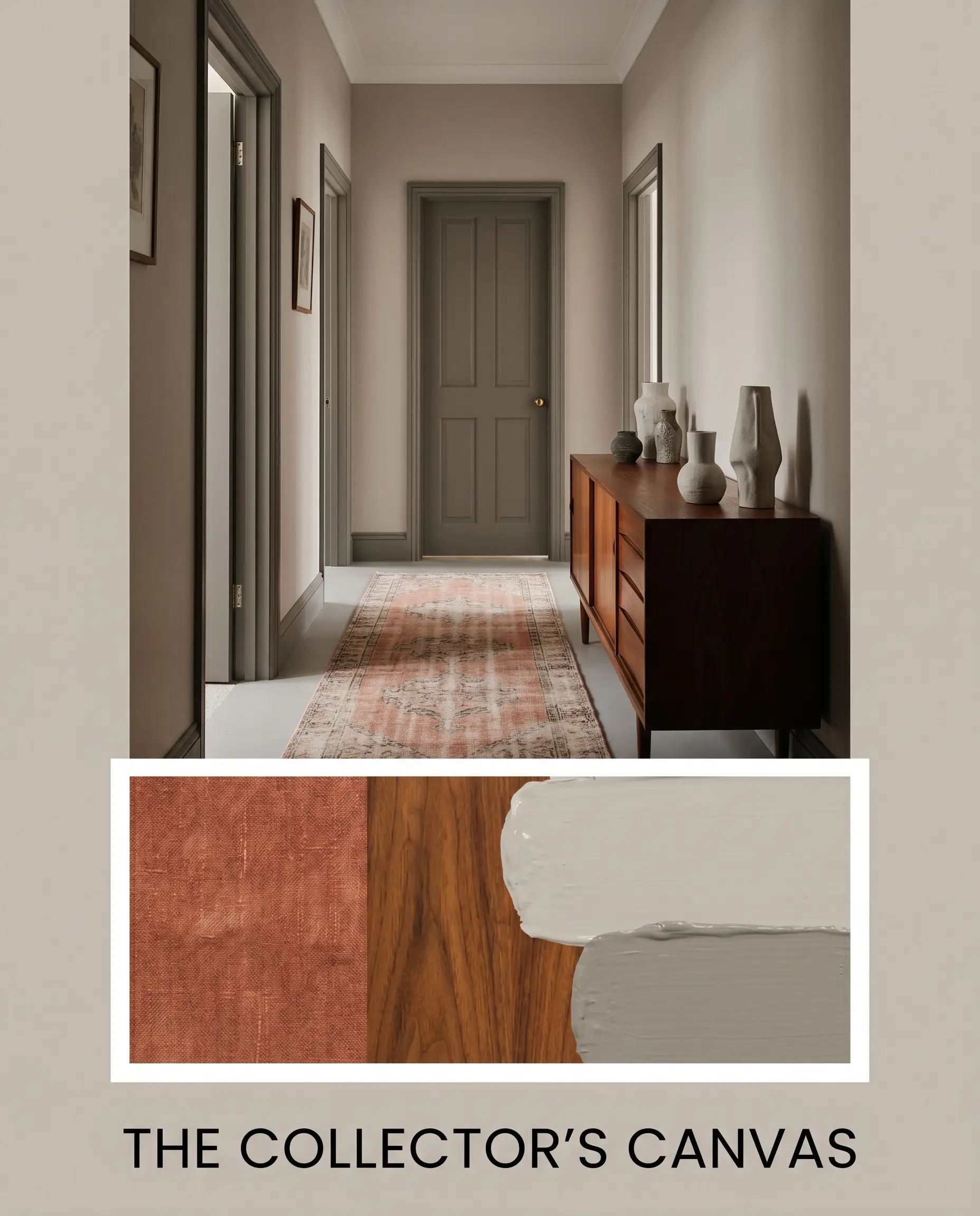
The Collector’s Canvas Designed for the homeowner who appreciates layered history, this palette uses color to create a moody, enveloping backdrop. Paint your interior doors in the rich, stabilizing tones of Charleston Gray to give the architecture a sense of weight and purpose. Layer the floor with a distressed vintage runner in faded terracottas, and introduce a vintage mid-century credenza to bring organic wood grain into the sightline. The resulting atmosphere is deeply collected, allowing sculptural vases and stacked vintage art to command attention without fighting the wall color.
Comparative Color Theory: Making the Right Choice
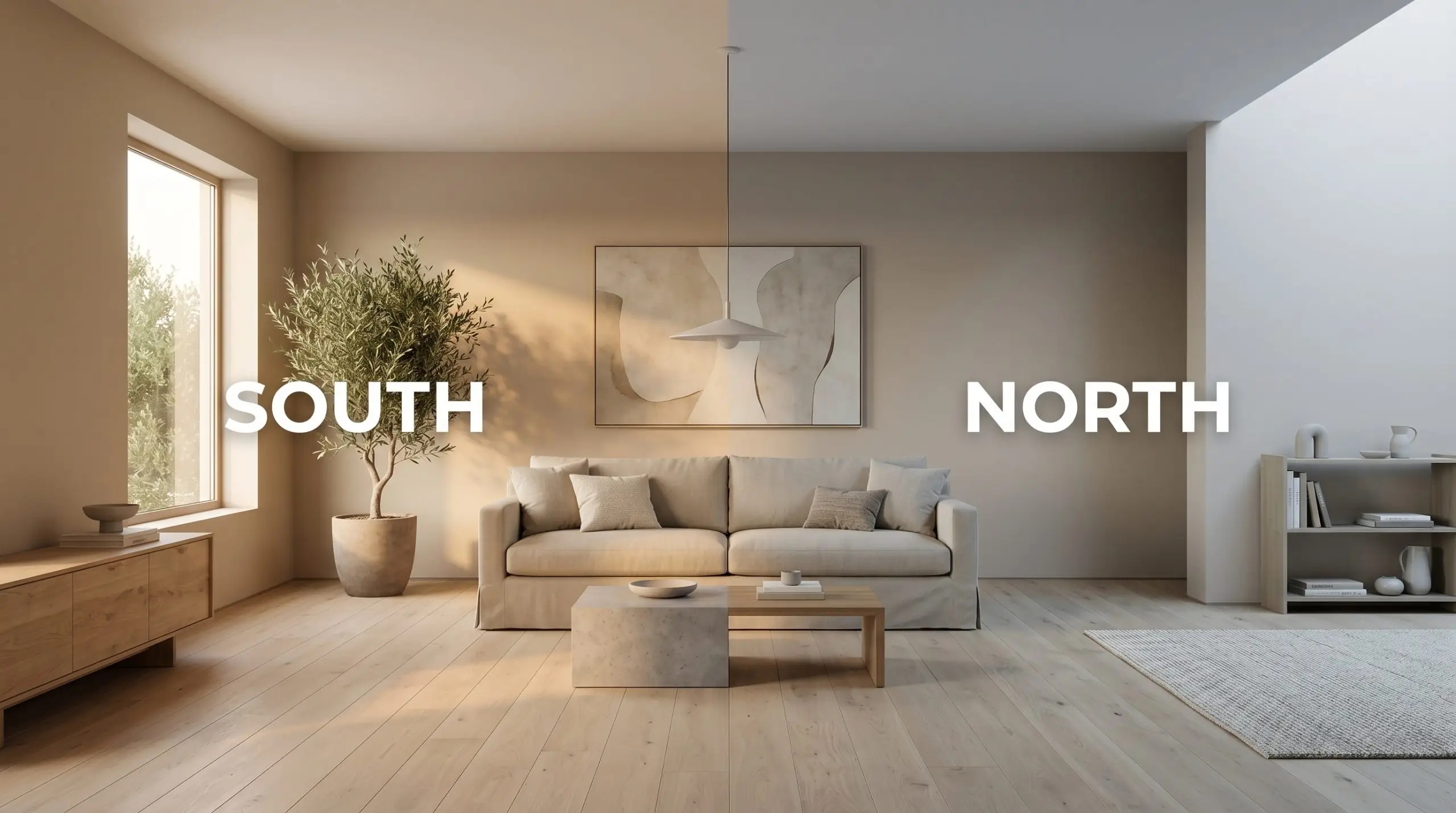
Sometimes, a paint’s specific undertone behavior will clash with your home’s fixed elements or lighting exposures. If your room receives entirely cool, north-facing light, the magenta base of this shade might push too far into purple territory for your comfort. When this happens, understanding how rival paints manage light is the key to making a confident pivot.
Farrow & Ball Elephant’s Breath vs. Benjamin Moore Revere Pewter
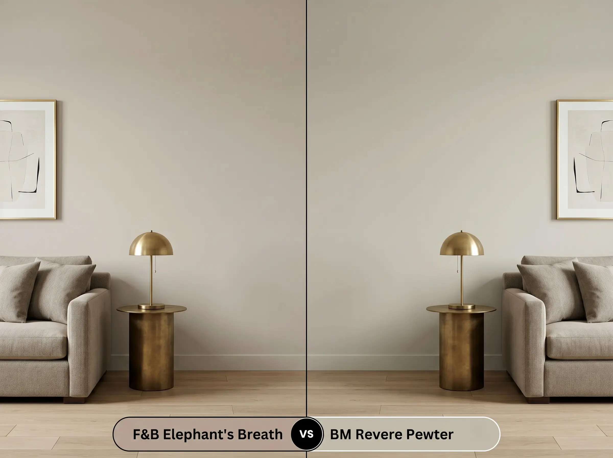
This is the ultimate battle of the mid-tone greiges. If your room features warm, red-toned wood floors, Benjamin Moore Revere Pewter is often the safer choice because its subtle green-yellow base beautifully neutralizes red reflections. However, if you are working with neutral or white oak flooring, the Farrow & Ball option offers a much more sophisticated, shifting depth. Choose Revere Pewter for predictable, earthy stability, but choose its rival if you want a dynamic color that changes its mood throughout the day.
Farrow & Ball Elephant’s Breath vs. Sherwin-Williams Agreeable Gray
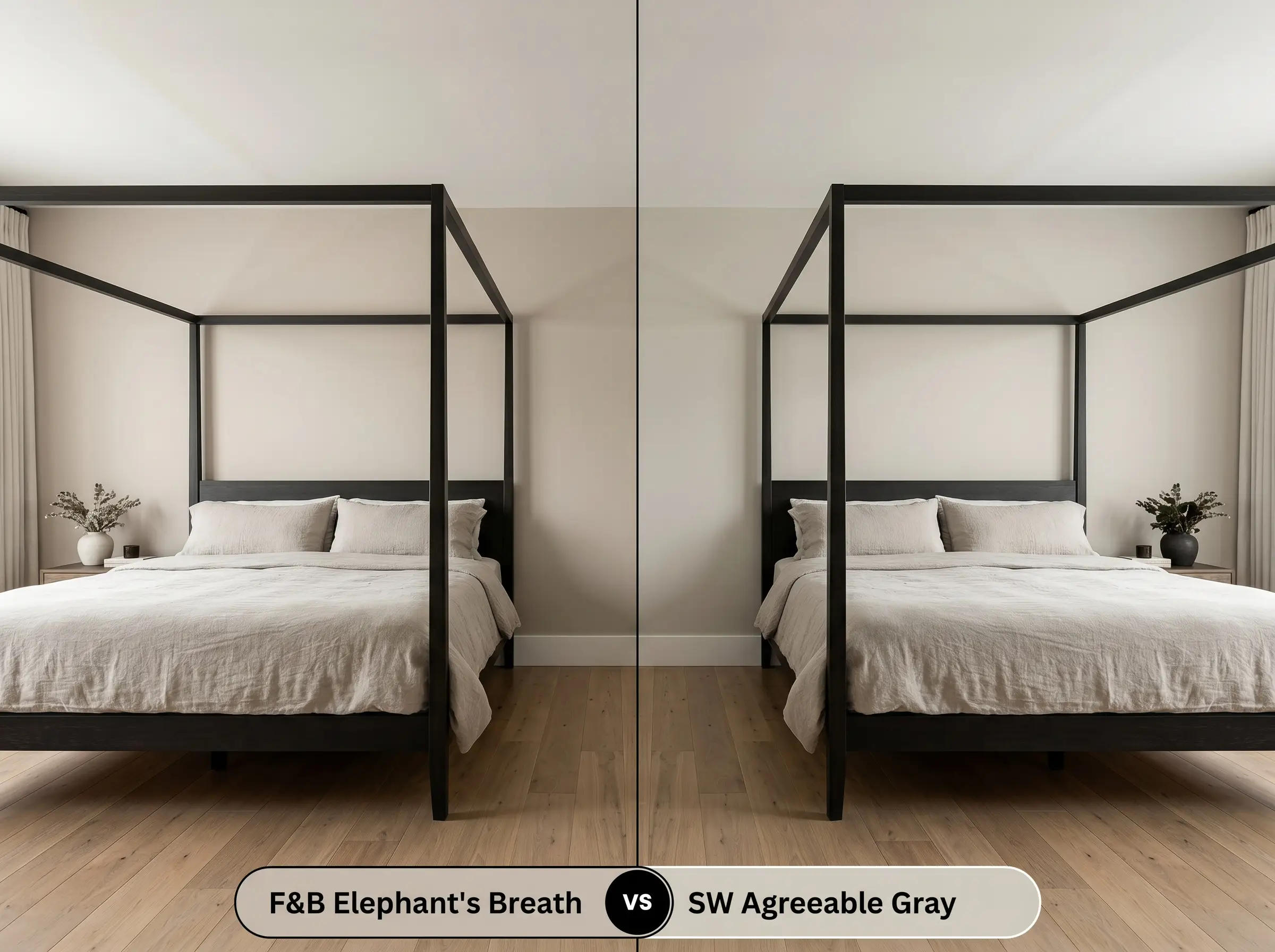
While both colors aim to bridge the gap between warm and cool, they go about it in entirely different ways. Sherwin-Williams Agreeable Gray is significantly lighter and leans heavily into a straightforward, sunny beige, making it incredibly easy to use in almost any lighting condition. If you fear purple undertones, you must choose Agreeable Gray. Conversely, if you want a color that feels richer, moodier, and more architecturally significant, the Farrow & Ball shade is the superior curatorial choice.
Alternative Selections for Elephant’s Breath
If you love the general aesthetic of this shade but need it to perform slightly differently in your specific lighting, a minor adjustment is all it takes. You might need a higher LRV for a dark corridor or a slightly warmer base to combat cool afternoon shadows.
Farrow & Ball Alternatives
Cross-Brand Matches
Application Strategies & Finish Guide
Transitioning this complex color from a sample card to your actual walls requires a strategic approach to finishes and preparation. The sheen you select will fundamentally alter how the pigment absorbs light, directly impacting how prominent the magenta undertones become.
Do not attempt to apply this shade over a standard white primer. You must use a dedicated Mid Tones Primer. A tinted base ensures the complex magenta and grey pigments develop their full, rich opacity without looking washed out or streaky.
Hackrea Pro-Tip (The Primer Mandate)
For a truly professional outcome, plan for a minimum of two generous coats. Because this pigment is highly reactionary, rolling the paint too thin will result in visible flashing—uneven streaks where the light catches the roller marks. Maintain a wet edge as you work, and resist the urge to touch up partially dried sections, as this will permanently alter the sheen in that spot.
Frequently Asked Questions
Because harsh, unshielded natural daylight strips away the grounding warmth of most mid-tones, the hidden magenta base will absolutely push forward outdoors. If you apply this to a sun-drenched exterior, expect it to read as a distinct, muted lilac rather than a warm greige.
The magenta undertone actually fights against the yellow in the wood, creating a beautiful, neutralizing tension. This complementary relationship cools down the floor’s brassiness while allowing the paint to retain its sophisticated, earthy depth.
Without natural light to activate its warmer notes, this shade will lean heavily into its shadowed, grey-purple identity. To prevent it from feeling muddy, you must introduce warm 3000K artificial lighting and highly reflective surfaces, like a polished marble vanity or unlacquered brass sconces.
Crisp, cool 4000K light will instantly amplify the lilac shift, stripping away the earthy mushroom qualities. If you want the room to feel warm and inviting, you must swap your bulbs to a softer 2700K or 3000K temperature.
The Final Verdict on Elephant’s Breath
Farrow & Ball’s No.229 is the ultimate foundational color for homeowners who want their spaces to feel deeply curated, tactile, and responsive to the environment. It is perfect for those who appreciate intentional design tension and are not afraid of a neutral that actively changes its mood throughout the day. This shade excels in spaces layered with natural materials—like honed stone, raw wool, and living brass—where its earthy greige base can anchor the room while its subtle lilac shifts provide a continuous sense of architectural intrigue.
This paint is NOT for you if your home is filled with bright, primary yellows, stark cool-toned whites, or icy grey furnishings. Placing this complex magenta-based greige next to a cool, blue-leaning grey will instantly make the walls look like a bruised, dirty purple. Similarly, pairing it with highly saturated yellow decor will trigger a jarring complementary clash, entirely destroying the calm, organic atmosphere the color was designed to create.
Hackrea Design Secret (The Undertone Clash)
Closest Cross-Brand Equivalents
The absolute closest scientific color matches for Elephant's Breath across top paint brands.