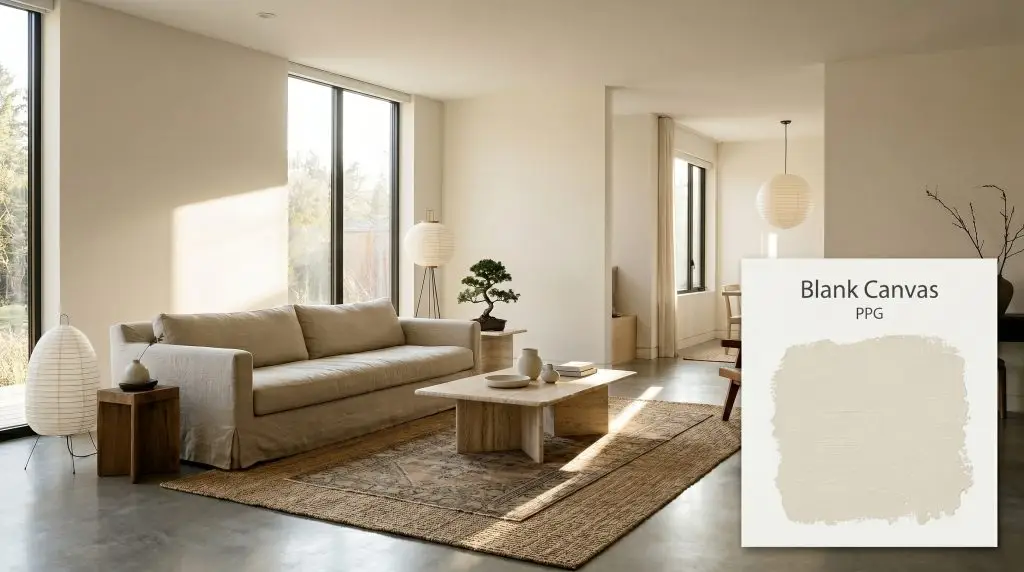
Blank Canvas PPG1085-1
PPGPPG Blank Canvas (PPG1085-1) is a pale, neutral yellow-beige off-white with subtle green undertones. With an LRV of 78, it acts as a highly versatile, warm foundation that softens spaces without feeling overly yellow or starkly clinical.
Paint Technical Profile
| Color ID / SKU | PPG1085-1 |
| HEX Code | #EAE4D6 |
| Light Reflectance (LRV) | 78 |
| Use | Interior, Exterior |
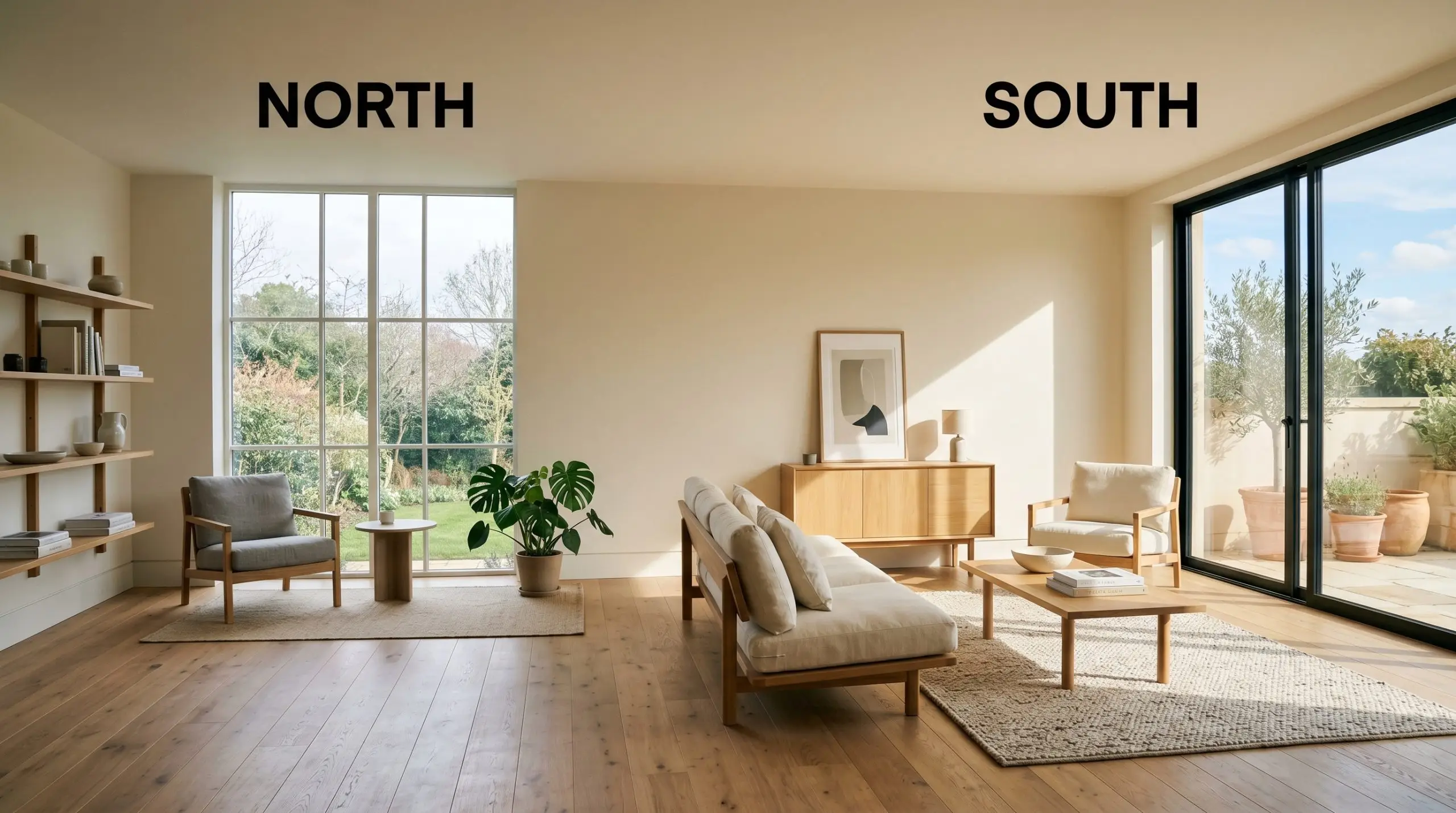
| Best Exposures | North, East |
| Best For | Living Rooms, Bedrooms, Open Concept Spaces |
Designing With PPG Blank Canvas: The Warm Neutral That Cures Sterile Rooms
Finding the exact point where a white wall stops feeling like a hospital corridor and starts feeling like a home is one of the hardest tasks in interior design. Pure, untinted whites often bounce light too aggressively, creating a harsh, sterile atmosphere that makes standard furniture look flat. To fix this, you need a foundational layer that softens the room’s edges while maintaining a bright, open aesthetic.
PPG Blank Canvas (PPG1085-1) masters this delicate balance. It behaves like a soft, ambient glow spread across your walls, wrapping the room in an inviting, tactile warmth. This isn’t just a standard background color; it is a highly intentional architectural finish that fundamentally changes how light and shadows interact in your space.
By stepping slightly away from stark white, this warm neutral gives you an incredibly forgiving canvas. It allows you to layer rich textures, mix metal finishes, and introduce vibrant accents without anything feeling visually disconnected. Whether you are updating a suburban living room or refining an urban loft, this color establishes a serene, sophisticated baseline for your entire home.
Demystifying the Color DNA: Undertones & LRV of PPG Blank Canvas
If you are wondering whether this paint leans warm or cool, the definitive answer is warm. Operating at a hue angle of 42 degrees, PPG Blank Canvas is a warm neutral that instantly takes the chill out of north-facing rooms and shaded exteriors. However, its brilliant formulation relies on a hidden element to keep that warmth perfectly balanced.
Here is the exact color structure that makes this shade so effective:
With a Light Reflectance Value of 78, this shade falls firmly into the off-white to pale beige category. LRV 78 means the paint bounces a massive amount of light back into the room, making small or shadowed spaces feel significantly larger. Yet, it retains just enough pigment to create a crisp, beautiful contrast when paired with pure white baseboards, crown molding, or window trims.
The Chameleon Factor: How Light Alters This PPG Neutral
Every paint color shifts throughout the day, but high-LRV neutrals are especially sensitive to their environment. Because it reflects so much of its surroundings, the chromatic profile of this off-white will adapt dramatically depending on the specific light hitting your walls.
Here is exactly how the color behaves under different lighting conditions:
If you want your living room to feel warm and relaxed in the evening, strictly avoid daylight bulbs (4000K and above). Stick to warm white LEDs (2700K to 3000K) to beautifully enhance the yellow-beige base of this paint without turning it yellow.
Hackrea Pro-Tip (The Bulb Strategy)
Transforming Spaces: Popular Applications for This Architectural Finish
The true value of a premium off-white lies in its ability to adapt to entirely different architectural footprints and design aesthetics. Because it refuses to dominate the room, it allows your materials, textiles, and styling choices to take center stage. Here is how to maximize the impact of this shade across the most important areas of your home.
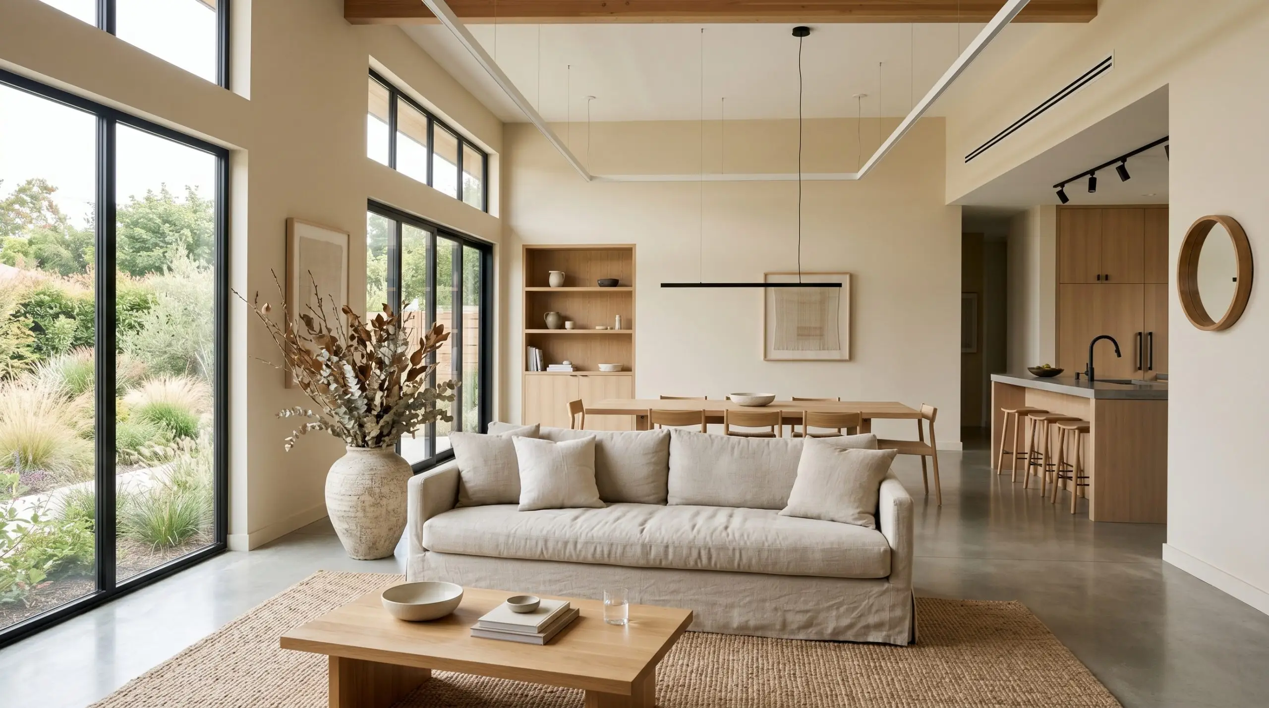
Unifying Expansive Living Zones
Open-concept living areas often suffer from a lack of definition, feeling cavernous rather than cozy. Painting these expansive walls in this warm neutral instantly pulls the boundaries of the room inward, creating a sense of intimacy without sacrificing brightness. For a bustling young family that needs a serene, calming environment at the end of the day, this shade acts as a visual reset button.
To avoid the predictable modern farmhouse look, steer your styling toward a Japandi or Soft Modern aesthetic. Pair the creamy walls with low-profile, minimalist console tables and a relaxed, slipcovered sofa in washed linen. Introduce an aspirational focal point—like a sculptural accent chair upholstered in nubby bouclé or a stunning travertine coffee table—to immediately elevate the everyday foundational pieces.
Layering organic textures is critical here. Because the walls are quiet, you need tactile friction to bring the room to life. Incorporate oversized branches in artisan ceramic vases, layer a vintage Turkish rug over a massive sisal base, and use matte black or blackened steel hardware to provide a sharp, modern contrast against the soft beige background.
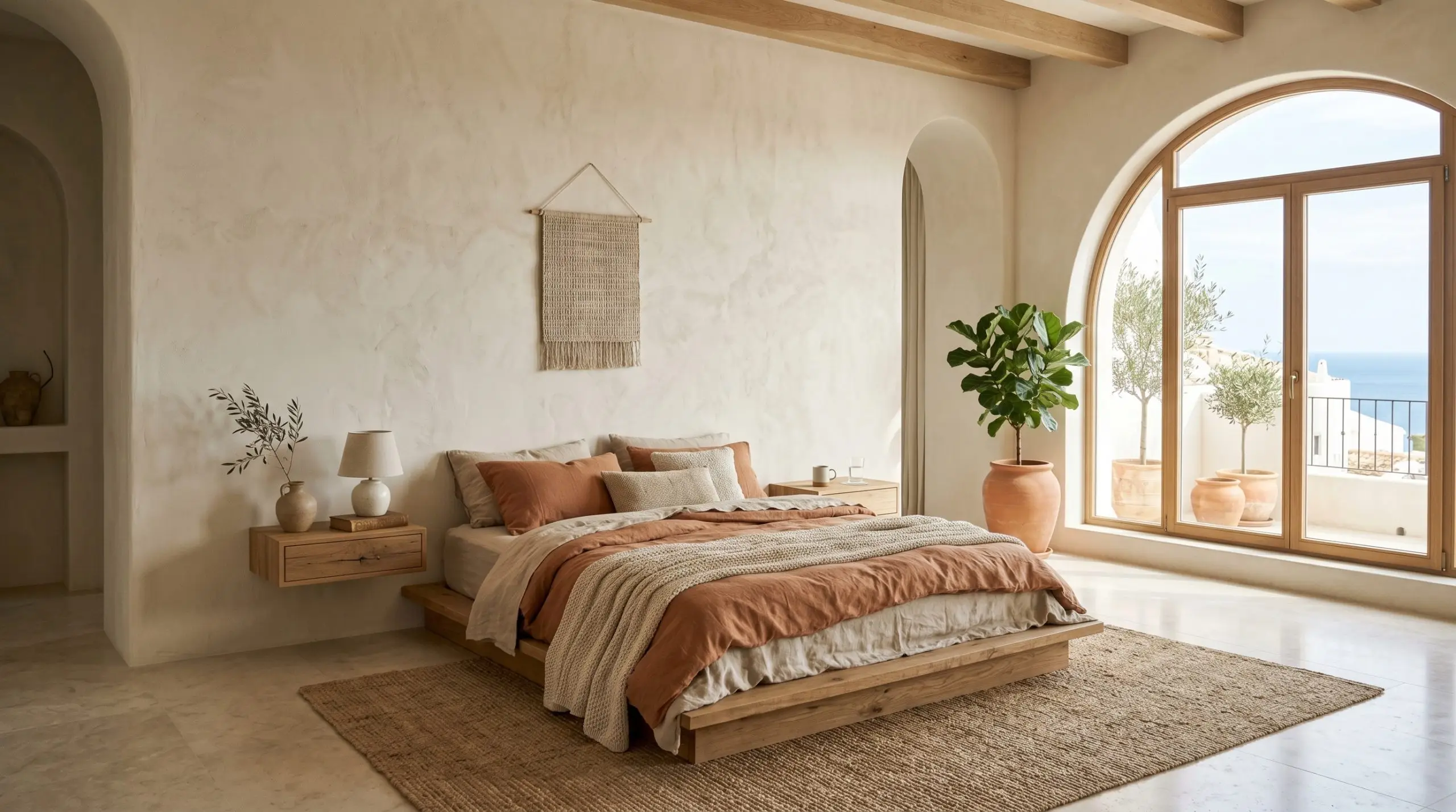
Crafting Restful Sleep Sanctuaries
A bedroom should be a sensory escape, especially for remote workers who spend their entire day navigating a busy house. This paint establishes a deeply restful atmosphere, reflecting the morning sun beautifully while turning soft and enveloping by lamplight. Instead of defaulting to traditional bedroom styling, use this color to curate a Mediterranean-inspired boutique hotel vibe.
If your budget allows for one major architectural update, apply a limewash treatment or Roman clay over the base color on the wall behind your bed. This adds a subtle, cloudy texture that plays beautifully with the green undertone hiding in the paint. Center the room with a low-profile platform bed in reclaimed oak, and flank it with floating nightstands for a clean, tailored look.
Because this paint has a distinct yellow-beige structure, pure, icy white bedding can sometimes make the walls look slightly dingy by comparison. Instead, dress your bed in warm ivory, oatmeal linen, or a heavily saturated accent color like terracotta or muted plum to keep the contrast intentional and luxurious.
Clash Warning (The Bedding Trap)
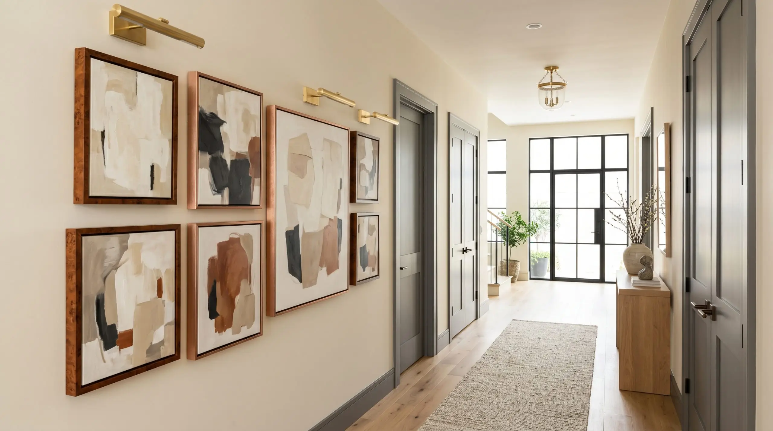
Elevating Corridors and Passageways
Transitional hallways are frequently treated as mere utility spaces, slapped with leftover white paint and forgotten. By utilizing this specific off-white, you can turn a dark, narrow corridor into a curated, gallery-like experience. The high light reflectance pulls whatever ambient light is available and bounces it down the hall, making the space feel instantly wider.
Transform the hallway into a deliberate design moment by installing asymmetrical gallery walls. Frame abstract canvas art or vintage botanical prints in warm burl wood or brushed copper frames. To make the hallway feel custom-built, install unlacquered brass picture lights above the art; the metal will patina beautifully and highlight the warmth of the walls.
For a dramatic, high-end finish, paint all the interior doors leading off the hallway in a soft black or deep charcoal gray. This sharp, tailored contrast grounds the airy walls and gives standard, everyday doors a massive visual upgrade.
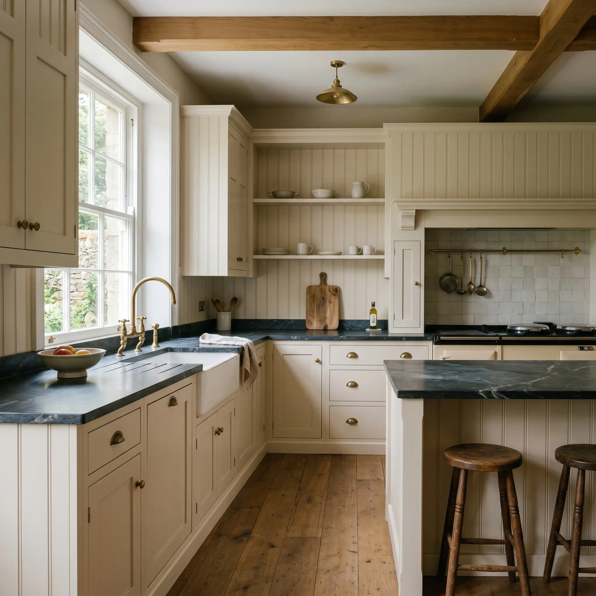
Warming Up the Culinary Hub
White kitchens are timeless, but pure white cabinetry can often feel clinical or stark, especially in homes with cool, north-facing light. Using this shade on your kitchen cabinetry provides the clean, bright look of a classic white kitchen while injecting a necessary dose of warmth. It is the perfect solution for a passionate home chef who wants a welcoming, lived-in culinary space.
This color is incredibly versatile across different cabinetry styles. If you love an English bespoke aesthetic, apply it to traditional cabinetry and pair it with honed soapstone countertops, beadboard accents, and an unlacquered brass bridge faucet. The green undertone in the paint harmonizes beautifully with the dark, moody veining of the soapstone.
If your taste leans contemporary, use this shade on sleek, flat-panel modern cabinets. Pair the warm doors with a dramatically veined marble backsplash, ribbed glass pendant lights, and polished nickel hardware. The creamy base of the paint softens the hard, geometric lines of modern cabinetry, resulting in a kitchen that feels highly sophisticated but never unapproachable.
Curating a Palette Around PPG Blank Canvas
This specific off-white requires soft, intentional tonal bleeding rather than rigid, high-contrast boundaries to maintain its serene energy. When placed next to thoughtfully selected materials, the pigment adapts beautifully, allowing the surrounding textures to dictate the final mood of the room.
Framing the Walls: Ideal Trim Choices
To keep the walls looking intentional and clean, you need a crisp, untinted white for your baseboards and crown molding. Benjamin Moore Chantilly Lace OC-65 and Sherwin-Williams High Reflective White SW 7757 are brilliant options for this task. Because the main wall color has a soft yellow-beige foundation, pairing it with a razor-sharp white trim creates a distinct architectural boundary that prevents the room from feeling muddy.
Tactile Pairings: Metals, Woods, and Textiles
Secondary Paint Colors for Seamless Flow
Curated Aesthetics: Bringing the Palette to Life
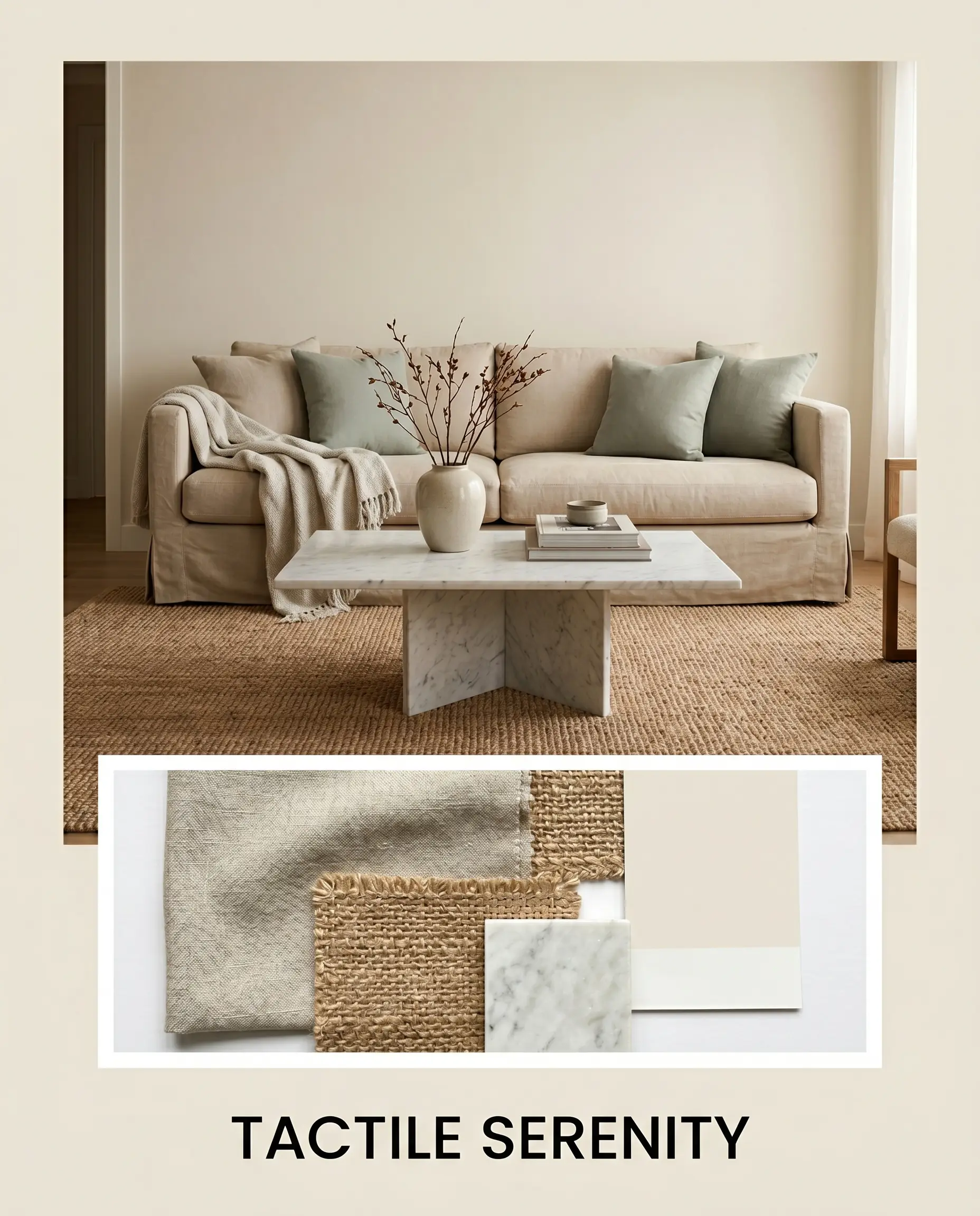
Tactile Serenity This aesthetic leans into a restorative, Japandi-inspired softness that feels incredibly calming at the end of a long day. The walls are paired with expansive jute rugs, a slipcovered sofa in washed linen, and a striking honed marble coffee table. Subtle accents of Sherwin-Williams Sea Salt in the decor help cool the room’s energy, resulting in a balanced, breathable environment.
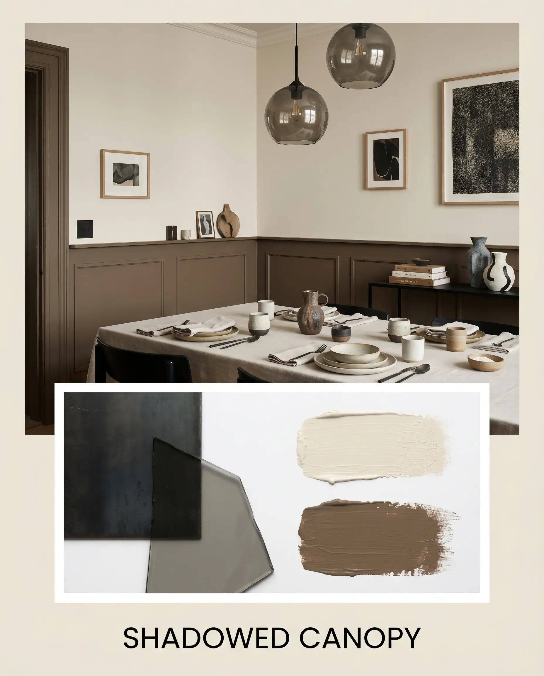
Shadowed Canopy For a more intimate, sophisticated vibe, this palette uses sharp contrasts to ground the airy walls. Blackened steel hardware and smoked glass lighting fixtures create tailored, modern silhouettes against the warm backdrop. By painting the interior doors or wainscoting in PPG Fig Branches, the space gains a profound, earthy depth that feels both organic and highly curated.
Deciding Between Premium Neutrals: Head-to-Head
Sometimes, the specific lighting exposure or fixed architectural elements in your home demand a slightly different approach. If your space pulls too green or feels too stark under artificial lighting, you might need to pivot to a rival formulation to achieve the right glow.
PPG Blank Canvas vs. Sherwin-Williams Alabaster SW 7008
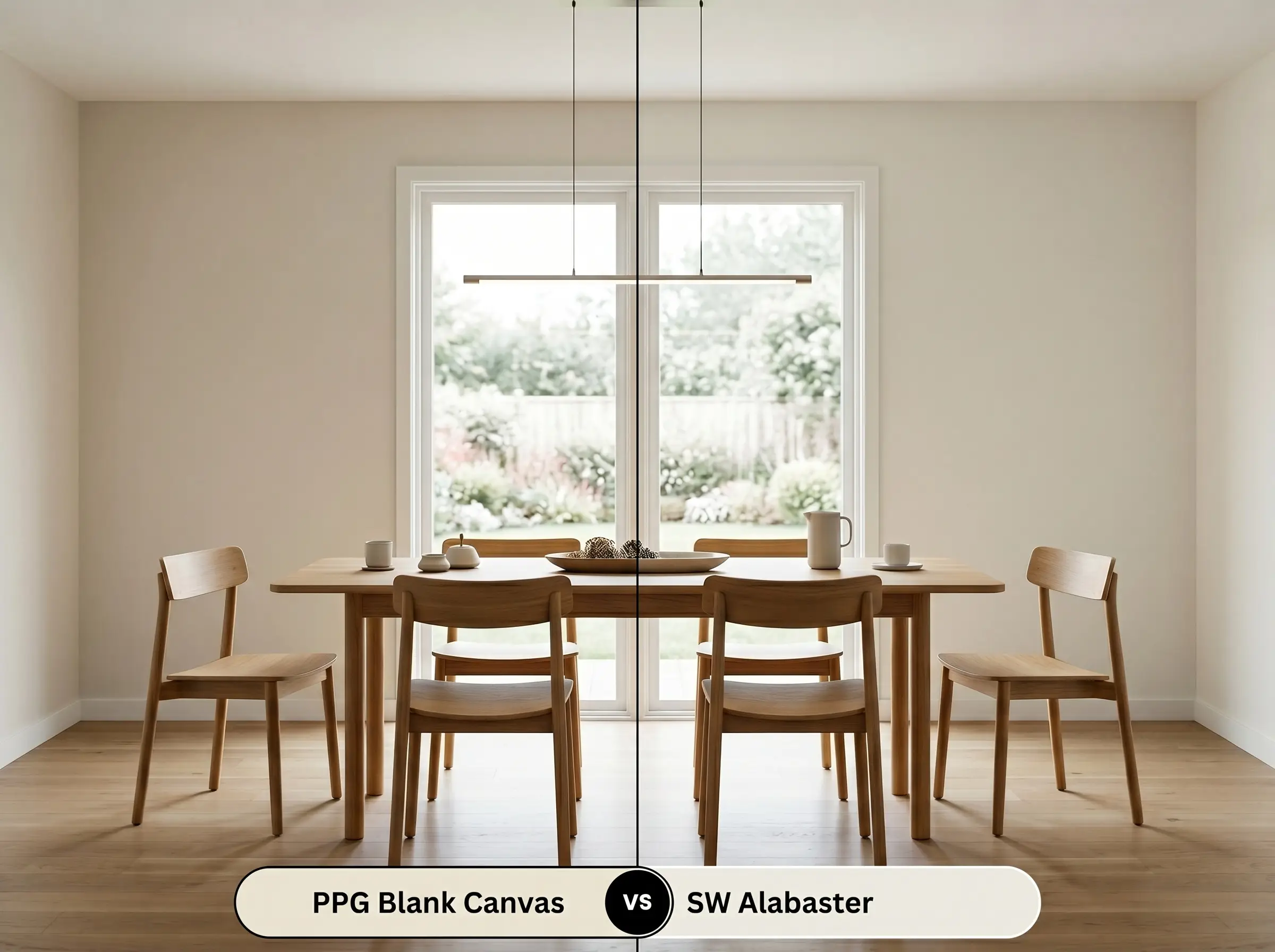
Alabaster relies on a much warmer, almost creamy beige base without the stabilizing green influence found in the PPG option. If your room faces north and you want to inject maximum warmth to combat the chilly light, then Alabaster is the superior choice. However, if you have red-toned wood floors, Alabaster can sometimes read slightly yellow, making the balanced, muted structure of Blank Canvas the safer bet.
PPG Blank Canvas vs. Benjamin Moore Swiss Coffee OC-45
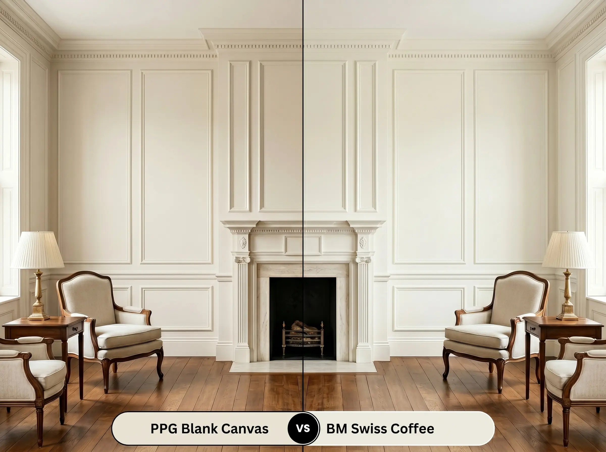
Swiss Coffee is an iconic off-white that carries a slightly lower light reflectance and a more pronounced earthy, traditional warmth. If you are working with an older home filled with historic millwork and want a lived-in, heritage feel, then Swiss Coffee effortlessly delivers that vibe. Conversely, if you prefer a crisper, more modern aesthetic that feels slightly brighter and more adaptable to cool-toned accents, stick with the PPG formulation.
Exploring Color Alternatives for PPG1085-1
You might fall in love with the general energy of this hue but realize your specific room needs a fraction more depth to feel grounded. Alternatively, you may be restricted to a different paint manufacturer based on your contractor’s preferences.
Same-Brand Variations
Rival Brand Color Matches
Executing a Flawless Finish with the Warm Neutral
Transitioning from color theory to the practical reality of putting paint on drywall requires a shift in strategy. How you apply this shade dictates whether it looks like a premium architectural finish or a hasty weekend project.
The Dynamic Sheen Guide
Primer Strategy and Coverage Expectations
Because this is a high-LRV off-white, it demands a high-quality, bright white primer to ensure the yellow-beige base develops correctly. Skipping the primer will allow the old wall color to alter the new paint’s delicate undertones. Plan for two full coats of the premium paint line to achieve a truly opaque, professional result.
When touching up a high-reflectance neutral, always use the exact same roller nap you used for the original coat. Using a brush for quick touch-ups will change the texture of the paint film, causing the light to catch it differently and creating a visible, patchy streak known as “flashing.”
Hackrea Design Secret (The Flashing Trap)
Frequently Asked Questions
Because it is highly reflective, this paint will aggressively pull the vibrant hues from outside your windows. If you have dense trees right outside, expect the interior walls to shift toward a noticeable, earthy sage tone during the afternoon.
The cool, crisp nature of 4000K bulbs actually flattens out the yellow-beige base. Instead of looking overly warm or buttery, the paint will read as a very clean, slightly muted off-white.
Its high light reflectance makes it an excellent candidate for textured surfaces. The creamy base softens the harsh shadows created by the stucco, allowing the exterior to look bright and intentional rather than dirty.
The strong red and orange tones in the wood will visually amplify the hidden green undertone in the paint. This creates a beautiful, balancing contrast that prevents the room from feeling overwhelmingly warm.
Final Verdict: Is PPG Blank Canvas Right for Your Home?
PPG Blank Canvas is a brilliant example of restrained warmth, perfect for homeowners who crave a bright, airy environment but despise the clinical feel of pure white. Its beautifully balanced color DNA makes it the ultimate foundational layer for Soft Modern, Japandi, and organic transitional homes. By bouncing abundant light while retaining a tactile, welcoming energy, it effortlessly cures cold, sterile spaces.
While this shade is incredibly adaptable, it is not the right choice for homes permanently locked into the cool, icy gray trend of the early 2010s. If your house features cool blue-gray luxury vinyl plank flooring, stark silver hardware, and slate-toned upholstery, introducing this warm neutral will create an uncomfortable visual friction. The yellow-beige base of the paint will visually clash with the blue-toned grays, making the floors look aggressively cold while the walls will appear artificially yellowed and aged. To make this color work, you must be willing to transition your surrounding hard finishes toward warmer, more organic tones like rich woods, warm metals, and earthy stones.
Hackrea Clash Warning (The Cool Gray Disconnect)
Closest Cross-Brand Equivalents
The absolute closest scientific color matches for Blank Canvas across top paint brands.