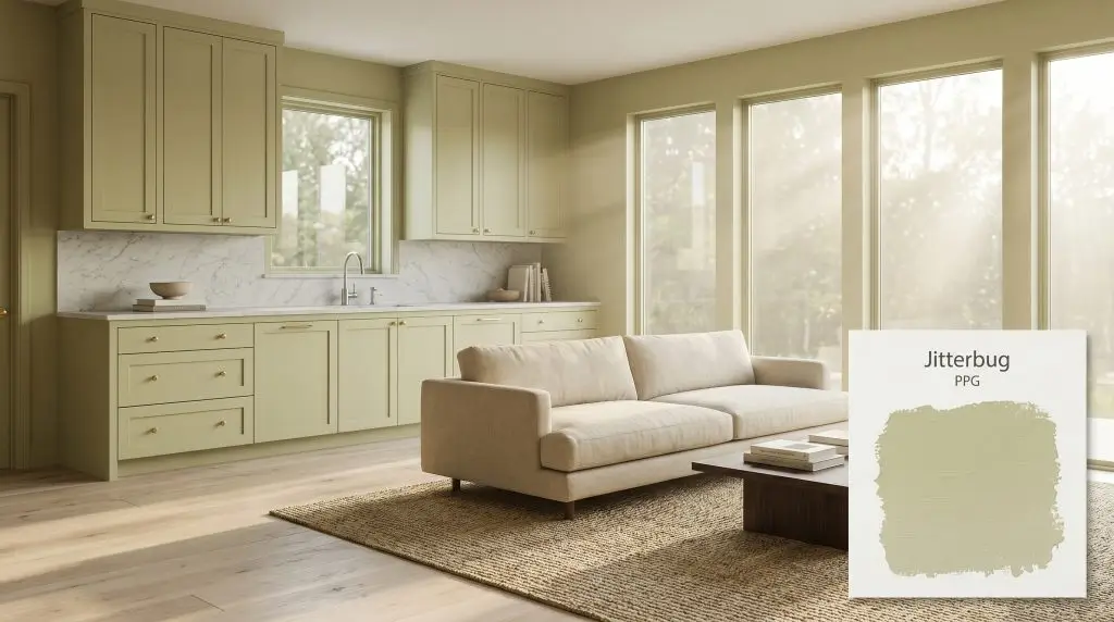
Jitterbug PPG1118-4
PPGPPG Jitterbug (PPG1118-4) is a muted, warm, mid-tone green with a distinct earthy, yellow-khaki undertone. Boasting an LRV of 49, this organic hue strikes a perfect balance between a soft olive and a subdued sage, making it highly versatile for biophilic interiors.
Paint Technical Profile
| Color ID / SKU | PPG1118-4 |
| HEX Code | #bac08a |
| Light Reflectance (LRV) | 49 |
| Use | Interior, Exterior |
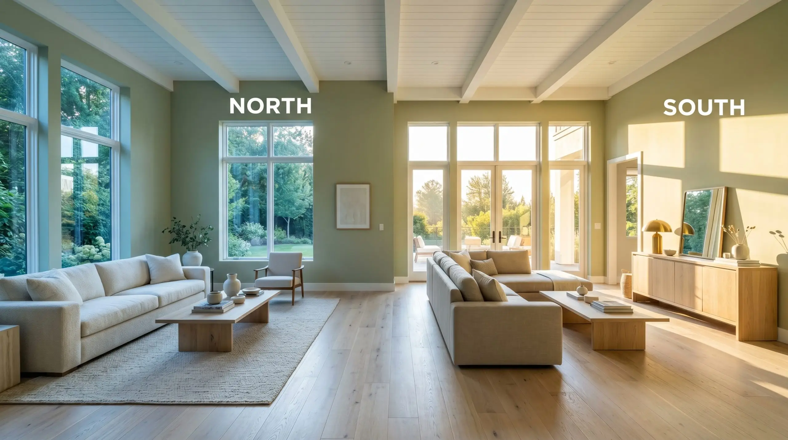
| Best Exposures | South, West |
| Best For | Kitchen Cabinetry, Home Offices, Mudrooms, Exterior Trim |
PPG Jitterbug: Mastering the Warm Sage Hybrid in Modern Interiors
Finding the perfect green paint is notoriously difficult for most homeowners. You want a color that brings the outdoors inside, but you often end up with a shade that feels either uncomfortably neon or overly shadowed.
This is where a truly sophisticated botanical mid-tone changes the entire design conversation.
PPG Jitterbug 1118-4 is a masterclass in balance, offering a saturated, earthy presence that feels incredibly intentional on the wall. It provides the lushness of a traditional green but carries a complex internal structure that keeps it remarkably versatile.
Whether you are updating a suburban kitchen or bringing life to an urban home office, this hue establishes a calm, stabilizing foundation.
PPG Jitterbug 1118-4: Undertones & LRV
When evaluating this paint for your home, the definitive temperature is undeniably warm. It avoids the icy, sterile feeling that plagues many modern greens, offering a welcoming embrace instead.
This warmth comes directly from its complex pigment structure, which dictates exactly how it will behave alongside your furniture and finishes.
With a light reflectance value 49, Jitterbug sits perfectly in the middle of the spectrum. It absorbs and reflects light in almost equal measure.
This specific LRV means it possesses enough saturation to center a room without plunging the space into shadow. However, it requires a thoughtful lighting strategy, as it will lose its botanical vibrancy in entirely windowless or poorly lit environments.
Lighting Effects & The Chameleon Factor
Because of its yellow-khaki base, this warm sage hybrid shifts dramatically depending on the sun’s position and your light fixtures. Understanding this movement is crucial for planning your room’s overall palette.
If you are using this color in a living space, strictly avoid daylight-balanced bulbs. Stick to 2700K to 3000K lighting to preserve the beautiful, earthy richness of the khaki undertone after the sun goes down.
Hackrea Pro-Tip (The Bulb Rule)
Popular Applications for PPG Jitterbug
The true beauty of this architectural finish lies in its ability to adapt to entirely different aesthetics based on the materials you pair it with. Let’s look at how this muted olive cast behaves in real-world spaces.
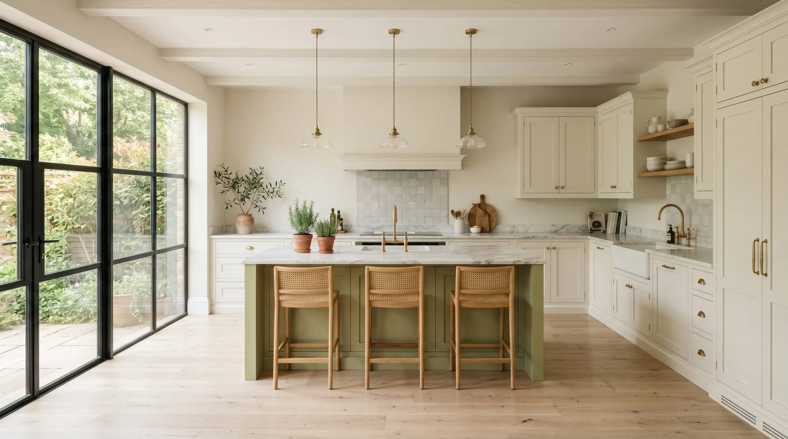
Kitchen Cabinetry & Islands
Painting kitchen cabinets is a significant commitment, and this hue offers a brilliant alternative to stark white or predictable navy blue. When applied to shaker-style cabinetry, it establishes a warm, inviting atmosphere that feels both historic and entirely modern.
To elevate the design without a massive renovation budget, focus on your hardware and countertops.
Pair the painted cabinets with unlacquered brass pulls and a honed marble countertop. The brass will naturally patina over time, echoing the golden-khaki warmth hidden within the paint, while the matte finish of the marble keeps the overall aesthetic soft and sophisticated.
If you are only painting the kitchen island, surround it with bleached oak flooring and creamy off-white perimeter cabinets. This creates a stunning focal point that feels incredibly fresh and Transitional.
Do not pair this organic yellow-green with cool, blue-toned gray backsplashes or stark white quartz. The clash in temperature will make the paint look muddy and the tile look cheap. Stick to warm whites, creamy zellige tiles, or natural stone.
Clash Warning (The Cool Gray Mistake)
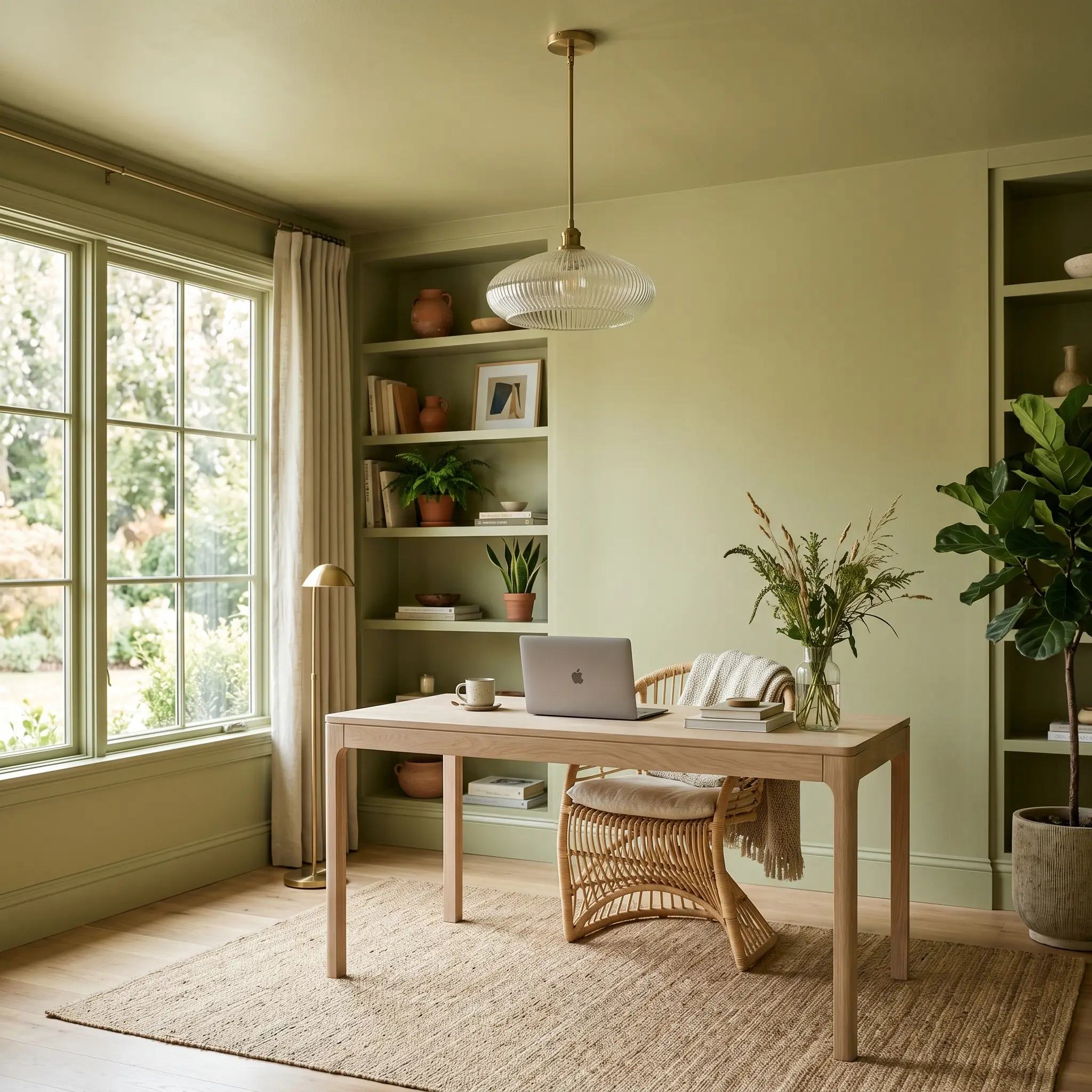
Home Offices & Studies
For a home office, this color excels at fostering a focused, calm environment. Instead of the traditional, dark-wood library aesthetic, use this shade to create a serene, Organic Modern workspace.
Consider color-drenching the room—painting the walls, baseboards, and window trim in the exact same finish. This technique blurs the architectural boundaries, making a standard-sized suburban office feel expansive and custom-built.
Introduce natural textures to complement the biophilic design elements of the paint. A bleached oak desk, a rattan chair, and fluted glass lighting fixtures will beautifully offset the saturated walls.
Mudrooms & Utility Spaces
Mudrooms are hardworking spaces that desperately need a touch of design intention. Applying this color to beadboard half-walls or custom built-in lockers instantly upgrades the room from a simple drop-zone to a curated entryway.
Because utility spaces often lack massive windows, the paint will likely lean into its subdued olive-gray cast.
Embrace this slightly more muted appearance by pairing it with highly durable, earthy materials. A floor laid with natural terracotta tiles or durable slate provides a gorgeous, rustic contrast that hides dirt perfectly while looking effortlessly stylish.
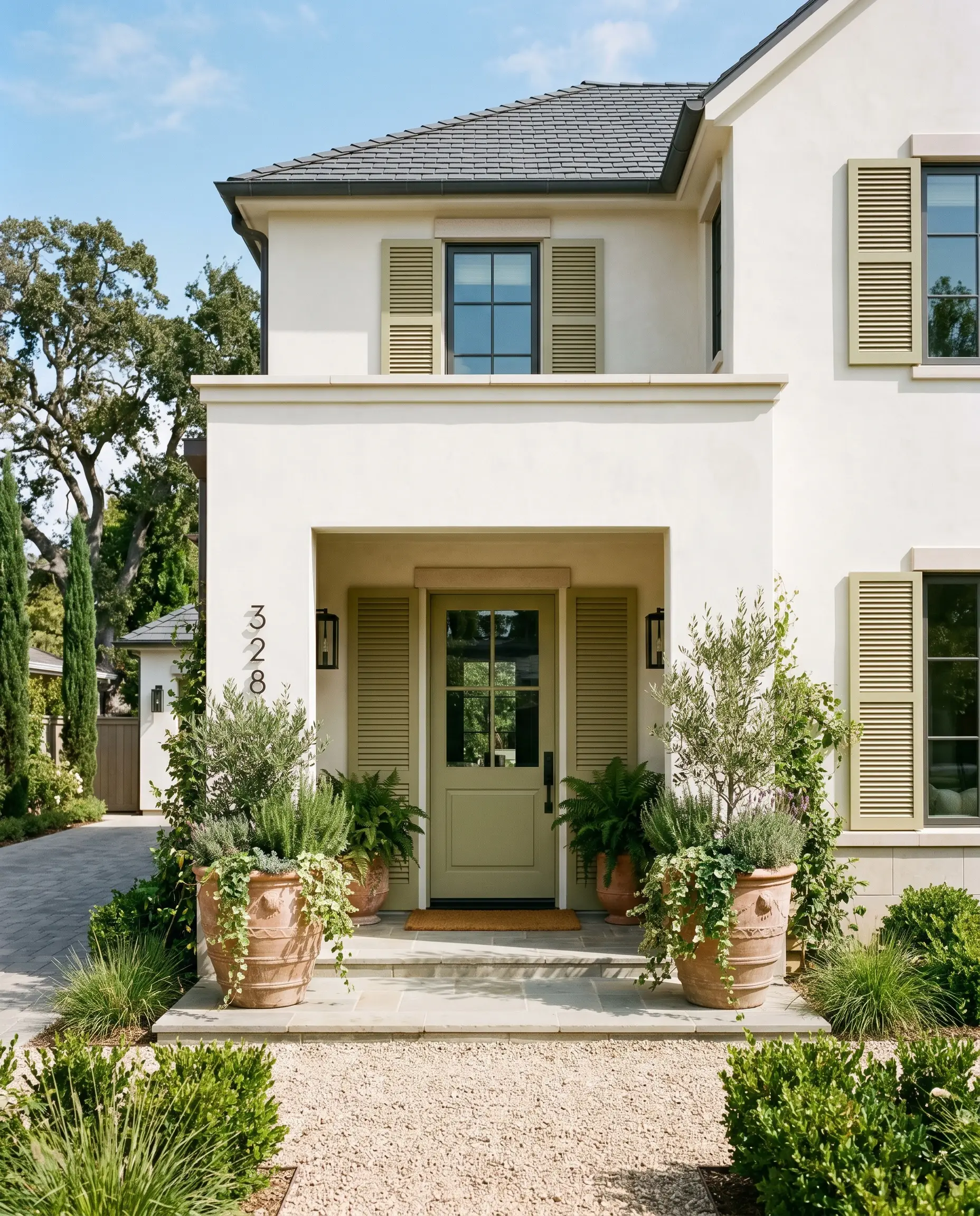
Exterior Shutters & Trim
When taken outside, the intense natural sunlight washes out a significant portion of any paint’s darkness. On an exterior facade, PPG Jitterbug 1118-4 transforms into a lively, welcoming botanical accent.
It works beautifully on shutters and front doors, especially when set against a warm white stucco or creamy brick exterior.
To complete the curb appeal, update your exterior styling with blackened steel house numbers and oversized terracotta planters. The contrast between the crisp metal, the earthy clay, and the warm green trim creates a beautifully balanced, high-end facade.
Designing with PPG Jitterbug: Palettes & Material Pairings
This warm sage hybrid requires deliberate contrast to prevent it from blending into a muddy blur. It thrives when you intentionally frame its saturated pigment with crisp boundaries or layer it with rich, earthy textures that draw out its inherent warmth.
Selecting the Perfect Trim
The color you choose for your baseboards and window casings will dictate exactly how Jitterbug behaves in your room.
Tactile Elements and Finishes
To build a truly curated space, you must consider how your hard finishes visually interact with the paint.
Curated Accent Colors
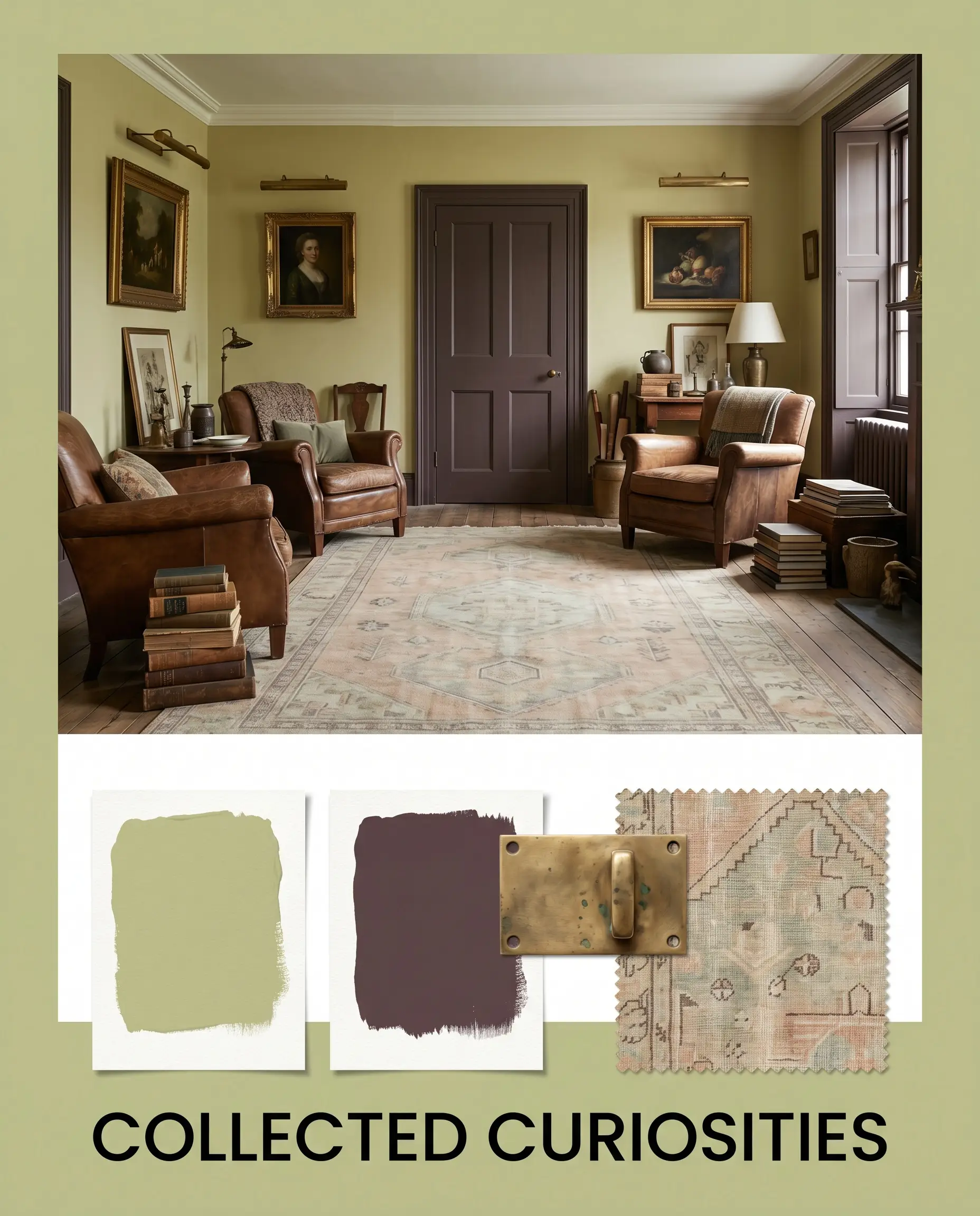
Collected Curiosities
This palette thrives on intentional layering and a slightly moody, historic energy. By wrapping the walls in PPG 1118-4, you create a saturated backdrop that beautifully supports the deep, dusty plum accents of Brinjal on your doors or wainscoting. To keep the vibe feeling curated rather than cluttered, focus on warm metallic reflections. Introduce unlacquered brass picture lights over oversized art, and ground the space with a faded Oushak rug to complete the rich, lived-in atmosphere.
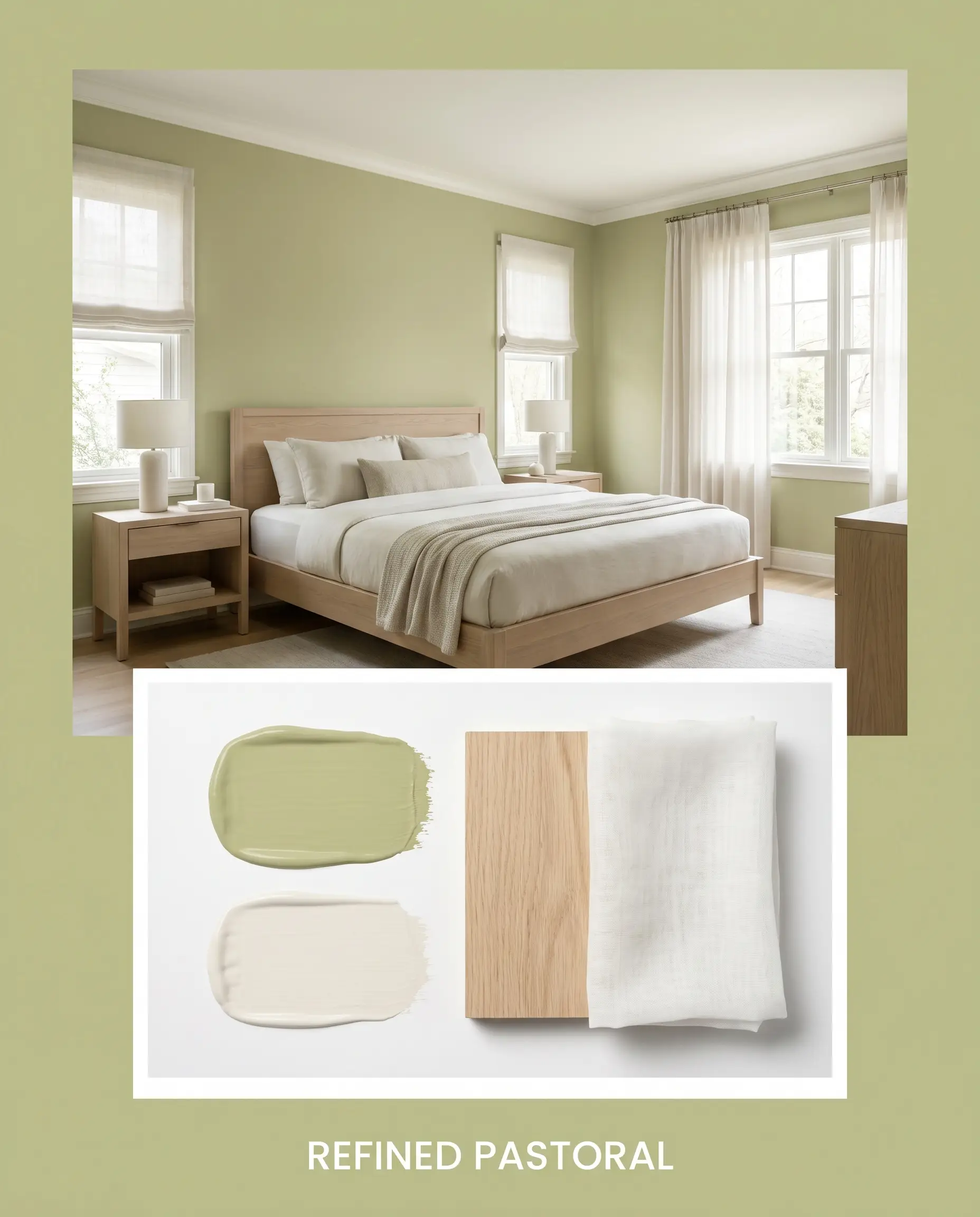
Refined Pastoral
For a much softer, airier aesthetic, this concept leans into the relaxed elegance of Transitional design. The walls provide a stabilizing foundation, while generous amounts of creamy Alabaster on the trim and ceiling lift the overall energy. Introduce bleached oak furniture and sheer cotton textiles to filter the natural light softly. The resulting mood is incredibly serene, offering a quiet, organic retreat that feels fresh and effortlessly tailored.
PPG Jitterbug vs. Rival Greens
Sometimes a space’s specific lighting exposure or architectural style demands a slightly different approach. If your room lacks natural light or if your fixed finishes lean noticeably cool, you might need to pivot to a color with a different foundational structure to achieve your desired look.
PPG Jitterbug PPG1118-4 vs. Sherwin-Williams Clary Sage SW 6166
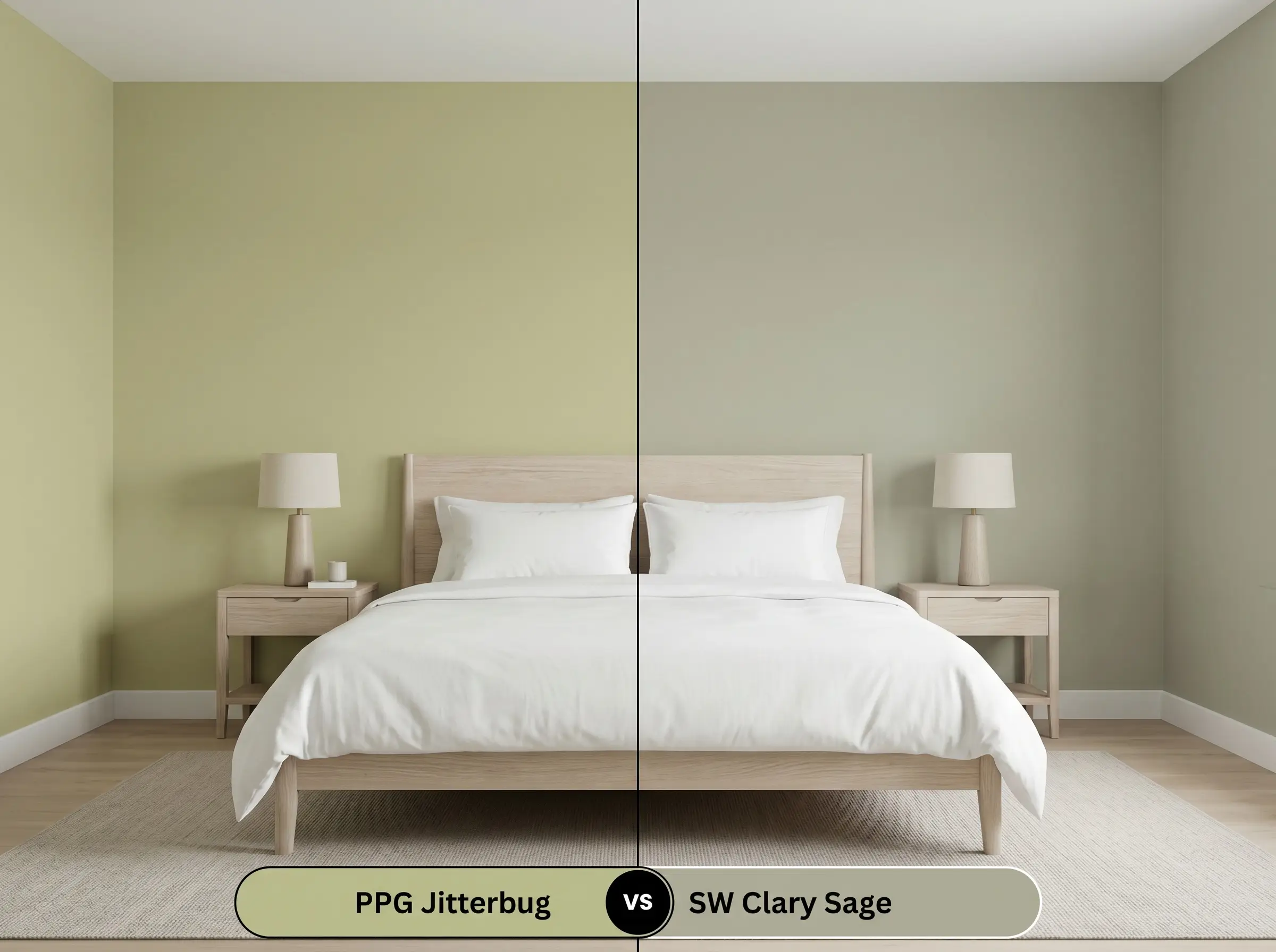
Clary Sage is slightly cooler and noticeably softer on the wall. If your room receives intense southern light that causes Jitterbug to read far too yellow, Clary Sage provides a more neutralized, gray-leaning alternative. It offers a similar botanical feel but with a much quieter, less saturated presence.
PPG Jitterbug PPG1118-4 vs. Benjamin Moore Saybrook Sage HC-114
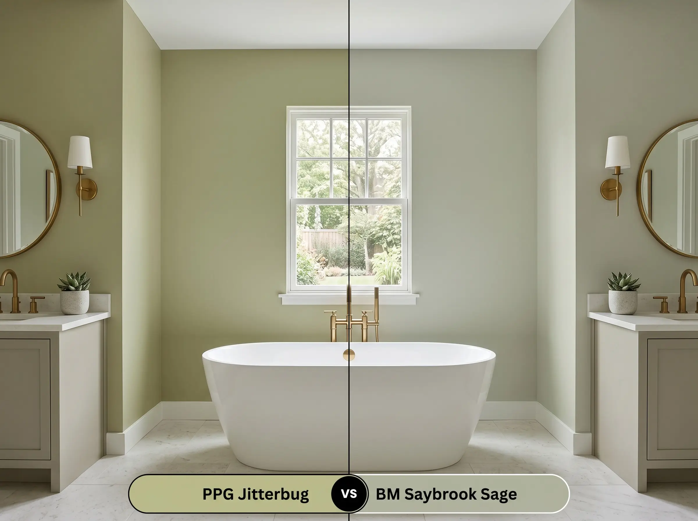
Saybrook Sage carries a distinct silver-blue undertone that completely changes its relational behavior. If you are pairing your paint with cool Carrara marble or bright white subway tile, Saybrook Sage will harmonize beautifully. In contrast, the khaki warmth of the PPG option would actively fight against those icy finishes.
PPG Jitterbug PPG1118-4 vs. Farrow & Ball Vert de Terre 234
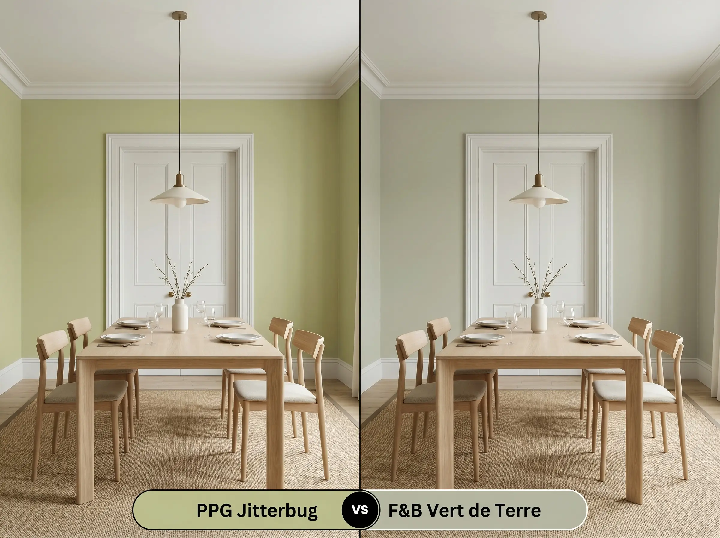
Vert de Terre is significantly lighter and far more delicate in its composition. If you want a mere whisper of biophilic design rather than a profound, saturated statement, the Farrow & Ball option is highly responsive to shifting light. It creates a gentle, ethereal atmosphere compared to the earthy permanence of the PPG hue.
Exploring Alternatives to Jitterbug
You might find that you love the earthy chromatic profile of this hue, but your specific lighting situation requires a slight adjustment in depth or tone.
Same-Brand Variations
Cross-Brand Matches
Executing PPG Jitterbug Like a Professional
Moving from color theory to the actual roller requires a clear, practical strategy. To achieve a flawless architectural finish, you must tailor your sheen and primer choices to support this specific depth of color.
Because of its mid-tone depth, starting with a high-quality, gray-tinted primer is essential. This crucial step ensures the khaki undertone develops fully and evenly, preventing the old wall color from altering the final aesthetic.
Expect to apply two generous coats for complete, professional opacity. Be highly mindful of flashing if you need to touch up a spot later. To avoid visible roller marks or uneven streaks, always maintain a wet edge while painting and resist the urge to over-roll once the paint begins to tack up.
Mid-tone greens are notoriously difficult to touch up seamlessly. If a wall gets scuffed months later, do not simply dab paint over the spot. You will often need to repaint the entire wall corner-to-corner to maintain a flawless, uniform finish.
Hackrea Design Secret (The Touch-Up Rule)
Common Questions About Jitterbug
Low-E glass often casts a subtle blue or green tint into a room, which acts as a cool filter. This will strip away the warm khaki undertones, making the paint appear flatter and more gray. To counteract this effect, introduce warm 2700K artificial lighting and reflective brass accents to restore the color’s natural vitality.
Because its light reflectance value sits comfortably in the middle of the scale, it works beautifully on a ceiling if the room receives ample natural light. Pair it with crisp white walls to draw the eye upward, creating an airy, tented feeling rather than a confined or shadowed space.
Red and green are natural complements on the color wheel, meaning they actively intensify each other when placed side-by-side. If you have cherry or mahogany floors, this paint will make the red tones in the wood appear significantly more vibrant. You can easily balance this energetic pairing by layering neutral, textured rugs over the flooring.
Intense, direct sunlight naturally washes out the depth of any mid-tone paint. On a bright exterior facade, this warm sage hybrid will read much lighter and emphasize its yellow base, making your home feel remarkably cheerful and welcoming rather than somber or overly dark.
The Final Verdict on Jitterbug
PPG Jitterbug is a masterful choice for homeowners seeking a sophisticated, earthy foundation that bridges the gap between vibrant botanical hues and grounded neutrals. It is perfect for Transitional and Organic Modern spaces where a sense of calm is paramount. Its absolute best application is in well-lit living areas, home offices, or on custom cabinetry, where its rich, muted olive cast can be fully appreciated alongside warm metals, textured textiles, and natural woods.
However, this paint requires specific environmental conditions to thrive. If your home features predominantly cool-toned finishes—such as blue-gray luxury vinyl plank flooring, icy glass backsplashes, or stark white quartz countertops with cool gray veining—this paint will struggle to integrate. The warm, organic yellow-green will actively fight against those icy tones, creating an uncomfortable visual tension. In these cool-toned environments, the paint will lose its lush biophilic charm and instead look muddy, while simultaneously making your expensive cool finishes appear artificial and disconnected. Always ensure your hard finishes share the same inherent warmth before committing to this beautifully complex hue.