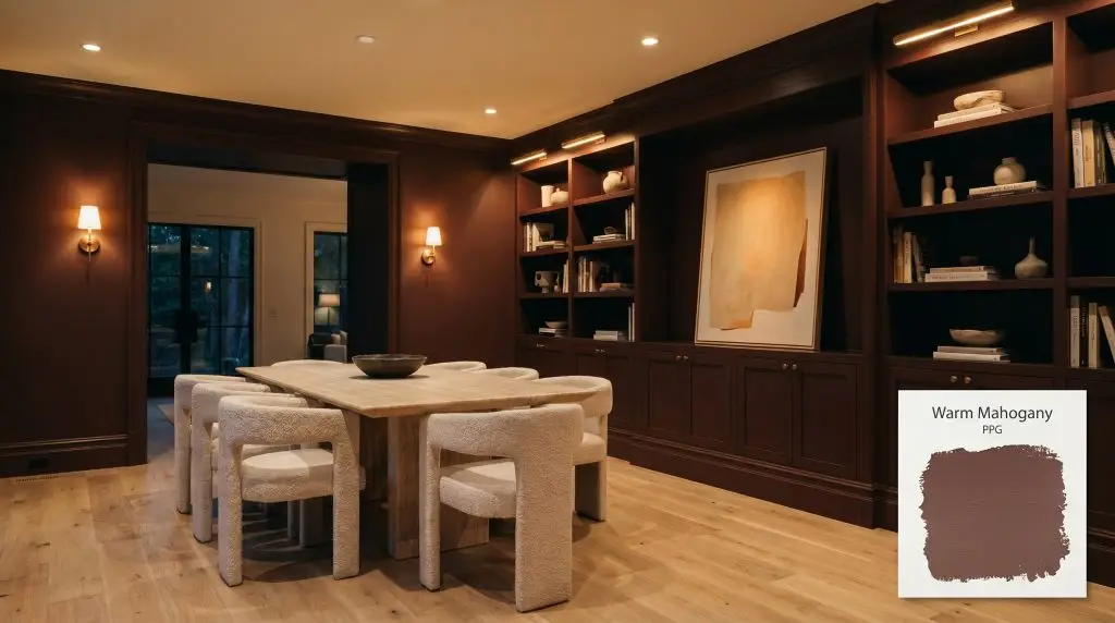
Warm Mahogany PPG1060-7
PPGPPG Warm Mahogany (PPG1060-7) is a dark, neutral, spiced red with rich Sedona red-rock undertones. With an LRV of 7, this deep, enveloping hue is perfect for dramatic dining rooms, sophisticated wine cellars, or as an inviting front door color.
Paint Technical Profile
| Color ID / SKU | PPG1060-7 |
| HEX Code | #6d4741 |
| Light Reflectance (LRV) | 7 |
| Use | Interior, Exterior |
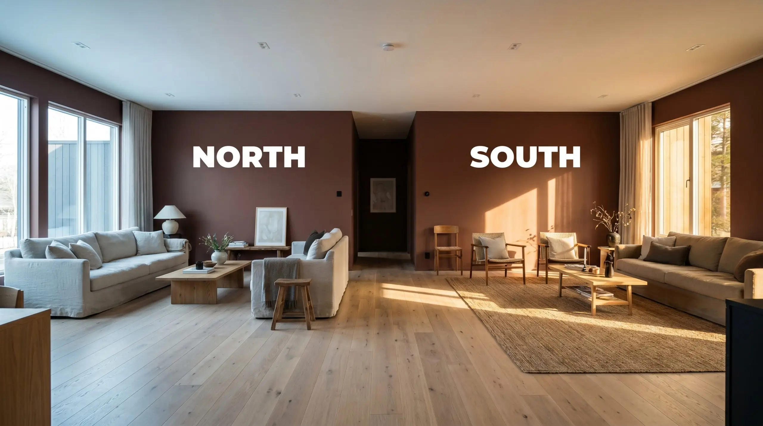
| Best Exposures | South-facing, West-facing |
| Best For | Dining rooms, wine cellars, front doors, studies |
Mastering PPG Warm Mahogany: A Guide to Velvety Architectural Warmth
Finding a dark, earthy neutral that actually brings energy to a room is a persistent design challenge. Far too often, dark browns fall flat, while standard reds feel entirely too aggressive for a relaxing home.
PPG Warm Mahogany completely bypasses both of those common pitfalls. It acts less like a standard wall color and more like a tactile architectural material, wrapping a space in a rich, enveloping warmth.
By relying on a highly specific pigment balance, this shade transforms standard drywall into something that feels substantial and intentionally crafted. Whether you are updating a suburban dining room or adding character to a modern urban study, this color establishes a robust, sophisticated foundation.
Undertones & LRV of Warm Mahogany
If you are trying to determine how this color will influence the temperature of your home, PPG Warm Mahogany is an undeniably warm shade. It radiates a baked-clay energy that instantly takes the chill out of any room. This robust temperature is driven entirely by the complex layers hiding beneath its surface.
While it might look like a straightforward dark neutral on a tiny paper swatch, its actual color DNA is much more intricate.
Every paint color is assigned a Light Reflectance Value (LRV) measuring how much light it bounces back into the room on a scale of 0 to 100. Sitting at an LRV of 7, this shade absorbs a massive amount of light.
It will not brighten a dark hallway or bounce illumination around a shadowy corner. Instead, it creates a dense, velvety atmosphere that visually pulls the walls inward, making expansive spaces feel incredibly intimate and secure.
How Lighting Alters This Spiced Red
Because this color relies on a delicate balance of earthy pigments, its appearance shifts dramatically depending on the sun’s angle and the time of day. You must anticipate these shifts before committing to a full room application.
If you want to maintain the spiced, enveloping warmth of this hue after the sun goes down, strictly avoid bulbs labeled “daylight” or “cool white.” Stick to soft white bulbs in the 2700K to 3000K range to keep the color looking intentional and rich.
Hackrea Pro-Tip (The Bulb Strategy)
Popular Architectural Applications
When working with a shade this dark and saturated, you have to treat it as a deliberate architectural feature rather than an afterthought. The key to success is balancing its intense light absorption with contrasting textures and thoughtful material pairings.
Here is how homeowners and designers are utilizing this spiced hue across various spaces.
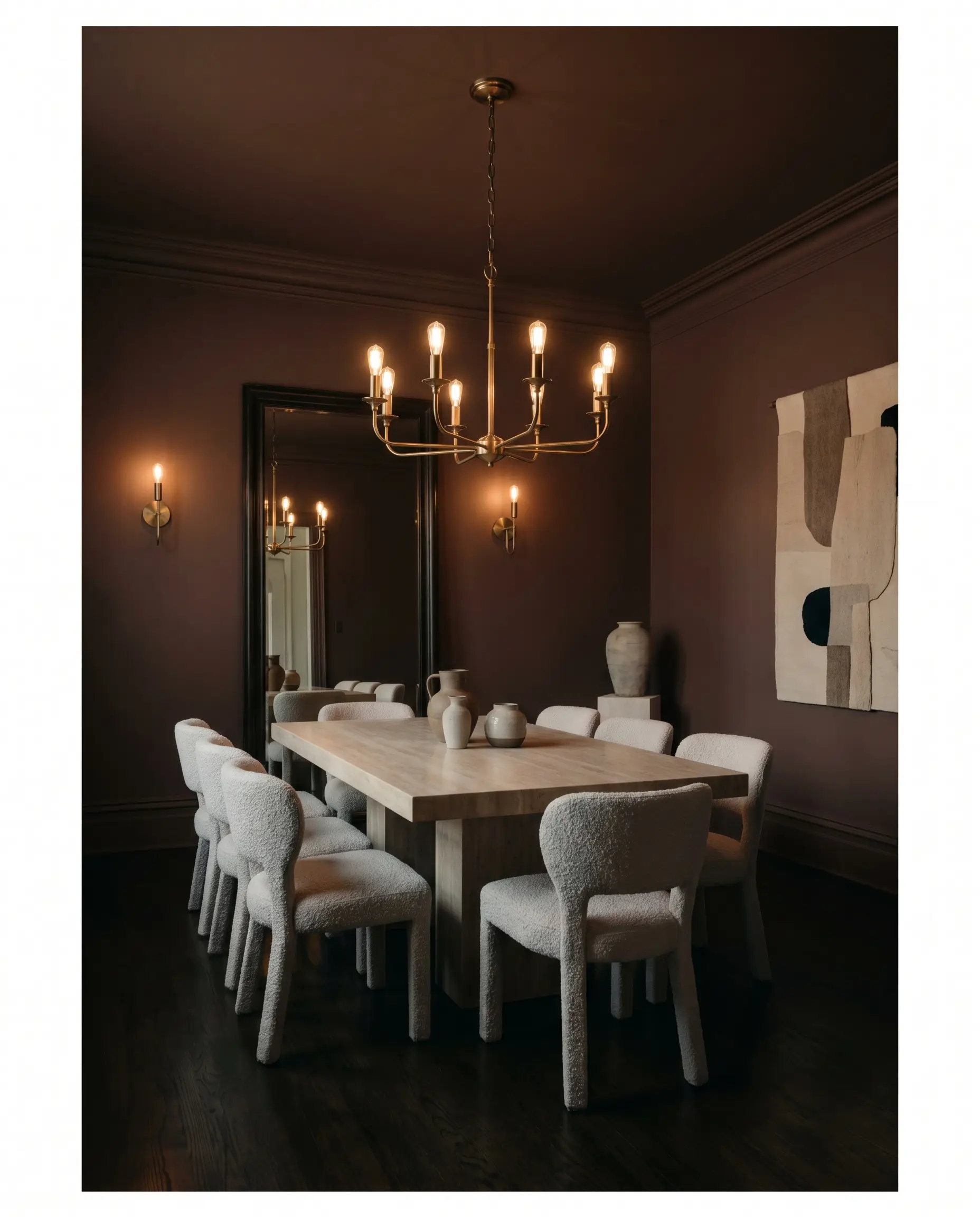
Formal Dining Rooms
This shade thrives in spaces designed for evening entertaining, where you want a moody, candlelit atmosphere. By wrapping the entire room—including the baseboards and crown molding—in this burnished hue, you create a seamless, immersive environment for dinner guests.
To keep the room from feeling overwhelmingly traditional, introduce modern, tactile materials. A honed travertine dining table paired with nubby boucle chairs provides a stunning, pale contrast against the dark walls. Finish the space with unlacquered brass sconces; the warm metallic tones will beautifully echo the spiced red undertones of the paint.
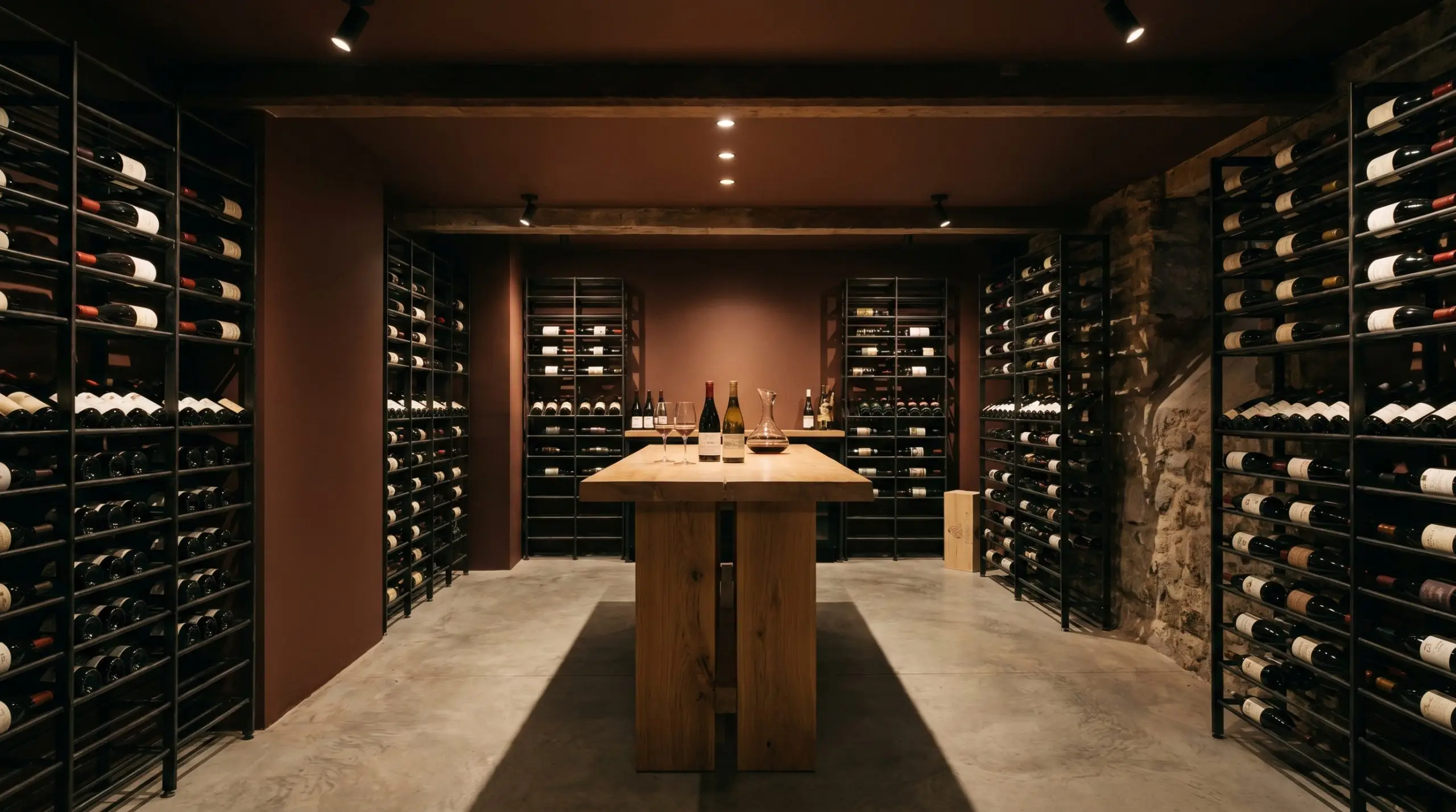
Wine Cellars & Tasting Rooms
If you have a dedicated tasting room or a finished basement wine cellar, this hue establishes an authentic, subterranean richness. The low light reflectance works in your favor here, creating a cozy, secluded retreat that feels miles away from the rest of the house.
For styling, lean into a rugged, industrial-meets-organic aesthetic. Install blackened steel wine racks and a chunky white oak tasting table to complement the earthy brown base. Keep the lighting low and moody to let the velvety atmosphere take center stage.
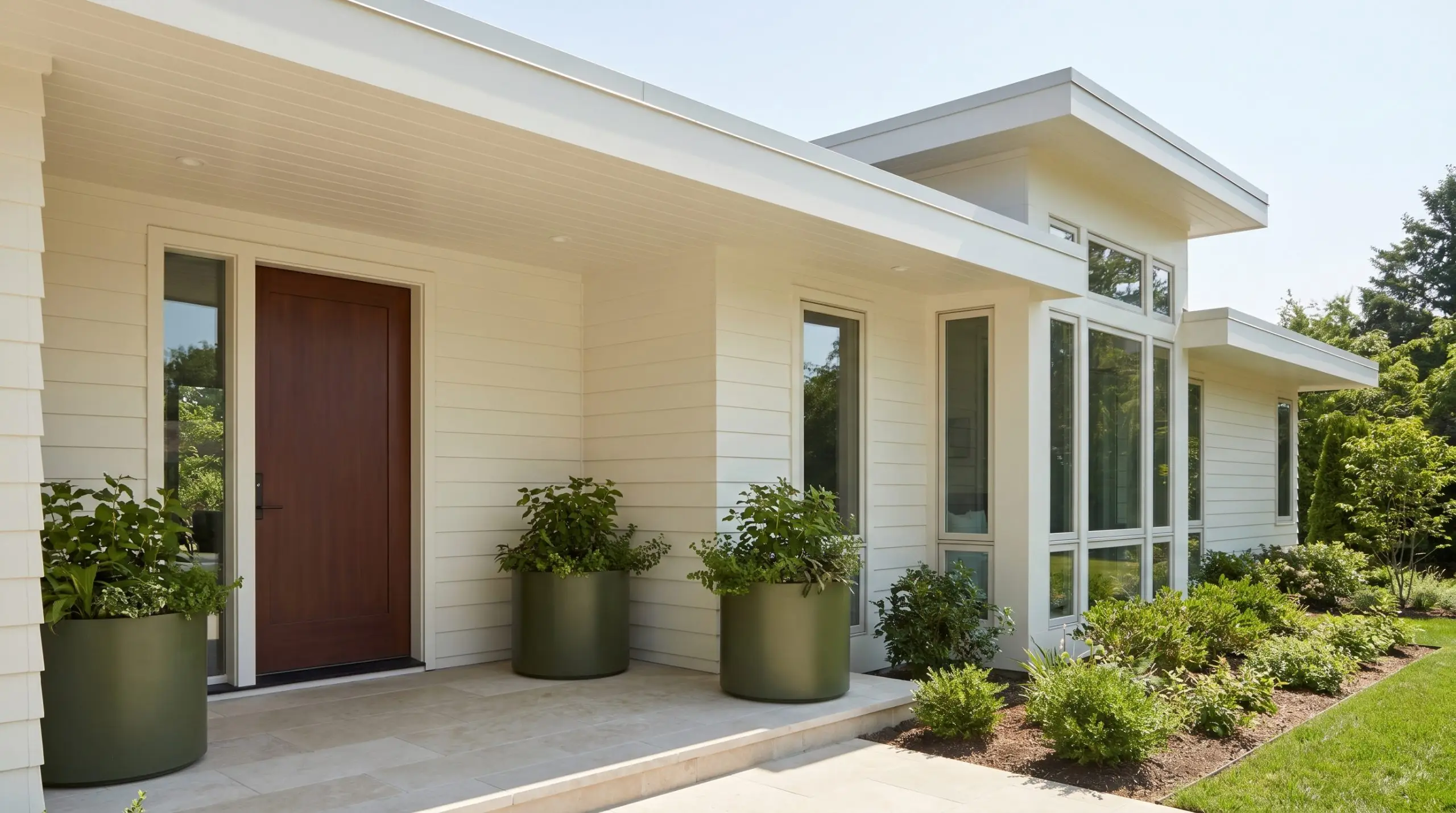
Front Doors & Exterior Accents
Using a dark, spiced hue on your home’s exterior makes a fantastic, welcoming statement, but you must account for the power of the sun. Full exterior daylight naturally washes out paint colors, making them appear significantly lighter and less saturated than they look indoors.
Be highly critical of your existing brick or stone before applying this to your front door. If your exterior masonry features stark orange or cool pink tones, the baked-clay energy of the paint will violently clash. It pairs best with neutral limestone, creamy white siding, or deep olive-green exteriors.
Clash Warning (Exterior Masonry)
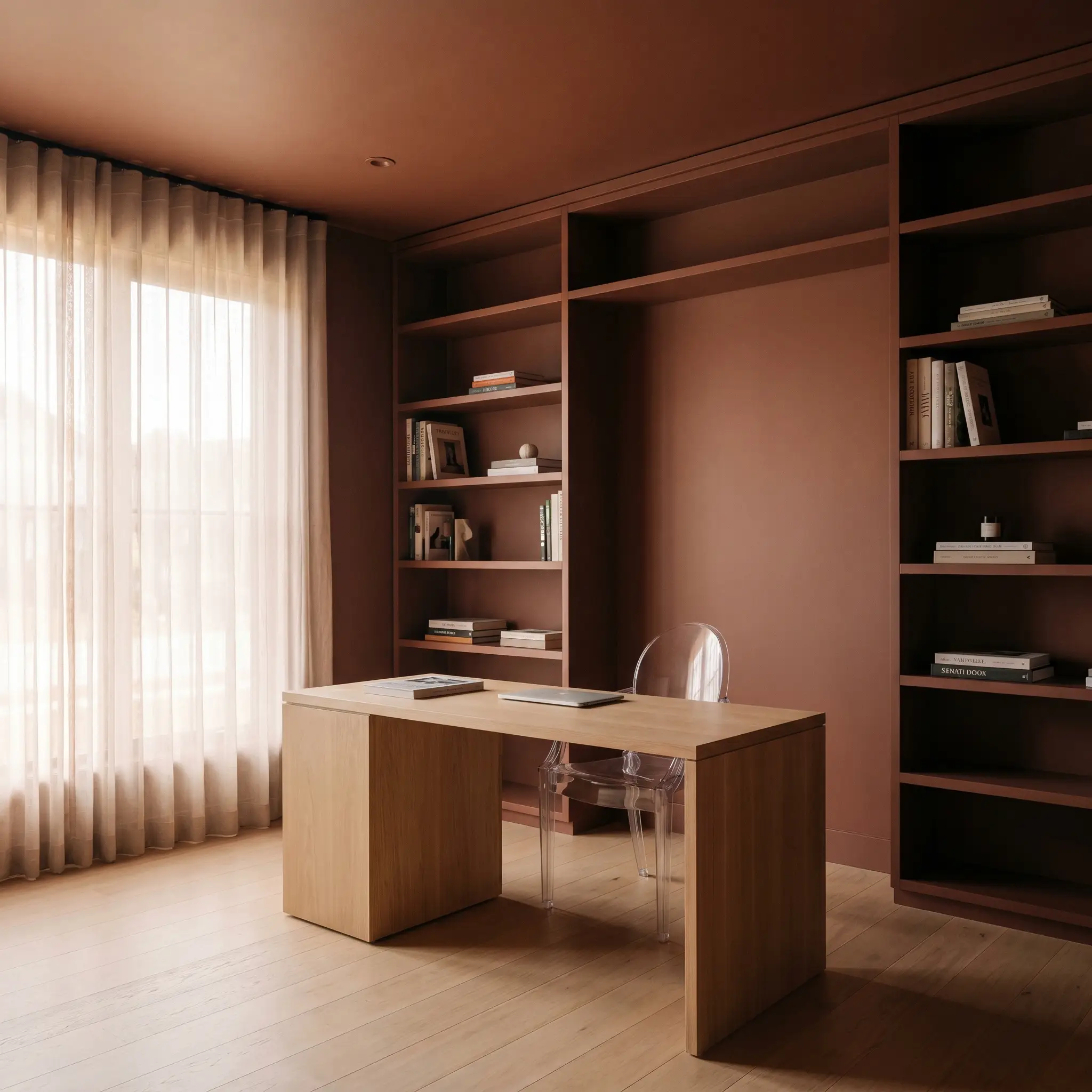
Home Libraries & Studies
You do not need a historic, wood-paneled mansion to create a stunning home library. You can replicate that enveloping, focused energy in a standard suburban study by color-drenching the room in this shade. Painting the walls, ceiling, and any built-in bookcases in a uniform matte finish modernizes the application.
To break up the visual weight, introduce unexpected, contemporary elements. An acrylic ghost chair at a sleek, minimal desk or an oversized piece of abstract art leaning against the dark built-ins instantly shifts the vibe from a dusty heritage room to a curated, modern workspace.
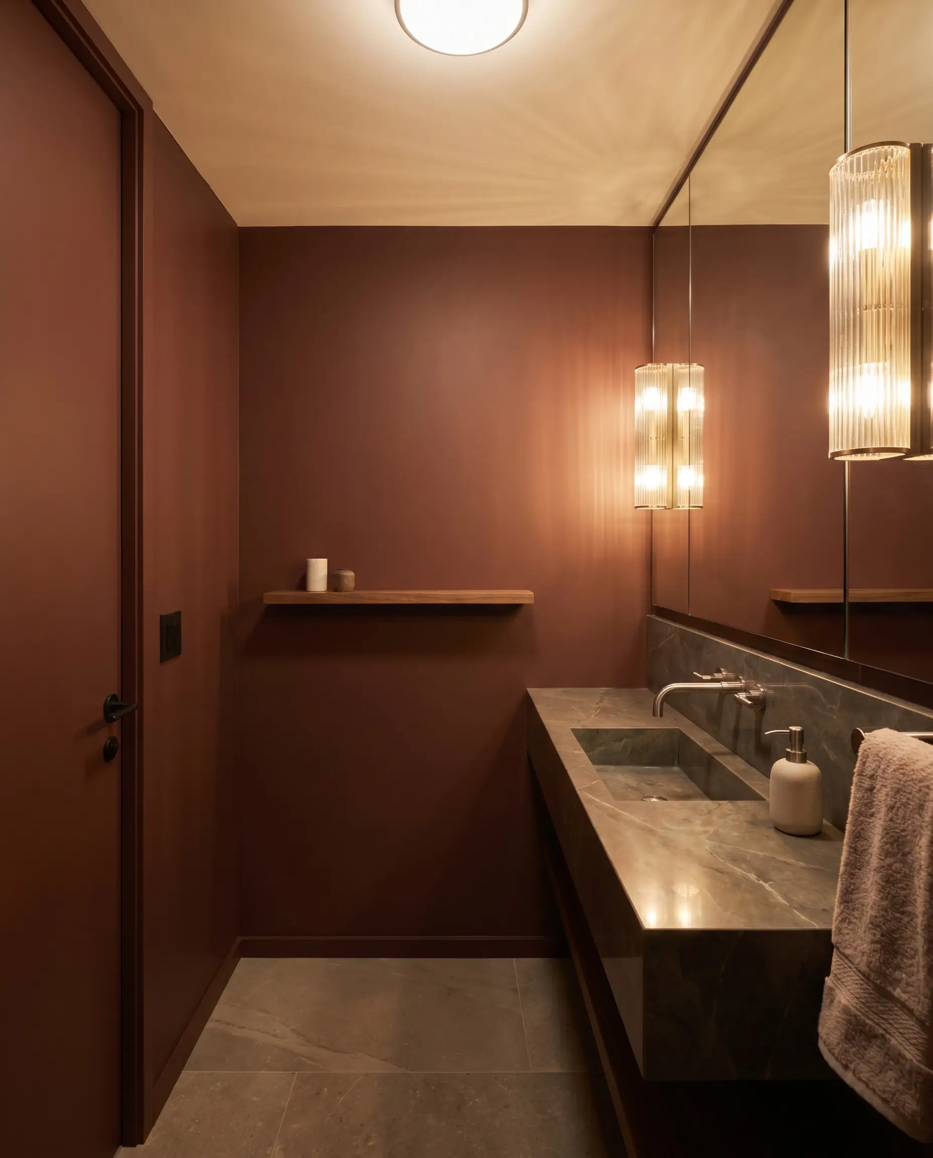
Powder Rooms
Powder rooms are the perfect testing ground for intense colors because you only occupy them for a few minutes at a time. Wrapping a small, windowless bathroom in this shade creates a dramatic, jewel-box effect that surprises guests.
To maximize the impact, pair the dark walls with highly reflective surfaces. A polished soapstone vanity top, an oversized mirror, and fluted glass lighting fixtures will bounce just enough light around the room to keep the dark walls from feeling restrictive.
Building a Palette Around PPG Warm Mahogany
Because this spiced red possesses such a dense, velvety atmosphere, it demands companions that can either hold their own against its intensity or offer a soft, luminous contrast. It requires intentional material pairings and thoughtful color transitions to prevent the room from feeling flat or restrictive.
Selecting the Right Trim and Baseboards
Crisp, stark white trim will visually jar against the earthy brown base, creating an unwanted, harsh boundary. Instead, you need creamy, shaded whites that gently transition into the dark walls and soften the overall contrast.
Benjamin Moore White Dove OC-17 offers a beautifully muted, shaded border that frames the room without startling the eye. If you want a slightly warmer glow, Sherwin-Williams Alabaster SW 7008 possesses a subtle beige undertone that seamlessly connects the dark woodwork to a lighter ceiling.
Hardware, Wood, and Tactile Finishes
To balance the low light reflectance of this burnished architectural finish, you must introduce textures that bounce illumination and soften the visual weight. The goal is to create a sensory dialogue between the walls and the room’s hard finishes.
Complementary Paint Choices
Curated Room Palettes
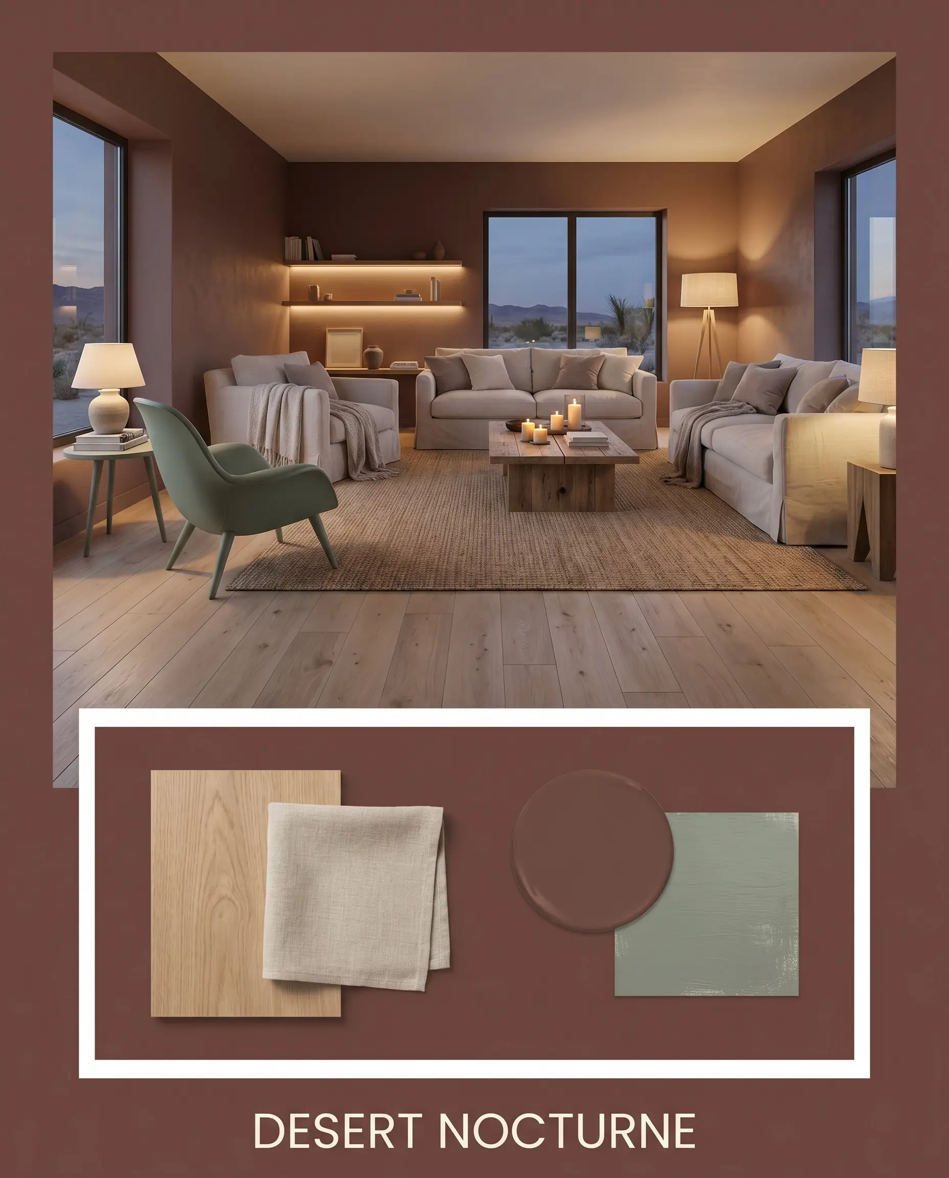
Desert Nocturne This palette captures the quiet, cooling energy of an arid landscape at dusk. By rooting the space with wide-plank white oak floors and walls painted in this deep chromatic profile, the environment feels instantly grounded. Layer in washed linen textiles and accents of Farrow & Ball Card Room Green to introduce a breathable, organic softness that encourages total relaxation.
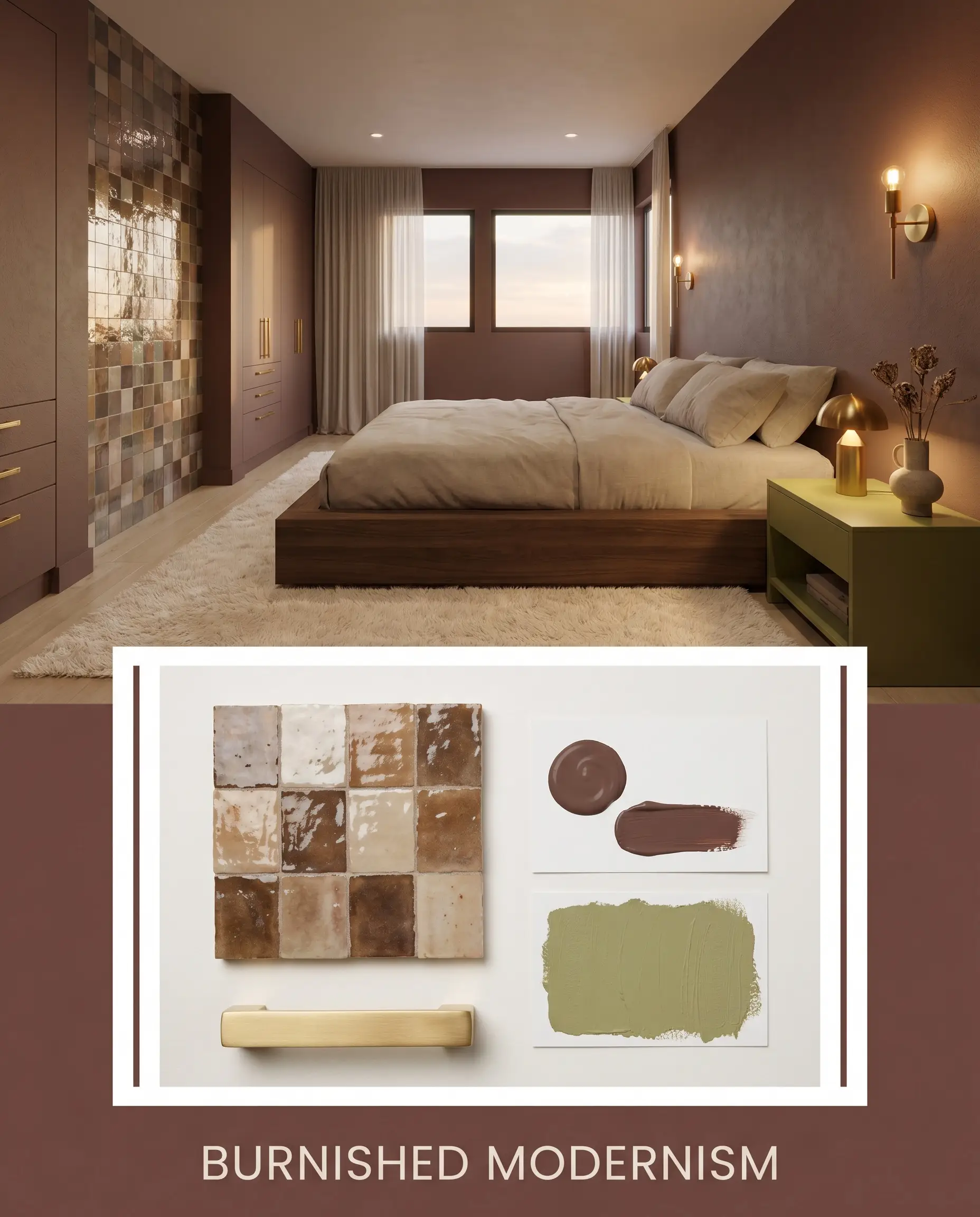
Burnished Modernism A brilliant exercise in intentional design tension, blending sleek contemporary lines with earthy warmth. The walls provide a moody color structure that makes glossy Zellige tile and unlacquered brass hardware absolutely sing. Introduce a minimal plinth bed or a low-profile modular sectional alongside a pop of PPG Golden Grass to inject a sophisticated, artistic energy.
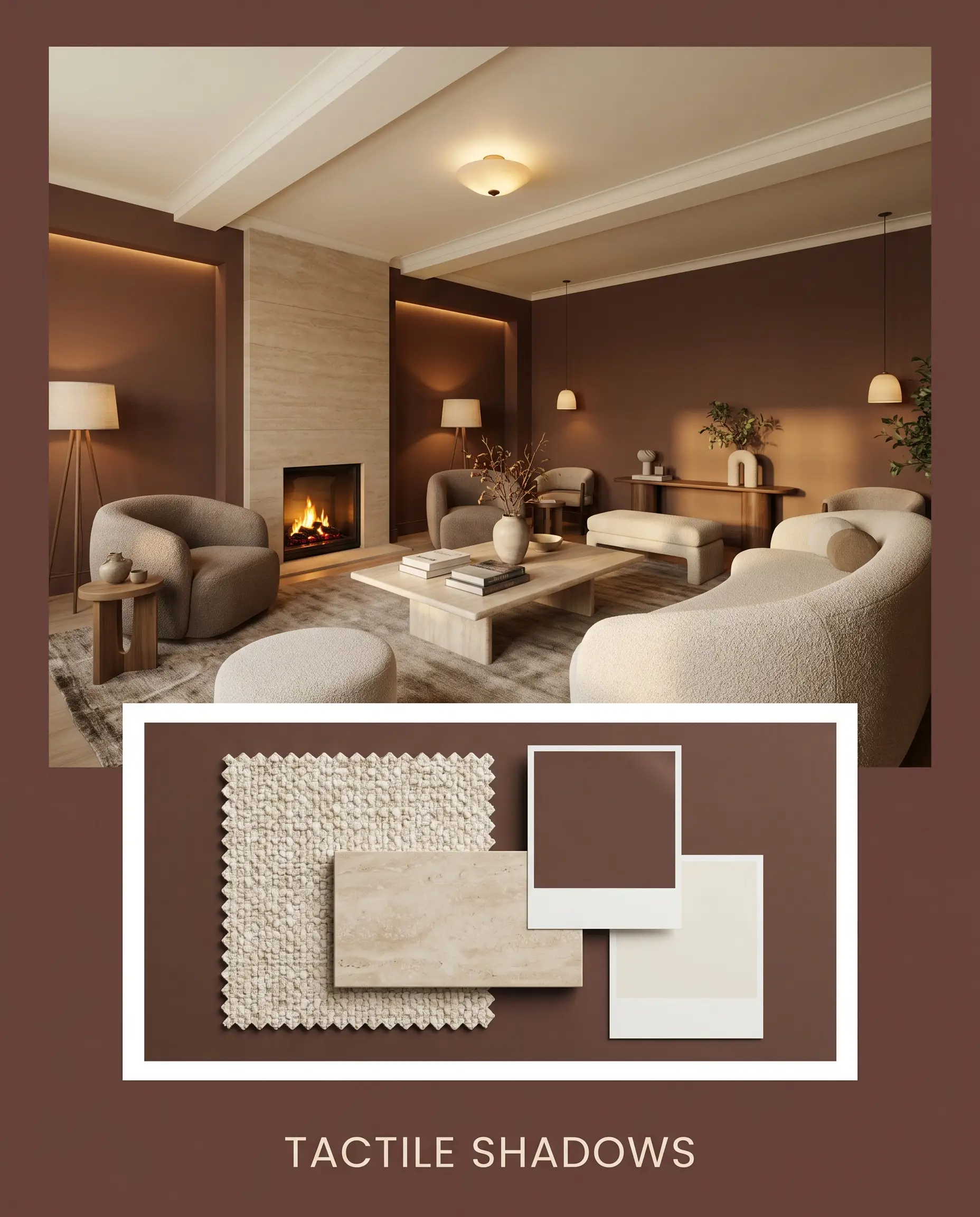
Tactile Shadows Designed for those who crave a cocooning, sensory-rich environment. The velvety atmosphere of the dark walls is softened by expansive, creamy ceilings painted in Benjamin Moore White Dove. Introduce nubby textiles like heavily textured boucle alongside honed stone surfaces to create a space that feels incredibly secure, intimate, and intentionally crafted.
Comparing PPG Warm Mahogany to Rival Shades
Selecting the perfect dark neutral often comes down to how the paint behaves under your specific lighting conditions. While this burnished finish thrives in sun-drenched spaces, certain architectural exposures might cause it to pull too dark or lose its earthy nuance, making a rival shade the more successful candidate.
PPG Warm Mahogany vs. Sherwin-Williams Carriage Door SW 7594
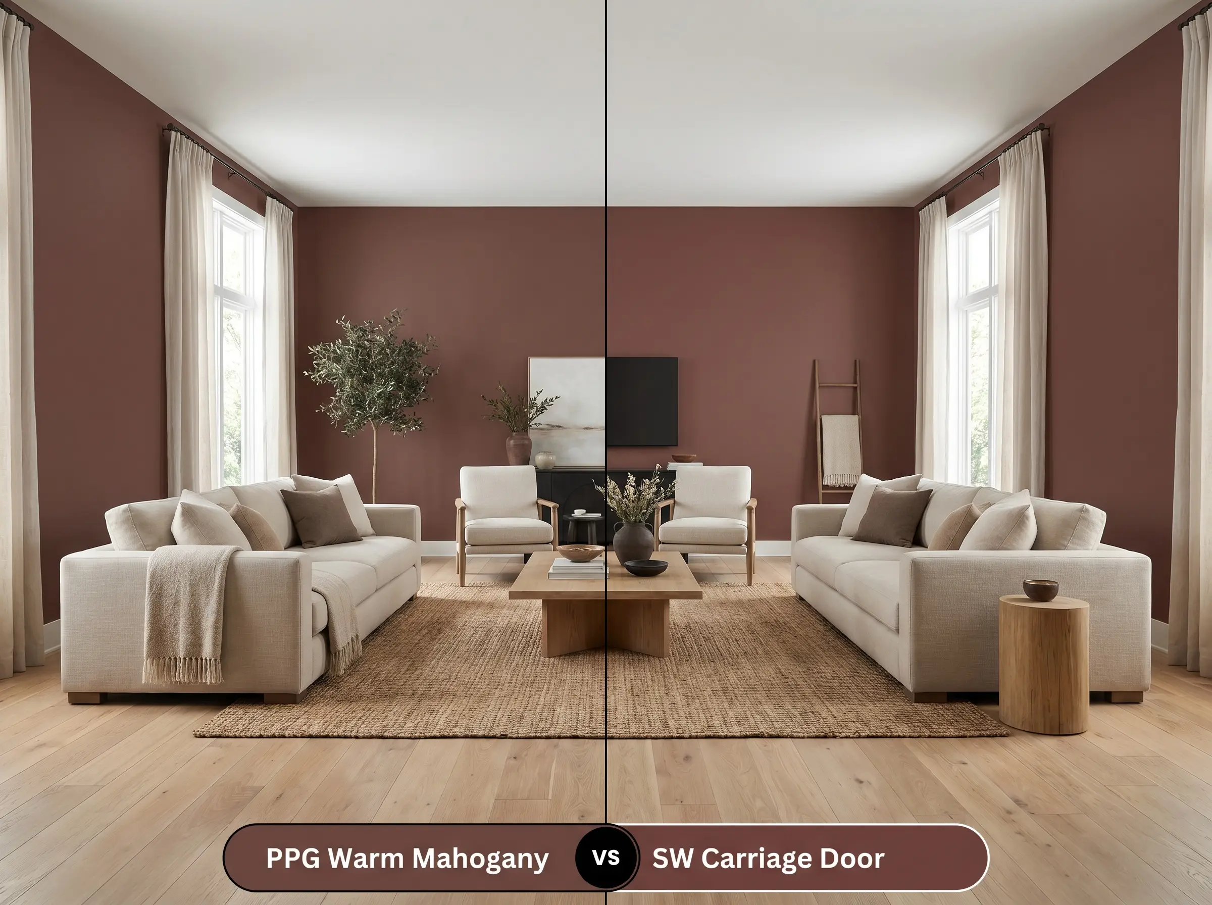
Carriage Door is noticeably more red, lacking the heavy brown foundation that keeps its PPG rival grounded. If your room features ample natural light and you want a clearer, more traditional crimson presence, SW 7594 is the better choice. However, if you are styling a modern organic space and need a muted, baked-clay undertone to pair with natural woods, stick with the PPG option.
PPG Warm Mahogany vs. Benjamin Moore Townsend Harbor Brown HC-64
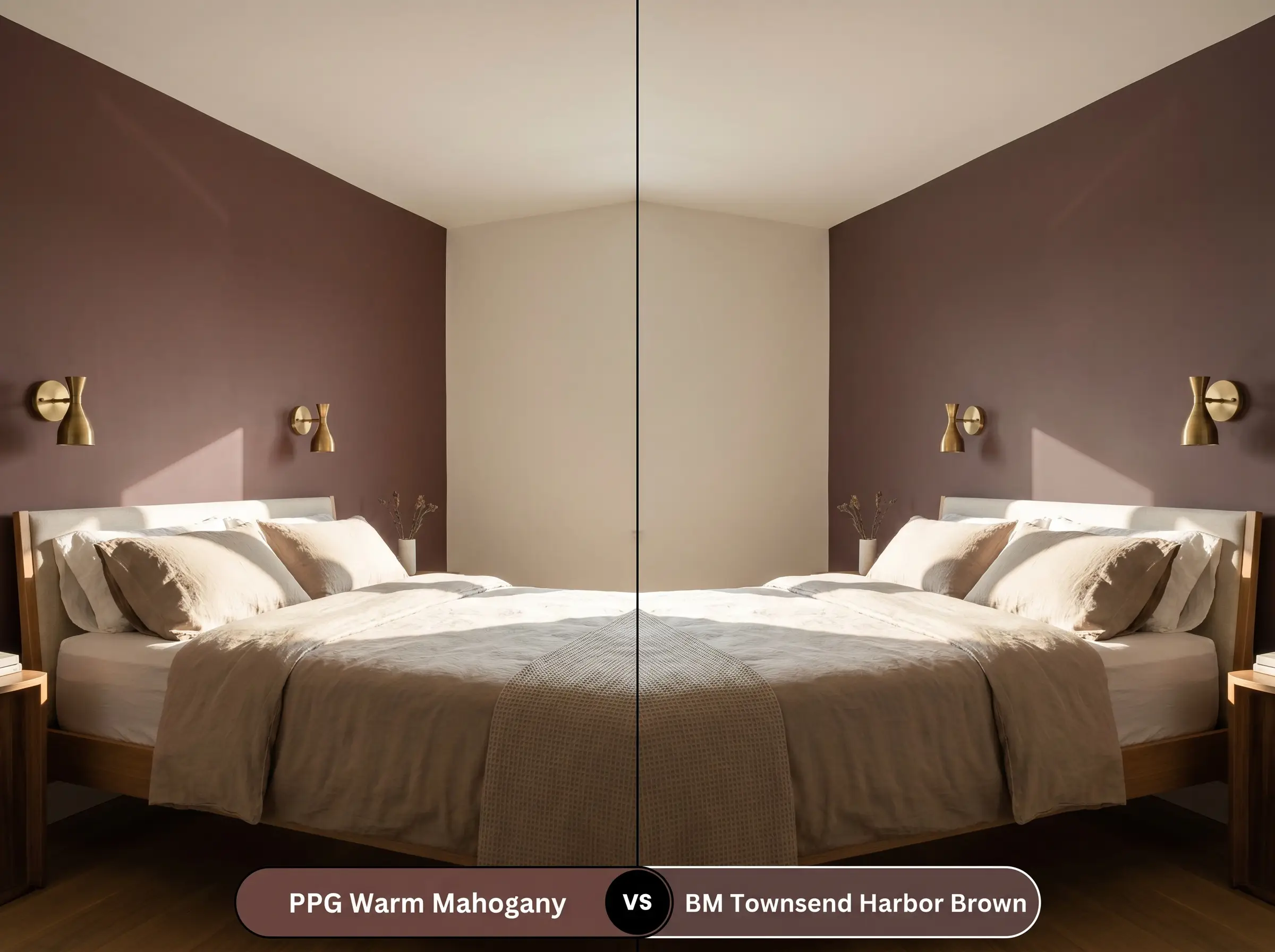
Townsend Harbor Brown pushes much further into a dark, plum-infused chocolate territory. If your space has strong southern exposure that makes standard reds feel too fiery, the Benjamin Moore alternative absorbs that light beautifully without turning orange. Conversely, if you want a true spiced red that retains its inviting warmth in standard lighting, the PPG formulation remains superior.
Alternative Options and Brand Matches
You might find that your specific lighting requires a shade with a slightly different undertone, or perhaps you simply need to source a color from a different local supplier. The following alternatives offer similar enveloping warmth with subtle structural variations.
Exploring the PPG Catalog
Sourcing From Rival Brands
Executing a Flawless Paint Application
Transitioning this moody color structure from a small paper swatch to a full room requires careful planning. Dark, saturated paints demand a flawless application strategy to ensure the final finish looks intentional and high-end.
Selecting the Right Sheen
Primer Strategy and Coverage Expectations
A standard white primer will sabotage the depth of this deep chromatic profile. You must use a high-quality, gray-tinted primer to establish a dark foundation, allowing the true earthy red pigments to saturate fully. Expect to apply at least two to three coats for a professional, opaque finish.
Dark paints with low LRVs are notorious for “flashing”—those visible, uneven streaks that appear when the paint dries inconsistently. To avoid this, always maintain a wet edge while rolling and never press the roller forcefully into the drywall to squeeze out the last drop of paint.
Hackrea Design Secret (Preventing Roller Marks)
Answering Your Most Common Color Questions
Because south-facing exposures receive intense, direct sunlight, deep chromatic profiles naturally fade faster than lighter shades. To keep this spiced red looking vibrant and intentional, you will need to apply a high-quality UV-protective clear coat and anticipate repainting a year or two sooner than you would with a pale neutral.
Embracing the low light reflectance in a windowless space is actually a brilliant design strategy. Instead of fighting the lack of light, wrapping the room in this velvety atmosphere creates a stunning jewel-box effect that feels incredibly intimate and sophisticated.
The underlying pigments in this paint clash directly with heavily orange or red-toned woods. The baked-clay undertones will visually compete with honey oak, while cherry wood blends too closely with the wall, leaving the room looking muddy and undefined.
While flat finishes hide drywall imperfections beautifully, lower-tier flat paints can sometimes leave a dull, chalky residue in dark colors. Opting for a premium washable matte or a subtle eggshell finish ensures the rich, earthy brown base retains its depth and smooth, tactile appearance.
The Final Verdict on Warm Mahogany
This enveloping, spiced red is the ultimate solution for homeowners who want to introduce dramatic color without sacrificing earthy sophistication. It performs beautifully in spaces designed for evening relaxation, focused study, or intimate dining, turning standard rooms into curated retreats. If you are ready to move away from safe, builder-grade neutrals and embrace a truly architectural finish, this shade delivers an incredible return on investment.
While this paint pairs beautifully with neutral white oak, you must exercise extreme caution around honey oak or cherry wood elements. The yellow-orange undertones in honey oak will actively compete with the Sedona red-rock influence, creating a chaotic environment. If you cannot change these existing wood finishes, pivot to a cooler, contrasting wall color to maintain visual balance.
Clash Warning (The Wood Tone Conflict)