Beige Royal S15B1
DuluxDulux Beige Royal is a sophisticated, warm taupe-greige with a Light Reflectance Value (LRV) of 61. Characterized by a subtle pink undertone, this elegant neutral strikes a perfect balance between warmth and modernity, making it highly versatile for both open-plan interiors and contemporary exteriors.
Paint Technical Profile
| Color ID / SKU | S15B1 |
| HEX Code | #cfc7b8 |
| Light Reflectance (LRV) | 61 |
| Use | Interior, Exterior |
| Best Exposures | South-Facing or Eastern Morning Light |
| Best For | Open-plan living, bedrooms, kitchen cabinetry, and modern exteriors. |
Dulux Beige Royal: The Sophisticated Taupe That Elevates Everyday Architecture
The era of stark, icy interiors is officially behind us, but finding a warm neutral that doesn’t immediately read as a dated, yellow-tinted tan remains a notorious design challenge. Homeowners are constantly searching for that elusive foundational layer—a color that feels inviting and lived-in, yet retains a crisp, contemporary edge.
Dulux Beige Royal answers that call with remarkable precision.
Far from a flat, predictable builder-basic shade, this nuanced taupe base acts as a sophisticated bridge between cozy, organic styling and refined architectural elegance. Whether you are updating a suburban split-level or softening a modern urban condo, understanding how this specific pigment behaves is the key to unlocking a truly custom aesthetic.
Decoding Dulux Beige Royal: Undertones & LRV
When evaluating this paint for your home, the most immediate question is always: Is this color warm or cool? Dulux Beige Royal is definitively warm.
However, its warmth is incredibly sophisticated, completely bypassing the muddy, orange-leaning pitfalls of traditional tans. A close look at its chromatic profile reveals exactly why this shade feels so uniquely modern and highly adaptable.
Understanding the Light Reflectance (LRV 61) With an LRV of 61, this architectural finish sits in the sweet spot of the mid-light spectrum.
It reflects enough natural daylight to keep a room feeling expansive and breathable, yet it possesses enough structural depth to contrast beautifully against crisp white trims. This ideal mid-tone weight ensures the color won’t visually wash out and disappear the moment the afternoon sun hits it.
Lighting Effects & The Chameleon Factor
Because of that delicate pink-violet micro-nuance, Beige Royal is a true chameleon. The ambient lighting in your space will physically alter which part of the color’s DNA steps into the spotlight.
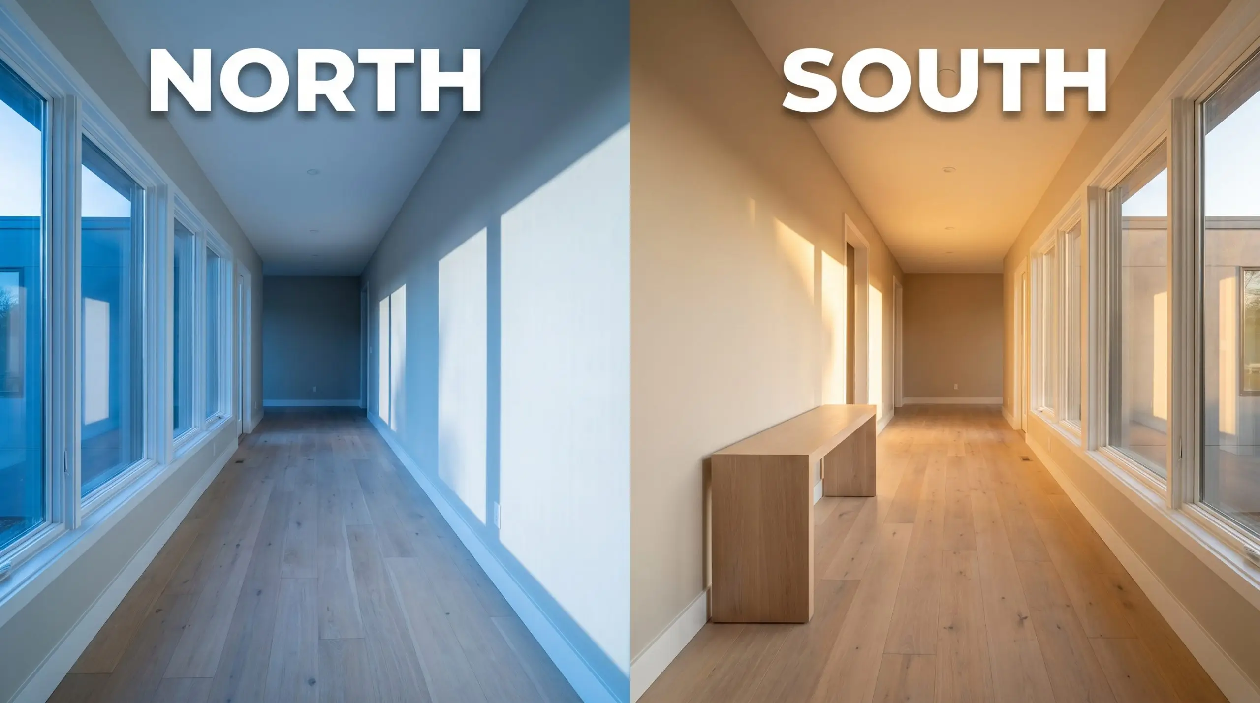
If you are painting a windowless corridor or a basement, strictly avoid bulbs over 3500K. Anything cooler will strip the warmth right out of this paint, leaving you with a sterile, slightly purple-tinged gray rather than the inviting taupe you originally selected.
Hackrea Pro-Tip (The Hallway Lighting Fix)
Architectural Placements: Where This Warm Neutral Shines
The true brilliance of this color lies in its adaptability across entirely different architectural styles and lifestyle needs. Here is how to manipulate this specific taupe to elevate the most important spaces in your home.
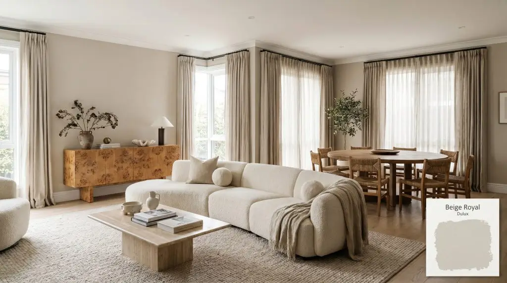
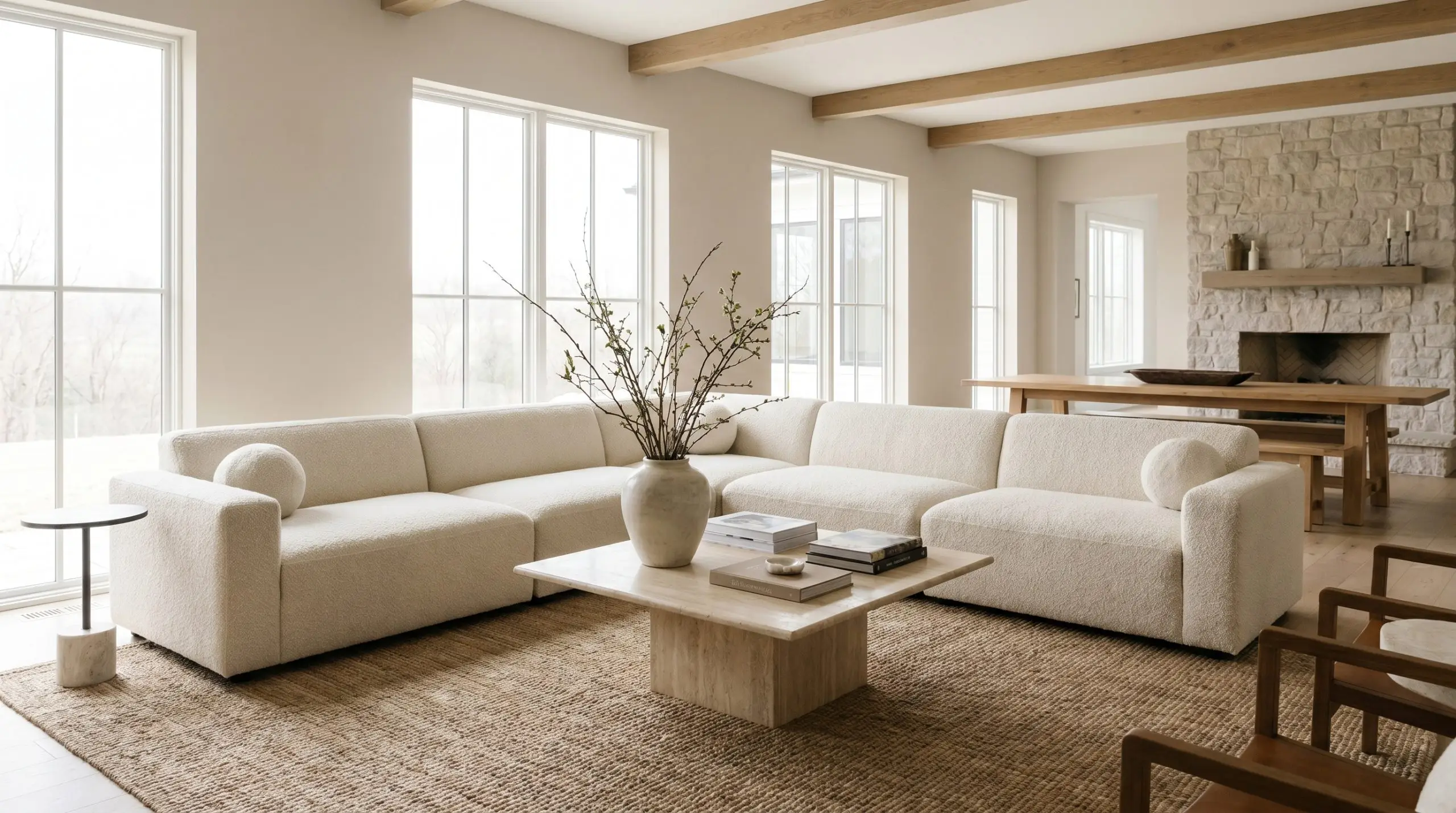
Open-Plan Living and Dining Areas
In expansive, multi-use spaces, you need a wall color that provides visual continuity without feeling utterly sterile. This mid-tone greige excels here, offering enough color structure to make the walls feel intentionally designed while allowing your furnishings to take center stage.
To lean into an Organic Modern aesthetic, pair these walls with warm, tactile materials.
Think fluted white oak media consoles, oversized bouclé sectionals, and a large jute rug to solidify the seating arrangement. The earthy taupe base sings when layered alongside other natural textures, so introduce raw ceramics, oversized botanical branches, and perhaps a honed travertine coffee table to introduce a premium, curated focal point into an otherwise relaxed family space.
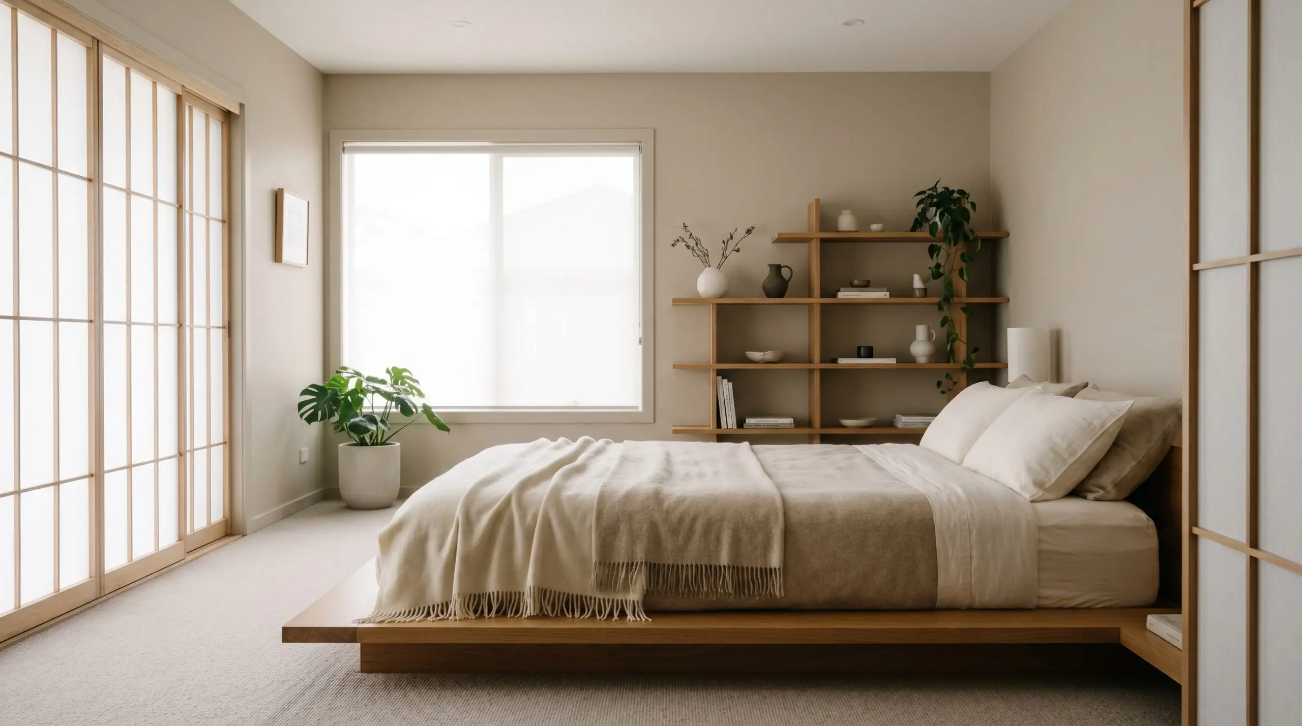
Primary Bedrooms and Nurseries
For spaces dedicated to rest and recovery, the subtle pink micro-nuance becomes your greatest asset. It introduces a gentle, calming softness that pure grays and stark whites simply cannot replicate.
This shade is a brilliant foundation for a Japandi-inspired retreat.
Pair the walls with a low-profile platform bed, worsted wool throws, and minimalist, asymmetrical shelving. If your home leans more Transitional, use this paint across paneled wainscoting or picture molding. The subtle shadows cast by the millwork will naturally highlight the color’s depth, creating a sophisticated, tailored backdrop for slipcovered seating and unlacquered brass reading sconces.
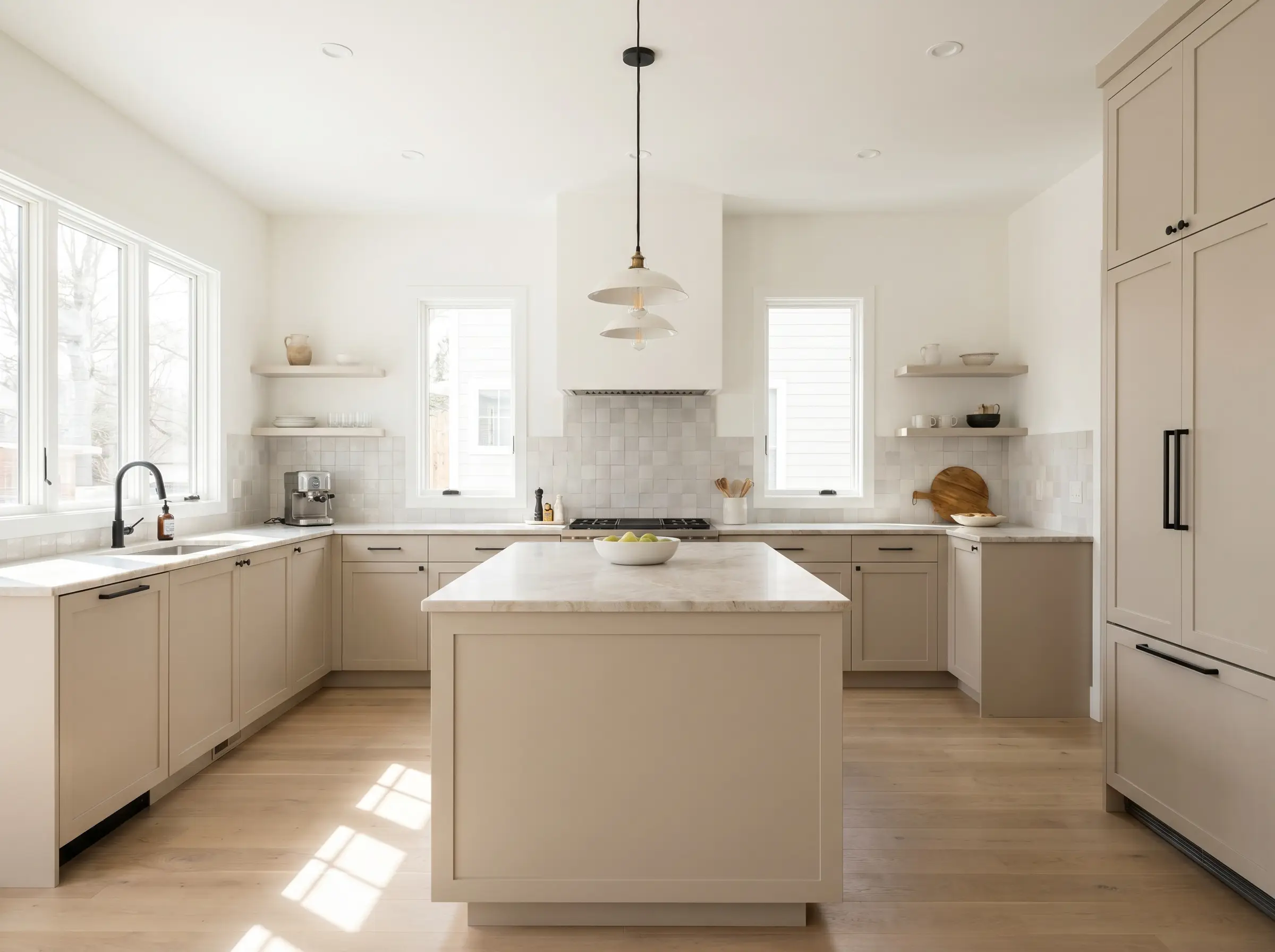
Modern Kitchen Cabinetry
Moving away from stark white kitchens, homeowners are increasingly seeking warmth for their cabinetry. When applied to lower cabinets or a central island, this nuanced taupe acts as a soft, grounding element in a high-traffic zone.
It pairs flawlessly with matte black steel hardware and the beautifully varied textures of zellige tile backsplashes.
Be highly intentional if you plan to pair this specific paint with heavily veined, cool-toned Carrara marble countertops. The stark, blue-gray veining of the marble will fiercely compete with the warm, pink-leaning taupe of the cabinets. Instead, opt for a warmer stone like Taj Mahal quartzite, a rich soapstone, or butcher block to maintain a cohesive, harmonious palette.
Hackrea Design Secret (The Carrara Marble Clash)
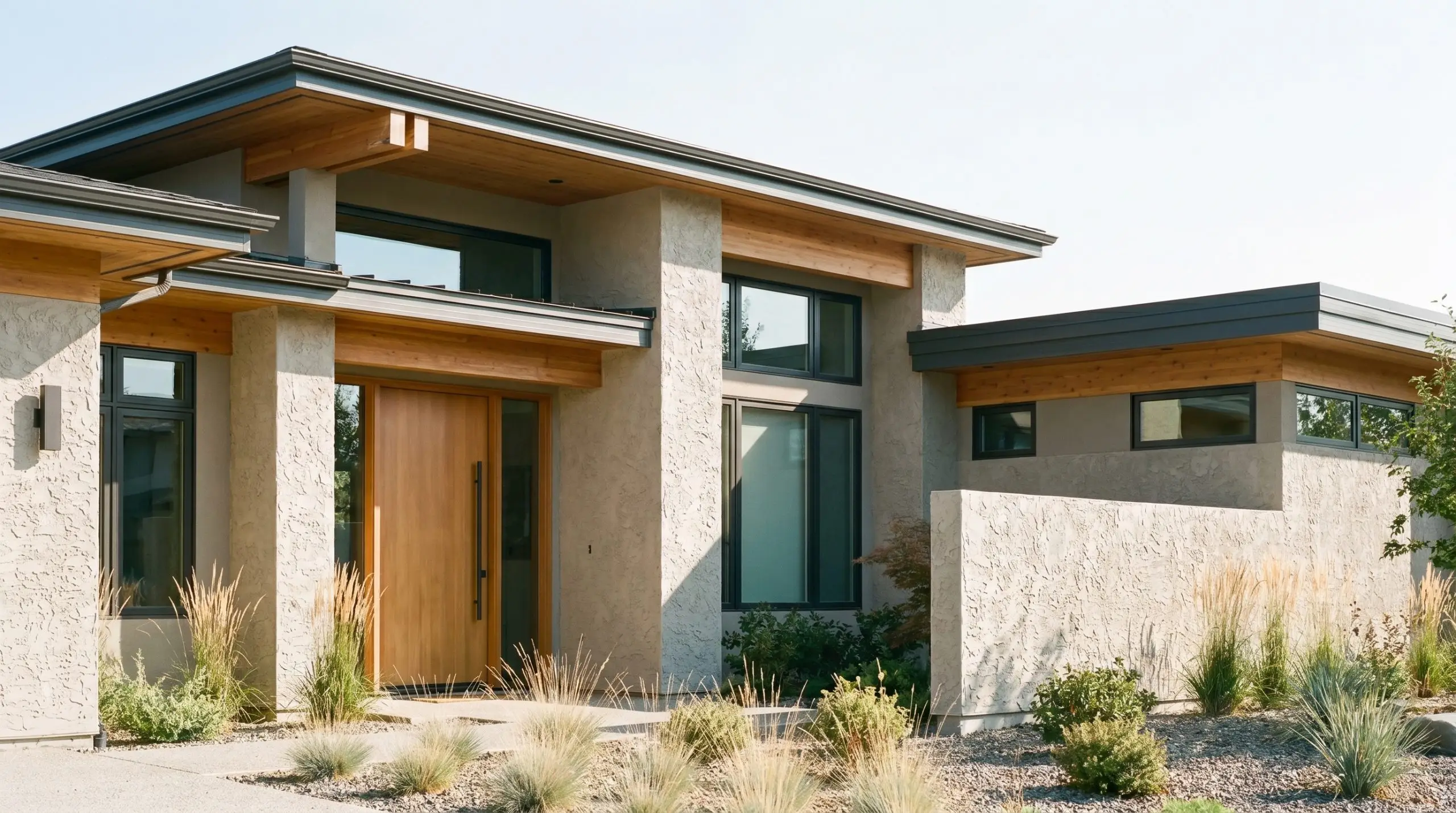
Exterior Render and Weatherboard Façades
Taking this color outdoors requires a strategic understanding of how direct sunlight impacts mid-tone paints. On an exterior facade, the intense natural light will wash out the color slightly, making it appear a touch lighter and creamier than it does on an interior swatch.
It is a stunning choice for Modern Prairie homes or Mediterranean Revival updates.
However, the texture of your home’s exterior will physically alter the final look. On heavily textured render or stucco, the micro-shadows created by the rough surface will deepen the color, making it appear richer and more saturated. On smooth, modern weatherboards, the color will read crisper and slightly more reflective.
A crucial landscaping warning: If your home is surrounded by dense, heavy green foliage, the bright green light reflecting off the leaves will interact directly with the paint’s pink undertones. This complementary color reaction can sometimes emphasize the rosy tint, so always test a large swatch directly facing your largest trees before committing to the entire facade.
Perfecting the Palette: Coordinating Materials and Accents
Rather than requiring sharp, high-contrast boundaries to hold its shape, this particular pigment thrives when allowed to softly bleed into surrounding warm tones. Its foundational color structure creates an atmosphere of quiet, enveloping comfort that benefits from deliberate, tonal layering rather than jarring interruptions.
Tailored Architectural Boundaries
To properly frame this nuanced shade, you must select a trim color that provides a clean break without flashing too stark or icy. Dulux Vivid White SW1G1 is an exceptional choice, offering a pure, un-tinted boundary that allows the wall’s greige cast to step fully into focus.
If you are mixing brands across your home, Benjamin Moore Chantilly Lace OC-65 delivers a similarly crisp, neutral edge that prevents the taupe from feeling overly saturated.
For a slightly more luminous, highly reflective finish on your baseboards and crown molding, Sherwin-Williams High Reflective White SW 7757 bounces natural daylight beautifully. This ensures the transition between your walls and trim feels sharp, intentional, and highly refined.
Tactile Elements and Hardware
The secret to elevating this mid-tone neutral is pairing it with materials that actively engage with its light reflectance. Because the paint sits comfortably in the middle of the spectrum, you can use tactile finishes to either absorb light for a cozier feel or bounce it for a brighter aesthetic.
Secondary Tones and Accents
Curated Aesthetic Concepts
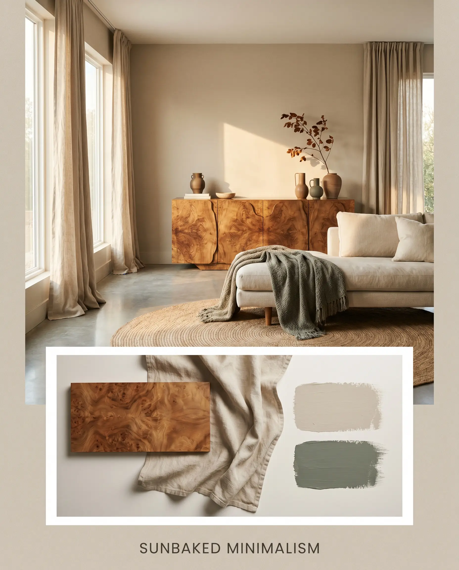
Sunbaked Minimalism This aesthetic relies on the paint’s ability to act as a warm, inviting canvas for highly sculptural, organic forms. By pairing the taupe walls with flowing stonewashed linen drapery and a statement burl wood credenza, the space immediately feels grounded and intentional. The introduction of muted olive accents—like a beautifully draped throw in Sherwin-Williams Retreat—adds a quiet, natural tension. The resulting energy is restorative, uncluttered, and effortlessly sophisticated, allowing negative space to feel like a deliberate design choice rather than an empty void.
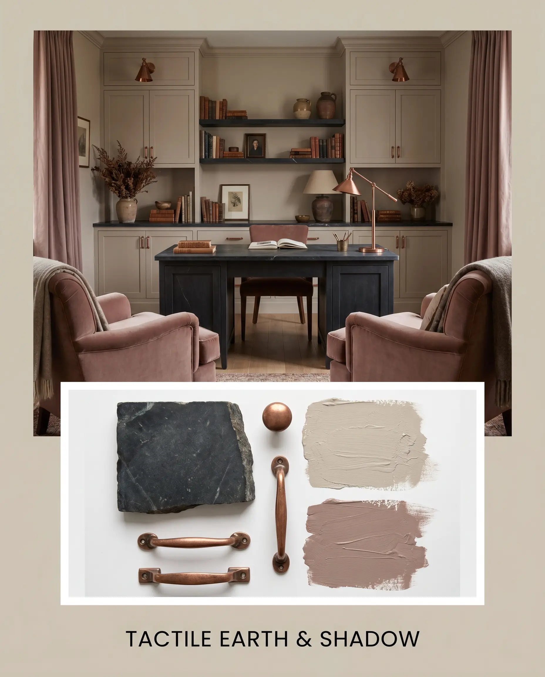
Tactile Earth & Shadow For a moodier, more enveloping atmosphere, this palette pushes the paint’s earthy base to its absolute limits. Dark honed soapstone surfaces and aged copper hardware provide a deeply patinated, stabilizing contrast against the mid-tone walls. To amplify the luxury, introduce rich textiles and accents in Farrow & Ball Sulking Room Pink, which coax the subtle violet undertones out of hiding. This combination creates an incredibly intimate, curated vibe that feels both historic and fiercely contemporary.
Head-to-Head: Dulux Beige Royal vs. Rival Neutrals
While this warm neutral performs beautifully in balanced lighting, certain architectural exposures demand a slightly different pigment structure. If your space lacks natural light or you are fighting intense, cool-toned shadows, you may need to pivot to a shade with a more resilient undertone.
Dulux Beige Royal vs. Dulux White Duck S16B1
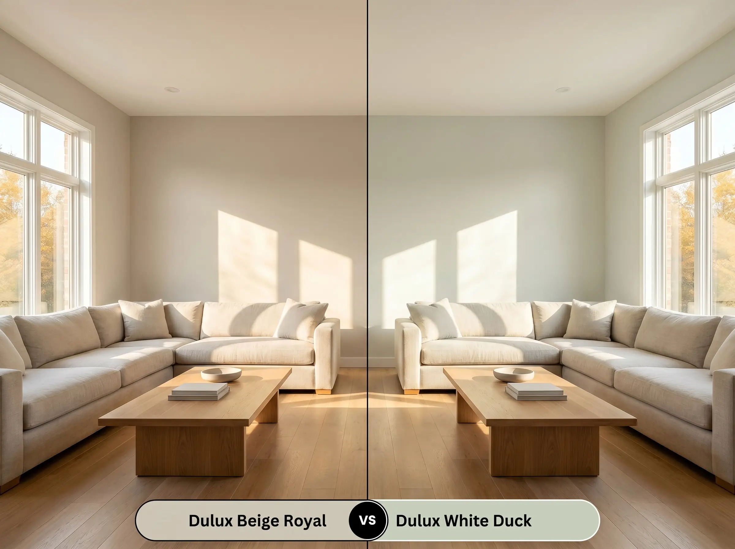
This is a classic debate between a true warm taupe and a slightly cooler, more flexible greige.
If your room is flooded with intense, warm afternoon sunlight, Beige Royal might pull slightly too much heat. In that specific scenario, Dulux White Duck S16B1 is the superior choice. White Duck possesses a slightly grayer, more muted base that actively neutralizes harsh yellow light, maintaining a serene, balanced aesthetic where the taupe might feel overly saturated.
Dulux Beige Royal vs. Dulux Hog Bristle S14D1
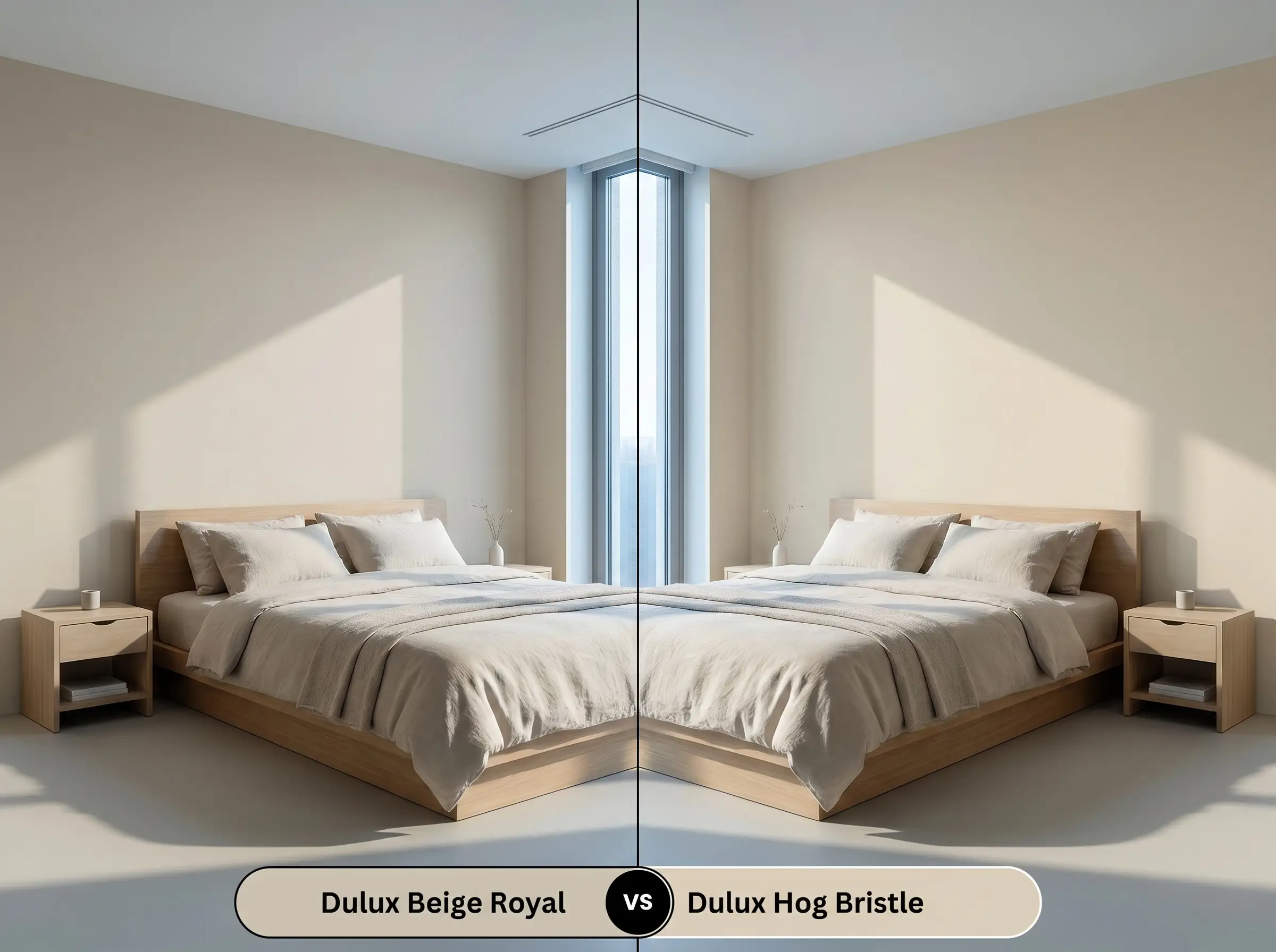
Choosing between these two comes down entirely to how much traditional warmth your architecture requires.
If you are painting a cool, north-facing room where Beige Royal’s hidden pink-violet nuance turns slightly chilly or purple, Dulux Hog Bristle S14D1 becomes your safest bet. Hog Bristle leans firmly into a classic, yellow-based tan, providing an undeniable, baked-in warmth that easily cuts through cold, blue-tinted shadows.
Exploring Tone Alternatives
Sometimes you fall in love with a color’s specific DNA, but the depth or brand availability isn’t quite right for your upcoming project. Here are the most reliable pivots to keep your design on track.
Same-Brand Variations
Cross-Brand Matches
Executing a Flawless Paint Finish
Transitioning this beautifully curated color from a tiny paper swatch to a sweeping architectural feature requires precise execution. The physical finish you choose will dramatically alter how the color is perceived in your home.
Primer Strategy Because this color relies on a delicate balance of warm and cool micro-nuances, applying it over a stark white or dark builder-grade wall can severely warp the final result. You must use a high-quality, warm gray tinted primer. This creates a neutral foundational layer that allows the true taupe pigment to develop accurately.
Mid-tone colors with an LRV in the low 60s are notoriously prone to “flashing”—visible, uneven streaks where the roller overlapped or touch-ups were applied after the paint dried. To avoid this frustrating visual inconsistency, always maintain a wet edge while rolling, commit to two full coats, and never attempt to spot-touch a wall months later. If a wall gets scuffed, you must repaint the entire single wall from corner to corner.
Hackrea Pro-Tip (The Flashing Warning)
Frequently Asked Questions
Because of its hidden pink-violet micro-nuance, this paint will actively react to the green light bouncing off dense exterior trees. This complementary color interaction can sometimes emphasize the rosy tint, so it is highly recommended to test a large swatch directly facing your windows before committing.
The physical texture of your facade dictates the color’s depth. On textured render, the tiny micro-shadows will deepen the paint, making it appear richer and more saturated, whereas smooth weatherboards will reflect more sunlight, making the hue look slightly crisper and lighter.
While it is a stunning cabinet color, pairing it with prominently veined, cool-toned Carrara marble requires caution. The stark, blue-gray veining of the stone will fiercely compete with the warm, pink-leaning taupe, often resulting in a disjointed aesthetic. Warmer stones like Taj Mahal quartzite are a much more harmonious pairing.
Under crisp, 4000K daylight bulbs, the cooler, violet-leaning edge of the paint is sharply highlighted. In a windowless hallway, this artificial lighting will strip away the inviting earthy taupe base, often leaving the walls looking like a sterile, slightly purple-tinged gray.
The Final Verdict on Dulux Beige Royal
Dulux Beige Royal is a masterclass in modern neutrality, offering a highly sophisticated alternative to the flat, uninspired tans of the past. Its greatest strength lies in its perfectly balanced LRV 61 and that delicate pink-violet micro-nuance, which together create a shade that feels both expansive and deeply comforting. It is the definitive choice for homeowners looking to soften modern, open-plan architecture, or those wanting to inject a sense of organic, curated warmth into bedrooms and living spaces without resorting to stark whites or chilly grays.
However, you must respect the boundaries of its specific color structure. If you attempt to force this warm, nuanced taupe into a room dominated by icy blue-grays, stark black leather furniture, or cool-toned architectural stone, the palette will immediately fracture. The warmth of the paint will clash uncomfortably against those cold, rigid materials, making the walls look dull and the furnishings feel entirely disconnected. To ensure a flawless execution, always support this beautiful pigment with equally warm, tactile, and earthy materials that allow its sophisticated greige cast to truly shine.
Closest Cross-Brand Equivalents
The absolute closest scientific color matches for Beige Royal across top paint brands.