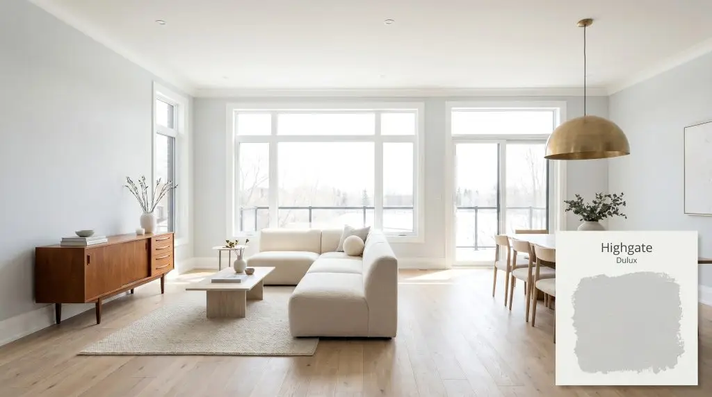
Highgate SP2B6
DuluxDulux Highgate is a soft, subtle cool grey with a high Light Reflectance Value of 74. Known for its delicate greenish-blue undertones, it serves as a crisp, refreshing neutral that perfectly complements contemporary interiors and exterior cladding.
Paint Technical Profile
| Color ID / SKU | SP2B6 |
| HEX Code | #d9dddf |
| Light Reflectance (LRV) | 74 |
| Use | Interior, Exterior |
| Best Exposures | South-Facing, West-Facing |
| Best For | Contemporary living rooms, spa-inspired bathrooms, modern kitchen cabinetry, exterior weatherboards |
Dulux Highgate: The Architectural Neutral That Redefines Cool Grey
Finding a grey paint that feels genuinely sophisticated without turning your home into a sterile commercial lobby is an incredibly common design hurdle. Many popular greys fall flat on the wall, absorbing the energy of the room and leaving the space feeling rigid and unwelcoming. Dulux Highgate bypasses this problem entirely by hiding a very specific, vibrant pigment just beneath its surface.
Instead of relying on stark black-and-white colorants, this shade utilizes a subtle wash of color to give the grey life, movement, and breathability. It acts as a crisp, silver-toned foundation that elevates the materials around it.
Whether you are smoothing out the rough edges of an urban loft or building a serene, Soft Minimalist retreat in the suburbs, this color adapts beautifully. It establishes a clean, modern atmosphere that feels incredibly intentional, giving you the perfect architectural blank slate to layer your personal style.
Dulux Highgate: Undertones & LRV
Dulux Highgate is undeniably a cool grey neutral. If you are searching for a warm, cozy greige or a mushroom tone, this is not the color for your project. However, if you want a crisp, refreshing, and highly modern atmosphere, this shade delivers exactly that.
The Anatomy of the Color:
With a Light Reflectance Value (LRV) of 74, this architectural finish bounces a significant amount of light back into the room while absorbing roughly 26% of it. This specific rating means it is light enough to keep a room feeling expansive and airy, but it holds enough physical saturation to contrast beautifully against pure, crisp white trim and ceilings.
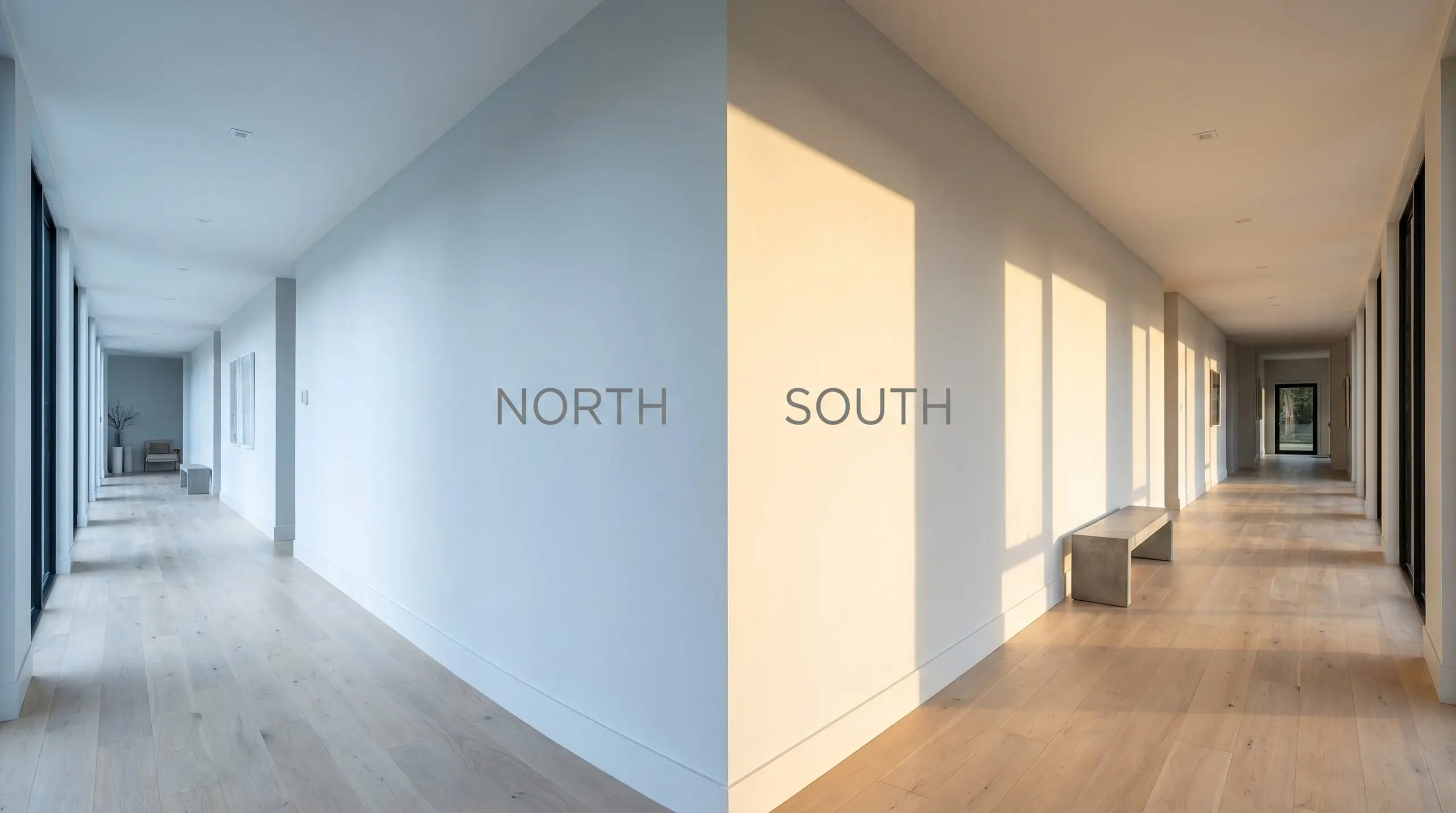
Lighting Effects & The Chameleon Factor
That hidden cyan pigment makes this cool grey highly reactive to the shifting temperature of your light sources. Throughout the day, you will watch the walls transition from a sharp, icy silver to a much softer, balanced neutral.
How the Color Shifts:
If you love the crispness of this grey but want to tame the blue undertones after the sun goes down, stick strictly to 3000K LED bulbs. This specific temperature provides a clean, neutral light that keeps the color honest without turning it overly blue or muddying it with yellow.
Hackrea Pro-Tip (The Bulb Strategy)
Elevating Everyday Spaces: Popular Applications
Because it sits at such a comfortable reflectance level, this shade is incredibly forgiving across a wide variety of architectural features. From sprawling open-concept interiors to weather-beaten exterior facades, it provides a clean, modern baseline. Here is how to maximize its potential across your home.
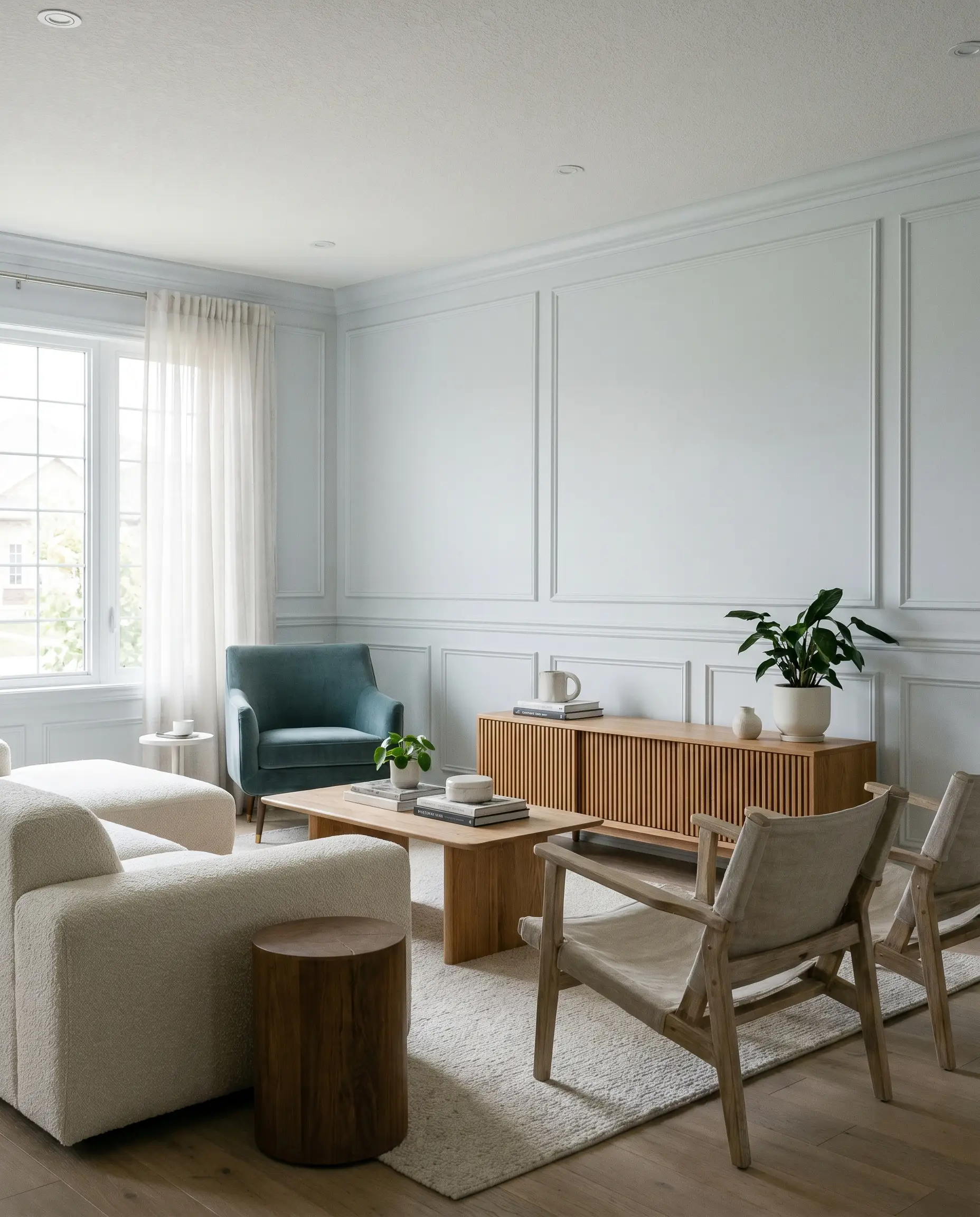
The Modern Living Space
To keep a cool silver from feeling stark in a primary gathering space, you must introduce aggressive tactile warmth through your furnishings. Lean into a Soft Minimalist or Japandi aesthetic by pairing the painted walls with natural, matte textures. A low-profile boucle sectional or a pair of washed linen sling chairs will instantly soften the room’s energy.
Because the walls provide such a crisp backdrop, you can afford to introduce mid-tone woods without the room feeling heavy. White oak flooring, a slatted wood media console, or a vintage mid-century credenza will warm up the cool base beautifully. For a striking, high-contrast focal point, incorporate a single accent piece in a saturated tone, like a velvet chair in Benjamin Moore Aegean Teal 2136-40.
If your living room features wainscoting or picture molding, consider color-drenching the entire space—walls, trim, and doors—in the same finish. This technique modernizes traditional architectural details, making standard suburban living rooms feel highly custom and incredibly cohesive.
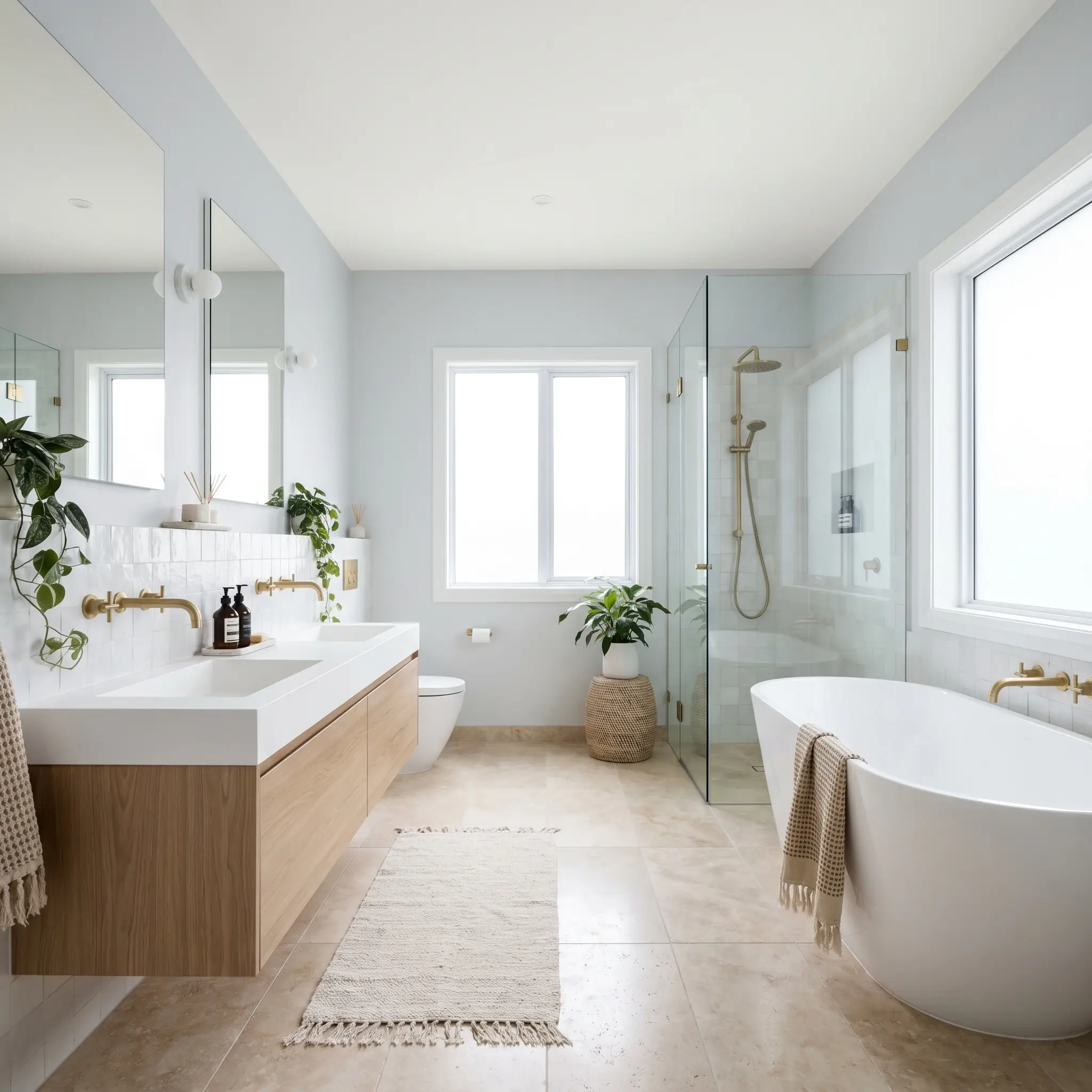
Tranquil Washrooms & Ensuites
Cool, blue-leaning greys are naturally suited for bathrooms, but the key to elevating the design is avoiding the predictable, clinical “white tile and grey wall” combination. Instead, push the space toward an Organic Modern aesthetic. Pair the crisp walls with earthy, imperfect materials like honed travertine floor tiles or a textured zellige backsplash.
The hardware you select will dictate the final temperature of the room. To create intentional design tension, install unlacquered brass or blackened bronze plumbing fixtures. The warmth of the living metal cuts through the icy tones of the wall, creating a sophisticated, layered look that feels far more expensive than standard chrome.
For a seamless, premium finish, paint the ceiling in a pure, un-tinted white like Dulux Vivid White SW1G1. This sharp contrast will make the ceiling feel taller while highlighting the subtle cyan notes in the grey walls below.
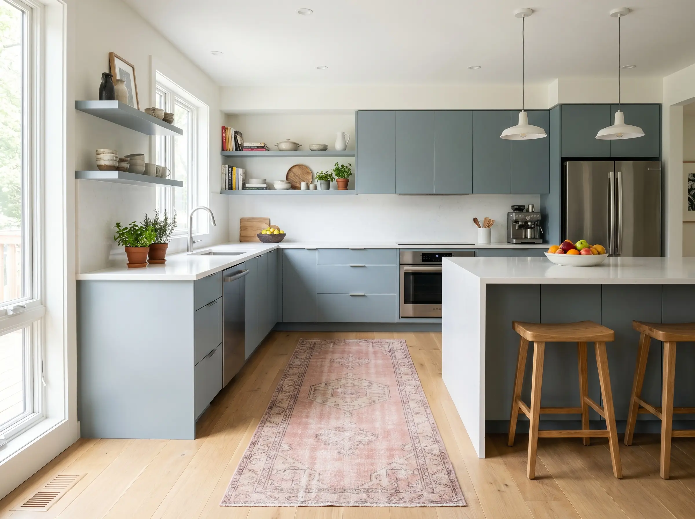
Sleek Culinary Workspaces
Using this neutral on kitchen cabinetry is a brilliant way to achieve a sleek, contemporary aesthetic without resorting to the starkness of pure white or the intensity of charcoal. It works exceptionally well on flat-panel doors in a modern kitchen, but it completely transforms traditional shaker cabinets when applied in a matte finish.
Be incredibly careful when pairing this specific grey with heavily veined granite or warm, creamy quartz. The cool blue-green base will actively fight against yellow or beige undertones in your stone. Always opt for crisp white marble, pure white quartz, or a dark, solid soapstone to maintain harmony.
Clash Warning (The Countertop Conflict)
To warm up the culinary space, introduce organic styling elements along the countertops. Stacked terracotta bowls, a large vase of oversized branches, or a vintage runner rug in muted oxblood or Farrow & Ball Setting Plaster No. 231 will inject necessary warmth. Frame the cabinetry with crisp white walls using Benjamin Moore Chantilly Lace OC-65 to let the grey truly stand out.
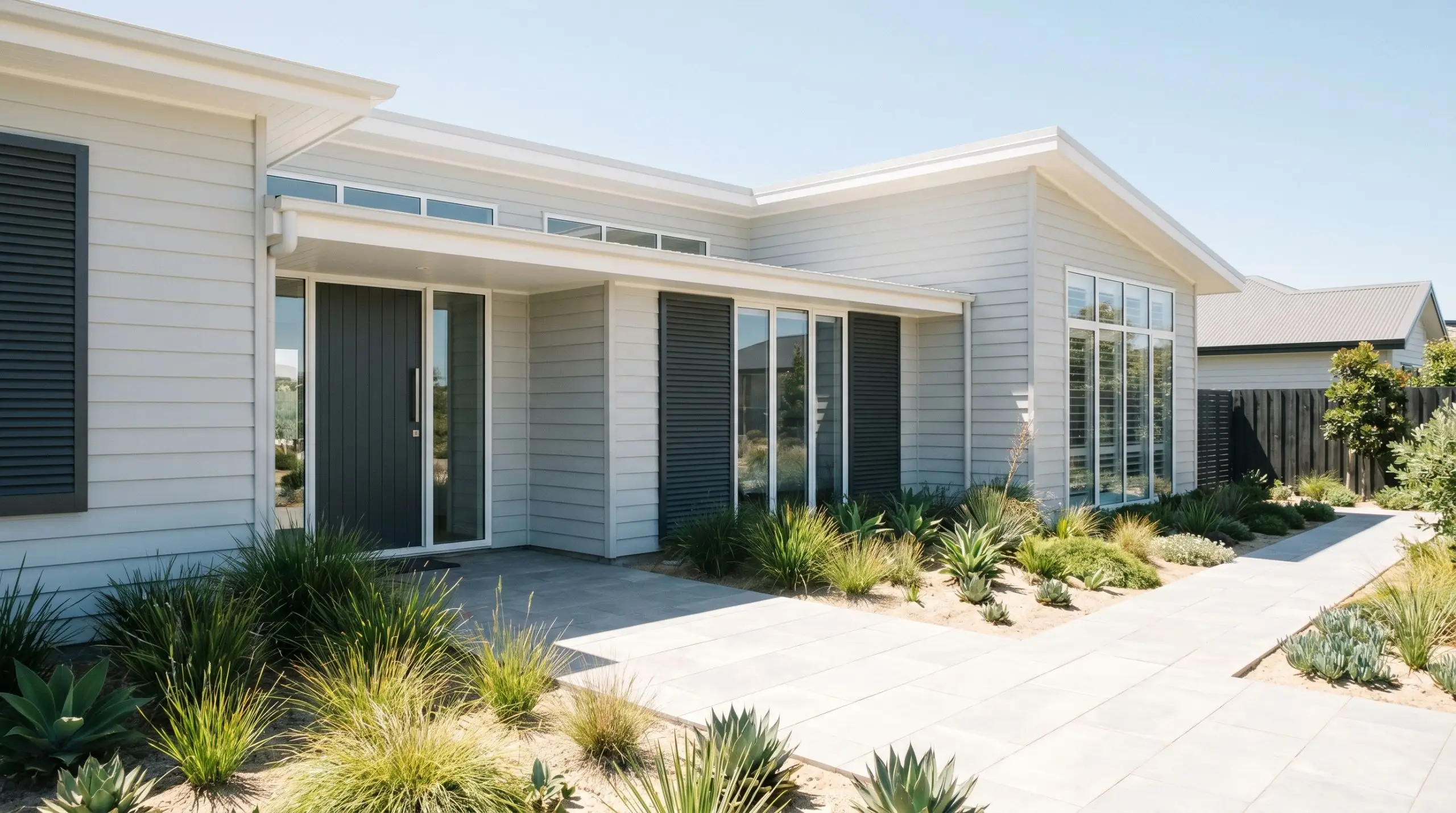
Facades & Exterior Cladding
When taken outside, the intense power of direct sunlight will wash out a significant portion of this color’s depth. On exterior weatherboards or stucco, it will read much lighter and significantly less blue than it does on an interior living room wall. It establishes a breezy, Coastal Modern or refined Transitional look that boosts curb appeal without overwhelming the neighborhood.
To prevent the facade from looking washed out, you must frame the house with high-contrast elements. Paint the exterior trim, eaves, and window casings in a brilliant, stark white to give the grey a defined boundary.
For the final architectural touch, use a saturated, dramatic color on the front door and exterior shutters. A rich, moody charcoal like Sherwin-Williams Peppercorn SW 7674 secures the entire exterior palette, giving the home a substantial, custom-built presence.
Curating a Contemporary Color Scheme with Highgate
This specific silver-toned pigment behaves best when it is sharply contained by high-contrast borders or allowed to bleed softly into tonal, muted companions. It requires intentional boundaries to maintain its refined structure and prevent the room from feeling visually unmoored.
Framing the Walls: Trim and Baseboard Strategies
When dealing with a cool grey neutral, your trim color acts as the architectural highlighter for the entire room. Pairing the walls with a stark, un-tinted white like Dulux Vivid White SW1G1 forces the grey to stand at attention, emphasizing its crisp, tailored edges. If you prefer a softer transition, dropping the trim to a slightly muted white like Dulux Lexicon Quarter softens the visual boundary while still keeping the cyan notes looking fresh.
Tactile Elements and Hardware Finishes
Bringing this crisp color to life requires a thoughtful mix of finishes that either reflect its cool light or provide necessary organic grounding.
Secondary Palette Inspirations
Building a cohesive room requires secondary tones that either gently support the silver base or provide a grounding, high-contrast anchor.
Signature Aesthetic Mood Boards
To visualize how these individual materials and secondary colors interact in a real space, consider these distinct stylistic approaches.
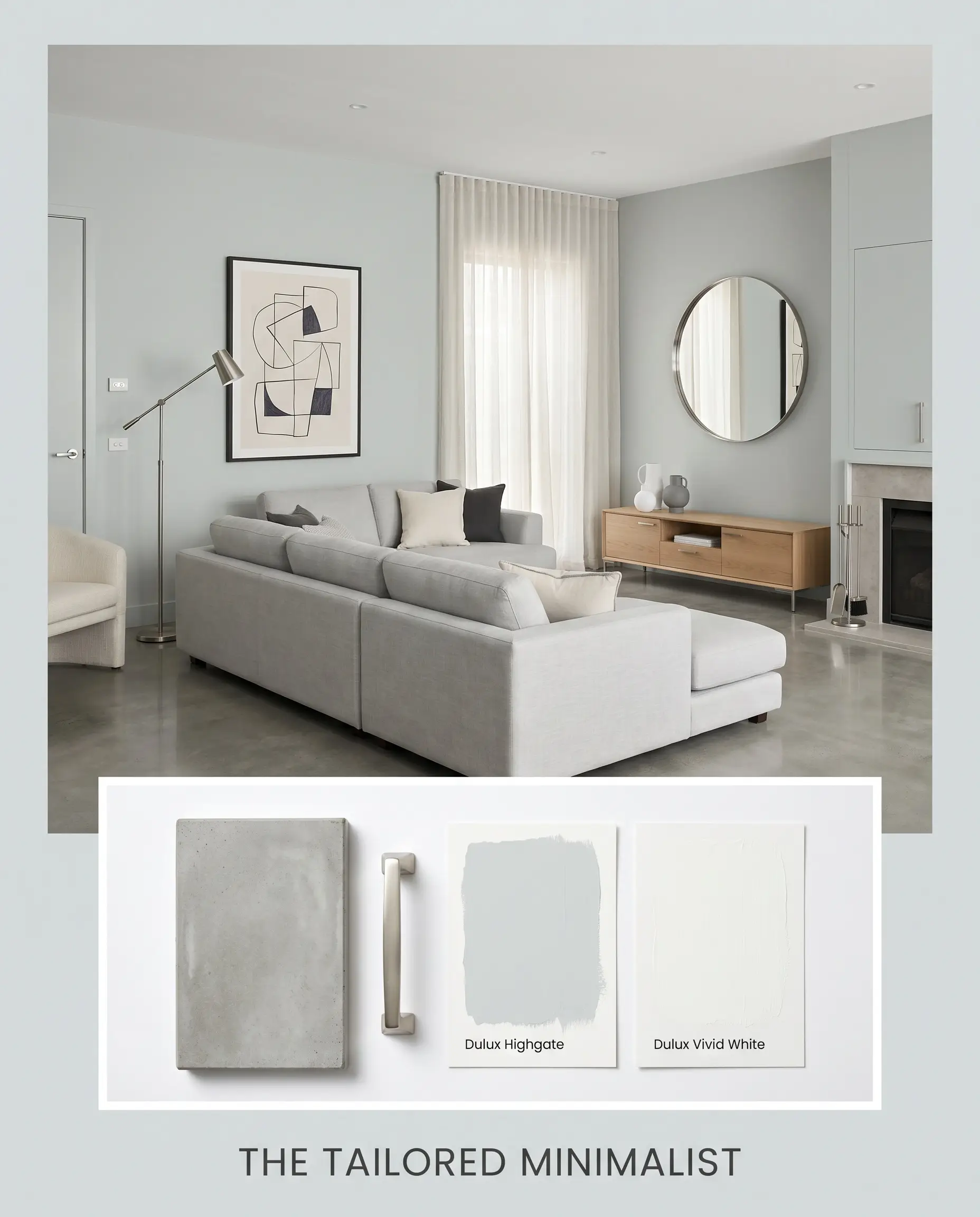
The Tailored Minimalist: This aesthetic leans into the sharp, architectural qualities of the paint by pairing it with polished concrete and sleek brushed nickel accents. The energy here is incredibly focused and calm, relying on clean lines and a strict monochromatic grey palette to eliminate visual clutter. To keep the space from feeling sterile, introduce oversized abstract line art and a single statement piece painted in Dulux Blue Ridge.
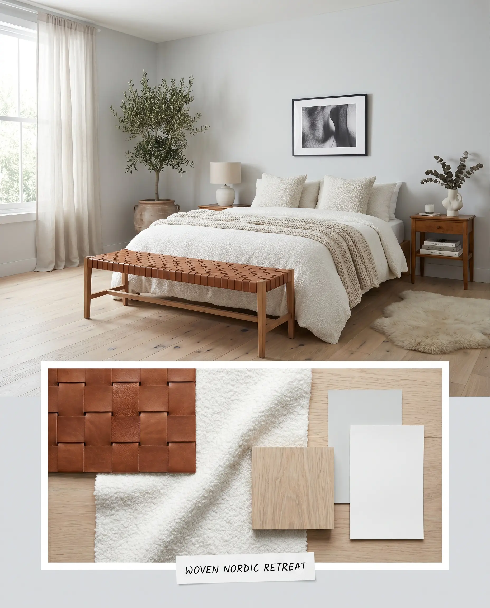
Woven Nordic Retreat: Here, the cool silver walls act as a refreshing backdrop for an abundance of organic, tactile warmth. The icy tones are balanced by the introduction of rich saddle leather, soft boucle textiles, and pale white oak accents. It creates an atmosphere that feels both airy and deeply comforting, proving that cool tones can still feel inviting when layered with the right textures.
Dulux Highgate vs. Popular Cool Grey Neutrals
When evaluating cool silvers, your home’s specific natural lighting and the direction your windows face will dictate which shade ultimately succeeds. A paint that looks brilliantly crisp in a sun-drenched southern exposure might turn uncomfortably chilly in a shadowed, north-facing space. Understanding how the underlying pigments react to your environment is the only way to make a confident final selection.
Dulux Highgate SP2B6 vs. Dulux Terrace White SN4F1
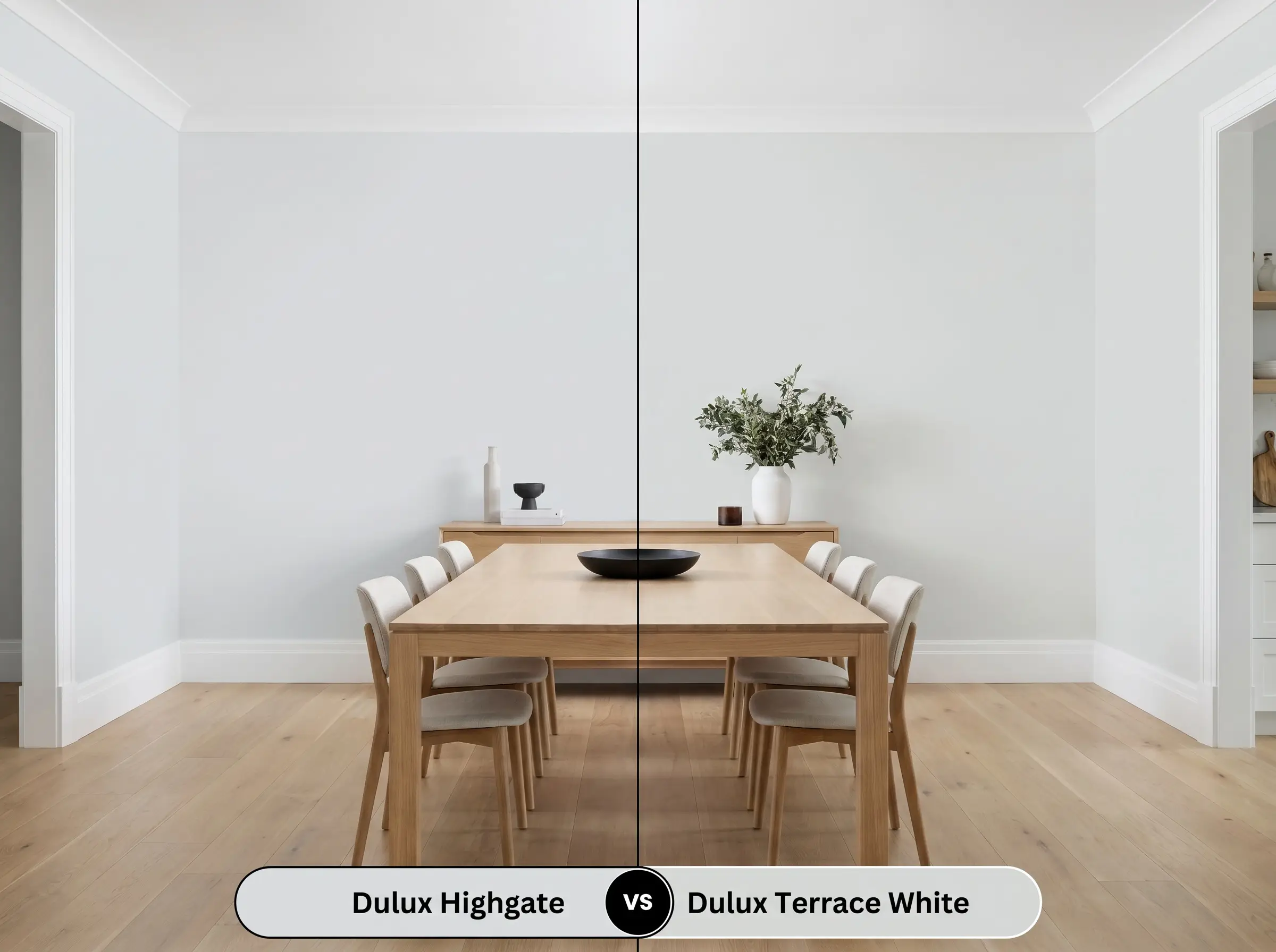
Terrace White SN4F1 is significantly lighter and carries a slightly more neutralized, grey-white profile compared to the distinct cyan base of its rival. If your room lacks natural light and you simply want a whisper of cool shadow on the walls, Terrace White provides that subtle contrast without darkening the space. However, if you are pairing the walls with brilliant, crisp white trim and need a definitive, architectural grey to make that woodwork pop, Highgate offers the necessary saturation.
Dulux Highgate SP2B6 vs. Dulux Tranquil Retreat SN4G1
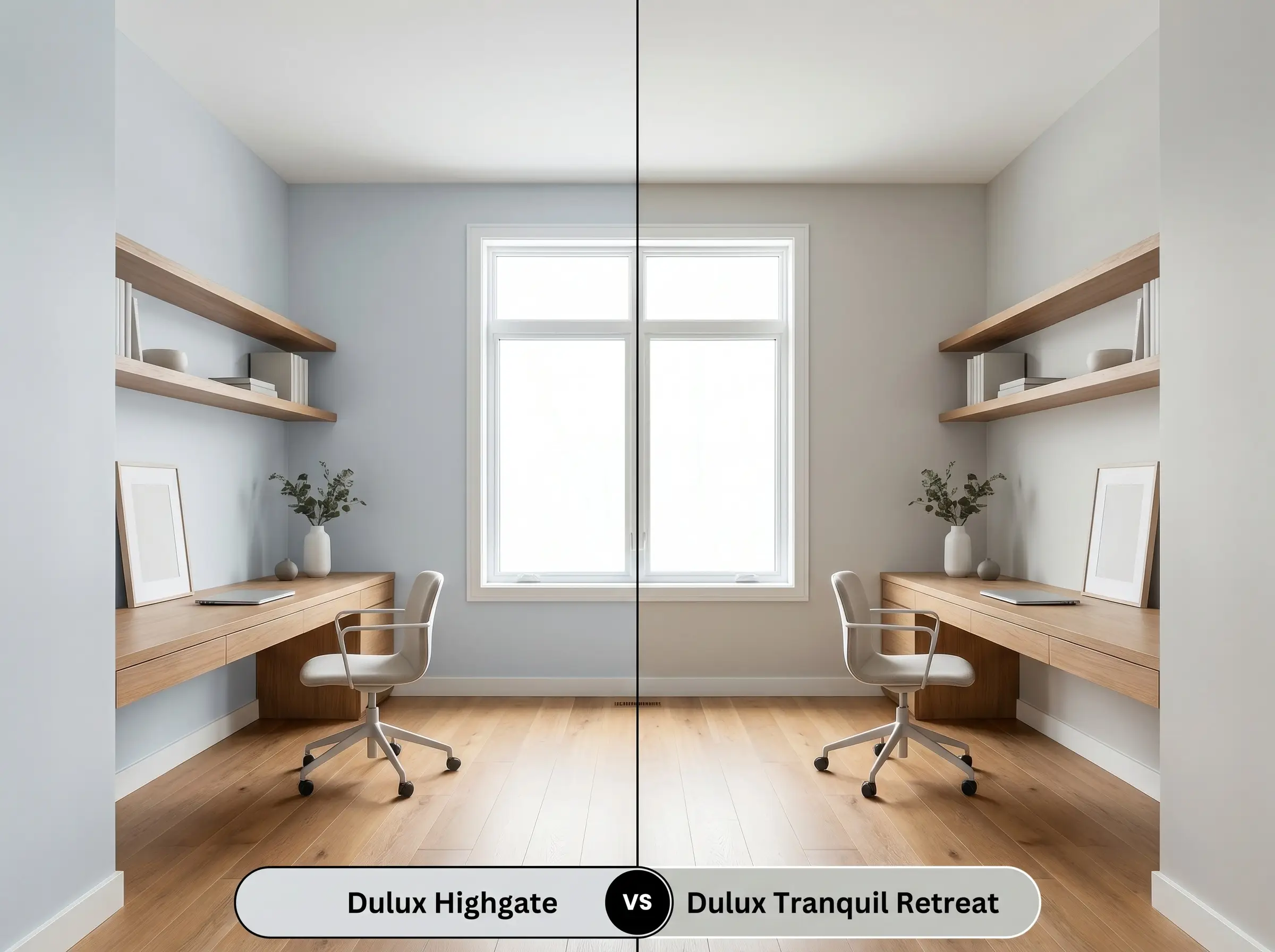
Tranquil Retreat shifts the conversation away from blue and leans slightly more into a balanced, true stone grey. If you are decorating a room with warm wood floors and fear that a blue-green undertone might clash, Tranquil Retreat offers a safer, more adaptable baseline. Choose Highgate SP2B6 when you actively want that refreshing, icy undertone to cool down a room that receives intense, hot afternoon sunlight.
Exploring the Monochromatic Grey Palette and Rival Matches
Sometimes a color is nearly perfect, but the specific lighting in your home demands a subtle pivot in depth or warmth. Whether you need a shade with a higher light reflectance to brighten a dim corridor, or you are simply shopping across different brands, these alternatives provide excellent solutions.
Exploring Same-Brand Alternatives
If you love the foundational DNA of this paint but need a slight adjustment in depth or tone, Dulux offers excellent adjacent options.
Cross-Brand Color Matches
For homeowners restricted by local paint availability, these alternative brands provide nearly identical aesthetic results.
Execution Strategies for this Architectural Finish
Transitioning from a beautiful color swatch to a flawless wall requires a firm understanding of how this specific pigment behaves on a roller. The subtle nuances of a cool grey can easily be ruined by incorrect prep work or the wrong choice of finish.
Selecting the Right Sheen
The gloss level you choose will fundamentally alter how light interacts with the cyan pigment, making sheen selection just as important as the color itself.
Primer Selection and Roller Techniques
Because this shade sits comfortably in the mid-to-light range, it does not require a deeply tinted primer to achieve its true color. A standard, high-quality white primer is perfectly sufficient to block previous stains and provide a clean slate.
Cool greys are notorious for “flashing”—leaving behind visible, uneven roller marks when touched up later. To ensure a seamless finish, always apply two full, generous coats, maintaining a wet edge as you roll to prevent the pigment from drying unevenly.
Hackrea Pro-Tip (The Flashing Defense)
Common Homeowner Concerns Resolved
Because overcast skies naturally cast a cool, blue-tinted light, the cyan base in this paint will absolutely become more pronounced. However, the sheer scale of an exterior facade dilutes the intensity, meaning it will read as a refined, coastal blue-grey rather than a vibrant baby blue.
This specific lighting temperature acts as a brilliant equalizer for the paint. The 3000K bulbs provide just enough warmth to keep the silver from feeling like a frozen locker room, while still remaining crisp enough to honor the modern, clean aesthetic.
The intense yellow-orange tones of legacy honey-oak will aggressively fight the cool, blue-green base of this paint. This combination often forces the walls to look unexpectedly icy and makes the floors appear overly orange. You are much better off pairing honey-oak with a warmer, green-leaning greige to bridge the gap.
The Final Ruling on Dulux’s Cool Silver
Dulux Highgate SP2B6 is a highly refined, modern neutral built specifically for spaces that crave structure and crisp, refreshing energy. It performs brilliantly in sun-drenched, south-facing rooms where its icy undertones act as a natural coolant against intense afternoon light. This paint is the ultimate foundational layer for homeowners looking to execute a polished Soft Minimalist or tailored contemporary design scheme without resorting to stark white.
While its crisp profile is a massive asset in the right context, it can quickly turn against you if forced into the wrong environment. If you are attempting to update a home filled with earthy Tuscan tiles, creamy yellow countertops, or dominant cherry wood cabinetry, this silver tone will actively fight those warm elements. The resulting clash will make the grey walls feel incredibly sterile and the warm finishes look dated and unkempt.
Always honor the cool DNA of this paint by surrounding it with equally clean, intentional materials that support its modern vision.
Closest Cross-Brand Equivalents
The absolute closest scientific color matches for Highgate across top paint brands.