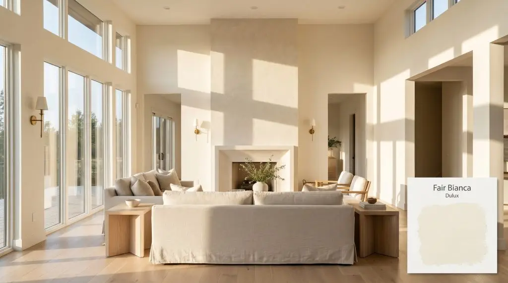
Fair Bianca SP2B1
DuluxDulux Fair Bianca is a luminous, warm off-white with subtle red and peachy-yellow undertones. With an LRV of 91, it reflects a massive amount of light, making it an excellent choice for brightening up dim spaces while maintaining a soft, inviting atmosphere.
Paint Technical Profile
| Color ID / SKU | SP2B1 |
| HEX Code | #f8f3e6 |
| Light Reflectance (LRV) | 91 |
| Use | Interior, Exterior |
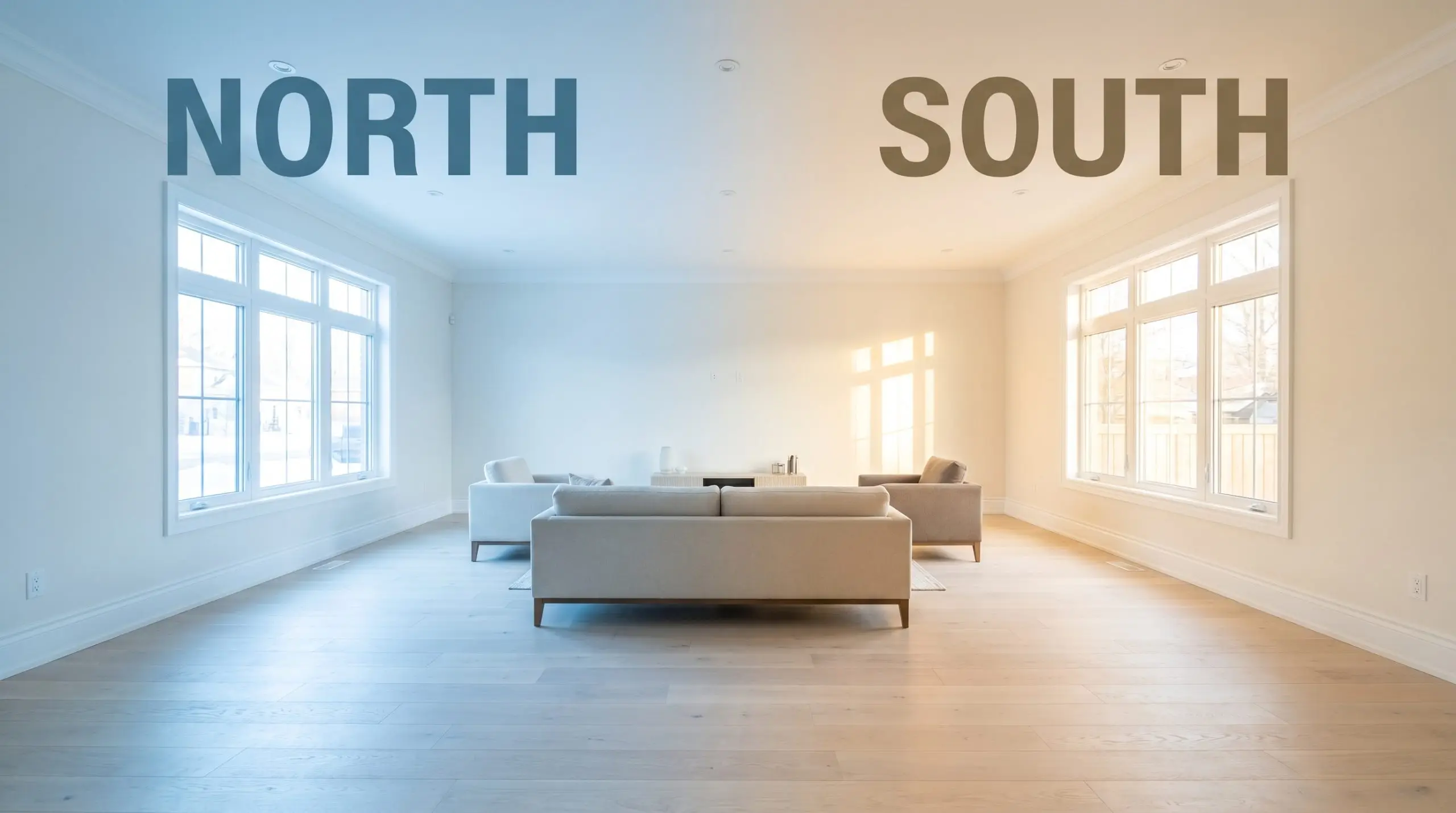
| Best Exposures | North-Facing, East-Facing |
| Best For | Living rooms, bedrooms, heritage homes, dark hallways |
The Architectural Glow of Dulux Fair Bianca: A Luminous Neutral for Sunlit Spaces
Some white paints simply reflect the light in a room, while others seem to generate their own intrinsic warmth. Dulux Fair Bianca SP2B1 falls firmly into the latter category. This is not your typical stark, gallery-style white that leaves a space feeling chilly or unfinished.
Instead, it acts as a soft, atmospheric layer that wraps a room in a welcoming, sunlit energy.
Whether you are trying to soften the hard edges of a modern kitchen or breathe new life into a historic living room, understanding this paint’s unique chromatic profile is the key to unlocking its full potential. Let’s break down exactly how this beautifully complex shade behaves on the wall.
Undertones & LRV of Dulux Fair Bianca
If you are wondering whether this shade leans warm or cool, the answer is definitively warm. Fair Bianca is a beautifully balanced warm off-white that actively resists the clinical chill of pure white paints. This warmth is entirely driven by its underlying pigment composition, which dictates how it interacts with the surrounding environment.
To truly understand how this color will behave in your home, we have to look at its structural DNA:
With an official light reflectance value (LRV) of 91, this paint acts as a massive light multiplier. This means it absorbs virtually no light. Instead, it bounces ambient lighting back into the room, making it an exceptional tool for expanding the visual footprint of tight or dimly lit spaces.
Lighting Effects & The Chameleon Factor
Because of its complex red and peachy-yellow base, this paint is highly responsive to the shifting temperature of the sun. The color cast will actively adapt as the light moves across your home throughout the day.
Here is exactly how you can expect the color to shift:
Where to Apply Fair Bianca for Maximum Impact
The beauty of a high-LRV warm white is its sheer architectural versatility. Because it balances brightness with an inviting undertone, it can seamlessly transition between drastically different design styles and functional spaces.
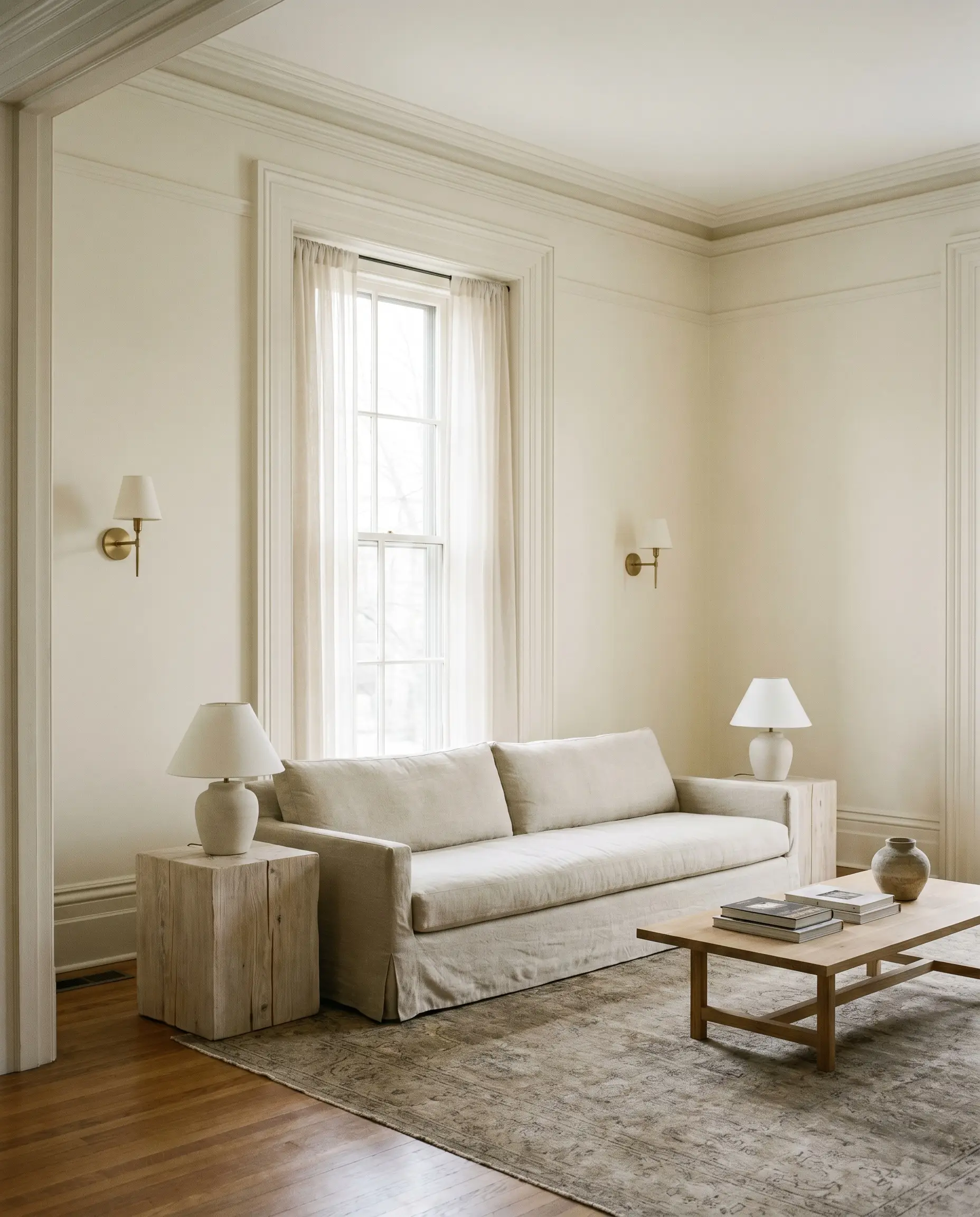
Heritage Home Restorations
While traditional restorations often rely on heavy, historically accurate creams, this shade offers a slightly more updated, luminous alternative. It honors the intricate details of crown molding and tall baseboards without feeling dated.
To bring a historic space into the present, pair the soft walls with transitional furnishings like a clean-lined, slipcovered sofa in washed linen. Avoid overly ornate, dark mahogany furniture here. Instead, introduce raw, pale white oak side tables and unlacquered brass sconces to create a fresh, curated tension between the old architecture and modern styling.
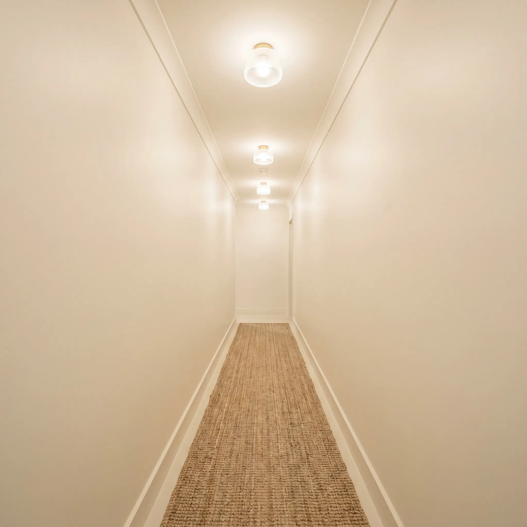
Dark Hallways and Corridors
Narrow, windowless corridors are notoriously difficult to design, often feeling like afterthoughts. The massive reflective power of this paint transforms these tight transitions into glowing, intentional spaces.
Consider color-drenching the hallway—painting the walls, trim, and ceiling in the same finish—to blur the boundaries of the room and create a seamless, expansive feel. Add a long, textured jute runner and a series of minimalist, fluted glass flush mounts to establish a warm, organic rhythm.
If your hallway lacks natural light, rely on 3000K LED bulbs in your fixtures. This specific temperature strikes the perfect balance, illuminating the space without pulling too much yellow out of the paint’s base.
Hackrea Design Secret (The Corridor Trick)
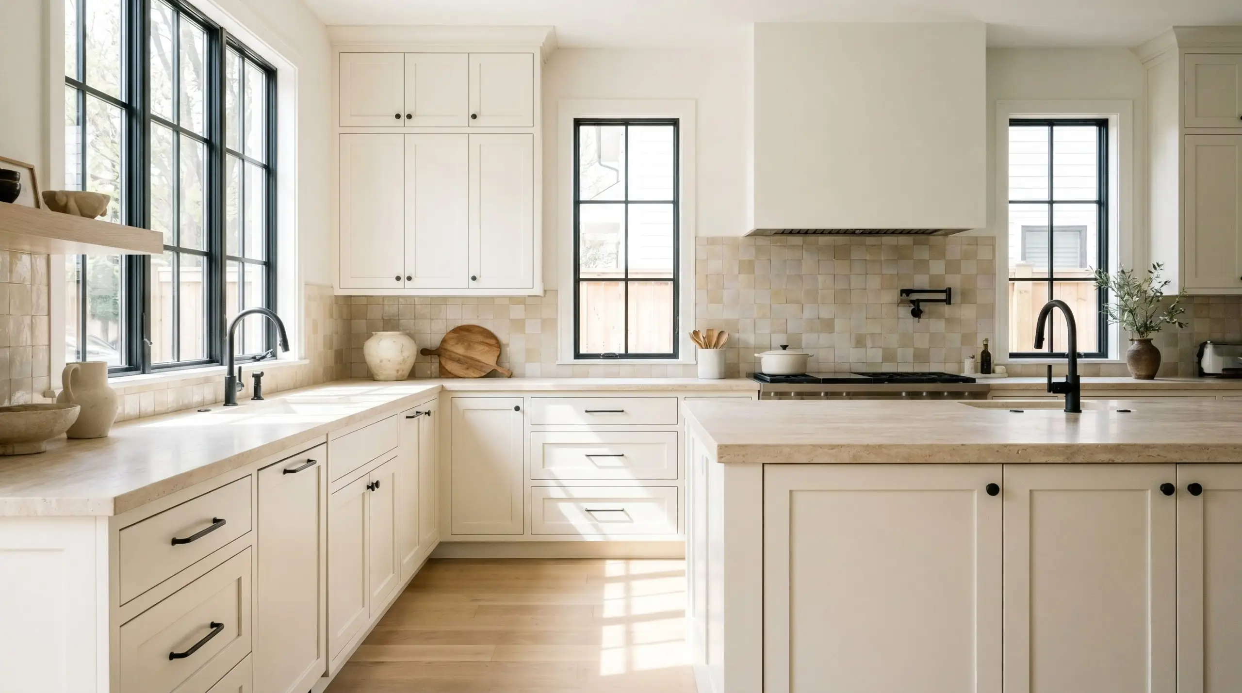
Shaker-Style Kitchen Cabinetry
Applying this warm off-white to kitchen cabinetry instantly softens the hard, utilitarian lines of standard Shaker doors. It provides a beautifully clean backdrop that feels much more inviting than a sterile, pure white kitchen.
To elevate the overall design, pair the creamy cabinets with honed travertine countertops and a zellige tile backsplash in a complementary warm tone. Introduce matte black steel hardware to tether the lightness of the room and provide a crisp, modern contrast.
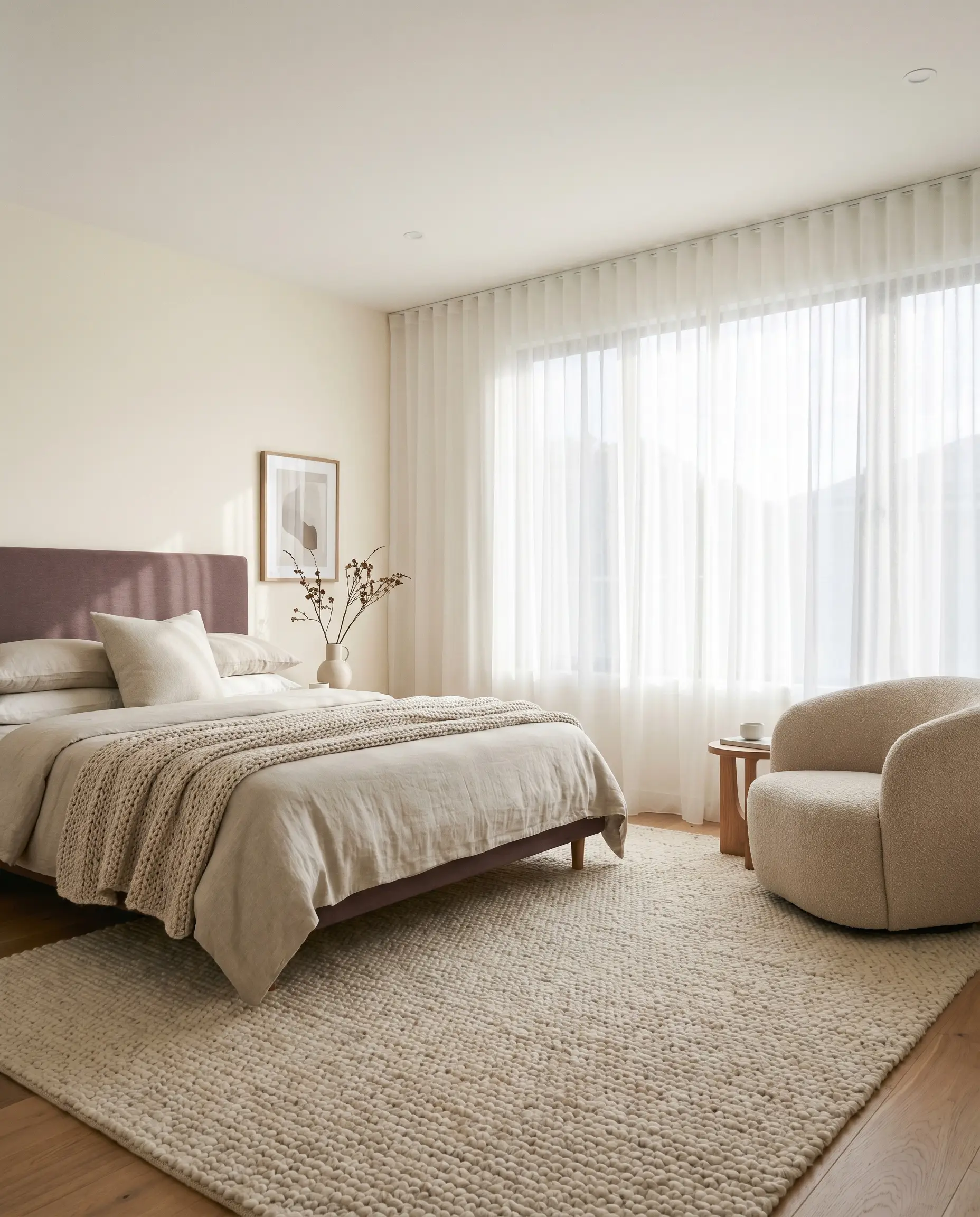
Nursery and Bedroom Walls
Bedrooms require a color structure that promotes rest and relaxation, making this peachy-warm neutral an ideal foundation. It provides a soft, enveloping energy that feels incredibly comforting in the early morning light.
Layer the room with tactile textiles to enhance the coziness. Think nubby wool rugs, bouclé accent chairs, and sheer voile drapery that filters the sunlight. If you want to introduce color, a muted plum or dusty blue upholstered headboard will pop beautifully against the warm walls.
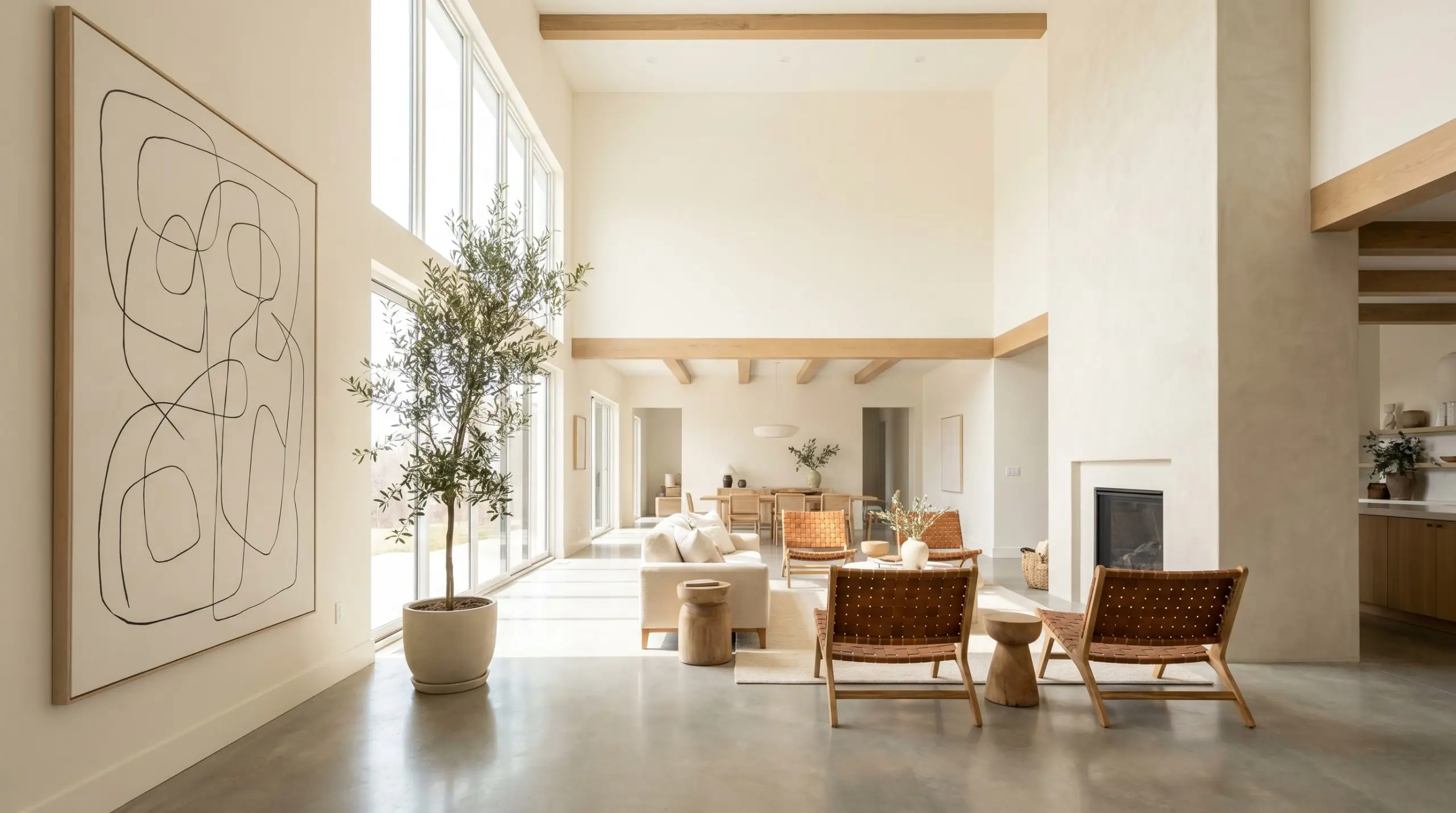
Open-Plan Living Areas
In sprawling, open-concept spaces, stark whites can quickly feel cavernous and uninviting. This shade secures the room, bringing a subtle, unifying warmth that connects the living, dining, and kitchen zones.
Use large-scale, organic elements to break up the expansive walls. A massive, oversized canvas featuring abstract line art or a tall, potted olive tree will add essential visual interest. Keep the styling relaxed with California Casual elements like woven lounge chairs and a light, textural Roman clay fireplace surround.
Material Pairings & Coordinating Palettes
The secret to styling this paint lies in understanding how its peachy-red base interacts with other finishes in the room. It requires relational pairings that either gently enhance its warmth or provide a crisp, stabilizing contrast.
Trim & Baseboards
Choosing the right trim color is essential for defining the architectural boundaries of your room.
Hardware, Wood & Material Pairings
The tactile elements you bring into the space will dictate the final aesthetic direction of the paint.
Coordinating Colors
When building a broader palette, look for secondary colors that offer a sophisticated, stabilizing contrast.
Designer Mood Boards
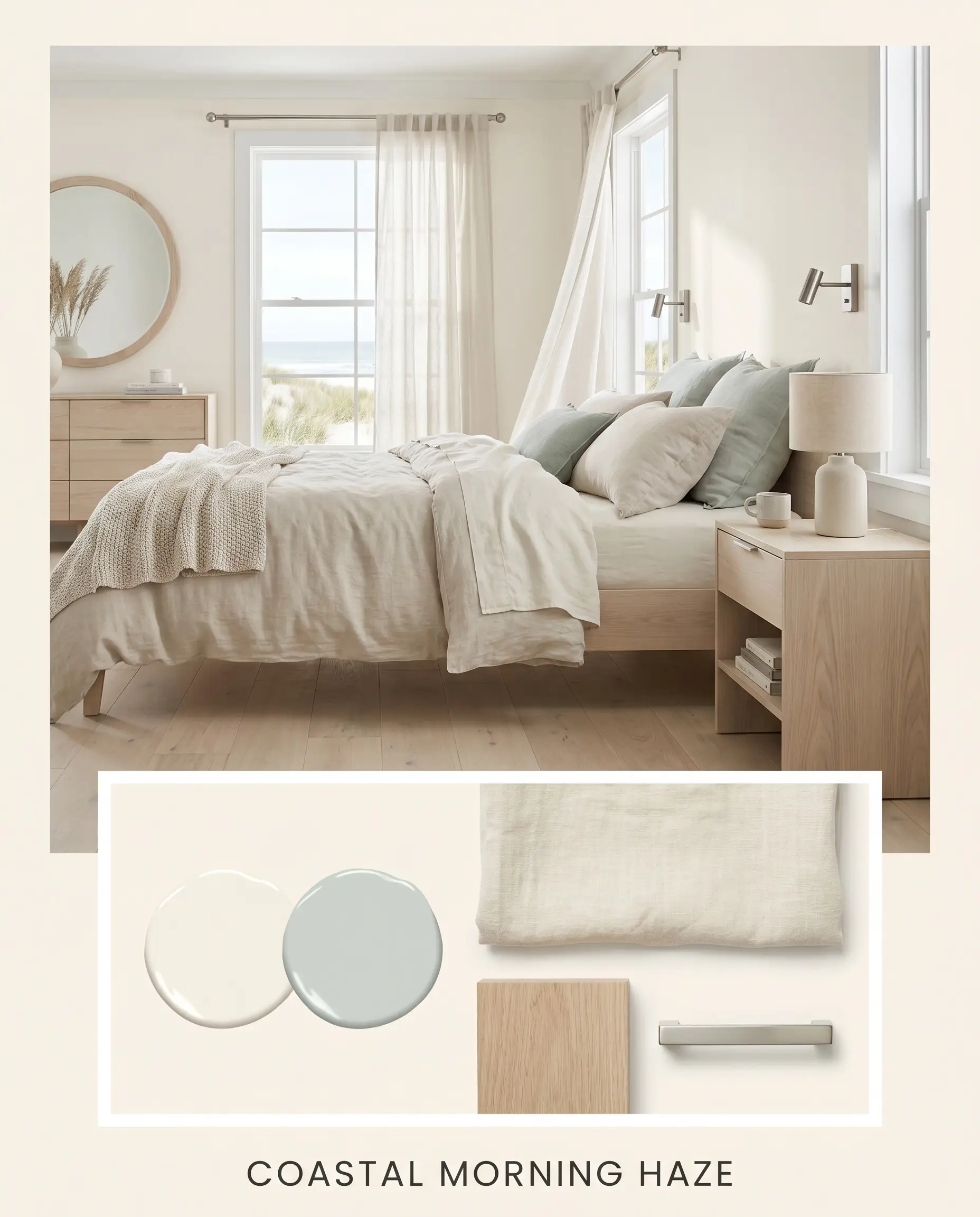
Coastal Morning Haze This palette captures the serene, quiet energy of a foggy beach at sunrise. The warm off-white walls serve as a luminous backdrop for soft, washed linen textiles and raw, pale white oak furniture. Accents of Sherwin-Williams Sea Salt introduce a subtle, refreshing coolness, while brushed nickel hardware keeps the overall aesthetic crisp and airy. The vibe is relaxed, understated, and effortlessly elegant.
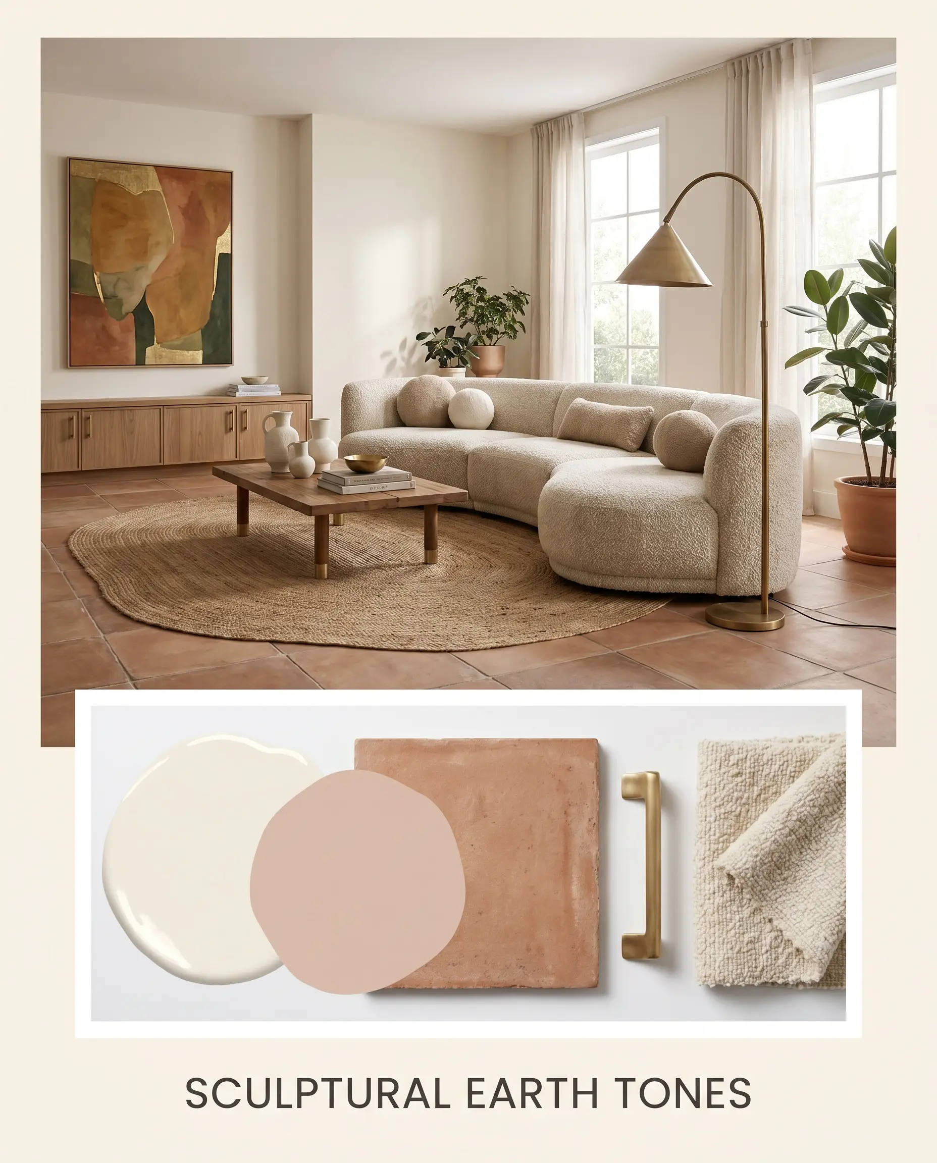
Sculptural Earth Tones Designed for the Organic Modern enthusiast, this combination leans heavily into tactile warmth. The peachy-yellow base of the paint is amplified by the introduction of honed terracotta tiles and rich, unlacquered brass accents. A touch of Farrow & Ball Setting Plaster on an accent piece adds a layer of tonal sophistication. The energy here is rooted, earthy, and deeply inviting, perfect for spaces layered with vintage pottery and textural bouclé.
Dulux Fair Bianca vs. Rival Whites
Sometimes, a paint’s specific undertones might not align perfectly with your home’s lighting or your desired aesthetic. Comparing it against direct rivals is the best way to ensure you are making the right choice for your architecture.
Dulux Fair Bianca vs. Dulux Antique White U.S.A.
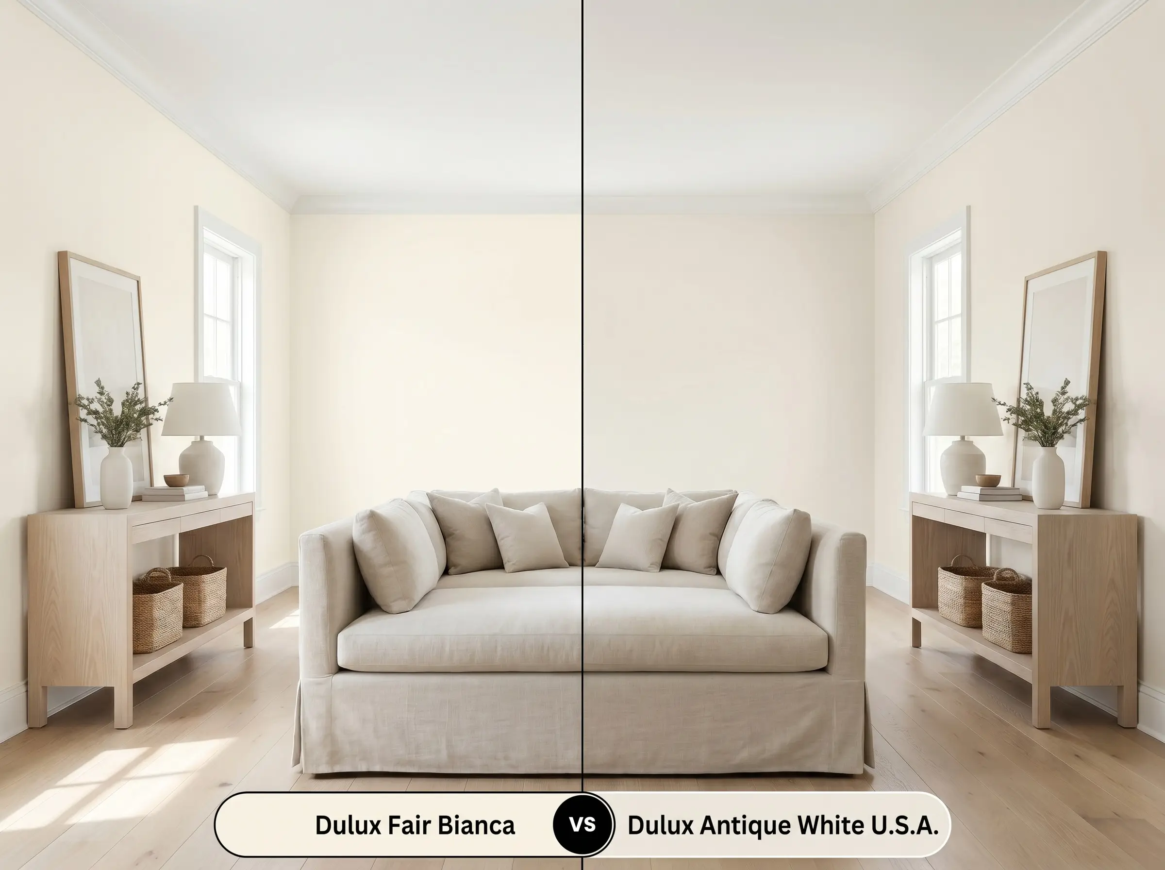
Antique White U.S.A. is an iconic, highly popular shade, but it carries a distinctly more yellow-beige undertone. If your room receives intense, warm southern light, Fair Bianca will retain a softer, peachier glow, whereas Antique White U.S.A. may pull slightly more traditional and creamy. Choose Fair Bianca for a slightly more modern, rosy warmth.
Dulux Fair Bianca vs. Dulux Lexicon Half
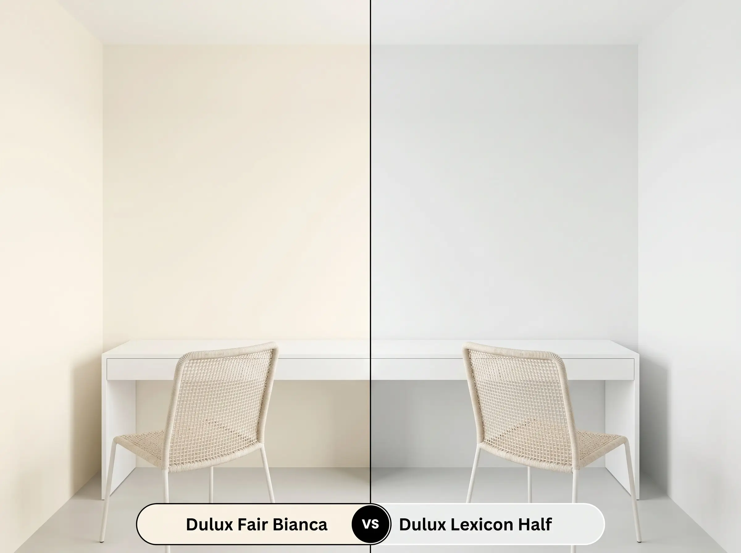
This is a battle of temperatures. Lexicon Half is a famously cool, crisp white with distinct blue/gray undertones. If you are designing a stark, minimalist space with polished concrete floors and cool-toned LED lighting, Lexicon Half is the safer choice. However, if that same room feels too sterile, Fair Bianca is the perfect solution to inject essential warmth.
Dulux Fair Bianca vs. Benjamin Moore White Dove
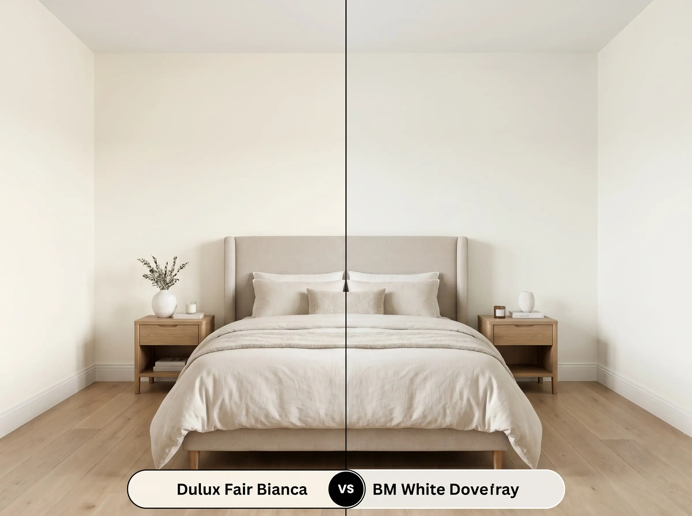
White Dove OC-17 is a beloved, highly versatile off-white with a subtle greige base that rarely reads as yellow or pink. If you are worried about the red cast in Fair Bianca clashing with your existing finishes, White Dove offers a safer, more neutral transition. If your goal is maximum coziness, however, the Dulux option provides a significantly warmer embrace.
Similar Colors & Cross-Brand Matches
If you love the general profile of this paint but need a slight adjustment in depth or are shopping across different brands, these alternatives provide excellent starting points.
Alternative Dulux Whites
Cross-Brand Equivalents
Practical Application & Finishes
Translating color theory into reality requires the right technical approach. The finish you choose will fundamentally alter how the light interacts with the pigment on your walls.
Because this is a high-LRV white with a warm base, it generally covers well. However, if you are painting over a dark or highly saturated color, a high-quality, tinted primer is absolutely essential. Skipping the primer will result in the old color bleeding through, completely altering the delicate red and peachy undertones of your new finish.
Hackrea Pro-Tip (The Coverage Rule)
Frequently Asked Questions
Because direct exterior sunlight washes out subtle nuances, the red undertones will be visible but rarely read as overtly pink. However, on highly textured surfaces, shadows can sometimes amplify the warmth, so always test a large swatch on different sides of the house before committing.
It performs beautifully. The 3000K bulbs provide a clean, slightly warm light that harmonizes perfectly with the paint’s peachy-yellow base, creating a glowing, flattering atmosphere in a space that otherwise lacks natural illumination.
You must proceed with caution here. Calacatta marble often features cool, gray, or stark white veining. The warm, peachy base of the paint may clash with the cooler stone, making the cabinets look slightly yellowed or dingy by comparison.
Not at all. In fact, the subtle red undertones in the paint will naturally complement and enhance the earthy, baked warmth of the terracotta, creating a beautifully cohesive, sun-drenched aesthetic.
The Final Verdict on Dulux Fair Bianca
Dulux Fair Bianca is an exceptional choice for homeowners seeking a luminous, welcoming atmosphere without the starkness of a pure white. Its complex red and peachy-yellow base makes it a master at warming up cool, north-facing rooms and expanding the visual feel of dark hallways. This shade truly shines in Transitional and Organic Modern spaces, where its soft glow can be paired with tactile linens, raw woods, and earthy ceramics.
While this paint is highly adaptable, you must be extremely careful when pairing it with cool, starkly gray finishes. If your home features cool-toned Carrara marble countertops, blue-gray slate flooring, or icy blue glass tiles, the peachy-red base of this off-white will actively fight against those materials. The visual friction will likely cause the paint to read as unexpectedly yellow or dingy, while making the stone look harsh and uninviting. Always ensure your hard finishes share a similarly warm or perfectly neutral temperature before committing to this beautifully complex shade.
Clash Warning (The Cool-Toned Conflict)
Closest Cross-Brand Equivalents
The absolute closest scientific color matches for Fair Bianca across top paint brands.