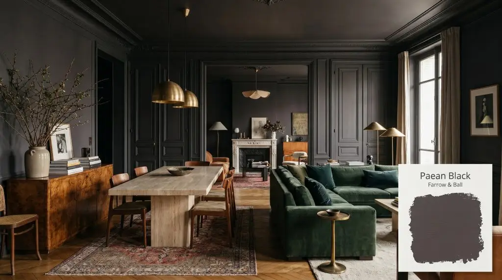
Farrow & Ball's Paean Black No. 294 is a sophisticated, red-based black with distinct purple and magenta undertones. With an LRV of 6, it functions as a dramatic, warm soft black that evokes the rich hue of antique leather, perfect for intimate spaces and striking accents.
Will Paean Black clash with your room?
Paint Technical Profile
| Color ID / SKU | 294 |
| HEX Code | #484348 |
| Light Reflectance (LRV) | 6 |
| Use | Interior, Exterior |
| Best Exposures | South-Facing, West-Facing |
| Best For | Dining Rooms, Libraries, Accent Walls, Cabinetry |
The Art of the Aubergine Shadow: Designing with Farrow & Ball Paean Black
There is a distinct difference between a flat, utilitarian charcoal and a living, breathing dark hue that changes with the sun. Farrow & Ball Paean Black 294 belongs entirely to the latter category, offering a profoundly rich alternative to stark, true blacks. It brings an undeniable sense of history to a room, yet it adapts beautifully to highly contemporary silhouettes.
This specific shade mimics the worn, textured appearance of antique leather hymnals, holding a quiet, stabilizing energy. Rather than flattening a room, this Georgian-inspired black creates a sense of infinite, velvety depth. When applied thoughtfully, it transforms intimate spaces into enveloping, sophisticated retreats.
We are going to explore exactly how this complex pigment behaves across different lighting scenarios and architectural styles. You will learn how to manipulate its hidden undertones using specific tactile materials and coordinating palettes. By the end, you will know exactly how to integrate this luxurious shade into your own home.
Paean Black: Undertones & LRV
Is Paean Black warm or cool? It is definitively warm. While many dark shades lean toward icy blue or stark green, this specific formula relies on a rich, enveloping heat to soften its intensity. This foundational warmth is what prevents the color from feeling overly corporate or austere in residential settings.
To truly understand how this Farrow & Ball favorite operates, we have to look at the hidden structure beneath its dark surface:
With a light reflectance value (LRV) of 6, this shade absorbs a massive amount of light, yet it avoids the total void of a pure 0 LRV black. It registers as a substantial, weighted color that secures the boundaries of a room. This specific depth allows the complex, red-based black structure to remain visible rather than turning into a featureless silhouette.
Lighting Effects & The Chameleon Factor
Dark, complex colors are notoriously sensitive to their environment, and this shade is no exception. Because of its intricate magenta nuance, the way it looks at dawn will be entirely different from how it reads under evening lamps.
Here is exactly how the ambient light in your space will manipulate its final appearance:
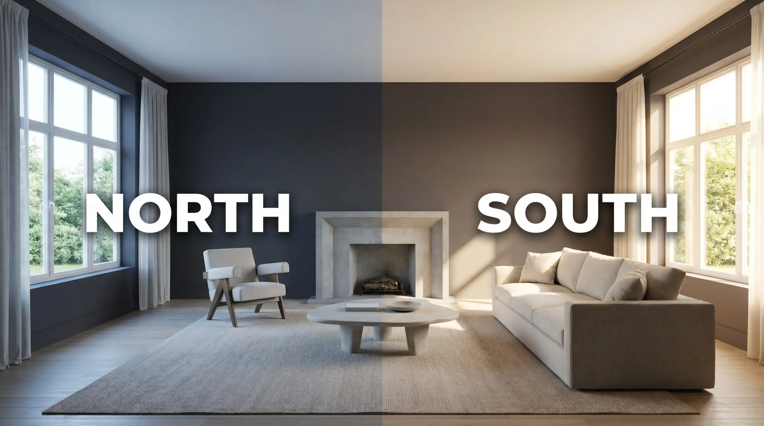
If you want to emphasize the luxurious, antique leather quality of this paint, strictly avoid daylight bulbs (4000K or higher). Stick to warm 2700K bulbs to enhance the rich red-purple base and maintain a cozy, sophisticated atmosphere.
Hackrea Pro-Tip (The Bulb Temperature Rule)
Translating Pigment to Architecture: Popular Applications
Because this shade balances substantial depth with a subtle, bruised warmth, it performs exceptionally well when used to define specific architectural moments. It is less about simply painting a wall and more about creating a distinct atmospheric shift. Let’s look at how to deploy this color effectively across various functional spaces.
Dining Rooms
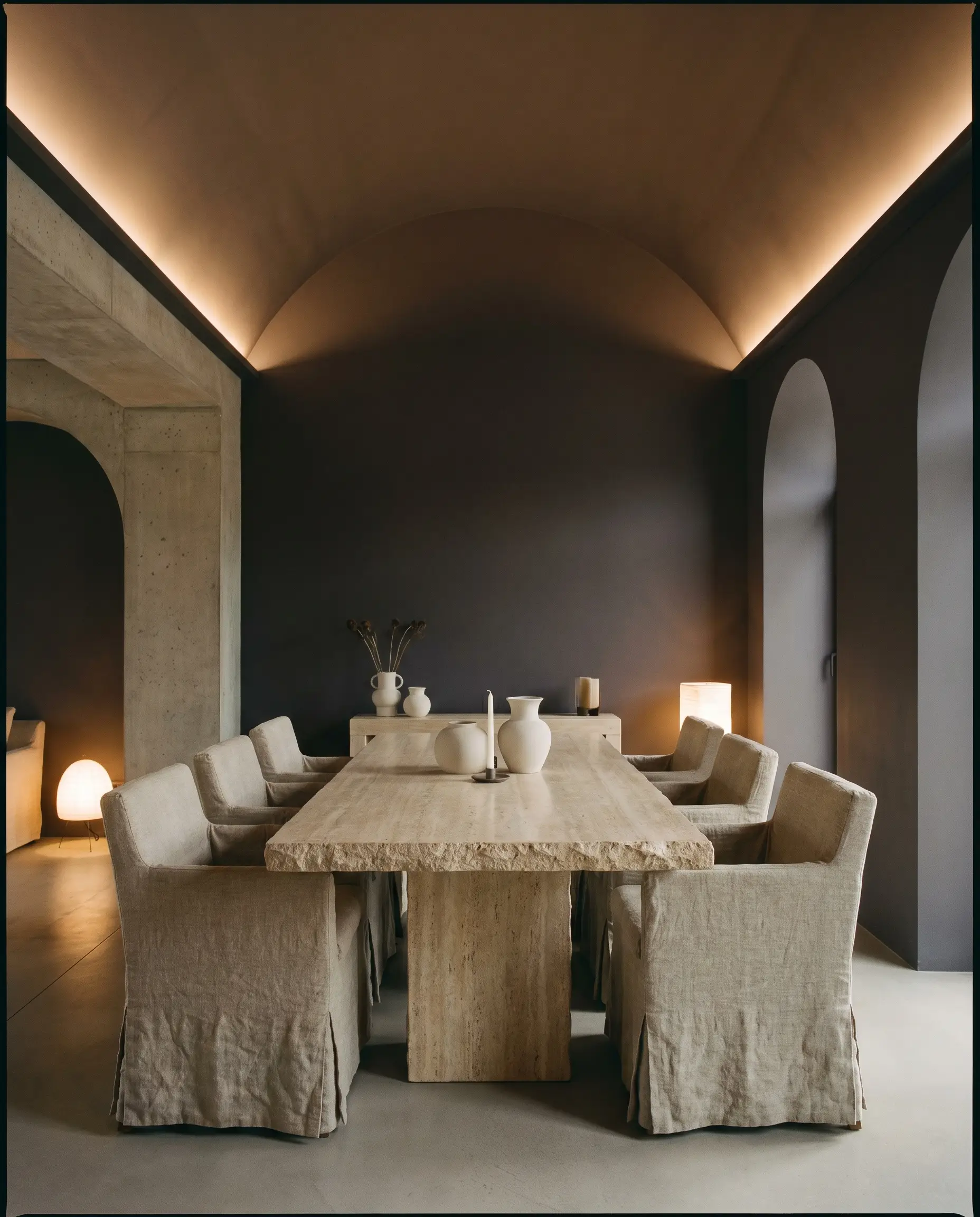
This shade is brilliant for cultivating an atmosphere of intimate, evening elegance. Instead of defaulting to traditional wainscoting, consider taking this rich plum-black across all four walls and the ceiling for a seamless, enveloping effect. Pair it with a travertine dining table and slub linen slipcovered chairs to introduce a Brutalist softness that contrasts beautifully with the dark walls.
If you prefer a Parisian Eclectic approach, use this color strictly below a chair rail, leaving the upper walls in a chalky plaster finish. Add an asymmetrical gallery wall of vintage sketches and a patinated bronze chandelier. The warm red base of the paint will beautifully echo the metallic tones of the lighting fixture.
Libraries & Studies
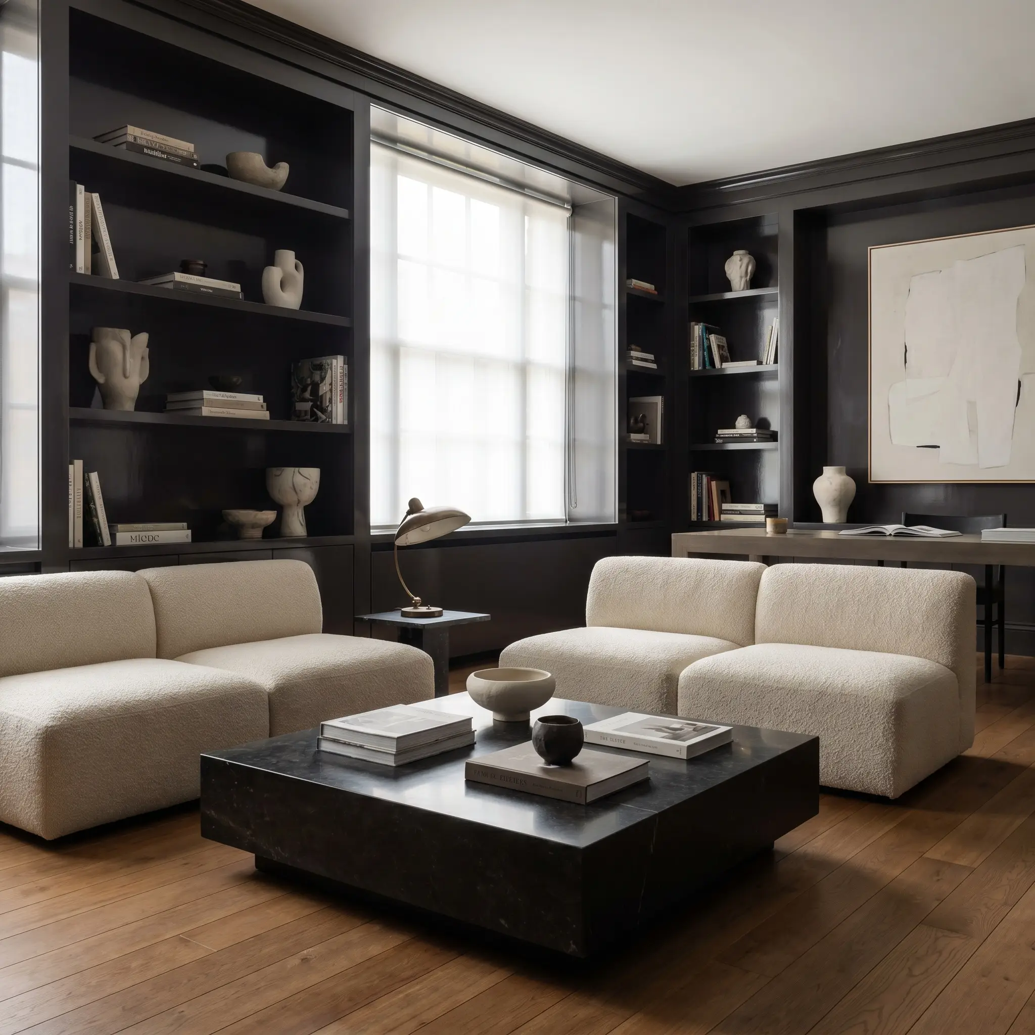
While it is incredibly easy to lean into a predictable heritage aesthetic here, this color also excels in highly contemporary studies. Try painting built-in bookcases and the surrounding trim in a high-gloss finish to bounce ambient light around the room. Contrast the glossy, aubergine-black millwork with a low-profile, modular bouclé sofa and a plinth coffee table for a Post-Modern edge.
Using a high-gloss finish on dark cabinetry instantly elevates the space, but it will also make the purple undertones much more pronounced. If you want the color to read as a quieter, softer black, stick to an ultra-matte finish.
Hackrea Design Secret (The Finish Shift)
Will Paean Black work with your specific lighting, floor, or furniture?
Powder Rooms
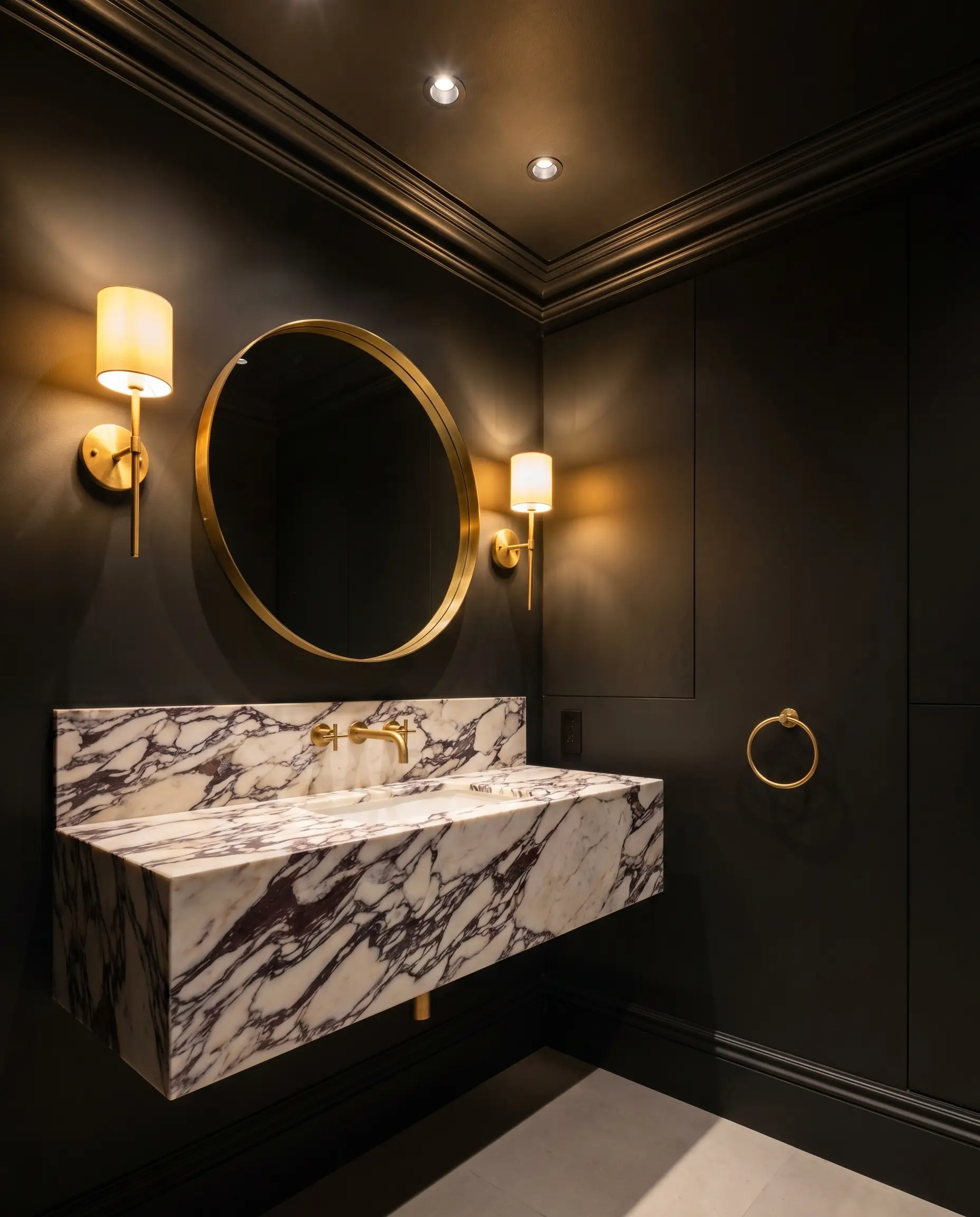
Powder rooms are the perfect laboratory for high-impact design tension. Because these are inherently intimate spaces, color drenching the walls, ceiling, and trim in this red-based black creates a stunning, jewel-box effect. To prevent the small room from feeling overly enclosed, install a floating vanity crafted from heavily veined marble.
The natural movement in the stone will break up the dark expanse, while unlacquered brass plumbing fixtures will pop brilliantly against the magenta nuance. Add a textured ceramic table lamp or a pair of brass picture lights to cast a warm, flattering glow across the dark walls.
Kitchen Cabinetry & Islands
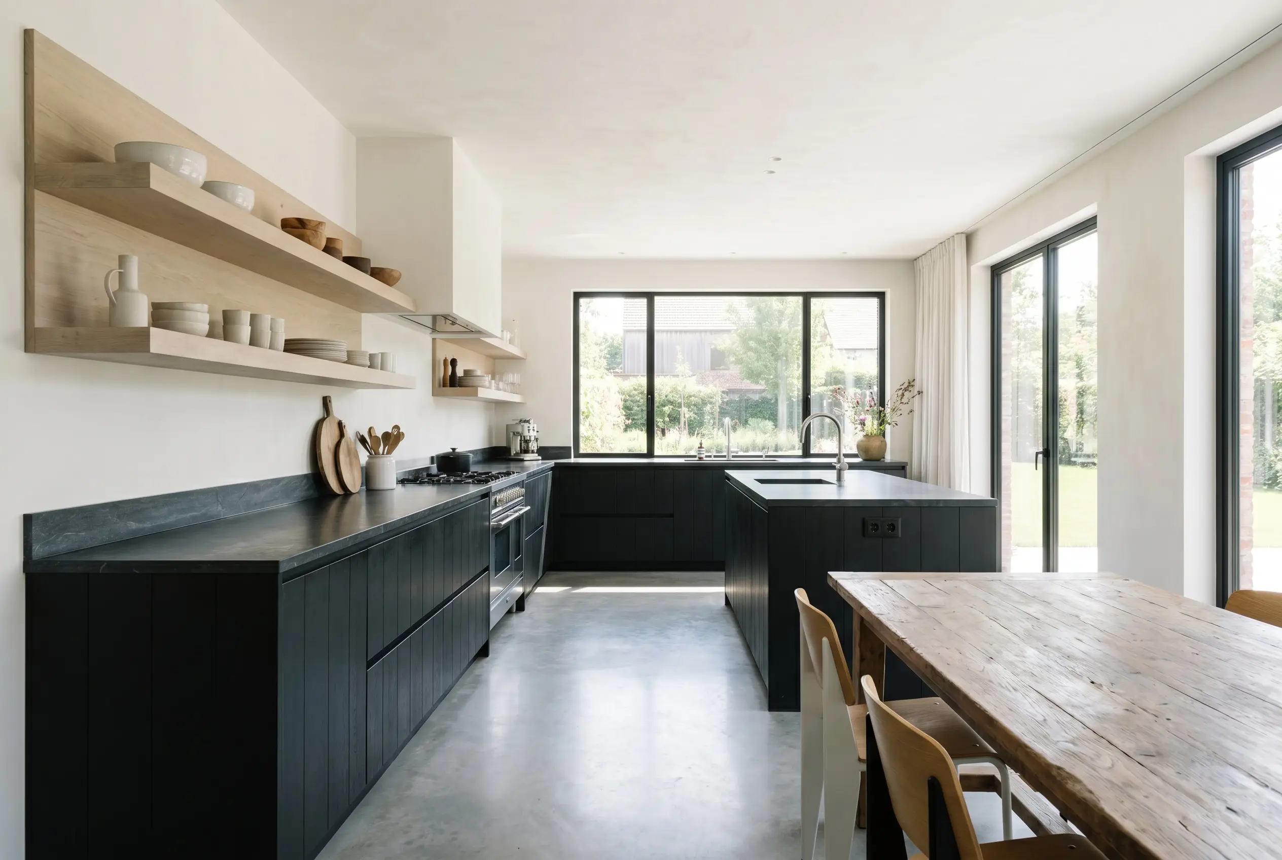
For a sophisticated alternative to standard navy or forest green islands, this shade offers incredible depth. It looks spectacular on lower cabinetry when paired with pale, bleached oak open shelving and honed soapstone countertops. The organic, wood tones pull out the subtle warmth in the paint, pushing the overall aesthetic toward Modern Organic rather than stark contemporary.
If you are updating a transitional kitchen, use this color exclusively on a central island as a stabilizing focal point. Pair it with zellige tile backsplashes and oxidized copper pendants. The slight imperfections in the handmade tile will beautifully complement the complex, shifting nature of the dark paint.
Mudrooms
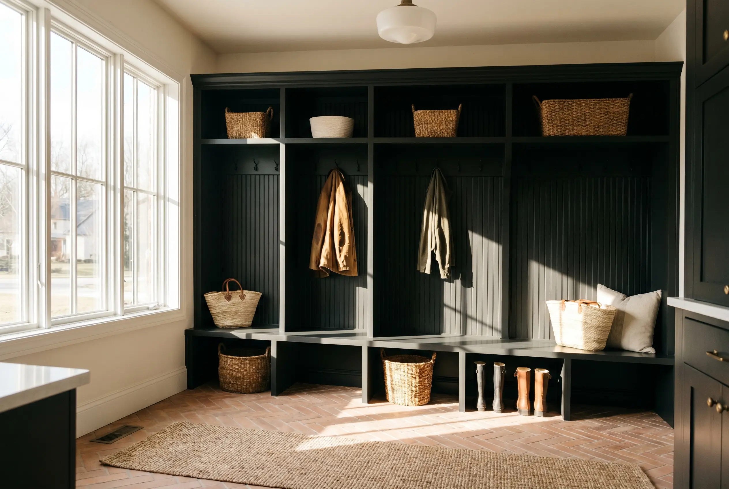
Mudrooms often suffer from purely utilitarian design, but a dramatic accent wall or painted built-ins can instantly elevate the entry experience. Use this robust shade on custom cubbies or beadboard paneling to hide daily wear and tear while establishing a premium aesthetic.
Contrast the dark, weighted cabinetry with raw terracotta floor tiles laid in a subtle herringbone pattern. The earthy, burnt sienna tones of the floor will harmonize perfectly with the paint’s hidden red structure. Finish the space with woven catchalls and casual jute runners to keep the vibe relaxed and welcoming.
Will Paean Black work with your specific lighting, floor, or furniture?
Farrow & Ball Paean Black: Coordinating Colors & Best Pairings
The secret to integrating a color this complex lies in how you manage its visual boundaries. Because it carries such a distinct aubergine shadow, it requires intentional, tactile companions to either crisp up its edges or soften its overall impact.
Trim & Baseboards
When framing this dark hue, the undertone of your white trim dictates the entire mood of the room.
Hardware, Wood & Material Pairings
To truly elevate this color, you must surround it with materials that engage in a direct dialogue with its hidden warmth.
Coordinating Colors
Building a palette around this rich shade requires secondary colors that respect its depth without competing for attention.
Designer Mood Boards
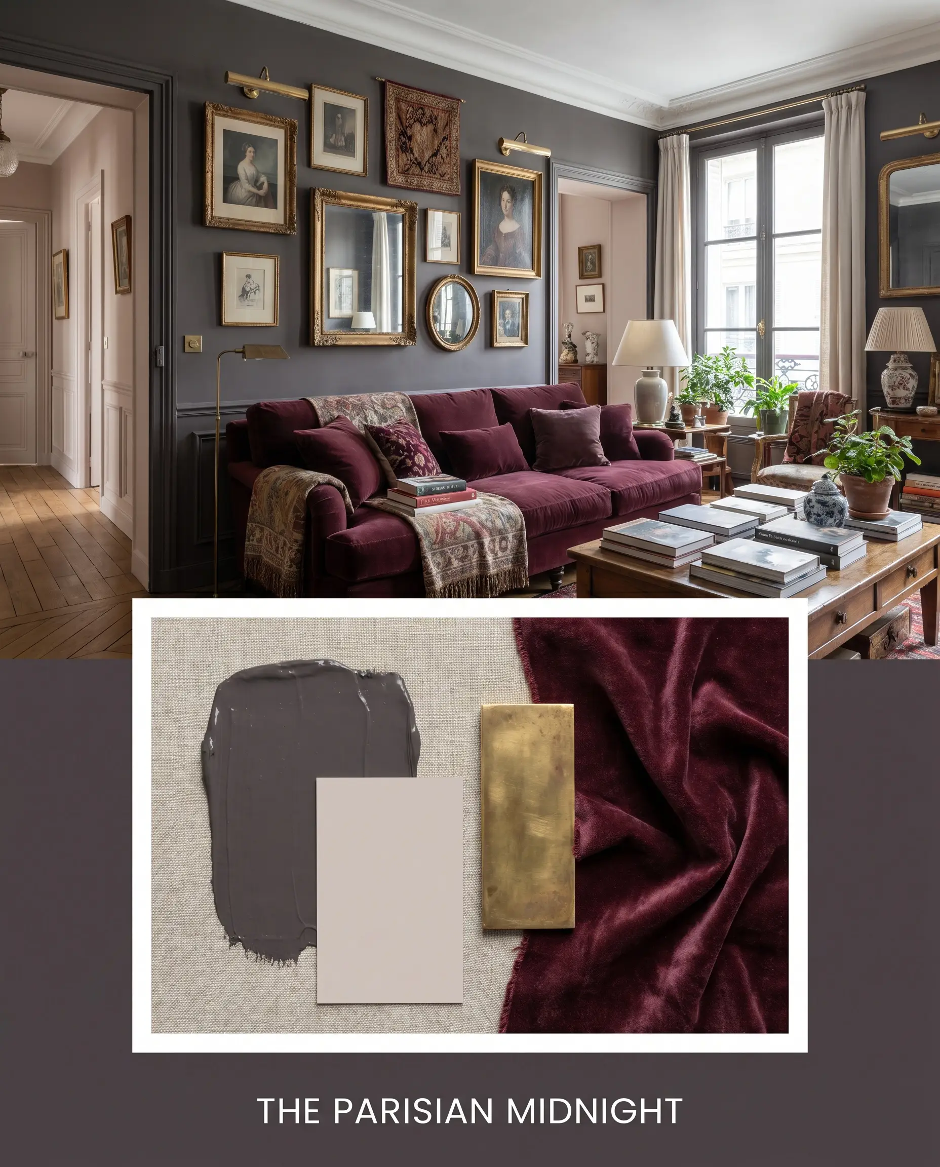
The Parisian Midnight This palette is all about cultivating an atmosphere of effortless, romantic tension. We pair the robust dark walls with adjacent hallways painted in Farrow & Ball Peignoir 286, allowing the subtle grey-pink to soften the overall transition. Unlacquered brass picture lights and a low-profile sofa upholstered in crushed mohair complete this deeply intimate, tactile experience.
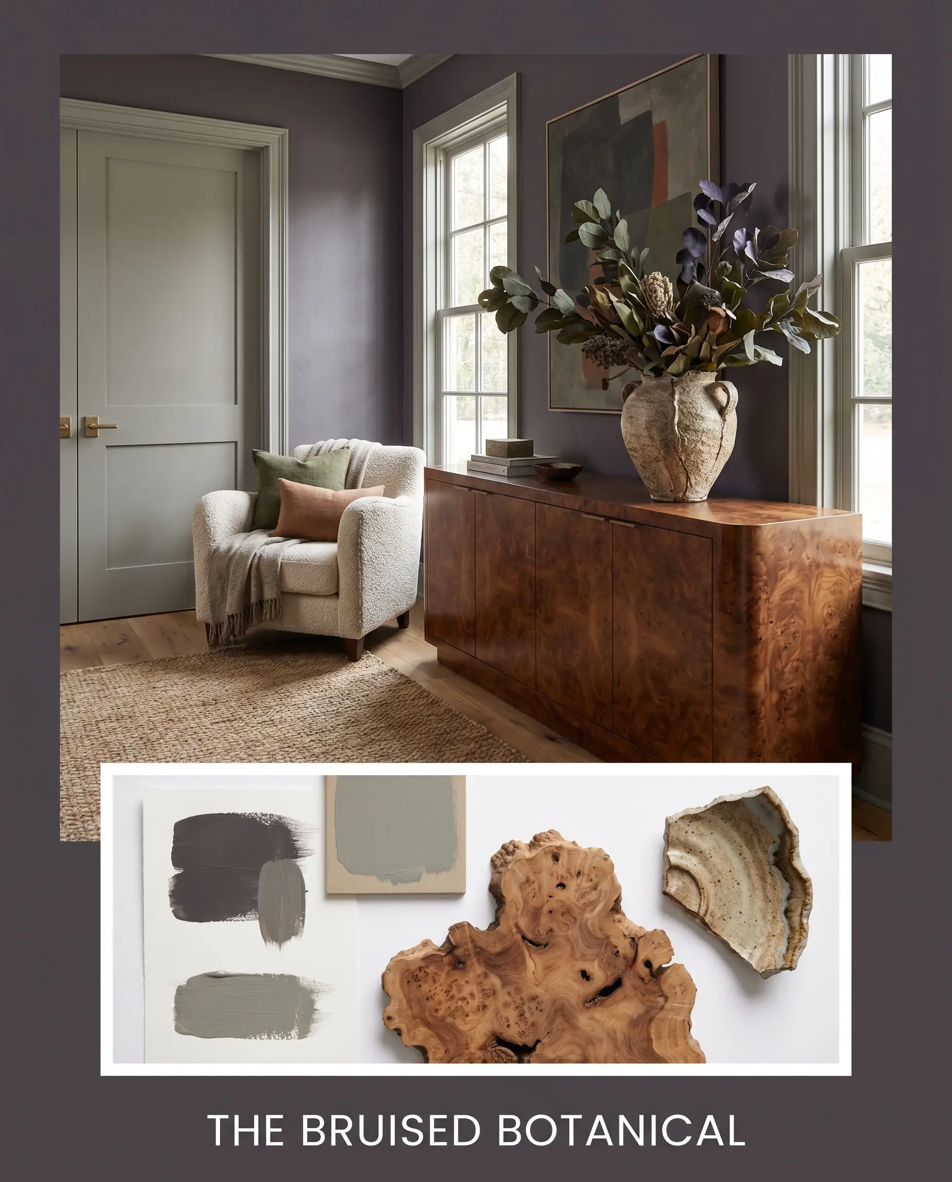
The Bruised Botanical Rooted in Modern Organic principles, this combination uses the dark paint as a stabilizing force against softer, nature-inspired elements. Sherwin-Williams Evergreen Fog SW 9130 is used on interior doors to introduce a muted, silvery green contrast. We ground the aesthetic with rich burl wood credenzas and oversized branches in textured ceramic vessels, creating a space that feels both grounded and incredibly fresh.
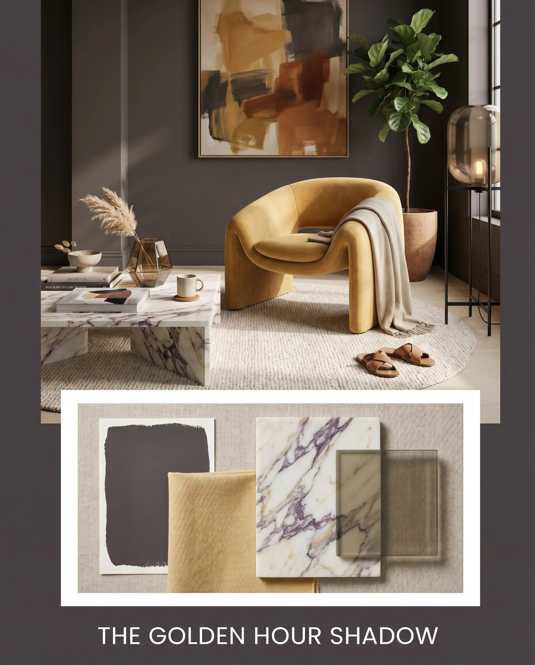
The Golden Hour Shadow Designed for maximum visual impact, this palette embraces bold, Post-Modern contrast. The aubergine-black walls serve as the ultimate backdrop for strategic pops of Benjamin Moore Dijon 193, perhaps introduced through a sculptural accent chair or heavy cotton canvas drapery. Honed Calacatta Viola marble surfaces and smoked glass accents tie the contrasting tones together, resulting in a vibrant, highly curated energy.
Will Paean Black work with your specific lighting, floor, or furniture?
Head-to-Head Comparisons
Sometimes, understanding what a color isn’t is the best way to determine if it belongs in your home. If you are debating between this shade and another dark option, your home’s natural light and your preferred design style will dictate the winner.
Farrow & Ball Paean Black vs. Farrow & Ball Off-Black 57
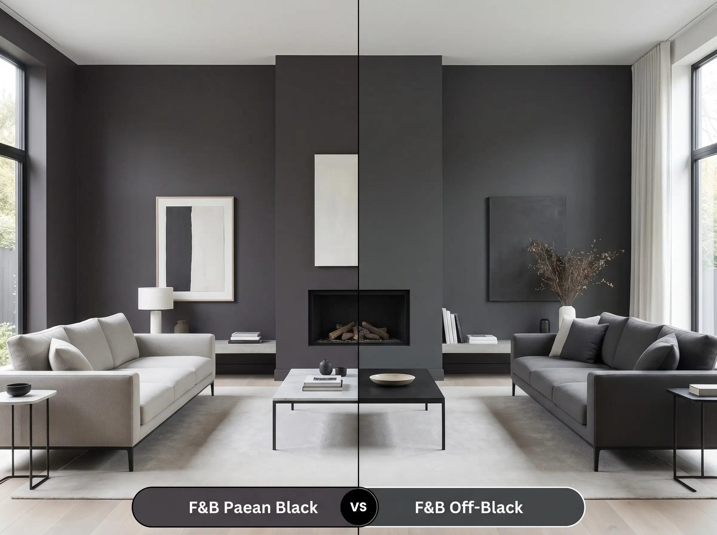
If you want a highly versatile, true charcoal, Off-Black 57 is the safer choice. It lacks the distinct red and purple undertones, making it a more neutral companion for cool-toned stones and stark modern architecture. However, if your room feels visually cold and you need a dark color that actively radiates warmth, the aubergine notes in Paean Black are far superior.
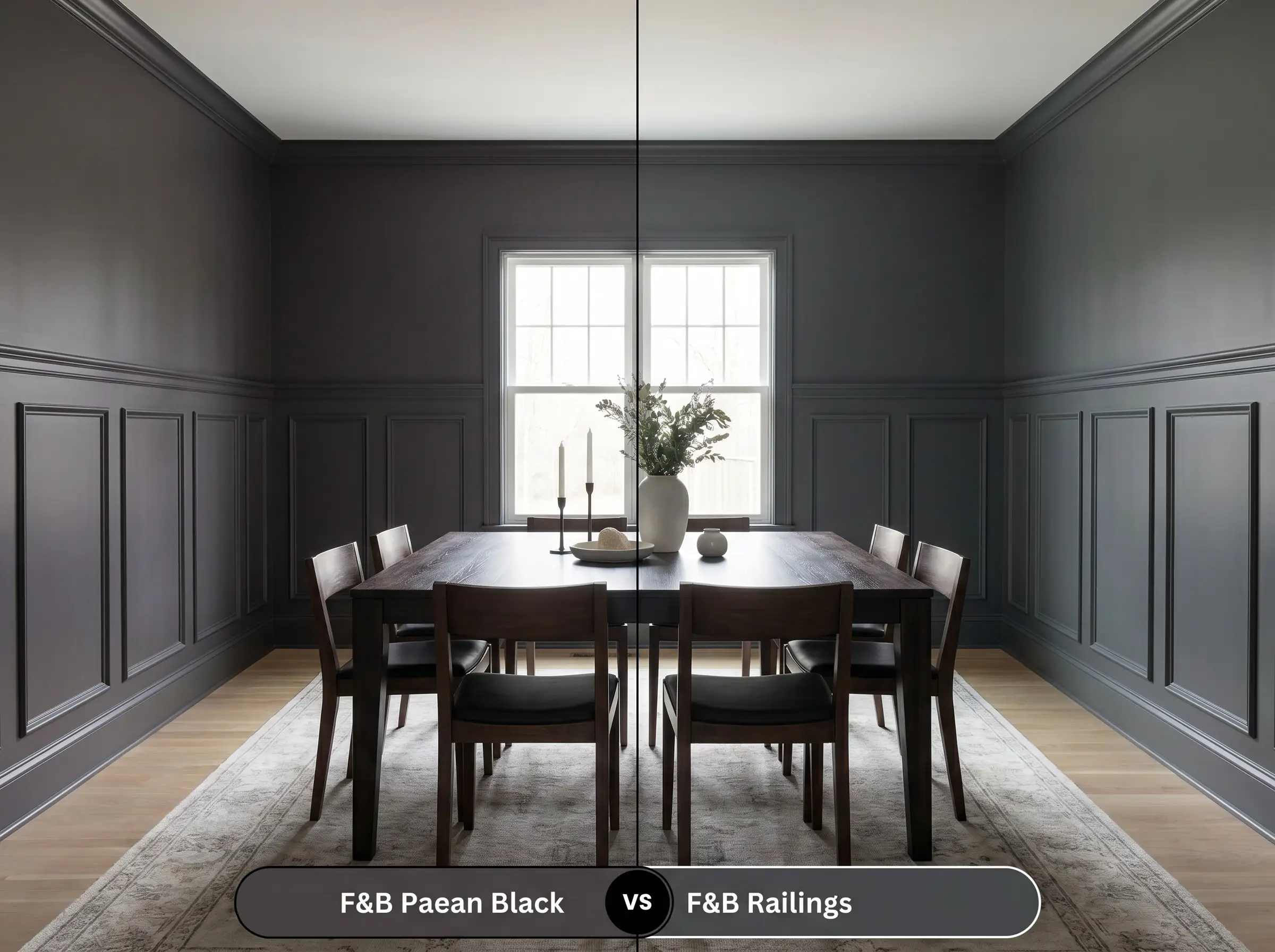
Farrow & Ball Paean Black vs. Farrow & Ball Railings 31
Will Paean Black work with your specific lighting, floor, or furniture?
Railings 31 is famously known for its strong blue undertones, often reading as a deep, inky navy in natural light. If you are designing a crisp, coastal-inspired space or pairing the paint with bright white marbles, Railings is incredibly effective. Conversely, Paean Black leans entirely into the red spectrum, making it the better candidate for spaces featuring warm terracotta, raw woods, and vintage brass.
Farrow & Ball Paean Black vs. Benjamin Moore Black Beauty 2128-10
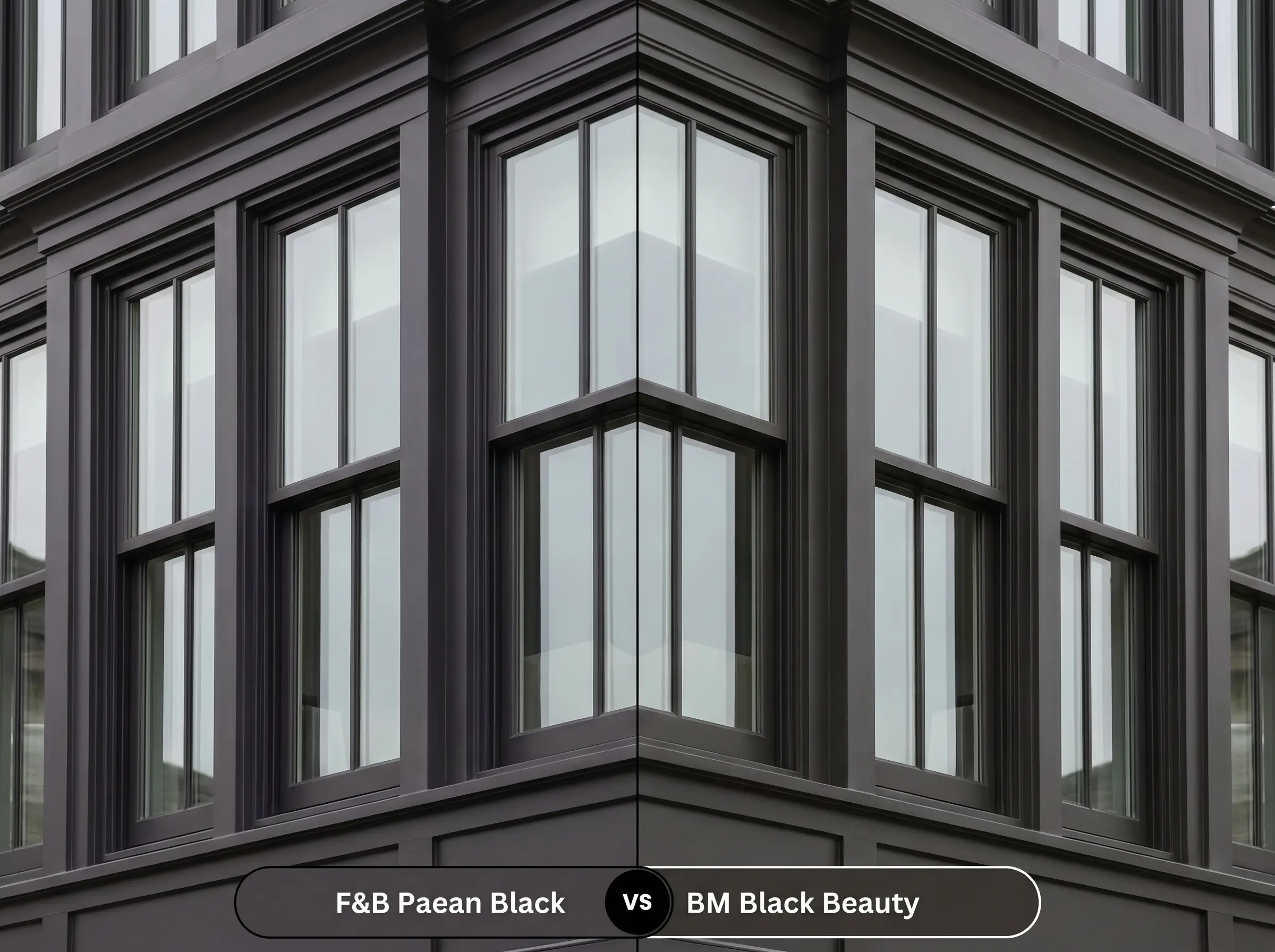
Black Beauty is a much more traditional, straightforward black with a very subtle, warm brown undertone. It is an excellent choice for grounding exterior trim or painting modern window sashes where you want a crisp, graphic punch. Paean Black, with its distinct magenta nuance, is much more of a “feature color,” demanding to be the center of attention rather than just a framing element.
Similar Colors & Cross-Brand Alternatives
If this specific Farrow & Ball shade isn’t quite hitting the mark for your project, there are several compelling alternatives.
Similar Colors from Farrow & Ball:
Cross-Brand Equivalents:
Practical Application Guidelines
Executing a dark, complex color requires a bit more planning than rolling out a standard builder-grade white. The subtle undertones only reveal themselves when the paint is applied correctly and with the appropriate finish.
Primer Strategy: You must use a high-quality, dark-tinted primer (often a deep gray or red-based brown) before applying this color. Using a standard white primer will force you to apply four or five coats to achieve the correct depth, and the final color will likely look chalky and washed out.
Coverage & Success Tips: Dark colors are notoriously unforgiving when it comes to “flashing”—those visible, uneven roller marks that appear when the paint dries at different rates. To avoid this, maintain a wet edge while rolling, work in small sections, and never go back over semi-dry paint. Plan for a minimum of two generous coats over your dark primer for a flawless, professional result.
Frequently Asked Questions
Actually, it is a brilliant pairing. Because the paint features a warm, red-based structure, it harmonizes beautifully with the earthy, burnt sienna tones found in natural terracotta, creating a cohesive, organic warmth.
Like most dark, complex pigments, it is highly susceptible to fading in intense, direct sunlight. If used on a south-facing exterior in a high-UV climate, the black base may weather over time, causing the magenta nuance to become much more prominent and slightly chalky.
Because of its low LRV and warm undertones, color-drenching a windowless room creates a profoundly centering, intimate environment. It eliminates visual distractions and blurs the boundaries of the room, making the space feel like a luxurious, enveloping retreat rather than a confined box.
Yes, but the texture will dramatically alter how the light interacts with the color. The deep crevices in the stucco will cast literal shadows, making the paint appear much closer to a true black, while only the raised, sunlit portions will reveal the subtle magenta notes.
Final Verdict
Farrow & Ball Paean Black is an incredibly sophisticated architectural tool designed for homeowners who want the drama of a dark room without the stark, cold reality of a true black. Its brilliant combination of a low LRV and a warm, red-purple base allows it to secure the boundaries of a space while radiating a quiet, antique warmth. It is absolutely perfect for color-drenching intimate dining rooms, elevating modern cabinetry, or bringing a touch of Parisian Eclectic romance to a powder room.
Because this paint relies so heavily on its warm, aubergine undertones, it struggles significantly when placed next to stark, cool-toned elements. If your room features icy blue glass tiles, cool gray luxury vinyl plank flooring, or stark white LED lighting, this paint will look bruised and completely out of place. The clash between the warm red base and the cool surroundings creates an uncomfortable visual tension, making the paint appear murky rather than luxurious. To ensure success, you must surround this shade with equally warm, organic materials that support its complex DNA.
Clash Warning (The Temperature Conflict)
Room Compatibility & Clashes Diagnoses
Hackrea's reports evaluating the compatibility of Paean Black in real rooms.Windowless Sitting Room
"Deep red-violet undertones accentuate the rich terracotta velvet upholstery and dark wood flooring to deliver an enveloping, moody aesthetic. However, color-drenching an entirely enclosed space in a near-black shade absorbs ambient light, demanding deliberate directional fixtures to preserve surface texture."