Lakeside SW 9683
Sherwin-WilliamsSherwin-Williams Lakeside (SW 9683) is a tranquil, mid-tone blue-gray with a Light Reflectance Value of 47. Featuring subtle cyan and slate undertones, it acts as a sophisticated, cool-leaning neutral that shifts beautifully between moody gray and serene blue depending on the lighting.
Paint Technical Profile
| Color ID / SKU | SW 9683 |
| HEX Code | #ADB8C0 |
| Light Reflectance (LRV) | 47 |
| Use | Interior, Exterior |
| Best Exposures | South, West |
| Best For | Bathrooms, Bedrooms, Kitchen Cabinets |
Sherwin-Williams Lakeside Review: The Mid-Tone Slate That Redefines Everyday Blue
Finding a sophisticated blue that doesn’t instantly turn your living room into a nursery is one of the most common challenges in residential design. Too much pigment, and the walls feel overwhelming; too little, and the room feels stark and chilly. Sherwin-Williams Lakeside strikes a brilliant balance, offering a mature, cool-leaning neutral that feels incredibly intentional.
This specific shade acts as a refined architectural finish rather than just a standard wall color. Its muted profile allows it to wrap a room in calm, steady energy without demanding all the visual attention. Whether you are updating a suburban kitchen or bringing character to a new build, Lakeside SW 9683 provides a rooted, elegant foundation.
Sherwin-Williams Lakeside: Undertones & LRV
When evaluating the temperature of Sherwin-Williams Lakeside, the verdict is definitive: this is a cool color. However, it avoids the icy, sterile feeling of pure blues by relying on a highly complex color structure. The secret to its sophisticated warmth lies entirely in its hidden pigment ratios.
With an official Light Reflectance Value (LRV) of 47, this shade sits perfectly in the mid-tone range. This means it absorbs enough light to create substantial contrast against crisp white trim, giving your architecture a tailored, custom appearance. Yet, it reflects just enough light to keep the space feeling open and breathable.
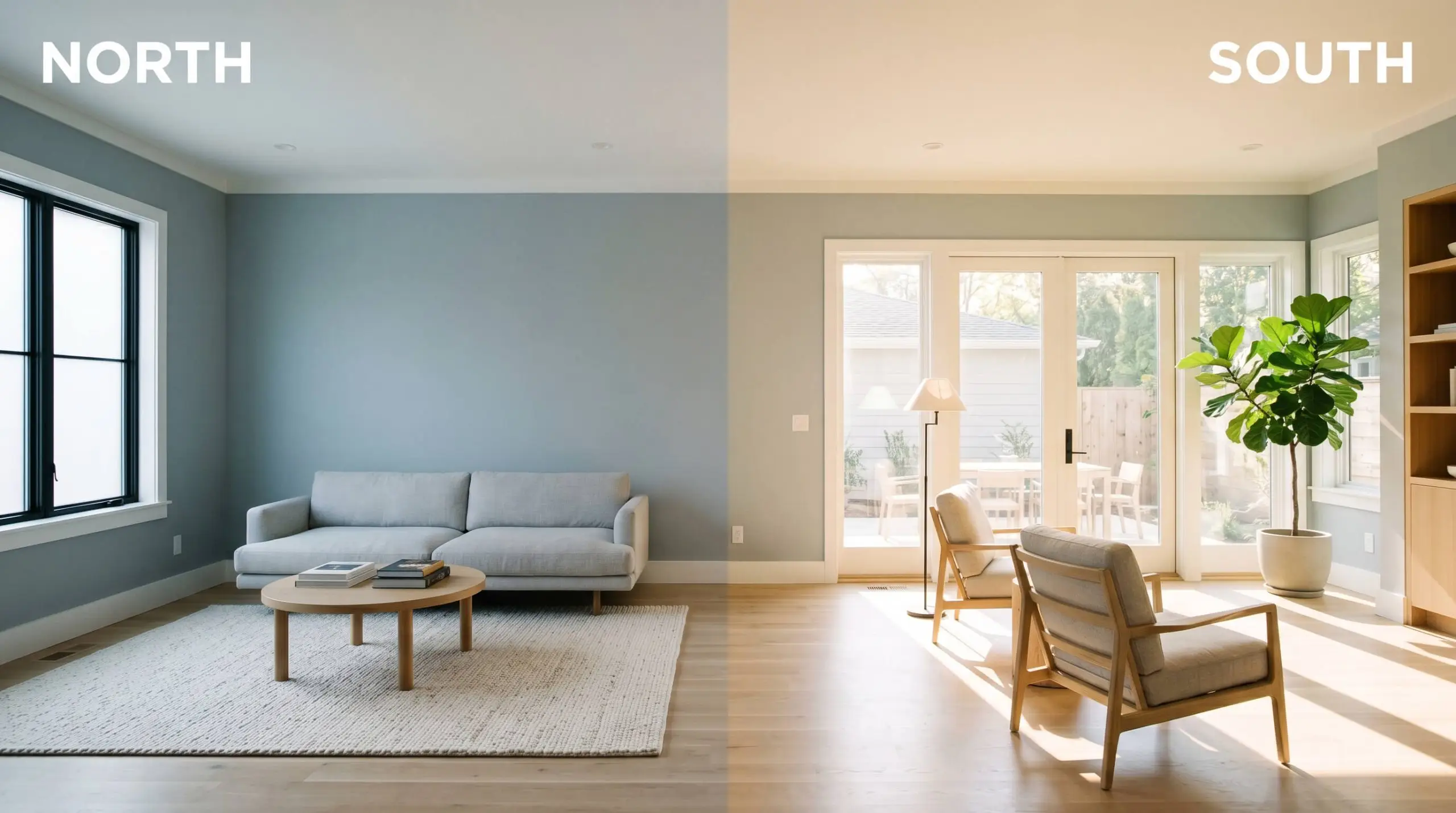
Lighting Effects & The Chameleon Factor of Lakeside
Because this mid-tone slate relies on a delicate balance of gray and cyan, it is highly reactive to the specific light in your home. You must treat this paint as a dynamic material that will shift its mood as the sun moves across the sky.
Best Rooms to Paint with This Mid-Tone Slate
Understanding how this color behaves in light is only half the battle; knowing where to place it dictates the final success of your design. Because of its balanced depth, this shade is incredibly versatile across different functional spaces. Here is how to maximize its potential throughout your home.
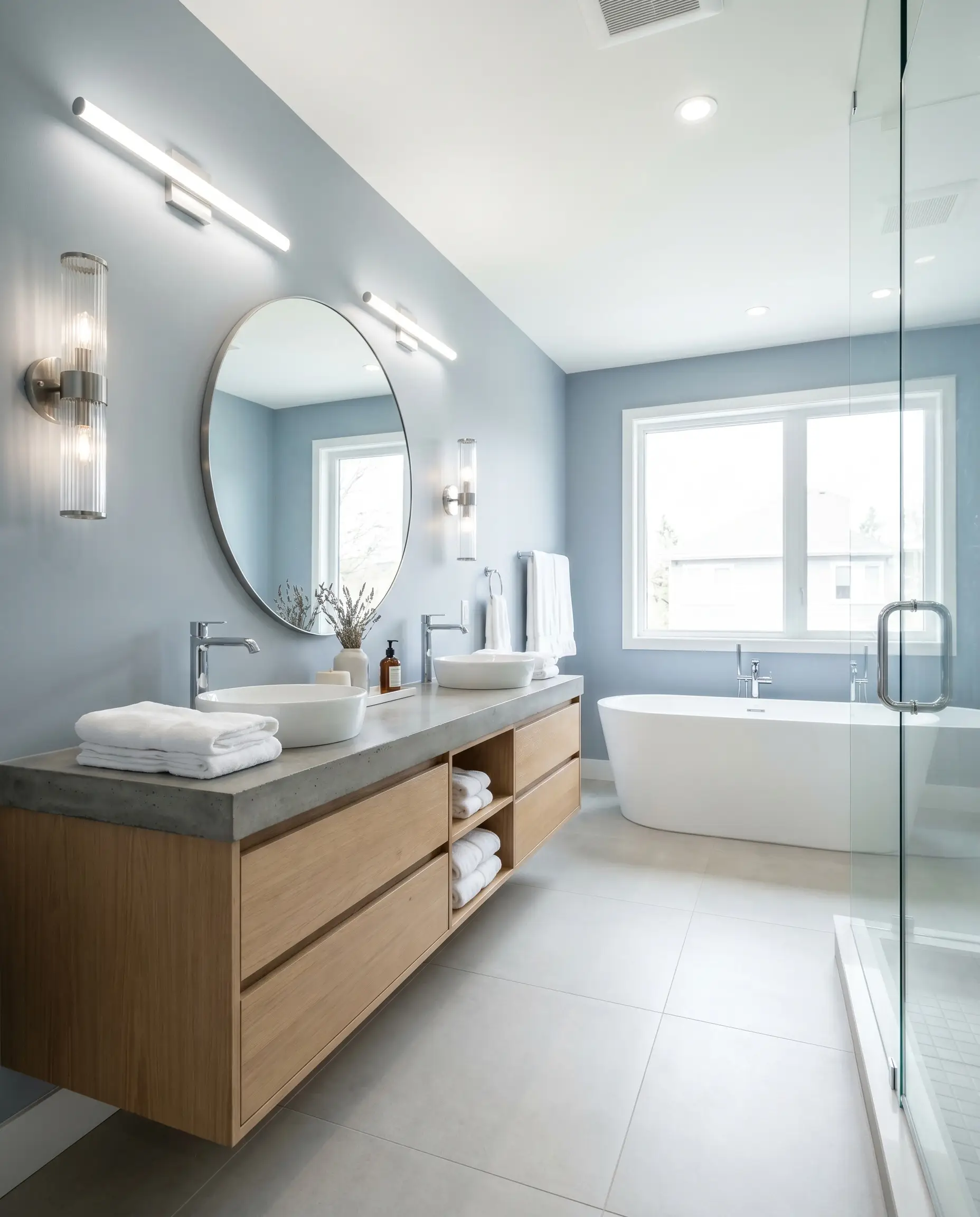
Refreshing Bathrooms & Powder Rooms
Instead of defaulting to predictable coastal tropes, use this muted blue to create a Soft Minimalist retreat. Its cool-leaning profile thrives in bathrooms, especially when paired with the clean lines of a floating white oak vanity and fluted glass sconces. The color provides enough visual weight to make the room feel designed, without requiring expensive floor-to-ceiling tile.
If your bathroom lacks natural light and relies entirely on warm, dim fixtures, this color will lose its crispness. Always opt for 3500K-4000K LED bulbs near the vanity to ensure the cyan-blue structure remains clean and vibrant.
Hackrea Pro-Tip (The Lighting Strategy)
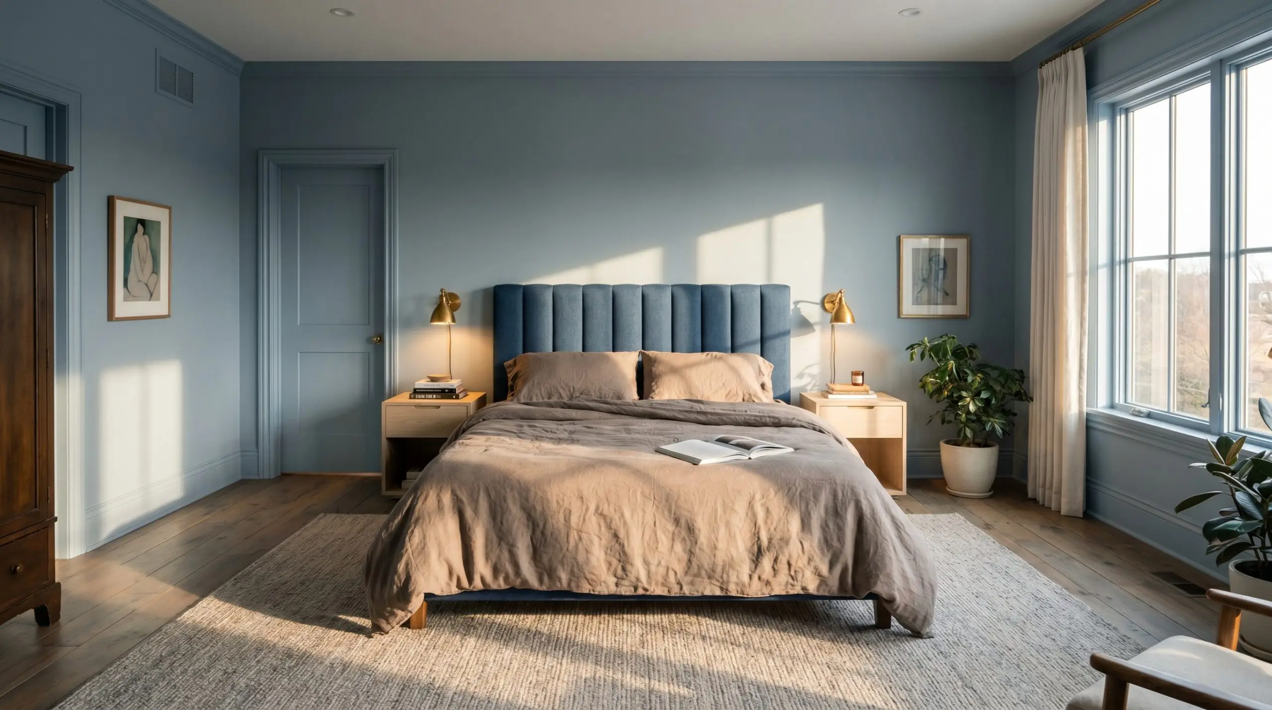
Serene Primary Bedrooms
This shade is brilliant for bedrooms because it naturally lowers the visual heart rate of the space. Consider color-drenching the room—painting the walls, baseboards, and even the doors in the same finish—to create a seamless, enveloping atmosphere.
Pair it with washed linen bedding in warm taupe and a channel-tufted headboard to soften the cool walls. The result is a transitional space that feels both incredibly restful and highly curated.
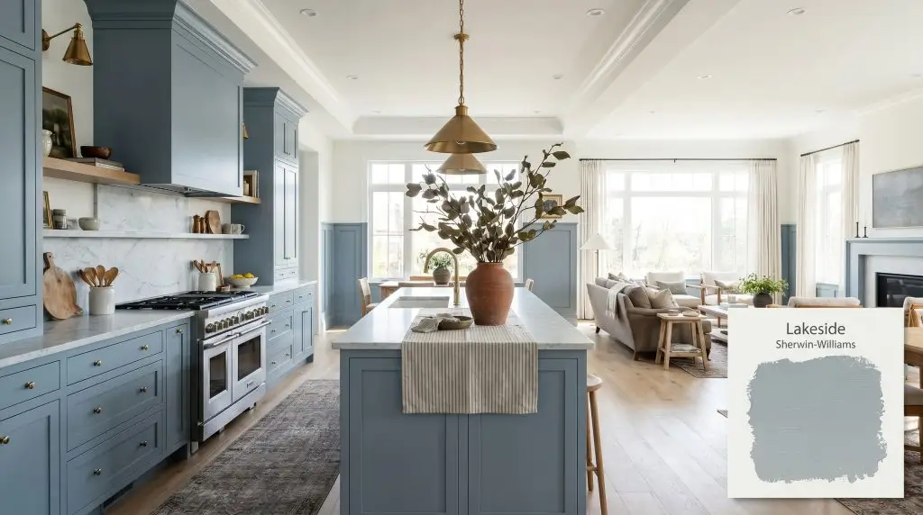
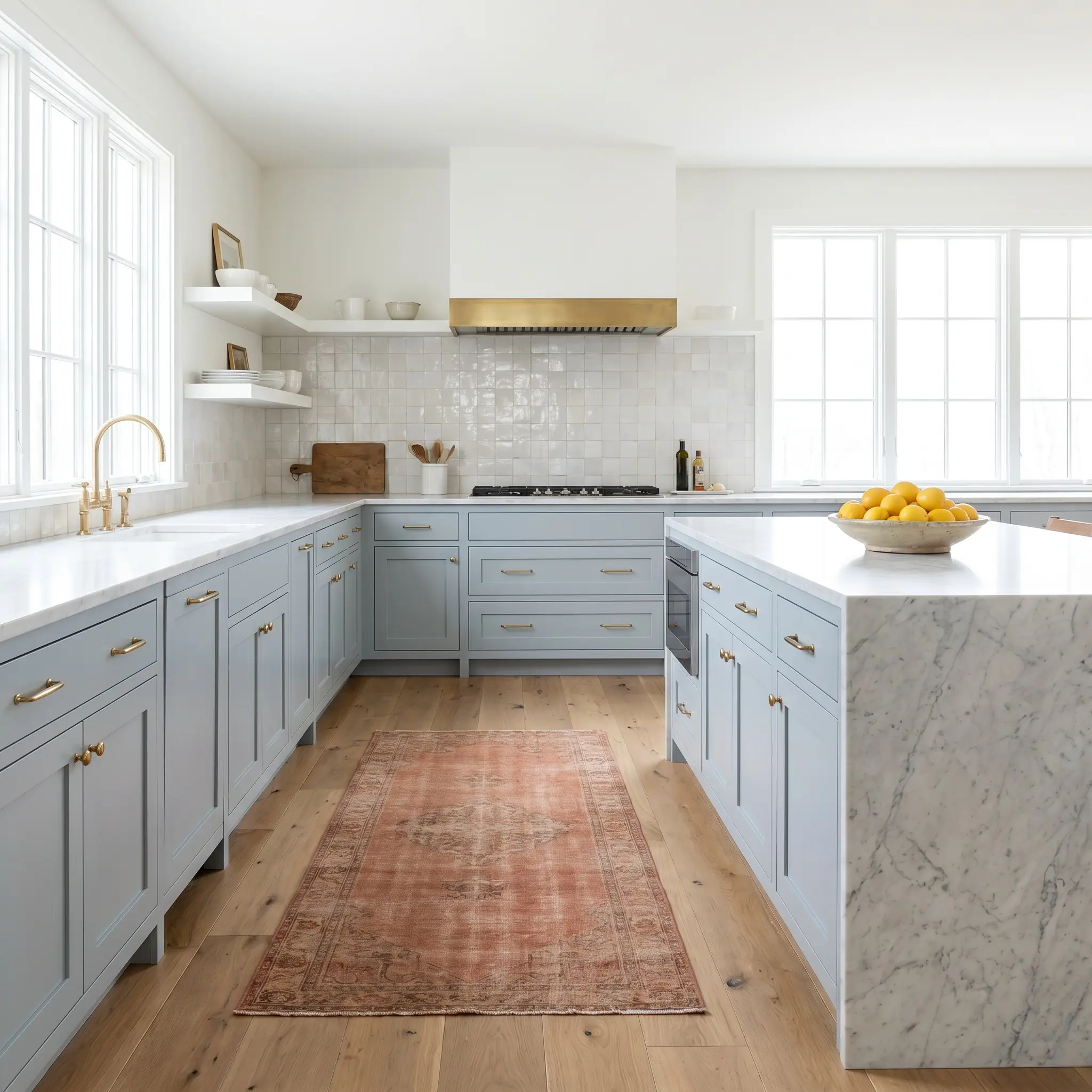
Elevated Kitchen Cabinetry & Islands
If you are tired of all-white kitchens but aren’t ready to commit to a stark black, painting your lower cabinets or center island in this shade is a phenomenal compromise. The slate-gray base provides enough depth to hide everyday scuffs, while the blue undertones inject personality into the room.
To elevate the design, contrast the cool cabinetry with honed Carrara marble countertops and warm terracotta floor runners. This creates a beautiful tension between warm and cool elements, making the kitchen feel custom-built.
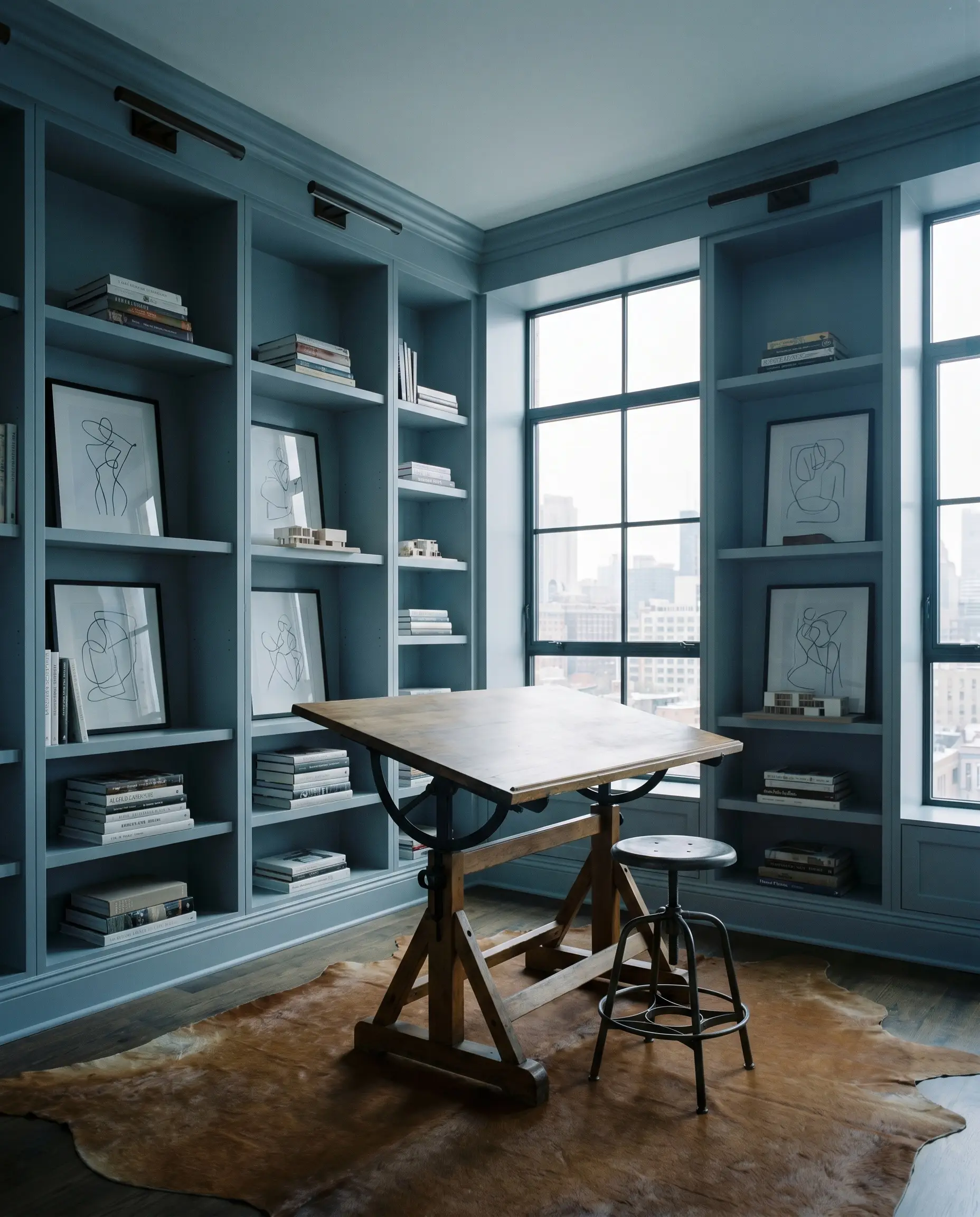
Focused Home Offices
In a home office, you need an environment that promotes focus without feeling like a corporate cubicle. Applying this color to built-in bookshelves or classic wainscoting adds a layer of Urban Modern sophistication.
The muted chromatic profile prevents the walls from becoming a visual distraction during long hours of work. Pair it with a vintage drafting table and blackened steel hardware for a sharp, tailored aesthetic.
Coordinating Colors & Best Pairings for SW 9683
The true potential of any architectural finish is unlocked by what you place next to it. Because this paint relies on a delicate balance of gray and cyan, it requires intentional pairings to either pull out its warmth or highlight its crisp, cool nature.
Trim & Baseboards
To maintain the tailored, sophisticated edge of this color, you need a crisp, highly reflective boundary.
Hardware, Wood & Material Pairings
The secret to styling this specific hue is introducing tactile materials that physically contrast its cool, desaturated cast.
Coordinating Colors
When building a whole-home palette, you must surround this muted blue with colors that respect its delicate structure.
Designer Mood Boards
To help you visualize how these individual elements come together, here are two distinct stylistic pathways for integrating this color into your home.
The Transitional Slate This palette leans into the tailored, sophisticated side of the paint. Imagine crisp Chantilly Lace trim framing the muted blue walls, accented by unlacquered brass picture lights and polished chrome hardware. We layer in subtle ticking stripe textiles and a vintage oil portrait to create an atmosphere that feels classic, yet entirely updated and fresh.

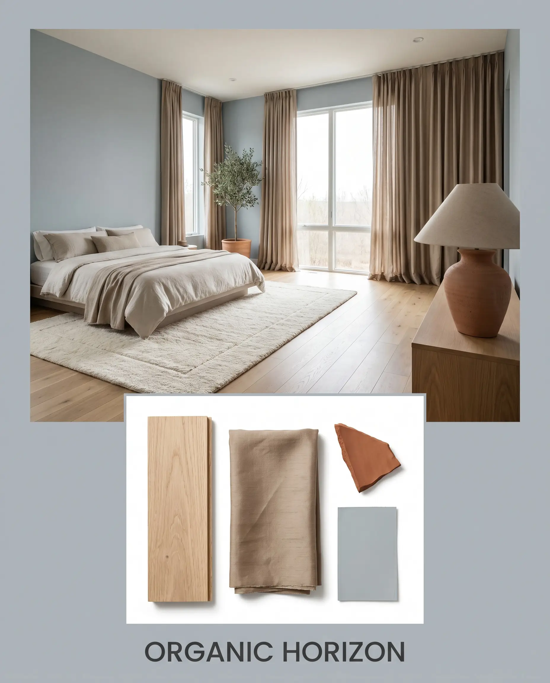
Organic Horizon This approach highlights the paint’s connection to nature by utilizing a Soft Minimalist aesthetic. We pair the cool walls with expansive white oak flooring and raw silk window treatments in a warm taupe. By introducing a terracotta focal point—like an oversized ceramic table lamp or a patterned lumbar pillow featuring Red Earth tones—the room achieves a beautiful, rooted balance.
Head-to-Head Comparisons: Lakeside vs. Rivals
Sometimes, the lighting in your home or your specific architectural style requires a slight pivot. If you are testing samples and finding that the color isn’t behaving exactly as you hoped, comparing it against its closest rivals will guide your final decision.
Sherwin-Williams Lakeside vs. Sherwin-Williams Upward
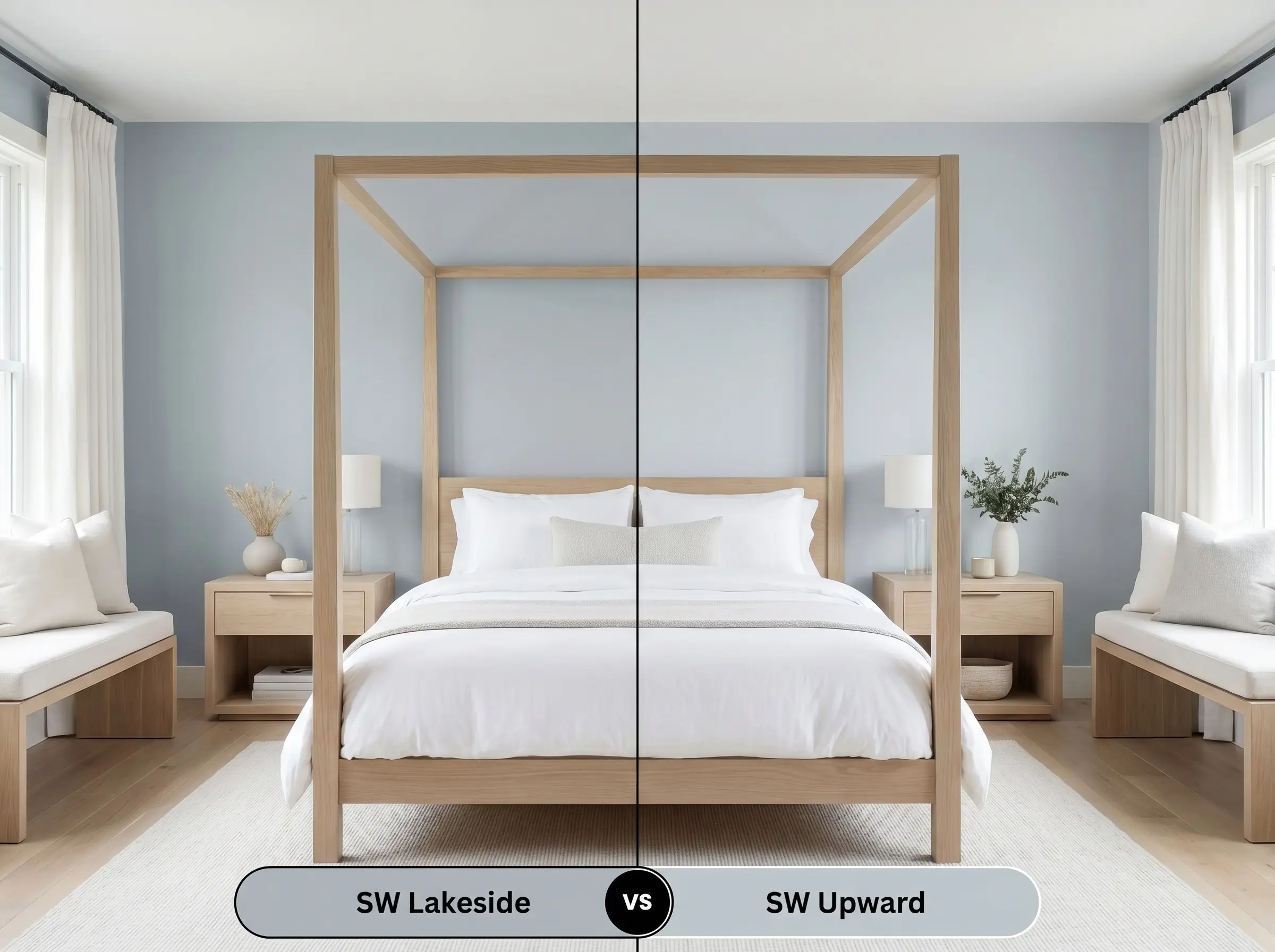
If you find that Lakeside feels a bit too dark or substantial for your space, Upward SW 6239 is the natural alternative. Upward has a significantly higher LRV, making it a lighter, more airy blue that reflects much more light. However, be aware that Upward carries more purple undertones; if your room is north-facing, it may lose the sophisticated slate edge and pull slightly periwinkle.
Sherwin-Williams Lakeside vs. Sherwin-Williams Stardew
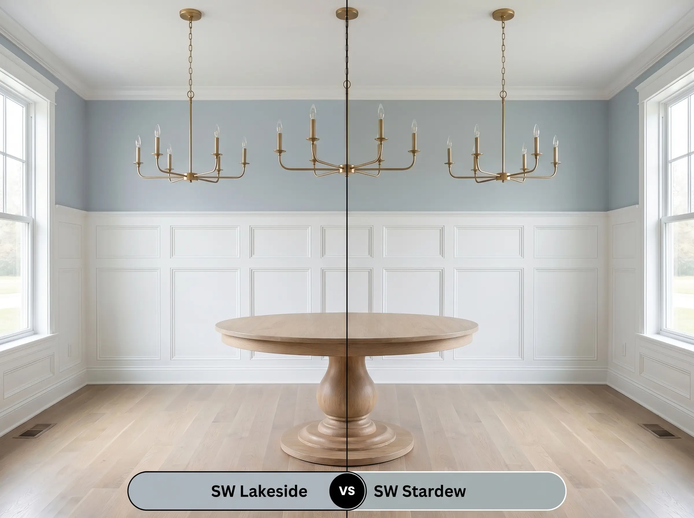
Stardew SW 9138 is an excellent pivot if you love the depth of your current sample but need something slightly warmer. While both share a similar mid-tone depth, Stardew leans much heavier into its gray and green undertones. If your room features a lot of warm wood tones or vintage red oak floors, Stardew will often harmonize better than the cleaner cyan structure of Lakeside.
Similar Colors & Brand Equivalents
If you are committed to this specific color family but need to adjust the depth, or if you simply need to color-match across different paint manufacturers, here are the most reliable alternatives.
Practical Application & DIY Advice
Moving from design theory to the physical reality of painting requires strategic planning. The finish you choose and the preparation you put in will dictate the final luxury feel of the space.
Because mid-tone colors with complex undertones can sometimes look streaky over white drywall, a tinted gray primer is highly recommended. Plan for two full coats of premium paint to ensure the cyan-blue structure fully develops without any visible roller marks.
Hackrea Design Secret (The Coverage Rule)
Frequently Asked Questions About Lakeside
When used on an exterior, direct sunlight will wash out the color, making it appear significantly lighter and bluer than it looks on an interior swatch. Additionally, heavy green foliage will reflect onto the siding, potentially pulling the paint’s hidden cyan undertones forward and giving it a slight teal appearance.
No, it is highly unlikely to pull purple. The 4000K LED lighting provides a crisp, cool illumination that will actually enhance the paint’s slate-gray and cyan structure, keeping the blue looking clean and sophisticated rather than violet.
Absolutely. This is a highly premium pairing. The cool, muted blue beautifully grounds the dramatic gray veining of the Calacatta marble, while the living warmth of the unlacquered brass provides the perfect fiery contrast to the cool cabinetry.
It can be a challenging combination. Because blue and orange are complementary colors, the vibrant orange tones in vintage red oak will actually force the cyan undertones in the paint to look brighter and more intense, potentially losing its sophisticated, muted edge.
Final Verdict & Expert Warnings
Sherwin-Williams Lakeside is an incredibly versatile, sophisticated choice for homeowners who want the calming effects of blue without the juvenile brightness. It performs best in spaces that receive ample natural light, where its complex slate-gray base can beautifully shift throughout the day. This paint is perfect for those looking to elevate standard cabinetry, create a serene primary bedroom, or introduce a cool-leaning neutral into a modern, transitional home.
However, you must be highly strategic when pairing this color with existing warm, bossy finishes. If your home features heavily saturated orange-toned woodwork, honey oak cabinets, or expansive terracotta tile floors, this cool blue will fight against those warm elements. The high-contrast interaction will force the muted paint to appear much brighter and sharper than intended, entirely ruining its calm, architectural vibe. Instead, reserve this shade for spaces featuring neutral white oak, crisp white trim, or cool stone surfaces where its subtle beauty can truly shine.
Closest Cross-Brand Equivalents
The absolute closest scientific color matches for Lakeside across top paint brands.