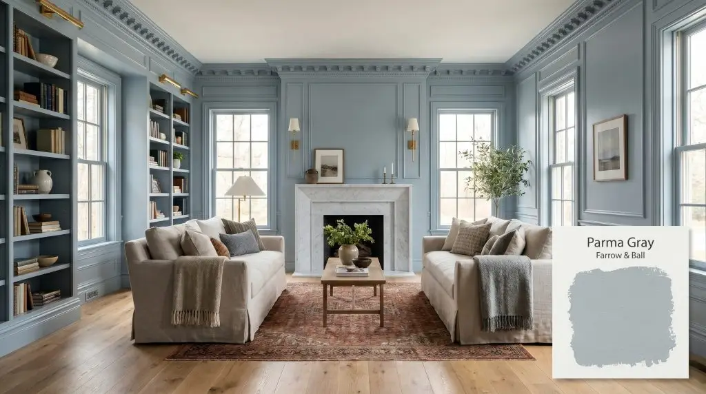
Parma Gray No. 27
Farrow & BallFarrow & Ball Parma Gray No. 27 is a cool, crisp mid-blue with a subtle gray cast. Despite its name, it reads predominantly as a formal, airy blue rather than a true gray, making it a classic choice for elegant, period-inspired spaces.
Paint Technical Profile
| Color ID / SKU | No. 27 |
| HEX Code | #b0bec6 |
| Light Reflectance (LRV) | 52.0 |
| Use | Interior, Exterior |
| Best Exposures | South-facing, East-facing |
| Best For | Bedrooms, Bathrooms, Period Living Rooms, Cabinetry |
Farrow & Ball Parma Gray No. 27: The Tailored Mid-Blue That Transforms Light and Shadow
Sourcing the perfect blue paint is a notorious design challenge. Lean too saturated, and the room instantly feels like a nursery; lean too dark, and the walls absorb all the natural light. Farrow & Ball Parma Gray No. 27 strikes a brilliant, elusive balance.
This is not a timid pastel, nor is it a standard primary shade. It is a highly tailored, architectural finish that brings an undeniable sense of tailored elegance to a room.
Whether you are updating a centuries-old townhouse or adding character to a modern build, this mid-blue tone operates with incredible sophistication. Let us explore exactly how its underlying pigment structure dictates its behavior on your walls.
Farrow & Ball Parma Gray: Undertones & LRV
If you are wondering whether Farrow & Ball Parma Gray No. 27 reads warm or cool, the verdict is definitively cool. However, it is far from a flat, freezing shade. Its complexity comes from a highly specific pigment profile that constantly reacts to its environment.
The Anatomy of the Color:
At an LRV (Light Reflectance Value) of 52.0, this shade sits almost perfectly in the middle of the light reflectance scale. This 52.0 LRV is a massive advantage for homeowners. It means the paint absorbs a moderate amount of light, allowing it to hold its rich color structure beautifully without washing out in bright spaces, while still reflecting enough light to avoid feeling overly shadowed in darker corners.
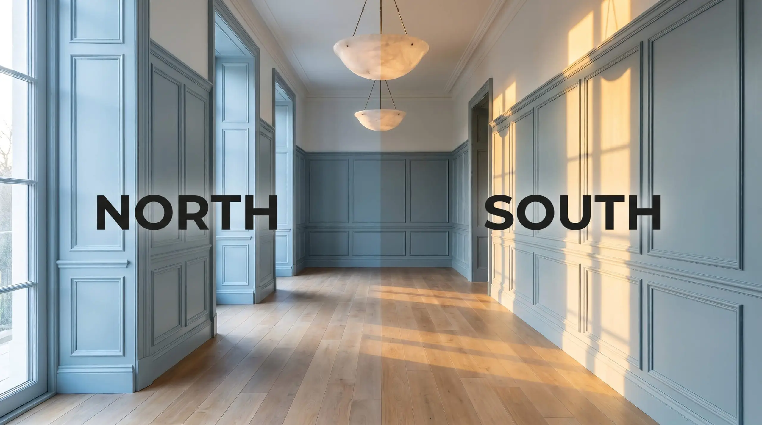
The Chameleon Factor: Lighting Effects
Because of that stabilizing gray-green cast, this historic blue is highly reactive to the temperature of your lighting. You must anticipate how your specific exposure will pull different characteristics forward.
Popular Applications for Parma Gray
Understanding how this mid-blue tone behaves in the light is only half the battle; the real magic happens when you apply it to specific architectural features. Because of its 52.0 LRV, this shade is incredibly versatile, adapting to both expansive walls and detailed millwork.
Here is how to maximize its potential across different spaces in your home.
The Tailored Living Space
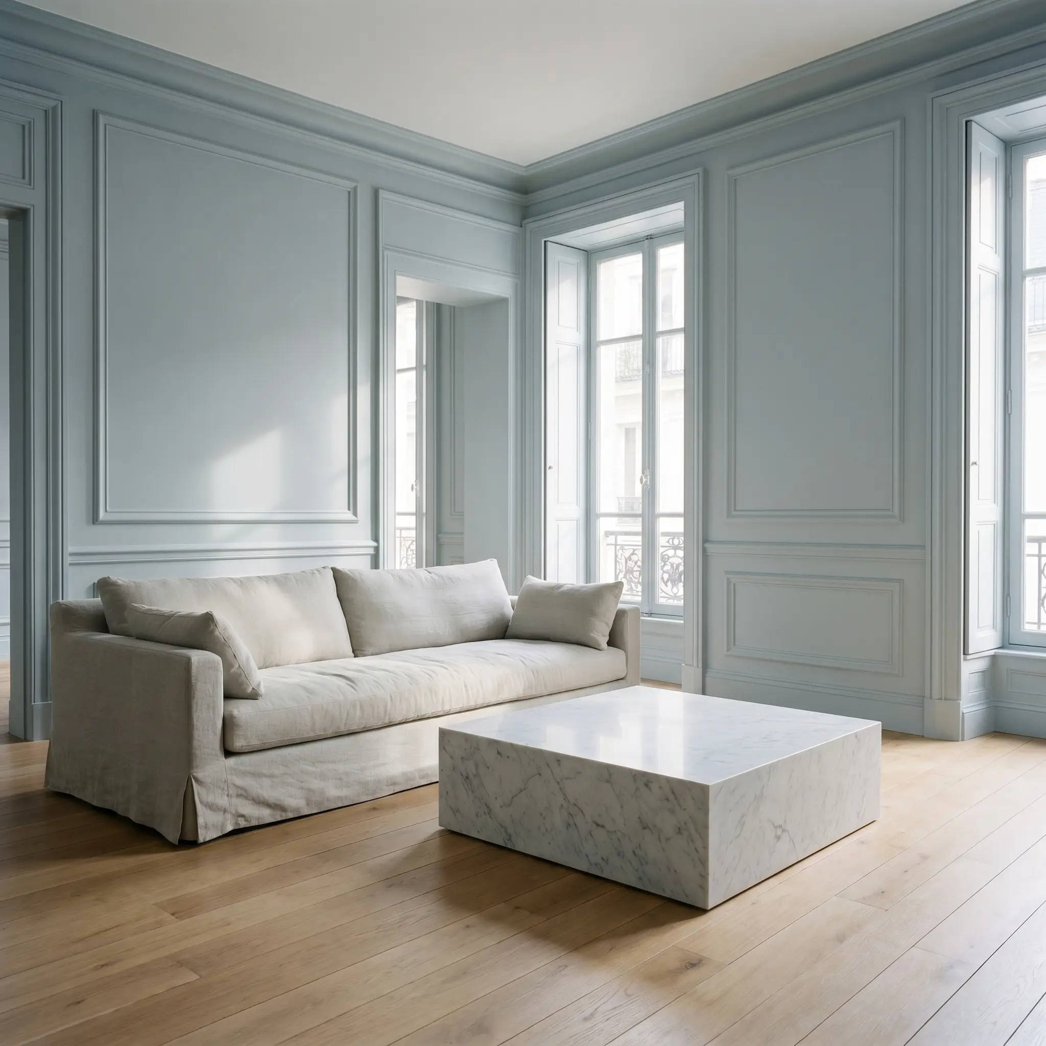
While often associated with period living rooms, this shade thrives in a Parisian Chic aesthetic. Imagine it color-drenched across the walls, baseboards, and intricate picture molding, creating a seamless, sophisticated envelope. Pair the crisp blue walls with an oversized, slipcovered sofa in washed linen and a plinth coffee table in honed Carrara marble.
If you prefer a Transitional approach, use the paint on the walls but keep the ceiling and trim a crisp white. Ground the airy blue with a vintage, rust-toned rug and introduce warmth through reeded walnut media consoles and unlacquered brass picture lights.
When color-drenching a living room, use a flat or matte finish on the walls to absorb light, but switch to a satin or eggshell finish in the exact same color for the trim. The subtle shift in sheen creates gorgeous architectural definition without breaking the monochromatic look.
Hackrea Pro-Tip (The Finish Strategy)
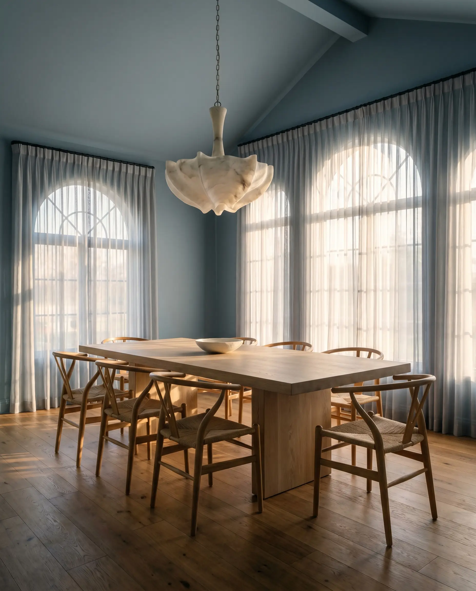
Atmospheric Dining Enclaves
Formal dining rooms naturally lend themselves to dramatic color choices, and this gray-blue offers a brilliant alternative to expected moody greens or dark navies. Apply it above crisp white wainscoting to create a refined, tailored upper wall that bounces candlelight beautifully.
For a more Organic Modern interpretation, paint the entire dining space, including the ceiling, and introduce a massive pedestal dining table in white oak. Suspend a sculptural alabaster chandelier above the table to contrast against the cool walls, and use sheer organza window treatments to filter the afternoon light.
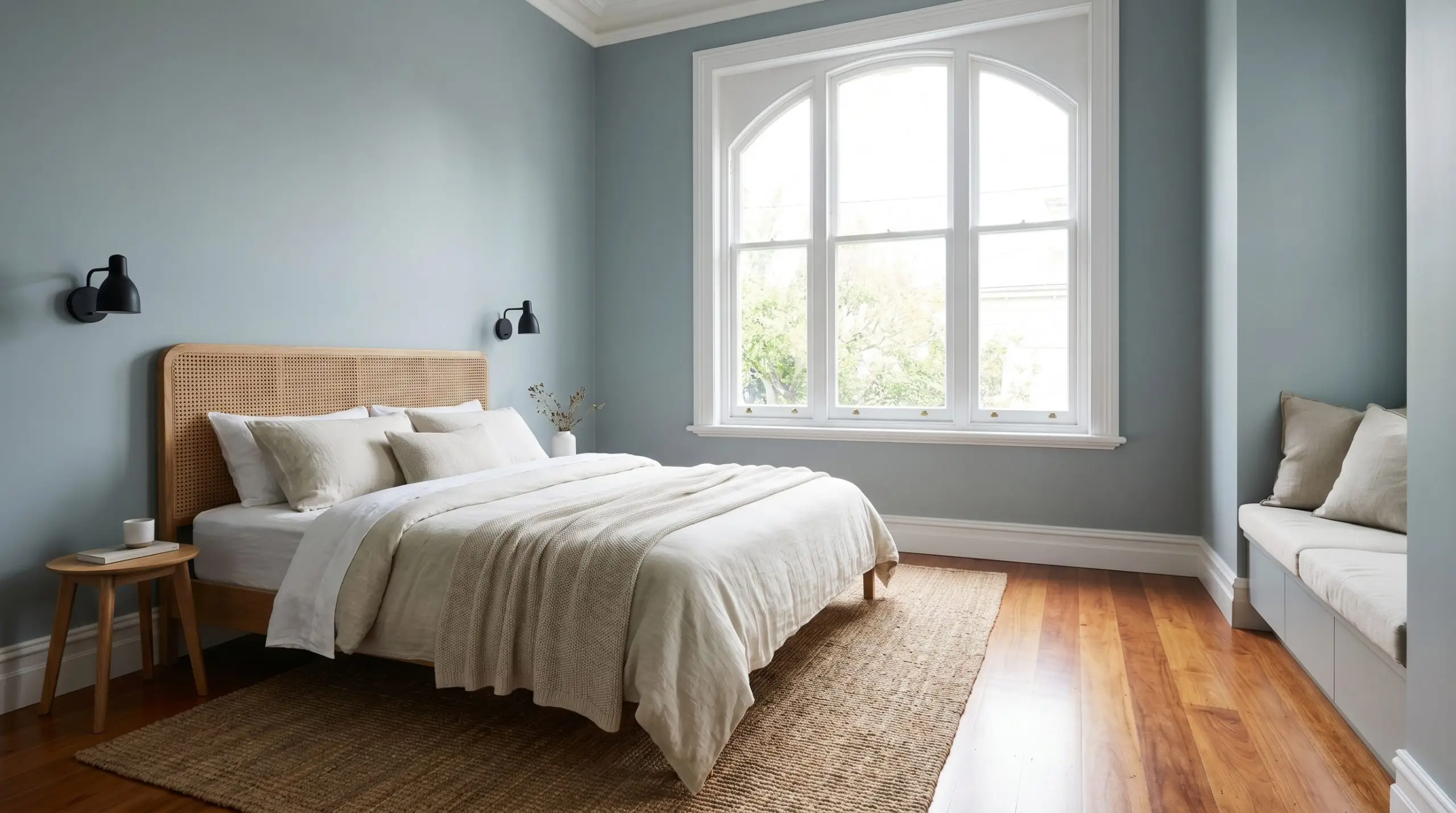
Serene Guest Retreats
In a guest bedroom, the goal is to create a restful, universally appealing environment. This vintage gray-blue is incredibly calming when paired with layers of slub cotton bedding and a cane headboard.
To elevate the space, flank the bed with blackened steel sconces and incorporate a brutalist credenza to add a touch of necessary tension against the soft blue walls. If the room receives heavy northern light, lean into the coolness by introducing worsted wool throws in deep charcoal.
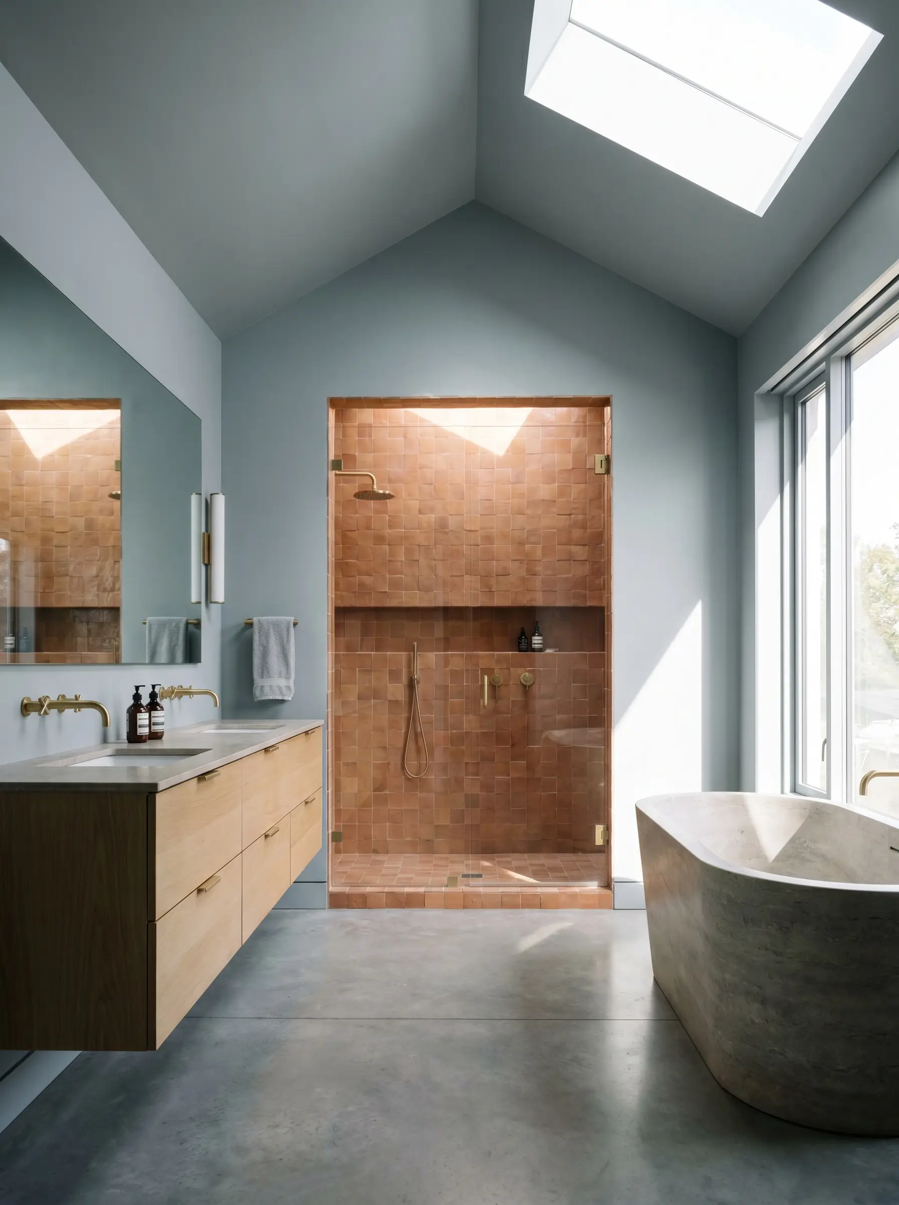
Architectural Bath Transitions
Bathrooms are the perfect testing ground for rich color, particularly when applied to detailed millwork. Using this shade on classic bathroom wainscoting or beadboard paneling establishes a stunning, water-inspired foundation.
Pair the painted lower walls with a heavily veined marble vanity and polished nickel plumbing fixtures for a classic, high-end hotel aesthetic. Alternatively, run the paint up to the ceiling and offset the cool tones with an expanse of warm, earthy zellige tile in the shower enclosure.
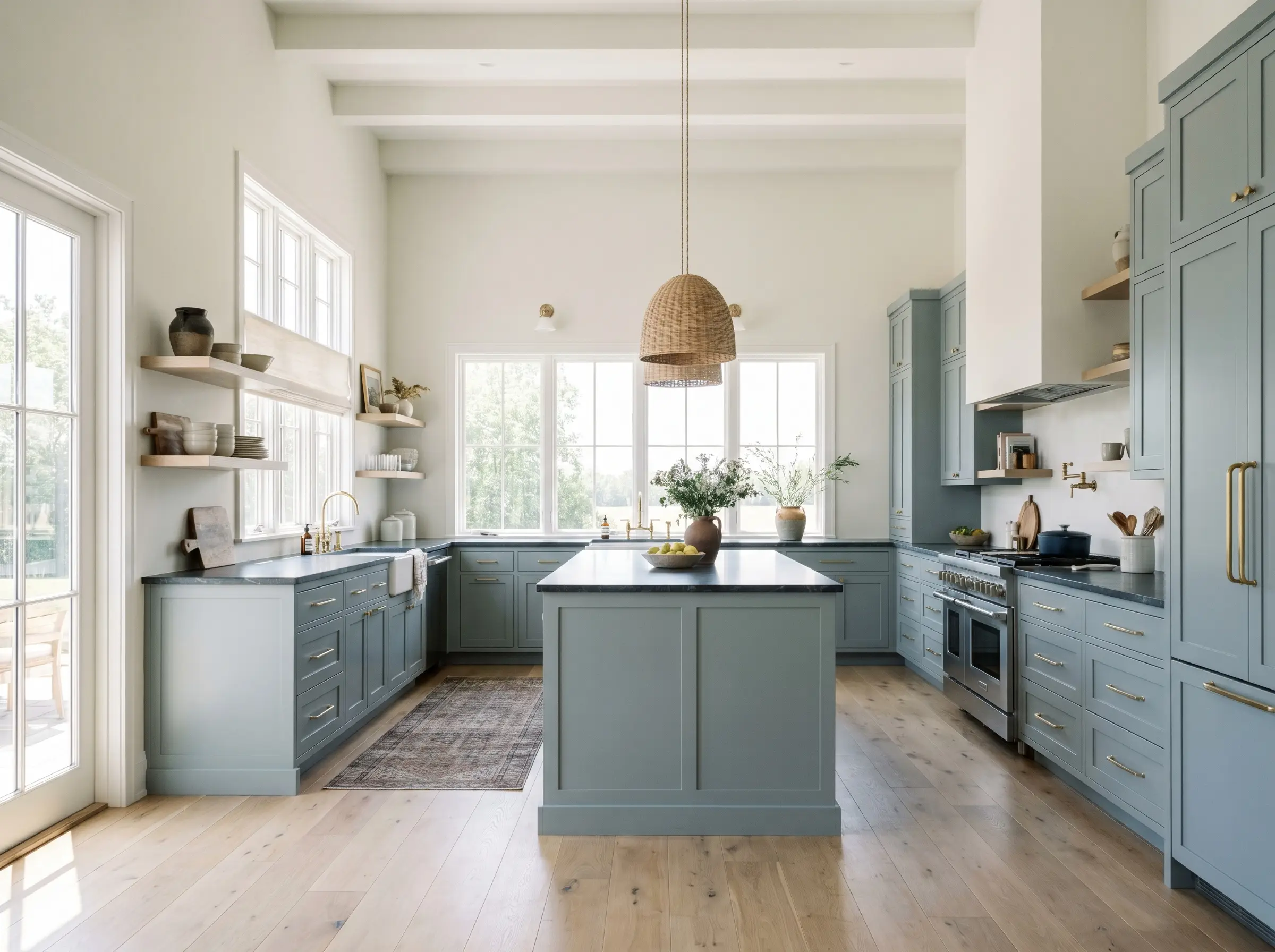
Bespoke Culinary Cabinetry
Kitchen cabinetry painted in this cyan-blue spectrum instantly feels custom and highly considered. It is a brilliant choice for lower cabinets or a standalone kitchen island, especially when grounded by wide-plank white oak flooring.
The hardware you choose will dictate the entire kitchen’s style. Polished chrome cup pulls will pull the space toward a traditional, coastal feel, while minimalist, unlacquered brass edge pulls will sharpen the design, pushing it firmly into modern, tailored territory.
Material Pairings & Coordinating Colors
The true success of Farrow & Ball Parma Gray No. 27 relies entirely on what you place next to it. Because it is a cool, structured shade, it requires strategic material pairings to balance its temperature and prevent the room from feeling sterile.
Trim & Baseboards
The trim color you select will either sharpen the blue or soften its edges.
Hardware, Wood & Tactile Pairings
To elevate this icy cast, you must introduce materials that provide contrasting warmth and texture.
Coordinating Paint Colors
Building a whole-home palette around this shade requires colors that either complement its coolness or intentionally disrupt it.
Designer Mood Boards
To help you visualize how these elements interact, here are three distinct aesthetic pathways for this specific color profile.
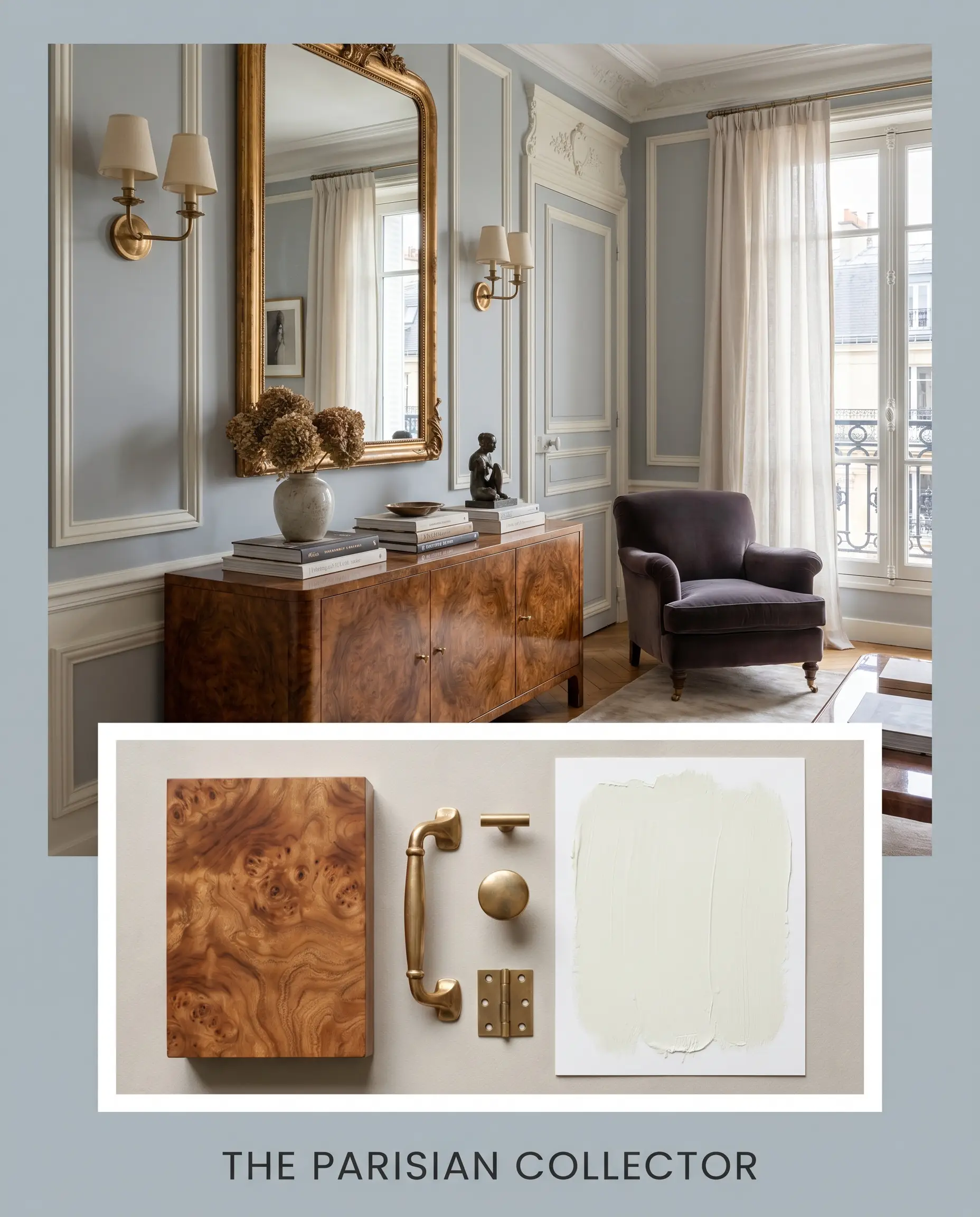
The Parisian Collector This palette thrives on the tension between cool, formal architecture and warm, lived-in materials. The walls are wrapped in the crisp mid-blue, bordered by the razor-sharp contrast of Benjamin Moore Chantilly Lace on the picture molding. We introduce warmth through a vintage burl wood console and heavy, unlacquered brass hardware. The energy is refined, slightly formal, yet undeniably inviting.
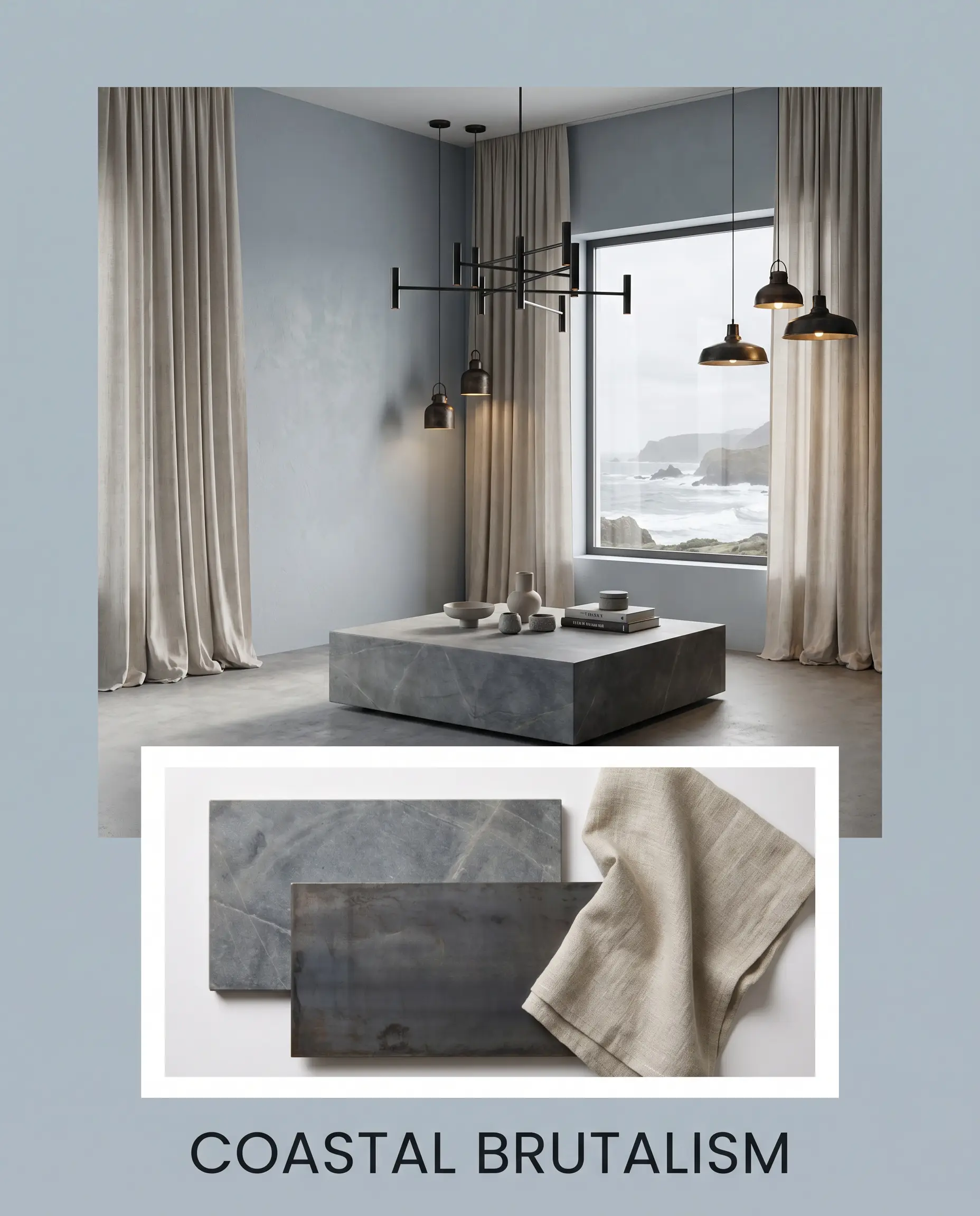
Coastal Brutalism A highly modern, textural approach that strips away the historical expectations of the paint. The gray-blue walls act as a serene backdrop for dense, weighty materials like a honed soapstone coffee table and blackened steel lighting fixtures. We soften the hard architectural lines with expansive drapery in oatmeal washed linen, creating an atmosphere that feels grounded, earthy, and quietly powerful.
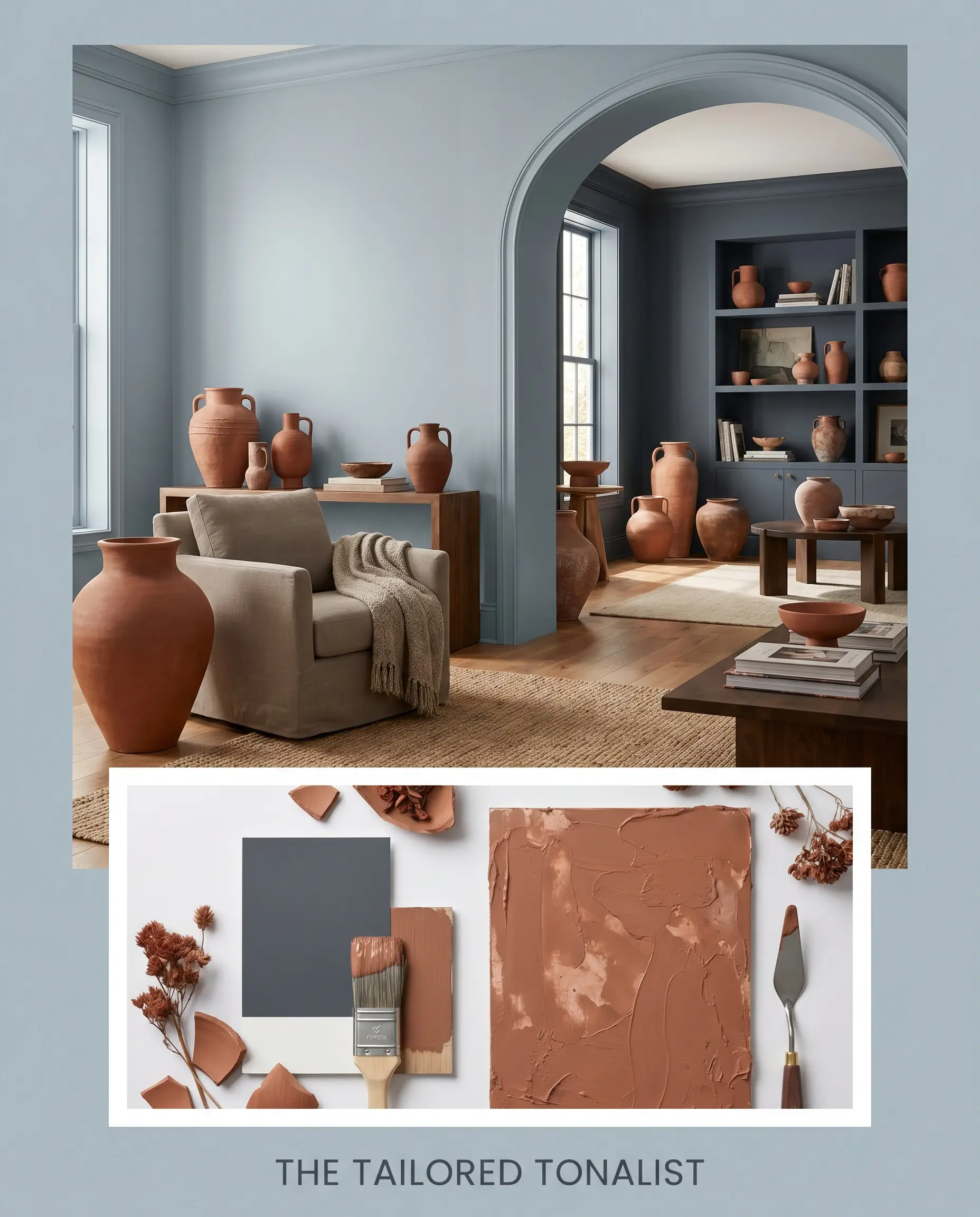
The Tailored Tonalist This palette is all about seamless, atmospheric layering. The mid-blue tone flows effortlessly into adjacent spaces painted in the profound depth of Benjamin Moore Hale Navy. To keep the cool tones from feeling chilly, we introduce accents of Sherwin-Williams Cavern Clay through ceramic vessels and terracotta styling pieces. The mood is enveloping, deeply saturated, and highly intentional.
Head-to-Head Paint Comparisons
Sometimes, understanding what a color is requires looking at what it is not. If you are testing samples and feeling unsure, comparing it against its closest rivals will clarify your decision.
Farrow & Ball Parma Gray vs. Benjamin Moore Smoke 2122-40
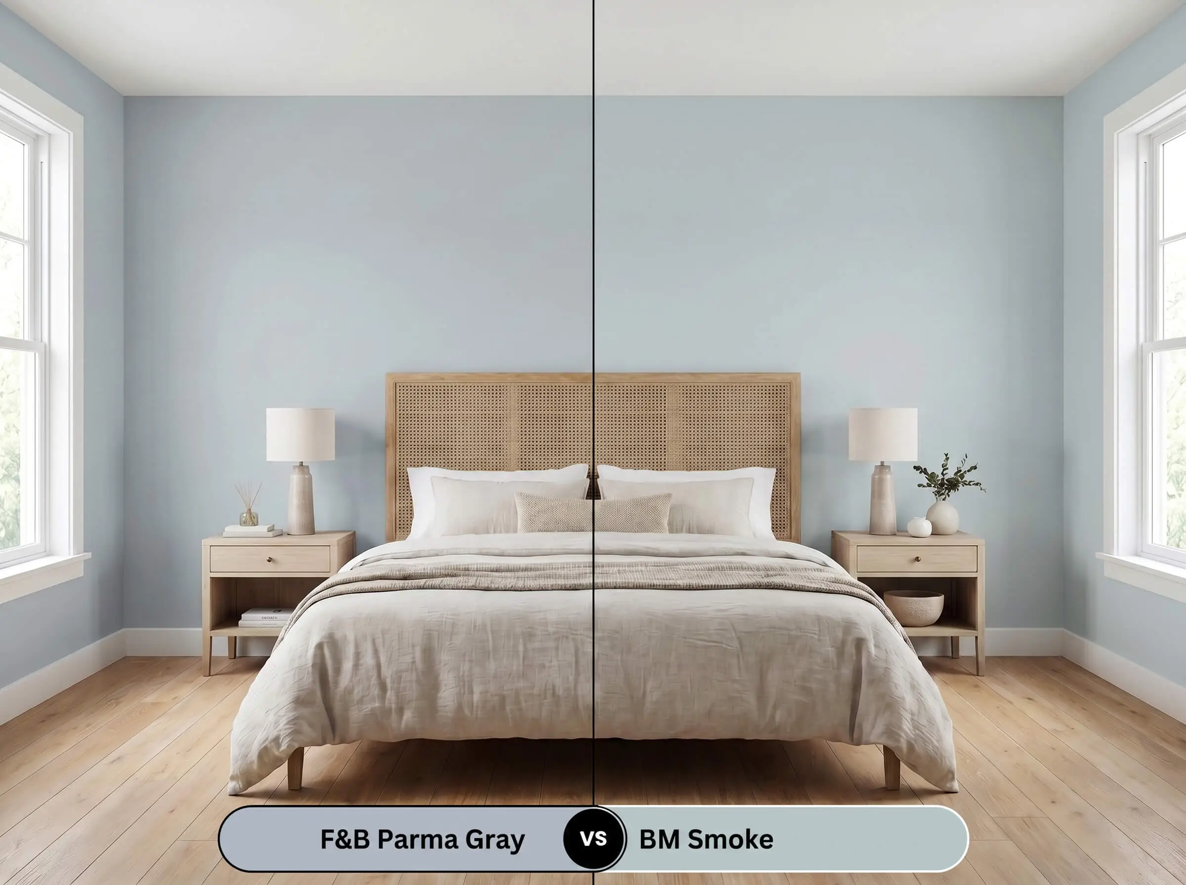
If you find that F&B No. 27 is pulling slightly too intense in your space, BM Smoke is the logical pivot. Smoke has a slightly higher LRV and carries a much stronger gray undertone, making it softer and more muted on the wall. Choose Parma Gray for a confident, tailored blue, but switch to Smoke if you need a quieter, more passive backdrop.
Farrow & Ball Parma Gray vs. Sherwin-Williams Tradewind SW 6218
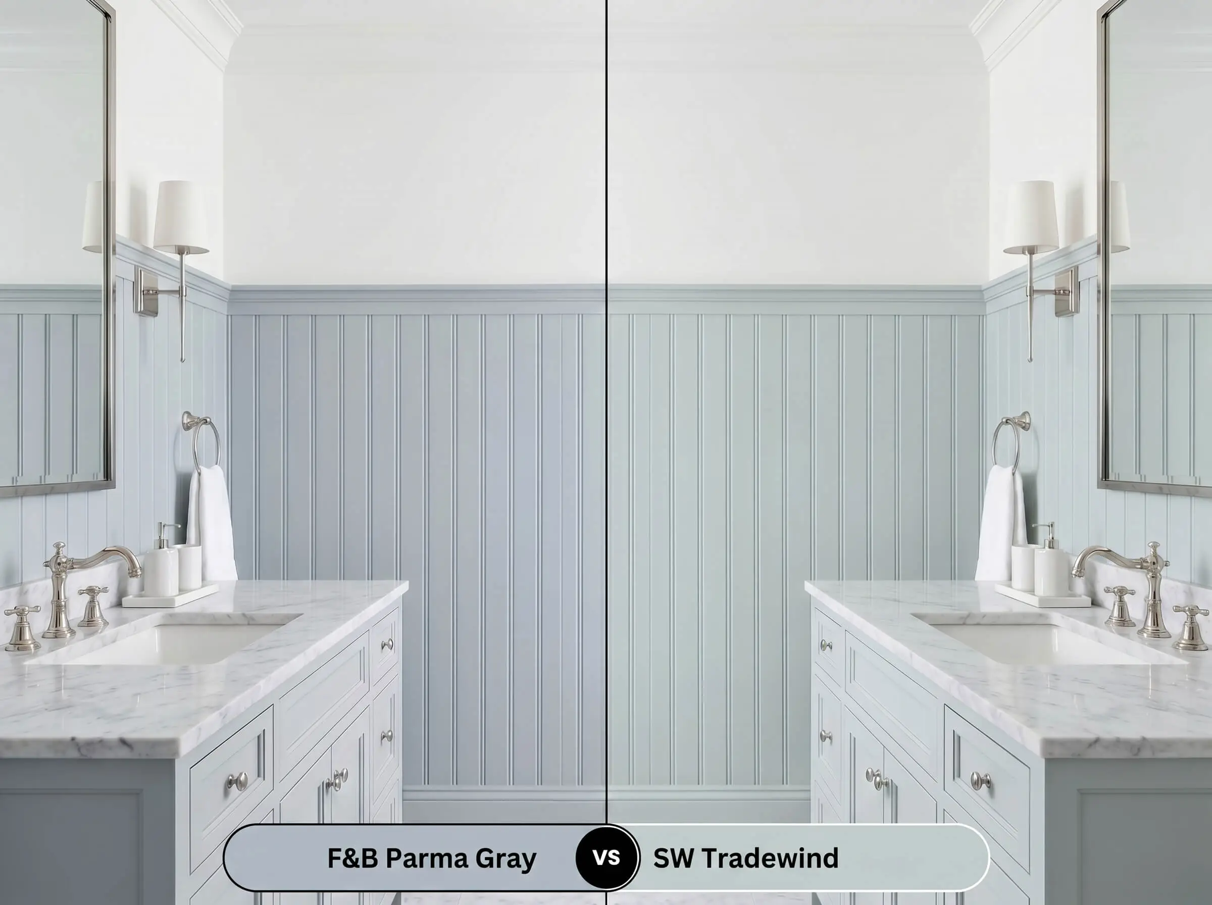
SW Tradewind leans noticeably further into the green spectrum, reading more like a breezy aqua compared to the structured cyan-blue of F&B No. 27. If your room is flooded with warm southern light, Tradewind might amplify into a vibrant teal. Stick with the Farrow & Ball option if you want to maintain a formal, historic gray-blue cast.
Farrow & Ball Parma Gray vs. Farrow & Ball Lulworth Blue No. 89
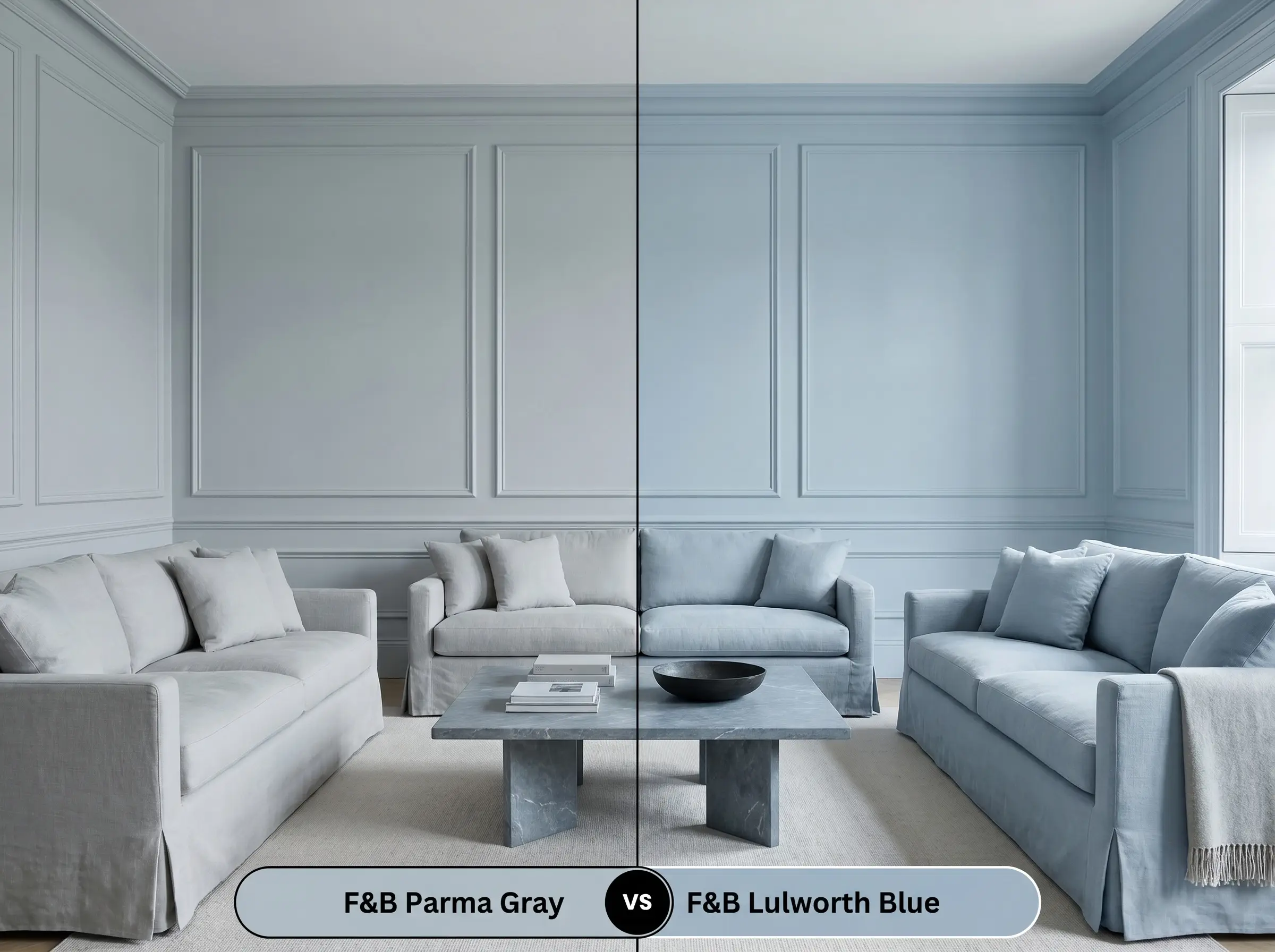
Lulworth Blue is a much purer, sweeter mid-blue with significantly less gray in its DNA. If you place them side-by-side, No. 27 looks distinctly moodier and more architectural. Choose Lulworth Blue for a cheerful, classic blue, but rely on Parma Gray if you want a sophisticated, mature finish that changes with the shadows.
Similar Shades & Cross-Brand Matches
If you love the general profile of this color but need to make a subtle adjustment for your specific lighting, or if you need to color-match across brands, here are the closest alternatives.
Similar Colors Within the Brand:
Cross-Brand Equivalents:
Practical Application & Finishes
Translating a beautiful color swatch into a flawless architectural finish requires strict attention to your application strategy.
The Dynamic Sheen Guide:
Primer Strategy & Coverage: Because this is a mid-tone color with a 52.0 LRV, it generally covers well over light walls. However, to achieve the true depth of the cyan-blue spectrum, you must use a mid-tones primer. Plan for a strict two-coat minimum to ensure the hidden gray-green cast develops properly; a single coat will often look patchy and fail to reveal the color’s true complexity.
When rolling this specific depth of color in a flat finish, maintain a strictly wet edge. If you go back over partially dried paint, you will cause “flashing”—visible, uneven roller marks that ruin the velvety texture. Work methodically from one corner of the room to the other.
Hackrea Pro-Tip (The Flashing Warning)
Frequently Asked Questions
Not at all; in fact, it creates a stunning complementary contrast. The cool, icy cast of the blue beautifully balances the intense, earthy warmth of red brick, making it an exceptional choice for exterior shutters or front doors.
Under 3000K lighting, which is a neutral-warm temperature, the paint will hold its mid-blue identity well but will lean slightly into its vintage, muted gray qualities. It will feel tailored and clean, though it won’t have the crisp, icy pop it would under natural daylight.
While it is a gorgeous blue, its 52.0 LRV makes it slightly too weighted to act as a receding, airy sky tint on a low ceiling. It will visually lower the ceiling further; if you want an ethereal sky effect, opt for a much lighter shade like Farrow & Ball Skylight.
The intense red-orange undertones of varnished mahogany will actively pull the cool, cyan-blue forward, making the paint appear much bluer and crisper. The gray cast will recede into the background, creating a highly traditional, high-contrast environment.
The Final Verdict
Farrow & Ball Parma Gray No. 27 is the ultimate solution for homeowners who want the elegance of a blue room without the risk of it feeling juvenile or overly bright. Its absolute best application is in spaces with prominent architectural millwork—such as wainscoting, built-in bookshelves, or custom cabinetry—where its tailored, gray-green cast can truly shine. It is perfect for those who appreciate a color that shifts dynamically with the sun, offering a crisp, formal energy in the morning and a muted, atmospheric glow by night.
While this shade is incredibly versatile, you must be cautious when pairing it with stark, cool-toned gray flooring (like weathered gray LVP or gray-washed hardwoods). The competing cool grays will flatten the room entirely, stripping the paint of its historic charm and making the entire space feel sterile and institutional. Always anchor this icy blue with warm, organic wood tones or rich, earthy stones to maintain a balanced, high-end aesthetic.
Hackrea Design Secret (The Material Clash)
Closest Cross-Brand Equivalents
The absolute closest scientific color matches for Parma Gray across top paint brands.