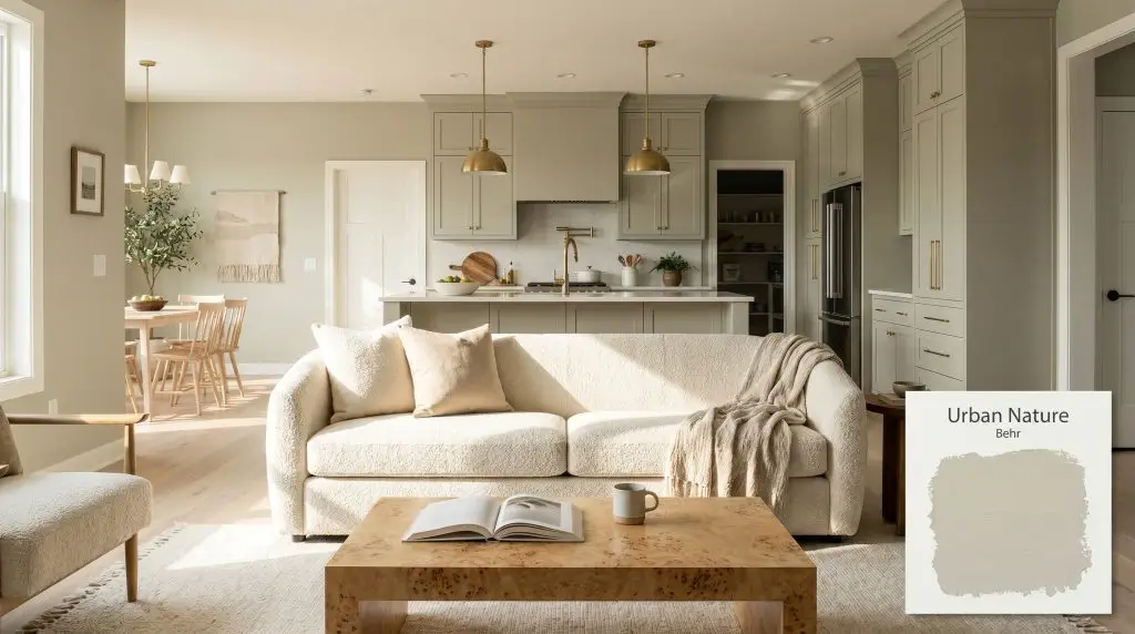
Urban Nature S380-3
BehrBehr Urban Nature (S380-3) is a soft, mid-tone earthy green with an LRV of 51. Blending a botanical green base with warm yellow and subtle gray undertones, it acts as a grounding, organic neutral perfect for both interior spaces and exterior facades.
Paint Technical Profile
| Color ID / SKU | S380-3 |
| HEX Code | #bcbfa8 |
| Light Reflectance (LRV) | 51 |
| Use | Interior, Exterior |
| Best Exposures | South, West, East |
| Best For | Kitchen cabinets, cozy living spaces, wainscoting, biophilic designs |
Behr Urban Nature: Crafting a Restorative Retreat with the Perfect Mid-Tone Green
Bringing the outdoors inside is a common design goal, but capturing the exact, quiet essence of a shaded forest canopy is incredibly difficult. Paint colors often lean too minty, too yellow, or too heavy, turning a room into a caricature of nature rather than a true extension of it. Behr Urban Nature strikes a rare, delicate balance, acting as a visual threshold that blurs the boundaries between your interior walls and the natural landscape outside.
This botanical green establishes an immediate sense of calm without relying on dramatic, shadowy intensity. It wraps a room in a soft, organic aesthetic that feels remarkably lived-in and historically authentic, even in brand-new construction. By manipulating how sunlight settles across a surface, this specific pigment creates a restorative envelope that feels both fresh and beautifully familiar.
Undertones & LRV of Behr Urban Nature
When homeowners ask if this paint leans warm or cool, the answer is a definitive, welcoming warm. It carries an inherent coziness that prevents the shade from ever feeling chilly or sterile, even in less-than-ideal lighting conditions. This warmth is the secret to its versatility, allowing it to pair beautifully with a vast array of natural materials.
Understanding the color structure of this shade reveals exactly why it feels so complex on the wall. The chromatic profile is built on a very specific foundation:
With a light reflectance value of 51, this paint sits squarely in the middle of the spectrum. It absorbs and reflects light in near-equal measure, giving it the structural integrity to hold its color in bright, direct sun without washing out. In shadows, it retains just enough brightness to avoid turning a hallway or small room into a dark cave.
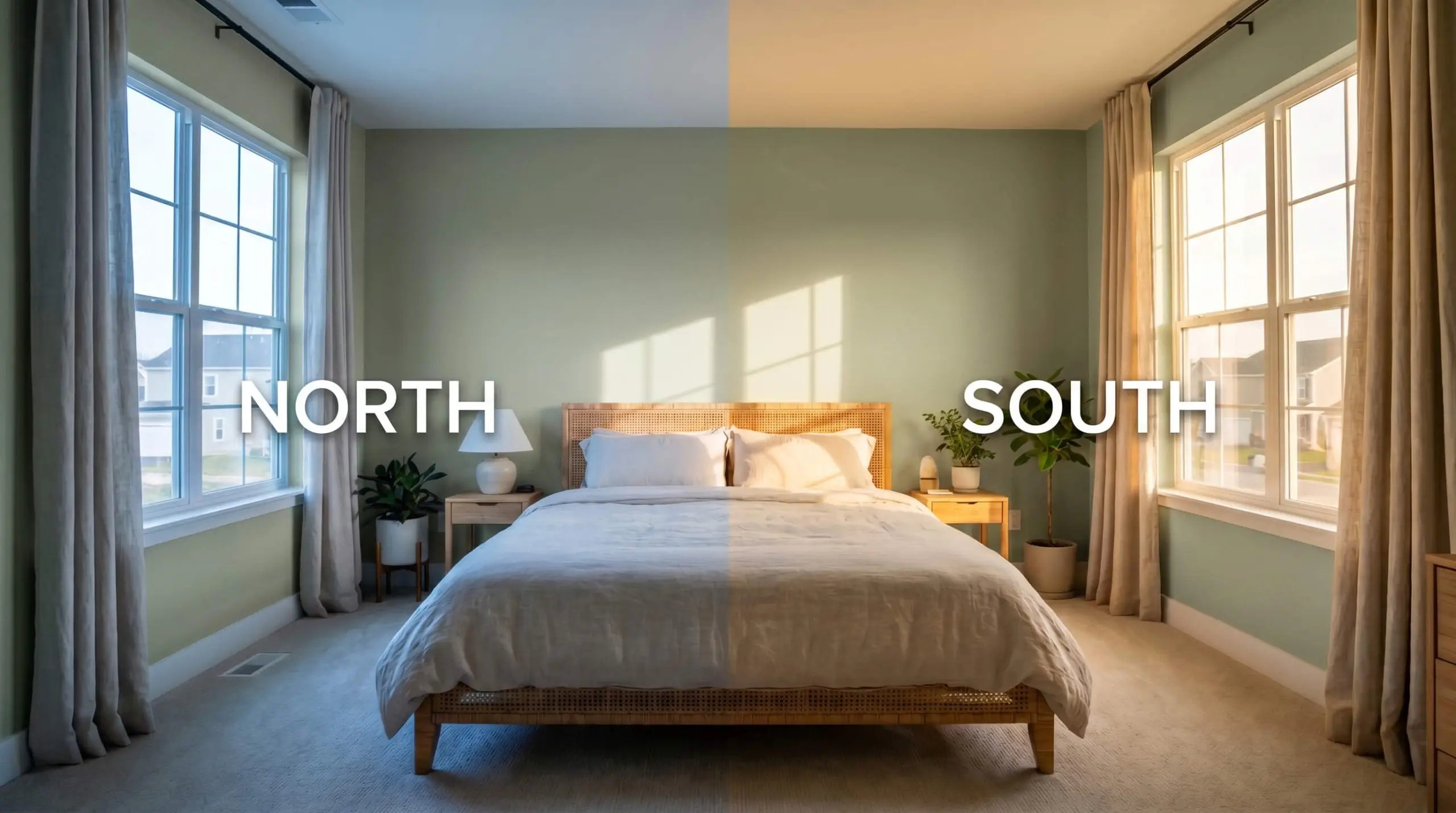
How Lighting Alters the Chromatic Profile
Every paint shifts throughout the day, but complex, muted shades are particularly sensitive to their environment. If you place this earthy neutral in a stark, North-facing room lit only by cool, 5000K daylight bulbs, the gray undertone will entirely overpower the yellow. This failure state turns a gorgeous, lively olive into a flat, sterile cement-green, completely stripping the room of its organic energy.
To ensure you get the exact mood you want, you must anticipate how the sun travels through your home. The way light hits the wall physically alters which undertone steps forward.
Transforming Spaces with Behr Urban Nature
Rather than forcing a specific aesthetic onto a room, this warm green stabilizes the energy of a house, adapting seamlessly to the architecture it covers. It provides a lush, tactile backdrop that allows your furniture, textiles, and daily life to take center stage.
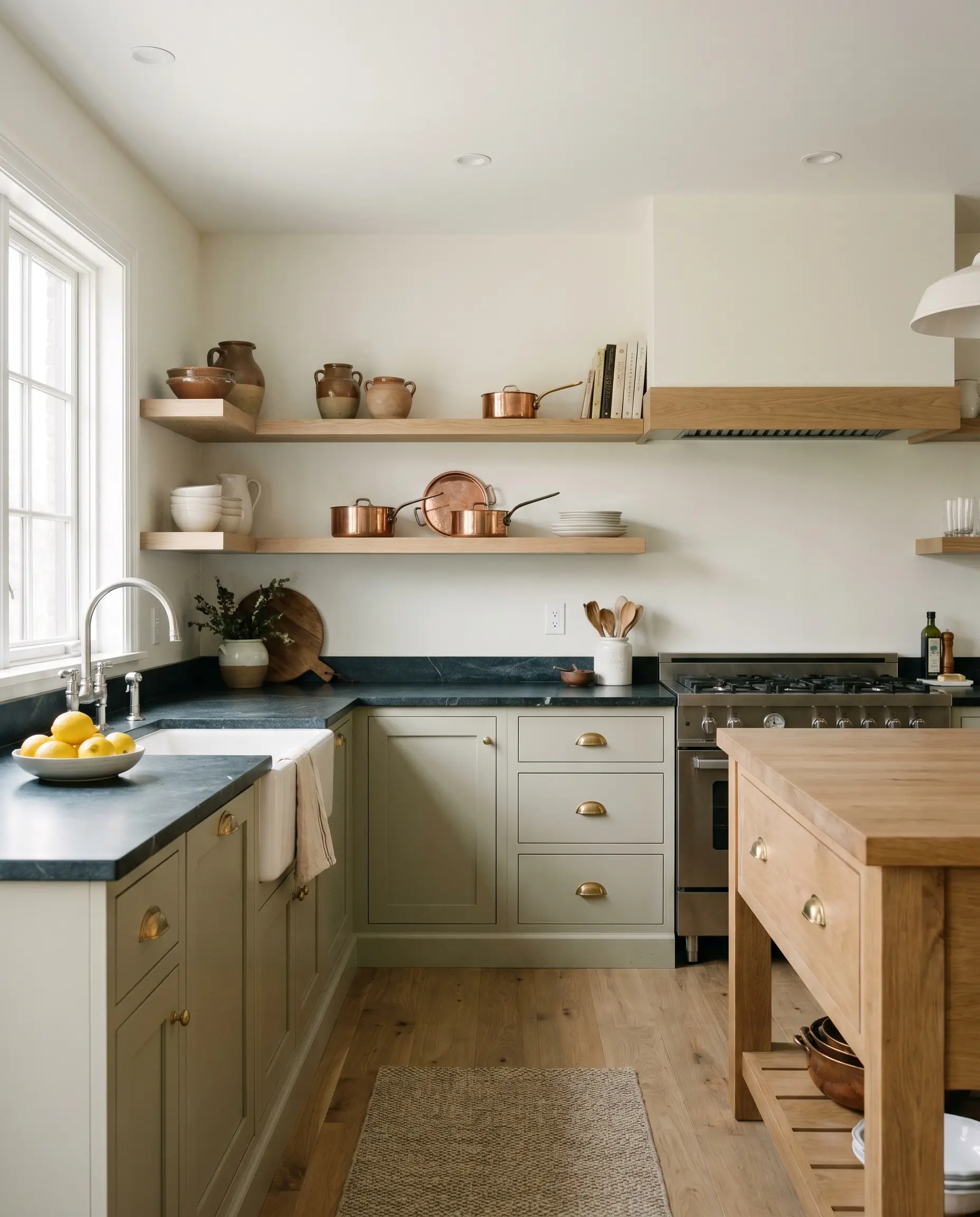
Kitchen Cabinetry
Applying this mid-tone green to kitchen cabinets instantly transforms the heart of the home into a warm, inviting workspace. It pairs exceptionally well with classic Shaker profiles, where the subtle shadows of the recessed panels highlight the gray undertone. To keep the space feeling open, balance the green base cabinets with creamy white uppers or floating white oak shelves.
Styling this color in a kitchen allows for beautiful tactile collisions. Pair the cabinetry with honed soapstone countertops and unlacquered brass cup pulls to lean into a timeless, English Cottagecore aesthetic. For a more modern approach, use sleek matte black hardware and a polished white quartz counter to create crisp, geometric contrast.
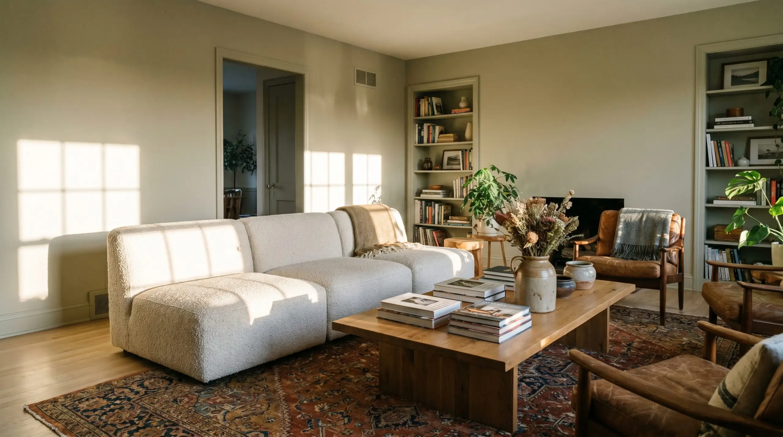
Cozy Living Rooms
In a living room, this shade provides a lush alternative to standard beige or gray walls. It creates a serene, conversational atmosphere that encourages lingering, especially when applied across all four walls and the baseboards. The color naturally softens the hard edges of televisions and large media consoles, making the technology recede into the background.
Enhance the organic aesthetic by layering the room with varied textiles. A low-profile modular sofa in a nubby cream bouclé, paired with a vintage patterned rug in rust and navy, builds a highly curated, Transitional vibe. Add heavy linen drapery in a soft oatmeal shade to frame the windows and filter the incoming sunlight beautifully.
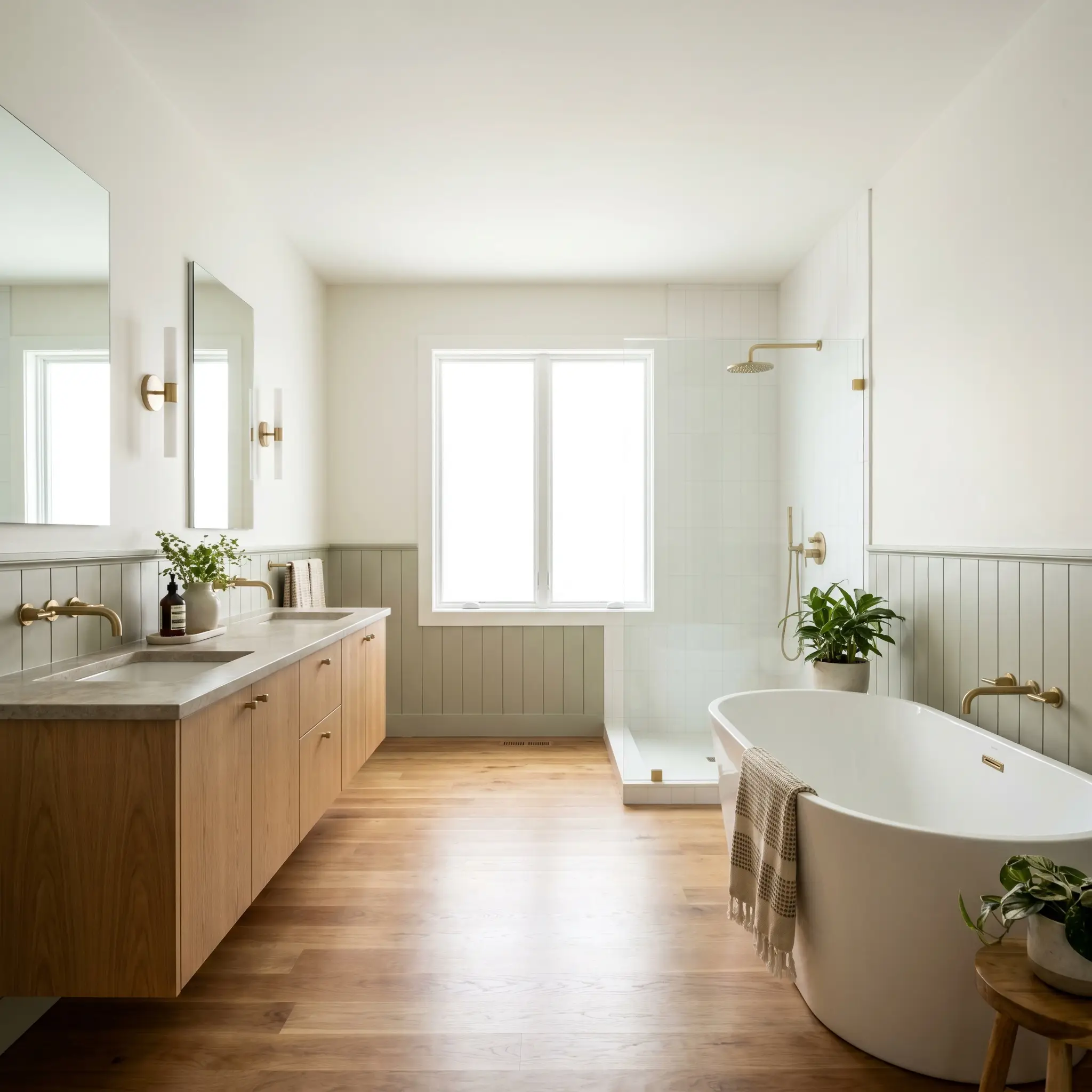
Bathroom Wainscoting
Bathrooms often suffer from an abundance of cold, hard surfaces like porcelain, glass, and chrome. Introducing this warm green via tongue-and-groove paneling or classic beadboard on the lower half of the wall instantly injects necessary warmth. It establishes a spa-like, restorative energy without requiring a massive renovation budget.
Keep the upper walls a crisp, warm white to maximize light reflection near the mirrors. Accent the green wainscoting with a floating oak vanity, reeded glass sconces, and subtle brass plumbing fixtures. This combination of wood grain, soft green, and warm metal creates a highly refined, custom-built look.
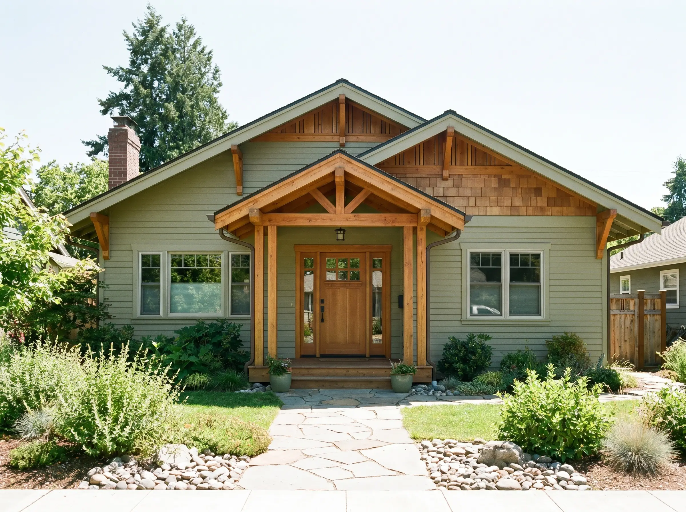
Exterior Siding & Shutters
On an exterior facade, the abundant natural sunlight will slightly wash out the color, making the LRV of 51 perform more like a lighter sage. It is a brilliant choice for full siding on Craftsman bungalows or Mid-Century ranches, blending the home seamlessly into the surrounding landscaping. It feels incredibly natural, honoring the environment rather than competing with it.
If full siding feels too ambitious, use it as a strategic accent. Painting exterior shutters and the front door in this muted olive adds immense curb appeal to a creamy white brick or stucco home. Pair it with brushed copper exterior lanterns that will beautifully patinate over time, echoing the earthy tones of the paint.
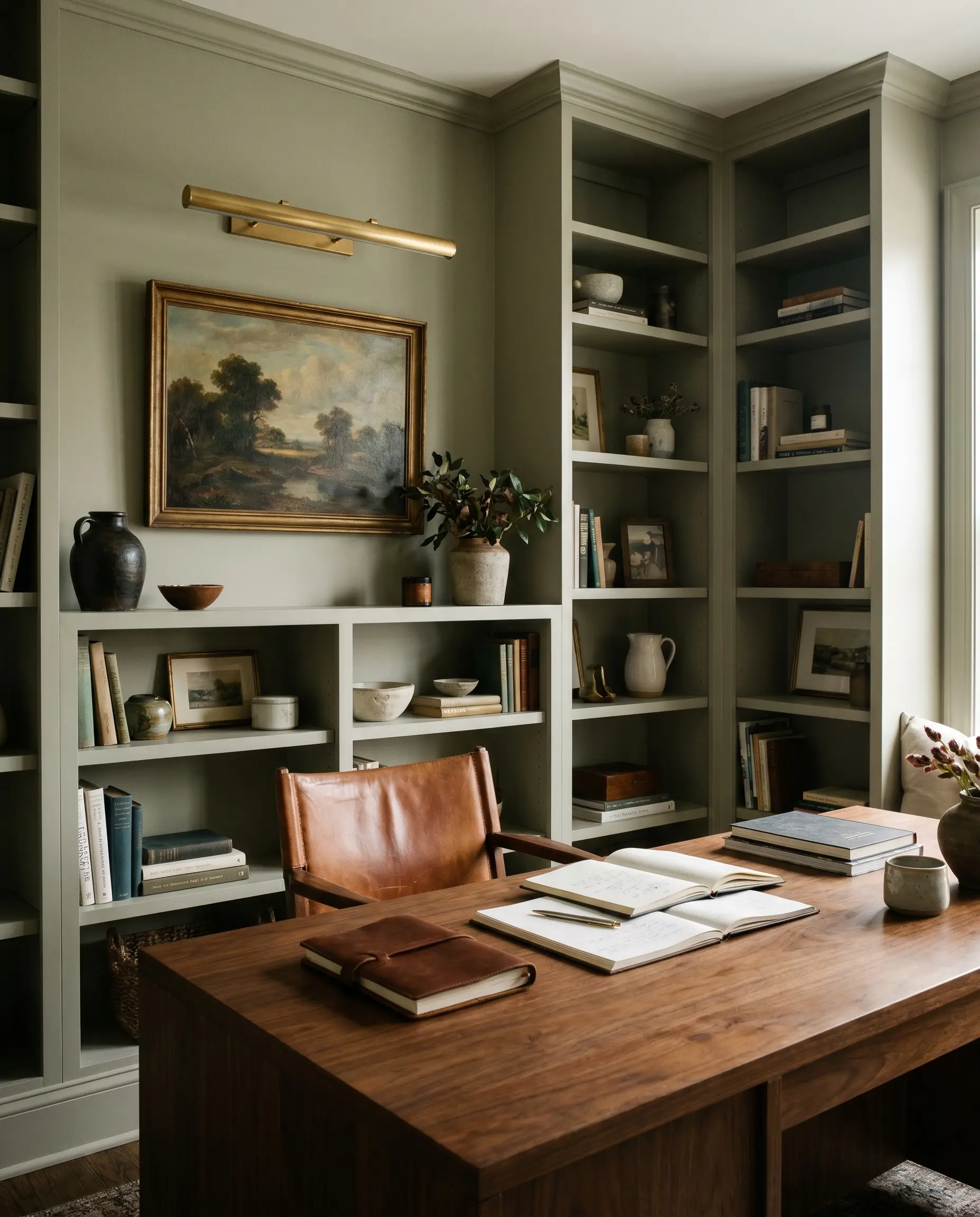
Home Offices
A home office requires a delicate balance: it must be stimulating enough for focus, yet calm enough to prevent visual fatigue. This botanical green is an ideal solution, offering a biophilic design element that connects the mind to nature during long hours at a screen. Wrapping the entire room—including built-in bookshelves—in a flat finish creates a sophisticated, library-like feel.
Furnish the space with a warm walnut desk and a saddle leather chair to complement the green’s yellow undertones. Add a vintage landscape oil painting and a brass picture light to elevate the styling. The resulting environment feels curated, professional, and deeply comforting.
Creative Applications for this Botanical Green
When you stop viewing paint merely as a background color and start seeing it as an architectural tool, the possibilities expand dramatically. This specific pigment has a unique ability to manipulate spatial perception, allowing you to solve tricky design challenges with nothing more than a brush and a roller.
The Quiet Canopy Ceiling
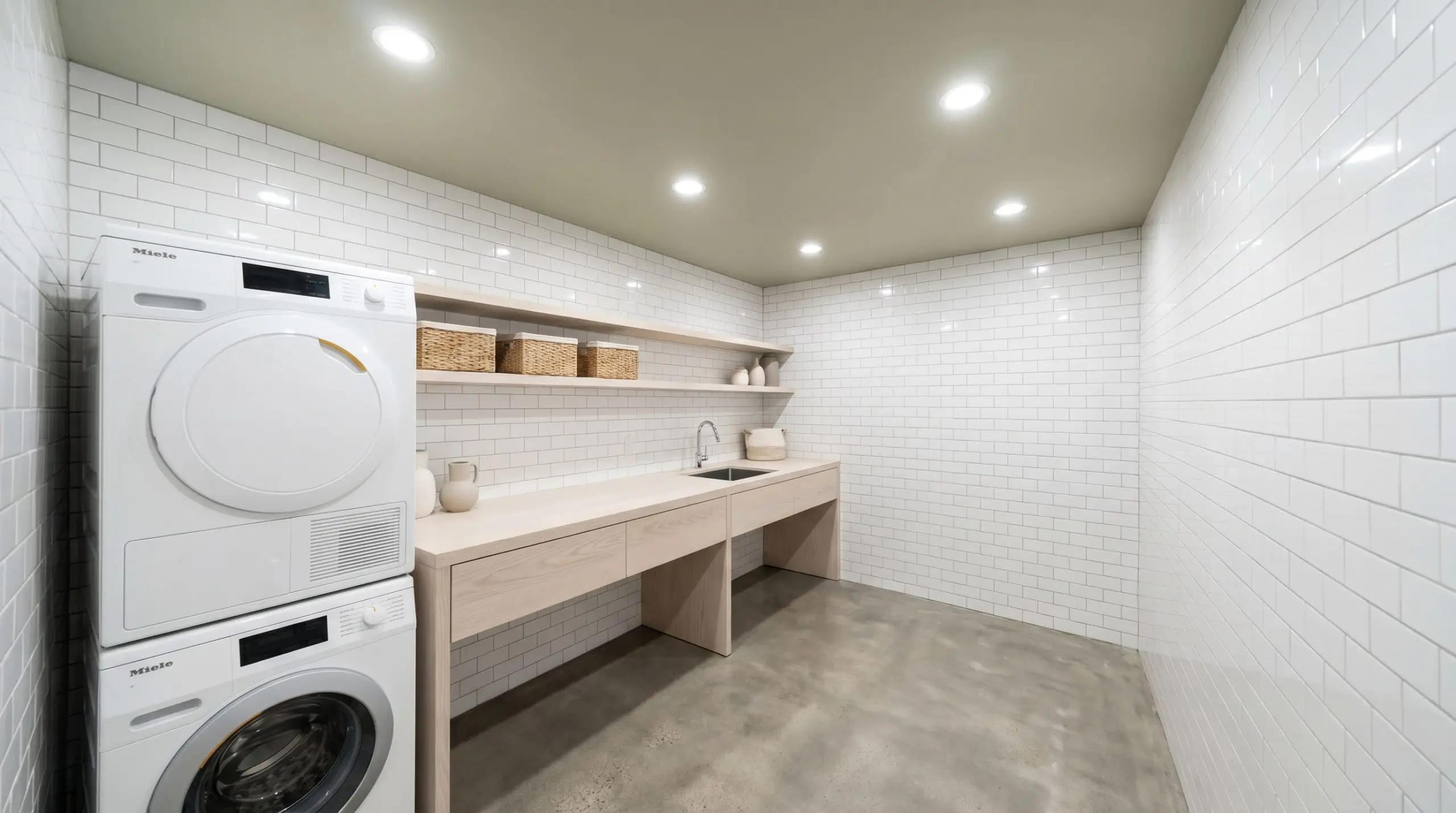
Laundry rooms are often overlooked, utilitarian spaces filled with stark white appliances and glaring overhead lights. Painting the ceiling in a flat finish of Urban Nature above high-gloss white tiles provides a visually quiet canopy for sensory relief. This unexpected placement draws the eye upward, softening the harshness of the room and creating a momentary, grounding pause during daily chores.
The Restorative Bedroom Enclosure
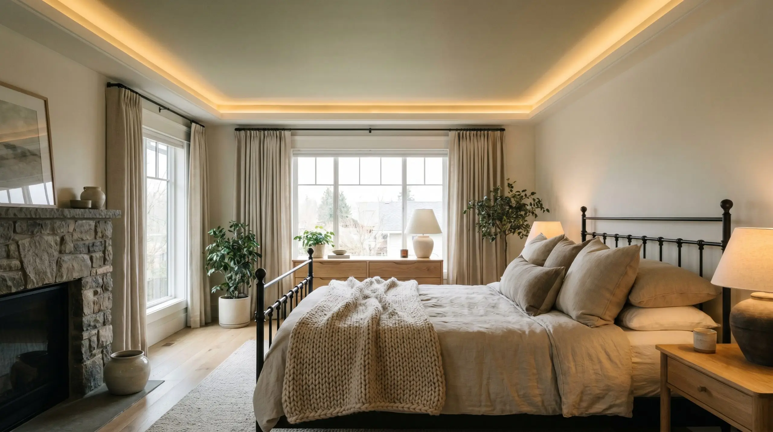
For those who are highly sensitive to their environment and seek a low-stimulation resting zone, the ceiling can act as a protective embrace. Coating an entire bedroom ceiling in this shade mimics a natural tree canopy, visually lowering the height of the room to make it feel infinitely cozier. When paired with soft, indirect ambient lighting, the green settles over the bed, offering profound visual quiet.
The Biophilic Studio Arch
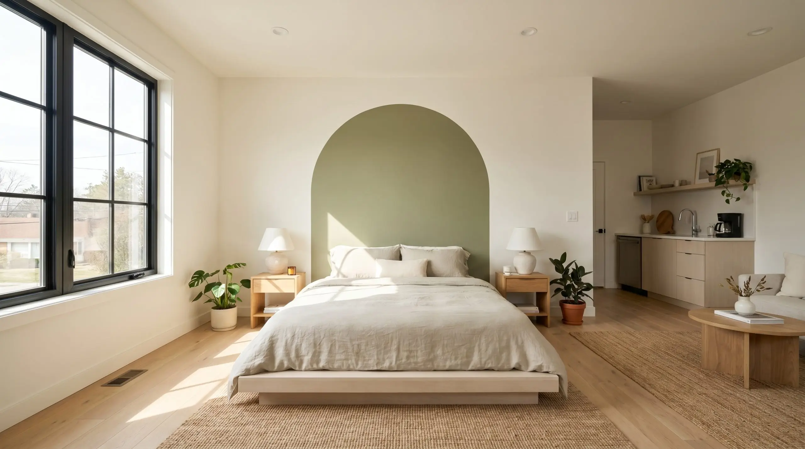
In a studio apartment, defining separate zones without physical walls is a constant challenge. Painting a crisp, arched color-block of this warm green directly behind the bed instantly zones a biophilic sleeping area. The arch acts as a massive, two-dimensional headboard, organizing the visual clutter of the apartment and providing a clear, intentional boundary for rest.
The Forest Threshold
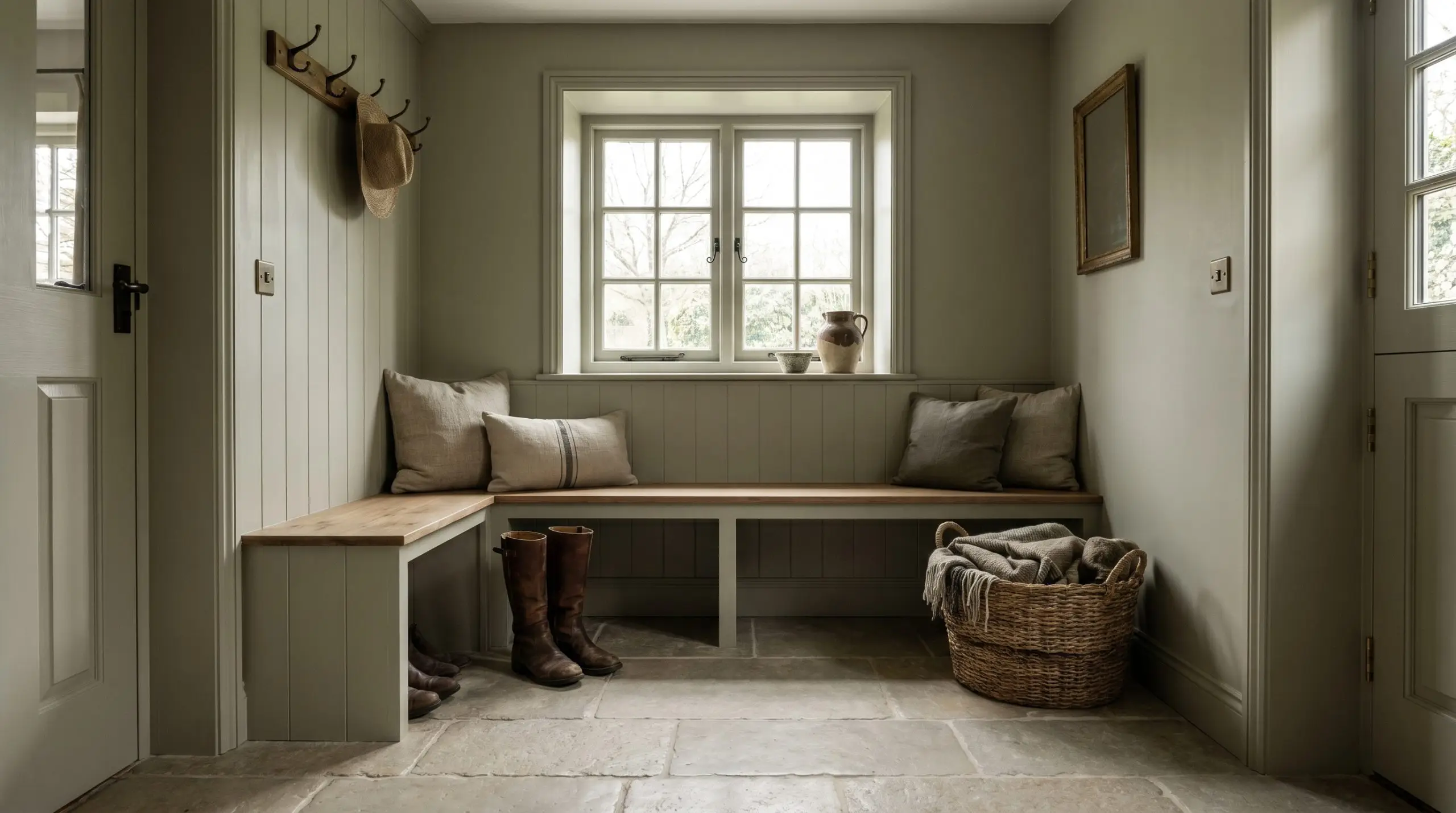
A mudroom vestibule serves as the crucial transition between the chaotic outside world and the sanctuary of the home. Drenching this small threshold zone in Urban Nature brilliantly bridges a lush, Pacific Northwest forest exterior with a warm, English Cottagecore interior. By painting the walls, trim, and doors in the same continuous color, you create an immersive airlock that physically slows you down as you enter the house.
When drenching a small space like a vestibule, use a flat finish on the ceiling and an eggshell finish on the walls, but bump the trim and doors up to a satin or semi-gloss. The subtle shift in sheen creates a highly custom, architectural look without breaking the monochromatic spell.
Hackrea Design Secret (The Gloss Shift)
Coordinating Colors & Material Pairings
The secret to successfully styling this earthy neutral lies in understanding how its gray and yellow undertones react to surrounding textures. It requires companions that either share its warm, organic nature or offer a crisp, clean contrast to highlight its botanical depth.
Trim & Baseboards
Selecting the right trim dictates the entire posture of the room. Because this green has a muted, dusty quality, you must avoid stark, hospital-white trim, which will make the paint look dirty by comparison.
Hardware, Wood & Tactile Elements
To truly elevate this color, you must introduce tactile materials that engage in a sensory dialogue with the paint’s organic DNA.
Coordinating Paint Colors
Building a cohesive palette requires secondary colors that manipulate the main green in intentional ways.
Curated Aesthetic Pathways
These curated palettes demonstrate how the individual elements above come together to shape the final vibe of your home.
The Artisan’s Studio
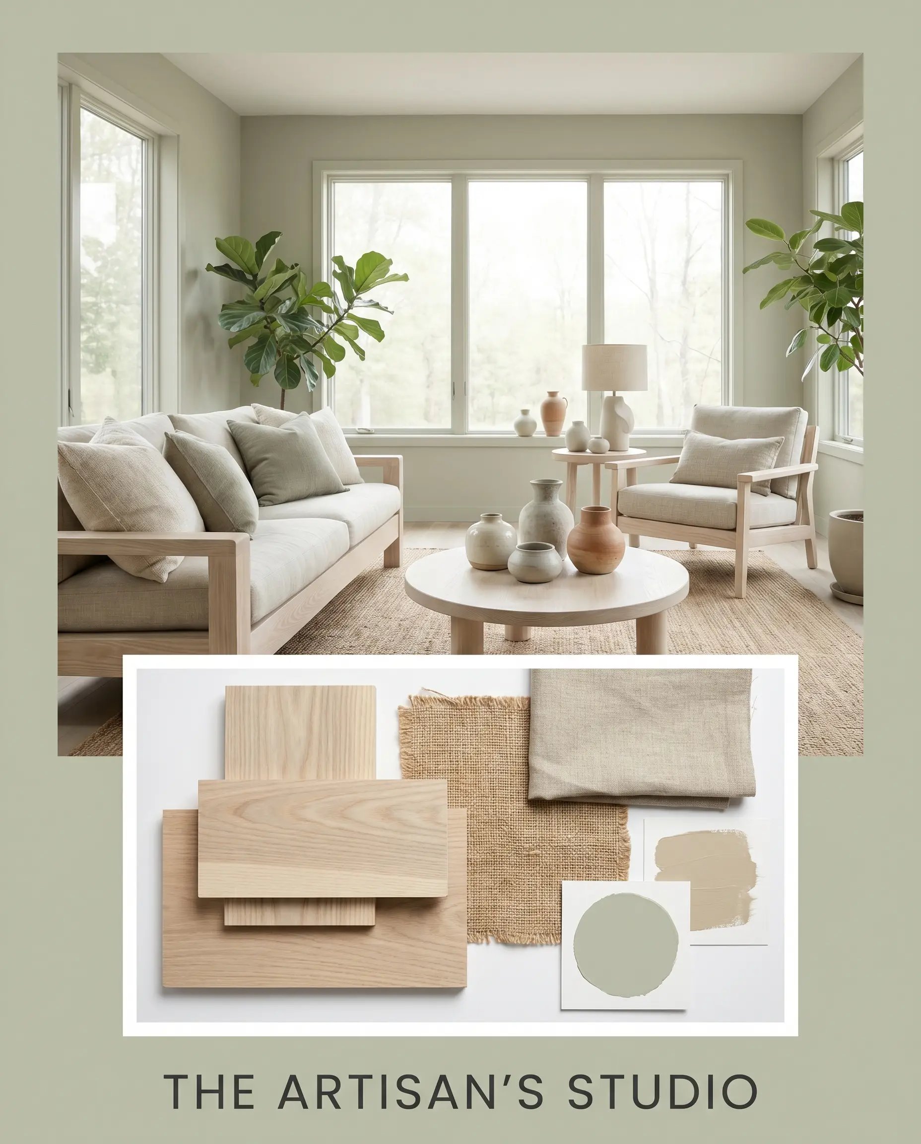
This pathway leans heavily into a relaxed, Organic Modern aesthetic. By pairing the botanical green with extensive bleached ash wood and soft accents of Benjamin Moore Senora Gray, the space feels light, airy, and deeply connected to nature. Incorporate heavily textured, hand-thrown ceramics, oversized linen pillows, and jute rugs to enhance the tactile experience. The resulting mood is serene, unpretentious, and perfectly imperfect.
The Heirloom Solarium
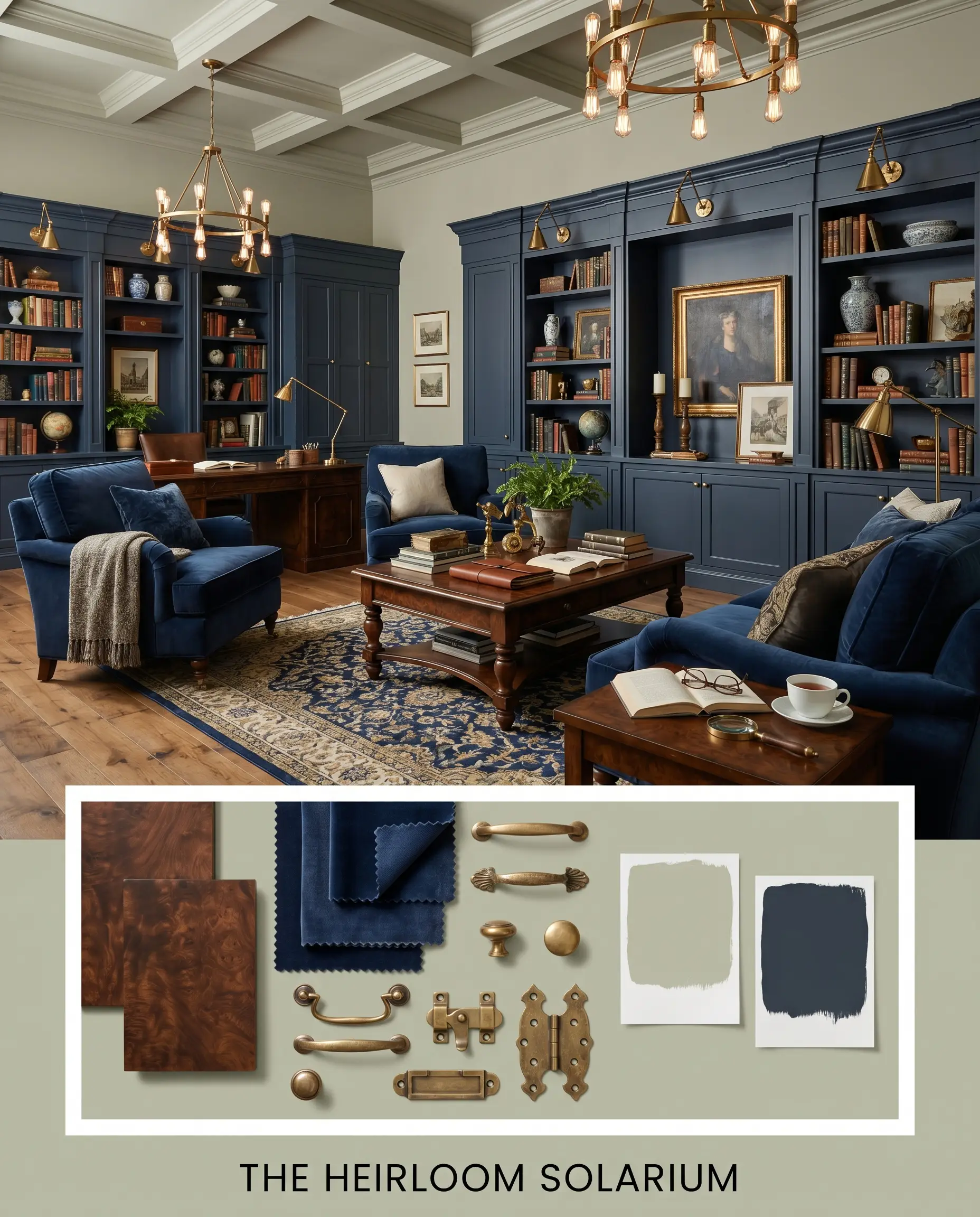
For a more dramatic, Transitional approach, this palette embraces rich contrast and historic weight. The walls are grounded by the introduction of Sherwin-Williams Naval on adjacent cabinetry or heavy velvet upholstery. Unlacquered brass lighting fixtures and picture frames bounce warm light around the room, while dark burled wood side tables add a sense of age. This combination feels curated, worldly, and quietly luxurious.
Head-to-Head Color Comparisons
Sometimes, the specific lighting in your home requires a slight pivot. Comparing this shade against its closest rivals helps clarify exactly which undertone will perform best in your unique space.
Behr Urban Nature vs. Behr Ecological S380-6
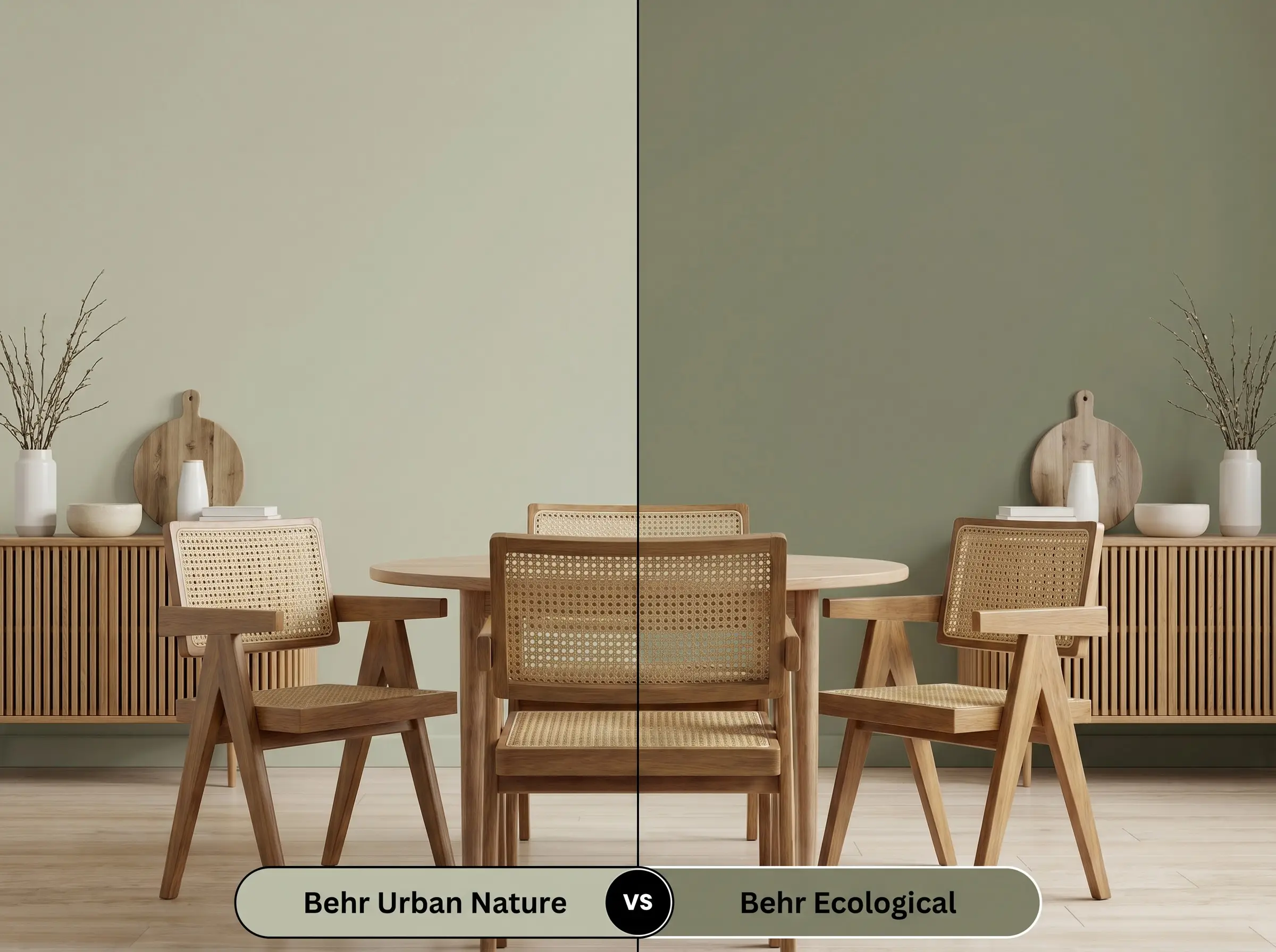
Ecological is noticeably lighter and leans heavily into a cooler, mintier profile. If your room receives an abundance of warm, South-facing afternoon sun, Ecological might maintain a fresher appearance, whereas Urban Nature could pull slightly too yellow. However, in standard or North-facing lighting, Urban Nature provides far more architectural depth and feels significantly more sophisticated.
Behr Urban Nature vs. Sherwin-Williams Evergreen Fog SW 9130
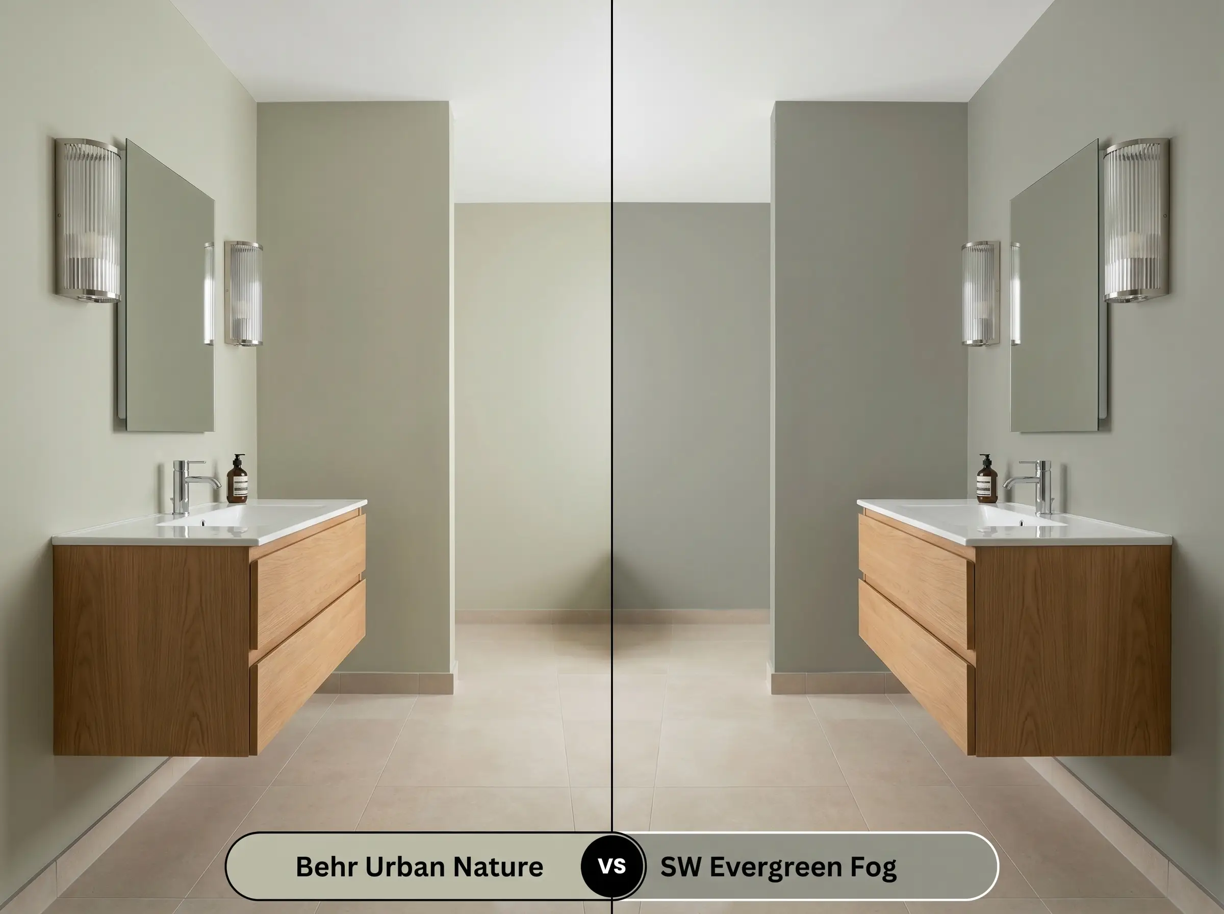
Evergreen Fog carries a much heavier dose of gray, making it a true chameleon that often reads as a gray-blue-green. If you are afraid of the yellow undertones in Urban Nature pulling too warm, Evergreen Fog is the safer, cooler alternative. However, Urban Nature wins effortlessly when you want a cozier, more traditional olive aesthetic that wraps the room in warmth.
Similar Colors & Cross-Brand Matches
If you love the general aesthetic but need a slight adjustment in depth or are shopping across different paint manufacturers, these alternatives provide excellent starting points.
Exploring Similar Earthy Neutrals
Cross-Brand Equivalents
Practical Application & DIY Advice
Executing a flawless paint job requires more than just picking the right color; you must respect the physical properties of the paint itself.
The Dynamic Sheen Guide
Primer Strategy
Because this is a mid-tone shade with a complex gray base, a standard white primer is usually sufficient over new drywall or light colors. However, if you are painting over raw wood or knotty pine paneling, you must use a high-quality, stain-blocking primer. The yellow tannins in the wood will eventually bleed through the paint, ruining the delicate olive balance.
Coverage & Success Tips
Expect to apply two full, generous coats to achieve the true, rich depth of the LRV 51. Be highly aware of “flashing”—visible roller marks that occur when you paint over sections that have already begun to dry. To avoid this frustrating DIY mistake, maintain a wet edge as you roll, work in small sections, and never press too hard on the roller in an attempt to stretch the paint.
Frequently Asked Questions
Because it relies on natural light to activate its yellow undertones, it can lean slightly heavy or gray in windowless spaces. To prevent it from feeling muddy, ensure your bathroom has layered artificial lighting, specifically using warm 2700K to 3000K bulbs to pull the green forward.
It pairs effortlessly with white oak, creating a calm, airy, Organic Modern vibe. With red oak, the green actually acts as a complementary color to the red undertones in the wood, making the floors appear richer and warmer while the paint feels incredibly vibrant.
While standard exterior paint will never perfectly mimic the mineral texture of limewash, applying this shade in a flat exterior finish over brick provides a beautiful, earthy, cottage-like aesthetic that feels highly natural and integrated into the landscape.
It can be a tricky pairing. Carrara marble features cool, crisp gray and blue veining, which can sometimes fight with the warm, yellow-olive base of the paint. If you have Carrara, you are usually better off pairing it with a cooler green like Sherwin-Williams Evergreen Fog.
The Final Verdict & Expert Warnings
Behr Urban Nature is an incredibly successful, highly versatile mid-tone green that excels at bringing a calm, restorative energy into a home. Its perfect balance of gray and yellow undertones makes it the ultimate choice for homeowners looking to soften their spaces without resorting to bland neutrals. It shines brightest in Organic Modern, Transitional, and Cottagecore aesthetics, particularly when applied to kitchen cabinetry, cozy living rooms, or immersive threshold spaces.
However, you must be cautious of its specific temperature. If your home features predominantly cool-toned fixed elements—like icy gray luxury vinyl plank flooring, stark Carrara marble, or brilliant cool-white subway tile—this warm, olive-leaning green will clash. The cool elements will pull the yellow out of the paint in an unflattering way, making the green look slightly sickly while making the gray floors look sterile. Always pair this beautiful botanical green with warm woods, creamy whites, and earthy stones to let its true, natural beauty flourish.
Closest Cross-Brand Equivalents
The absolute closest scientific color matches for Urban Nature across top paint brands.