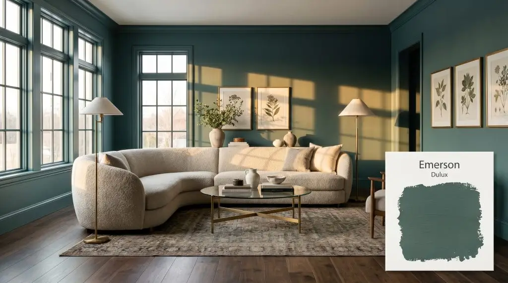
Emerson S27B8
DuluxDulux Emerson (S27B8) is a deeply saturated, blackened teal-green with an LRV of 14. Rooted in cool cyan undertones with a heavy charcoal cast, it acts as a dramatic, sophisticated anchor for cabinetry, millwork, and moody, atmospheric interior spaces.
Paint Technical Profile
| Color ID / SKU | S27B8 |
| HEX Code | #3e6057 |
| Light Reflectance (LRV) | 14 |
| Use | Interior, Exterior |
| Best Exposures | South, West, or well-lit East |
| Best For | Cabinetry, Accent Walls, Home Offices, Moody Bedrooms |
Embracing the Shadows: Why Dulux Emerson is the Ultimate Architectural Green
Applying a deeply saturated, blackened teal to a featureless, boxy living area completely alters its acoustic and emotional energy. The architecture immediately feels heavier, more intentional, and intimately grounded. Dulux Emerson captures this exact sensory shift, acting as a structural anchor for spaces that lack inherent character.
This is not a vibrant, energetic jewel tone that demands the spotlight. Instead, it is a shadowed, eucalyptus green that thrives on subtle restraint and biophilic design principles. Let’s explore how to harness its smoky depth to completely redefine your home’s interior and exterior landscapes.
Dulux Emerson: Undertones & LRV
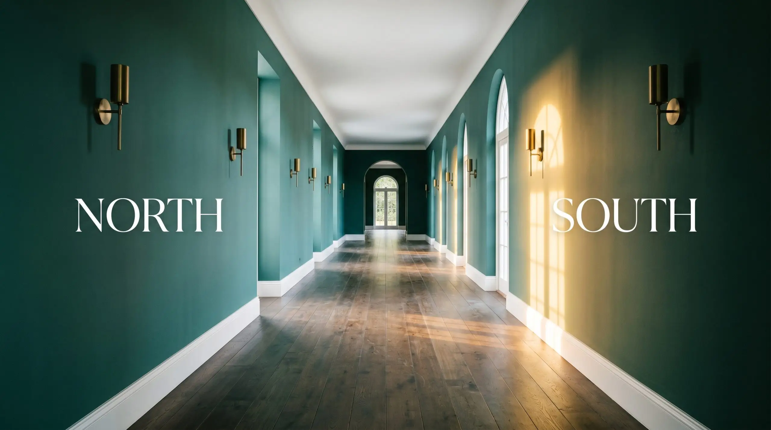
When evaluating this color for your home, the most critical question is always its core temperature: Is this a warm or cool shade? Dulux Emerson firmly establishes itself as a cool paint color, driven by a deep blue-green foundation that visually recedes away from the eye.
With a light reflectance value of 14, this shade absorbs a massive 86 percent of the ambient light in a room. This immense visual weight means it functions as a heavy architectural tool, easily shadowing out into a rich, blackened charcoal-teal in dimly lit environments. If you are unfamiliar with how light absorption affects your walls, reviewing our guide on light reflectance value will help you understand its impact.
Lighting Effects & The Chameleon Factor
Relying on a color swatch alone might lead you to expect a lush, vibrant green, but this paint’s dense gray influence carries a significant environmental risk. If placed in a severely light-starved, north-facing hallway, this pigment can completely lose its green identity and read as a flat, heavy gray-black. Because it absorbs so much illumination, this color is highly reactive to the shifting path of the sun.
Transforming Everyday Spaces with Dulux Emerson
This heavy, light-absorbing pigment does not just coat a wall; it actively pulls the boundaries of a room inward, creating a deeply intimate, enveloping atmosphere. It thrives in areas where you want to foster focus, rest, or a striking sense of arrival.
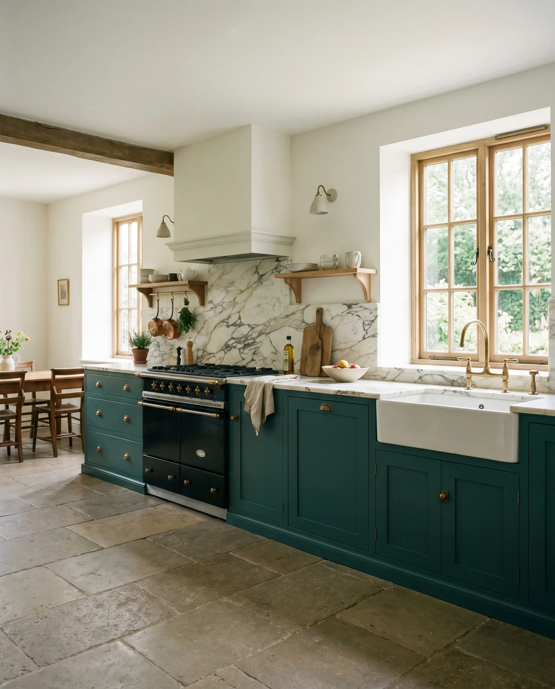
Kitchen Cabinetry & Islands
Grounding stock base cabinets with this shadowed green instantly gives a basic kitchen a custom, high-end British standard aesthetic. It anchors the lower half of the room beautifully when paired with creamy upper walls or heavily veined marble countertops. For a softer approach, brushing this onto a central island creates a sophisticated focal point that warms up the harsh lines of modern stainless steel appliances.
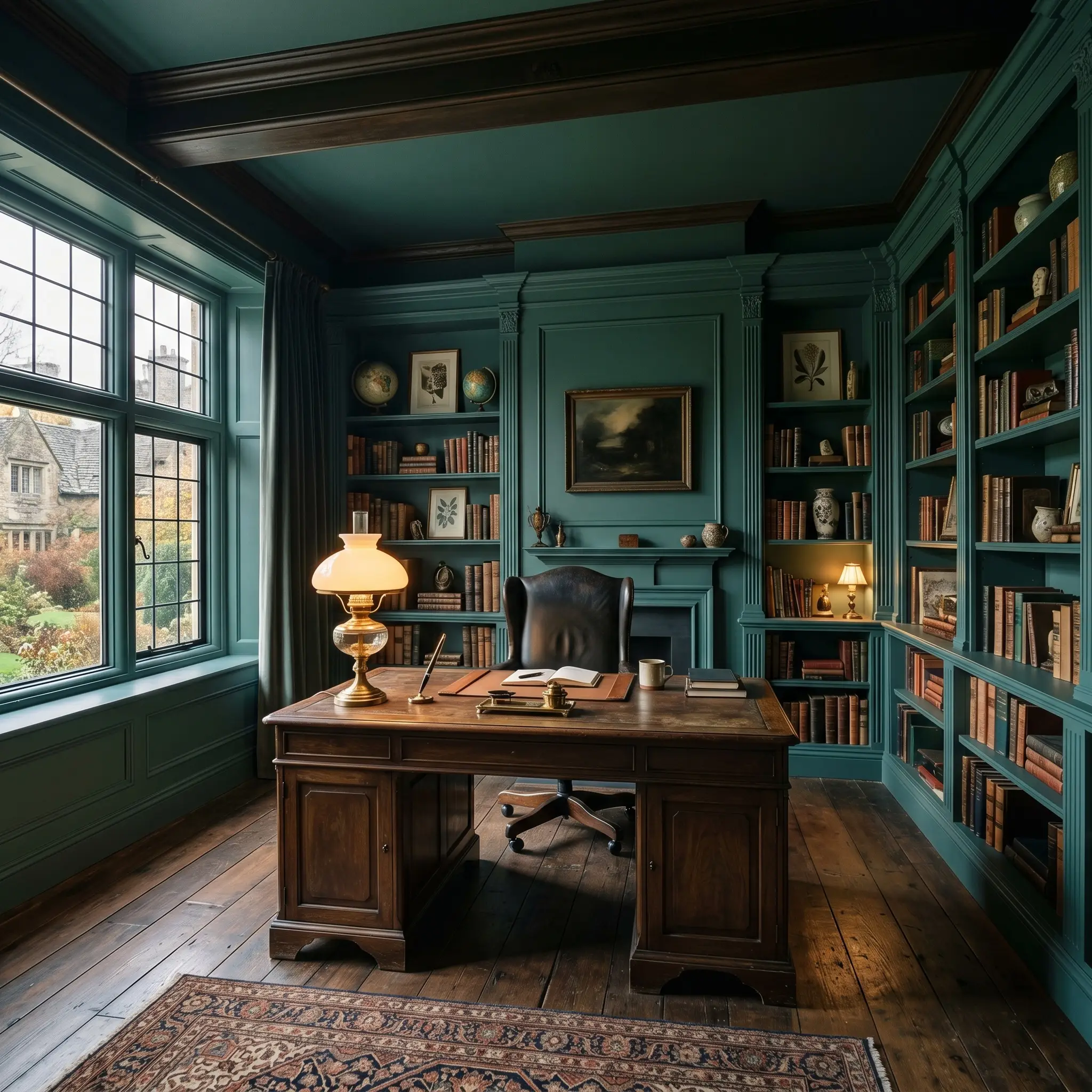
Home Offices & Studies
This shade is practically engineered for deep work and quiet concentration. Wrapping the walls and built-in shelving of a study in this cool, recessive tone creates a distraction-free zone that feels both historic and highly contemporary. It is widely considered one of the best moody green paint colors for home offices because it reduces visual fatigue.
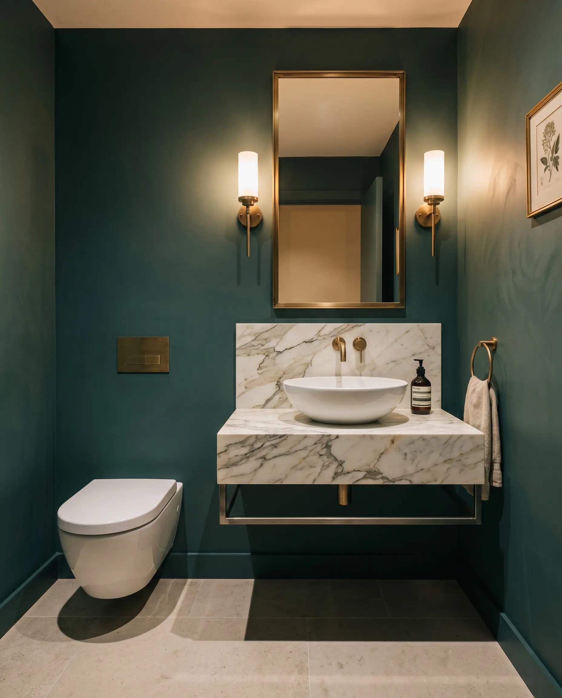
Powder Rooms
Small, windowless half-baths are the perfect canvas for leaning into dark, dramatic aesthetics. Instead of fighting the lack of square footage with pale colors, use this rich teal to blur the room’s corners and edges. The dark pigment hides the architectural boundaries, making the space feel like a hidden, luxurious retreat.
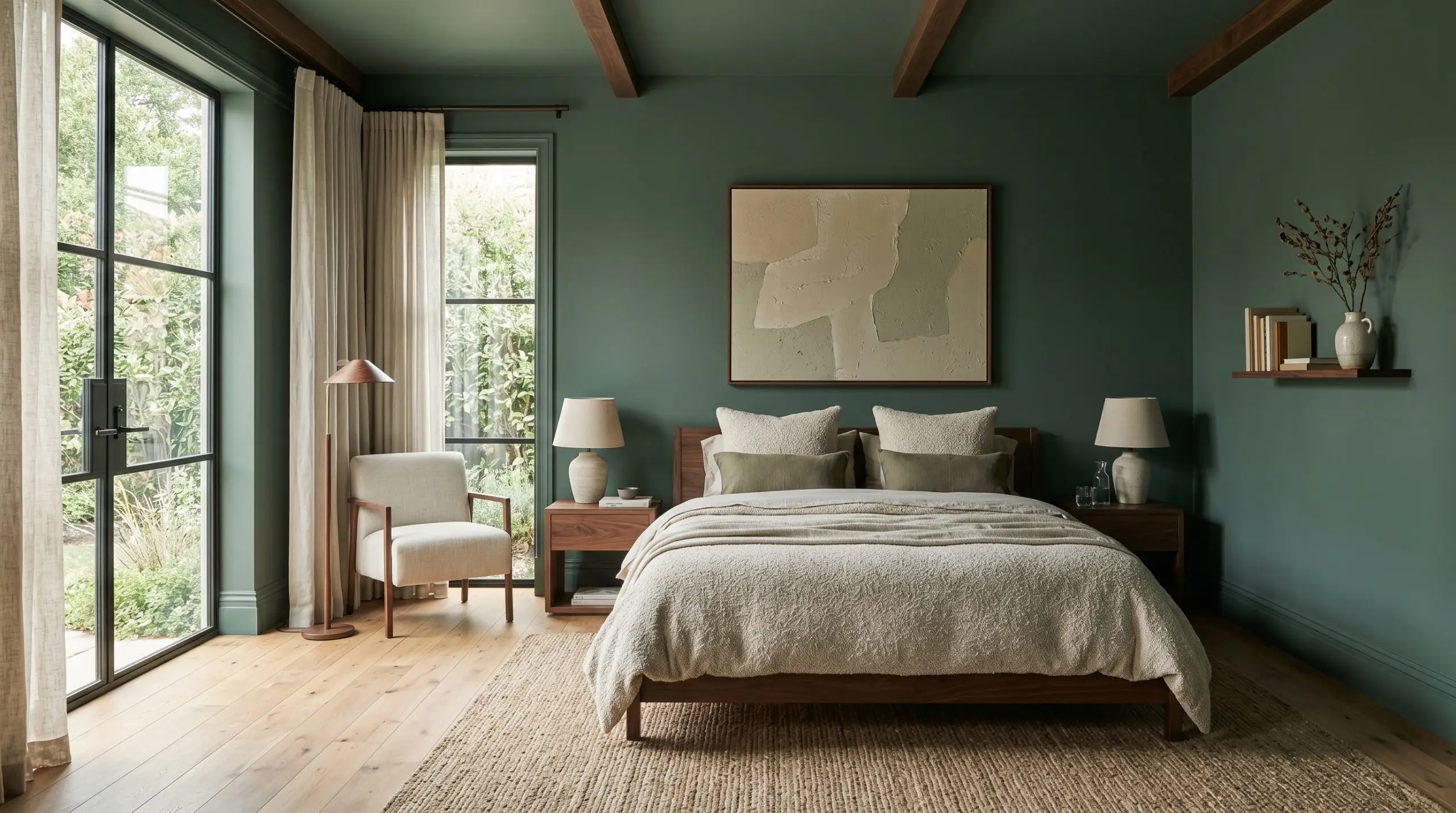
Bedrooms
To cultivate a restful, sleep-inducing sanctuary, carry this color across all four walls and the baseboards. This continuous application softens the architectural boundaries, enveloping the bed in a serene, shadowed canopy. If you want to fully commit to this enveloping aesthetic, reading the ultimate guide to color-drenching with dark teals will provide the foundational styling rules you need.
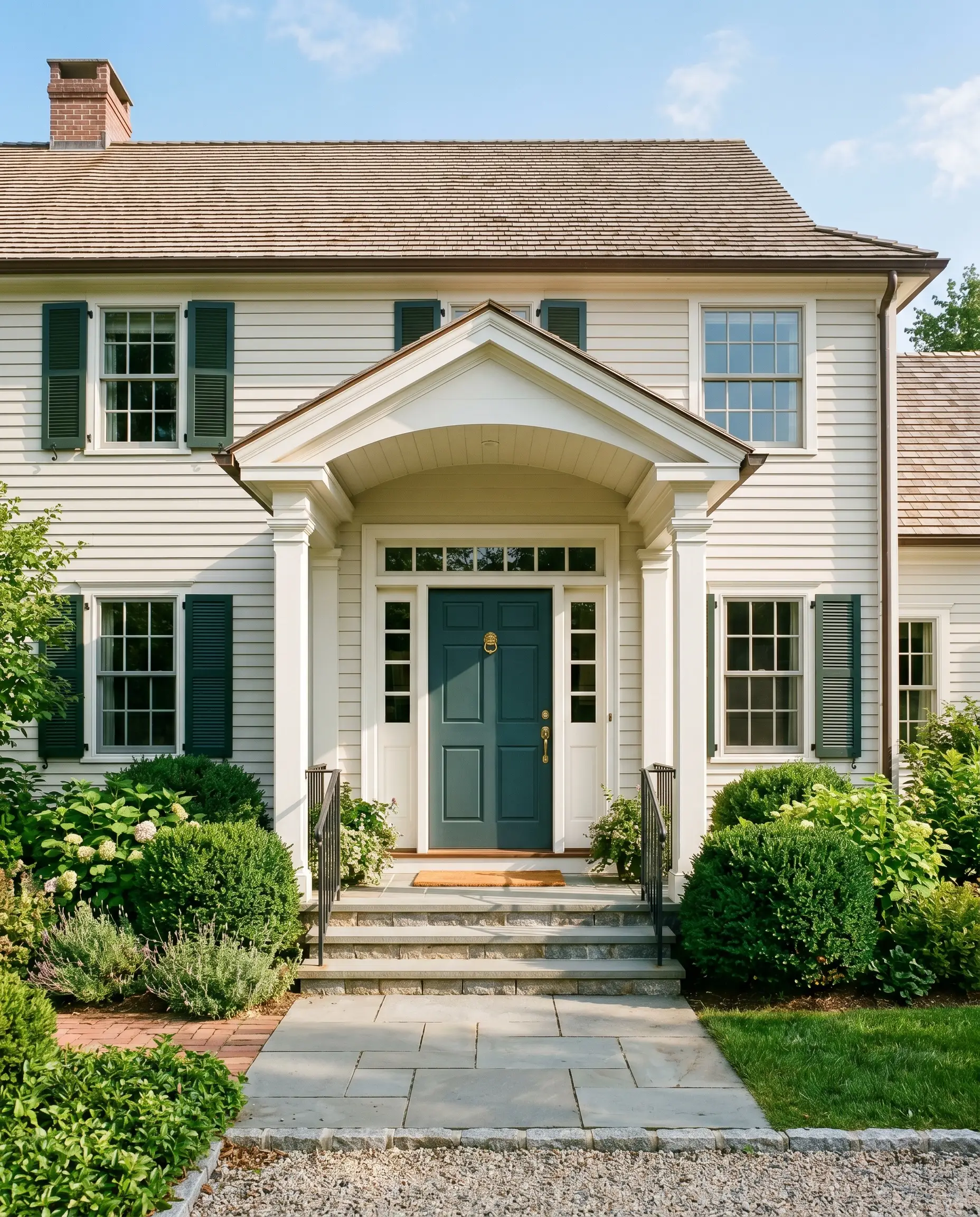
Exterior Front Doors
On a home’s facade, direct sunlight will wash out a portion of the color’s depth, making the green base read slightly more vibrant than it does indoors. Applied to a front door, it offers a stately, welcoming contrast against classic white siding or natural cedar shingles. It grounds the entryway with a sense of permanence and classic curb appeal.
Custom Projects & Creative Applications
When you move away from standard wall applications, this deeply saturated pigment becomes a powerful tool for architectural manipulation. Its smoky, muted profile inspires highly intentional, custom interventions that completely redefine how a home feels.
The Monochromatic Library Nook
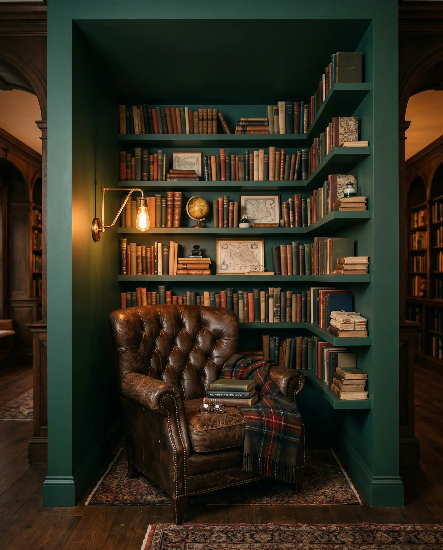
Transform an awkward, unused alcove into a striking reading destination by coating the entire recess—walls, ceiling, and floating shelves—in this dense green. The charcoal cast absorbs shadows, making the back wall recede and giving the illusion of added depth. Pair it with an oversized, tufted leather armchair and a brass swing-arm sconce to complete the vintage, scholarly vibe.
Grounding the Open-Concept Ceiling
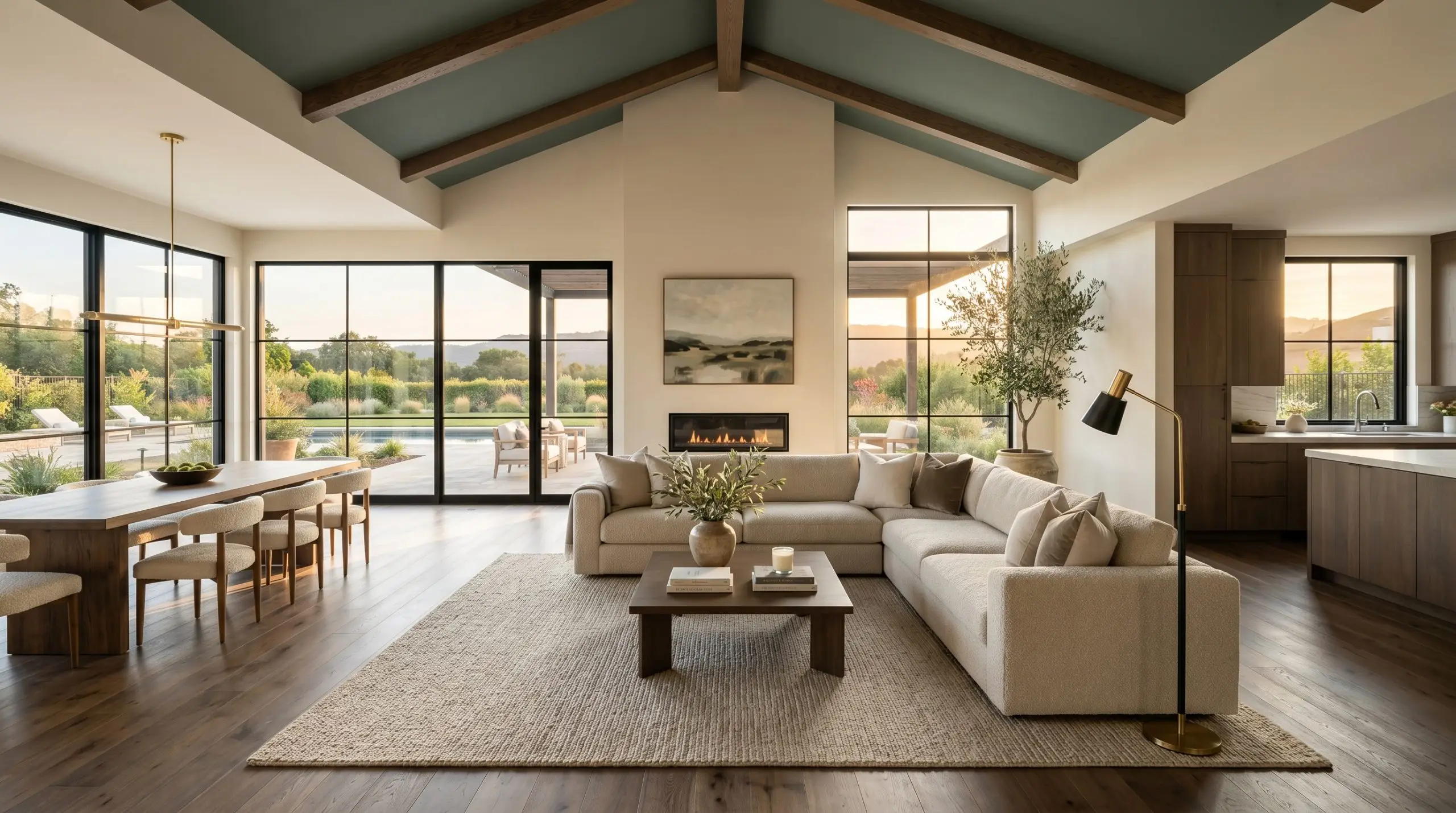
In sprawling, light-flooded living areas suffering from harsh western glare, a stark white ceiling can feel blinding and sterile. Painting the ceiling in this blackened teal visually lowers the overhead plane, immediately making the expansive architecture feel cozy and contained. The cool cyan notes subtly counteract the intense afternoon heat, balancing the room’s temperature.
Reviving Salvaged Wainscoting
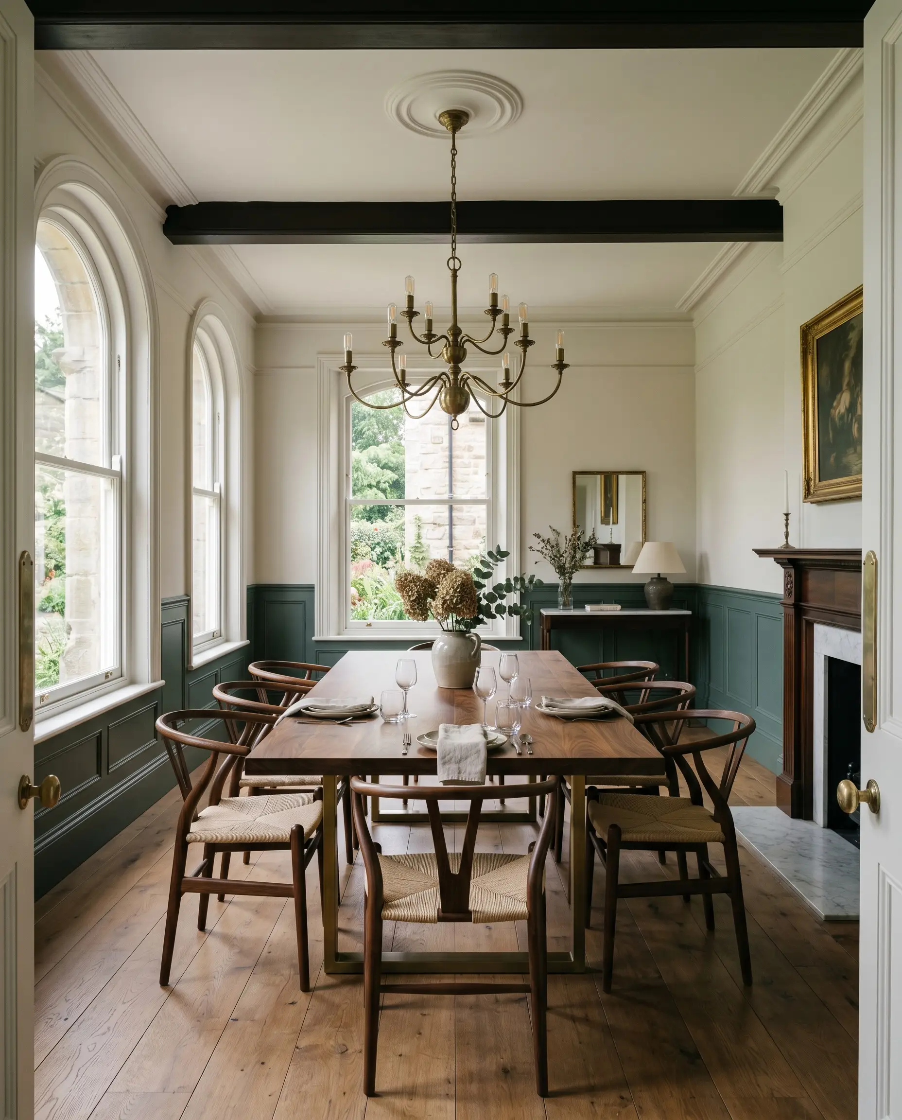
Applying this rich color to half-wall architectural millwork or beadboard instantly injects heritage character into a bland dining space. The low reflectance value creates a heavy, grounding base that allows the upper walls to breathe.
When painting lower wainscoting, always use a satin or semi-gloss finish. The slight sheen will catch the ambient light, highlighting the carpentry’s profile and preventing the dark pigment from looking like a flat black void.
Hackrea Design Secret (The Finish Trick)
Coordinating Colors & Best Pairings
Because of its heavy gray influence, this green relies on thoughtful material and color relationships to prevent a room from feeling oppressive. It requires crisp, luminous boundaries to hold its shape, or warm, earthy tones to soften its smoky edge.
Trim & Baseboards
To establish a sharp, tailored boundary that highlights the depth of the walls, frame this color with ultra-crisp, clean whites. The high contrast allows the green to truly anchor the space.
Hardware, Wood & Material Pairings
Coordinating Colors
Designer Mood Boards
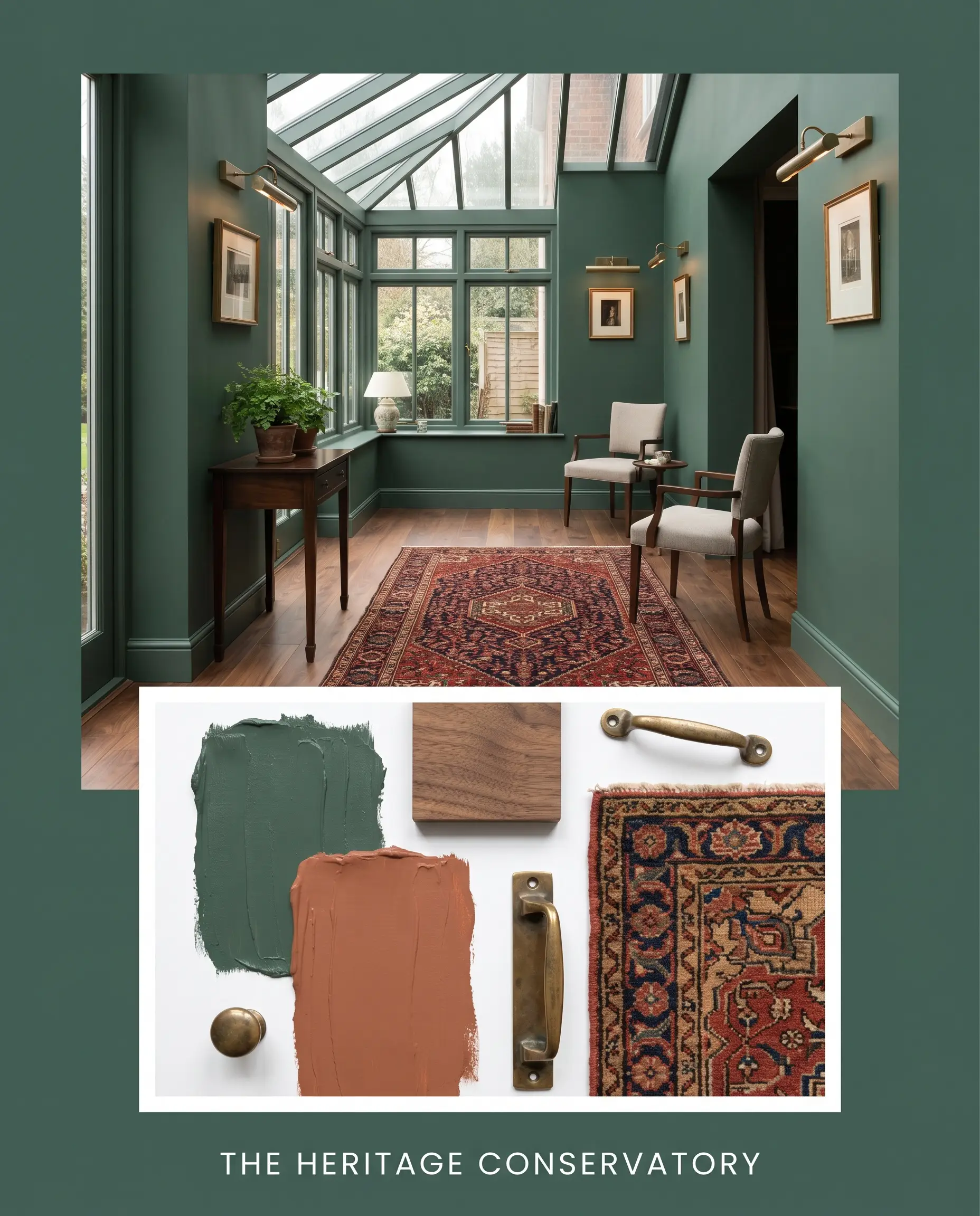
The Heritage Conservatory: This aesthetic blends the deep, shadowed walls with the organic warmth of Walnut flooring and the earthy pop of Sherwin-Williams Cavern Clay SW 7701. By introducing a vintage Persian rug and unlacquered brass picture lights, the room achieves a grounded, collected-over-time energy that feels incredibly inviting.
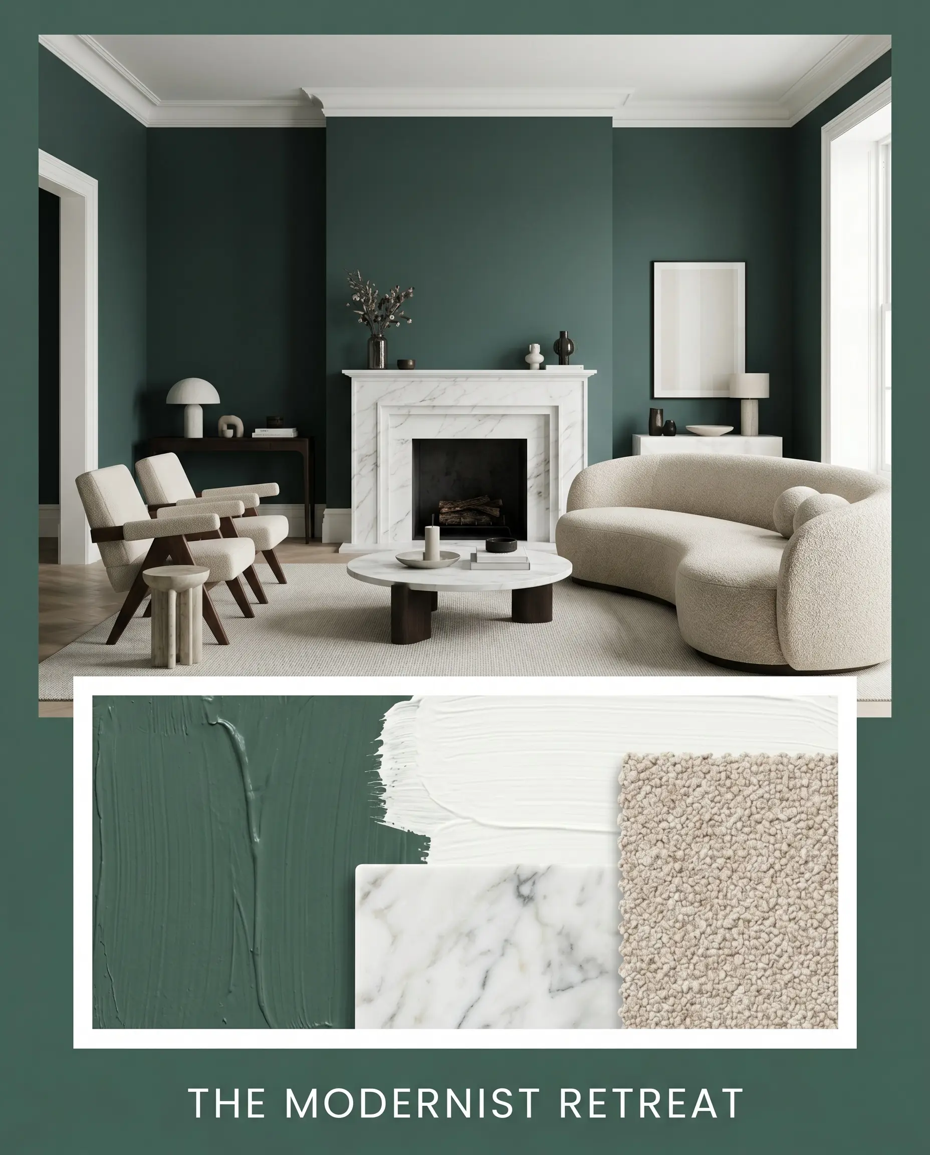
The Modernist Retreat: Anchored by the crisp contrast of Benjamin Moore Chantilly Lace OC-65 on the trim, this palette leans heavily into sleek sophistication. The addition of Honed Calacatta Marble and a curved sofa upholstered in oatmeal bouclé softens the severe, moody architecture, resulting in a perfectly balanced, tactile sanctuary.
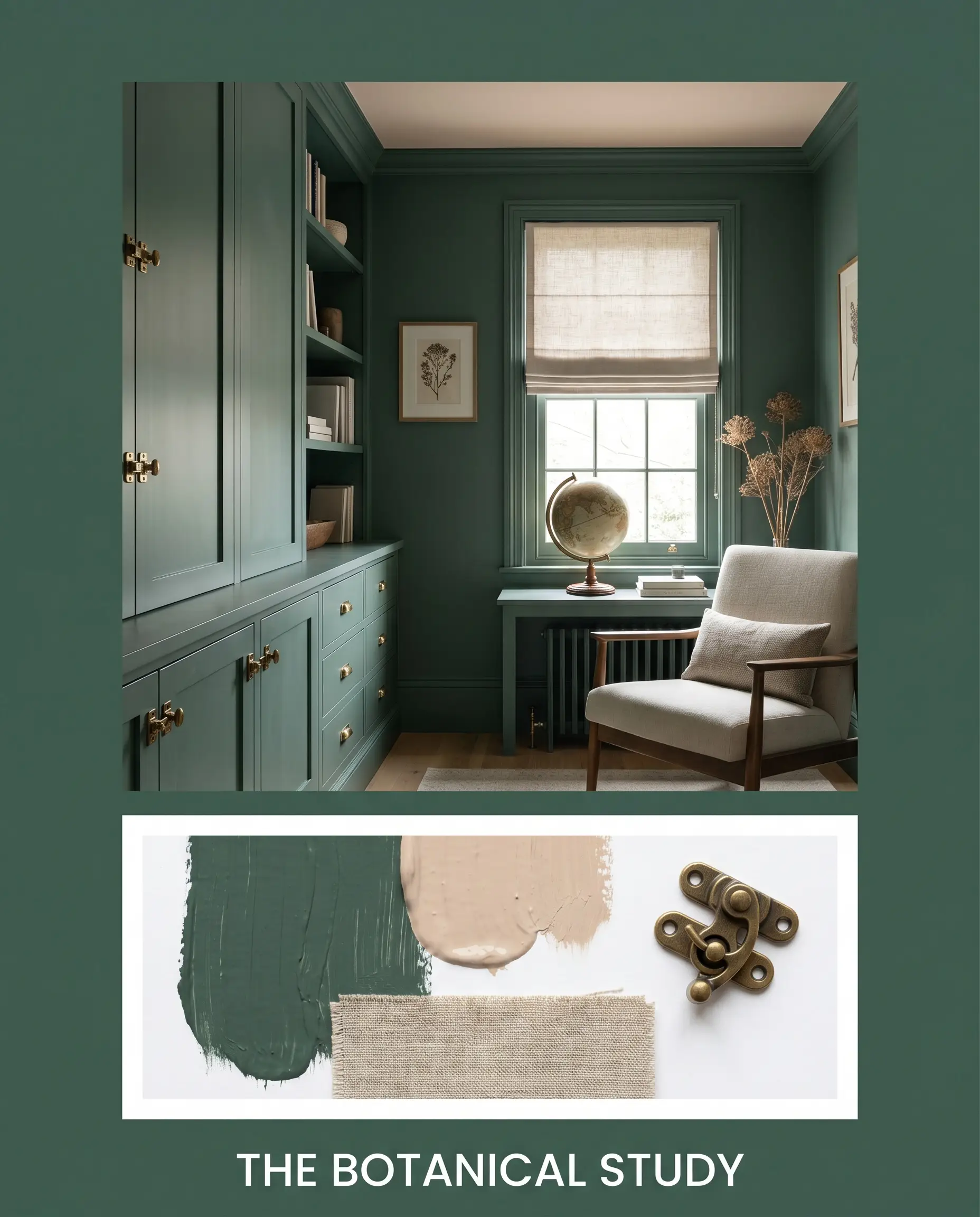
The Botanical Study: Here, the overarching vibe is calm, quiet, and deeply tied to nature. We pair the blackened teal with the dusty elegance of Farrow & Ball Setting Plaster No. 231 on the ceiling, while aged brass cabinet latches and natural linen roman shades add essential texture. The result is an enveloping, distraction-free environment.
Head-to-Head Comparisons: Dulux Emerson vs. The Rivals
Choosing the right dark green often comes down to the specific lighting conditions of your home. If your space lacks natural light or features extensive warm wood tones, a rival shade with a different undertone structure might be the more successful candidate.
Dulux Emerson vs. Sherwin-Williams Pewter Green SW 6208
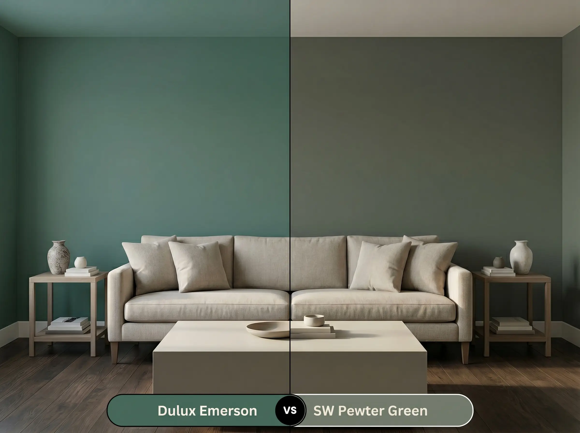
Pewter Green SW 6208 is a highly popular, muted sage that leans significantly more into a silvery-gray cast than the Dulux option. If your room receives heavy, warm southern sunlight, Pewter Green will hold its cool, frosty edge, whereas Emerson will warm up and reveal more of its lush eucalyptus base.
Dulux Emerson vs. Benjamin Moore Salamander 2050-10
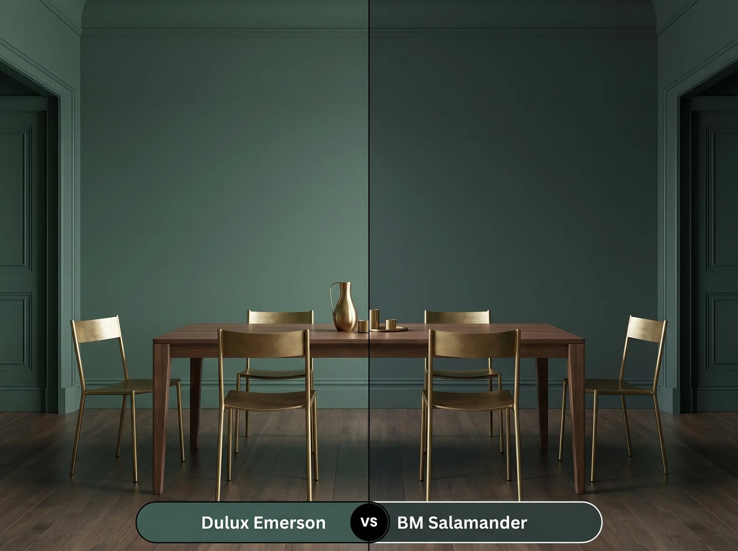
Salamander 2050-10 is an incredibly deep, almost black-green with a much stronger blue influence. If you are aiming for true, dramatic color-drenching in a room with ample artificial lighting, Salamander pushes a moodier, inkier boundary, while the Dulux shade retains a slightly softer, more approachable finish.
Dulux Emerson vs. Farrow & Ball Studio Green No. 93
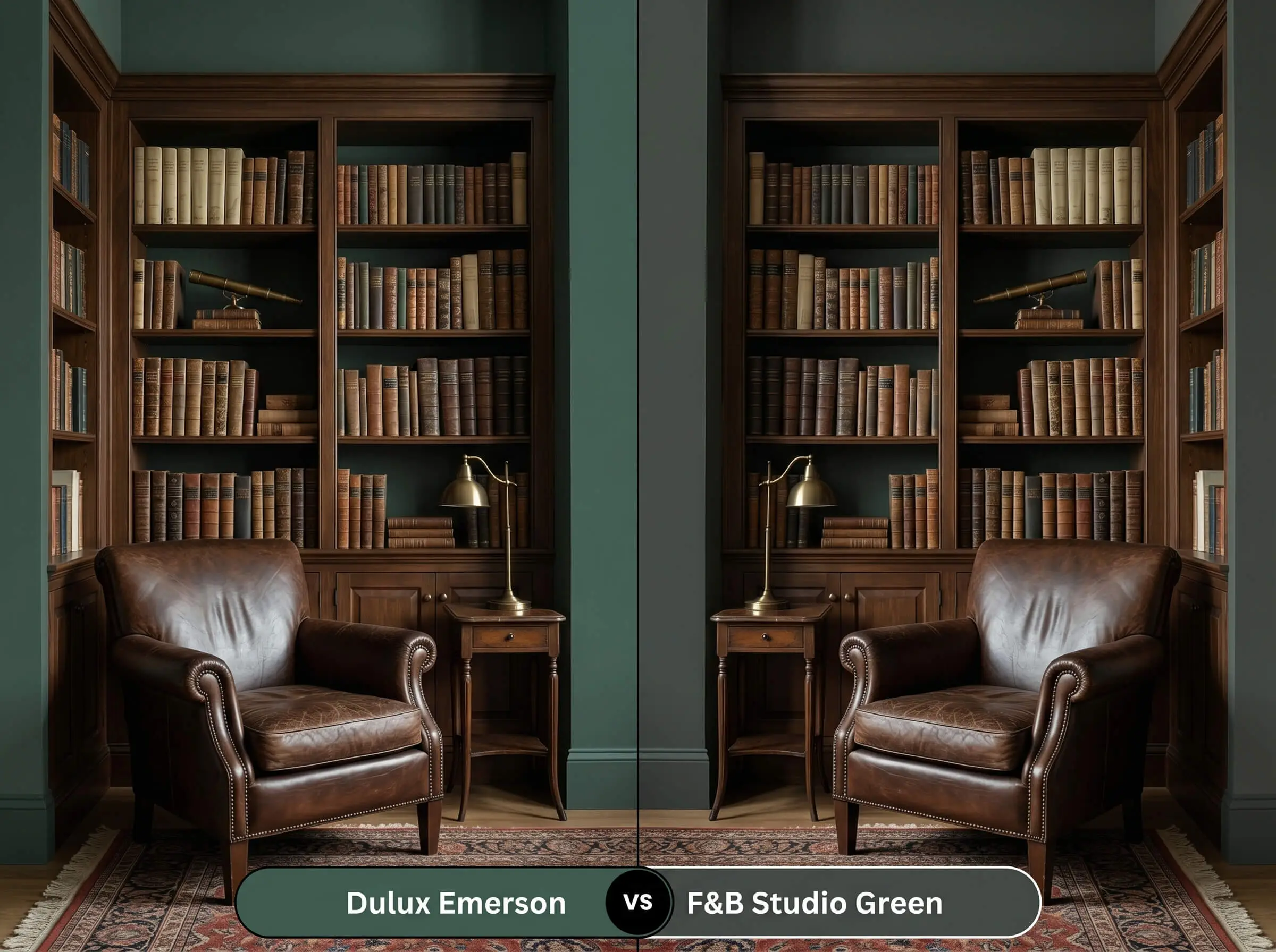
Studio Green No. 93 is famous for appearing almost entirely black in low light, only revealing its rich, historic green roots when directly illuminated. If you want a chameleon color that constantly shifts between black and green, choose Farrow & Ball; if you prefer a consistent, smoky teal, stick with the Dulux option.
Similar Colors & Brand Equivalents
Whether you need a slightly lighter alternative for a shadowy corridor or simply prefer to shop from a different manufacturer, there are several excellent alternatives that capture a similar spirit.
Similar Colors Within the Brand
Cross-Brand Matches
Practical Application & DIY Advice
Transitioning this heavy, light-absorbing pigment from a tiny swatch to a full wall requires strategic planning. The deep charcoal cast demands specific preparation to ensure the final finish is rich, even, and professional.
The Dynamic Sheen Guide
Primer Strategy
Because of its incredibly low light reflectance, this pigment absolutely requires a high-quality, deeply tinted gray primer. Applying this color over a standard white primer will result in a streaky, uneven finish, forcing you to apply three or four expensive topcoats to achieve true opacity.
Coverage & Success Tips
Even with a tinted primer, expect to roll at least two generous coats to fully develop the cyan and eucalyptus notes.
Dark, matte paints are notorious for “flashing”—where the sheen of a freshly touched-up spot looks noticeably different from the rest of the wall. To avoid this visible failure, always keep a tight wet edge while rolling, and if a wall gets heavily scuffed later, you will likely need to repaint the entire wall corner-to-corner rather than just dabbing the spot.
Clash Warning (The Touch-Up Rule)
Frequently Asked Questions
Because of its heavy light absorption, this color will look incredibly dark in a windowless room, but that is actually a design advantage. Embracing the darkness blurs the architectural boundaries, making a tiny powder room feel like an expansive, luxurious jewel box rather than a cramped closet.
The heavy charcoal cast beautifully neutralizes the intense warmth of red brick. Instead of creating a stark, high-contrast Christmas effect, the muted green base complements the earthy tones of the masonry while the gray keeps the overall exterior palette grounded and sophisticated.
Yes, wrapping the walls, trim, and ceiling in this single color actually helps disguise the low ceiling line. By removing the harsh white boundary at the top of the wall, the eye is not drawn to the height limitation, creating a continuous, enveloping canopy.
Warm metals like unlacquered brass, antique gold, and oil-rubbed bronze are the perfect foils for this cool paint. The golden warmth of the brass directly counteracts the chilly cyan undertone, bringing a balanced, inviting glow to the space.
Final Verdict & Expert Warnings for Dulux Emerson
Dulux Emerson is an exceptional, grounding pigment designed for homeowners who want to infuse their architecture with quiet, sophisticated drama. It is the ultimate choice for elevating transitional spaces, anchoring kitchen cabinetry, or creating a deeply restful, color-drenched sanctuary. By balancing a cool eucalyptus base with a smoky charcoal edge, it delivers a high-end, tailored atmosphere that feels both historic and effortlessly modern.
However, this heavy, shadowed teal is not a universal fix for every home. You must exercise extreme caution if your space features extensive honey-oak flooring, bright cherry cabinets, or heavily yellowed travertine tile. The cool, cyan-leaning undertones of this green will aggressively clash with those warm, orange-based woods and stones, making the paint look unpleasantly muddy while forcing the wood to appear cheap and overly orange. Additionally, avoid pairing it with polished, icy chrome hardware in low-light rooms, as the combination will feel incredibly stark, clinical, and devoid of the welcoming warmth this color is meant to inspire.