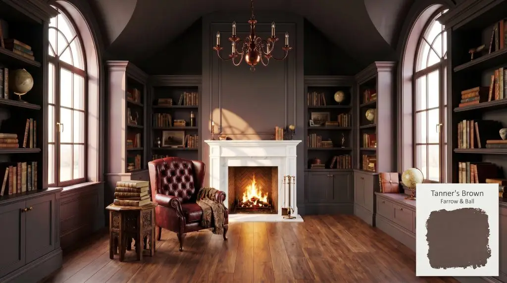
Tanner's Brown No. 255
Farrow & BallFarrow & Ball's Tanner's Brown (No. 255) is a deeply saturated, almost-black drab brown with warm red undertones. With an LRV of 7.0, it reads as a soft, velvety black in low light but reveals its rich, leathery brown warmth in well-lit spaces.
Paint Technical Profile
| Color ID / SKU | No. 255 |
| HEX Code | #4f4a4a |
| Light Reflectance (LRV) | 7.0 |
| Use | Interior, Exterior |
| Best Exposures | South-facing or North-facing |
| Best For | Fireplace interiors, moody bedrooms, kitchen cabinets, dramatic entryways |
Farrow & Ball Tanner’s Brown: Crafting Architectural Drama with Velvety Shadows
There is a profound difference between a room that simply feels dark and one that feels intentionally enveloping. When faced with a cavernous, undefined living space or a stark hallway lacking architectural character, standard dark neutrals often fall flat. Farrow & Ball Tanner’s Brown steps in as a deeply grounding material, pulling the walls inward to create a sense of profound intimacy.
This leathery brown behaves less like a standard wall color and more like a tactile fabric. By absorbing excess light and wrapping the environment in rich, red-leaning warmth, it transforms ordinary drywall into a feature of architectural drama. Whether you are anchoring a sleek, minimalist study or enriching a layered, traditional sitting room, this pigment offers a masterfully complex foundation.
Undertones & LRV of Tanner’s Brown
When evaluating this deep shade, the immediate question is whether it reads warm or cool. Tanner’s Brown is undeniably warm, radiating a subtle, earthy heat that prevents it from ever feeling stark or industrial. This inherent warmth is what makes it one of the best dark brown paint colors for moody interiors.
With a Light Reflectance Value (LRV) of 7.0, Farrow & Ball No. 255 absorbs an astonishing 93% of the light that hits it. In practical terms, this means the color is highly light-devouring and will dramatically pull the visual boundaries of a space closer together. It relies heavily on natural sunshine or intentional ambient fixtures to activate its underlying warmth.
Light Manipulation & The Chameleon Factor
Because it absorbs so much illumination, this velvety black-brown is highly reactive to the specific light source in your home. The biggest risk with a shade this deep is allowing it to turn into a flat, lifeless void in totally light-starved corners. You must intentionally layer your lighting to keep the pigment alive.
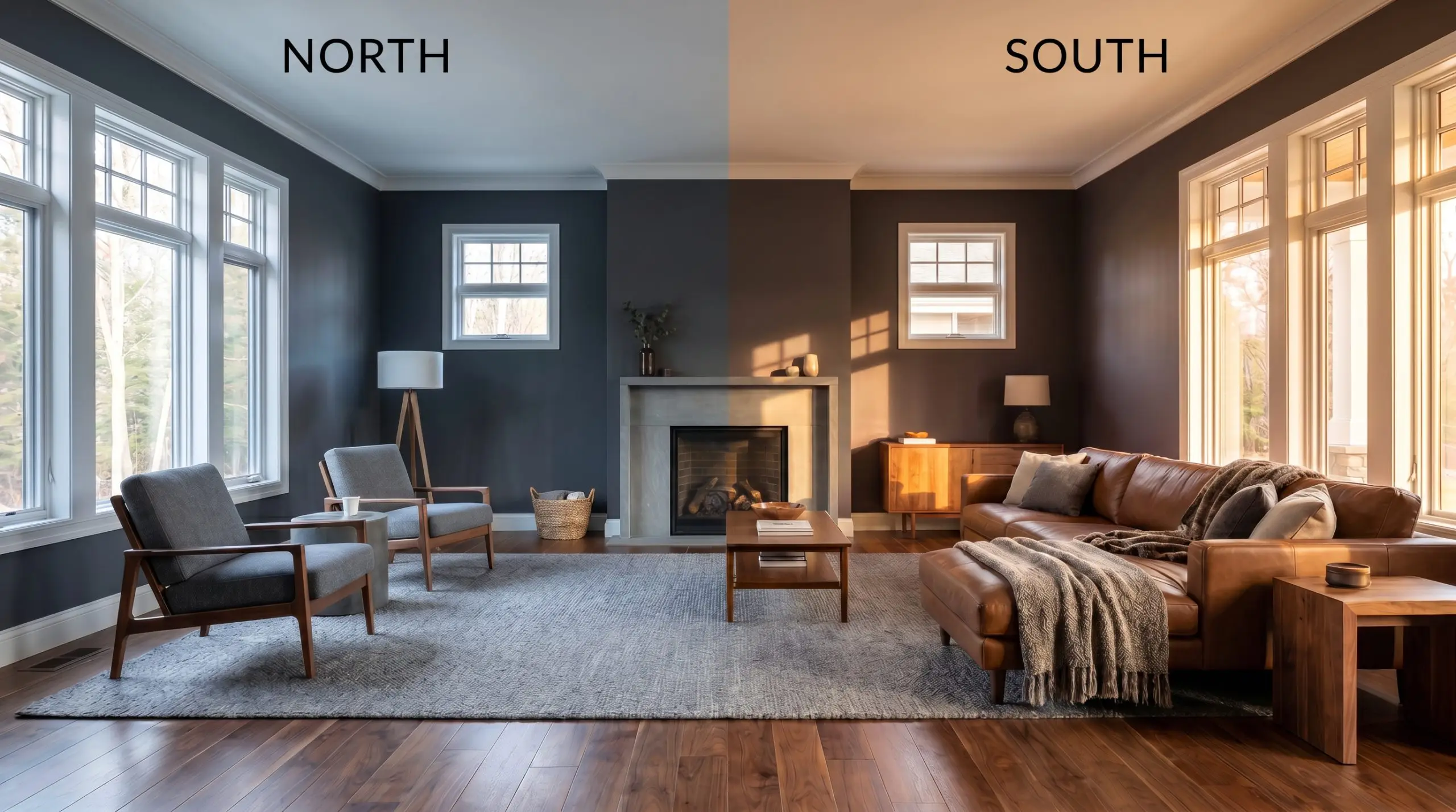
When using a color with an LRV this low, never rely solely on overhead recessed lighting. Incorporate wall sconces and shaded table lamps to wash the walls with warm, directional pools of light, which highlights the paint’s velvet-like texture.
Hackrea Pro-Tip (The Ambient Glow)
Everyday Applications for Farrow & Ball No. 255
This rich pigment demands to be used with intention, bringing a cohesive, grounding energy to any home. It thrives when asked to anchor a room, turning otherwise overlooked architectural moments into striking focal points.
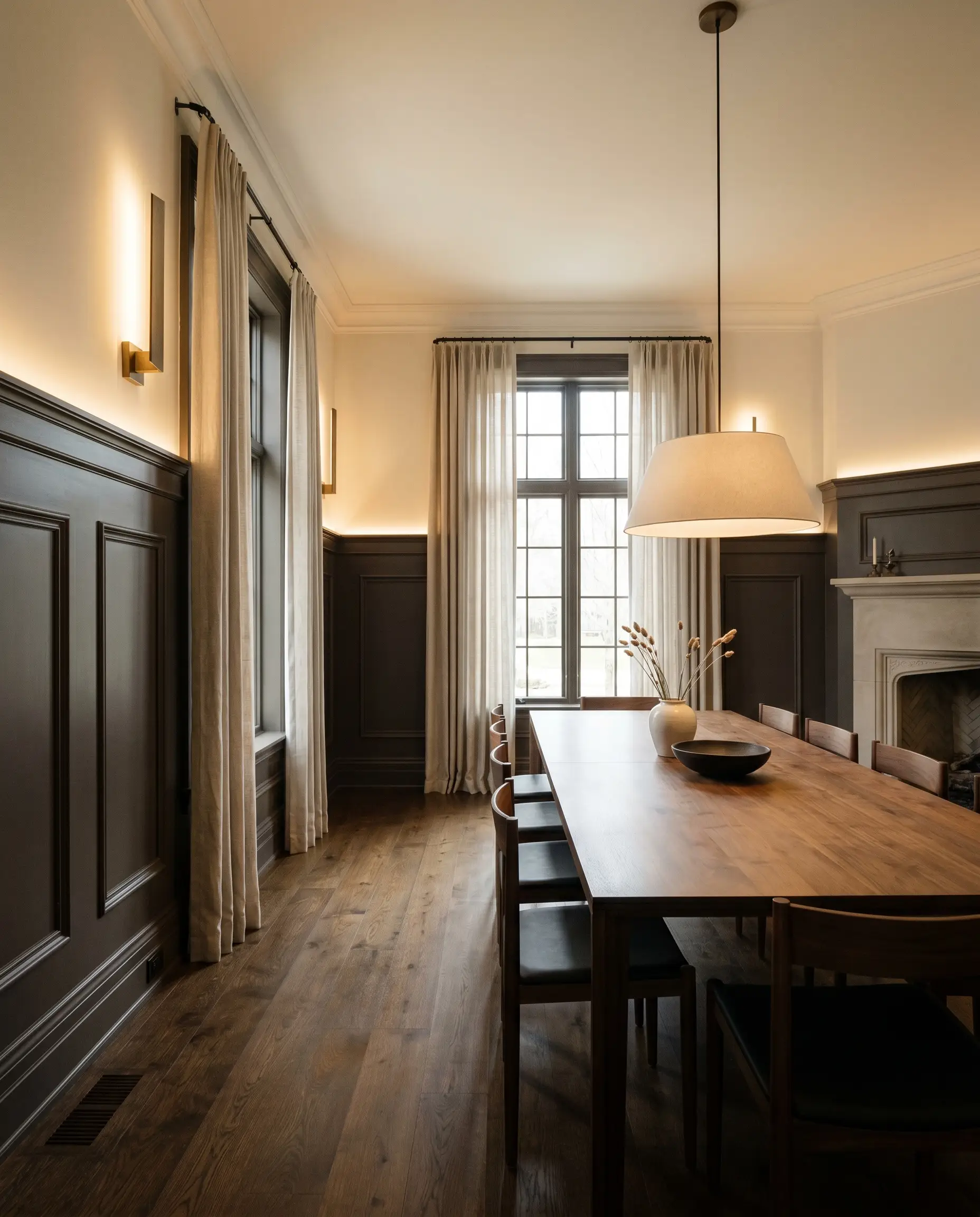
Fireplace Interiors & Surrounds
Applying this shade to a fireplace surround instantly grounds the living room. In a crisp, transitional space, it provides a stunning backdrop that makes white marble or pale limestone mantels pop with sharp contrast. The red undertones naturally harmonize with the warmth of a crackling fire, making the hearth feel like the true heart of the home.
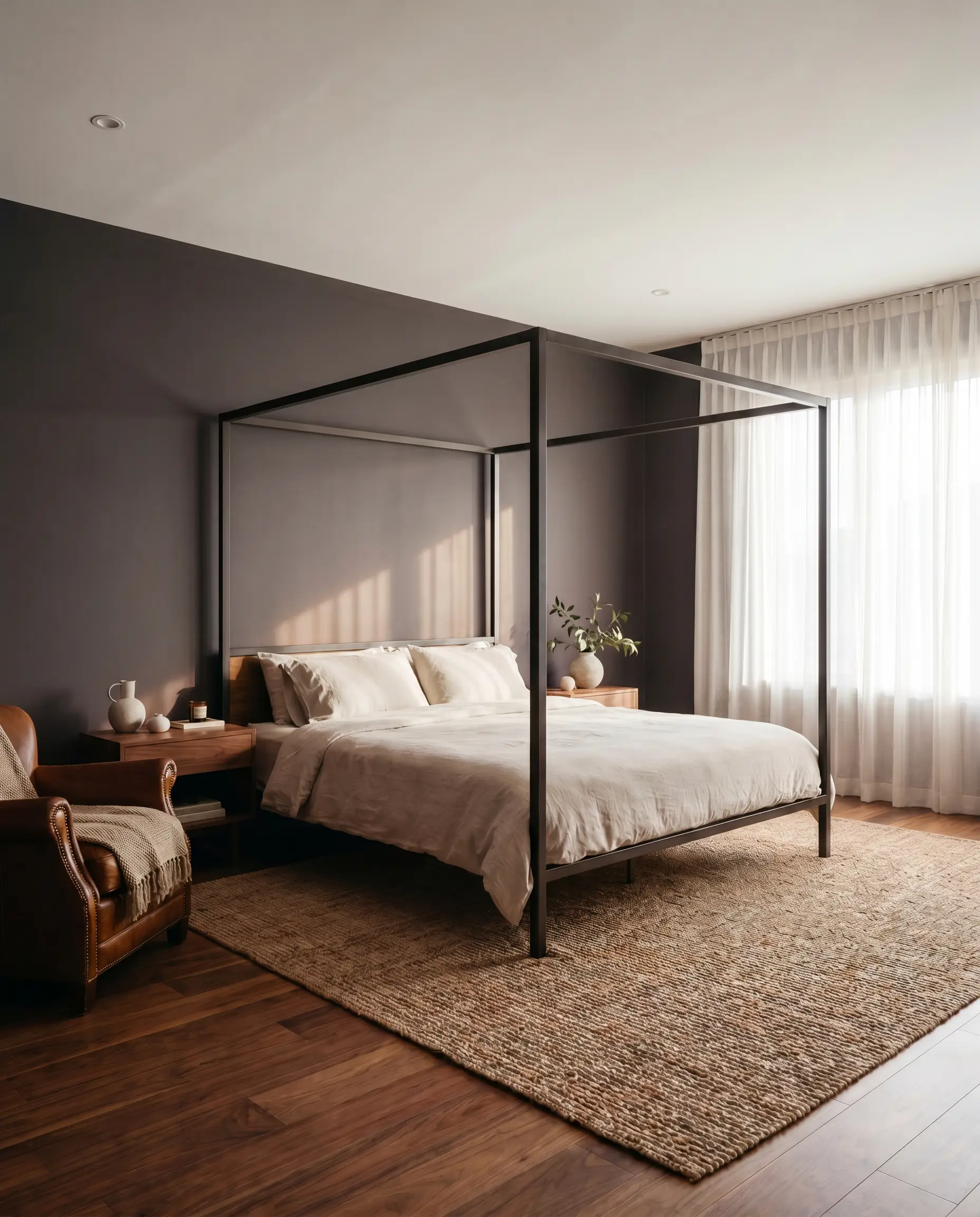
Primary Bedrooms
For a deeply restful retreat, this color wraps the walls in a soothing, cocoon-like embrace. It provides a stunning backdrop for a sleek, modern canopy bed, but also grounds rich tobacco-toned leather and heavy wool curtains beautifully. If the room receives ample morning light, the walls will wake up with a soft, plum-toned glow.
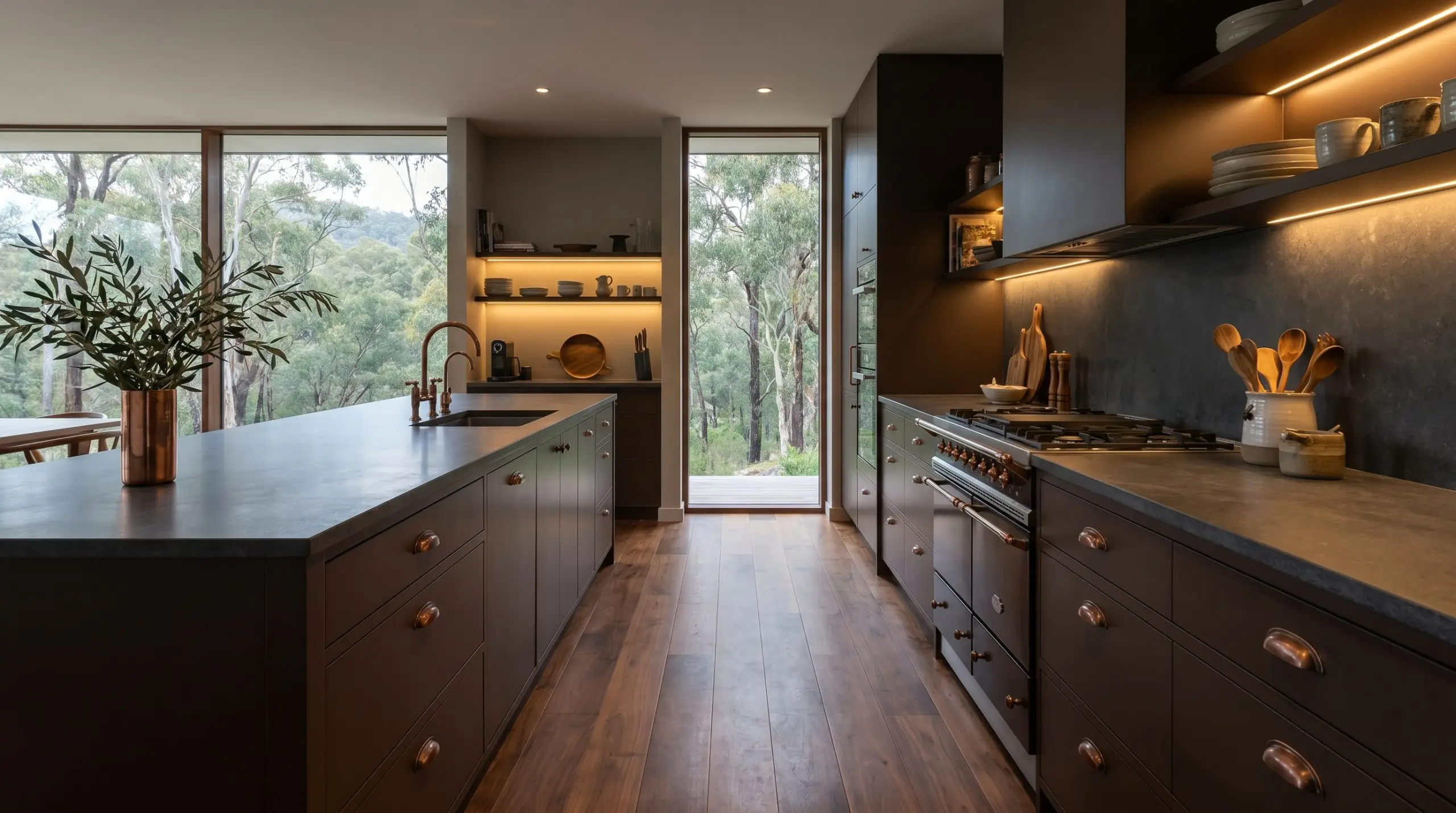
Kitchen Islands and Lower Cabinetry
Using this deep brown on lower cabinets or a central island grounds the kitchen without the heavy starkness of pure black. It anchors a sleek, minimalist culinary space when paired with honed stone countertops and burnished antique copper hardware. The rich brown hides everyday scuffs effortlessly while elevating the entire room’s curatorial feel.
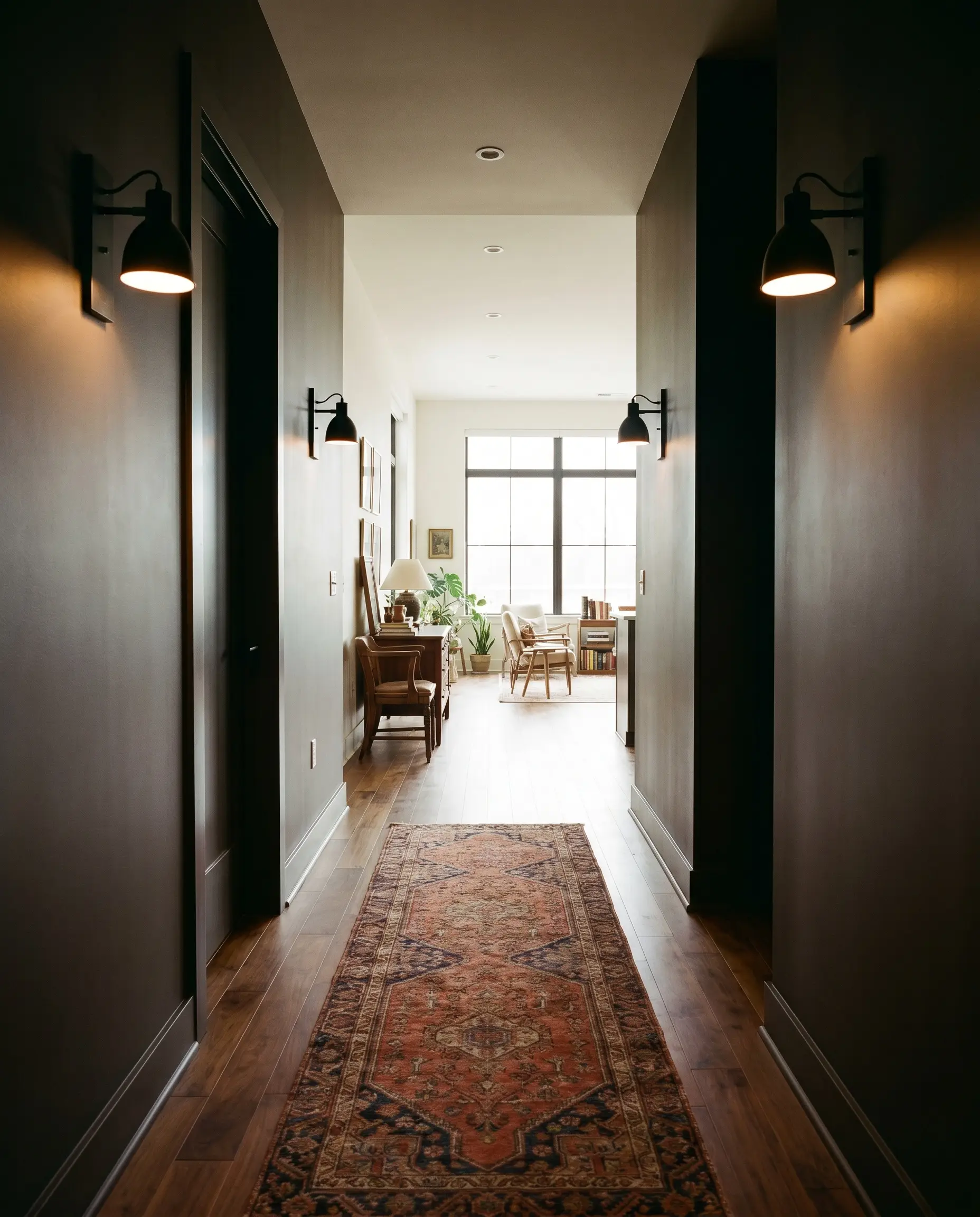
Entryways and Hallways
Transitional spaces are the perfect canvas for architectural drama. Painting a narrow hallway in this dark drab creates a thrilling sense of compression, making the bright, adjoining rooms feel even larger and more expansive when you walk into them. It pairs beautifully with an antique Persian runner and blackened steel sconces.
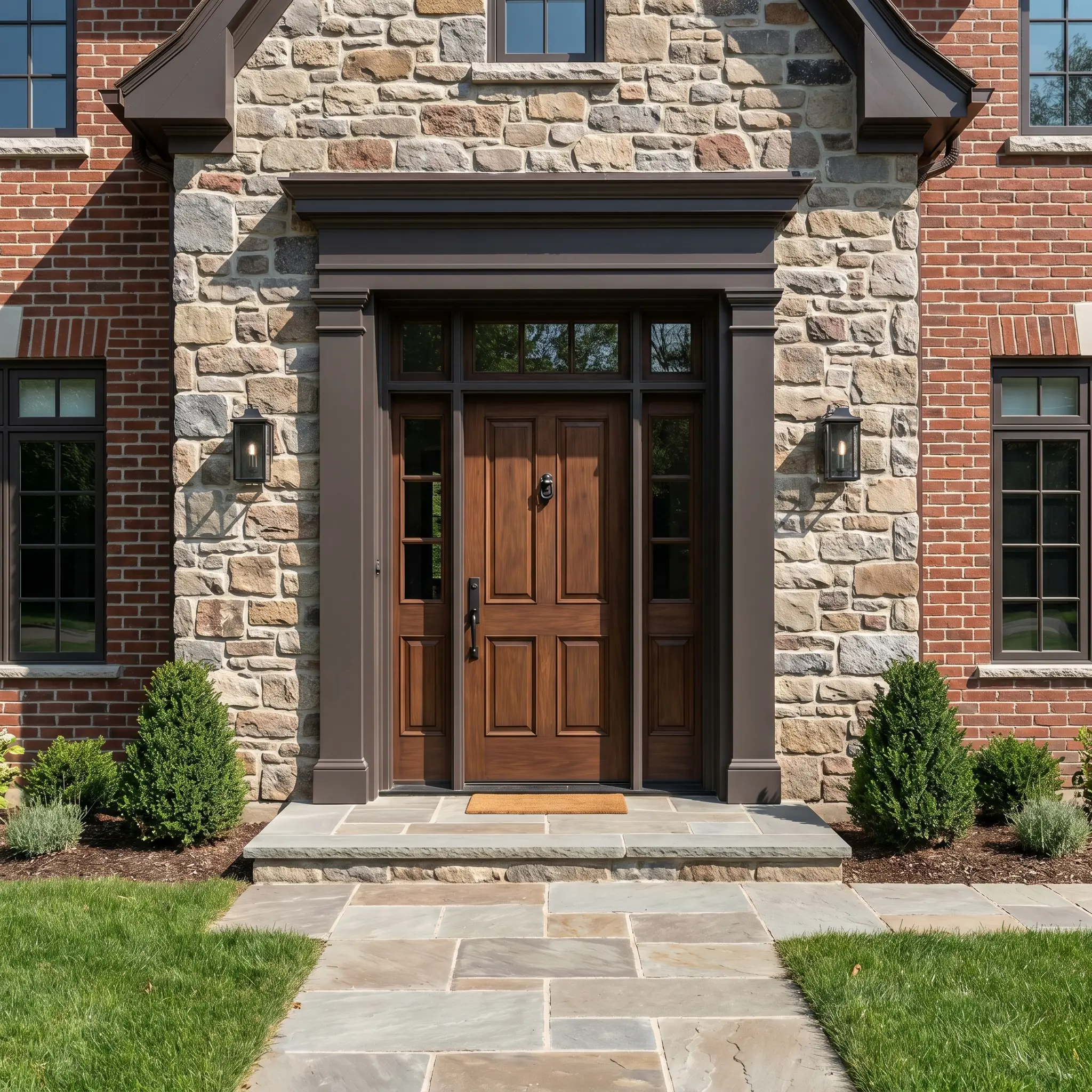
Exterior Trim and Front Doors
On an exterior facade, natural sunlight washes out darker colors, making them appear significantly lighter. Used on exterior trim or a classic front door, it reads as a sophisticated, earthy charcoal that beautifully complements natural stone siding or classic red brick. It provides a grounded, heritage feel that feels far more nuanced than a standard black door.
Custom Design Ideas & Inspiration
Beyond standard walls, this color’s complex DNA makes it an incredible tool for highly curated, inventive design projects. Let its rich, light-absorbing qualities inspire a more adventurous approach.
The Cinematic Home Theater
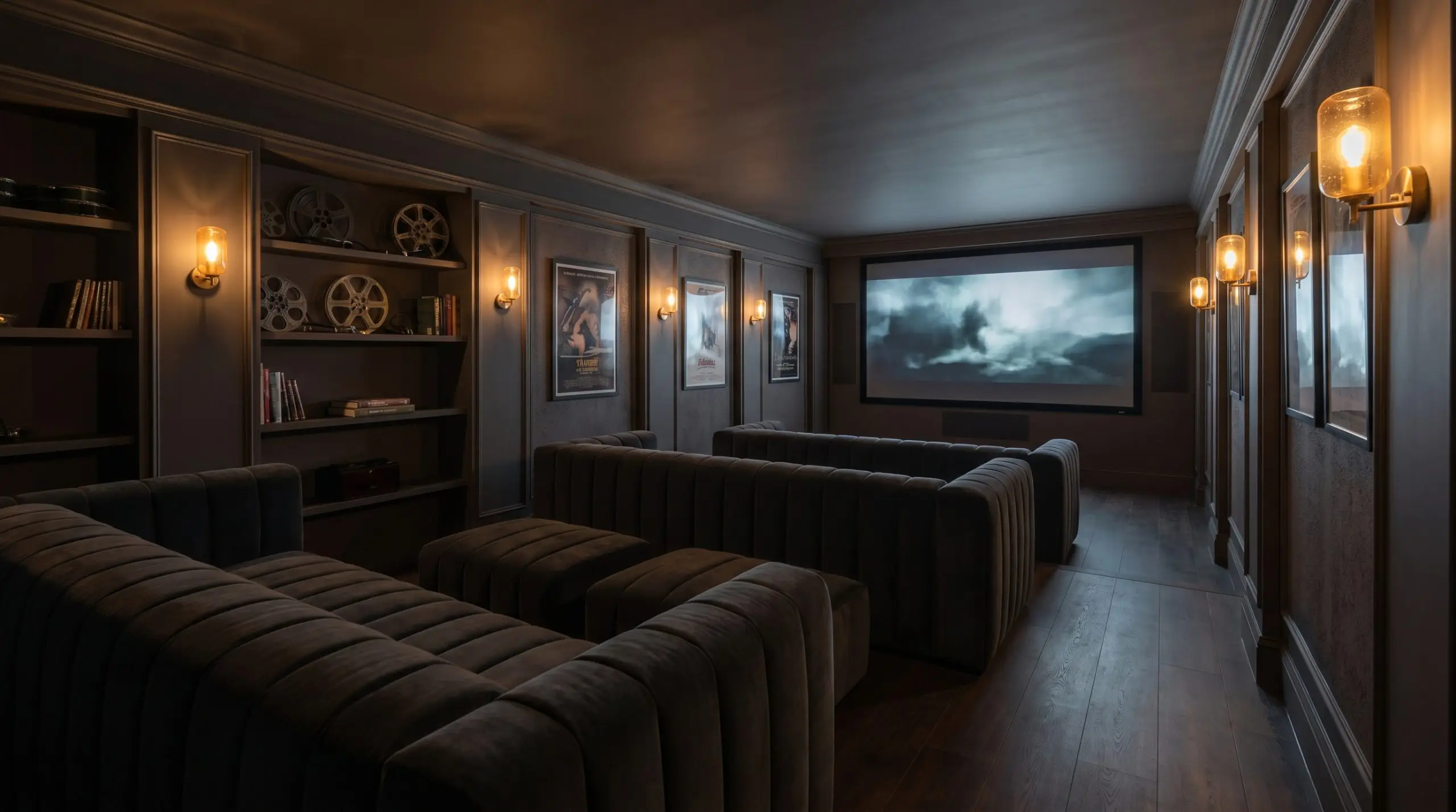
Transform a standard basement or bonus room into an immersive viewing space. By wrapping the walls, trim, and ceiling in this deep brown, you blur the hard edges of the room, creating an endless, shadowy atmosphere perfect for movie nights. Pair it with deep channel-tufted seating and low-lit amber glass wall fixtures to complete the cinematic vibe.
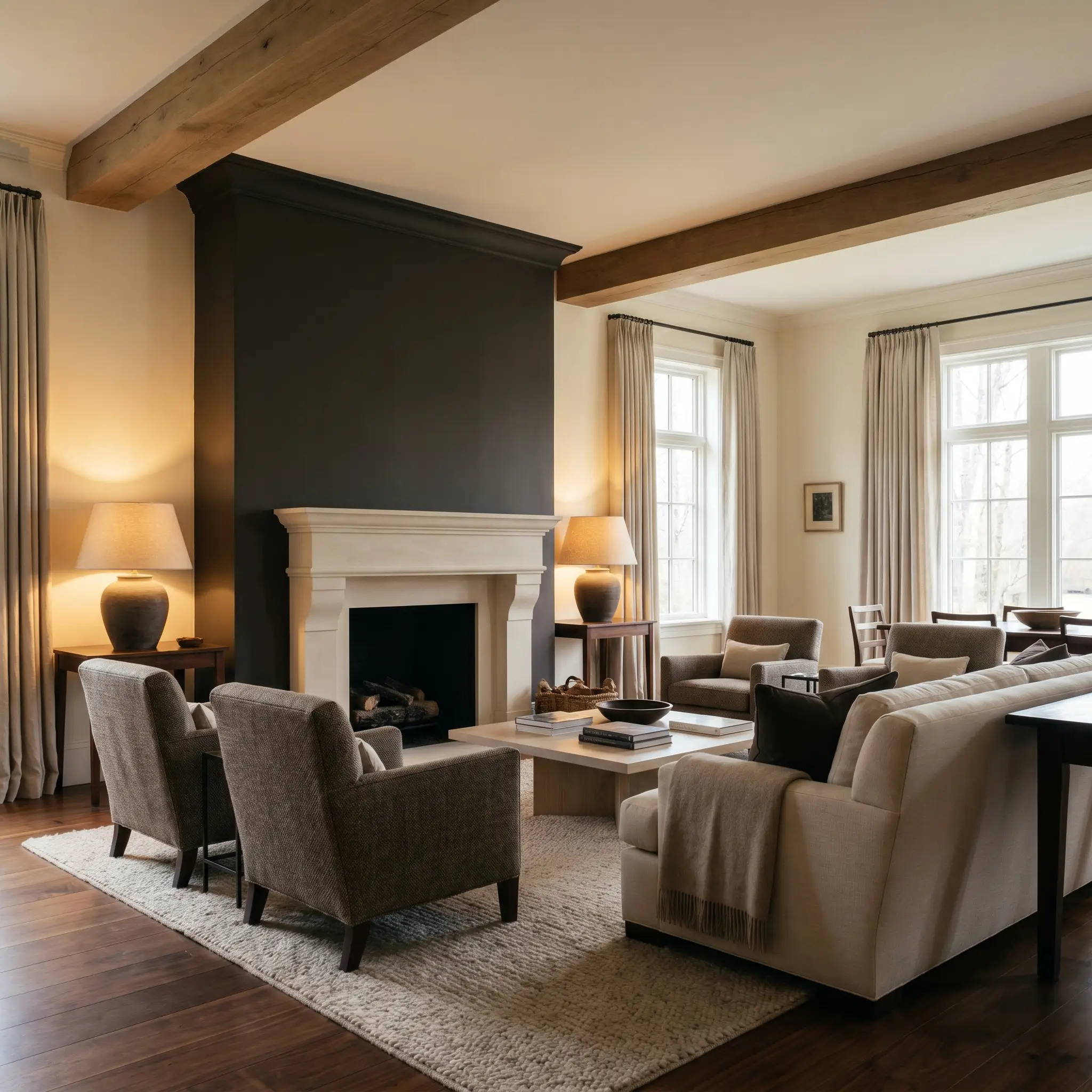
The Grounded Millwork Accent
If you want the gravity of a dark color without committing to the entire wall, apply it strictly to the heavy architectural millwork in a formal dining space. This technique anchors the lower half of the room while allowing a softer, lighter neutral to dominate the upper drywall. It perfectly bridges the gap between traditional heritage styling and a modern, high-contrast aesthetic.
The Color-Drenched Library
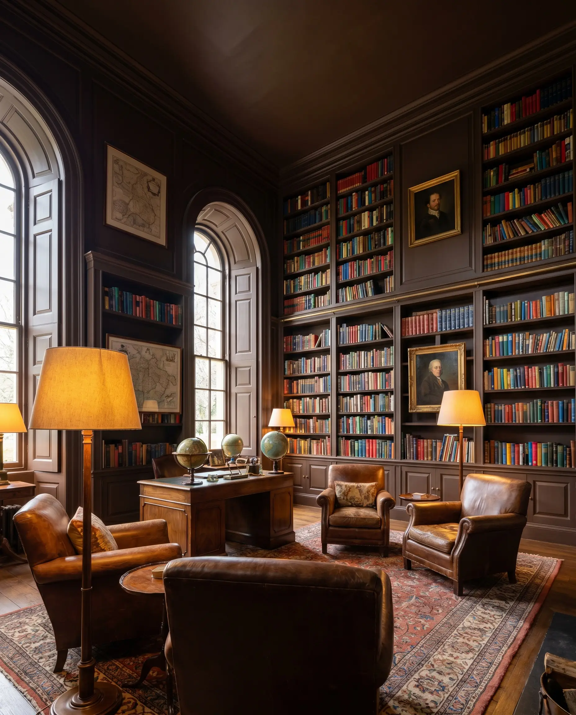
For a truly immersive experience, learning how to color drench with Farrow & Ball paints is a transformative strategy. Apply Tanner’s Brown across the walls, built-in bookshelves, window casings, and ceiling of a home library or study. The seamless application makes the room feel incredibly tall and grand, allowing the colorful spines of your book collection to jump off the dark shelves.
Coordinating Colors for Tanner’s Brown
The key to styling this deep shade is deciding whether you want crisp, high-contrast boundaries to feel tailored, or soft, tonal transitions to feel serene. Its rich undertones require intentional companions to truly shine.
Trim & Baseboards
When framing this color, your trim choice completely dictates the room’s energy.
Hardware & Tactile Pairings
Coordinating Color Palette
Designer Mood Boards
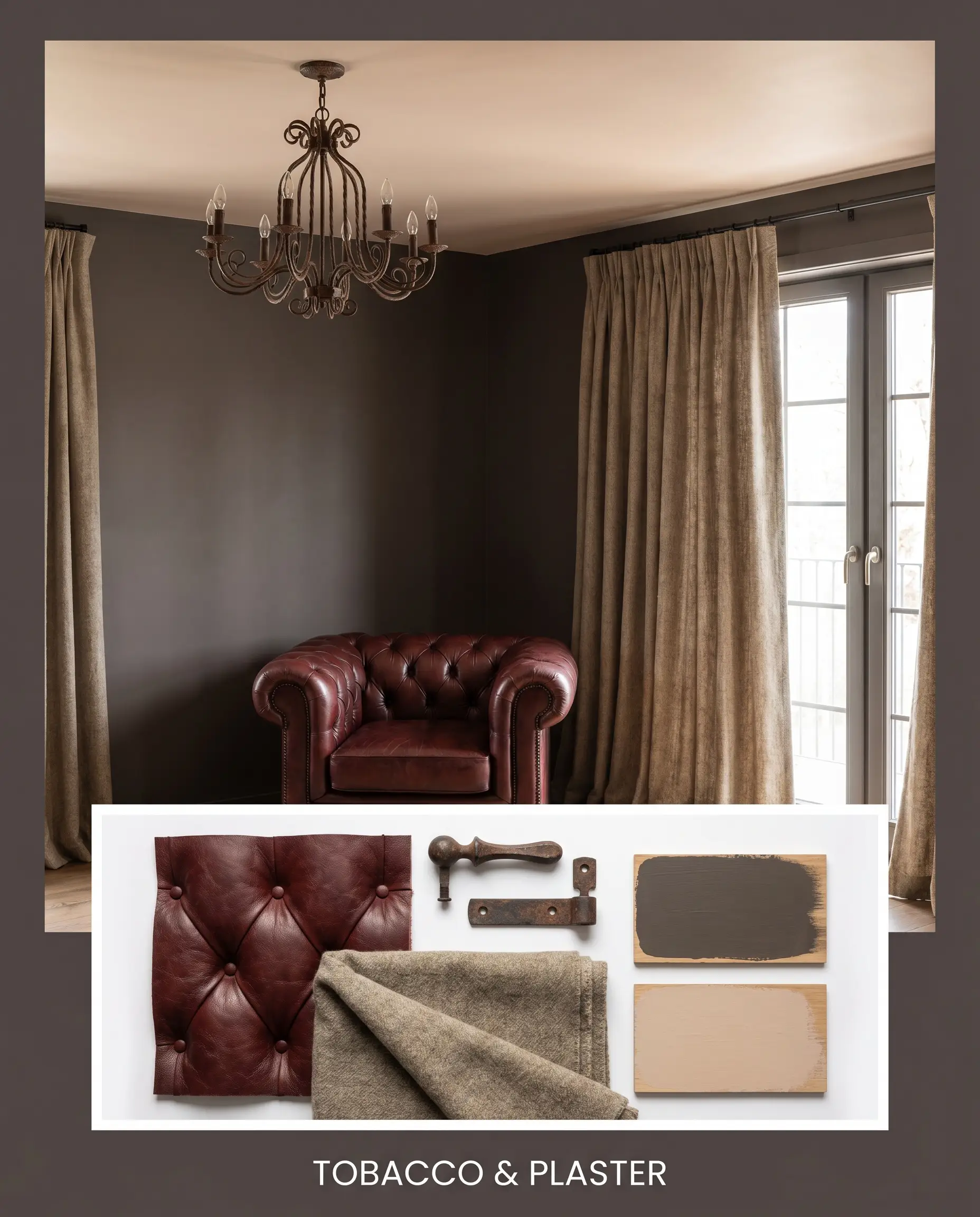
Tobacco & Plaster This palette leans heavily into a warm, organic modern aesthetic. The rich walls serve as the backdrop for a tufted oxblood leather armchair, an oxidized iron chandelier, and heavy wool curtains. Farrow & Ball Setting Plaster No. 231 is used on the ceiling to cast a soft, flattering glow over the entire arrangement.
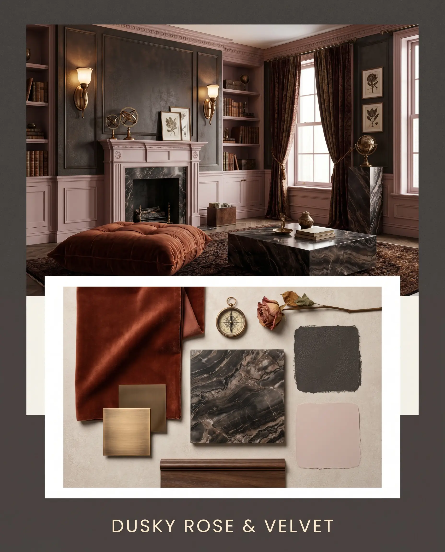
Dusky Rose & Velvet A nod to sophisticated, heritage maximalism. The dark, leathery backdrop is softened by accents painted in Benjamin Moore Wild Aster 1240, bringing a touch of muted romance. Polished bronze wall sconces, a plush rust-colored floor cushion, and deeply veined dark marble accents complete the highly tactile, luxurious mood.
Head-to-Head Comparisons
Sometimes a specific lighting condition or architectural style demands a slightly different pigment profile. Understanding how this color stacks up against its closest rivals will ensure you make the perfect selection for your specific environment.
Farrow & Ball Tanner’s Brown vs. Farrow & Ball London Clay No. 244
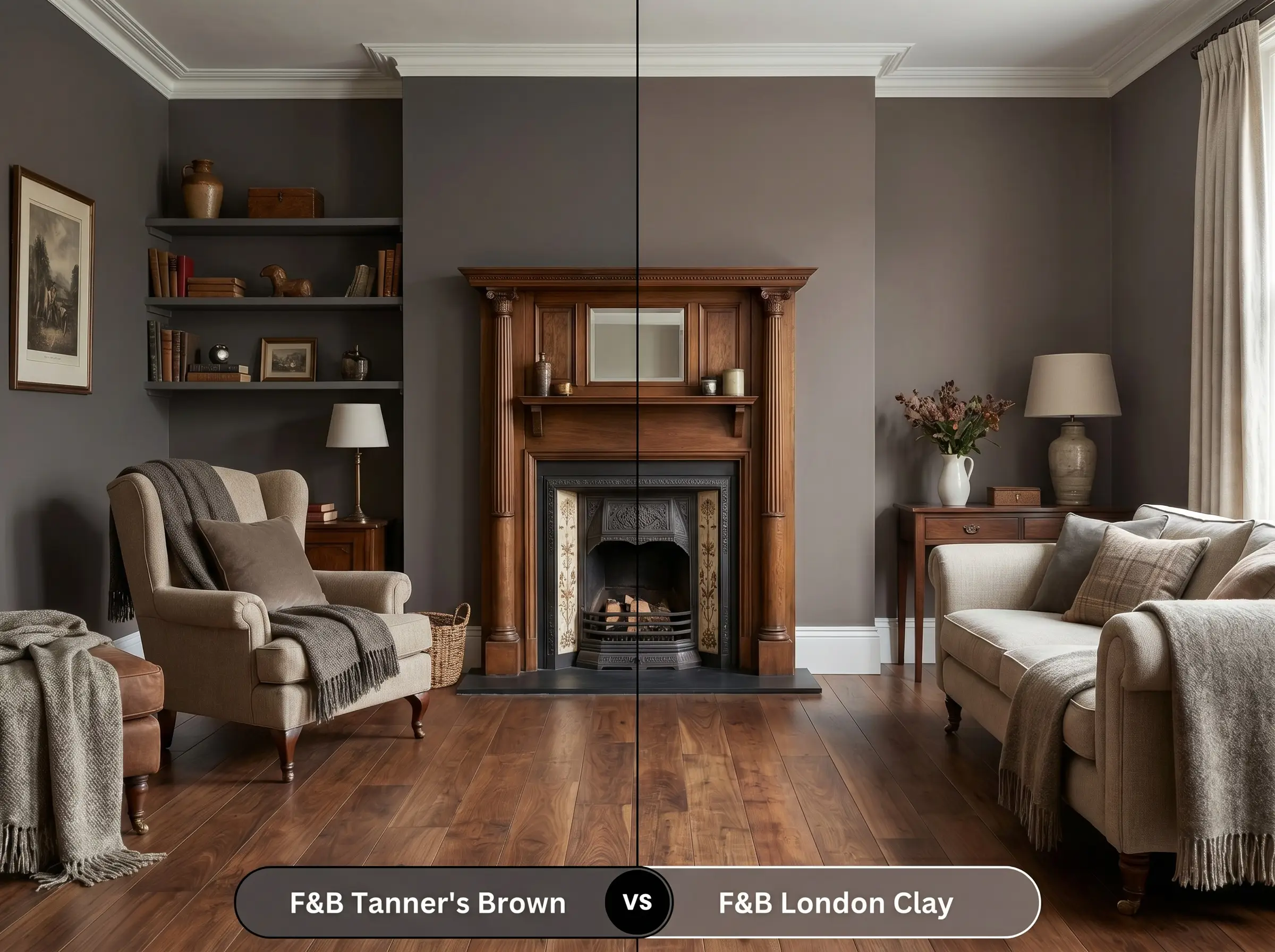
London Clay is significantly warmer and noticeably lighter, carrying a much stronger dose of magenta. If your room is north-facing and you fear the darker brown will pull too charcoal, London Clay offers the extra warmth needed to maintain a cozy, chocolatey feel. Tanner’s Brown is the better choice for true, dramatic depth.
Farrow & Ball Tanner’s Brown vs. Sherwin-Williams Black Fox SW 7020
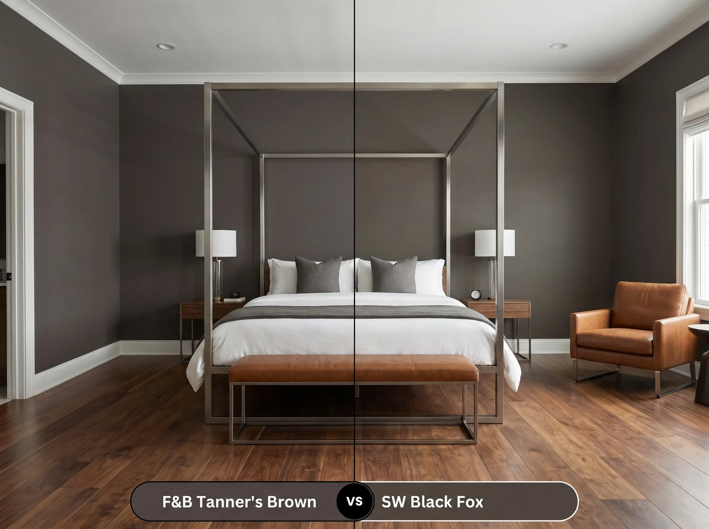
Black Fox is a deeply saturated greige that leans much further into gray territory than the Farrow & Ball option. If you want a dark, anchoring neutral but are worried about red undertones clashing with your existing decor, Black Fox is a safer, cooler alternative. However, it lacks the rich, leathery complexity of No. 255.
Farrow & Ball Tanner’s Brown vs. Benjamin Moore Deep Caviar 2130-20
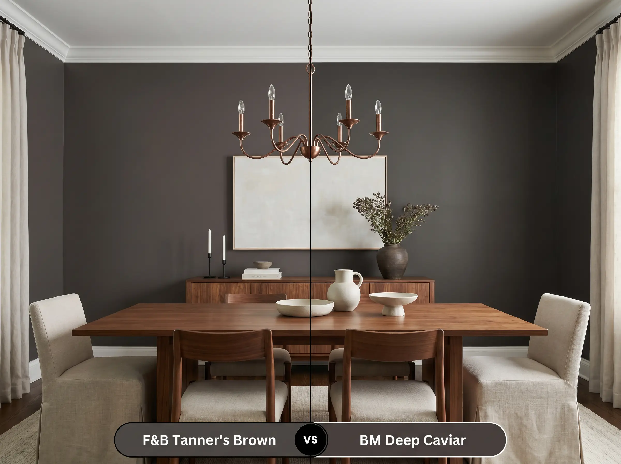
Deep Caviar is an incredibly dark, sophisticated brown-black with subtle cool, almost purplish undertones. If you are designing a highly modern, sleek space, Deep Caviar provides a sharper, more industrial edge. Tanner’s Brown remains the superior option for spaces that require an earthy, enveloping warmth.
Similar Colors & Brand Equivalents
If you love the general energy of this shade but need a slight adjustment in depth or are looking for an option from a different manufacturer, consider these alternatives.
Same-Brand Alternatives
Cross-Brand Matches
Practical Application & DIY Advice
Executing a flawless finish with a color this dark requires specific planning. Transitioning from a light wall to a deep, light-absorbing hue demands attention to detail and the right materials.
The Dynamic Sheen Guide
Primer Strategy
You must use a dark, tinted primer before applying this paint. Applying a dark brown directly over a white wall or standard white primer will result in a streaky finish that lacks true depth. A dark gray or brown-tinted undercoat ensures the final color looks rich, solid, and structurally sound.
Coverage & Success Tips
Expect to apply at least two generous coats, even over a tinted primer, to achieve the full, leathery opacity. Dark, matte paints are highly susceptible to “flashing”—visible, uneven roller marks caused by the paint drying too quickly during application. To avoid this, maintain a wet edge while rolling, work in small sections, and resist the urge to touch up semi-dry spots on the wall.
Frequently Asked Questions
Because direct sunshine naturally amplifies warm undertones, the subtle red and plum notes in this paint will become much more prominent outdoors. While it won’t look like a bright purple, it will definitely read as a rich, warm burgundy-brown rather than a flat black.
It performs brilliantly by embracing the lack of natural light to create a jewel-box effect. Wrapping the entire windowless room blurs the sharp corners and ceiling lines, making the small space feel intentionally moody and endlessly deep rather than cramped.
A high-gloss finish will completely change the aesthetic from a velvety, light-absorbing surface to a highly reflective, glamorous one. While you lose the soft ‘leathery’ texture, a gloss sheen actually makes the dark color highly durable and bounces ambient light around the kitchen beautifully.
The crisp white background of Calacatta marble creates a striking, high-end contrast that allows the warm red undertones of the paint to truly glow. The paint acts as a grounding anchor, making the grey and gold veining in the stone look even more pronounced and luxurious.
Final Verdict & Expert Warnings
Farrow & Ball Tanner’s Brown is an uncompromising, deeply sophisticated color perfectly suited for homeowners who want to craft intentional, atmospheric spaces. Its absolute best application is found in immersive, color-drenched environments like intimate home libraries, moody primary bedrooms, or striking dining spaces where it can wrap the architecture in warmth. It effortlessly elevates a variety of styles, from historic, heritage-rich homes to sleek, organic modern apartments that need a grounding anchor.
However, this rich pigment demands careful curation when it comes to existing finishes. You must exercise extreme caution if your home features extensive cool-toned gray flooring, icy blue-gray stonework, or stark modern furniture. The deep warmth of the paint will aggressively fight against these cool elements, requiring surrounding materials that share its earthy, organic warmth to truly succeed.
Closest Cross-Brand Equivalents
The absolute closest scientific color matches for Tanner's Brown across top paint brands.