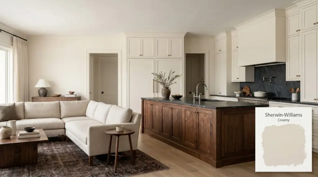
Sherwin-Williams Creamy (SW 7012) is a warm, soft off-white with an LRV of 81. Characterized by subtle yellow and beige undertones, it provides a cozy, inviting glow without feeling overly yellow, making it an incredibly versatile choice for cabinetry, trim, and main living areas.
Will Creamy clash with your room?
Paint Technical Profile
| Color ID / SKU | SW 7012 |
| HEX Code | #EFE8DB |
| Light Reflectance (LRV) | 81 |
| Use | Interior, Exterior |
| Best Exposures | North-Facing, East-Facing |
| Best For | Kitchen Cabinets, Living Rooms, Bedrooms, Exterior Trim |
Sherwin-Williams Creamy: A Luminous Foundation for Layered Interiors
High-LRV off-whites can sometimes feel stark, but Sherwin-Williams Creamy (SW 7012) brings a specific, lived-in softness that makes everyday living rooms feel incredibly intentional. By bouncing a tremendous amount of illumination around the room while holding onto its rich pigment, this shade bridges the gap between a bright, airy envelope and a deeply inviting atmosphere.
It acts as a brilliant canvas for blending high-end vintage finds with standard, everyday upholstery. Whether you are updating a suburban builder-grade layout or softening an urban loft, this color provides a sophisticated, forgiving backdrop.
Sherwin-Williams Creamy: Undertones & LRV
If you are wondering whether Sherwin-Williams Creamy leans warm or cool, the answer is a definitive, beautiful warm. This soft neutral base establishes a highly inviting atmosphere without tipping into overwhelming heat.
With a light reflectance value of 81, this shade bounces a high volume of light around the room. It sits in that coveted sweet spot where it visually expands a space but retains enough pigment to avoid looking primed or sterile under intense glare.
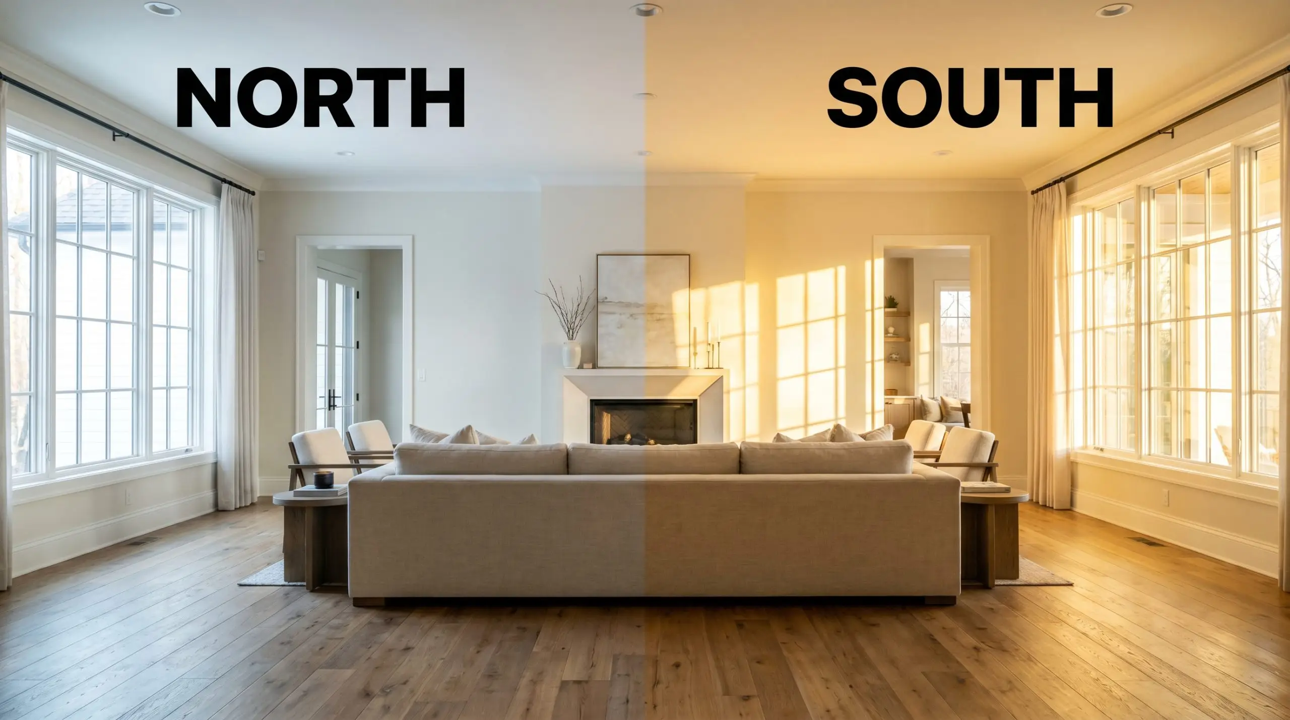
Lighting Effects: The Chameleon Factor of Creamy
Because of its specific color chroma, this shade shifts noticeably as the sun moves across your home. The biggest risk here is placing it in a room flooded with late-afternoon western sun, where the yellow pigment can suddenly amplify into an overly intense, buttery glow. Always test your swatches on multiple walls to see how the shadows play throughout the day.
Grounding Everyday Spaces with Warm Off-Whites
This creamy white demands to be layered with varied textures and contrasting tones to truly shine. It creates a cohesive, welcoming energy that easily transitions from bustling morning routines to quiet evening retreats.
Kitchens
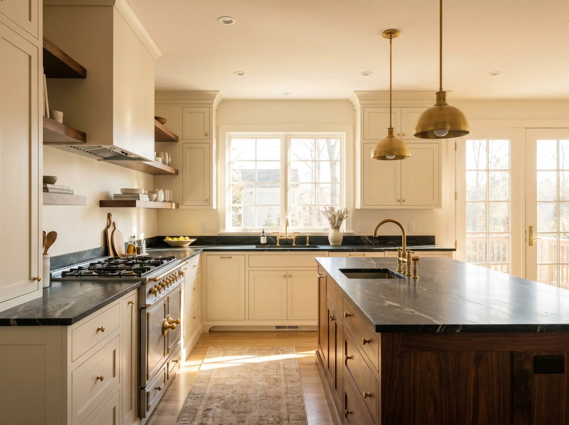
While it is a staple for a classic farmhouse aesthetic, it is equally stunning when used to warm up a sleek, transitional culinary space. Coating your kitchen cabinets in this soft tone provides a brilliant counterpoint to dark, veined soapstone or richly stained walnut islands. Pair it with polished nickel fixtures to bounce light, or unlacquered brass to lean into its inherent warmth.
Will Creamy work with your specific lighting, floor, or furniture?
Living Rooms
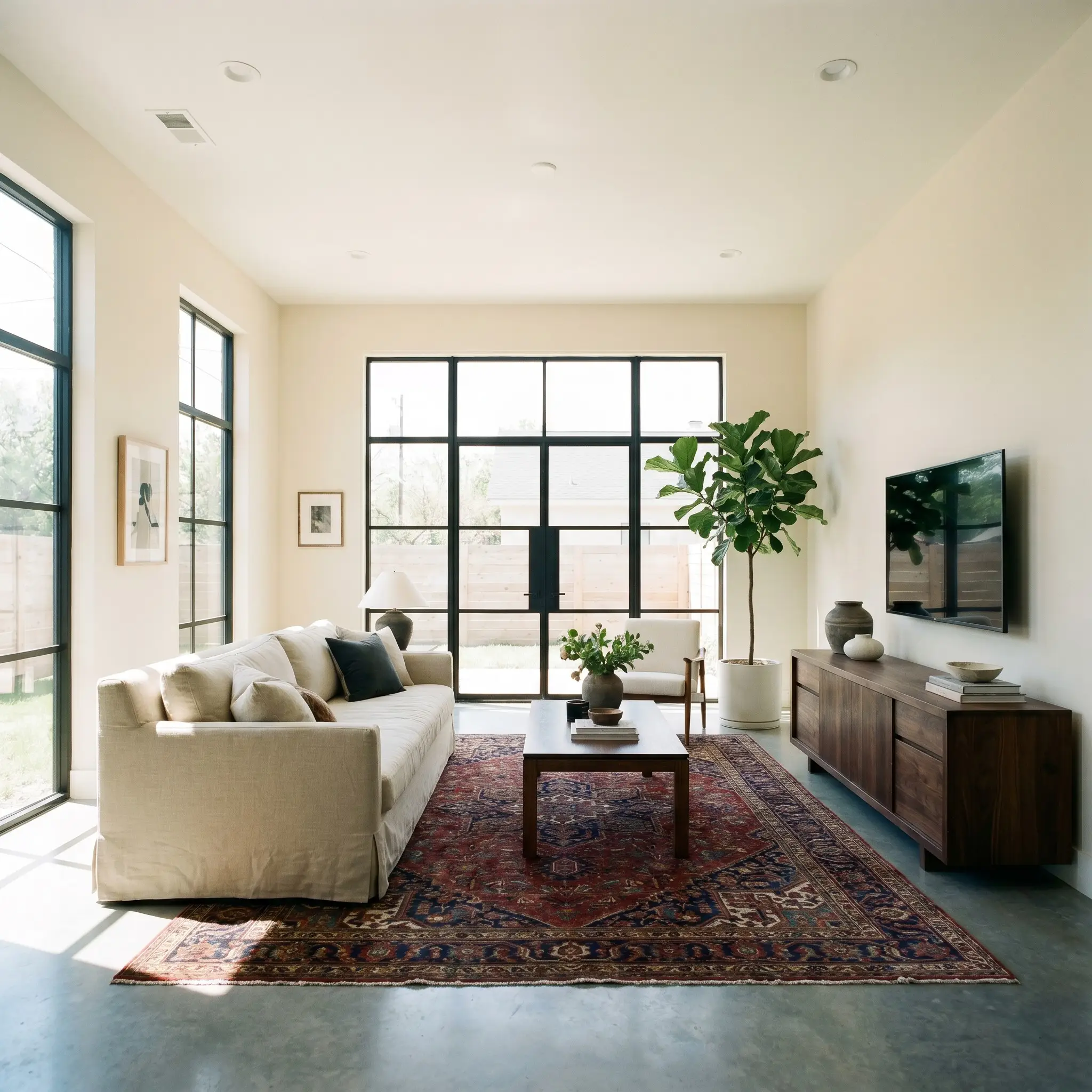
Open-concept layouts benefit greatly from this shade because it prevents large expanses of drywall from feeling cavernous. It acts as a unifying wrap that plays beautifully with both a standard linen sofa and a premium, deeply colored vintage rug. The subtle beige notes help ground heavy, dark media consoles while keeping the overall room feeling remarkably light.
Bedrooms
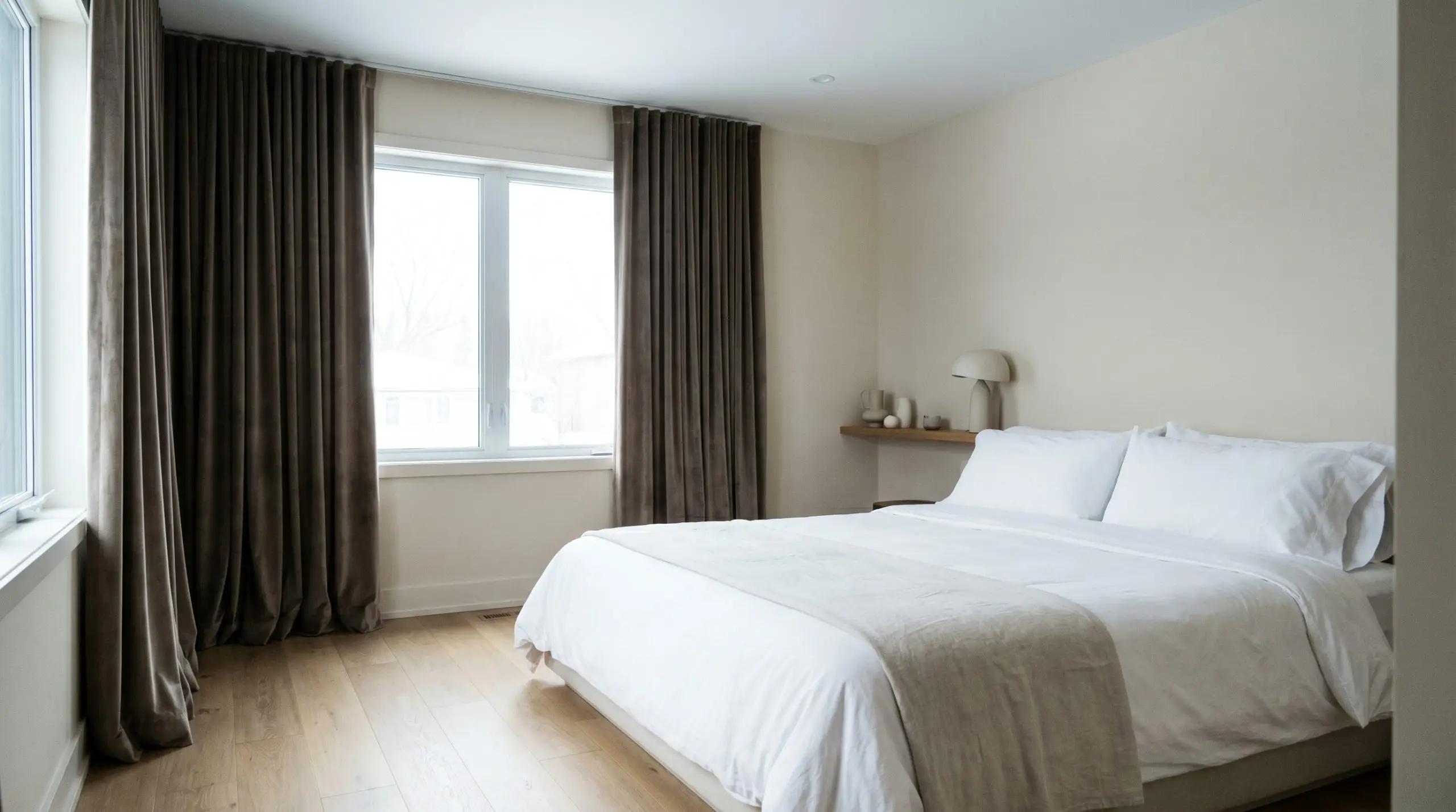
In north-facing light, this color temperature stabilizes into a soothing, restful envelope perfect for sleeping quarters. Pair it with heavy velvet drapery and crisp white percale sheets to create a deeply restorative retreat. The soft pigment ensures the walls feel like a warm embrace rather than a chilly hospital ward during the early morning hours.
Exteriors
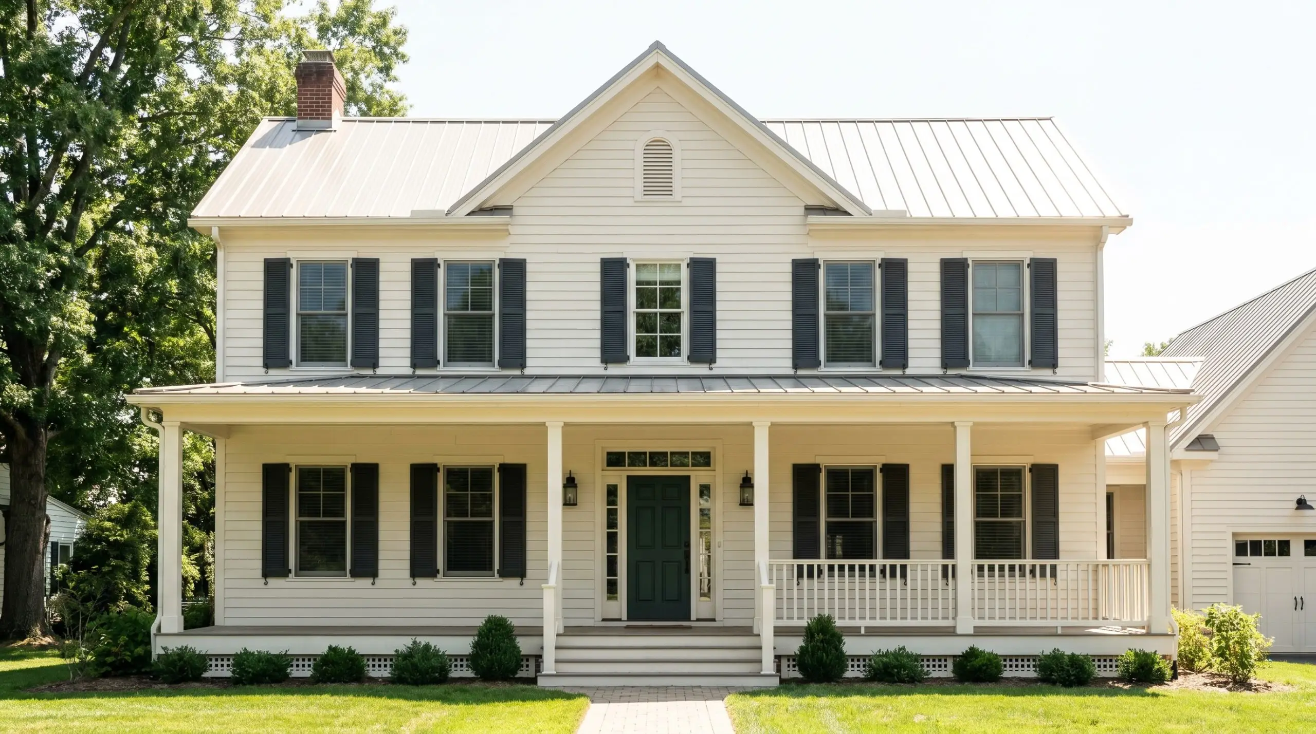
When used as exterior siding or trim, the intense outdoor sun washes out a bit of the pigment, leaving a beautifully soft, historic-feeling facade. It pairs exceptionally well with dark charcoal shutters or deep forest green front doors.
Will Creamy work with your specific lighting, floor, or furniture?
Creative Ways to Use Sherwin-Williams Creamy
Beyond standard four-wall applications, this shade excels when used as a strategic architectural tool to elevate highly curated moments in your home.
The Color-Drenched Library
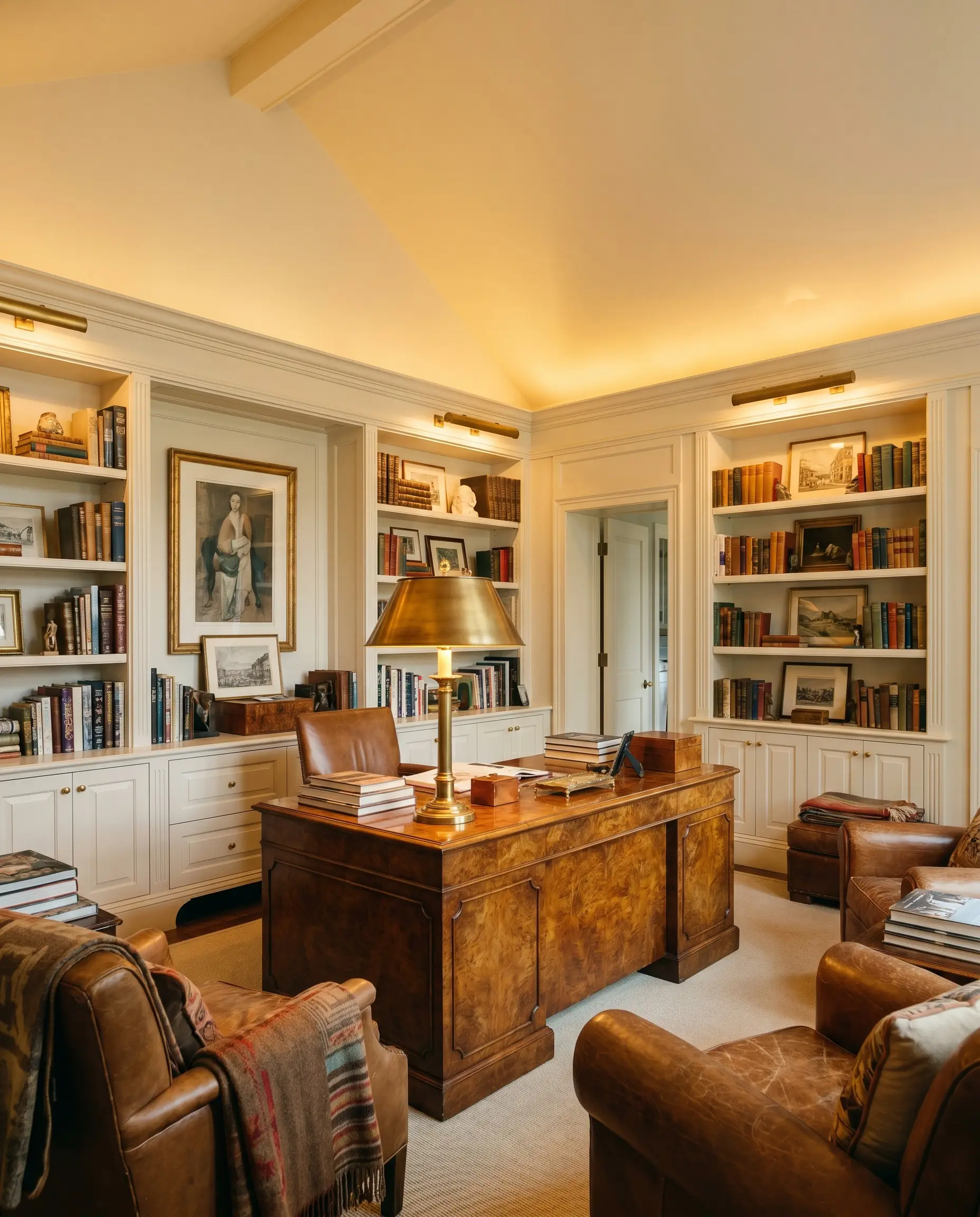
Applying this shade across the walls, ceiling, and built-in bookcases creates a seamless, enveloping study. The muted yellow undertones make the room feel like it glows from within, especially when paired with a highly polished burled wood desk and a statement brass reading lamp.
The Parisian-Inspired Foyer
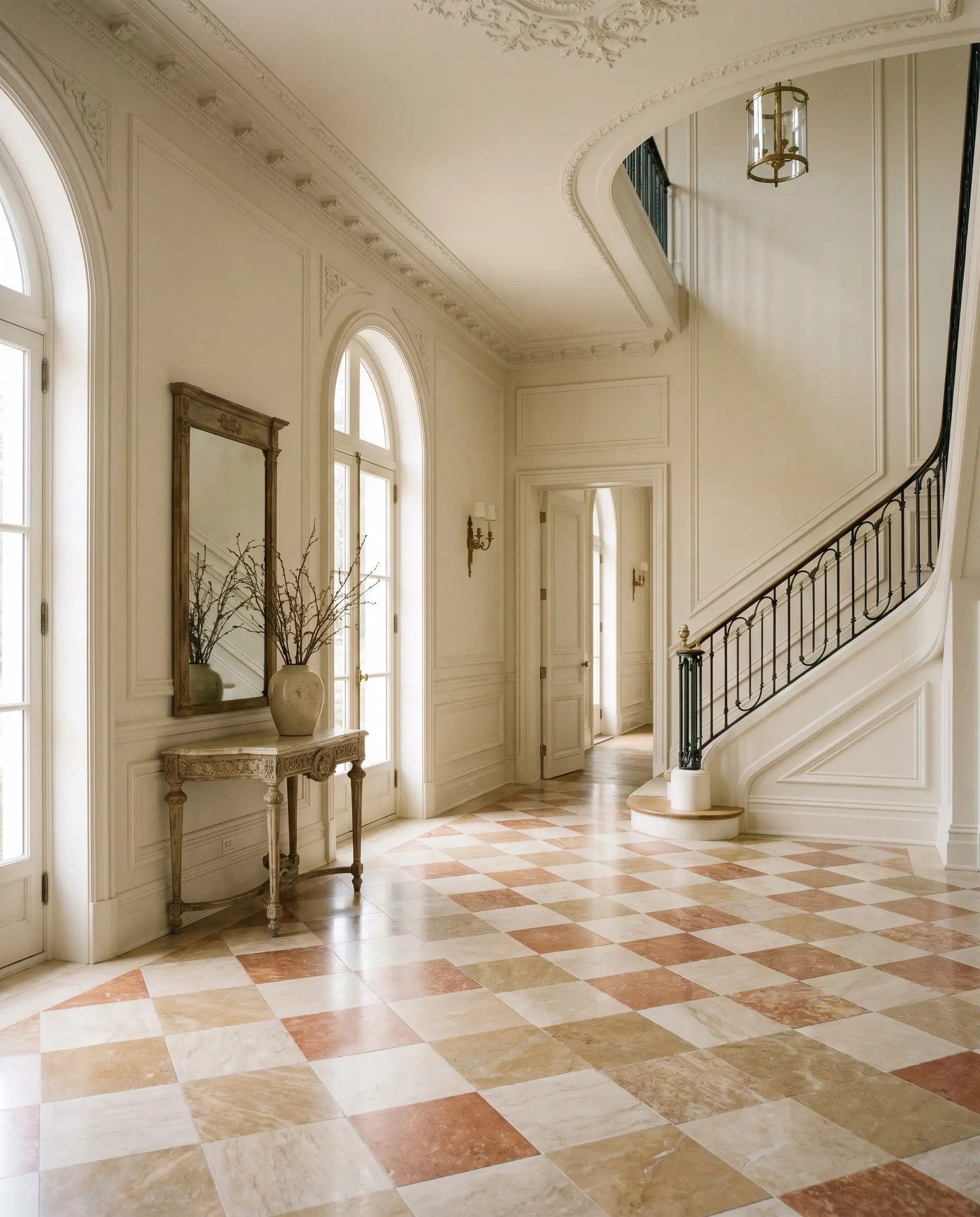
Use this warm off-white to highlight intricate picture molding and tall baseboards in an entryway. The subtle contrast between the creamy walls and a checkerboard marble floor establishes an immediate sense of sophisticated, old-world elegance.
The Upcycled Fluted Console
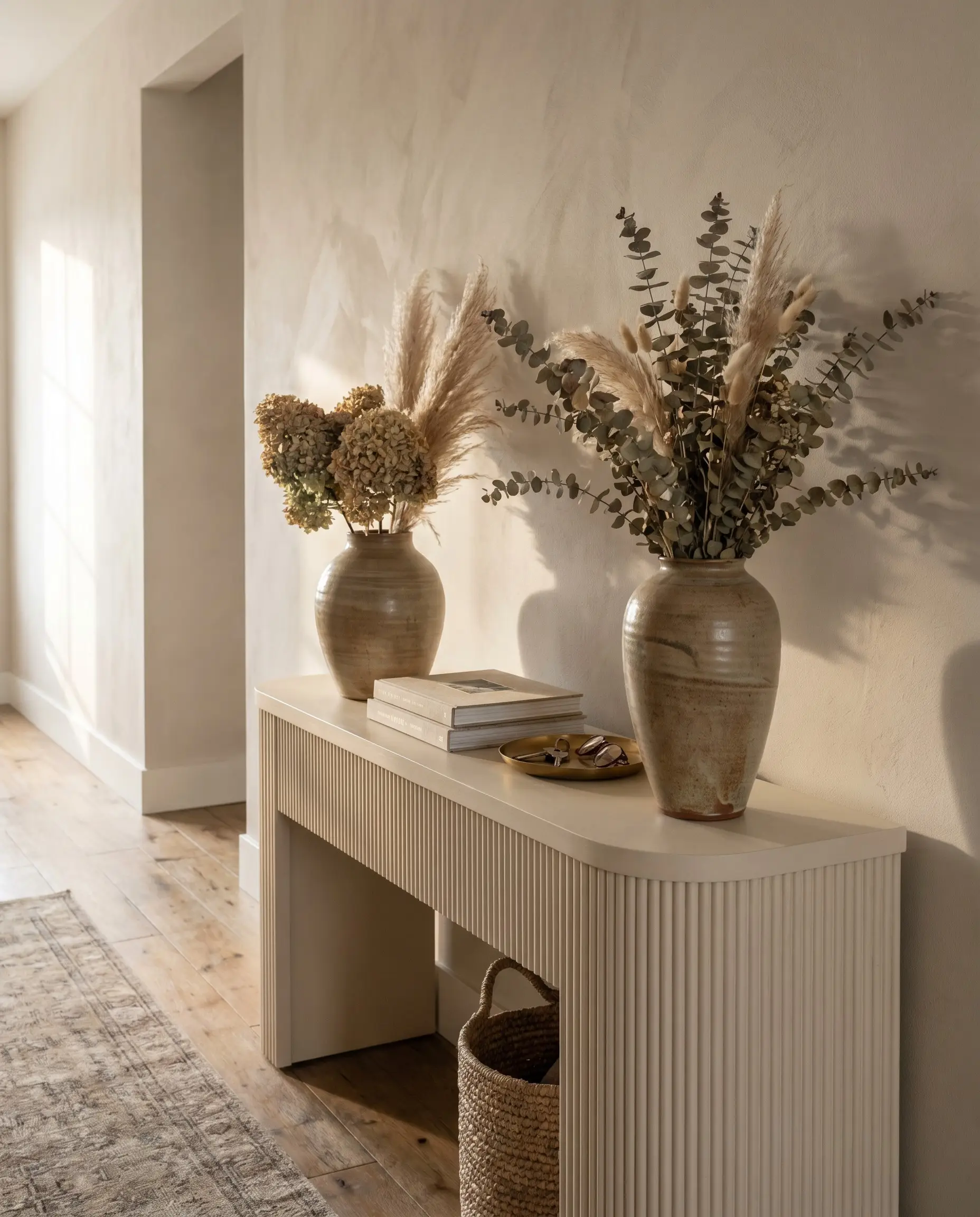
Revitalizing a tired, thrifted entryway table with a fresh coat of this color instantly modernizes its silhouette. The soft warmth elevates the piece, allowing it to anchor a hallway seamlessly without demanding too much visual attention from your primary decor.
Curating a Cohesive Neutral Palette
This shade thrives on intentional contrast, requiring either crisp, bright boundaries to feel fresh or deeply saturated companions to feel grounded.
Trim & Architectural Boundaries
Benjamin Moore Chantilly Lace OC-65 and Farrow & Ball All White No. 2005 are exceptional choices for borders. The stark, clean nature of these trim colors physically pushes the warmth of the wall color forward, creating a beautifully tailored, intentional boundary.
Hardware, Wood & Material Pairings
Coordinating Colors
Designer Mood Boards
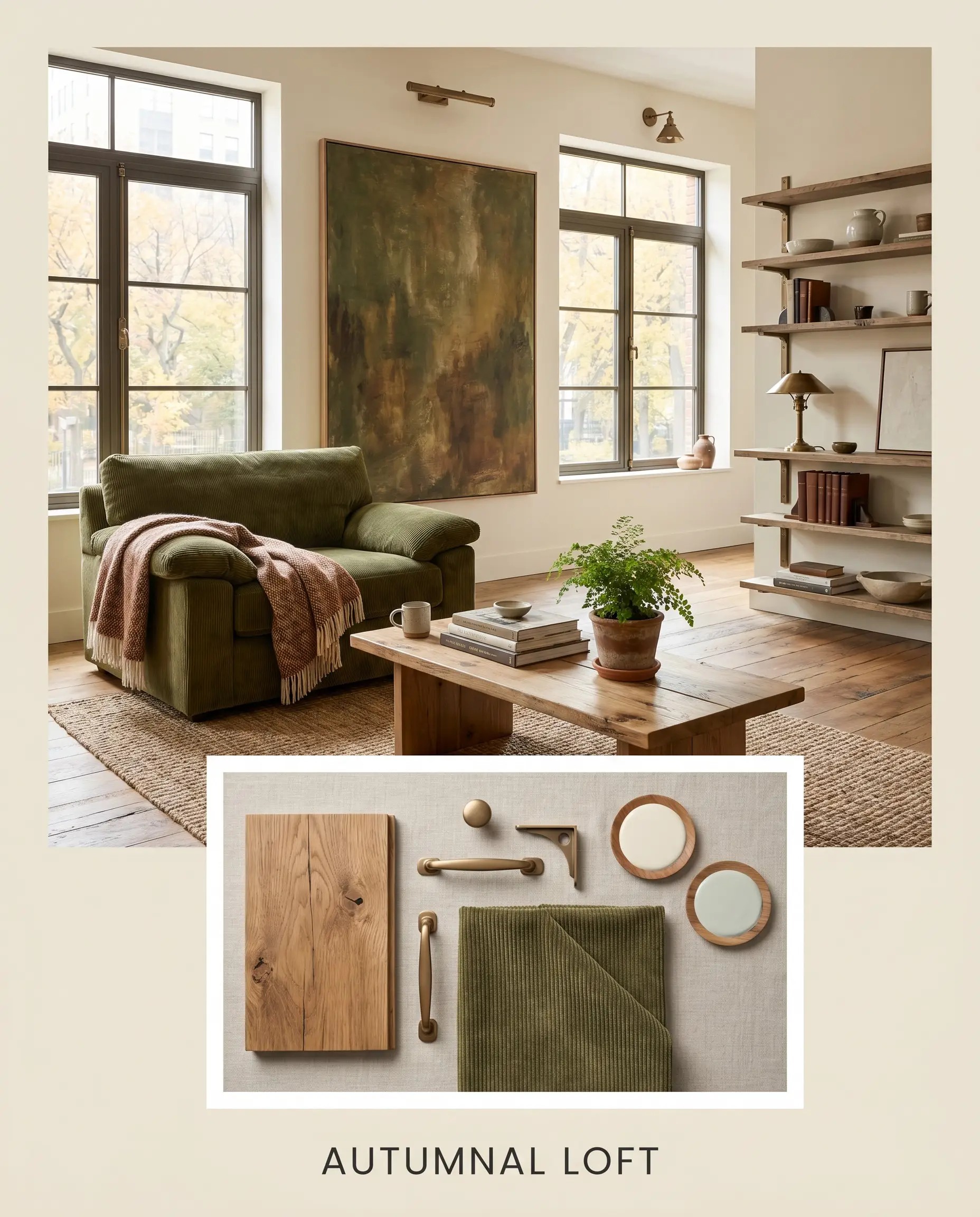
Autumnal Loft: This palette blends matte bronze hardware, reclaimed wide-plank elm, and accents of SW Sea Salt to create a grounded, relaxed atmosphere. Styling the room with an olive green corduroy armchair and an oversized textured canvas adds a slightly rugged but deeply inviting energy. The warmth of the paint softens the industrial edges perfectly.
Will Creamy work with your specific lighting, floor, or furniture?
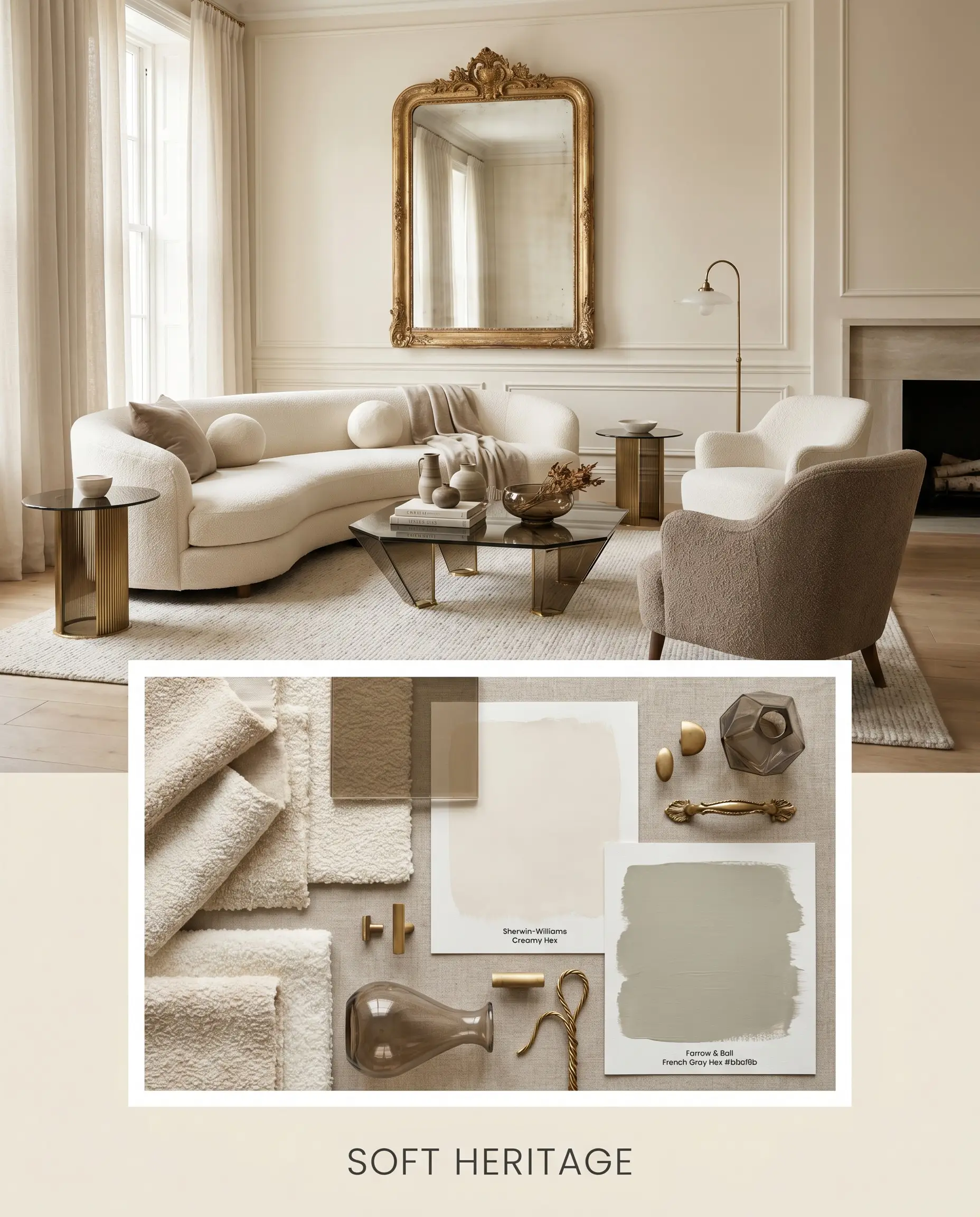
Soft Heritage: Leaning into refined elegance, this board pairs bouclé upholstery, smoked glass, and F&B French Gray. By incorporating an antique gilt mirror and a curved ivory sofa, the design feels exceptionally quiet and layered. The off-white walls provide a luminous backdrop that allows the historic silhouettes to breathe.
Will Creamy work with your specific lighting, floor, or furniture?
Comparing Sherwin-Williams Creamy
Choosing the right off-white often comes down to the specific lighting conditions of your home and how much warmth your space can handle. If your room pulls too much yellow, a pivot to a rival shade might be necessary.
Sherwin-Williams Creamy vs. Sherwin-Williams Alabaster SW 7008
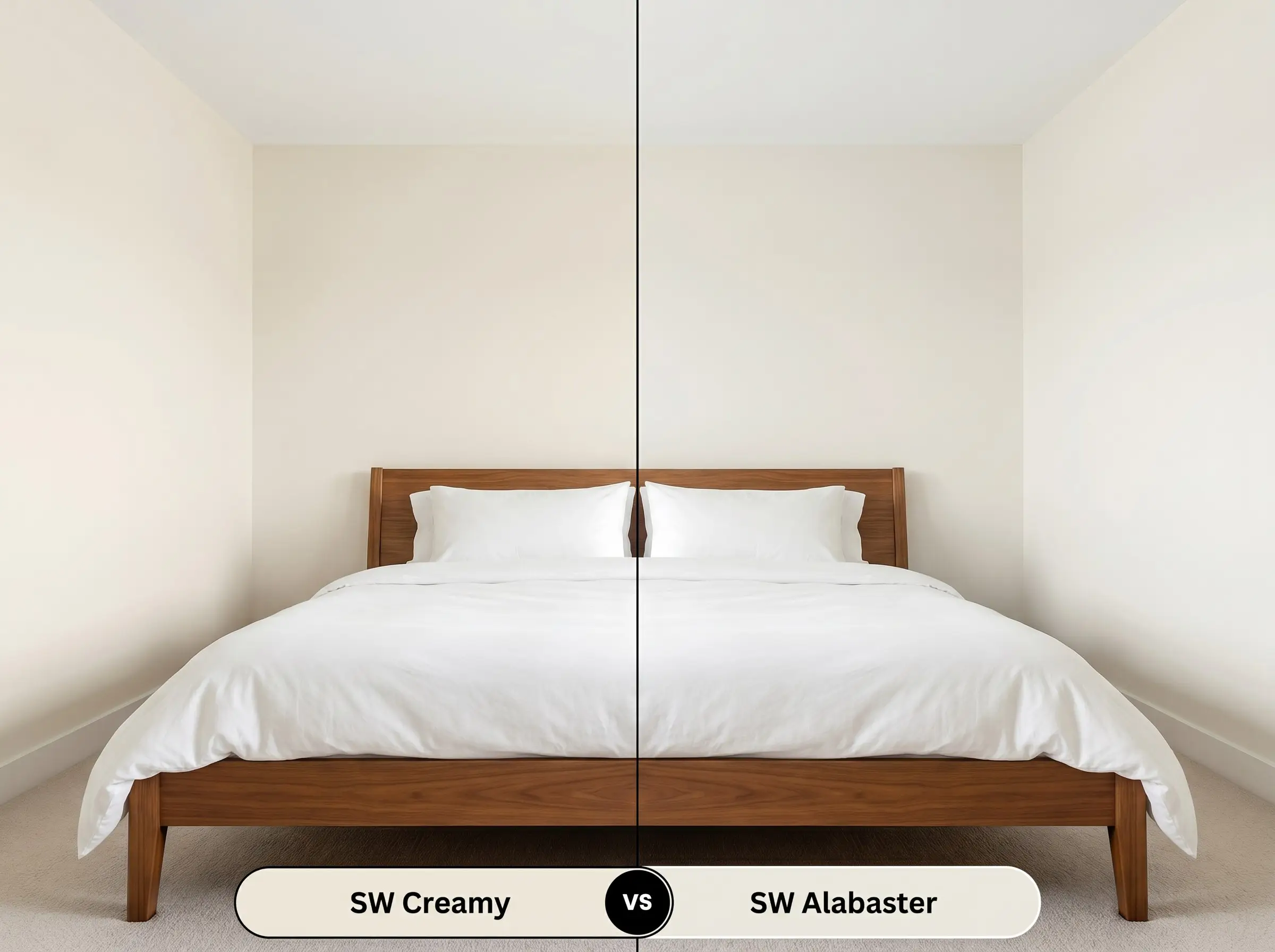
If your room receives heavy western sunlight, Alabaster is often the safer choice. Alabaster has a slightly lower LRV and a more muted, neutral base, whereas the yellow in SW 7012 will amplify significantly in the afternoon glow.
Sherwin-Williams Creamy vs. Sherwin-Williams Dover White SW 6385
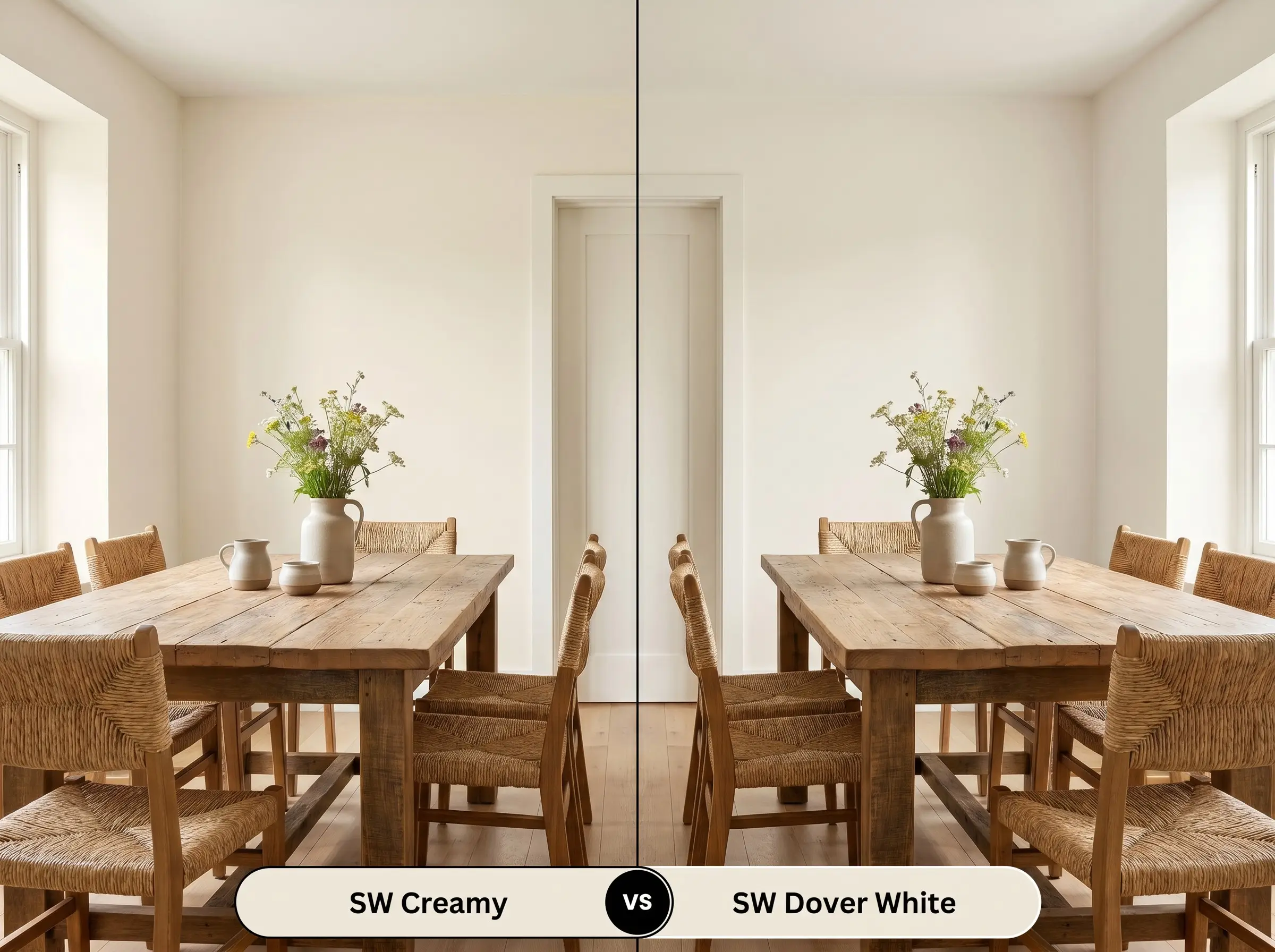
Dover White leans even further into the yellow spectrum. If you want a subtle, sophisticated warmth, stick with SW 7012; if you are intentionally designing a highly saturated, sun-drenched cottage aesthetic, Dover White pushes that boundary further.
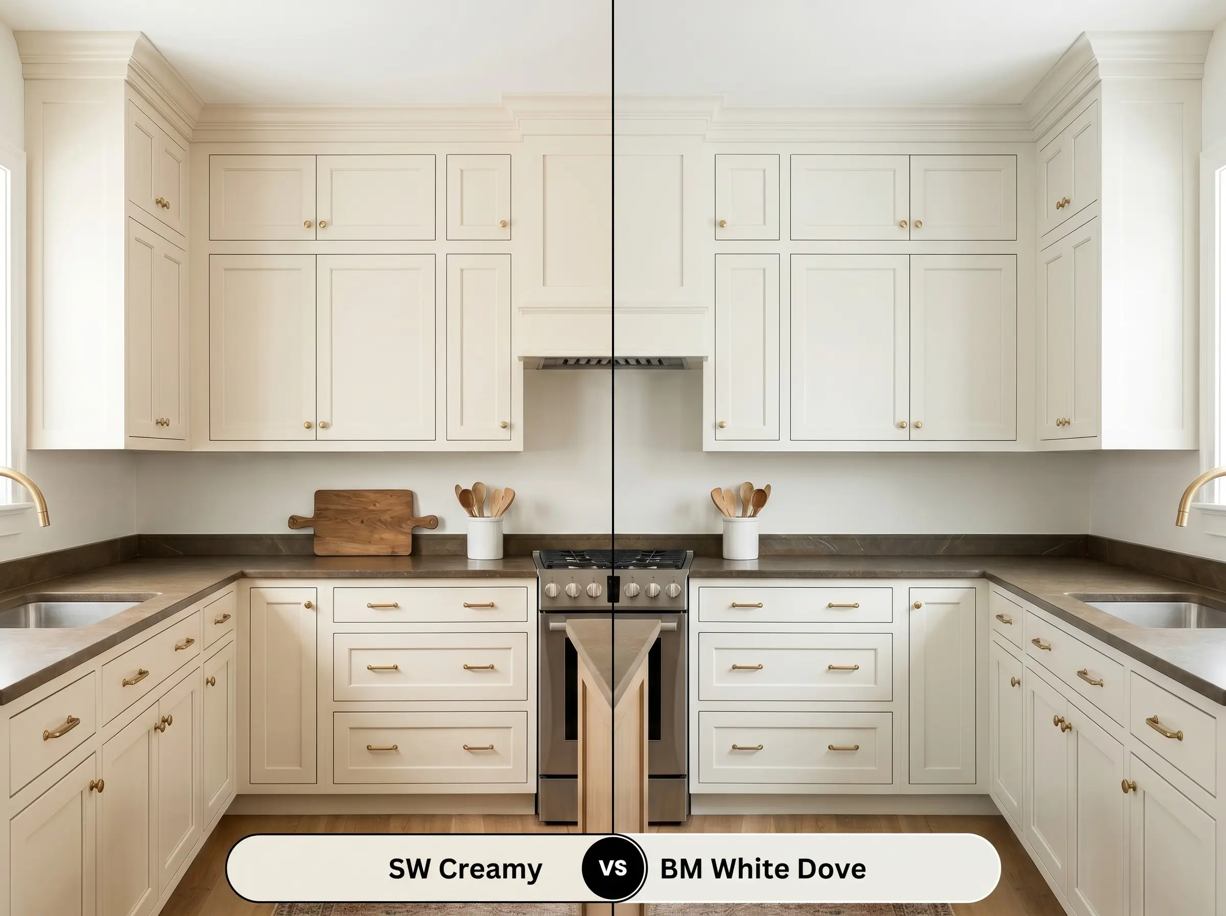
Sherwin-Williams Creamy vs. Benjamin Moore White Dove OC-17
Will Creamy work with your specific lighting, floor, or furniture?
White Dove is significantly more neutral, featuring a slight gray-green undertone that cools it down. If you are pairing your walls with stark, cool-toned stone countertops, White Dove will harmonize better than the buttery nature of SW 7012.
Alternatives to this Soft Neutral Base
Sometimes a space demands a nearly identical vibe but requires a subtle shift in brightness or a different brand for local sourcing.
Similar Colors
Cross-Brand Matches
Executing Your Paint Project Flawlessly
Translating a beautiful color from a swatch to a finished room requires strategic planning regarding finishes and preparation.
The Dynamic Sheen Guide
Primer Strategy
A high-quality, bright white stain-blocking primer is essential, especially when painting over raw wood or darker existing colors. This ensures the delicate yellow undertones aren’t muddied by the surface below.
Coverage & Success Tips
Expect to roll at least two full coats to achieve solid, opaque coverage.
Off-whites with high light reflectance will immediately highlight uneven roller pressure. Maintain a wet edge and avoid over-working the paint once it begins to tack up to prevent visible flashing in bright, naturally lit rooms.
Hackrea Pro-Tip (The Roller Rule)
Frequently Asked Questions
Because natural exterior light washes out color, the yellow undertones actually soften significantly outside. It typically reads as a beautifully warm, historic off-white on brick rather than a stark yellow.
Without natural light to balance it, low-quality artificial bulbs can make the subtle beige and yellow notes look slightly muddy. Upgrading your fixtures to high-quality 3000K LED bulbs will ensure the paint retains its luminous, clean warmth.
By using a flat finish, this shade works wonderfully on ceilings to create a cohesive, enveloping wrap. The high LRV ensures the ceiling still bounces plenty of light, maintaining the room’s visual height.
The buttery warmth of this paint physically reacts against the icy blue-gray veining of cool marble, often making the cabinets look aged rather than intentionally warm. It is much better suited for warm woods, soapstone, or heavily veined warm-toned quartzes.
The Final Verdict on Sherwin-Williams Creamy
Sherwin-Williams Creamy is the ultimate foundation for homeowners seeking a deeply inviting, lived-in atmosphere. It excels in softening expansive, open-concept layouts and beautifully bridges the gap between classic elegance and relaxed, modern living. By providing a luminous backdrop that bounces light without feeling sterile, it allows your curated furnishings and architectural details to take center stage.
However, this specific warmth requires careful curation when it comes to your hard finishes. You must exercise caution when pairing this shade with heavily blue-toned or stark, icy gray elements, such as cool Carrara marble countertops or slate flooring. The buttery yellow undertones will physically react against those chilly surfaces, making the paint look slightly dingy or aged rather than intentionally warm. To ensure the space feels cohesive, always anchor this color with complementary warm woods, earthy stones, or deeply saturated, grounding accents.
Room Compatibility & Clashes Diagnoses
Hackrea's reports evaluating the compatibility of Creamy in real rooms.South-Facing Loft Bedroom
"The paint's warm cream profile complements the planned neutral flooring and woodwork, though direct southern sunlight will noticeably intensify its golden undertones."
West-Facing Kitchen
"Prominent yellow undertones in the paint compound the warm amber cast of the golden oak cabinetry rather than neutralizing it. Furthermore, late-afternoon western sunlight will intensify this yellow cast, creating severe chromatic friction against the cool under-cabinet task lighting."
Closest Cross-Brand Equivalents
The absolute closest scientific color matches for Creamy across top paint brands.