Roycroft Copper Red SW 2839
Sherwin-WilliamsSherwin-Williams Roycroft Copper Red (SW 2839) is a deeply saturated, warm red-brown paint color with distinct coppery undertones. Belonging to the historic Arts and Crafts palette, its low LRV of 7.03 makes it a dramatic, grounding hue for both interiors and exteriors.
Paint Technical Profile
| Color ID / SKU | SW 2839 |
| HEX Code | #7B3728 |
| Light Reflectance (LRV) | 7.03 |
| Use | Interior, Exterior |
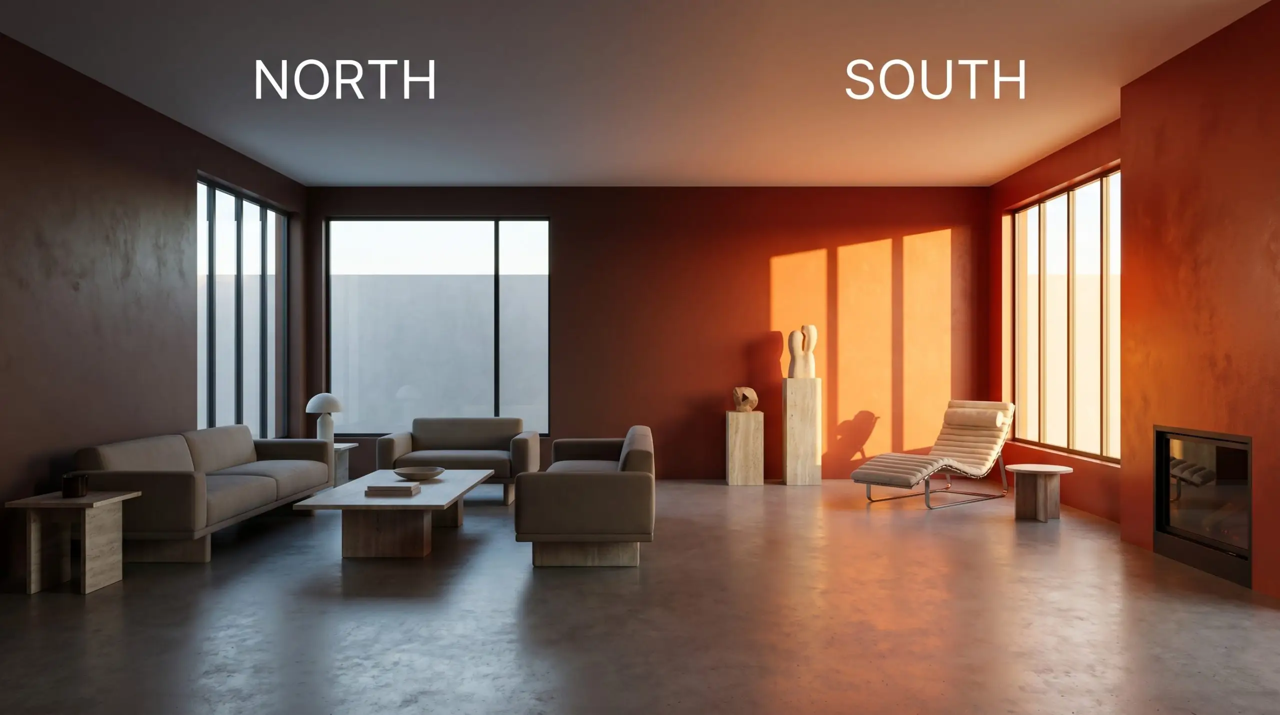
| Best Exposures | South-Facing, West-Facing |
| Best For | Dining rooms, libraries, exterior accents, cabinetry |
Sherwin-Williams Roycroft Copper Red: Anchoring Rooms with Earthy, Tactile Warmth
Sherwin-Williams Roycroft Copper Red (SW 2839) possesses a profound ability to manipulate how we perceive the boundaries of a room. By absorbing light so heavily, this deeply saturated terracotta shade actually blurs the corners of a standard living space, making low ceilings feel intentionally intimate rather than cramped.
It serves as an incredibly versatile foundation, allowing you to pair an aspirational marble coffee table with standard linen seating, instantly elevating the entire arrangement. This rich hue forces everything layered against it to look more deliberate, grounded, and expensive.
Undertones & LRV
When evaluating if SW 2839 is warm or cool, the answer is an undeniable, radiating warmth. This shade bypasses the energy of a primary red, settling into a grounded, deeply baked clay tone. Let’s look at the underlying structure that dictates its behavior.
With a light reflectance value of 7.03, this pigment acts as a heavy light-absorber. This low number means it carries immense architectural weight, drawing walls inward and requiring thoughtful lighting strategies to prevent the room from feeling uninviting.
Lighting Effects & The Chameleon Factor
Because of its dense pigmentation, Roycroft Copper Red shifts dramatically depending on the sun’s trajectory. If placed in a heavily shaded room without adequate supplemental lighting, the rich terracotta energy will collapse into a heavy, indistinct brown. You must test this color on multiple walls to track its response to your specific environment.
Popular Room Applications
This dense shade demands a purpose, bringing a highly cohesive, grounding energy to any environment it touches. Whether you are aiming for a classic revival look or a sleek modern contrast, its underlying warmth anchors the space beautifully.
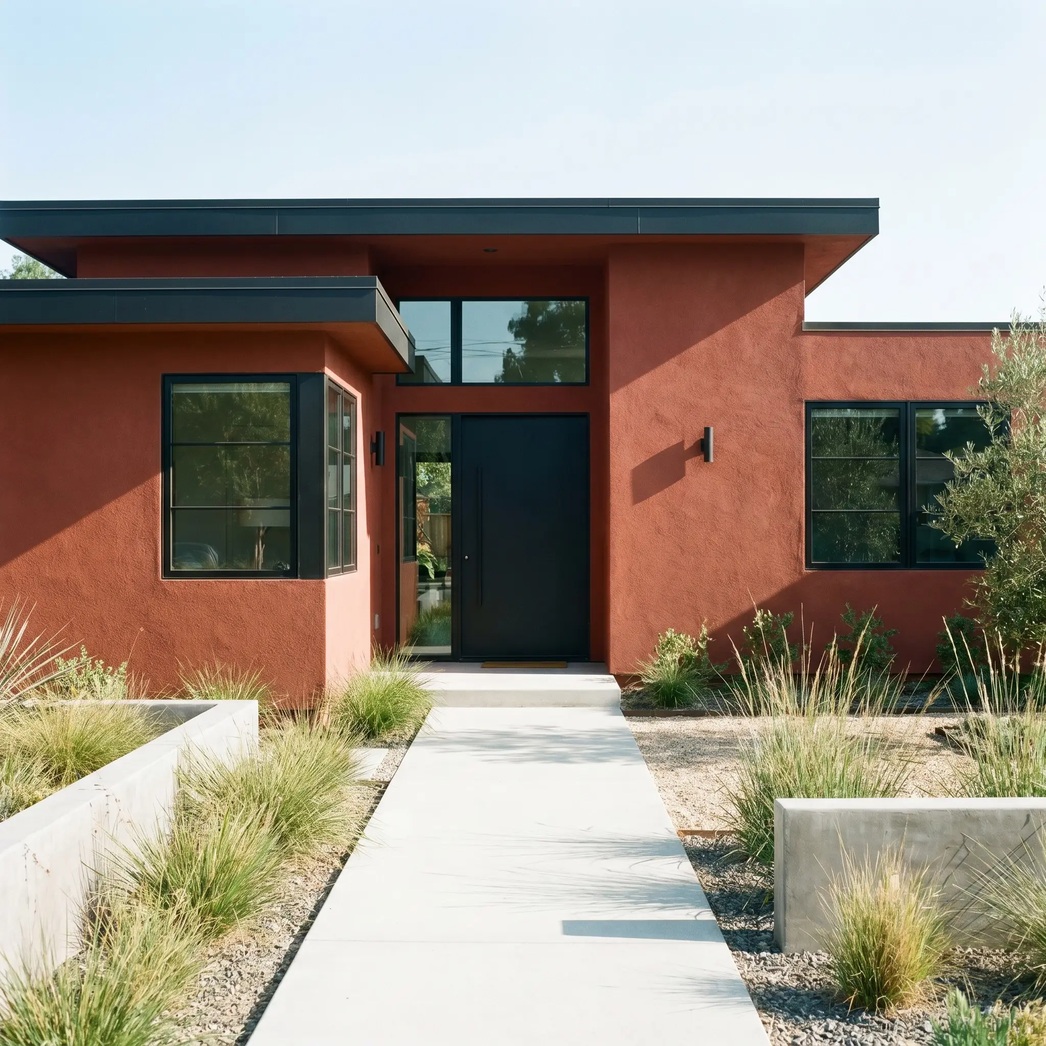
Exteriors
While traditionally celebrated within the historic color palette, this hue adapts brilliantly to contemporary facades. It grounds modern stucco beautifully, but also feels naturally at home on classic weatherboard siding. For a highly modern, graphic approach, a matte black trim pairing completely modernizes the earthy facade.
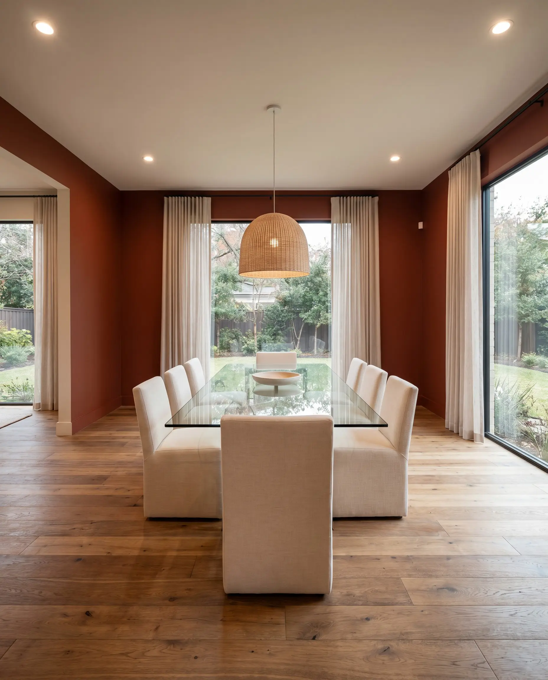
Dining Rooms
This shade creates an immediate ambient temperature shift, transforming a standard dining area into a deeply inviting gathering space. It provides a stunning backdrop for a sleek, minimalist glass table, yet also grounds heavily carved, dark walnut antique dining sets.
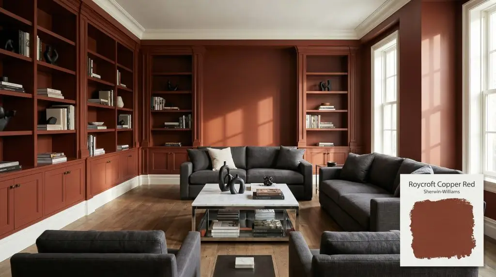
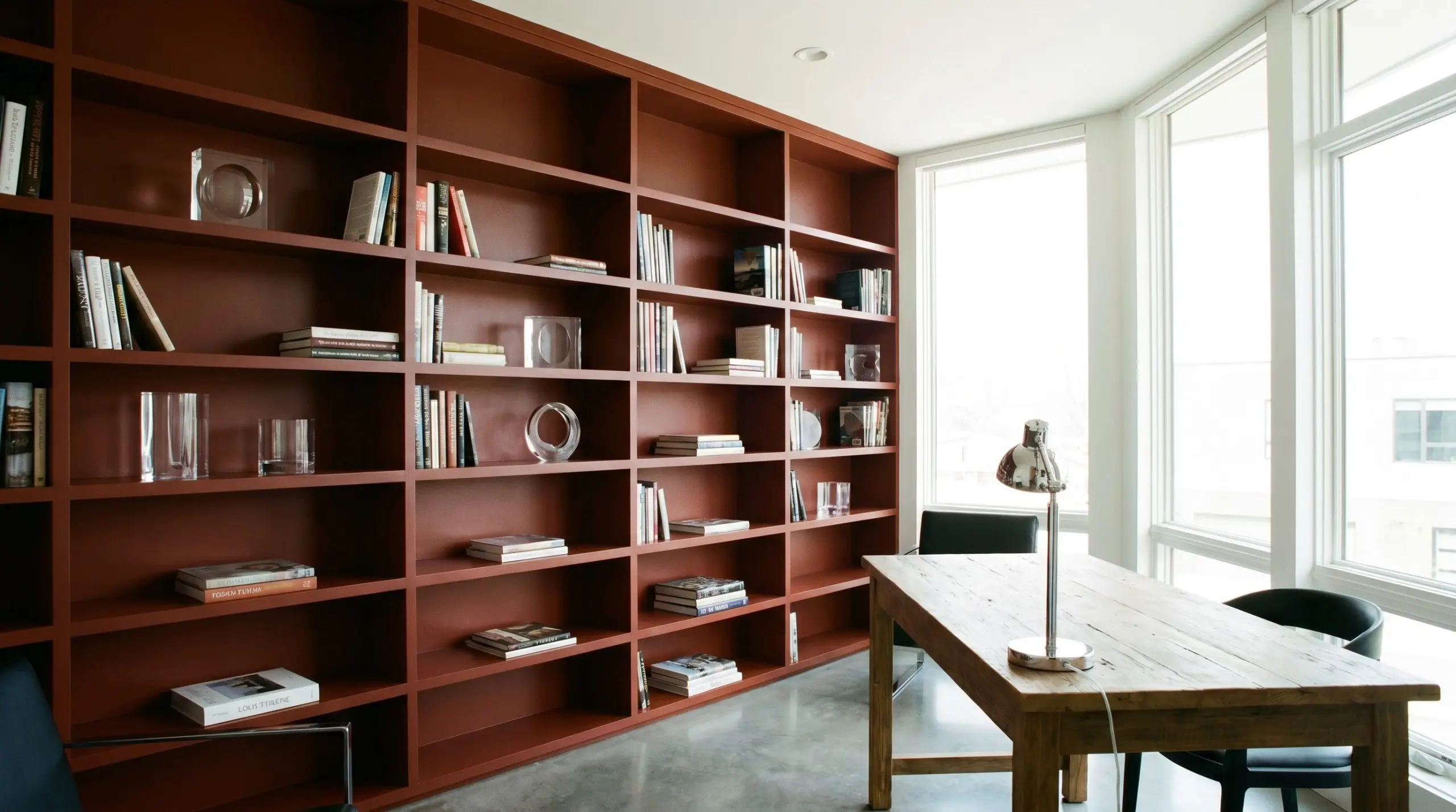
Built-Ins & Libraries
Wrapping your shelving in this coppery tone immediately elevates standard millwork into a premium focal point. Whether you are honoring the traditional craftsmanship of the Arts and Crafts movement or styling a sleek contemporary study, the rich pigment highlights the spines of books beautifully. It provides a brilliant contrast against both modern acrylic decor and traditional brass reading lamps.
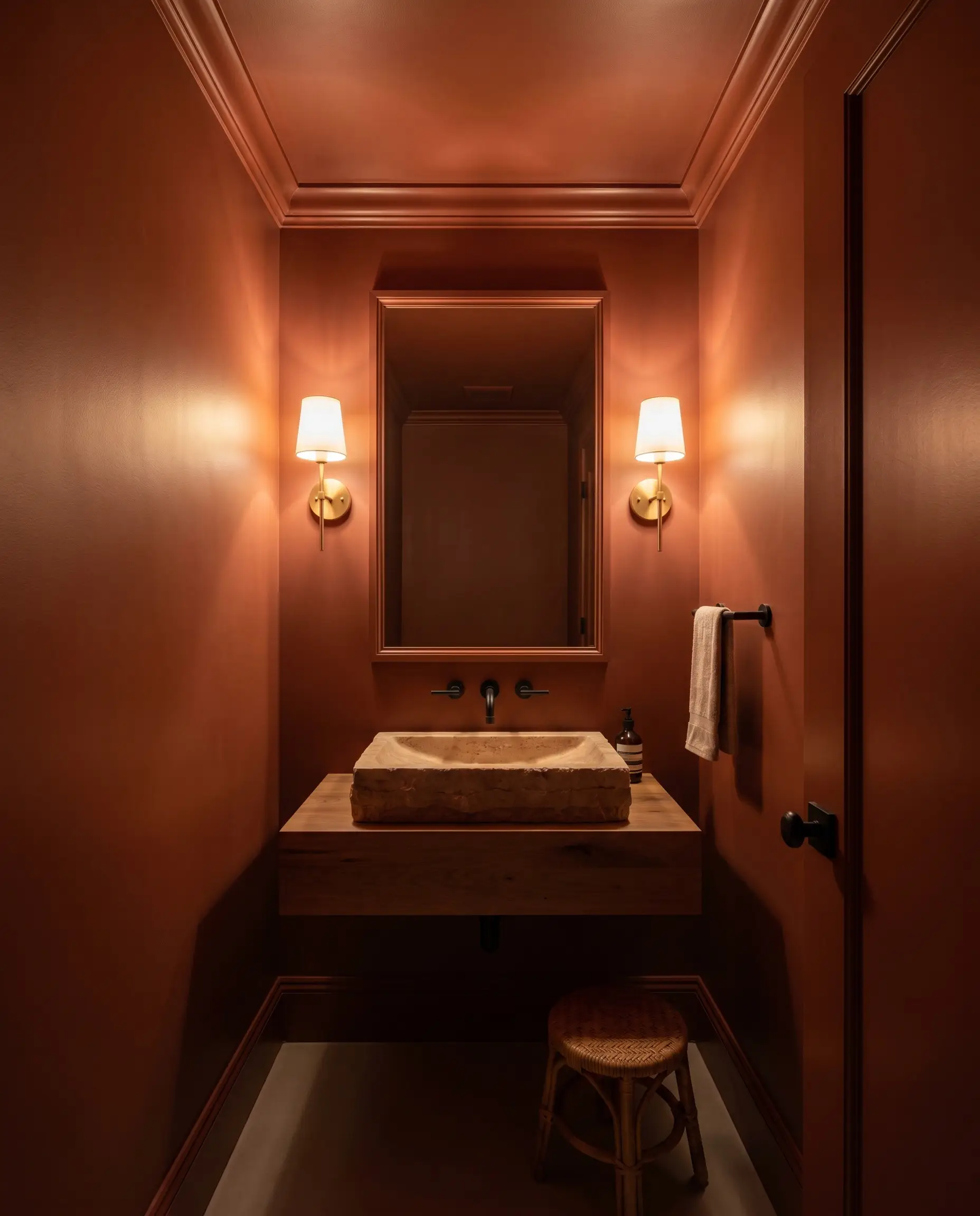
Powder Rooms
Color-drenching a small, windowless bathroom in this shade creates a jewel-box effect. By painting the walls, ceiling, and trim in the exact same finish, you blur the boundaries of the room, turning a builder-grade half-bath into an immersive, high-end experience.
When executing a monochromatic wrap in a small space with a low-LRV paint like SW 2839, install wall sconces with frosted glass shades. The diffused light washes across the dark walls, highlighting the rich undertones rather than creating harsh, uninviting shadows.
Hackrea Pro-Tip (Lighting Strategy)
Creative Ways to Use Sherwin-Williams Roycroft Copper Red
Beyond standard walls, this heavy terracotta hue is a brilliant tool for highly specific, curated transformations.
The Modern Rustic Mudroom
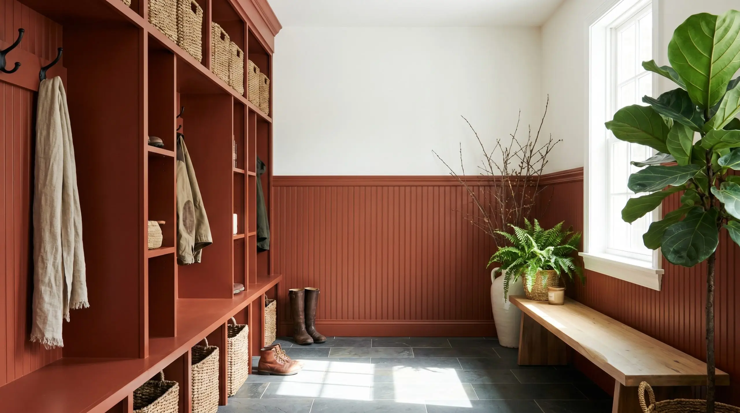
Use this shade on custom cubbies and beadboard to create a highly durable, welcoming entry point. The earthy tone hides everyday scuffs while acting as a biophilic design anchor, seamlessly connecting the interior of the home to the outdoors. It pairs effortlessly with standard slate floor tiles and heavy woven storage baskets.
A Moody Home Bar
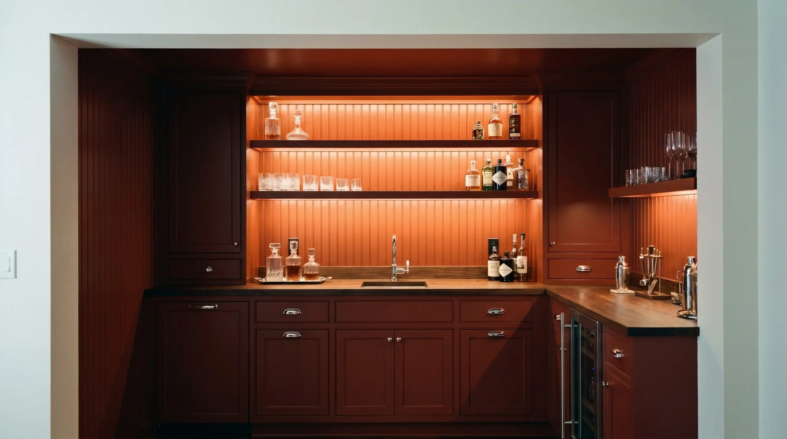
Transform a neglected alcove or basement corner into a sophisticated lounge by wrapping the cabinetry and backsplash in this deep red. When illuminated by warm LED strip lighting, the hidden tones glow, creating an atmosphere reminiscent of an exclusive, hidden tavern.
The Upcycled Apothecary Cabinet
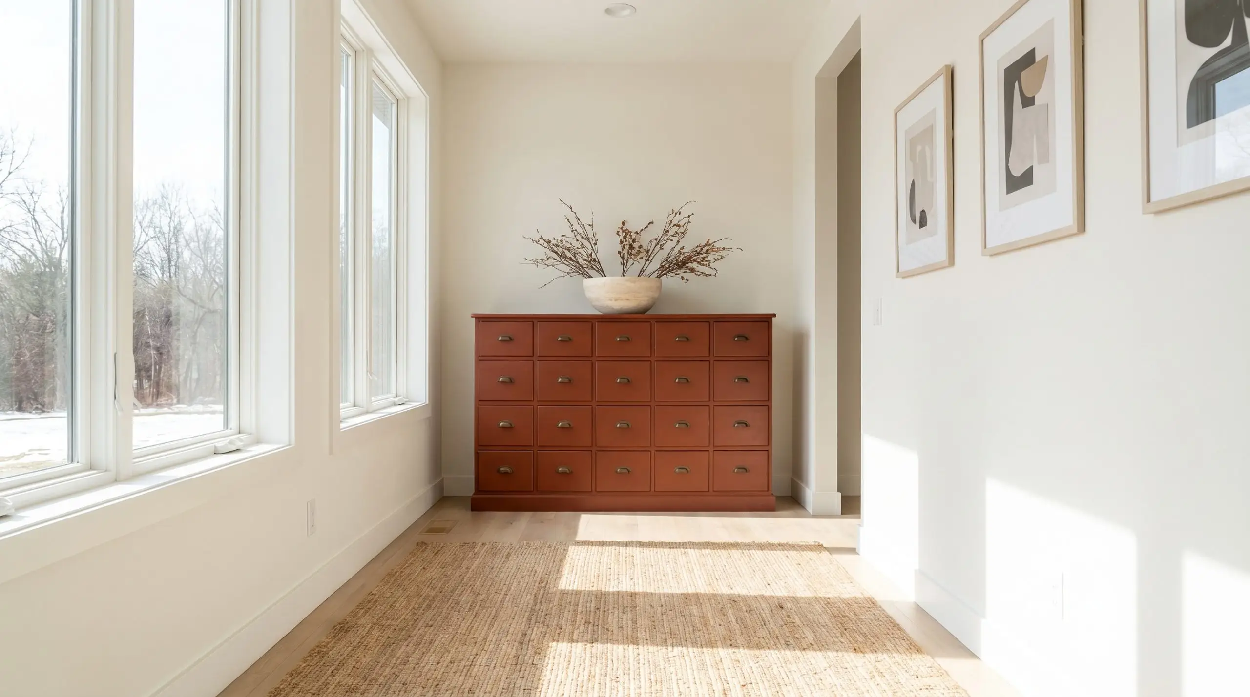
Revitalize a thrifted, multi-drawer chest with a fresh coat of this rich pigment. The dense color modernizes the vintage silhouette, making it a striking statement piece in a minimalist hallway or an eclectic home office.
Coordinating Colors & Best Pairings
To make this heavy shade feel intentional, you must surround it with materials and colors that either sharply define its boundaries or softly enhance its earthy nature.
Trim & Baseboards
A crisp, highly reflective boundary is often necessary to keep this shade from feeling heavy. Sherwin-Williams Alabaster (SW 7008) offers a soft, creamy edge that complements the warmth without creating a jarring, sterile contrast. For a slightly cleaner, more luminous border, Benjamin Moore White Dove (OC-17) provides a beautifully tailored frame that lifts the entire room.
Hardware, Wood & Material Pairings
Coordinating Colors
Designer Mood Boards
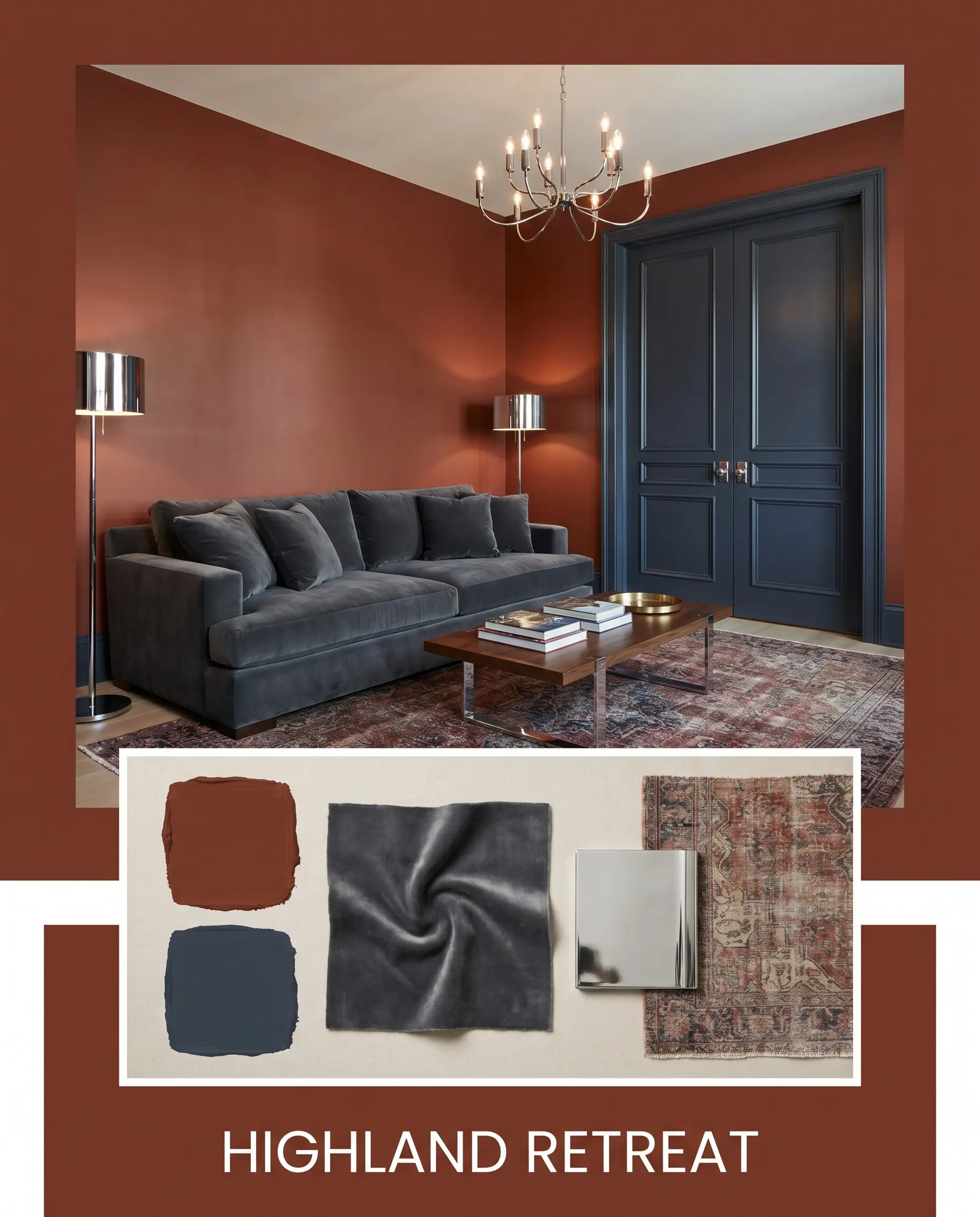
Highland Retreat: This palette merges the heavy warmth of Roycroft Copper Red with the cool, tailored structure of Benjamin Moore Hale Navy. Imagine a room anchored by a plush, charcoal-gray velvet sofa, accented with polished chrome lighting, and grounded by a vintage, faded Persian rug. The tension between the icy metals and the baked terracotta walls feels incredibly deliberate.
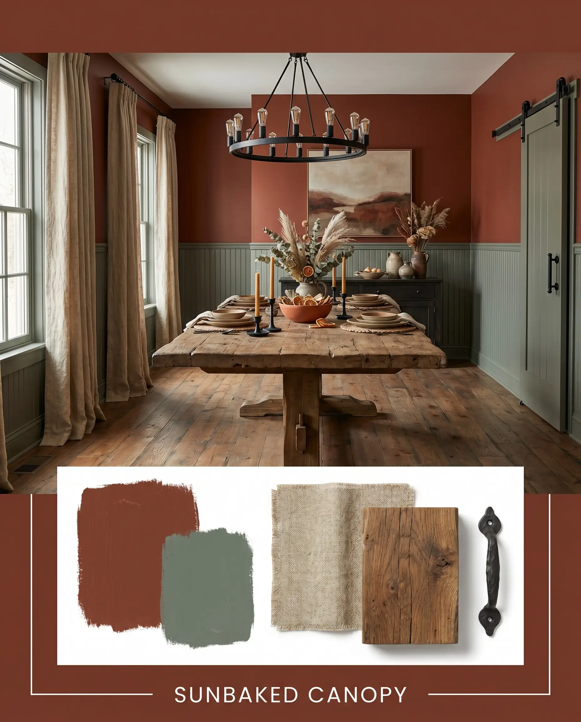
Sunbaked Canopy: Leaning into a highly tactile, earthy aesthetic, this board pairs the main hue with Farrow & Ball Green Smoke. Picture heavily textured, natural linen drapery, a reclaimed elm dining table, and matte black iron hardware. The combination of the rich walls and the muted green creates a deeply restorative, grounded environment.
Head-to-Head Comparisons
Choosing the right deep red often comes down to how the paint behaves under specific lighting conditions. If your room lacks natural light or you want a slightly different emotional resonance, you might need to pivot to a rival shade.
Sherwin-Williams Roycroft Copper Red vs. Sherwin-Williams Fired Brick (SW 6335)
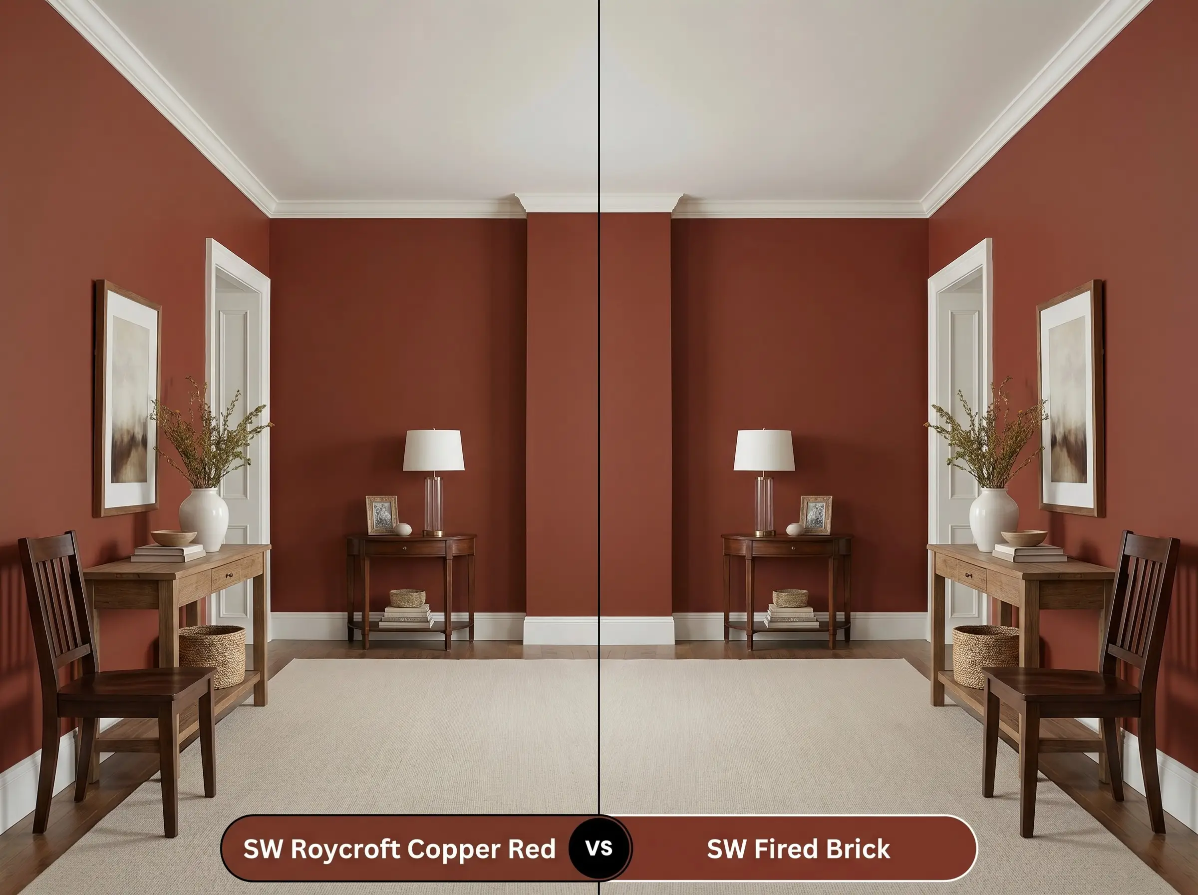
If you need a red that feels slightly more traditional and less brown, Fired Brick is the better candidate. While Roycroft Copper Red leans heavily into its earthy, oxidized roots, Fired Brick maintains a purer, slightly crisper brick-red presence. Fired Brick will hold its color better in low-light situations where SW 2839 might read as too muddy.
Sherwin-Williams Roycroft Copper Red vs. Benjamin Moore Moroccan Red (1309)
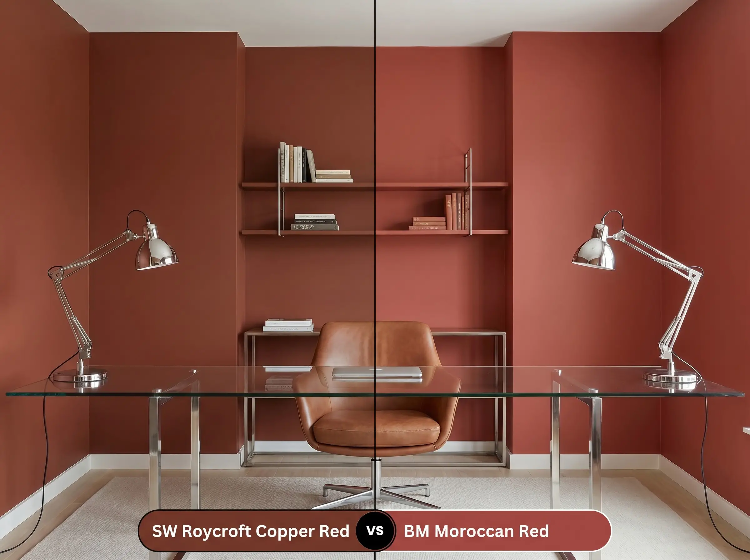
Moroccan Red introduces a significantly higher dose of vibrancy and a slightly cleaner undertone compared to the heavy, slate-like shadows of SW 2839. If your goal is to create a truly vibrant, energetic space, Moroccan Red will deliver that punch. However, if you want the wall to recede and act as a moody, architectural backdrop, the Sherwin-Williams option is far more effective.
Similar Colors & Brand Equivalents
Whether you need a subtle shift in undertone or require a match from a different manufacturer due to local availability, these alternatives offer a similar grounding energy.
Similar Colors
Cross-Brand Matches
Practical Application & DIY Advice
Executing a flawless finish with a deeply pigmented paint requires strict attention to your materials and technique.
The Dynamic Sheen Guide
Primer Strategy
You must use a high-quality, deeply tinted gray primer under this color. Applying this heavy red over a standard white primer will result in a streaky, uneven finish that requires four or more coats to reach true opacity.
Coverage & Success Tips
Even with a tinted primer, expect to apply at least two generous coats to achieve the full depth of the pigment.
Dark, heavily pigmented reds are notorious for “flashing”—leaving visible roller marks or shiny bands where the paint overlaps. To avoid this, maintain a wet edge at all times, roll from ceiling to floor in one smooth motion, and never touch up a semi-dry wall.
Clash Warning (Application Technique)
Frequently Asked Questions
Because of its heavy brown and orange base, it resists the common pitfall of turning pink. Instead, direct sunlight will amplify its coppery, baked-clay warmth.
The warm 2700K bulbs will heavily exaggerate the red and orange undertones, creating a very rich, slightly rusty glow. If you want a more balanced, neutral terracotta feel, swap your bulbs to 3000K.
Yes, its low LRV makes it an excellent choice for visually dropping a soaring ceiling. By absorbing the light overhead, it creates a much more intimate, grounded atmosphere in a highly voluminous space.
Final Verdict & Expert Warnings
Sherwin-Williams Roycroft Copper Red is an incredibly effective architectural tool for homeowners looking to inject grounded, earthy warmth into their spaces. It excels when used to anchor expansive rooms or to create deeply immersive, moody environments in smaller, controlled spaces. Its ability to shift between a classic, historic aesthetic and a sleek, high-contrast modern vibe makes it a truly versatile foundation.
However, this dense pigment demands careful pairing to avoid visual exhaustion. You must be extremely cautious when introducing heavily yellowed oak floors or aggressively warm, orange-toned cherry cabinetry, as these woods will compete with the paint’s base, resulting in a muddy, overwhelming warmth. Furthermore, avoid pairing it with bright, stark white textiles or icy, desaturated slate-blue upholstery that lacks depth; the extreme contrast will make the red feel harsh and unrefined rather than intentionally curated. Instead, rely on muted, complex secondary colors and textured, natural materials to let this beautiful terracotta shade breathe.