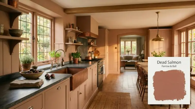
Dead Salmon No.28
Farrow & BallFarrow & Ball Dead Salmon (No. 28) is a complex, warm mushroom-pink neutral with earthy brown and subtle grey undertones. With an LRV of 36.3, it acts as a moody, color-shifting chameleon, transitioning from a muted buff beige in bright light to a rich, aged salmon in darker spaces.
Farrow & Ball Dead Salmon: Styling This Moody, Aged Pink
| Best Exposures | South, West, East |
|---|---|
| Best For | Dining rooms, historic homes, cozy bedrooms, cabinetry |
There is a distinct curatorial magic that happens when you take a deeply historic, muted pigment and drop it directly into a stark, modern environment. Farrow & Ball Dead Salmon No. 28 is exactly that kind of transformative material. When applied to the walls of a standard builder-grade living room, its heavy, earthy base immediately strips away the sterile feeling of bare drywall.
Instead of reaching for a predictable white, leaning into this rich, color shifting pigment forces a room to feel intentionally designed. It acts as a grounding anchor, allowing you to seamlessly mix premium vintage textiles with everyday, standard furniture silhouettes.
If you are craving a space that feels inherently intimate and layered, this shade demands your attention. We are going to break down exactly how this complex neutral behaves, how lighting manipulates its hidden tones, and how to style it across multiple contrasting aesthetics.
Undertones & LRV of Farrow & Ball Dead Salmon
When determining the temperature of this complex shade, the verdict is decisively warm. Sitting at a hue angle of 25 degrees, it is fundamentally built on a red-orange and brown foundation. This unique composition prevents it from reading as a flat, predictable tan, giving it a deeply resonant, earthy beige quality on the wall.
To truly understand how this shade will behave in your home, you have to look at its structural anatomy:
At a light reflectance value of 36.3, this is a medium-dark color that actively absorbs illumination rather than bouncing it around the room. If you are unfamiliar with how this metric impacts a space, you can read our comprehensive light reflectance value guide to understand the visual weight of paint. Because it sits lower on the scale, No. 28 will pull the walls inward, naturally fostering a moody interior rather than a light, airy aesthetic.
You can apply wallpapers, paints, etc. on walls and see how they look in various interiors.

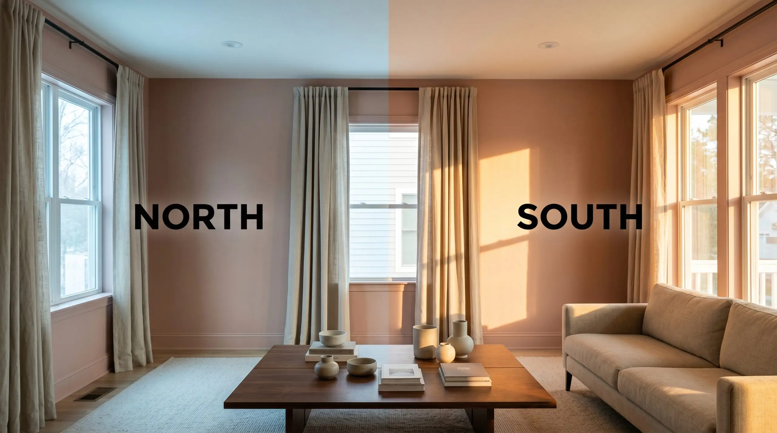
Lighting Effects & The Chameleon Factor
The biggest environmental risk with this specific pigment lies in heavily shadowed, North-facing rooms. Because northern light carries a naturally icy, blue tint, it actively flattens the warm pink notes, pulling the grey and brown undertones aggressively to the surface. If you do not test this carefully, the color can easily read as a muddy, lifeless brown rather than a curated neutral.
Always paint your swatches on large boards and move them around the room at 10 AM, 2 PM, and 8 PM. You must see how the shadows manipulate that hidden grey undertone before committing to gallons of premium paint.
Hackrea Pro-Tip (The Illumination Test)
Here is exactly how different lighting scenarios manipulate the paint:
Popular Room Applications for Dead Salmon
This shade brings a remarkably cohesive, grounding energy to a home, demanding to be paired with intentional textures and thoughtful lighting. It does not want to recede quietly into the background; it wants to wrap the architecture in a warm, tactile embrace. Whether you are aiming for a rustic retreat or a sleek metropolitan flat, its complex undertones adapt beautifully to the surrounding environment.
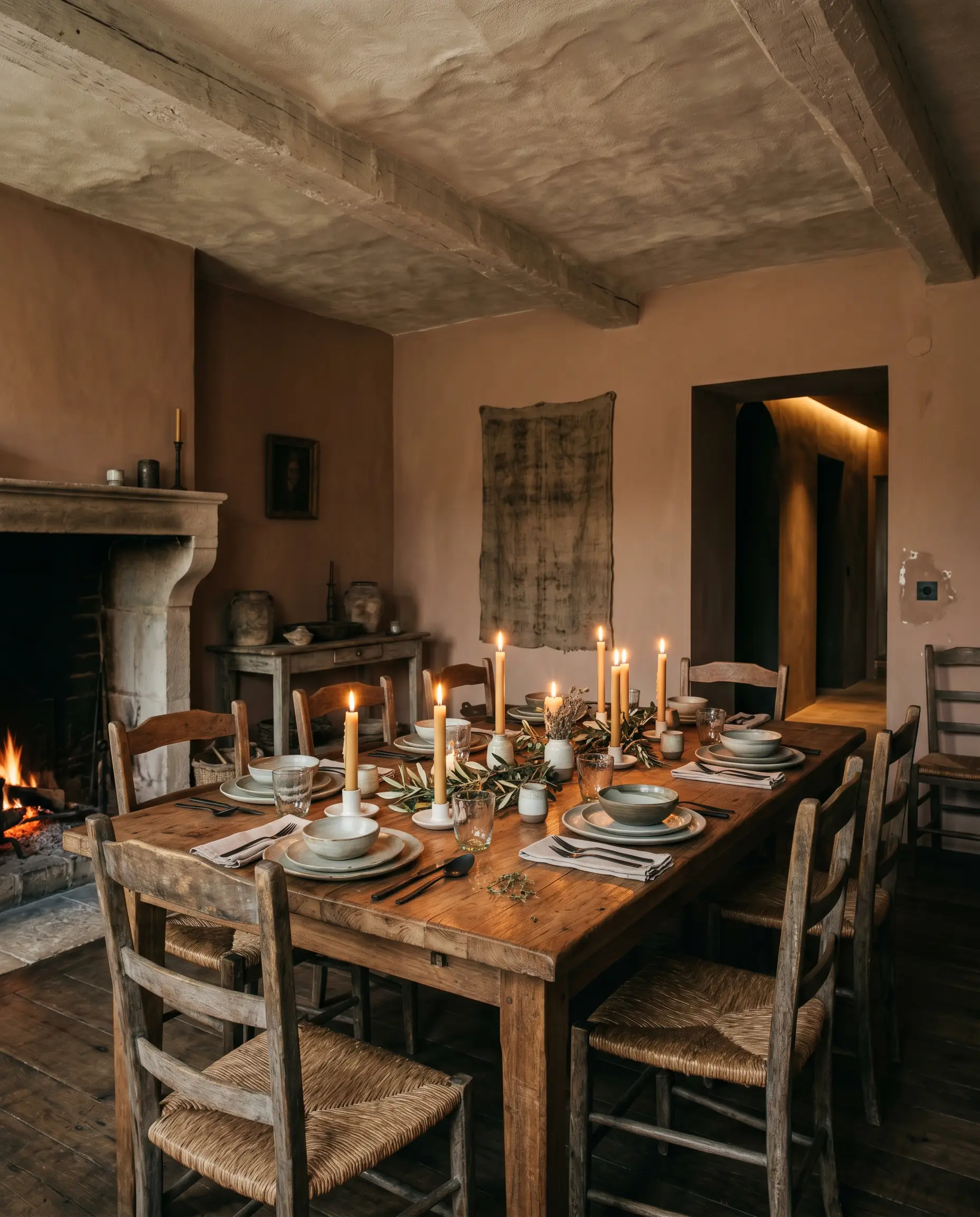
Dining Rooms
This color was practically engineered for intimate, candlelit dining rooms. To lean into a raw, Wabi-Sabi aesthetic, pair it with a heavily textured lime-wash ceiling and a solid, reclaimed teak dining table. If you prefer a more tailored, Transitional approach, use it above crisp white wainscoting to anchor a set of standard upholstered dining chairs and a gleaming polished nickel chandelier. For more structural inspiration, explore our favorite moody dining room ideas to see how dark neutrals elevate evening entertaining.
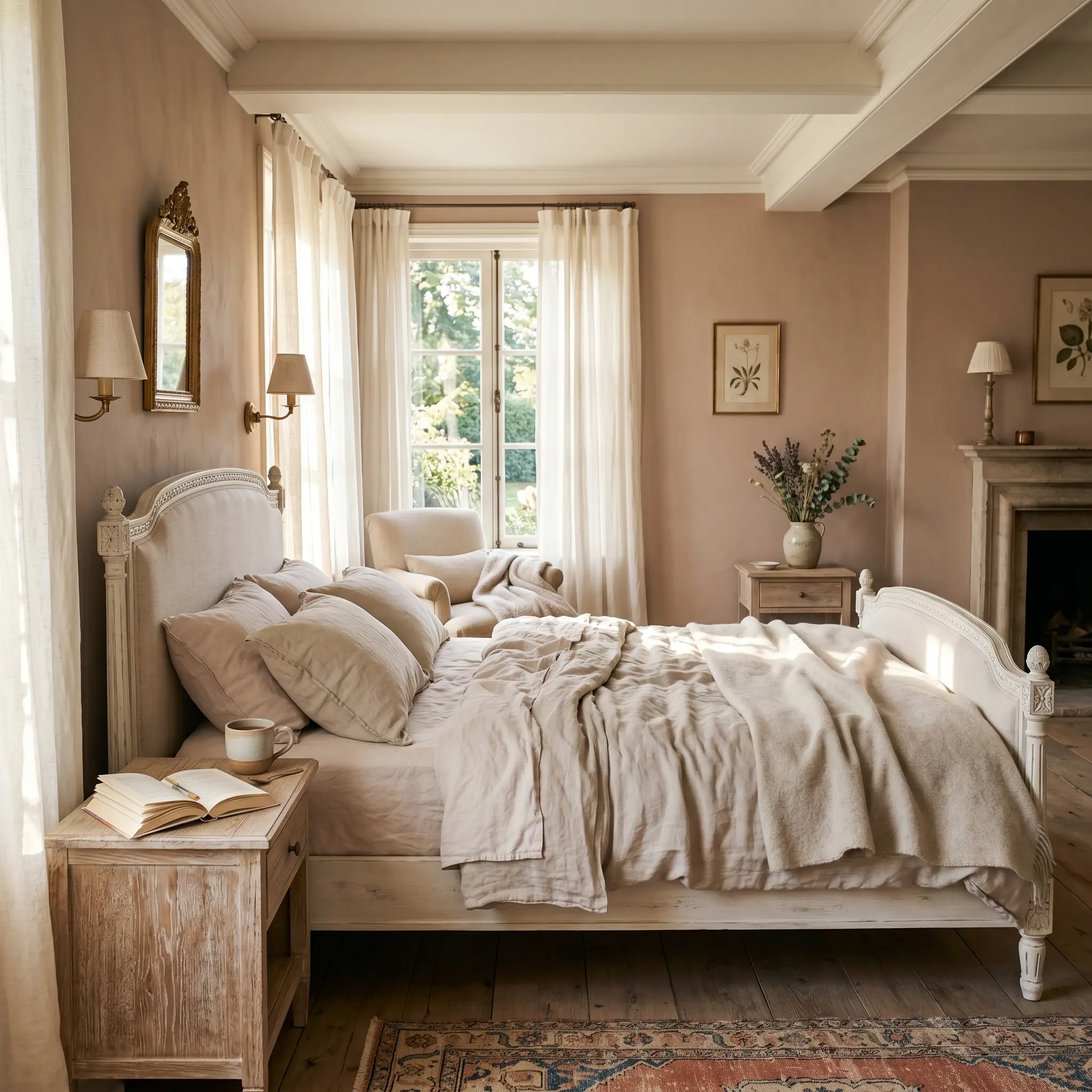
Bedrooms
In a bedroom, this shade creates an immediate sense of sanctuary and calm. It provides a stunning, earthy backdrop for a romantic French Provincial aesthetic, especially when paired with soft, washed linen bedding and distressed white oak nightstands. Conversely, you can push it into a sleek, Contemporary space by grounding the warm walls with an oversized, low-profile charcoal bed frame and minimalist brass reading sconces.
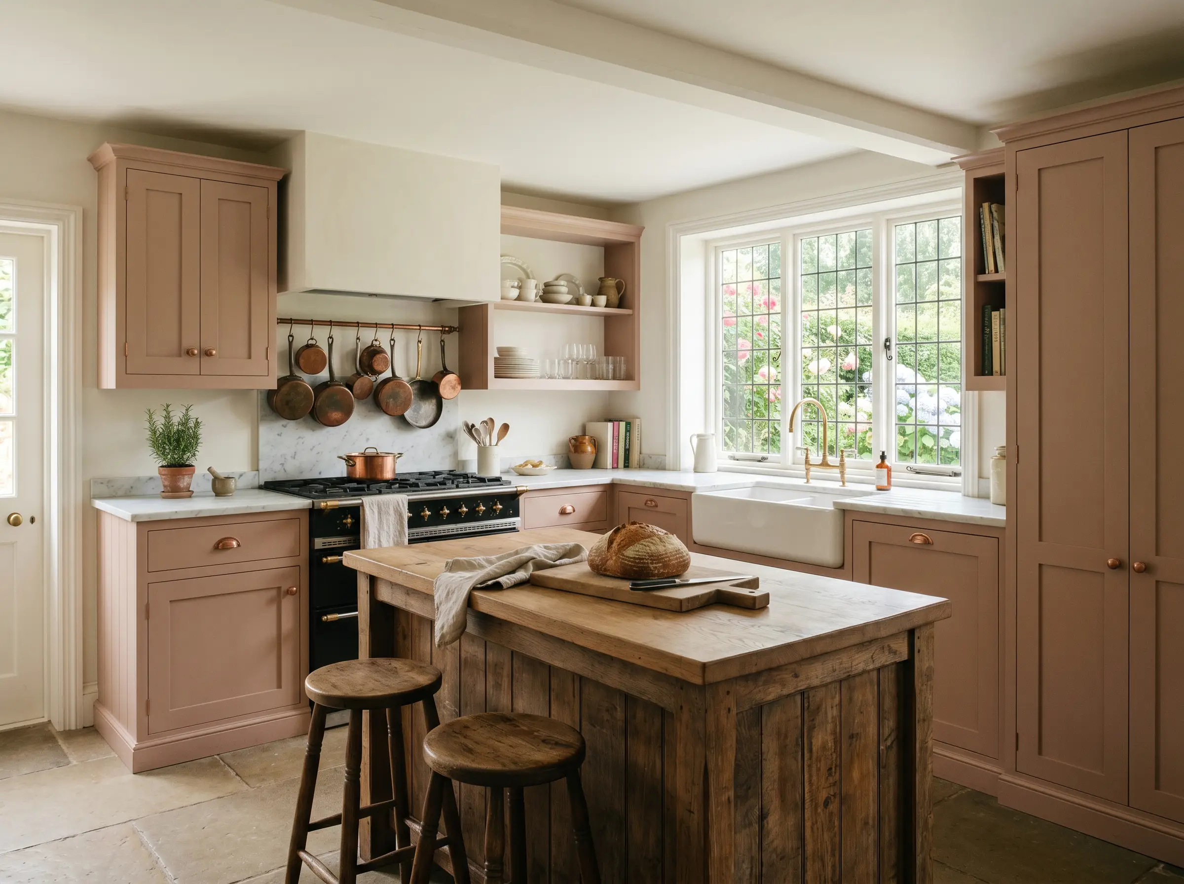
Kitchen Cabinetry
Painting kitchen cabinets in this muted tone instantly elevates the heart of the home, offering a sophisticated departure from standard white or navy. It shines in an English Cottage-inspired kitchen, beautifully complementing unlacquered copper hardware and a classic farmhouse sink. To modernize the application, pair these earthy cabinets with heavily veined Calacatta Viola marble countertops and sleek, handleless millwork.
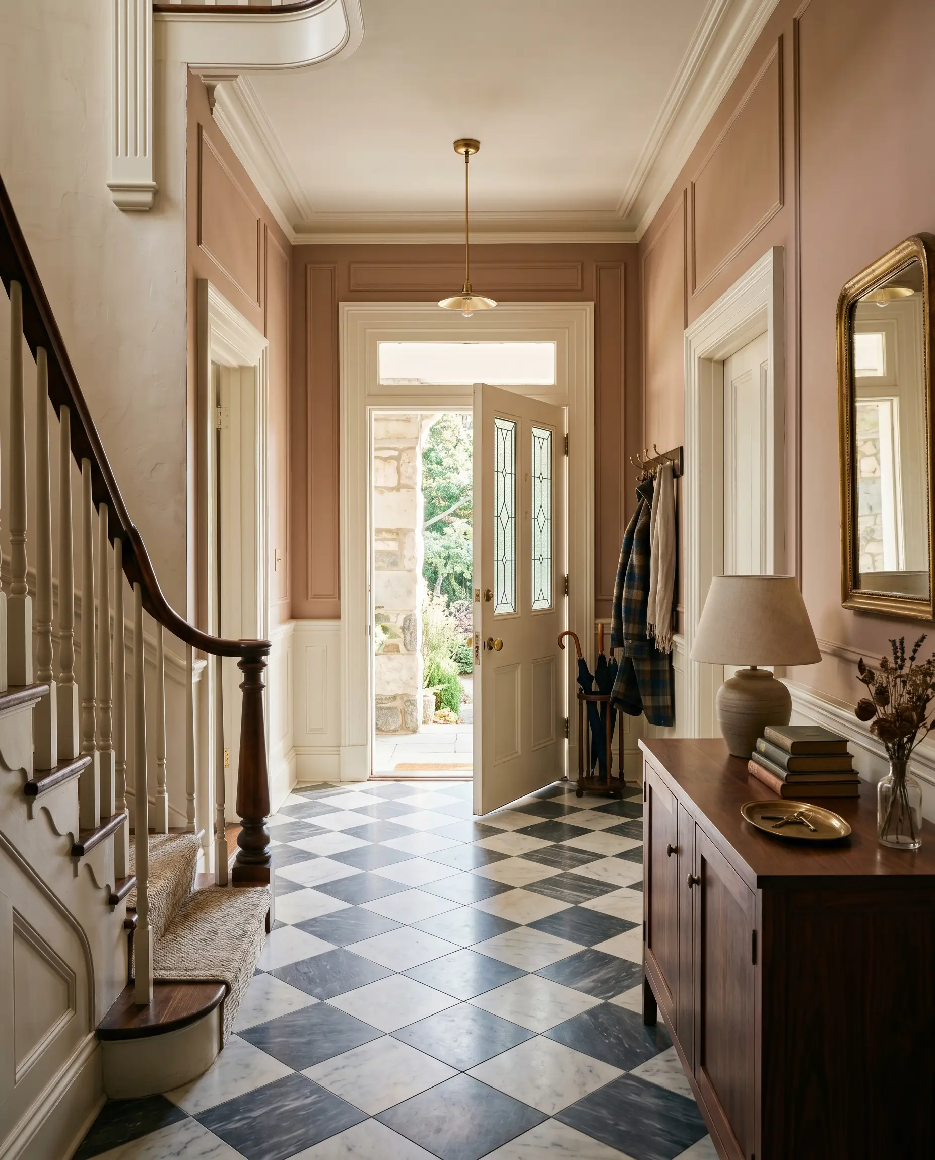
Entryways & Powder Rooms
Small, transitional spaces are the perfect canvas for committing to a color-drenched application. In a grand historic home entryway, it honors the original architecture while providing a warm welcome against classic checkerboard marble floors. In a tiny, windowless powder room, wrapping the walls, ceiling, and trim in this single shade creates a jewel-box effect that feels incredibly intentional and luxurious.
Creative Ways to Use This Mushroom Neutral
Sometimes, the most striking design moments happen when you take a traditional color out of its expected context. By looking beyond standard wall applications, you can utilize this shade to highlight unique architectural features or breathe new life into everyday furnishings.
The Color-Drenched Library Ceiling
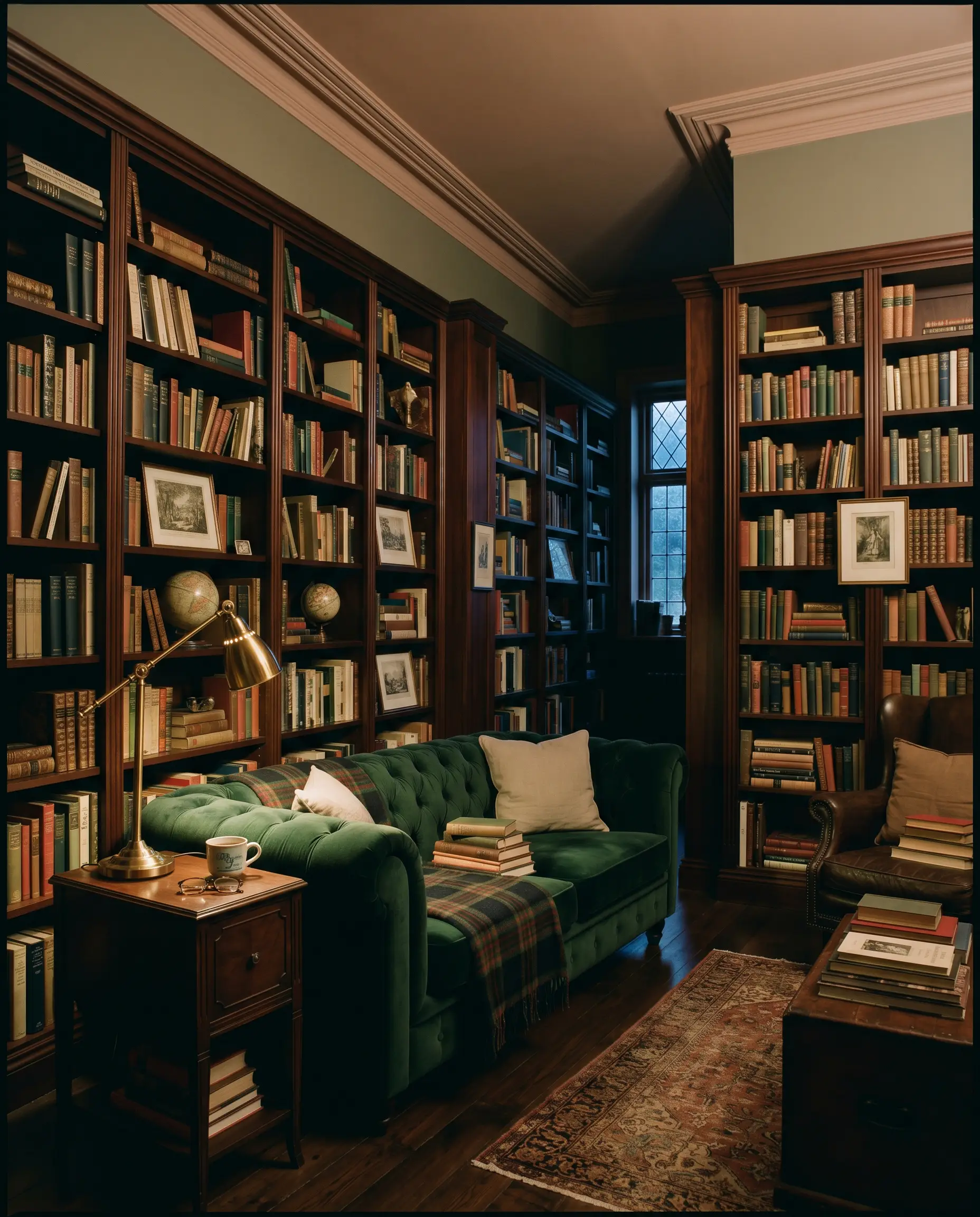
Instead of defaulting to a flat white ceiling, pull this rich shade upward in a home office or reading room to create a heavily layered, Dark Academia atmosphere. By wrapping the ceiling and the crown molding in the same aged pink, you instantly lower the visual height of the room, making it feel like a private, secluded den. Pair this overhead warmth with towering, dark mahogany bookshelves and a plush emerald velvet sofa.
The Upcycled Fluted Media Console
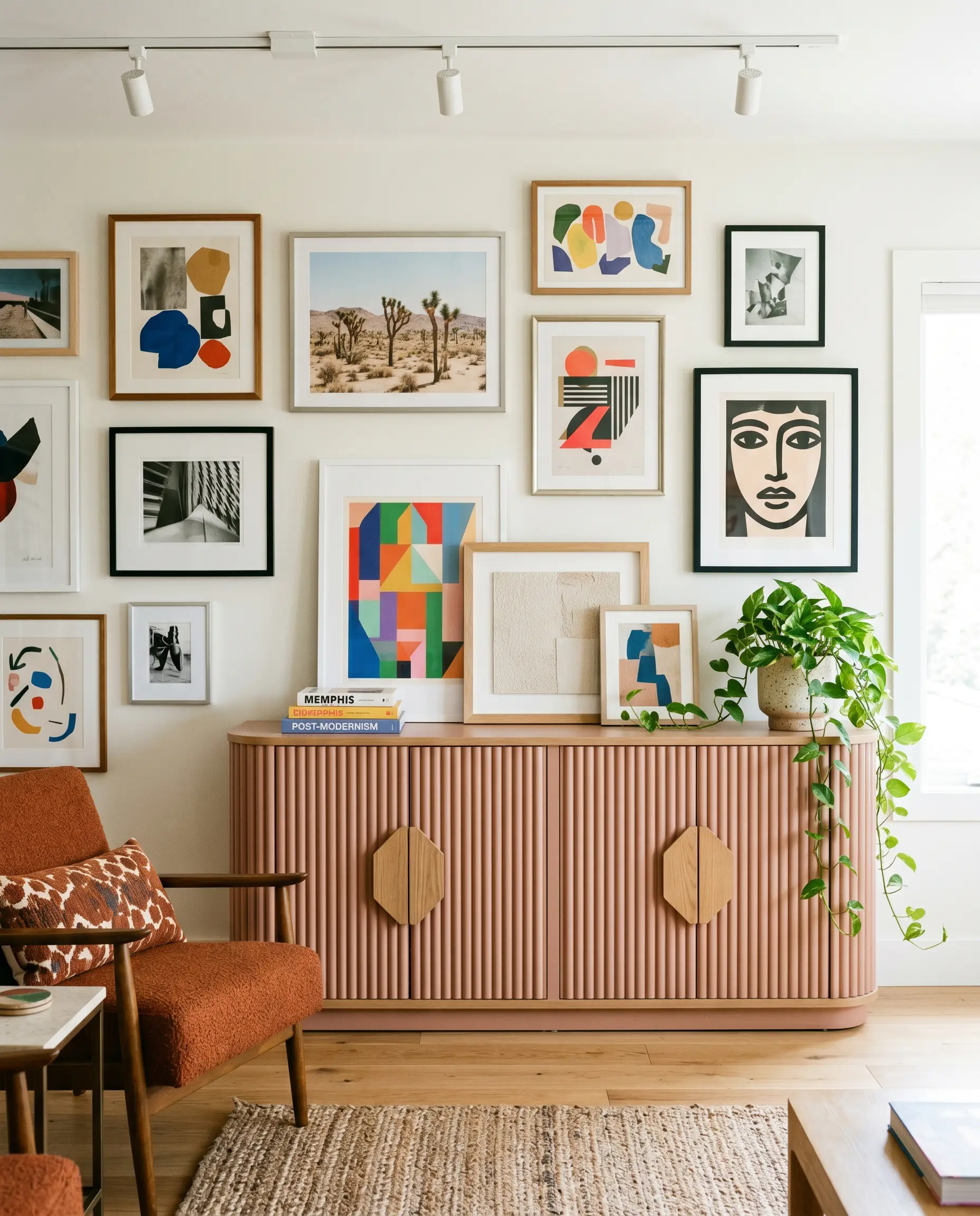
If you are working with a standard, big-box media console, adding half-round wood trim and coating the entire piece in F&B No. 28 completely transforms its perceived value. This application leans beautifully into a playful, Post-Modern aesthetic, especially when styled against a stark white gallery wall. Finish the piece with oversized, geometric wood hardware to emphasize its custom, sculptural new identity.
The Mediterranean Sunroom Archway
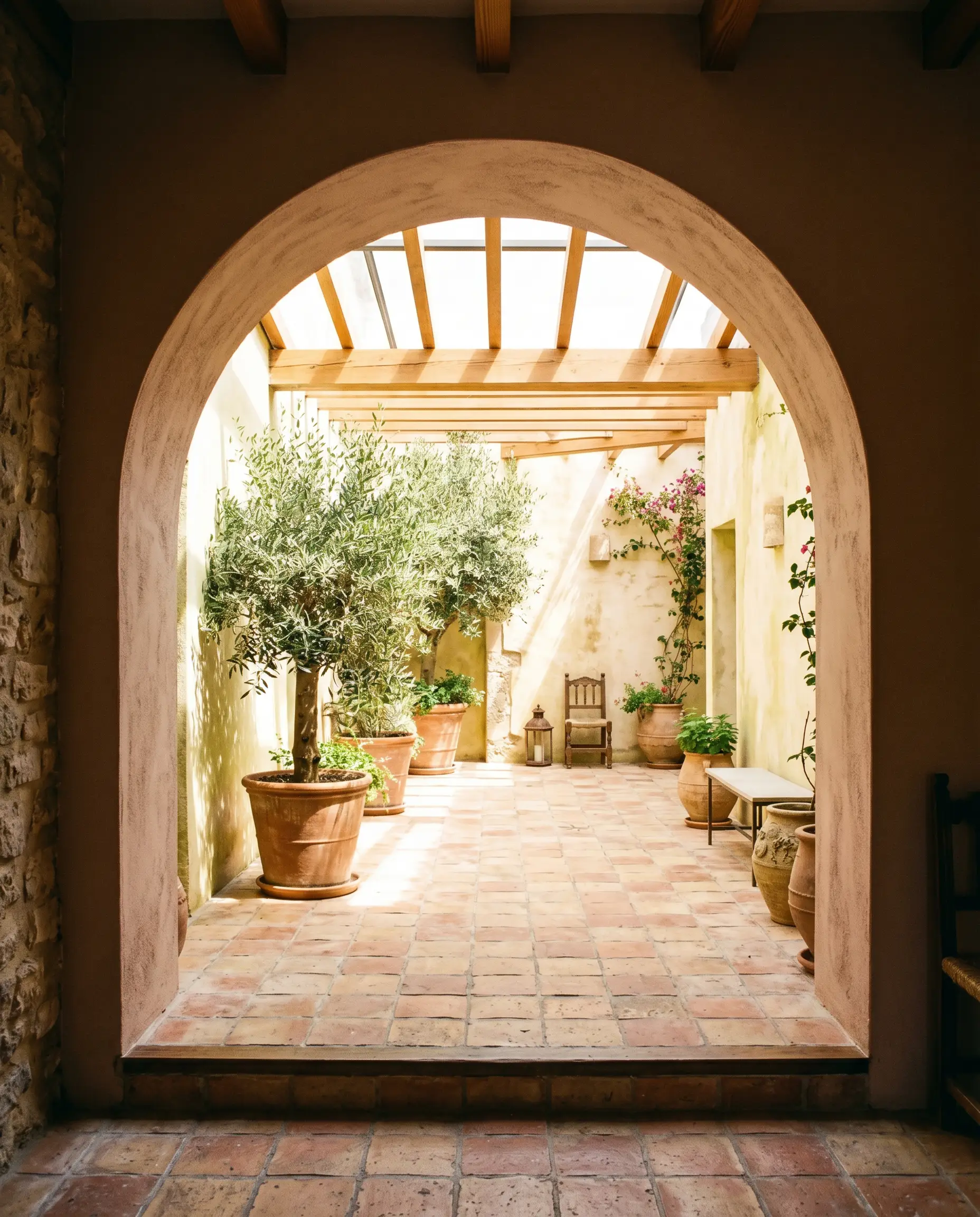
Use this earthy pigment to highlight structural transitions, such as a large archway leading into a sun-drenched enclosed patio. The direct southern light will make the paint glow, echoing the warmth of tumbled terracotta floor tiles and lush, oversized olive trees. This strategic color-blocking technique draws the eye through the architecture, framing the sunroom like a curated painting.
Coordinating Colors & Best Pairings
The core styling principle for this deeply nuanced shade is intentional contrast. Because it is a heavy, light-absorbing color, it requires thoughtful material pairings to dictate its final mood—either crisp, high-contrast borders to feel tailored, or soft, tonal layers to feel organic.
Trim & Baseboards
Hardware, Wood & Material Pairings
Coordinating Colors
Designer Mood Boards
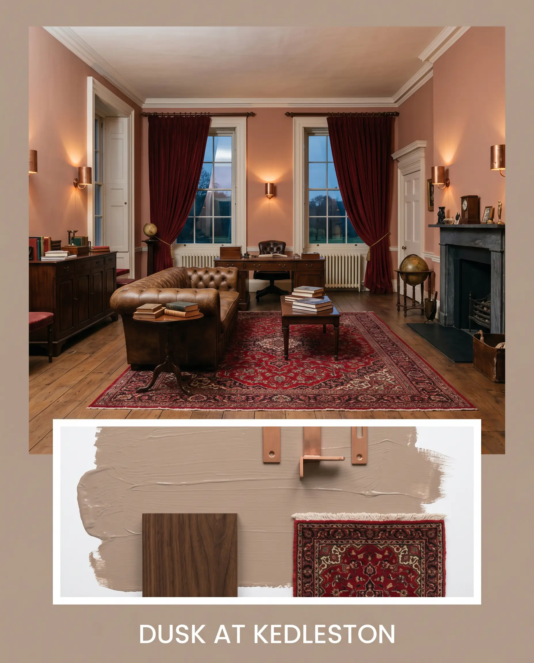
Dusk at Kedleston: This palette channels the grandeur of Kedleston Hall, relying on deep, historic contrasts and luxurious textures. Pair the warm walls with heavy, dark walnut antique furniture and unlacquered copper wall sconces. Style the space with a deeply saturated, crimson Persian rug and heavy velvet drapery to complete the opulent, evening-ready atmosphere.
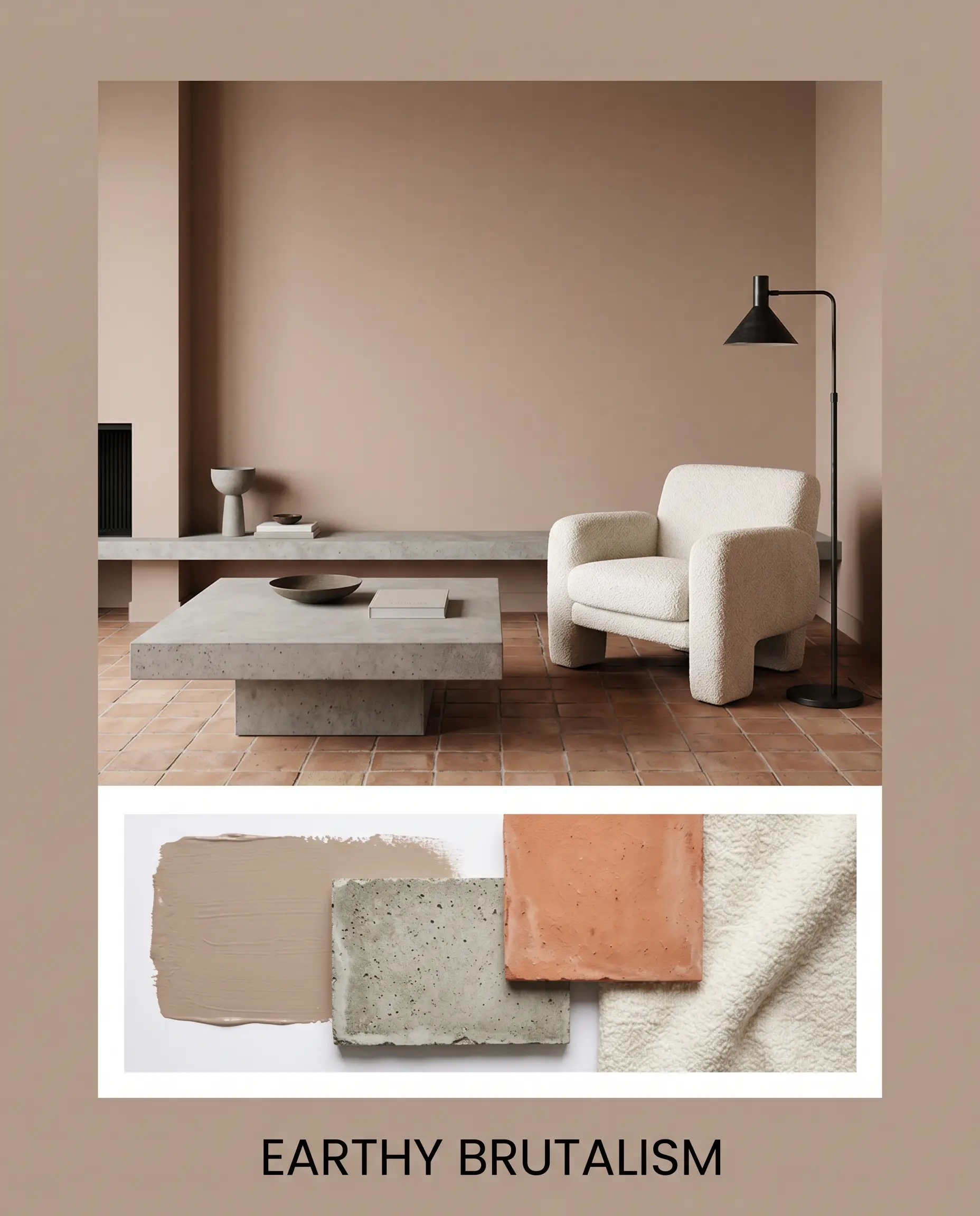
Earthy Brutalism: For a stark, highly textural aesthetic, this board strips away delicate details and focuses on raw, unrefined materials. The paint acts as a soft backdrop for an oversized, concrete-finished coffee table and tumbled terracotta floor tiles. Introduce a chunky, off-white boucle armchair and a minimalist, blackened steel floor lamp to balance the heavy, earthy tones.
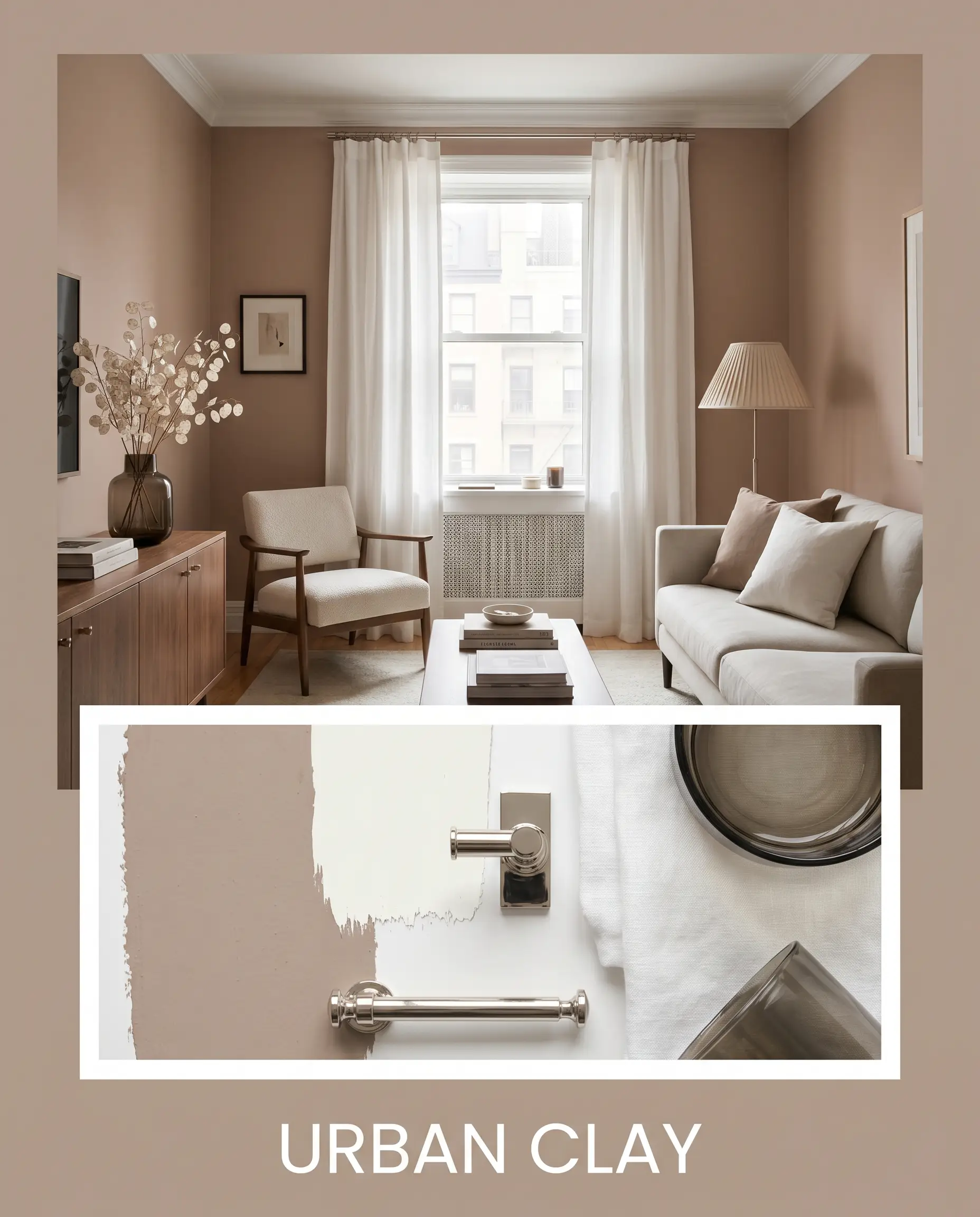
Urban Clay: This Transitional palette blends the warmth of the paint with sleek, modern city living. Anchor the room with standard, polished nickel hardware and crisp white linen window treatments to keep the energy light and reflective. Style the surfaces with dried lunaria stems in a smoked glass vase and a pleated silk lampshade to add soft, tactile interest.
Farrow & Ball Dead Salmon Head-to-Head Comparisons
When deciding between premium neutrals, the final choice often comes down to how the paint handles the specific lighting in your home. If your room lacks natural sunlight or features challenging architectural elements, a rival shade might offer a safer, more predictable performance.
Farrow & Ball Dead Salmon vs. Farrow & Ball Setting Plaster No.231
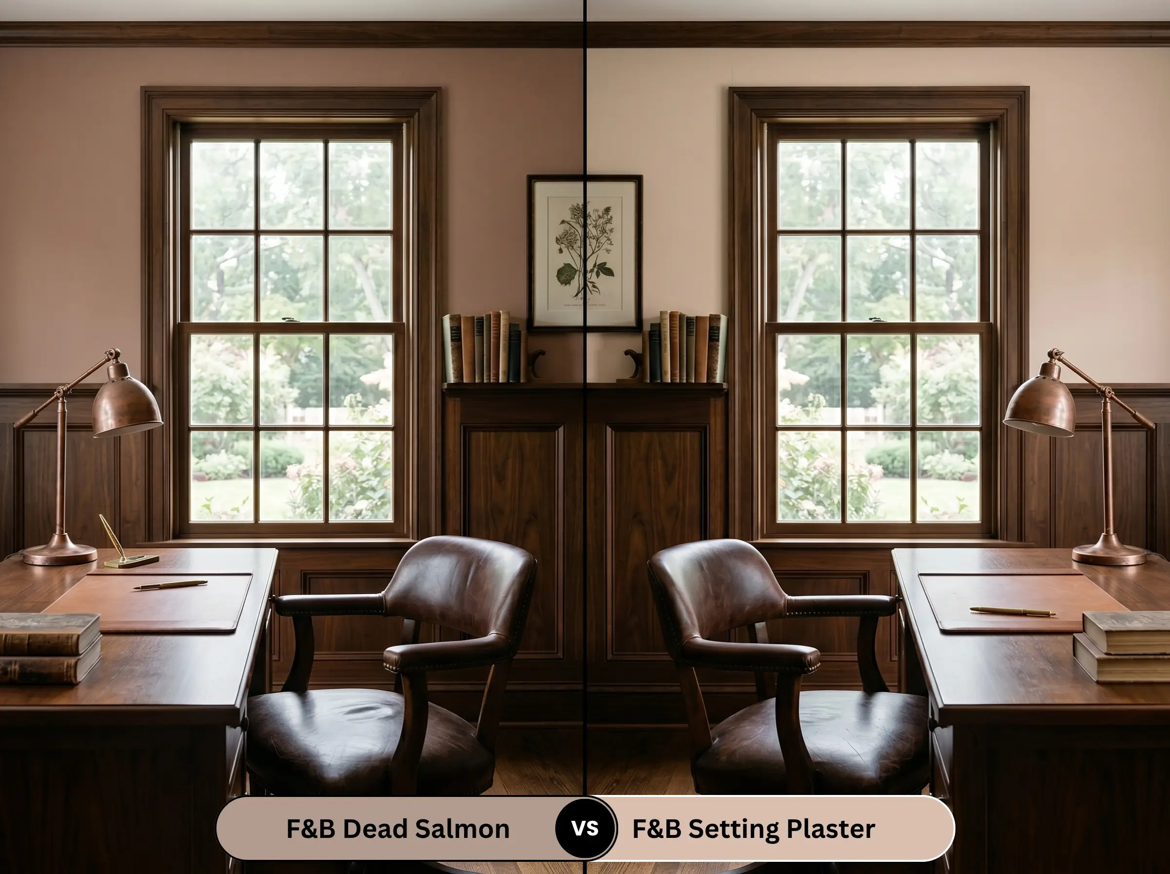
If you find that No. 28 reads too heavy and muddy in your space, Setting Plaster is the immediate solution. Setting Plaster features a significantly higher light reflectance value and a much cleaner, more dominant pink undertone. Use Setting Plaster in darker, North-facing rooms where you need the walls to feel inherently lighter and more vibrant.
Farrow & Ball Dead Salmon vs. Benjamin Moore Pashmina AF-100
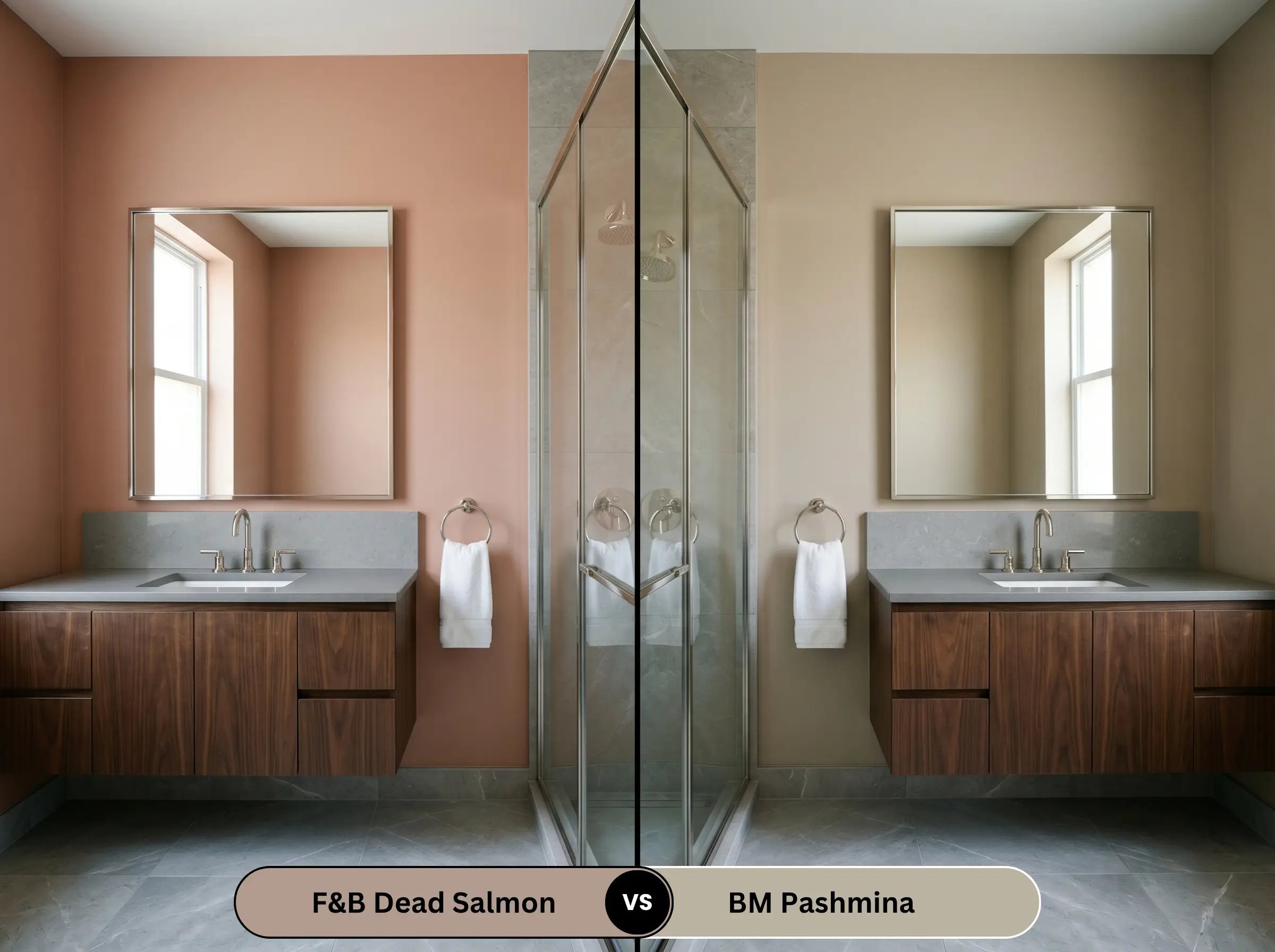
Pashmina is a brilliant alternative if you want the depth of a mushroom neutral but are afraid of the aged pink pulling too much focus. Pashmina leans heavily into a green-taupe base, stripping away the red-orange energy entirely. Choose Pashmina for a highly versatile, foolproof neutral that plays beautifully with cool-toned stones and modern grey fabrics.
Farrow & Ball Dead Salmon vs. Sherwin-Williams Mindful Gray SW 7016
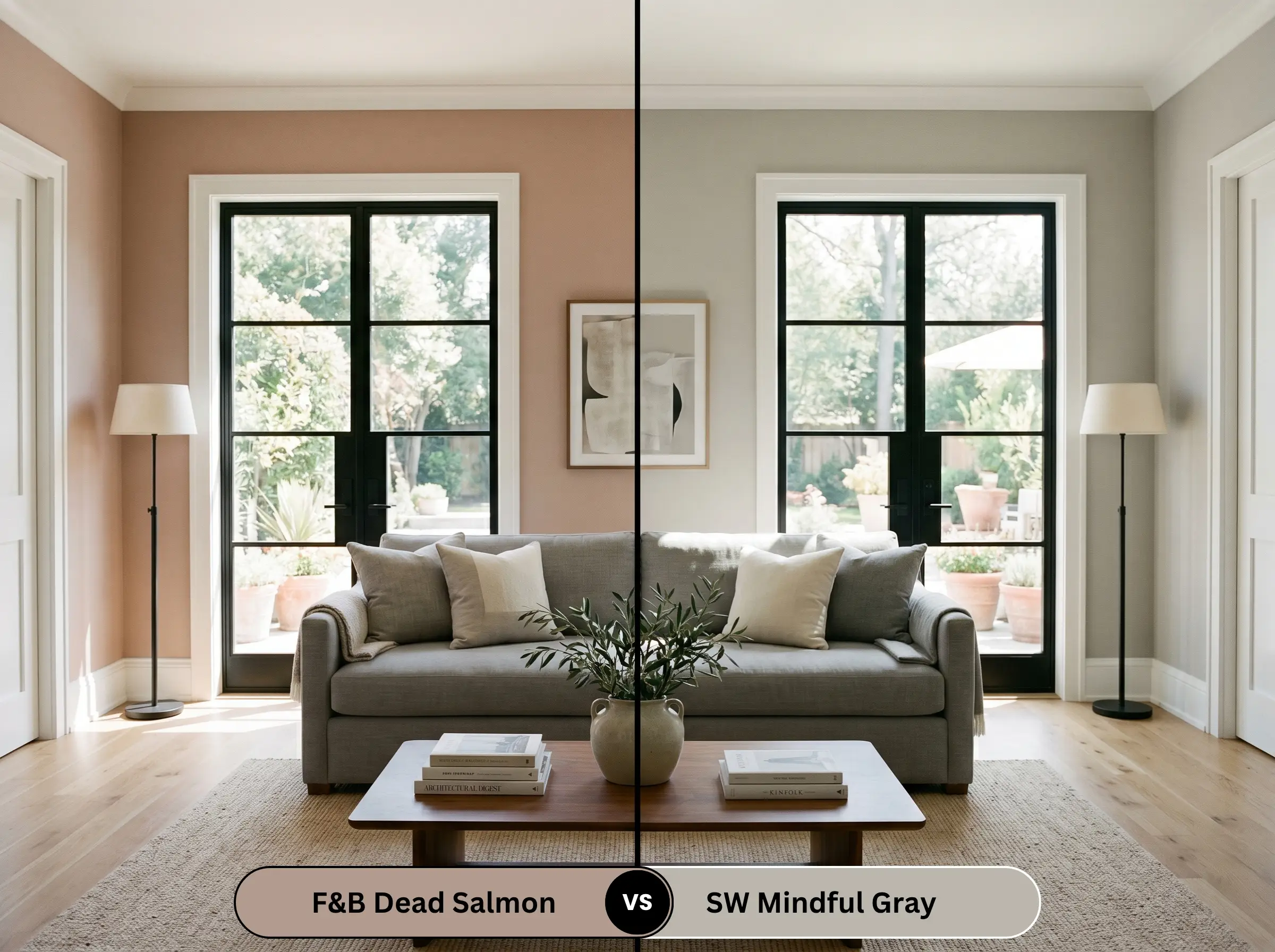
When you need a color to cool down a room that receives aggressive, blinding Southern sunlight, Mindful Gray is the superior choice. While No. 28 will amplify the heat and glow radiantly, Mindful Gray acts as a visual air conditioner, offering a crisp, greige neutrality. Opt for the Sherwin-Williams shade if you want a tailored, Transitional look that avoids any hint of salmon or terracotta.
Similar Colors & Alternative Options
Sometimes you fall in love with a color’s DNA, but the specific depth or local availability requires a slight pivot. Whether you need a subtle shift in undertone from the same brand or a practical match from a local hardware store, these alternatives deliver a very similar atmospheric energy.
Same Brand Alternatives
Cross-Brand Matches
Practical Application & DIY Advice
Transitioning this complex pigment from a swatch to a fully painted room requires an understanding of how premium finishes behave on the wall. The physical application and the sheen you select will dramatically alter how the final color is perceived.
The Dynamic Sheen Guide
Primer Strategy
Because this is a medium-dark, highly pigmented shade, a standard white primer will aggressively fight against the paint, requiring unnecessary extra coats. You absolutely must use a mid-tone, warm grey primer (Farrow & Ball recommends their Mid Tones undercoat) to establish a proper foundation. This ensures the earthy mushroom base develops its true, rich depth immediately upon application.
Coverage & Success Tips
To achieve the brand’s signature depth, plan for a strict minimum of two generous coats, though highly porous drywall may demand a third. Be incredibly mindful of “flashing”—visible, uneven roller marks that occur when you touch up a wall that has already dried. If you find a mistake after the wall has cured, you will likely need to repaint that entire architectural plane from corner to corner to maintain a flawless, velvety finish.
Frequently Asked Questions
Because it lacks natural light to activate the pink undertones, it will absolutely lean into its heavy mushroom base in a windowless space. To prevent it from feeling like a dark cave, you must rely on warm, 2700K artificial lighting to artificially force the aged pink back to the surface.
Unlike stark, primary reds that can quickly fade or look chalky under harsh UV rays, this muted pigment actually benefits from bright exterior sunlight. The sun brings out a beautiful, welcoming terracotta glow, making it a highly sophisticated, slightly weathered alternative to a predictable bright red door.
While it thrives with warm, earthy materials, pairing it with cool, heavily veined marble creates a brilliant, high-tension design moment. The stark white and cool grey veining of the stone sharply contrasts with the warm walls, making the marble feel incredibly crisp and the paint feel even cozier.
It actually harmonizes beautifully with red oak, as the underlying warmth in the wood speaks directly to the subtle orange-red base of the paint. Instead of clashing, the two elements create a seamless, tonal foundation that is perfect for layering vintage rugs and warm lighting.
Final Verdict & Expert Warnings
Farrow & Ball Dead Salmon No. 28 is an exceptionally sophisticated, light-absorbing neutral that excels at creating intimate, highly curated environments. It is the perfect choice for the homeowner who wants to move beyond safe, predictable greys and embrace a color that actively shifts and evolves with the sun. When paired with rich walnuts, raw terracotta, and warm lighting, it establishes a deeply historic, layered energy that elevates both traditional and modern architecture. If you are looking to design a space that feels inherently welcoming and tactile, this aged pink is a brilliant foundational layer.
However, this complex pigment requires strict curatorial respect, as introducing the wrong fixed elements will force the paint to look disjointed and sickly. If your home features heavily yellow-toned woods, like raw pine or dated honey oak cabinets, the clash in undertones will make the walls read as a muddy, bruised purple. Similarly, you must avoid pairing this shade with icy, blue-tinted white trims or harsh, primary red decor, as these aggressive elements will instantly strip away the paint’s sophisticated mushroom base, leaving you with an uncomfortably fleshy, unbalanced room.
Expert Warnings