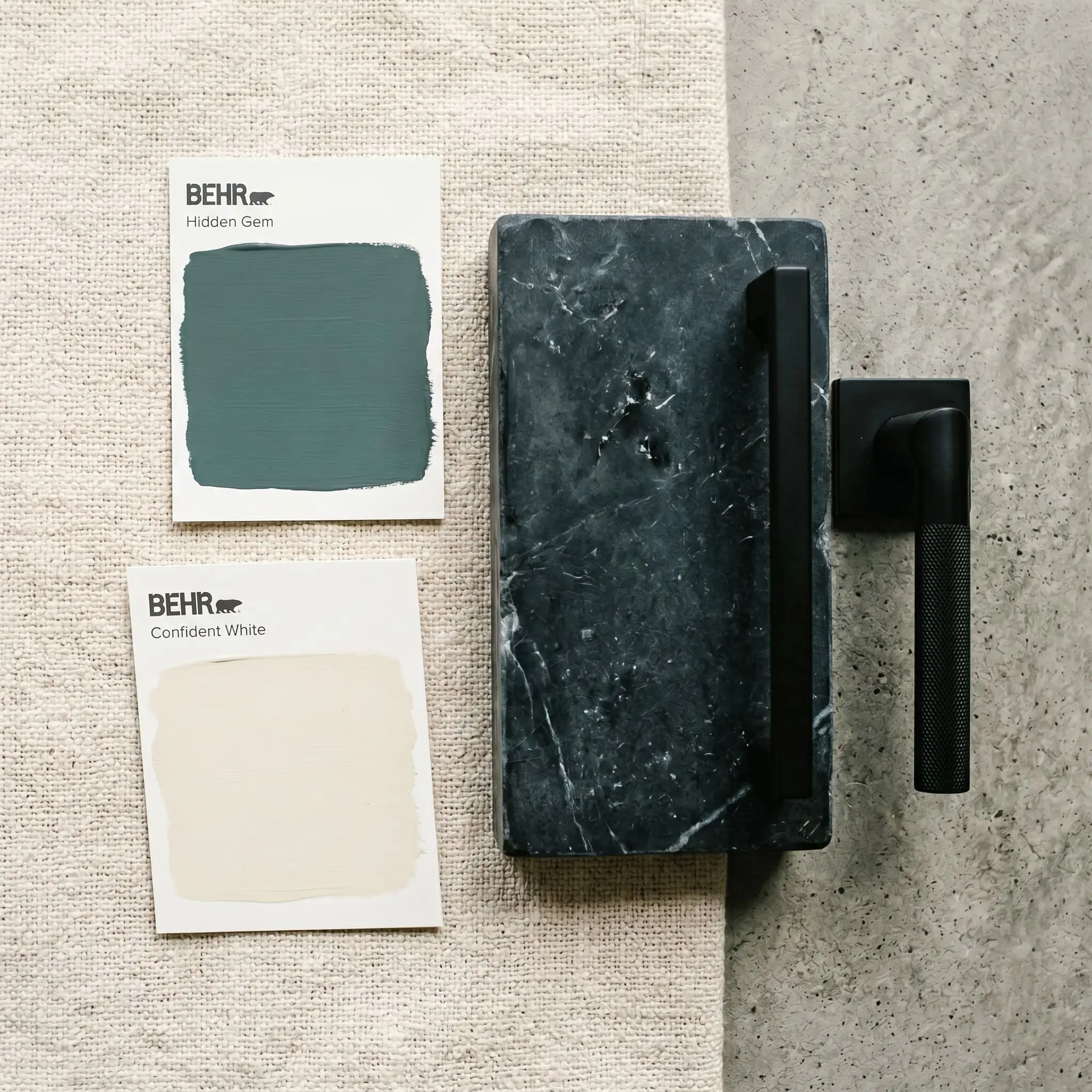
Behr Hidden Gem (N430-6A) is a deep, moody smoky jade green with cool blue and subtle gray undertones. With an LRV of 14, it acts as a dramatic yet grounded jewel tone that excels in well-lit rooms, color-drenched spaces, and striking exterior palettes.
Behr Hidden Gem Paint Review: Crafting a Grounded, Vibrantly Deep Atmosphere
| Best Exposures | South-facing or well-lit rooms |
|---|---|
| Best For | Accent walls, color-drenched home offices, exterior siding, kitchen cabinetry |
The design world is fiercely pivoting away from sterile grays, seeking refuge in colors that feel intentional, connected to nature, and unapologetically rich. Behr Hidden Gem answers this call with absolute authority.
Named the 2026 Color of the Year, this deeply grounded shade strikes a rare balance between serenity and striking architectural drama. It is not just another dark green; it is a meticulously calculated hue designed to bring the outdoors inside without overwhelming the senses.
If you are looking to design a sophisticated, moody space that feels high-end and deeply rooted, N430-6A is your anchor. However, dark colors demand respect and scientific precision. We are going to break down the exact color math, lighting requirements, and material pairings necessary to make this smoky jade work flawlessly in your home.
The Color DNA: Undertones & LRV
A paint’s success on your walls is dictated entirely by its chemical makeup and light reflectance. You cannot guess how this muted green will behave; you have to understand its structural DNA.
At an LRV 14, this shade absorbs a massive amount of light. Because of its Light Reflectance Value, it sits firmly in the dark category. It is heavy enough to provide intense architectural contrast, but just light enough that its complex color character remains visible, preventing it from collapsing into a stark, lifeless black.
You can apply wallpapers, paints, etc. on walls and see how they look in various interiors.

Lighting Effects & The Chameleon Factor
The greatest fear when using an LRV 14 paint is that it will turn a room into a dark, swampy cave. This only happens when you ignore your room’s natural exposures.
If your space lacks natural light, you must rely on contrasting trim, reflective metals, and strategic artificial lighting to keep the room feeling rich and expansive. This shade is a chameleon, and it will shift dramatically depending on the sun.
Never evaluate a dark green under hardware store fluorescent lights. You must paint a physical swatch on a north-facing wall and a south-facing wall in your own home to witness the undertone shift.
Hackrea Pro-Tip
Popular Room Applications
Behr’s 2026 choice is highly adaptable, but it is not a foolproof neutral. It demands intentionality. If you apply it haphazardly in a poorly lit hallway, it will feel oppressive. When applied with purpose, it transforms standard architecture into bespoke design.
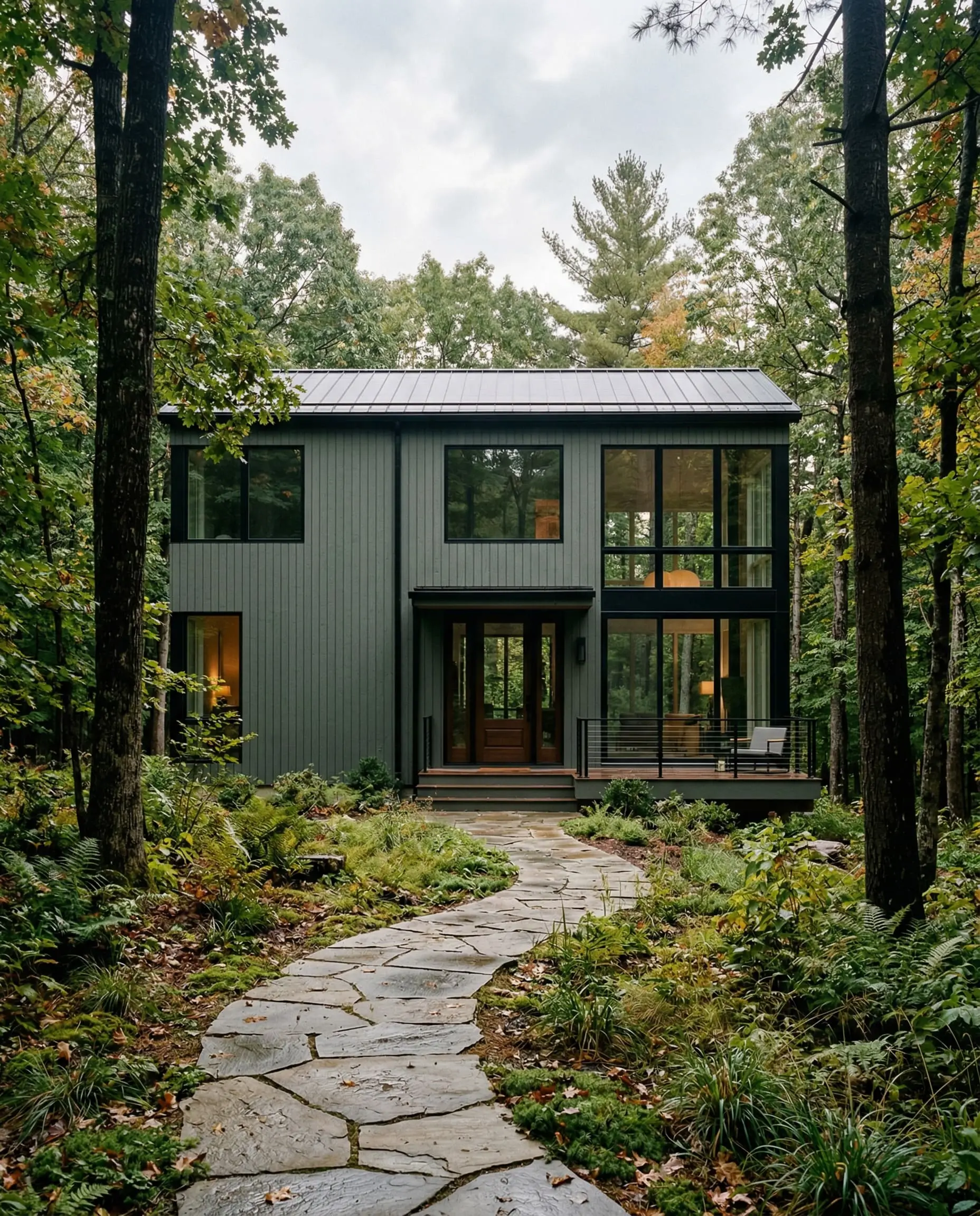
Striking Exterior Siding & Fascia
Dark exteriors require a color that won’t wash out completely under direct sunlight. This shade excels in moody exterior palettes because the heavy gray undertone prevents the green from looking neon outdoors. It grounds the home, pairing beautifully with organic landscaping and natural stone foundations.
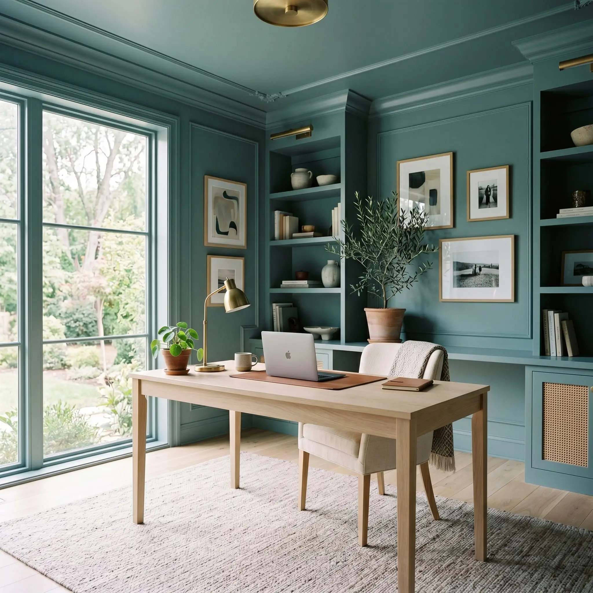
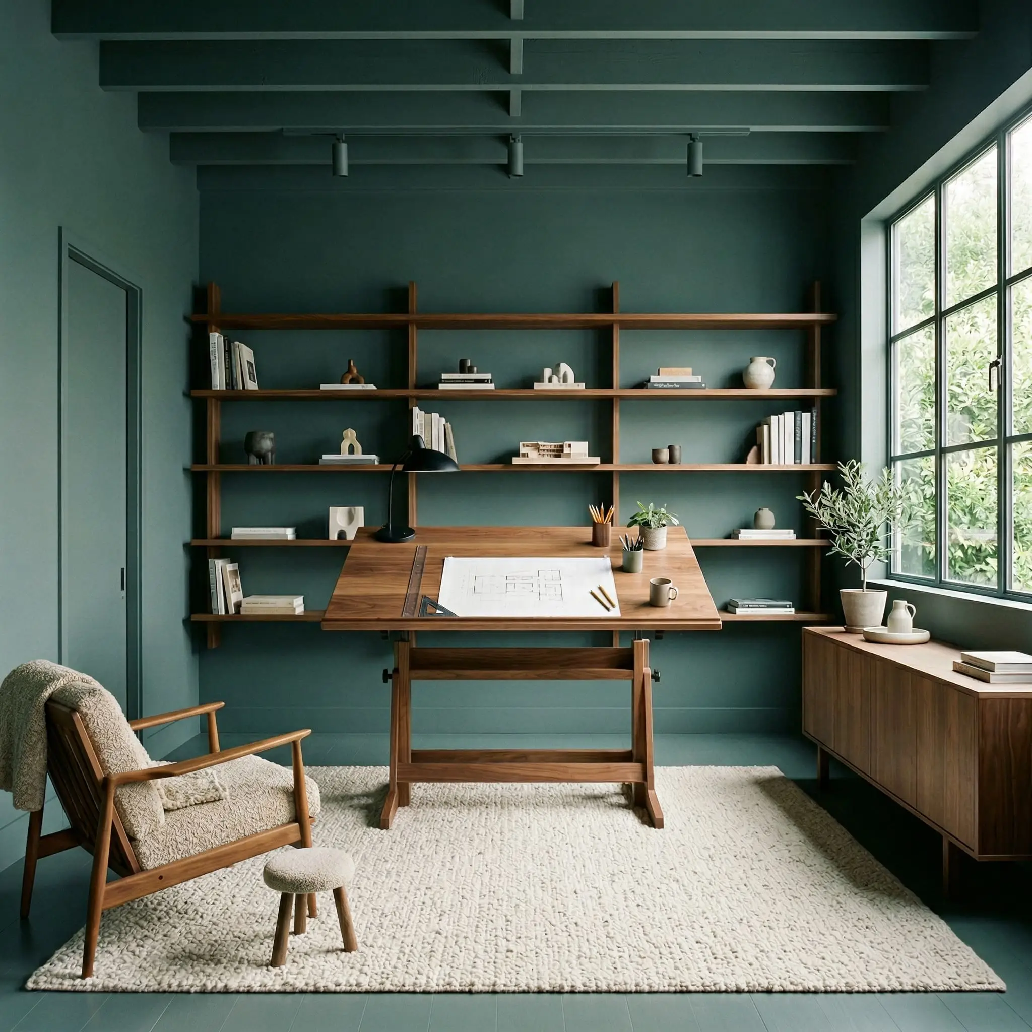
Immersive Home Offices
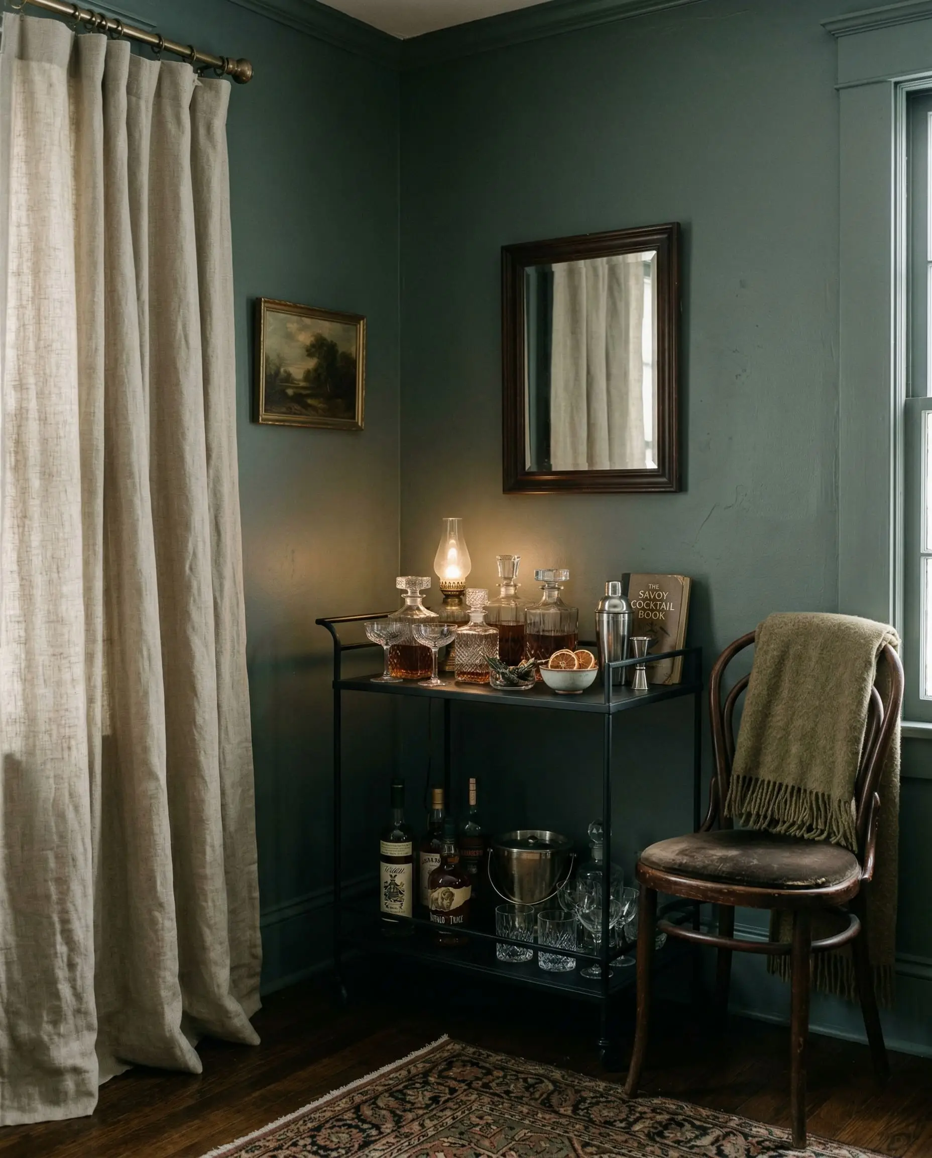
For spaces requiring deep focus, enveloping the room in this color is a strategic move. By learning how to color-drench a room (painting the walls, trim, and ceiling the exact same shade), you erase the visual boundaries of the office. This technique creates a seamless, sophisticated backdrop that minimizes visual clutter and enhances concentration.
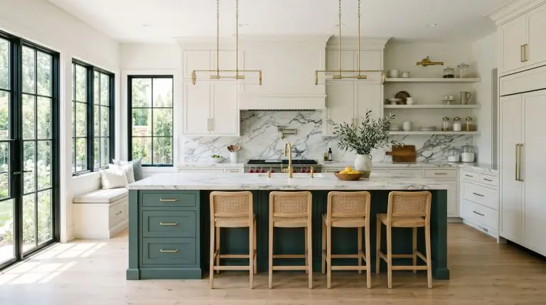
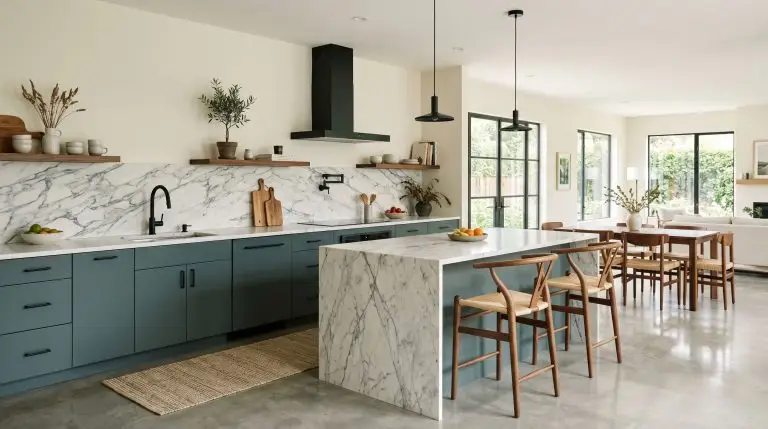
Grounding Kitchen Cabinetry
We rarely recommend this heavy of a green for upper cabinets in standard-height kitchens, as it can visually lower the ceiling. However, it is an elite choice for lower cabinetry or a massive central island. The deep tone anchors the kitchen’s footprint, allowing lighter upper walls and heavily veined countertops to command the visual space.
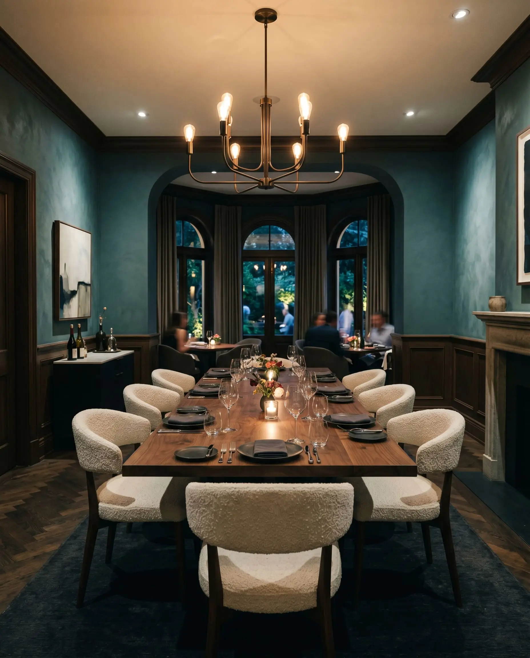
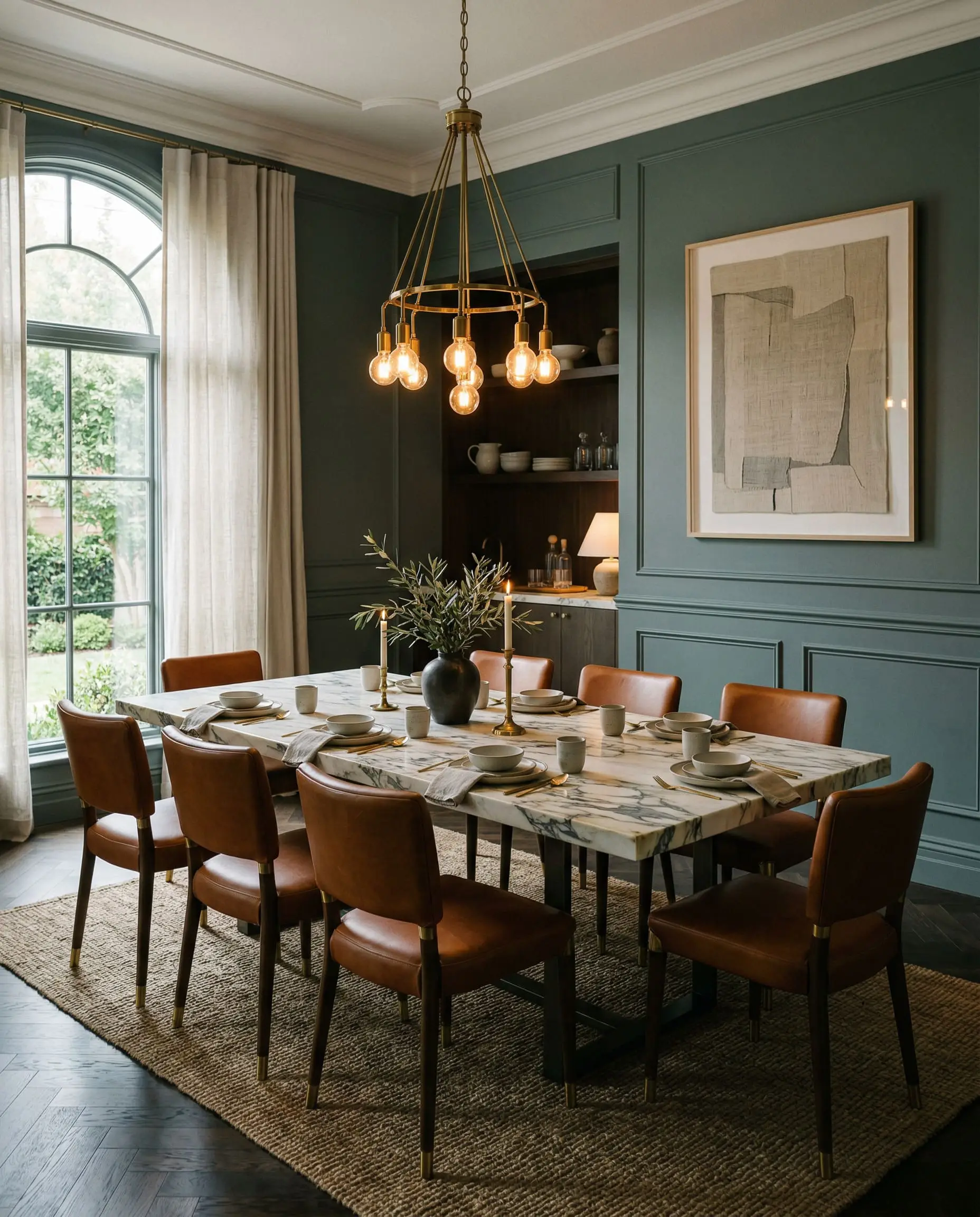
Atmospheric Formal Dining Rooms
Dining rooms are transitional spaces meant for evening use and atmospheric entertaining. The low LRV thrives here under dim, warm chandelier lighting. The color absorbs shadows beautifully, creating an intimate, high-end restaurant aesthetic that encourages long, lingering dinners.
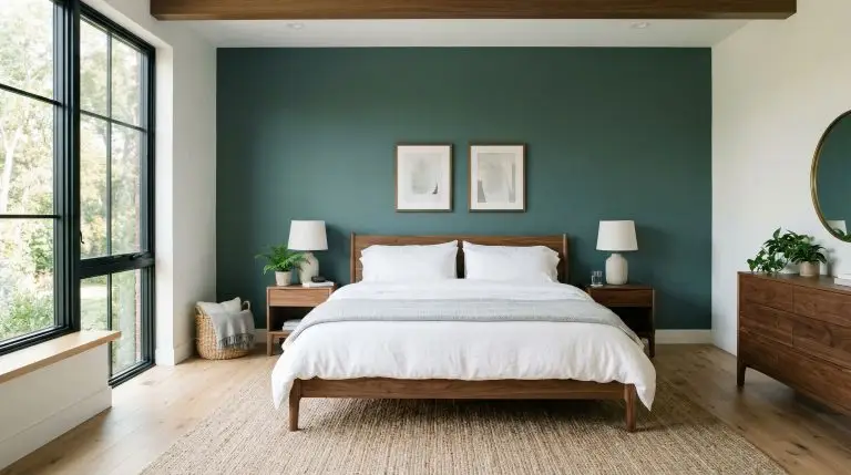
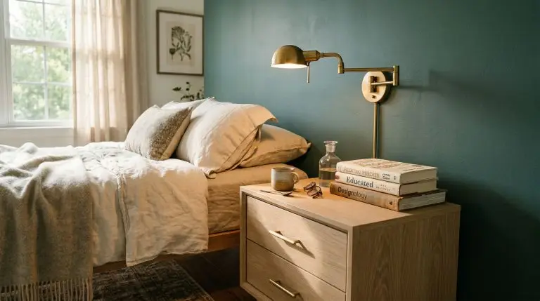
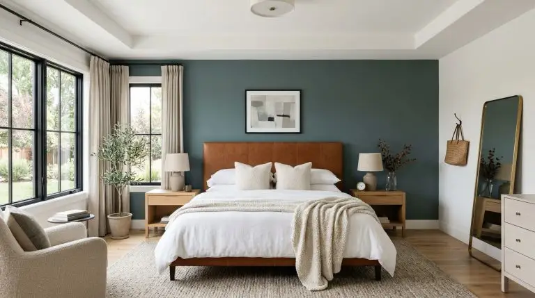
Anchoring Primary Bedroom Accent Walls
If color-drenching feels too intense for a sleeping space, this shade serves as a phenomenal grounding wall behind a bedframe. It provides necessary visual weight, acting as a dark canvas that makes crisp white bedding and natural wood tones advance into the foreground.
Signature Design Ideas & Inspiration
Moving beyond broad applications, there are specific architectural moments where this paint transcends being just a color and becomes a defining physical material in the room.
Moody Vintage Bathrooms
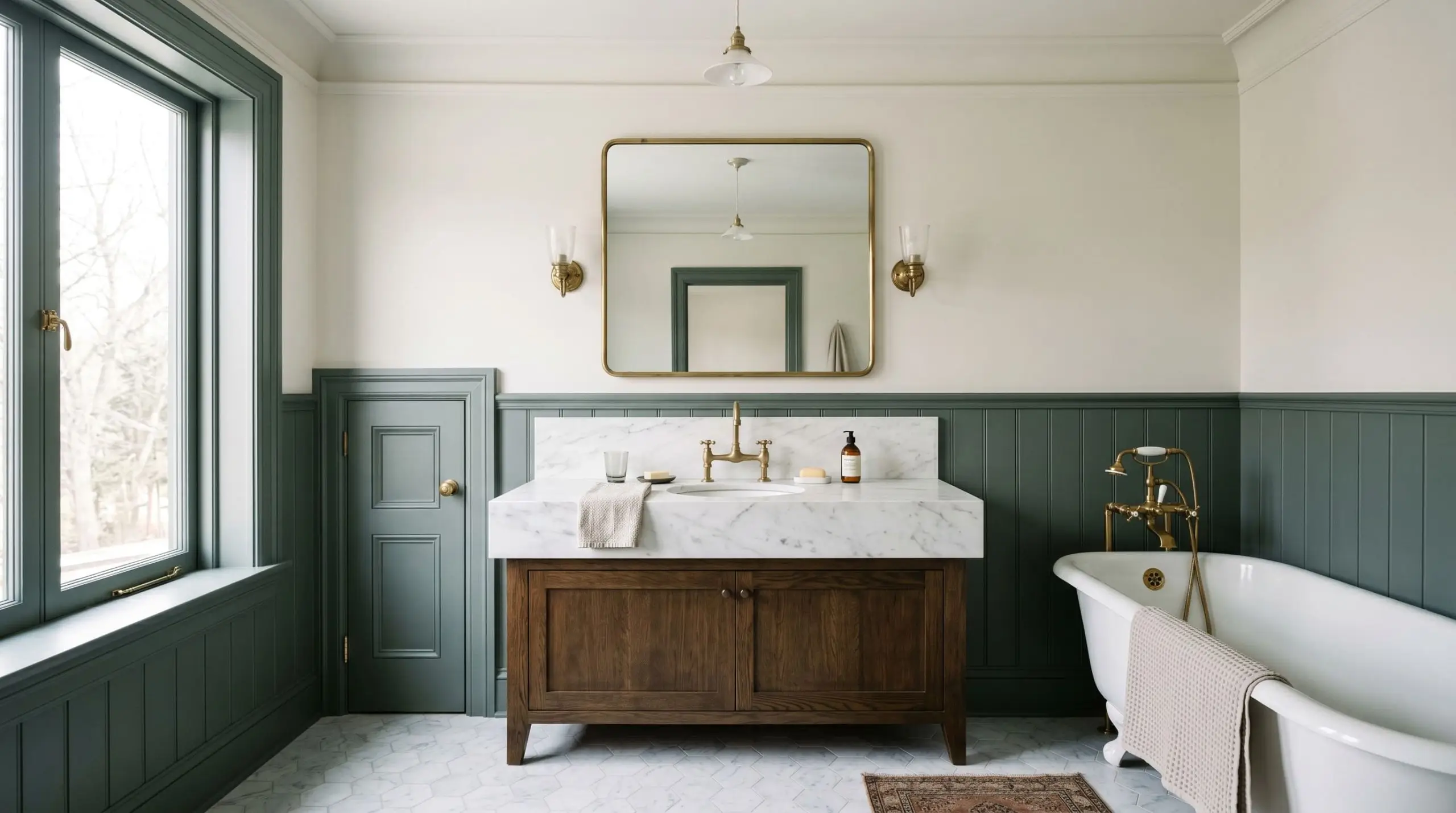
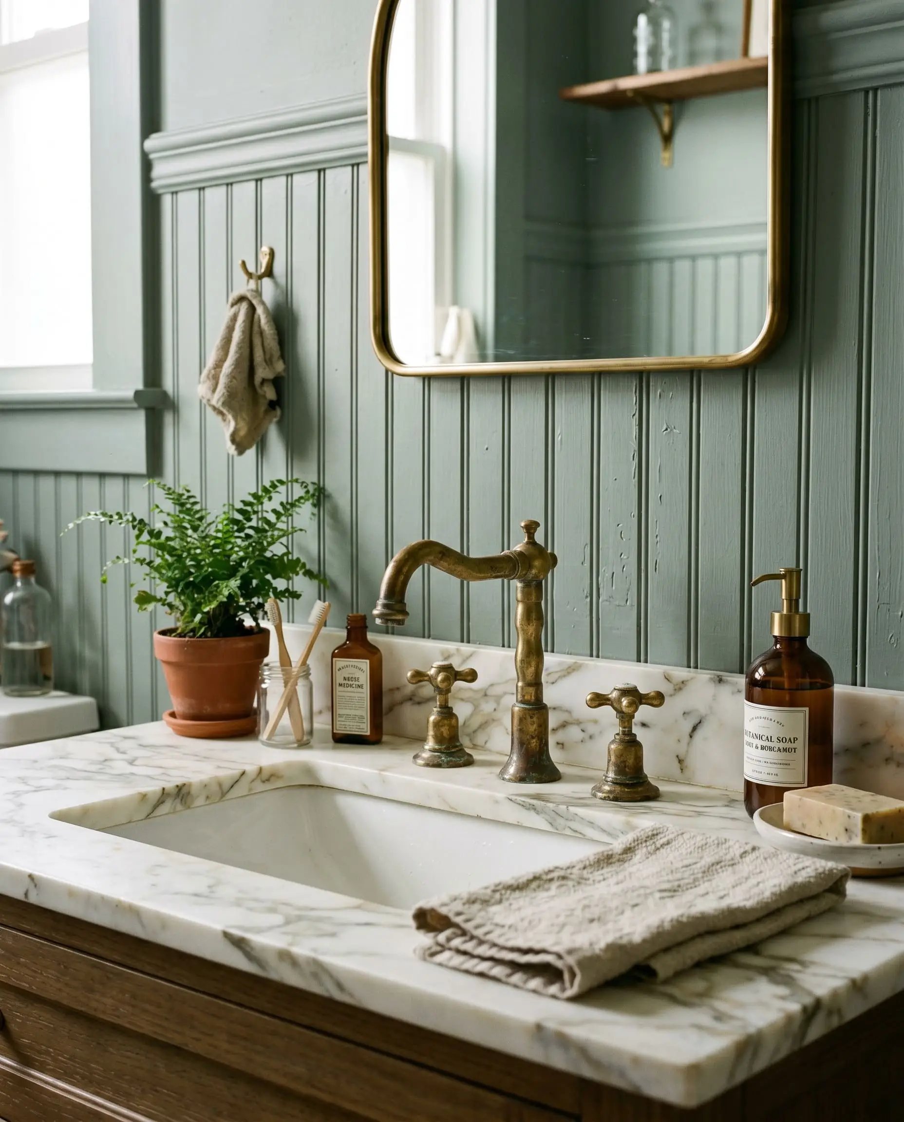
When applied to historic beadboard or traditional wainscoting, this color instantly ages a space in the best way possible. The muted green plays off the organic veining in Calacatta marble vanity tops, while the cool undertones provide a striking, high-contrast backdrop for unlacquered brass plumbing fixtures. The brass will patinate over time, echoing the historic, grounded nature of the paint.
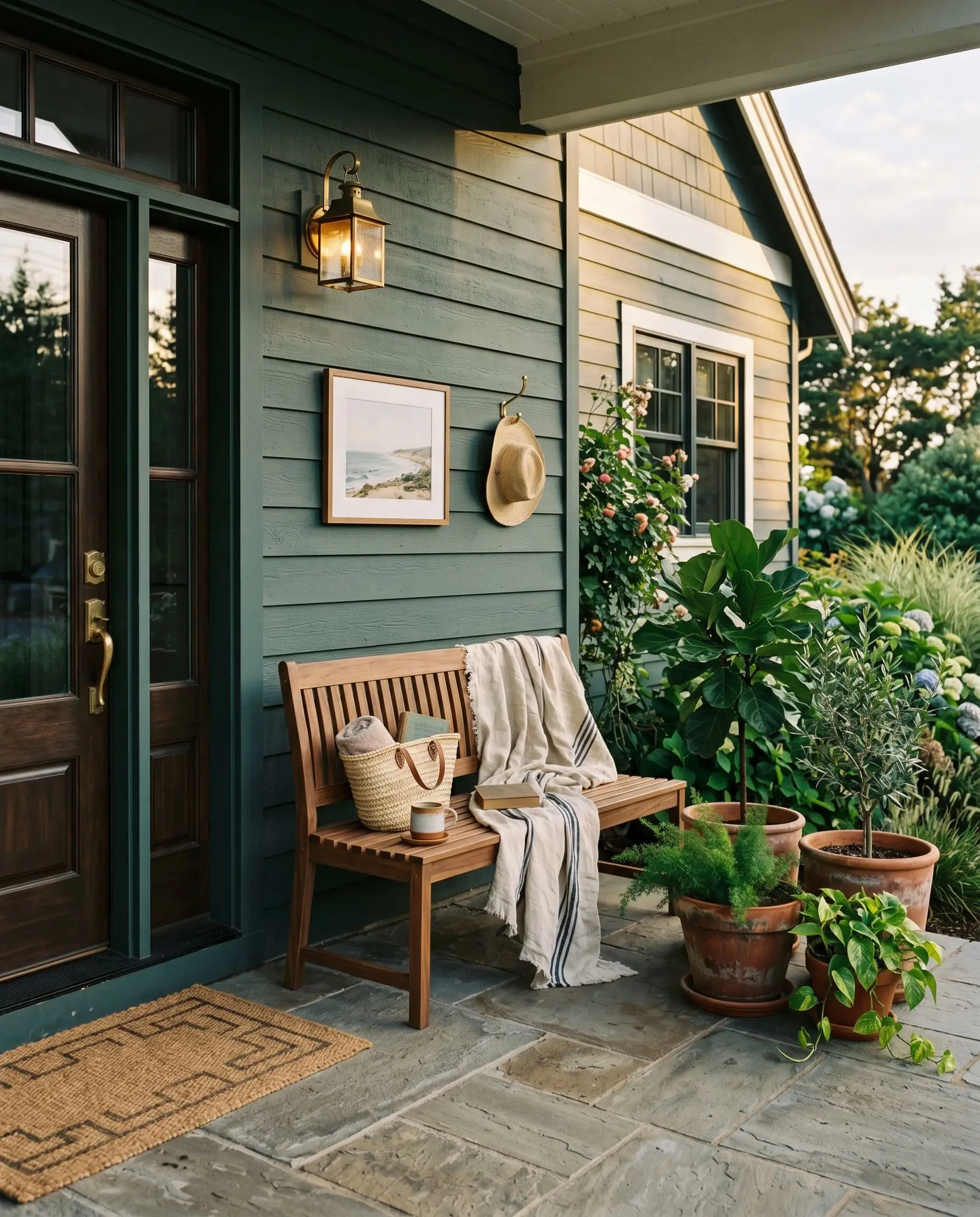
Statement Front Doors
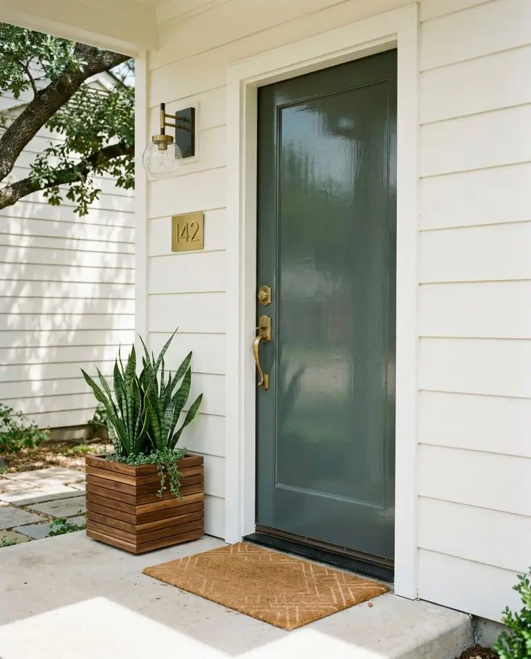
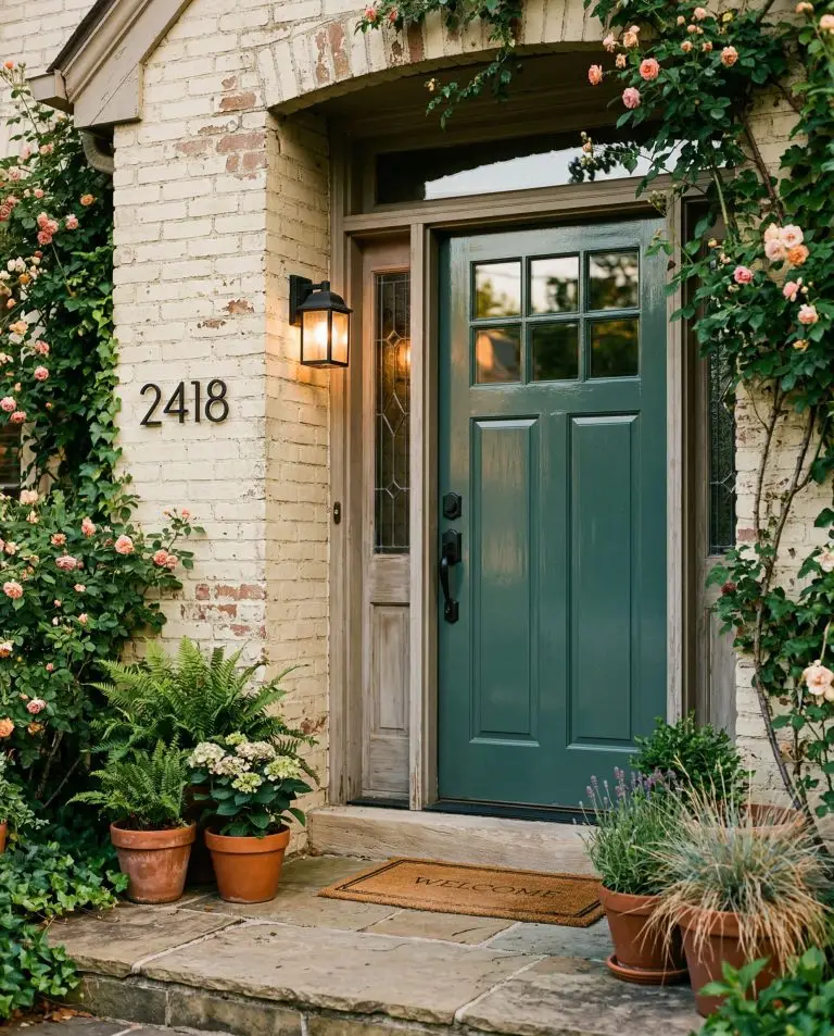
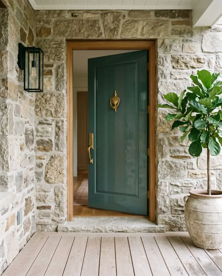
If you are hesitant to commit to a fully dark exterior, use this shade as a singular architectural focal point. Against warm white siding, creamy brick, or natural stone, a high-gloss application on a front door creates a sophisticated, welcoming entrance. It offers the richness of a jewel tone without the aggressive saturation of a primary color.
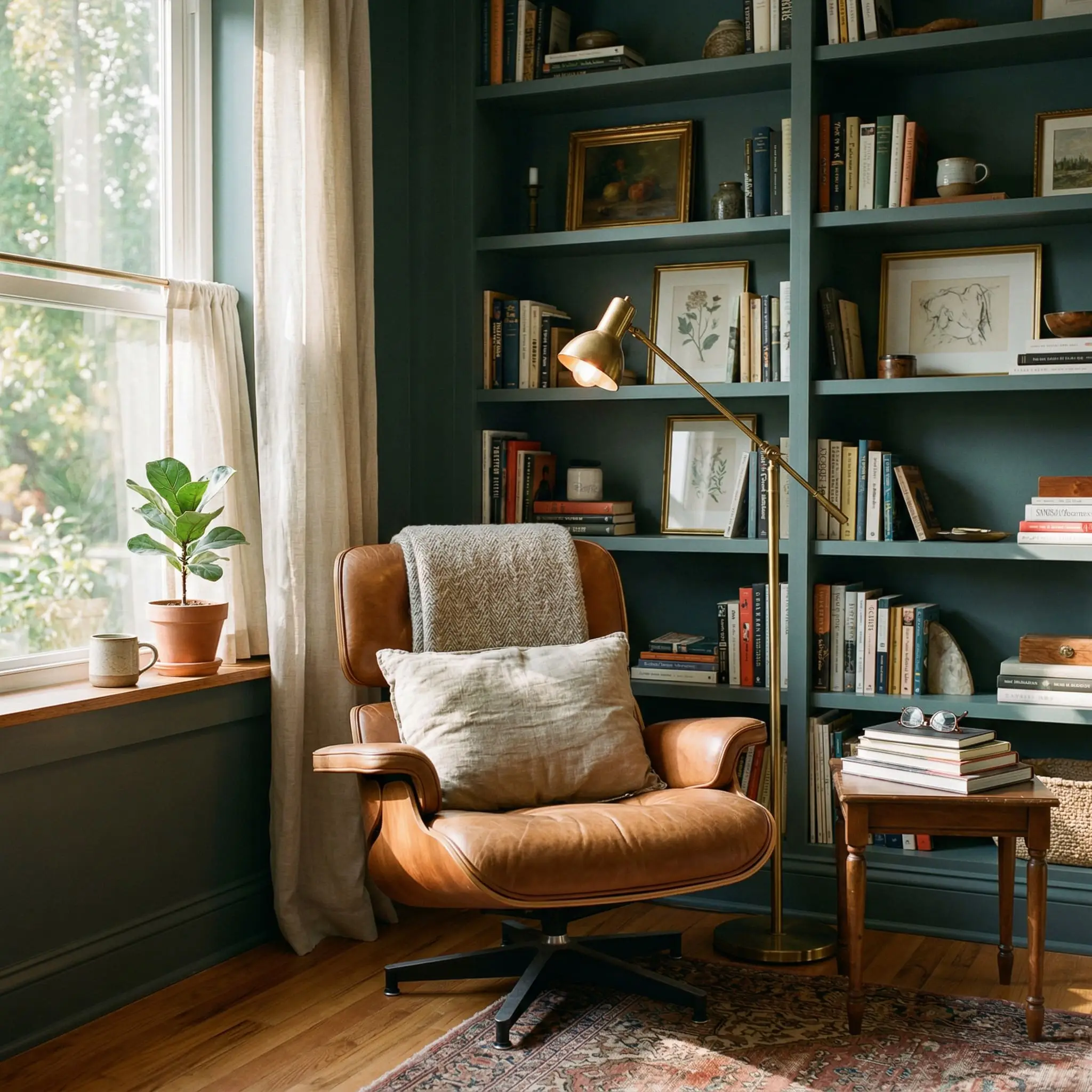
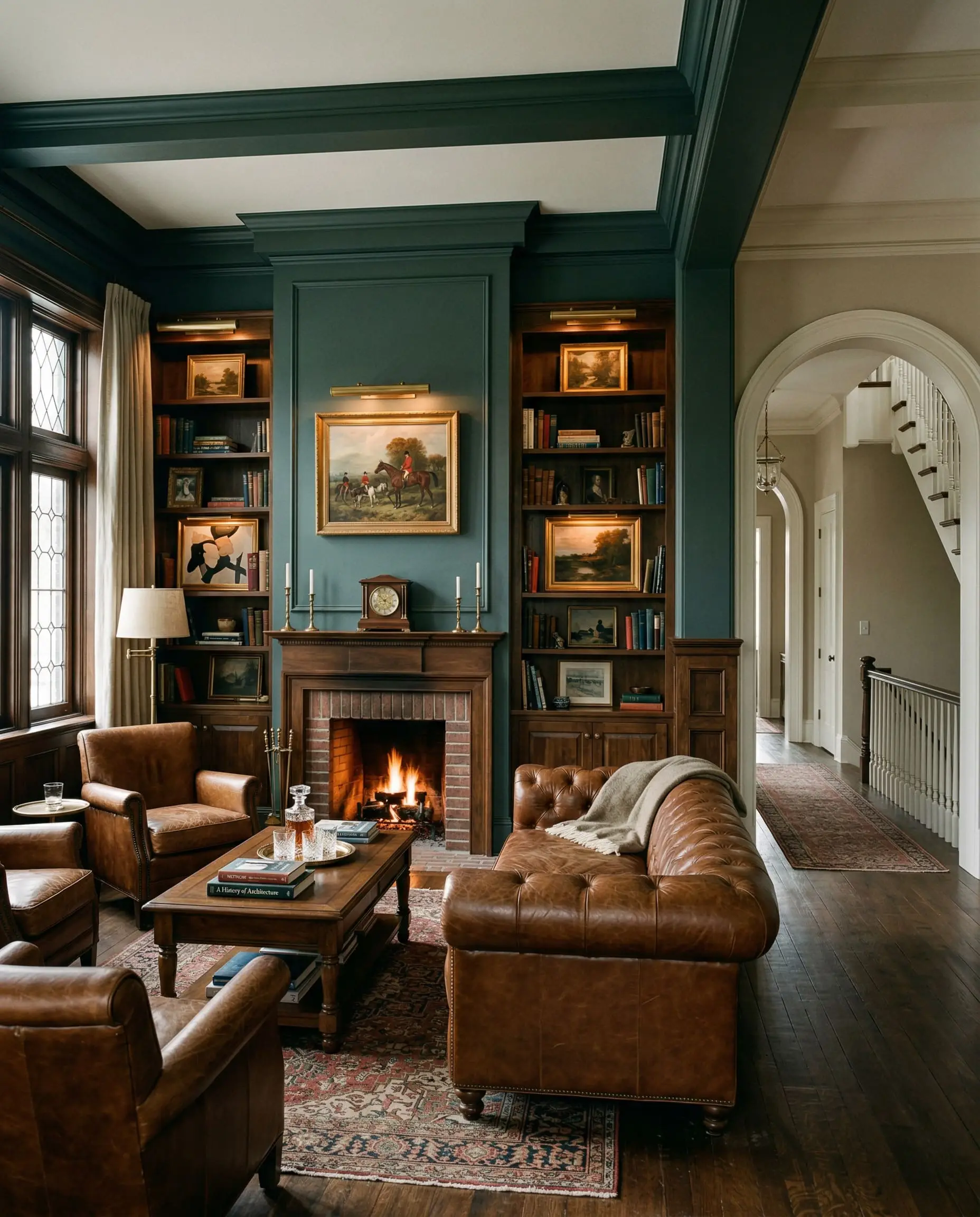
Bespoke Built-in Library Shelving
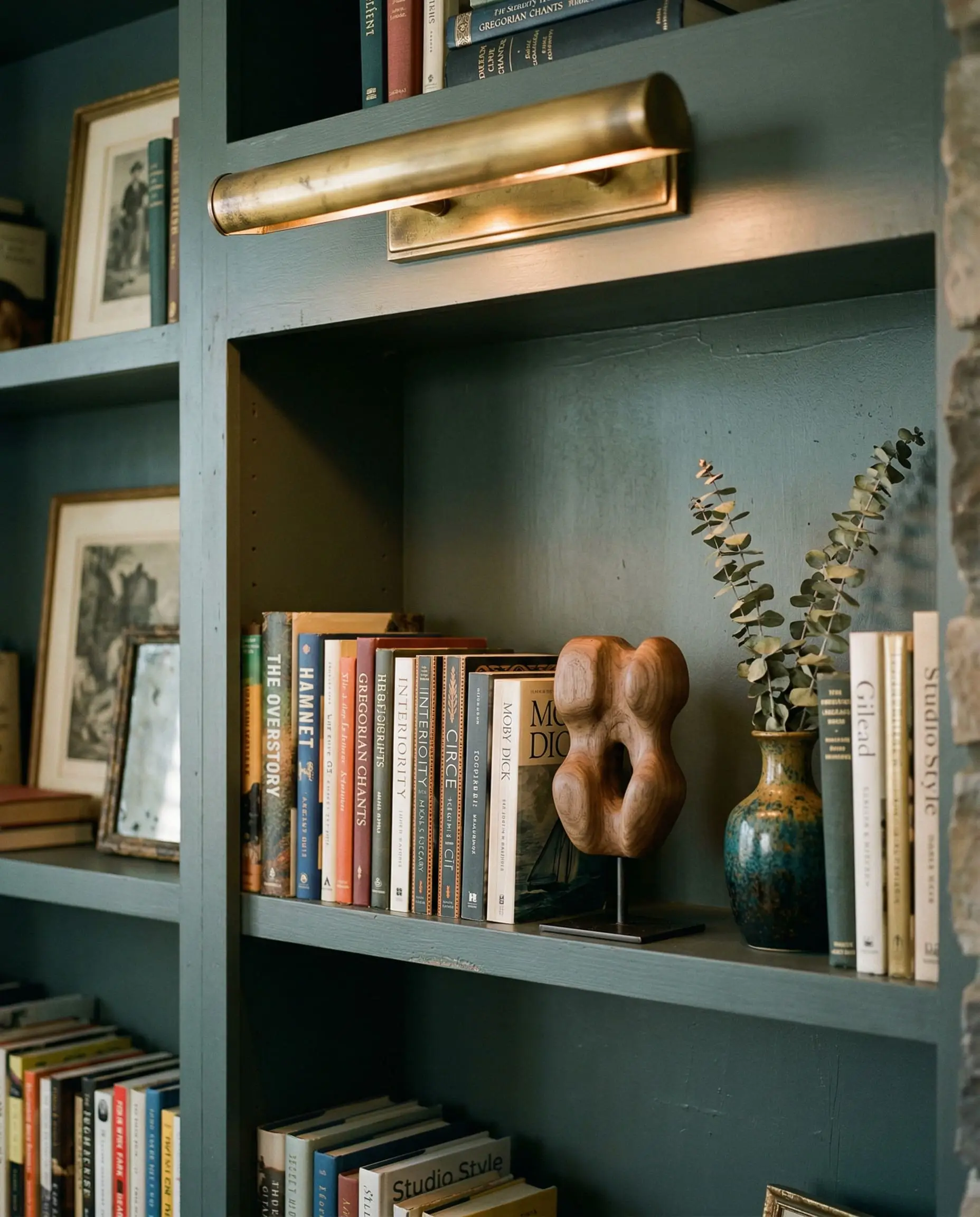
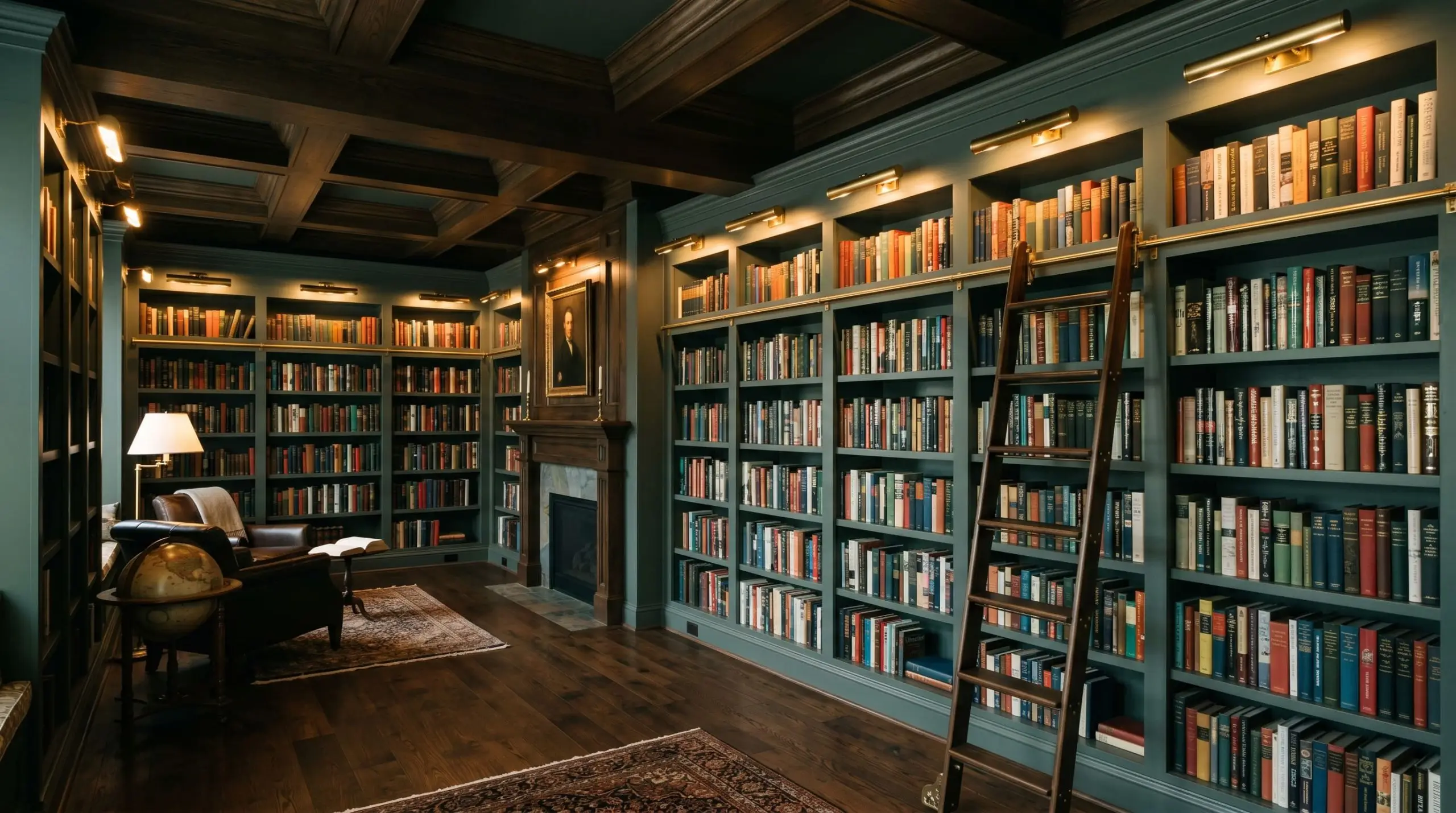
This is where the paint’s LRV works entirely in your favor. Coating floor-to-ceiling bookcases in this deep tone creates a dark, recessive backdrop. The shadows inside the shelving units deepen, pushing the colorful spines of books, warm brass picture lights, and curated decor into sharp, museum-like relief.
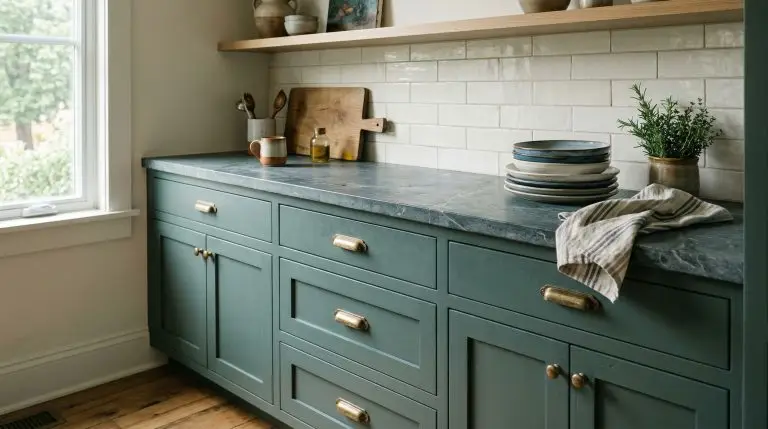
The Pairings & Accents Guide
A paint color is only as successful as the materials placed directly next to it.
Flawless Trim Pairings
Dynamic Architectural Materials
To prevent the room from feeling flat, you must introduce tactile contrast.
Formulating Coordinating Colors
Curated Mood Boards
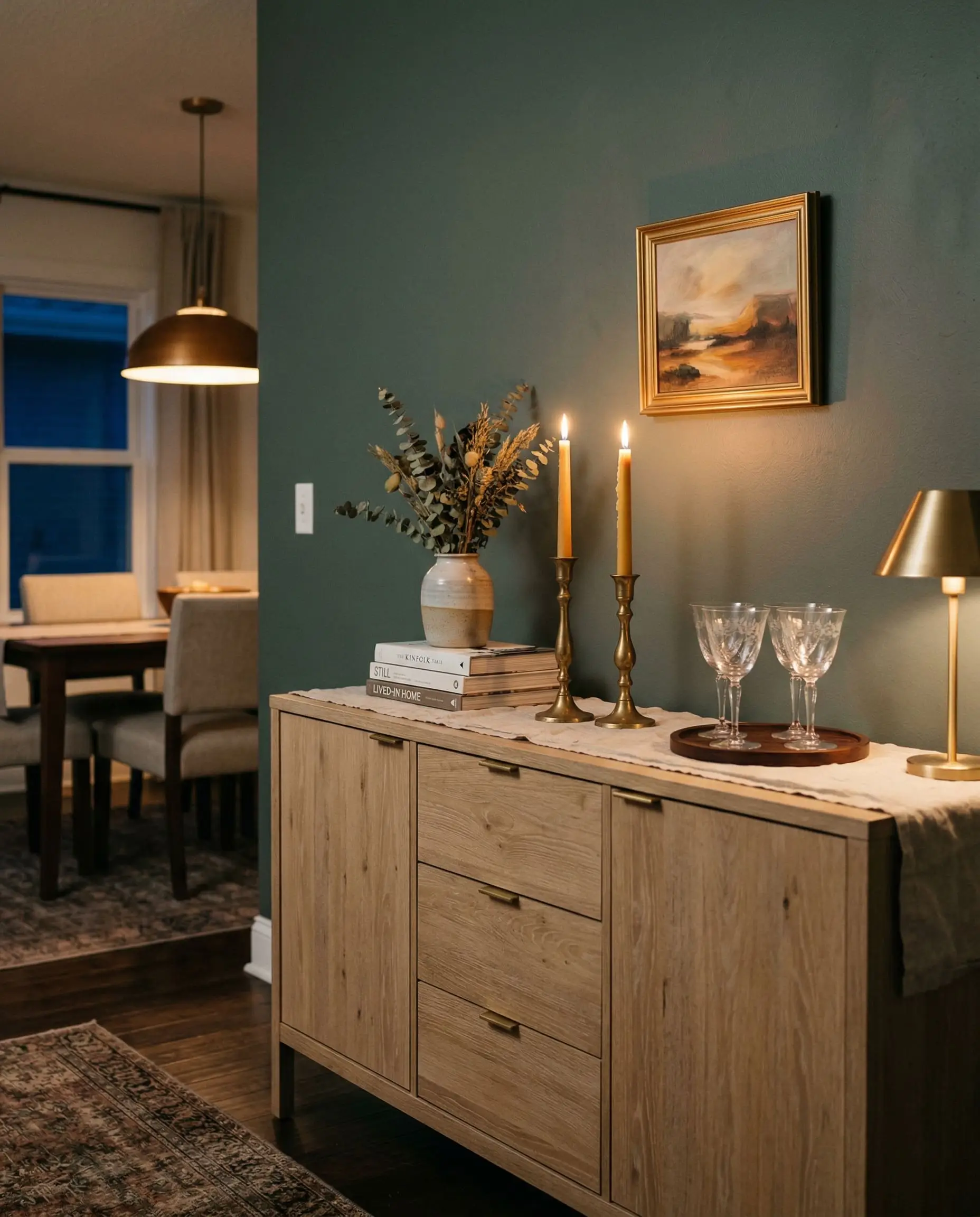
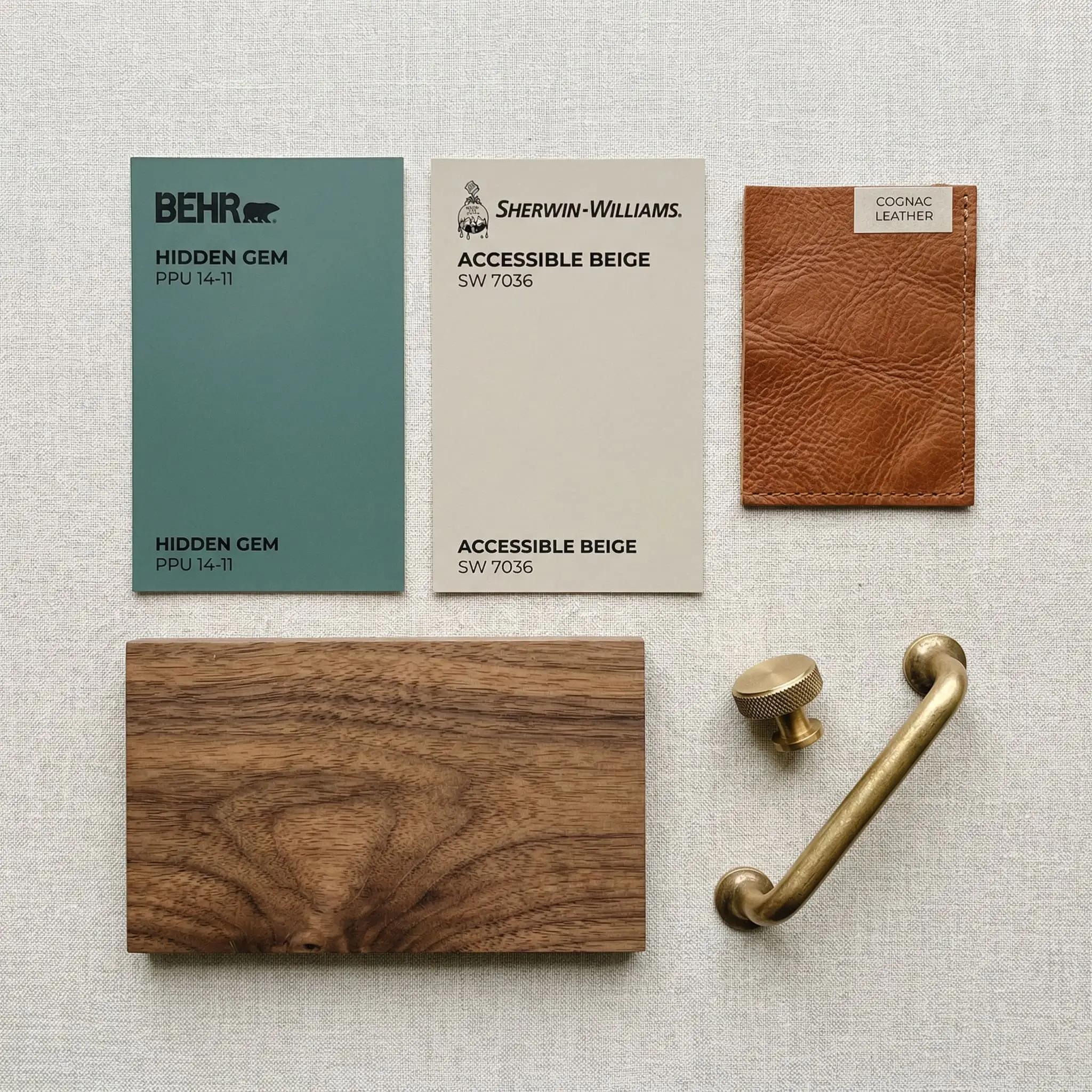
The Heritage Walnut Palette This aesthetic leans heavily into historic architectural weight and masculine sophistication. We pair the deep walls with rich, natural walnut antique furniture and heavy cognac leather seating. Unlacquered brass picture lights provide the metallic warmth, while Sherwin-Williams Accessible Beige is used on adjoining hallway walls to maintain an earthy, grounded warmth throughout the floor plan.
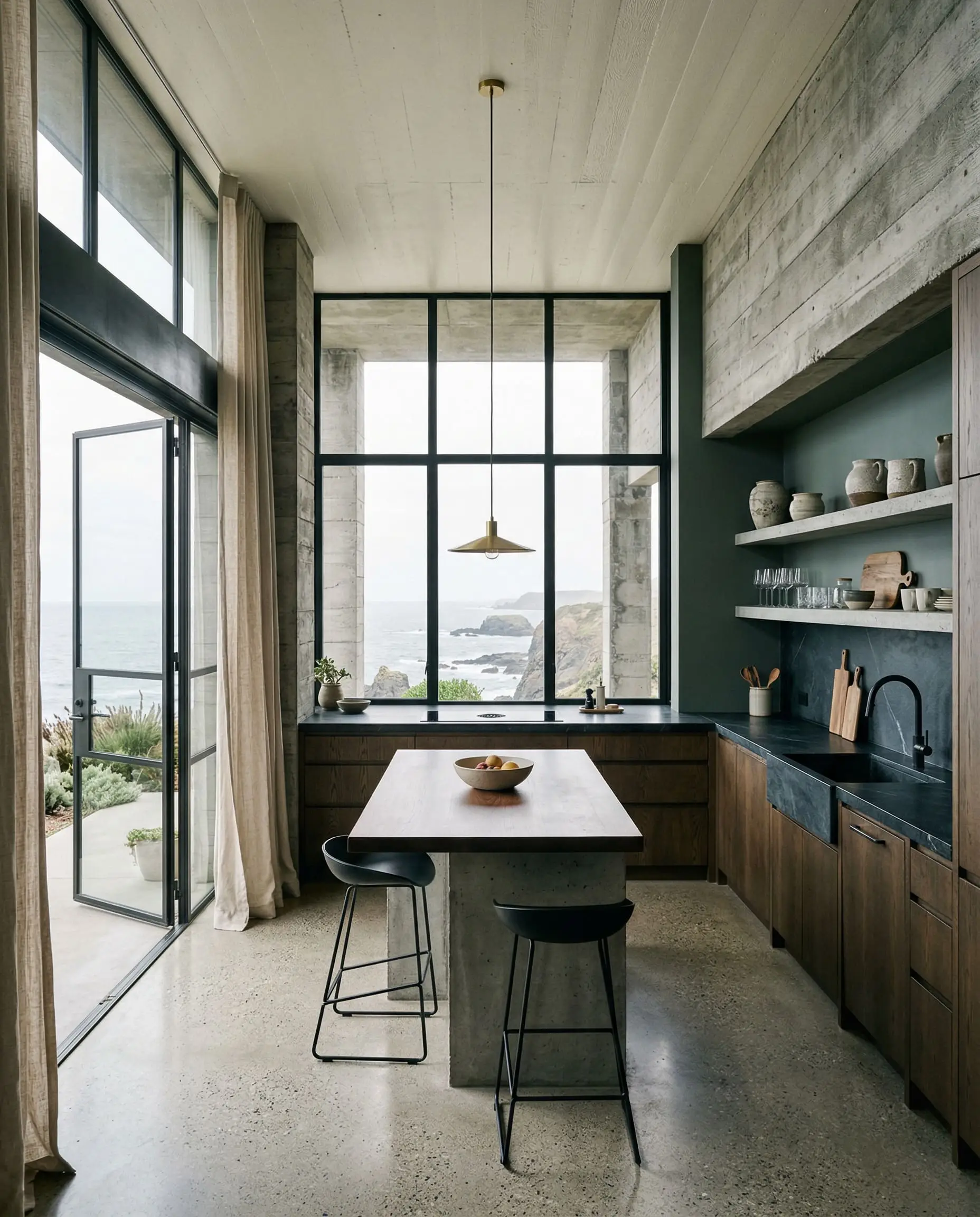
The Coastal Brutalist Palette This is a study in high-contrast, modern organic tension. The smoky green walls act as the anchor, paired with heavy, honed soapstone countertops and matte black fixtures. We introduce warm black pairings via architectural steel doors. To keep the space from feeling like a cave, large expanses of natural linen drapery and Behr Confident White ceilings bounce natural light back into the room.
Head-to-Head Comparisons
When selecting a dark, moody green, you must evaluate the micro-undertones against its closest industry rivals to ensure you are getting the exact vibe you want.
Behr Hidden Gem vs. Benjamin Moore Jack Pine
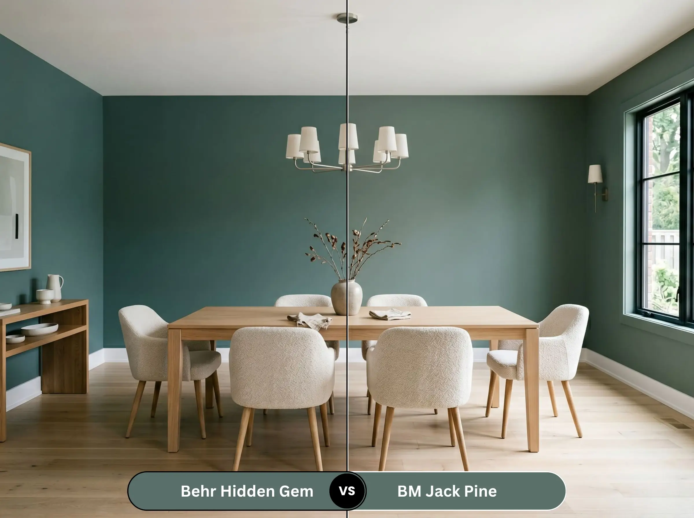
Jack Pine is noticeably warmer and leans much heavier into a true, earthy forest green. It lacks the prominent blue undertone found in the Behr shade. If your room already has a lot of cool northern light, Jack Pine might feel more balanced, whereas the Behr option will lean heavily into a cool teal.
Behr Hidden Gem vs. Sherwin-Williams Rocky River
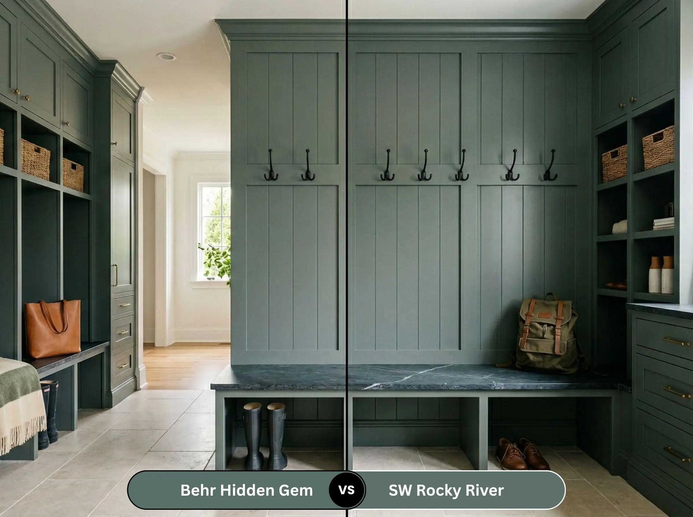
Rocky River is an incredibly close competitor, but it possesses a slightly higher LRV and a bit more gray saturation. Rocky River feels slightly more muted and “dusty” on the wall. If you want a richer, slightly more saturated jewel tone, stick with Behr.
Similar Colors & Brand Equivalents
If you are locked into a specific paint manufacturer or need a microscopic shift in depth, these are your mathematical alternatives.
Same-Brand Alternatives (Behr)
Cross-Brand Matches
Practical Application & DIY Advice
Executing a dark paint color flawlessly requires contractor-level strategy. Dark pigments behave entirely differently on the roller than light neutrals.
The Dynamic Sheen Matrix
Primer Strategy
You cannot paint an LRV 14 color directly over a white wall or builder-grade beige and expect it to look correct. You must use a tinted gray primer. A deep gray base coat reduces the number of expensive topcoats required and ensures the final green achieves its true, rich depth without looking streaky.
Coverage & Touch-Ups
Expect to apply a minimum of two heavy coats, even with premium paint lines.
Dark paints with matte finishes are highly susceptible to “flashing”—visible, shiny roller marks where the paint overlapped and dried unevenly. You must maintain a wet edge while rolling and avoid touching up small spots later, as the touch-up will almost certainly dry slightly off-sheen.
Hackrea Pro-Tip
Frequently Asked Questions
It is fundamentally a cool paint color. While the green base provides some earthiness, the prominent blue and gray undertones place it firmly on the cooler side of the color spectrum.
The primary undertones are cool blue and a heavy, smoky gray. The gray is what neutralizes the color, keeping it sophisticated rather than neon.
It is undeniably a green paint, but in north-facing rooms or under cool LED lighting, the blue undertones will surge forward, making it look like a deep, moody teal.
Benjamin Moore Chantilly Lace offers the crispest, most modern contrast. For a softer, more traditional transition, Behr Cameo White or Sherwin-Williams Alabaster are excellent, slightly warmer choices.
Absolutely. Its heavy gray undertone makes it a phenomenal choice for exterior siding, fascia, or front doors, as it won’t wash out or look overly vibrant under harsh, direct sunlight.
Final Verdict & Expert Warnings
Behr Hidden Gem is a masterfully engineered color that rightfully earned its title as the 2026 Color of the Year. It is the ultimate choice for homeowners who want to inject deep, moody sophistication into an office, dining room, or exterior without resorting to stark black or predictable navy. It is a “grown-up” jewel tone that relies on its smoky gray anchor to remain timeless.
However, we must issue a strict Clash Warning. You must entirely avoid pairing this paint with cherry wood tones or mahogany; the red-against-green contrast will trigger a permanent, inescapable “Christmas” effect in your room. Furthermore, keep this shade far away from stark, sterile, hospital whites (which will make the green look muddy) and overly yellow creams (which will violently clash with the cool blue undertones). Respect the color math, control your lighting, and this shade will completely redefine your home’s architecture.