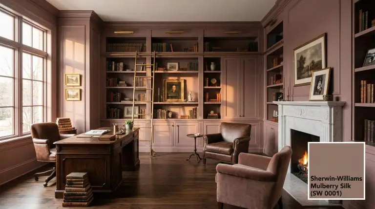
Sherwin-Williams Mulberry Silk (SW 0001) is a deeply muted, earthy plum-brown with warm, dusty rose undertones. As part of the Historic Collection, this sophisticated mid-tone boasts an LRV of 20, making it a moody, grounding choice for formal spaces, vintage bathrooms, and accent cabinetry.
Sherwin-Williams Mulberry Silk (SW 0001) Color Review: The Definitive Guide to Sophisticated, Moody Warmth
We know exactly what you are afraid of. You want a sophisticated, moody warm tone, but you are terrified of accidentally turning your room into a dated 1990s mauve nightmare or a muddy, oppressive brown cave.
You are not alone in this fear. Navigating the world of dark, warm neutrals requires mathematical precision, not just a good eye.
At Hackrea, our color science team treats paint as an architectural material. Sherwin-Williams Mulberry Silk (SW 0001) is not just another flat brown; it is a complex, chromatic gray disguised as an earthy mauve. When deployed correctly, it delivers an unparalleled sense of grounded elegance and vintage charm.
If you want to harness its historic depth without falling into amateur traps, you must understand how this color responds to light and contrast.
The Color DNA: Undertones & LRV
Every paint color is driven by its underlying chemical math. Mulberry Silk sits firmly in the red-orange to red-purple hue family, but its read on the wall is highly complex.
To understand how this paint will behave, you must look at its component parts:
With a Light Reflectance Value of 20, Mulberry Silk absorbs a massive 80% of the light it receives.
This is not a whole-house neutral. It is a deliberate, heavy mid-tone that will recede significantly in low-light environments, transforming into a chocolatey plum. You must commit to its darkness rather than fighting it.
You can apply wallpapers, paints, etc. on walls and see how they look in various interiors.

Lighting Effects & The Chameleon Factor
If you are terrified of that dated 1990s mauve, your lighting strategy is your ultimate defense. Mulberry Silk is highly reactive to its environment, heavily shifting its undertones based on the color temperature of your light source.
You control the undertones by controlling the exposure.
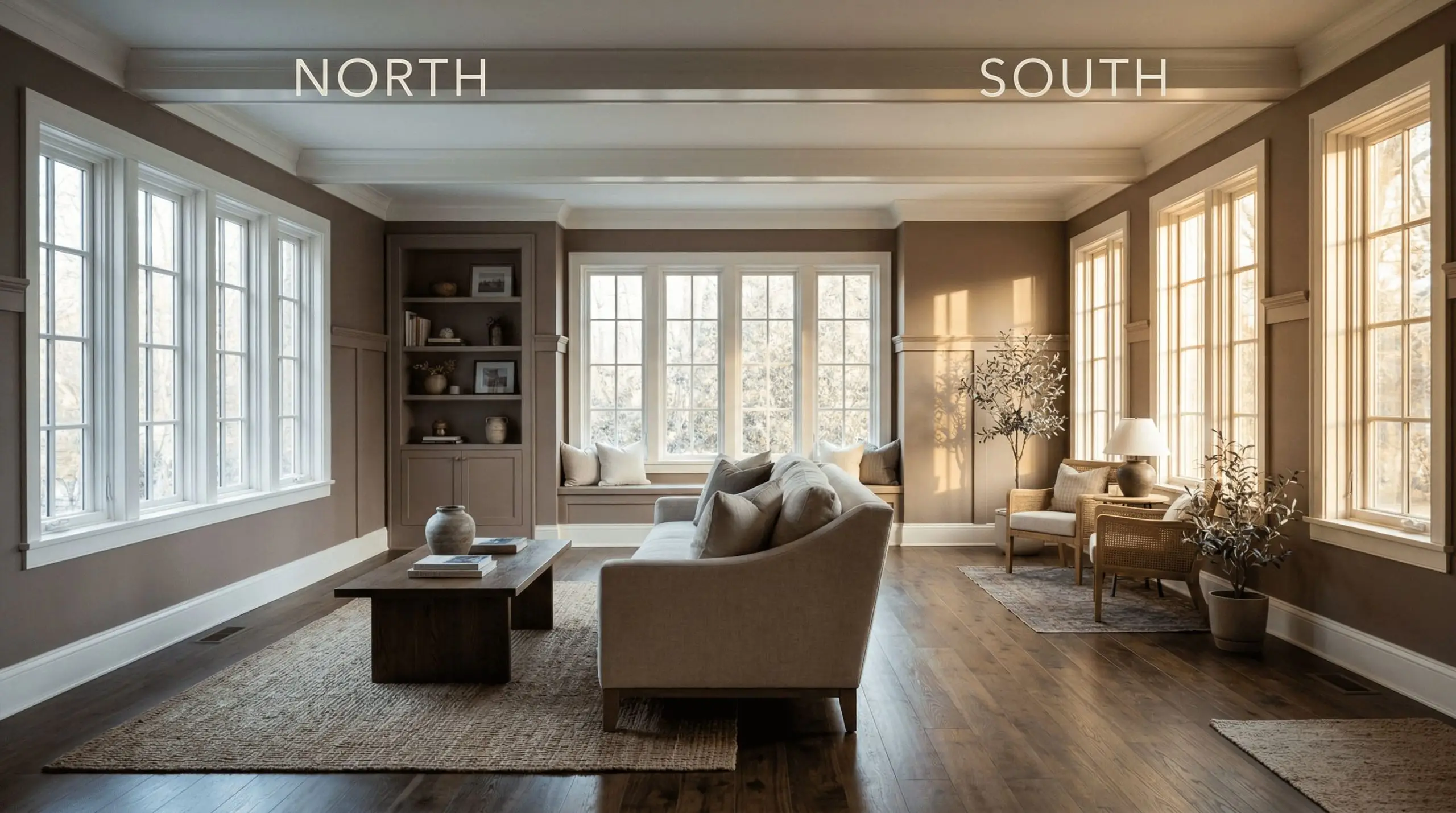
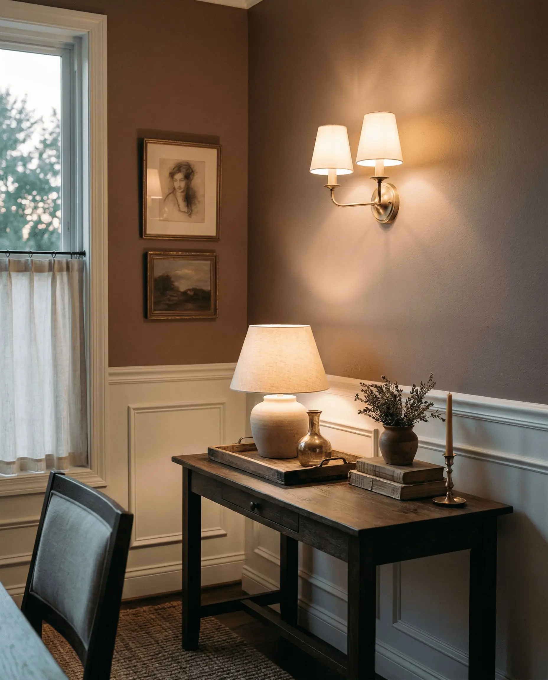
To prevent Mulberry Silk from looking like a bruised plum, you must dictate its contrast. Surrounding it with stark, cool white trim will pull out the unwanted purple notes. Always pair it with creamy, warm whites to lock the earthy brown tones in place.
Undertone Secret
Popular Room Applications
Let us be fiercely honest: Mulberry Silk is not a versatile, slap-it-anywhere color. It requires architectural intent and specific lighting conditions to succeed. If you try to force this into a windowless hallway, it will look like mud.
When used in the right spaces, however, it delivers an incredibly high-end aesthetic.
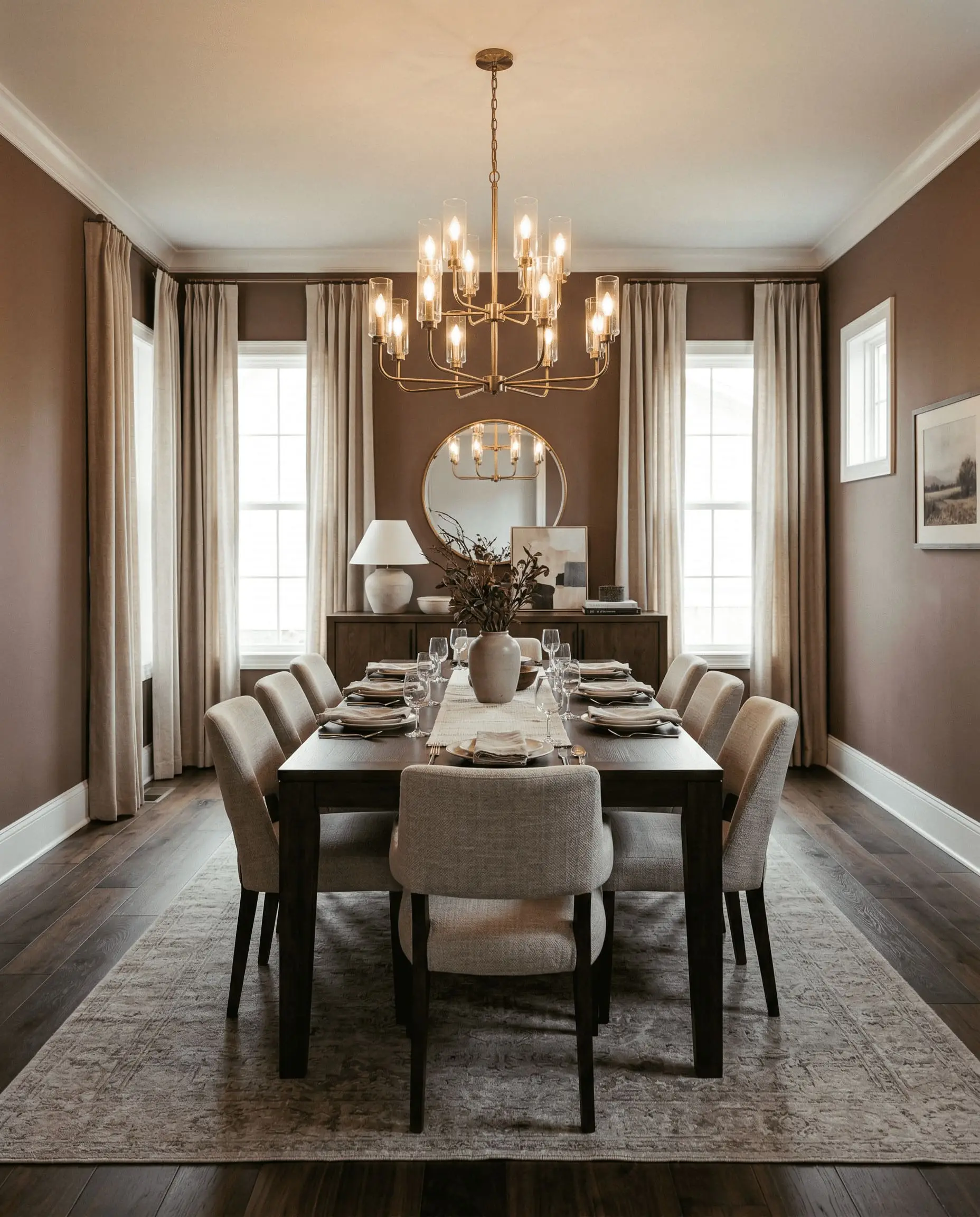
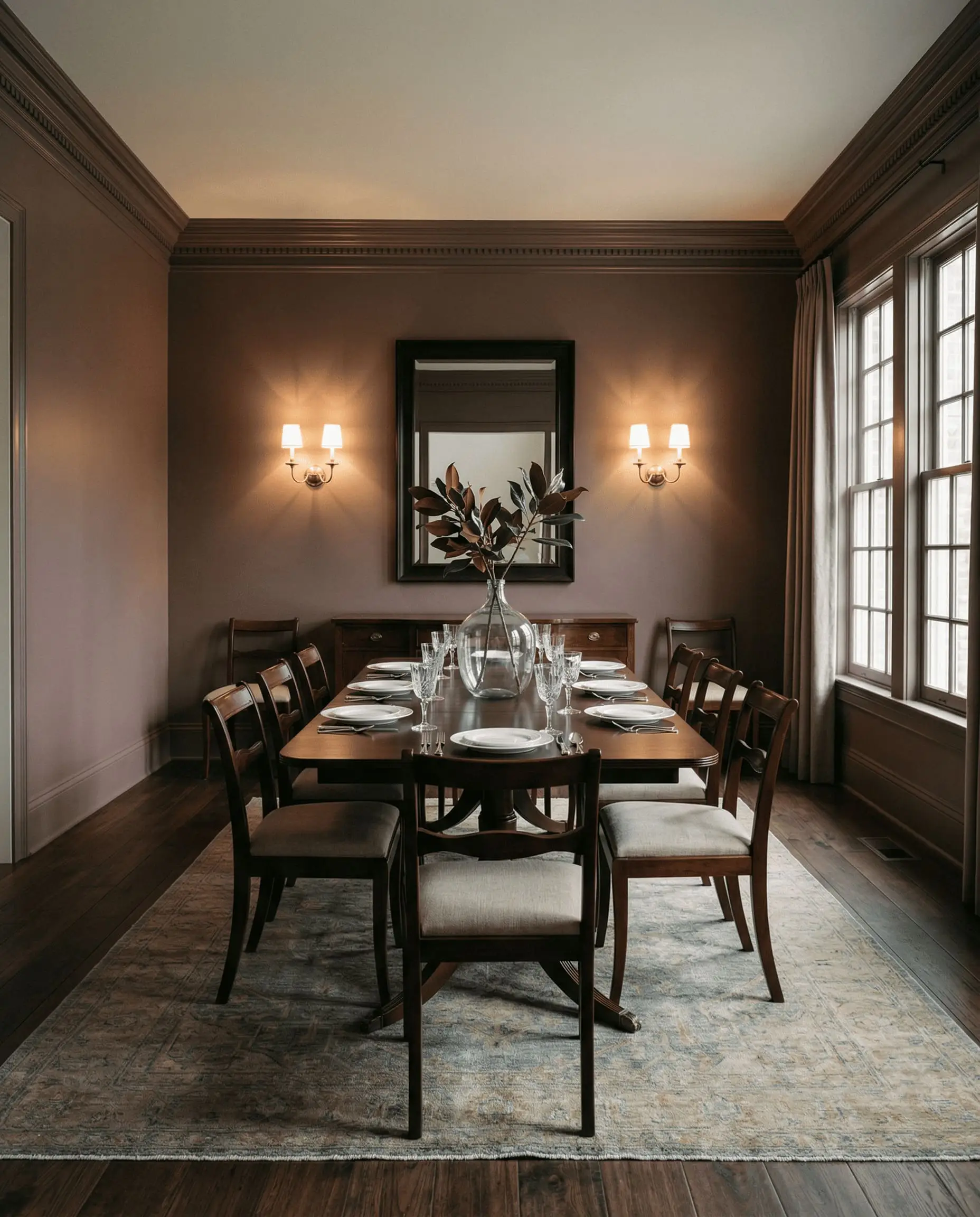
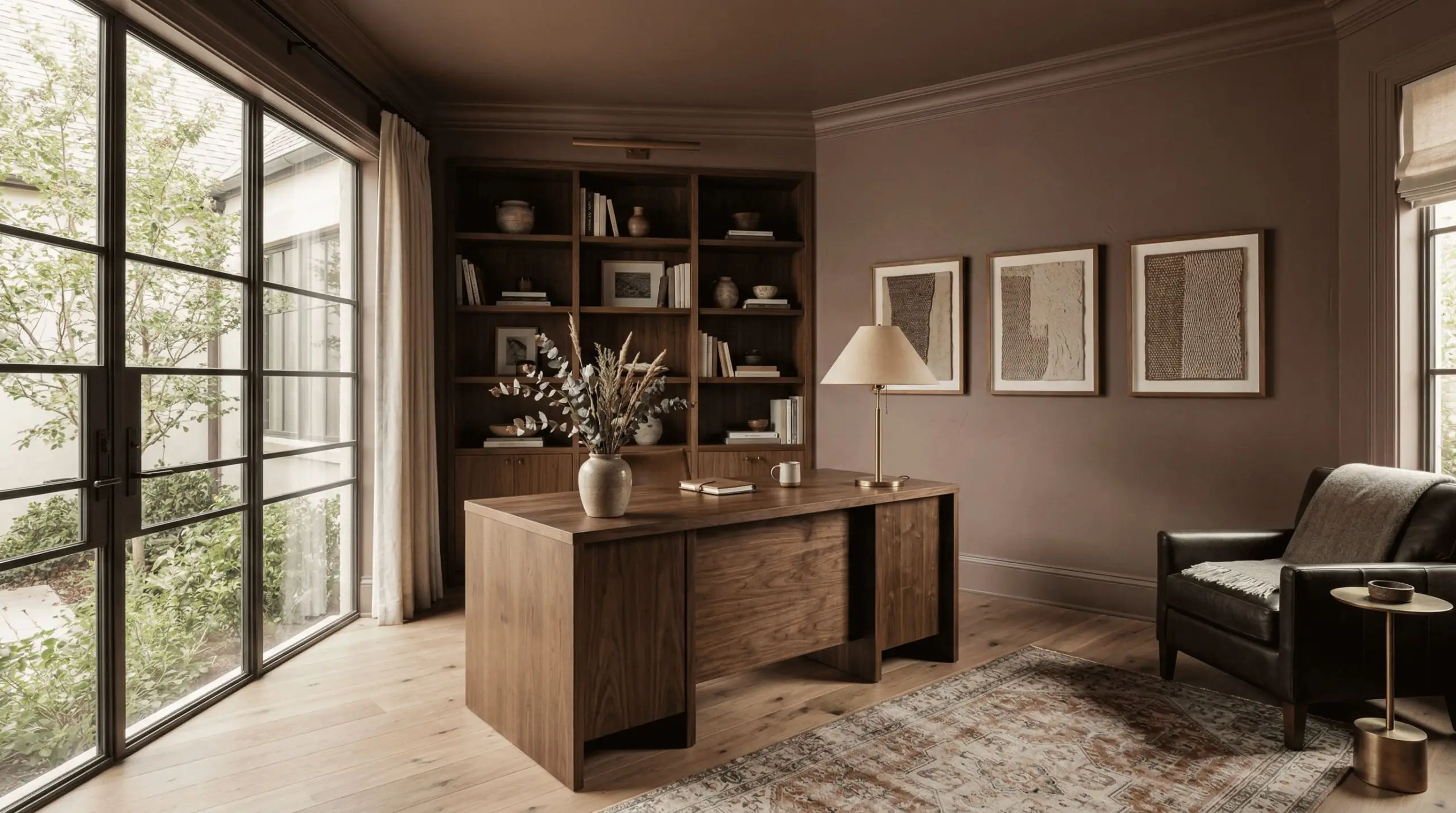
Designing Formal Dining Rooms
This is where Mulberry Silk truly dominates. Because formal dining rooms are typically used in the evening under warm artificial lighting, the paint’s rich brown-red undertones create a highly intimate, conversational atmosphere.
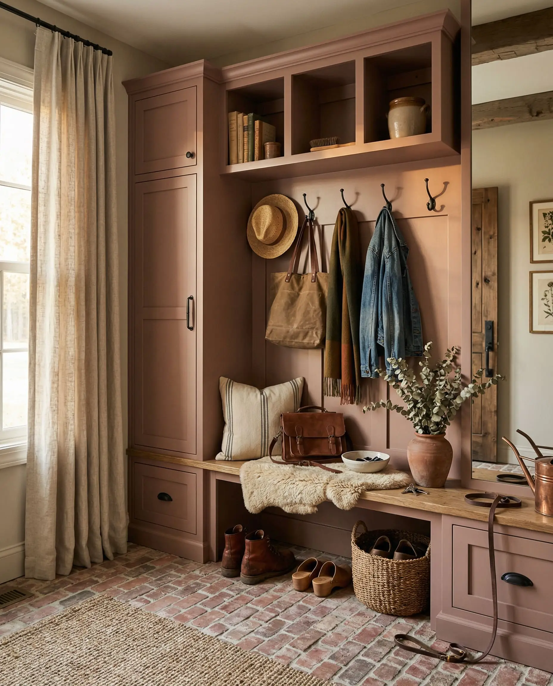
Do not break up the walls with a stark white chair rail. Instead, carry the color from the baseboards to the crown molding for a seamless, enveloping effect.
In a Transitional dining room, pair this paint with heavy linen drapery and unlacquered brass chandeliers to bounce warm light around the space. In a Modern Organic setting, contrast the earthy mauve walls with raw, wire-brushed oak dining tables and matte black iron accents.
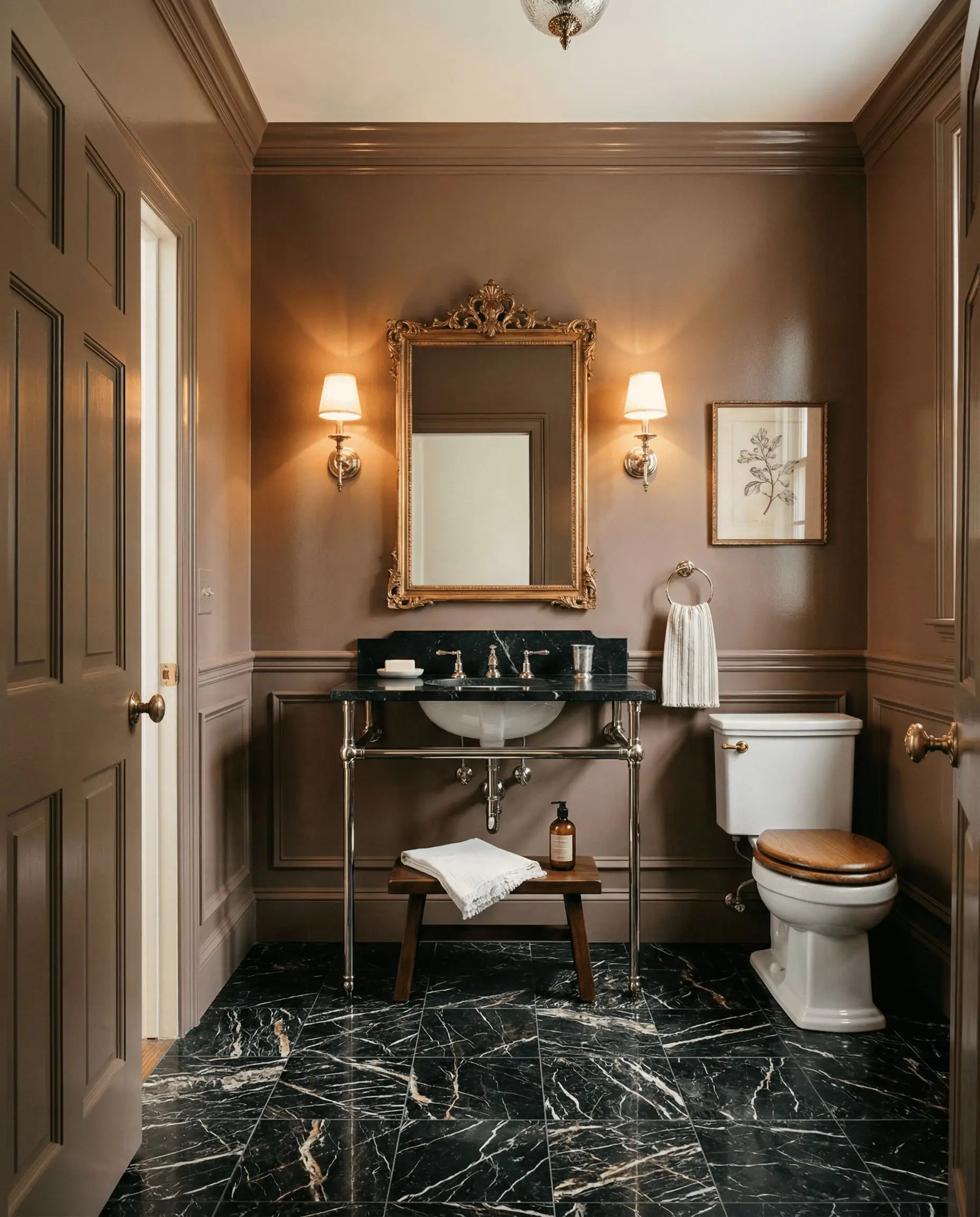
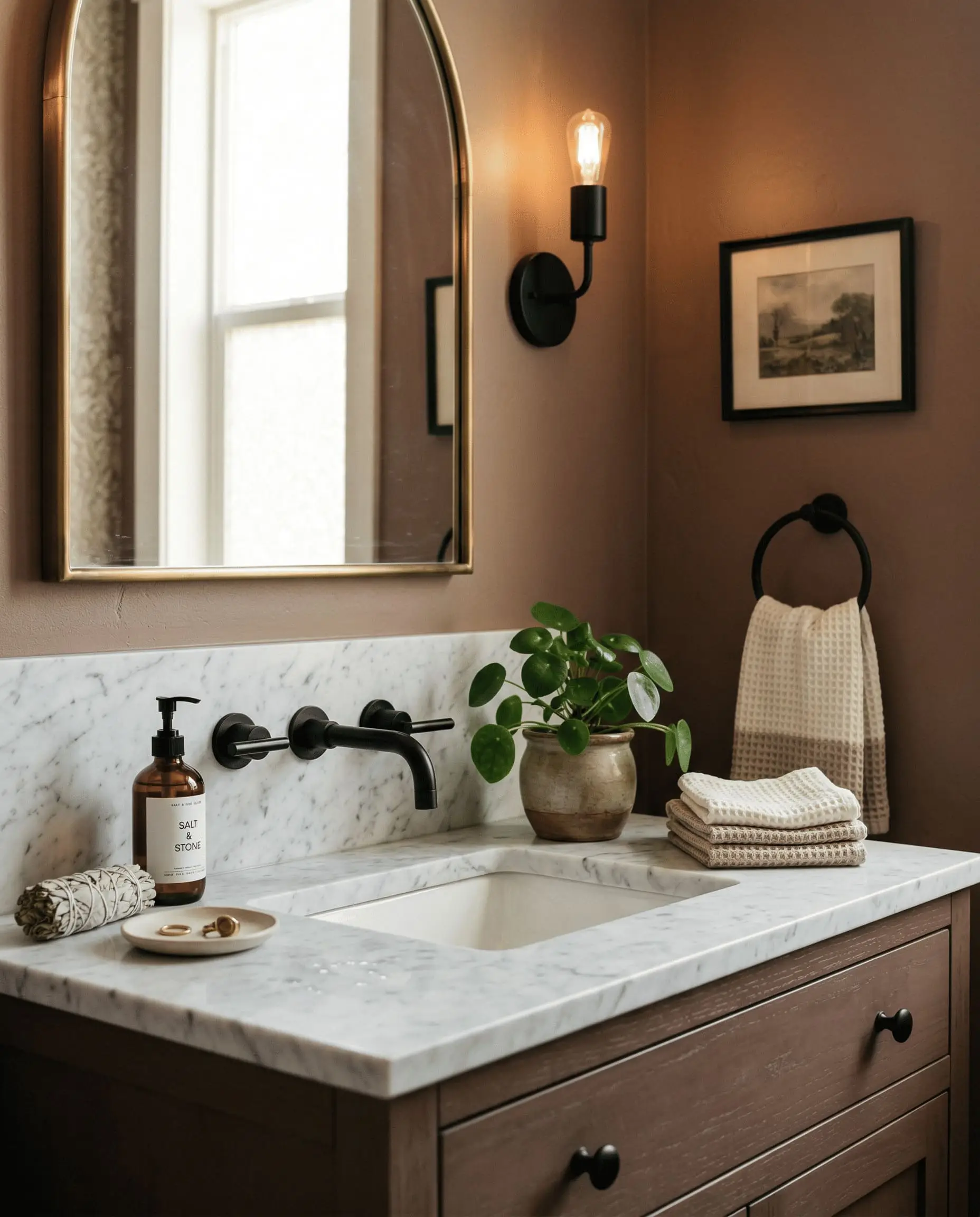
Crafting Moody Powder Rooms
Powder rooms are the perfect laboratory for dark, dramatic colors. Because these spaces lack natural light, Mulberry Silk will read much darker, leaning into its chocolate-plum DNA.
To maximize the impact, use a high-sheen finish on the walls to reflect your vanity lighting.
For a Vintage aesthetic, pair the walls with a polished nickel console sink and a heavily veined black marble floor. If you prefer a Moody Contemporary look, install a floating walnut vanity and matte brass wall sconces directly against the plum-brown backdrop.
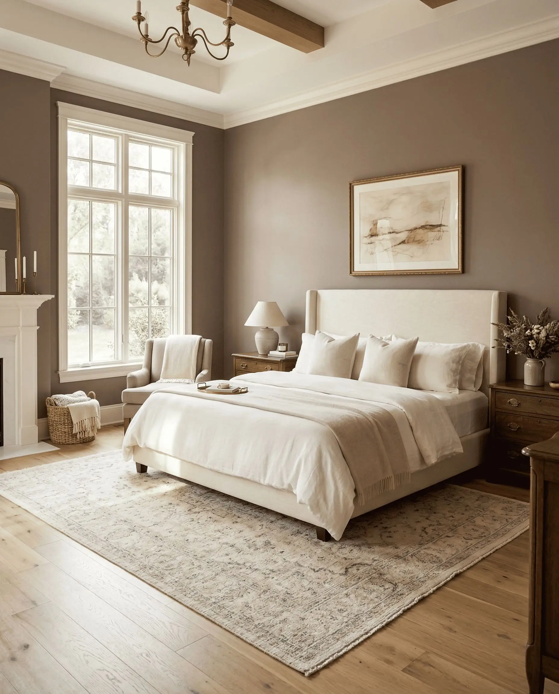
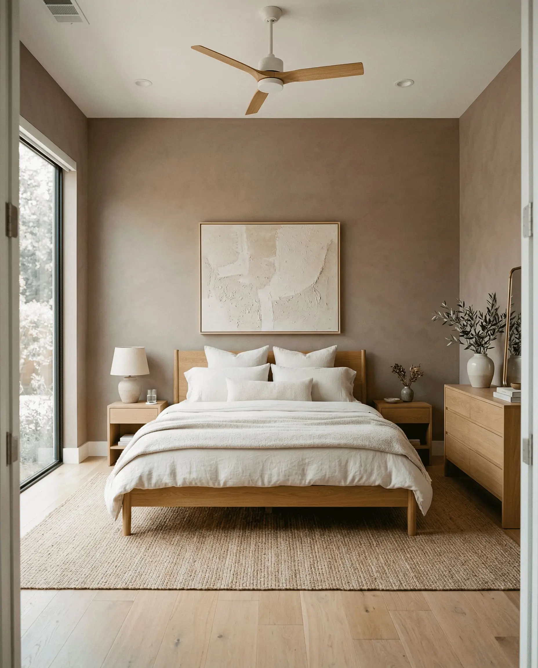
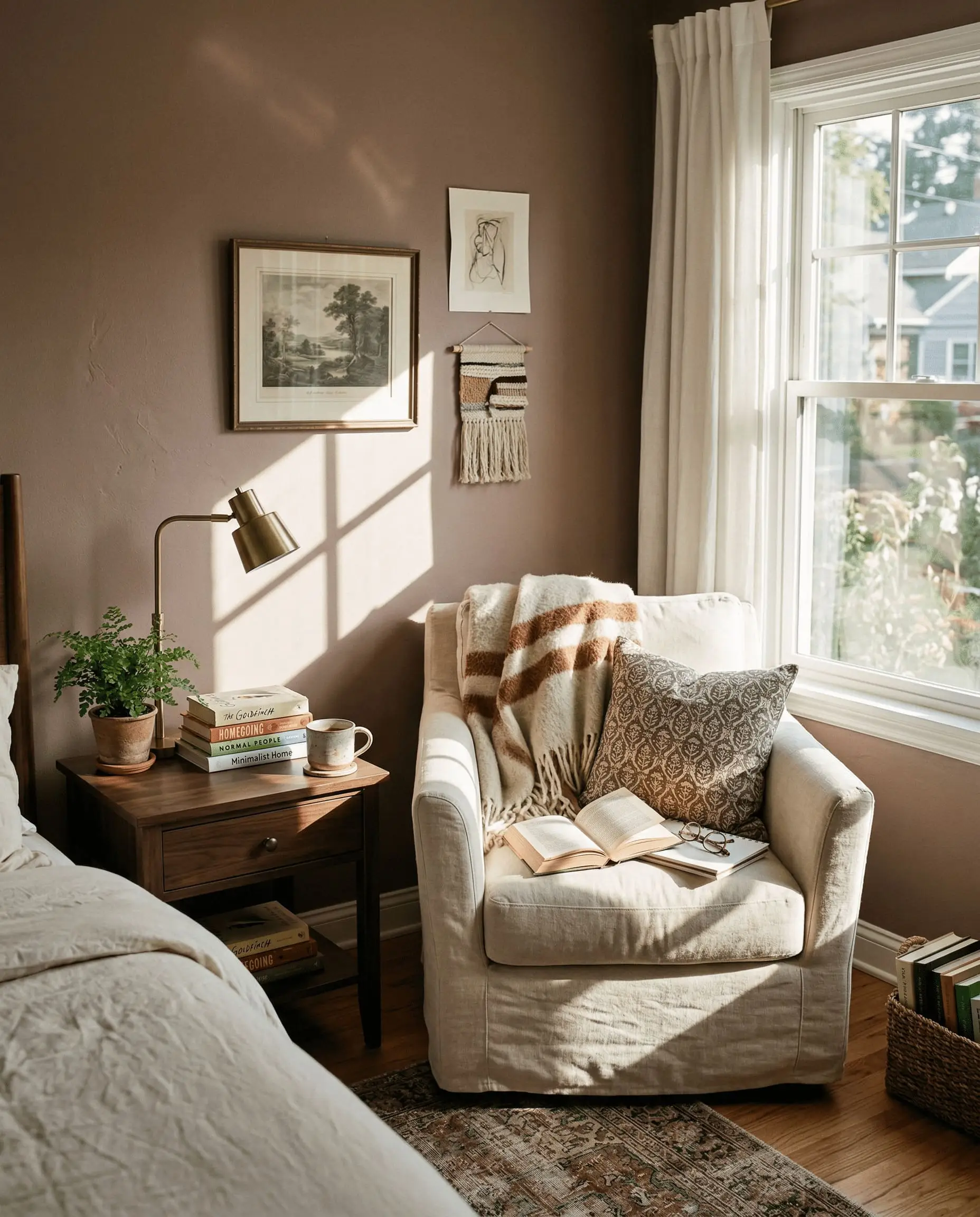
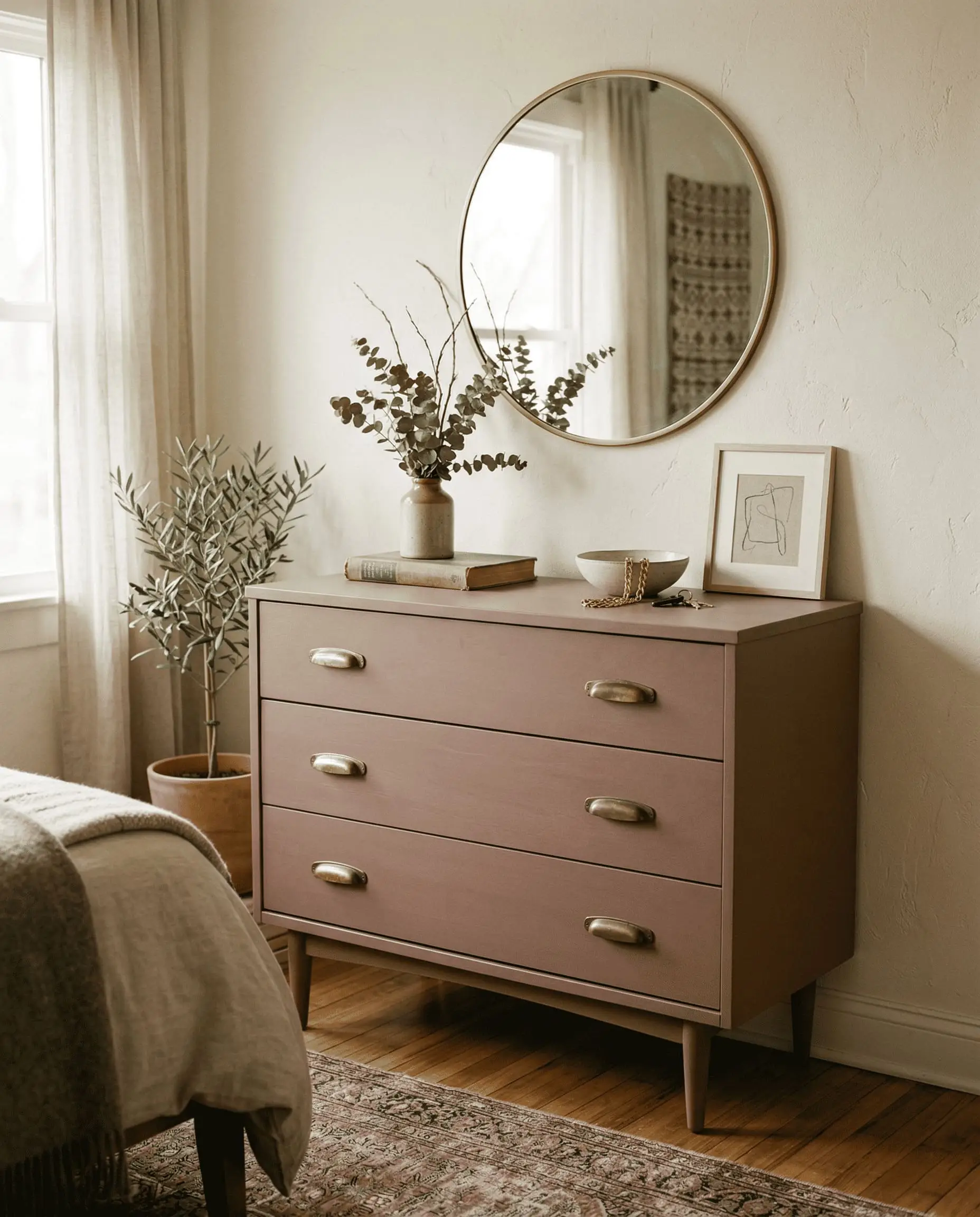
Grounding Primary Bedrooms
Mulberry Silk works beautifully in primary bedrooms, provided the room receives ample Southern or Western light. The warmth of the dusty rose undertones creates a deeply relaxing, grounding environment.
You must balance the visual weight of the walls with lighter textiles.
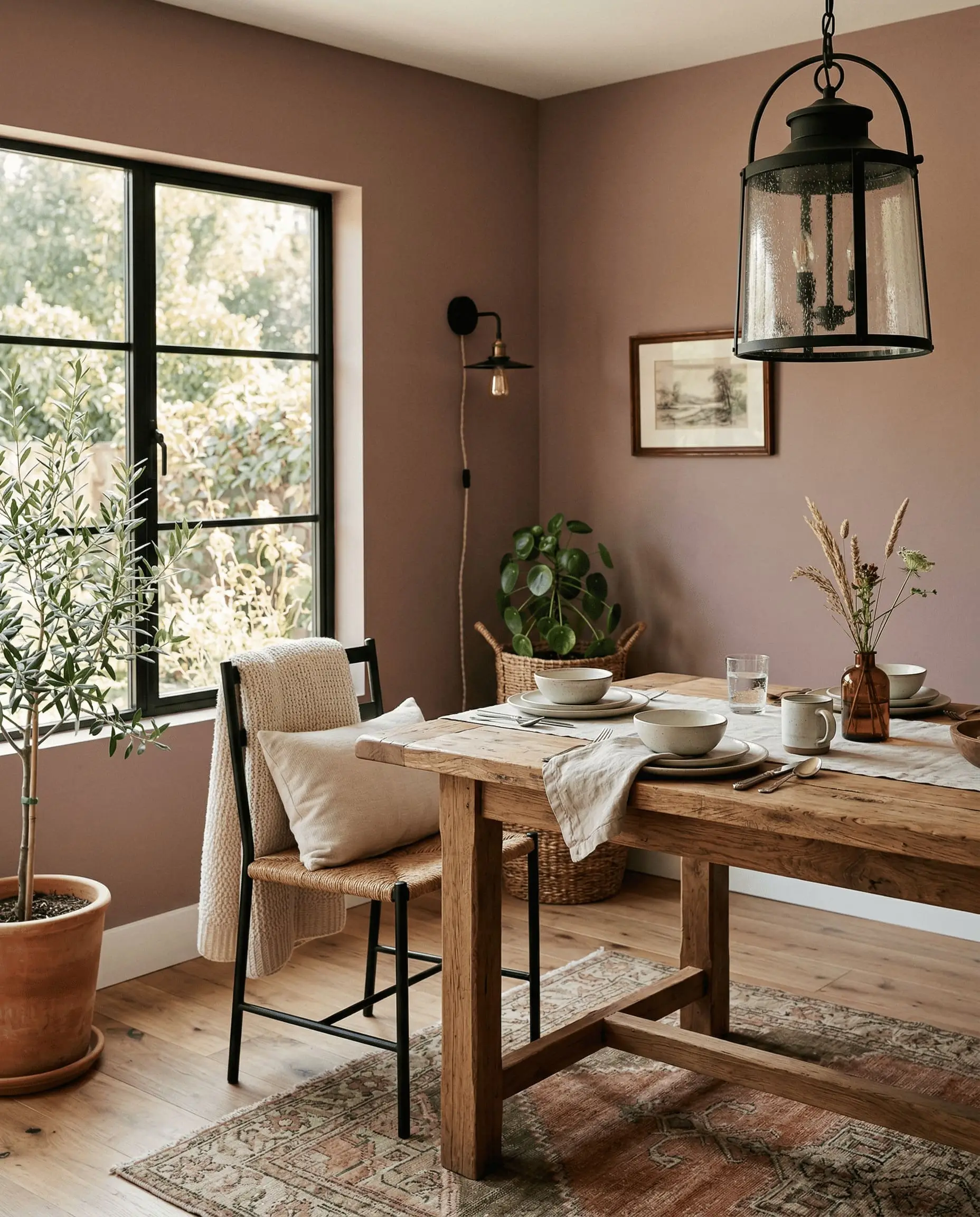
In a Classic Traditional bedroom, anchor the space with a creamy upholstered headboard and crisp ivory bedding. For a Minimalist Earthy approach, pair the walls with rumpled terracotta linen sheets, jute rugs, and heavily textured plaster lamps.
Signature Design Ideas & Inspiration
Moving beyond standard four-wall applications, Mulberry Silk truly shines when applied to specific architectural features. This is where its complex color DNA can be manipulated for maximum design impact.
Immersive Color-Drenched Studies
If you want to create a space that feels deeply intellectual and enveloping, color drenching is your answer. By painting the walls, baseboards, crown molding, and ceiling in Mulberry Silk, you erase the visual boundaries of the room.
This sensorial approach amplifies the moody warmth, making the space feel like a velvet-lined jewelry box. The lack of white contrast prevents the eye from stopping, allowing the muddy undertones to wrap the room in a continuous, calming embrace.
Victorian & Craftsman Exterior Accents
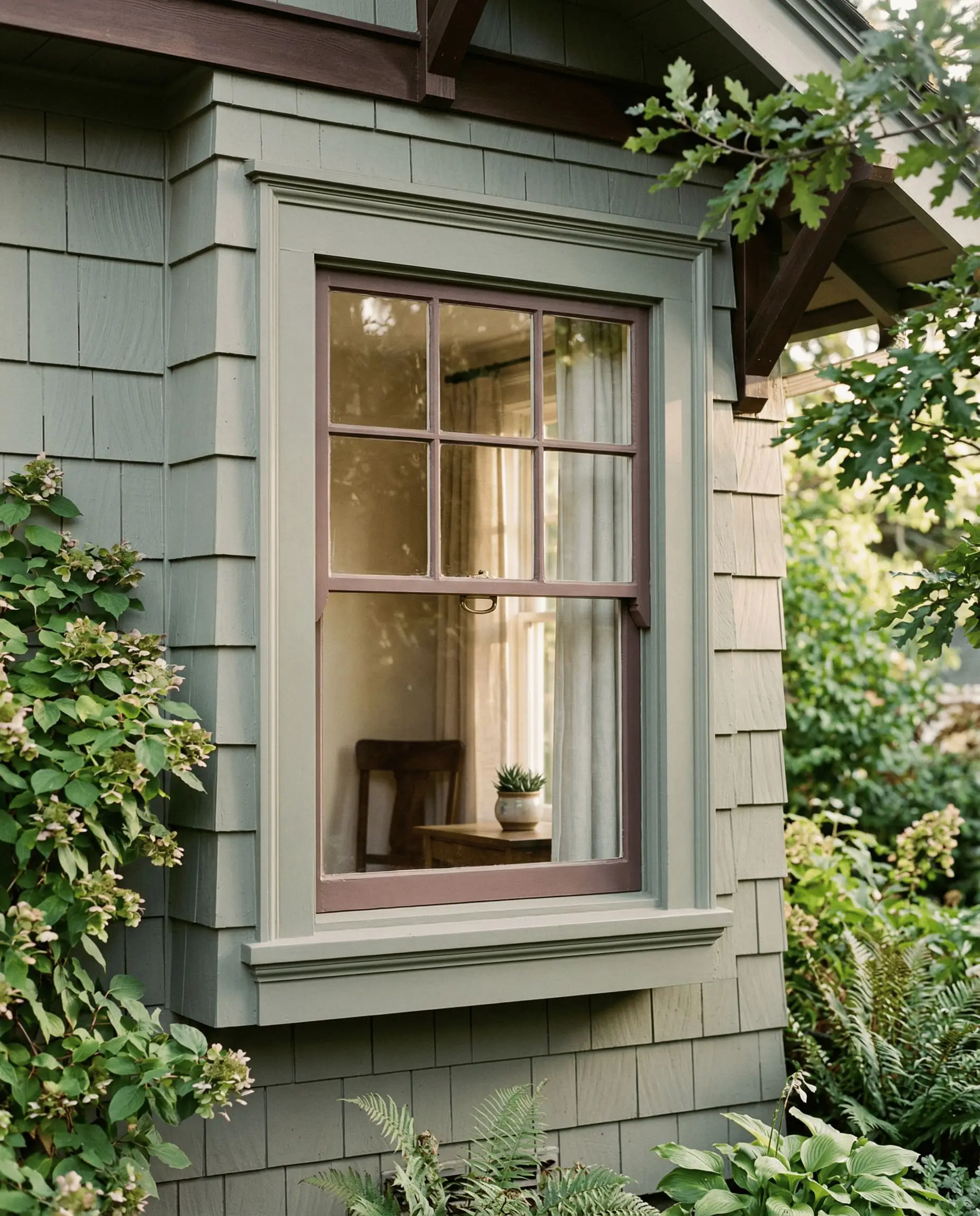
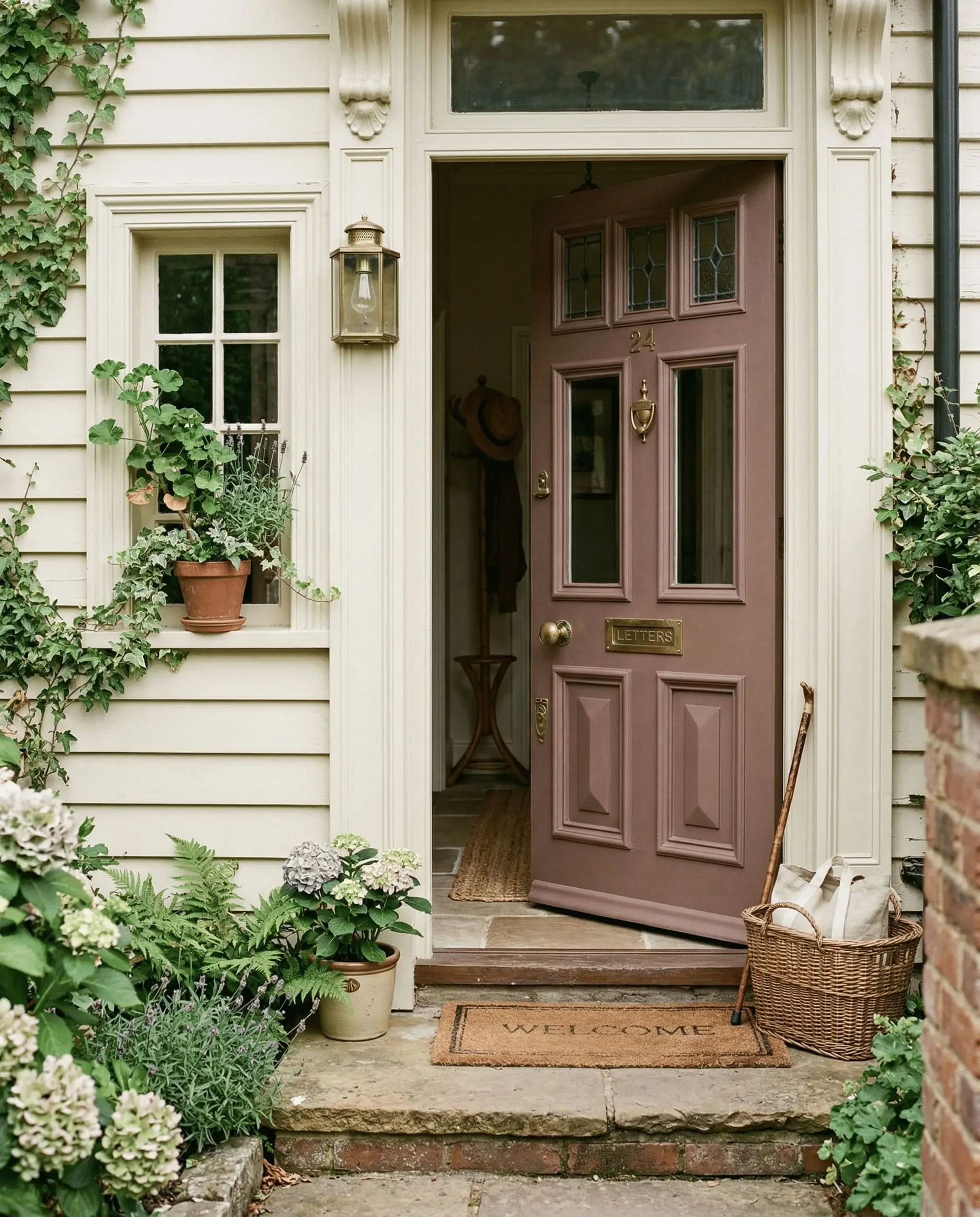
Tying a color to its architectural roots is the fastest way to make it look expensive. Mulberry Silk belongs to a deeply historic palette, making it a flawless choice for Victorian or Craftsman exterior accents.
When applied to a heavy wooden front door or original window sashes, the color reads as a historically accurate, muted terracotta. It provides brilliant, period-appropriate contrast against olive green or warm cream exterior siding.
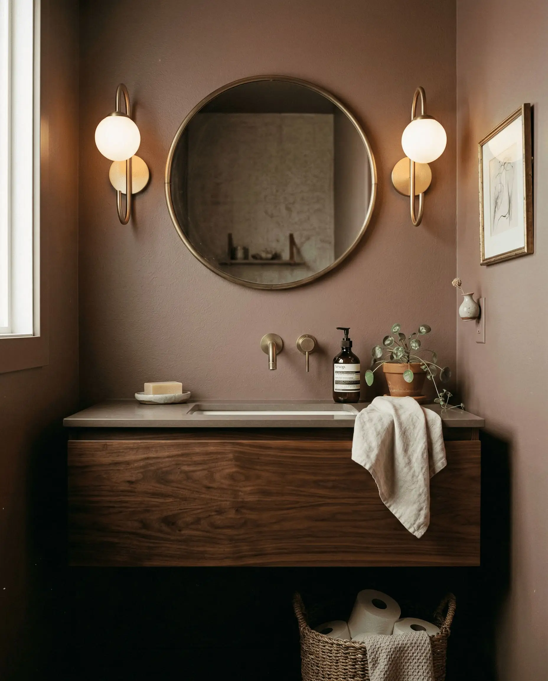
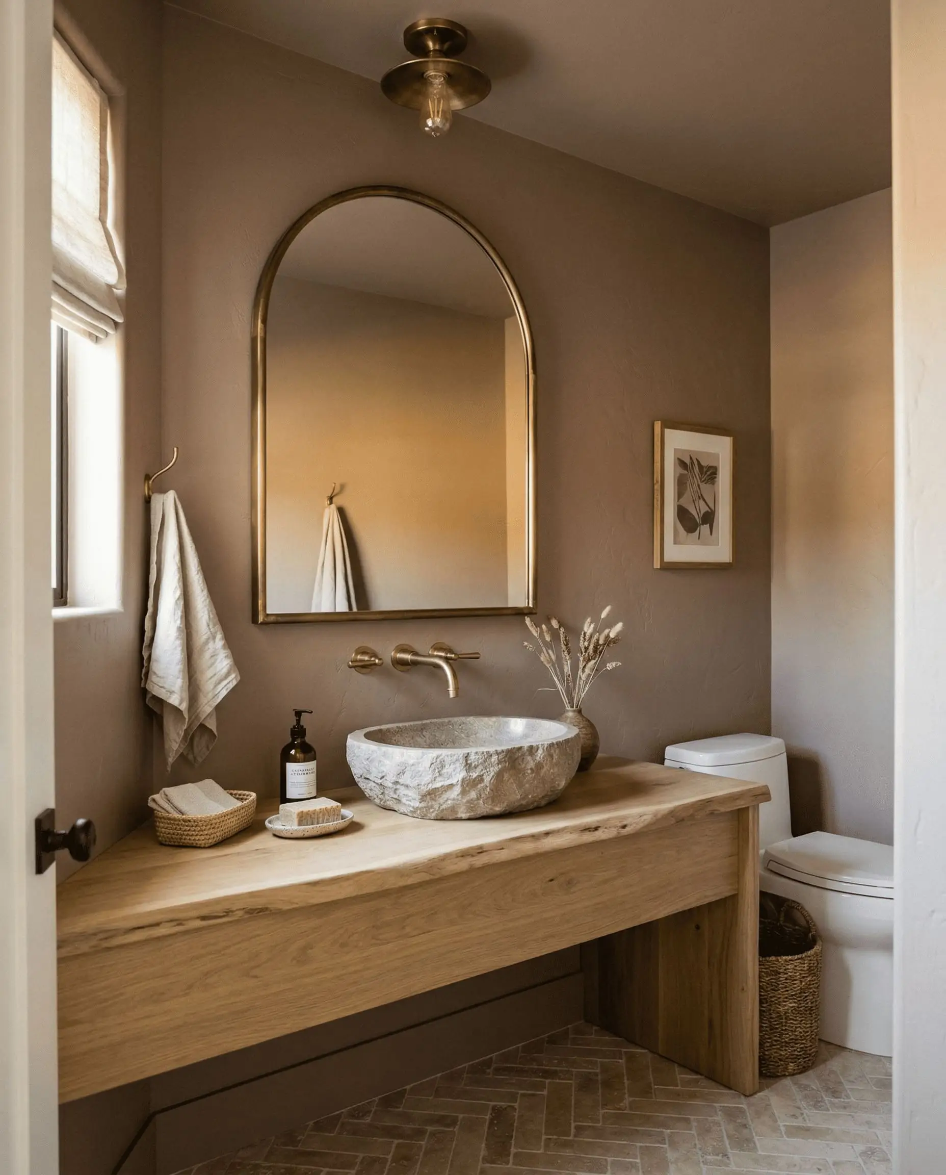
Heritage Bathroom Wainscoting
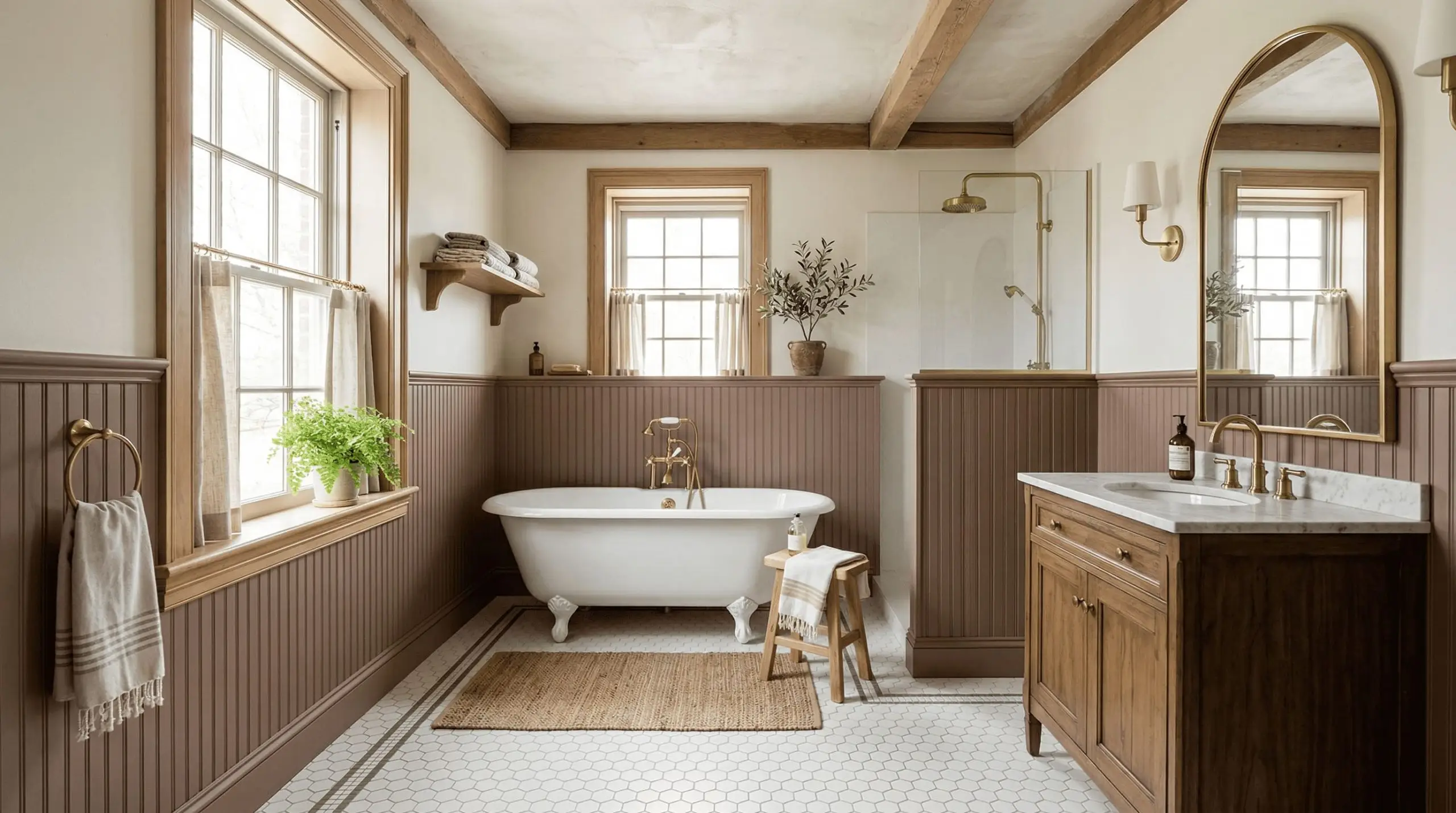
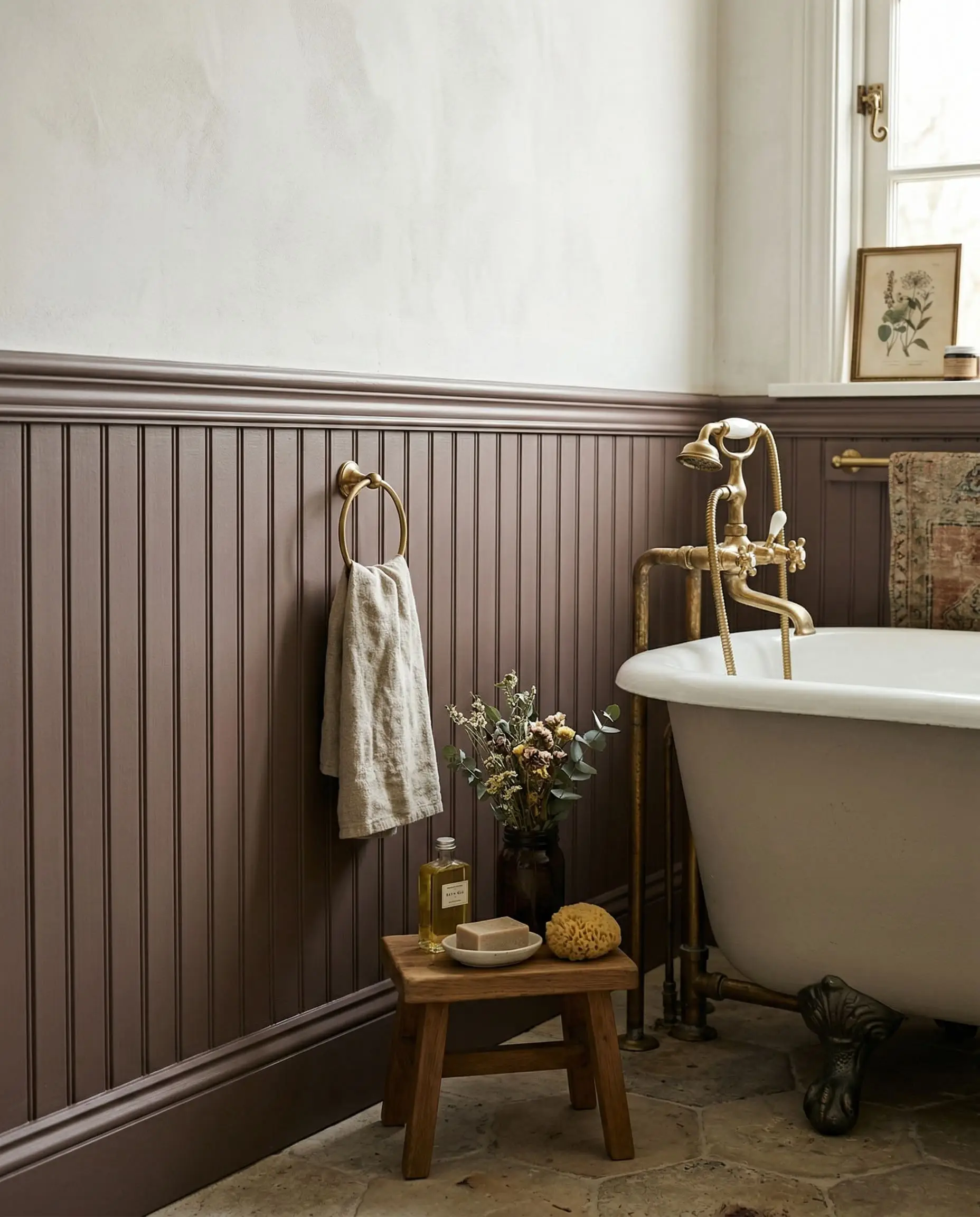
The physical texture of beadboard and wainscoting fundamentally changes how light interacts with paint. When Mulberry Silk is applied to lower-wall millwork, the shadows caught in the grooves pull the darker plum notes forward, while the flat surfaces reflect the warmer rose tones.
This architectural interaction grounds the bathroom, providing a heavy visual base that pairs perfectly with classic clawfoot tubs and vintage hex-tile floors.
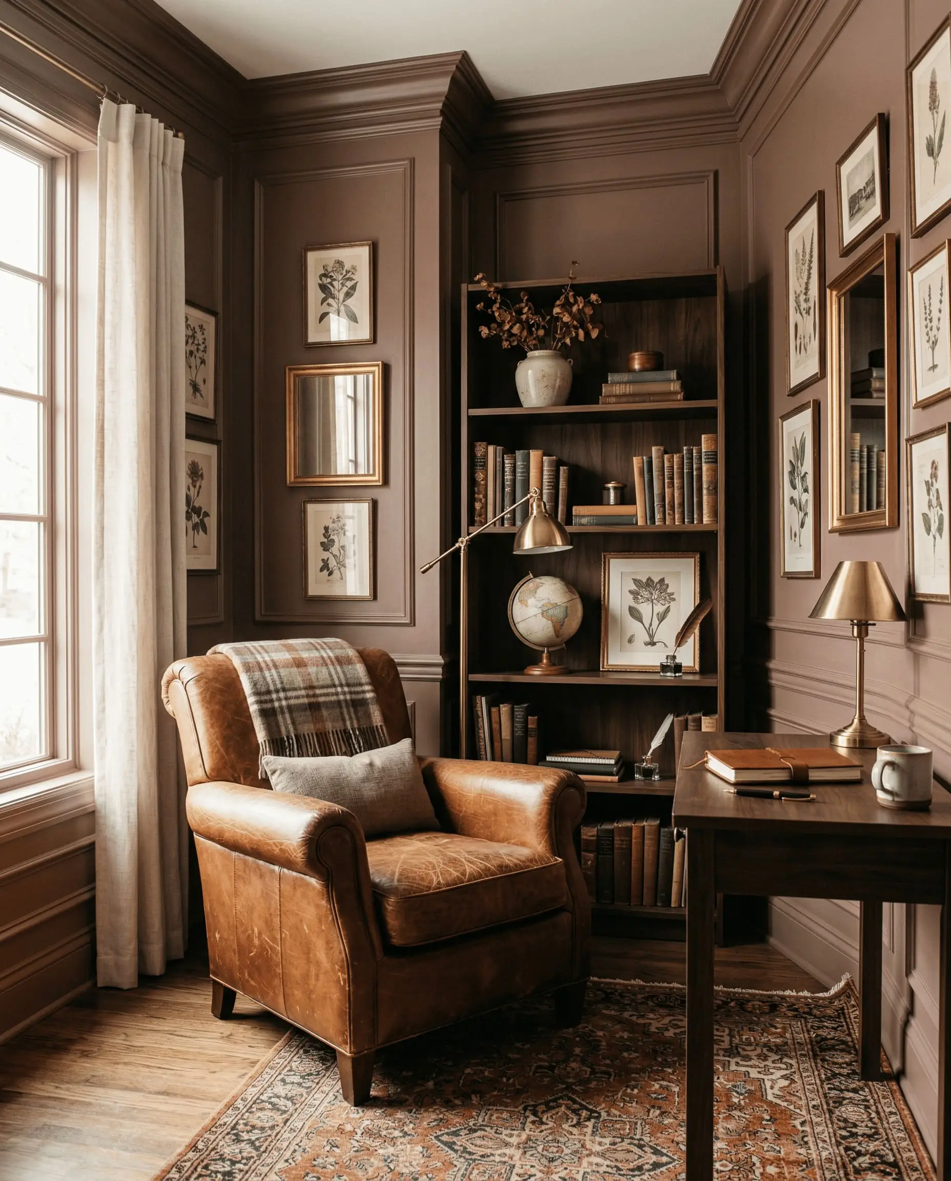
Refinished Vintage Dressers & Built-Ins
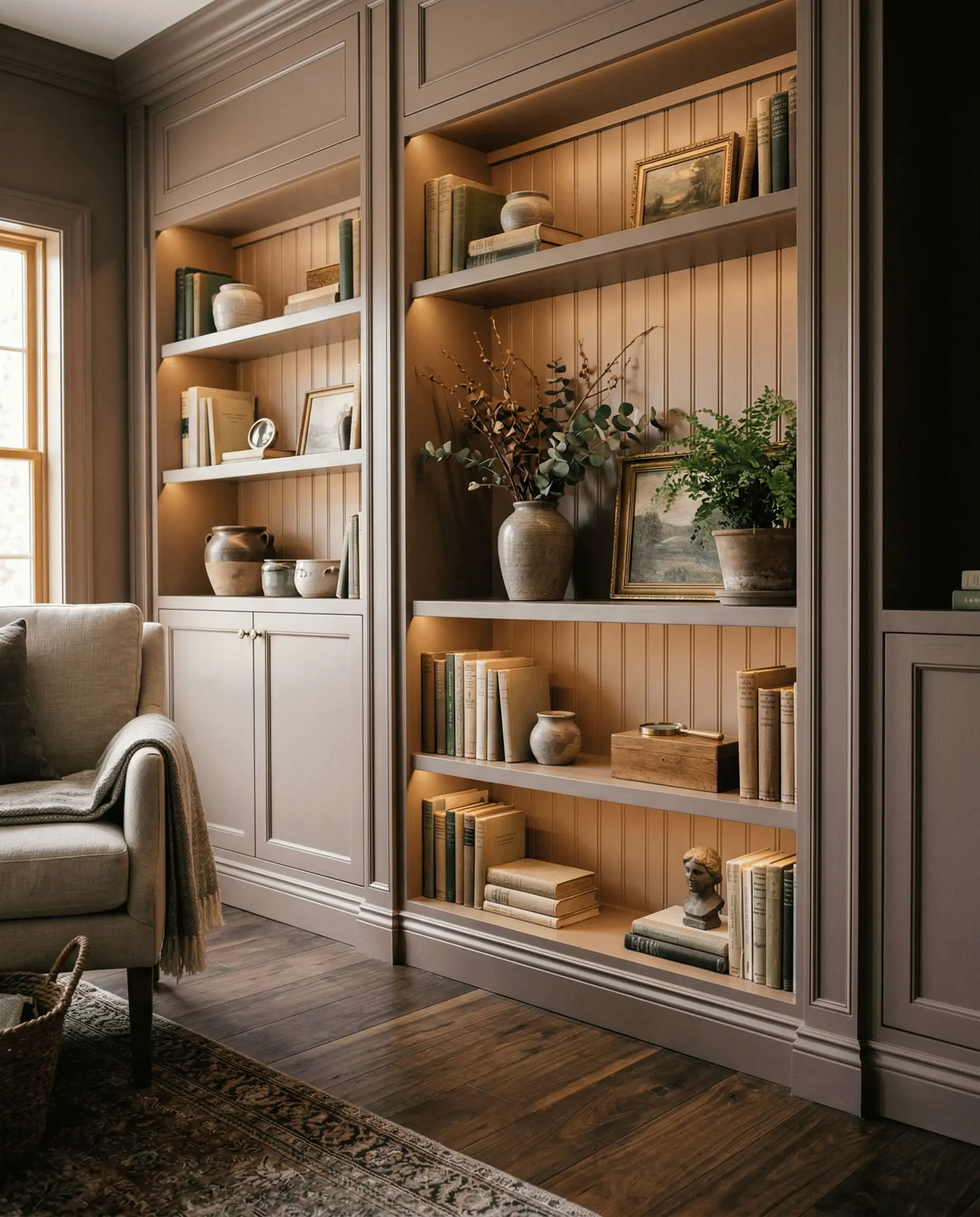
We see countless DIYers ruin vintage furniture by painting it stark white or trendy navy. Mulberry Silk is the antidote.
However, if you fail to properly prime a mahogany or cherry wood dresser before applying this color, the underlying red tannins will bleed through, clashing violently with the paint’s dusty rose undertones. Always use a high-quality stain-blocking primer. When executed correctly, a Mulberry Silk built-in bookcase instantly looks like a custom, high-end installation rather than a weekend project.
The Pairings & Accents Guide
A dark, complex color like this lives or dies by its supporting cast. You must be ruthless with your material and color pairings to keep Mulberry Silk looking intentional.
Flawless Trim & Baseboard Pairings
You must avoid stark, hospital-white trims at all costs. Cool whites will make Mulberry Silk look dirty and emphasize the purple undertones in the worst way possible.
You need creamy, warm whites that bridge the gap smoothly.
Architectural Materials & Hardware
To elevate this paint, you must pair it with materials that share its organic, earthy nature.
Unlacquered brass hardware is non-negotiable; the living finish of the metal warms up the plum notes beautifully. Honed Carrara marble countertops provide a soft, matte visual break, while dark walnut flooring anchors the room’s historic weight. Finally, tumbled red brick fireplaces or exposed walls pull the muted terracotta undertones straight to the surface.
Coordinating Color Chemistry
When building a whole-room palette, look for colors that share a similarly muted, grayed-out chemical structure.
Curated Mood Boards
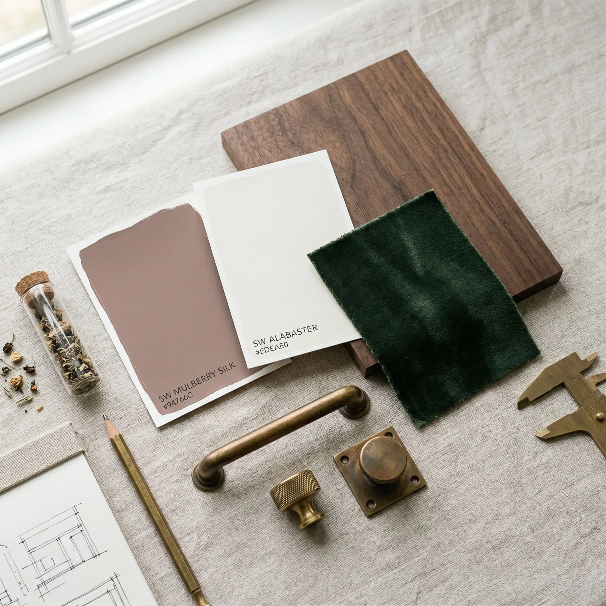
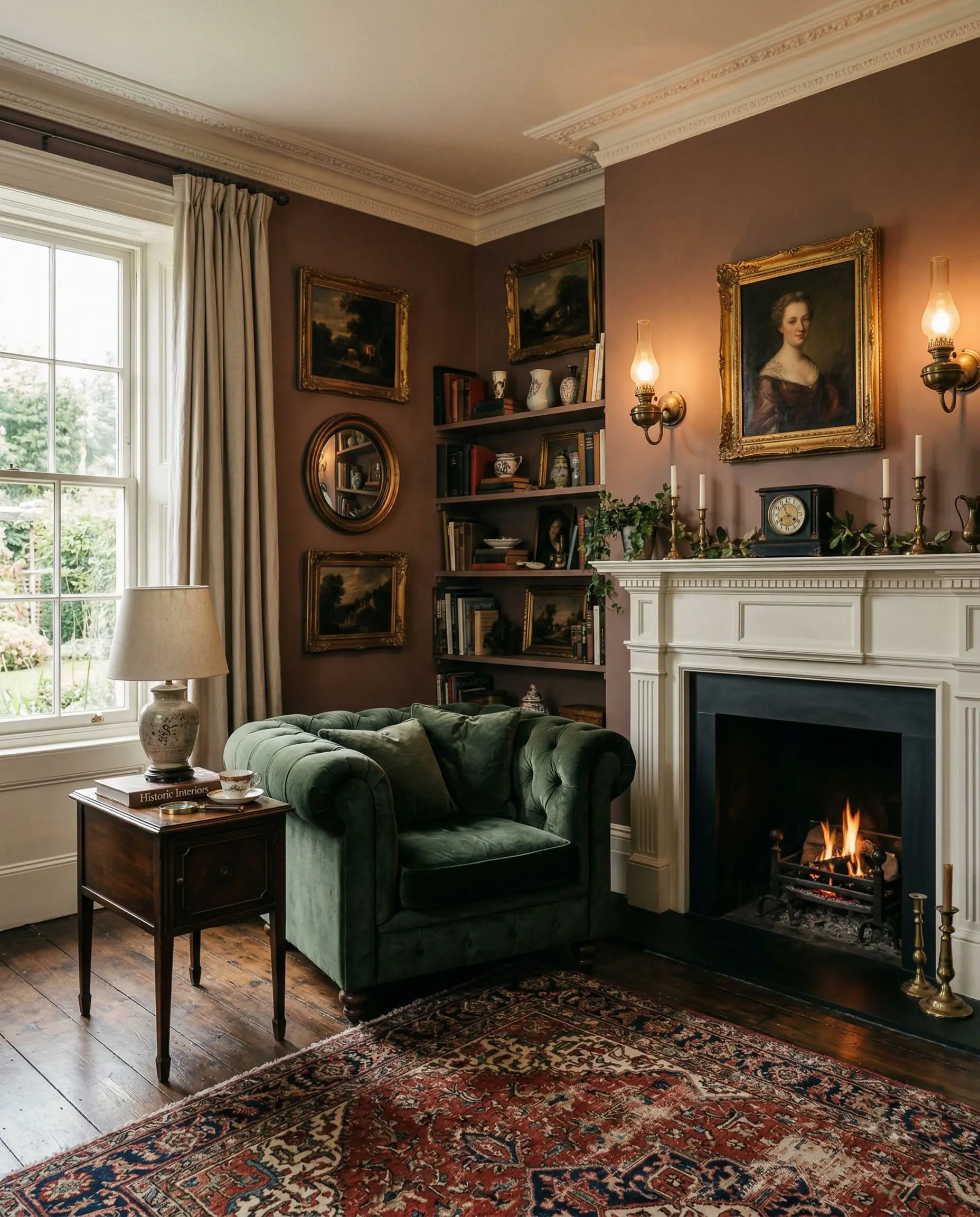
The Victorian Heritage Palette: Combine Mulberry Silk walls with Alabaster trim, heavily aged unlacquered brass sconces, and dark walnut floors. Add accents of deep, forest green velvet on seating to create a rich, historically grounded atmosphere that feels curated over decades.
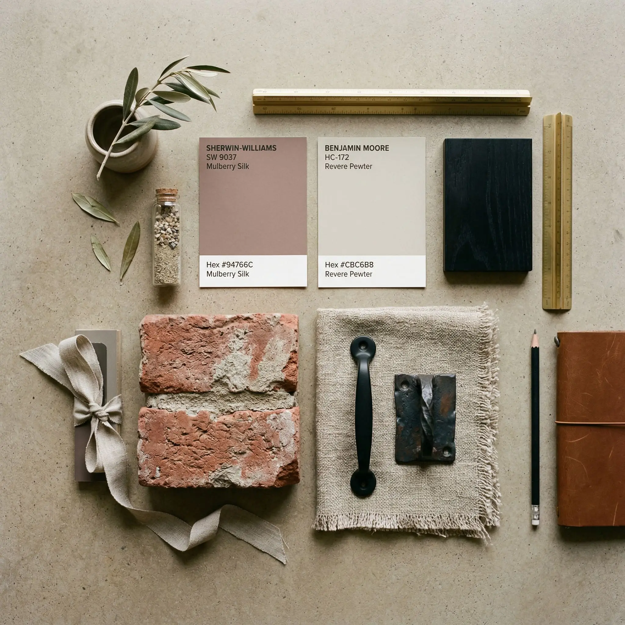
The Muted Terracotta Palette: Pair Mulberry Silk accent cabinetry with Revere Pewter walls. Introduce tumbled red brick flooring, matte black iron hardware, and heavily textured linen drapery. This combination leans heavily into the paint’s earthy, grounded DNA, perfect for a rustic yet refined mudroom or kitchen.
Similar Colors & Brand Equivalents
If you love the concept of Mulberry Silk but need a slight adjustment in depth or tone, consider these alternatives.
Similar Colors Within Sherwin-Williams
Cross-Brand Color Matches
Never trust a digital hex code for cross-brand matching. The proprietary bases and colorants used by Sherwin-Williams cannot be perfectly replicated by a Benjamin Moore mixing machine. Always buy a physical sample of the alternative brand to test the undertones.
Hackrea Pro-Tip
Head-to-Head Comparisons
Choosing the right dark mauve often comes down to microscopic differences in undertone. Here is how Mulberry Silk stacks up against its fiercest competitors.
Sherwin-Williams Mulberry Silk vs. Farrow & Ball Sulking Room Pink
While both colors aim for a sophisticated, muddy rose aesthetic, they behave very differently on the wall. Sulking Room Pink is noticeably lighter and leans heavily into its powdery, romantic pink undertones. Mulberry Silk is significantly darker, heavier, and far more brown. If you want a moody neutral, choose Mulberry Silk; if you want a sophisticated pink, choose Sulking Room Pink.
Sherwin-Williams Mulberry Silk vs. Sherwin-Williams Redend Point
Redend Point is a lighter, much warmer blush-beige that functions easily as a mid-tone neutral. It lacks the heavy plum and brown depth of Mulberry Silk. Redend Point is safe for medium-lit living rooms, whereas Mulberry Silk demands the commitment of a true dark accent color.
Practical Application & DIY Advice
Understanding the color theory is only half the battle. Putting a dark, low-LRV paint on the wall requires strict adherence to contractor-level application rules.
The Dynamic Sheen Matrix
Your choice of sheen will drastically alter how dark this color appears.
Primer Strategy for Dark Colors
Do not attempt to paint Mulberry Silk over a stark white wall without a primer.
Because of its LRV of 20, you must use a tinted gray primer. A gray base allows the dark plum-brown to achieve its true depth in just two coats. If you use a white primer, the paint will struggle to cover, and the undertones will look chalky and weak.
Coverage Expectations & Touch-Ups
Expect to apply a minimum of two generous coats.
Because this is a dark color, it is highly susceptible to “flashing”—visible roller marks that occur when the paint dries at different rates. You must maintain a wet edge while rolling. Furthermore, dark paints in matte or eggshell finishes are notoriously difficult to touch up. If you scuff the wall six months later, touching up just the spot will likely leave a visible ring; you may need to repaint the entire wall corner-to-corner.
Frequently Asked Questions
Mulberry Silk is definitively a warm color. While it has subtle plum notes, its dominant undertones are dusty rose and muted terracotta, which inject significant visual warmth into a space, especially in South-facing light.
To keep the color looking sophisticated, pair it with creamy, warm whites (like SW Alabaster), muddy organic greens (like SW Evergreen Fog), and warm greiges (like BM Revere Pewter).
It can, but only if you pair it incorrectly. If placed in a cool, North-facing room or surrounded by stark, blue-toned white trim, the plum undertones will surge forward. To keep it looking like an earthy brown, use warm lighting and creamy accents.
It has an LRV (Light Reflectance Value) of 20. This makes it a dark, heavy mid-tone that absorbs 80% of the light in a room, meaning it will recede heavily in spaces without adequate natural or artificial lighting.
Final Verdict & Expert Warnings
Sherwin-Williams Mulberry Silk is an absolute triumph of color formulation, but it is not for the faint of heart.
It is a masterful, sophisticated choice for anyone looking to create a moody, historically grounded space without resorting to predictable navy blues or forest greens. Its absolute best application is color-drenched in a formal dining room or study, where its muddy, dusty rose undertones can wrap the space in undeniable elegance.
However, we must issue a final warning.
If your home is filled with cool, blue-toned grays, stark white trims, or bright cherry wood floors, you must avoid this paint entirely. These elements will violently clash with the earthy mauve DNA, making the paint look dirty and disjointed.
Clash Warning
If you are willing to commit to warm lighting, creamy trims, and organic textures, Mulberry Silk will reward you with one of the most high-end, curatorial aesthetics available on the market today.