The Architectural Guide to Mixing Wood Tones: How to Match Kitchen Cabinets to Floors
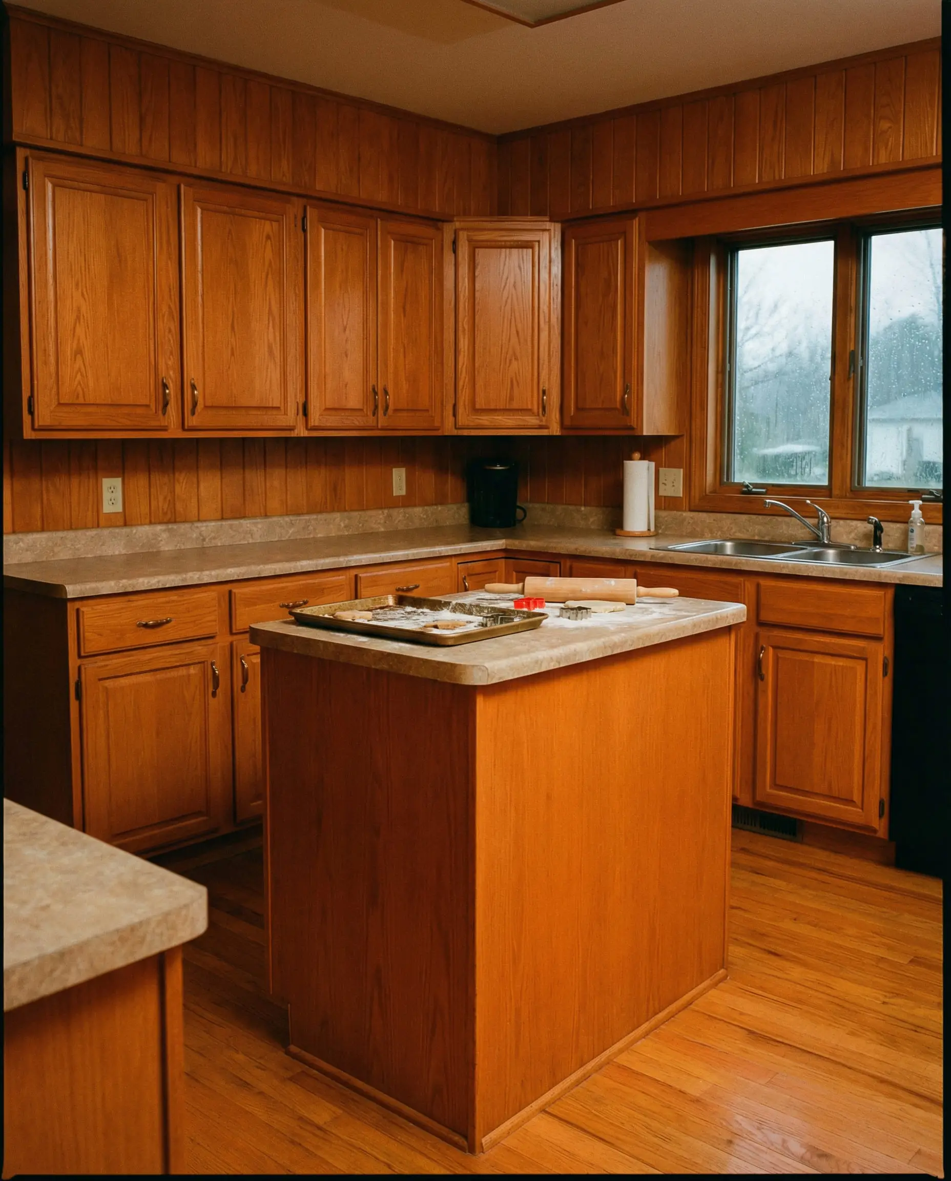
You are preparing to spend anywhere from $15,000 to $30,000 on custom cabinetry and premium flooring, and you are paralyzed by the fear of getting it wrong. We understand the high stakes. The most common pitfall in high-end kitchen renovations is the “sauna effect”—that dreaded, visually suffocating cigar box aesthetic where uncoordinated or heavily matched woods swallow a room whole.
For decades, the interior design industry pushed the myth that all wood finishes in a home must match perfectly. That rule is dead.
Achieving the highly coveted Organic Modern aesthetic favored by elite designers demands deliberate contrast, a rigorous understanding of grain geometry, and precise undertone science. Wood is not merely a color; it is a living material governed by the physics of light, the chemistry of stains, and the architectural geometry of its cut. To achieve true cohesion, you must treat your surfaces mathematically. The following architectural guide provides the exact formulas to bridge your finishes flawlessly.
The “Sauna Effect” and Why Mixing Wood is a Design Dilemma
Wood carries massive visual weight. Because of its inherent texture and organic variance, it dominates the sensory landscape of any room. When you attempt to create a seamless continuum between your floor and your cabinets, you are fighting a losing battle against nature.
Too much mid-tone wood instantly triggers a heavy, dated 1990s psychological response. We call this the “sauna effect.” Attempting an exact match is the most dangerous design choice you can make, as any slight variation in the stain batch or wood porosity will look like a glaring mistake rather than an intentional design choice. Contrast is mathematically and aesthetically safer.
Why exact matching usually fails:
You can apply wallpapers, paints, etc. on walls and see how they look in various interiors.

The Three Unbreakable Rules of Wood Tone Harmonization
True architectural harmony requires strict adherence to what we call the Triad of Cohesion. Before you ever look at a specific wood species or fall in love with a stain sample, you must run every material through three rigid architectural filters.
Rule 1: Master the Undertone Match (The Non-Negotiable)
You can mix light and dark values all day, but you absolutely cannot mix conflicting undertones. This is the foundational chemistry of interior design. Undertones dictate the subliminal color temperature of the wood, anchoring it to specific sectors of the color wheel.
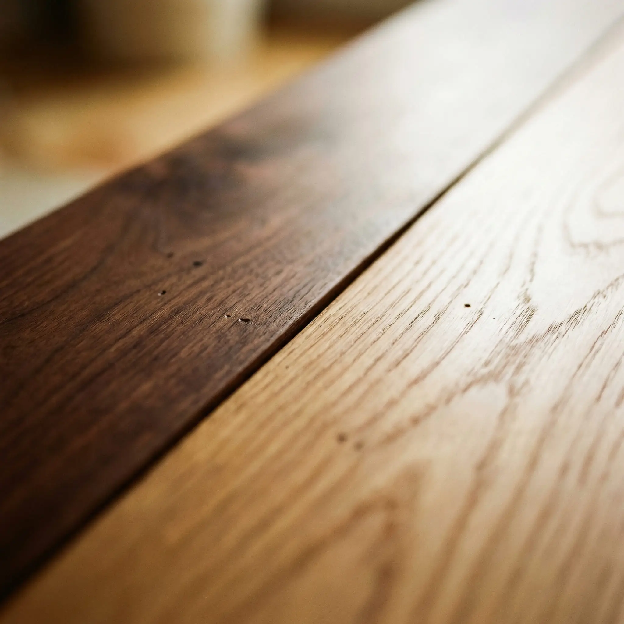
Never cross the color temperature barrier without a bridging material.
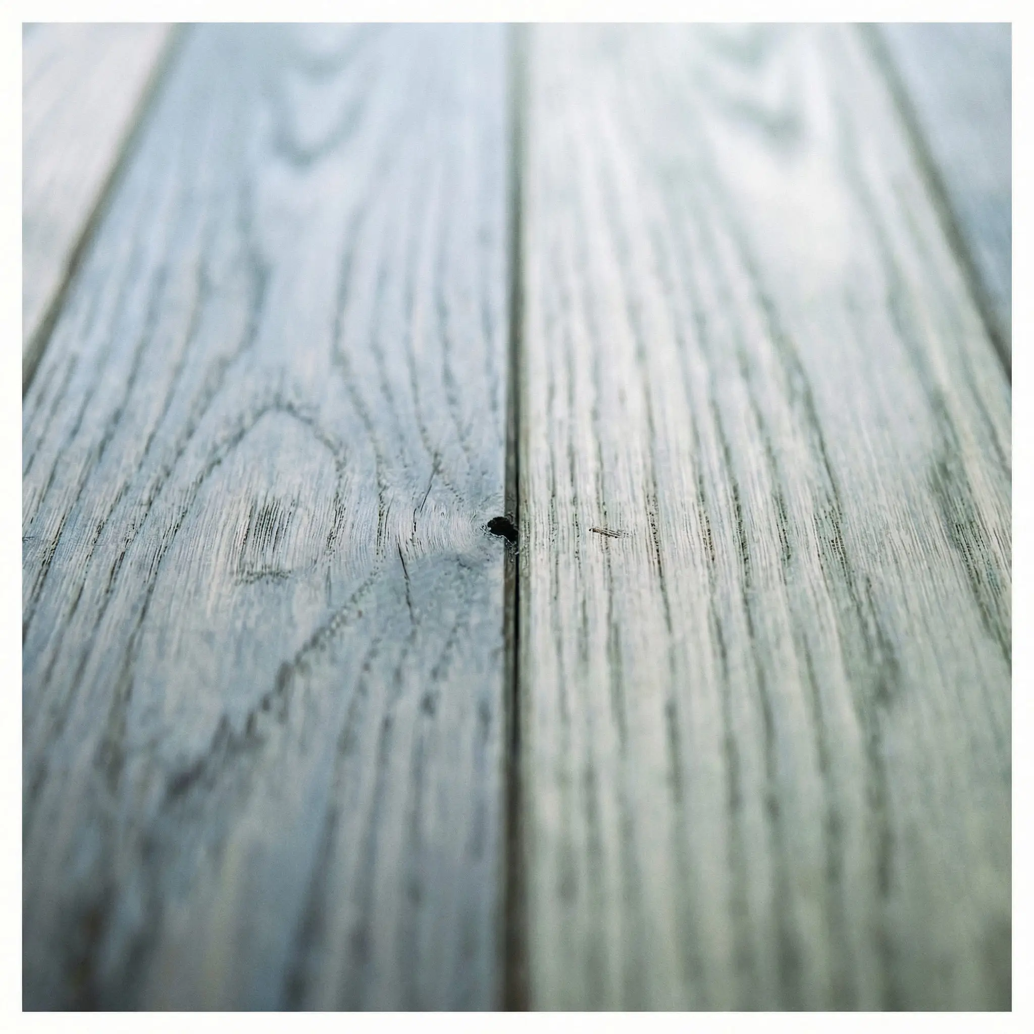
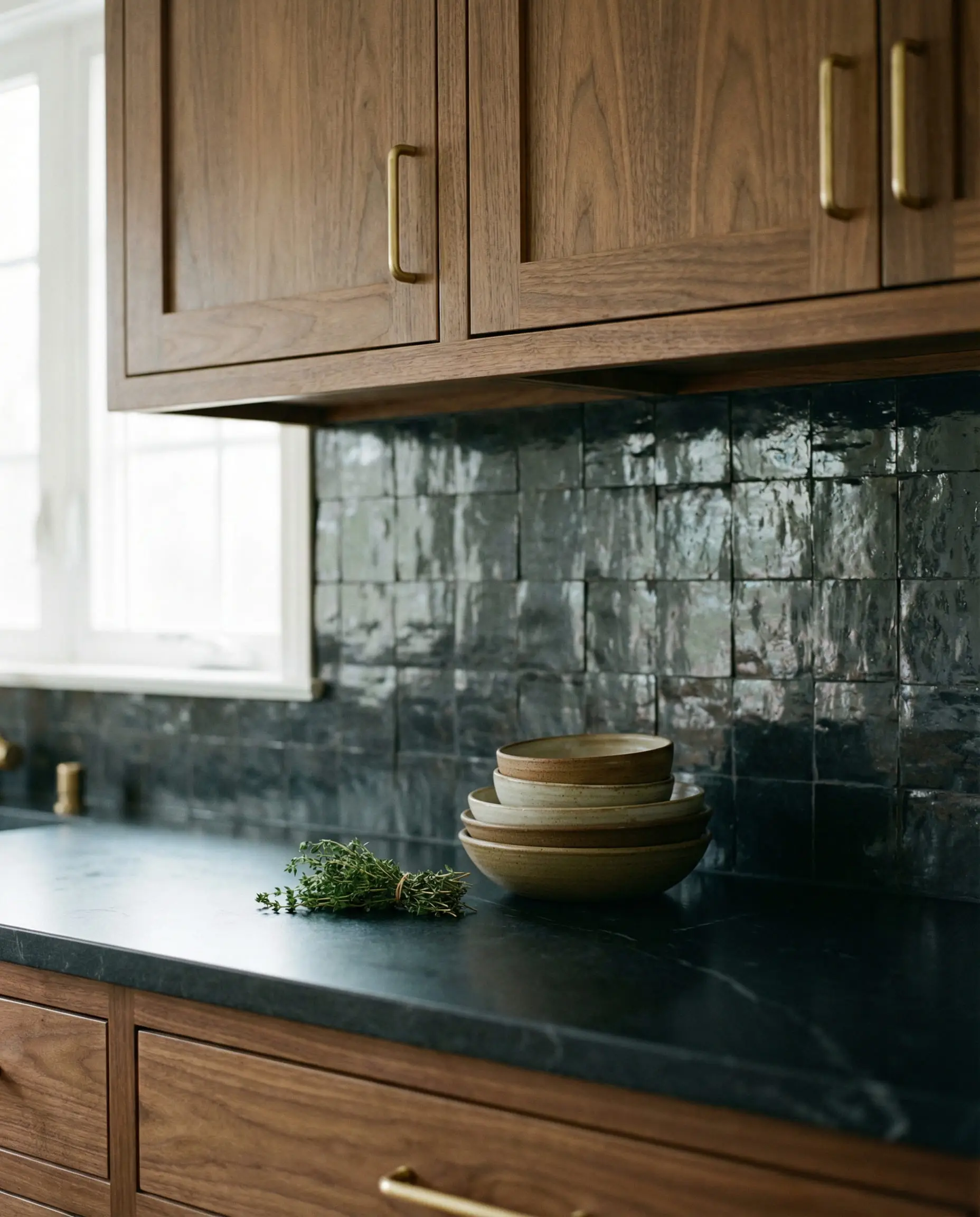
The architectural rule dictates: Warm pairs with warm; cool pairs with cool. Consider a real-world design disaster: pairing a cool, gray-washed European Oak floor (which pulls green and blue on the color wheel) with a warm, red-toned Mahogany cabinet guarantees visual failure. The floor will look perpetually dirty and ashy, while the cabinets will read as artificially, aggressively orange.
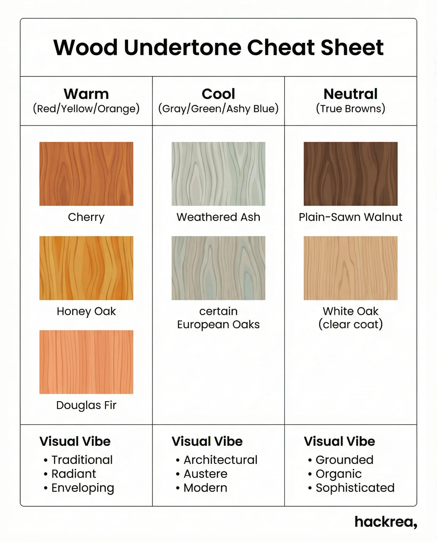
| Undertone Category | Common Wood Species | Visual Vibe |
|---|---|---|
| Warm (Red/Yellow/Orange) | Cherry, Honey Oak, Douglas Fir | Traditional, radiant, enveloping |
| Cool (Gray/Green/Ashy Blue) | Weathered Ash, certain European Oaks | Architectural, austere, modern |
| Neutral (True Browns) | Plain-Sawn Walnut, White Oak (clear coat) | Grounded, organic, sophisticated |
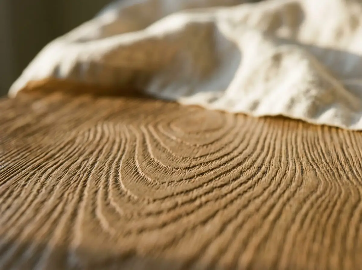
Rule 2: Grain Scaling and Visual Texture (Linear vs. Cathedral)
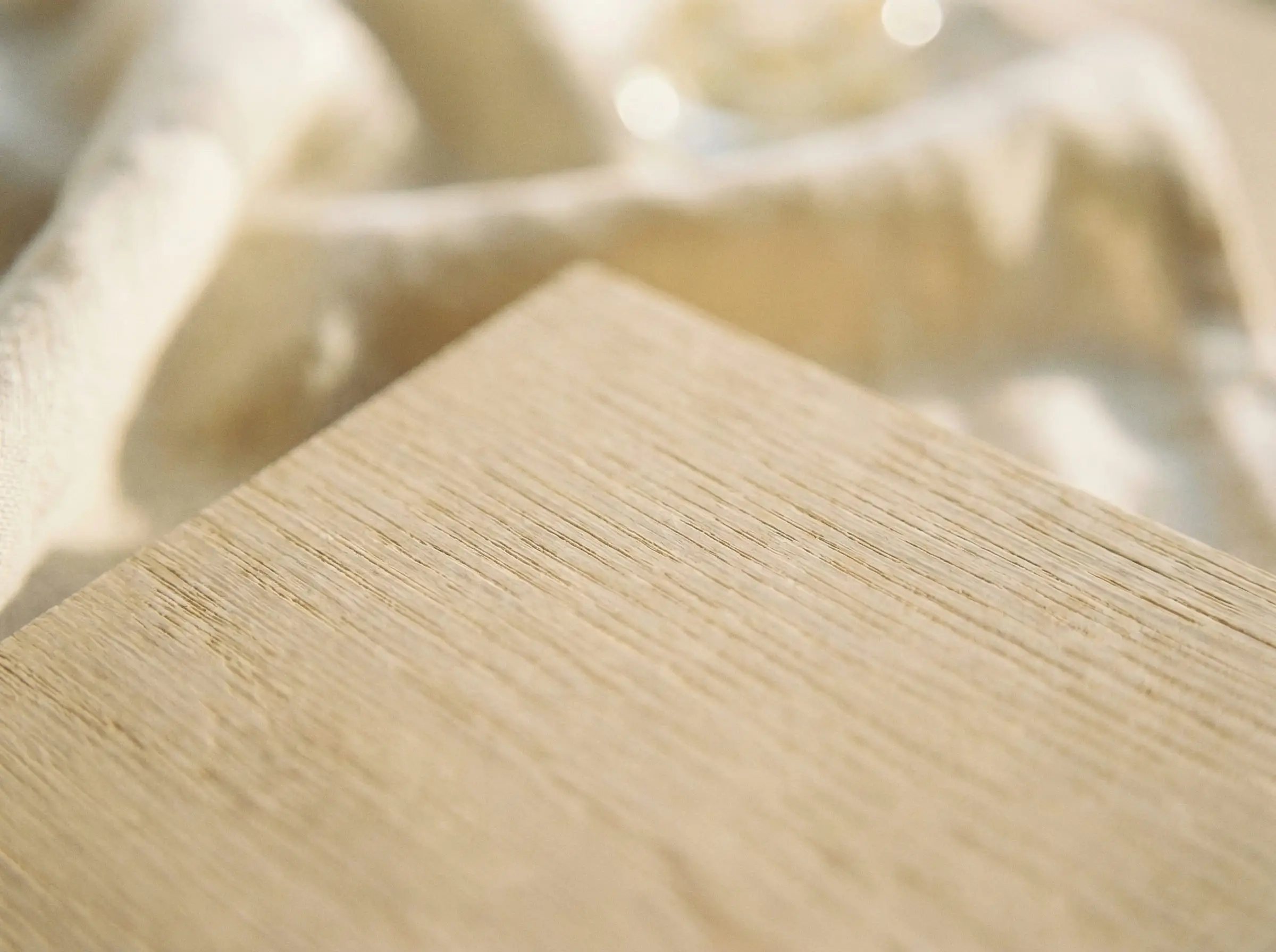
Matching wood is fundamentally an exercise in pattern matching. The industry obsesses over color while ignoring the geometry of the milling cut. Understanding grain scaling and visual texture is the secret to high-end cohesion.
Cathedral grain refers to the arching, flame-like patterns typical of traditional plain-sawn wood. It is loud, organic, and visually demanding. Conversely, Linear grain features the straight, uniform, and modern lines achieved through rift-sawn or quarter-sawn milling techniques.
Never mix two heavy cathedral grains in the same room, or the space will look visually chaotic.
If your floors feature a heavy, rustic, knotty grain, your cabinets must feature a clean, rift-sawn linear cut to balance the visual noise.
Always offset a dominant, highly figured floor with tightly grained, subdued cabinetry to allow the eye a place to rest.
Hackrea Pro-Tip
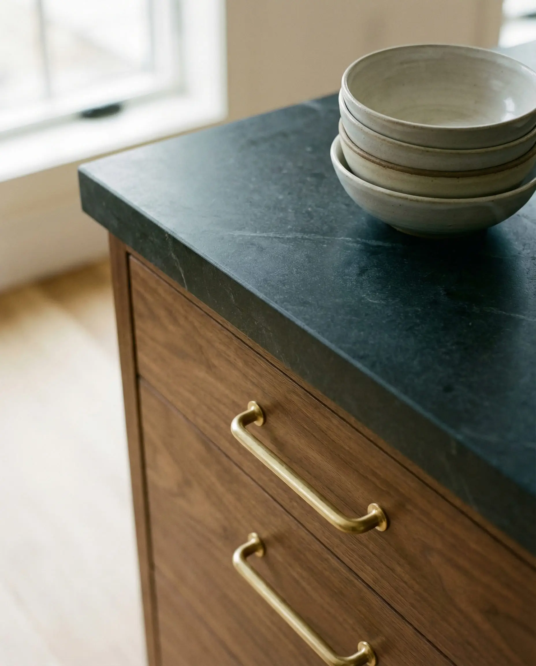
Rule 3: The Contrast Mandate (Light Reflectance Value)
To prevent a flat, lifeless space, you must rely on Light Reflectance Value (LRV)—the objective measurement of how much light a material reflects or absorbs. Cohesion requires at least a 20-30% difference in the light and dark values between your floor and your cabinets.
If you install light, bleached oak floors with a high LRV, you must ground the space with deep, rich walnut cabinets. Conversely, cavernous dark espresso floors demand light, airy wood cabinets—like natural, unstained maple—to reflect light upwards and prevent the room from feeling like a cave.
Designers rely on the proprietary concept of Sheen Offsetting to further differentiate the planes of the room. Always pair a flat, ultra-matte finish on the floor to ground the space with a satin 20% sheen on the cabinets to bounce ambient light.
Hackrea Pro-Tip
Foolproof Wood Pairing Formulas (The Designer Cheat Sheet)
Mastering the underlying theory is essential, but flawless execution is the ultimate goal. For those designing a kitchen from the ground up, here are three designer-approved, pre-calculated wood pairing formulas guaranteed to deliver absolute architectural harmony.
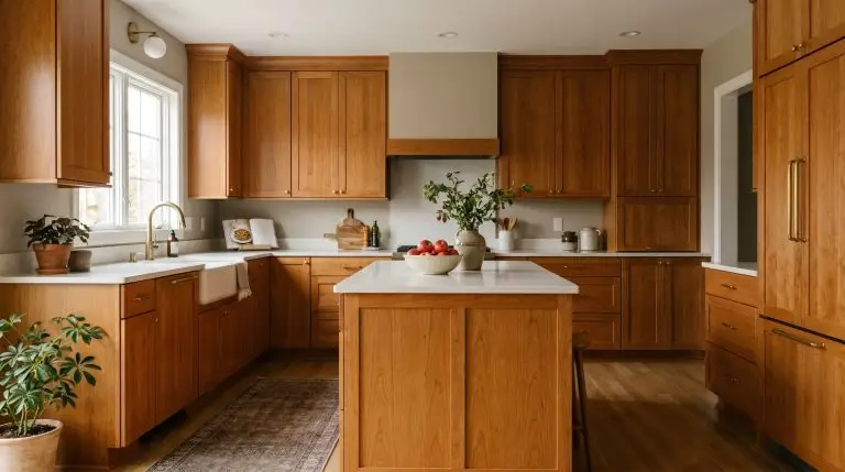
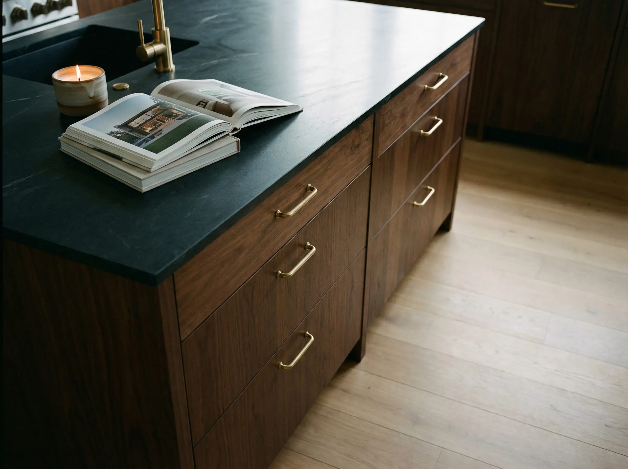
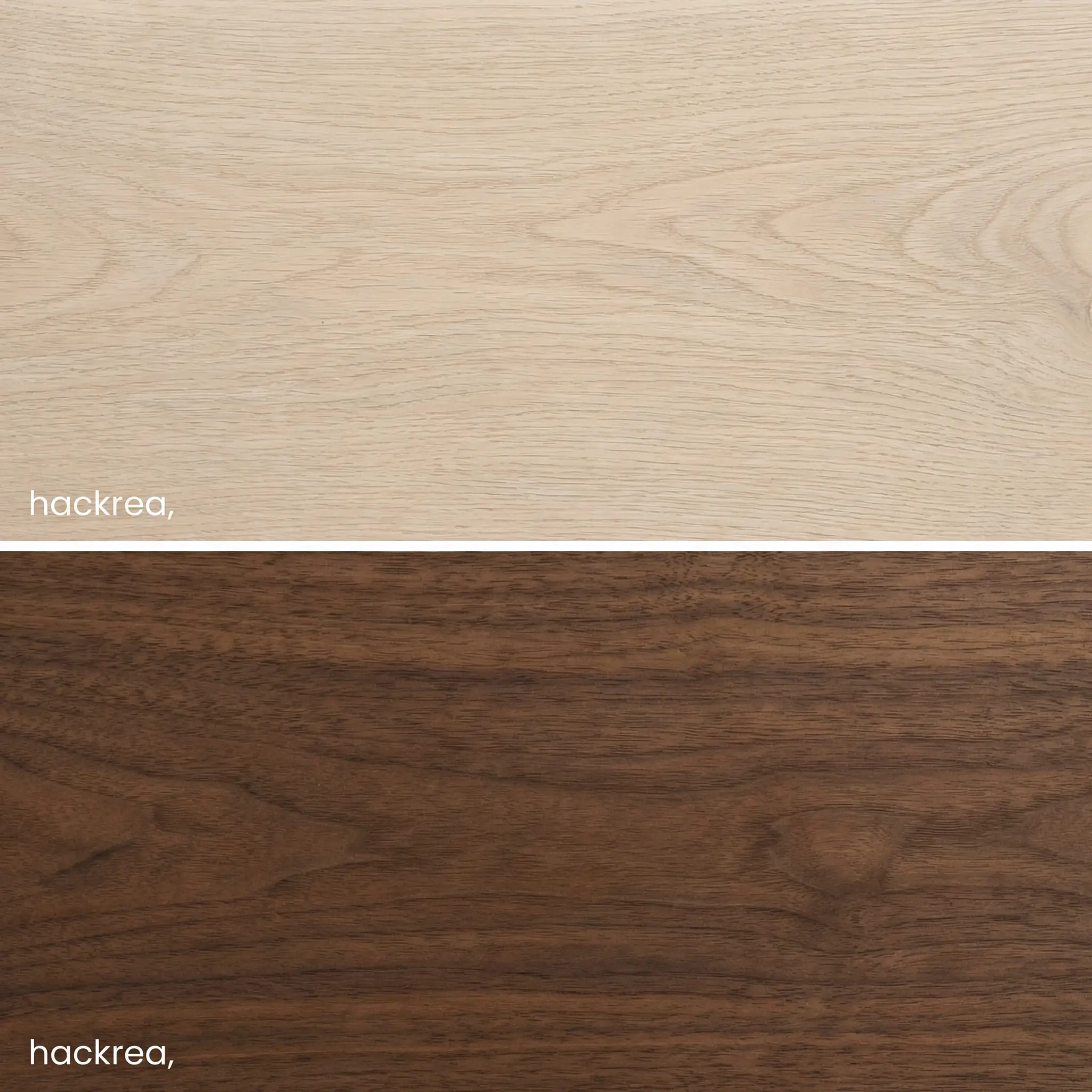
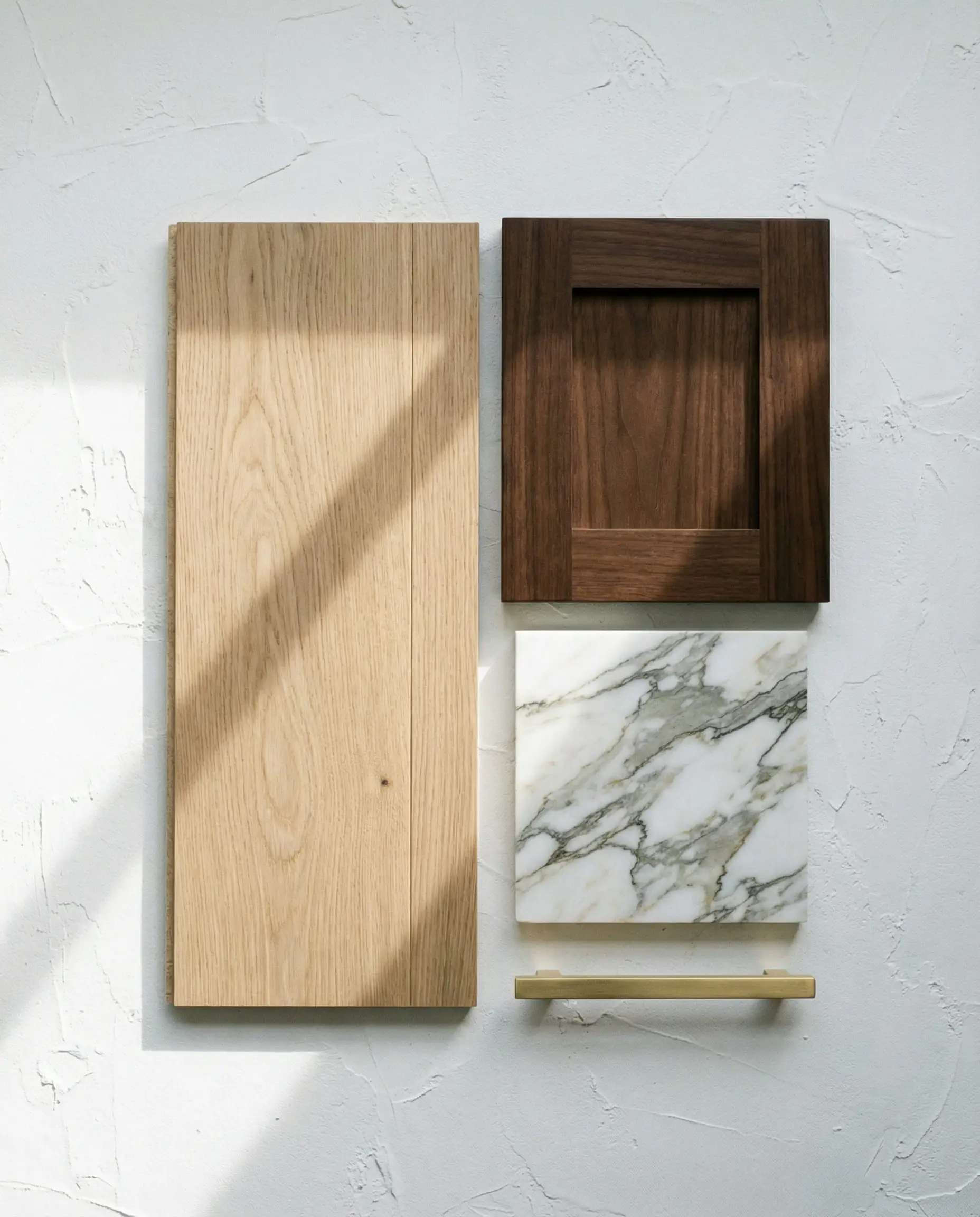
Formula A: The Organic Modern (White Oak & Walnut)
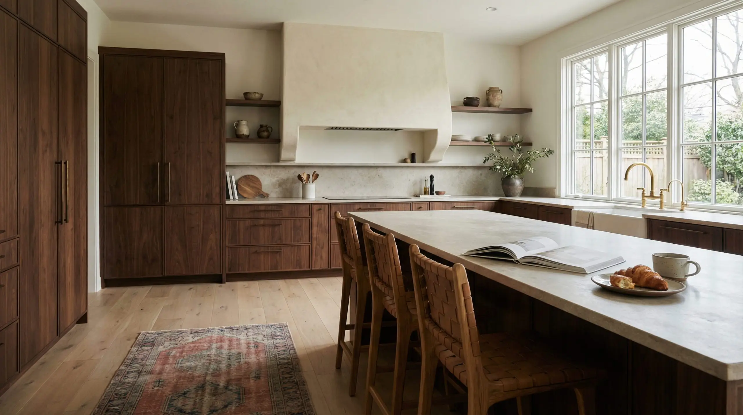
This is the pinnacle of the Organic Modern movement, heavily utilized by designers like Amber Lewis to create spaces that feel both luxurious and intimately connected to nature. You must pair wide-plank, light European White Oak floors—finished in a clear, flat matte to highlight their neutral undertone—with flat-panel, rich Walnut cabinetry.
The magic of this formula lies in the profound contrast of Light Reflectance Value, anchored by a shared neutral-to-warm undertone. The Walnut provides a deep, resonant warmth that grounds the room, while the airy, expansive nature of the White Oak floor keeps the visual weight perfectly balanced. The resulting aesthetic is immensely sophisticated, earthy, and effortlessly curated.
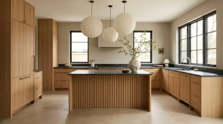
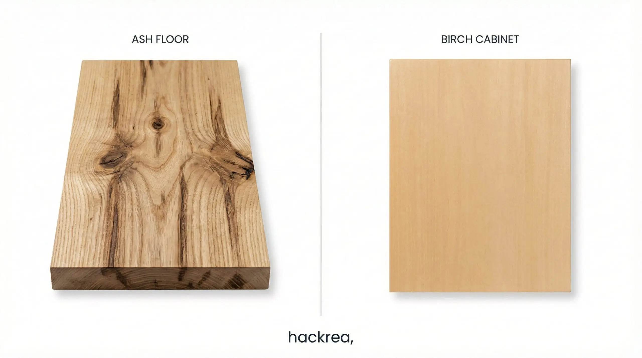
Formula B: The Scandinavian Light (Ash & Birch)
For purists seeking an airy, uncluttered, and deeply subtle aesthetic, this monochromatic approach delivers without sacrificing dimension. The Scandinavian Light formula pairs Pale Ash floors with clear Birch or Maple cabinets.
Because these materials possess nearly identical Light Reflectance Values, you must rely entirely on grain geometry to prevent the space from feeling sterile or flat. The structural mandate here is texture: specify a heavy, character-grade grain on the Ash flooring to provide an organic foundation, and contrast it with a smooth, almost grainless finish on the Birch cabinetry above. This creates a whisper-quiet tension that feels intentional and highly refined.
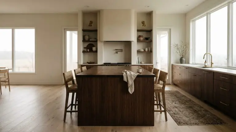
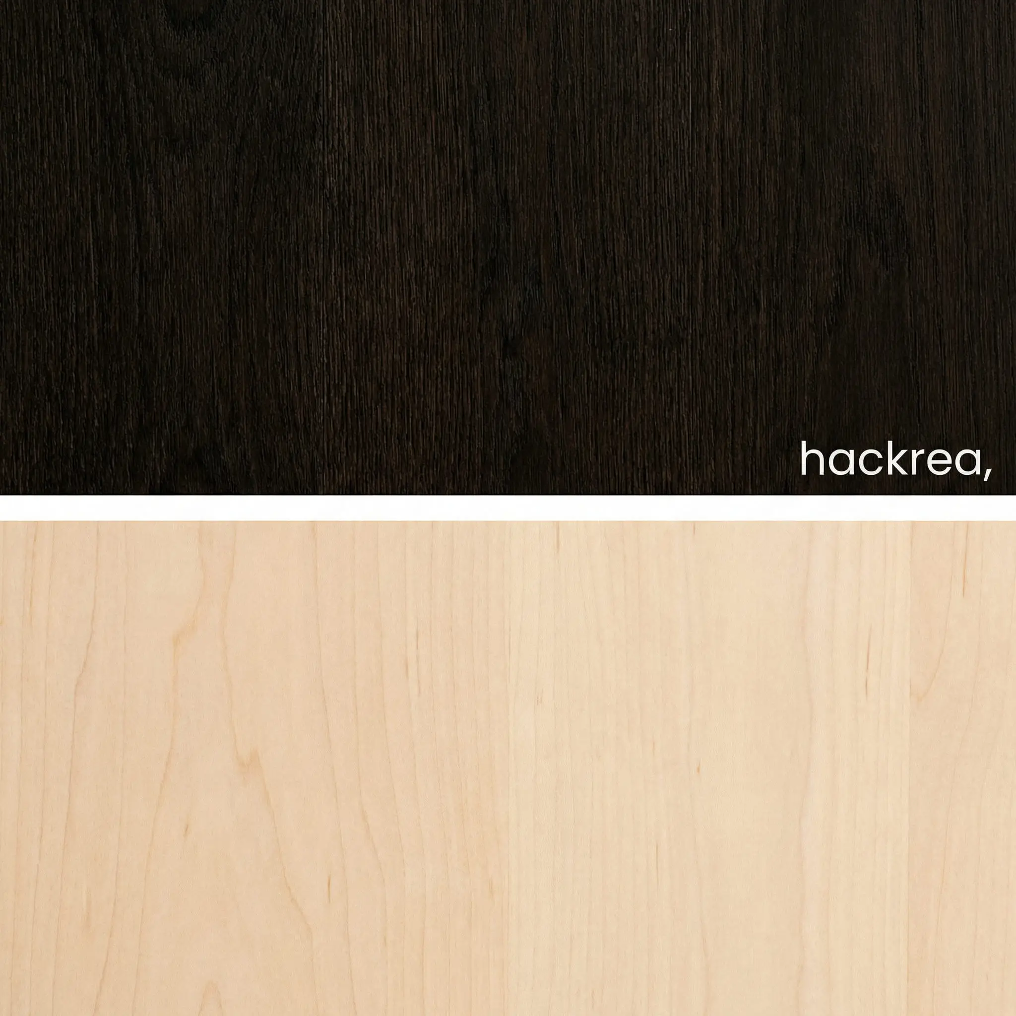
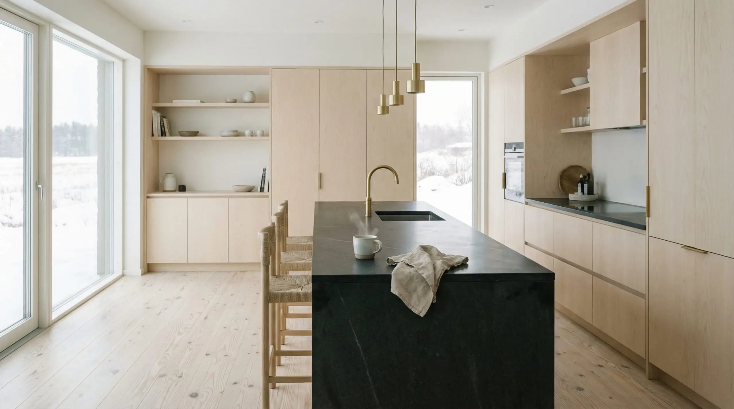
Formula C: The Moody Transitional (Dark Stains & Natural Maple)
Homeowners inheriting or installing dark floors often fear wood cabinetry, assuming it will render the kitchen visually oppressive. The Moody Transitional formula subverts this by using the floor as an anchor while lifting the visual weight upwards.
By pairing a deeply saturated floor with pale, light-reflective cabinetry, you force the eye upward, making ceilings feel significantly taller.
The exact material specifications for this formula:
How to Break Up the Wood (Transitional Elements)
Even mathematically flawless wood pairings require visual breathing room. If your wood cabinetry touches your wood flooring without interruption, the transition can feel jarring. You must deploy architectural transitional elements to act as a visual palate cleanser.
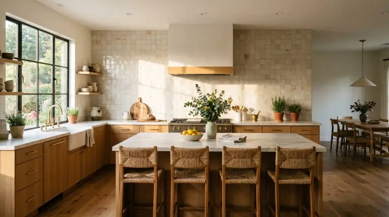
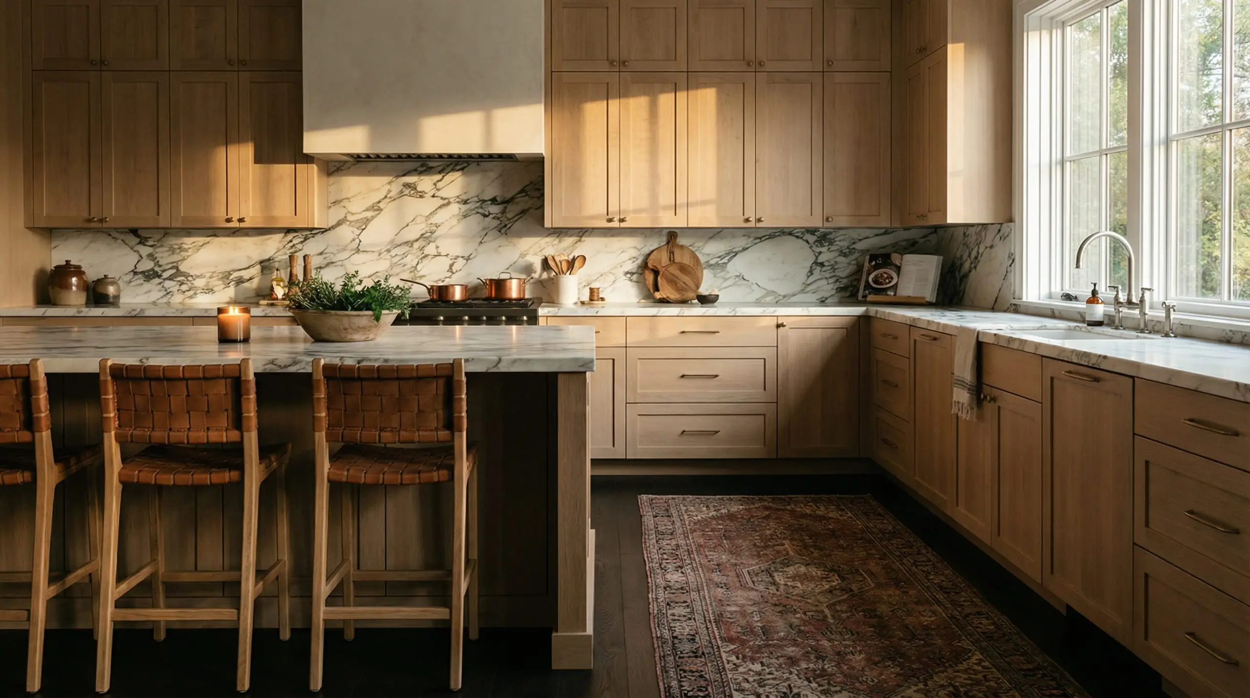
Strategic Countertops and Backsplashes
You must manipulate the visual weight of the room by introducing stark, contrasting materials. Stone and tile act as the ultimate architectural buffers between competing wood tones.
Designers rely on thick profiles of soapstone, honed marble, or heavily veined quartz to draw the eye horizontally. This solid band of stone physically and visually severs the vertical lines of the wood cabinets from the horizontal expanse of the wood floors.
If you find your wood tones leaning slightly too warm or too cool against each other, you must neutralize the conflict. Install a stark white plaster or deep charcoal zellige tile backsplash. By introducing a high-contrast, non-wood entity into the sightline, you reset the eye’s perception of color, masking minor undertone discrepancies and cementing the room’s cohesion.
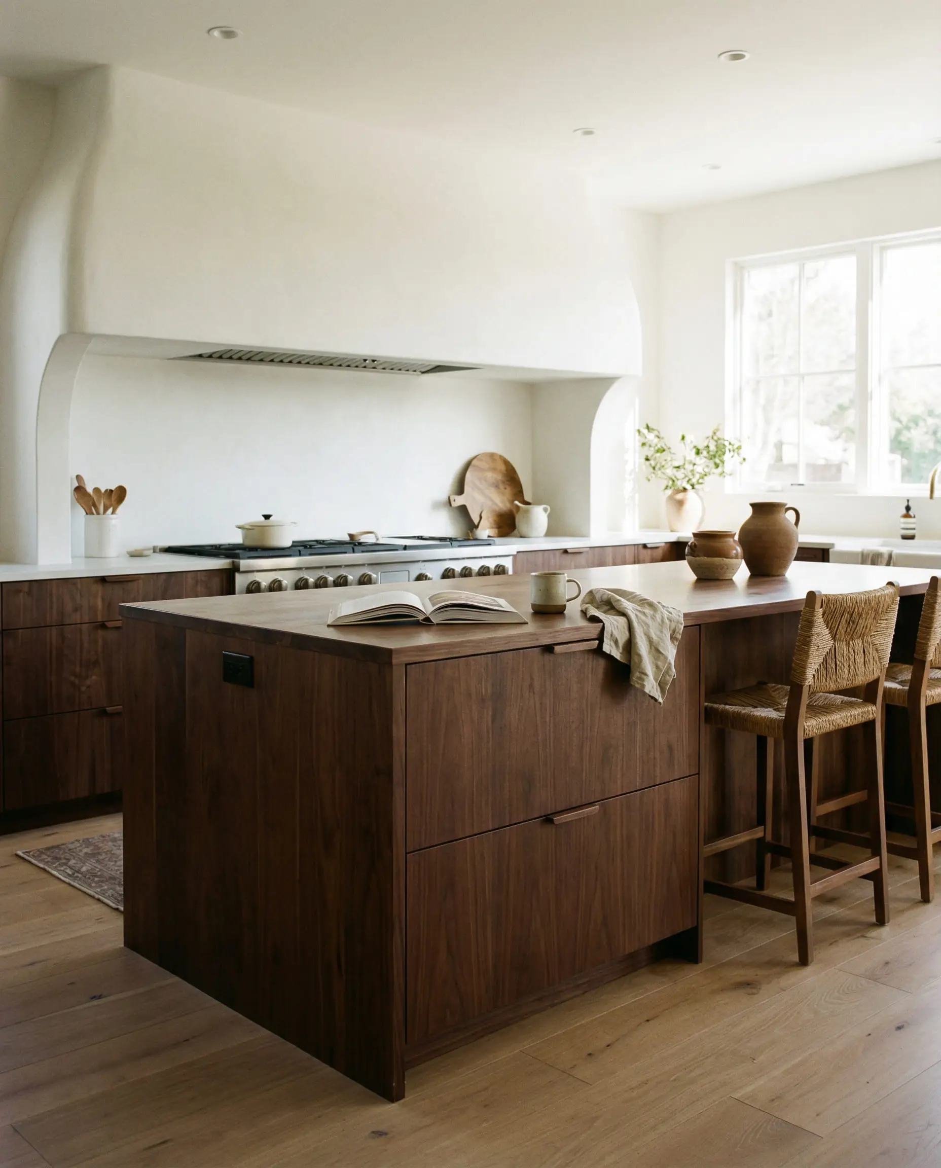
The Power of the Kitchen Island (Two-Tone Cabinetry)
For homeowners paralyzed by the sheer volume of wood required in a full kitchen remodel, there is an elegant, failsafe solution.
The Two-Tone Compromise dictates that you do not need to clad your entire kitchen in timber to achieve a warm, organic aesthetic. Instead, paint the perimeter cabinets a transitional color—such as a soft greige, a muted sage green, or a textured plaster white. Reserve your premium wood tone only for the kitchen island.
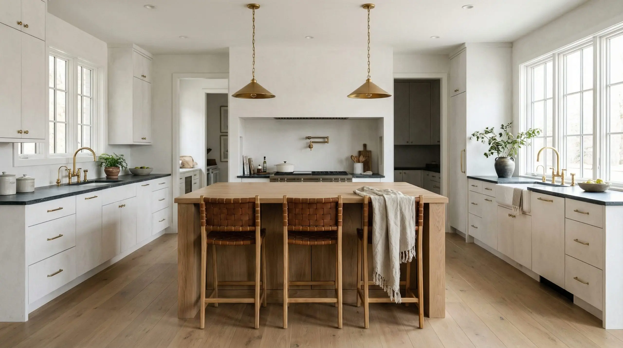
This isolates the wood-on-wood interaction to the center of the room. It creates a highly curated, intentional focal point rather than an overwhelming, monolithic block of cabinetry. By wrapping the perimeter in a solid, painted finish, you allow the island and the floor to converse beautifully without drowning out the rest of the architecture.
The Lighting Factor (How Kelvins Change Your Stain)
A wood pairing that looks mathematically perfect under the fluorescent lights of a design showroom can clash horribly the moment it is installed in your home. This is due to Color Temperature, measured in Kelvins. Lighting chemically and visually alters the perceived stain of your wood.
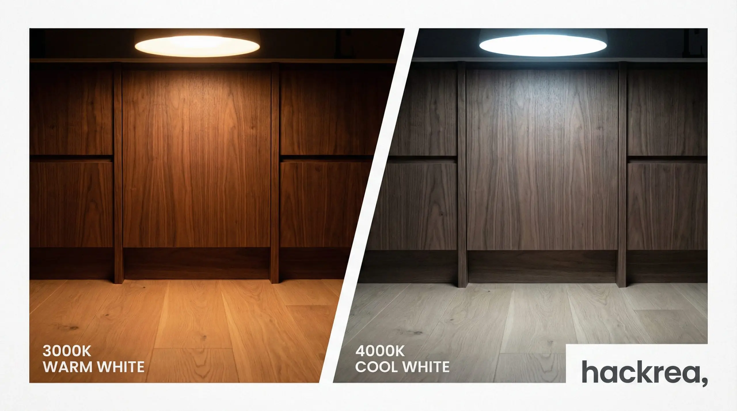
If you pair a neutral walnut cabinet with a white oak floor, a 3000K bulb (warm white) will aggressively pull the hidden red and yellow undertones to the surface, potentially causing a clash. Conversely, a 4000K bulb (cool white) will strip the warmth entirely, highlighting the ashy, gray tones in the floor and rendering the space sterile.
You must test your cabinet and floor swatches together in your actual kitchen, facing the same direction, under the exact Kelvin bulbs you plan to install, at three distinct times of day.
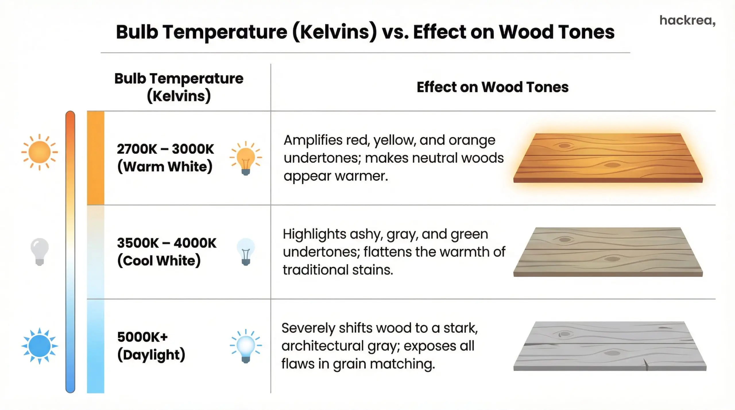
| Bulb Temperature (Kelvins) | Effect on Wood Tones |
|---|---|
| 2700K – 3000K (Warm White) | Amplifies red, yellow, and orange undertones; makes neutral woods appear warmer. |
| 3500K – 4000K (Cool White) | Highlights ashy, gray, and green undertones; flattens the warmth of traditional stains. |
| 5000K+ (Daylight) | Severely shifts wood to a stark, architectural gray; exposes all flaws in grain matching. |
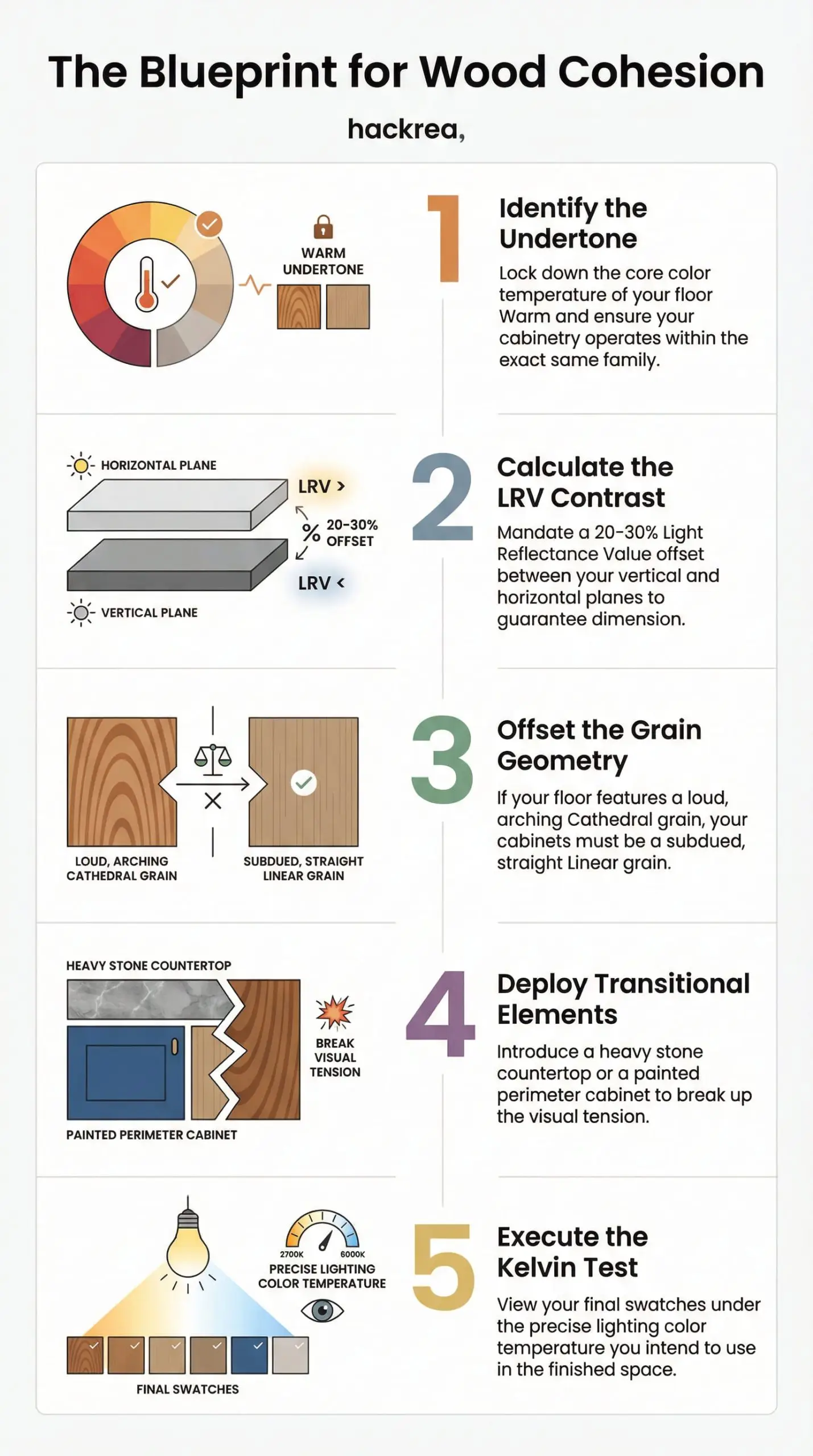
The Blueprint for Wood Cohesion: Your Project Checklist
Achieving architectural cohesion is not about luck; it is a meticulous, step-by-step scientific process. Before you finalize a single purchase order, run your materials through this exacting workflow:
- Identify the Undertone: Lock down the core color temperature of your floor (Warm, Cool, or Neutral) and ensure your cabinetry operates within the exact same family.
- Calculate the LRV Contrast: Mandate a 20-30% Light Reflectance Value offset between your vertical and horizontal planes to guarantee dimension.
- Offset the Grain Geometry: If your floor features a loud, arching Cathedral grain, your cabinets must be a subdued, straight Linear grain.
- Deploy Transitional Elements: Introduce a heavy stone countertop or a painted perimeter cabinet to break up the visual tension.
- Execute the Kelvin Test: View your final swatches under the precise lighting color temperature you intend to use in the finished space.
Design is an exercise in controlling the details. To complete your aesthetic vision, view Hackrea’s definitive guides on kitchen lighting and cabinet hardware to perfectly finish the space.
The Hackrea Style Desk treats interior decoration as an exact visual science. Rather than focusing on demolition or floor plans, this desk masters the art of color theory, undertone matching, material pairings, and spatial proportion. From balancing the visual weight of mixed metals to finding the perfect bridging tone between disparate wood species, this desk provides the rigorous aesthetic rules needed to achieve high-end, editorial-quality harmony in any space.