Best Wall Colors for Gray Floors in 2026: The Ultimate Guide to Pairing Paint & Decor
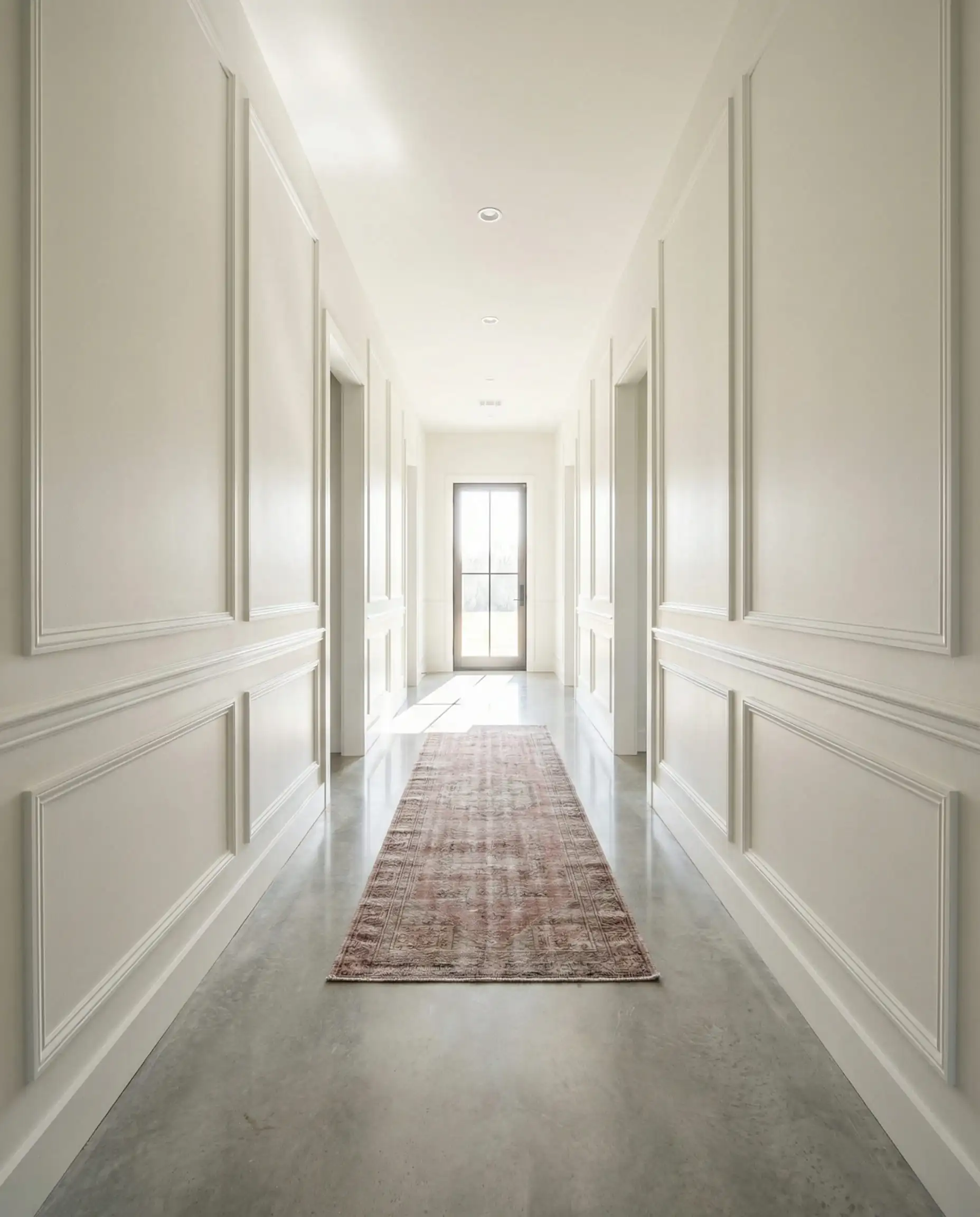
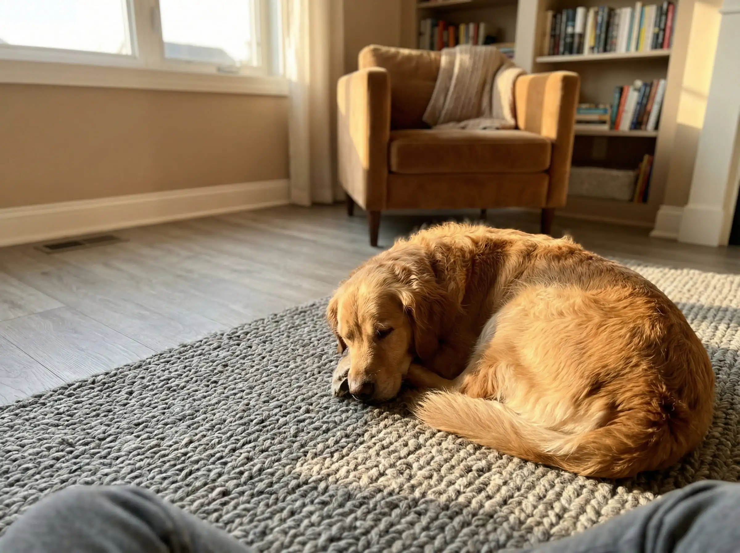
Gray floors are the chameleons of interior design. Since the mid-2010s, they have dominated the market, appearing in everything from luxury vinyl plank (LVP) to chic concrete tiles and weathered hardwood. But as we move into 2026, the way we style them is changing fundamentally.
For years, the standard advice was to pair gray floors with gray walls. The result? Spaces that felt cold, sterile, and often referred to as “The Hospital Effect.” Today, the trend has shifted dramatically toward warmth, contrast, and biophilic (nature-inspired) elements.
If you are standing in your living room holding a paint swatch and feeling overwhelmed, you aren’t alone. Gray is technically a neutral, but it is a “complicated” neutral with hidden undertones that can make or break your color palette.
In this ultimate guide, we will decode the undertones of your flooring and reveal the best paint colors to create a home that feels modern, cozy, and professionally styled.
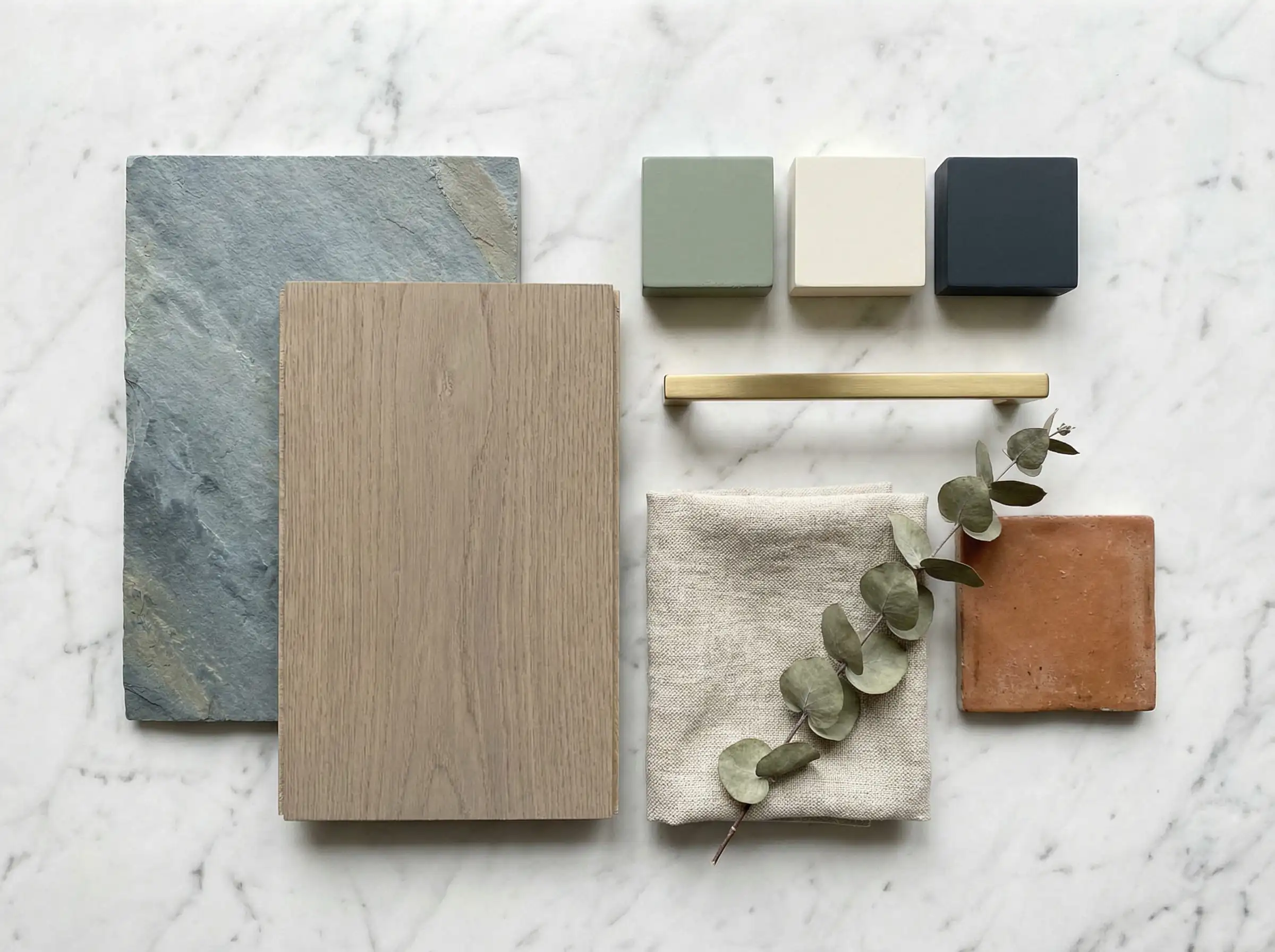
The “Cheat Sheet” Summary Table: Best Wall Colors for Gray Floors
If you are in a rush at the paint store, here is your quick reference guide to nailing the perfect match.
| If Your Floor Undertone Is… | The Best Wall Vibe Is… | Top Paint Picks (2026) |
| Cool Blue-Gray | Crisp, Clean, or Moody | SW Pure White, BM Hale Navy, SW Drift of Mist |
| Warm Brown-Gray (Greige) | Cozy, Earthy, Soft | SW Alabaster, BM Edgecomb Gray, SW Accessible Beige |
| Dark Charcoal / Slate | High Contrast & Airy | BM Chantilly Lace, SW Sea Salt, BM Revere Pewter |
| Light “Whitewashed” Gray | Bold or Monochromatic | SW Iron Ore (Accent), BM Swiss Coffee, SW Evergreen Fog |
| Green-Gray | Organic & Calming | BM October Mist, SW Clary Sage, SW Shoji White |
Never trust a paint chip in the store! Lighting varies wildly. Always paint a large sample board and move it around the room to see how it looks against your gray flooring ideas at different times of the day.
Hackrea Styling Tip 🎨
You can apply wallpapers, paints, etc. on walls and see how they look in various interiors.

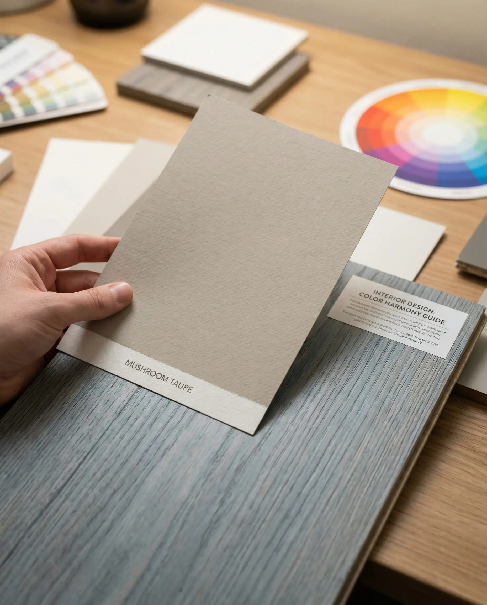
The Golden Rule: Understanding Undertones
Before you buy a single gallon of paint, you must identify the “temperature” of your gray floors. Gray is rarely just black and white mixed together; it almost always leans toward a color.
1. Cool Gray Floors (Blue or Purple Undertones)
These floors look like stone, slate, or “stormy” skies. They are crisp and modern but can feel icy if not handled correctly.
2. Warm Gray Floors (Brown or Yellow Undertones)
Often called “Greige” (Gray + Beige) or Taupe. These floors mimic natural wood more closely and feel cozier.
3. Green-Gray Floors
Common in weathered wood looks or “driftwood” styles.
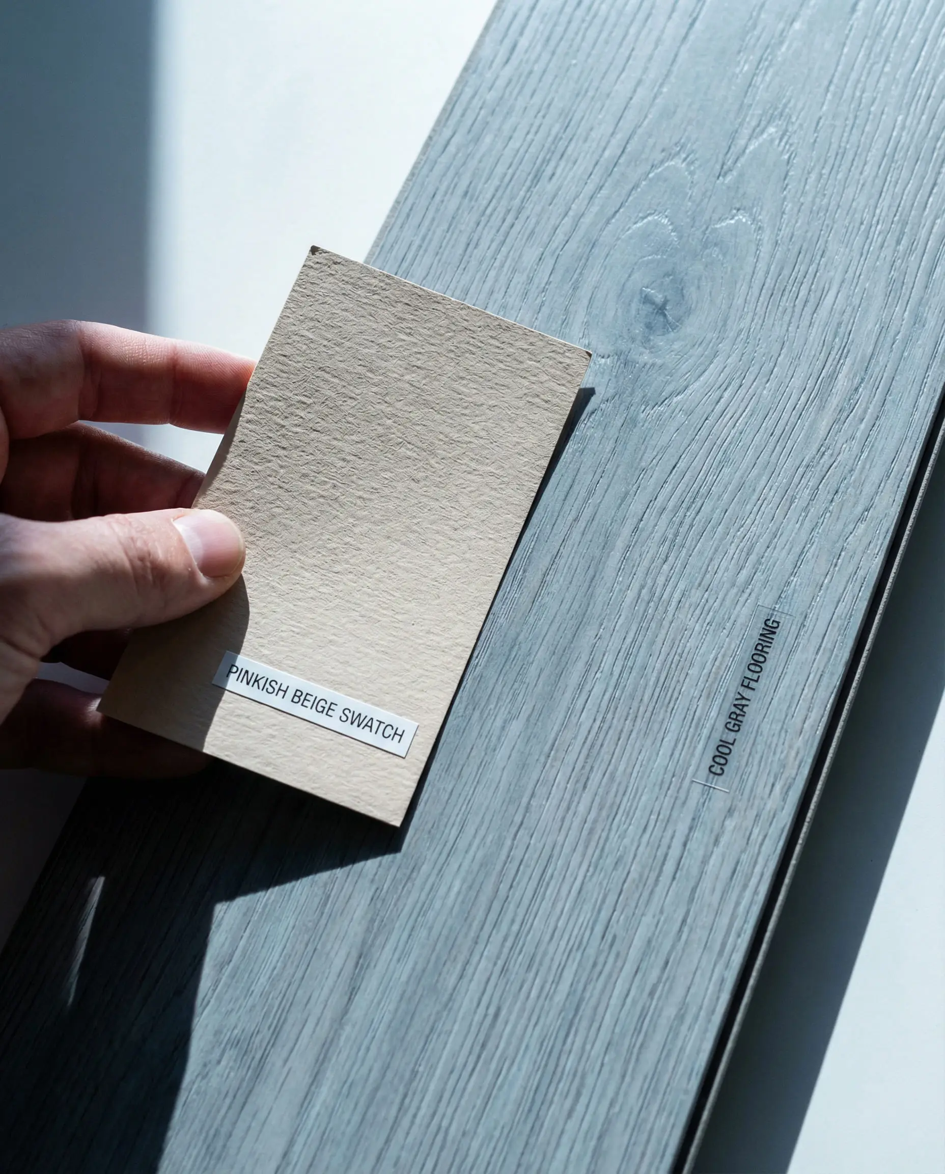
Can’t tell what undertone you have? Place a piece of pure white printer paper on the floor. The contrast will make the floor’s true color “pop.” If it looks bluish, it’s cool. If it looks brownish/muddy, it’s warm. This concept is crucial when exploring hardwood floor and wall color combinations.
Hackrea Pro Tip 🧐
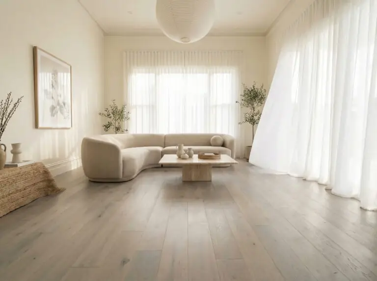
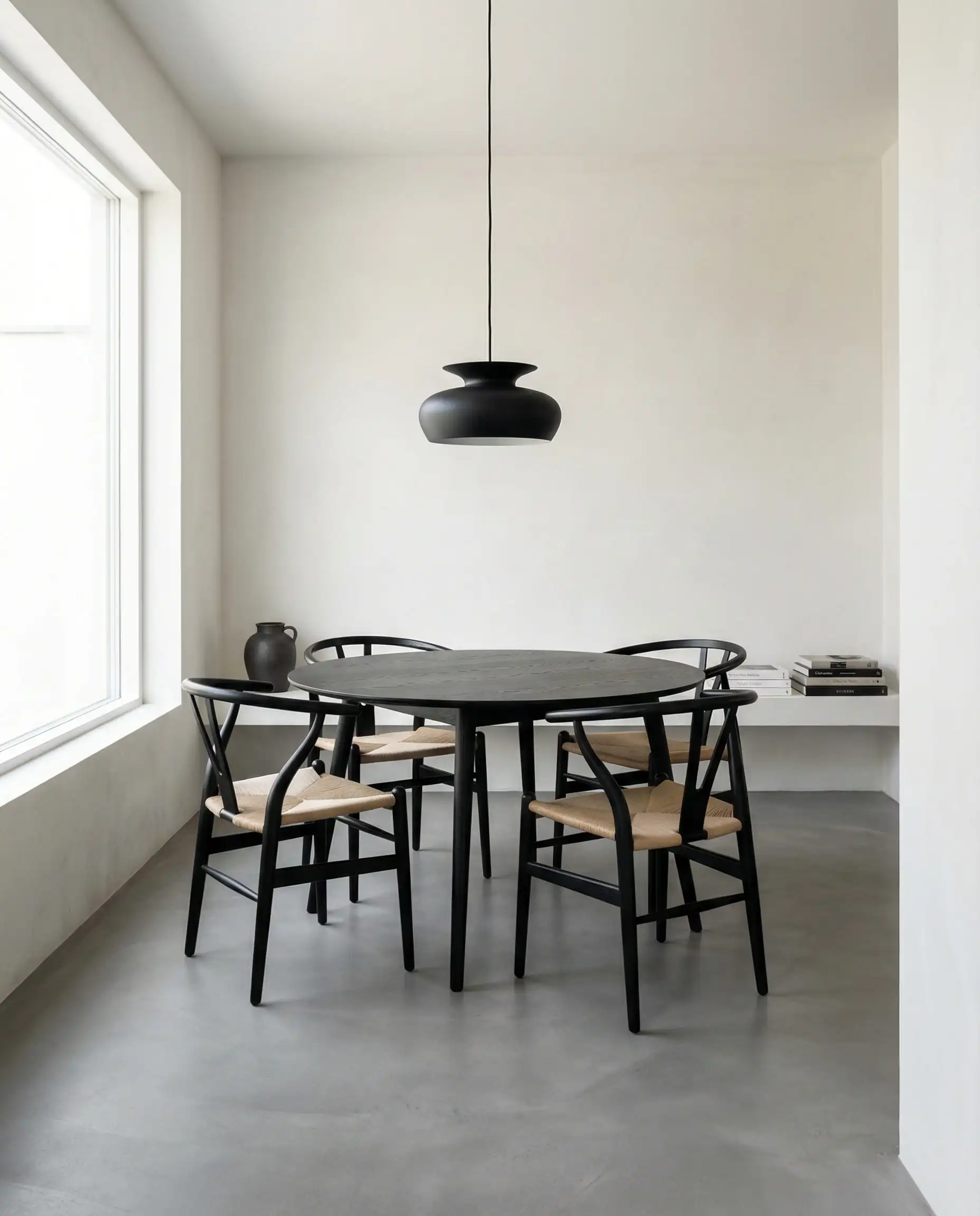
Top Color Trend 1: The “New Neutrals” (Warm Whites & Creams)
In 2026, we are saying goodbye to the “sterile laboratory” look. While white walls are still classic, we are moving away from stark, cold whites (like unmixed base white) toward “New Neutrals”—creamy off-whites that add a subtle glow to the room.
This is the safest and most popular choice for gray floors because it creates a bright, airy canvas that allows your furniture to shine.
Why It Works
Warm whites bridge the gap. They pick up the light and bounce it around, preventing gray floors from sucking the energy out of a room. It creates a “Scandi-Japandi” vibe that is very current.
Top Paint Recommendations
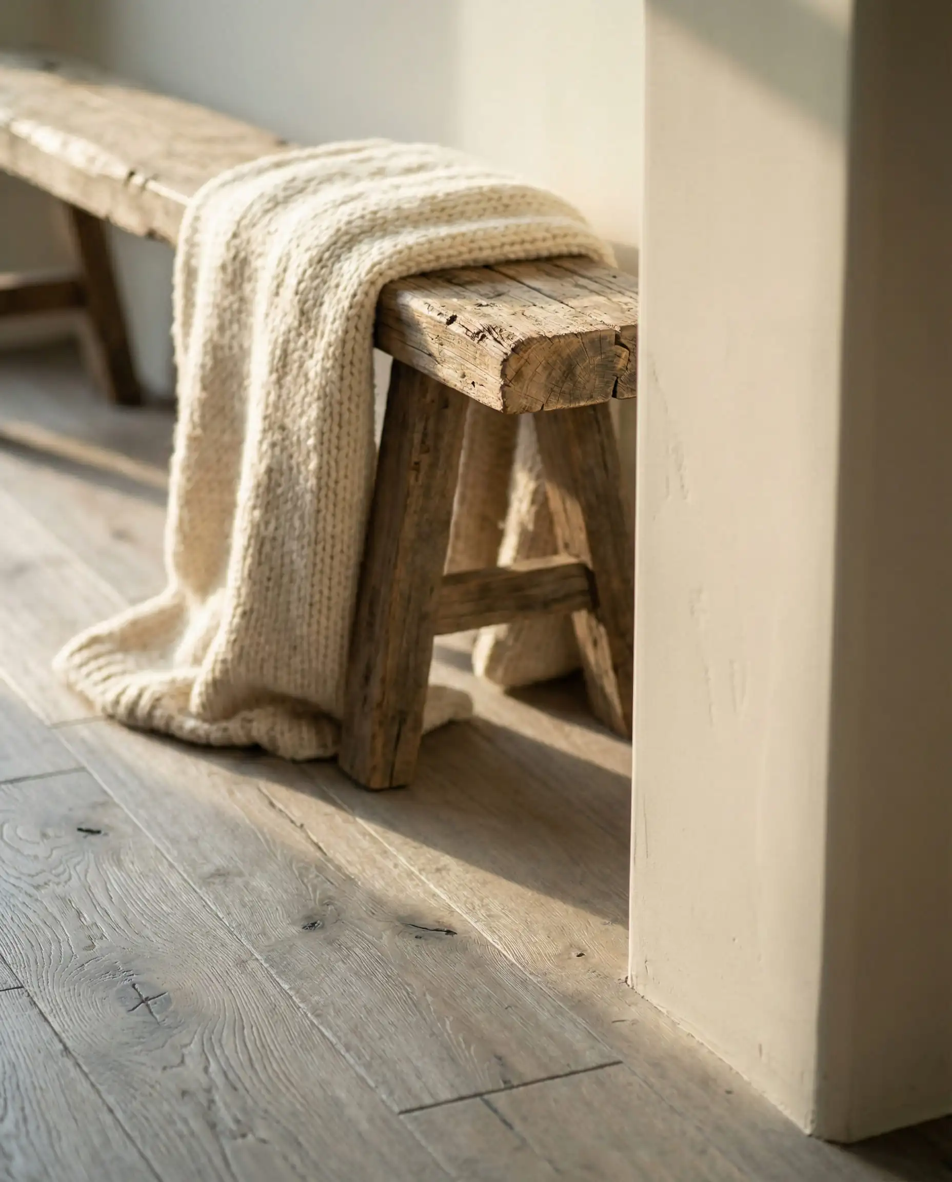
If you go with white walls, add texture! Use a beige rug or chunky knit throws to ensure the room feels cozy, not empty.
Hackrea Styling Tip 🛋️
Top Color Trend 2: Nature-Inspired Greens
Green is arguably the most significant color trend for the mid-2020s. As our lives become more digital, we crave a connection to the outdoors. Luckily, green and gray are natural neighbors on the color spectrum.
The Sage & Gray-Green Connection
Soft, muted greens (often called “neutral greens”) have gray undertones themselves. This shared DNA makes them blend seamlessly with gray floors. It softens the industrial edge of concrete or gray laminate and turns the room into a sanctuary.
Top Paint Recommendations
Check out our deep dive on Evergreen Fog Sherwin Williams SW 9130 to see how this color transforms spaces.
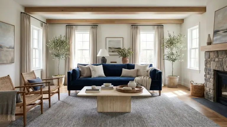
Top Color Trend 3: Moody Blues & Navies
If you want drama and elegance, look to the blue family. Gray and blue are a classic “cool” pairing, but the key in 2026 is to avoid primary, bright blues (like a kids’ playroom blue) and opt for “dusty” or “stormy” shades.
Dusty Blues vs. Navy
Top Paint Recommendations
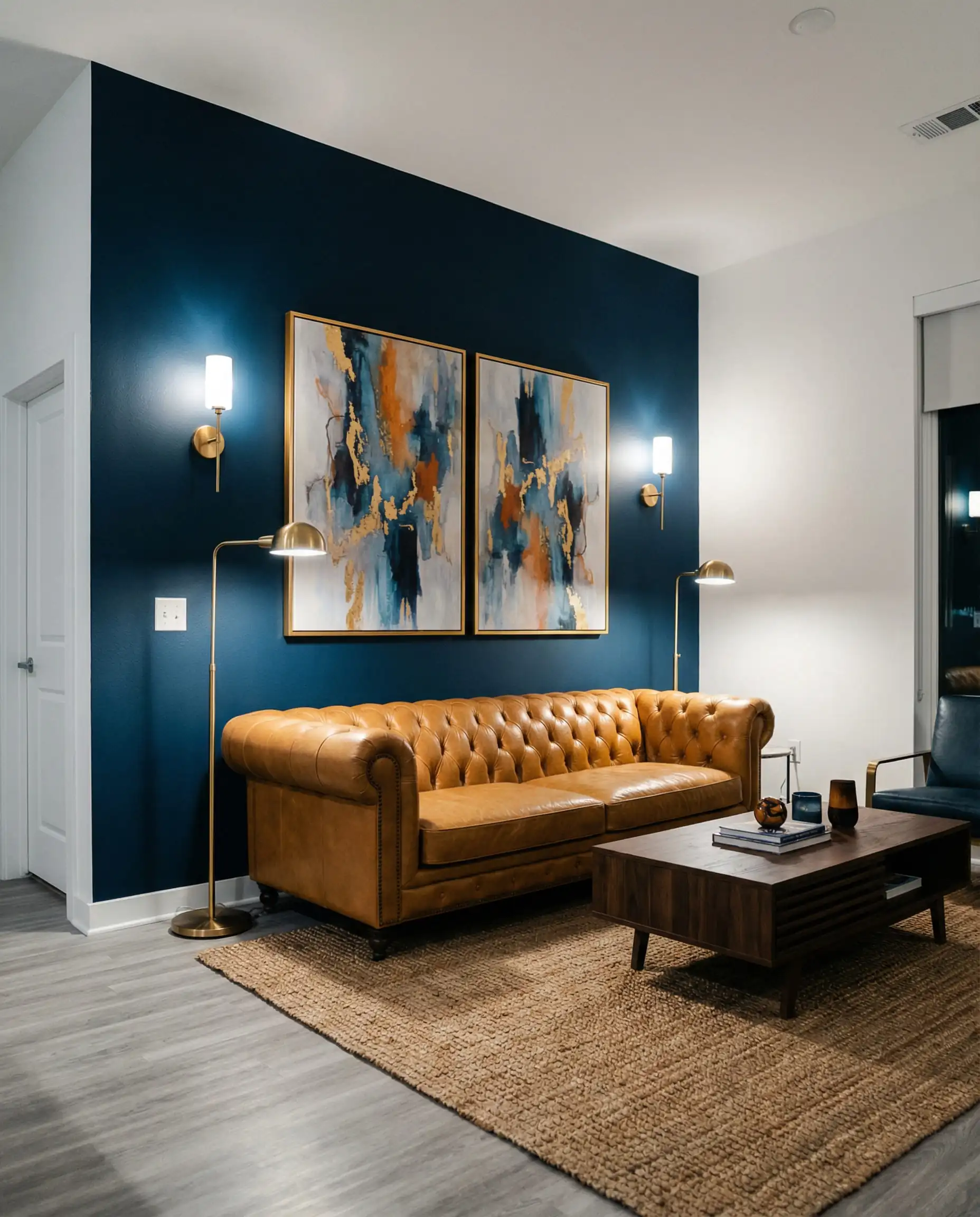
With blue walls and gray floors, introduce metallic accents. Gold or brass light fixtures warm up the cool palette. See our best gold wall sconces for inspiration.
Hackrea Styling Tip 🖼️
Top Color Trend 4: Unexpected Warmth (Terracotta & Clay)
This is the trend for the bold. As we move away from the all-gray aesthetic, homeowners are looking for ways to inject “life” into their homes.
The Theory of Contrast
On the color wheel, orange and blue (cool gray often reads as blue) are opposites. Opposites attract. By pairing a cool gray floor with a warm, earthy Terracotta, Rust, or Blush wall, you create a vibrant, modern energy that feels curated and intentional.
Top Paint Recommendations
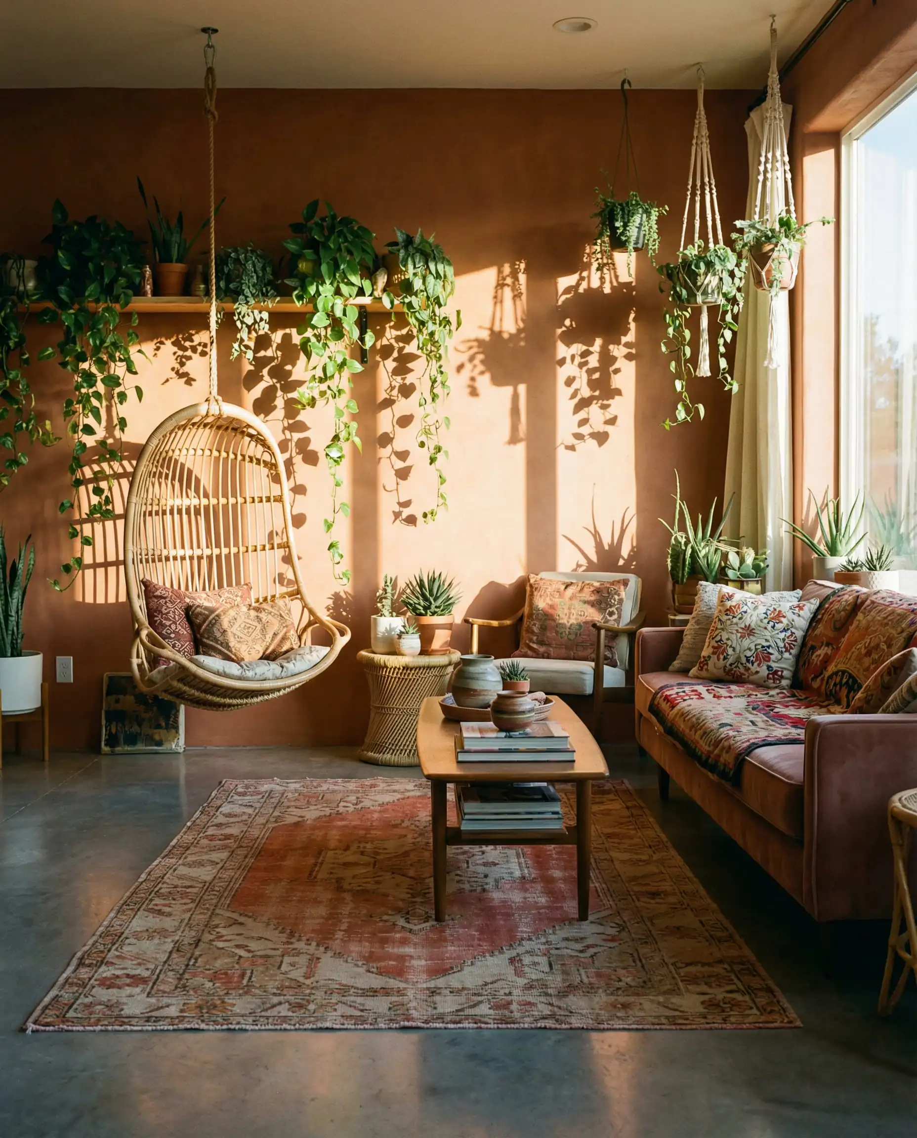
If you aren’t ready to paint a whole room terracotta, consider using terracotta wallpaper on a feature wall to test the waters.
Room-by-Room Guide
What works in a bright kitchen might feel too energetic for a bedroom. Here is how to adapt these colors by room.
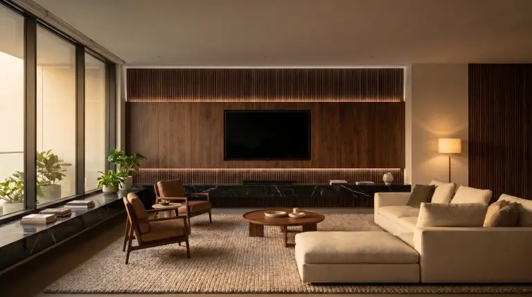
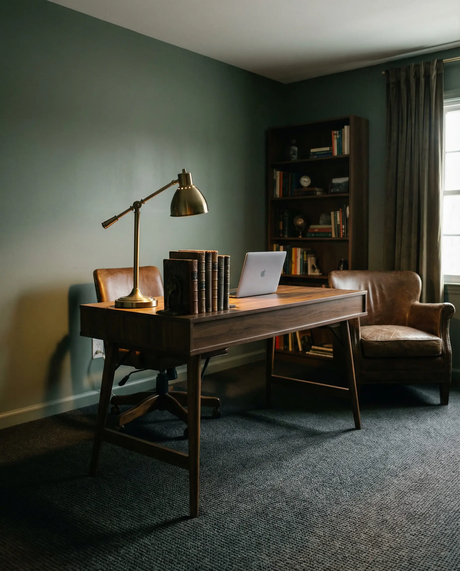
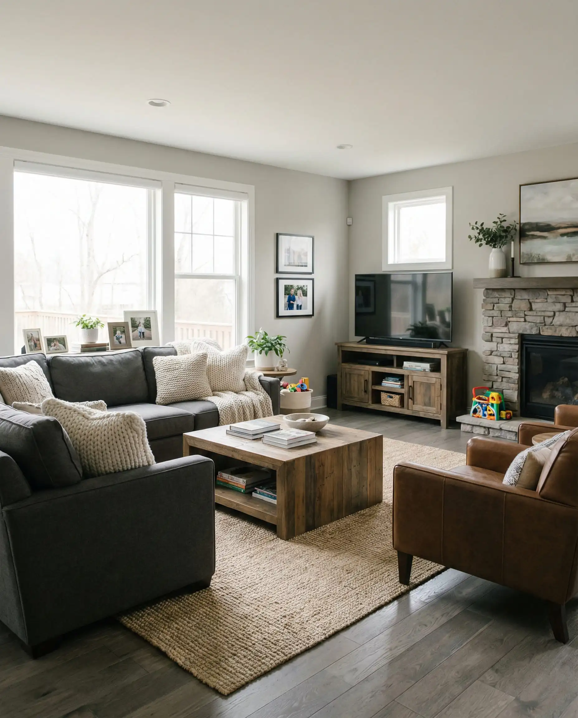
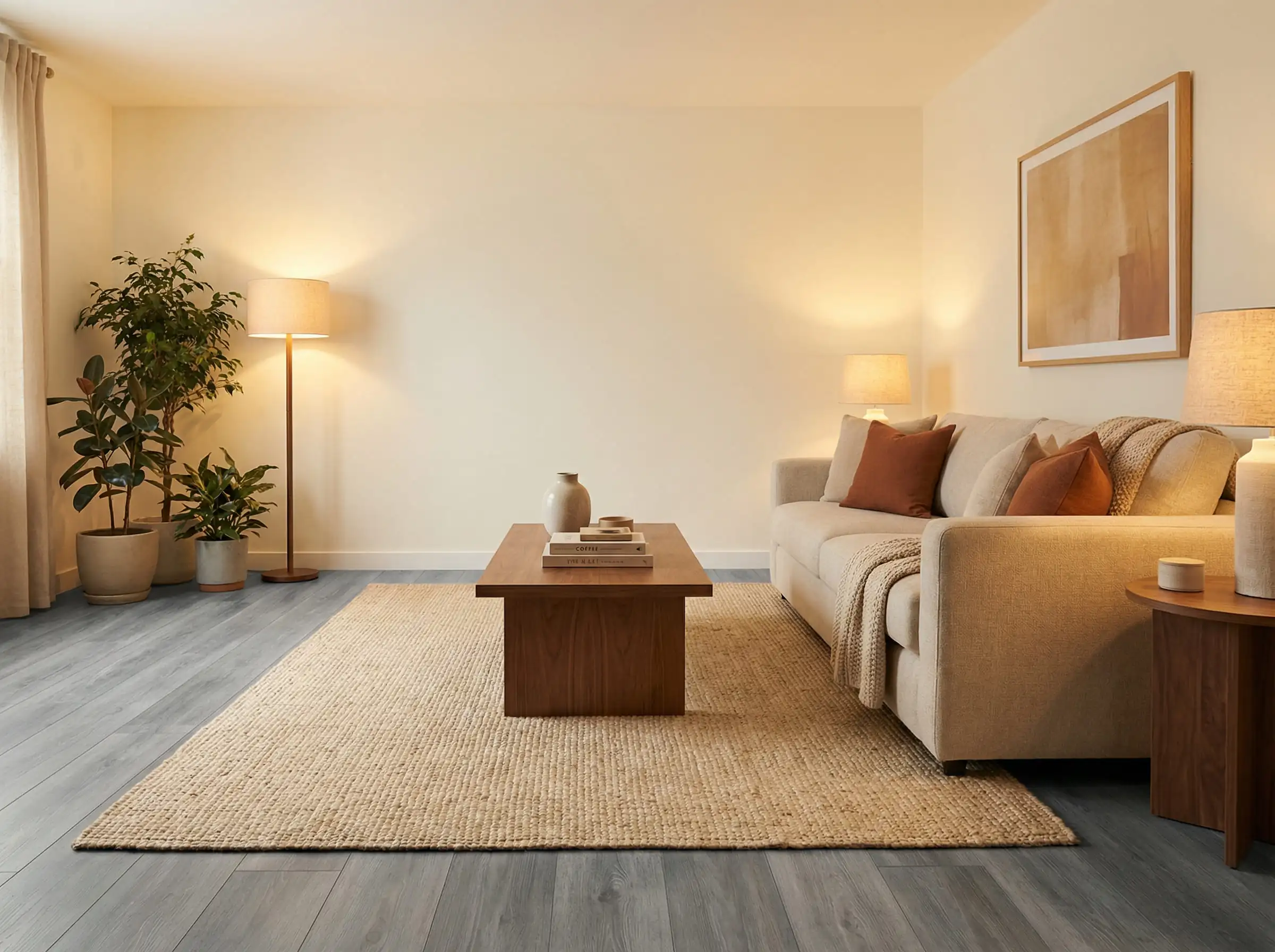
1. The Living Room
The living room is where you entertain and relax. You want versatility here.
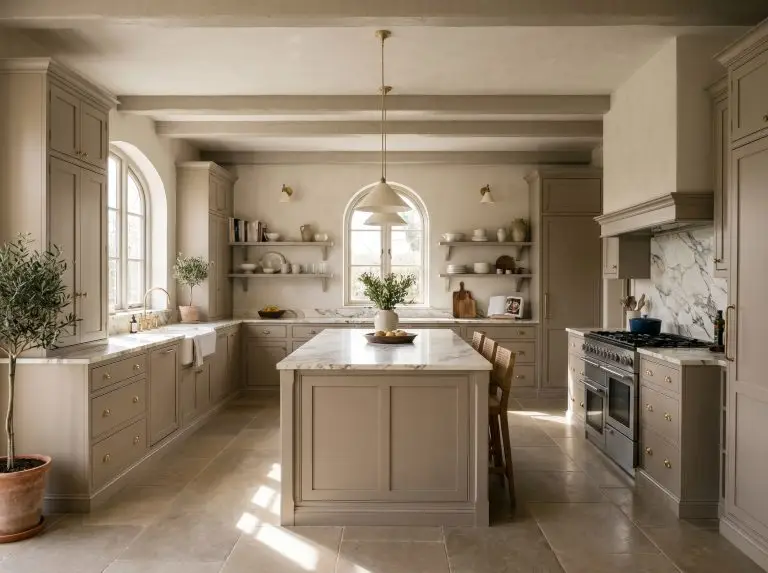
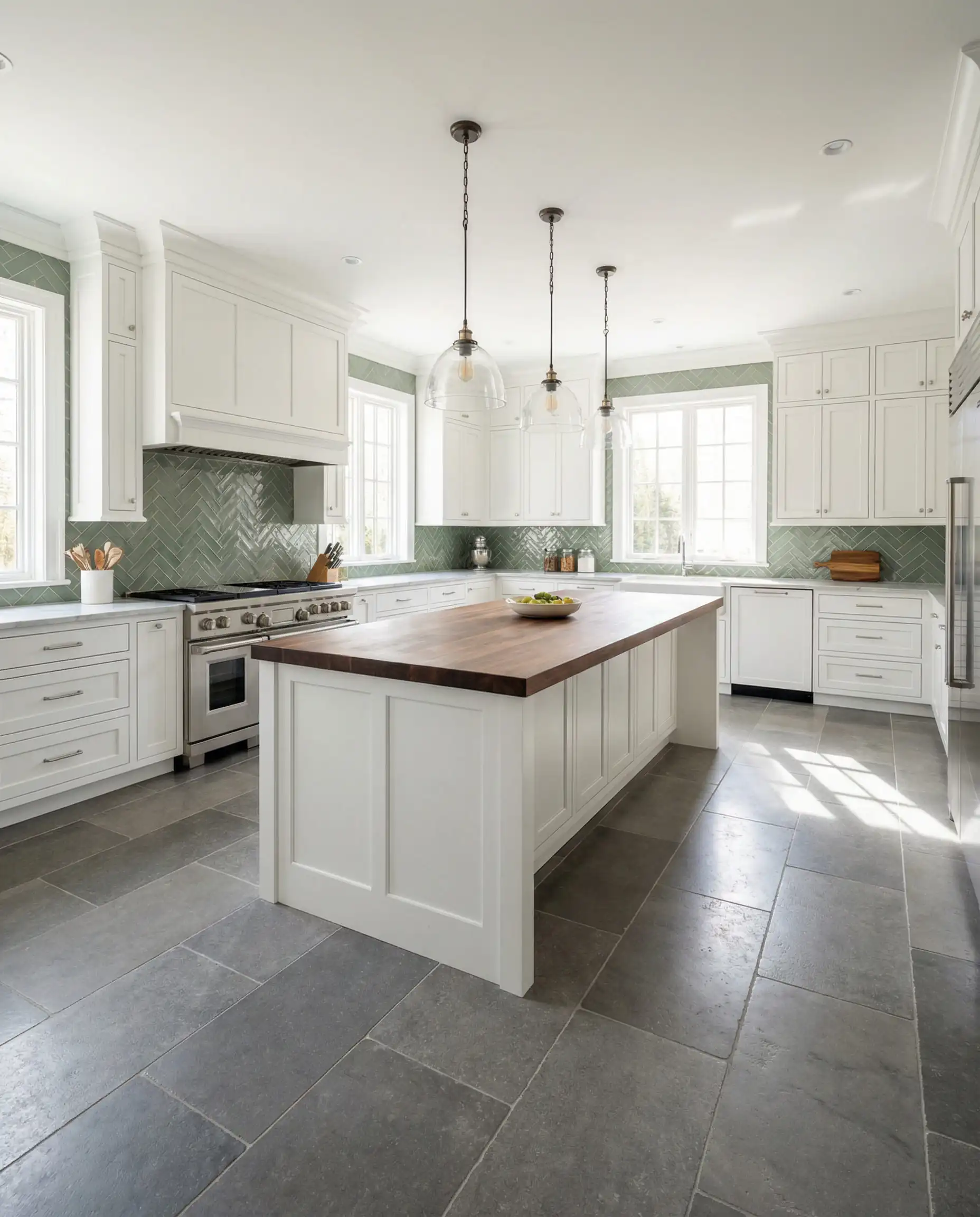
2. The Kitchen
Kitchens with gray floors usually have white or gray cabinets.
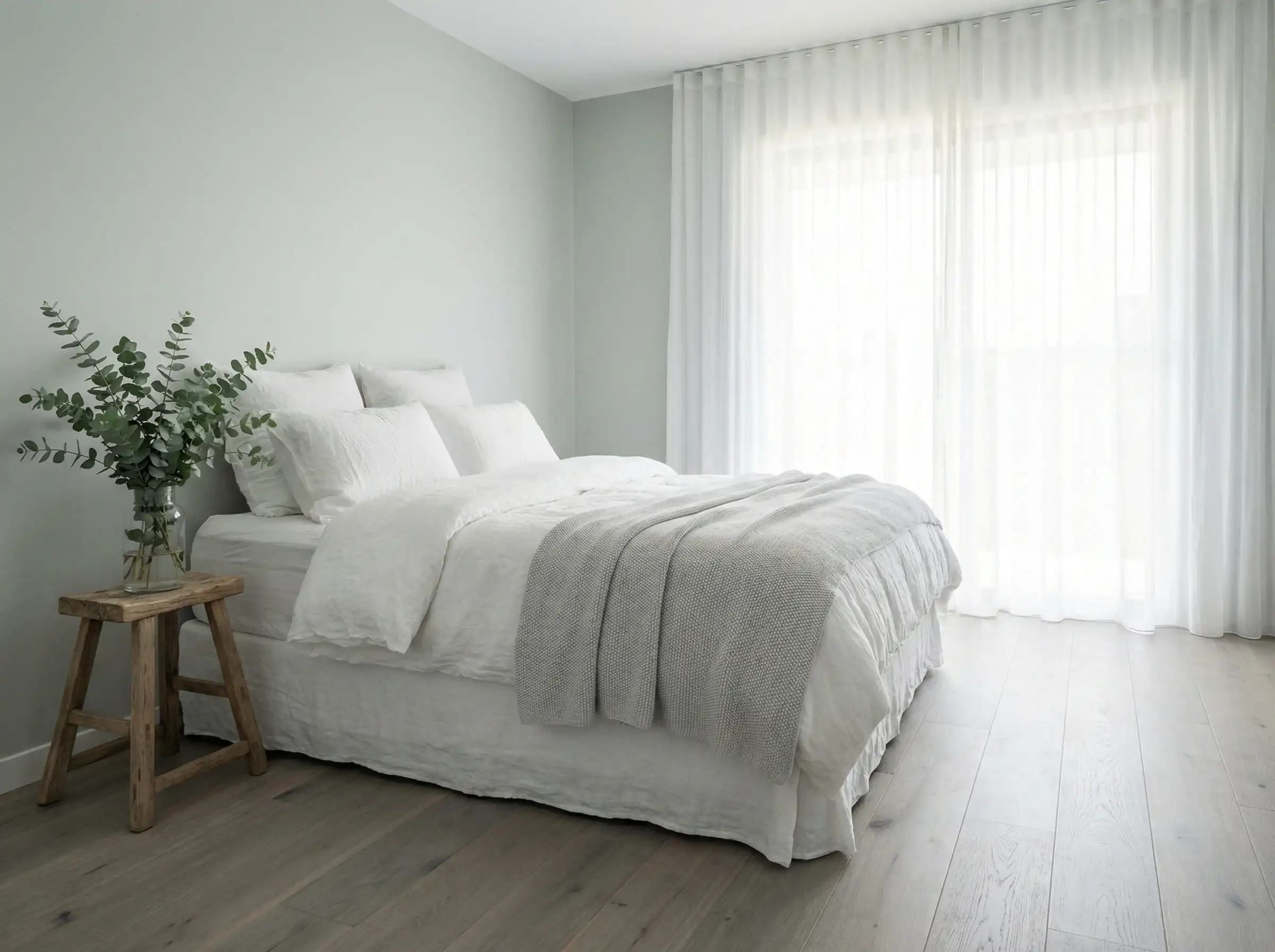
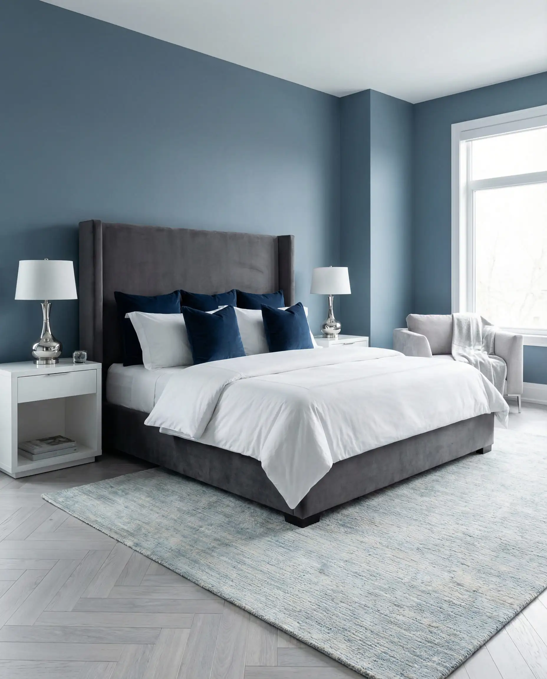
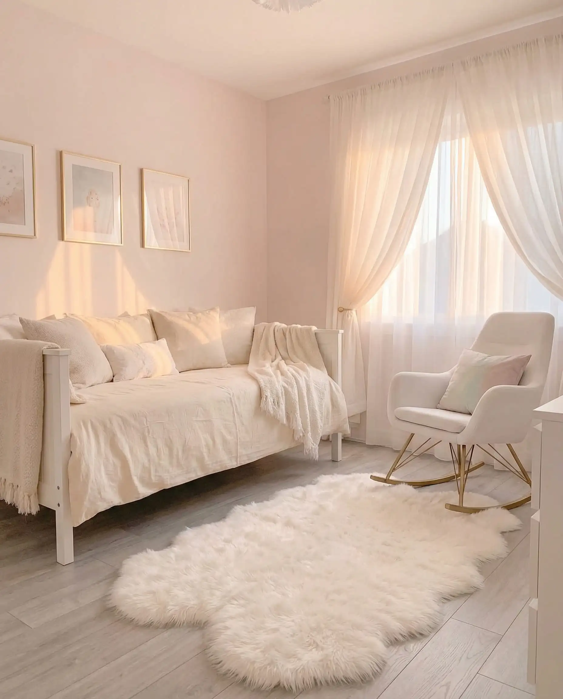
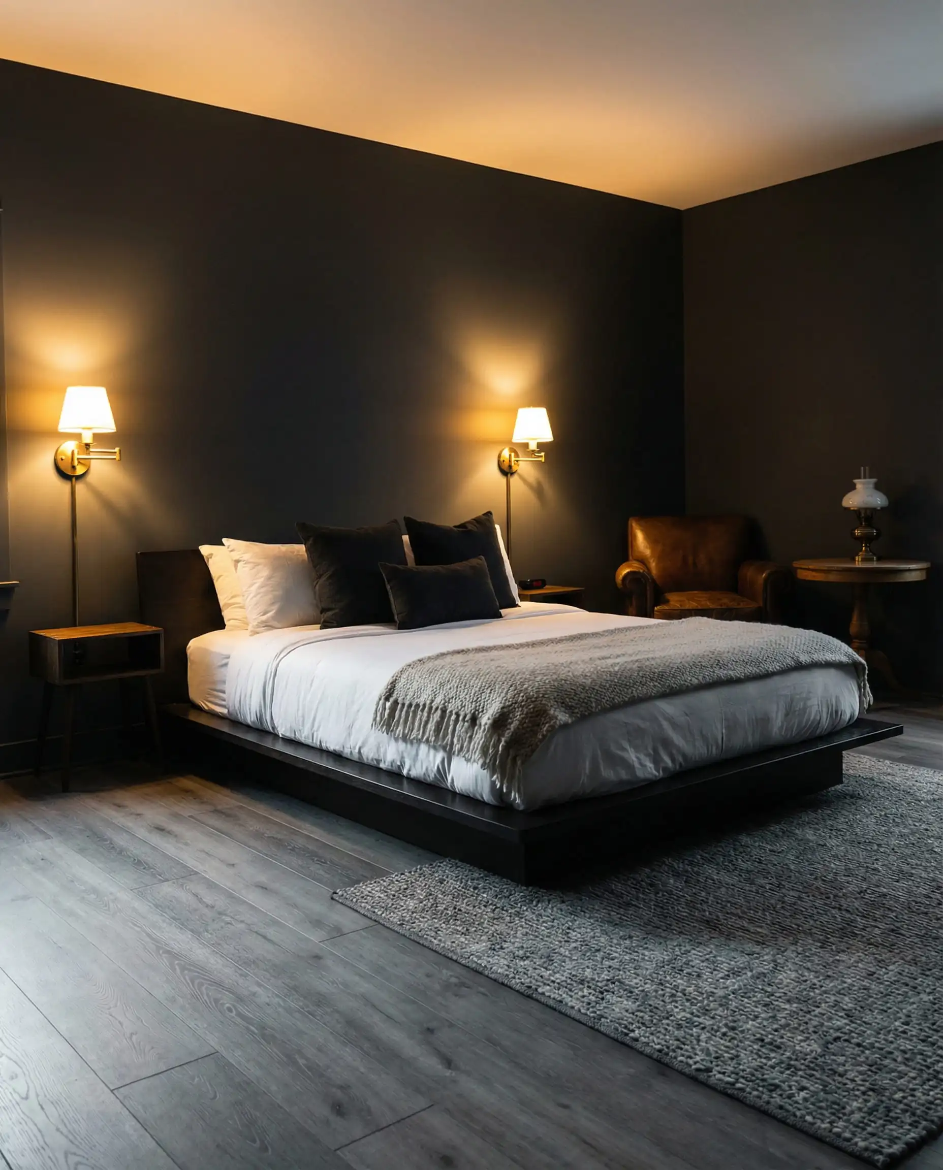
3. The Bedroom
This is your sanctuary. You want lower contrast and moodier vibes to promote sleep.
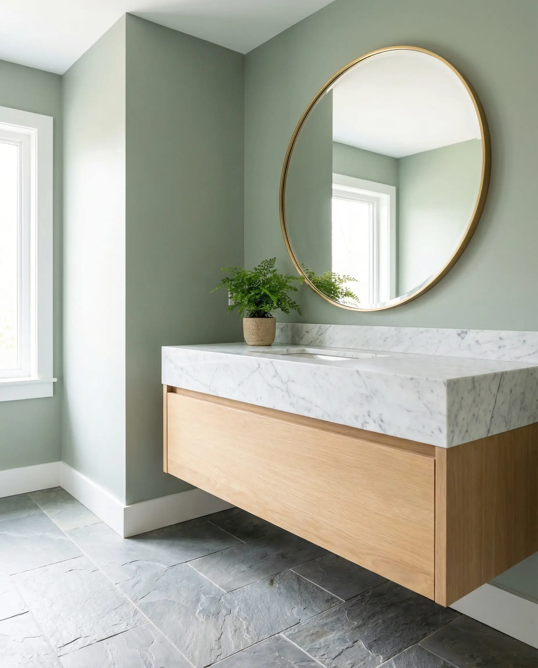
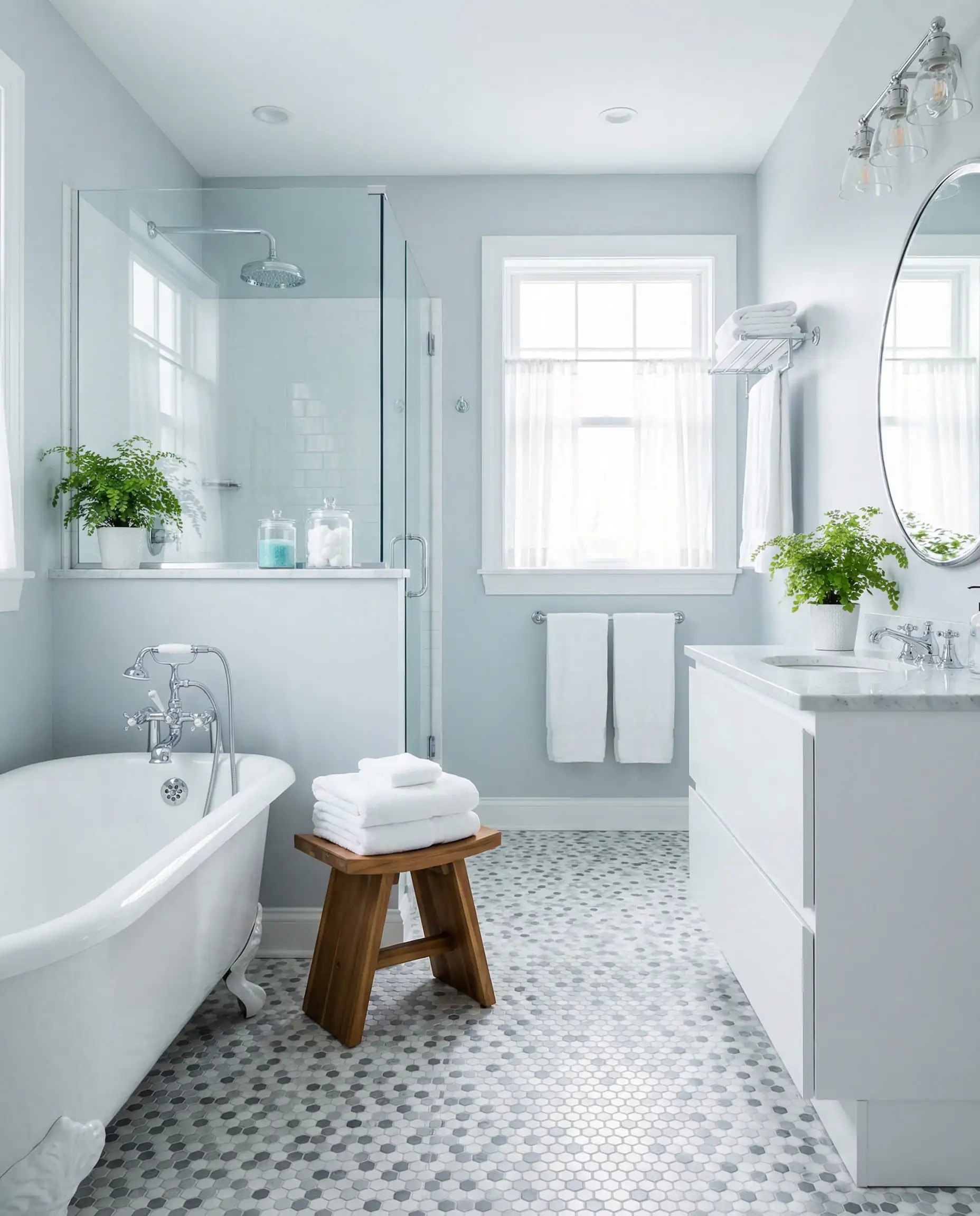
4. The Bathroom
Bathrooms are often small and lack natural light.
3 Common Mistakes to Avoid
Even with the best paint, things can go wrong. Avoid these three common pitfalls when styling gray floors.
Mistake #1: The “Hospital Effect”
This happens when you pair a cool, icy gray floor with a cool, icy white wall (like a white with blue undertones). The room feels sterile, cold, and uninviting.
Mistake #2: The “Pink” Beige Trap
You want to warm up the room, so you grab a beige paint. But once it’s on the wall next to your gray floor, the beige looks… pink.
Mistake #3: Ignoring Lighting
A color that looks like a warm gray in your south-facing living room (lots of sun) will look like a flat, cold concrete in a north-facing room (shadowy blue light).
Frequently Asked Questions (FAQ)
A: Yes, but be careful! The key is Contrast. If your floors are light gray, go for a dark charcoal wall. If your floors are dark slate, go for a pale mist gray wall. Avoid matching the shade exactly, or your room will look like a concrete box. Check out these gray accent wall ideas for inspiration.
A: Absolutely. This combination is the foundation of the “Greige” trend. It warms up the space. Just ensure the beige isn’t too yellow, or it might look dated. Look for “mushroom” or “taupe” shades.
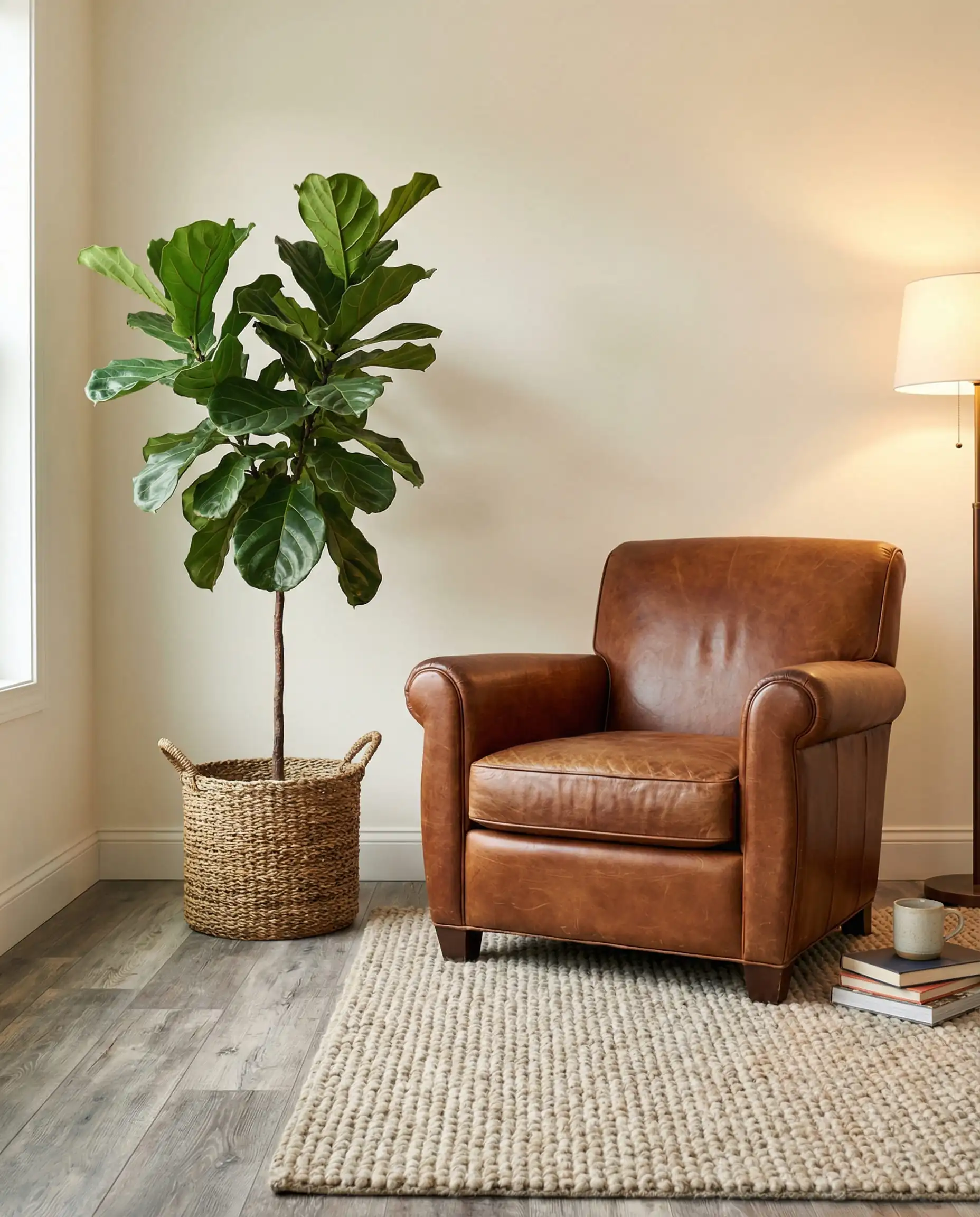
A: You have three great options:
Wood tones: Walnut and oak add much-needed warmth.
Black/White: For a high-contrast modern look.
Leather: Cognac or caramel leather looks stunning against cool gray floors.
For more details, see our guide on what color furniture goes with gray walls.
A: For a modern look, white baseboards are standard. They create a crisp line of separation between the gray floor and the wall color. However, for a moody, immersive look, you can paint the baseboards the same color as the walls (color drenching).
Conclusion
Gray floors are far from boring. They are a versatile foundation that allows you to change the personality of your home with just a coat of paint. Whether you choose the safety of a Creamy Alabaster, the serenity of a Sage Green, or the boldness of a Terracotta, the most important thing is to balance the visual temperature of the room.
Remember, design is personal. While trends like “New Neutrals” are popular in 2026, the best color is the one that makes you feel at home.
Next Step: Not sure if your gray floor is “warm” or “cool”? Take a photo of your floor in natural light and compare it to a white sheet of paper, or grab some peel-and-stick samples of the colors mentioned above!
Happy Painting!
The Hackrea Style Desk treats interior decoration as an exact visual science. Rather than focusing on demolition or floor plans, this desk masters the art of color theory, undertone matching, material pairings, and spatial proportion. From balancing the visual weight of mixed metals to finding the perfect bridging tone between disparate wood species, this desk provides the rigorous aesthetic rules needed to achieve high-end, editorial-quality harmony in any space.