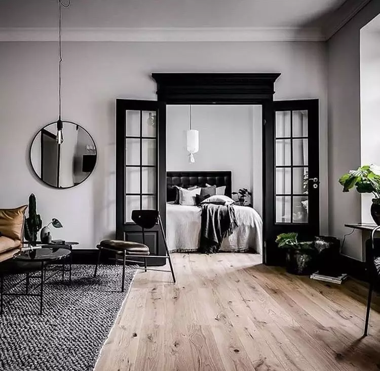
Scandinavian colors: classic and modern color palettes (2022)
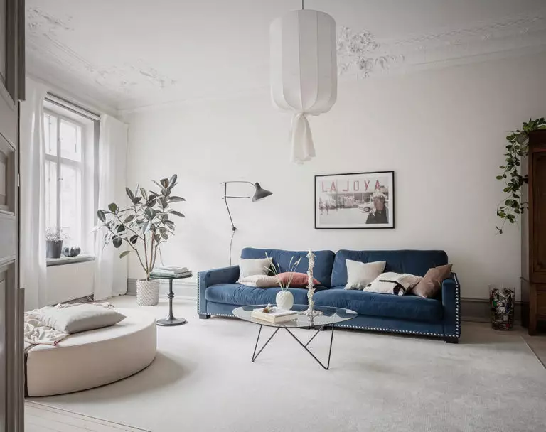
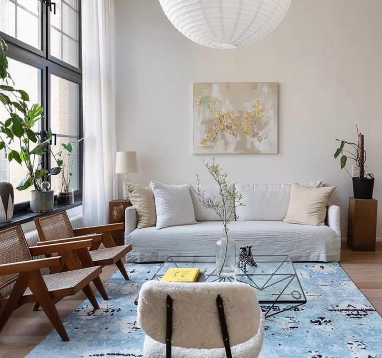
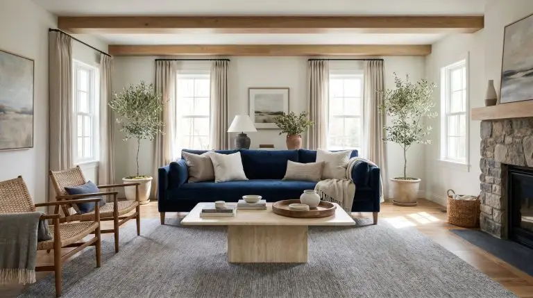
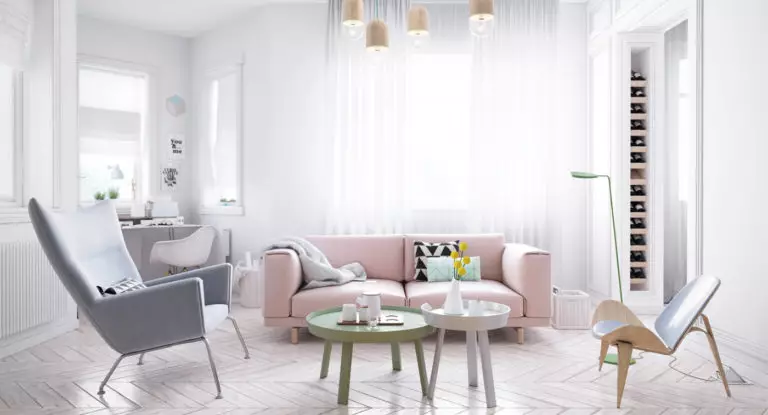
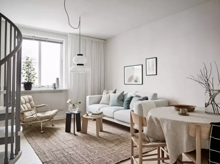
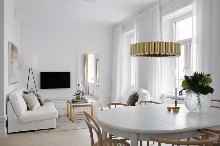
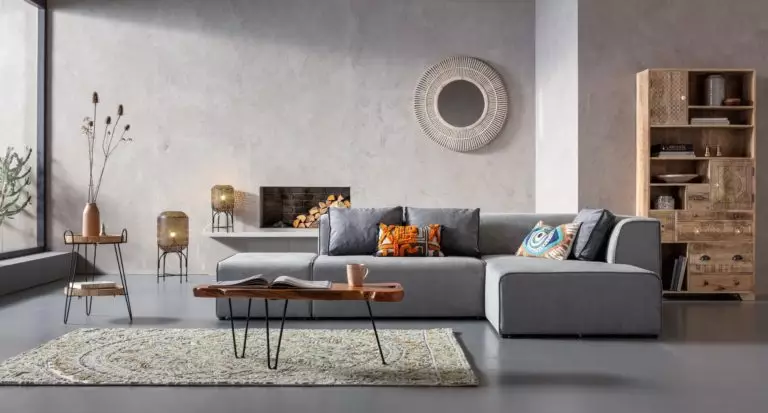
The selection of a color palette for an interior in the so-called Scandinavian style is a separate art form. A design born in a country with no more than 2,000 hours of sunshine per year requires color schemes that can add light, airiness, energy, and life as such. That is why simplicity, lightness, and naturalness are characteristic of all colors included in the Scandi range.
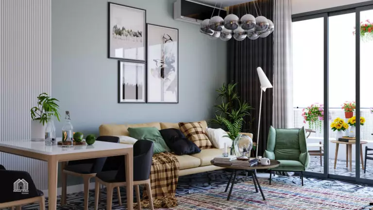
At the same time, the Scandinavian style boasts a good variety of shades and nuances, even within the framework of specific colors. If you dream of a simple and unpretentious but at the same time cozy interior reminiscent of Northern Europe, then it’s time to find out which palette you will have at your disposal. Let’s take a closer look at both the colors that have become classics of Scandinavian style and the solutions that have recently come into fashion.
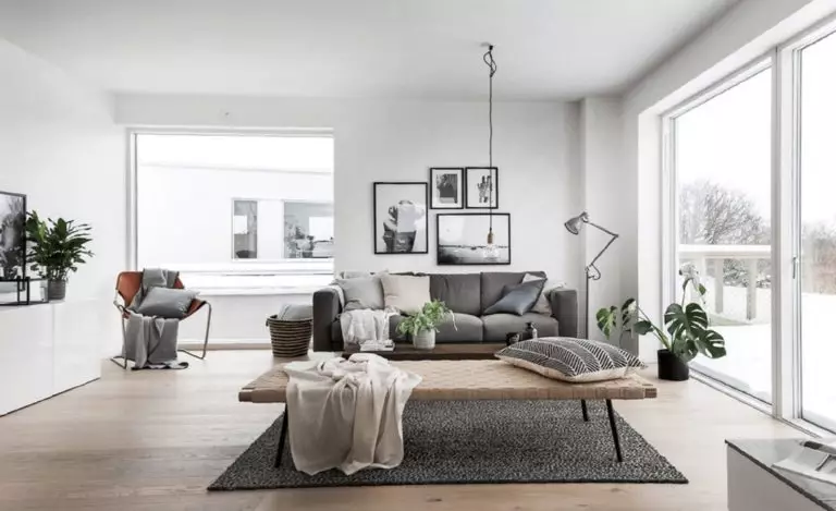
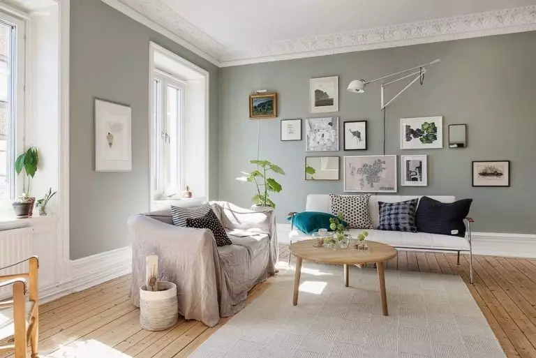
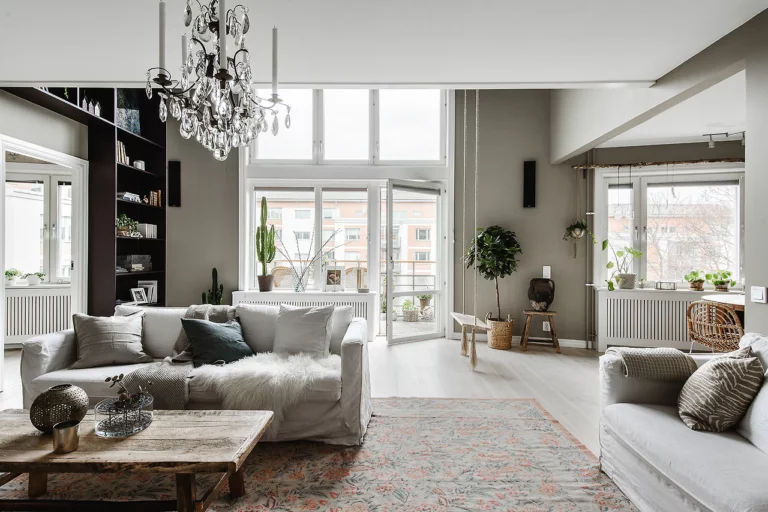
Traditional Scandinavian style color palette
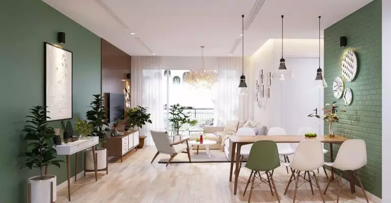
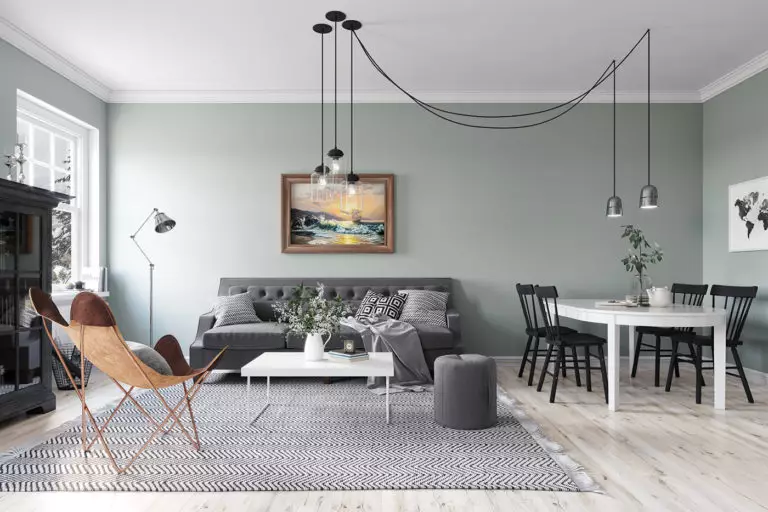
The colors that are actively used in Scandinavian interiors can be roughly divided into three large groups – primary, essential, and bright accent colors. Yes, yes, you should not think that Scandinavian style is exclusively about pastel and natural shades. In fact, there is room for colorful color nuances in Northern European interiors. However, we will talk about this a little later, but let’s start with key tones.
Primary colors
Basic tones occupy important positions in the palettes for the Scandinavian style and are present in absolutely all interiors – even if in smaller quantities. As you might have guessed by now, these are the so-called achromatic colors that can create illumination and rhythm. In this aspect, you are unlikely to get confused since there are only three of them:

Essential colors
So, when we have already figured out the base, it’s time to discuss the shades that create the key, individual mood in the Scandinavian-style interior. You can select them in different ratios and proportions since they are all combined with each other and, if necessary, even interchangeable. Let’s take a closer look at the most popular representatives of the traditional palette.
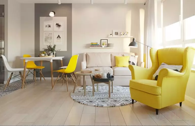
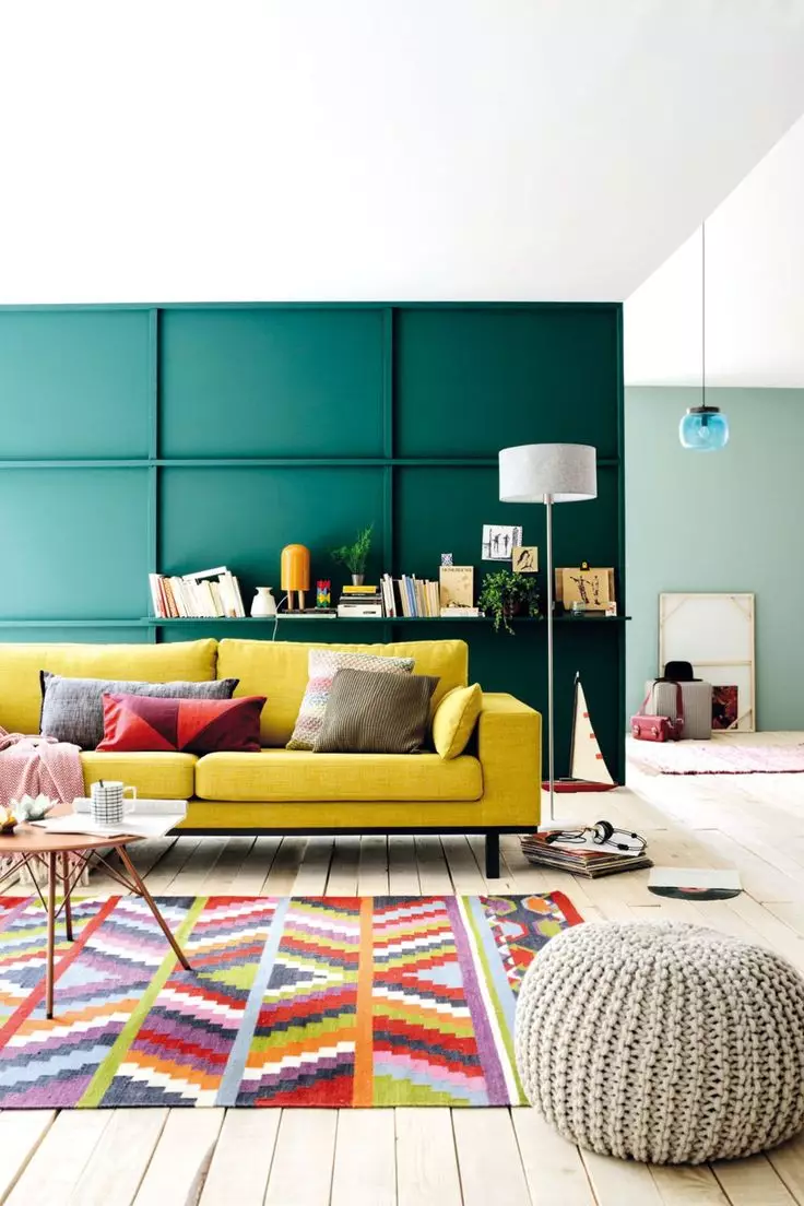
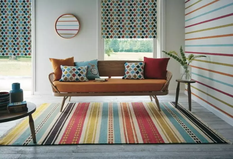
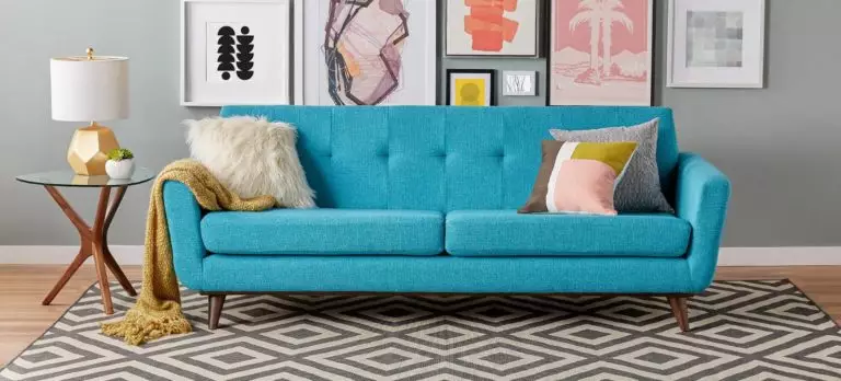
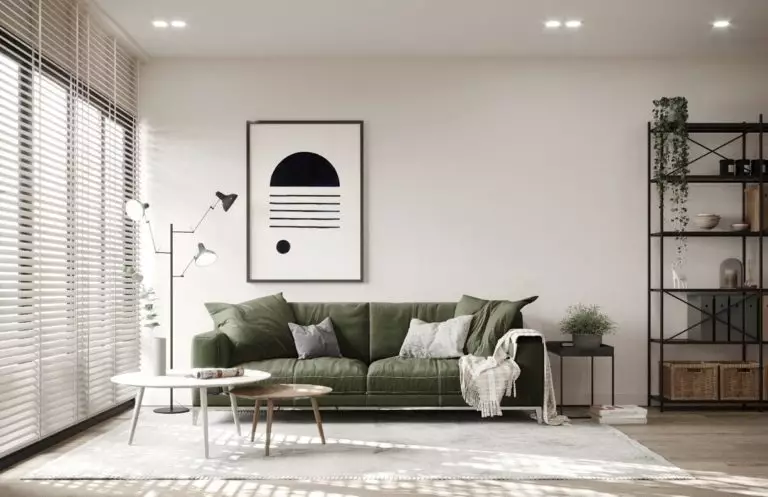
Bright accents
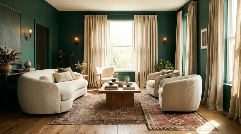
For some, this may sound surprising, but the Scandinavian style has not always been associated with pastel and light colors. So, in the 1970s, the Scandinavian countries were swept by a wave of popularity of bright colors and catchy patterns, which subsided a decade later. Today, echoes of that color holiday are more and more audible in contemporary Northern European interiors – as the desire of designers to move away from a slightly impersonal and universal environment in favor of individuality and unquestionably bright energy. So, in trendy projects and at exhibitions, the following shades are increasingly appearing:
Neutral and pastel colors have dominated Scandinavian interiors for more than 40 years – it is not surprising that today more intense colors are carefully but persistently introduced into North European design: a craving for novelty and visual joy is quite natural for any of us.
You can apply wallpapers, paints, etc. on walls and see how they look in various interiors.

How the Scandinavian color scheme is changing: trends of 2022
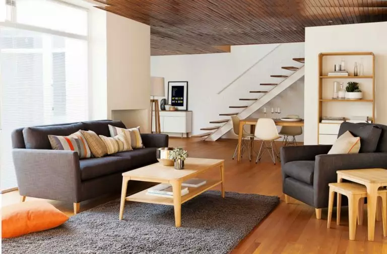
Despite a well-defined range of solutions and principles, all styles change slightly over time and adapt to current trends and needs of designers and owners of houses and apartments. The Scandinavian style was no exception: if you study its development in more detail, you can see how, little by little, not only new decorative techniques were introduced into it, but also completely different colors.
Jotun, a Norwegian manufacturer of paints and decorative coatings, can be called a color trendsetter for Scandinavian-style interiors. Every year the brand releases color palettes that set the tone for Northern European interiors, and 2022 is no exception. This time the collection of paints was named REDISCOVERY, which means a revision of the traditional Scandi colors.
This time Jotun presented four basic palettes at once, which in turn included 29 colors. According to the global color manager Lisbeth Larsen, the key idea of the collection was the ability to create an interior that becomes a natural source of energy and in which you can feel protected. So let’s see what shades you can add to your Scandinavian interior to make it even more relevant.
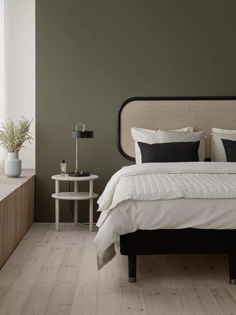
Warm and natural
To develop this palette, specialists were inspired by the idea of combining different traditions and cultures based on territorial landscapes around the world. The result is a lovely pool of colors that captivate with warmth, hospitality, and some kind of down-to-earthiness – and among them, there are:
All of these tones look great both as an accent and as a base. Thanks to them, Scandi-style interiors are soothing, inspiring, and energizing, as well as a reminder of the diversity of nature and cultural traditions.
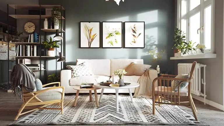
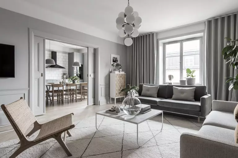
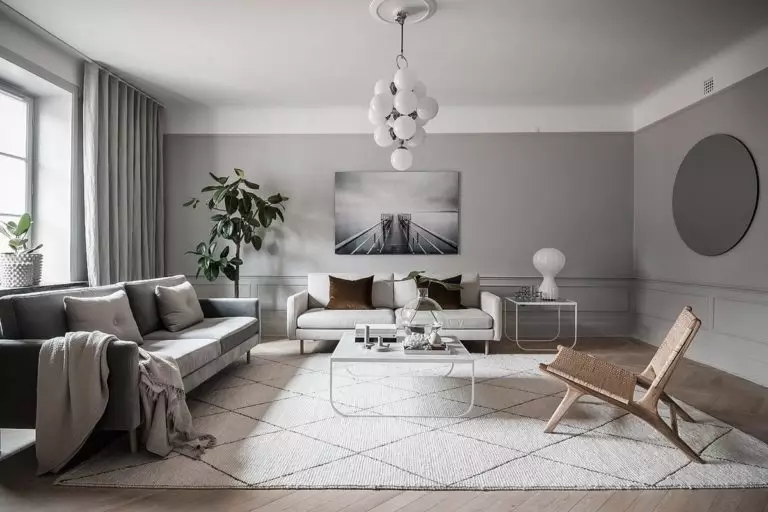
Sensual, soft, and neutral
Over the past couple of years, when you need calmness, clarity, and confidence, everything will be fine. You are trying to find hints of all this in the environment as well – that is why Jotun paid particular attention to the neutral palette, adding soft and soothing nuances to it. Today, this palette includes the following tones:
All of this color scheme promises neutrality and harmony. It helps create an atmosphere in which there is no place for anxiety or depression – and this is the fundamental principle of the Scandinavian style.
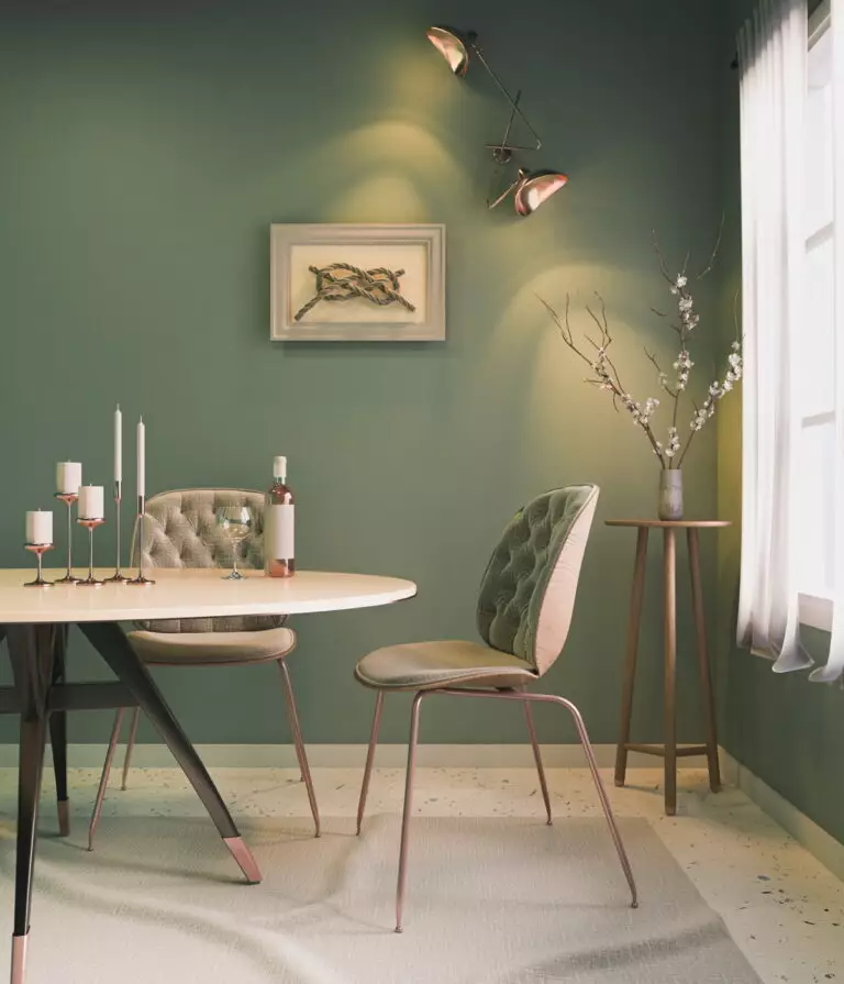
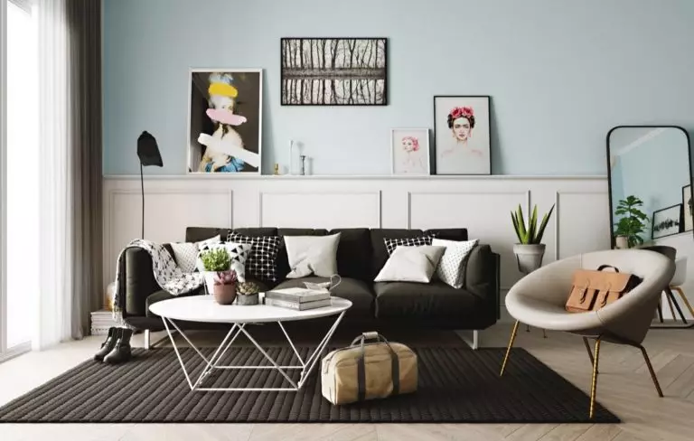
Cool, watercolor, and airy
It is simply impossible to create an ultra-fashionable Scandi-style palette and ignore the blue and light blue tones – it is they that give the interior lightness and mystery and also remind of the incredible beauty and harmony of sea and sky. Those who seek to combine tradition and relevance in a Scandinavian interior should take a closer look at the following shades:
It’s not without a reason that the greenish-gray and bronze tones are in this palette. Thanks to them, blue and light blue tones acquire greater saturation and depth without losing softness and serenity.
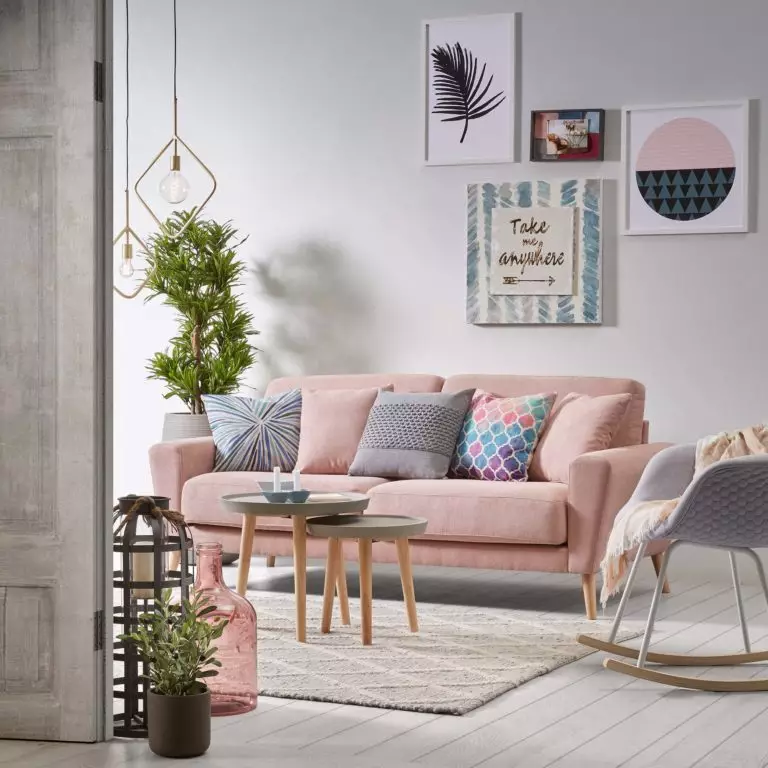
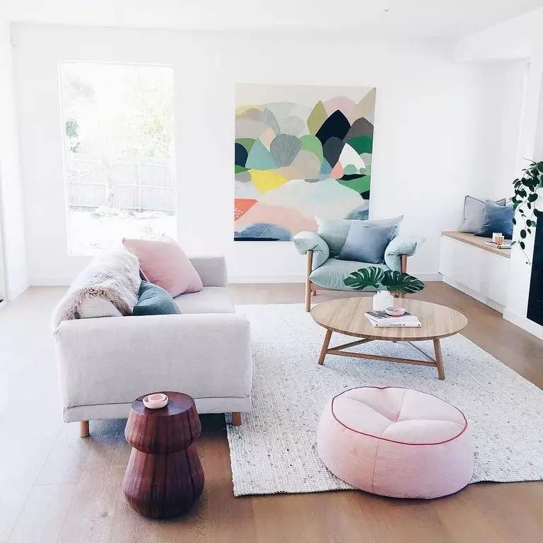
Muted pastel
This palette was specially designed for those who prefer open and free spaces without clutter with unnecessary details and still want to create a backdrop for immaculately finished furniture and a few accessories. This group of shades includes:
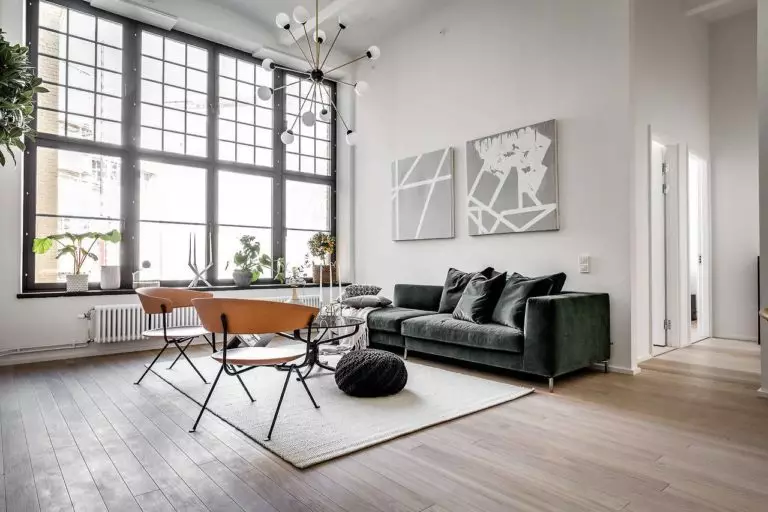
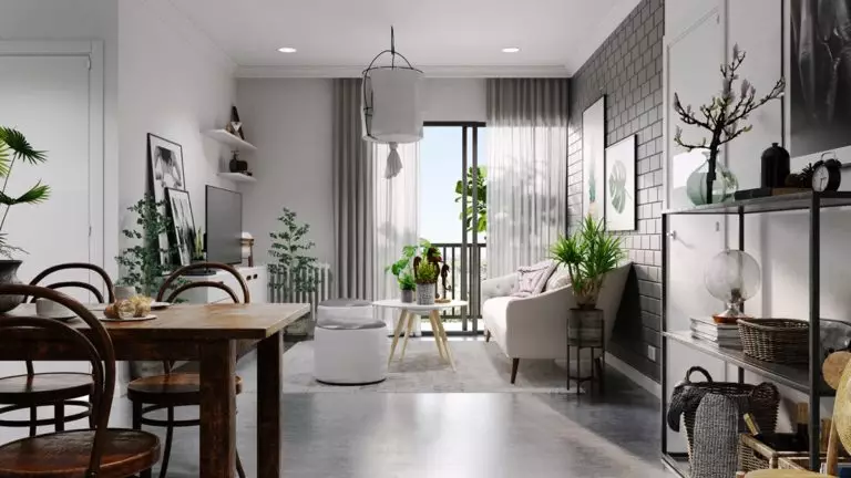
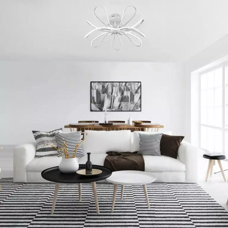
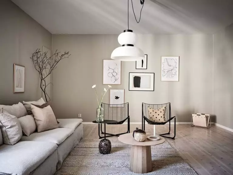
Scandinavian style color palette: Conclusions + Photo Gallery
Serenity, hospitality, harmony with nature and oneself – the combination of traditional and trendy palettes create Scandinavian-style interiors, in which it is simply impossible to feel anxious or upset. Almost all Scandinavian color palettes are perfectly mixed with each other, giving rise to cozy and mesmerizing color combinations – perhaps you will include your own in the list of possible combinations.