How to Use Color, Lighting, and Layout to Create a More Inviting Exhibition Space
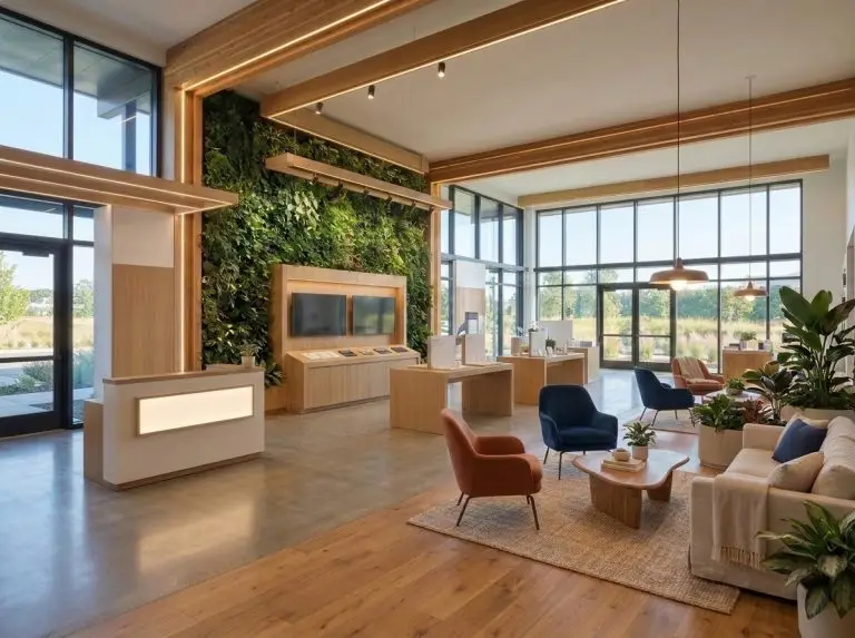
There is still so much commercial interior that looks like grey carpet, cold ceiling panels and a customs point entrance. Offices, showrooms and company exhibition corners are no longer to be taken seriously because visitors and employees benchmark their experience with their favorite homes and cafés. It’s mostly about colour, light and layout, and the tools improve on an annual basis. Below: what works, what’s being tested, and what it costs.
Color: The Quiet Part of the Brief
Create any type of office project brief and the color part is typically just one line: “use brand colors.” That’s how lobbies come to have logo blue on every wall and no one wants to be in a room like that. It’s better to choose the emotion first. Pantone has designated a soft white, Cloud Dancer, as its colour for 2026, and that indicates the mood – calm, airy, room to think.
Some brand colours do still exist; albeit in smaller quantities. One feature wall, front reception and hanging sign. Printed fabric is great at this and many companies are borrowing event hardware for permanent spaces. A seg trade show booth frame can display as a glowing brand wall in a lobby week after week, and then be reprinted with a different print for a conference next month using the same frame.
This advanced the wheel with biophilic design. Seattle’s Amazon Spheres are filled with live plants, while Apple Park puts its trust in natural wood and glass. Even the smallest co-working spaces today sport greens, clay tones, and raw timber to their own advantage. Those colours are associated with fresh air and a more relaxed heartbeat, so a meeting room doesn’t feel like a cell.
Each shade tends to do is what it does:Each shade tends to do is what it does
- Terracotta, amber, soft coral: social and warm, a good fit for cafeterias, breakout areas and client lounges.
- Deep blue and green: serious and steady, banks, law firms and clinics rest their case on them.
- Black and charcoal: a good render but absorbs light, so additional lamps are required to prevent the cave effect.
One practical note. Test paint chips and fabric samples in the lighting of the building at various times of day. A pleasant teal in the morning can turn to murky by the afternoon.
What’s New in the Commercial Design World
Design fairs are a precursor to the future direction of offices and exhibition spaces. NeoCon in Chicago and Orgatec in Cologne present the newest trends in the furniture industry, Light + Building in Frankfurt demonstrates lighting concepts and Salone del Mobile in Milan sets the trend for brands in space.
The main theme is human-centric lighting. There are systems available from Signify, Zumtobel and Lutron that will change the colour temperature throughout the day, from cool and bright in the morning to a warmer colour in the evening. The WELL Building Standard even gives credit for it, and hence developers listen.
Acoustics turned into a visual craze too. Noise control became a style choice with felt wall panels and Framery’s phone-booth pods. On the other hand, there are large LED walls, such as Samsung’s wall, that are no longer seen in corporate lobbies only as often as they are at ISE in Barcelona.
There are still things which are prototypes. LG demonstrated transparent OLED panels at CES, while the product is behind glass and the content is in front while Samsung followed with transparent MicroLED. E Ink’s Prism tiles change colour on a wall without the need for back lighting. They’re pretty, but they’re too expensive for most people, at the moment.
Light: Where a Modest Budget Goes Furthest
Have you ever had to work under cold overhead panels for an entire day? Faces look tired, screens are glaring and the afternoon seems to be going on and on. Typically, it does not require a complete reconstruction of the ceiling.
Layers take over the work. There is soft ambient light in the room, accent spots highlight displays of art or products, and task lamps are positioned right where people want to read or type. Daylight is also a layer, so sight-lines to daylight are more important than anything else.
In many cases, companies will have their lighting costs be their final expense on a showroom or event presence. They are surprised by a realistic review of trade show booth cost numbers which is usually around 10% of the total cost but really makes the entire feel. The same lesson might be applicable to an office reception but with less freight invoices.
Numbers Worth Knowing
- 3000K – 4000K: warm white to neutral white, good for most rooms. It begins to become clinical above 5000K.
- CRI 90 or above: maintains colors truthfully in showrooms when fabrics, food, cosmetics or art are present.
- Accent light that’s three times brighter than the surrounding light: attracts the attention of the reader without overwhelming them.
Common blunders? The walkway is only dimmed by spotlights focused on the logo. When warm and cool bulbs are accidentally mixed. A screen that captures people’s attention away from everyone in the room.
Layout: Make Walking In Feel Easy
Let’s have a quick test. Be at the door of a space and then ask if a stranger could enter that space without feeling like they are interrupting anybody. Not sure? If the plan doesn’t work, it’s time to make a change.
IKEA’s journey has been a graceful one — one in which the customer is never lost. Whereas, the Apple stores went the other way, with open floor plans, hip-height tables and staff who aren’t behind a counter. Various techniques, similar theme. No one should be cornered or stalked.
Reception and Lobby
The desk does not have to be in the line of sight of the door, as if the desk is facing the door, it looks like a wall. It’s not security, it’s hospitality, if it’s slightly angled, the approach is clear and there’s a seat to sit and wait. Do not fill the third of the floor. Space for standing and viewing.
Office Floors and Showrooms
The rows of identical desks gave way to the concept of activity-based working with an area for quiet work, comfortable seating areas for informal chat and a small number of enclosed spaces for phone calls. This is often exhibited at Dutch Design Week, and the most successful prototypes leave a clear view of the entire extent of the room, preventing the space from being divided up.
The same applies to showrooms and exhibition corners: a greeting zone next to the entrance, a demo zone in the middle and a well-shaded and quiet corner for real conversations. Those zones are separated by half-height walls, double-sided graphic panels, but do not close off anything.
Modular Pieces for Spaces That Change
Shuffling of offices, rotations of products in showrooms, and events come and go. These are all issues that confront fixed construction. SEG Solution’s catalog is based on this: 8′ high modular booths 10×10, 10×20, 20×20, one or two sided, custom frames, lightboxes, printed fabric graphics, accessories and spare parts.
The prices are indicative on the listing page. Entry level 10×10 kits begin in the mid $2k’s range and grow up from there. The point is reuse. The frame remains the same, the fabric swaps out and one set of hardware can be used for a lobby display in the spring and a conference stand in the fall.
Three concepts are carried over to the commercial interior:
- Create dedicated space for private, real-life conversations, not just for open display.
- Design lighting and screens as integral to the design rather than an afterthought.
- Create graphics that can be substituted without re-constructing an entire wall.
Cheap Fixes That Change the Feel
POs are not necessary for all upgrades. It takes 10 minutes to replace cold bulbs with warm ones. Thirty seconds can be easily spent to move a large table away from the entrance. You can use a brochure cutter to cut a brochure stack in half to make the counter cleaner. Tired visitor gets one more stool to stay.
Next comes the part that most people overlook, a “walk” through the dark. Go outside, glance through the glass and assess the area as an outsider would. Is it glowing or simply staying still? That one glance can pick up on more issues than any render.