What Curtains Go with Blue Walls? The Ultimate Guide & 2026 Trends
Blue is, without a doubt, the reigning champion of interior paint colors. From the deepest moody navy to the airiest sky blue, it is a color that promises tranquility, stability, and style. But if you have ever painted a room blue and then stood there holding a fabric swatch, scratching your head, you know the struggle: Blue is notoriously picky.
Choose the wrong curtain color, and your sophisticated navy room looks like a sports team locker room. Pick the wrong undertone for your light blue walls, and the space feels sterile and cold rather than fresh.
Here is the good news: The design rules for 2026 have shifted. For years, the default answer to “what curtains go with blue walls?” was a safe, crisp white. While that still works, the upcoming trends are all about warmth, earthiness, and texture. We are seeing a move away from the “cold gray” era toward spaces that feel hugged by color.
Whether you are looking for a dramatic contrast or a soothing monochrome retreat, this guide covers the latest fabric trends, styling rules, and the exact color palettes you need to make your blue walls sing.
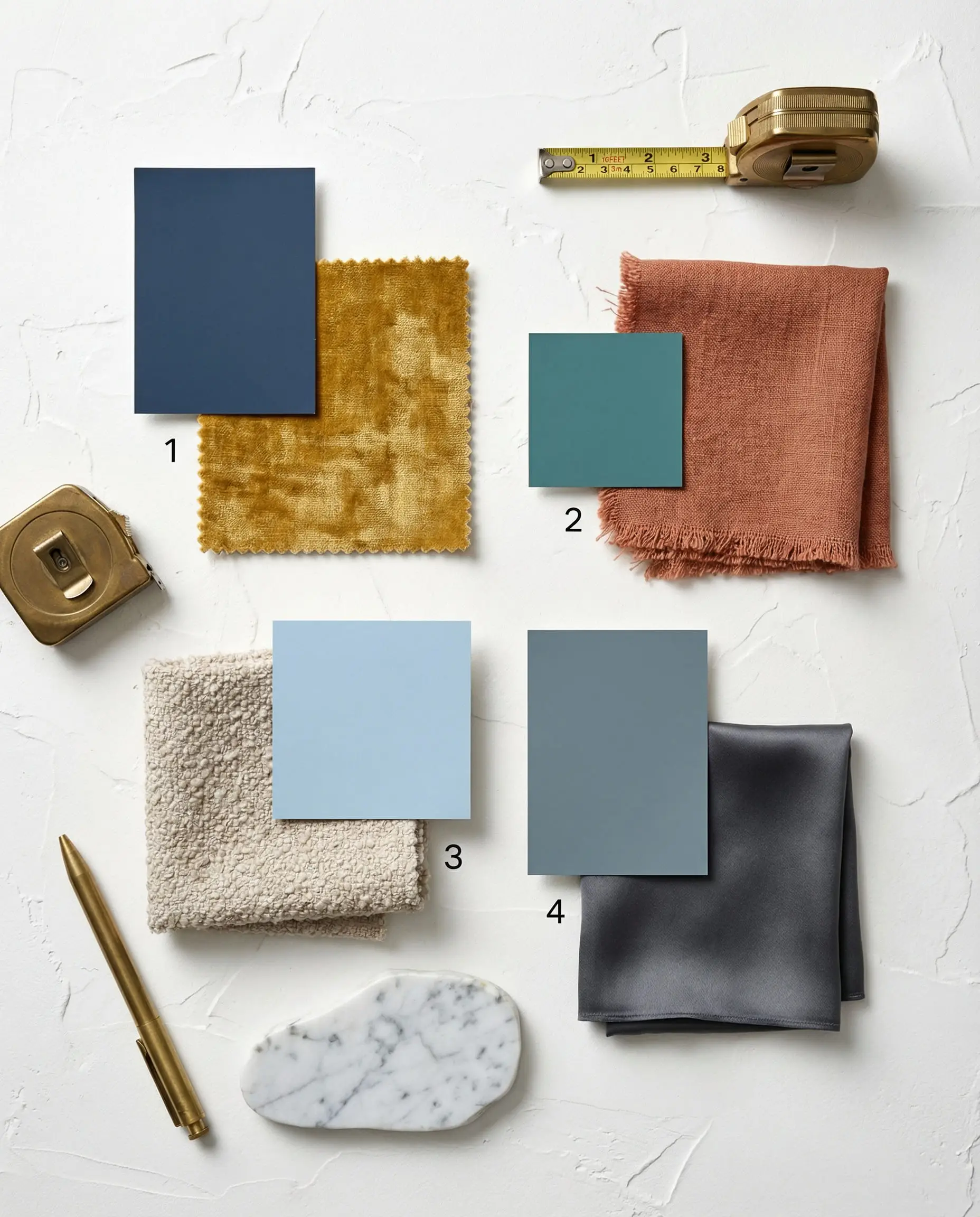
Quick Cheat Sheet: The Best Curtain Colors for Blue Walls
If you are in a rush to find the perfect match, here is the “at-a-glance” breakdown of the top trending combinations for 2026.
| If Your Wall Is… | Best Curtain Color | The Vibe & Style |
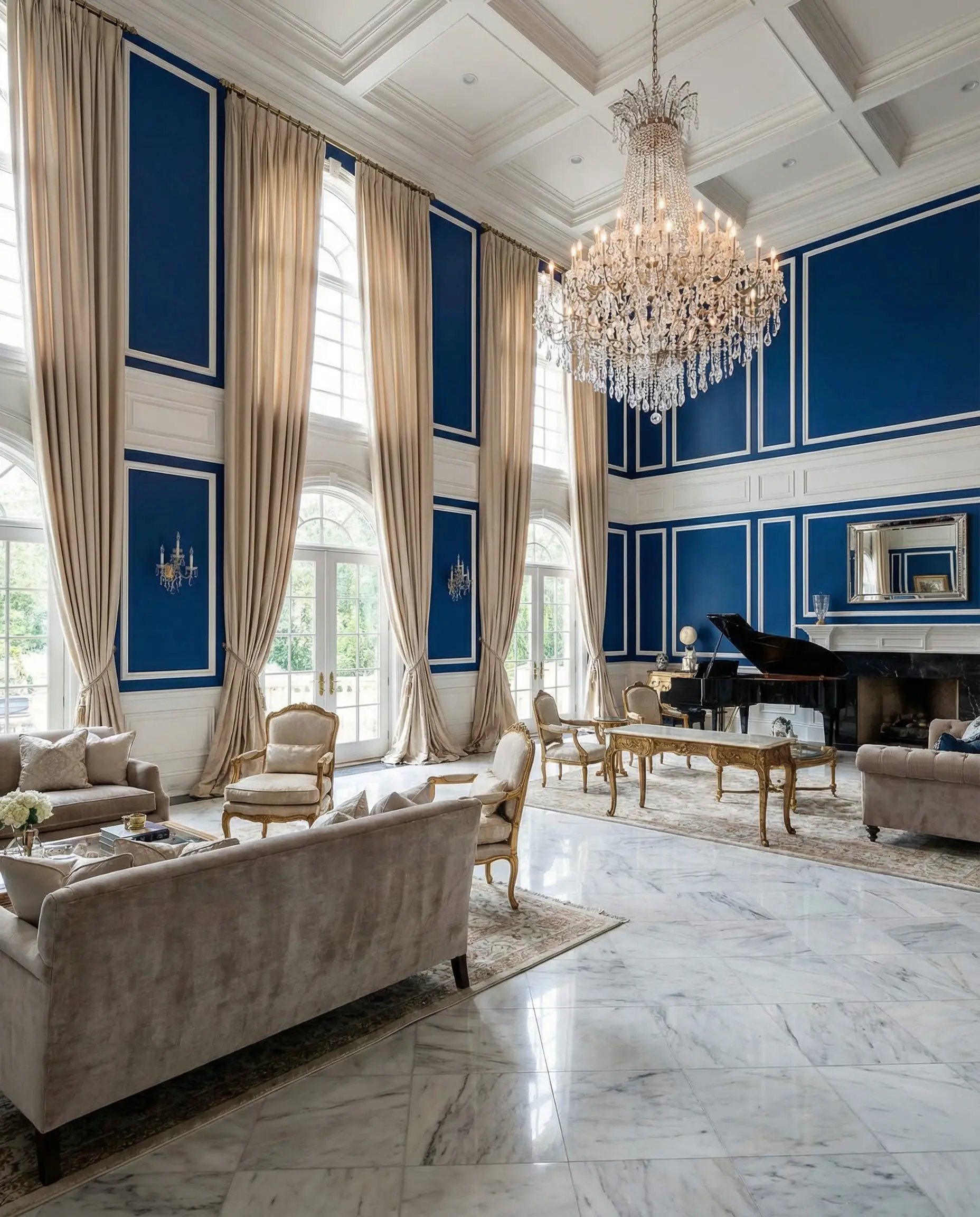
| Navy / Midnight Blue | Mustard or Ochre | Luxe & Dramatic. High contrast that feels expensive. |
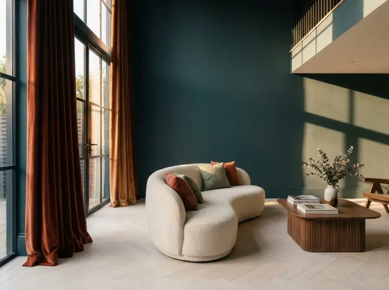
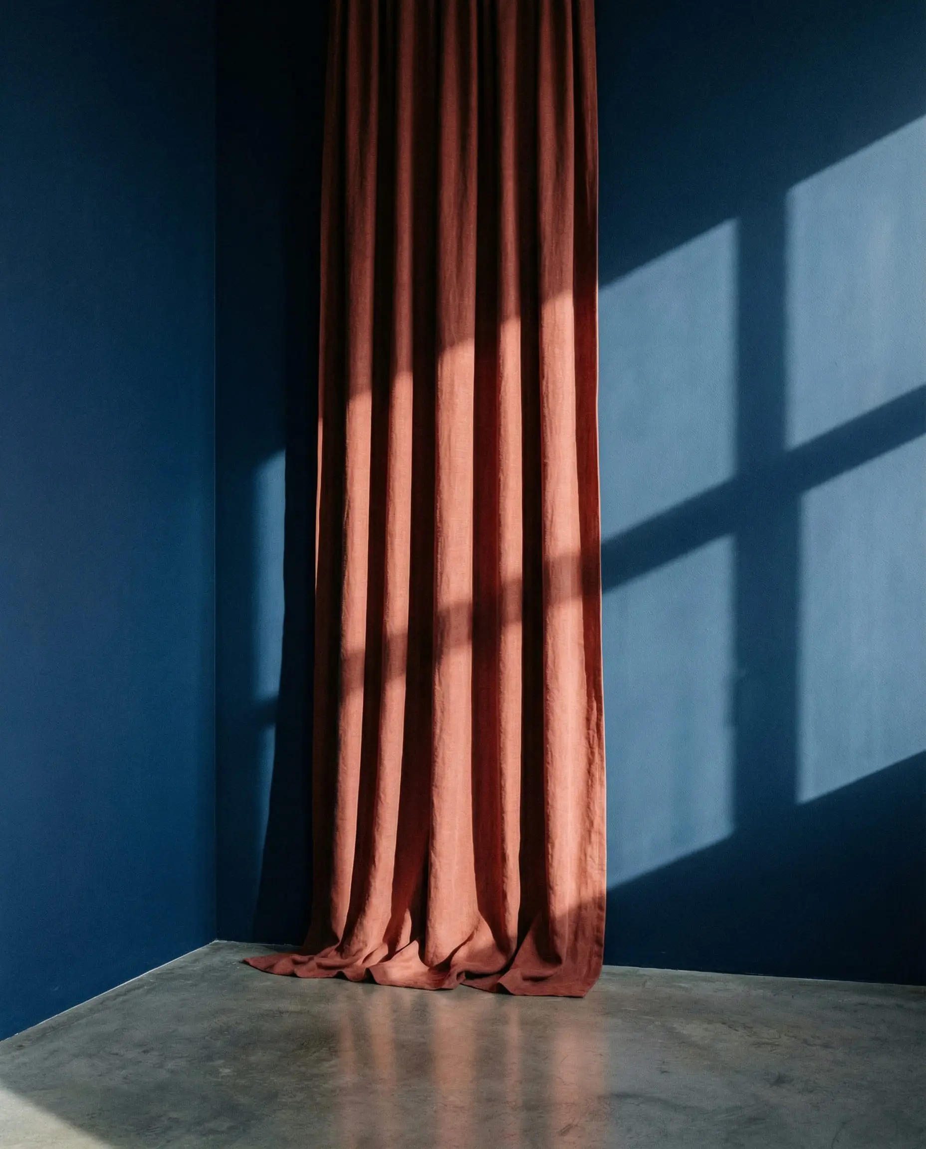
| Teal / Peacock Blue | Terracotta / Rust | Boho & Earthy. The hottest trend for 2026. |
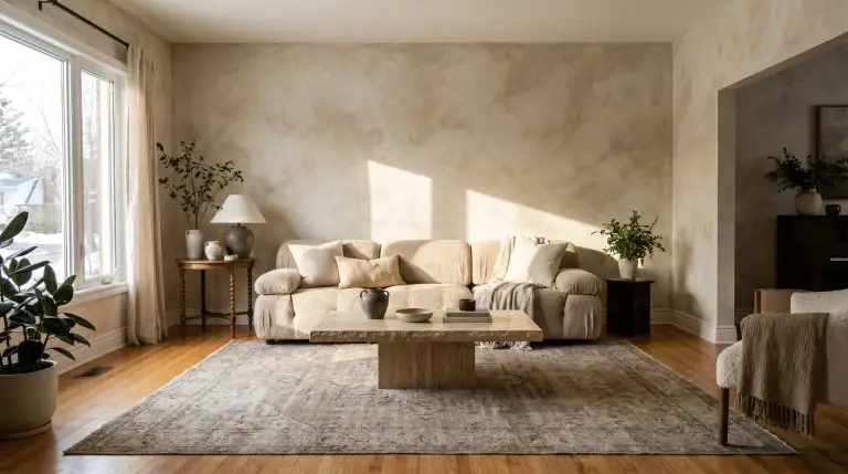
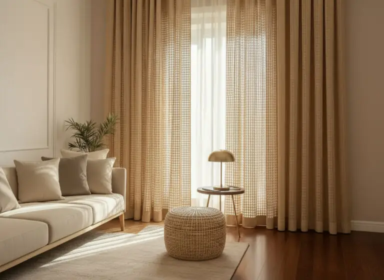
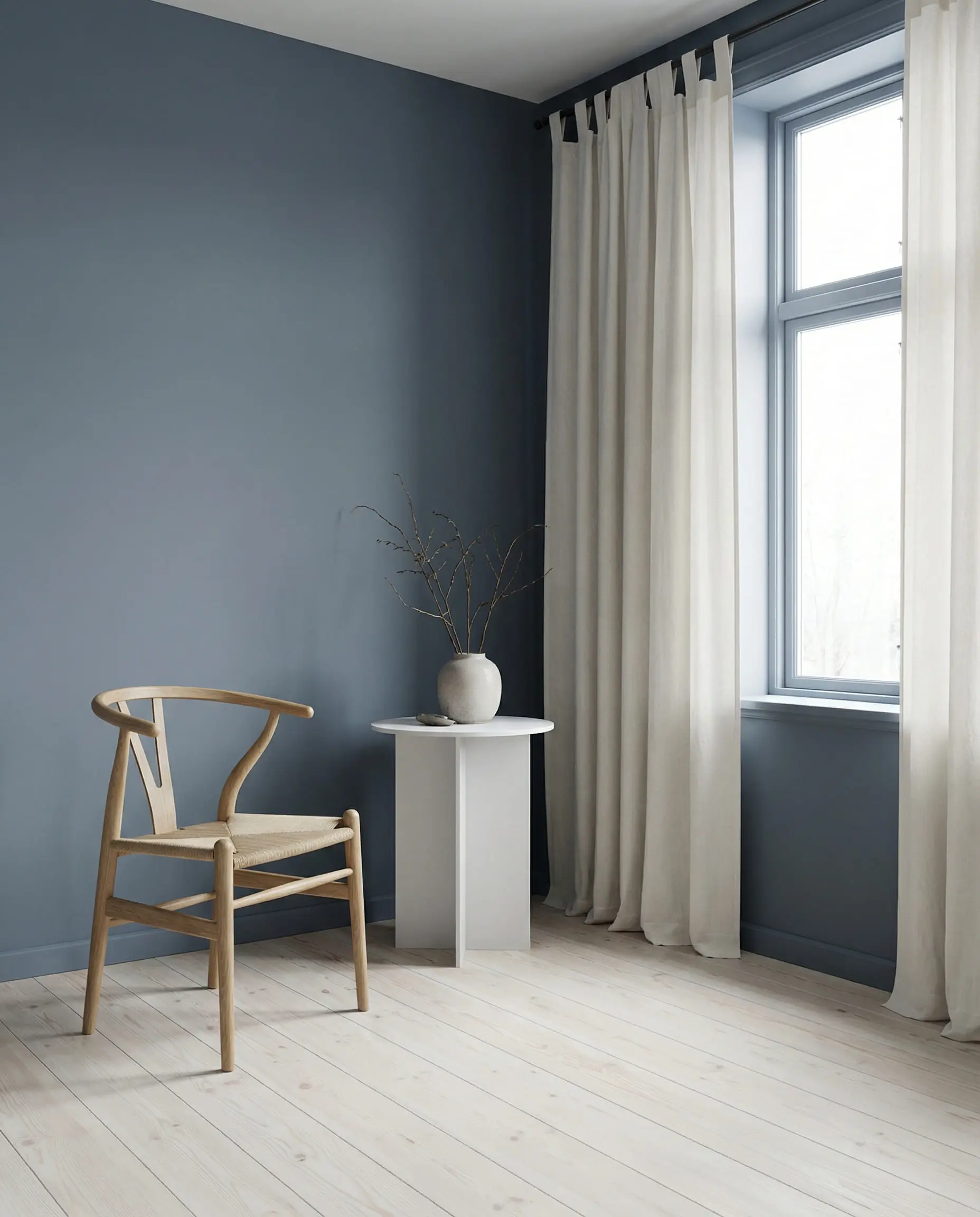
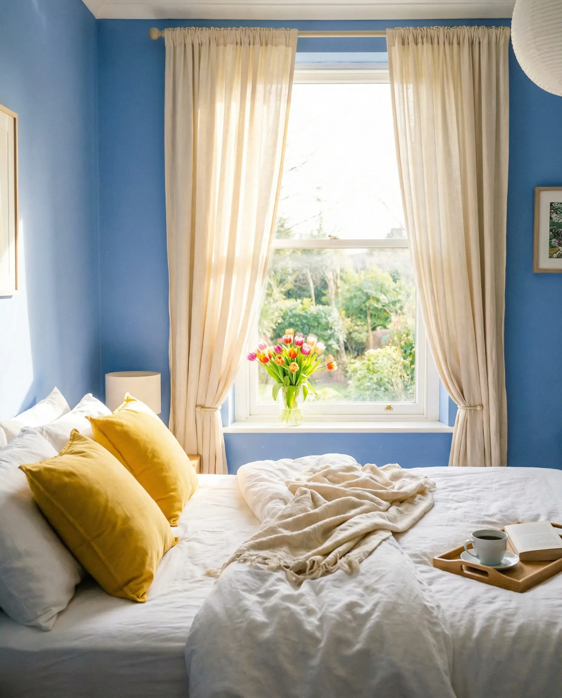
| Light / Sky Blue | Oatmeal / Cream | Soft & Organic. Warmer and cozier than stark white. |
| Slate / Gray-Blue | Charcoal Gray | Moody Modern. sophisticated tone-on-tone look. |
| Royal Blue | Blush Pink | Playful & Chic. Softens the intensity of the blue. |
| Turquoise | Natural Bamboo / Wood | Coastal Organic. Texture takes the place of color. |
The Golden Rules of Matching Curtains to Blue Walls
Before we dive into specific colors, we need to talk about the “science” of why some curtains look expensive and others look cheap against blue paint. It usually comes down to two things: Undertones and Ratio.
1. The Temperature Check (Warm vs. Cool)
Blue is inherently a cool color. To make a room feel balanced, you generally have two paths:
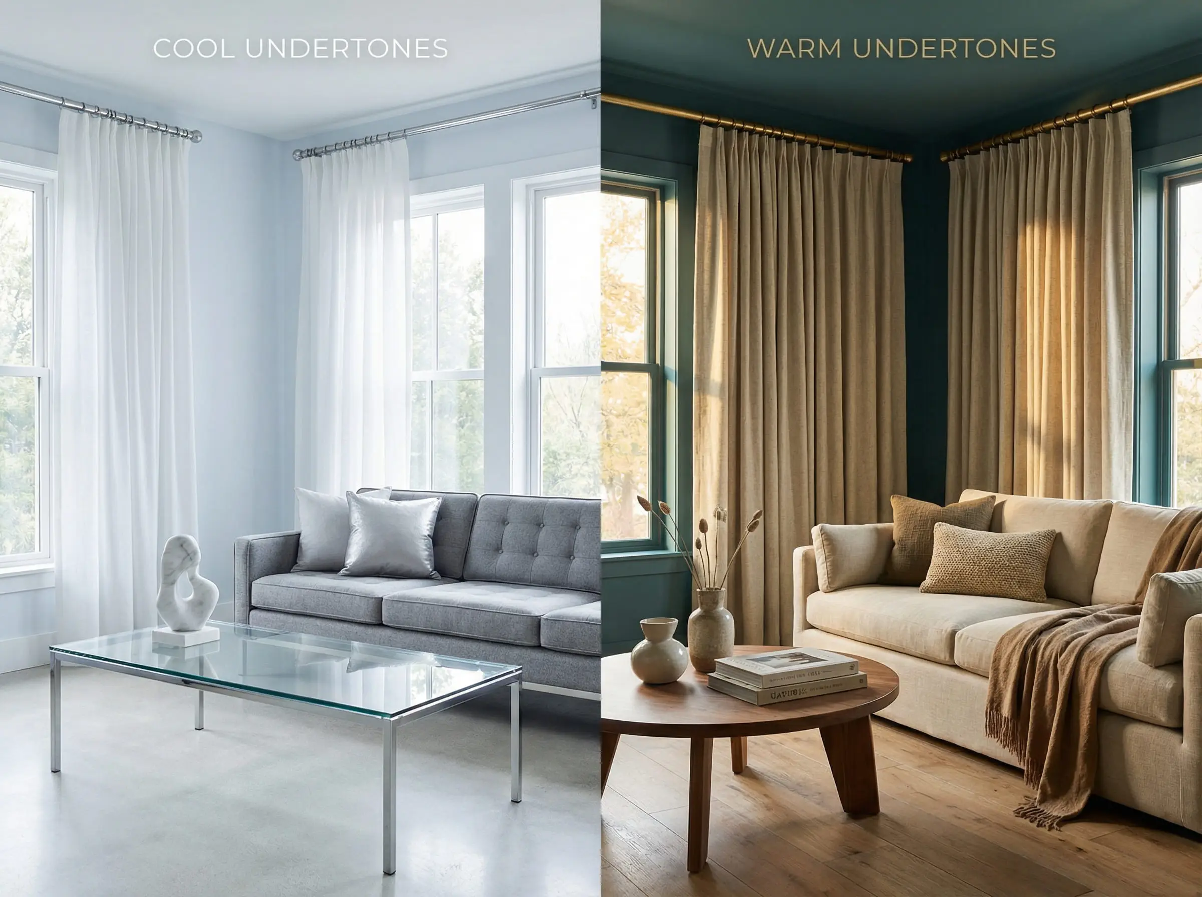
Not all blue paints are created equal! Paint a swatch on a piece of paper and hold it up to a pure white sheet of paper.
Hackrea Styling Tip 🎨
2. The 60-30-10 Rule
In interior design, your wall color is usually the “60%” (the dominant color). Your curtains often fall into the “30%” (secondary color) or the “10%” (accent) category.
If your curtains are the 30% (meaning you have large windows or floor-to-ceiling drapes), avoid a color that clashes violently with the floor. If you have dark wood floors and navy walls, a heavy black curtain might turn the room into a cave. In this scenario, you need a lighter “bridge” color like beige or soft gray to balance the visual weight.
For those trying to achieve a perfectly balanced aesthetic, it helps to understand the broader principles of contemporary style interior design. Understanding how modern lines interact with color mass will help you decide if your curtains should blend in or stand out.
You can apply wallpapers, paints, etc. on walls and see how they look in various interiors.

Top Trending Combinations for 2026
The design forecast for 2026 is exciting because it rebels against the “sterile showroom” look. We are seeing a massive influx of “ugly-pretty” colors—muddy tones, organic textures, and retro vibes—that look absolutely stunning against blue.
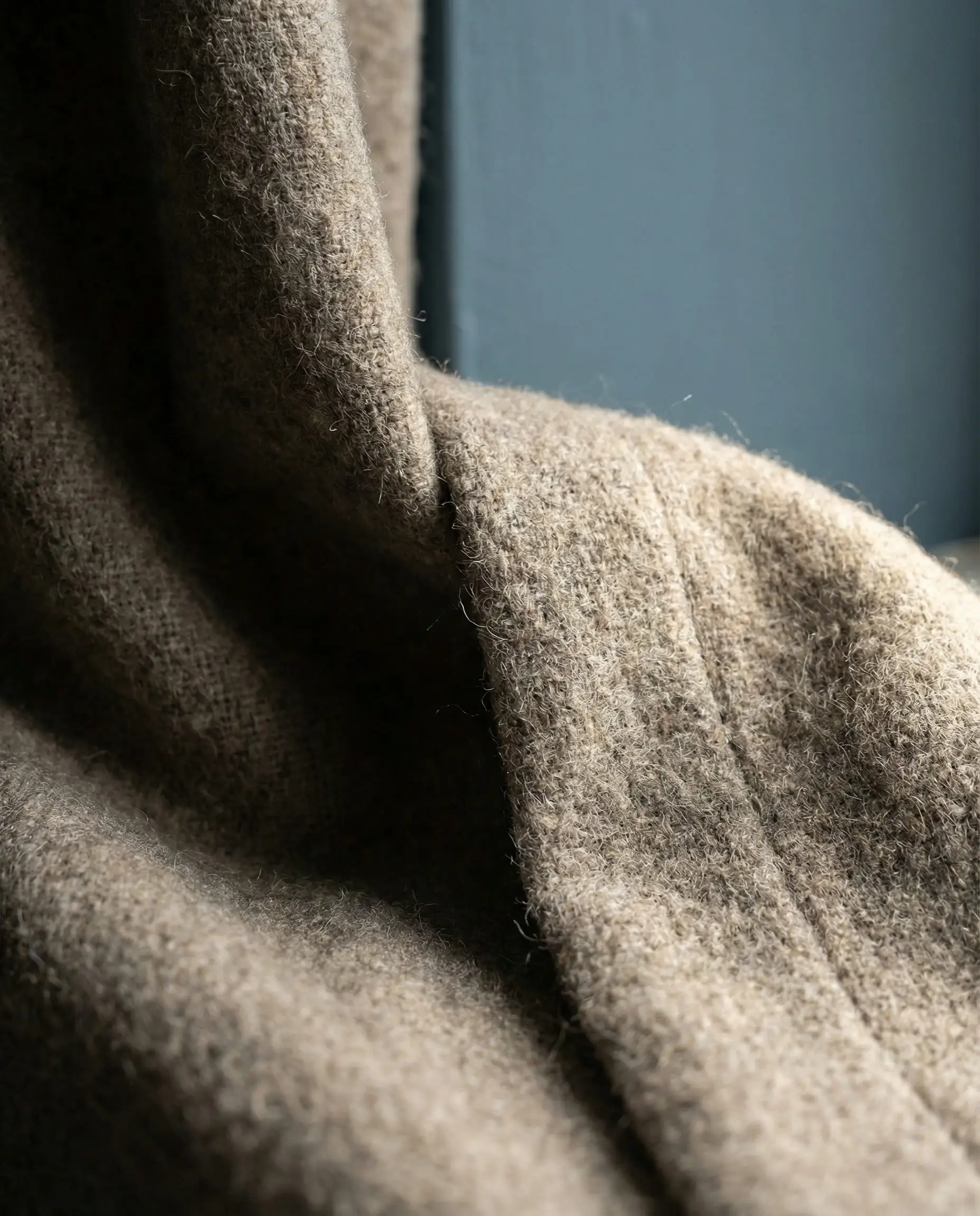
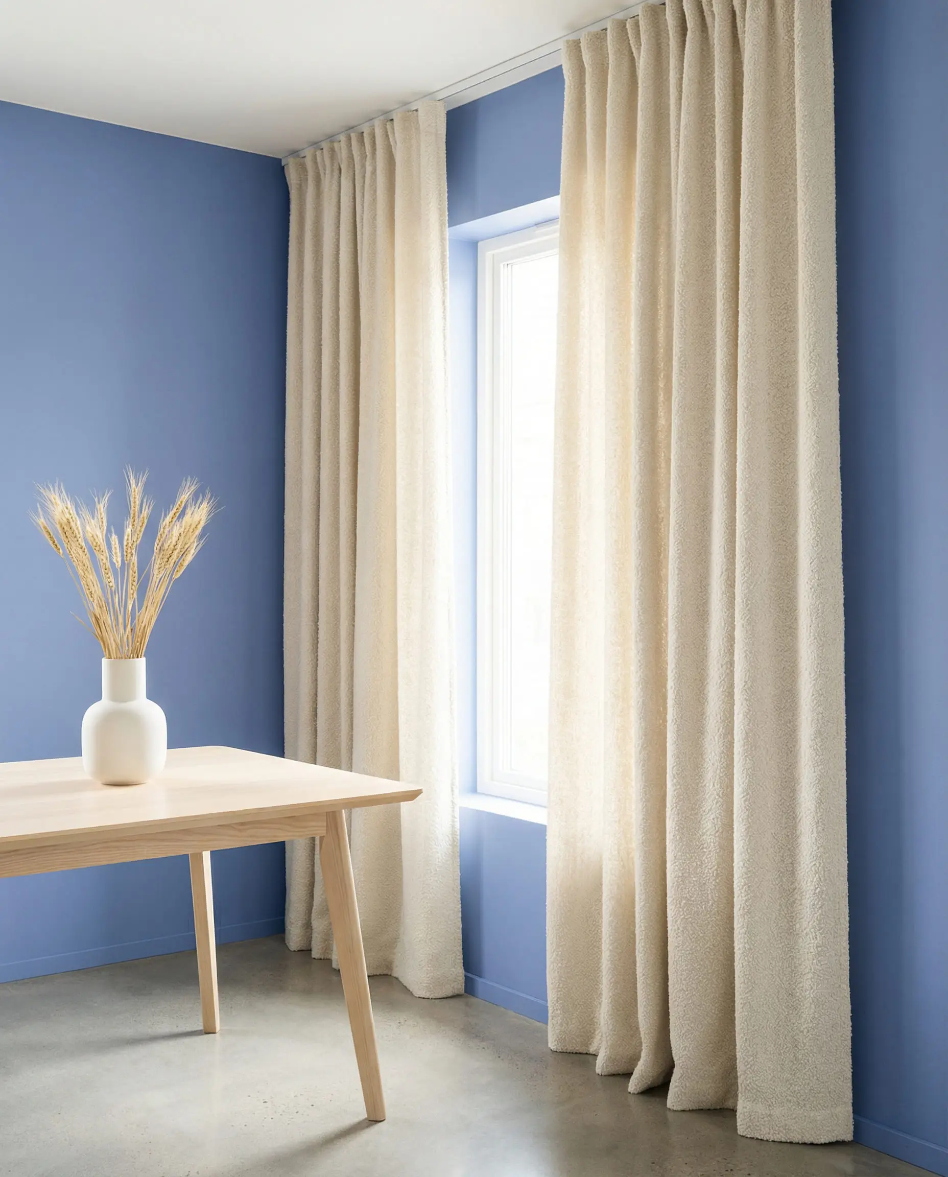
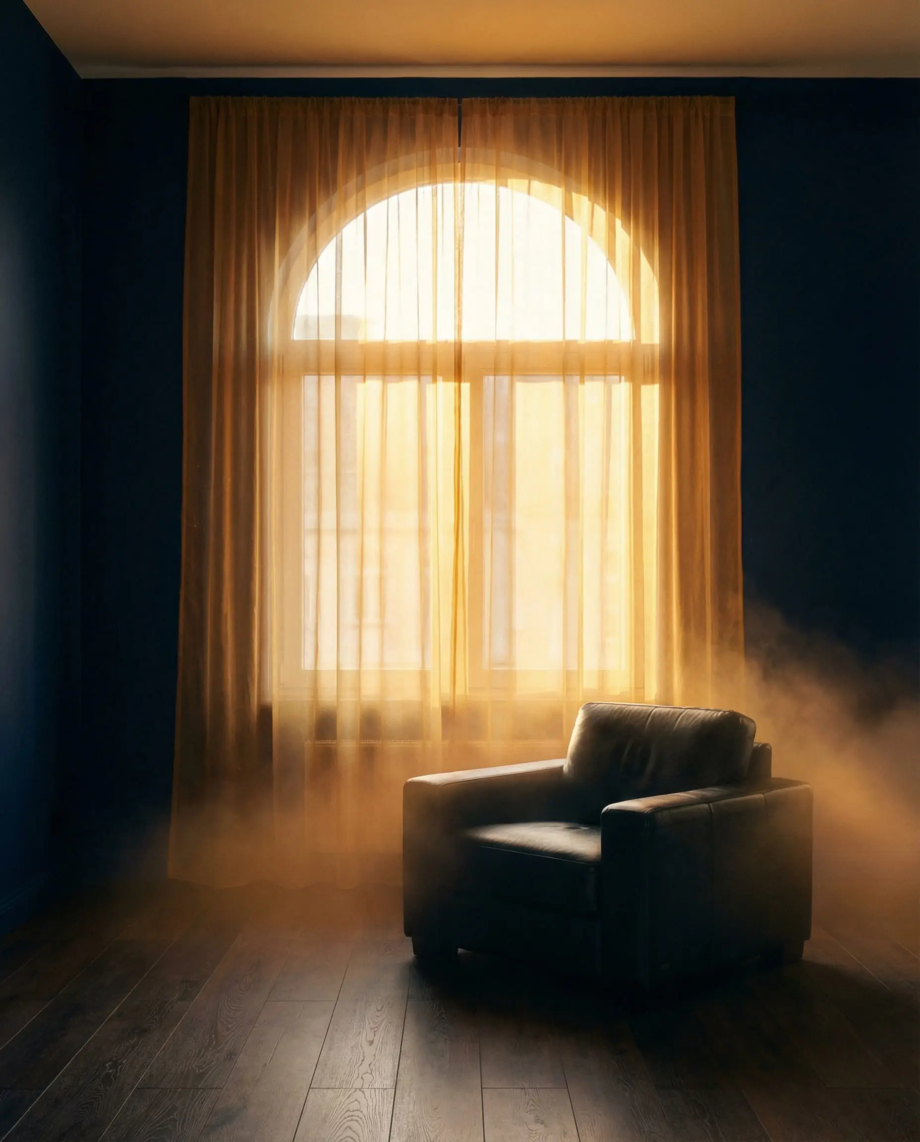
1. The Shift to “Warm Neutrals” (Oatmeal & Mushroom)
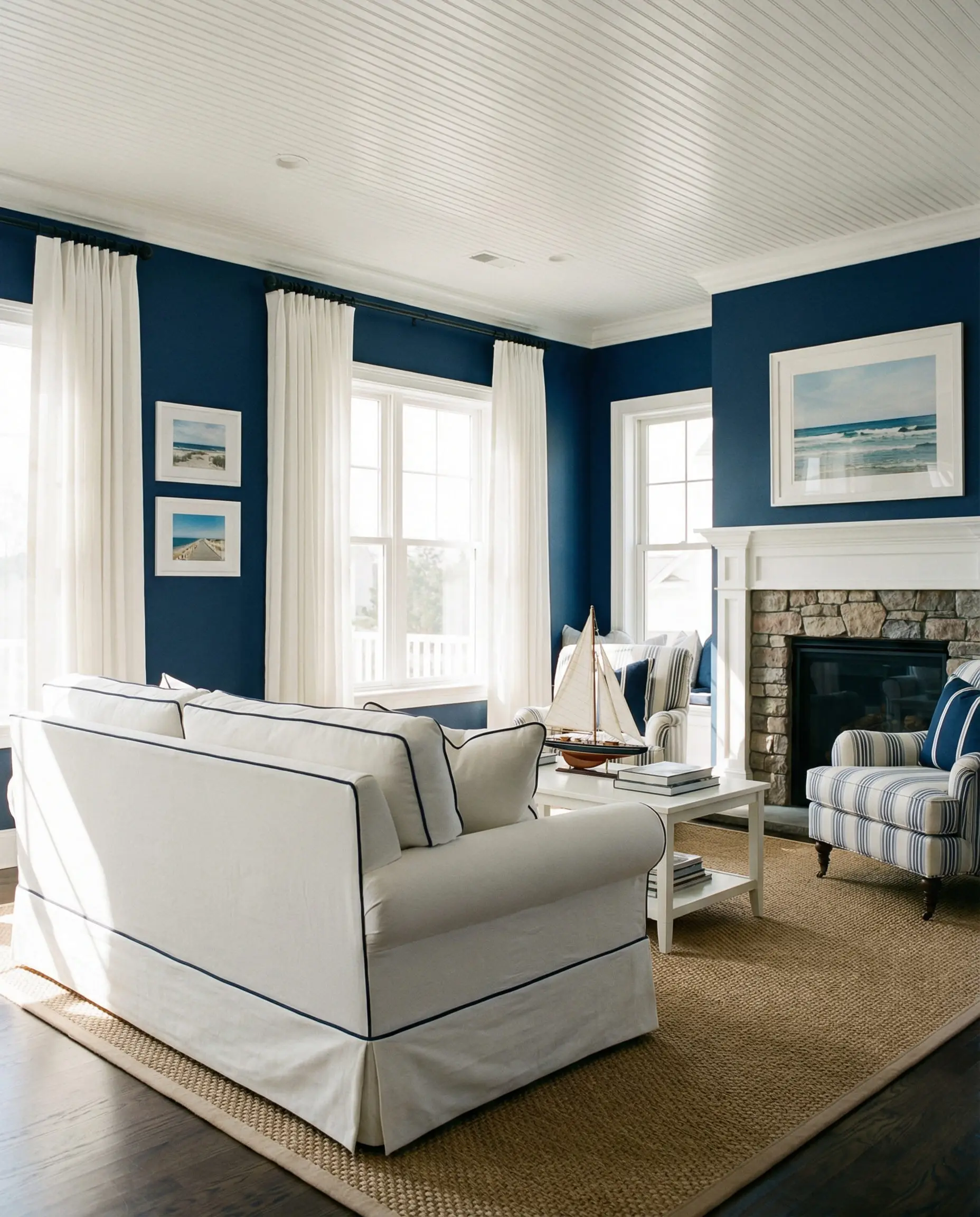
For the last decade, “Bright White” was the standard advice for blue walls. In 2026, we are swapping that for Oatmeal, Cream, and Mushroom.
Stark white against a dark blue wall can sometimes look too harsh—almost like a sailor suit. Creamy off-whites and beige tones (often called “greige”) soften the contrast. They bridge the gap between the cool walls and any wood furniture in the room, making the space feel inhabited and cozy rather than clinical.
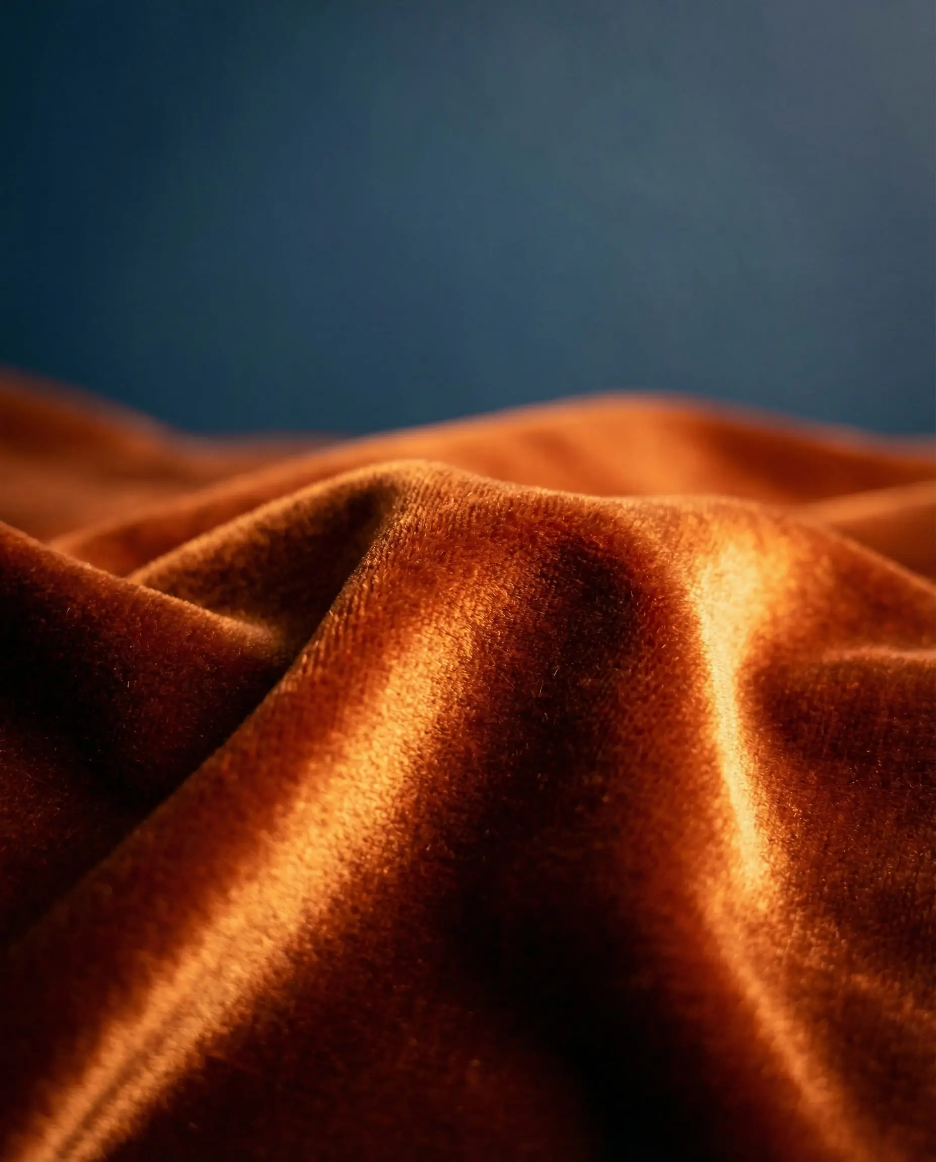
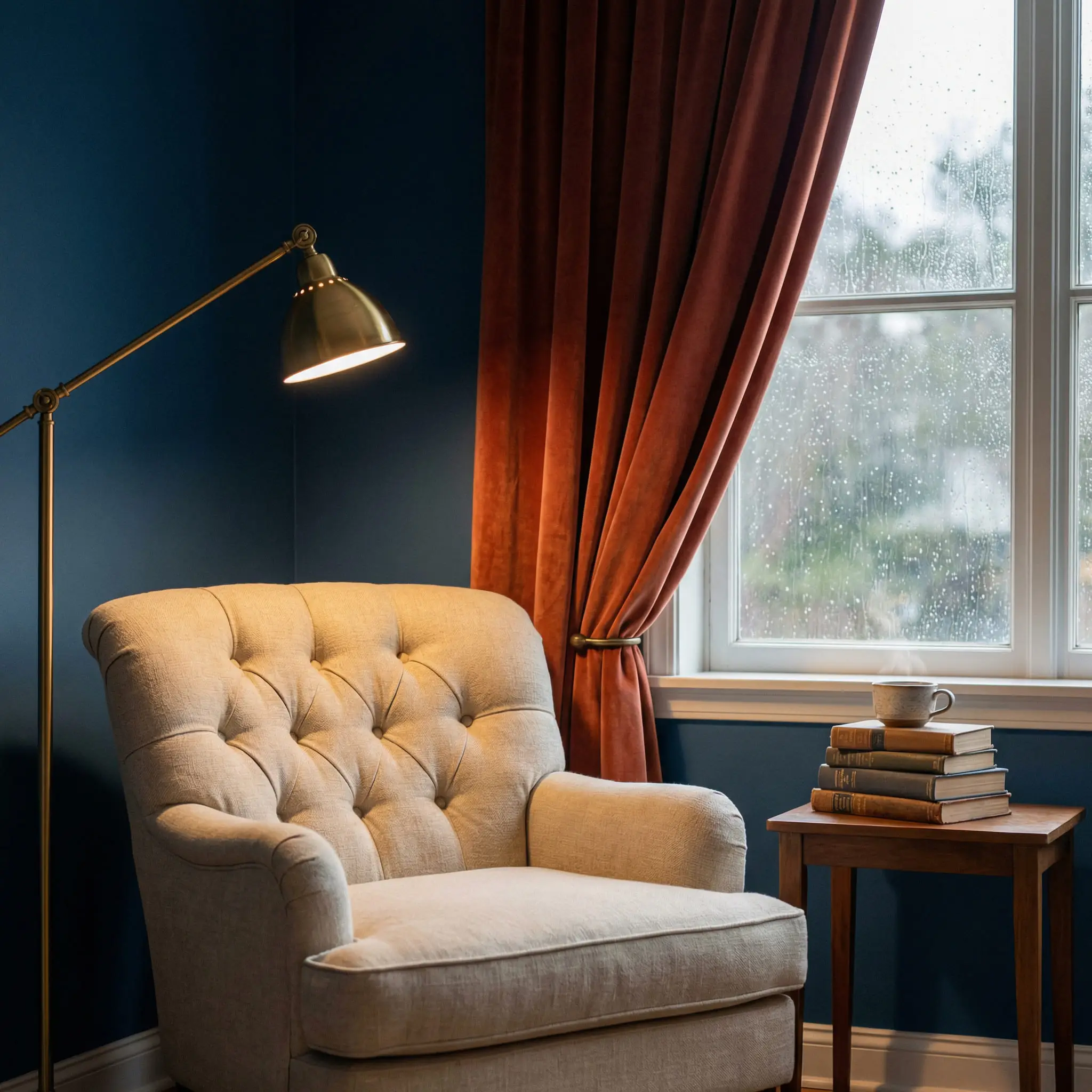
2. Earthy Contrast: Terracotta and Rust
This is the “It-Girl” combination of the year. If you look at the color wheel, orange sits directly opposite blue. This means they are complementary colors—they naturally make each other pop.
However, we aren’t talking about bright pumpkin orange. We are looking for burnt sienna, clay, rust, and brick.
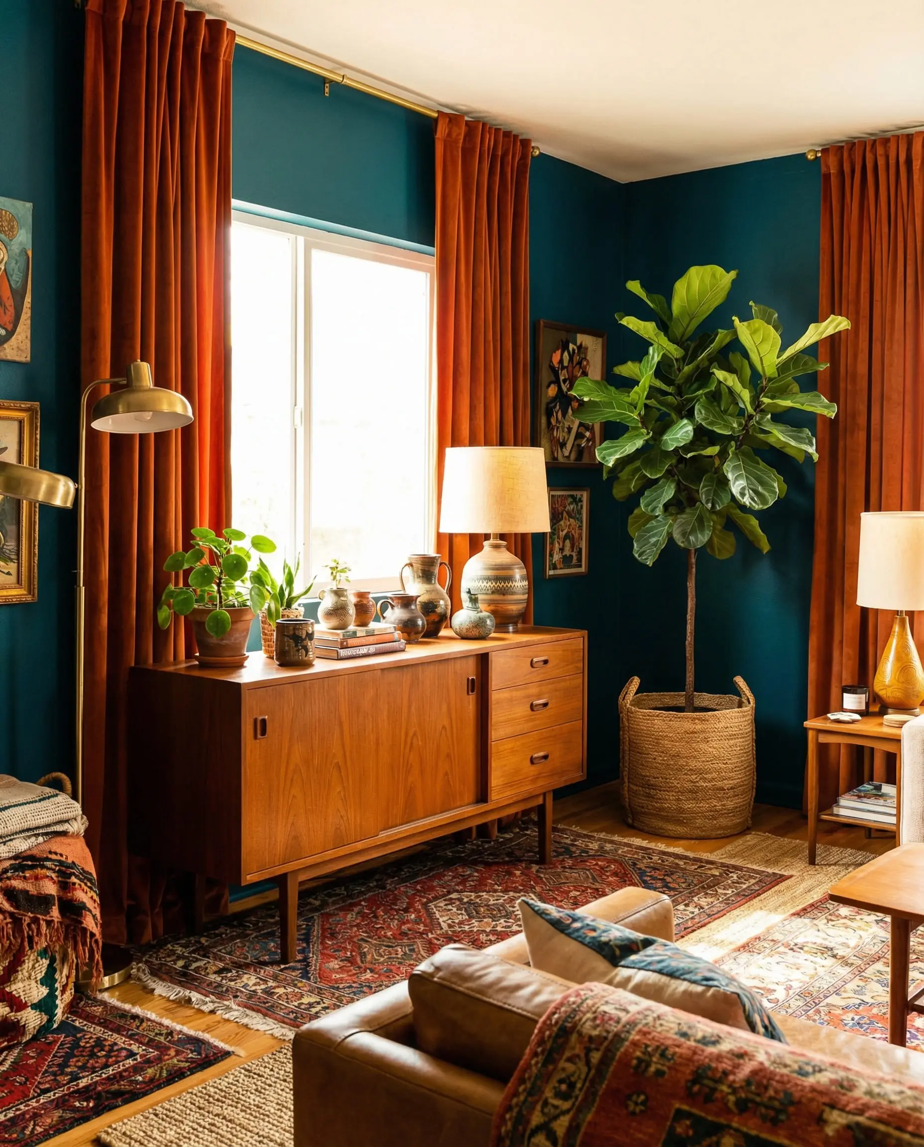
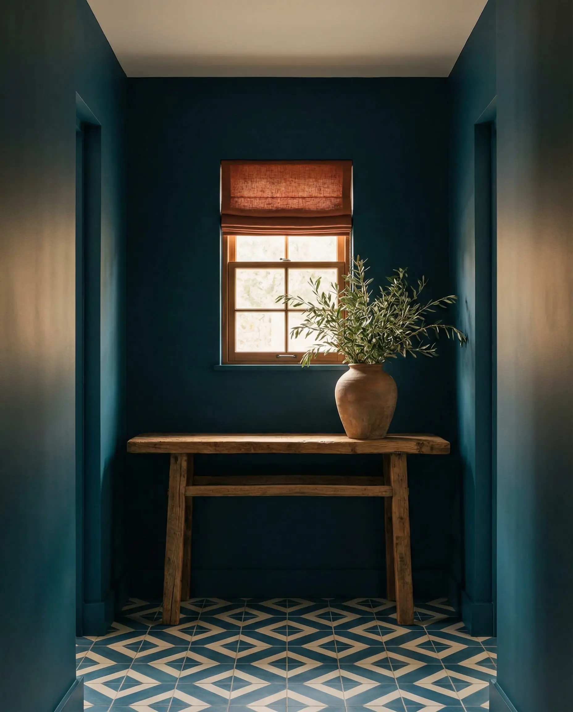
If you are trying to create a space that feels safe and enveloping, this combination is perfect for a “Hygge” inspired nook. You can read more about creating these cozy spaces in our guide on Hygge corners and feelings of warmth.
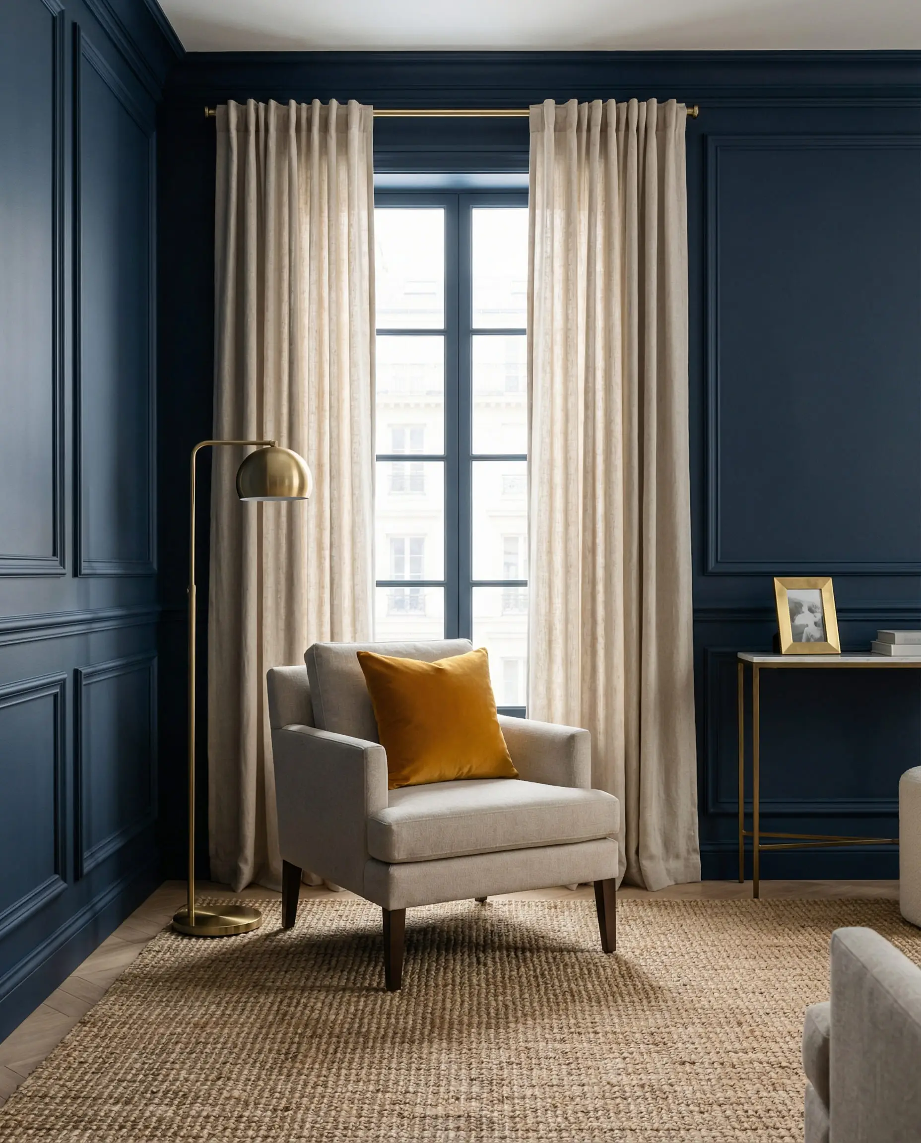
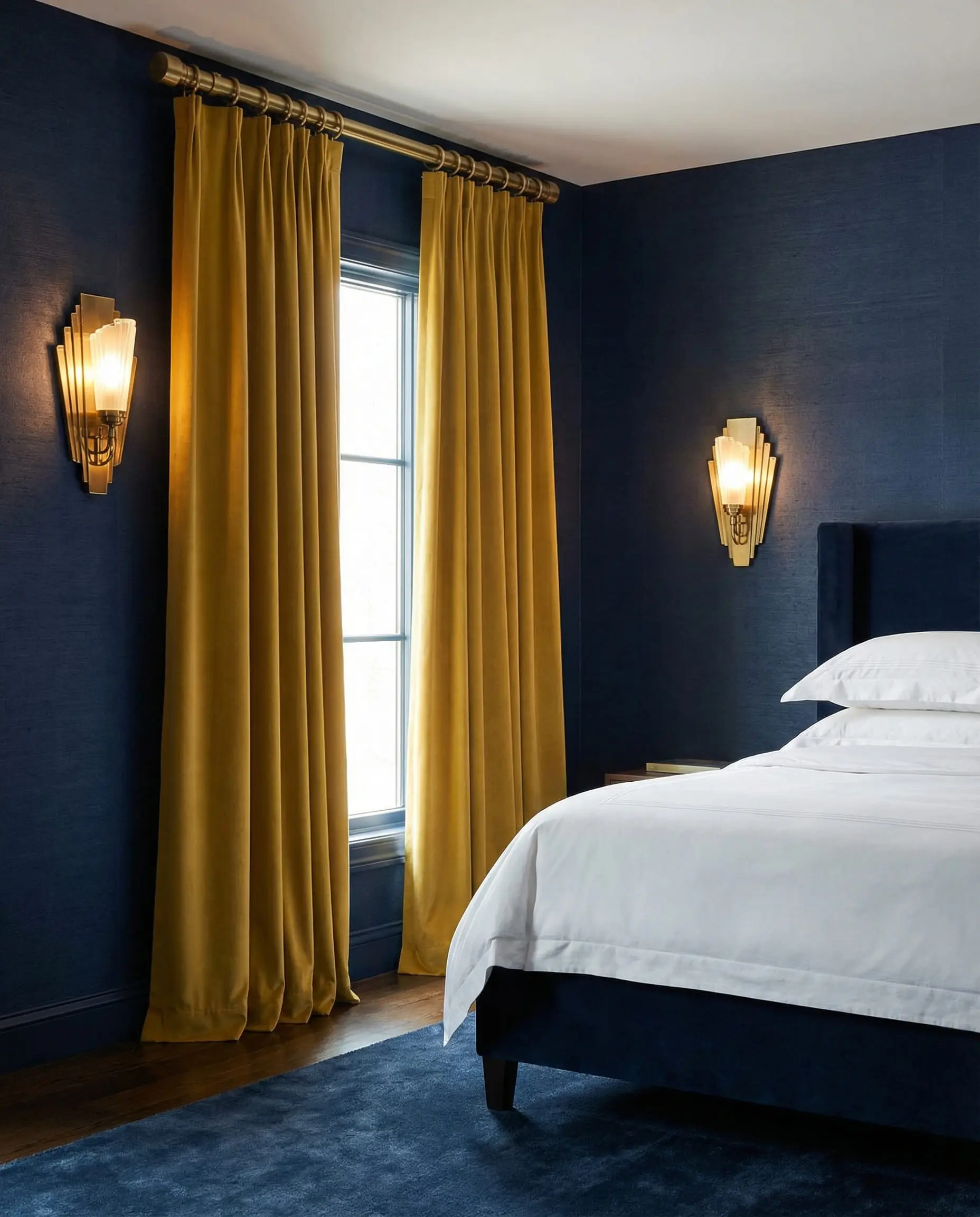
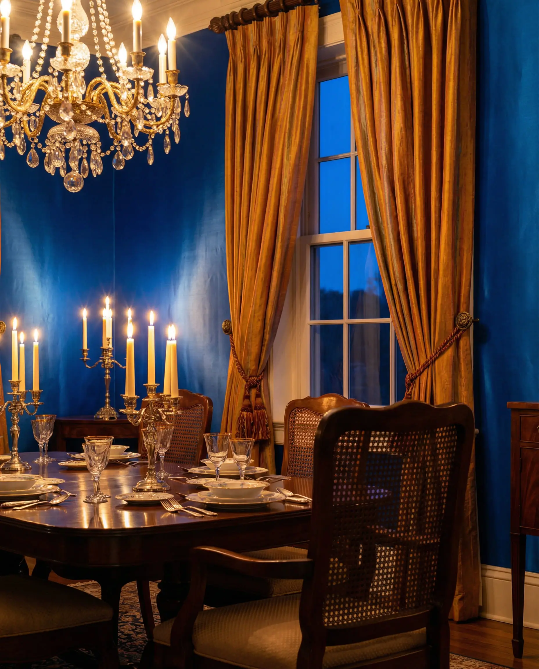
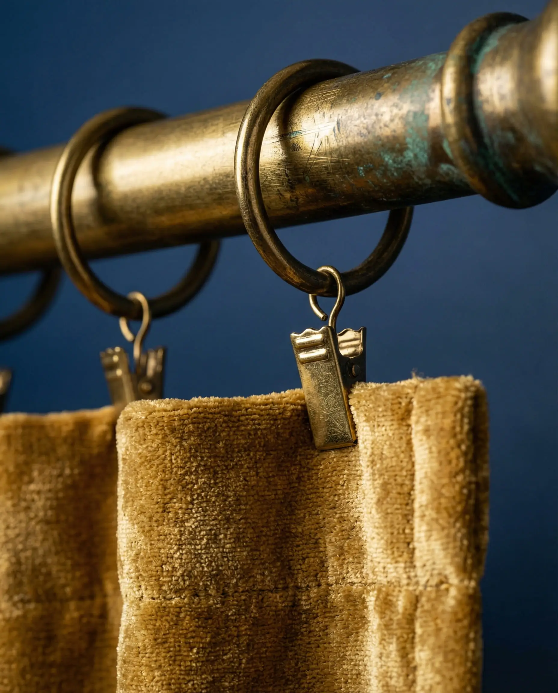
3. Luxe Metals: Mustard and Matte Gold
For navy and royal blue rooms, yellow is the classic partner. But leave the lemon yellow in 2015. The modern approach is Mustard, Ochre, and Antique Gold.
This combination screams “Mid-Century Modern.” It’s sophisticated and slightly masculine. When choosing this look, the fabric matters immensely. A shiny, cheap polyester gold curtain will look tacky. A heavy, matte velvet in mustard yellow, however, looks like a million dollars.
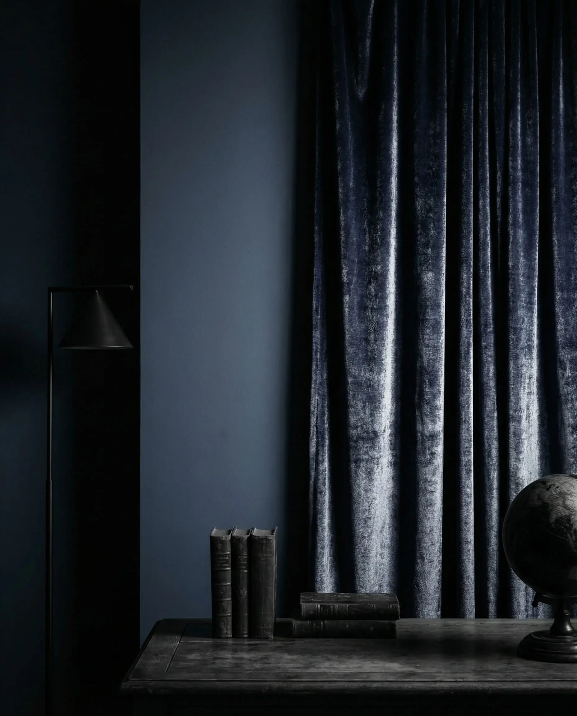
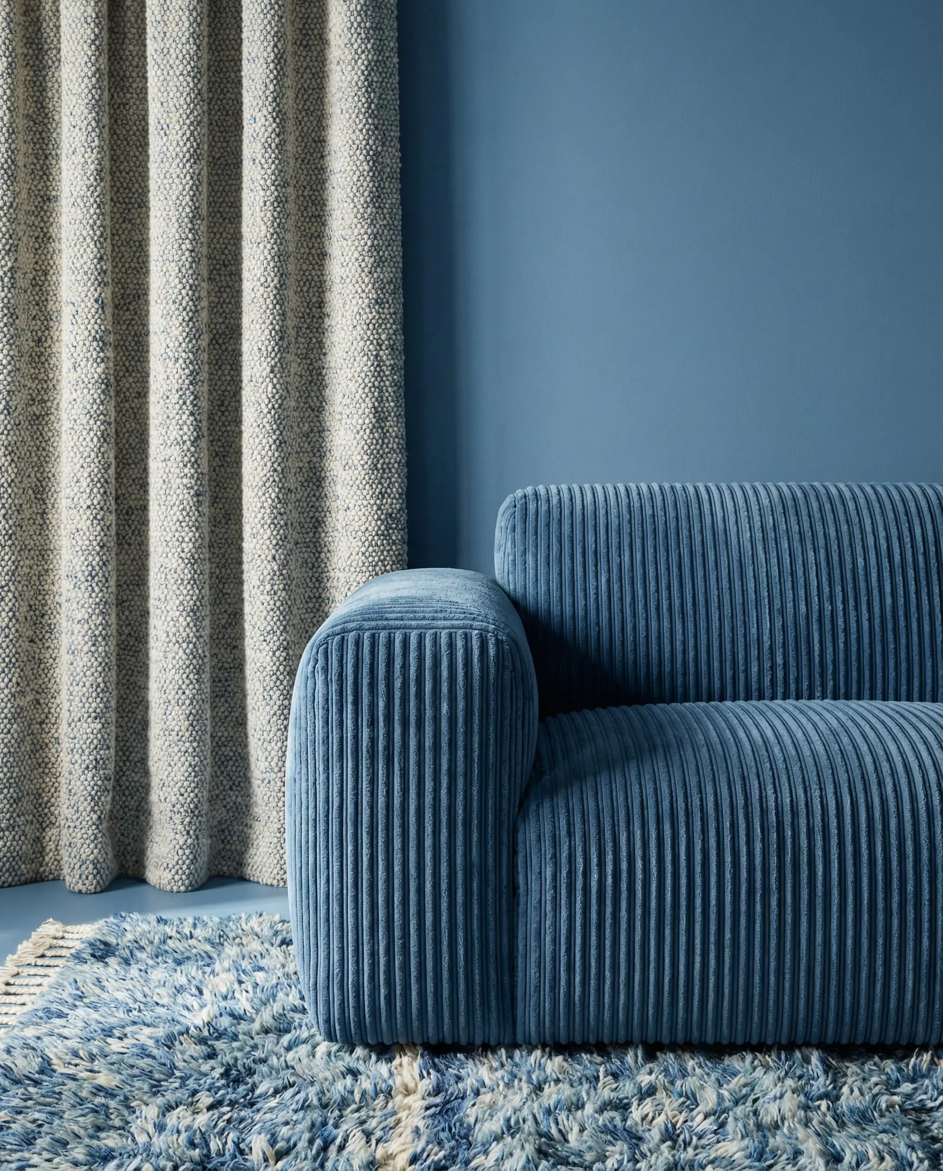
4. Monochromatic Layers (Blue on Blue)
Can you do blue curtains on blue walls? Yes, but there is a catch.
You cannot match the color exactly and the texture exactly, or your windows will disappear, and the room will feel like a box.
Best Curtains for Specific Shades of Blue
Not all blues behave the same way. Here is how to tackle the specific shade of paint you have chosen.
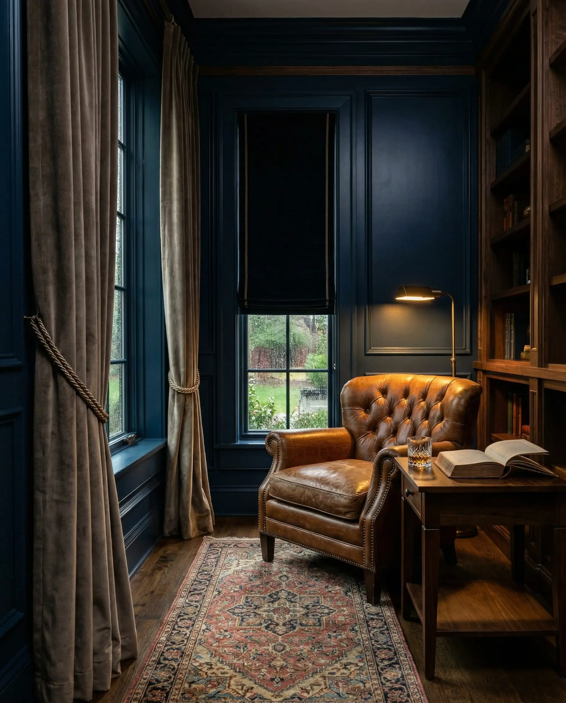
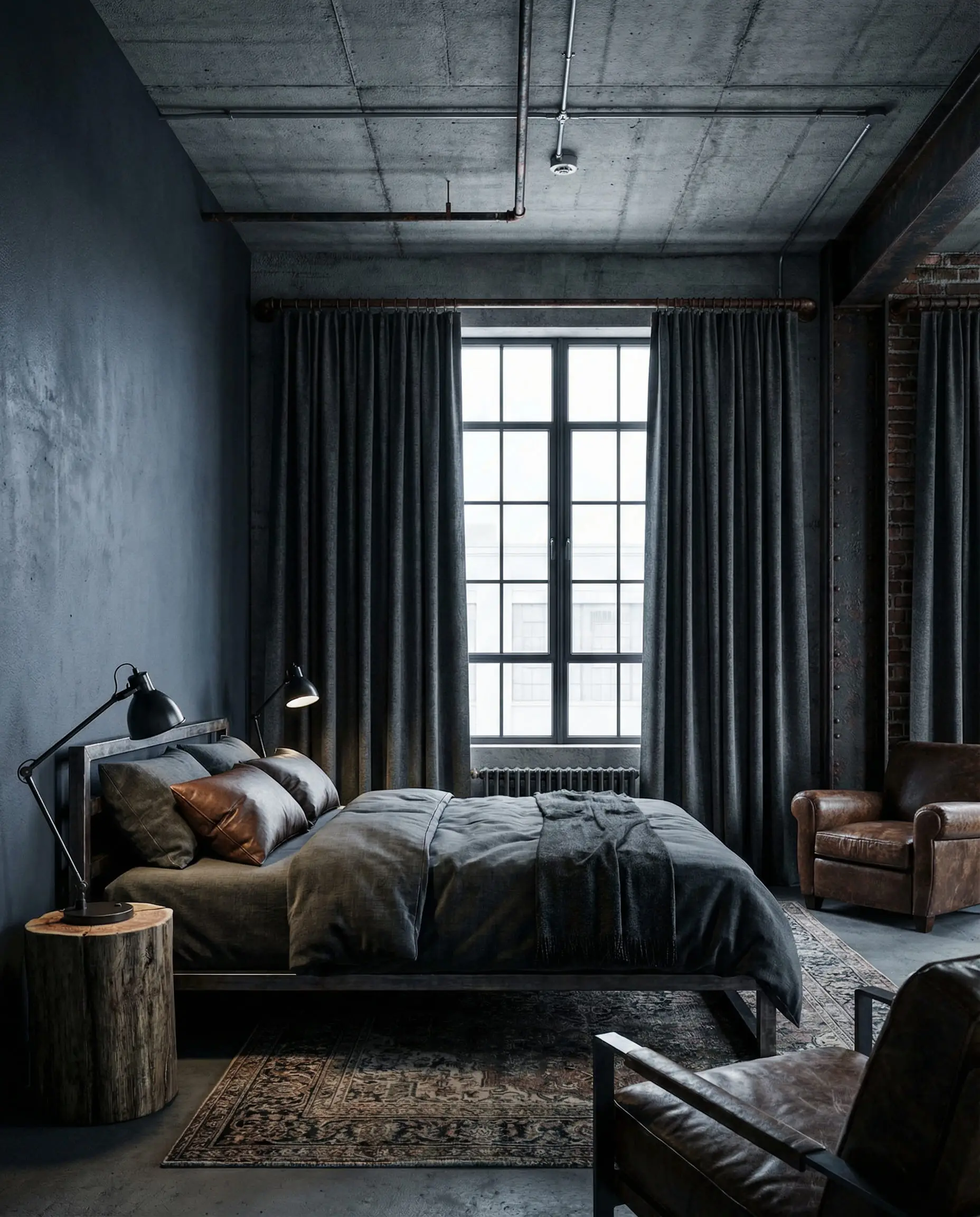
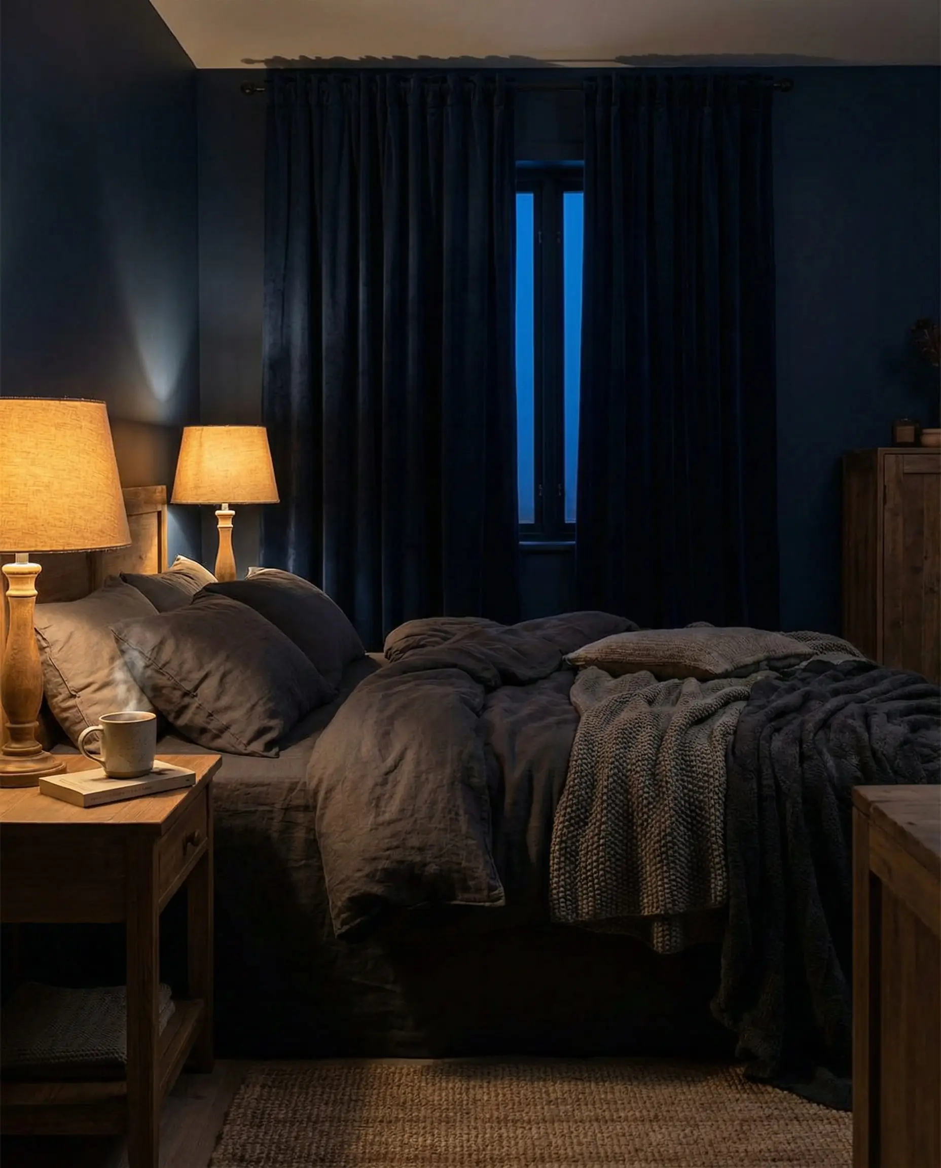
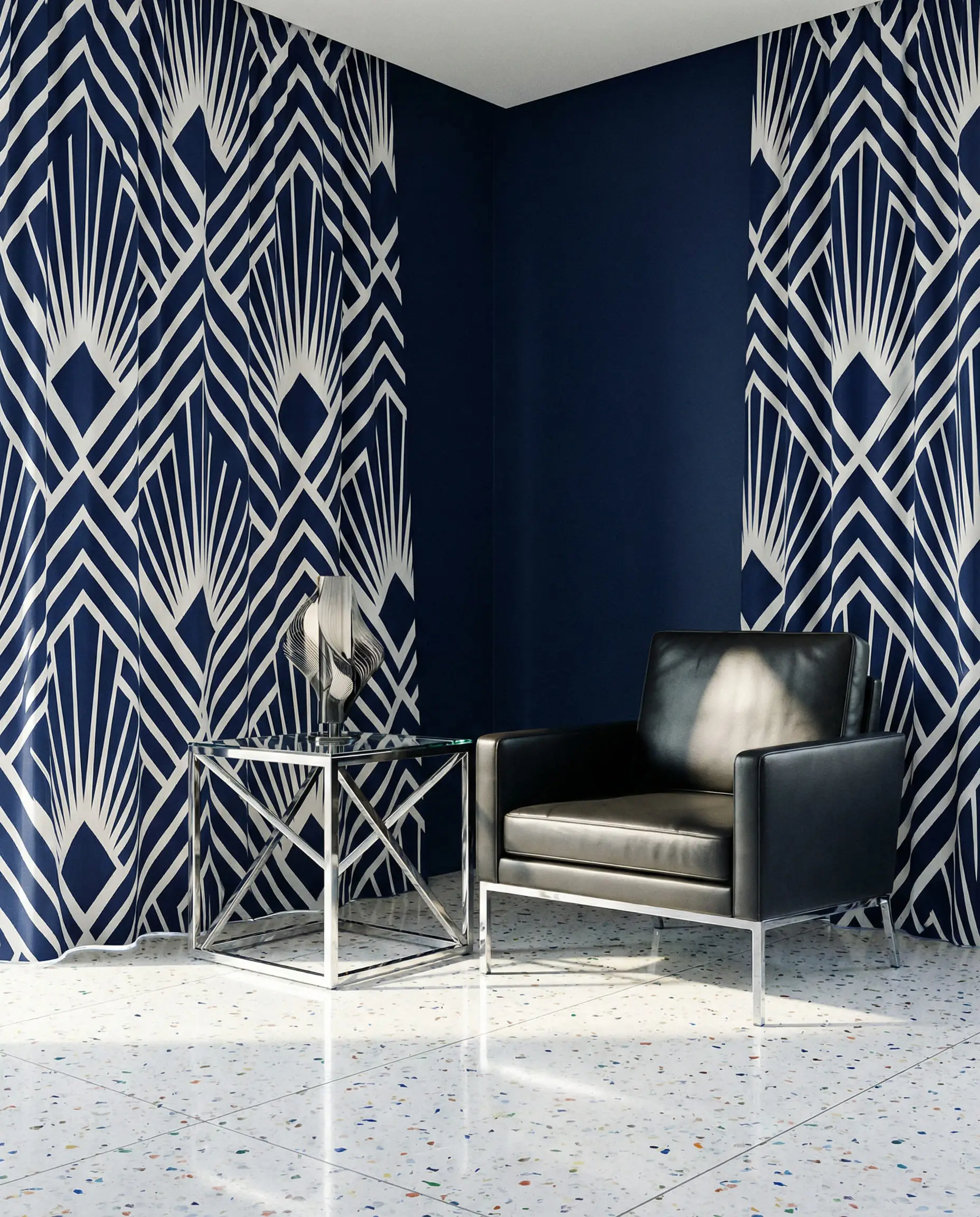
Curtains for Navy Blue Walls
Navy is a “power color.” It absorbs light, so your curtain choice dictates the lighting of the room.
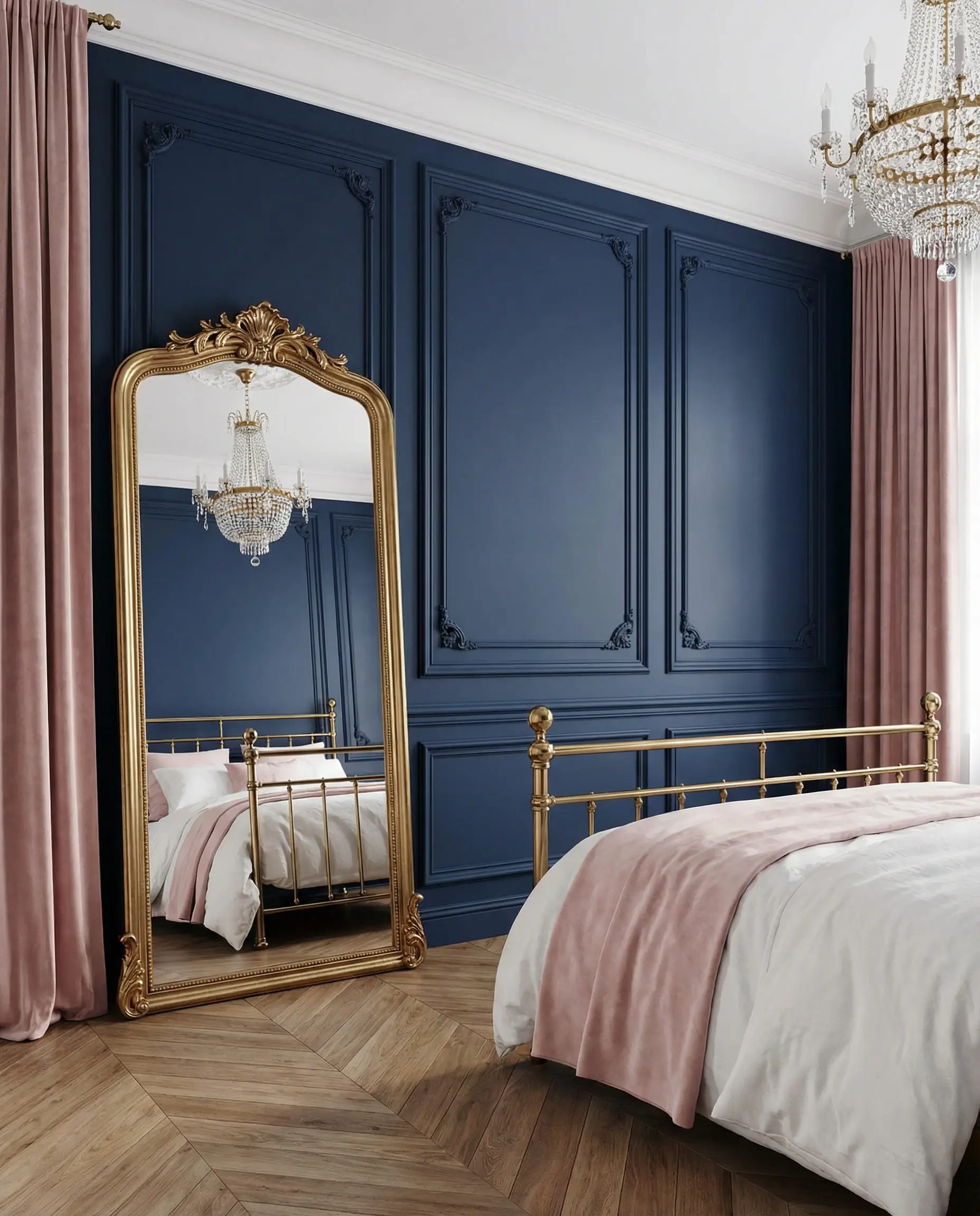
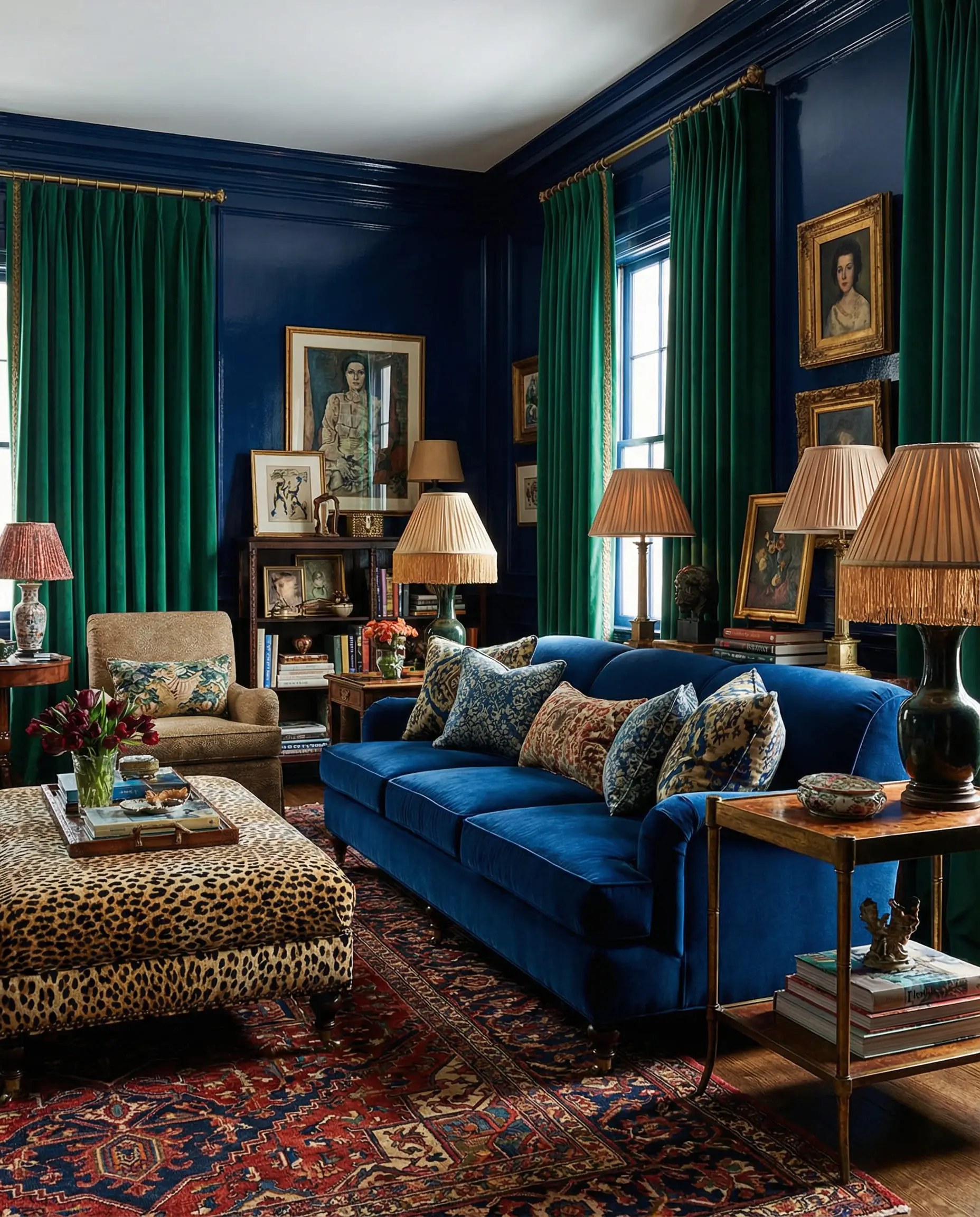
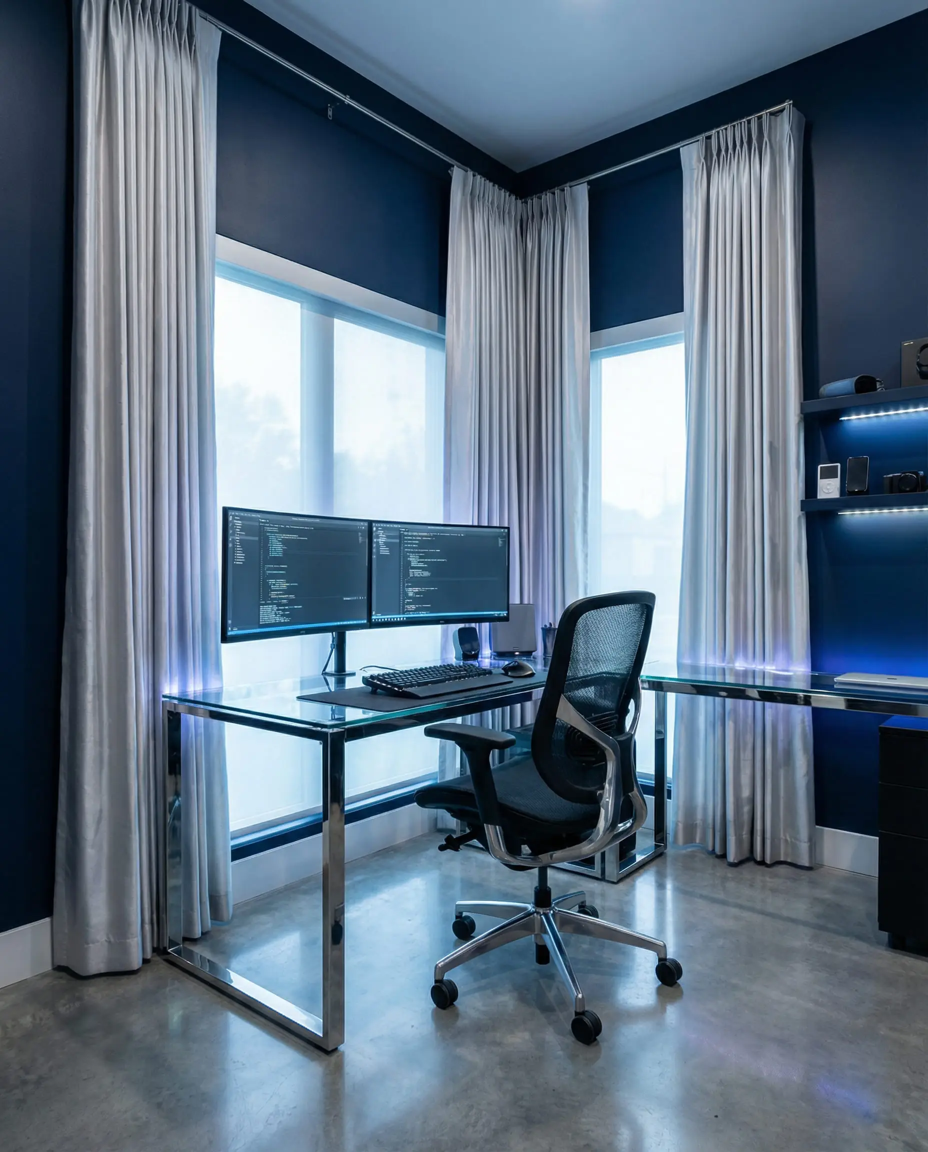
If you have Navy walls, avoid Black curtains unless you have incredibly high ceilings and tons of natural light. The two dark colors will merge and make the room feel smaller.
Hackrea Pro Tip 🛠️
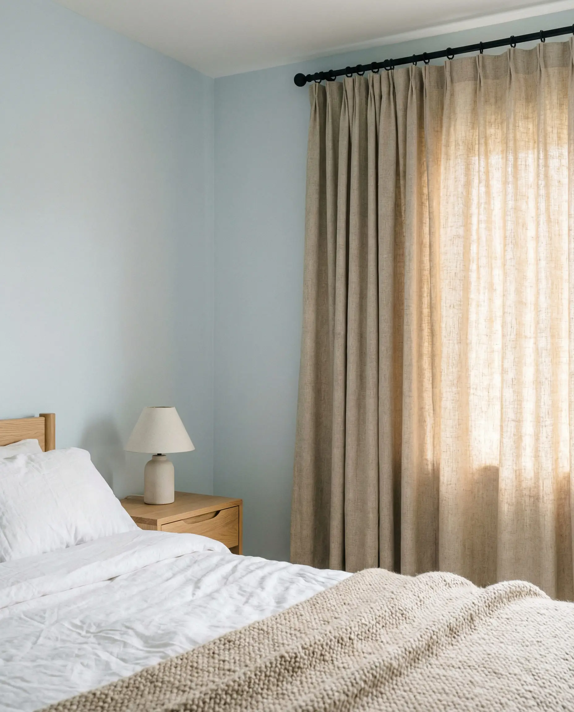
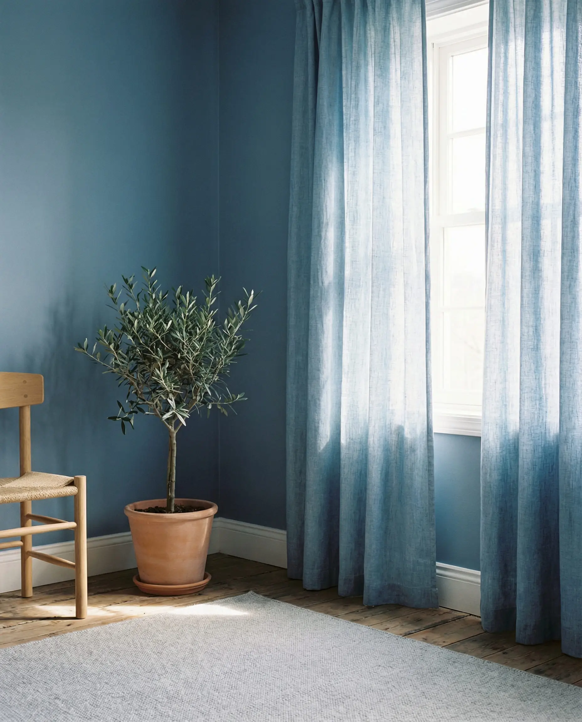
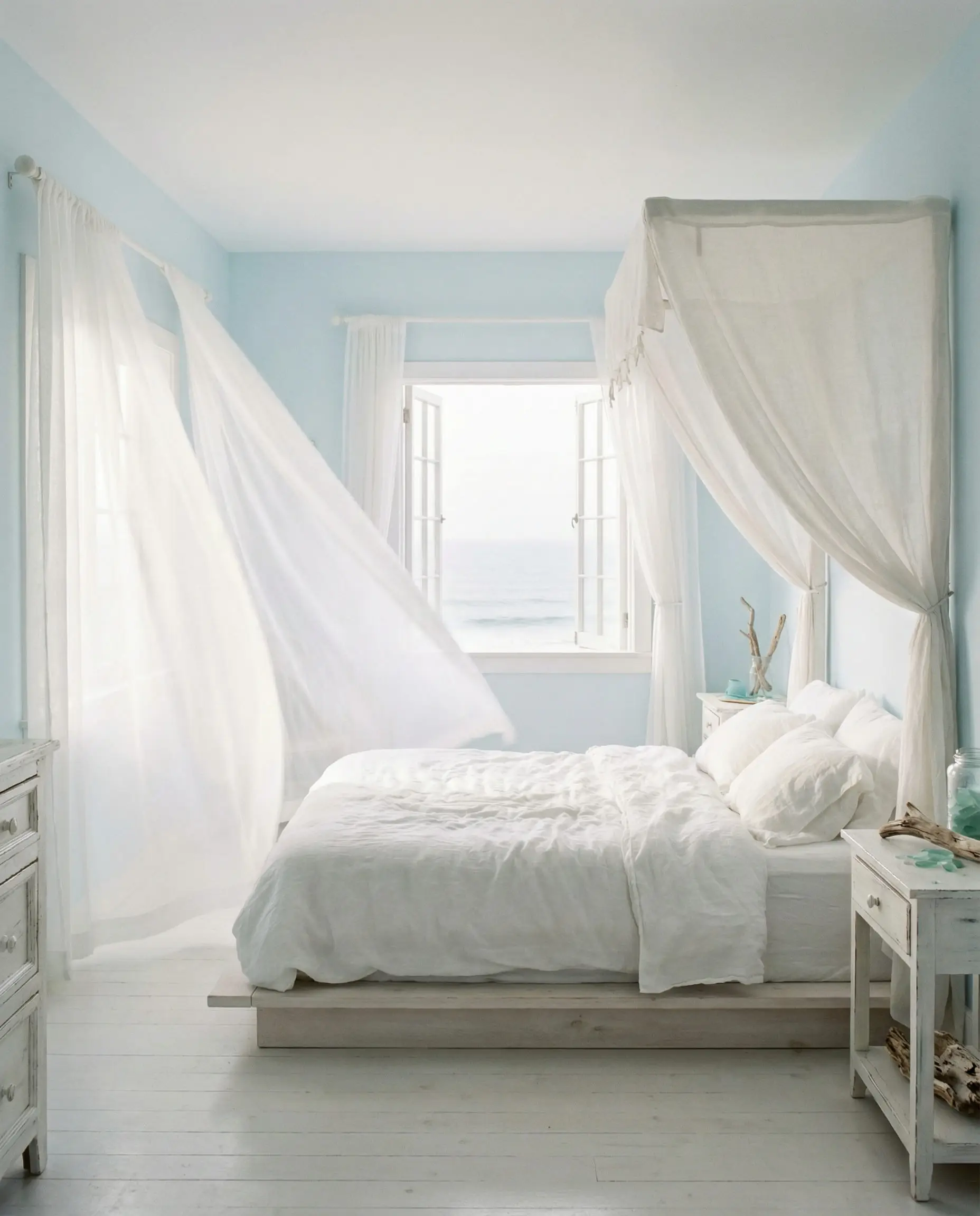
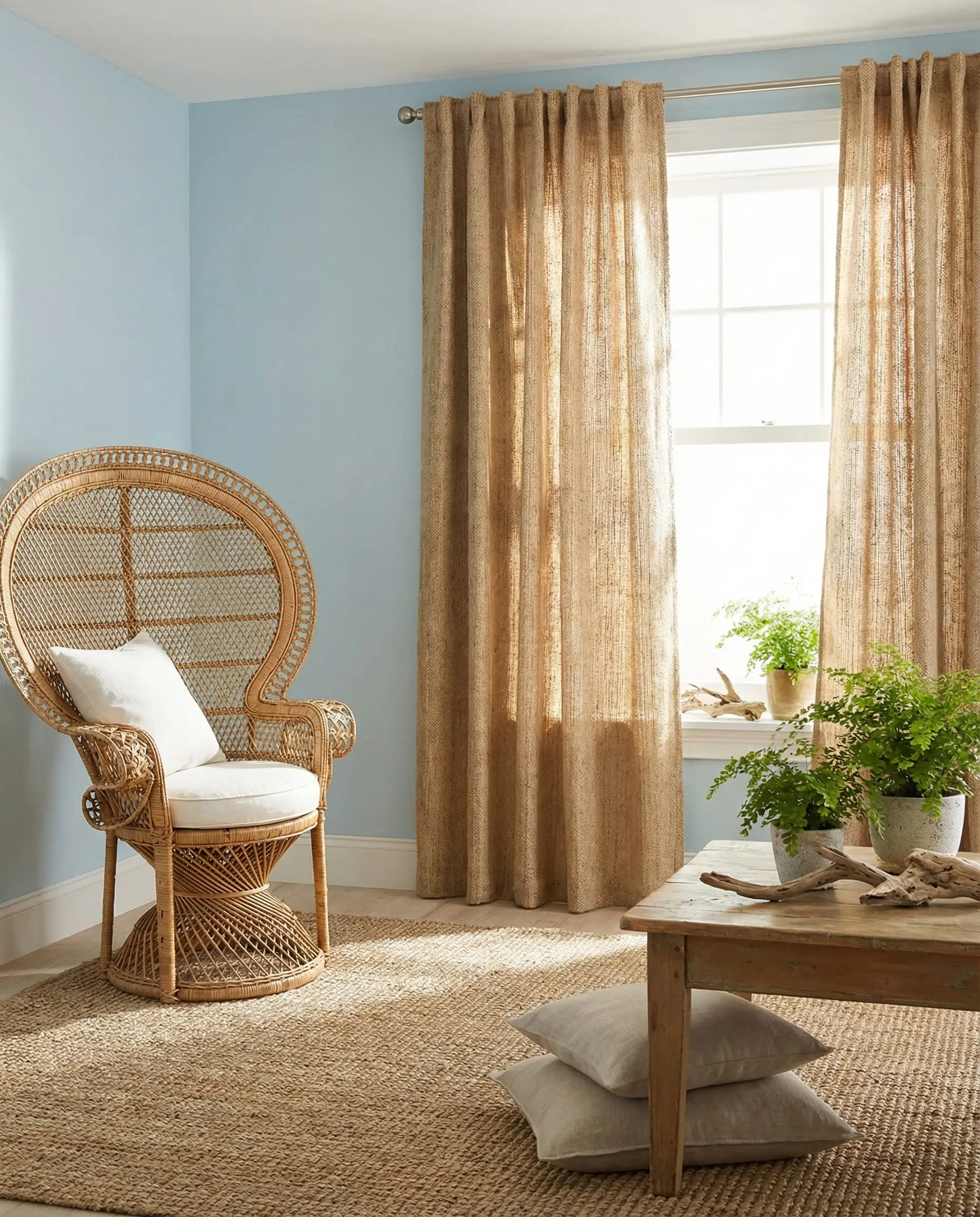
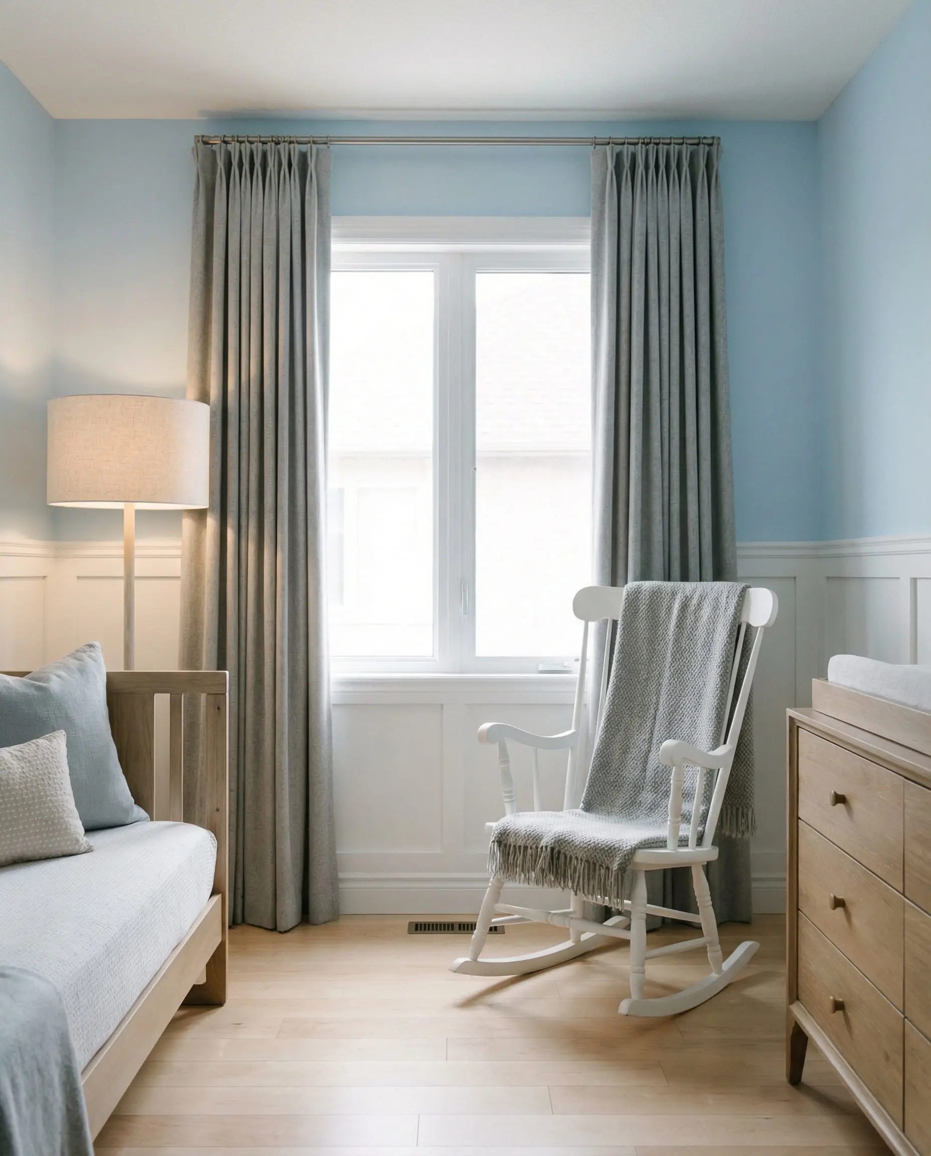
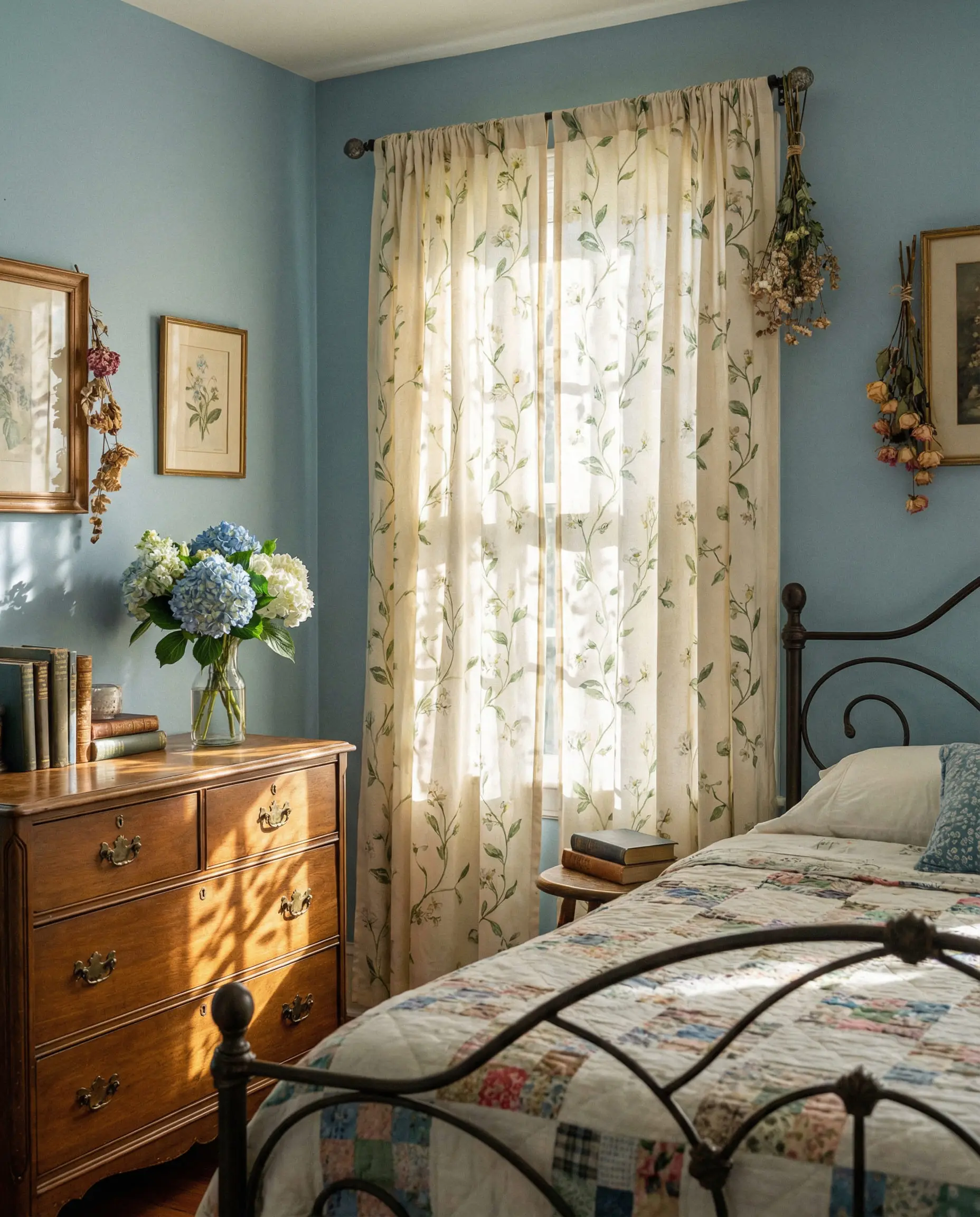
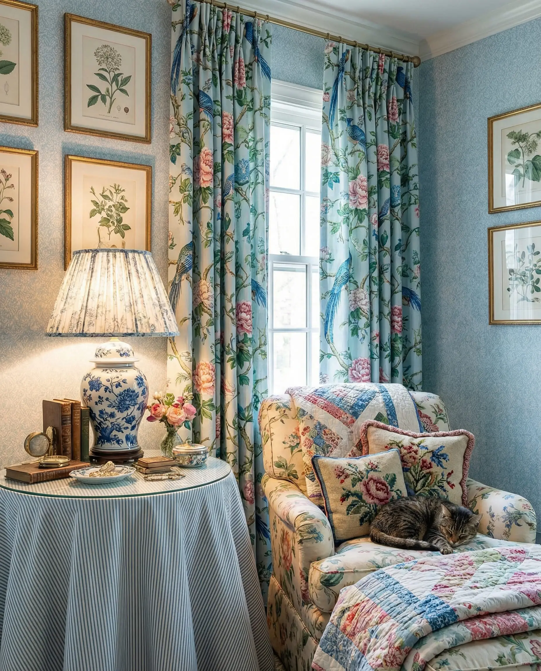
Curtains for Light Blue & Baby Blue Walls
Light blue is airy and restorative, often used in bedrooms and bathrooms.
If you are struggling to match a specific paint chip, you might want to check our deep dive into best behr paint colors, where we discuss which undertones are hiding in popular light blue paints.
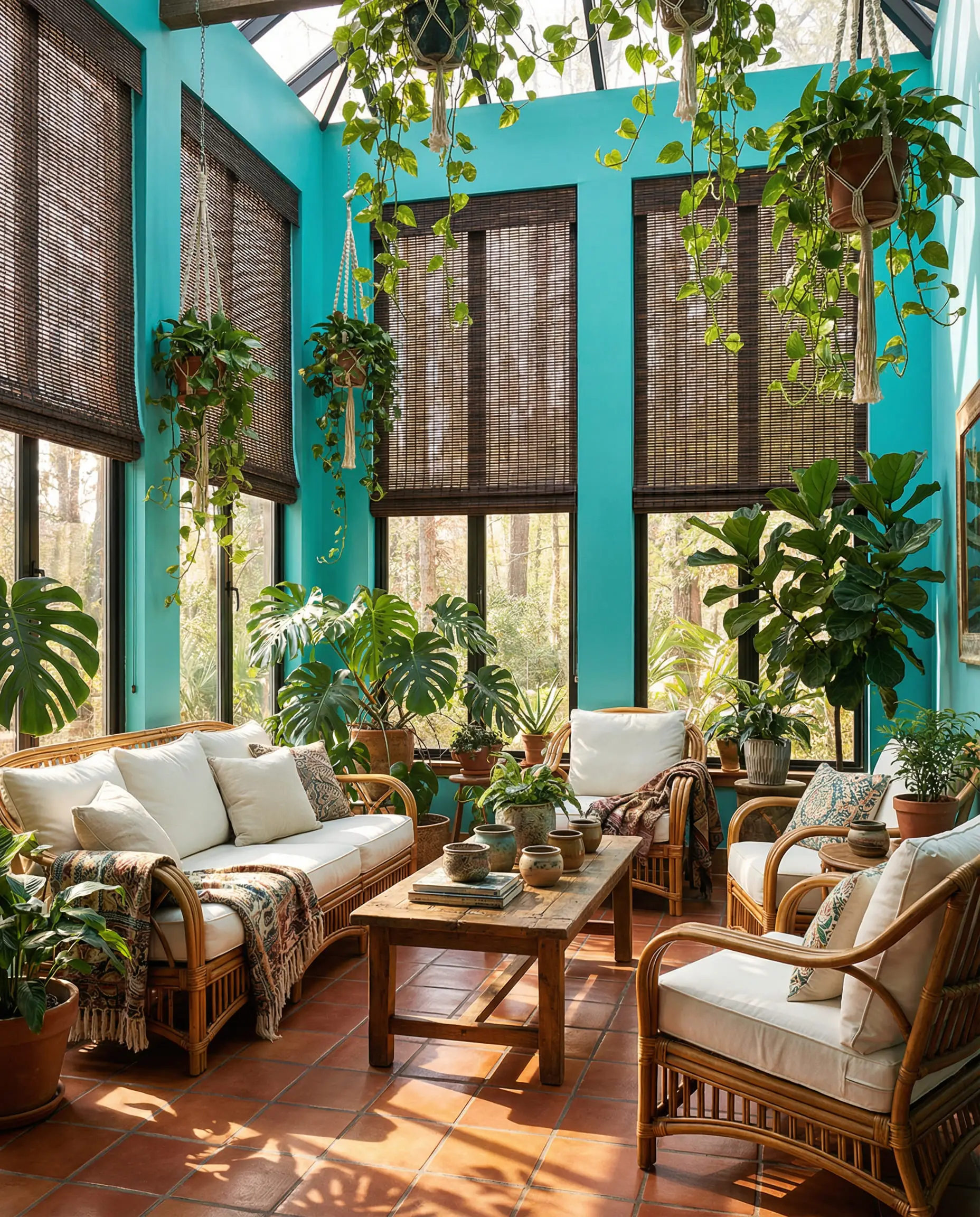
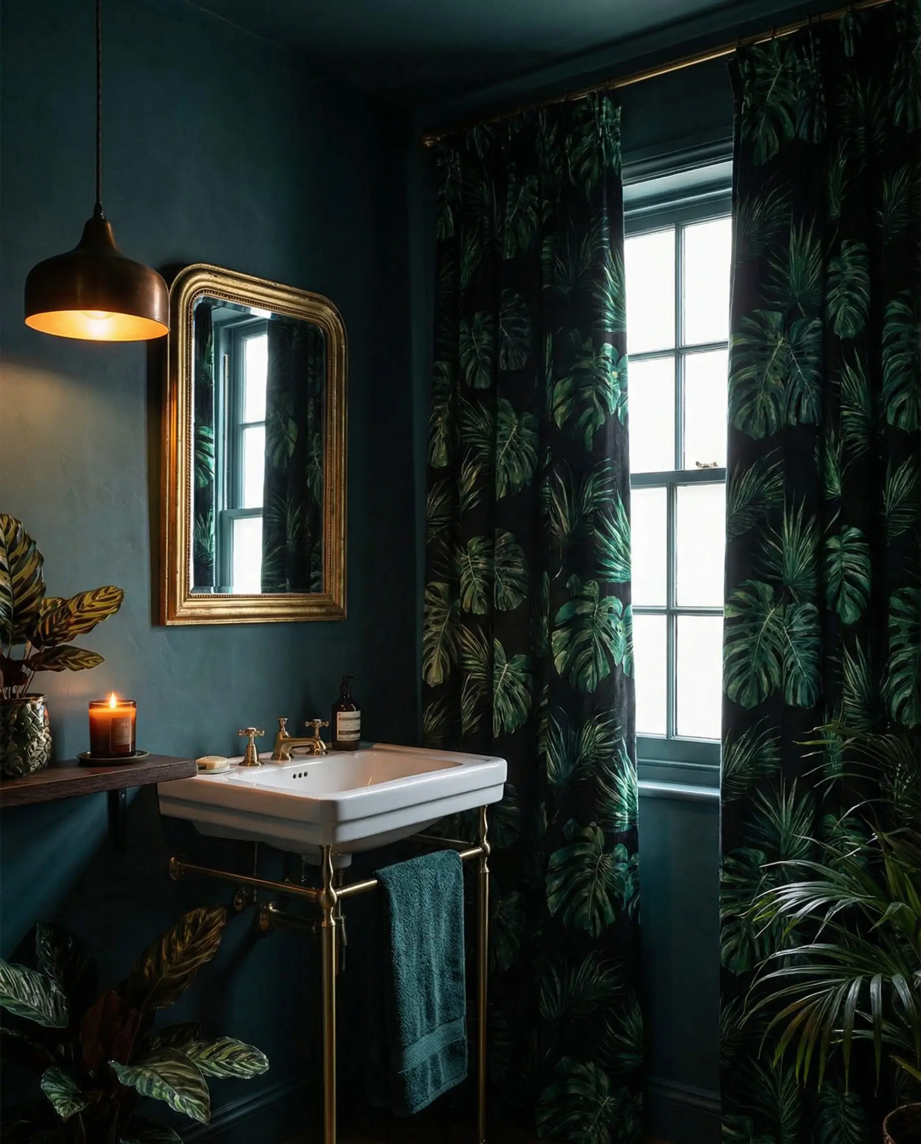
Curtains for Teal and Turquoise Walls
These are the “fun” blues with green undertones.
Curtains for Gray-Blue (Slate) Walls
Slate blue is the chameleon of the paint world. It changes color depending on the time of day.
Choosing Curtains by Room Atmosphere
The function of the room is just as important as the color of the wall.
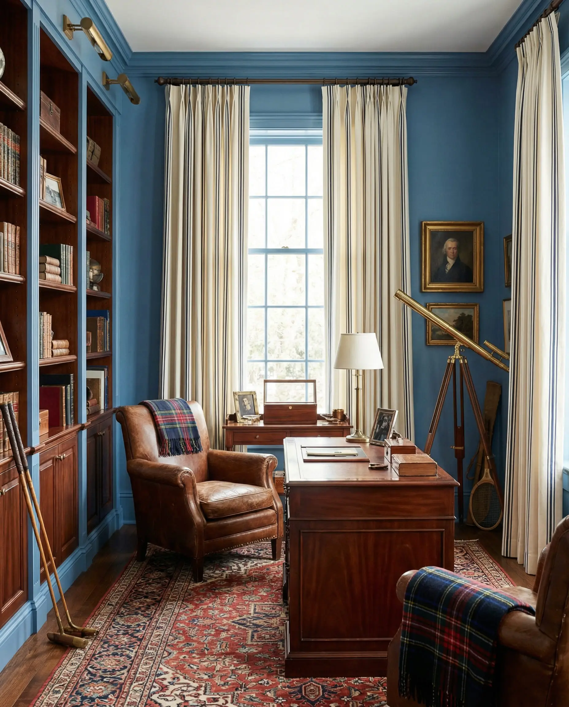
The Bedroom: Calm & Restful
In a blue bedroom, you usually want to lean toward soothing, low-contrast combinations. High contrast (like Navy and bright White) can be stimulating to the eye.
For more inspiration on creating a sanctuary, look at our current bedroom trends guide, which emphasizes the return of “cocooning” fabrics in sleeping spaces.
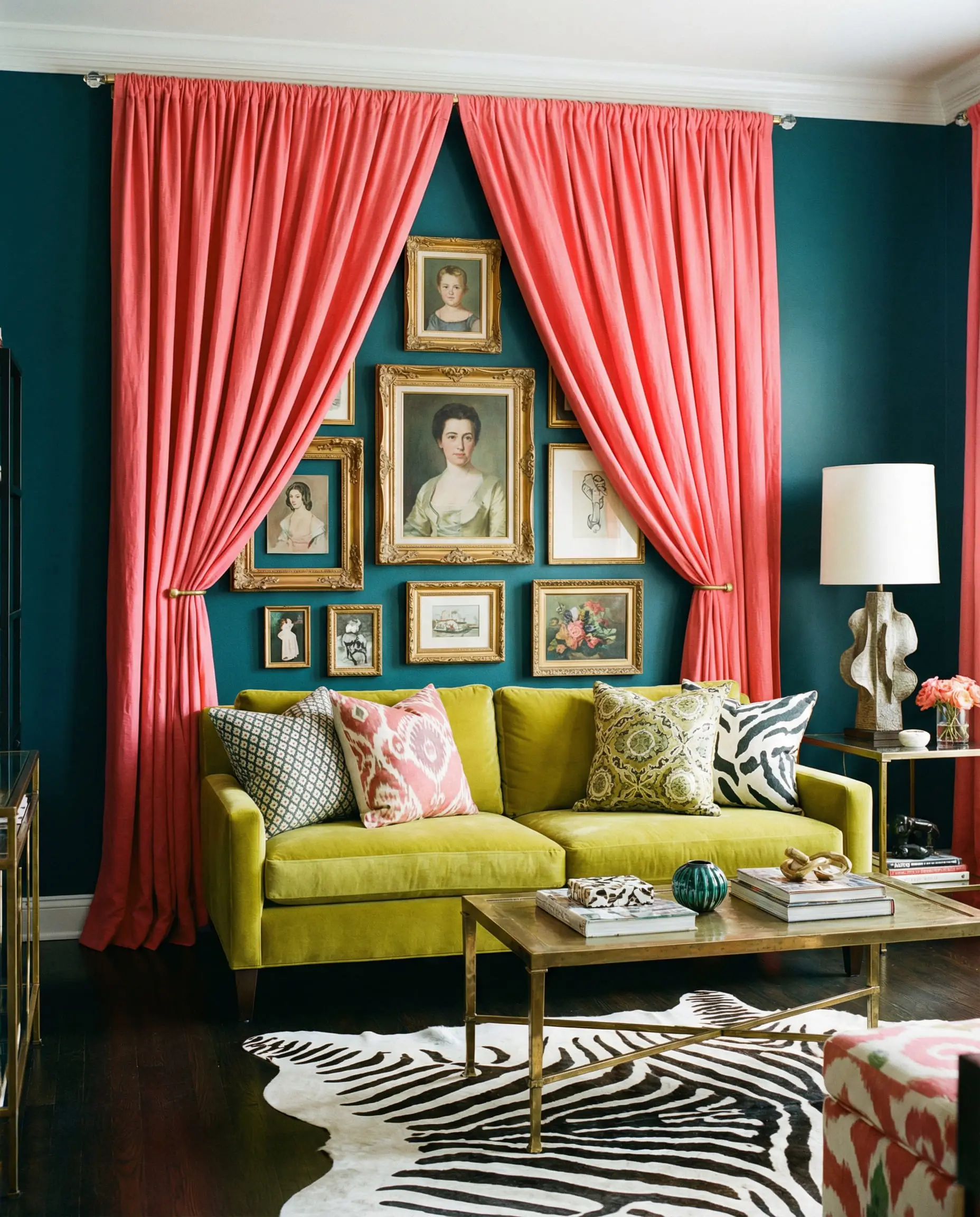
The Living Room: Social & Dynamic
This is where you can take risks. The living room is where you want to show off your personality.
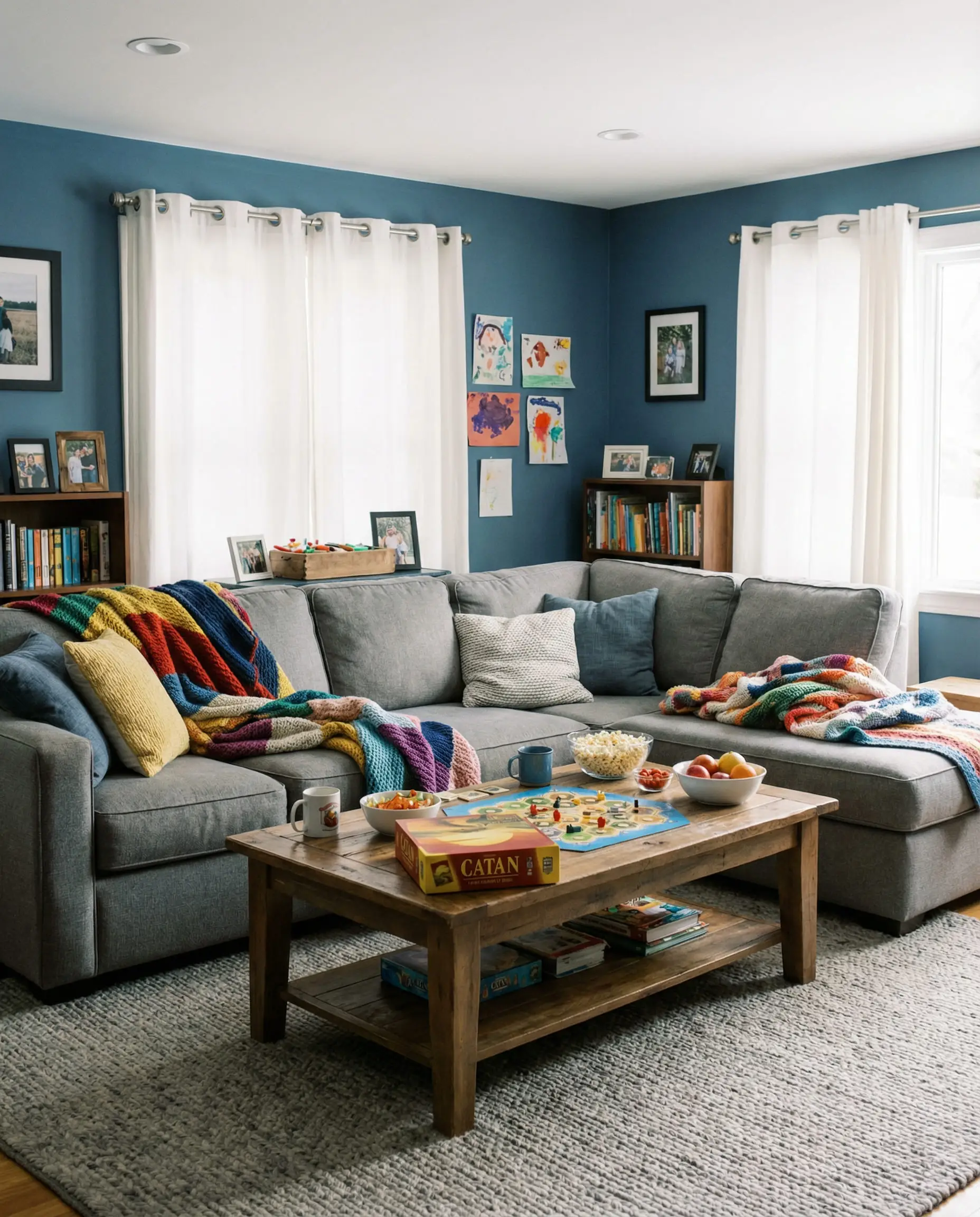
If your living room has an open plan or connects to a family space, consider how the curtains interact with other elements. Check out our modern family room decorating ideas to see how window treatments can zone a large space.
Patterns, Prints, and Textures: The 2026 Approach
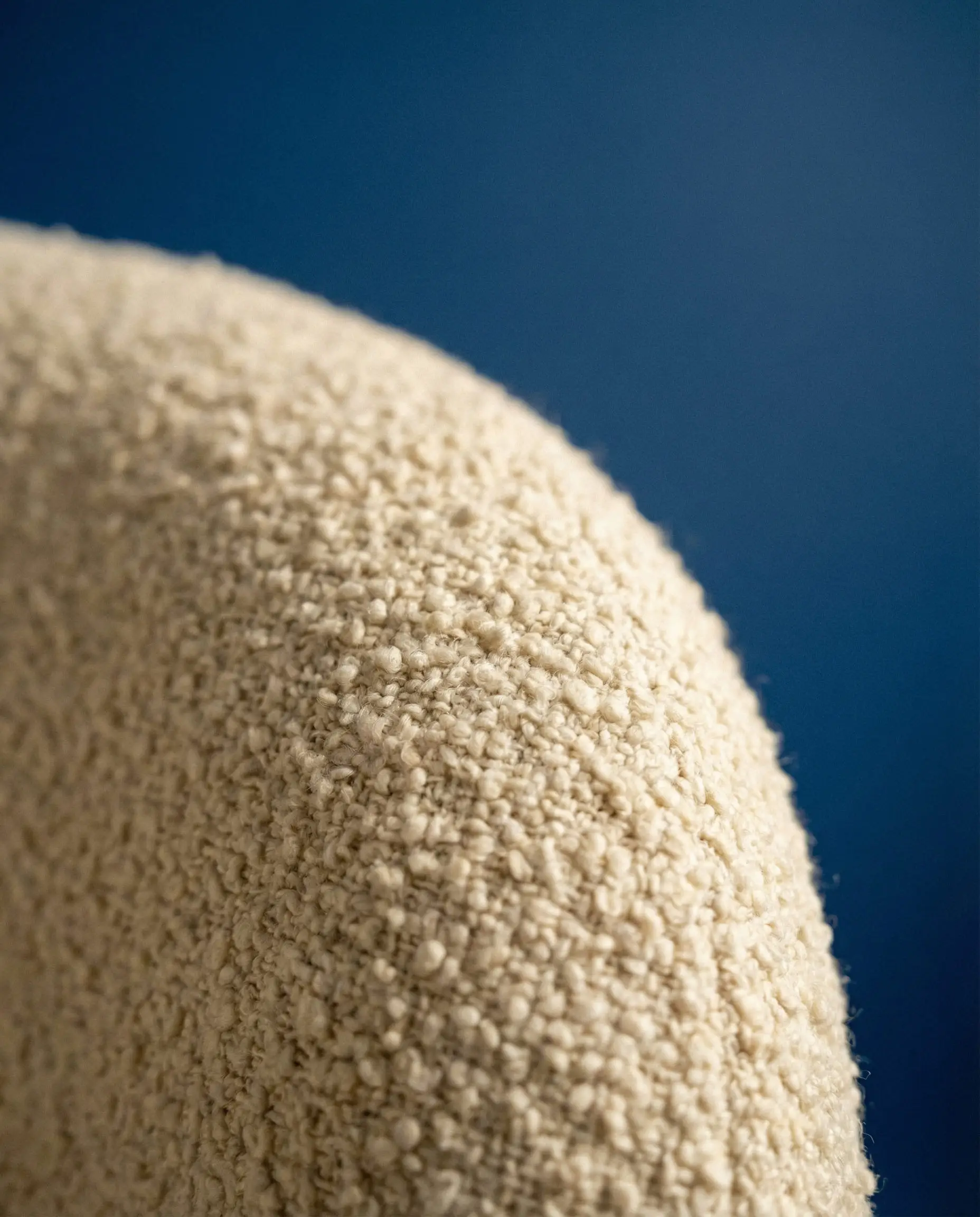
Color is only half the battle. In 2026, texture is king. A flat cotton curtain in beige is boring. A bouclé curtain in beige is a masterpiece.
1. The Texture Revolution
Because blue walls are often cool and smooth, you need curtains that beg to be touched.
To stay ahead of the curve, it is vital to understand which textiles are dominating the market. We cover this extensively in our report on home decor fabric trends, which highlights the shift toward tactile, 3D fabrics.
2. To Pattern or Not to Pattern?
Frequently Asked Questions (FAQs)
A: Both work, but they achieve different things.
Lighter curtains (White, Cream, Beige) make the room feel larger, airier, and more open. This is usually best for small rooms.
Darker curtains (Charcoal, Navy on light blue) make the room feel cozy, intimate, and den-like. This is great for media rooms or large bedrooms.
A: Yes, but be careful with the undertones. A “cool gray” (bluish-gray) looks beautiful with cool blues. A “warm gray” (brown-gray) looks better with teal or warm blues. If you mix a cool blue wall with a warm gray curtain, it can sometimes look like a mismatch rather than a choice.
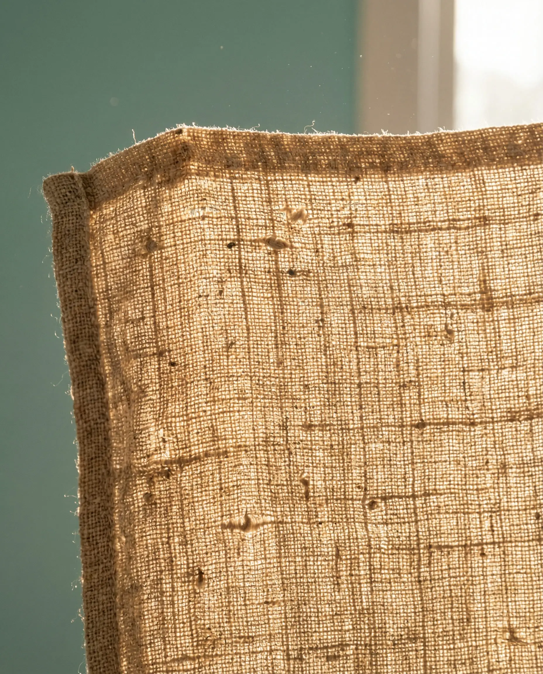
A: If you prefer blinds over curtains, natural wood tones are the winner. A woven wood shade or a bamboo blind adds a necessary organic element to blue walls. If you want roller shades, stick to a neutral light gray or white to keep it disappearing into the window trim.
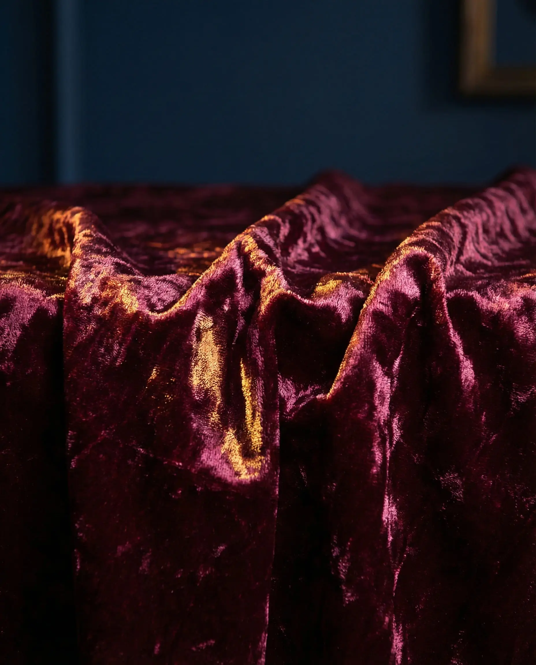
A: Proceed with caution! Bright red and bright blue can look like a superhero costume or a flag. However, deep Burgundy or Wine looks stunning with Navy blue (very Ralph Lauren aesthetic), and Rust/Terracotta (which is in the red family) looks amazing with Teal.
Conclusion: Don’t Be Afraid of Warmth
If there is one takeaway for updating your blue room in 2026, it is this: Step away from the pure white.
While white curtains will always be safe, the most stylish homes right now are embracing the tension between cool walls and warm textiles. Whether it is the earthy punch of terracotta, the luxury of mustard velvet, or the organic softness of oatmeal linen, your blue walls are a canvas waiting for contrast.
So, grab a few swatches, stick them to your wall, and live with them for a few days. The perfect match is the one that makes you smile when you walk into the room.
Need more inspiration for the rest of your home? From kitchen renovations to the latest in smart home tech, explore our full library of design stories at Hackrea.
The Aesthetics Desk curates the visual direction for Hackrea. Specializing in design history, global architectural movements, and interior styling, this desk focuses on the psychology of space and how to translate high-end, magazine-quality aesthetics into approachable residential design without falling into fleeting micro-trends.