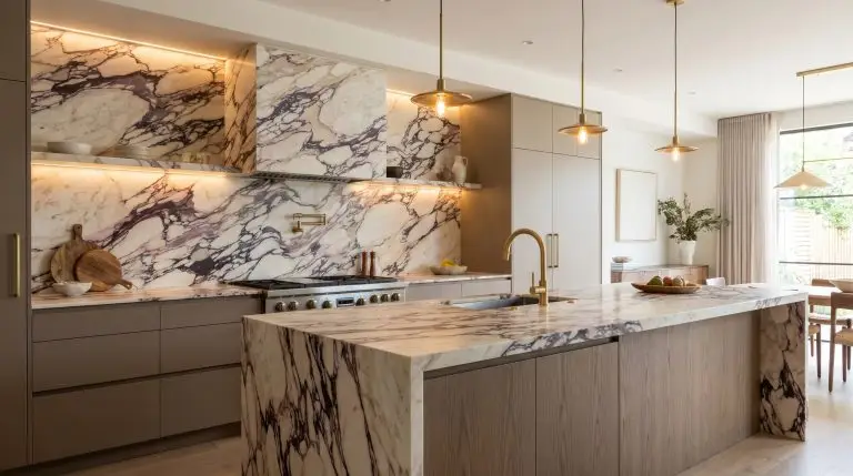
Installing a Calacatta viola marble kitchen backsplash is not merely a renovation choice; it is an architectural declaration. We have firmly exited the era of safe, subtle grays, and design-forward homeowners are now fully embracing the intoxicating, brecciated movement of this magnificent Italian stone. However, with its aggressive cabernet veining and creamy, warm ground, this material carries an inherent design risk.
To prevent a space from feeling chaotic or visually overwhelming, we must enforce the “Pattern Allowance” rule. When you select a stone this loud and demanding, it instantly becomes the undisputed star of the room. Every other element in your kitchen must act as a disciplined supporting actor, offering grounding harmony rather than competing for attention.
Here is exactly how to balance its rich, violet-laced veins with masterful restraint.
1. Cabinetry & Color Pairings: Casting the “Supporting Actors”
Calacatta Viola is resolutely not a neutral material. Its complex surface is a riot of violet, pink, and deep burgundy veins suspended in a warm, milky base. Because of this intense color profile, surrounding cabinetry must either be unapologetically muddy, exceptionally warm, or heavily contrasted to anchor the visual weight.
1. Ground the Stone with Muddy Taupes and Fawns
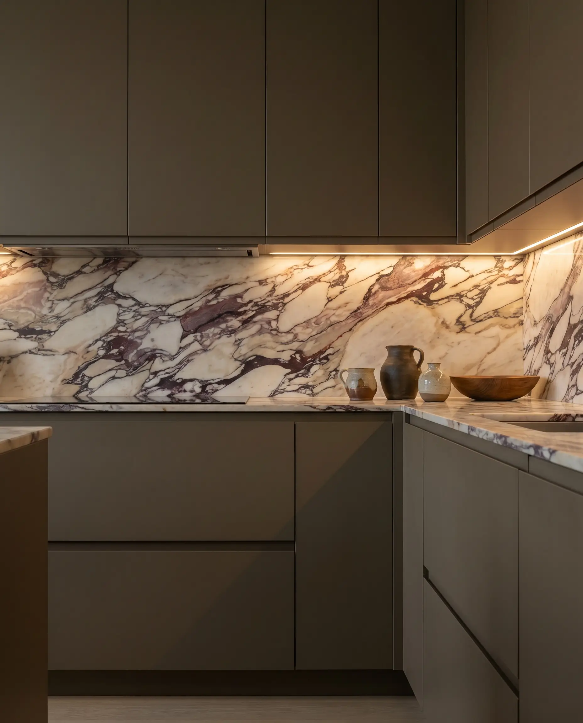
Surrounding this dramatic marble with a flat, primary color is a critical error, as the stone requires complex, muddy undertones to feel integrated rather than applied. A deep, earthy fawn pulls the warmth from the marble’s creamy background, creating a sophisticated, tonal envelope. This approach softens the intense cabernet veining, allowing the stone to breathe within a highly curated, organic palette.
- Vibe: Earthy, grounded luxury.
- Key Materials: Flat-panel or slim-shaker cabinetry, matte finishes.
- Paint Recommendation: Farrow & Ball Dead Salmon or Drop Cloth.
- Styling Pro-Tip: Keep cabinet hardware minimal and integrated to let the tonal relationship between the paint and the stone remain the focal point.
2. Lean into Moody Maximalism with Deep Aubergine
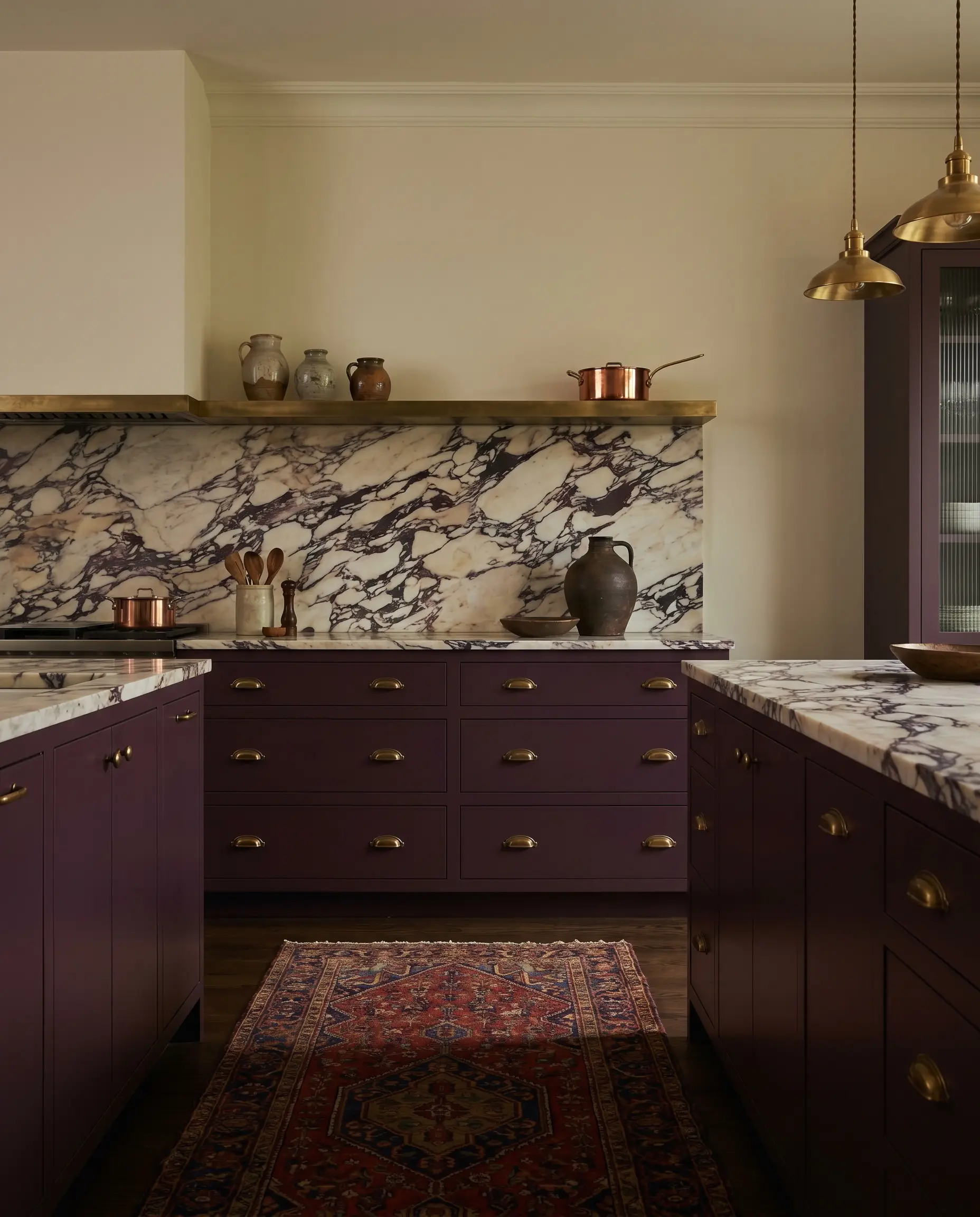
For those who wish to amplify the drama rather than subdue it, matching your cabinetry to the darkest, most concentrated veins in the stone yields a breathtaking, jewel-box effect. Deep aubergine or rich plum grounds the chaotic movement of the marble, making the lighter, creamy patches of the stone leap forward visually. It is a masterclass in using dark hues to create unexpected luminosity.
- Vibe: Sophisticated, moody maximalism.
- Key Materials: Saturated matte lacquers, deeply tinted wood stains.
- Paint Recommendation: Farrow & Ball Brinjal.
- Styling Pro-Tip: Restrict this dark pairing to base cabinets only, allowing the upper walls to remain open and airy so the space does not feel cavernous.
3. Create Parisian Contrast with Ebonized Walnut
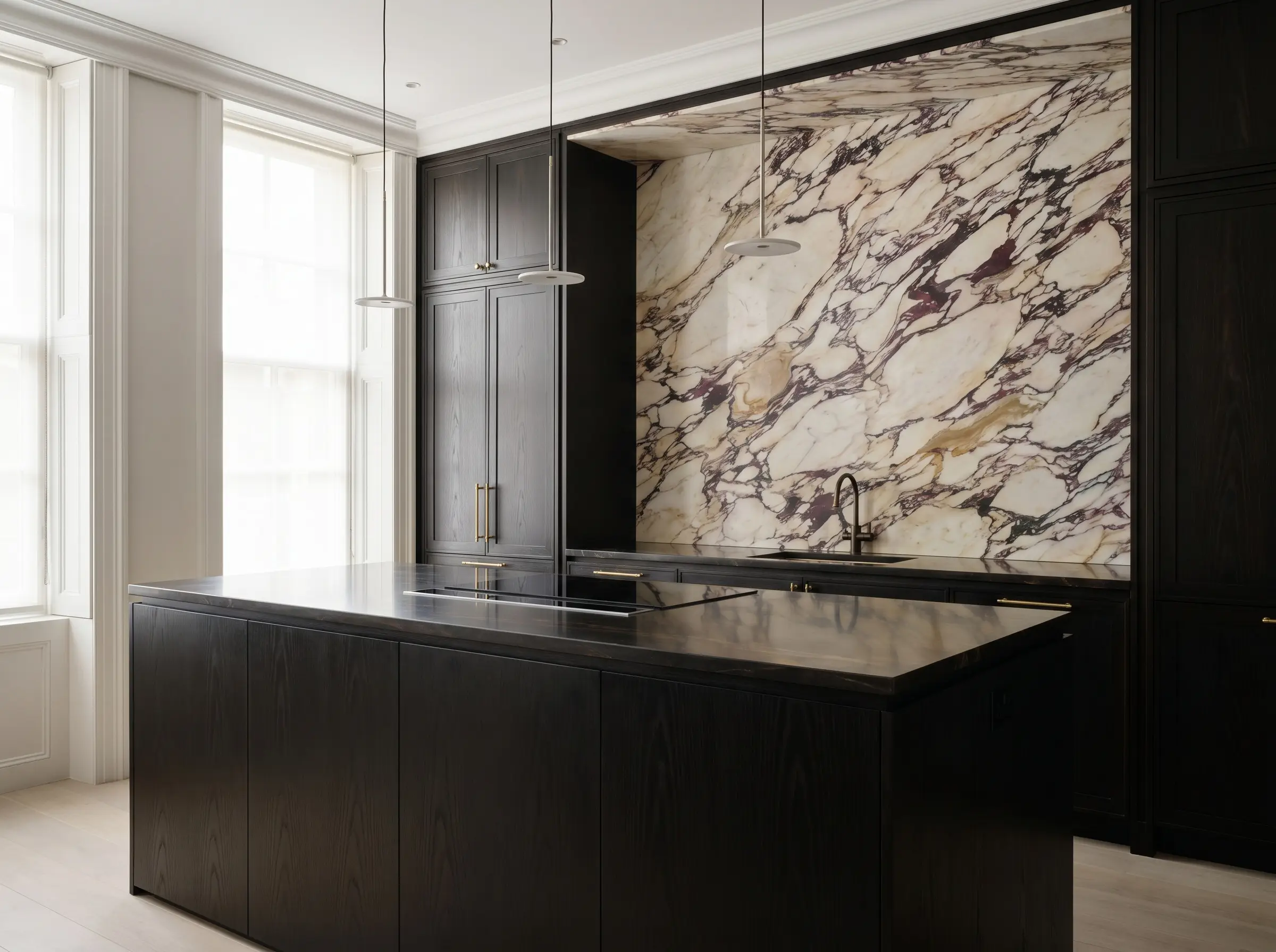
There is an undeniable architectural romance in pairing the wild, brecciated movement of Calacatta Viola with the strict, formal elegance of nearly black wood. Ebonized walnut offers immense visual weight, providing a stark, tailored boundary that frames the marble like a piece of fine art. The subtle, underlying grain of the walnut adds a layer of tactile richness without introducing a competing pattern.
- Vibe: Tailored Parisian apartment.
- Key Materials: Ebonized walnut veneer, visible but subdued wood grain.
- Paint Recommendation: True black or deep charcoal-brown stains.
- Styling Pro-Tip: Use this pairing on a large, central kitchen island, allowing the dark wood to anchor the room while the marble climbs the primary wall.
4. Warm the Palette with Rift-Sawn White Oak
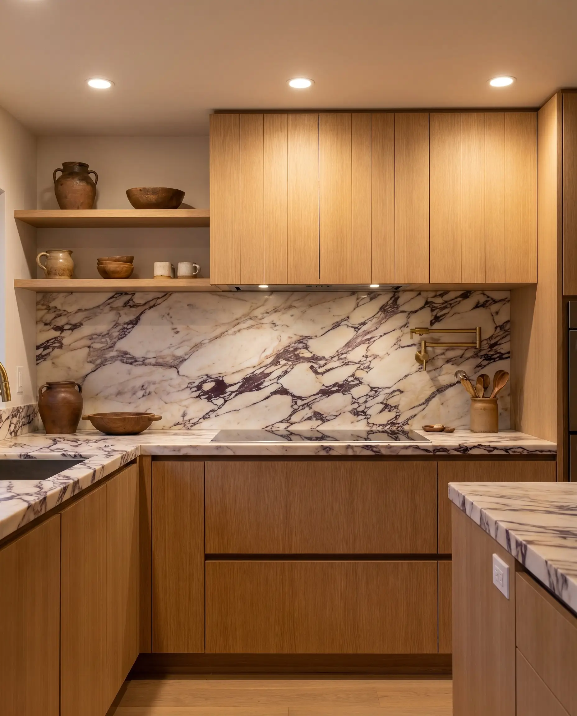
When executing an organic modern aesthetic, the raw, natural warmth of rift-sawn white oak serves as the perfect counterbalance to the cold, hard surface of the stone. The linear, disciplined grain of rift-sawn oak refuses to fight with the chaotic veining of the marble, offering a quiet, textural warmth. It is imperative that the wood finish remains entirely matte and free of any yellow or orange undertones.
- Vibe: Elevated organic modernism.
- Key Materials: Rift-sawn white oak, ultra-matte clear sealers.
- Material Match: Rubio Monocoat in Cotton White or Natural.
- Styling Pro-Tip: Run the wood grain vertically on the cabinetry to draw the eye upward toward the marble backsplash.
5. Execute the Classic: Warm Off-Whites
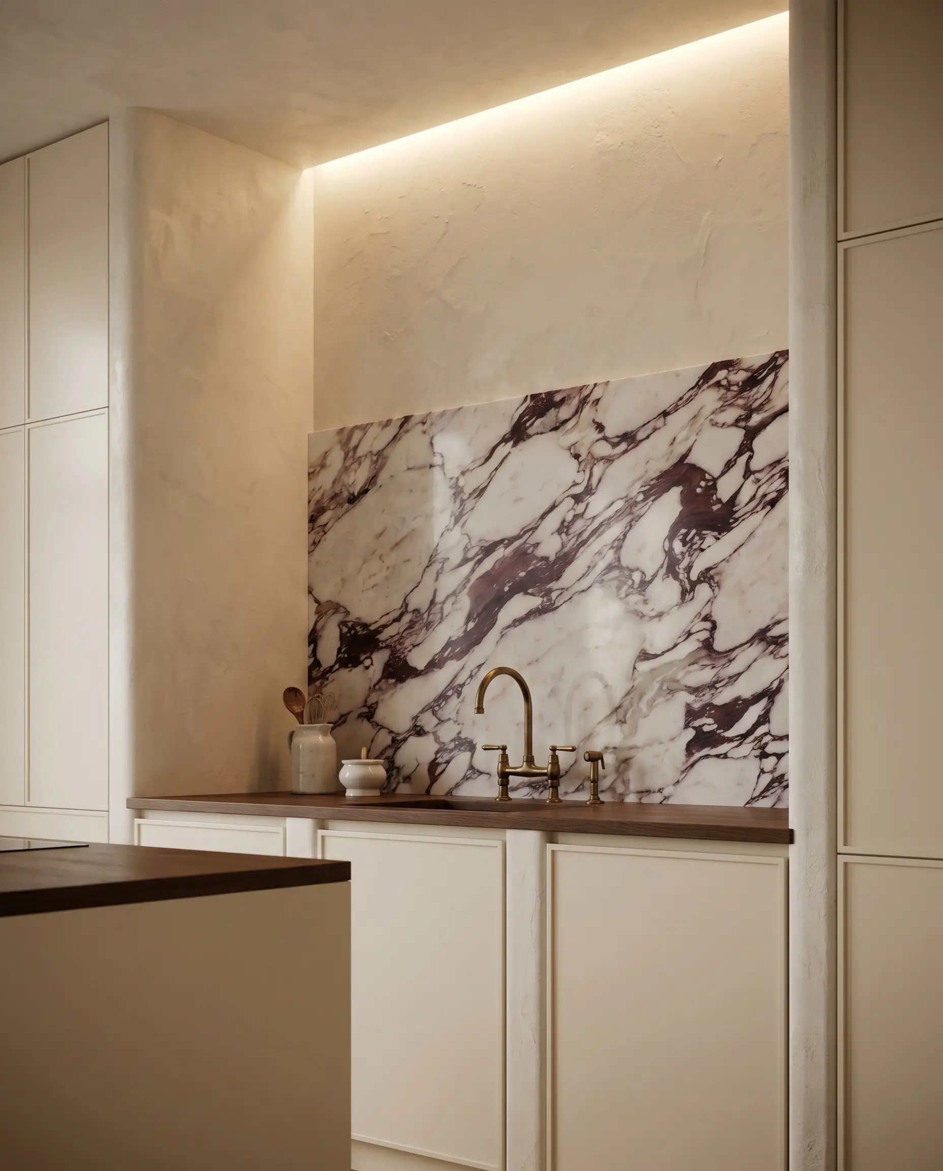
Pairing this stone with a stark, clinical white is a severe misstep that will immediately make the creamy base of the marble look dingy. Instead, wrap the surrounding architecture in rich, warm off-whites or creamy plasters that perfectly mirror the lightest tones within the slab. This creates an ethereal, seamless transition where the stone appears to organically emerge from the walls.
- Vibe: Timeless, transitional elegance.
- Key Materials: Hand-troweled plaster, satin-finish cabinetry.
- Paint Recommendation: Sherwin-Williams Alabaster or Benjamin Moore Swiss Coffee.
- Styling Pro-Tip: Order physical paint samples and view them against your specific marble slab under your actual kitchen lighting to ensure the undertones match flawlessly.
6. Embrace the Pink Undertones with Soft Plaster Pinks
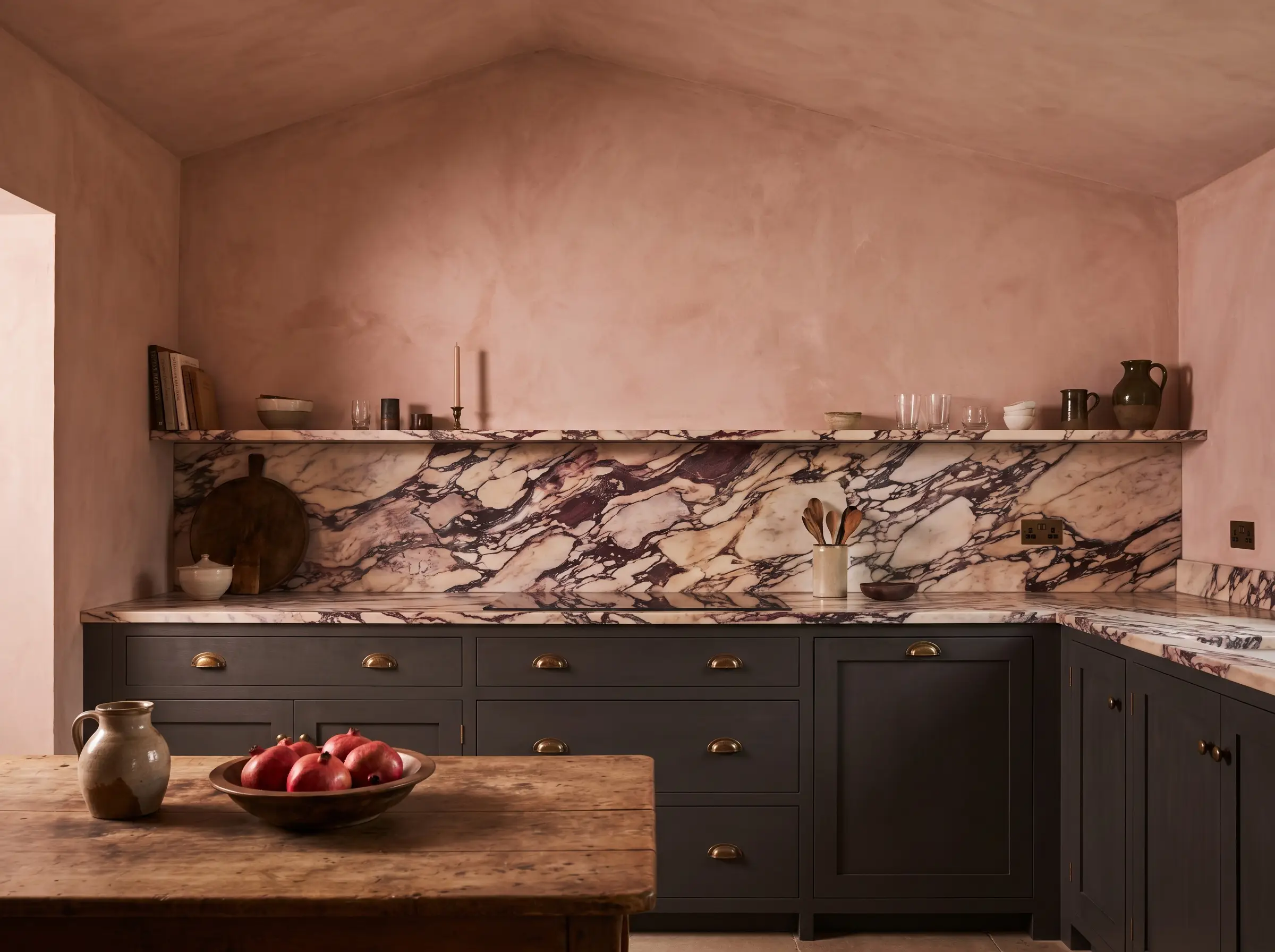
Calacatta Viola carries undeniable rosy, blush undertones that can be beautifully coaxed out with the right architectural pairings. Applying a soft, muddy plaster pink to the walls or upper cabinetry creates a highly romantic, tonal harmony that softens the overall aesthetic. The secret is ensuring the pink is earthy and muted, never bright or saccharine.
- Vibe: Soft, romantic, and highly bespoke.
- Key Materials: Limewash paint, matte cabinetry.
- Paint Recommendation: Farrow & Ball Setting Plaster.
- Styling Pro-Tip: Carry the muddy pink color onto the ceiling to create an immersive, jewel-box atmosphere that envelops the stone.
7. Anchor the Space with Deep Charcoal
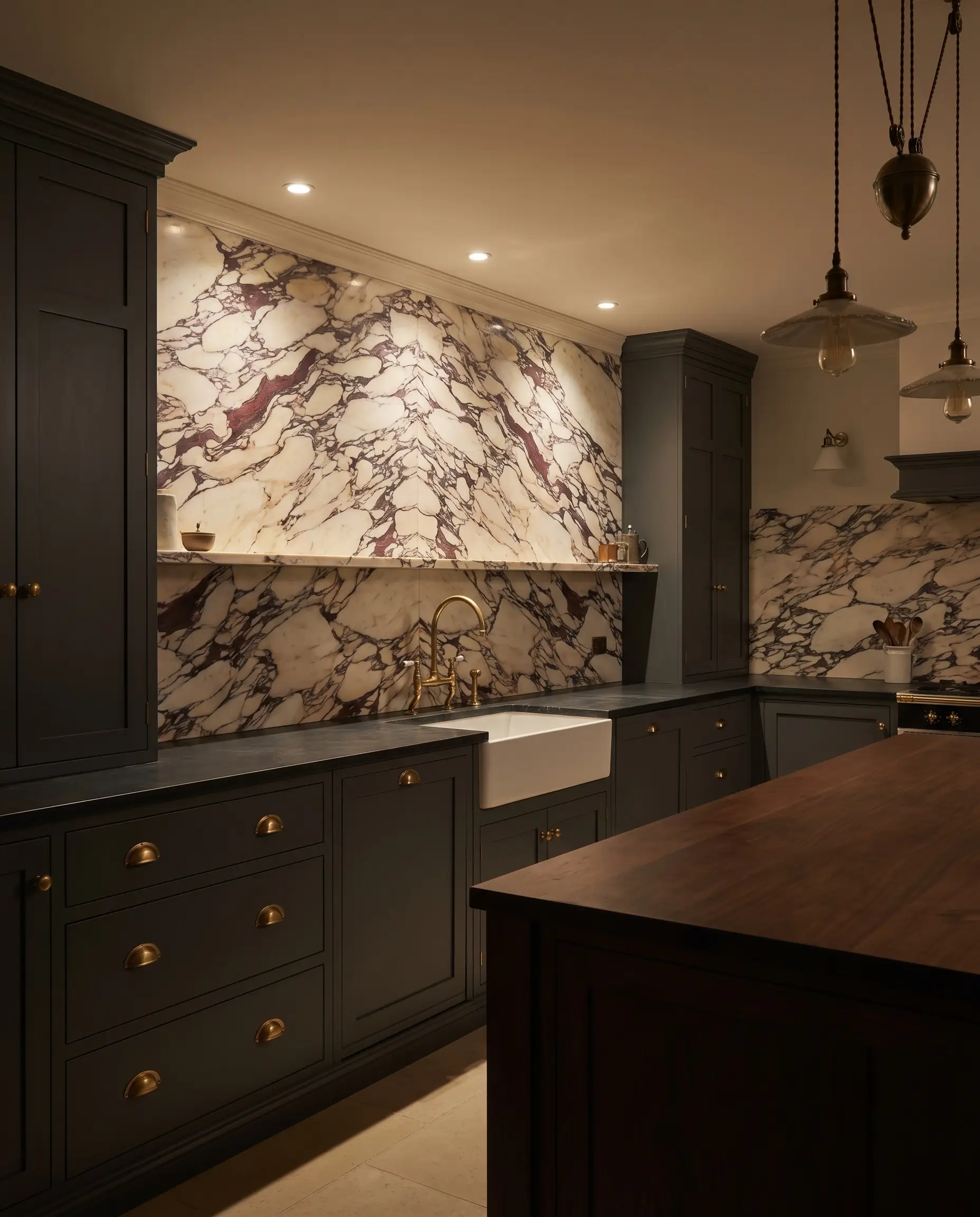
If pure black feels too harsh against the creamy base of the marble, a deeply saturated charcoal gray offers a softer, more nuanced alternative. Charcoal possesses enough visual density to ground the aggressive cabernet veining, but its subtle warmth prevents the kitchen from feeling sterile or overly modern. It acts as a sophisticated shadow, allowing the stone’s vibrant colors to command the room.
- Vibe: Refined, masculine sophistication.
- Key Materials: Painted shaker cabinets, soapstone perimeter counters.
- Paint Recommendation: Benjamin Moore Kendall Charcoal or Cheating Heart.
- Styling Pro-Tip: Pair this dark charcoal with unlacquered brass hardware to inject necessary warmth back into the cool, shadowy palette.
2. Architectural Layouts & Fabrication Cuts
How this stone is physically applied to your walls requires just as much consideration as the color palette. Master tradespeople and high-end fabricators understand that the cut, edge profiling, and scale of the application are the make-or-break factors for this material. A flawless installation honors the stone’s natural movement, while poor execution will fracture its beauty.
8. The Seamless Continuous Full-Slab Run
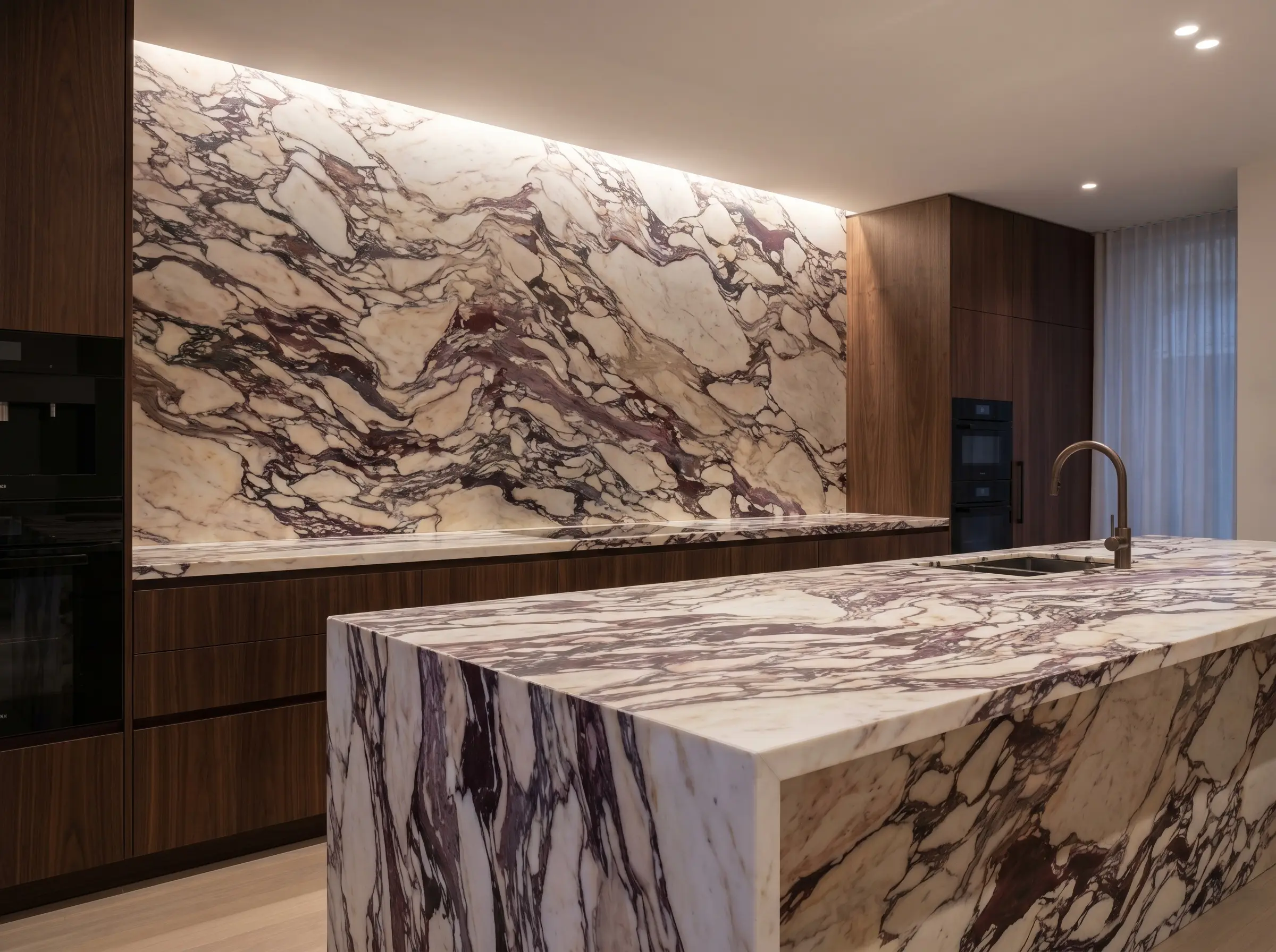
Nothing telegraphs bespoke luxury quite like a monolithic slab of marble flowing horizontally across the countertop and seamlessly climbing vertically up the wall. This continuous application eliminates visual interruptions, allowing the dramatic, brecciated veins to act as a singular, large-scale mural. It requires meticulous templating by a master fabricator to ensure the transition at the seam feels organic.
- Vibe: Monolithic, ultra-luxury.
- Key Materials: 2cm or 3cm full marble slabs.
- Fabrication Detail: Mitered edge at the counter-to-wall transition.
- Styling Pro-Tip: Omit electrical outlets on the primary backsplash wall, opting instead for under-cabinet plug molding to keep the stone surface entirely unblemished.
9. The 4-Inch Floating Marble Ledge
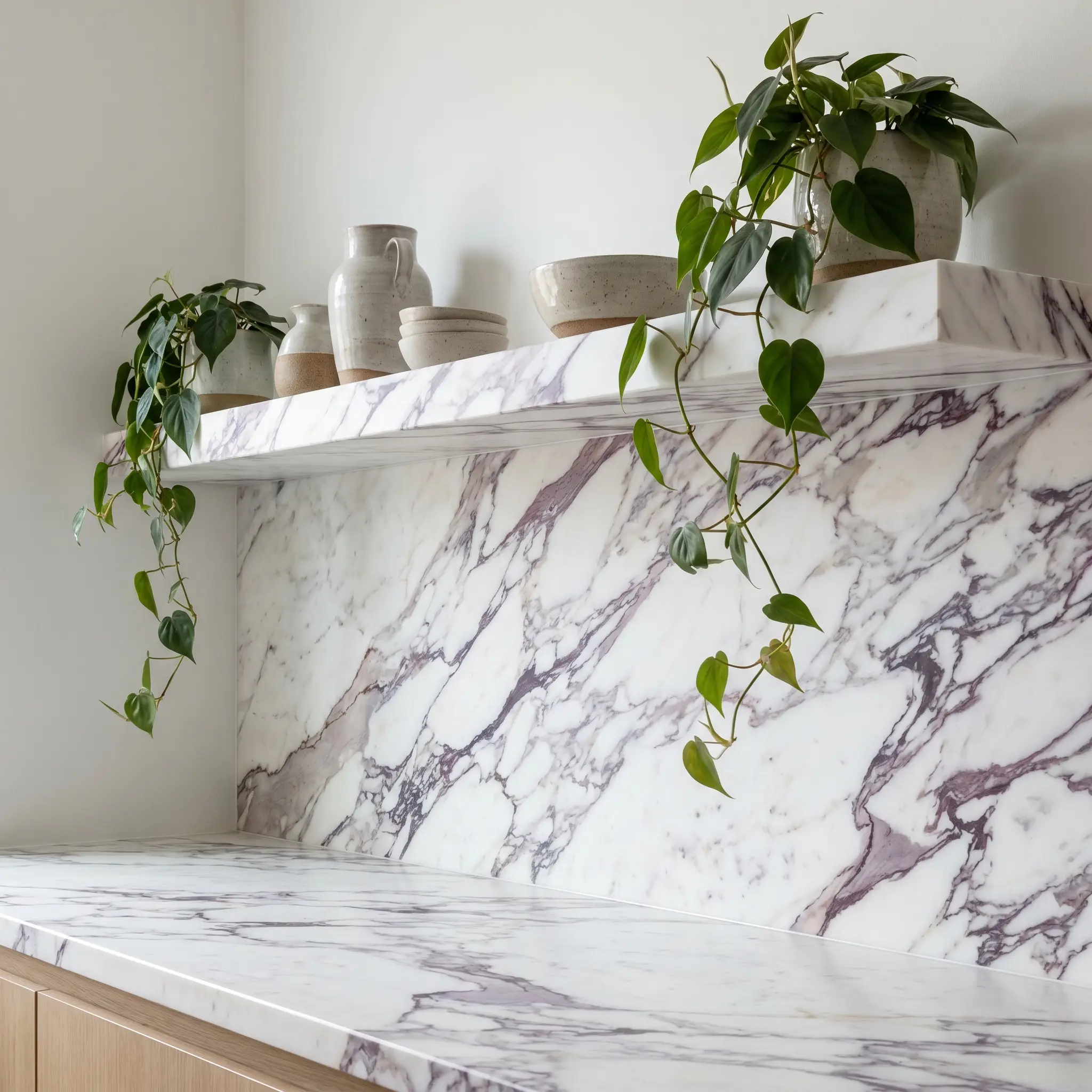
Replacing bulky upper cabinets with a shallow, floating marble ledge integrated directly into the backsplash is a hallmark of contemporary European design. This architectural detail provides a highly curated stage for displaying artisanal ceramics, vintage oils, or trailing greenery. It breaks up the imposing scale of a full slab while adding incredible dimensional interest to the wall.
- Vibe: Curated, gallery-like sophistication.
- Key Materials: 4-inch deep Calacatta Viola ledge, structurally reinforced.
- Fabrication Detail: Square, honed edge profile for a crisp, modern shadow line.
- Styling Pro-Tip: Ensure the fabricator aligns the veining of the ledge to perfectly match the veining of the backsplash behind it for a flawless, carved-from-one-block illusion.
10. The Accessible Luxury Hack: 18×18 Honed Tiles
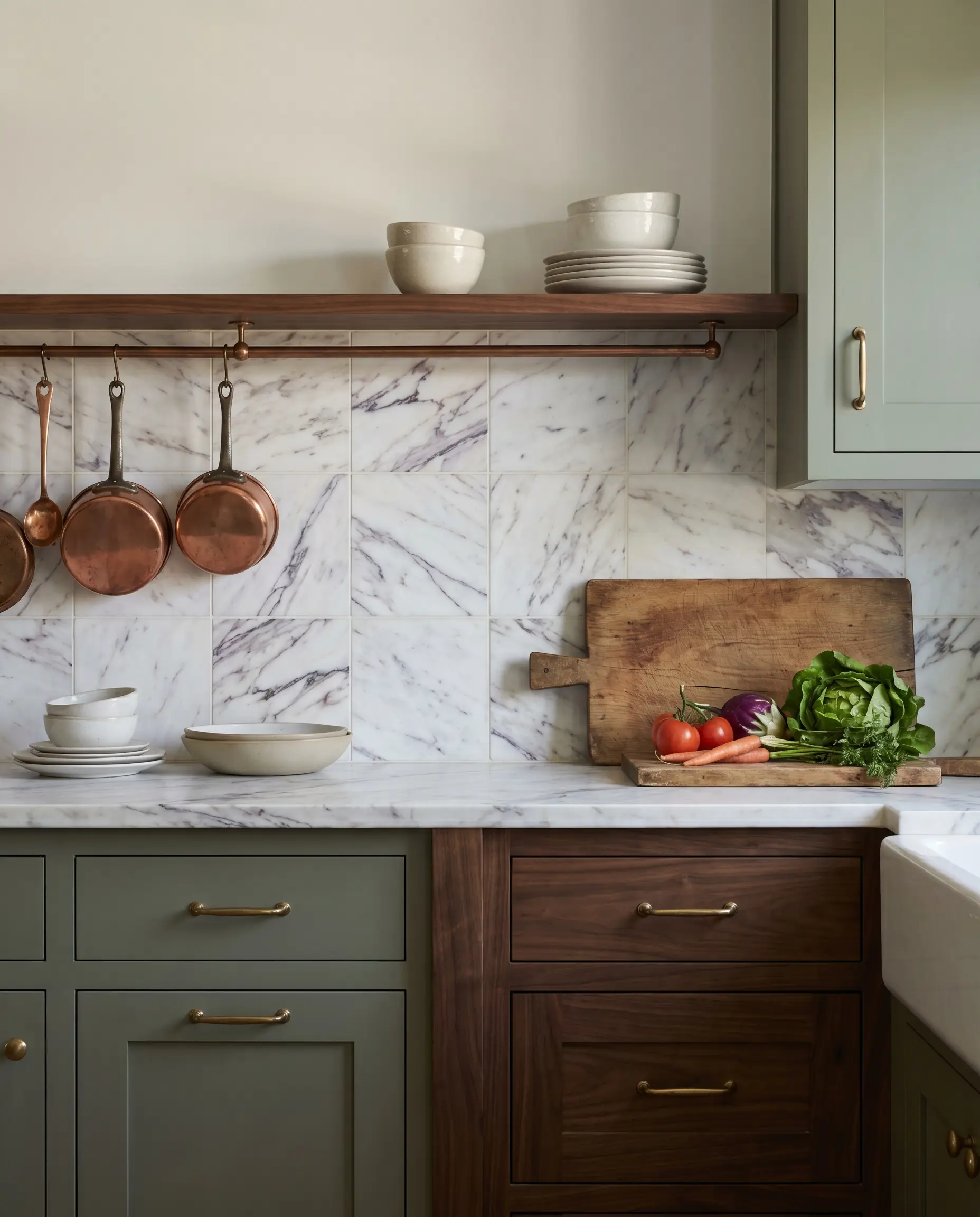
If allocating resources toward a full slab restricts other vital architectural elements, utilizing large-format honed tiles is a highly strategic alternative championed by boutique designers. When tightly grouted and expertly laid, 18×18 tiles deliver the magnificent color profile and texture of the stone without the staggering material and fabrication costs of a monolithic slab.
- Vibe: Heritage, Old-World charm.
- Key Materials: 18×18 or 12×12 honed Calacatta Viola field tile.
- Fabrication Detail: Minimal grout lines (1/16th inch) using a color-matched creamy grout.
Sourcing premium large-format tiles from brands like Artistic Tile allows you to achieve this bespoke look for roughly $1,800 in materials, rather than committing $10,000+ to a full slab and specialized hoisting labor.
Hackrea Designer Secret
11. Book-Matching Slabs Behind a Professional Range
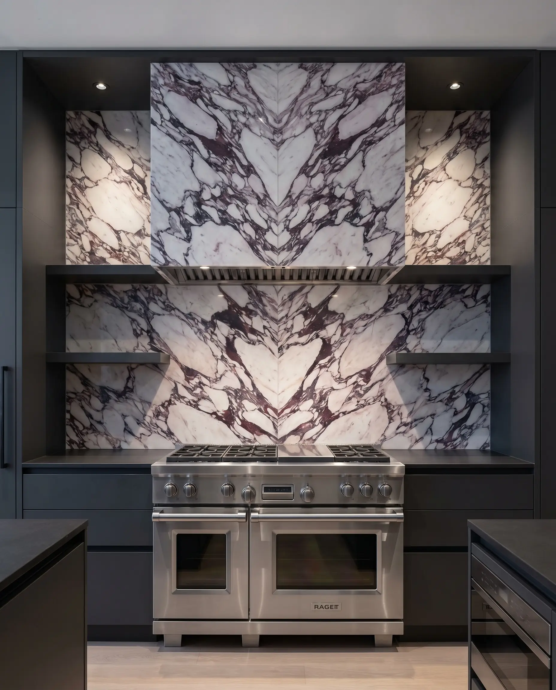
For the ultimate demonstration of fabrication prowess, book-matching two adjoining slabs creates a mesmerizing, symmetrical Rorschach-like pattern. Positioning this mirrored epicenter directly behind a heavy, professional-grade range establishes an undeniable architectural focal point. This technique demands absolute precision from your fabricator, as the veins must align with mathematical perfection.
- Vibe: Grand, theatrical luxury.
- Key Materials: Two sequential slabs from the same quarry block.
- Fabrication Detail: Book-matched seam alignment.
- Styling Pro-Tip: Keep the surrounding cabinetry remarkably quiet and symmetrical to frame the book-matched art piece without competing for the eye.
12. Framed Niche Insets
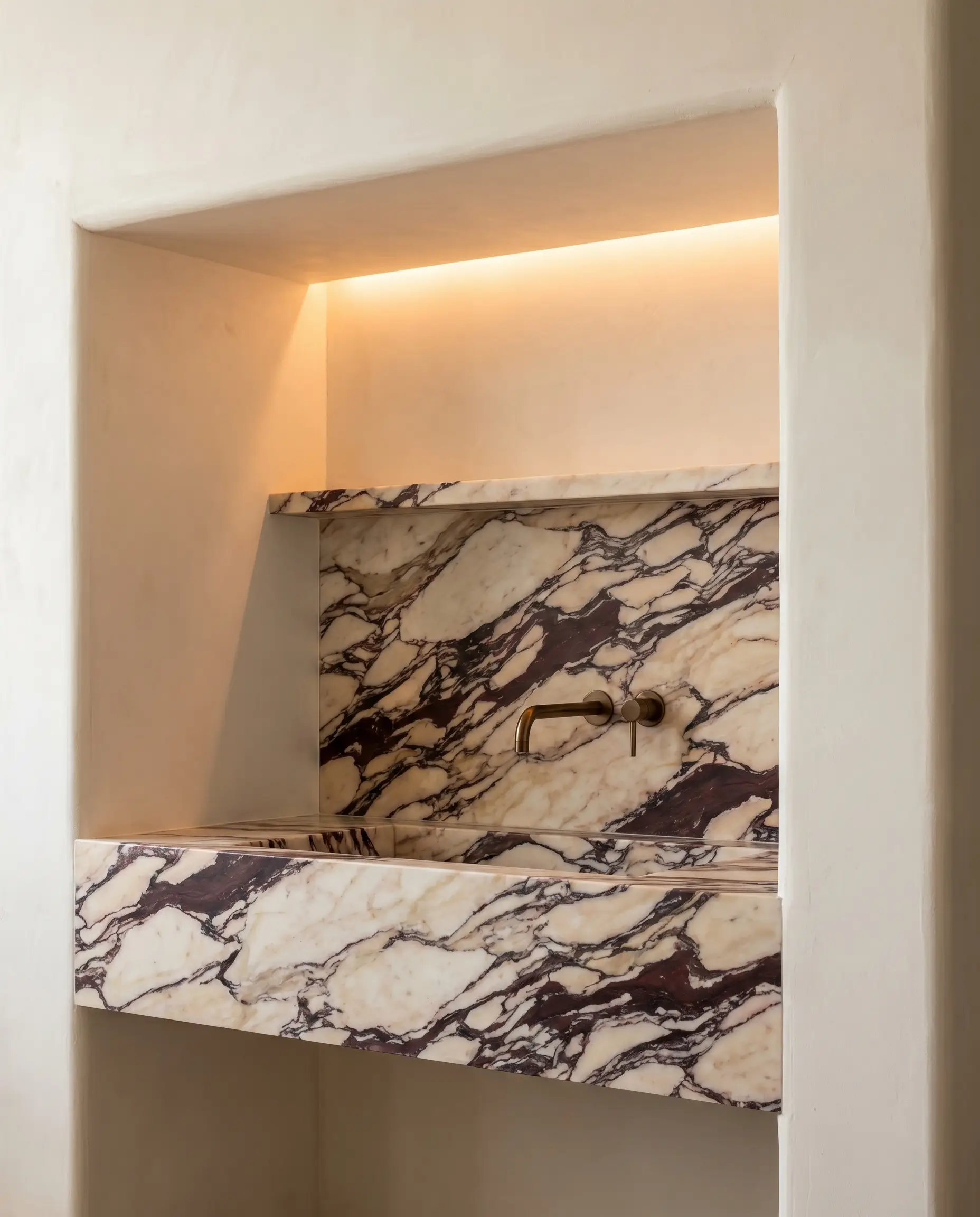
Applying this bold stone exclusively within a recessed architectural niche—such as a stove alcove or a dedicated coffee bar—is a brilliant exercise in design restraint. Framing the marble within thickened plaster walls or deep cabinetry turns the stone into a contained, precious focal point. It delivers immense visual impact while intelligently managing the pattern allowance of the wider room.
- Vibe: Intimate, bespoke detailing.
- Key Materials: Calacatta Viola slab inset, surrounding plaster or wood framing.
- Fabrication Detail: Polished or honed interior niche returns.
- Styling Pro-Tip: Install hidden, warm LED tape lighting at the top of the niche to wash the marble in a soft, dramatic glow during the evening.
3. Hardware, Metals & Textural Harmonies
Metals will either aggressively clash with or beautifully elevate the burgundy veins of this specific marble. Current design principles favor living finishes that evolve over time, grounding the stone with authentic texture. Sterile, highly polished modern metals often feel too cold and machine-made against the organic, ancient brecciation of Calacatta Viola.
13. The Ultimate Pairing: Unlacquered Brass
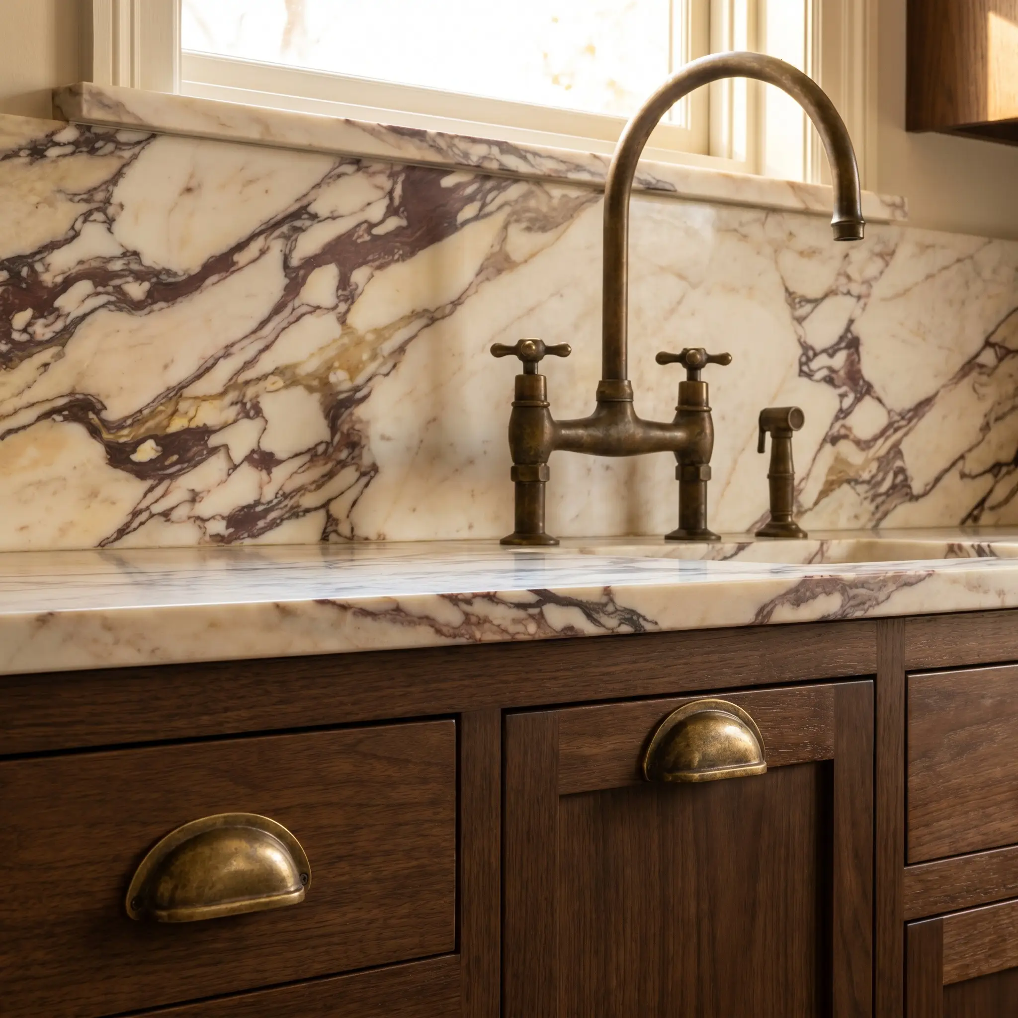
There is no pairing more deeply sympathetic to this stone than unlacquered brass, as its warm, evolving patina perfectly mirrors the golden and creamy undertones of the marble. As the brass ages, it loses its bright, factory-new shine, settling into a muted, earthy finish that feels historically grounded.
- Vibe: Timeless, living luxury.
- Key Materials: Solid, unlacquered brass hardware and fixtures.
Why Unlacquered Brass is Superior to Brushed Brass:
- Authentic Patina: Unlacquered brass organically darkens from the oils on your hands, creating a bespoke finish; brushed brass remains statically gold.
- Undertone Harmony: Living brass develops deep brown and olive undertones that complement cabernet veins, whereas brushed brass often leans unnaturally yellow.
- Tactile Depth: The raw metal offers a soft, velvety touch that pairs flawlessly with a honed marble surface.
14. Grounding the Veins with Burnished Bronze
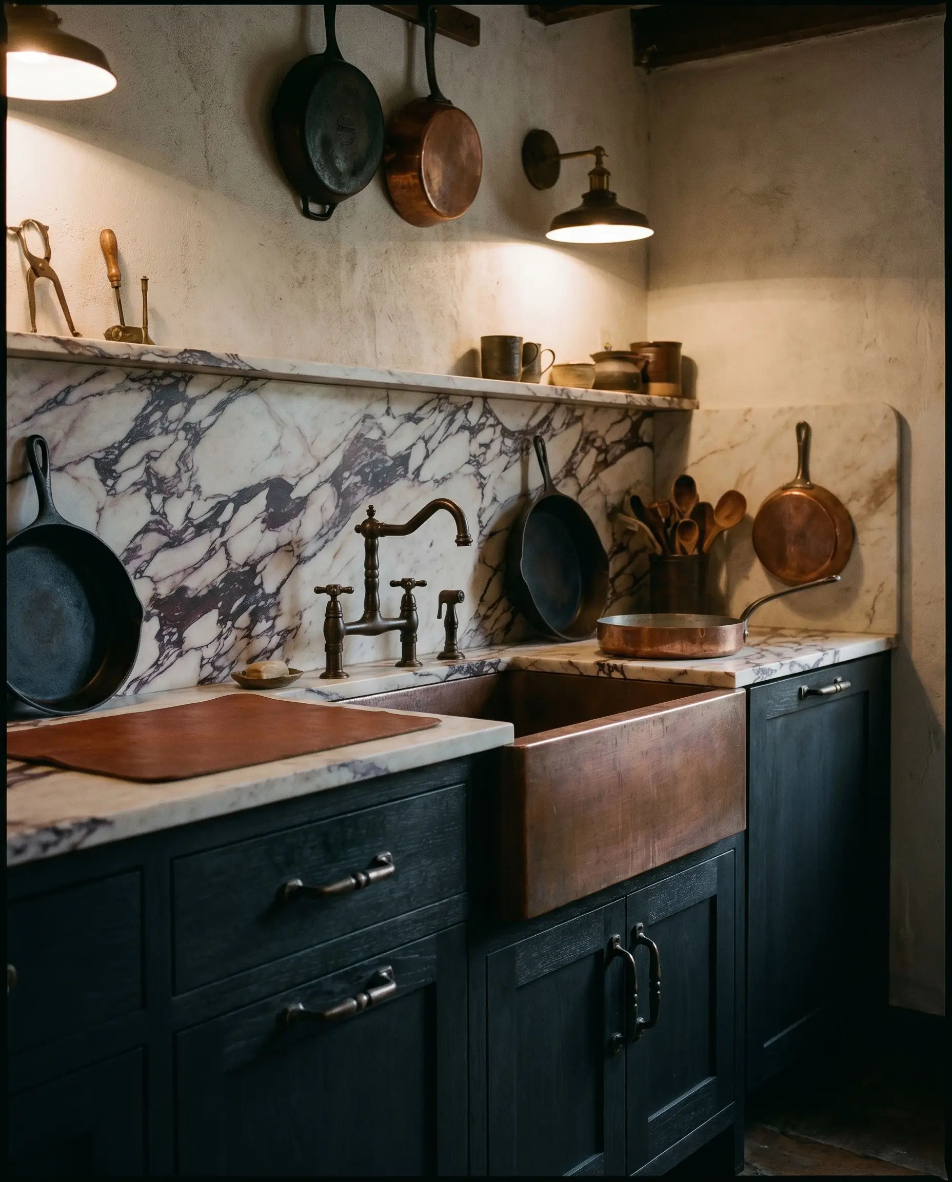
For a moodier, more masculine edge, burnished bronze offers a heavy, darkened metal option that anchors the aggressive movement of the stone. The deep, oil-rubbed tones of the bronze pull out the darkest violet and aubergine veins, creating a highly cohesive, integrated material palette. It provides necessary visual weight without the harsh, reflective glare of modern black metals.
- Vibe: Masculine, historic weight.
- Key Materials: Burnished or oil-rubbed bronze pulls and faucets.
- Color Match: Pairs exceptionally well with deeply saturated aubergine or charcoal cabinets.
- Styling Pro-Tip: Mix burnished bronze hardware with a raw copper sink for a multi-layered, heavily textured wet-zone.
15. Polished Nickel for Parisian Chic
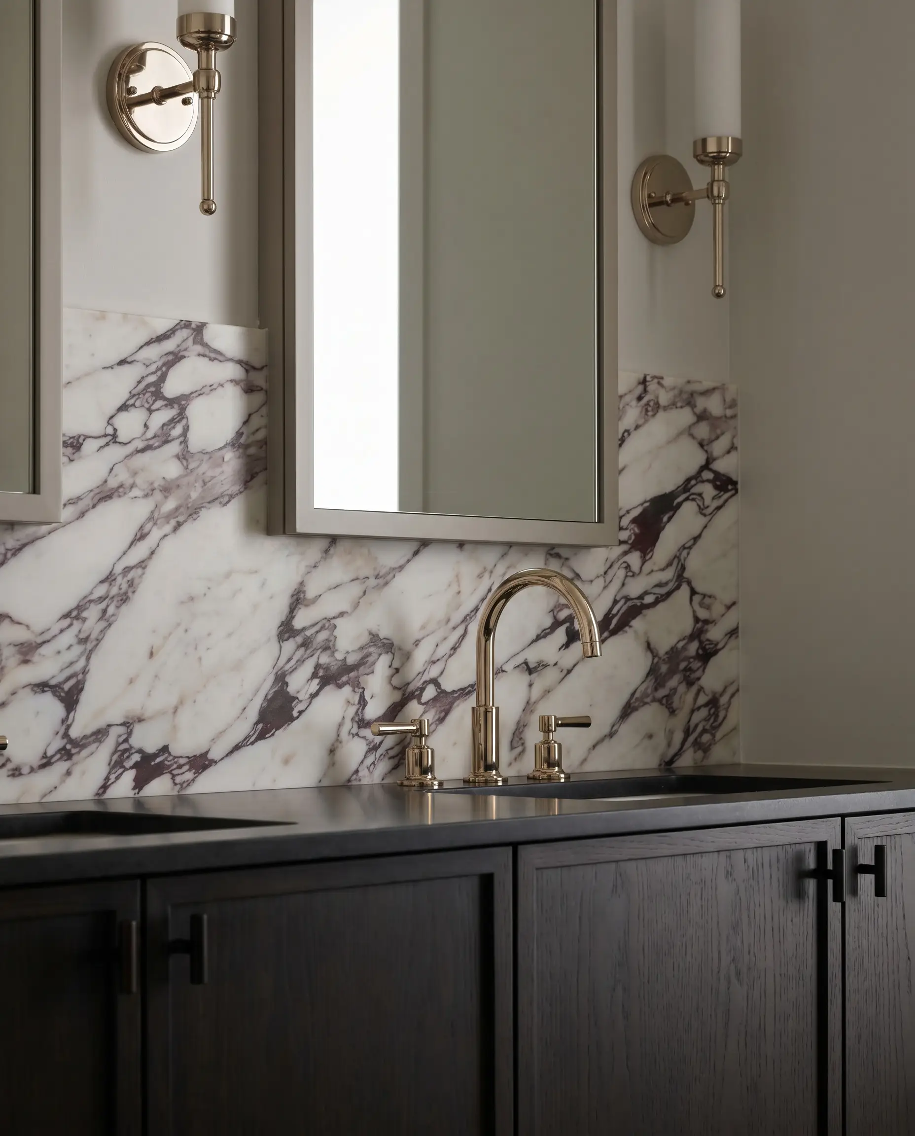
If you must introduce a silver-toned metal, polished nickel is the only acceptable choice, as chrome is far too blue and clinical for this warm stone. Polished nickel carries a distinct, warm, almost champagne-like undertone that harmonizes gracefully with the milky background of the marble. It adds a layer of glamorous, Parisian-chic reflectivity to the space.
- Vibe: Glamorous, tailored elegance.
- Key Materials: Polished nickel plumbing fixtures and lighting chassis.
- Color Match: Pairs flawlessly with ebonized walnut or deep black accents.
- Styling Pro-Tip: Allow the polished nickel to act as the sole reflective surface in the room by ensuring the marble and cabinetry remain completely matte.
16. Matte Black for High-Contrast Modernism
When executing a sharp, transitional design, matte black hardware provides a graphic, high-contrast punctuation mark against the swirling stone. The flat, light-absorbing quality of the matte black ensures the metal does not compete with the busy surface of the marble. It acts as an architectural underline, bringing strict, modern geometry to an otherwise organic material.
- Vibe: Crisp, transitional modernism.
- Key Materials: Knurled matte black pulls, black steel window frames.
- Color Match: High-contrast white or light taupe cabinetry.
- Styling Pro-Tip: Keep the hardware profiles incredibly slim and linear to avoid adding unnecessary visual bulk to the cabinetry.
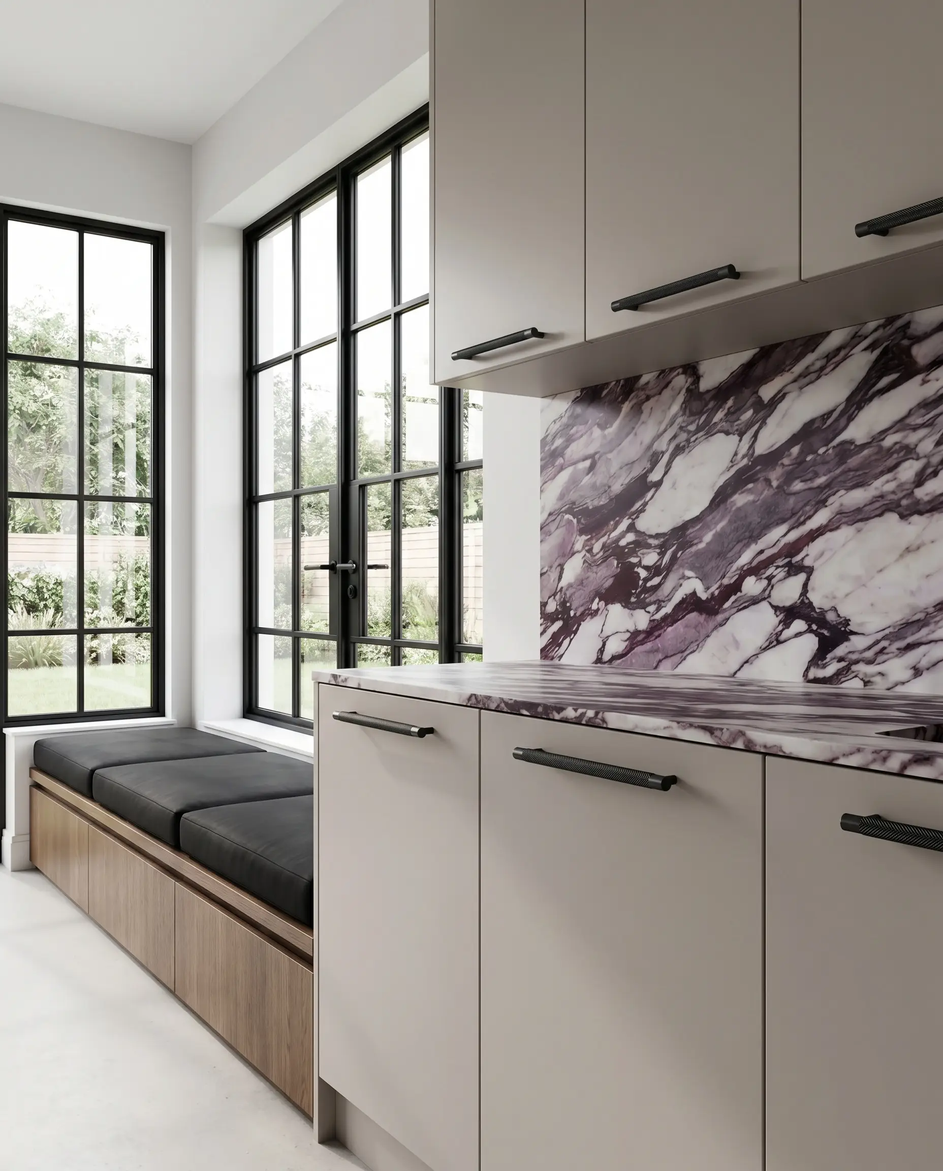
17. Soften the Visual Weight with Fluted Glass Cabinetry
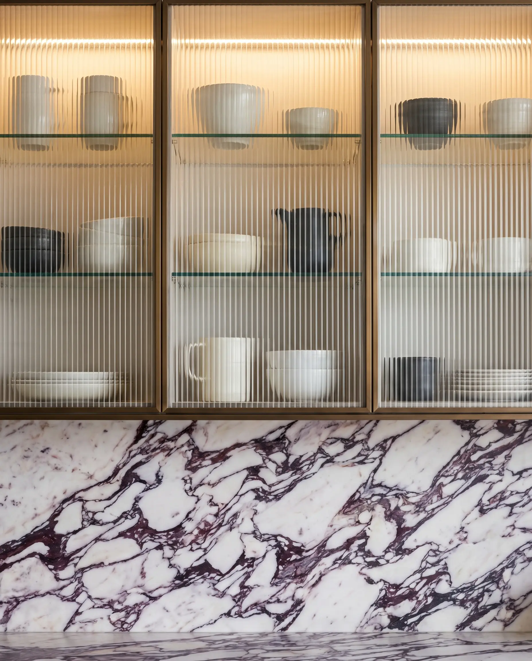
To prevent a kitchen swathed in heavy marble and solid wood from feeling oppressive, introduce upper cabinetry featuring fluted or reeded glass. The ribbed texture of the glass obscures the cabinet interiors while allowing light to pass through, effectively letting the heavy marble breathe. This textural shift adds a layer of delicate, vertical rhythm that contrasts beautifully with the chaotic veining.
- Vibe: Light, textured elegance.
- Key Materials: Fluted architectural glass, slim metal or wood frames.
- Fabrication Detail: Backlight the glass cabinets to create a soft, ambient lantern effect.
- Styling Pro-Tip: Only store monochromatic, highly curated ceramics behind fluted glass to maintain the disciplined aesthetic.
18. Tadelakt Plaster Hood Vents
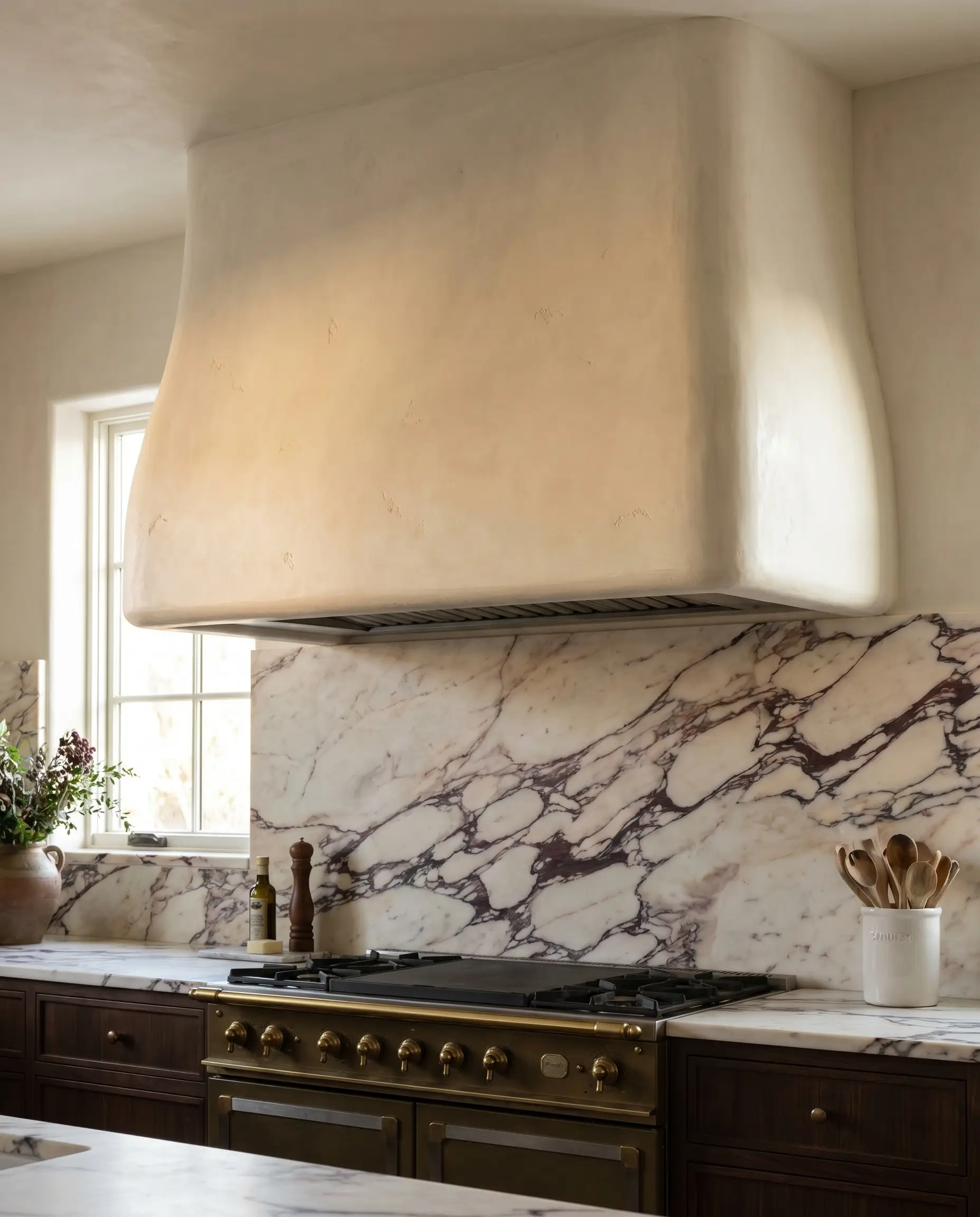
Introducing a second heavy pattern above the backsplash is a critical error; instead, utilize organic texture to transition away from the stone. Framing the range with a custom hood vent finished in authentic Moroccan Tadelakt plaster introduces a soft, velvety texture that perfectly complements the marble without fighting it. The plaster absorbs light beautifully, creating a quiet, structural canopy.
- Vibe: Artisan-crafted, organic luxury.
- Key Materials: Tadelakt or Roman clay plaster finishes.
- Color Palette: Color-match the plaster to the lightest, creamiest vein in the marble.
- Styling Pro-Tip: Curve the edges of the plaster hood slightly to soften the rigid, orthogonal lines of the kitchen architecture.
4. Lighting & Spatial Nuances
Even the most exquisite slab of Italian marble will look lifeless if subjected to poor lighting or cramped spatial planning. Calacatta Viola’s complex color profile—heavily reliant on delicate pinks and creamy whites—is highly susceptible to incorrect color temperatures. We must utilize precise spatial tricks and technical lighting mandates to maximize its impact.
19. Mandate 2700K Warm LED Lighting
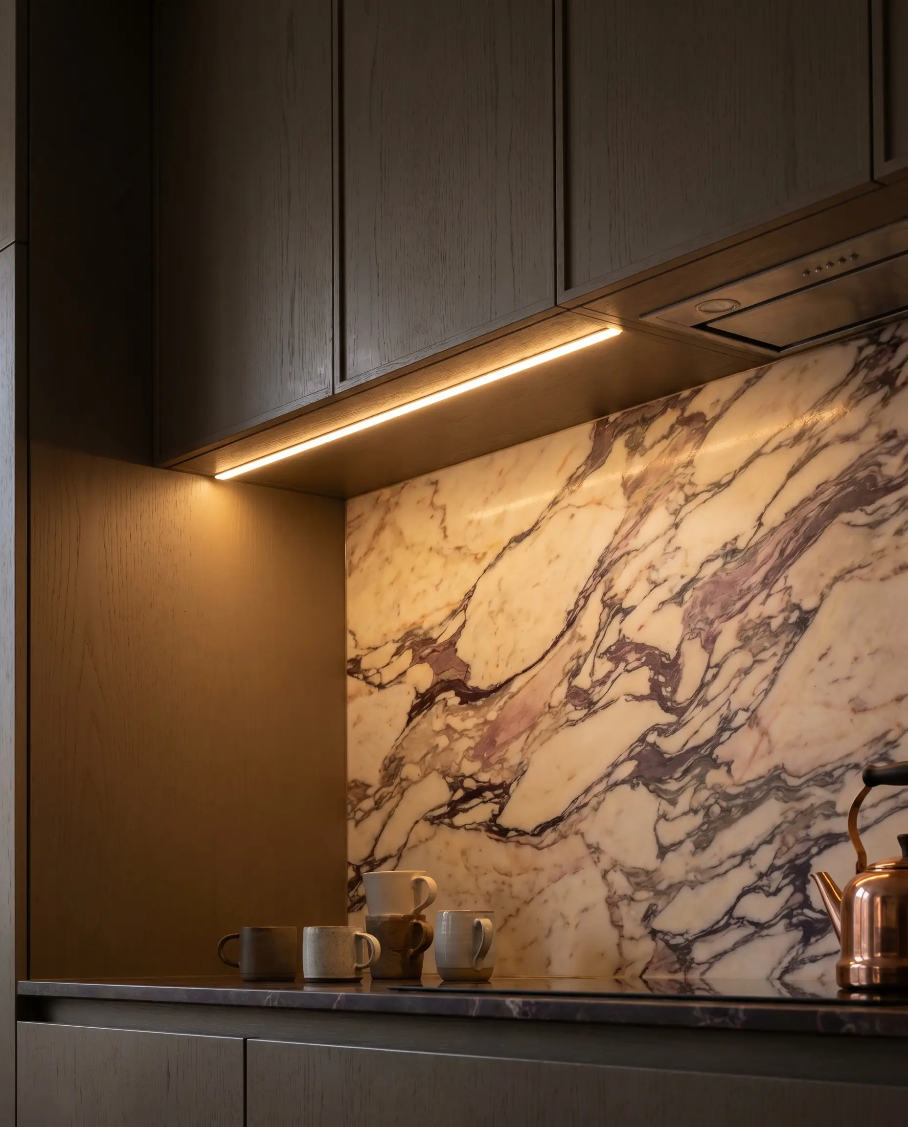
Industry standards and master tradespeople dictate that lighting temperature is non-negotiable when dealing with warm, brecciated stones. You must strictly mandate 2700K warm LED lighting across all under-cabinet and overhead fixtures. Anything cooler, such as 4000K daylight bulbs, will instantly turn the creamy background sterile, cast a blue pallor over the room, and completely wash out the delicate pink undertones.
- Vibe: Warm, inviting, and true-to-color.
- Key Materials: 2700K LED tape lighting, high CRI (90+) bulbs.
- Color Palette: Enhances muddy taupes and soft pinks perfectly.
- Styling Pro-Tip: Install under-cabinet lighting at the front edge of the upper cabinets, angling the light back toward the stone to highlight its crystalline depth.
20. Mount Alabaster Sconces Directly on the Slab
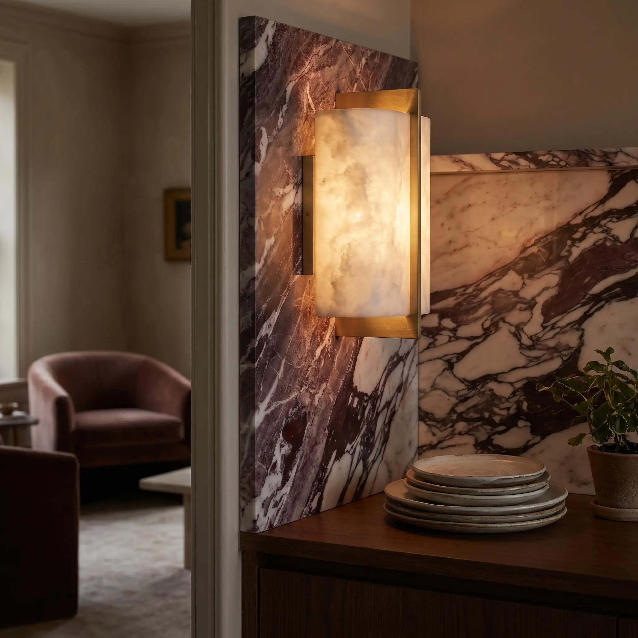
Piercing the marble slab to mount delicate, ambient wall sconces is a signature move of high-end bespoke architects. Opt for fixtures featuring natural alabaster shades, as the translucent, glowing stone of the sconce converses beautifully with the heavy, opaque marble of the wall. This introduces an intimate, secondary layer of lighting that feels highly residential and luxurious.
- Vibe: Intimate, layered luxury.
- Key Materials: Alabaster and unlacquered brass sconces (e.g., Visual Comfort & Co.).
- Fabrication Detail: Requires precise pre-drilling by the fabricator before installation.
- Styling Pro-Tip: Place the sconces symmetrically flanking a sink or range to establish a formal, architectural rhythm.
21. Eliminate Upper Cabinets for Visual Breathing Room
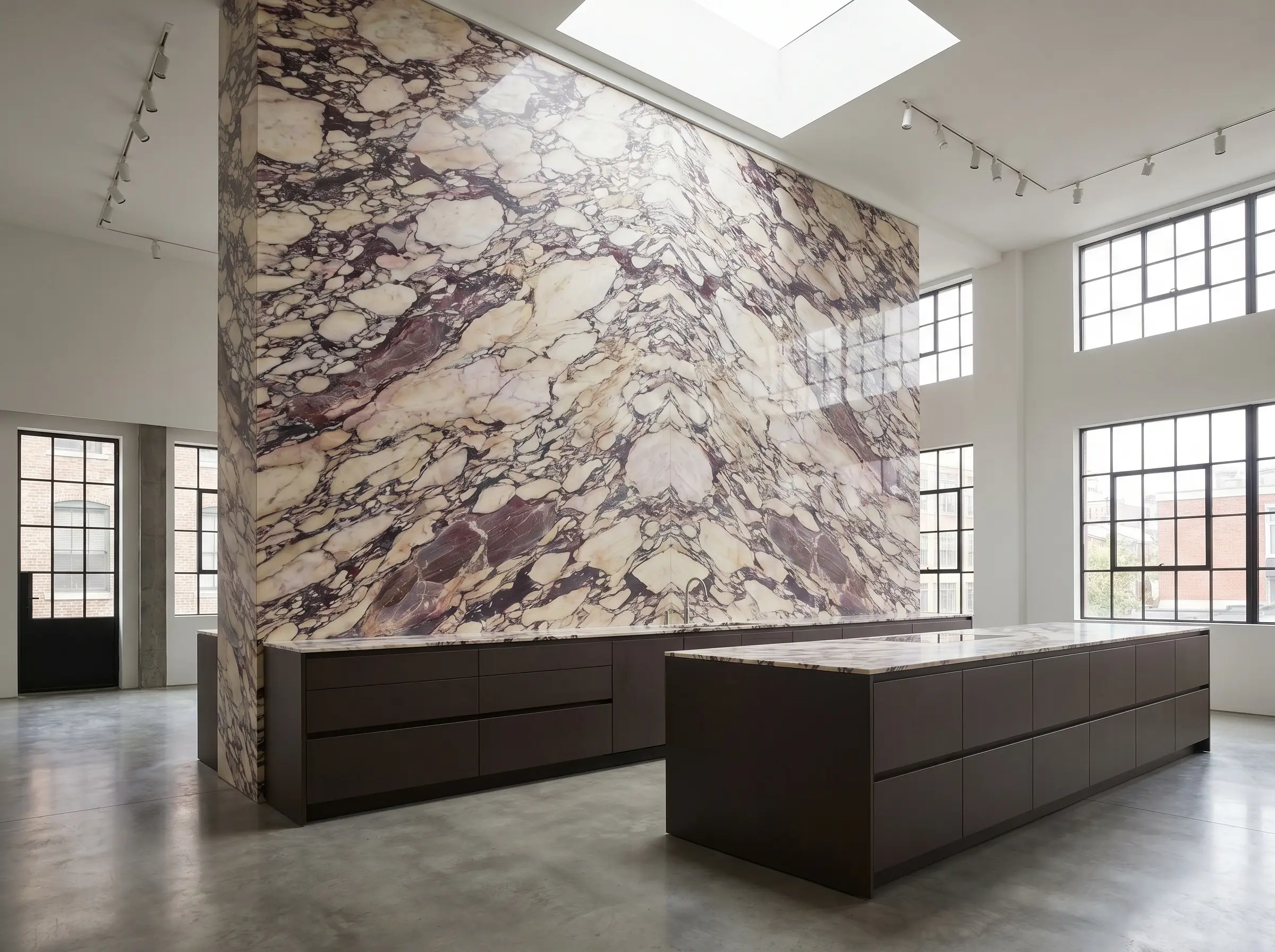
To truly honor the financial and aesthetic investment of this material, eliminate upper cabinetry entirely on the primary focal wall, allowing the slab to run uninterrupted to the ceiling. This creates immense visual breathing room, transforming the stone from a mere protective backsplash into a monumental piece of architectural art. It fundamentally shifts the room’s proportions, making the ceilings feel significantly higher.
- Vibe: Expansive, gallery-like architecture.
- Key Materials: Floor-to-ceiling Calacatta Viola slabs.
- Fabrication Detail: Expert seaming required for walls taller than the slab height.
- Styling Pro-Tip: Compensate for the lost storage by designing a highly efficient, deep-drawer system in your base cabinetry or a dedicated walk-in pantry.
22. Pair with a Classic Checkerboard Floor
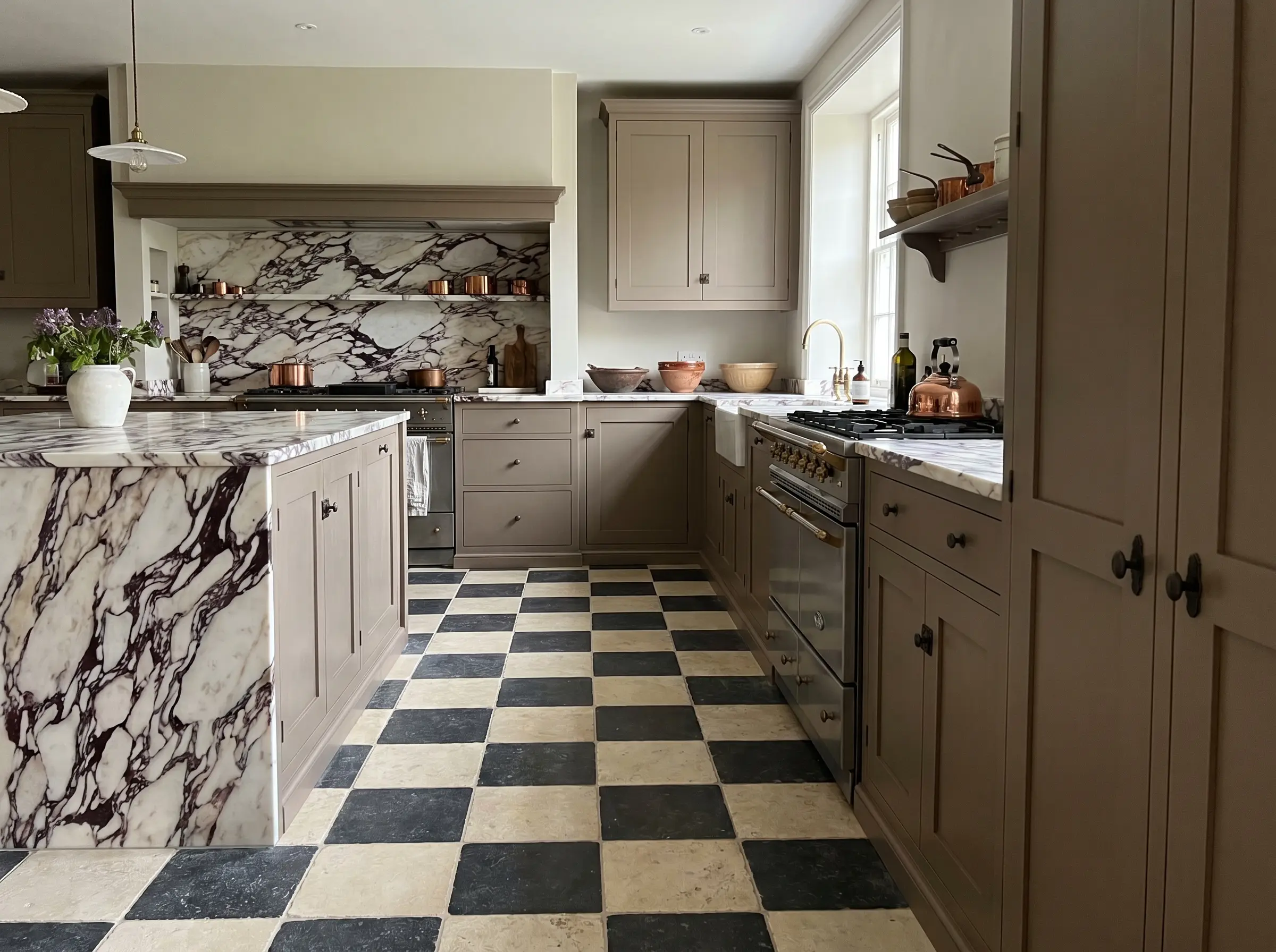
For a brilliant nod to European heritage design, pairing this highly active stone with a classic, two-tone checkerboard floor creates a masterful tension between organic movement and strict geometry. The rigid, mathematical grid of the floor grounds the wild, brecciated veining of the walls, resulting in a space that feels both historic and fiercely curated.
Vibe: European heritage, timeless tension.
Key Materials: Tumbled limestone and Belgian bluestone floor tiles.
Specific Paint/Colors: Neutral, tonal checkers (avoid stark black and white).
If you execute a checkerboard floor beneath a Calacatta Viola backsplash, absolutely every other element in the room—cabinetry, counters, and ceilings—must be completely solid, matte, and utterly neutral. Introducing a third pattern will instantly collapse the design into visual chaos.
Pattern Allowance Warning
23. Heavy Marble Corbels
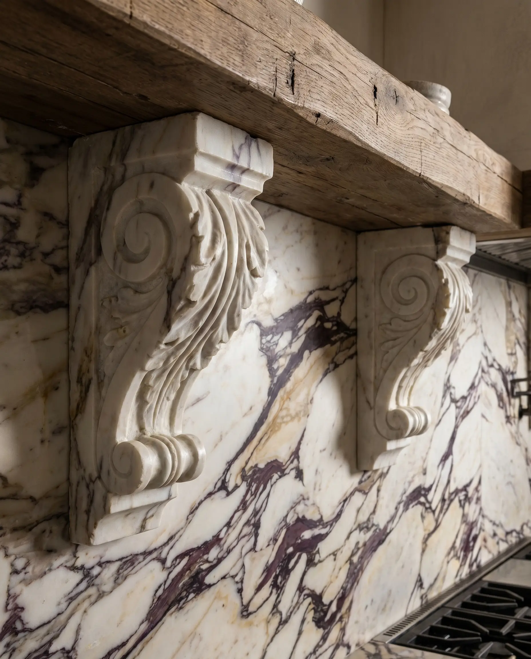
Integrating structural, heavy marble corbels beneath open shelving or a floating ledge elevates the stone from a simple surface veneer to a perceived structural element. Carving these thick, supportive brackets from the same slab adds incredible depth, shadow, and architectural permanence to the kitchen. It is a detail that whispers of old-world craftsmanship and uncompromising quality.
- Vibe: Substantial, bespoke craftsmanship.
- Key Materials: 2-inch or 3-inch thick carved marble corbels.
- Fabrication Detail: Requires custom templating and heavy-duty internal steel supports.
- Styling Pro-Tip: Rest a solid white oak shelf across the marble corbels to introduce a warm, contrasting material plane.
24. Backlit Onyx-Style Applications
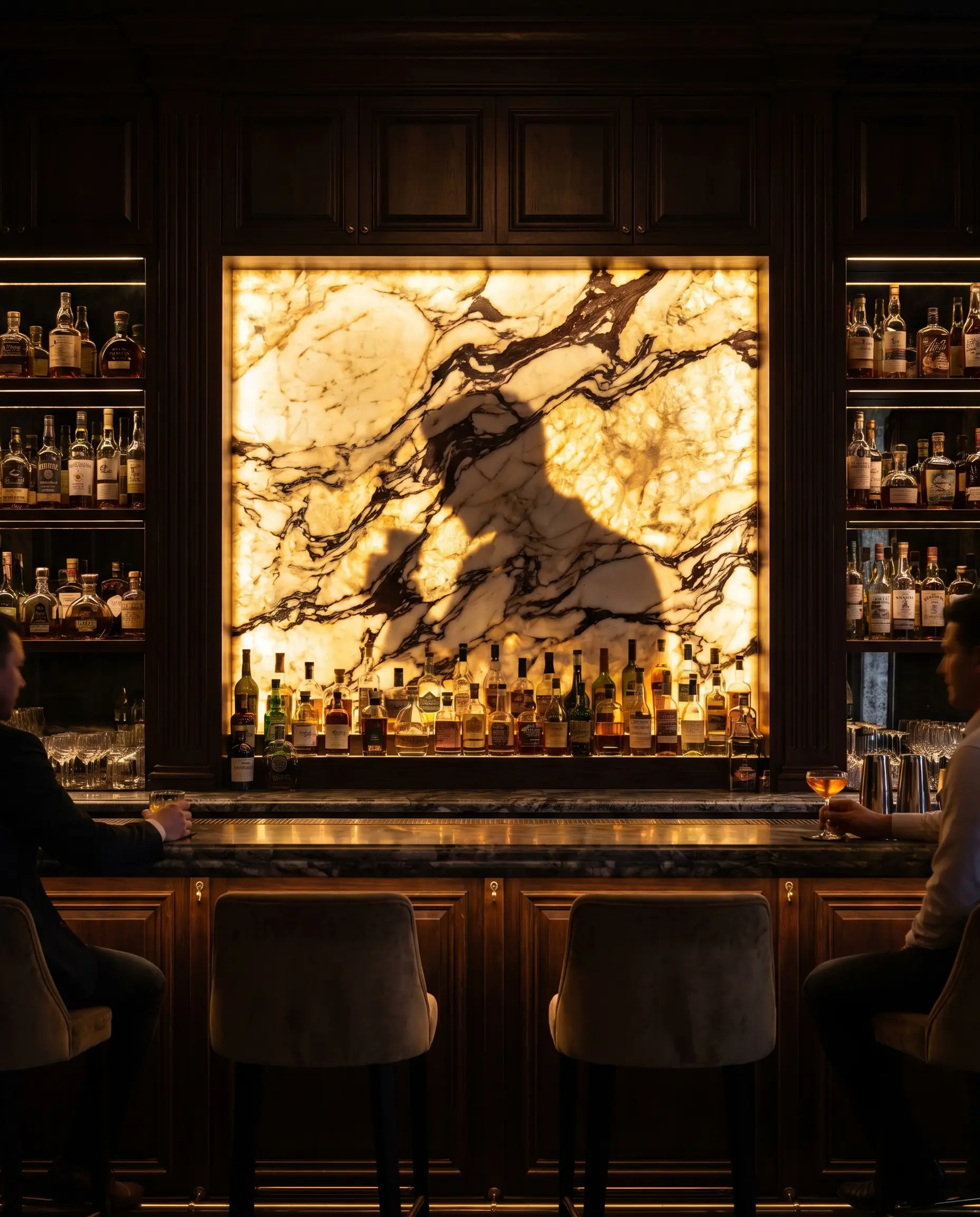
While Calacatta Viola is denser than onyx, certain slabs possess enough crystalline quartz deposits to allow for breathtaking backlit applications. Utilizing specialized LED light panels behind a thinned slab in a dedicated bar or evening-use zone creates an ultra-luxury, glowing focal point. The light penetrates the creamy base while the dark, cabernet veins remain silhouetted, resulting in an unparalleled dramatic effect.
- Vibe: Ultra-luxury, dramatic nightlife.
- Key Materials: Thinned marble slabs, custom LED backlighting panels.
- Fabrication Detail: Requires an expert stone artisan and advanced electrical integration.
- Styling Pro-Tip: Reserve this dramatic application for a moody, enclosed butler’s pantry or a dedicated cocktail bar rather than the primary, sunlit kitchen.
5. Maintenance & Fabrication Realities
Never let the fear of etching stop you from installing natural stone. The microscopic wear and tear of daily life is what gives a home its soul; embrace the patina as proof of a life well-lived.
Hackrea Styling Tip
To specify Calacatta Viola is to accept the realities of living with a porous, calcareous natural stone. It requires a dedicated commitment to maintenance, and buyers must understand that it will etch when exposed to lemon, wine, or acidic tomatoes. We strongly advise opting for a honed finish rather than a polished one, as the matte surface is significantly more forgiving at hiding inevitable watermarks and etches.
| Feature / Reality | The High-End Expectation | The Practical Mitigation |
|---|---|---|
| Porosity & Staining | Marble is highly porous and will absorb dark liquids (wine, coffee) if left unattended. | Mandate a premium, penetrating sealer applied by your fabricator, and reseal annually. |
| Acid Etching | Acidic foods will chemically burn the calcium carbonate, leaving dull spots. | Specify a honed finish; it diffuses light, making etches nearly invisible compared to polished stone. |
| Heat Resistance | Excellent heat resistance; will not melt or scorch behind a professional range. | Safe for full-height backsplash applications directly behind heavy-duty, high-BTU gas burners. |
| Vein Fissures | Highly brecciated stones have natural fissures that can feel slightly textured. | A master fabricator will use high-quality epoxy resins to stabilize the slab before installation. |
6. Elevating the Everyday: Final Design Verdict
Choosing Calacatta Viola is an investment in art, not just a building material. It requires a discerning eye and a deep commitment to material restraint. When you allow the wild, cabernet veining to take center stage, supported by muddy taupes, unlacquered brass, and masterful fabrication, you elevate the everyday act of cooking into a truly bespoke, sensory experience.
The ultimate secret to success with this stone is remembering that less is always more when casting your supporting actors. Will you anchor your slab with the formal elegance of ebonized walnut, or will you lean into moody maximalism with a deep, aubergine palette? The choice dictates the soul of your kitchen.
The Hackrea Style Desk treats interior decoration as an exact visual science. Rather than focusing on demolition or floor plans, this desk masters the art of color theory, undertone matching, material pairings, and spatial proportion. From balancing the visual weight of mixed metals to finding the perfect bridging tone between disparate wood species, this desk provides the rigorous aesthetic rules needed to achieve high-end, editorial-quality harmony in any space.