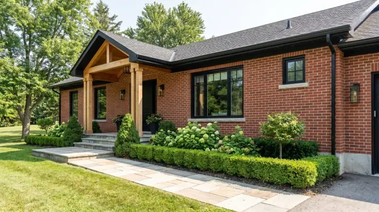
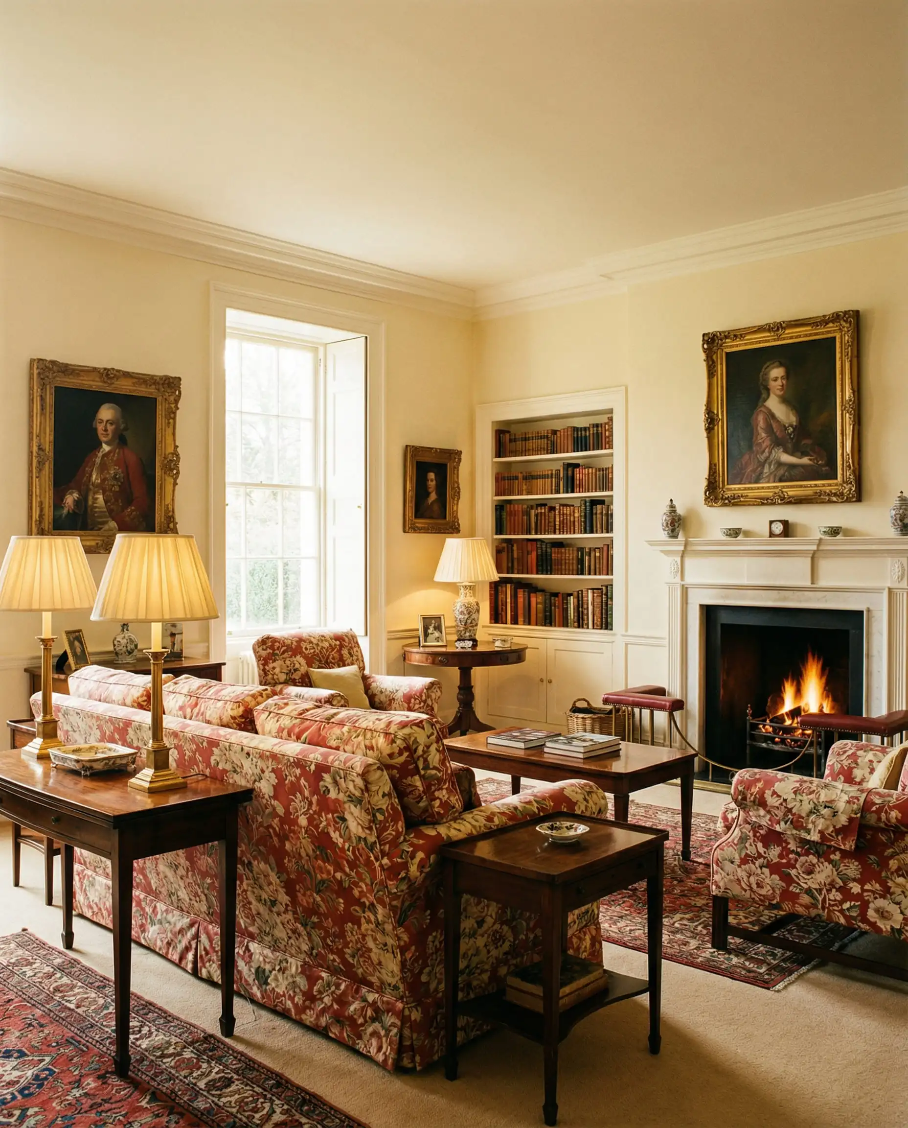
If there is one thing the interior design world agrees on for 2026, it is that the era of the “sterile showroom” is officially over. We are no longer painting our homes to look like untouched museums; we are painting them to be lived in.
While Sherwin-Williams has thousands of colors in their fan deck, staring at that wall of paint chips can feel paralyzed. Does “Alabaster” really look different from “Pure White”? (Spoiler: It does). Is gray actually “out,” or has it just evolved?
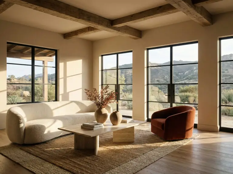
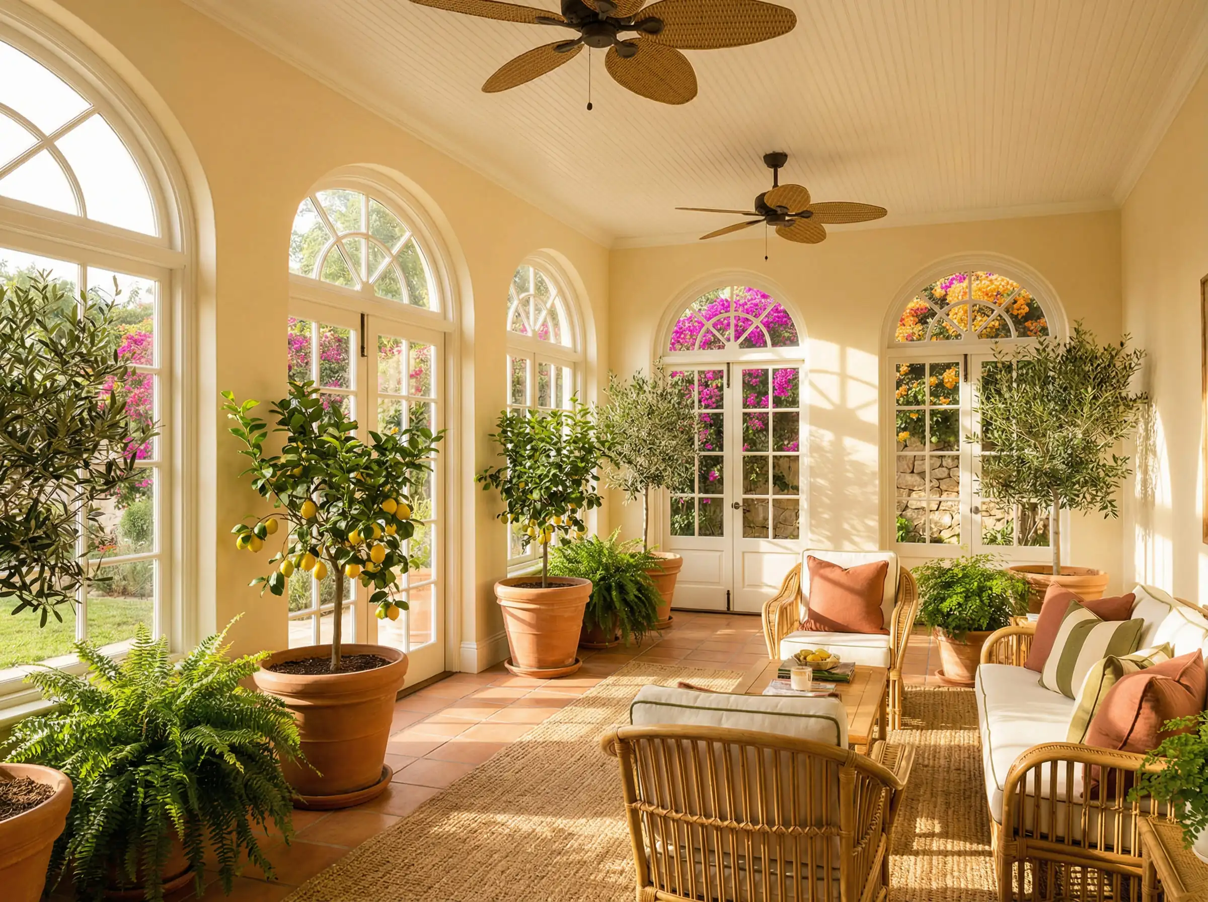
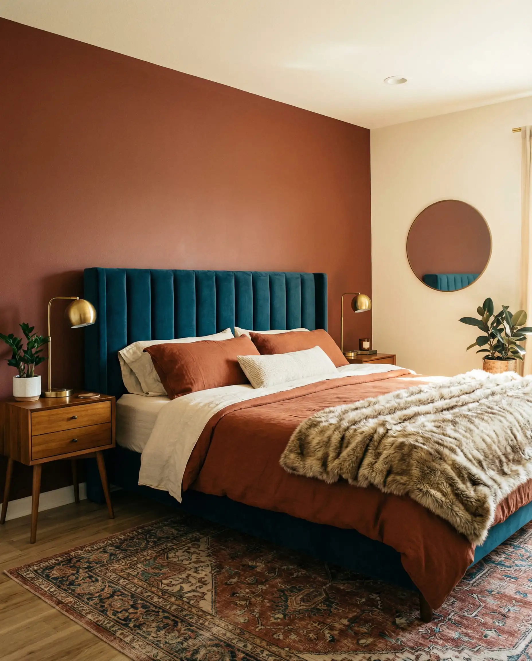
For 2026, the forecast is all about “Essentialism”—a return to colors that feel sturdy, nostalgic, and undeniably comforting. We are seeing a massive shift away from the cool, stark grays of the last decade toward sunbaked beiges, restorative darks, and “frosted” digital-inspired pastels.
Whether you are refreshing a single powder room or repainting a whole exterior, we have analyzed the 2026 Colormix Forecast, consulted with top designers, and dug into the data to bring you the 30 best Sherwin-Williams paint colors you need to know right now.
⚡ Quick Summary: The Top 5 Sherwin-Williams Colors for 2026
In a hurry? Here are the essential paint colors dominating the 2026 forecast:
You can apply wallpapers, paints, etc. on walls and see how they look in various interiors.

The 2026 Headliner: Color of the Year
Every year, there is one shade that defines the mood of the moment. For 2026, Sherwin-Williams has selected a color that bridges the gap between the cool modernism of the past and the warm nostalgia of the future.
1. Universal Khaki (SW 6150)
The Vibe: Sturdy, dependable, and effortlessly chic.
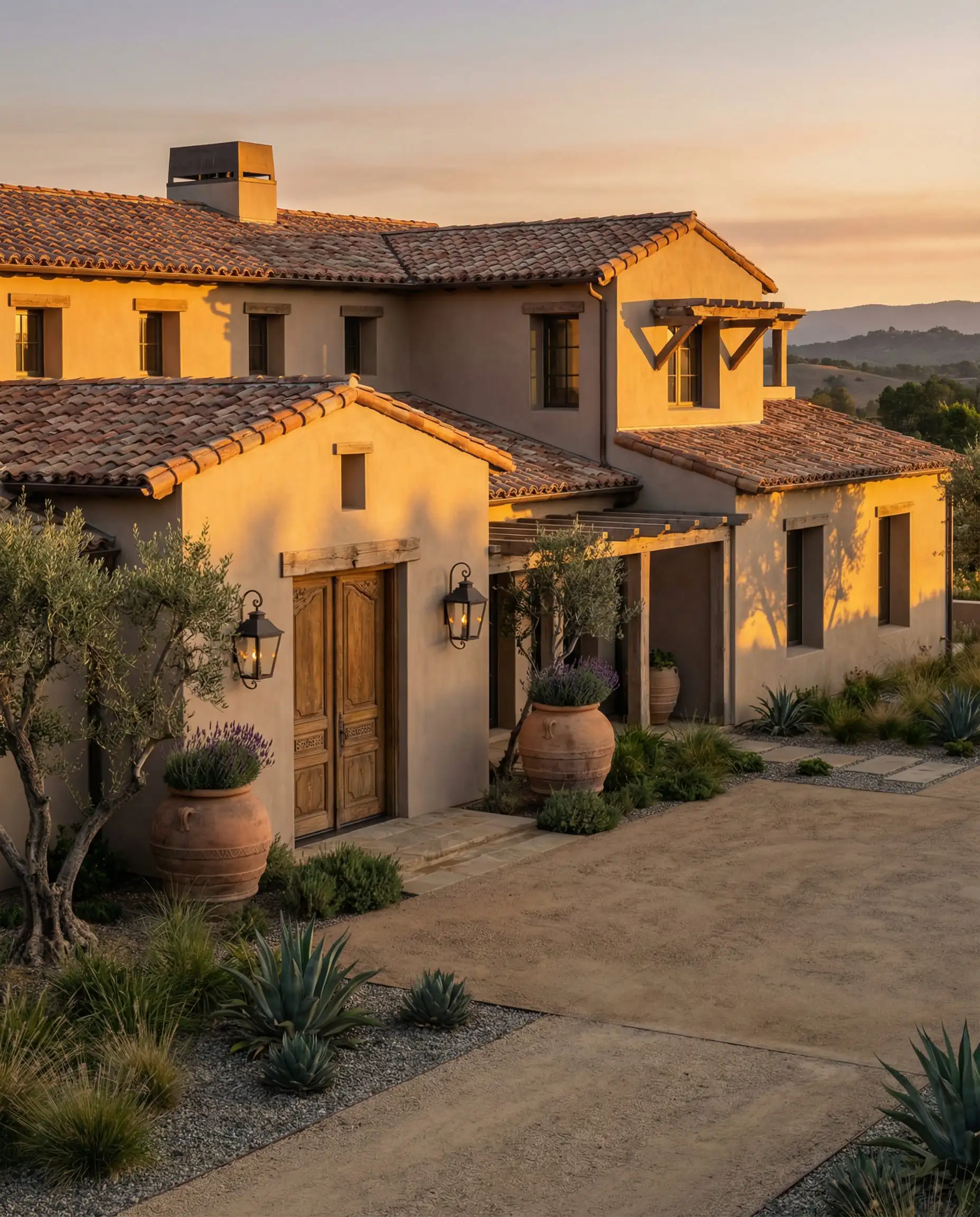
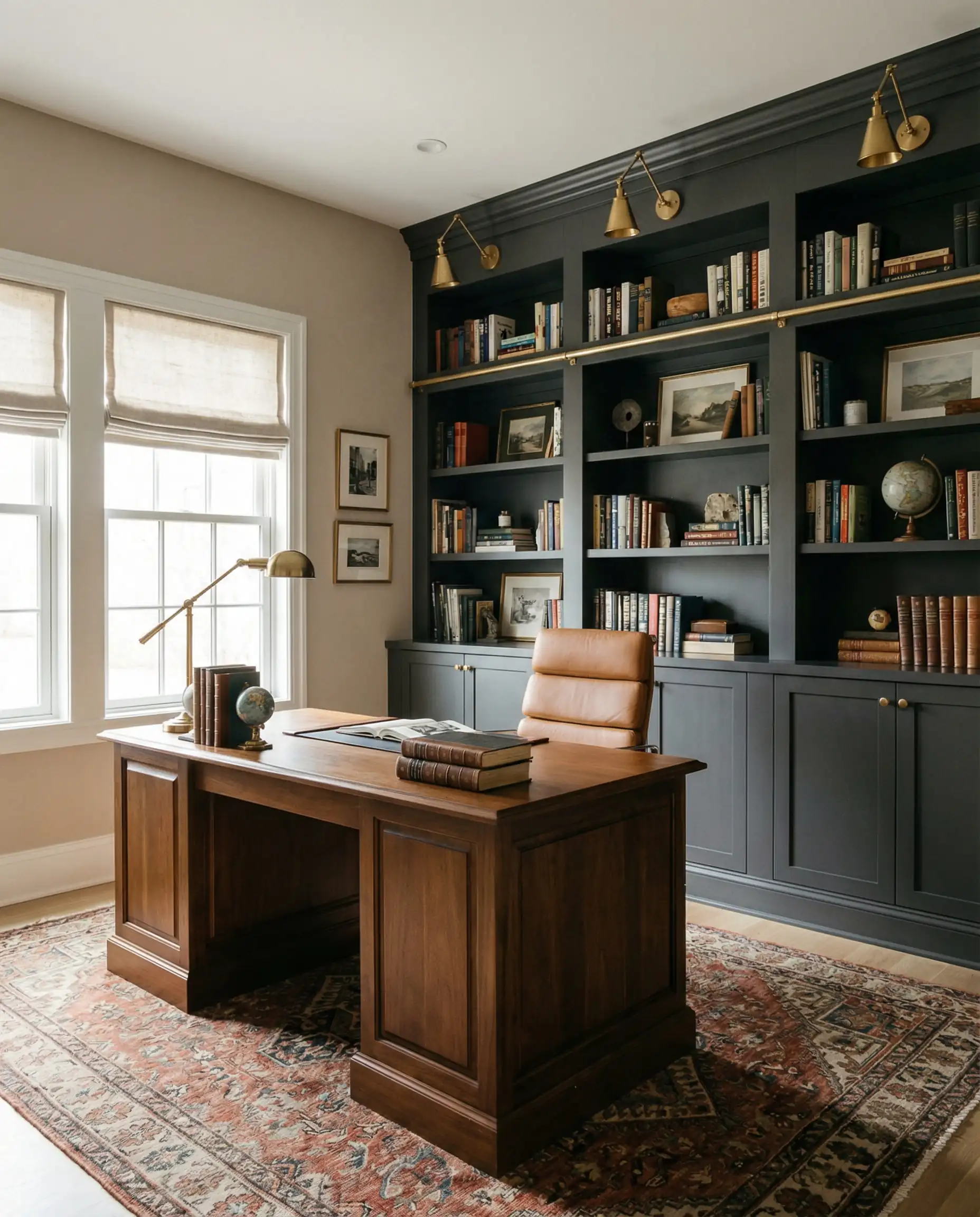
Universal Khaki is the antidote to the “Greige” era. It isn’t trying to be gray. It is unabashedly a warm, yellow-based neutral that feels like a favorite pair of vintage trousers or the stone walls of a Mediterranean villa. It represents a grounding force in our homes.
It sits right in the “Goldilocks” zone of depth. It’s light enough to act as a primary wall color in a living room but saturated enough to make cabinetry or wainscoting feel architectural and expensive.
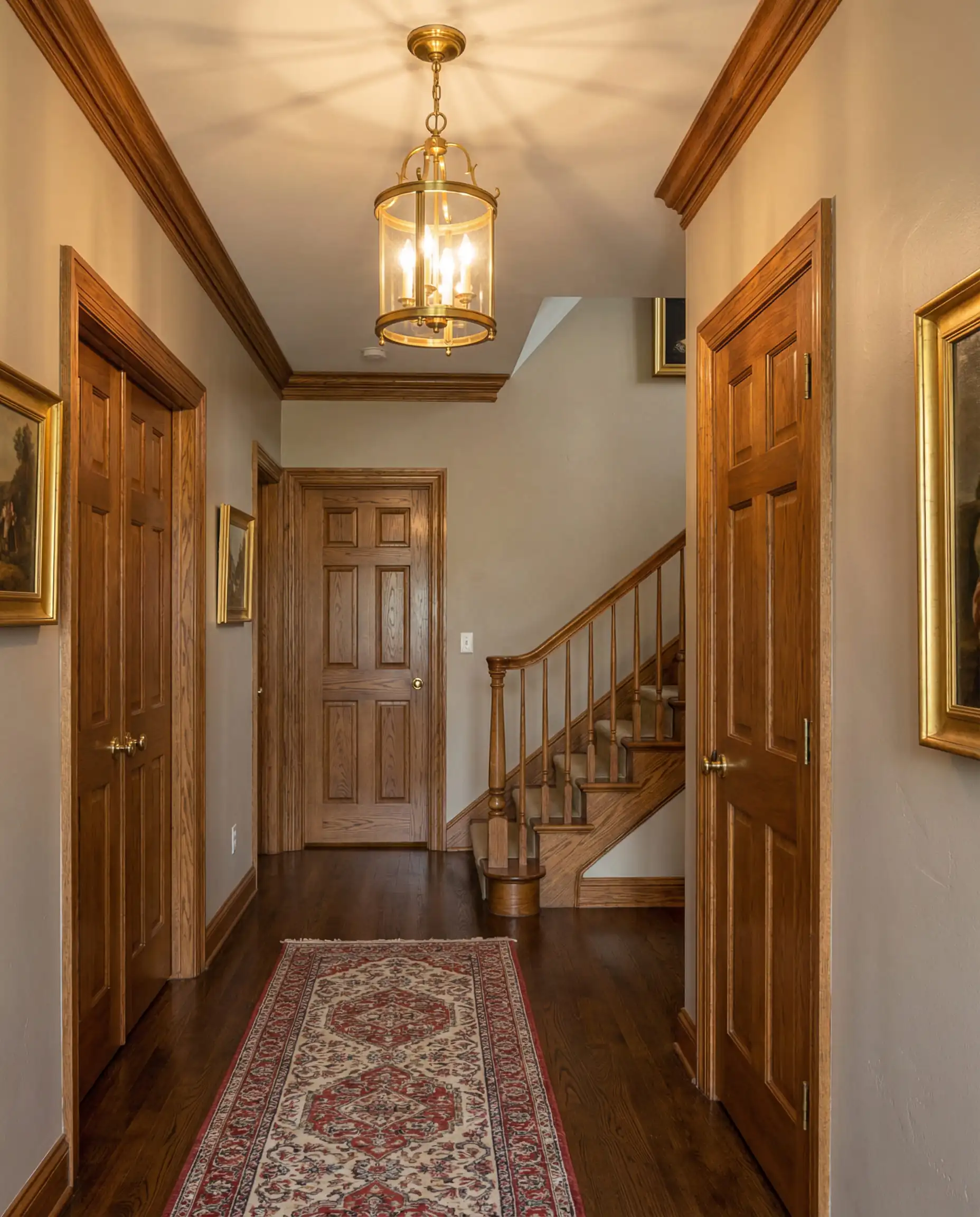
Universal Khaki is a chameleon. In south-facing light, it glows with a golden warmth. In north-facing rooms, it can read slightly flatter. Always test this color against your flooring. It looks stunning with walnut wood tones but can clash with certain yellow-oak floors.
💡 Designer Tip
The 2026 Colormix Forecast: The 4 Key Trends
Before we dive into the full list, you need to understand the “vibe check” for 2026. Sherwin-Williams has categorized this year’s movements into four distinct stories. Knowing which “story” your home fits into will help you choose your palette.
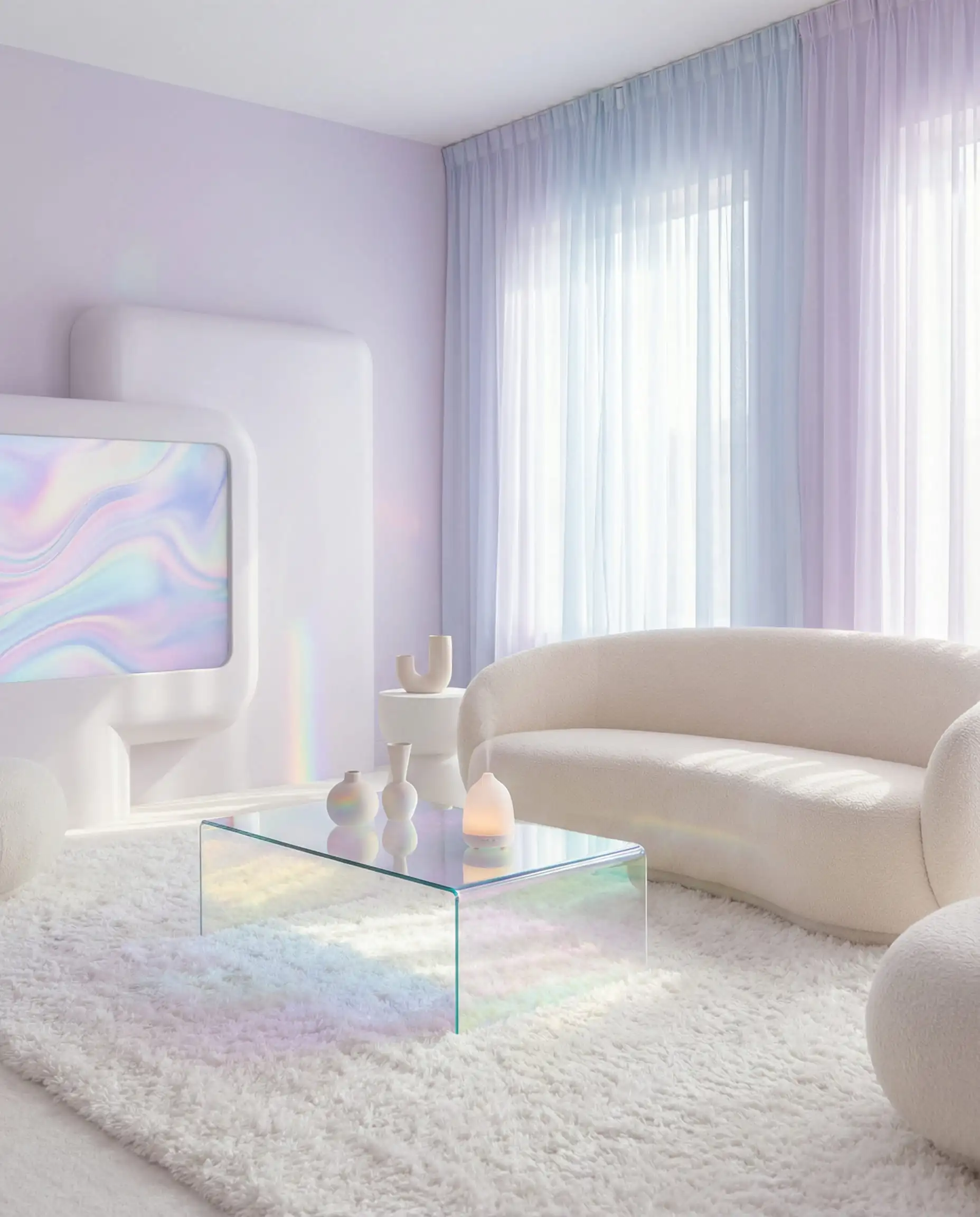
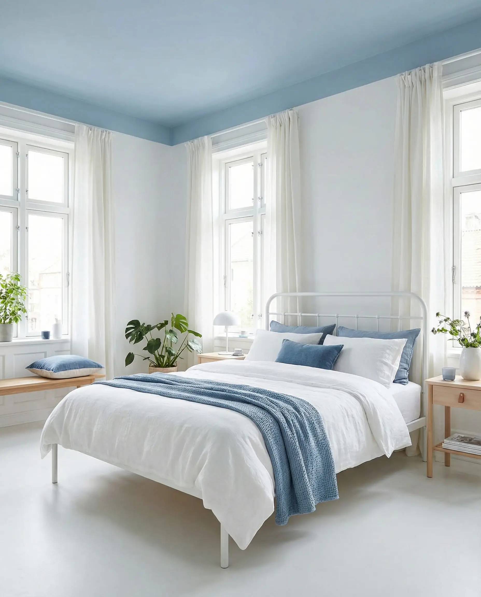
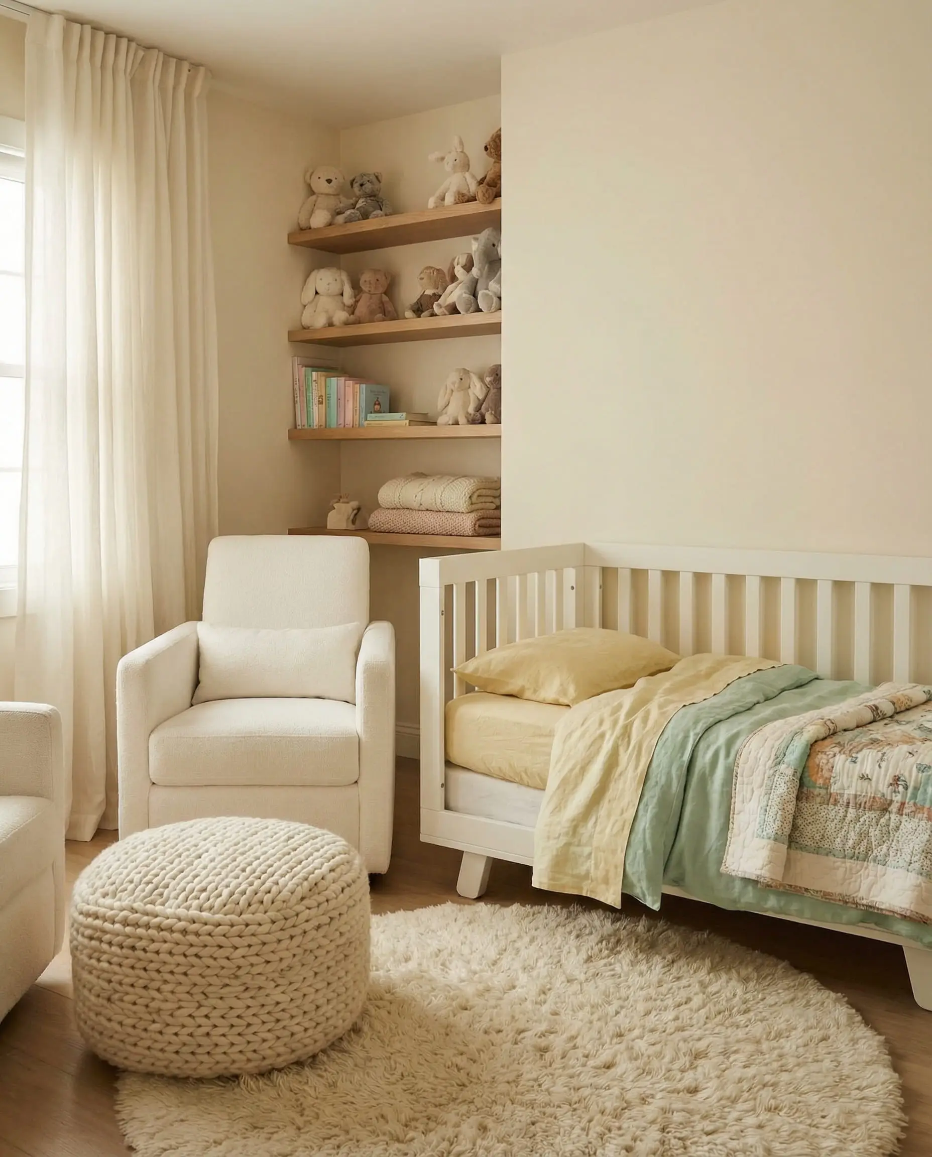
- Frosted Tints (The New Pastels): These aren’t nursery colors. Think “digital airiness.” Pale lilacs, icy greens, and airy blues that mimic the calming glow of technology and wellness.
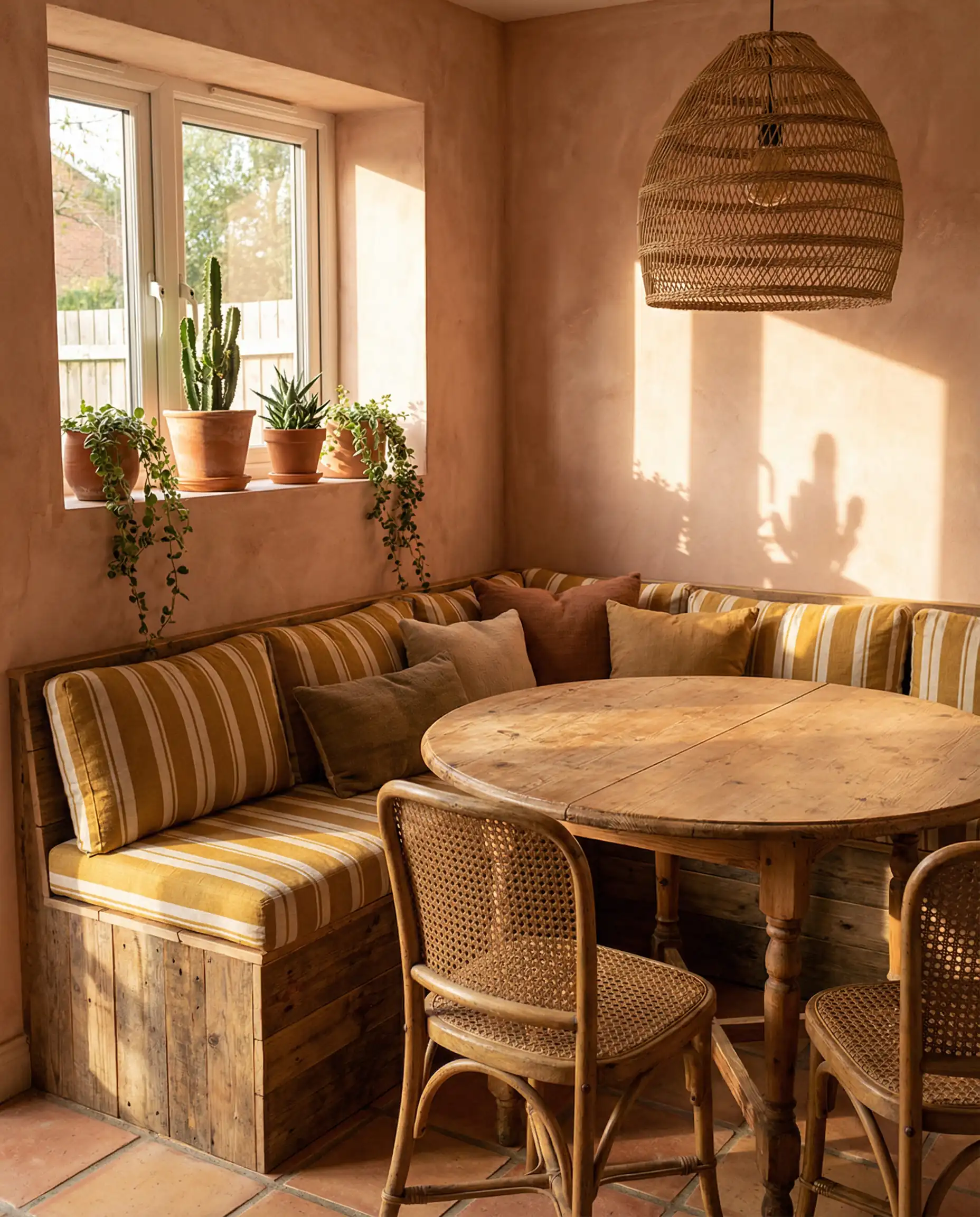
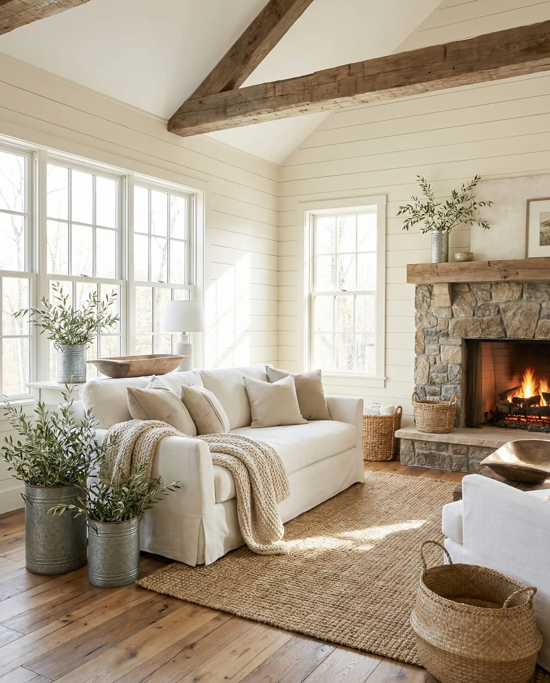
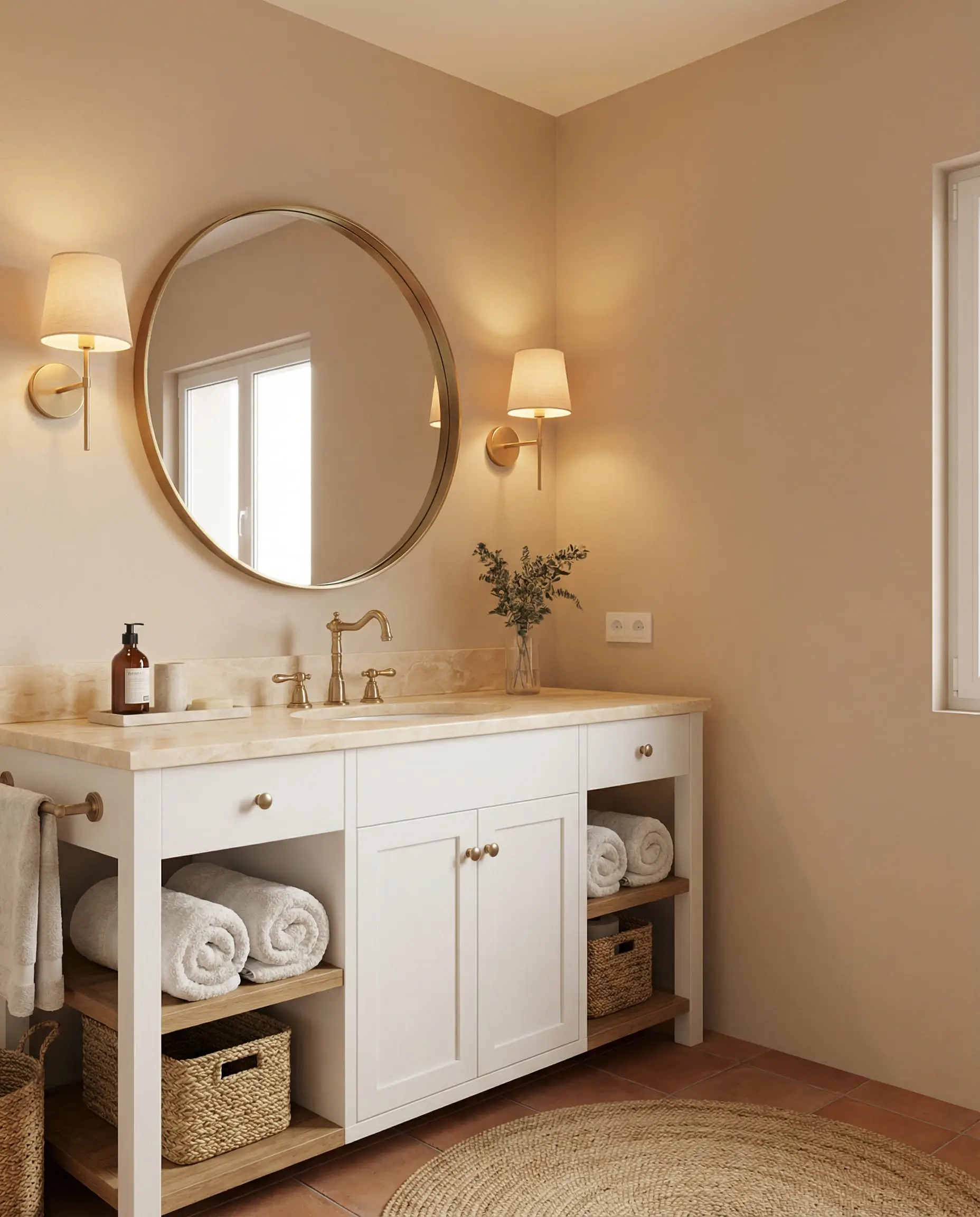
- Sunbaked Hues (Desert Nostalgia): As we crave comfort, we look to the earth. Terracotta, buttermilk yellow, and warm clay tones are huge this year.
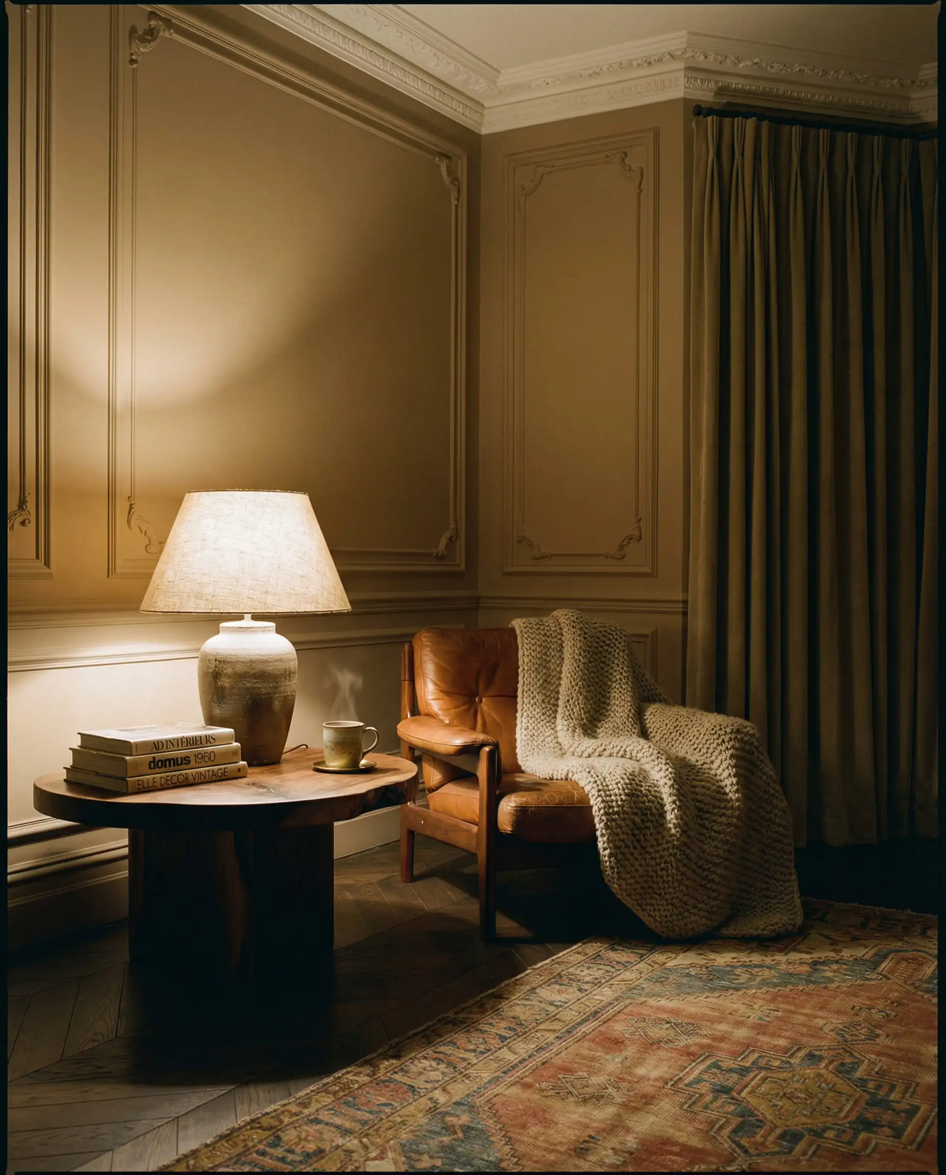
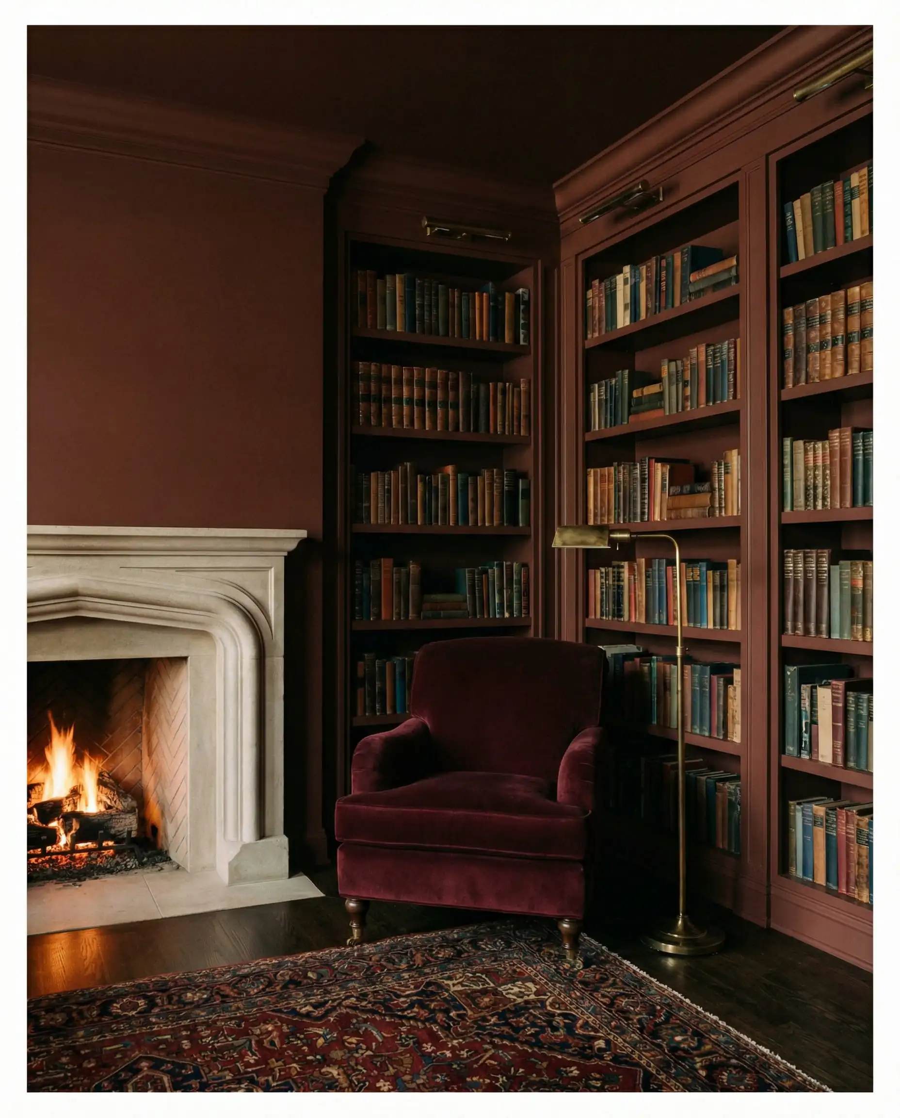
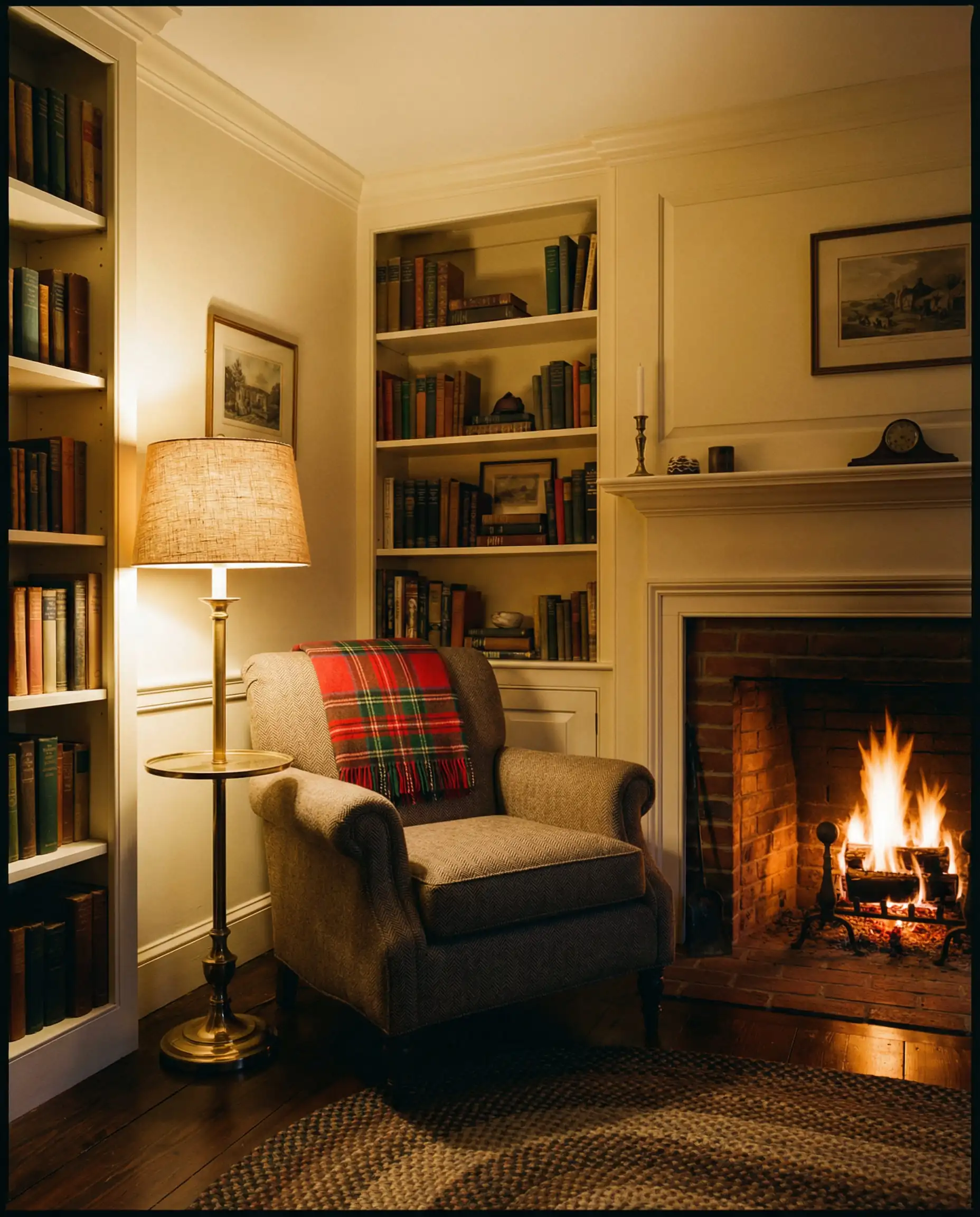
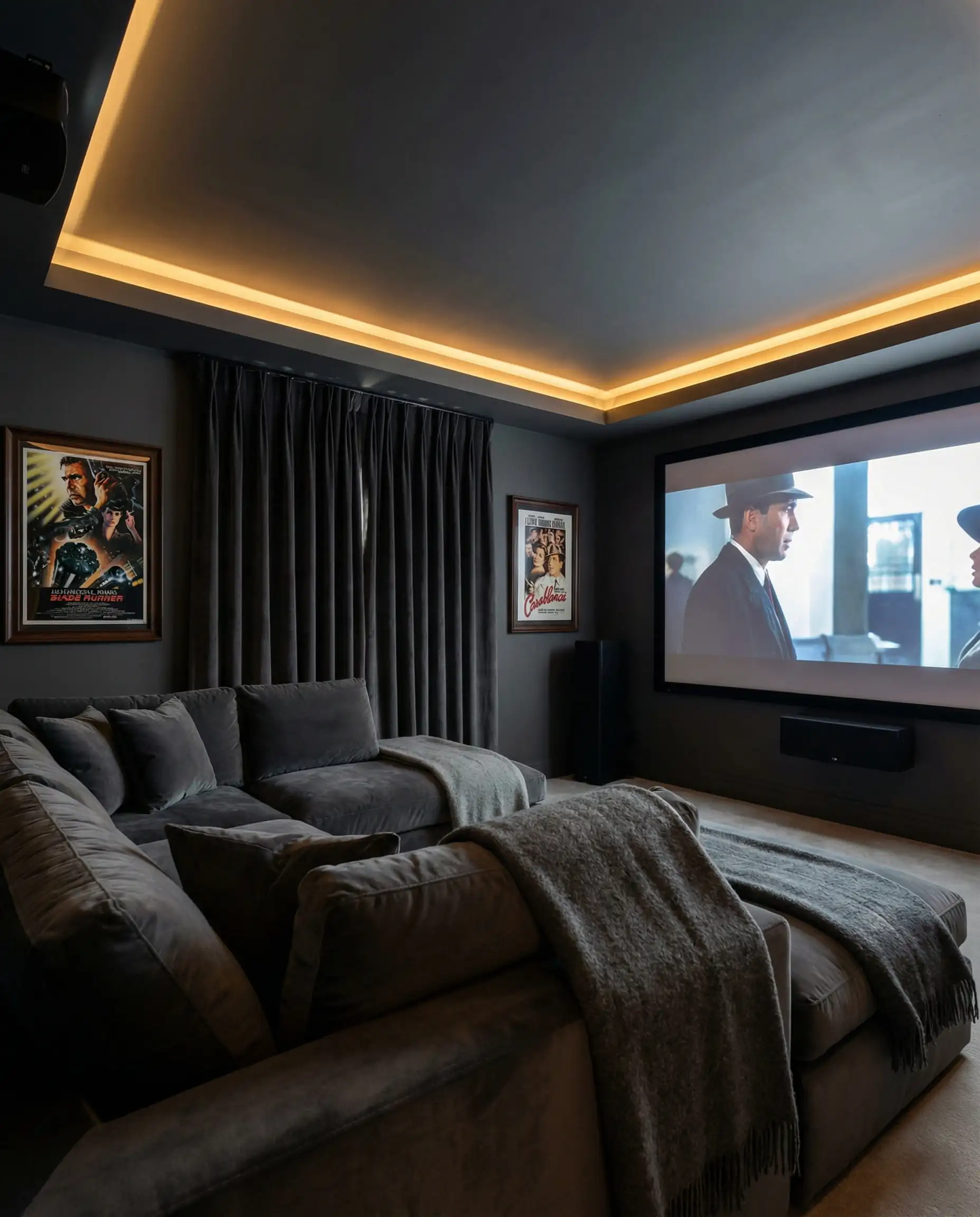
- Restorative Darks (The Sanctuary): Deep, moody colors are being used to create “cocoon” rooms—spaces to disconnect. Think deep auburns, forest greens, and chocolate browns.
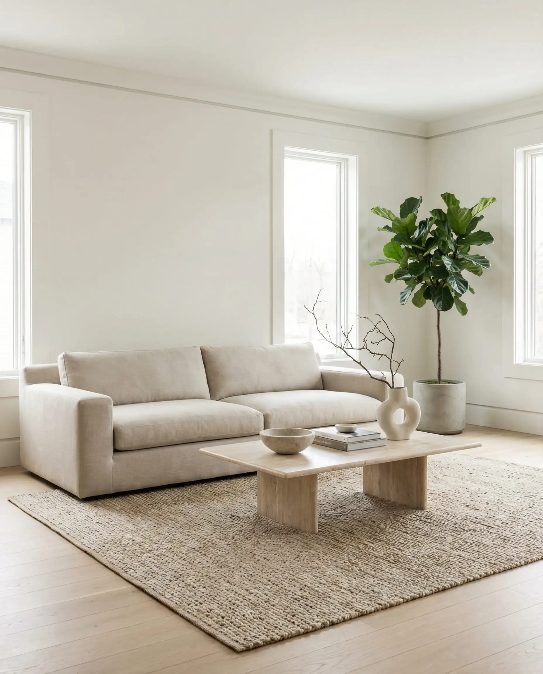
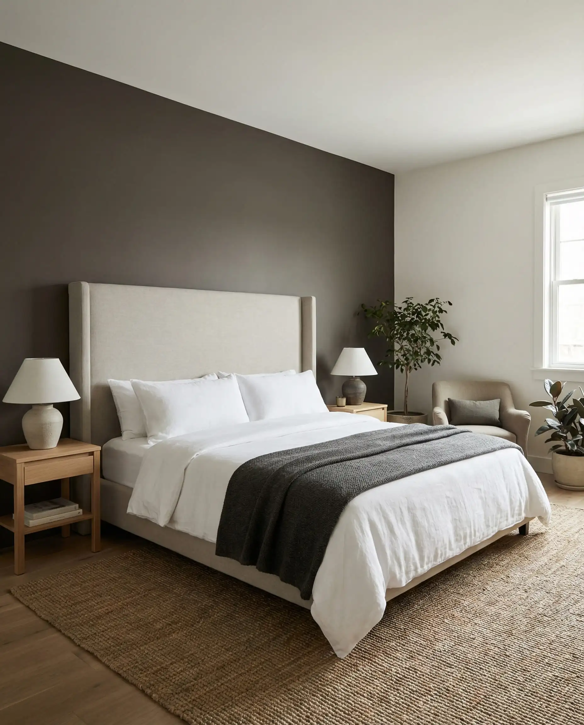
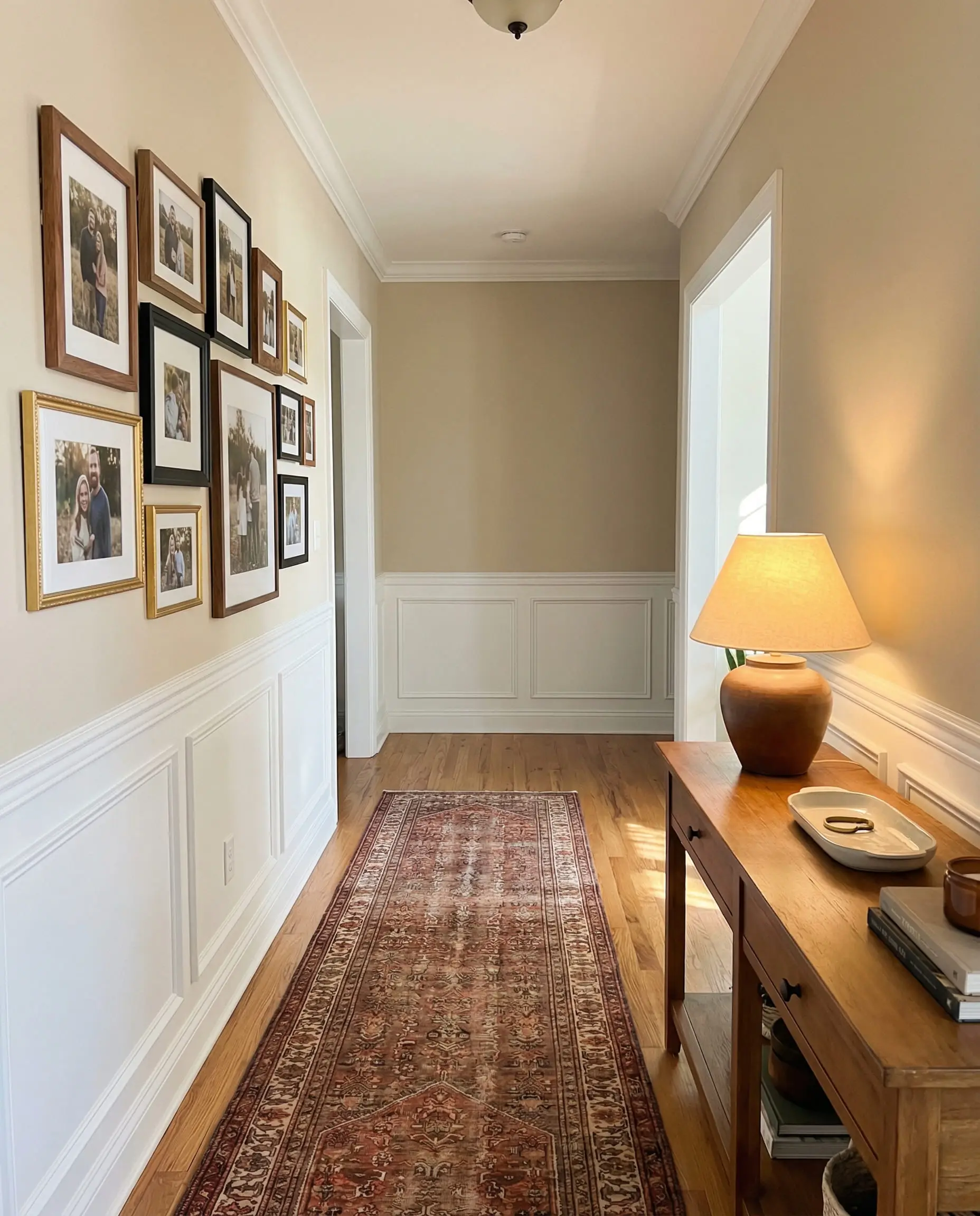
- Foundational Neutrals (Quiet Luxury): The classics, elevated. These are the whites and beiges that serve as the quiet backdrop for a busy life.
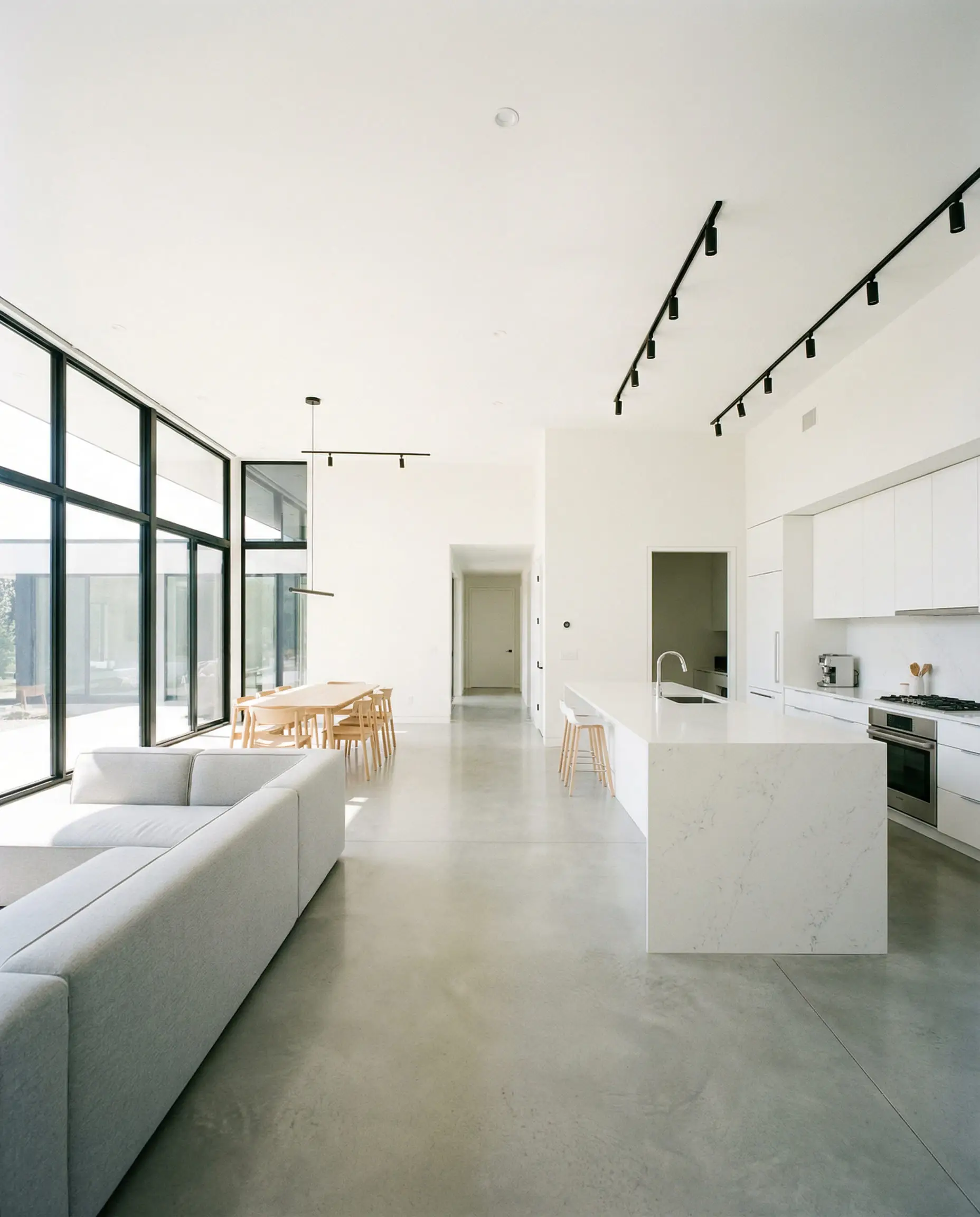
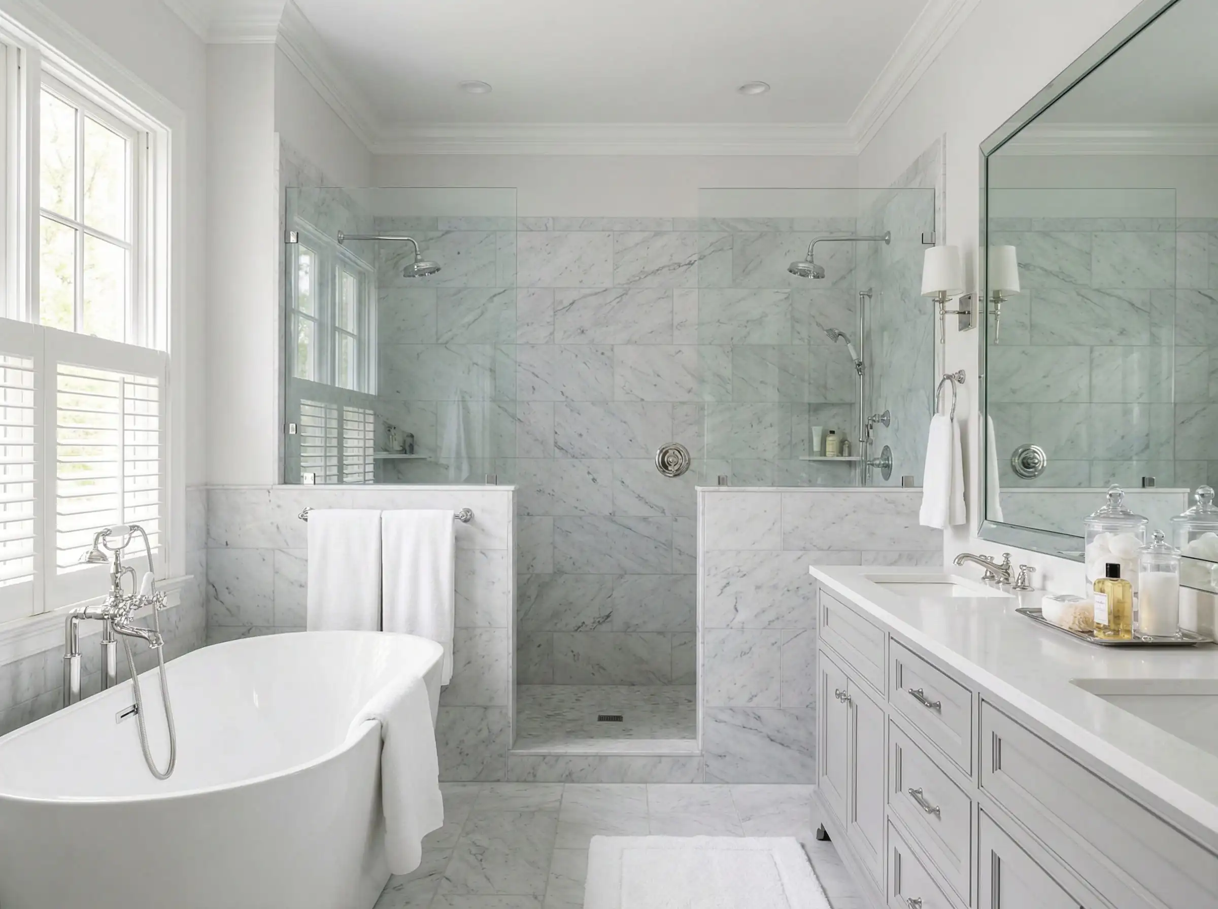
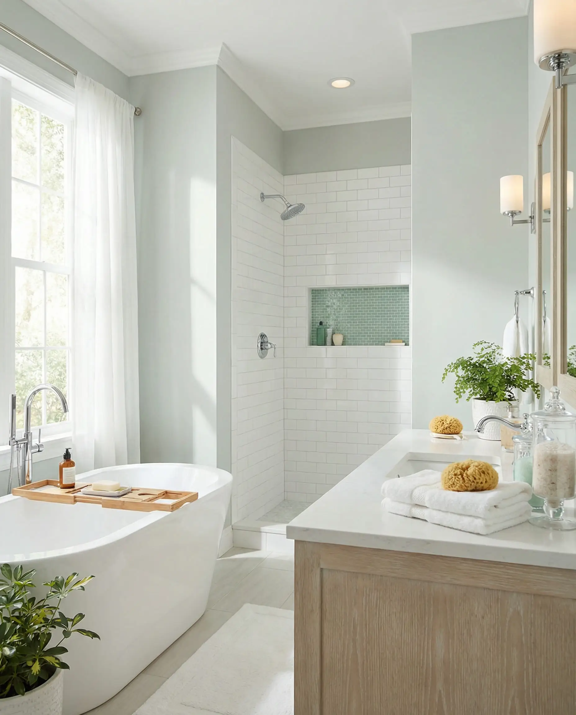
Best Whites & Off-Whites (The Classics)
White paint is never “just white.” It is the most complex color family because it reflects everything around it. These are the top contenders that designers refuse to stop using.
2. Pure White (SW 7005)
The Vibe: Crisp, clean, and zero drama.
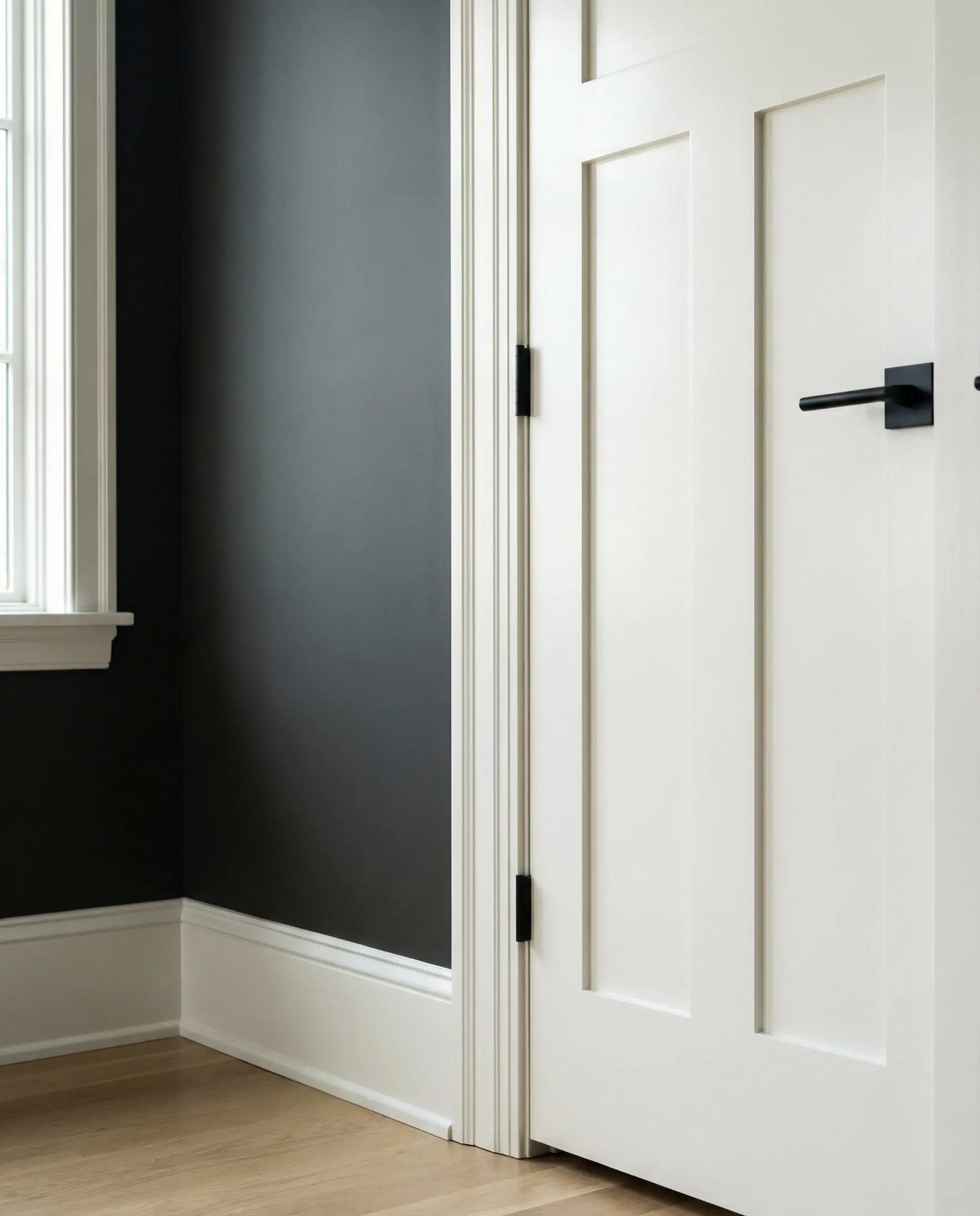
If you are looking for the perfect trim and ceiling color, stop looking. You found it. Pure White has the tiniest drop of black and yellow in its formula, which keeps it from looking like “primer white,” yet it doesn’t have a creamy yellow cast. It is the universal donor of paint colors.
3. Alabaster (SW 7008)
The Vibe: Soft, cozy, and perfectly imperfect.
Alabaster had its moment as a previous Color of the Year, but it remains a best-seller for a reason. It is a “soft white” with distinct creamy undertones. It avoids being yellow, but it definitely brings warmth. It’s the color of a tumbled stone.
Be careful using Alabaster on trim if your walls are a clean, cool gray. The Alabaster will look dirty or yellow by comparison. It shines best when paired with warmer wall colors.
🎨 Styling Tip
4. Greek Villa (SW 7551)
The Vibe: A sunny vacation in a can.
Greek Villa is slightly warmer than Alabaster. It has a definite yellow-green undertone that sounds scary but actually translates as “sunlight.” It is incredible for brightening up darker hallways or rooms that don’t get enough natural light.
5. Snowbound (SW 7004)
The Vibe: Cool, calm, and collected.
While Alabaster leans warm, Snowbound leans cool. It has a slight gray/pink undertone that makes it feel very crisp and velvety. It pairs exceptionally well with Carrara marble counters or gray tile floors where a yellow-white would look wrong.
6. White Snow (SW 9541)
The Vibe: The modern minimalist.
Part of the newer Emerald Designer Edition, White Snow is gaining massive traction in 2026. It is brighter and has a higher Light Reflectance Value (LRV) than Pure White, but it feels less stark than High Reflective White. It is the new darling for contemporary architecture.
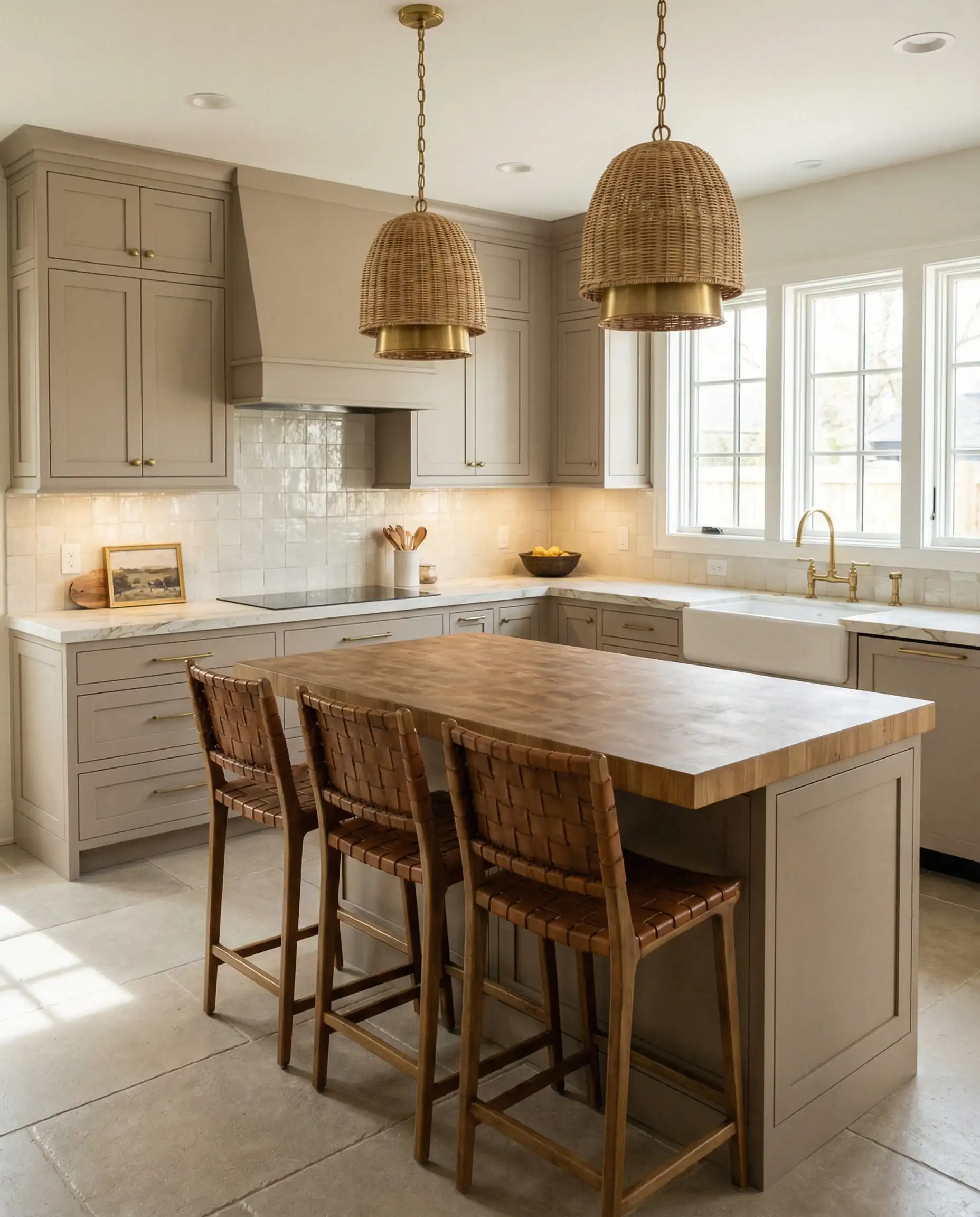
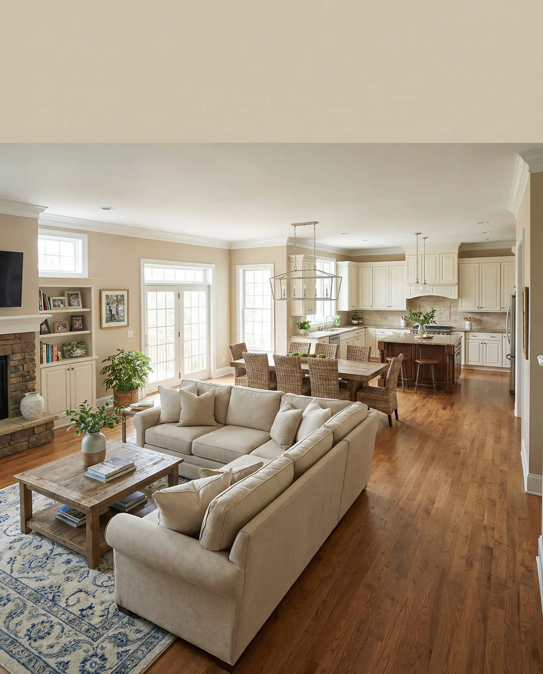
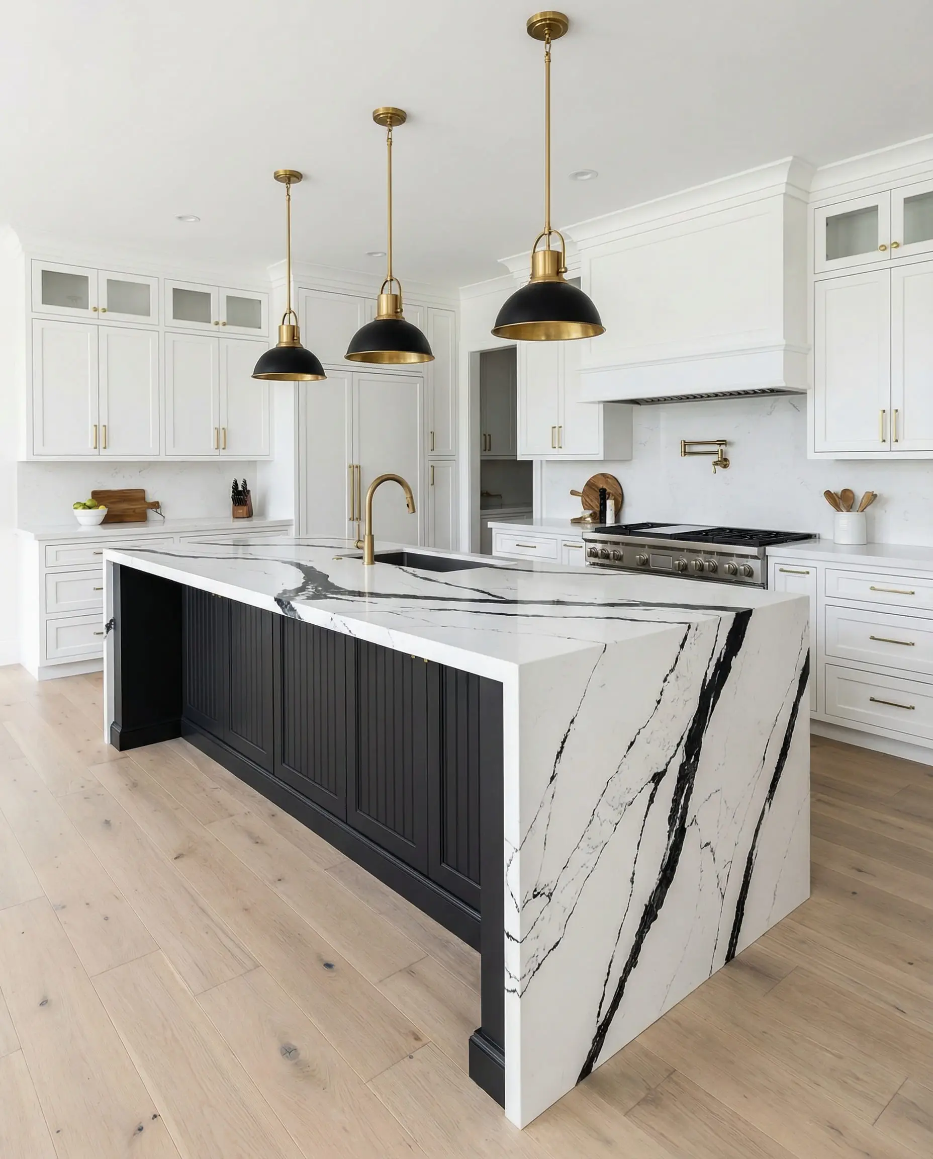
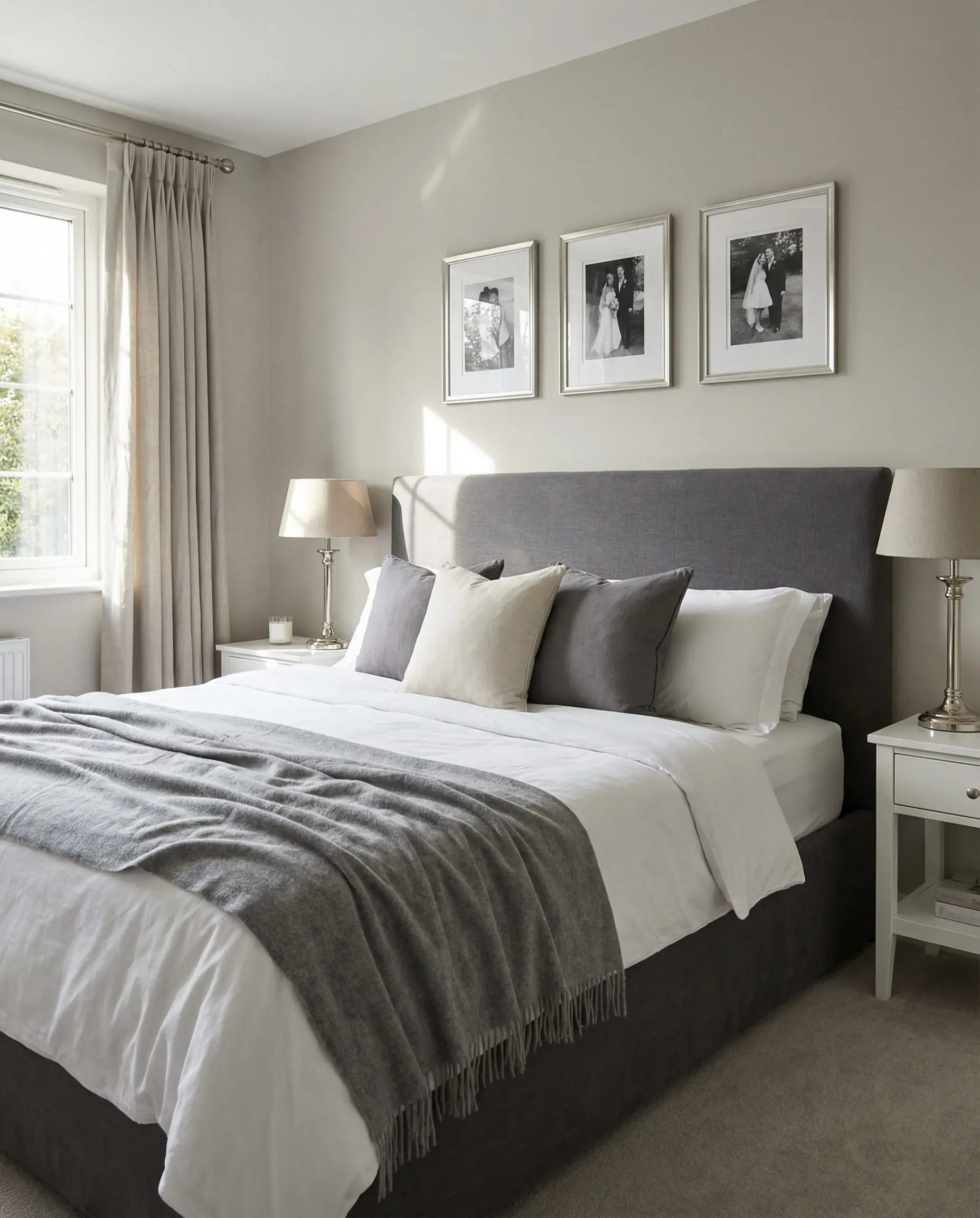
Best Neutrals & Beiges (The 2026 Focus)
This is where the magic is happening this year. We are saying goodbye to “sad grays” and welcoming “happy beiges,” mushrooms, and taupes.
7. Accessible Beige (SW 7036)
The Vibe: The diplomat of paint colors.
Accessible Beige is famous because it plays nice with everyone. It is technically a beige, but it has enough gray in it to prevent it from looking like builder-grade tan. It is warm, inviting, and makes a large room feel furnished even when it’s empty.
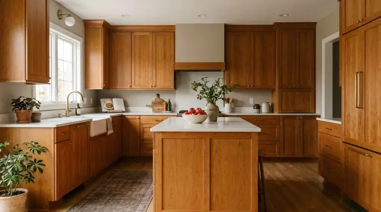
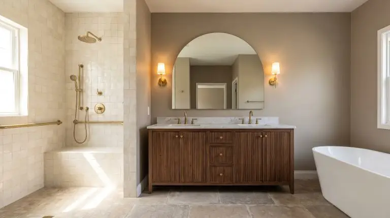
8. Natural Linen (SW 9109)
The Vibe: Organic, textural, and effortless.
As we move into 2026’s “Essentialism,” Natural Linen is a top contender. It feels darker and richer than a standard beige. It looks exactly like its namesake fabric—breezy but substantial.
9. Shiitake (SW 9173)
The Vibe: The sophisticated mushroom.
“Mushroom” is the buzzword for neutrals right now—a mix of beige, gray, and a tiny hint of purple or brown. Shiitake captures this perfectly. It is moodier than Accessible Beige and works incredibly well in dining rooms or home offices where you want a bit more elegance.
Lighting is critical for Shiitake. In the evening, under 2700K (warm) light bulbs, this color turns incredibly cozy and velvety.
💡 Designer Tip
10. Agreeable Gray (SW 7029)
The Vibe: The reigning champion (still).
We cannot write a Sherwin-Williams list without mentioning the undisputed king. Agreeable Gray is the ultimate “Greige.” However, in 2026, we are seeing it used differently. Instead of painting the whole house this color, it’s being used as a balancing act in rooms that have very warm furniture, cooling down the space without icing it out.
11. Pavilion Beige (SW 7512)
The Vibe: Warm elegance.
Pavilion Beige is gaining traction as a slightly cleaner, less “muddy” alternative to the older beige classics. It reflects light beautifully and creates a soft, canvas-like backdrop for art collections.
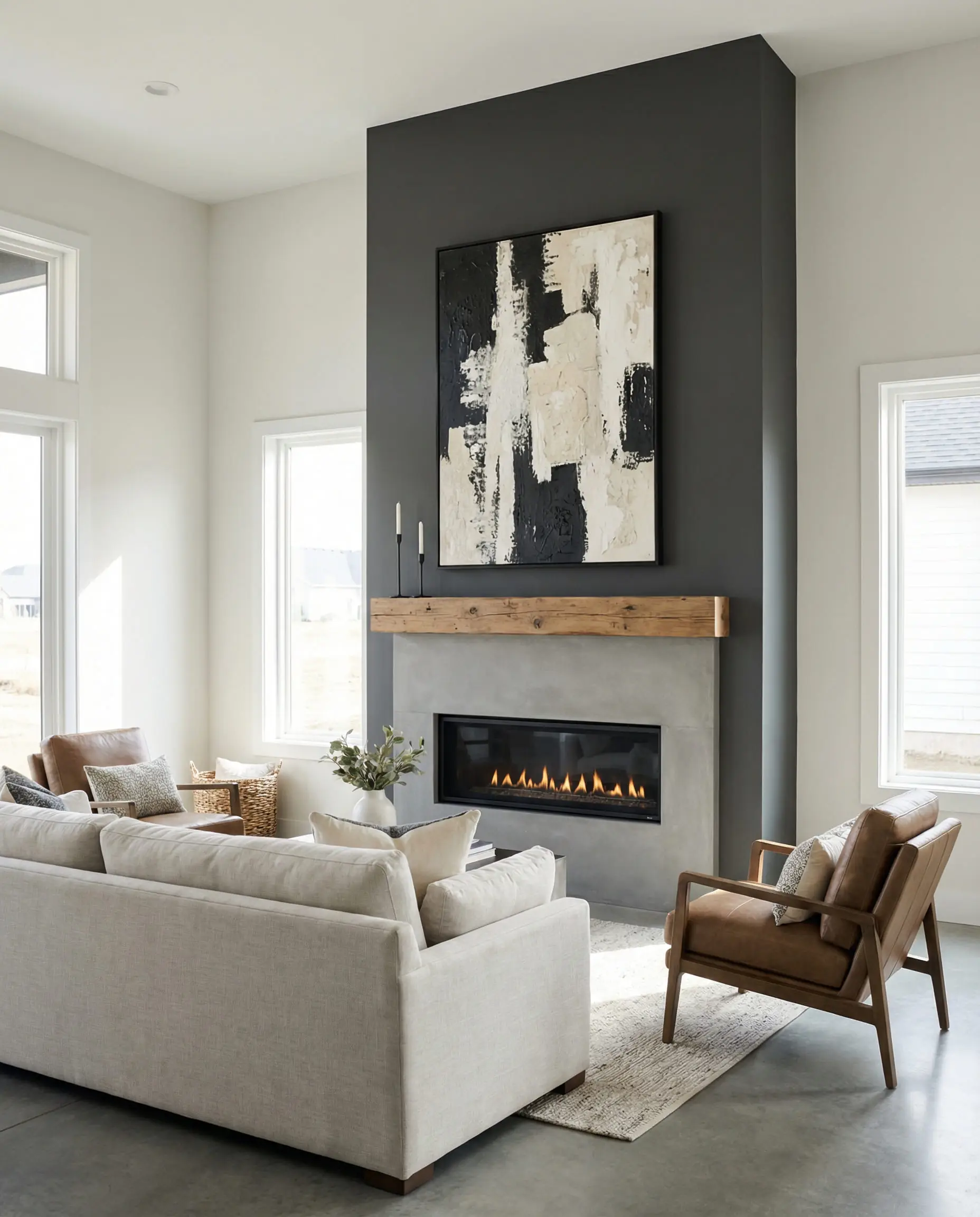
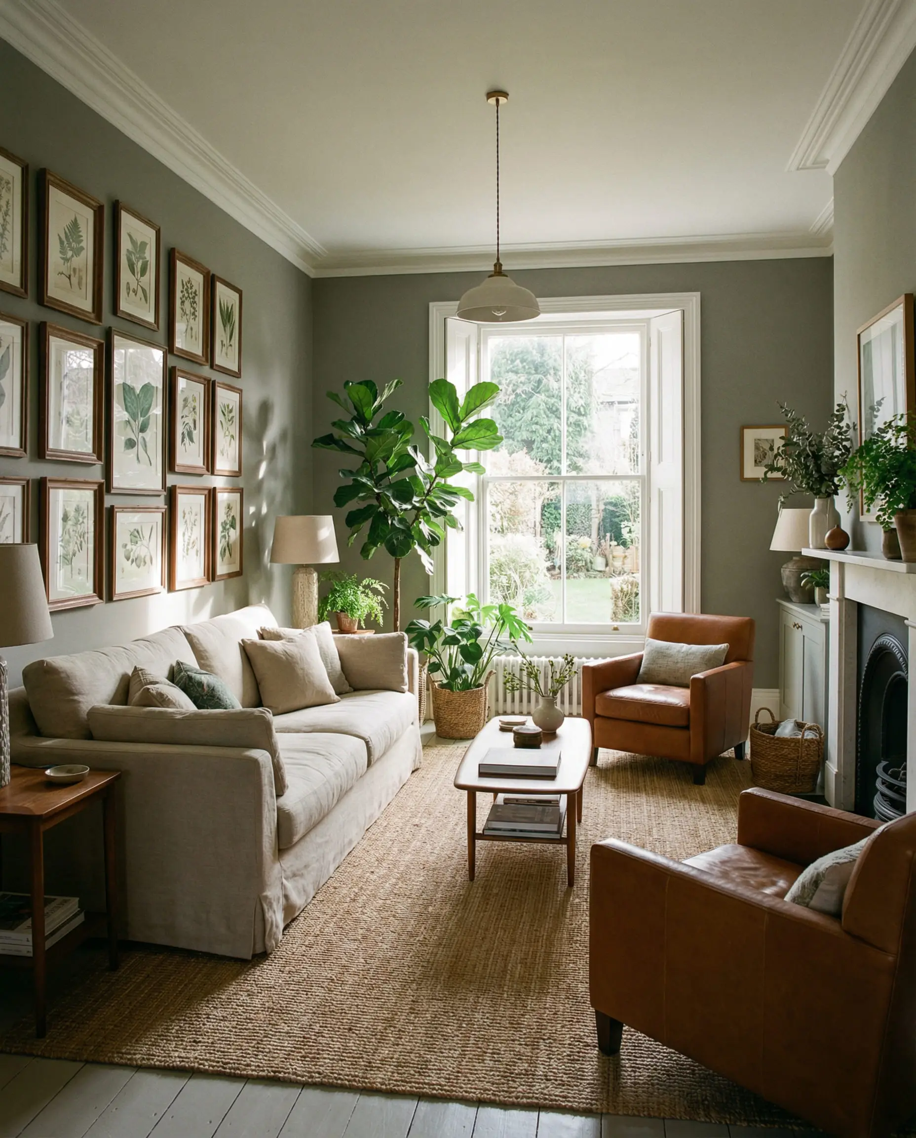
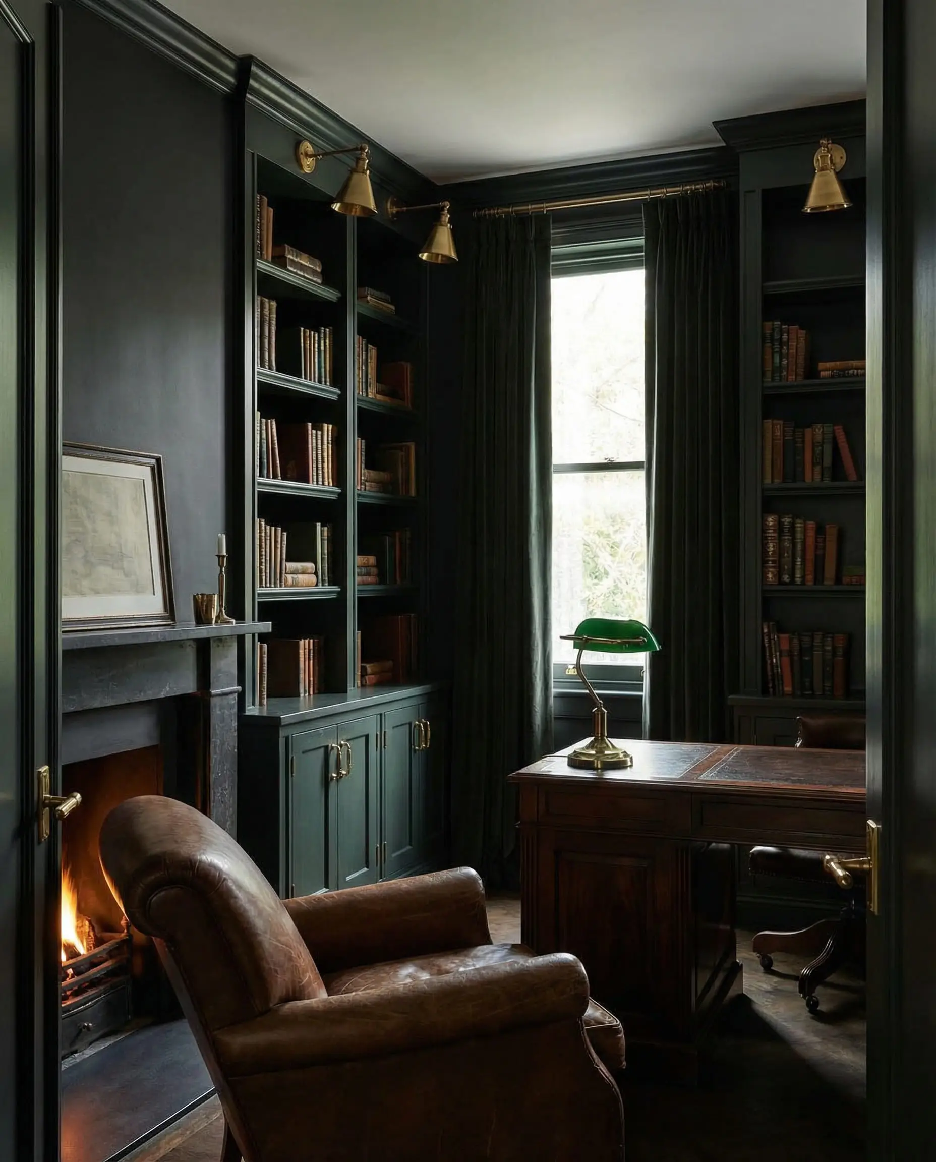
Best Moody & Dark Accents (Restorative Darks)
In 2026, we aren’t afraid of the dark. Dark colors are being used to create “jewel box” rooms—small spaces packed with personality.
12. Tricorn Black (SW 6258)
The Vibe: The little black dress of paints.
If you want a true black—not blue-black, not brown-black, just black—this is it. Tricorn Black is a staple for interior designers. It provides a sharp, high-contrast look that defines a space.
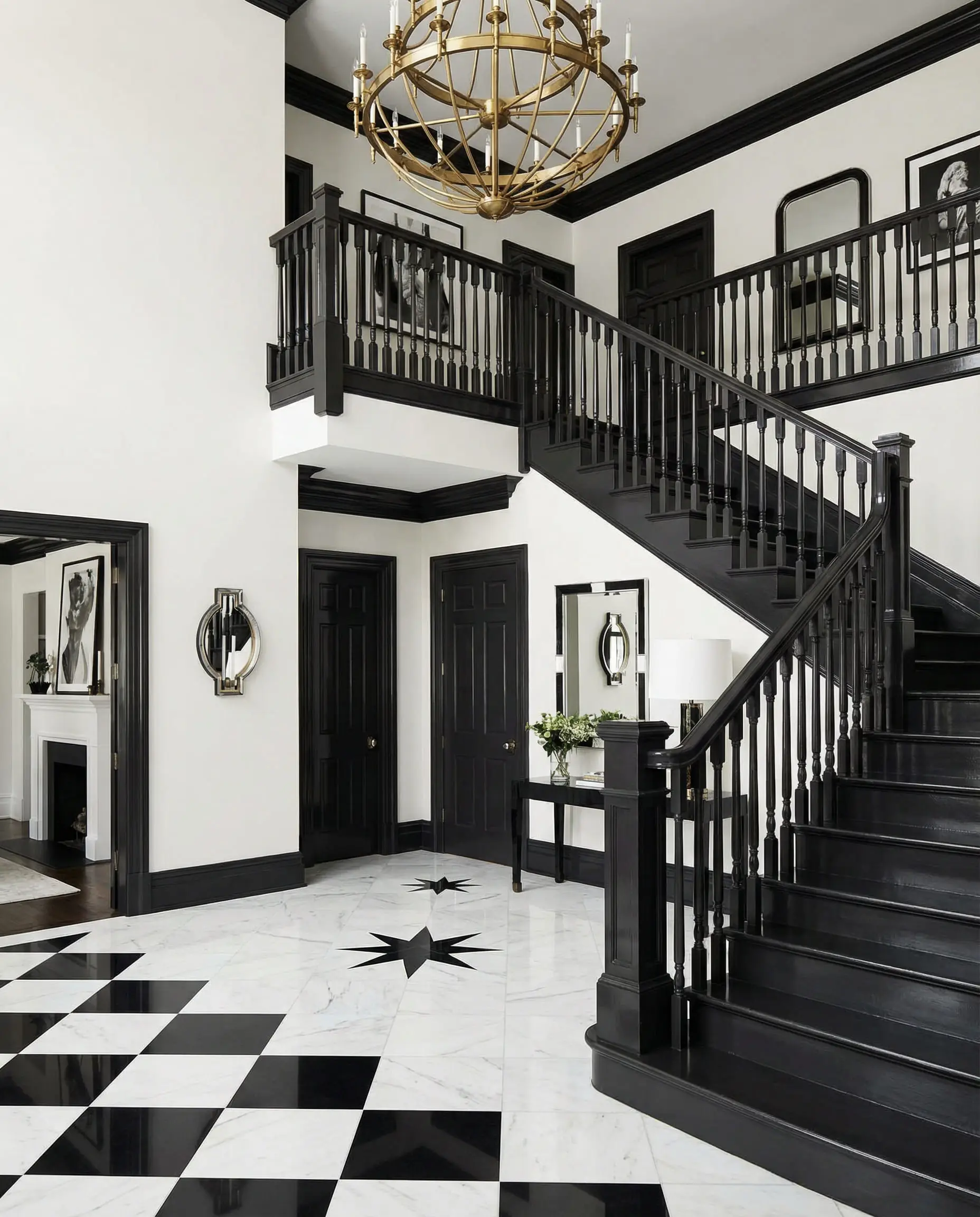
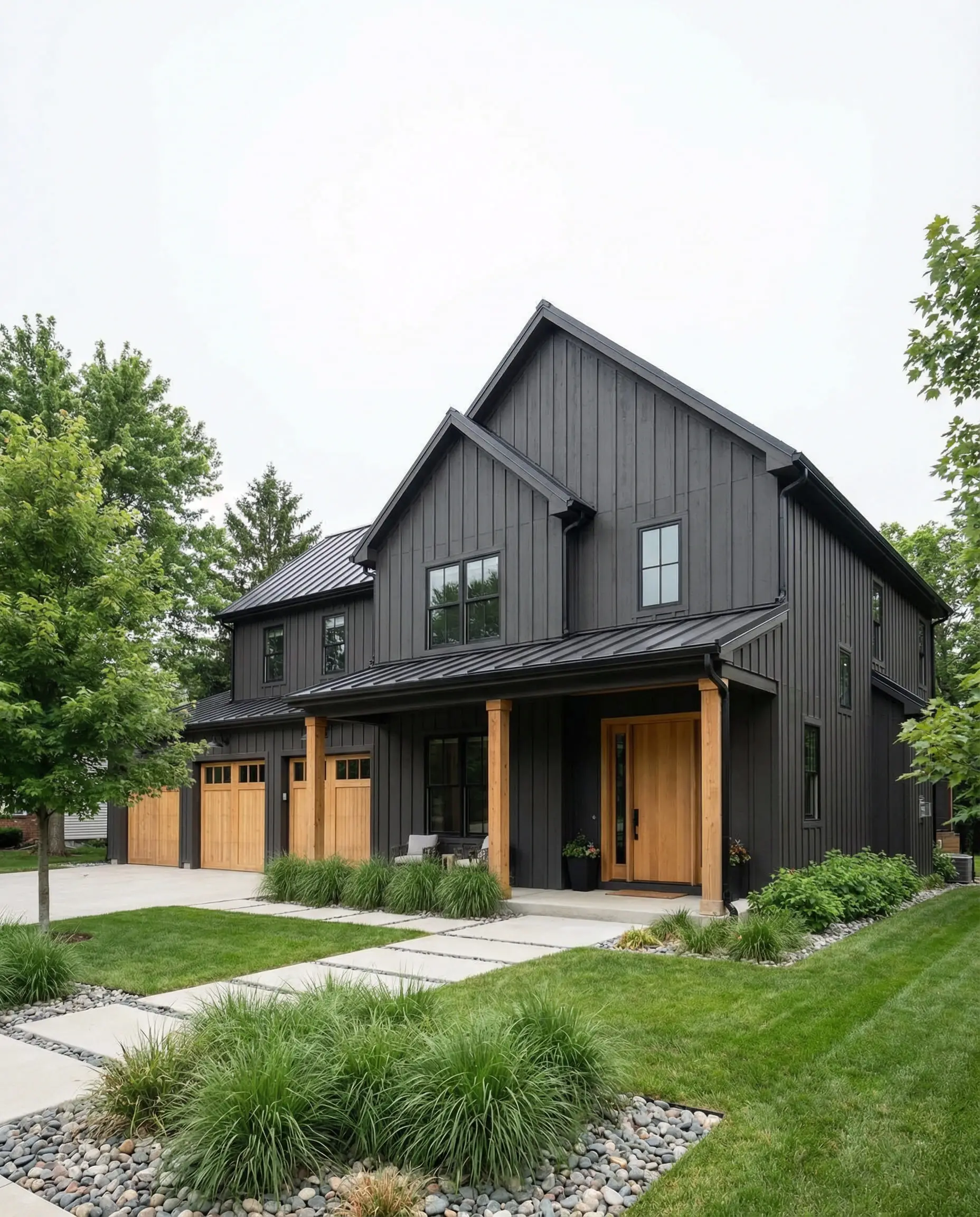
13. Iron Ore (SW 7069)
The Vibe: The soft industrial.
Iron Ore is a dark charcoal that reads as a soft black. It is less harsh than Tricorn Black. Because it has cool undertones, it looks stunning as an exterior color on modern farmhouses or on a fireplace accent wall.
14. Rojo Marrón (SW 9182)
The Vibe: The 2026 “It” dark.
Part of the 2026 “Restorative Darks” palette, this color is a rich, deep brown with heavy red/auburn undertones. It feels like mahogany wood or dark leather. It is incredibly luxurious and aligns with the trend of “library aesthetics.”
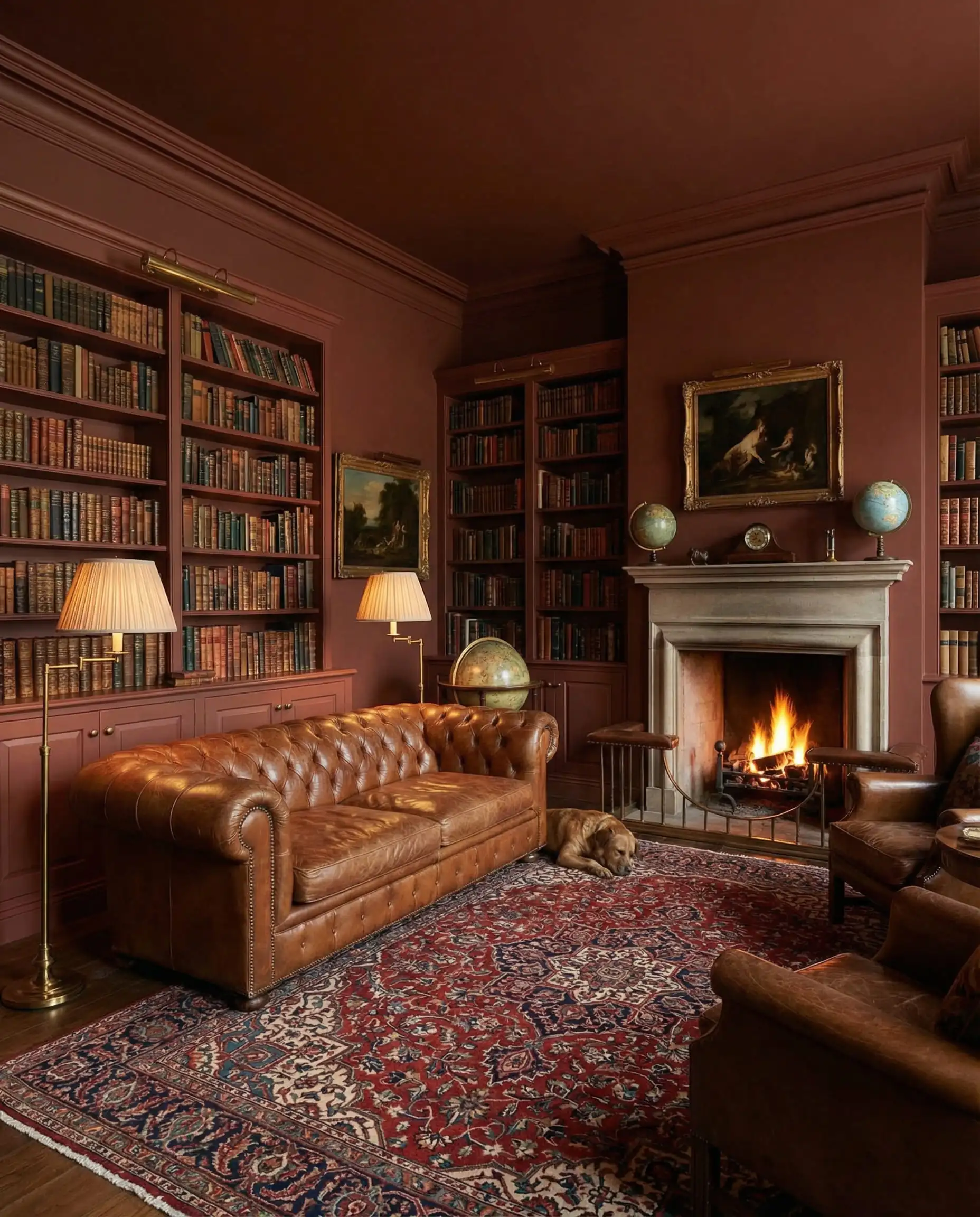
Don’t be afraid to color-drench with Rojo Marrón. Paint the walls, the trim, and even the ceiling in this shade for a fully immersive, moody experience.
🎨 Styling Tip
15. Urbane Bronze (SW 7048)
The Vibe: Earthy sophistication.
A former Color of the Year, Urbane Bronze is still a powerhouse. It is a brownish-gray that feels rooted in nature. It evokes the feeling of bronze metal or dark stone. It is warmer than Iron Ore, making it feel more welcoming.
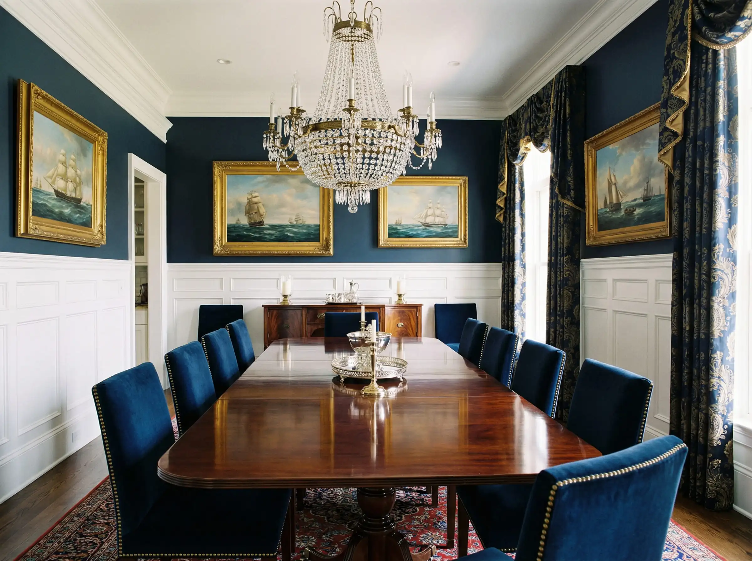
16. Naval (SW 6244)
The Vibe: Maritime luxury.
Navy blue is a classic neutral. Naval is a deep, confident blue that doesn’t look purple. It brings a sense of authority and calm to a room.
Best “New” Colors (The 2026 Trend Pops)
These are the colors for those willing to take a risk and bring the “Frosted” and “Sunbaked” trends to life.
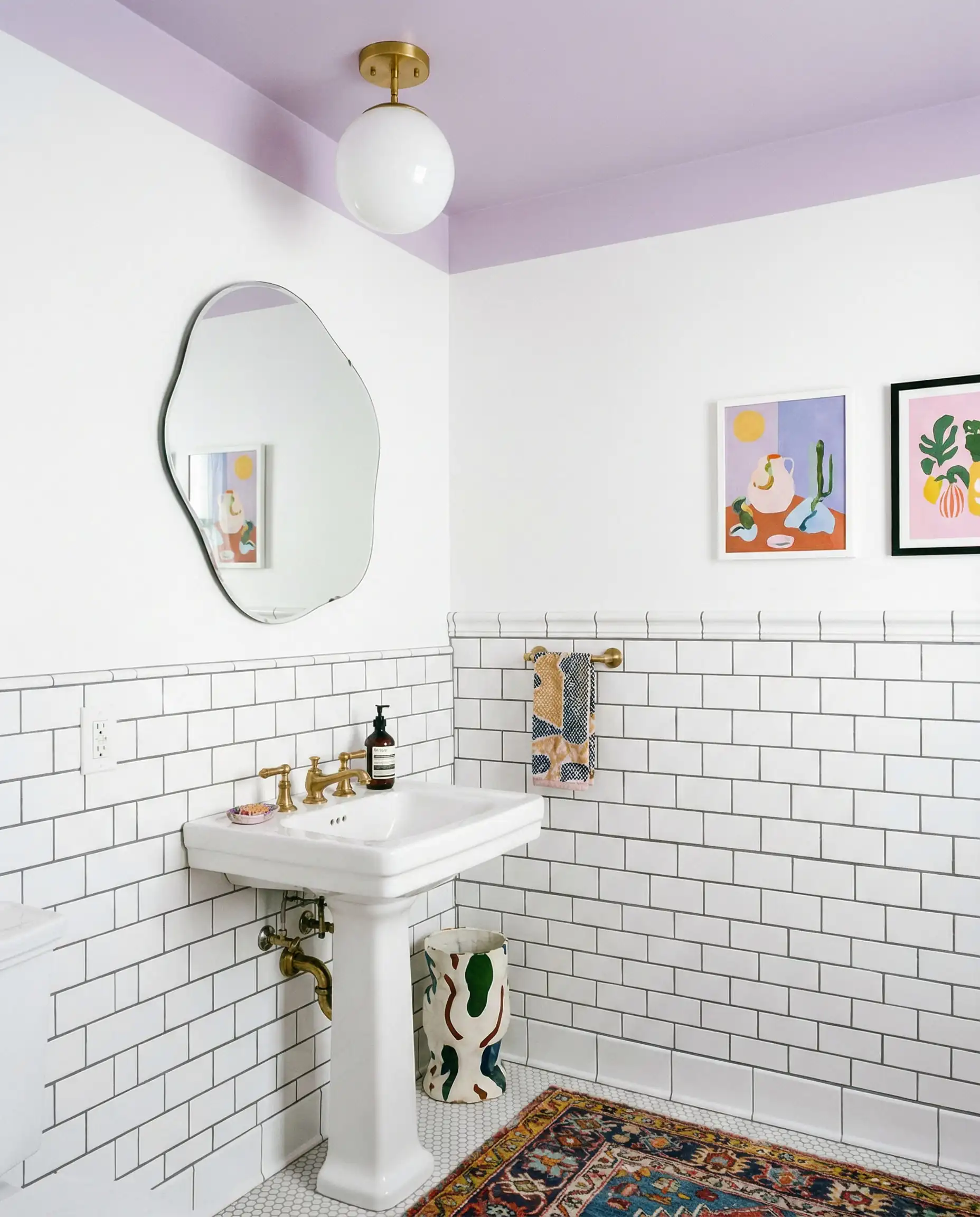
17. Modern Lavender (SW 9688)
The Vibe: Digital Zen.
Purple is back, but not the grape purple of the 90s. Modern Lavender is dusty, grayed-out, and barely there. It fits the “Frosted Tints” trend perfectly. It feels creative yet calming.
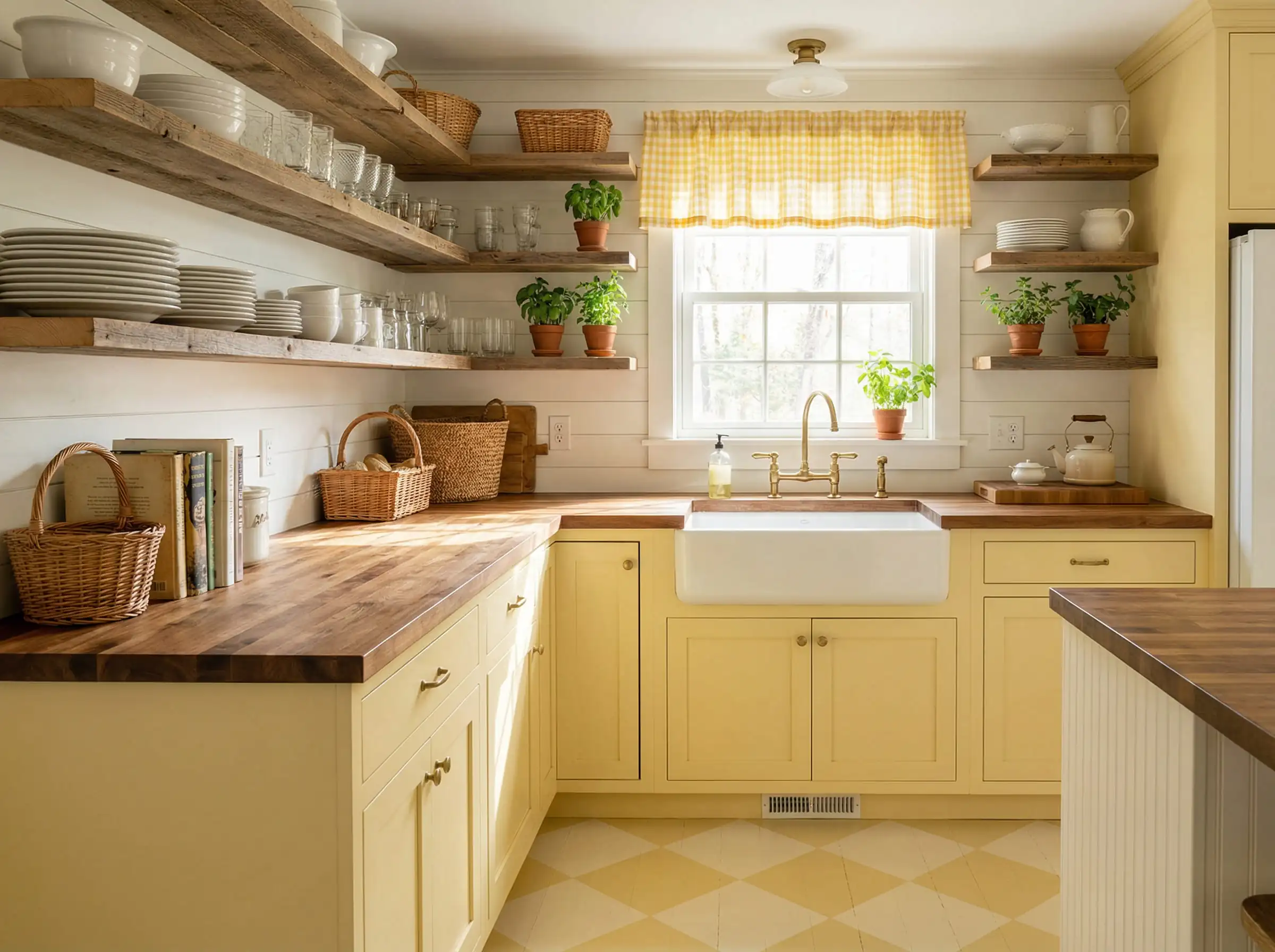
18. Lemon Chiffon (SW 6686)
The Vibe: Nostalgic sunshine.
Yellow can be aggressive, but Lemon Chiffon is buttery and soft. It taps into the “Sunbaked” trend, bringing a sense of morning optimism to a space. It’s perfect for the “Cottagecore” aesthetic that refuses to die.
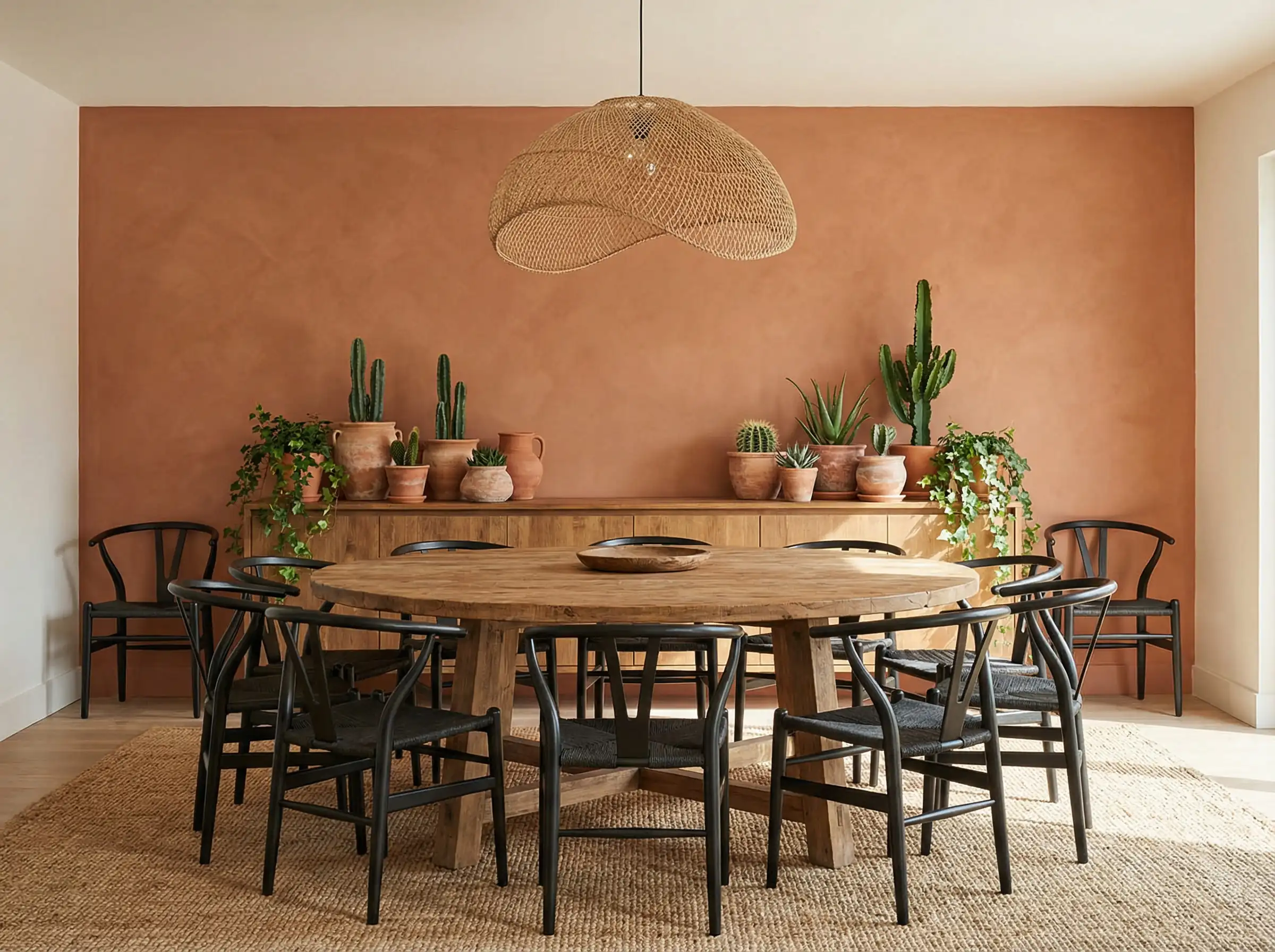
19. Pennywise (SW 6349)
The Vibe: Earthy clay.
Terracotta has been bubbling up for years, and Pennywise is the best version of it. It’s a burnt orange that feels grounded, not neon. It brings instant heat to a room.
The Best of the Rest (Rounding out the Top 30)
To give you the most comprehensive resource, here are the remaining picks that round out our top 30 for 2026. These include specific problem-solvers and designer favorites.
Cool Grays & Blues (For serenity)
Warm Neutrals (For coziness)
Bold Statements
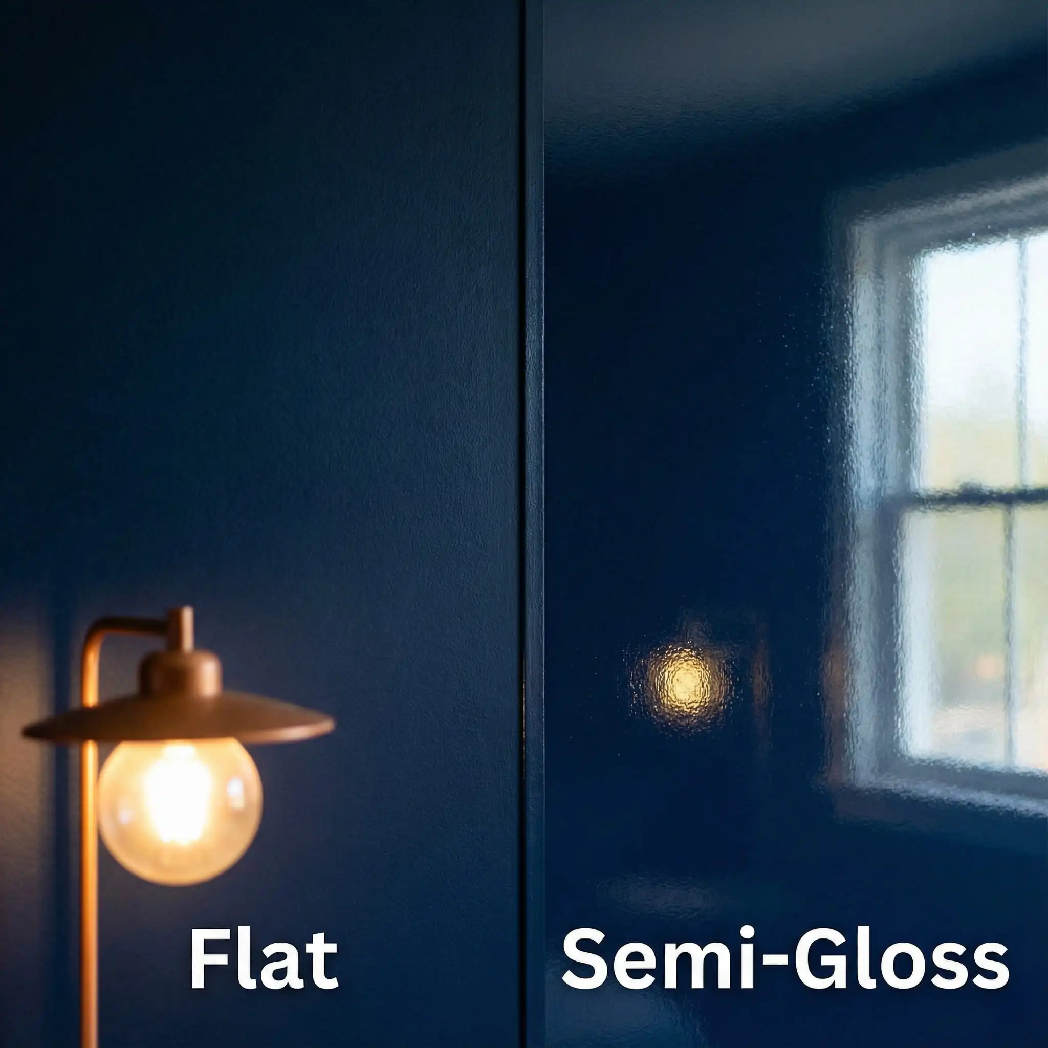
Buying Guide: Sheens & Sampling
Picking the color is step one. Buying the right can is step two. Here is how to avoid the most common mistakes.
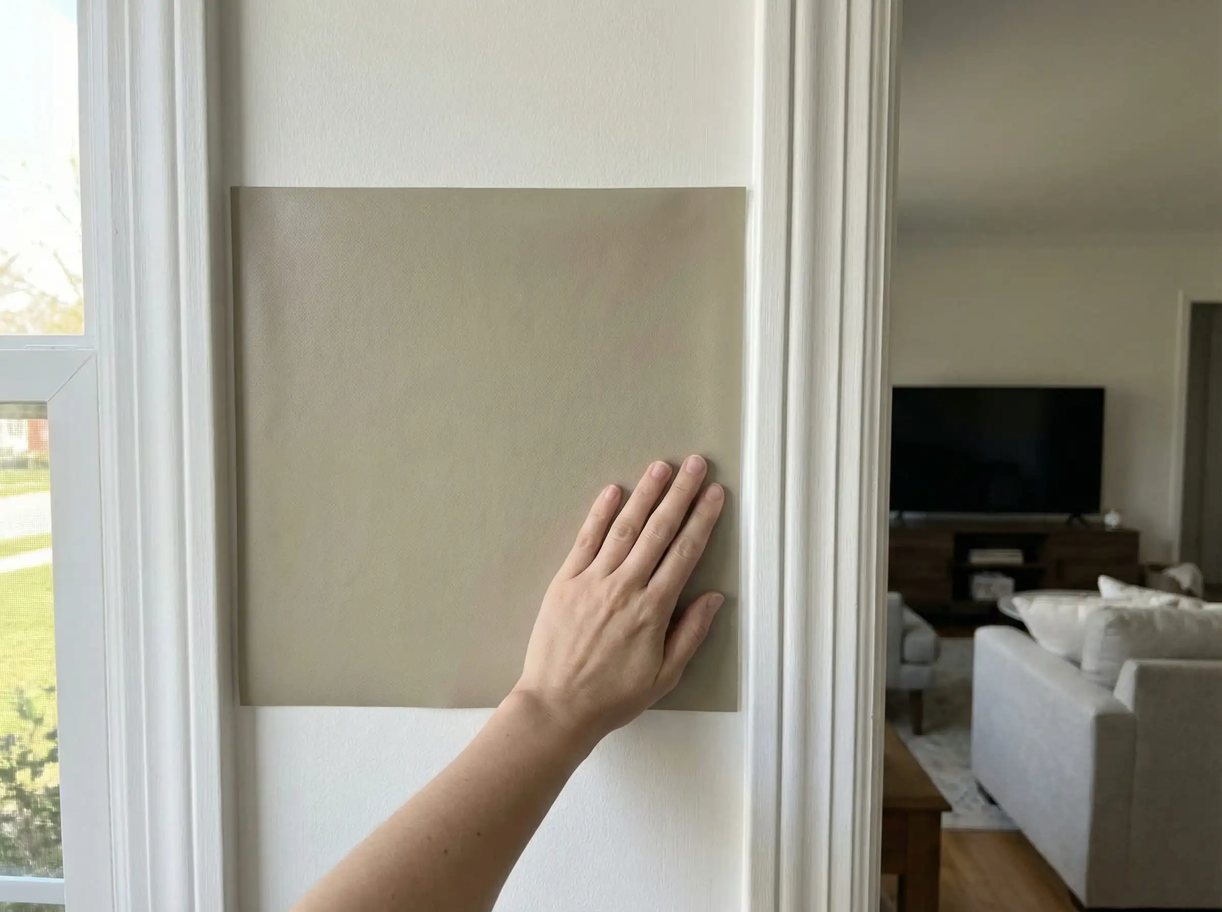
The “Peel & Stick” Revolution
Please, for the love of your walls, do not paint a 2×2 square on your wall and decide immediately.
Choosing the Right Sheen
Frequently Asked Questions (FAQ)
While Alabaster and Agreeable Gray remain top sellers by volume, the trendiest color for 2026 is Universal Khaki (SW 6150). It represents the design world’s shift toward warmer, sturdier neutrals.
Cool, icy grays are declining in popularity. However, gray is evolving into warmer variations like “Greige” (gray-beige) and “Taupe.” If you love gray, opt for warmer shades like Repose Gray or Agreeable Gray to keep the look current.
The 2026 Color of the Year is Universal Khaki (SW 6150). It is a “foundational neutral” designed to pair well with the resurgence of natural materials, wood tones, and restorative design aesthetics.
Pure White (SW 7005) is the most versatile choice for trim. It is bright and clean without being blindingly stark, and it pairs correctly with both warm and cool wall colors.
Not necessarily! A massive trend for 2026 is “drenching,” where you paint the ceiling the same color as the walls (or a shade lighter, like Modern Lavender). This makes the room feel larger and more cohesive.
Ready to transform your space? Visit your local Sherwin-Williams store to grab these chips, or explore the Hackrea Visualizer to see these 2026 trends in your own room before you paint.